
1. Cream watercolor border with bold date bar
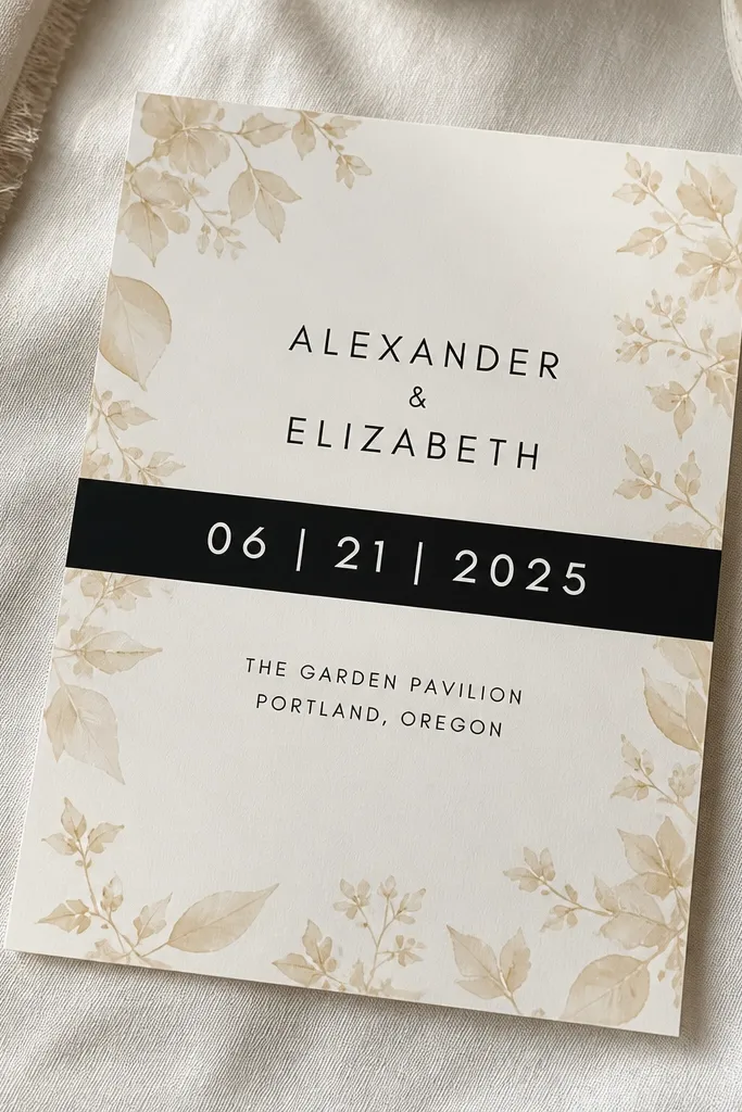
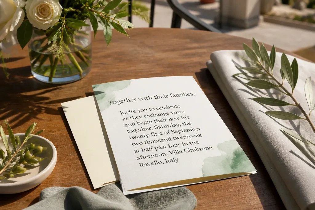
This design hits the sweet spot between dreamy and legible. The watercolor border gives that soft, romantic frame, but the date bar is the anchor — one thick, high-contrast strip that makes the wedding date readable from across a table. Put the couple’s names above the bar and keep the venue line below it in a clean serif or readable sans. It photographs beautifully because the border stays delicate while the bar adds structure. It works for families because kids can spot the date instantly and older relatives can read it without squinting.
Quick tipSkip heavy raised watercolor textures; smooth printing looks cleaner in handheld photos.
Start by choosing a cream base (not bright white) and a border watercolor that stays pale — think dusty rose, sage, or light blue. Then add a date bar using dark ink like charcoal or deep navy, and keep the text centered with generous line spacing. Finally, print the venue name and address in a medium weight font directly under the bar so the card follows a top-to-bottom reading path. For travel-style invites, add the city name as the venue line so it’s clear in photos and easy for out-of-towners to remember.
Skip thisDon’t use pale gray text on cream — it kills readability and makes the dreamy look feel washed out.
2. Garden icon set with one sentence RSVP
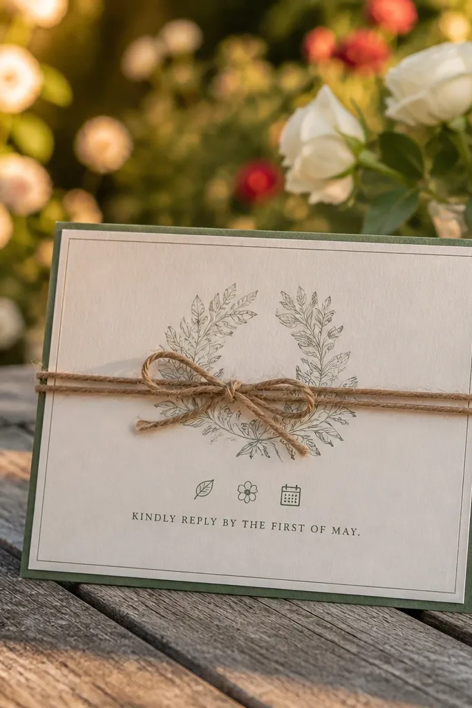
If you want family-friendly wedding card design that kids won’t ignore, use icons as a friendly guide. A tiny set like a leaf, a tiny flower, and a calendar sits near the RSVP line, so the card feels playful without turning into a cluttered scrapbook. Keep the RSVP as one short sentence — names, date, and “RSVP by” — so adults can read it quickly and everyone understands the request. The layout stays airy, which is what makes it look dreamy in travel photos. It also works well for mixed ages because the icon gives context instantly.
Start by picking 3 simple icons in the same color family (muted green and dusty rose look great together). Then place them next to a single RSVP block that stays short and bold enough to read at a distance. Finally, keep the rest of the card minimal: couple names at top, wedding date and venue center, and the RSVP block at bottom with clear contact or QR. If you’re mailing, leave at least 5-7 mm of margin so icons don’t get cut by trimming.
Use icons that print in one ink color; multi-color icons can look muddy on cheap paper.
Don’t cram directions, dress code, and gifts into the main design — it destroys scan speed.
3. Soft sage photo frame with matte typography
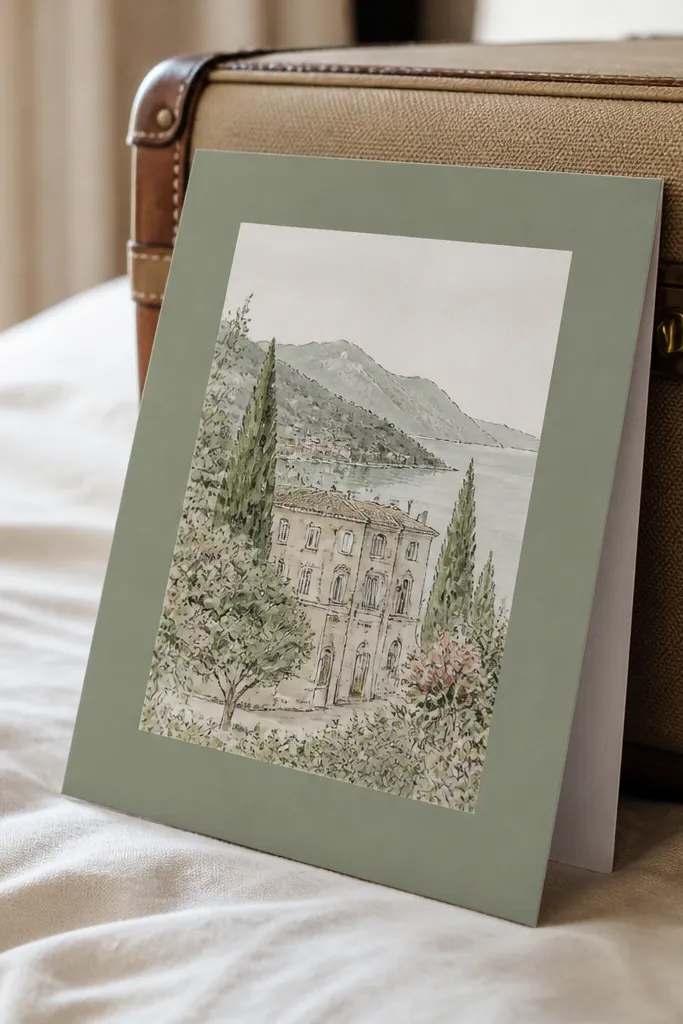
This one is for couples who want a dreamy travel vibe without making the card hard to read. A soft sage frame surrounds a small scenic illustration or a simple venue sketch, while the typography stays matte and high contrast. The sage frame gives warmth, and the matte text avoids glare that ruins photos. Keep the couple names large enough for grandparents and place the location name clearly inside or just under the frame. It feels modern but still soft, and it works especially well for destination weddings where people need the place to click in their heads.
Quick tipChoose a frame thickness that matches your printer’s margins so the border doesn’t get trimmed.
Start by selecting a sage tone that’s light enough to stay airy, then create a thin frame (about 6-10 mm) around the central illustration. Next, print the main headings in deep navy or charcoal and keep body text in one readable font size around 18-20 pt. Finally, put the full venue name and city directly under the frame so out-of-town guests can confirm details fast. For printing, ask for a matte finish and avoid glossy varnish over the text area.
Skip thisDon’t place the illustration too close to the edge; it makes trimming look sloppy in photos.
4. Navy night sky gradient with starry dots
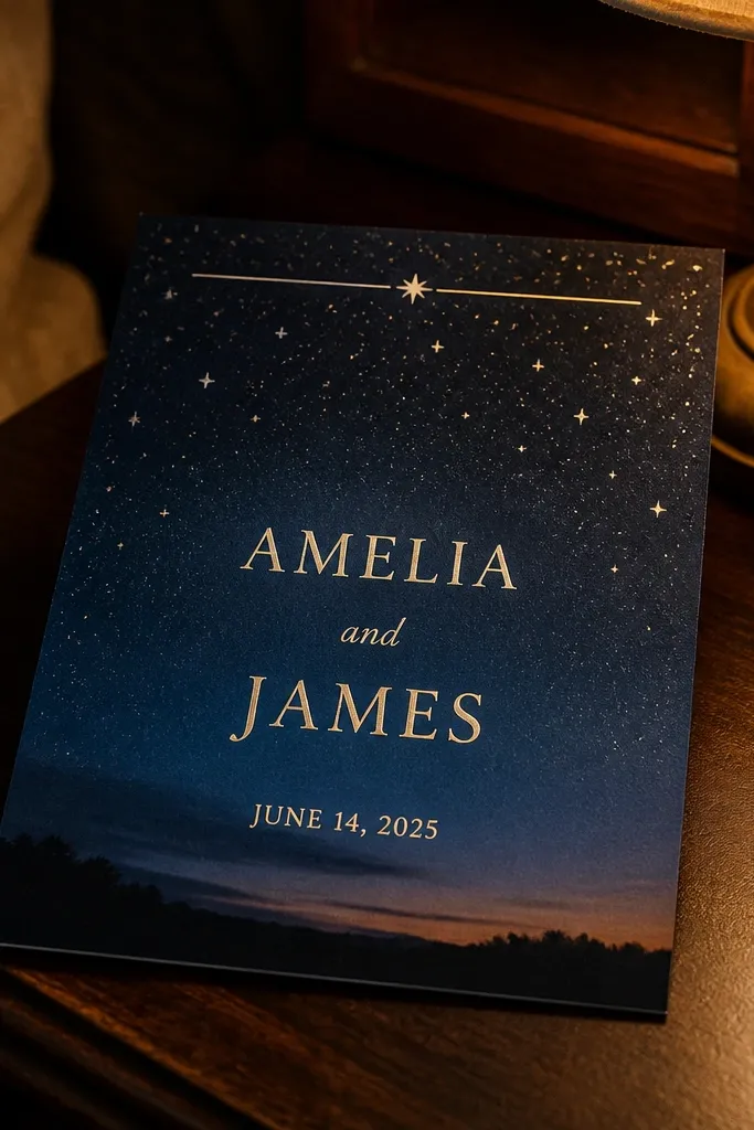
This design reads “dreamy” instantly because the night sky background makes everything feel romantic. For family-friendly wedding card design, keep the gradient subtle and use star dots as a visual texture, not as random clutter. Use gold foil or warm metallic ink only for tiny stars or a thin header line so the main text remains easy to read. The contrast between deep navy and cream text makes the names, date, and venue stand out for older relatives. In photos, this style looks great at dusk or indoors with warm lighting because the background doesn’t blow out the camera.
Quick tipIf you’re printing at home, use a matte navy background image at high resolution to avoid banding.
Start by choosing a navy base with a gentle gradient from top to bottom, then add small star dots in two sizes. Keep foil to under 10% of the surface area — header line, a few stars, and maybe a small date accent. Next, print the couple names and date in cream with a font that has thick strokes so it stays readable. Finally, add RSVP details in a smaller but still readable size (18 pt body or larger) and keep line breaks simple to avoid wrapping.
Skip thisDon’t use white text that’s too thin; it looks pretty but becomes hard to read for mixed ages.
5. Terracotta arch invitation with single-line address
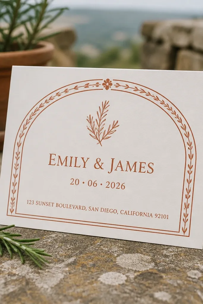
An arch border feels architectural and romantic without needing a bunch of decorations. The terracotta color gives warmth, and the arch framing naturally guides the eye toward the couple names and date. Keep the address as one clean line if it fits, because wrapping makes cards feel busy and harder for older guests to read. This is a strong choice for family-friendly wedding card design because it’s structured and calm, which helps kids and grandparents focus. It also photographs well because the arch creates a natural framing effect in flat lays.
Quick tipUse a slightly off-white background (cream) so terracotta looks warm instead of harsh.
Start by drawing a simple arch border centered on the card, leaving equal space above and below the arch opening. Use deep charcoal text and keep the couple names in a larger size than the venue line. Then format the address as one line with abbreviations like “St.” and “Ave.” only if your guests will understand them. Finally, add RSVP at the bottom with a clear deadline date and one contact method.
Skip thisAvoid busy patterns inside the arch; it makes the card look cramped when mailed.
6. Peony blush corner cluster
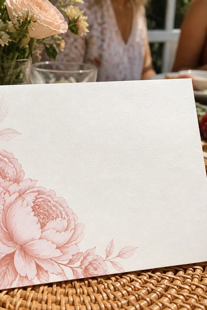
This is the “pretty but not loud” option. A peony blush corner cluster creates a romantic focal point while leaving most of the card clean for readable text. Put the date and venue in the center area so the flowers don’t compete with the information. For family-friendly wedding card design, this works because kids see the flowers, but the adults see the details right away. It looks especially dreamy in soft daylight, like outdoor porch photos and garden shots.
Quick tipLeave at least 15-20 mm clear space around the corner art so it stays crisp on envelopes.
Start by selecting one corner only, then place a cluster of 3-5 peony blooms with a few leaves, all in one limited color palette (blush, dusty rose, and pale green). Next, keep the typography centered and use a high-contrast ink like espresso brown or deep navy. Then add a thin border line if you want extra structure, but keep it light. Finally, print on a textured paper only if the texture is subtle; heavy texture can blur fine lettering.
Skip thisDon’t stretch the floral art across the whole card; readability drops fast.
7. Minimal line art venue map
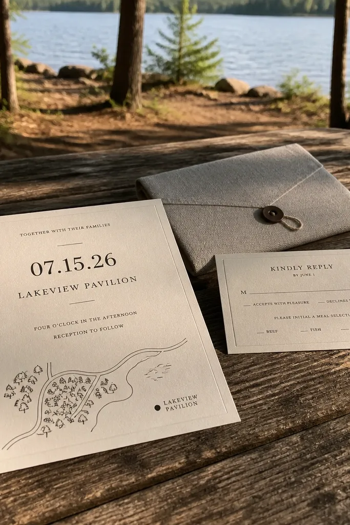
This is for travel-loving couples who still want a clean, family-friendly layout. A minimal line art map sketch of the venue area gives a thoughtful, memorable detail without turning into a messy brochure. Put the map near the bottom or side and keep the date and venue name as the primary text in the center. The line art looks dreamy in a soft monochrome palette, and it gives out-of-town guests a visual cue. It’s also great for mixed ages because the text stays uncluttered while the map acts like a friendly guide.
Quick tipUse one ink color for the map and one for text; two inks keeps it photogenic and clean.
Start by simplifying the map to a few landmarks and the venue outline, not a full street grid. Then place the map in a small box with a thin line border so it doesn’t bleed into typography. Next, print the venue name large and clear, with the city right under it. Finally, include RSVP and address details in the main body area, using a font size that stays readable at arm’s length.
Skip thisDon’t include tiny street labels; they look cool in design software and unreadable in real life.
8. Botanical frame with large RSVP date block
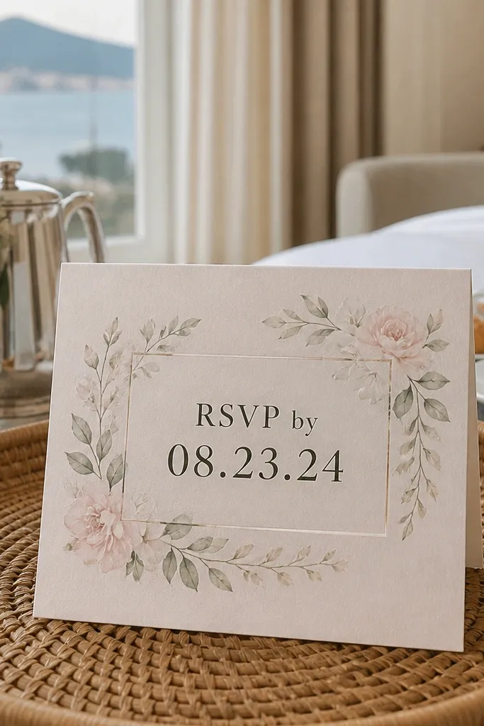
A botanical frame makes the card feel like a garden letter, but the real win is the large RSVP date block. When you put the “RSVP by” date inside a clear rectangle, everyone can read it quickly, including kids who want to help. The frame stays delicate so the card doesn’t feel heavy, and the boxed date gives the design a strong structure. This style looks dreamy in flat lays because the frame creates a border and the box adds a clean graphic element. It’s one of the best options for mixed ages because it reduces the mental work of finding the RSVP deadline.
Start with an ivory base and a botanical frame drawn in thin lines around the edges — small leaves and tiny flowers only. Next, build the RSVP section as a bold rectangle with the RSVP-by date centered and larger than the surrounding text. Then place the venue and time above the RSVP block so the reading order is obvious. Finally, keep body text to 18-20 pt and use a deep ink color for contrast.
Use a rectangle with rounded corners; it softens the frame and looks better in photos than sharp boxes.
Don’t make the RSVP date the same size as the rest of the text; it defeats the whole point.
9. Monochrome art deco border with gold accents
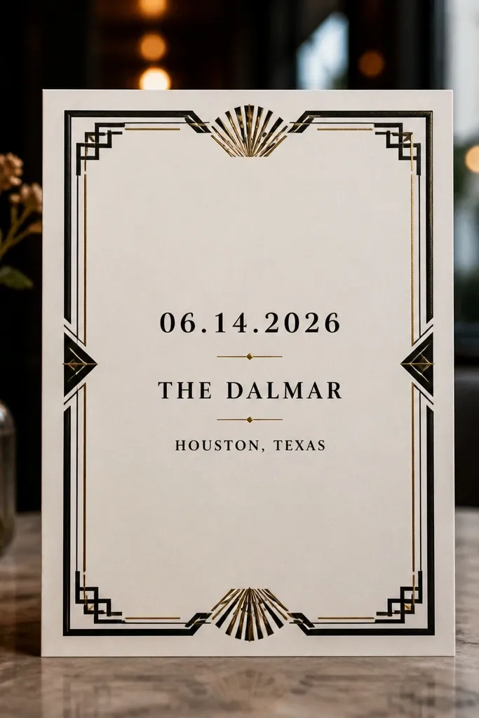
Art deco borders look grown-up and dreamy without needing heavy imagery. Use a monochrome palette (cream and black) and add thin gold accents for a luxury feel that still reads clearly. Keep the border symmetrical and avoid extra flourishes inside the text area. This design works for family-friendly wedding card design because it’s structured and high-contrast, which helps older guests and anyone reading quickly. In photos, the gold line work catches light in a controlled way, especially with matte paper underneath.
Start by designing a symmetrical border that leaves a clean center panel for text. Then add gold accents as thin lines at the top and near the date, keeping foil limited to prevent glare. Next, set the couple names in a large size with strong letterforms, and keep body text in a readable font size around 18 pt. Finally, choose matte paper so the gold accents pop without turning the whole card reflective.
Keep the gold to borders and separators, not full background fills.
Don’t use too many font styles; art deco already has visual noise in the border.
10. Pastel stripe background with centered typography
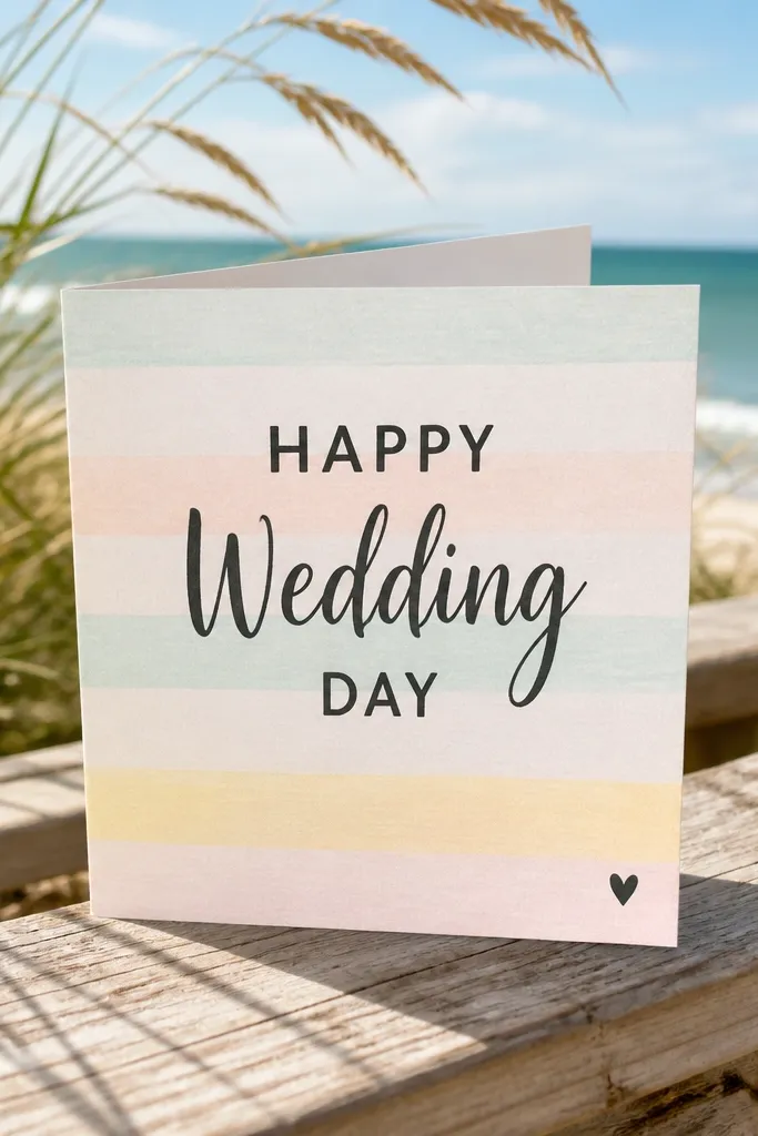
Pastel stripes give a playful, airy feel that reads as “dreamy” in bright daylight. The trick for family-friendly wedding card design is to keep the stripes subtle and use dark text with enough spacing. Put the couple names and date in the center so the design feels organized, not chaotic. A tiny heart or small icon near the bottom adds warmth without stealing attention. This is a good choice when you want the invitation to look fun in family photo sessions, including when kids are in the frame.
Start by choosing 3-4 pastel stripe colors and keep the stripe width consistent, roughly 6-10 mm each. Then place a solid cream or semi-opaque panel behind the text so letters stay readable. Next, center the couple names and date on that panel and keep the venue line directly below. Finally, add RSVP in a small but readable block at the bottom with one clear contact method.
Use a text panel so the camera exposure doesn’t wash out the letters against stripes.
Avoid tiny stripes packed too tightly; they create visual flicker in photos.
11. Soft-touch blush with blind emboss leaves
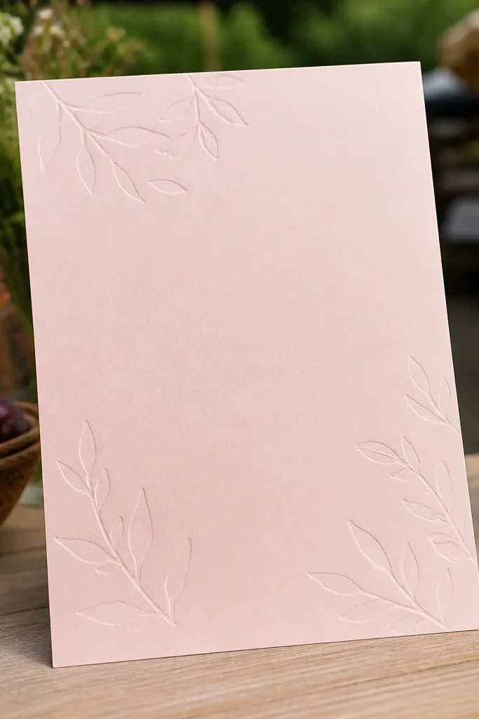
Raised emboss gives you that premium, dreamy feel without adding glare. For family-friendly wedding card design, a blind emboss (raised but not foiled) keeps the focus on readability because the text stays crisp and matte. Use leaf shapes in the corners or along the side, then keep the center clean for the wedding details. This looks gorgeous in close-up photos because the light catches the texture, but it stays practical for mailing since you’re not relying on shiny surfaces. It also feels special for mixed ages because it’s tactile and calm, not flashy.
Quick tipTest the emboss placement with a digital proof; you want texture to sit outside the text safety zone.
Start with a blush base and pick a light blind emboss pattern in the corners so it doesn’t interfere with text. Then set the typography in deep charcoal with generous line spacing so raised areas never overlap letters. Next, add a thin divider line between the date and venue for structure. Finally, request soft-touch or matte lamination so the card feels smooth and the emboss stays visible under indoor lighting.
Skip thisDon’t emboss under the tiniest RSVP text; it will reduce contrast.
12. Lakehouse blue invitation with white wave border
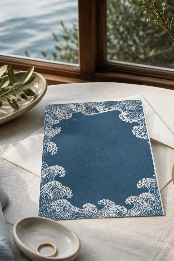
Wave borders signal a relaxed, dreamy setting fast. Lakehouse blue with a white wave border looks clean and modern, and it photographs well because the border creates motion lines around the card edges. For family-friendly wedding card design, use cream or off-white text in a bold, readable typeface. Keep the venue and city in the center so out-of-town relatives can find it quickly. This is a great match for waterfront venues, cabins, or any wedding where the setting is the star.
Start by picking a lake blue background and a wave border that stays thin, about 10-15 mm along the edges. Then print the date in a larger font with centered alignment and strong contrast. Next, keep the venue line short and include the city, like “Marina House, Seabrook.” Finally, place RSVP and contact at the bottom in one compact block with clear line breaks.
Choose a background color that’s not too close to navy; it helps the wave border stay distinct.
Don’t use light gray text on blue; it disappears in shade and in camera shadows.
13. Vintage ticket stub border with date cutout
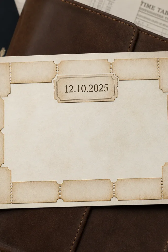
Ticket-stub design looks playful and travel-themed, which is perfect for destination weekends and family celebrations. The best version keeps the ticket stub border around the edge, while the date sits in a clear cutout label in the center or top. This gives you that dreamy, collectible vibe without making the information hard to read. For mixed ages, kids love the “ticket” look and adults still get a clear hierarchy. It also photographs well because the border adds detail without covering the text.
Quick tipUse one accent color for the ticket border, like muted teal, to keep it cohesive with the rest of the palette.
Start by designing a ticket stub border with perforation lines on two sides, leaving the center clean. Then create a date label that’s a solid rectangle with the wedding date in large type. Next, place the venue name and city directly under the label for quick scanning. Finally, keep RSVP in one block and avoid extra icons everywhere; one travel motif is enough.
Skip thisAvoid tiny “terms and conditions” text inside the ticket border — it turns into noise.
14. Terracotta and olive botanical monogram corner
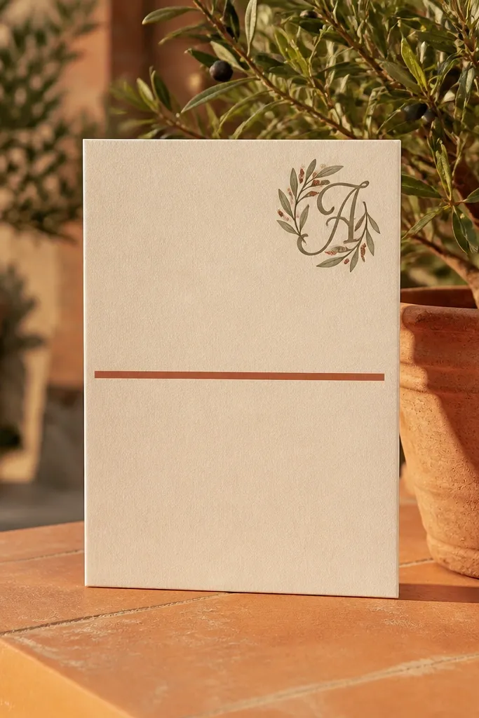
Monogram corners feel intimate and designed, and the botanical add-on keeps it warm for families. A terracotta date line anchors the card, while the olive botanical monogram in one corner adds personality without covering the information. This style is dreamy because it has an earthy palette and clean spacing, not because it’s overly decorative. For family-friendly wedding card design, it works because the date and venue stay central and readable, while the monogram gives kids something simple to look at. It also suits autumn weddings and rustic venues.
Quick tipKeep the monogram size big enough to see in photos, not tiny like a watermark.
Start by placing a monogram in the top corner only, with small botanical sprigs around it. Then add a terracotta date line across the card center or top third, keeping text dark and readable. Next, keep the venue name as a single line with city included so it’s clear for out-of-towners. Finally, add RSVP at the bottom with a clear deadline date and contact method.
Skip thisDon’t put the monogram in the center; it competes with the date for attention.
15. Sun-bleached linen texture with black serif text
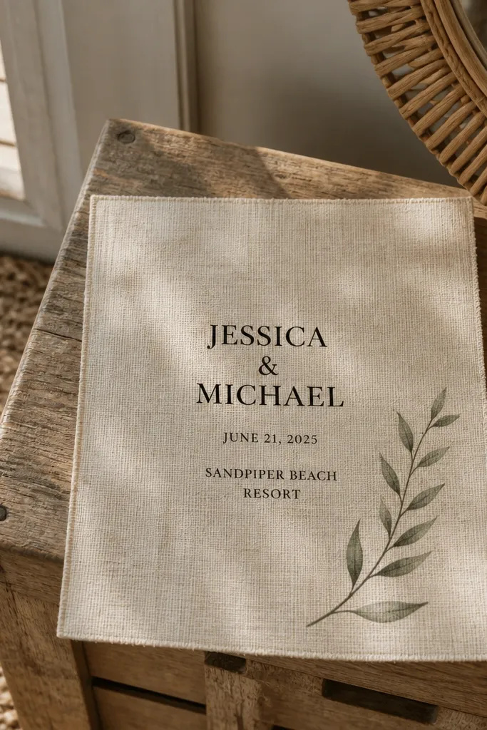
Linen texture reads expensive and dreamy, and it doesn’t need extra graphics. If you keep the typography bold and black, it stays readable for mixed ages and still feels special. Add one small botanical sprig near the corner to soften the look without turning it into a collage. This is a strong choice for family-friendly wedding card design because the texture is subtle and the typography does the work. In photos, linen texture looks good under both warm indoor lighting and natural daylight, as long as you avoid glossy coatings.
Quick tipAsk for matte lamination or no lamination; glossy over linen kills the effect and adds glare.
Start by picking a linen-textured stock in cream or warm ivory. Then set the couple names in black serif with a larger size for readability and place the date and venue in a clean stacked format. Next, add a small sprig illustration in one corner and keep it monochrome or one accent color. Finally, print RSVP details in a medium weight so it stays legible when folded or held at arm’s length.
Skip thisDon’t choose a light gray serif; on linen texture it can look faded.
16. Blush ombre with ribbon-style divider
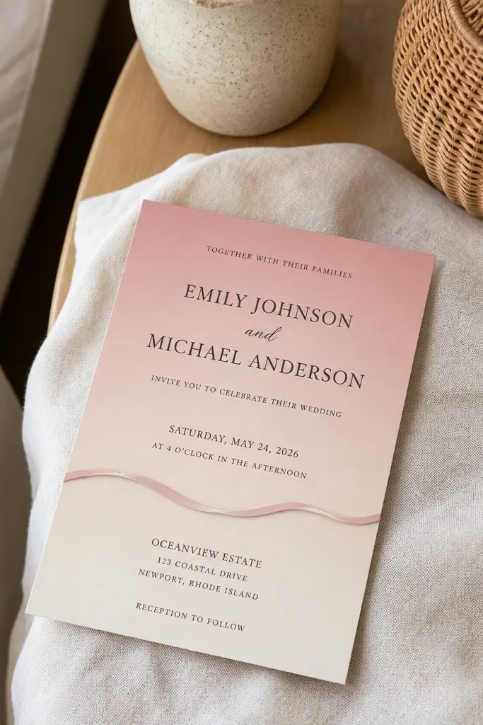
Ombre backgrounds feel dreamy because they create soft depth, but you need a structure so the text stays clear. Use a blush ombre that fades gently and then add a ribbon-style divider line to separate the couple/date block from the venue details. This gives the card a romantic look without clutter. For family-friendly wedding card design, it’s a win because the ribbon divider acts like a visual guide, and the text stays centered and readable. It also photographs well because ombre backgrounds add softness without bright highlights.
Quick tipAvoid ombre that’s too close to white; it makes text harder to read in bright sun.
Start by selecting an ombre range from pale blush at the top to a slightly deeper blush near the bottom. Then add a ribbon-shaped divider using a slightly darker blush or muted rose, keeping it thin enough that letters remain the focus. Next, place couple names and date above the divider and venue details below it with consistent line breaks. Finally, keep RSVP at the bottom in a clear block with 18-20 pt body text and high contrast ink.
Skip thisDon’t add multiple decorative dividers; one ribbon line is enough.
17. Modern monoline florals with big negative space
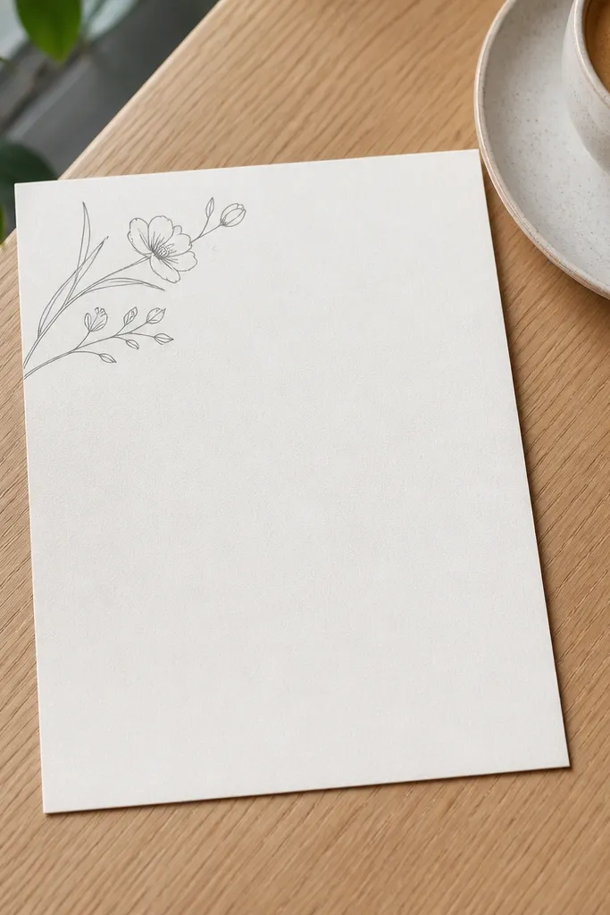
This design is airy and photogenic because it relies on negative space. Thin monoline florals in one corner or along a side give a delicate, modern vibe, while the big empty center makes the card easy to read for mixed ages. Put the essential info — date, time, venue — in the middle with generous spacing and a simple hierarchy. It’s dreamy because the emptiness looks intentional, not because it’s overloaded with patterns. Great for families who want something pretty but not overly busy for kids to handle and read.
Quick tipUse monoline art that has consistent line weight; uneven lines print unevenly and look messy on paper.
Start by choosing a white or near-white base and a monoline floral style in one ink color like deep green or black. Then keep the florals small and place them in one corner only. Next, center the wedding details and use bold headings with body text at 18-20 pt. Finally, add RSVP at the bottom with minimal lines so it doesn’t crowd the card.
Skip thisAvoid adding a full border; it eliminates the airy look and makes the text feel tight.
18. Tropical frame with one bold location stamp
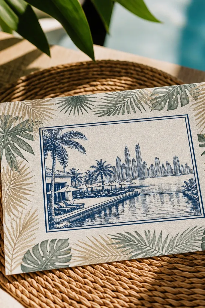
Tropical frames can look chaotic unless you control the center. Keep a tropical leaf border around the edges, then put the venue and city inside a bold “stamp” rectangle so it’s instantly readable. This is family-friendly wedding card design that works for mixed ages because the stamp gives a single focal point for the location, and kids can point to it. The card stays dreamy because the frame is decorative but the center is clean and structured. It’s also a smart choice for warm-weather destination weddings where bright photos are the goal.
Quick tipUse a stamp rectangle with slightly rounded corners; it looks friendlier than sharp signage boxes.
Start by choosing 1-2 tropical leaf colors (muted teal and sage look calm) and limit the border to leaves and a thin line. Then create a centered stamp label with the venue name and city in large, dark text. Next, place the date and time above the stamp, using the same ink color for consistency. Finally, keep RSVP simple at the bottom with one deadline and one contact method.
Skip thisDon’t use bright neon tropical colors; they look loud and can wash out the text.
19. Champagne gold foil header on matte ivory
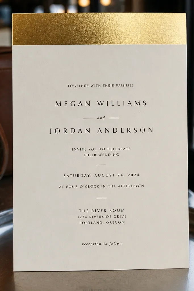
Gold foil headers look dreamy because the light catches them, but only when the rest of the card stays matte and calm. Use a single champagne gold foil band at the top with the couple names or a short line like “Wedding Celebration” (keep it short). Then keep the date, time, and venue in dark ink with large spacing. For family-friendly wedding card design, this is one of the easiest ways to look elevated while staying readable for older guests. It photographs well because the foil is confined to the top area, so it doesn’t create glare across the text.
Start with matte ivory paper and design a header band height around 12-18 mm. Then add champagne gold foil only on that header band and a thin divider line if you want. Next, set the date and venue in a clean font with 18-20 pt body size and clear line breaks. Finally, print RSVP details in dark ink at the bottom with enough spacing from the edges for trimming tolerance.
If your venue lighting is dim, foil still reads well — matte text keeps it legible.
Don’t foil the entire border; it turns into glare and reduces readability.
20. Cream card with large hand-lettered style names
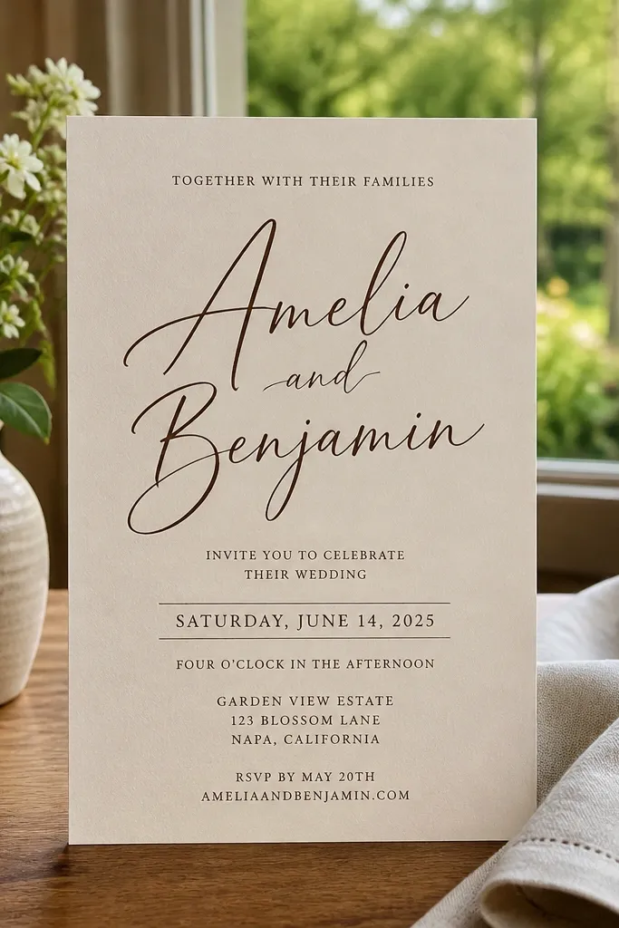
This is the “names first” design: big, hand-lettered style couple names on a clean cream background. The dreamy look comes from the typography contrast, not from busy graphics. Keep the rest structured: a simple date line, time line, venue line, then RSVP at the bottom. For family-friendly wedding card design, the important part is that the names are decorative but the date and venue are still in readable sizes. Kids love seeing the couple names large, and adults can still scan the critical details quickly.
Start by choosing a couple-name script style that stays legible and doesn’t connect too tightly. Then set the date and venue in a clean, readable sans or serif with 18-20 pt body text. Next, keep the layout centered with generous margins and avoid extra ornaments around the text. Finally, add a small divider line between the venue and RSVP so the card follows a clear reading order.
Make the date line bold and simple — it’s the most photographed line in most invitation photos.
Don’t use script for every line; RSVP and addresses become hard to read.
21. Coastal shells with clear venue panel
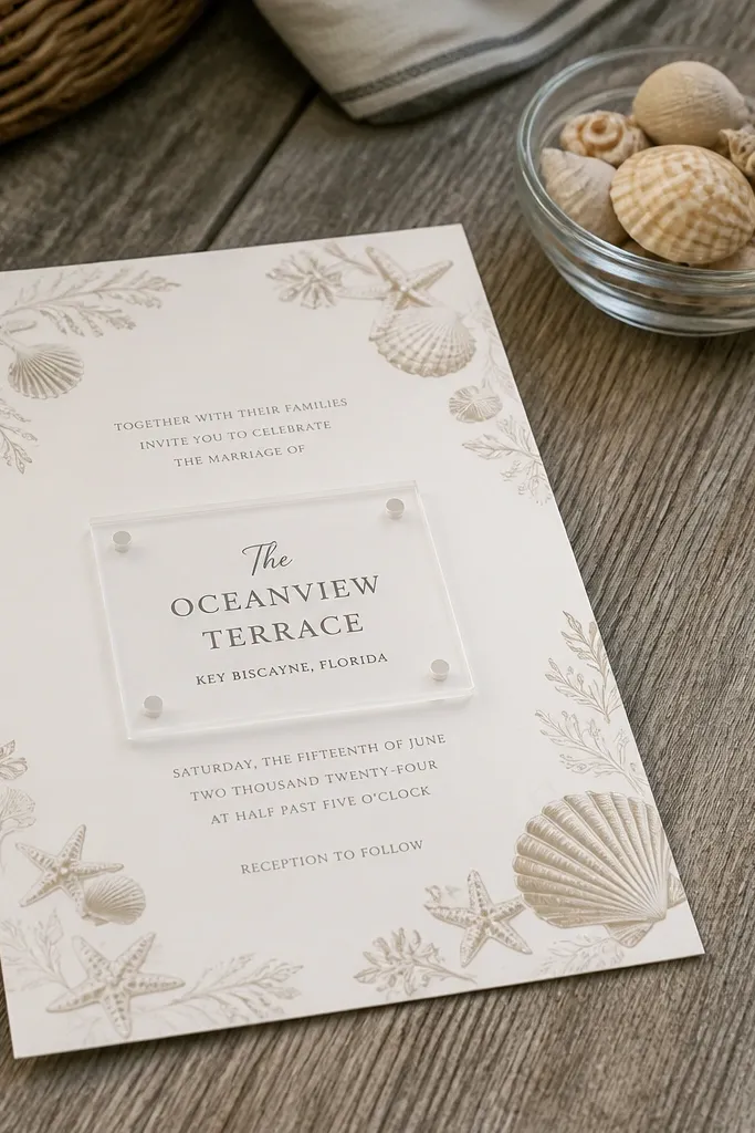
Shell illustrations feel coastal and dreamy, especially when you keep them small and consistent in color. The key for family-friendly wedding card design is the clear venue panel: a solid or lightly tinted rectangle where the venue name and city sit in dark ink. That panel makes the card easy to read quickly, even if kids are touching it or adults are scanning at a table. It also photographs well because the shell art adds texture without cluttering the text. This design is a great fit for beach weekends, lakeside venues, and warm months.
Quick tipUse one shell motif repeated lightly in the corners; too many shells make the card look busy fast.
Start by picking a sand-toned background and choosing shell illustrations in one ink color. Then create a venue panel in a slightly lighter or slightly darker sand tone so the text pops. Next, place date and time above the panel and RSVP below it, keeping the RSVP block compact. Finally, keep body text at 18 pt or larger and avoid placing fine print directly over shell art.
Skip thisDon’t put the address in tiny type; the venue panel is where readability should live.
22. Winter pine border with snowflake RSVP icon
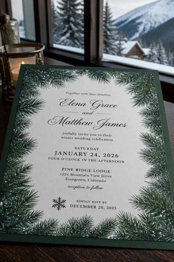
Winter invites can look magical without being hard to read. A pine border around the edges gives the dreamy feel, and a single snowflake icon next to the RSVP deadline makes the card feel festive but still practical. Keep the center clean for the date, time, and venue so grandparents don’t have to hunt. Use deep green or charcoal ink for high contrast on cream paper. This design is ideal for holiday-adjacent weddings where families need a clear RSVP message because calendars are packed.
Quick tipUse a thicker font for the RSVP deadline so it stays crisp in winter lighting.
Start by drawing a thin pine border with small needles and a few cones, keeping it subtle so it doesn’t overpower the typography. Then place the RSVP block at the bottom with the deadline in larger text and add a snowflake icon beside it. Next, keep the venue name and city in the center with clear line breaks. Finally, use matte paper and avoid glossy snow effects; matte keeps it readable and photo-friendly.
Skip thisAvoid blue-on-white text; it looks pretty but fades in indoor photos.
23. Spring meadow confetti dots with centered date
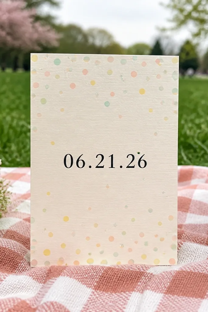
Confetti dots make invitations feel joyful and dreamy, especially for spring weddings. The trick is to keep dots as a soft background texture and then center the date in a bold, readable style. For family-friendly wedding card design, this works because the date becomes the anchor and the dots don’t compete with it. Older guests get clear hierarchy, while kids enjoy the playful dots. It photographs well in bright outdoor settings because the dots add sparkle without glare.
Quick tipLimit dot size — medium dots stay visible; tiny dots disappear when printed low quality.
Start by choosing a white base and generating confetti dots in 3 pastel colors only. Then keep dots light and spread across the background, leaving the center slightly cleaner for text. Next, place the date as the largest element, with the venue line directly below it. Finally, include RSVP at the bottom in a compact block and use 18-20 pt body text for readability.
Skip thisDon’t add patterns behind the RSVP section; it makes the deadline harder to find.
24. Monochrome photo silhouette with big time line
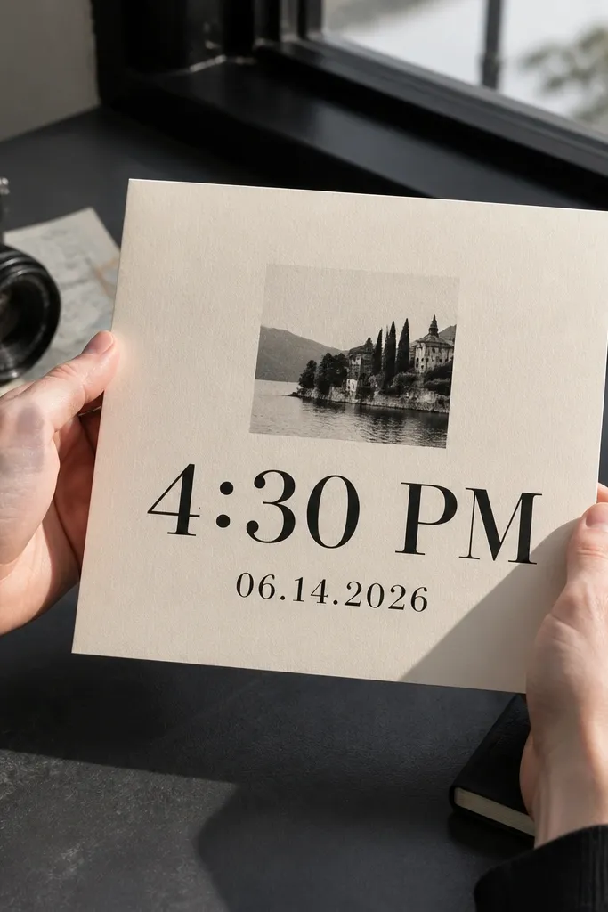
Silhouette graphics feel dreamy and modern, especially when you keep them monochrome. Add a simple couple or venue silhouette above the date and make the time line the biggest text after the date. That helps families because the time is the part everyone forgets, and it’s the most important scheduling detail for mixed ages. The monochrome palette keeps the card classy and readable, while the silhouette adds visual emotion. In photos, the silhouette creates strong contrast against cream and looks good in both indoor and outdoor light.
Quick tipChoose a silhouette that leaves a clean margin around it so text doesn’t feel crowded.
Start by selecting a monochrome silhouette that matches your venue style — a simple skyline, arch, or scenic shape. Then place it above the main date and set the time as the second-largest line, using a clear font. Next, keep the venue name and city in one or two lines beneath the time. Finally, keep RSVP at the bottom with a clear deadline and contact method, using 18 pt body text.
Skip thisDon’t use a detailed silhouette; fine details turn into blobs when printed.
25. Rattan-style border with warm tan typography
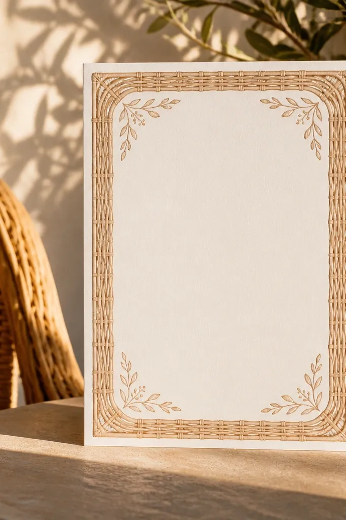
Rattan-style borders bring a vacation feel without looking childish. The border lines add texture, while warm tan typography keeps the card cohesive and dreamy. For family-friendly wedding card design, pick a dark ink for the main text so it stays readable for older relatives — don’t rely on tan-on-tan contrast. Use the border only around the edges and keep the center clean for the essential details. This style works well for destination weddings in warmer climates and for receptions with indoor-outdoor flow.
Quick tipUse the border as a frame, not a background; keep it limited so text remains the hero.
Start by choosing a warm tan stock and designing a rattan border pattern in a slightly darker tan or a muted brown. Then set the couple names and date in dark ink with large spacing and consistent alignment. Next, place the venue name and address in a clear stacked layout in the center, keeping each line short. Finally, add RSVP at the bottom in a compact block and request a matte finish so the pattern stays subtle in photos.
Skip thisAvoid light text over a busy border area; it makes the card feel visually noisy.



