
1. Ivory Soft-Touch Card with Navy Crescent Corner Guide
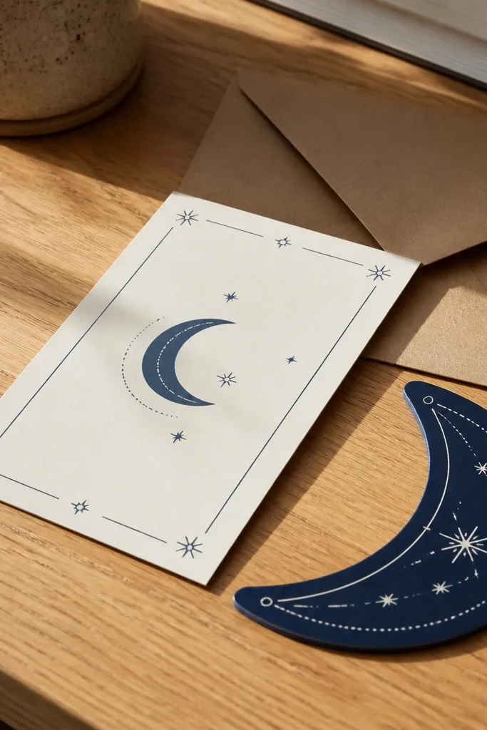
This design is a good hidden gem because it looks intentional without needing heavy decoration. The crescent sits as a small corner guide, so your main text stays crisp and readable. Use warm ivory cardstock with matte lamination so the navy ink doesn’t glare in daylight photos. It suits couples who want a modern, respectful look for both the main invitation and the matching RSVP card. It also works well for outdoor venues because the layout stays legible when the background is bright.
Start by setting your card size to a standard 5x7 inch (12.7x17.8 cm) with generous margins. Then place the couple names in the center using a calligraphy-style font for names only, and use a clean serif or sans for the event lines. Finally, add the navy crescent as a thin outline in the top corner and keep all other elements flat to avoid glare.
Ask for a matte soft-touch finish and a navy ink color that is not too grey — it should look deep, not dusty.
Don’t add a full border if you’re already using corner motifs; it makes the card feel crowded.
2. Emerald Frame with Gold Leaf-Effect Border Lines
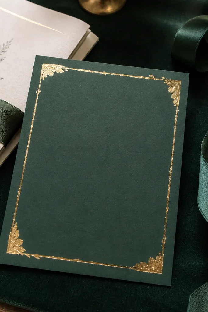
A framed layout is one of the most photogenic formats because it creates a clean rectangle around your message. Emerald looks rich in photos, but the trick is to keep the gold effect minimal — thin lines only. This card design is a strong match for wedding invites where you want a classy, traditional feel without heavy patterns. It suits couples who plan a formal dinner or banquet hall wedding and want the invitation to look like part of the event styling. Gold leaf-effect lines also photograph better than large gold blocks because they catch light without overexposing.
Choose emerald cardstock or a full-bleed emerald background panel, then add a 1-2 mm gold-effect line frame inset from the edges. Place the date and venue in the center on an ivory text block to keep contrast sharp. Finish by adding small gold dots at the frame corners (four dots max) so the design stays balanced and not busy.
If you’re printing, request a proof in daylight to check that the gold lines don’t wash out under bright sun.
Skip thick gold borders; they look flat and cheap on many home printers.
3. Dusty Rose Watercolor Wash with Dark Teal Names
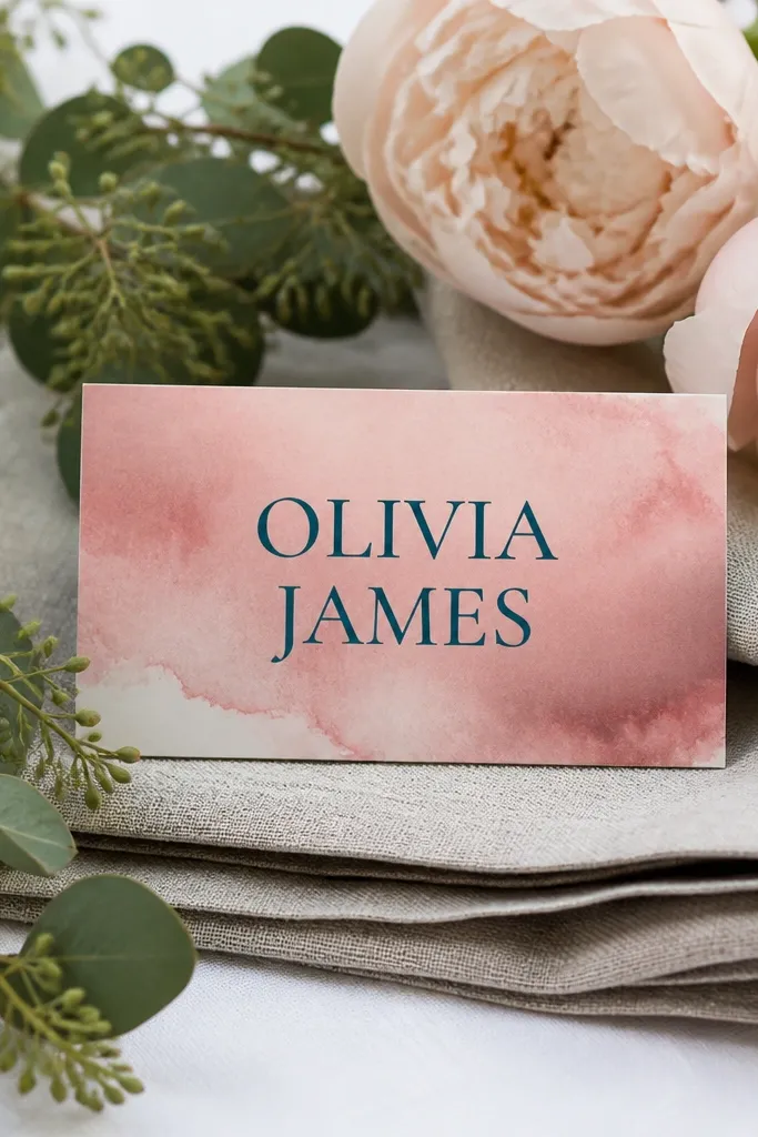
Watercolor-style backgrounds are hidden gems when they stay subtle and let typography lead. This design uses a dusty rose wash that softens the card, while dark teal names bring the contrast you need for readability. It suits couples who want a softer, romantic look for a daytime wedding or garden photos. The best version keeps the watercolor only in the corners or behind a central panel, so the text area stays clean. Phone cameras love this because the texture adds depth without overwhelming the layout.
Start with a blush or dusty rose base and add watercolor texture only around the edges, leaving a clear center panel. Then set the names in dark teal with a calligraphy-style script, and keep the event details in a simple font on a light overlay. Finally, add a small crescent icon or star dot pattern in one corner, keeping it to 3-5 elements total.
Use a semi-transparent watercolor look, not a fully speckled texture; heavy speckling kills legibility.
Don’t place long text directly over the watercolor; it makes the lines hard to read.
4. Black Card with Matte Silver Arabic-Style Header
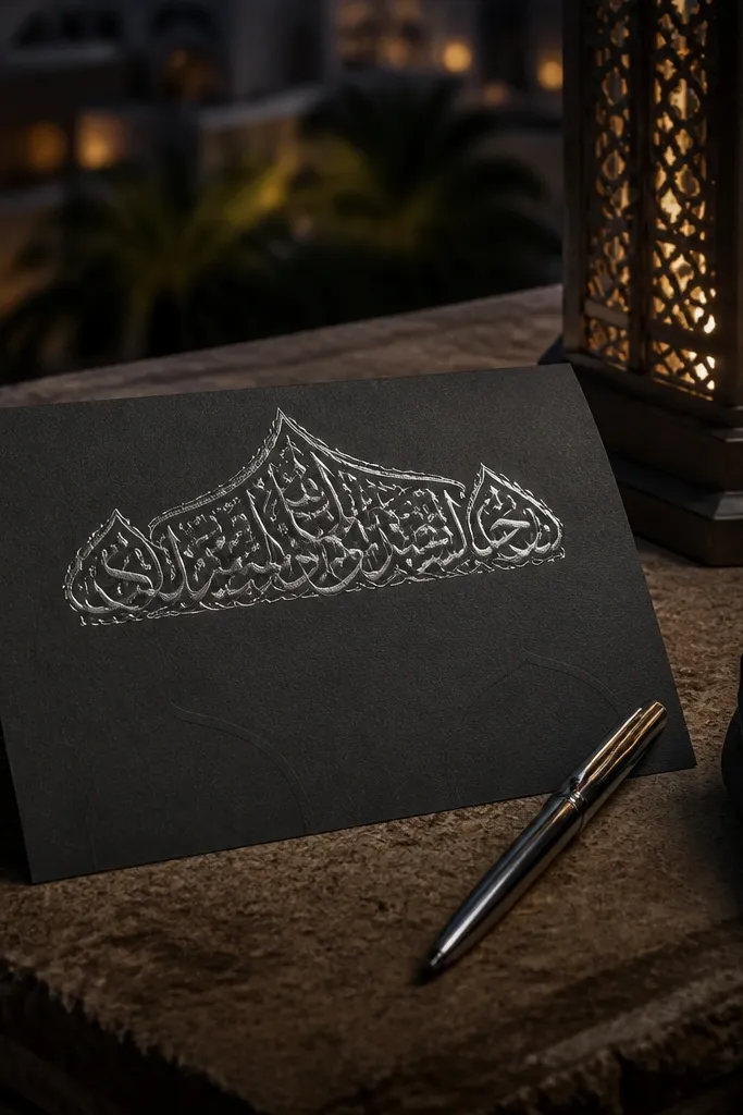
Black invitations look premium when the metallic effect is restrained and matte. This design has a matte silver Arabic-style header and a clean body in white or cool light grey. It’s a great hidden gem for couples doing a night wedding or a venue with dark decor, because the invite matches the mood. The minimal icon set keeps the design elegant and easy to photograph. It also works for couples who want a modern Muslim wedding look that feels more fashion-forward than traditional.
Use black cardstock and print the header in matte silver ink or a simulated metallic that stays non-glossy. Keep the body text in light grey with a clear hierarchy: names first, then date and venue. Add one small star and crescent icon as a divider line under the header, then leave the rest empty for breathing room.
Quick tipAsk for matte silver instead of shiny foil if you’ll photograph in direct sun.
Skip thisAvoid bright white blocks everywhere; too much white on black makes photos harsh.
5. Ivory Linen Texture with Navy Typographic Band
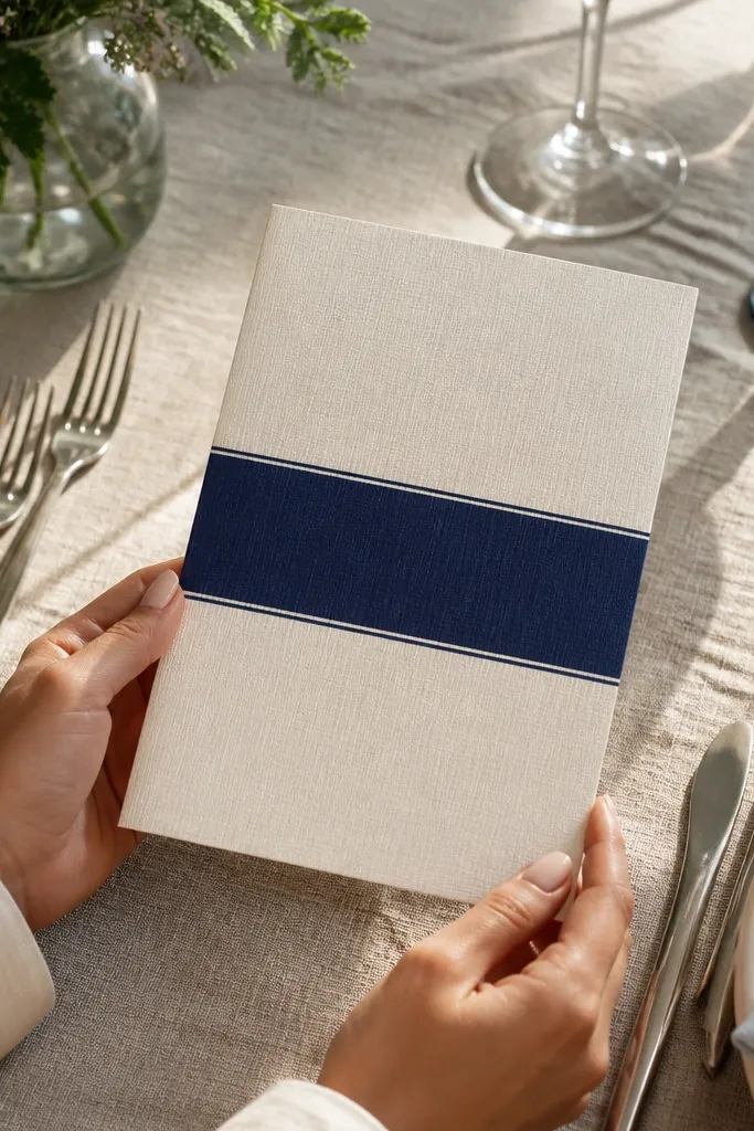
Linen texture is a quiet flex. It makes the card look tactile even on a flat photo, and it pairs well with Muslim wedding typography because the texture gives depth without extra graphics. This design uses an ivory linen background plus a navy horizontal band where the date and venue sit. The band creates a strong visual line, so your invitation reads instantly. It suits couples who want a classic, timeless vibe for indoor weddings and family events. The best part is how clean it looks — no dense patterns needed.
Pick a linen-textured cardstock (about 300gsm) in warm ivory. Then add a navy band across the center at about 25-30% of card height, and place the date and venue in white text on that band. Finish by placing the couple names above the band in a calligraphy-style script and keeping corner icons to a single small motif.
Use a band color that matches your wedding theme, but keep the band text short so it stays sharp.
Don’t add a full border on linen; the texture already adds frame-like interest.
6. Soft Sky Blue Card with Gold Crescent Micro-Pattern
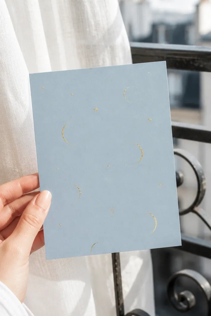
This one is a hidden gem because the micro-pattern is small enough to look premium, not busy. The sky blue background feels fresh for daytime ceremonies, while gold crescents repeat lightly behind the typography. The key is opacity: the pattern should be faint so the text stays the star. It suits couples who want a modern invitation that still signals Islamic motifs in a classy way. In photos, the micro-pattern adds sparkle when the light hits, but it doesn’t fight the names.
Start with a light sky blue base and create a pattern layer of tiny crescent icons at low opacity (think 10-20% strength). Then place the couple names in the center on an ivory or slightly lighter panel so readability stays perfect. Finally, add the date line in deep navy and keep the corner decorations to one small star icon.
Use pattern icons in a single color only; multi-color patterns look messy on small cards.
Avoid large repeated crescents; they look like wallpaper and kill the aesthetic.
7. Deep Navy Invitation with White Floral Border Corners
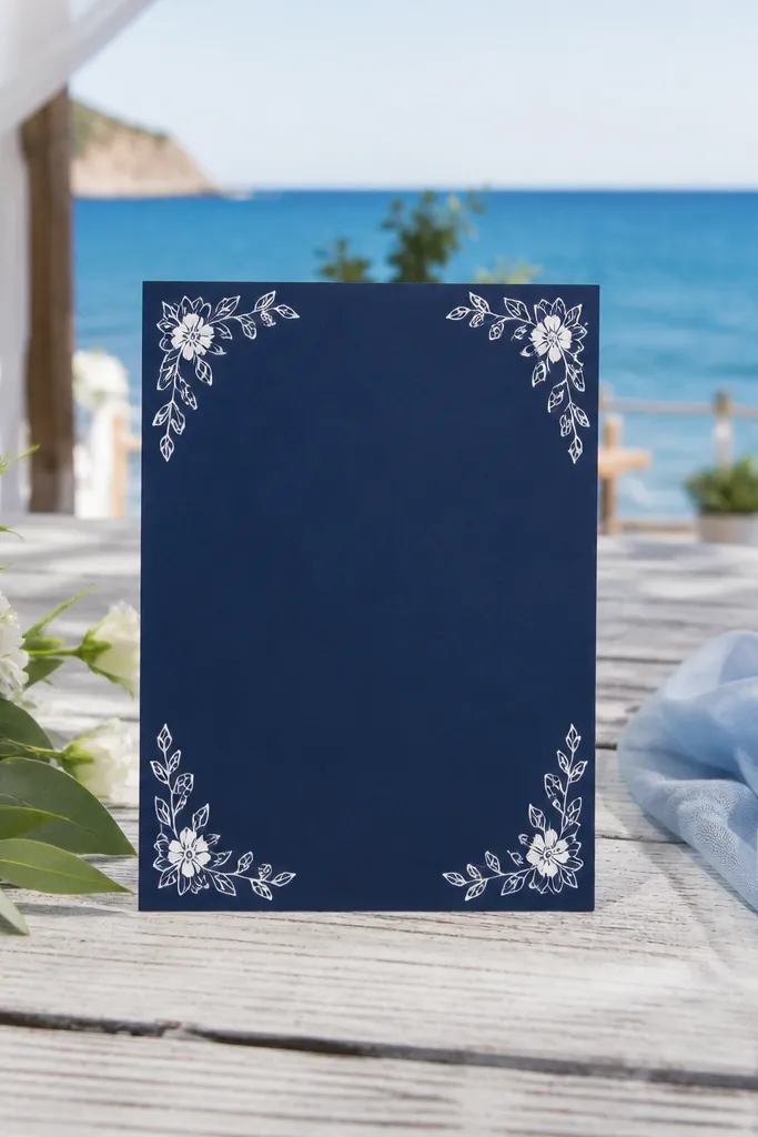
Floral borders can look elegant when they’re limited to corners. This design uses deep navy as the main color, then adds white floral corner accents that frame the center without outlining everything. It’s a great hidden gem for couples who want a wedding vibe that feels feminine but still formal. The center stays clean for names, date, and venue, which helps photos and readability. It also suits venues with dark interiors where the navy matches the decor and the white corners pop.
Choose deep navy cardstock, then add floral corner elements only at four corners with a consistent size. Place the couple names in the center and use a calligraphy-style font for names, with a simple font for the rest. Keep the date and venue in one line block so it doesn’t wrap and break the layout in printing.
Pick floral corner artwork that is line-based, not heavy filled, for better clarity at small sizes.
Don’t add a full floral border; it makes the card feel like a mass-printed template.
8. Champagne Ivory Card with Debossed Geometric Frame
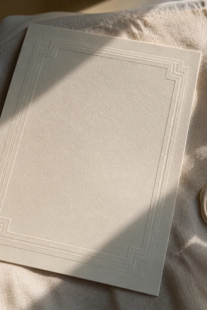
Debossing is one of the most underrated ways to make an invitation feel “premium” without using lots of color. This design uses champagne ivory with a geometric frame that is pressed into the paper, so it shows as light shadows in photos. The inside stays minimal: names, date, and a single line of calligraphy. It’s a strong fit for couples who want understated luxury and a clean look for formal venues. Because there’s no heavy ink coverage, the card looks sharp and doesn’t blur in close-up shots.
Print the text in a neutral ink (dark brown or deep navy) on champagne ivory cardstock. Then create a geometric frame as a debossed element in the design file and leave the center uncluttered. Add a small crescent icon as a single dot under the header line, and set the RSVP info in a small, clean font at the bottom.
Quick tipAsk your printer if they can confirm deboss depth (often measured in microns or spec sheets) before final approval.
Skip thisDon’t rely on deboss alone if your text is too light; contrast still matters.
9. Olive Green Card with Gold Arabic-Style Name Medallion
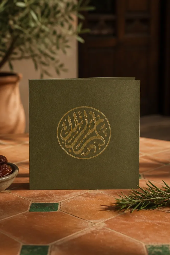
A medallion behind the names turns a simple card into a focal-piece. Olive green is less common than navy or rose, so it reads as a hidden gem while still feeling natural and grounded. The gold Arabic-style name medallion should be subtle and not too busy — think a circular ornament behind the typography. This design suits couples having a wedding with earthy decor, outdoor gardens, or a rustic-modern theme. In daylight, the gold catches light and makes the names look like they’re floating.
Start with olive green cardstock and place a circular gold ornament behind the couple names at 60-70% opacity. Then set the couple names on top in gold or warm beige ink, keeping the event details in a darker neutral for contrast. Finally, add the date and venue in a straight line block beneath the medallion to keep the layout structured.
Keep the medallion size to about 60% of the card width so it doesn’t cover the text area.
Don’t add more than one ornament shape (medallion plus border); it becomes clutter quickly.
10. Maroon Card with Split Typography Panels
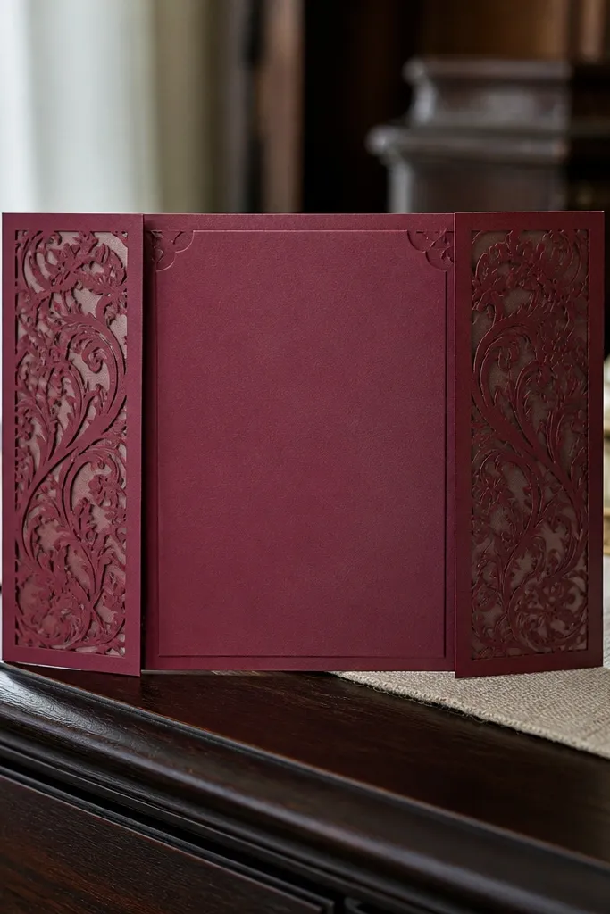
Split panels are a clean way to make the invitation look designed rather than “printed.” This card uses maroon as the base, with two vertical panels on the sides and a clear center for names and date. It’s a hidden gem because it looks modern and structured, and it photographs well because the layout has strong geometry. This design suits couples who want a bold, formal look without heavy ornamentation. It also works for larger families who need the RSVP and address lines to stay perfectly readable.
Choose maroon cardstock, then create two side panels in a lighter maroon or muted blush at about 12-15% width each. Put the couple names centered in the middle and set the date and venue below in a larger font. Add a small crescent icon as a divider between date and location, then keep any extra text to a single line to avoid tight wrapping.
Use a font that stays legible at small sizes for the RSVP line; test in your phone camera preview.
Avoid tiny fonts on maroon; they blur when printed and look messy in photos.
11. Terracotta Invitation with Stamped-Style Crescent Lines
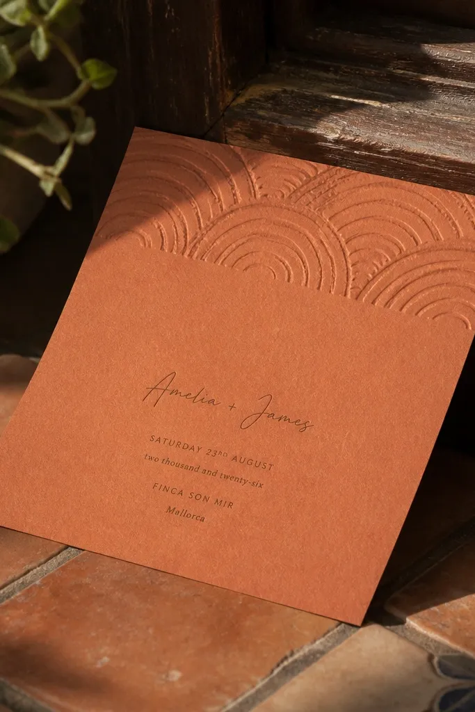
Stamp-style details feel handmade without going messy. This design uses terracotta as the warm base and adds stamped crescent lines along the top edge, like a light imprint. The center stays clean with a calligraphy-style name and the event details in a simple layout. It’s a great hidden gem for couples who want a warm, welcoming invitation that fits daytime weddings and family gatherings. Terracotta also looks great in outdoor photos where the background has greenery or warm stone.
Start with terracotta cardstock and add a stamped crescent line across the top margin only (keep it about 15-20% of card height). Then place the couple names in the center, using a calligraphy-style font in deep ink. Finally, set the date, time, and venue in two lines below the names so they don’t wrap awkwardly during print.
Quick tipAsk for the stamp effect to look slightly imperfect but still readable; overly distressed stamps turn into noise.
Skip thisSkip heavy background patterns; terracotta already carries warmth and needs breathing space.
12. Powder Blue Card with White Embossed Star Corner
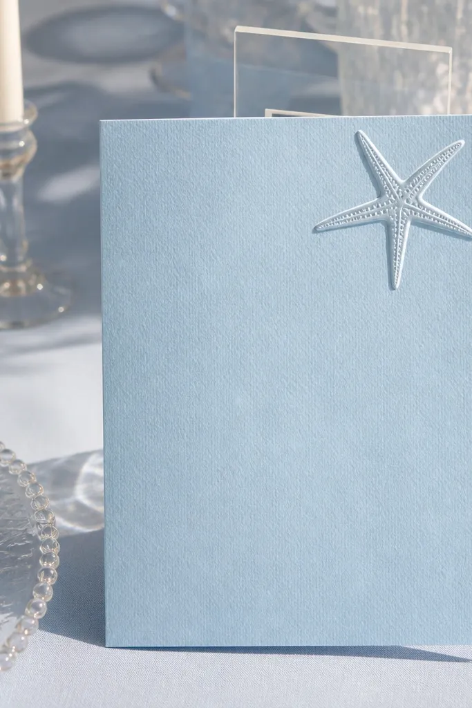
Embossing on a single corner gives a clean, modern “statement” without turning the whole card into a craft project. Powder blue is soft and works for daytime events, and the embossed star catches light with a delicate shadow. The rest of the design stays minimal: names in the center and event text in a single column. This is a hidden gem for couples who want a light, airy invitation that still feels Muslim and intentional. It also pairs well with light wedding decor and pastel color palettes.
Choose powder blue cardstock and add a white emboss element only in one corner, like a star above a small crescent dot. Place the couple names center and keep the event details in a clean single-column layout. Use a deep navy or charcoal ink for text so it stays readable against the light background. Keep your RSVP line short and set it at the bottom on a plain field.
Quick tipEmboss works best with matte paper; glossy stock makes the embossed shadow look flat.
Skip thisDon’t add additional icons around the star; one hero detail is the point.
13. Monochrome Grey Card with Black Calligraphy Banner
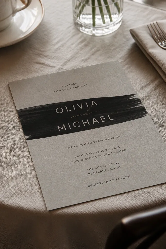
Monochrome invitations are a hidden gem when they use typography as the decoration. This design has a grey background and a black calligraphy banner behind the couple names, so the card looks bold and modern. You get high contrast without needing metallics, which keeps costs down and still looks styled. It suits couples who want a sleek city wedding or a venue with neutral decor. In photos, the banner creates a strong shape that reads instantly even when the image is small.
Pick a medium-light grey cardstock and create a black banner rectangle behind the couple names. Use calligraphy-style script for names and keep the date and venue in a simple sans font below. Add a tiny crescent icon as a divider between the header and the details, then keep all other elements off the card to maintain the clean look. Make sure the banner height is about 20% of the card so it doesn’t feel cramped.
Quick tipIf your printer can’t do custom calligraphy, use a calligraphy-style font and keep letter spacing tight for a premium look.
Skip thisAvoid grey-on-grey text; it looks washed out in real prints.
14. Ivory Card with Geometric Cutout Window Reveal
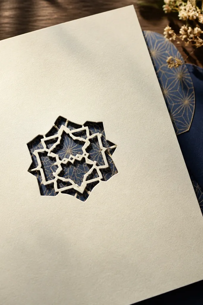
A cutout window is one of the rare invitation details that feels like a real object, not a flat print. This design uses an ivory card front with a small geometric cutout, revealing a patterned layer beneath (often a subtle navy pattern). The payoff is huge in photos: the window creates depth and a “wow” moment without clutter. It suits couples who want something a little different while still keeping a respectful, elegant tone. Best for weddings where guests will hold the invite in their hands during arrival photos.
Start with a two-layer design: an outer ivory card and an inner patterned layer (navy, emerald, or deep maroon). Create one geometric cutout area around the upper center or side corner, large enough to show the pattern but not so large it breaks readability. Put the couple names next to or below the window so the text stays clear. Confirm the cutout size with your printer so it doesn’t shift during assembly.
If you’re mailing invites, ask about window alignment tolerance so edges don’t look uneven.
Don’t use a busy pattern behind the cutout; keep it subtle so the window reads as elegant.
15. Gold-Stamped Corner Flourish on Black Matte Background
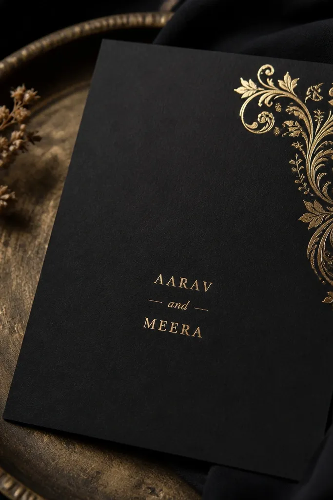
This is a classic hidden gem because it’s simple and still looks high-end. The card has a black matte base, and the only gold detail is a corner flourish stamp — not a full border, not a full gold panel. That restraint makes the card look expensive instead of overloaded. It suits couples who want a night wedding invitation with a sleek, fashion look. The gold corner flourish also creates a strong visual anchor for photos, especially when the card is angled slightly.
Choose black matte cardstock and add gold-stamped corner flourishes in only one corner or two corners diagonally. Keep the couple names centered in white or cool light grey ink. Add date and venue in a clean font with one line breaks only if needed. Leave the rest blank so the gold stamp stays the star.
Quick tipAngle the card slightly during photography to catch the stamp shadow — it makes the gold look richer without extra elements.
Skip thisAvoid multiple gold elements (stamp plus border plus icons); one stamp is enough.
16. White Card with Navy Diagonal Band and Crescent Divider
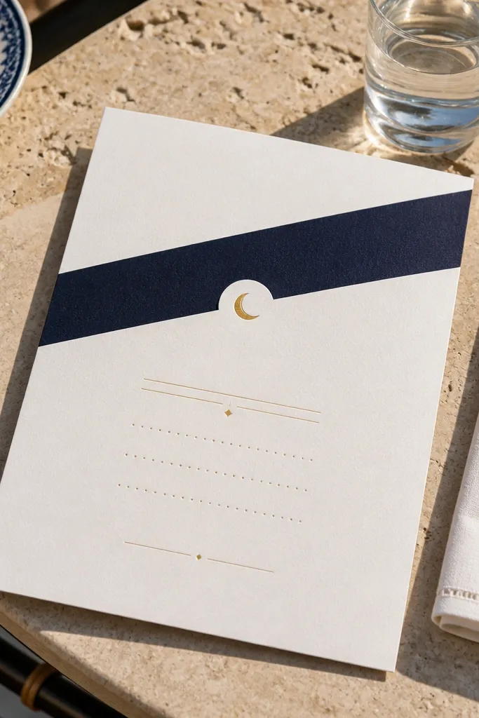
Diagonal bands are a hidden gem because they add motion to an otherwise flat invite. This design keeps it clean: white cardstock, a navy diagonal band crossing near the top, and a small crescent divider separating the header from the details. It suits couples who want a modern invitation that still respects the theme. The diagonal band also frames the names nicely, which helps photos look balanced. It’s especially good for weddings with a bright venue where white cardstock looks fresh.
Start with white cardstock and place a navy diagonal band that covers about 20-25% of the card height, angled from left to right. Put the couple names centered over the white area, then place the date and venue beneath with a crescent icon line as a divider. Keep the RSVP text in a small, clean font at the bottom aligned left or centered consistently. Make sure the diagonal band doesn’t cut through any critical text — leave safe margins.
Quick tipUse consistent alignment rules: either center everything or left-align the details; mixing alignments looks accidental.
Skip thisDon’t add extra patterns behind the diagonal band; it becomes visually noisy.
17. Sage Green Card with Tiny Floral Vine Along the Side
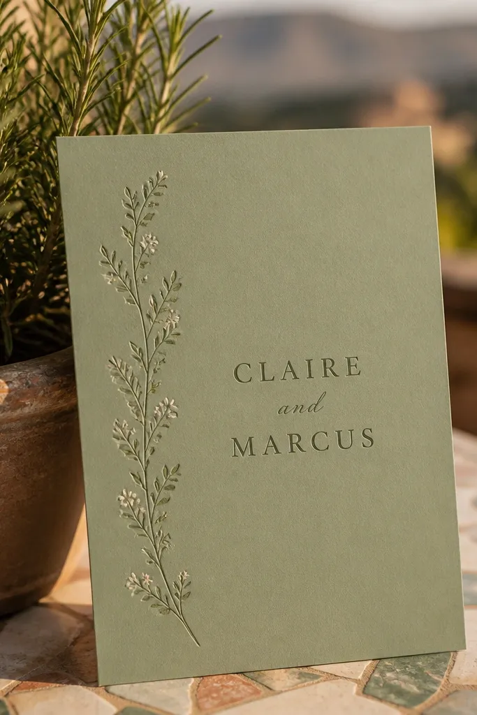
Sage green feels calm and modern, and the thin floral vine makes it human without becoming girly. This design uses a single side vine to guide the eye toward the names, and the rest is mostly typography. It’s a hidden gem for couples who want a garden-like vibe but still want a clean invitation. In photos, the vine adds delicate detail that looks good even when the card is small in the frame. The center stays readable, which is the difference between “pretty” and “actually usable.”
Choose sage green cardstock, then place a thin floral vine illustration along the left edge only. Center the couple names in a calligraphy-style script and keep the date and venue in a simple font aligned under the names. Add a small crescent dot or star near the bottom of the vine as a finishing touch. Keep the RSVP line short and place it in the lower right so it doesn’t clash with the vine.
If your printer can’t do fine line art cleanly, simplify the vine to fewer leaves and thinner strokes.
Avoid full floral coverage; a side vine is the aesthetic, not a background pattern.
18. Cream Card with Navy Mandala Dotwork Halo
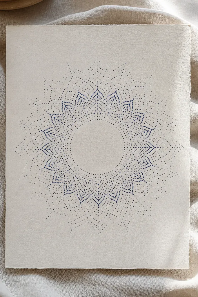
Dotwork halos look like art, but they work as invitation design because they frame the typography. This hidden gem uses a navy dotwork mandala circle behind the couple names, with a clean cream background. The dotwork should be subtle so the names stay readable. It’s a great match for couples who want a ceremonial feel without heavy borders. In daylight photos, dotwork creates a soft texture that looks premium and intentional.
Start with cream cardstock and add a circular dotwork halo behind the couple names, sized to about 70% of the width of the card. Keep the rest of the card mostly blank except for the date and venue in a simple block below. Use navy ink for all text and the dotwork so the palette stays cohesive. Finish with a tiny star-and-crescent icon as a separator between the header and the body lines.
Request a proof to check dot density; too many dots can make the center look muddy when printed.
Don’t combine dotwork halo with a full border; it becomes too much texture.
19. Cobalt Blue Card with Silver Crescent Ribbon
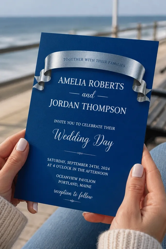
A ribbon banner is an easy way to create hierarchy, and the crescent detail keeps it culturally on-theme. This design has a cobalt blue background with a silver ribbon behind the header text, like a folded strip. The ribbon makes the couple names and event title feel like they sit on a stage, which reads well in photos. It suits couples having a formal wedding with bold color styling. Because the ribbon is a single element, the card stays clean and doesn’t become a collage.
Choose cobalt blue cardstock and design a silver ribbon banner that spans roughly 60-70% of the card width. Place the event title or couple names on the ribbon in a dark ink that contrasts well (charcoal or deep navy). Then set the date and venue below in a simple font with one line break max. Add one small crescent icon at the bottom of the ribbon for a finishing touch.
Quick tipIf silver looks too bright in your printer, switch to a brushed silver effect or warm champagne foil look.
Skip thisAvoid using multiple ribbon colors; keep it silver only so photos look sharp.
20. Maroon Invitation with Black Calligraphy Quote Panel
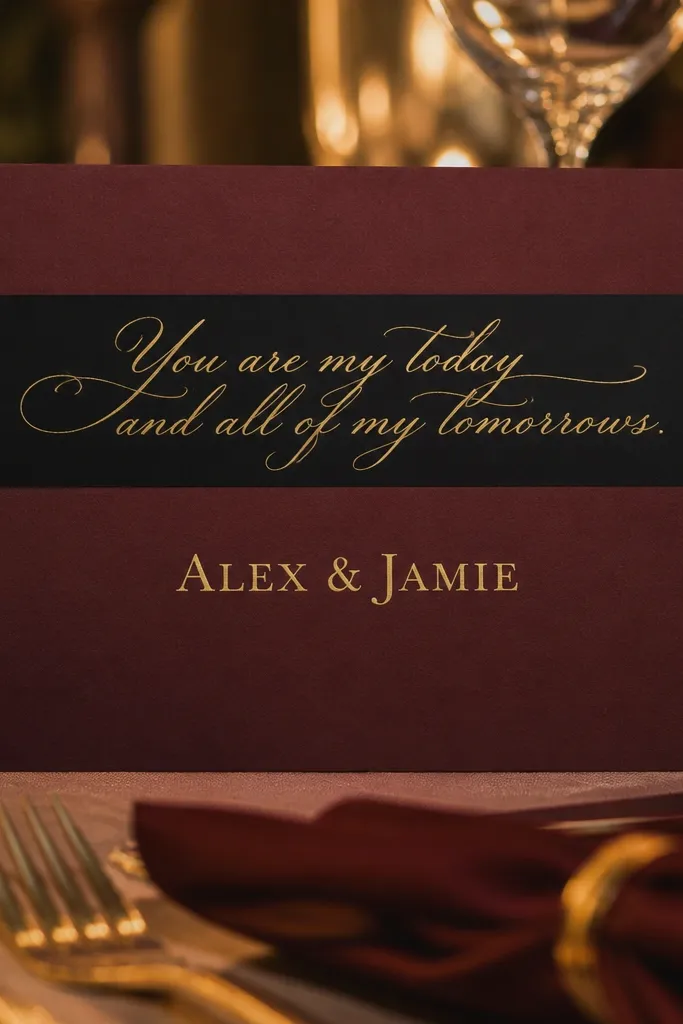
Quote panels can go wrong fast, but when you keep the quote short and typography-led, it looks stunning. This design uses maroon as the base and puts a black calligraphy quote panel near the top, with the couple names centered below. The quote panel adds depth and meaning while the layout stays structured. It suits couples who want the invitation to feel heartfelt without turning into a wall of text. Photos look strong because the calligraphy panel creates a dramatic block of attention.
Start with maroon cardstock and create a rectangle panel near the top in a slightly darker maroon or black ink wash. Put a short calligraphy quote inside and keep it to a few lines so it doesn’t wrap awkwardly. Then place the couple names centered and set the date and venue in a clean font below the names. Keep the RSVP and address line on the bottom in a single neat block.
Use a quote length that fits your card width — if it needs more than 4 lines, simplify the text.
Don’t add additional decorative borders; the quote panel already gives the drama.
21. Peach Blush Card with Gold Frame and Minimal Star Dots
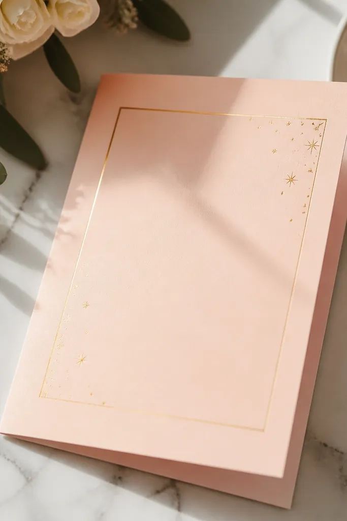
This is a hidden gem for couples who want something warm, soft, and still polished. The peach blush background looks flattering in daylight, and a thin gold frame gives structure without feeling heavy. Minimal star dots add a gentle Islamic cue, but the card stays mostly typography and whitespace. It suits weddings with pastel decor, brunch-style ceremonies, or daytime reception photos. The gold frame also makes the card look neatly finished even when guests place it on a table.
Choose peach blush cardstock and add a thin gold frame line inset from the edges by about 8-10 mm. Place the couple names in the center with a calligraphy-style script and keep the date and venue in a readable sans font. Add 5-8 small star dots along one side of the frame, not around the whole border. Finish by placing the RSVP info on a plain strip at the bottom for clarity.
Keep dot accents small (like pinhead size). Large stars look cartoonish on invites.
Avoid mixing gold frame with big floral illustrations; it makes the card feel crowded.
22. Charcoal Grey Card with Warm Ivory Typographic Stack
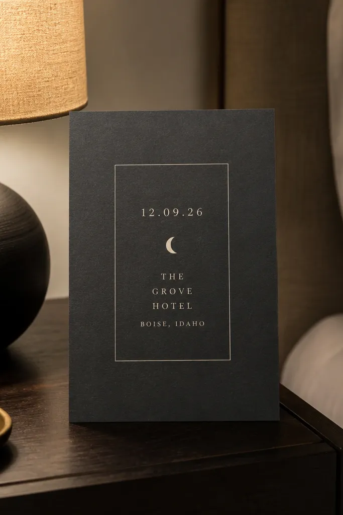
Charcoal grey is a modern neutral that photographs cleanly, and the warm ivory typographic stack makes it feel soft. This design uses a charcoal background with a warm ivory rectangle or area where the names and event lines stack vertically. A small crescent icon sits between the date and venue to keep the theme subtle. It’s a hidden gem for couples who don’t want bright colors but still want something photo-ready. It also works for weddings where the invitation needs to match a minimalist table setting.
Start with charcoal grey cardstock and add a warm ivory text panel in the center, leaving clear margins. Stack the couple names at the top, then the event title, then the date and venue lines below in consistent spacing. Insert a small crescent icon as a divider line between date and location. Keep RSVP text small but readable and align it to the same left edge as the panel text.
Check contrast in a phone photo: if the ivory panel looks too grey, switch to a warmer ivory ink or panel tone.
Don’t use too many font styles; one calligraphy font for names and one clean font for details is enough.
23. Royal Blue Card with White Botanical Border Corners
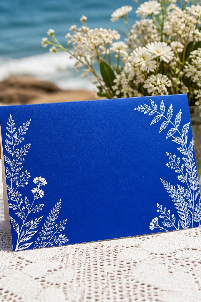
Royal blue plus white botanical corners is a reliable hidden gem because it looks crisp and celebratory. The corners bring in a fresh, airy feel, while the center remains clean for the key details. This design suits couples who want a formal invitation that still feels light and photo-friendly. Botanical corners read well in daylight because the white lines stand out without needing metallics. It’s also easy to match with wedding themes that use blue and white tones in decor.
Pick royal blue cardstock and add botanical line art only in the corners, not as a full frame. Center the couple names and place the date and venue in a single block beneath. Use a calligraphy-style font for names and a simple serif or sans for everything else. Keep any extra icons to one crescent divider line so the card stays elegant.
Quick tipIf your printer struggles with thin lines, slightly thicken the botanical strokes for sharper edges.
Skip thisAvoid adding patterned backgrounds under the text; royal blue already carries color.
24. Sand Beige Card with Navy Crescent Band Under Names
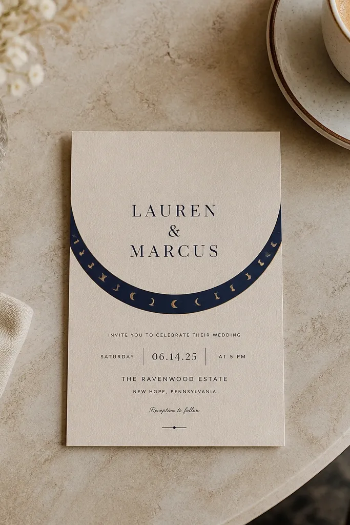
This is a clean, warm design that feels modern and respectful. The sand beige background gives a soft, neutral base that works for many wedding color themes. The navy band under the names creates a strong visual anchor, and tiny crescent icons on the band add the Muslim motif without taking over. It suits couples who want an invitation that looks good on tables and in group photos, including indoor lighting. The band also helps keep the typography aligned, so the design stays tidy even when printed.
Choose sand beige cardstock and place the couple names centered at the top. Add a navy horizontal band beneath the names that spans about 80% of the card width. Print the date and venue inside the band in a light ink, and add tiny crescent icons along the band edge only. Finish by placing RSVP details below the band in a simple font with consistent spacing.
Quick tipKeep the band height around 15-18% of the card so it doesn’t crowd the bottom text.
Skip thisDon’t add extra borders; the band is your structure.
25. Ivory Card with Deep Teal Calligraphy Name Halo
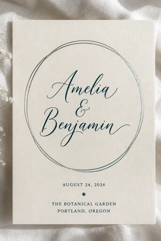
A name halo is a hidden gem because it frames the couple names without turning the card into a cluttered ornament. Use an ivory background and a deep teal calligraphy-style name, then add a thin halo outline around it. Keep the rest minimal: date and venue in plain typography below, with one small star icon. This suits couples who want a graceful, modern invitation for both intimate and larger weddings. It also photographs beautifully because the halo creates a clean shape that reads even at small sizes.
Start with ivory cardstock and place the couple names in the center using deep teal ink. Add a thin circular or oval halo outline around the names, with line thickness about 1-2 pt equivalent in print. Put the event title and date beneath in a simple font, keeping line breaks consistent. Add one small star icon near the bottom right and keep the RSVP line short.
Quick tipUse teal instead of green: teal reads more “wedding” and less like office stationery.
Skip thisAvoid thick halos; they look like stickers on printed cards.