1. Spot-UV RSVP Window on Cream Card
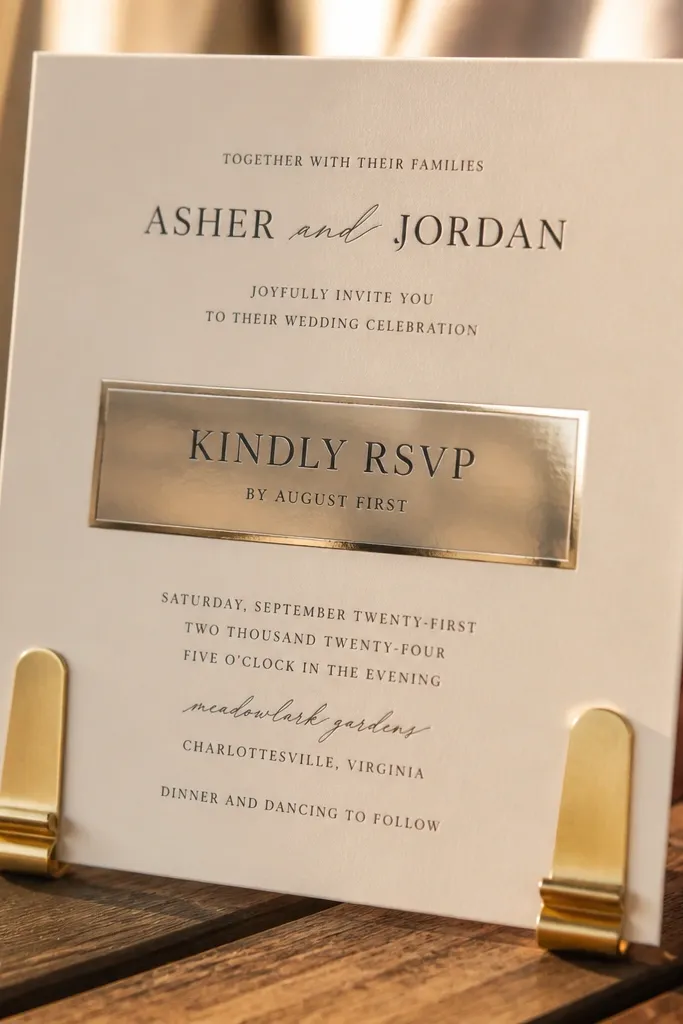
This design makes the RSVP line the star without shrinking your font. A glossy spot-UV rectangle on a cream base catches light fast, so your eyes land on the action instantly. Keep the rest matte so the card looks clean and not glare-y in photos. It suits couples who want modern-romantic and guests who need the RSVP deadline to stand out. Best seasons are spring and fall because the warm cream tone photographs beautifully with soft outdoor light.
Start with an 5x7 or 4.25x6.25 layout on 14pt or 16pt cream cardstock with a matte finish. Print the entire design normally, then ask your printer to apply spot-UV only behind the RSVP line or deadline. Finally, proof the exact text placement — spot UV edges look sharp when the line is centered and not too close to the border.
Use one short RSVP deadline line only — long paragraphs make the glossy box look crowded.
Don’t put spot UV behind thin script letters; it can blur under gloss.
2. Die-Cut Corner Bloom with Bold Date Type
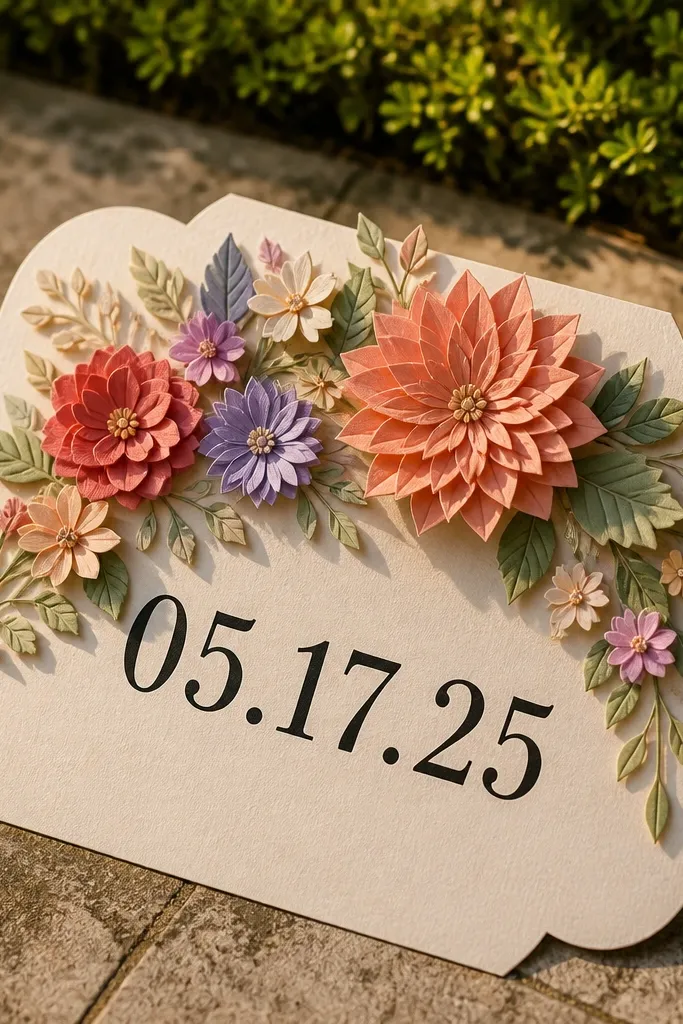
A die-cut corner feels special because it shows dimension even in a quick snapshot. You get a “wow” moment without adding complex inserts. Pair the cut with bold, high-contrast date typography so the information still reads at a glance. This works for gardens, outdoor ceremonies, and spring weddings where you want the stationery to hint at the setting. It’s also a good pick if you want a feminine touch without going full lace.
Choose a corner die that removes a small floral shape from the top-right or bottom-left corner. Keep the background cardstock opaque so the cut reads clearly; if you want extra pop, place a colored backing insert behind the cut. Then set your date in a thick sans-serif or slab serif and keep it on the opposite side from the die-cut so nothing overlaps visually.
Pick a die-cut size that’s under 1 inch wide so the card stays sturdy when mailed.
Avoid placing the die-cut near critical text; guests read the text, not the cut-out.
3. Layered Border Strips with French-Cuff Fold
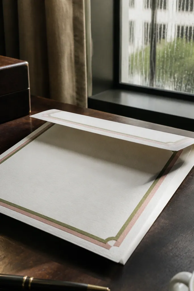
Layered border strips create that “designed” look even when the card is simple inside. The French-cuff fold (a flap that folds over neatly) makes the border visible on the outside and gives movement when the invite is opened. Use two narrow accent strips in complementary colors — like dusty rose and deep olive — so it photographs with depth. This is great for couples who want modern stationery with a tailored feel. It looks especially good in photos taken indoors near windows.
Start with a 5x7 folded card (or 4.5x6.25) and design a frame border that sits 0.25-0.35 inches inside the edges. Print the base on matte white cardstock, then add two separate border strips as a second layer with a clean adhesive tape runner. Finally, align the fold so the border lands perfectly when closed; do a test print sheet to check alignment before production.
Use narrow strips (around 0.2-0.25 inches) so the border stays crisp and doesn’t look bulky.
Skip heavy textured paper if your printer can’t handle tight alignment for layered strips.
4. Foil Script Swipe Across the Middle
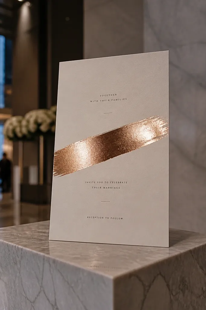
A foil swipe adds high-end contrast without clutter. Keep it to one line — like “You’re Invited” or the couple’s last name — and place it across the middle so it shows in most angles. Use gold foil on ivory for classic warmth, or rose gold on blush for softer photos. This design fits city weddings, modern venues, and anyone who wants a glamorous look without extra pieces. It photographs best in late afternoon light because foil catches highlights cleanly.
Pick 14pt or 16pt ivory cardstock and a simple centered layout with big date and time text below the foil area. Ask your printer for foil stamping only on the script phrase — avoid foil on tiny RSVP details. Then proof the foil placement with a mock-up because foil edges need clear spacing from other text.
Choose one foil color and one ink color; mixing too many metallics makes the card look busy fast.
Don’t foil the whole border — it can look flat in photos and costs more than it’s worth.
5. Letterpress Look Using Reverse Ink Date
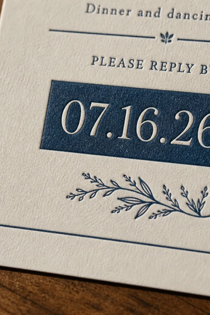
If you like that pressed, old-school feel but need speed, a reverse-ink panel gives the letterpress look without the wait. Put the date and time in a dark rectangle that prints cleanly and looks like it’s pressed into the paper. This design is calm and readable, with a tactile vibe that still works for 3 day wedding card design timelines. It suits rustic chic and modern minimalist couples who want texture without lace. Best for indoor venues with warm lighting where the contrast pops.
Start with a light base cardstock (cream or oatmeal) and set the date/time inside a solid dark block. Print normally, then keep the rest of the card in a simple ink style — one serif font for the couple names and one clean sans for RSVP. Finally, check that your date letters are thick enough; thin fonts can fill in on reverse panels.
Use a solid block around 0.15-0.25 inches taller than the text so it reads crisp.
Avoid super thin outlines on the reverse panel; they disappear under quick printing.
6. Watercolor Band with One Photo-Friendly Accent
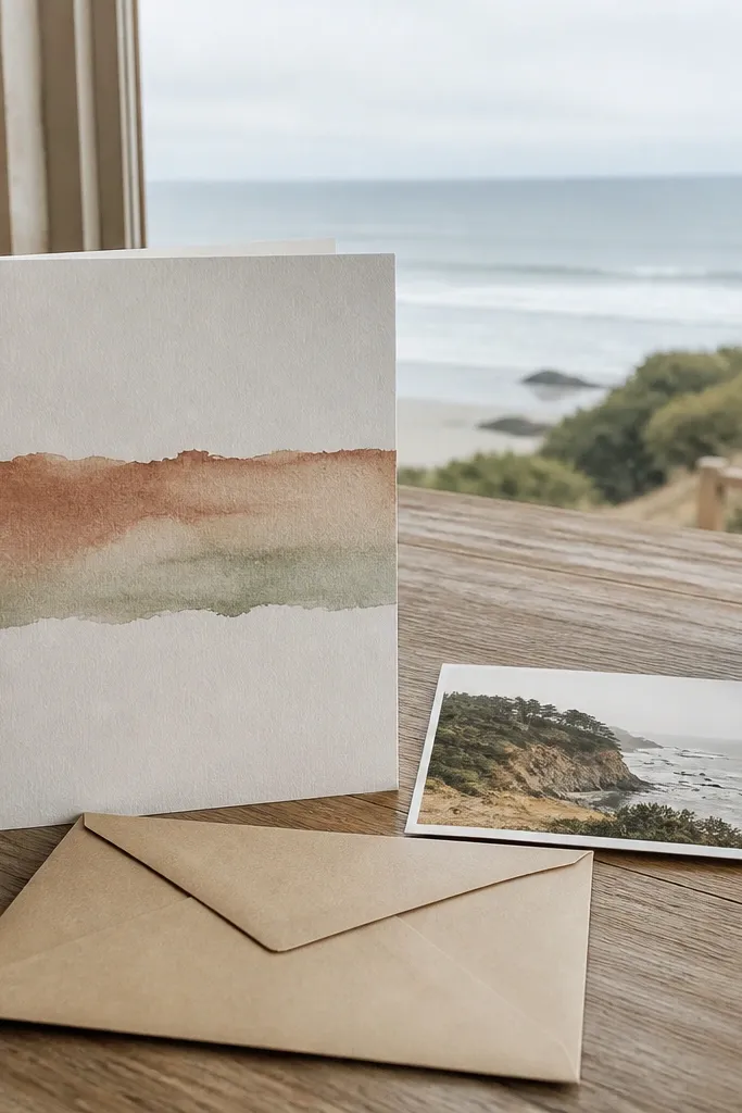
A watercolor band is soft and photogenic, but the trick is restraint. Put the wash in one horizontal strip behind the main text area and keep everything else stark and readable. Choose two colors maximum — like muted terracotta and pale sage — so the card doesn’t look muddy in photos. This design works for outdoor ceremonies and daytime weddings where you want airy stationery. It’s also forgiving if your printer’s color consistency varies slightly.
Create a band that spans the width of the card about 1.25-1.5 inches tall. Print the band first, then place your date/time and RSVP lines on top in a dark ink with enough padding from the watercolor edges. Finally, add one small icon — like a tiny leaf or ring — in the corner to anchor the design visually.
Keep the RSVP line in a solid block or strong contrast strip if the watercolor is busy.
Don’t use full-card watercolor; it kills readability and makes quick photos look gray.
7. Crisp Monogram Stamp with Wax-Seal Circle
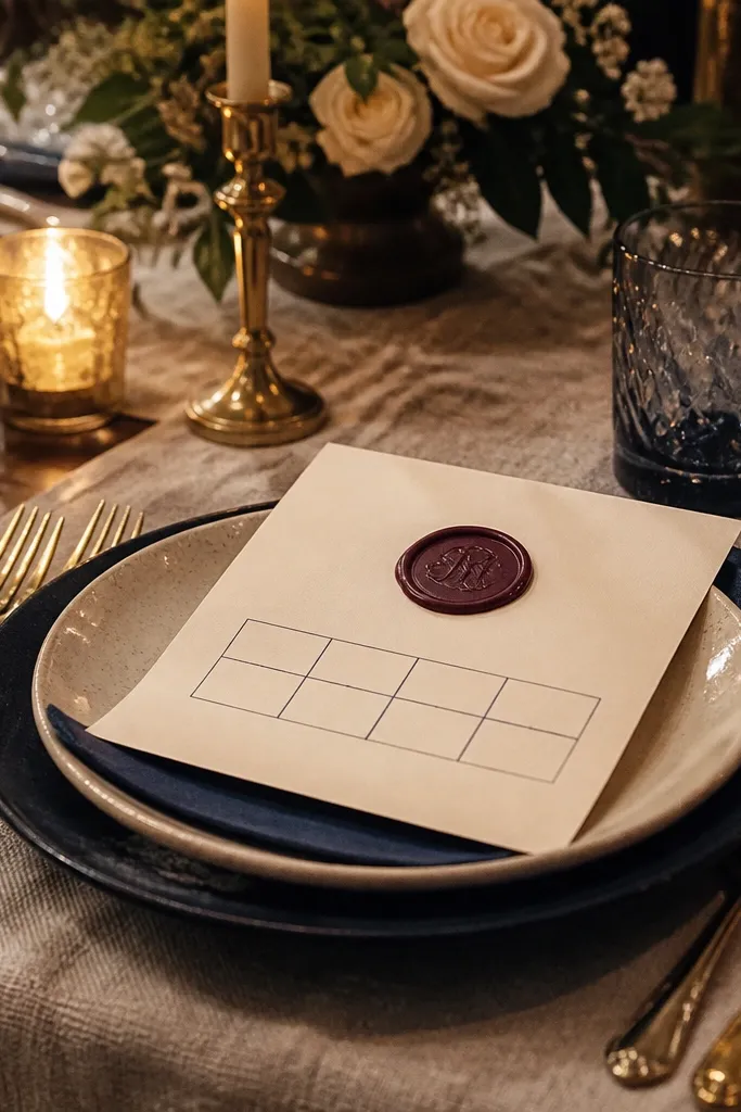
A wax-seal circle turns a flat invite into something guests want to photograph. The design works best when the seal holds one clean monogram or date, not a bunch of text. Pair it with a simple grid layout below so the card doesn’t become a visual puzzle. This suits formal weddings and evening events where you want a dramatic first look. It also looks great against dark envelopes.
Choose a round seal graphic about 1.25 inches wide and place it in the top-left or center-top. Print the seal with a slightly textured look, then keep the rest of the card typography simple and bold. Finally, use a dark ink for the details and leave generous margins so the seal feels intentional.
Quick tipMatch the seal color to your envelope liner or wax color theme for a cohesive photo.
Skip thisDon’t cram the monogram with extra words; seals look best with one focal element.
8. Arch Top Invitation with Lettering on a Curved Path
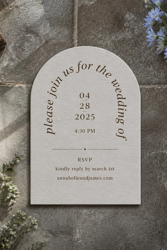
An arch top gives you instant structure and makes the invite look custom, even when it’s printed quickly. Use curved path lettering only for the names or a short phrase, not for the full RSVP block. The arch frames your date and time so it’s easy to read and looks good in overhead shots. This works for chapel weddings, winter events, and anyone who wants a timeless shape without adding heavy embellishments. It also photographs well because the silhouette is distinctive.
Start with a template that has an arch cutout or arch border drawn into the design — keep the card size standard for mailing. Set the curved text across the arch and keep the date/time in a straight line below for clarity. Then add a small separator line under the RSVP line so the layout reads cleanly even at small scale.
Use a font with sturdy curves; thin curved fonts can look wobbly when printed quickly.
Avoid curving the RSVP deadline; curved text becomes harder to scan fast.
9. Blackboard Chalk Style with Real Contrast RSVP Block
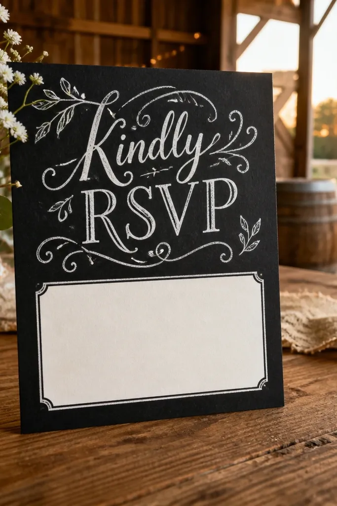
Chalkboard invites look fun and aesthetic, but the information has to be legible. Put the chalk-style script on the top section and then add a bright rectangle behind the RSVP line, like light cream or white. That way, guests still catch the deadline even if they skim. This design fits casual barn venues, fall evenings, and couples who want personality. It photographs well against warm-toned envelopes and kraft paper.
Choose a dark gray or deep charcoal cardstock base and print chalk-style headings in a lighter off-white ink. Then reserve a clean, light rectangle for RSVP instructions and deadline with bold sans-serif type. Finally, keep the rest minimal — one icon or underline is enough so the card doesn’t look messy.
Use a thicker line weight for chalk headings so the print doesn’t look faint.
Don’t make the entire card chalky; guests will miss the RSVP line.
10. Two-Tone Envelope Liner Look with Matching Card Tabs
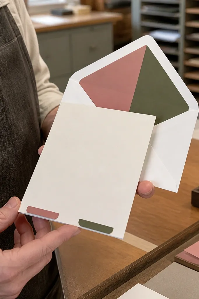
This is a design trick: make the card match the envelope liner so the first reveal looks intentional. Use small tab accents on the invite — like two color blocks at the bottom or side — that match your envelope liner colors. It looks cohesive in photos and feels like a set. Great for modern weddings and couples who want a playful, color-forward look without complicated extras. It also works in 3 day timelines because it’s mostly printing.
Pick two colors that look good together on paper — like teal and blush, or navy and sand. Design a small tab or strip on the invite edge (about 0.3-0.5 inches tall) and keep the main text in a neutral ink. Then order matching envelope liners and photograph the open invite with the liner visible to sell the look.
Keep tab accents away from fold lines so they don’t peel or crack under pressure.
Don’t choose colors that only work on screen; test with printed swatches if possible.
11. Minimal Card with One Big Embossed Date
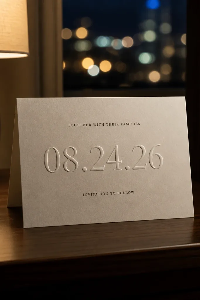
Embossed dates are one of the cleanest ways to look luxe without adding color chaos. You put one large date element in raised emboss, then keep everything else flat and simple. In photos, emboss reads as a highlight when the light hits from the side. This is perfect for modern weddings, destination invites, and couples who hate clutter. It also stays readable because the text is minimal.
Choose a smooth white cardstock and set the date area as a large typographic element. Ask for blind emboss (raised but no ink) or emboss with a tiny ink tint if your printer supports it. Then place RSVP and location in a single clean font with strong contrast so guests can read quickly.
Quick tipAngle the card slightly during photography; emboss pops best with side lighting.
Skip thisAvoid embossing small words; tiny embossed text can look blurry.
12. Kraft Paper + Navy Foil Coordinates
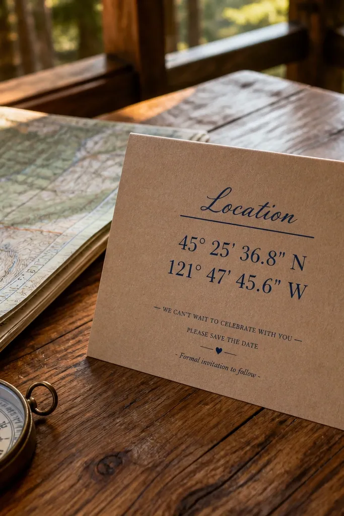
Kraft paper gives instant warmth, and foil coordinates make it look thoughtful without extra writing. Use a navy foil line for “Location” and include the venue coordinates or a short geographic reference. Keep the rest in navy ink so the card stays readable. This design fits beach weekends, cabin weddings, and destination stays where a location detail feels special. It photographs beautifully against natural wood and neutral backgrounds.
Start with kraft cardstock (14pt or 16pt) and design your layout in navy ink. Add a foil stamped phrase like “Venue” or the venue name, then include coordinates in small but bold type. Finally, keep the RSVP line in plain ink on a light rectangle so it’s not lost on kraft.
If your printer struggles with foil on kraft, switch to spot UV for the coordinates line.
Don’t put foil on long sentences; foil looks best on short phrases.
13. Framed RSVP Line with Thin Gold Spot UV
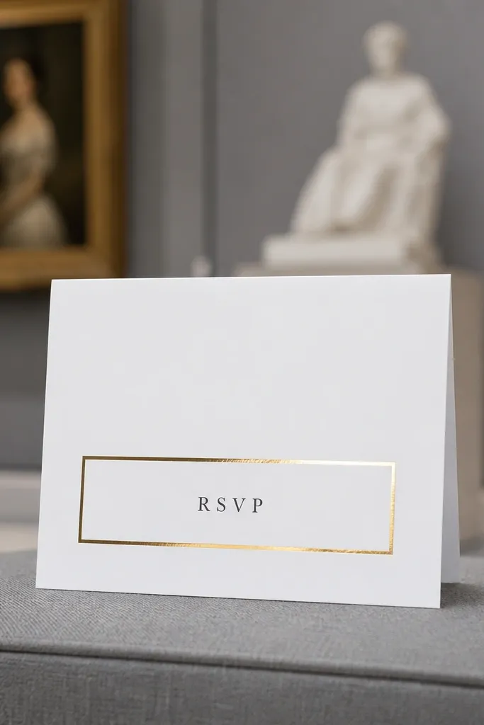
This design is all about precision. A thin spot-UV gold frame around the RSVP line pulls attention without covering the rest of the card. Use a clean layout with lots of white space so the frame looks crisp and expensive. It suits weddings that feel formal but not heavy, like museum venues or hotel ballrooms. It’s also great for quick photo posts because the glossy frame catches light immediately.
Design a centered card with generous margins and set the RSVP line as its own block. Add spot UV in a thin rectangular outline around that block, leaving at least 0.05 inches from text edges. Print everything else matte, then proof the spacing so the frame doesn’t overlap with small punctuation.
Use a single RSVP deadline date; multiple dates make the frame look cluttered.
Skip thick gold frames; they can look like stickers instead of printing.
14. Transparent Overlay Look with Printed Window Panel
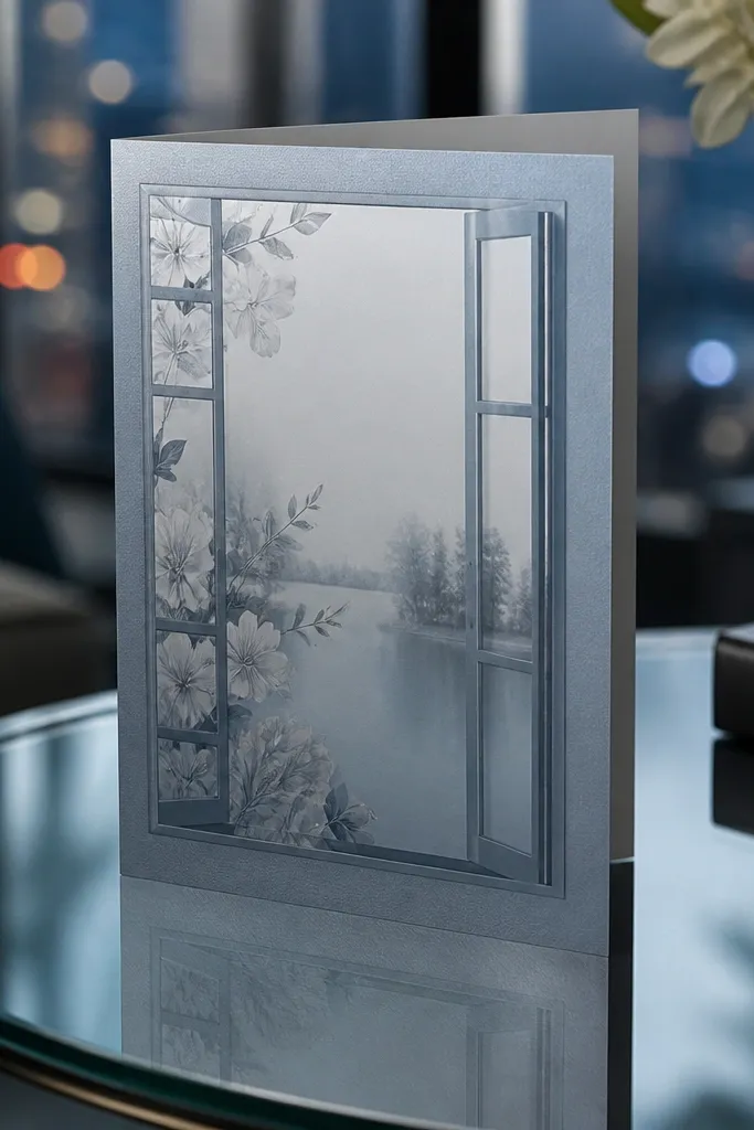
You can get the “transparent overlay” look without using actual acetate. A printed window panel simulates the effect by leaving a clean cut of background color and placing text over a lighter, semi-transparent style. This gives a modern, airy vibe and makes the card feel layered in photos. It fits sleek city weddings and minimalist couples who still want a design moment. Works best when you keep the background light and the text dark.
Create a rectangular panel area in your design and print it with a light tint or soft gradient that mimics transparency. Place the RSVP line in the center of that panel in bold, high-contrast type. Then keep the rest of the card flat color to avoid muddy layers in quick photographs.
Use a light tint panel color like pale gray or warm beige instead of blue; blue can look washed out under indoor lights.
Don’t add more than one “window” area; multiple panels make the design look gimmicky.
15. Geometric Confetti Border with Clean RSVP Layout
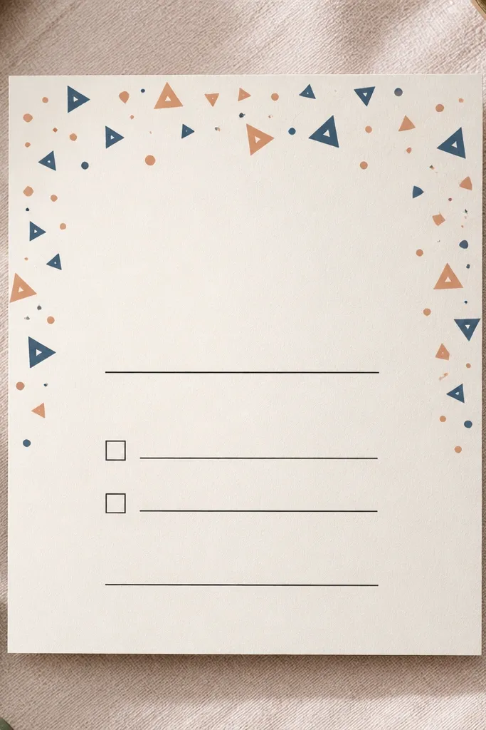
A confetti border gives energy and makes the invite feel celebratory without turning it into a party flyer. Keep the confetti confined to one edge band — like top and sides — and keep the center layout calm for readability. Use two shapes only — triangles and dots — so it looks intentional. This suits weddings with a playful tone, like rooftop receptions or spring celebrations. It photographs well because the border adds texture while the center stays crisp.
Design a border band that runs along the top and sides at about 0.75-1 inch height. Print the confetti in a limited palette and leave the center for date, time, and RSVP. Then add a solid divider line under RSVP instructions so guests know where action info ends.
Quick tipChoose confetti colors that match your theme accent color; don’t add extra hues for “fun.”
Skip thisAvoid confetti behind the RSVP text; busy backgrounds reduce scan speed.
16. Ribbon Tie Look with Printed Fold-Over Strip
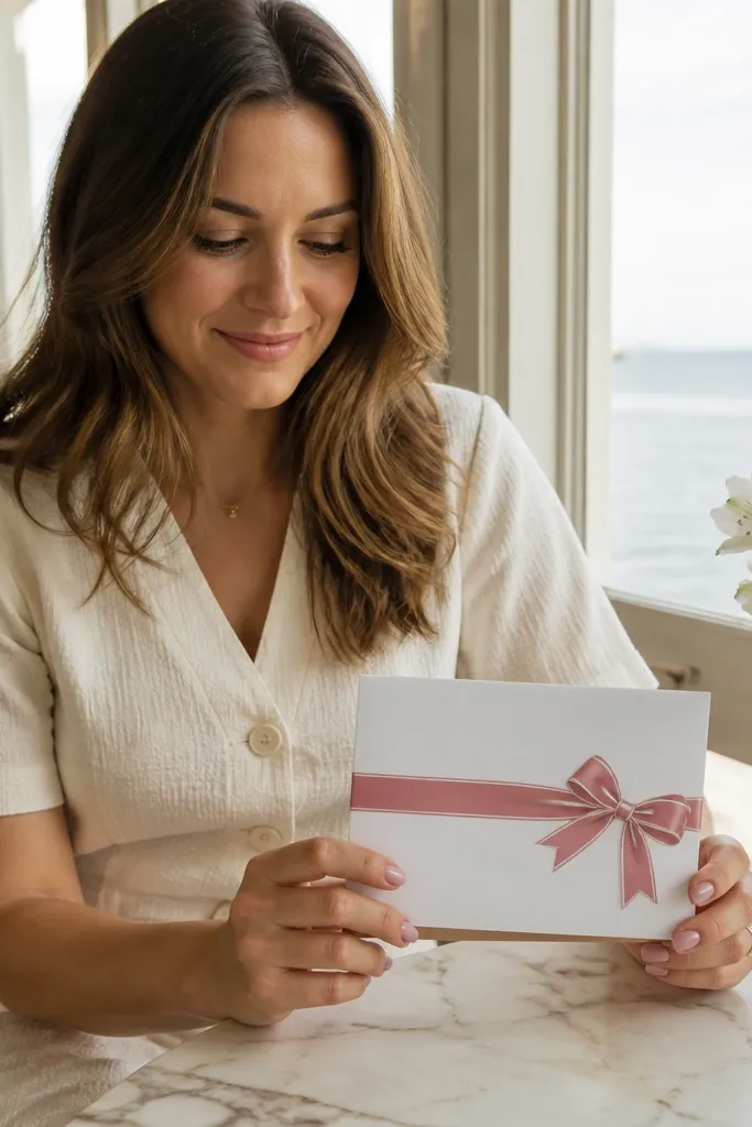
This is a clever way to get a ribbon tie look without adding string that gets messy in envelopes. You print a ribbon graphic strip across the card and add a bow illustration in the corner. Use one ribbon color — like dusty rose or deep navy — and keep it matte. The rest of the typography stays clean and large. This design is great for romantic weddings and for couples who love classic details but need speed. It also photographs well because the ribbon graphic creates a focal point.
Start with a folded or flat card and place a ribbon graphic across the front, about 0.8-1.1 inches tall. Add a small bow graphic at the side where the ribbon “ties,” then keep the date/time text either above or below the ribbon so it’s not visually blocked. Finally, use a simple font pair and keep the RSVP line short.
Use a slightly textured ribbon print pattern; it reads as “fabric” in photos.
Don’t print ribbon graphics over the thinnest font sizes; ribbon backgrounds can make text look fuzzy.
17. Botanical Press Silhouette with Foil Leaf Accent
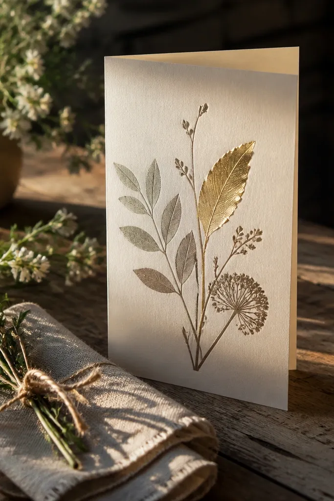
Botanical press silhouettes look like real pressed leaves and feel thoughtful fast. The key is to keep the silhouette subtle and let one foil leaf do the highlighting. This gives you a natural, elevated look without relying on full watercolor complexity. It suits spring weddings, farms, and ceremonies that feel close to nature. Best in daylight photos where the silhouette shows texture and the foil leaf glints.
Pick a light base cardstock and print a leaf silhouette in a muted green or charcoal. Add one small foil leaf accent — about the size of a thumbnail — near the address or RSVP corner. Then keep the typography minimal and spaced so the botanical image doesn’t compete with the details.
Use one botanical motif only; too many leaf types make the card look chaotic.
Avoid busy full-bleed botanicals; they reduce RSVP legibility.
18. Calendar-Grid RSVP Card with Day Blocks
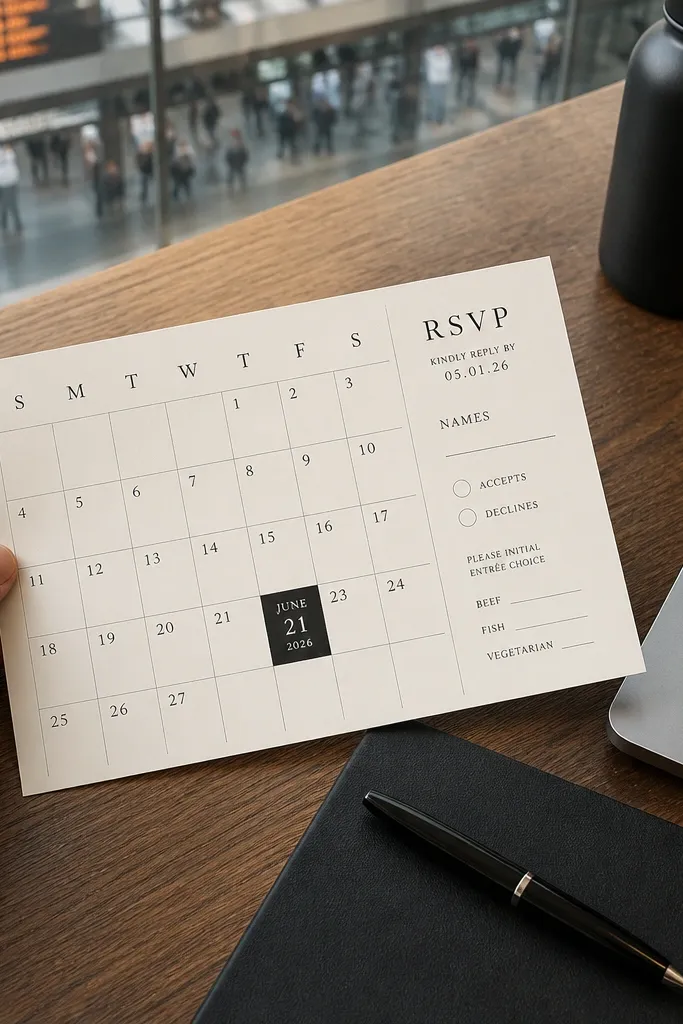
A calendar-grid layout turns the date into a visual that people understand instantly. Put the wedding date inside a small grid block, then keep the rest of the information in a clean column. This is surprisingly photogenic because it looks like a designed planner page. It works for couples who want guests to remember the day without reading a long paragraph. It also suits destination weddings where the date needs to stand out fast.
Design a compact calendar grid about 1.5-2 inches wide, with the wedding day highlighted. Print the grid in a muted ink and use bold type for the date next to it. Then place RSVP deadline and method in a single block beneath the calendar so it’s easy to scan.
Quick tipUse a one-month grid only; multi-month calendars look cramped on a 3 day timeline.
Skip thisDon’t use tiny grid text; legibility matters more than accuracy flourishes.
19. Monochrome Photo Frame Layout with Text Under
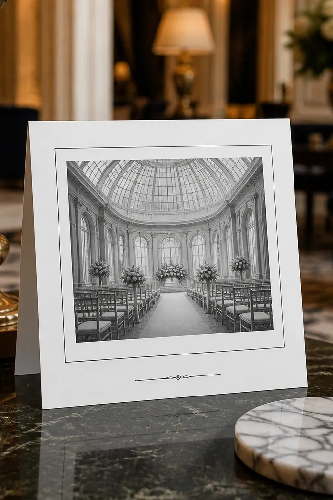
If you want the invite to look photo-ready, treat it like a design frame. Use a monochrome palette and add a framed area where your venue photo will sit (or a simple decorative frame if you’re not using a photo). The typography under the frame stays bold and readable, so the card doesn’t become a picture booklet. This suits modern couples and city weddings that look good in black-and-white photography. It’s best for venues with clean architecture lines.
Choose a monochrome scheme and design a rectangular frame area near the top, leaving space for the date and RSVP below. Print the frame and all text in one or two ink tones, then add the photo if your printer and timeline allow it. If you’re not adding a photo, use the frame as a graphic element with a subtle pattern.
Leave at least 0.25 inches between the frame border and any text so it doesn’t look crowded.
Avoid full-bleed photos with long text over them; contrast gets messy fast.
20. Raised Border with Blind Emboss + Tiny Icon Set
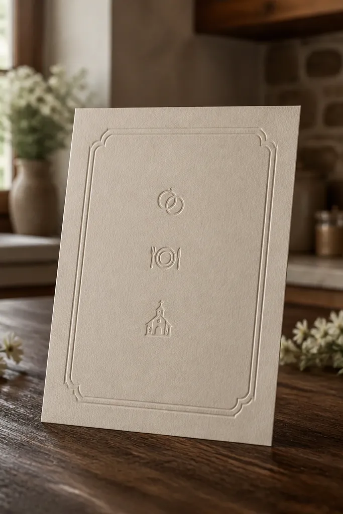
A blind embossed border is one of the cleanest ways to make a card feel premium without adding color. Add tiny icons for the ceremony time, dinner, or location, so guests can skim faster. Keep the icon set to two or three icons max so it stays elegant. This design suits minimal weddings that still want texture. It photographs well because the raised border creates a shadow line under most lighting.
Start with a smooth white cardstock and design a border that sits 0.2-0.35 inches from the edge. Ask for blind emboss on the border only, then print the rest in simple black or deep charcoal ink. Finally, place icons next to short lines — like “Ceremony 4:30” — and keep the RSVP deadline in bold type.
Use fewer icons than you think; two icons look intentional, four can look like a checklist.
Don’t emboss text and borders together; emboss text can lose crispness.
21. Navy Folded Card with Light Marble Band
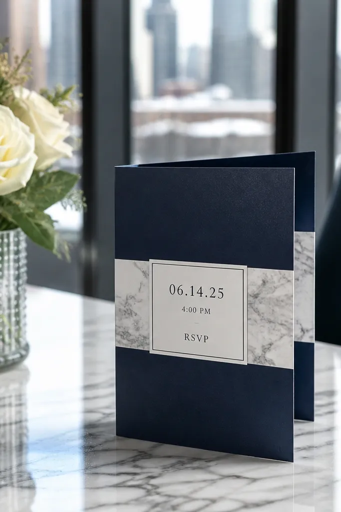
Dark base cards look dramatic in photos, and the trick is to keep the design readable. A pale marble band breaks up the navy and gives a premium, designer feel. Put your main date and time on the marble band, then place RSVP in a solid light block so it’s always legible. This fits evening weddings, winter events, and elegant venues. It also looks great photographed against warm wood or gold-toned backgrounds.
Choose navy cardstock and design a marble band about 1.5 inches tall across the center. Print the marble band, then overlay your date/time in a contrasting light ink. Finally, create a light rectangle for RSVP details with bold type, and keep the envelope color neutral so the navy doesn’t swallow the card in photos.
Use a matte navy base to prevent glare; marble patterns already create enough visual shine.
Avoid placing RSVP directly on marble without a solid backing.
22. Modern Line-Art Venue Map with RSVP Deadline Sticker
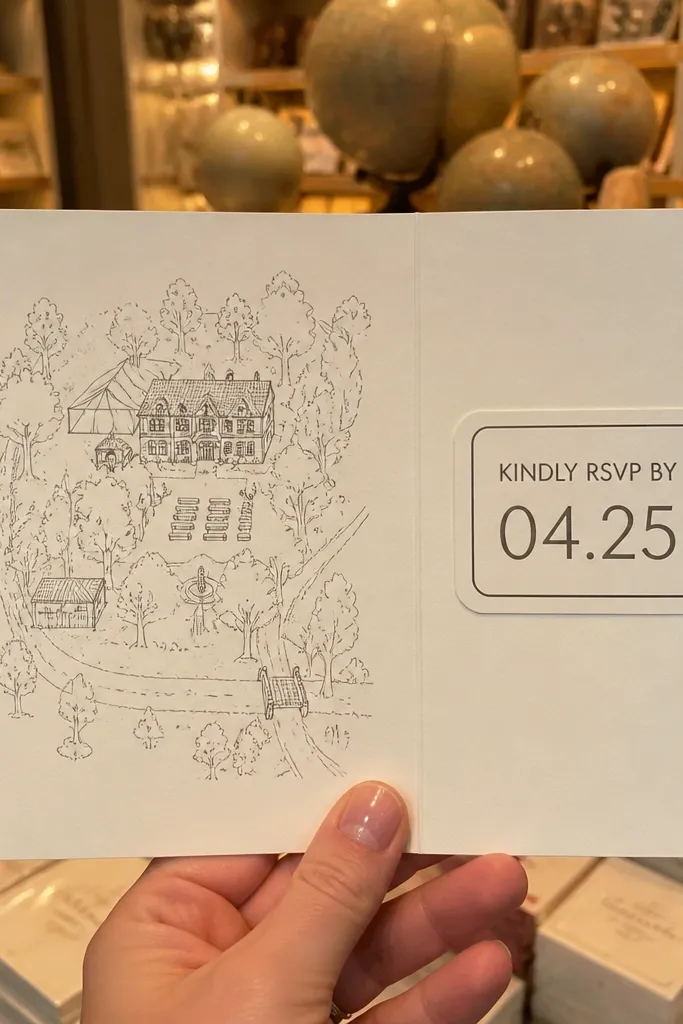
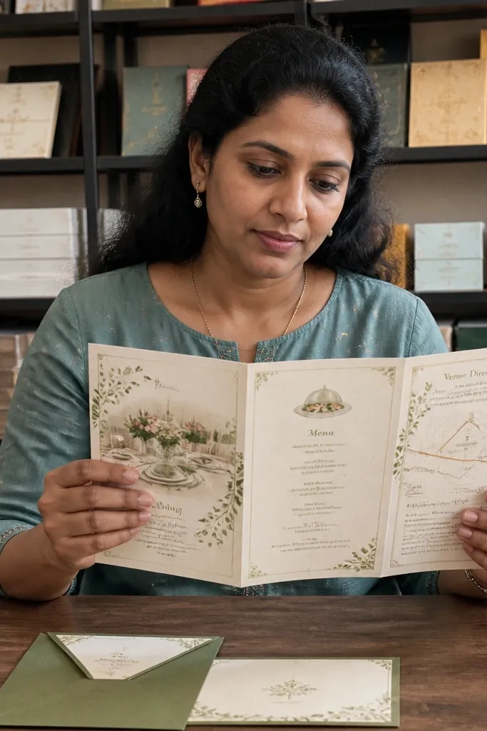
Line-art venue maps are one of the most useful, most photogenic details you can add. Guests love them because they feel like a plan, not just information. Put the map in a small panel on one side, then add a deadline panel that looks like a sticker. Keep the map monochrome so it doesn’t compete with the typography. This design suits destination weekends and venues with confusing entrances. It photographs well because the map lines create a crisp texture.
Design a simplified line-art map of the venue grounds or nearby landmark — keep it to 2-3 labeled points. Place it in a side panel and print it in dark ink on a light background. Then add a separate deadline panel styled like a sticker, with bold RSVP text, so the action stands out immediately.
Use only one map label that matters most — like parking entrance or main gate.
Don’t include multiple tiny POIs; guests won’t read them in a hurry.
23. Serif Banner with Two-Color Thermo Ink Style
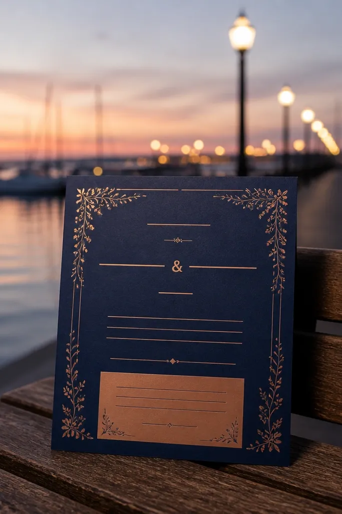
A two-color banner gives you that “printed invitation” look without heavy embellishments. Use a serif banner for the ceremony line or couple names, then keep the RSVP section in a contrasting solid color. The contrast makes it easy to photograph and easy to read. This works for classic weddings with a modern edge, especially when you want your invite to look coordinated with signage. Best for spring and summer because crisp colors look clean in brighter light.
Choose two ink colors that look good together on paper — like black plus terracotta, or navy plus sage. Place the banner at the top with a serif font and keep it narrow enough to avoid covering too much text. Then build the RSVP area as a solid rectangle in the second color with bold sans-serif type. Finally, keep spacing generous around the banner edges so the two colors feel intentional.
Pick one banner phrase only — too many banner lines makes the card look like a label.
Avoid gradients in the banner; they look muddy on quick printing.
24. Transparent-Style Acrylic Rectangle Look with Printed Backing
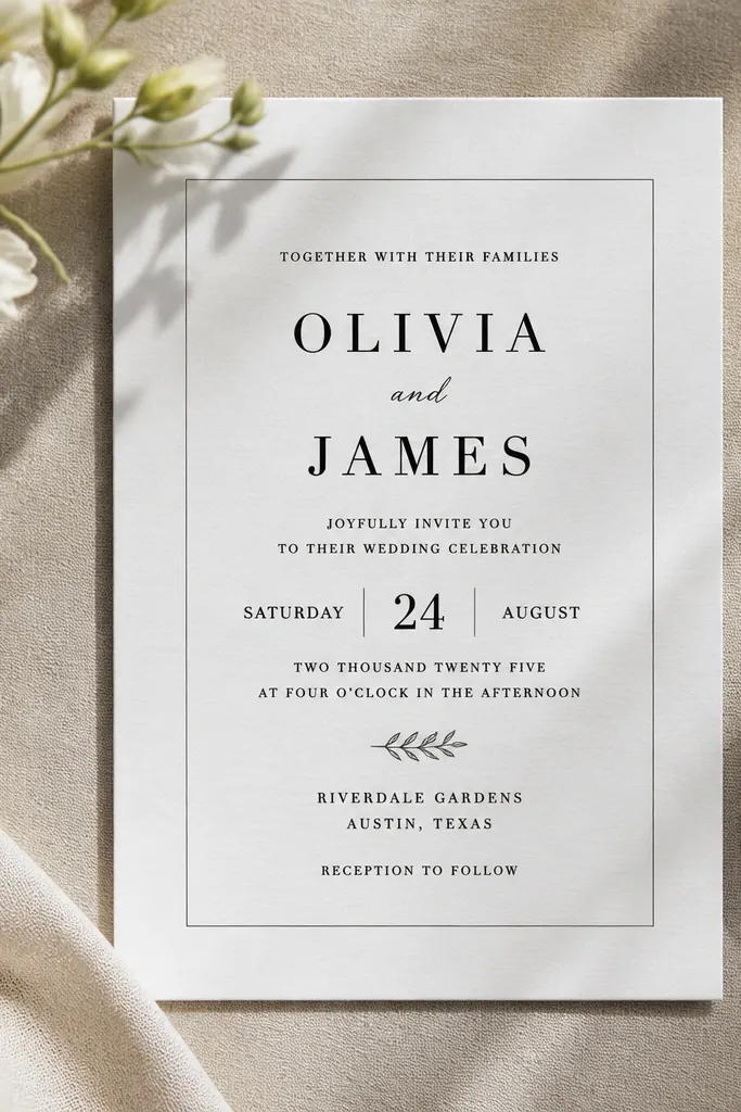
You get the sleek acrylic feel with a printed rectangle panel that simulates transparency. This design is clean, modern, and very photo-friendly because the rectangle creates a sharp frame. Keep the rectangle outline thin and place the date and RSVP inside with high contrast. It’s a strong choice for modern venues, rooftop weddings, and couples who want a techy minimal look. It also works well when you photograph the card from the side.
Create a rectangle panel area with a subtle light tint and a thin outline, leaving enough padding for text. Print the entire card in one or two ink tones plus the panel tint, then center the date/time inside the rectangle. Finally, add a small footer line for RSVP method in bold type so guests don’t hunt around the panel edges.
Quick tipUse a thin outline (around 0.5-0.75pt) so it stays crisp on print.
Skip thisDon’t add too many decorative lines inside the rectangle; it needs space to read.
25. Sunset Gradient Foil Save-the-Date Strip with Foil Weather Icons
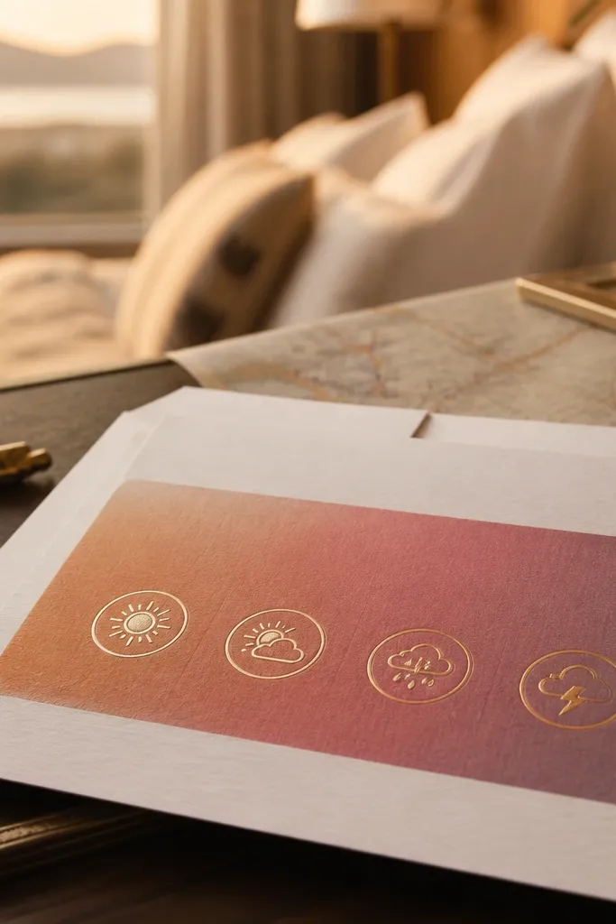
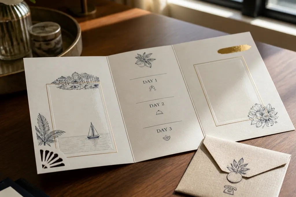
This design is built for a 3 day wedding card design that needs to feel like a mini travel itinerary. The top strip fades from peach to dusty rose to soft plum, then gold foil weather icons sit in small circles along the gradient. It looks amazing in photos because the foil catches light differently at every angle, even when the rest of the card stays simple. Put the 3-day wording in a crisp block at the bottom so it stays readable, then let the gradient do the “wow” work. It suits couples planning a weekend with a welcome dinner, a main ceremony, and a farewell brunch — basically any schedule with a clear rhythm. Book this look for late spring through early fall when the color palette matches the real world outside.
Step 1 — Choose a card base in warm cream or light ivory, then set up a horizontal gradient panel for the top 25-30% of the card. Add gold foil weather icons (sun, cloud, light rain) spaced every 1.5-2 inches, sized to be visible without crowding. Step 2 — Typeset the 3-day line in a solid, dark ink block at the bottom (charcoal or deep espresso) so the foil and gradient never compete with the dates. Step 3 — Order with a short proof timeline and request a physical sample if the printer can’t match the gradient closely. For travel practicality, plan to spend 3-4 hours designing and getting approvals, then 1-2 weeks for printing; typical cost lands around $1.50-$3.50 per card depending on foil coverage and minimum quantities. Step 4 — When you travel to the wedding location, keep these cards in a rigid folder so the foil strip doesn’t get scuffed during packing.
Pick the gradient colors from a real sunset photo taken at your venue, not from a generic palette. That simple choice makes the card look intentional in every lighting setup at the trip.
Don’t put the 3-day date text on the gradient strip — readability drops fast once foil glare hits.