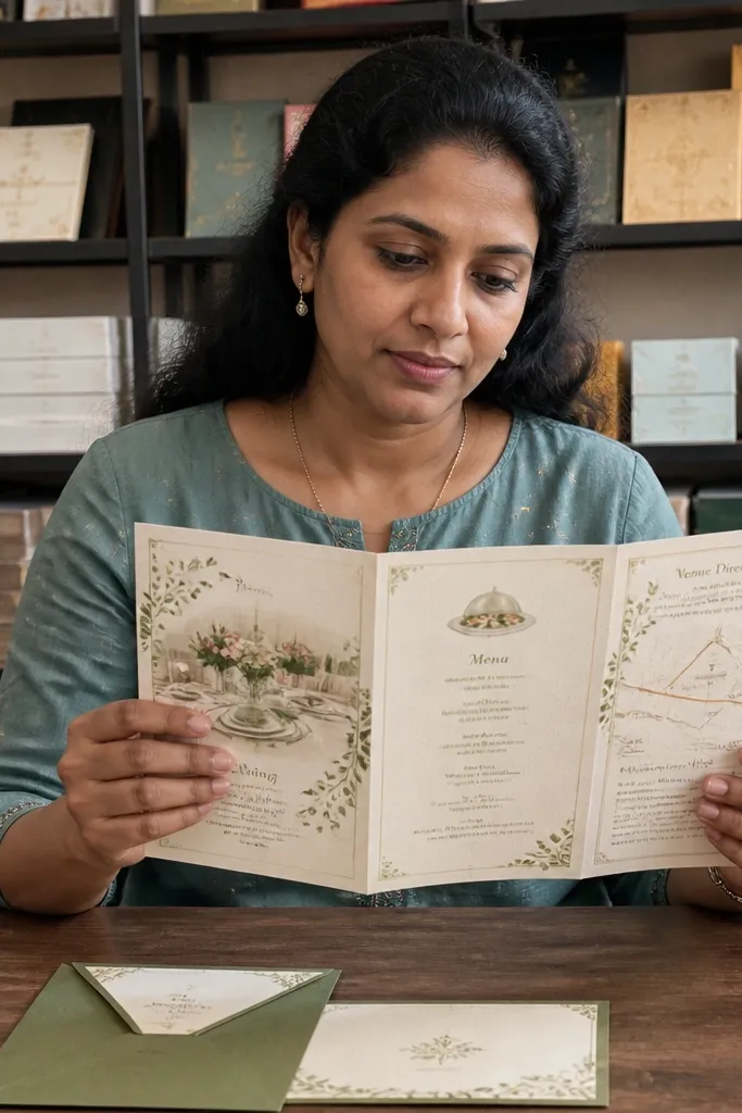

1. Black-Tie Typewriter Reveal
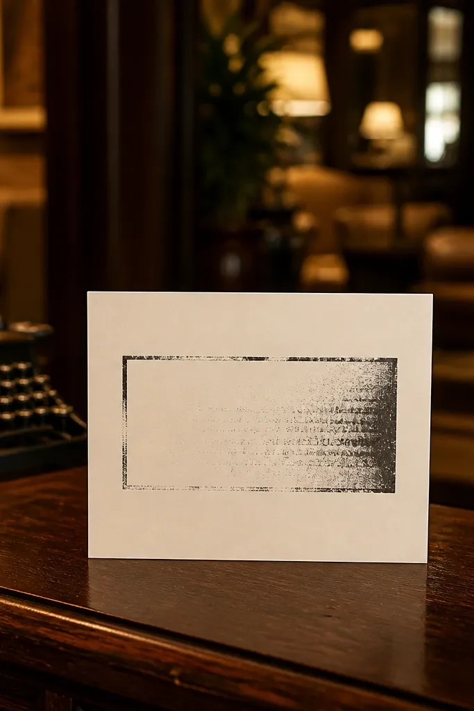
This template is all about readable drama. A cream card background keeps it warm, while the typewriter-style headline makes the invite feel handcrafted without looking messy. The motion is a simple ink fade that reveals your names and date in sequence, so guests understand it instantly even on a slow scroll. It’s a strong fit for couples doing a classic wedding, a courthouse ceremony with a formal dinner, or a black-and-cream stationery theme. The look stays classy in both daylight and warm indoor lighting, which matters for how video invites get shared.
Start by uploading a single portrait photo or leaving it text-only for maximum contrast. Then replace the headline with your names and set the date line in the smaller typewriter font, keeping it to one or two short lines. Finally, keep the motion timing default and export at 1080p so the thin type stays crisp. If the template has placeholders for venue details, paste only the essentials — street address on one line, city on the next.
Quick tipUse a cream or ivory photo with low contrast behind your text so the letters don’t fight the background.
Skip thisDon’t add extra lines like “dress code” or registry details on the first screen — it makes the reveal feel crowded.
2. Dusty Rose Photo Frame Slide
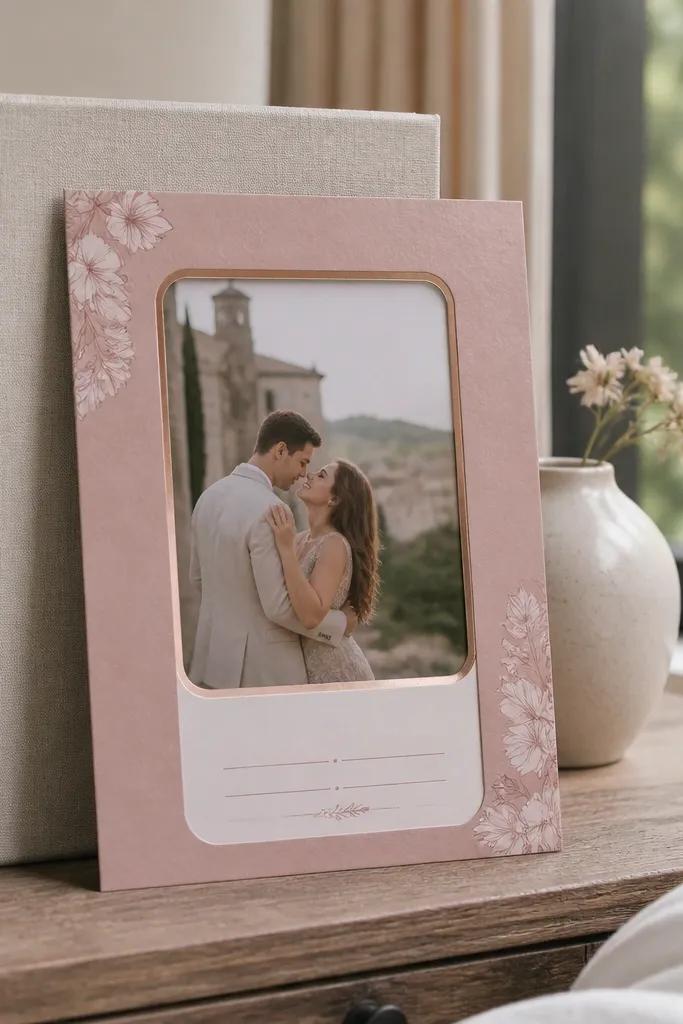
This one feels like stationery you’d keep in a drawer. The dusty rose frame gives a soft, romantic edge, but the layout stays clean so your guest can read the date right away. The motion is a gentle slide where the photo settles into place, which looks smooth on mobile without drawing attention away from the message. It suits spring weddings, garden venues, and couples using rose-gold accents or blush invites. The best part is that the frame makes even a casual photo look styled, so you don’t need a perfectly “editorial” image to get a polished result.
Start by selecting a photo with faces or florals — anything with clear subject contrast works best inside the frame. Then swap in your names and keep the date line short so it doesn’t wrap. Finally, place the venue and time in the same alignment as the frame edge and export at 1080p. If there’s a color picker for the border, match it to your stationery envelope liner or a blush bridesmaid dress shade.
Quick tipPick a photo where the subject is centered; the frame makes off-center photos look awkward during the slide.
Skip thisSkip busy backgrounds like night city shots — the rose frame can’t fix readability when the image is too loud.
3. Champagne Foil Confetti Fade
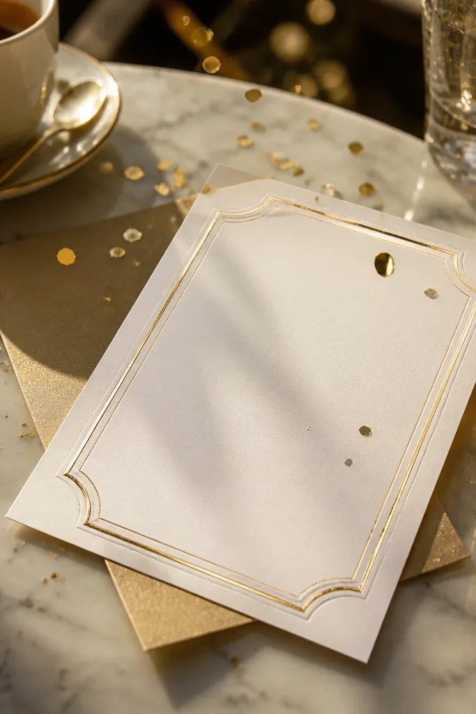
This template gives you that “foil invitation” look without making your video unreadable. The background uses champagne gold grain and very small confetti flecks that drift slowly, so it feels celebratory but still elegant. Your text sits on a clean white panel, which keeps names and dates sharp. It’s a great match for evening weddings, ballroom receptions, and any couple using gold foil on paper. If you want something that looks festive in a feed but not cheesy, this is the move.
Start by setting your text block to the brightest panel area and keep your names as the largest type on-screen. Then choose one photo — a close crop of flowers or a couple portrait — and keep it muted so the gold grain doesn’t clash. Finally, reduce any extra sparkle layers if the template lets you, and export at 1080p. Aim for a 6-10 second video so the confetti motion doesn’t feel long.
Quick tipUse gold text sparingly. White or near-black text reads better against grain backgrounds.
Skip thisDon’t crank up the confetti density — too many sparkles make the invitation look like a party flyer.
4. Ocean Lines Minimal RSVP
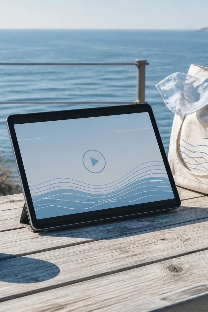
If you want “clean and stylish,” this template nails it. Thin ocean-line graphics sit behind your text like a subtle map, and the motion is a slow ripple that doesn’t distract from the information. The palette is light blue and off-white, which looks fresh on phones and doesn’t turn muddy when compressed. It works for beach weddings, destination weekends, and couples who want invites to feel modern and calm. The template also tends to handle extra RSVP wording better because it keeps text blocks wide and readable.
Start with a photo that has sky or water tones, then desaturate it slightly if the template offers filters. Next, replace the RSVP prompt with your exact wording and keep it to one or two lines. Then place the date and time in a single block so guests can scan quickly. Export at 1080p and use a 8-12 second duration for a smooth read.
Quick tipIf your venue name is long, shorten it to the common form guests use on Google Maps.
Skip thisAvoid dark navy text on light blue backgrounds — it can look heavy and blur when viewed on smaller screens.
5. Terracotta Sunset Photo Mat
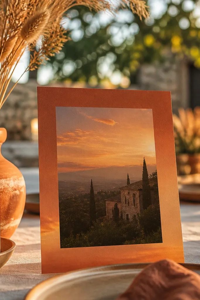
This template looks warm and photo-first. Terracotta mat borders frame your image with a sunset gradient that makes skin tones and florals look better than a flat background. The motion is a slow “mat reveal” where the photo appears to slide under the frame, which feels like custom stationery. It’s perfect for fall weddings, desert elopements, and any couple using terracotta, burnt orange, or warm neutrals. The layout is also friendly for longer location lines because the mat gives text space.
Start by uploading a photo with warm highlights — golden hour portraits or sunset florals work best. Then set your names in the center and keep the date line shorter than you think you need. Finally, add location on one line and time on the next, then export at 1080p. If the template has a gradient intensity slider, keep it moderate so the text stays readable.
Quick tipUse a slightly warmer filter on your photo, but don’t push saturation past “skin looks orange.”
Skip thisDon’t use cool-toned black-and-white photos here — the background warmth fights the image.
6. Botanical Line Art Menu Layout
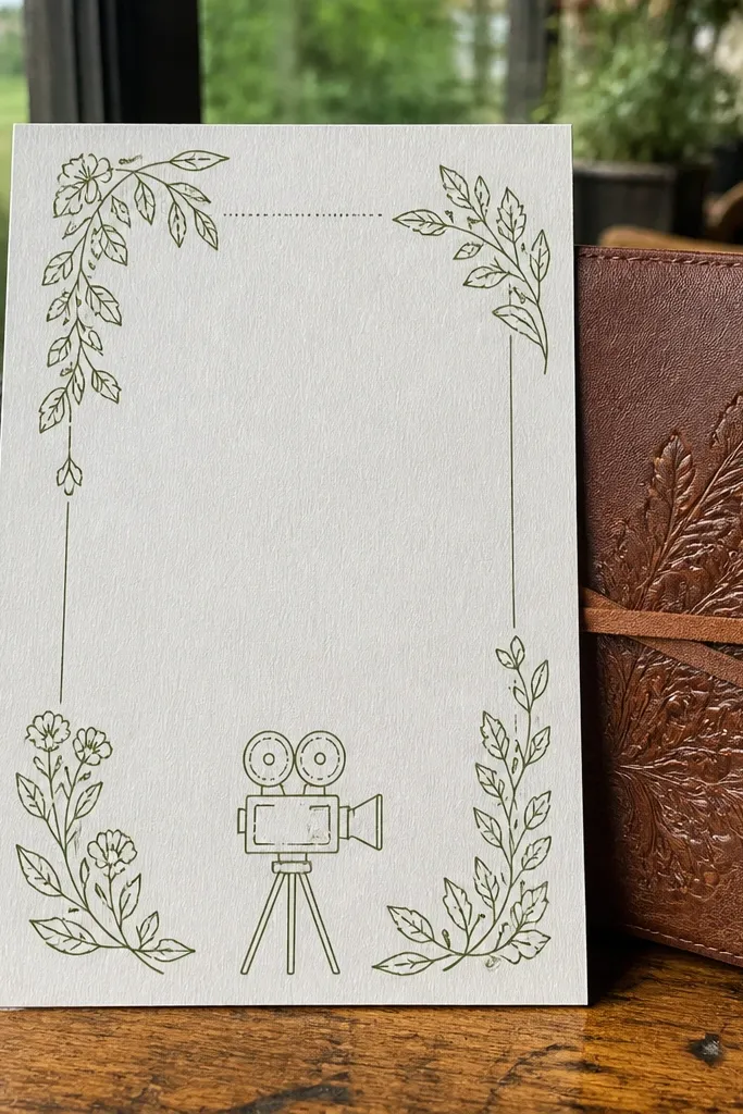
This one borrows the feel of printed menus and stationery inserts. Botanical line art sits in the corners, and the motion is a slow “ink draw” that traces small details without covering your text. It’s visually interesting but still minimal enough for serious wedding announcements. Great for spring and summer weddings, farmers market vibes, and couples who want a natural look without going full rustic. The typography usually leans serif, which pairs well with floral photography and gives the invite a composed, editorial feel.
Start by choosing a photo with clean edges — bouquets, greenery close-ups, or a simple portrait with a light background. Then replace the template text in the main center block and keep the date line to one line if possible. Next, position the venue details where the botanical corners already leave space. Export at 1080p and keep the video under 12 seconds so the ink-draw loop doesn’t feel repetitive.
If you’re using a venue with a long name, move the full address to the second screen if the template has one.
Skip templates with heavy watercolor splashes if you care about readability on small phones.
7. Midnight Marble Nameplate
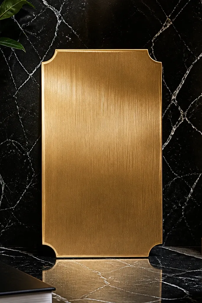
This template has a luxe, modern look that reads like high-end stationery. The dark marble background gives depth, while a gold nameplate panel holds your names and date. The motion is a subtle shimmer across the nameplate edges, not across the whole screen, so text stays crisp. It’s ideal for evening events, black-and-gold themes, and couples who want a “modern heirloom” feel. If your photos are darker or you’re sharing from an indoor venue, marble backgrounds still hold up because the contrast is built in.
Start by setting your names as the biggest line and keep the date line centered within the gold panel. Then add your photo in the designated lower area — choose a portrait with enough contrast. Finally, keep the shimmer intensity low if the template allows it, and export at 1080p. For sharing, a 6-9 second duration looks best because the nameplate does the work quickly.
Quick tipUse near-white text, not pure black, on marble — it stays legible when the video compresses.
Skip thisDon’t place a bright photo behind dark marble without a blur or dim overlay.
8. Ivory Lace Border Minimal
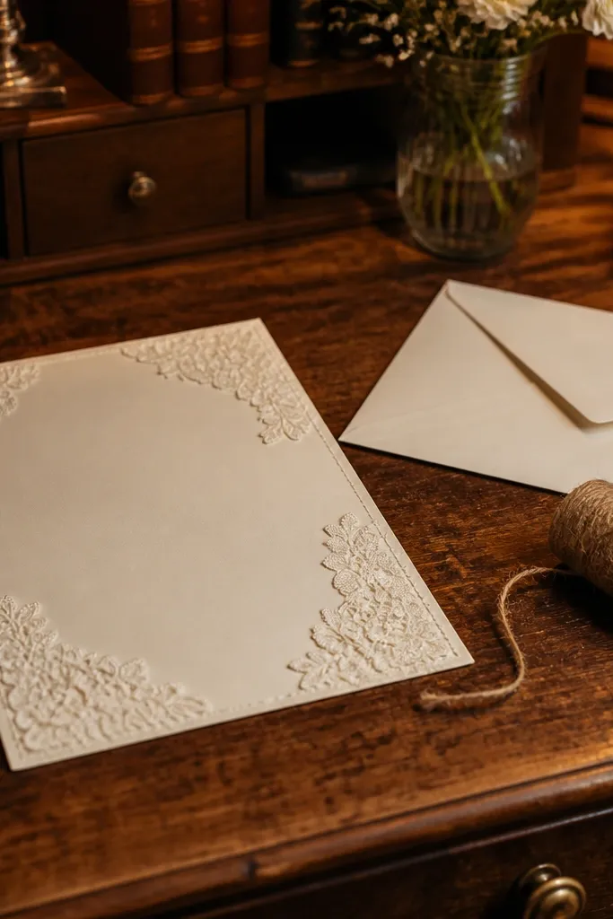
This is the “paper lover” template. An ivory base with lace border corners gives you that invitation-on-parchment vibe, and the motion is gentle — usually a fade-in of the border and then a slow text reveal. It keeps the layout uncluttered, so names and event details stay readable even when viewed in a messaging app preview. It suits classic weddings, vintage themes, and couples using black, navy, or deep green ink on cream paper. The best use is a clean save-the-date or ceremony invite where you want the design to feel intimate rather than flashy.
Start by choosing a photo that matches the lace tone — avoid anything neon or overly saturated. Then set your names and event type as the first lines and keep the rest of the text in one tidy block. Next, if the template has an option for border opacity, lower it slightly so it doesn’t compete with the typography. Export at 1080p and keep it around 8-12 seconds.
If your venue has a lot of punctuation (suite numbers, building names), simplify it for the first invite and include full details in the RSVP page.
Avoid adding extra decorative elements like extra icons — the lace border already does the styling.
9. Terrace Tiles RSVP Grid
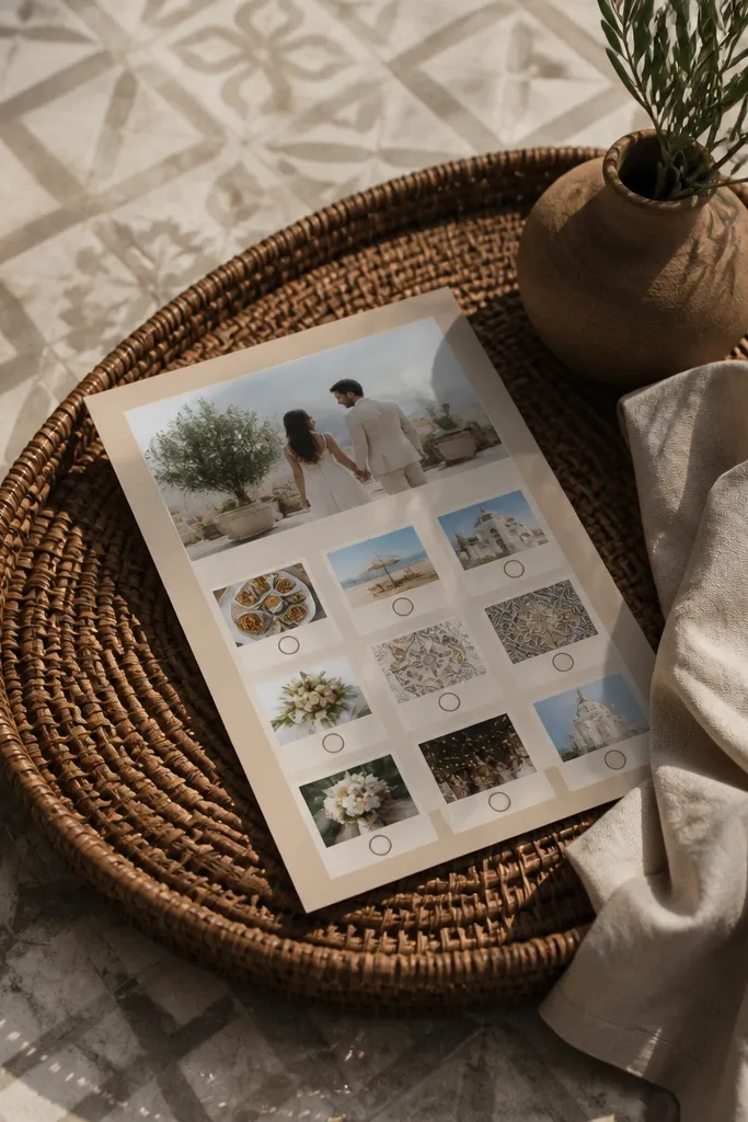
This template is for couples who want a modern travel vibe. A muted tile-pattern background nods to architecture without looking touristy, and the layout uses a grid so guests can scan fast. Motion is minimal, usually a grid slide or fade that keeps everything aligned. It’s great for destination weddings, city venues, and places with a strong design aesthetic. The grid layout also handles practical details well, so you can include dress code or “arrival time” without turning the invite into a wall of text.
Start by setting a color palette that matches your wedding stationery — pick one accent color and keep the rest neutral. Then replace the grid fields with your exact info and keep each line short. Finally, export at 1080p and test the video on your phone screen brightness before you share it broadly. If the template includes an RSVP code or link field, place it in the lowest grid cell so it doesn’t steal attention from the date.
Use a single accent color for the link or RSVP button area, not multiple colors.
Skip templates where the grid lines are bright — they can overwhelm the typography in compressed video.
10. Rose Quartz Soft Focus
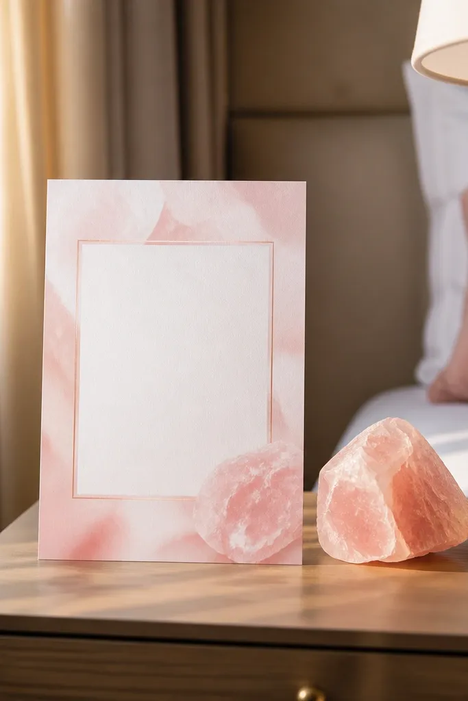
This one looks good even when your photo isn’t perfect. The soft-focus background uses rose quartz tones and gentle blur shapes, so the invite feels romantic and modern at the same time. Motion typically involves a slow gradient shift and a fade-in of text, which looks smooth and premium. It suits weddings with blush, pink, and neutral florals, and it works for bridesmaid proposals or engagement party invites too. If you’re sharing from a phone, the blurred background keeps the text readable in different lighting.
Start by using a portrait photo or a close-up of flowers, then reduce contrast slightly so it blends with the soft background. Next, place names at the center and keep the date line short to prevent wrapping. Finally, export at 1080p and keep the video duration between 7 and 10 seconds. If there’s a background intensity slider, keep it low enough that the text stays the sharpest element.
Turn down photo sharpening if the template has it — harsh edges look weird against blur backgrounds.
Don’t use high-contrast black-and-white photos here — the soft pink blur will fight the tone.
11. Forest Green Envelope Press
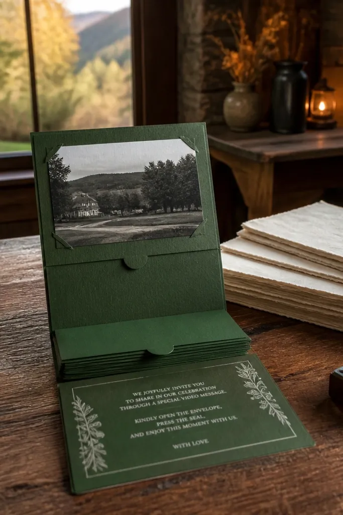
This template mimics the feel of an envelope press stamp. The forest green background has a paper texture that looks better than flat color, and the motion is a slow “stamp reveal” that brings the names into focus. White stamped text reads cleanly, so it’s practical for real wedding details. It’s a great fit for fall weddings, woodland ceremonies, and couples using green ink or deep olive accents. The design stays grounded and serious without feeling heavy.
Start by selecting a photo with muted greens or neutral tones, then add a slight vignette if the editor allows it. Next, replace the name line and date line and keep them centered to match the stamp look. Finally, export at 1080p and keep the motion subtle — let the paper texture do the work. If you have an RSVP deadline, put it on the same line as the RSVP link so guests don’t hunt for it.
Quick tipUse a single font family if the template allows it — stamped styles read cleaner with fewer typefaces.
Skip thisAvoid bright neon accent colors on top of forest green — they look like stickers, not stationery.
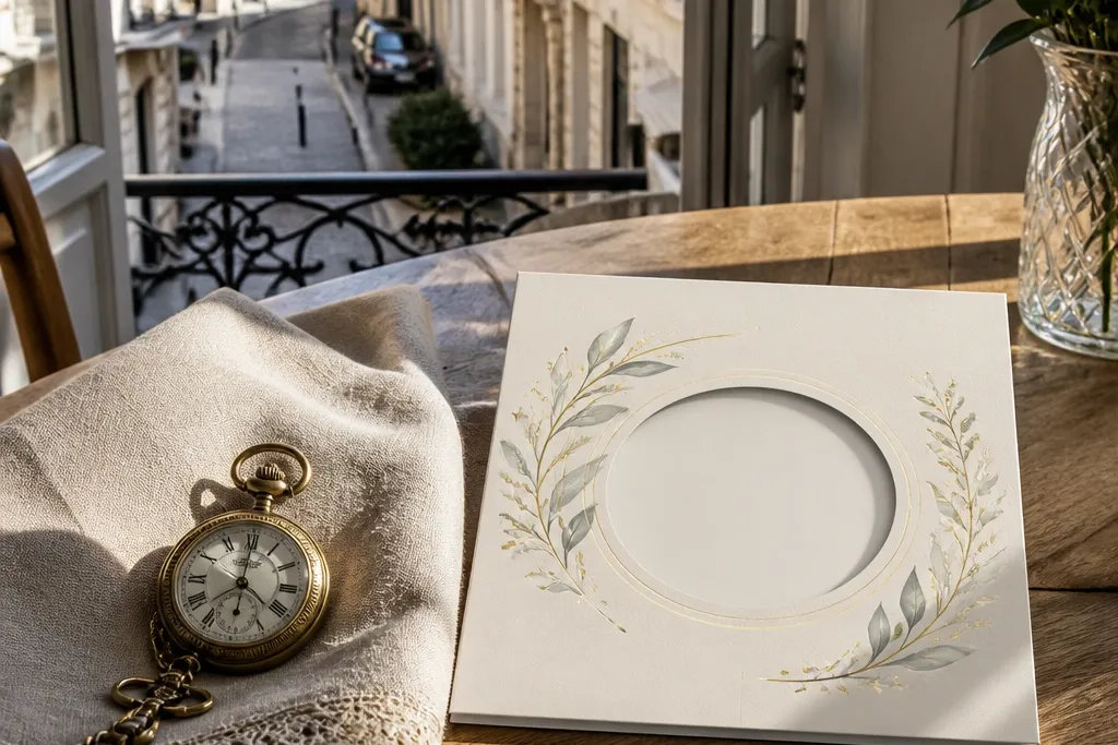
12. Cream Paper Cut-Out Frame
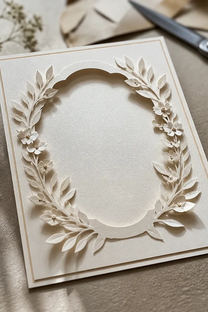
This template looks like layered paper you’d physically hold. A cream base plus a cut-out frame gives dimension, while the calligraphy-style name line brings the personality. Motion is usually a layered slide where the frame appears first, then the photo, then the date. It’s a strong choice for couples who want handcrafted aesthetics without using heavy animations. It photographs well because the layers create shadow depth, and it stays readable on phone screens because the text sits on a clean light panel.
Start by choosing a photo with soft edges — florals or a portrait with a light background works best. Then replace the calligraphy name text and keep the date as a smaller, simple sans line. Next, place location details in the bottom panel and avoid long addresses. Export at 1080p and keep it 8-12 seconds so the layering sequence feels intentional, not drawn out.
Quick tipIf the template uses a drop shadow under the frame, keep it subtle so it doesn’t blur during compression.
Skip thisDon’t add extra stickers or icons. The cut-out frame already gives you the “craft” look.
13. Sunlit Citrus Wedding Card
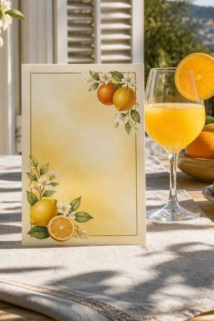
This template is bright, clean, and surprisingly classy. A warm yellow gradient background and small citrus illustrations give a fresh feel without turning into a summer carnival. Motion is a gentle drift of the citrus elements, while your text fades in sharply. It fits outdoor weddings, brunch receptions, and couples using yellow, gold, or soft white stationery. The layout is friendly for short event details, and it looks great in daylight photos because the colors don’t fight the light.
Start by picking a photo with warm tones — lemonade-colored sunsets or golden hour portraits. Then set your names in the center and keep the date line to one short line. Next, add venue and time in the lower text block, and keep RSVP details for the second screen if the template has one. Export at 1080p and test on a phone in bright light so the yellow doesn’t wash out your text.
Quick tipChoose near-black text for maximum contrast against yellow gradients.
Skip thisSkip templates that use white text on bright yellow backgrounds — they often look washed out after upload.
14. Slate + Chalk Timeline
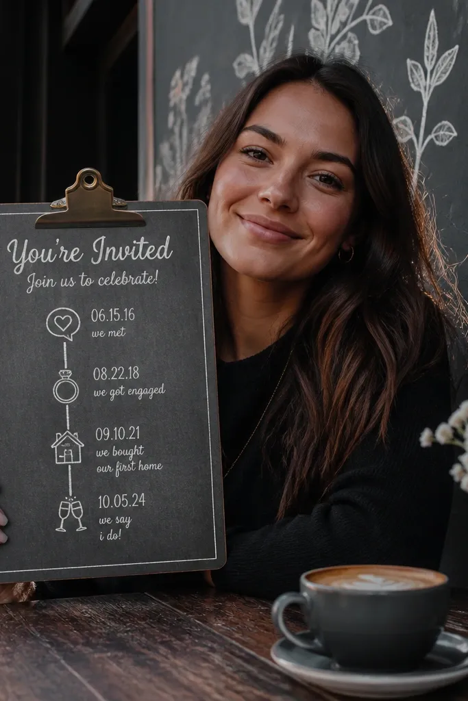
This template gives a casual-yet-stylish “chalkboard timeline” feel. Your invitation information appears along a clean line path, so guests see what matters in order: names, ceremony, reception, then location. Motion is typically a line draw effect that follows the timeline, which looks good without turning chaotic. It’s perfect for backyard weddings, weekend celebrations, and couples who want guests to feel oriented fast. The slate background also hides minor compression artifacts, so the video still looks solid when shared through social apps.
Start by entering your timeline events in a strict order and keep each line short. Then replace the names and date, and choose one clear photo that matches the mood — greenery, string lights, or a portrait in warm indoor light. Finally, export at 1080p and keep the duration around 10-12 seconds so the timeline finishes before people lose interest. If the template has a “chalk dust” effect, keep it light so it doesn’t cover text.
Limit to three timeline points on the first invite screen to keep the draw effect readable.
Don’t use long venue addresses in the chalk font — it becomes unreadable quickly.
15. Pearl Grey Minimal Foil
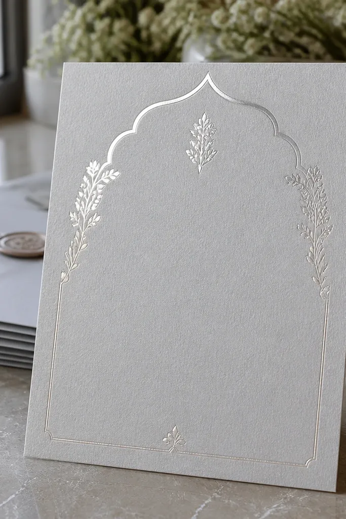
This one is quiet luxury. Pearl grey gives a refined neutral backdrop, and subtle foil highlights catch light in the motion without blasting the screen. Text stays centered and crisp, with a layout that looks like modern printed stationery. It’s a strong pick for couples who want elegance without florals or heavy patterns. It also plays nicely with monochrome photos and minimalist wedding palettes — think black, silver, and soft grey. If you’re sending invites to guests who prefer straightforward details, this template keeps everything clear while still looking styled.
Start by choosing a photo with soft contrast and place it in the template’s main panel area. Then set your names in the largest text and keep the date/time block tight so it doesn’t wrap. Next, adjust the foil highlight intensity to a low-medium level if there’s a slider. Export at 1080p and keep the video between 7 and 10 seconds so the highlights don’t feel repetitive.
Use one accent color for the RSVP link or button area, then keep everything else black or near-black.
Avoid busy patterned photos — the pearl grey background is calm, and loud images fight it.