
1. Marigold Border With Satvik Menu Strip
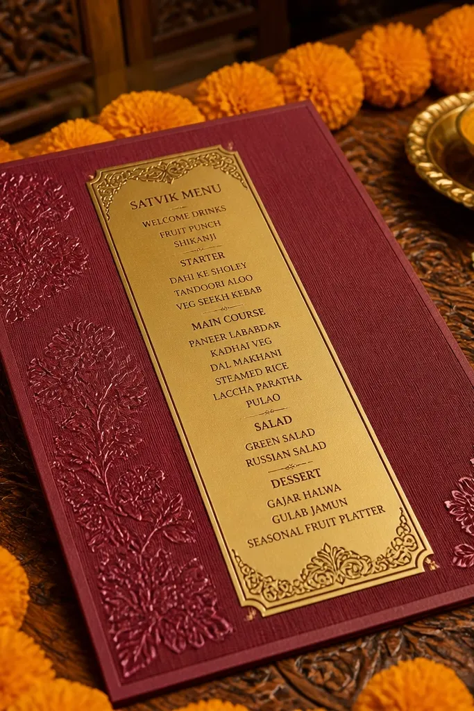
This design is all about warm color cues. A deep maroon background with a marigold-style border frames a narrow gold strip where you list the food items. The strip format keeps the menu readable even when the invite is photographed at an angle. It works well for mehendi and sangeet because the colors feel festive, and the food strip creates a clear “what’s served” moment. For Hindu weddings, satvik wording feels on-theme, especially when you keep the items short and recognizable.
Start with a portrait card in deep maroon, then add a marigold border that sits 8-12 mm from the edges. Next, create a gold rectangle band about 35-45% of the card width and place “Food and Drink” as a small header inside it. Add 2-4 lines like “Satvik starters” and “Lassi and seasonal sherbet,” keeping each line under 5-6 words. Finally, put Shubh Muhurat above the border so the invite still reads like a formal invitation, not a party flyer.
Use one drink highlight only. It keeps the strip clean and prevents the type from getting tiny.
Don’t list ten items in the strip — the invitation will look crowded and the menu will blur in photos.
2. Temple Arch Invite With Prasad Highlight
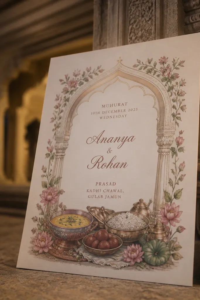
Temple arches look beautiful because they naturally guide the eye to the center. Put the couple names inside the arch, then add a small “Prasad” line under the muhurat. This is a strong option for wedding day invites where you want formality, but you still want the food story to show. The prasad highlight reads personal and spiritual, and it photographs well because it sits near the focal text. It suits families who want a traditional aesthetic without turning the card into a wall of symbols.
Choose a cream or ivory base, then draw a temple arch in gold foiled lines or a gold-toned print effect. Step two is typography placement: names go dead center, muhurat goes just below, and “Prasad and fruit drinks” sits in a smaller box. Keep the prasad line to one sentence, like “Prasad and fruit drinks will be served during the ceremony.” Finally, add the venue address in clean sans-serif text at the bottom for readability.
If you’re printing, use a slightly textured paper so the gold arch catches light without glare.
Avoid heavy script for the venue address. It should be fast to read.
3. Banana Leaf Green Panel With Chaat Station Line
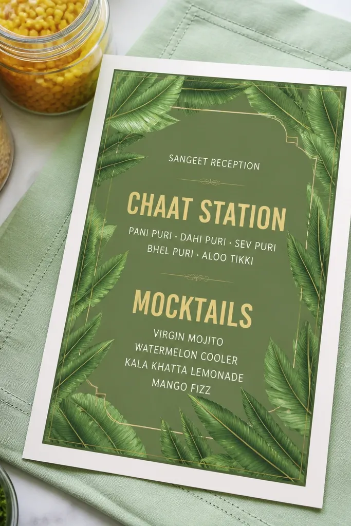
Banana leaf graphics instantly signal food and freshness. This design uses a green panel (not the whole card) so the background stays calm while the banana leaf element frames the food text. Put “Chaat Station” and “Mocktails” in a bold header style so guests instantly understand the vibe. It fits sangeet and reception cards because it feels lively, and it works for bilingual wording since the panel keeps the layout structured. If your family loves street-food style snacks but wants it to look classy, this is the cleanest way to do it.
Start with a light neutral background and place a banana leaf panel on the lower half of the card. Next, add a thick green header strip on top of the leaf where you write “Food and Drink.” Then list 2 lines: “Chaat station” and “Mocktails and flavored water.” Finish by placing RSVP and venue details above the panel so the food element doesn’t steal the scan.
Use one drink category word like “mocktails” or “flavored water,” not both. One reads sharper.
Don’t use too many leaf colors. Keep it to 2 greens plus gold accents so it stays photogenic.
4. Mehendi Pastel Card With Rose Milk and Falooda Block
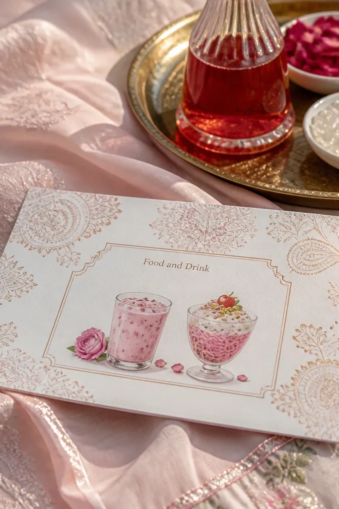
Pastel mehendi patterns make invitations look soft and romantic, especially in daylight photos. This design adds a boxed “Food and Drink” block with two dessert/drink highlights: rose milk and falooda. That pair works because it feels Indian, it’s recognizable, and it gives you a clear photo-ready detail. Use this style for mehendi night invites where guests expect sweet drinks and a relaxed schedule. It also fits couples who want a feminine look without heavy gold or loud reds.
Quick tipChoose dark charcoal or deep plum text for legibility against pastels.
Pick a pastel base like powder pink or pale peach, then add a subtle mehendi motif in the corners only. Step two is the boxed block: keep it 60-70% of the card width, centered, with a thin border and high-contrast text. Add a header “Food and Drink” and write “Rose milk” and “Falooda” as two separate lines. Finally, place the time and venue on the top third so the invitation remains readable after the pastel background.
Skip thisAvoid tiny decorative fonts. Pastels already add softness; small text makes it messy.
5. Black and Gold Modern Invite With Signature Mocktail Line
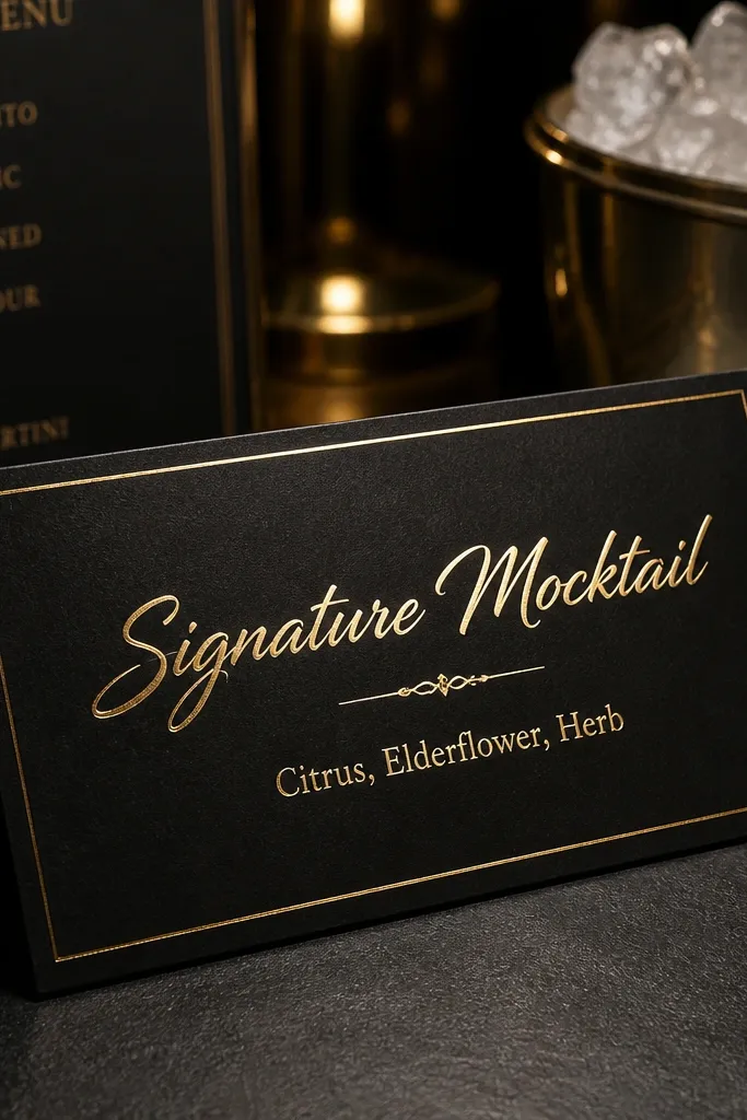
Modern black and gold looks high-end and photographs with sharp contrast. The trick here is to keep the food and drink wording to one signature line so the design stays clean. Use a sleek header like “Signature Mocktail” and add your flavor in one short phrase. This is a great choice for reception cards when you want guests to feel it’s an upscale evening with curated drinks. Hindu weddings can still look modern — keep the ritual lines formal, then let the drink line be the personality.
Quick tipIf you’re sending a digital version, keep the gold elements minimal so the image doesn’t look washed out.
Start with a matte black base and add gold typography or thin gold lines. Next, create a single horizontal strip under the muhurat for “Food and Drink.” Put “Signature mocktail — [your flavor]” as one line and add one more drink category line like “Seasonal mocktails and mocktail mocktails? — no, keep it clean: ”Water and sherbet." Finally, add venue address in a smaller, clean font at the bottom.
Skip thisDon’t add multiple menu items. Modern cards look best with one drink highlight.
6. Red Maroon Silk Texture Card With Double Lassi Header
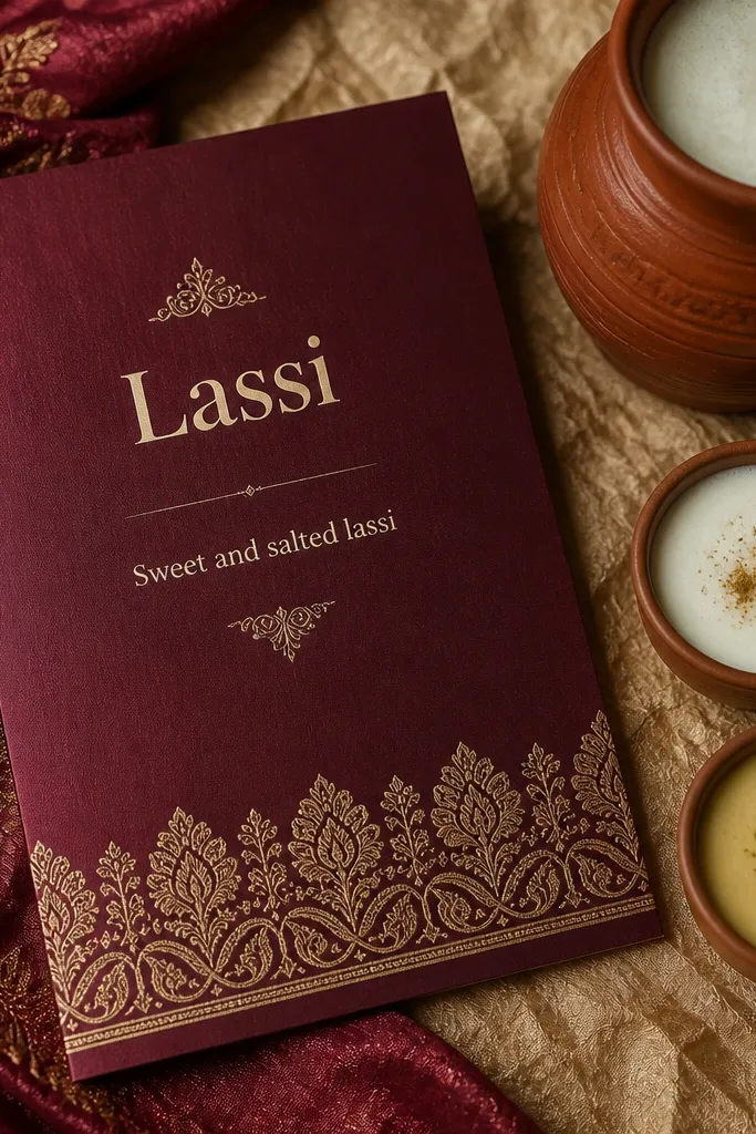
Silk-texture backgrounds make printed cards feel expensive, and maroon is perfect for Hindu wedding palettes. This design uses a strong “Lassi” header and then a short line about variety, like “Sweet and salted lassi.” It gives you a clear food theme without clutter. The best part is how quickly guests understand what to expect — dairy drinks are memorable and photograph well when you later share menu photos. Use it for wedding day invites when you want tradition with comfort-food warmth.
Quick tipUse slightly larger line spacing in the food block so the text stays crisp in close-up photos.
Choose a maroon base with a subtle silk-like texture effect. Next, place “Food and Drink” as a large header near the center, then add a “Lassi” line in a thicker font weight. Add 1-2 supporting lines like “Satvik starters” and “Seasonal sherbet.” Finish by keeping the muhurat and venue in the top third so the food block doesn’t push them out of scan range.
Skip thisAvoid gradients behind the text. They reduce readability and ruin the sharp look.
7. Lotus Stem Corner Design With Fruit Drink Mention
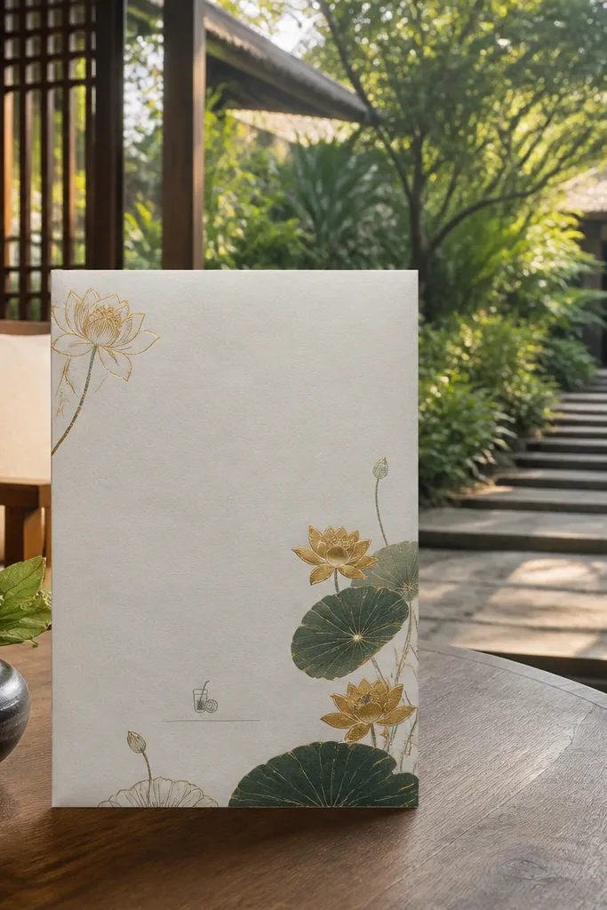
Corner lotus stems keep the invite airy while still feeling spiritual. This is a smart option if you want food and drink wording to look like an intentional detail rather than a loud theme. Put fruit drink wording near the bottom so it doesn’t fight with the names and muhurat. Lotus corner art also keeps the card clean for bilingual formatting because you have empty space. It suits smaller family functions and invitation sets where you want the design to stay elegant and not overcrowded.
Start with a white or warm cream base. Add lotus stem art only in the top corners, leaving a big center space for names. Next, create a small “Food and Drink” label and put “Fruit drinks and welcome refreshments” under it. Finally, add venue and RSVP in a single column at the bottom so the layout stays balanced.
Keep the food line to one sentence. One sentence reads premium on minimal cards.
Don’t place lotus art behind text. Keep it in corners only.
8. Sangeet Confetti Border With Chilled Mocktail Time
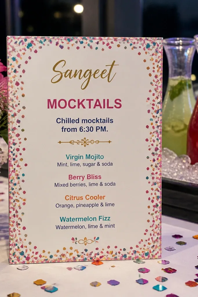
Confetti borders signal sangeet energy instantly. This design uses a playful border but keeps the food and drink section strict and readable, including a time cue for when guests can grab drinks. Add a line like “Chilled mocktails from 6:30 PM” — it feels practical and guests love it. This style is photogenic because bright borders pop against skin tones and colorful outfits. It’s best for evening events where you can build excitement around refreshments.
Pick a base color like off-white or pastel yellow to avoid visual noise. Add a confetti border along the edges, then leave a clean center panel for names and event time. Next, put “Food and Drink” in a bold header and write your mocktail line with a specific start time. Finally, place venue address in small text below the mocktail line so it doesn’t get buried under the border.
Use one accent color for the food header to keep it consistent with the confetti palette.
Avoid listing multiple drink types. The time line does the work.
9. Ganesha Motif With Sweet Dish and Tea Line
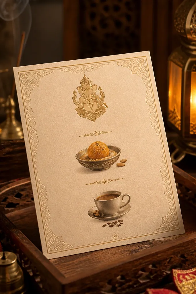
A Ganesha motif gives the invite a clear Hindu anchor, and that matters when you add food details — people expect a blessing tone. This design places the Ganesha illustration near the top and keeps the food and drink section centered with two lines: one sweet dish and one tea/coffee line. That keeps it warm and guest-friendly without turning into a menu card. It works well for wedding day and reception invites when you want tradition plus comfort. For families who like classic wording, this is a clean format.
Choose a cream or light beige base and place a small Ganesha illustration at the top center. Next, add a “Food and Drink” header in the middle with a decorative divider line. Write two lines: “Sweet dish” and “Tea, coffee, and welcome beverages.” Finally, put the muhurat and venue in a clear block above or below the divider so scanning stays easy.
Use dark green or espresso-brown text for a traditional feel that prints cleanly.
Don’t add more than two food lines. A third line makes the center feel cramped.
10. Champagne Gold Frame With Dinner and Dessert Panel
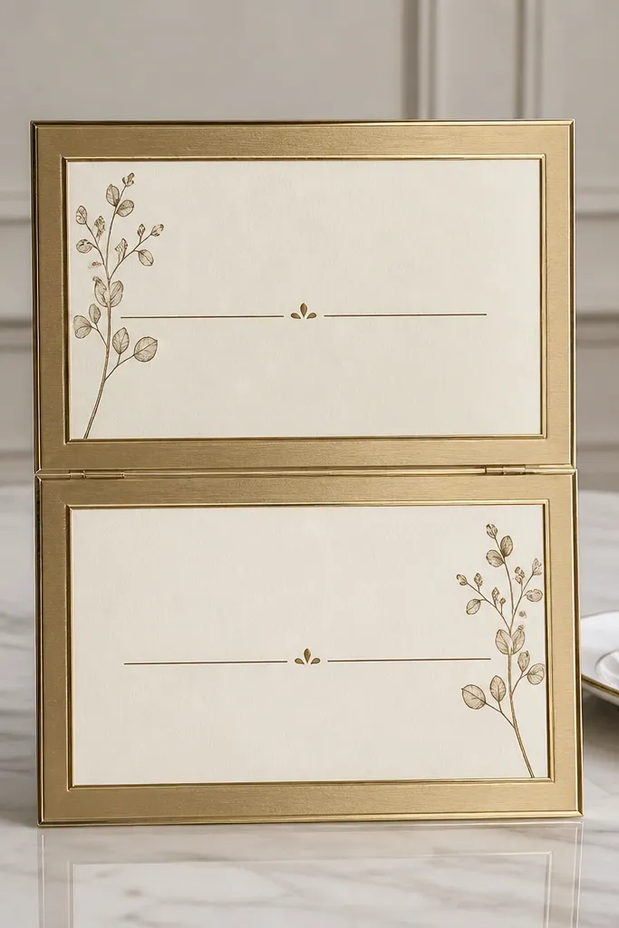
A champagne gold frame makes the card look like a formal event ticket. The food-and-drink detail here is split into two tidy panels: “Dinner” and “Dessert and drinks.” This is the best structure for couples who want to be specific but not list a full menu. It reads elegant in photos because the panels align perfectly with the frame. Use it for reception invites where dinner is the main expectation and dessert plus drinks are the payoff. It also works for larger guest lists because the layout stays consistent.
Quick tipKeep the boxes the same height across your whole invitation set so the series looks designed.
Start with a neutral base like ivory and add a champagne gold border with a thin inner line. Next, divide the center into two stacked boxes with equal width. Put “Dinner” in the first box and “Dessert and drinks” in the second, then add 1-2 item phrases under each. Finish by placing RSVP and venue in the bottom strip aligned with the outer frame.
Skip thisAvoid thick borders with busy patterns inside. The frame should do the work.
11. Nimbu Pani Lime Accent Invite With Citrus Typography
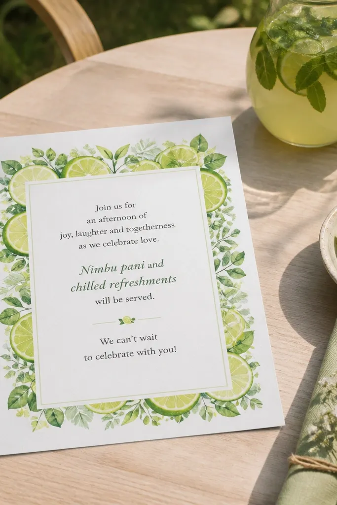
If you want food and drink invitations that feel fresh and summer-ready, this is the one. Lime green accents around a clean text block make the nimbu pani line look playful without being childish. Put “Nimbu pani and chilled refreshments” under the muhurat or event time. Citrus themes photograph well because they add color contrast to neutral backgrounds and to guest outfits. Use it for outdoor venues, garden receptions, and daytime functions where light makes everything look better.
Quick tipPrint this on slightly matte paper. Gloss makes lime accents look streaky in photos.
Use an ivory base and add lime green accents as thin lines only, not full patterns. Next, create a small “Food and Drink” box with lime border and dark text. Write “Nimbu pani and chilled refreshments” as one line, then add one extra food phrase like “Light snacks.” Finally, keep the venue address in plain black text for fast reading.
Skip thisAvoid orange or neon greens. Lime should look clean and natural.
12. Blue and White Ceramic Tile Pattern With Mocktail Pairing
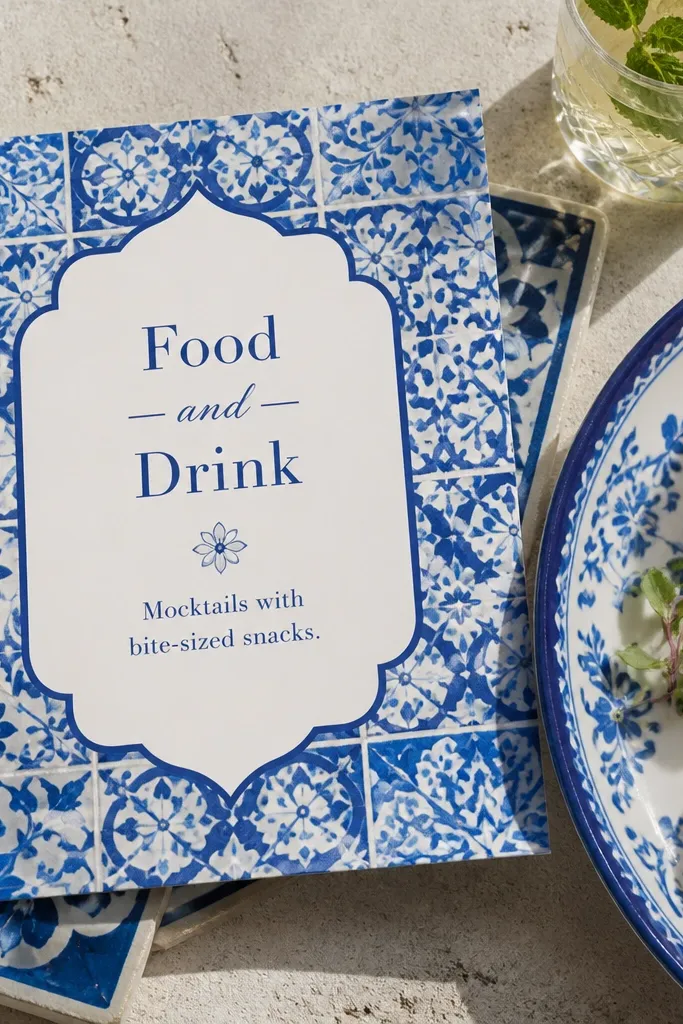
Ceramic tile patterns feel classic and photogenic because they create texture without clutter. This design uses a blue-and-white tile motif in the background, then keeps the food and drink wording in a clean white panel on top. Add a mocktail pairing line like “Mocktails with bite-sized snacks.” It’s a strong fit for reception invites where you want a cool, modern look. Hindu weddings can look crisp in blue palettes, and the food panel keeps it from becoming too decorative.
Pick a soft blue-and-white tile background, then place a white rectangular text panel in the center. Next, add “Food and Drink” as a header on the panel and include one pairing line plus a drink highlight. Keep text aligned left for readability and add venue details below the panel. Finally, match the RSVP font color to the blue so the card feels cohesive.
Limit the tile pattern to the background only. Foreground text should sit on a solid panel.
Don’t put food text directly on the tile pattern. It kills legibility.
13. Terracotta Clay Look With Roti and Chutney Mention
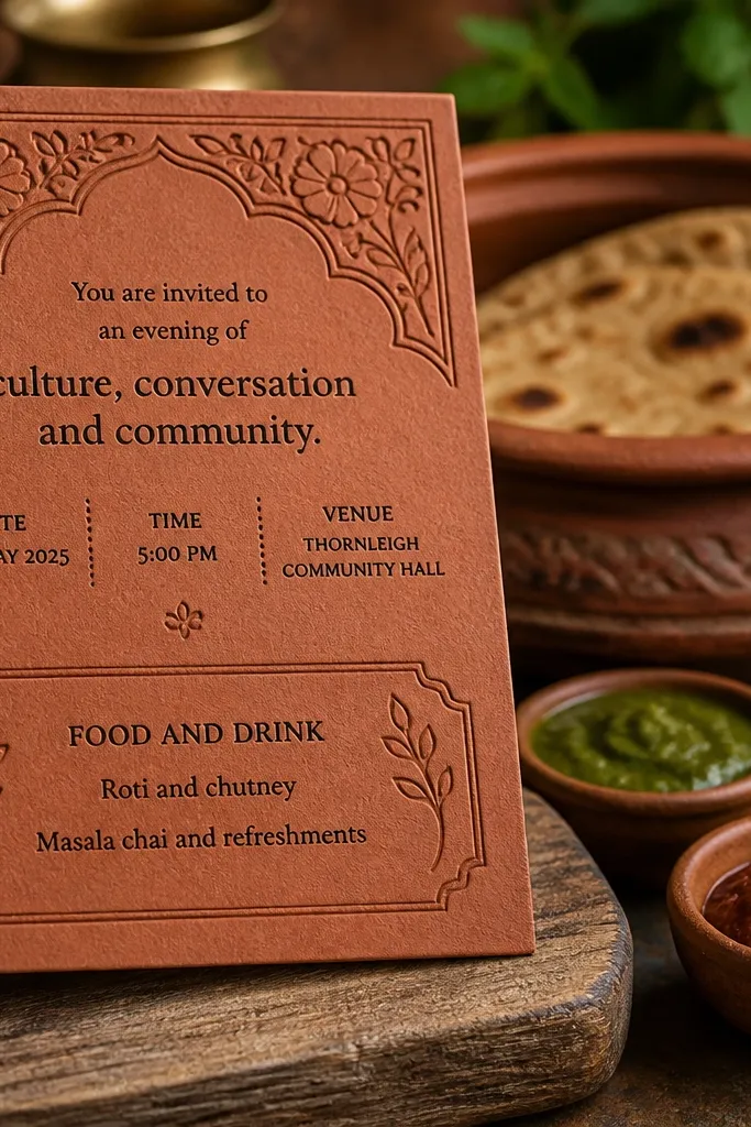
Terracotta clay textures look handcrafted and earthy, and they make food invitations feel grounded. This design uses a clay look background with a neat “Food and Drink” panel that mentions “Roti and chutney” alongside a beverage line. It’s perfect for mehendi and reception invites when you want comfort-food energy. The earthy palette also suits golden evening photos. If your menu leans toward North Indian or home-style dishes, this format makes it feel intentional.
Choose a terracotta base with a grainy clay texture. Next, add a cream or off-white panel in the center where the menu wording sits. Use two lines: “Roti and chutney” and “Lassi, sherbet, and welcome drinks.” Finally, keep the muhurat and venue in a separate section above the panel so the food block doesn’t dominate the invite.
Use slightly thicker font weights for the food panel so it prints sharp on textured backgrounds.
Avoid adding too many decorative icons. Clay backgrounds already have texture.
14. Emerald Green Frame With Saffron Kesar Milk Line
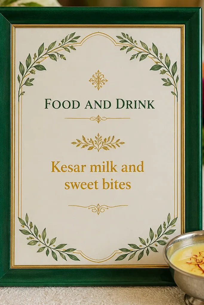
Emerald frames look rich and modern, and they make warm saffron text feel like a real highlight. Put “Kesar milk and sweet bites” under the Food and Drink header. This works beautifully for Hindu weddings because kesar milk feels ceremonial and comforting. It also photographs well because the green and saffron contrast reads instantly. Choose it for wedding day invites when you want a polished, premium look that still feels traditional through one clear sweet-drink detail.
Start with a deep cream background and build an emerald frame using a thick outer border plus a thin inner line. Next, place “Food and Drink” in the frame center and write “Kesar milk and sweet bites” as one compact line. Add 1 more small line for timing like “Served during ceremony breaks.” Finally, position the muhurat at the top center and the venue at the bottom so the frame doesn’t block scan flow.
Saffron text should be warm, not yellow. Choose a deeper orange-gold tone for printing.
Don’t use multiple bright colors. This design needs green and saffron only.
15. Ivory Minimal With Gold Foil Divider and Watercolor Rose Water
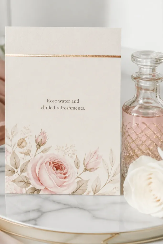
Minimal invites can still carry food and drink details if you give them a clear structure. This design uses a gold foil divider line and a watercolor rose accent near the bottom panel. Put “Rose water and chilled refreshments” under a short Food and Drink header. It feels classy because it doesn’t try to pack a full menu into the design. This works for couples who want a clean, modern wedding invitation set but still want the guest to know what they’ll be offered. The rose accent also makes the card look soft and aesthetic in photos.
Quick tipIf you’re printing, foil divider lines look best on matte paper. Gloss can make gold look harsh.
Use an ivory base with lots of white space, then add a gold foil divider line across the center. Next, place the Food and Drink header above the line and the rose water line below it in a smaller font. Add venue details under the bottom panel in plain text. Finally, keep the decorative rose accent confined to one corner so it doesn’t distract from the important lines.
Skip thisAvoid long menu lists. Minimal cards need one or two drink cues.
16. Traditional Red and Gold With Haldi Color Splash Food Block
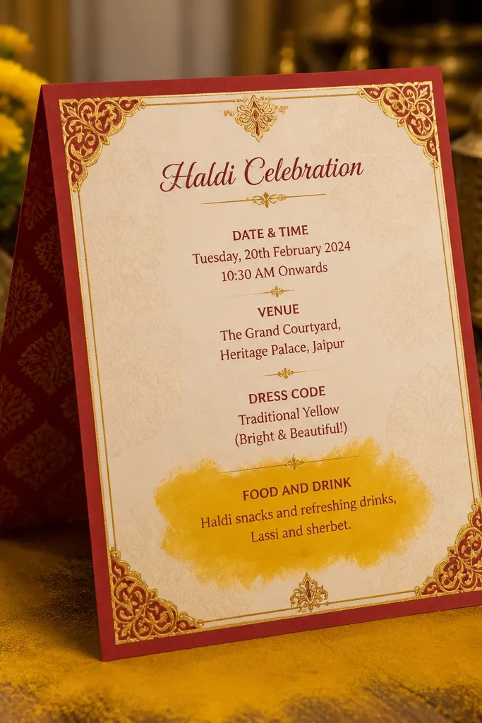
Haldi color splashes add energy and make the invitation feel alive. This design keeps a traditional red-and-gold base but adds a controlled haldi splash behind the Food and Drink block. Put “Haldi snacks and refreshing drinks” as the main line, then add one more item like “Lassi and sherbet.” The splash is photogenic because it creates soft stains of color without covering the text. It suits mehendi and haldi night invites where people expect food and drink during the fun.
Start with a red-and-gold traditional base, then add a haldi splash graphic only in the area behind the food block. Next, create a white or cream rectangle for the text so the splash stays decorative, not readable. Write your food line and one drink highlight inside the rectangle. Finally, keep the muhurat and venue in clean text above the splash area so scanning stays simple.
Use a light rectangle behind the text even if the background is dark. It prevents readability issues.
Don’t let the splash touch the font edges. Add padding so letters stay crisp.
17. Reception Night Invite With Candlelight Tea and Dessert Corner
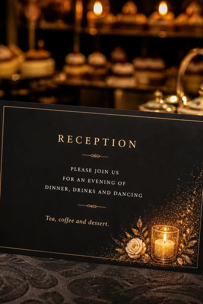
For a reception that feels like a night event, dark invites look dramatic and cinematic. This design uses a dark base with a small candlelight graphic near a corner panel where you write “Tea, coffee and dessert.” It’s a smart way to include food and drink info without making the whole card busy. The corner format makes the card look designed in close-ups, especially when guests hold it near warm lights. It suits reception invites where dinner is assumed but dessert and evening drinks are the highlight.
Quick tipUse warm white text, not pure white, for a softer night look.
Choose a deep navy or charcoal base, then add gold or warm cream typography. Next, place a small corner panel (about 25-30% of the card width) with the Food and Drink header and the tea/dessert line. Keep the muhurat and venue in the center area with high-contrast text. Finally, add RSVP at the bottom with a simple border line so the card feels structured.
Skip thisAvoid bright multi-color food graphics. Dark invites need restraint.
18. Temple Bells and Sweetmeats Wording With Date Ribbon
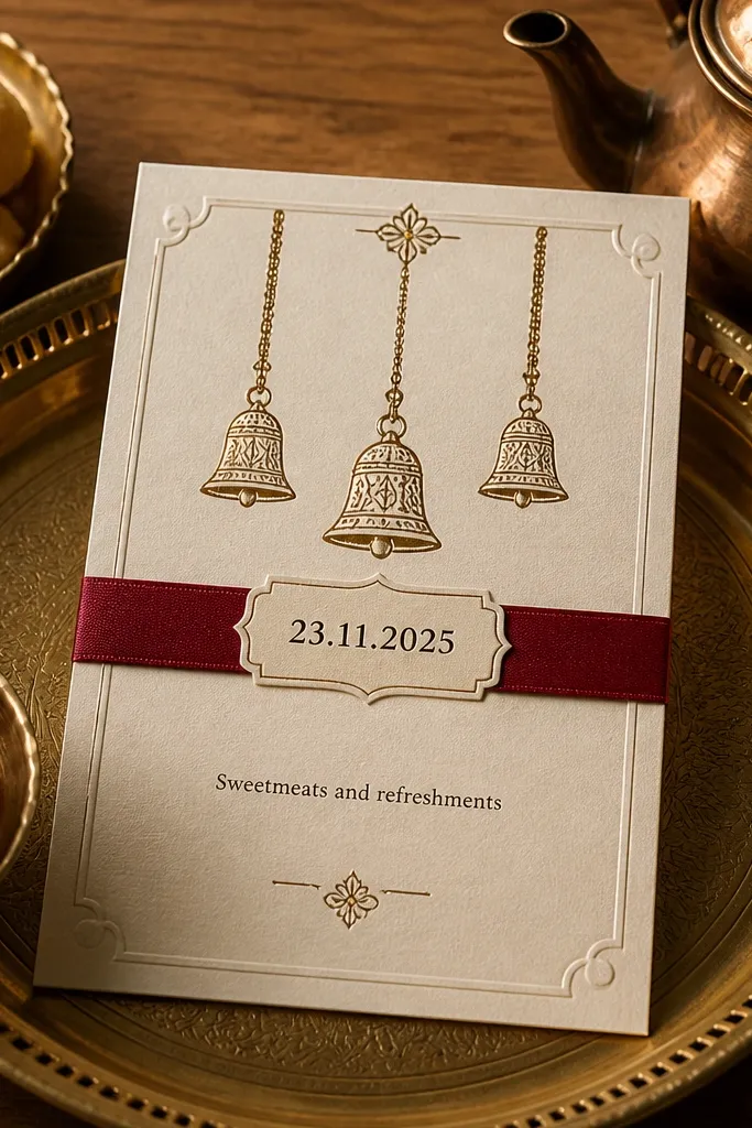
Temple bells motifs immediately connect food and celebration. This design uses a date ribbon that sits across the card, while the food and drink line sits just below it as “Sweetmeats and refreshments.” The ribbon makes the date feel like a centerpiece, and food details stay close enough to feel like part of the event. It’s a good option for wedding invitations where the date and muhurat are the most important details, but you still want guests to anticipate sweets. The bells also photograph nicely because they add small highlights without taking over the typography.
Quick tipUse a ribbon height that keeps the date fully readable even on WhatsApp crops.
Start with an off-white base and add a date ribbon in gold or maroon across the center. Next, place “Food and Drink” under the ribbon and write “Sweetmeats and refreshments” in a slightly larger font. Add 1-2 short phrases like “Milk-based sweets” and “Tea and coffee” if space allows. Finally, keep the venue address in a plain block at the bottom and use a thin divider line between sections.
Skip thisDon’t stack bells and symbols next to the food text. Keep motifs separate.
19. Gulab Jamun Pink Script With Welcome Drinks Line
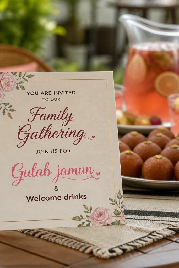
This one is for families who want the invite to feel delicious. A controlled pink script accent for “Gulab jamun” paired with a straightforward “Welcome drinks” line makes the card feel fun but still organized. The best way to keep it from looking messy is to limit decorative typography to one word or one short phrase. This format is especially good for reception and mehendi invites where sweets are a big part of the experience. It also makes your invitation instantly recognizable in a group photo.
Use a neutral base like cream or light tan and add a small pink script accent near the center. Next, create a clean “Food and Drink” block with two lines: “Gulab jamun” and “Welcome drinks and chilled water.” Keep the rest of the text in a simple serif or sans-serif font so the script stays as the highlight. Finally, place venue and RSVP in a tight bottom section so the center stays photo-friendly.
Pick one pink shade that prints well. Too light looks faded; too bright looks harsh.
Avoid using script for every line. One script highlight is enough.
20. Monogram Crest With Dinner Buffet and Mocktail Header
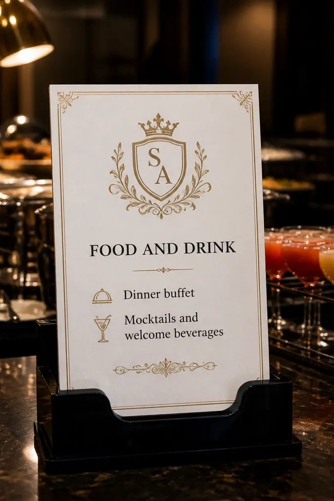
A monogram crest makes the invitation feel like branded stationery, and it gives you a perfect “home” for the food and drink section. This design places a crest at the top, then uses a bold Food and Drink header with two lines: “Dinner buffet” and “Mocktails and welcome beverages.” It’s the best choice for couples who want a clean, modern look but still want guests to know the food plan. The crest adds symmetry, so the card looks balanced even when photographed from the side. It also works great for multi-card sets because you can reuse the same crest across invite, RSVP card, and menu card.
Quick tipReuse the same crest artwork across all stationery. Consistency makes the set look designed, not random.
Start with a monogram crest placement at the top center, then keep the base a solid color like ivory or deep grey. Next, create a central text block with a bold Food and Drink header and exactly two lines underneath. Add “Dinner buffet” as one line and “Mocktails and welcome beverages” as the second. Finally, keep the venue address and RSVP in a bottom strip with a thin border line to keep everything aligned.
Skip thisDon’t put the crest behind the food panel. The crest should frame, not compete.