1. Ivory Card With Thin Gold Border and Three Event Panels
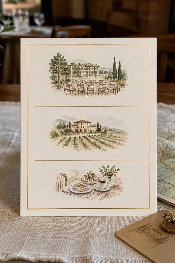
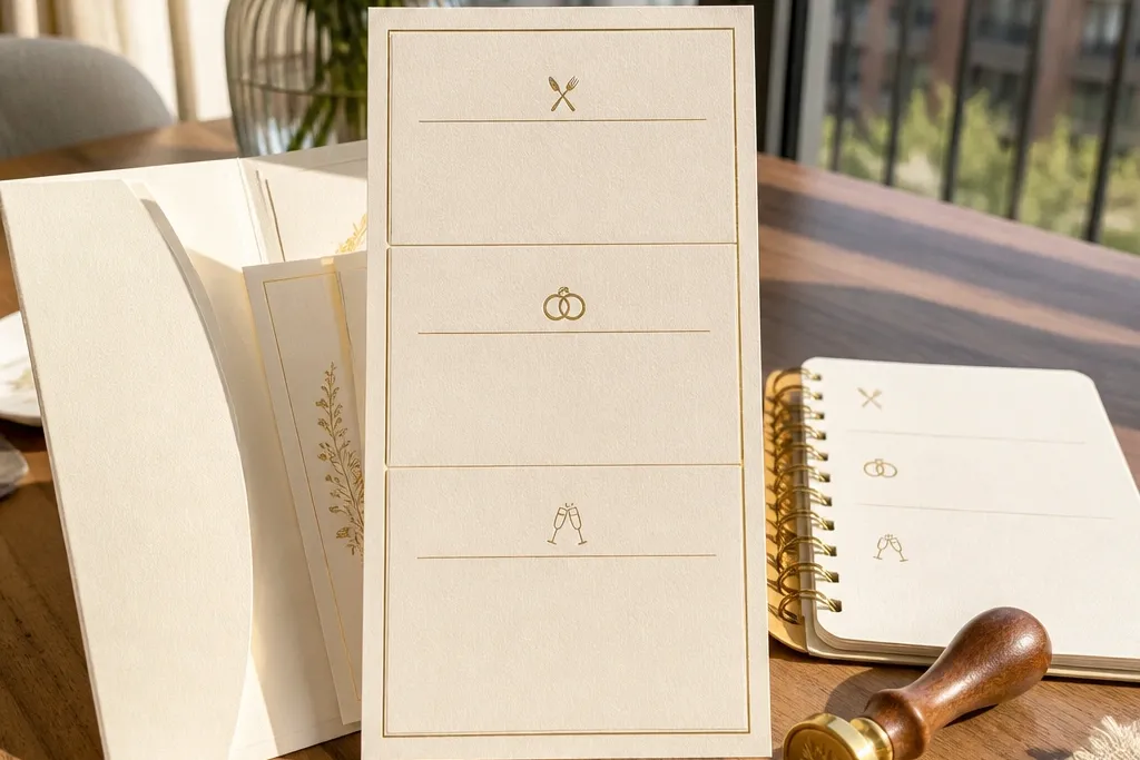
This template is built for a true 3 day flow: it gives you three clear panels so Rehearsal Dinner, Ceremony, and Reception stay in order without crowding. The thin gold border keeps the look refined instead of busy, and it gives your photos a clean frame when guests post it. Because the panels are separated, you can keep each event’s address readable, which matters for people who save the invite on their fridge or share it in a group chat. It’s a strong fit for couples going for classic, understated elegance with minimal illustrations.
Start by typing your three event blocks in order, keeping titles to one line each. Then paste your addresses into the panel’s address field and use line breaks so the street and city don’t run together. Finally, export at print-ready size and test one print on plain paper before you commit to textured ivory stock.
Quick tipUse a gold ink effect only if your printer handles metallics well; otherwise choose a warm beige/golden tone in a standard color.
Skip thisDon’t cram extra weekend notes into the panels — add them to a small details line instead.
2. Charcoal Minimal Layout With Stacked Weekend Dates
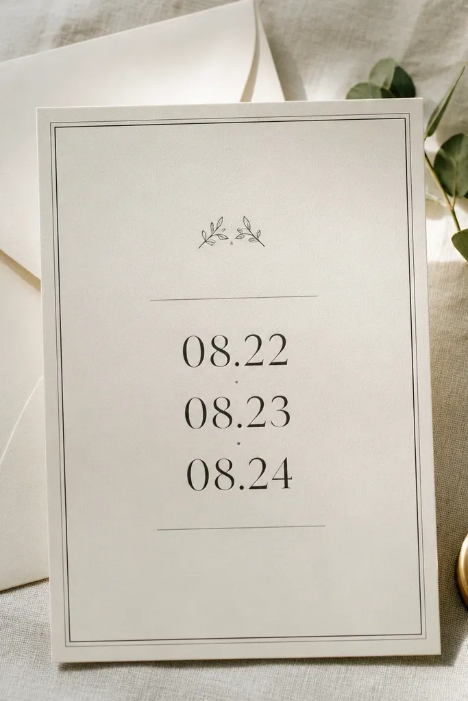
If you want the most legible, modern look, this is it. The design stacks the weekend dates so guests can scan quickly, and the charcoal text reads crisply against a light background. The minimal layout also photographs cleanly on flat lays because there’s no dense artwork competing with your hands, rings, or invitation suite. It fits couples who don’t want floral clutter and prefer a sharp, editorial vibe for a weekend with clear timing.
First, fill the top section with the weekend date range, then place each event title underneath with its own time line. Next, keep addresses short by using a venue name plus street and city only. Finally, choose a matte paper and avoid glossy finishes that make charcoal look blotchy in direct light.
Use a matte black or deep charcoal font weight around medium-bold for the cleanest edges.
Skip tiny script fonts for addresses — they get unreadable fast.
3. Dusty Rose Watercolor Wash With Gold Foil-Style Header
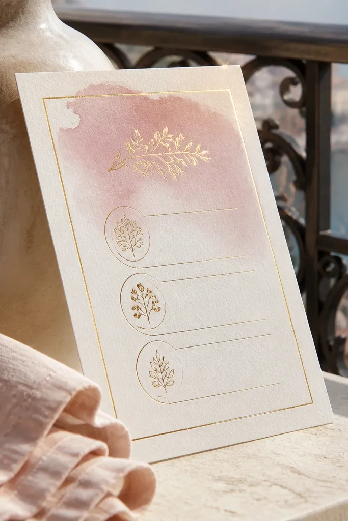
This template leans romantic without going full busy. The watercolor wash sits behind the header and creates depth in photos, while the gold-style title keeps it feeling special. Three event sections are still structured, so you get the practical benefit of a 3 day invitation that doesn’t turn into a wall of text. It’s a great match for spring and early fall weddings, especially if your palette includes blush, rose, or warm neutrals.
Start by placing your main weekend title in the header area, then adjust the event text size so each panel has breathing room. Next, keep your ink colors to the template’s palette so the wash doesn’t fight with extra colors. Finally, print a single copy with the exact paper you plan to use and check that the wash doesn’t look muddy in your lighting.
Quick tipIf your printer struggles with gradients, reduce the watercolor intensity in your design software.
Skip thisDon’t add dark backgrounds behind the text — it kills the softness of the wash.
4. Pressed Flower Frame With Three Corners of Text
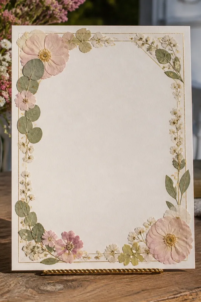
This one looks like a real keepsake. The pressed-flower frame gives you that “handmade” aesthetic while keeping the center clear for event details. The layout places key info in three sections so Rehearsal, Ceremony, and Reception remain separate and easy to follow. It’s perfect for garden venues, rustic-chic weddings, and couples who want soft visuals without losing clarity.
First, keep the event titles inside the three corner blocks and don’t let them spill into the frame. Then add times in the smaller lines under each title, using consistent formatting like 4:30 PM. Finally, print on a lightly textured cardstock so the frame looks intentional rather than flat.
Choose flower accents that match your actual florals — it makes the suite feel planned, not random.
Don’t use bright neon ink colors — the frame will clash.
5. Monogram Crest With Rehearsal Dinner and Ceremony Sections
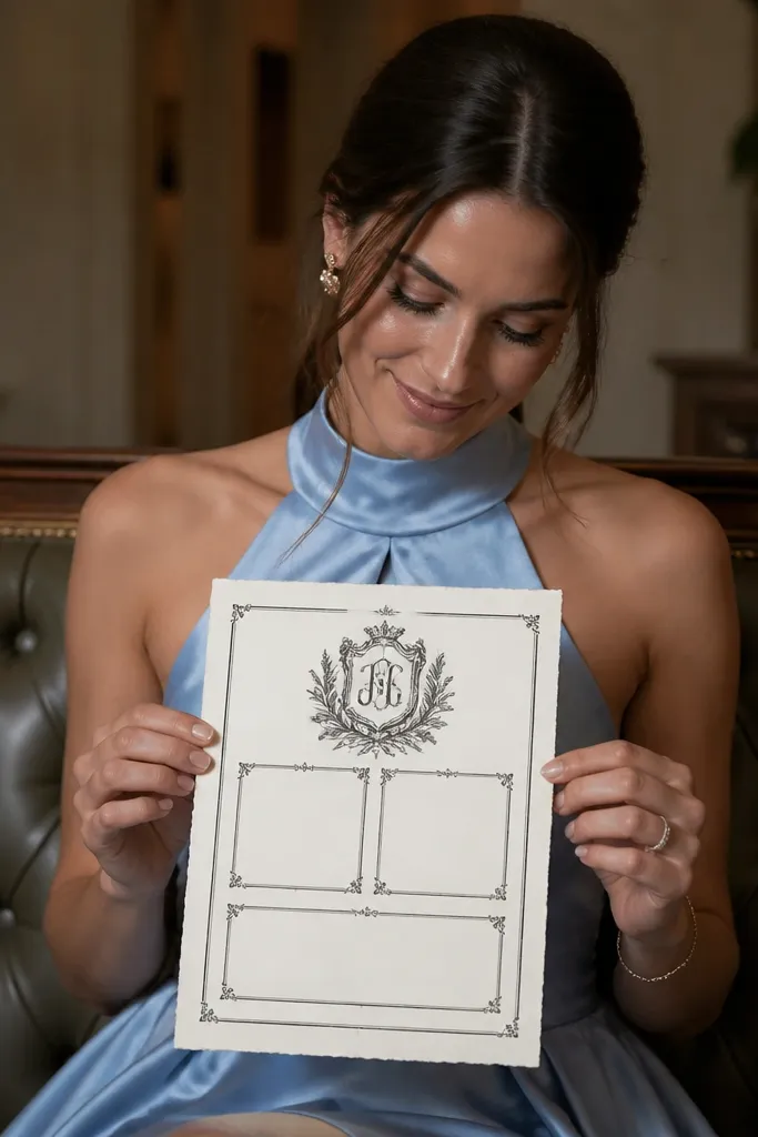
A crest-style monogram instantly makes an invitation feel formal, and this template uses that energy without sacrificing layout. It gives you strong sections for the first two days, then a third block for the reception so the weekend reads in sequence. The crest sits above the text, which helps it look centered and balanced in photos. This is a good pick if you like traditional wedding stationery but want it cleaned up for a modern printer.
Start by typing your monogram letter pair in the crest area, then fill the first section with Rehearsal Dinner details. Next, put Ceremony details in the second section and keep Reception details in the third. Finally, align the address lines to the same left edge across all three sections to keep it crisp.
Use the crest as your one hero element. Keep the rest of the typography simple.
Avoid long venue descriptions in the crest sections — they break the symmetry.
6. Navy Night Sky Background With Star Dot Date Lines
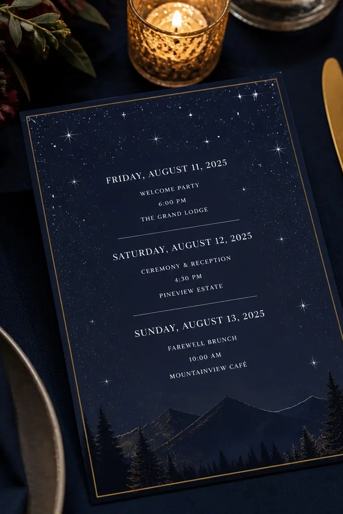
This template looks like wedding night energy. The navy background and star dot accents make the date lines pop, and that contrast helps guests read dates quickly even in darker lighting at receptions. The three event blocks are still structured, so you can list all weekend plans without turning it into a countdown poster. It’s a great fit for evening ceremonies, winter weddings, and couples who want something dramatic that still feels classy.
First, set your text color to a crisp off-white so it stays readable. Then fill each event block with a short title, time, and venue name, and keep addresses in a consistent format. Finally, print on heavyweight matte paper; glossy stock can make star dots look smeared.
Quick tipUse a slightly larger font size for the times — people scan times faster than titles.
Skip thisDon’t add extra icons beyond the star accents — it gets visually noisy.
7. Soft Linen Texture Template With Centered Weekend Title
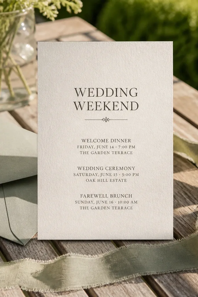
Linen texture is one of the easiest ways to make an invitation suite feel expensive without adding complicated artwork. This template centers the weekend title and keeps the three event details tidy, so it looks calm in close-ups. The texture shows up nicely in natural light, which makes it a strong choice for outdoor venues and spring photo sessions. It suits couples who want understated elegance with a tactile look.
Start by typing your weekend title in the center area and keep it to one or two lines. Then fill the three event lines in order, using short titles and a consistent time format. Finally, print on cotton or linen-look paper if you can; if not, choose a matte stock so the texture effect still reads.
Quick tipUse natural light for photos — linen textures look best without harsh flash.
Skip thisDon’t use thin hairline fonts on textured paper — they can disappear.
8. Aqua Gradient Header With Three Tier Event Timeline
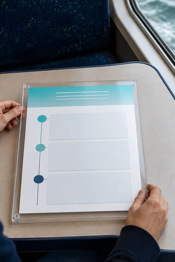
This is a clean, modern timeline layout that still feels pretty. The aqua gradient header adds color that photographs well, and the three-tier structure keeps rehearsal, ceremony, and reception from blending together. The template is designed to handle a weekend schedule without shrinking your addresses into tiny text. It’s a great fit for beach weddings, coastal venues, and couples who want a fresh palette.
First, set the header to your weekend name, then fill the three tiers with event titles and times. Next, place each venue name on its own line, then add the address in a smaller font so it stays readable. Finally, check that the gradient doesn’t wash out your header text by doing a test print.
Pick one accent color from your palette and keep everything else in neutral ink.
Avoid adding dark background photos behind the gradient — it dulls the color.
9. Monochrome Botanical Corner Vines With Clean Event Blocks
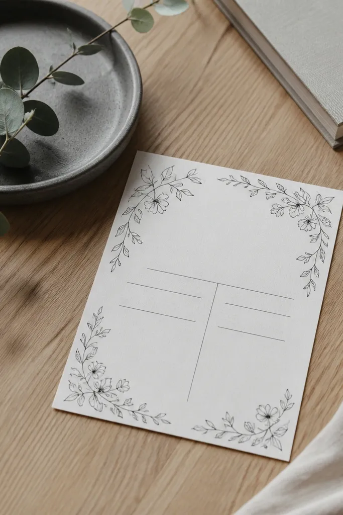
Corner vines are the sweet spot: they add nature without stealing attention from your dates. This template keeps the center clean, so your three event details stay readable and organized. The monochrome botanical linework looks sharp in photos and works for both rustic and modern weddings. It’s a good pick when you want an aesthetic that doesn’t depend on heavy watercolor or metallic inks.
Start by placing your three event titles in the main blocks and keep them short. Then type the times and venues, using consistent punctuation across all events. Finally, print on bright white or warm cream so the botanical lines stay crisp.
Use the same font weight for each event title so the timeline looks intentional.
Don’t add extra decorative icons — corner vines already do the job.
10. Art Deco Frame With Three Lines of Weekend Info
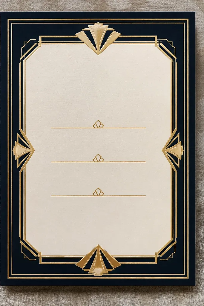
Art deco frames make invitations look instantly styled. This template uses geometric edges to create structure around the text, and the three event lines stay centered and balanced. Because the frame is symmetrical, it photographs well from a straight-on angle, even when your suite is photographed on patterned tablecloths. It’s a strong choice for couples who want vintage energy with a clean, readable schedule.
First, fill the top line with the weekend date range, then add each event title and time on its own line below. Next, keep addresses compact and aligned to the same width for all events. Finally, choose a high-contrast ink pairing like black and warm cream, and avoid low-contrast grays.
Use a ruler in your layout tool to keep all lines perfectly straight.
Skip busy fonts with deco frames — stick to simple serif or clean sans.
11. Terracotta Stamp-Style Header With RSVP Panel
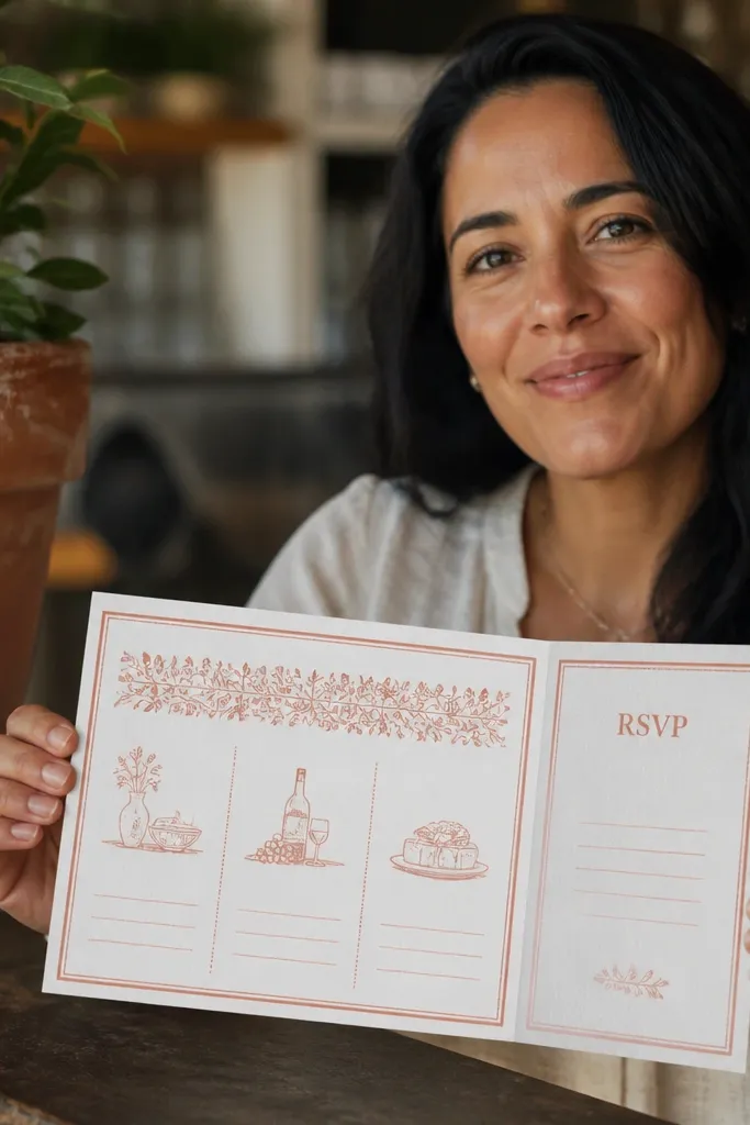
This template makes RSVP handling look organized, which is what you want when you’re planning a weekend. The terracotta stamp-style header adds a handcrafted feel, while the dedicated RSVP panel gives guests a clear spot for instructions. Your three event blocks stay structured beneath, so rehearsal, ceremony, and reception are easy to read at a glance. It suits warm-weather weddings, desert palettes, and venues that lean casual but polished.
Start by filling each event block first, then place RSVP instructions into the separate panel. Next, format your RSVP deadline as a single line with the date, and keep the email/phone consistent. Finally, print on warm white cardstock so the terracotta header looks like ink, not a muddy block.
Quick tipPut the RSVP deadline in the same position every time so it’s easier for guests to find.
Skip thisDon’t tuck RSVP details into the event blocks — it makes the schedule harder to scan.
12. Olive Leaf Wreath With Three Event Calendar Layout
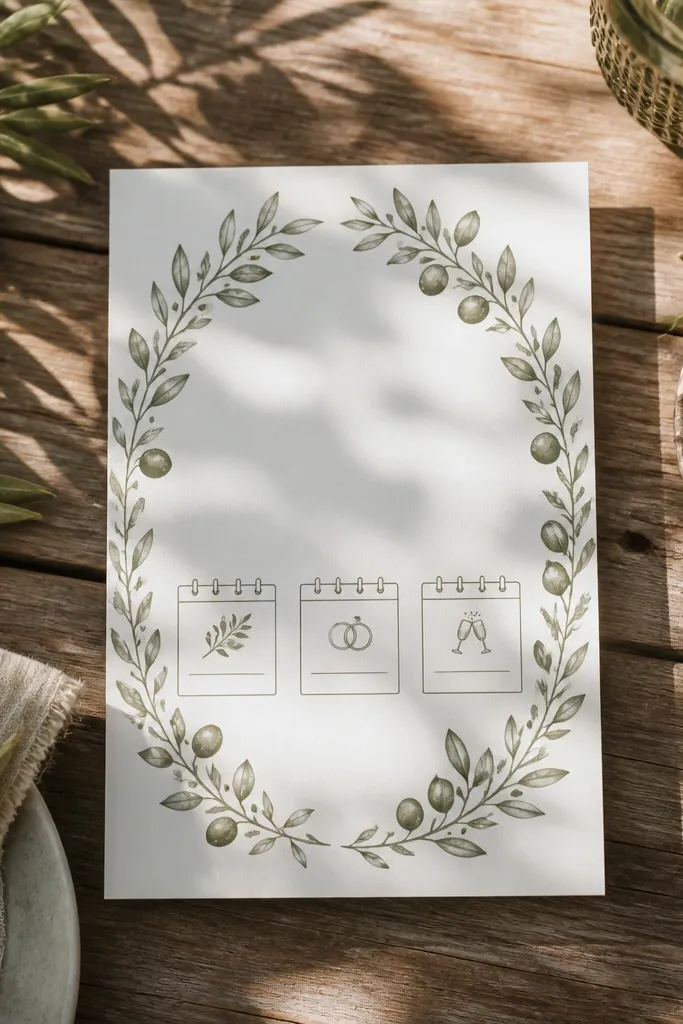
A leaf wreath looks refined, and this one frames the weekend without overpowering it. The calendar-style blocks make it easy to list dates and times, which is exactly what you need for a 3 day wedding. The olive palette also photographs beautifully with wood, stone, and greenery backdrops. It fits couples doing a farm, country club, or backyard wedding who want a polished stationery look.
First, place your weekend header inside the wreath area and keep it centered. Then fill the three calendar blocks with event titles, times, and venue names. Finally, add addresses in the smaller lines under each venue so guests can copy them quickly.
Use olive ink sparingly — keep text darker than the wreath lines for readability.
Avoid bright green accents — they can look neon against olive.
13. Black Tie Formal Template With White Script Header and Serif Body
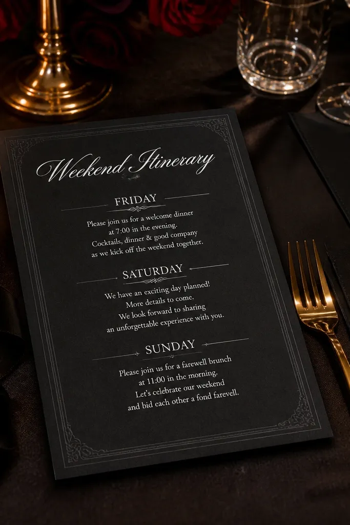
This is the “dress code on paper” option. The black background with white script header looks high-end, and the serif body keeps the schedule readable. The template separates the three events into distinct sections, so it still functions as a practical weekend itinerary. It’s a great match for evening weddings, formal venues, and couples who want a dramatic invitation that guests will actually keep.
Start by choosing a white ink simulation or a clean white font color for the header and body. Then fill each event section with short titles, times, and venue names, keeping addresses in a smaller but readable size. Finally, print on matte black cardstock; glossy black makes text look less sharp in photos.
Quick tipUse a slightly thicker font weight for times so they don’t blur on black paper.
Skip thisSkip thin script for addresses — it will be hard to read.
14. Botanical Linework With Centered Date Column and Two Side Details
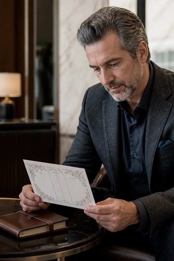
This layout is built for guests who scan vertically. The centered date column gives a clear timeline rhythm across the weekend, while side detail panels let you include location and notes without turning the invite into a paragraph. The botanical linework keeps it airy and pretty, and the overall spacing makes it photo-friendly on a table. It works well when your wedding weekend has a couple of different venues and you need to keep addresses separated.
First, place the three dates in the center column and align each event title with its corresponding date. Then fill side panels with venue names and short address lines. Finally, keep line spacing consistent across all blocks so the whole invitation looks engineered, not improvised.
Quick tipIf your venue names are long, shorten them on the invite and include full addresses only.
Skip thisDon’t add extra paragraphs — keep it to event essentials plus RSVP.
15. Cream and Blush Ombre Background With Three Rectangle Frames
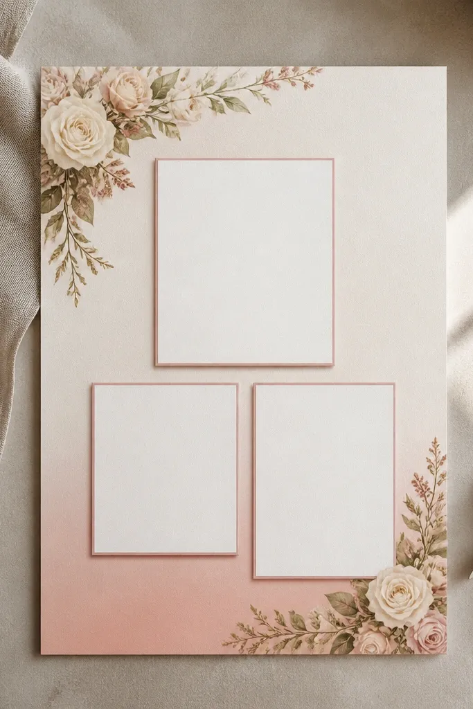
Ombre backgrounds look soft and expensive when they’re subtle, and this template keeps the color gentle so text stays readable. Three rectangle frames organize your 3 day events cleanly, which means rehearsal, ceremony, and reception don’t blend into the background. The blush tone photographs beautifully with neutral props like linen, beige envelopes, and soft florals. It’s a solid choice for weddings that feel romantic but not overly themed.
Start by setting your event titles and times inside the rectangle frames, using a darker font for contrast. Next, paste addresses into the bottom lines of each frame and keep them to two to three lines. Finally, export at high resolution and do a test print to confirm the ombre doesn’t shift color on your printer.
Use a darker font than you think you need. Ombres can steal contrast.
Avoid adding extra colored icons — the ombre already fills the background.
16. Minimal Marble Look With Gold Divider Lines
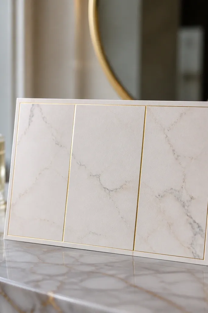
Marble looks luxurious in photos, and this template keeps it minimal so it doesn’t overpower your text. Gold divider lines help separate the three events and make the weekend timeline feel intentional. It’s ideal for couples who want a clean, modern aesthetic with just enough glamour. This design also works well for venues with neutral décor — marble, hotel ballrooms, upscale restaurants.
First, set the weekend header and keep it centered so it matches the marble look. Then fill the three event blocks, using the gold divider lines as your separation guide. Finally, choose a white envelope and matte paper so the marble effect stays crisp instead of glossy-blurry.
If your marble pattern looks too strong, lower its opacity in your design file.
Don’t use dark ink on a light marble area without checking contrast.
17. Sea Glass Palette Template With Rounded Corner Sections
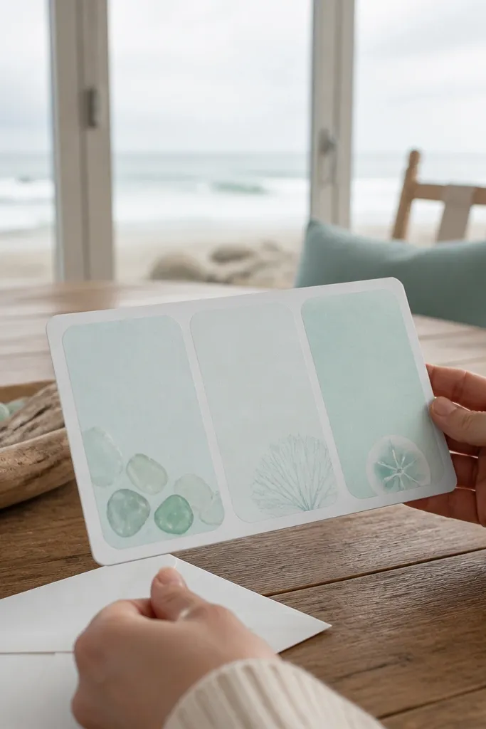
Rounded corner sections make this invitation feel friendly and coastal without turning childish. The sea glass palette gives you a refreshing color story that looks great against white envelopes and natural wood. The three event sections are easy to spot, so guests can read the weekend schedule quickly. It suits beach weddings, lakeside ceremonies, and any couple who wants the invitation to look like it belongs near water.
Start by selecting one sea glass accent color and using it for dividers or section headers. Then fill the three event cards with short titles, times, and venue names, keeping addresses in the smallest readable text. Finally, print on bright white cardstock to keep the sea glass colors from dulling.
Quick tipUse a clean sans-serif for body text so the rounded sections stay crisp.
Skip thisSkip multiple accent colors — it weakens the sea glass look.
18. Vintage Lace Border With Three Day Event List
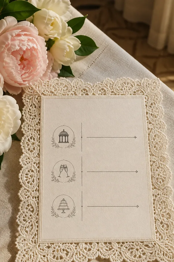
Lace borders add instant softness, and this template keeps the center structured so it still functions as a real schedule. The three-day event list format makes it easy for guests to spot the weekend flow without hunting for blocks. It’s a strong choice for weddings with classic décor, bridal showers that run into the weekend, and couples who like a romantic, slightly vintage vibe. The lace border also photographs well because it creates texture around the edges.
First, fill the three event titles and times in the list area, keeping each event to a tight group of lines. Then add locations and addresses underneath each title in the same font style. Finally, print on cream cardstock and use a slightly darker ink than you would for plain paper so the lace border stays visible.
Quick tipKeep the list font size consistent across all three events for clean scanning.
Skip thisDon’t add long venue addresses — lace borders make the edges visually busy.
19. Gallery Wall Style With Photo-Ready White Space and Three Labels
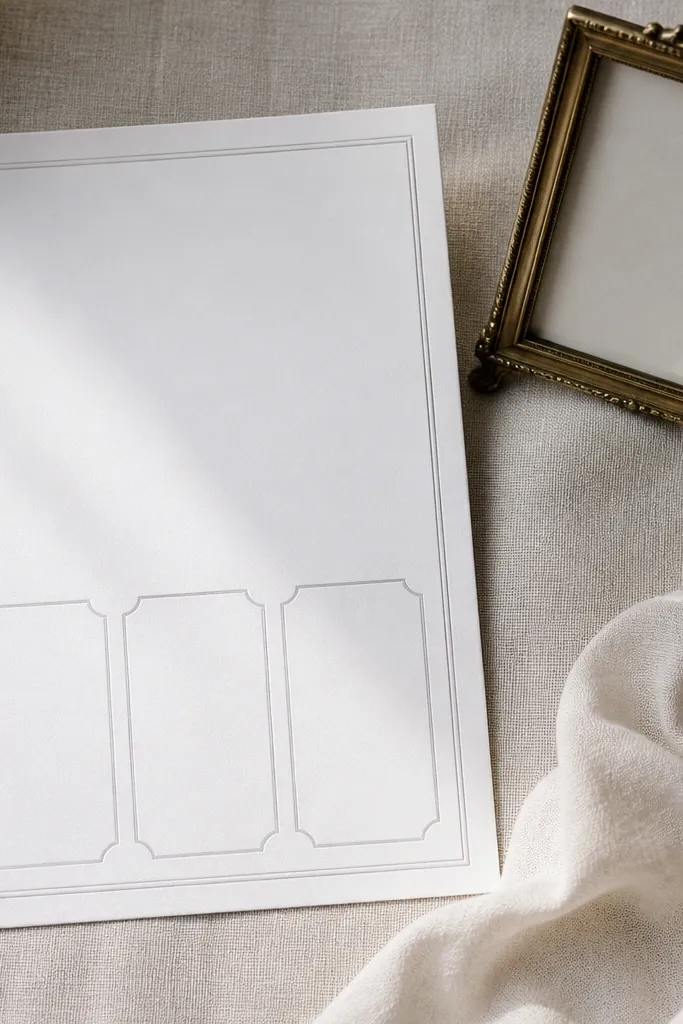
This template is for people who care about how the invitation looks on a table or in a flat lay. It uses generous white space and three labeled boxes so the schedule is readable without feeling packed. The design is intentionally “quiet,” which makes your names, dates, and venue details the star. It suits modern weddings, city venues, and couples who want the suite to look like it belongs in a magazine spread.
First, place the three event labels in their boxes and keep titles short and bold. Then add times and venue names, and keep addresses on one or two lines so the boxes don’t get text-heavy. Finally, choose a neutral envelope and print on matte paper to avoid glare in photos.
Quick tipUse a slightly bigger font for the RSVP deadline so it reads instantly.
Skip thisSkip extra icons — the white space is part of the aesthetic.
20. Gilded Botanical Illustration Silhouette With Three Date Boxes
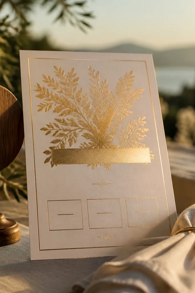
This is a statement template without being messy. The gilded botanical silhouette sits behind or beside the header, and the three date boxes keep the weekend schedule clear. The contrast between the gold-style artwork and the clean boxes makes it look expensive in photos. It fits couples who want a slightly artsy feel, like a museum wedding, a historic venue, or a garden ceremony with a formal dinner.
Start by placing your weekend title and names in the top area, then fill each date box with the event title, time, and venue name. Next, add addresses in smaller lines inside each box so nothing floats outside the structure. Finally, print on smooth ivory paper so the gold-style art looks crisp rather than grainy.
Quick tipIf your gold effect prints dull, switch to a deep warm gray for the artwork and keep borders gold-style only.
Skip thisDon’t add handwritten-style fonts — the boxes already create a graphic look.
21. Classic Serif Frame With Two-Column Addresses for Each Event
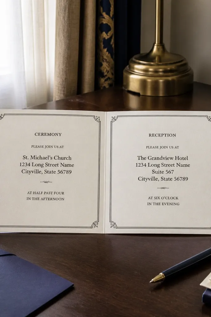
Two-column addresses are a practical design upgrade for real guests. This template keeps each event’s address neat, even if you have a venue with a long street name or a hotel with multiple lines. The classic serif frame makes it feel traditional, while the structured address format keeps everything readable. It’s ideal for weddings with multiple venues across the weekend where guests need accurate directions.
First, fill each event panel with the title and time, then paste the address into the two-column layout. Next, break lines so the city and state land together and the ZIP stays on its own line if there’s room. Finally, print a test and check that the smallest address text is still legible when you hold the invite at arm’s length.
Quick tipUse abbreviated state names consistently to keep the address lines aligned.
Skip thisSkip tiny font sizes for ZIP codes — they’re the first thing people miss.
22. Color Block Weekend Timeline With Soft Pastel Dividers
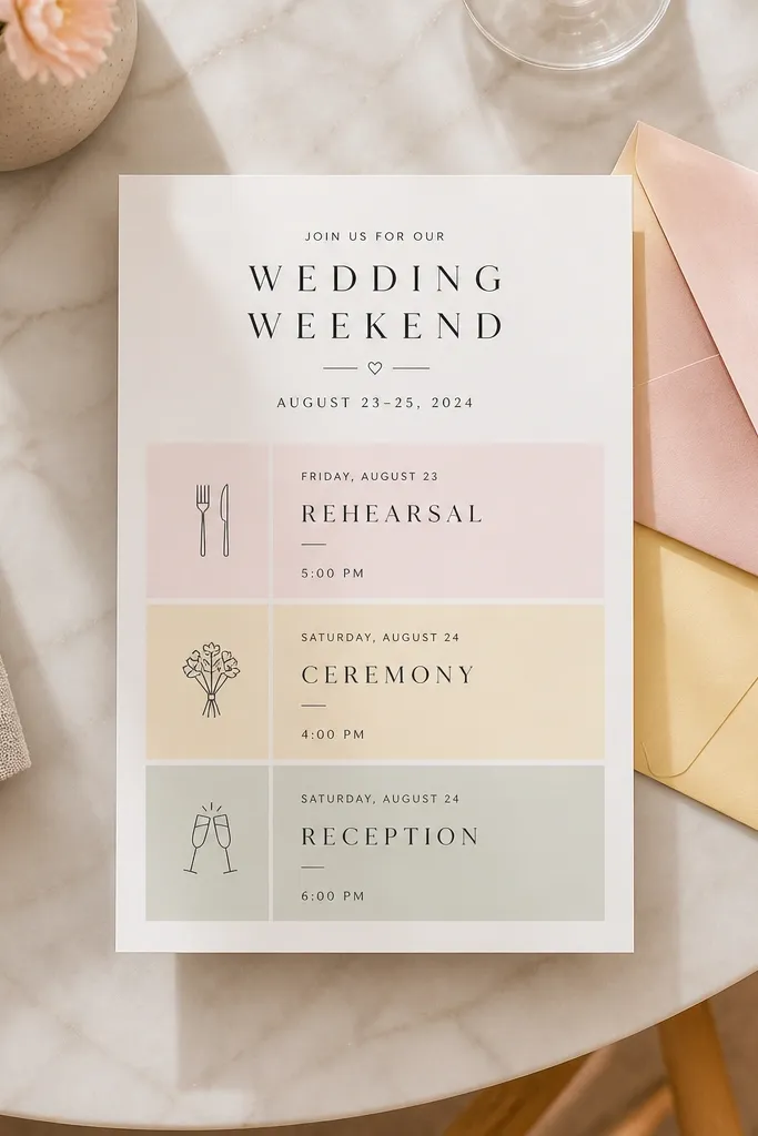
Color blocks make a 3 day invitation feel like a timeline, not a list. This template uses soft pastel dividers to separate rehearsal, ceremony, and reception while keeping the overall design modern and clean. The blocks are photogenic because they create clear sections that look great in flat lays with matching envelopes. It suits couples who want color without heavy illustrations and who are planning a weekend with distinct events and vibes.
Start by choosing your three pastel divider shades to match your wedding palette. Then fill each section with event titles, times, and venue names, keeping addresses in the same style across all three. Finally, print on a paper with a smooth matte finish so the divider colors look even and not streaky.
Quick tipPick pastels that are distinct enough in grayscale. If it looks the same in black-and-white, guests will struggle to scan.
Skip thisDon’t add patterned backgrounds behind the color blocks — it turns the layout messy.
23. Hand-Lettered Style Header With Three Centered Event Lines
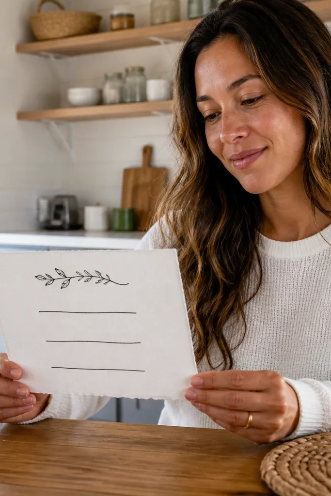
This template gives you the look of hand-lettering while keeping the event info clean and predictable. The centered event lines create a neat 3 day rhythm, and the header style makes the invitation feel personal without adding clutter. It photographs well because the typography is the artwork — guests can read it even in quick shots. It’s best for couples who have a simple weekend schedule and want a modern, intimate stationery feel.
First, enter the header names/date line and keep it to a short length so it stays centered. Then type the three event lines with consistent time format and venue names. Finally, print on warm white cardstock and use a deep ink color so the lettering stays sharp.
Quick tipUse one font style for all titles and only change the weight, not the font family.
Skip thisSkip long RSVP paragraphs — keep RSVP instructions in one short block.
24. Artisan Envelope Insert Template With Separate RSVP Card Slot
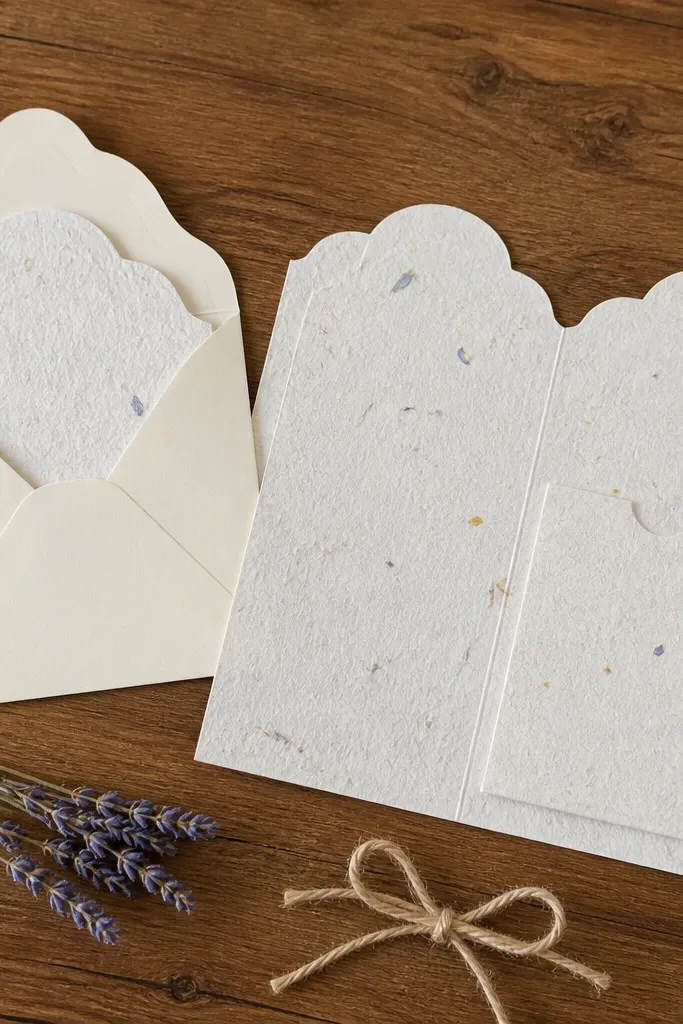
This is the most practical “suite-friendly” option if you want guests to separate RSVP from schedule. The design includes a dedicated RSVP area that looks intentional next to the three event sections, so the invite stays photo-pretty while also being functional. It works especially well when you’re using an RSVP card with a deadline and want it easy for guests to keep track of. The look is clean and editorial, with enough structure to handle a weekend timeline that includes brunch or welcome drinks.
Start by laying out the three event sections first and leaving the RSVP area blank until the end. Then add RSVP instructions with a single deadline line plus contact info. Finally, size your insert so it fits your envelope without bending; test with one physical mockup before printing the full batch.
Quick tipIf you’re mailing, leave at least 1/8 inch margin around the edges for trimming and folding.
Skip thisDon’t shrink the RSVP area — guests need to read it without squinting.
25. Sunlit Terrace Invitation With Terracotta Arch and RSVP Cutout
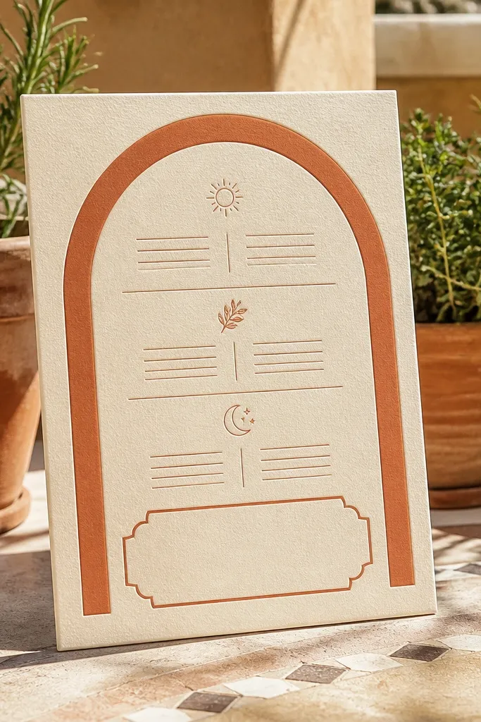
This template is built around a warm, sunlit shape language — a terracotta arch that frames the three-day schedule without crowding the page. The RSVP area is a clean, blank cutout-style box so it feels intentional even before you add names and addresses. It looks best when printed on textured cream cardstock because the ink catches lightly at the edges. I’d use this for a destination weekend where the ceremony and reception feel like they happen “outside,” even if the weather is mixed. It suits couples doing a 3 day wedding invitation set that includes rehearsal plans plus a relaxed day-after brunch. Late spring through early fall is where this color palette and arch motif photograph the most naturally.
Step 1 — set up your invitation layout in three horizontal panels under the arch: Friday rehearsal, Saturday ceremony, Sunday brunch, with thin blank lines for dates and times. Step 2 — leave one larger blank RSVP box centered at the bottom with a simple border so it’s easy to write on and easy to scan for return addresses later. Step 3 — print on 110-130 lb cream cardstock with a matte finish; expect about $25-$45 per 100 sheets depending on where you order. Step 4 — plan on 2-3 hours for design and proofing, then order a small test print first so the terracotta tones match what you see on screen. If you’re booking a printer, place the order 2-3 weeks before you need envelopes, and confirm whether they can match spot colors or only use standard CMYK.
Quick tipOrder one test pack and check the RSVP box legibility from a normal reading distance — that area is where messy handwriting usually happens.
Skip thisDon’t shrink the RSVP box to match the other panels — it makes the return card look cramped and harder to read.