1. Ivory Card with Thin Gold Cross Border
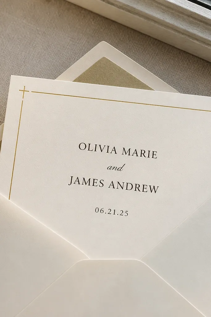
This design works when you want “Christian” without turning the card into a poster. The thin gold cross border frames the names and date while staying light enough that the text still feels airy. Use deep charcoal or espresso lettering so the cross detail doesn’t compete. For best results, keep the border lines consistent thickness so the foil catches light cleanly rather than looking patchy. It looks especially good for spring and early summer weddings because the gold reads bright without getting too loud.
Start by choosing a smooth, heavyweight ivory stock (aim for 300 gsm or more) and set your border line thickness to avoid hairline foil. Then send artwork with a 3-5 mm safe margin from all edges so trimming doesn’t cut into the gold. Finally, schedule printing with enough time for two proofs — first for alignment of the border, second for how the foil looks against your exact ivory shade.
If you’re unsure about foil color, proof a small batch using the same paper — gold foil can look warmer or greener depending on the stock.
Avoid white-on-white text near the border; it makes alignment mistakes obvious.
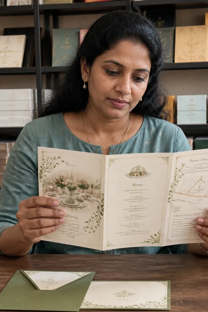
2. Matte Sage Gatefold with Scripture Header
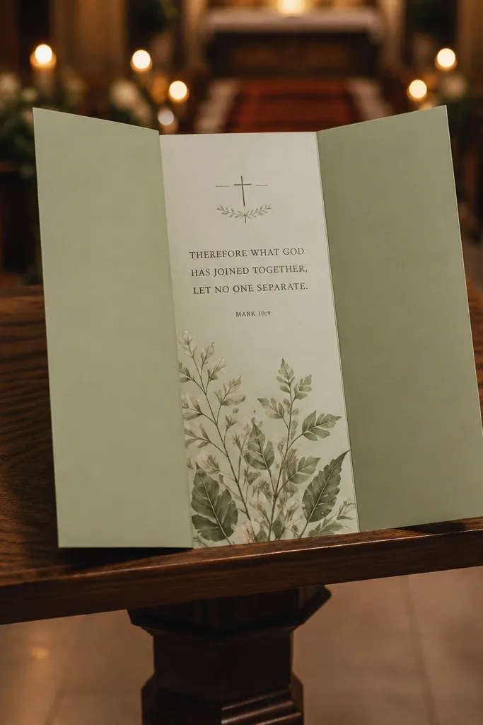
Gatefolds feel elegant because they create a moment of reveal, and matte sage keeps it calm and modern. A scripture-style header at the top gives a clear Christian signal without heavy icons. The matte finish hides tiny paper imperfections and keeps typography looking crisp, even when the room lighting is dim. This is a strong choice for fall and winter because sage looks soft under warm indoor lights. Pair it with dark ink like navy or espresso so the header stays readable from across the table.
Start by selecting a matte, textured-smooth paper and design the header to sit at least 8 mm from the fold line so it never looks crushed. Then format your inside panel text in a single column with generous line spacing, so the scripture header feels intentional. Finally, plan for printing about 10-14 days before you need them in hand, and order extra envelopes because gatefolds often need slightly different stuffing.
Test envelope fit with one sample before you commit, especially if your gatefold includes any thicker accents.
Skip thin serif fonts for the scripture header; they look delicate but reproduce poorly on matte stocks.
3. Cream Letterpress Look with Embossed Cross
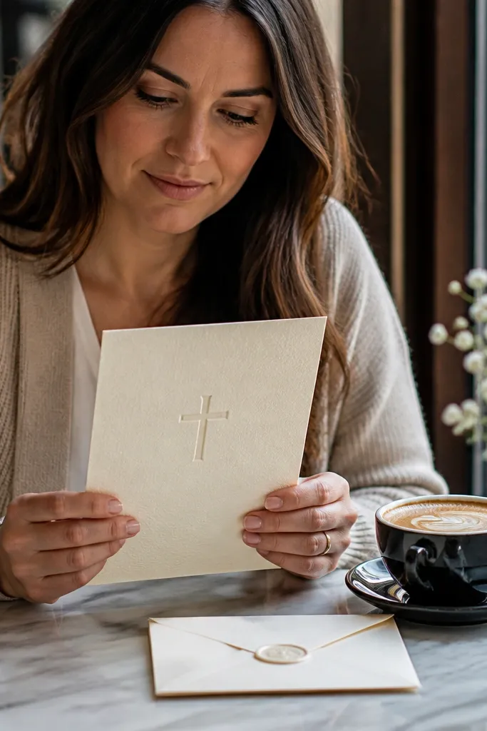
If you want elegant without shiny finishes, a letterpress look with a small embossed cross is a clean win. The texture adds depth while the embossed cross stays understated and high-class. Choose a cream base with slightly darker ink so the embossed area still catches light. This style photographs beautifully because the shadows around the emboss show up clearly without glare. It suits winter weddings well, and it also works for church ceremonies year-round when you want something reverent and quiet.
Start by using a print-ready file with true black for emboss text and avoid gradients behind the emboss area. Then place the cross 15-20 mm below the top edge so trimming doesn’t steal the shape. Finally, request a proof that includes the embossed section under both daylight and indoor light, since emboss shadows can look different depending on lighting.
Use fewer decorative elements — letterpress and emboss already add texture, and extra graphics make the card feel busy.
Don’t add super-fine line art around the emboss; it can fill in and look muddy.
4. Navy Monogram Circle with White Foil Cross
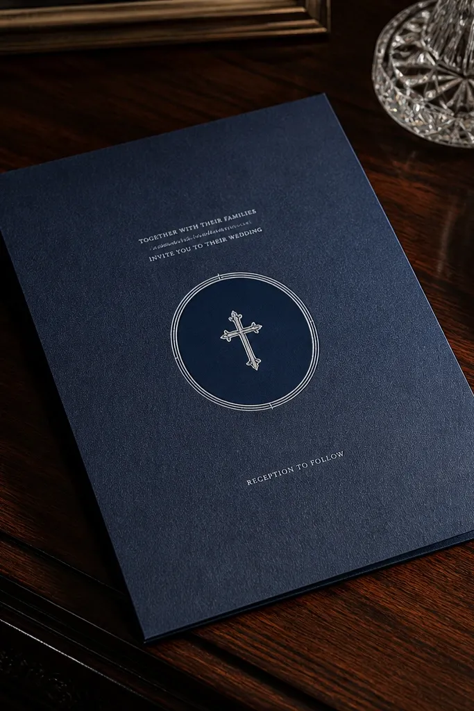
This is bold, but it still reads elegant because the design is controlled. A navy background feels formal, and the white foil cross keeps the Christian theme crisp and light-catching. The monogram circle adds personalization without cluttering the layout. For a clean result, keep the foil cross small and centered, then let the typography do the heavy lifting. This style is great for summer evening weddings and winter receptions because deep navy looks rich under event lighting.
Start by picking a navy paper that isn’t too glossy — high sheen can cause foil glare and hide letterforms. Then set the foil cross as a separate foil layer in your printer’s template so it doesn’t get blended into other colors. Finally, schedule printing early enough for two proofs so you can confirm how white foil sits on your exact navy shade.
Quick tipAsk for a foil test on the same navy paper if your printer offers it; white foil can vary a lot by stock.
Skip thisAvoid placing foil directly under long text lines; glare makes the words harder to read.
5. Blush Floral Frame with Small Cross Corner
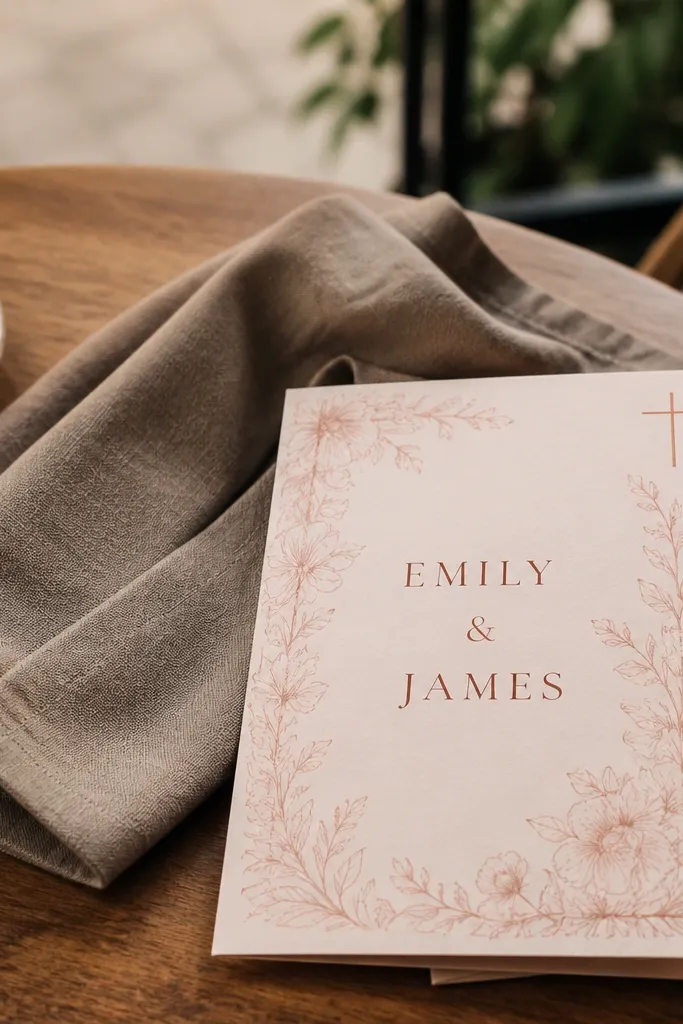
This one is for couples who want floral romance without losing the Christian cue. The blush floral frame is soft and pretty, and the small cross corner keeps the faith element present but not loud. Keep the floral art in a thin line style so it doesn’t overpower the names. For an elegant finish, use dark copper-brown or deep charcoal text to anchor the look. It’s most flattering for spring weddings and garden venues because blush and soft florals feel fresh rather than heavy.
Start by choosing a smooth off-white or cream stock and keep the floral frame as a single color line art. Then place the cross in only one corner with consistent stroke weight so it stays crisp. Finally, proof the card with your exact ink color and check that the floral frame doesn’t sit too close to where your text begins.
Quick tipUse a single floral color. Two-tone florals look pretty on screen but often print unevenly on small frames.
Skip thisSkip busy full-page florals if you want clean details; they hide alignment issues.
6. White-on-Charcoal Modern Cross Divider
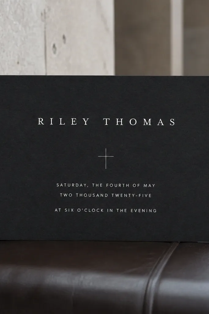
Charcoal with white text looks modern and expensive when the typography is spaced correctly. The cross divider is minimal — a small cross icon used like punctuation between the names and event details. This design is a great fit for city venues, winter receptions, and even summer night weddings where you want contrast. It also handles busy venues better because the card’s high contrast stands out in photos and at the table. Keep your font styles consistent and avoid mixing too many scripts.
Start by selecting a matte charcoal stock to reduce glare and keep the white text readable. Then use a two-part layout: names on top, date and location in the middle, and ceremony info at the bottom with clear hierarchy. Finally, do a proof check for white density — if the white looks thin, switch to a heavier white ink or adjust the file’s coverage settings.
Quick tipUse centered alignment for the cross divider so it looks intentional, not slightly off.
Skip thisDon’t use light gray text on charcoal; it disappears under warm lighting.
7. Gold Foil Script Names with Cream Watercolor Wash
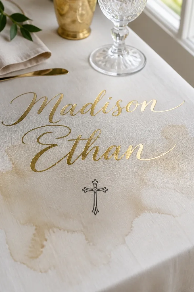
Gold foil script names are the fastest route to “elegant,” but they need controlled backgrounds. A cream watercolor wash adds softness without turning the card into a fuzzy mess, especially if you keep the wash low contrast. Add a small cross under the names so the faith element is clear but not competing with the foil. This design suits spring and summer because the wash feels light, and the gold stays warm in photos. Choose a script that stays legible — the goal is beauty plus readability.
Start by limiting the watercolor wash to a single area behind the names so the rest of the card stays clean. Then set the gold foil script as its own layer and keep it at least 6-8 mm away from any edges or fine line borders. Finally, approve a proof that checks for foil adhesion and edge sharpness, since foil on uneven washes can look patchy.
Quick tipIf your printer offers it, request a matte lamination on top of foil to reduce glare in photos.
Skip thisAvoid full-bleed watercolor behind small address lines; it kills clarity.
8. White Linen Texture with Debossed Cross and Coordinates
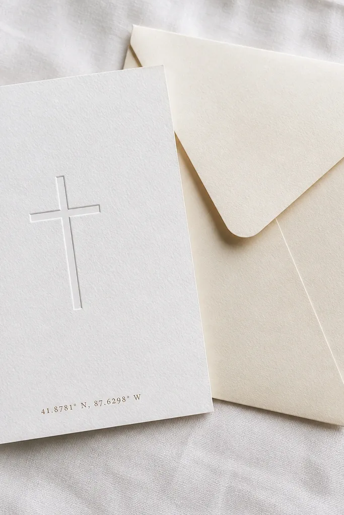
Linen-textured paper makes a Christian invitation feel handmade even when it’s fully printed. A debossed cross gives a tactile detail without shine, and the small coordinates add a thoughtful travel-like precision for destination weddings. This is an elegant choice for couples who love understated design and want the card to feel special in the hand. It looks great for fall weddings because the texture adds warmth, and it also photographs well because the shadows show up without glare. Keep the card text dark and simple so the texture supports the message rather than distracting.
Start by selecting a paper with a consistent linen texture and use a deboss that is large enough to read after trimming. Then place the cross near the top third and add coordinates in a smaller font below, with enough spacing that lines don’t crowd. Finally, proof the deboss depth because too shallow looks like a smudge, and too deep can distort fine typography nearby.
Quick tipUse a single accent icon (the cross) and keep the rest typography-only for a cleaner finish.
Skip thisSkip tiny coordinate text if your venue will be read in dim church lighting.
9. Two-Panel Blue Marble with Center Cross Emblem
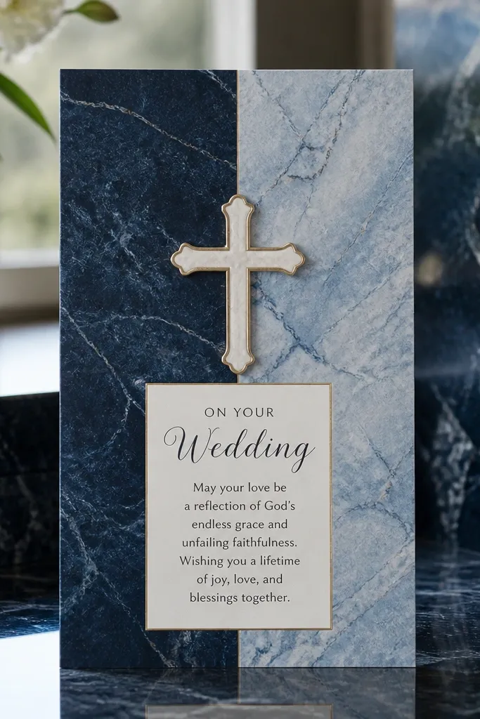
Marble backgrounds can look luxurious, and a two-panel layout keeps them from getting chaotic. The key is the center cross emblem, which anchors the design so it still feels Christian and intentional. Use marble in a controlled palette — navy, slate, and one lighter blue — so the text remains readable. This style is great for winter and late fall when you want a cooler tone that still feels romantic. For clean details, don’t put the most important text over the busiest marble sections.
Start by designing a text-safe band over the marble area, using a solid overlay behind the names and date. Then place the cross emblem in the center with a thicker stroke weight so it doesn’t disappear into the background. Finally, request a proof check for alignment between the panels, since marble patterns can make slight shifts more visible.
Quick tipIf you’re doing a fold, keep the marble pattern symmetrical across the fold line for a more polished reveal.
Skip thisDon’t let names sit directly on the marble’s darkest swirls.
10. Apricot Border with Cross Medallion at Top
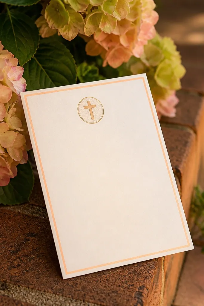
An apricot border gives warmth without turning the card into a “beige blob.” The cross medallion at the top works like a seal, making the card feel official while keeping the design tidy. This is a sweet, elegant choice for spring weddings and daytime ceremonies where you want the faith element to feel gentle. Keep the border thin and consistent so it frames the text instead of shrinking the content area. Pair the border with a deep ink — espresso or navy — for the best legibility.
Start by setting the border thickness to a thin line and leaving at least 10 mm margin around the text block. Then put the medallion where it doesn’t overlap with your header text, and keep it one color. Finally, proof the border alignment on your exact printer — borders are where small trimming differences show most.
Quick tipUse one medallion size for every card in the run; resizing creates uneven visuals across the set.
Skip thisSkip multi-colored borders; they tend to look muddy on smaller prints.
11. Champagne Foil Cross on Cream with Minimal Type
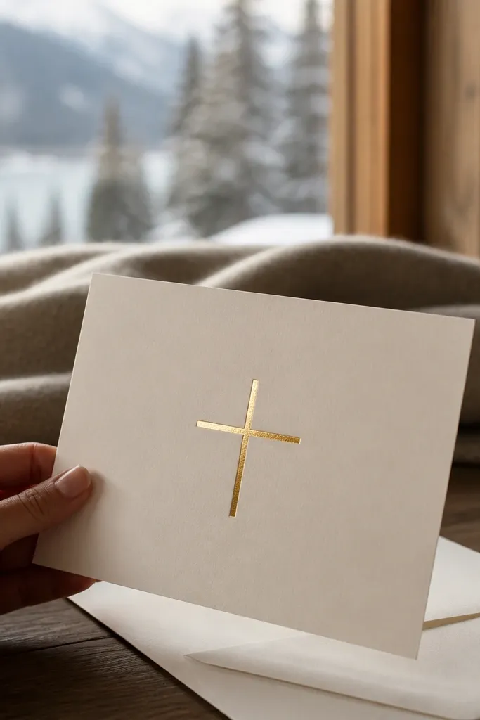
Minimal can still feel elegant when the foil is placed with restraint. A champagne foil cross on cream looks classy and doesn’t fight with the message because the layout stays open. The “rule” here is spacing: give the foil room so it catches light and the text doesn’t feel crowded. This design suits winter weddings and indoor venues because it reads crisp in warm lighting. It also works for couples who want a Christian invitation that feels modern and calm rather than decorative.
Start by choosing a thick cream stock with a smooth finish for cleaner foil edges. Then keep the cross near the top center and use one font family with two weights so the card stays cohesive. Finally, approve proofs that check foil placement and density — champagne foil can look pale if coverage is too light.
If your printer supports it, ask for a matte overlay choice to reduce foil glare in photos.
Don’t add extra icons around the cross; it makes minimal designs feel cluttered.
12. Terracotta Wreath Frame with Cross Scripture Line
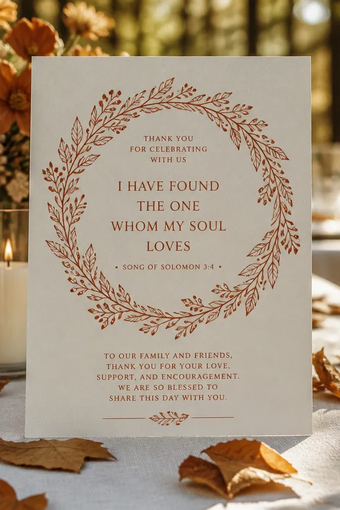
Terracotta wreath frames feel warm and grounded, and they bring a Christian touch without relying on heavy religious imagery. Put one scripture line inside the wreath, and keep the rest of the text clean and structured. This design looks especially good for fall weddings because terracotta matches the season’s colors and photographs well in outdoor light. The wreath should be thin-line or lightly shaded so it doesn’t compete with names and dates. Use a deep ink color so the wreath reads as an accent, not a background.
Start by limiting the wreath art to one color and keeping it behind a solid text-safe rectangle if needed. Then place the scripture line at a size that stays readable, and avoid tiny caps that print thin. Finally, schedule your print timeline with extra cushion because wreath art can reveal alignment shifts more than plain borders.
Use off-white text blocks on terracotta backgrounds if your printer has trouble with white ink consistency.
Skip watercolor wreaths; they blur and make clean details harder to guarantee.
13. Forest Green Layered Cutout Cross with Photo-Spot
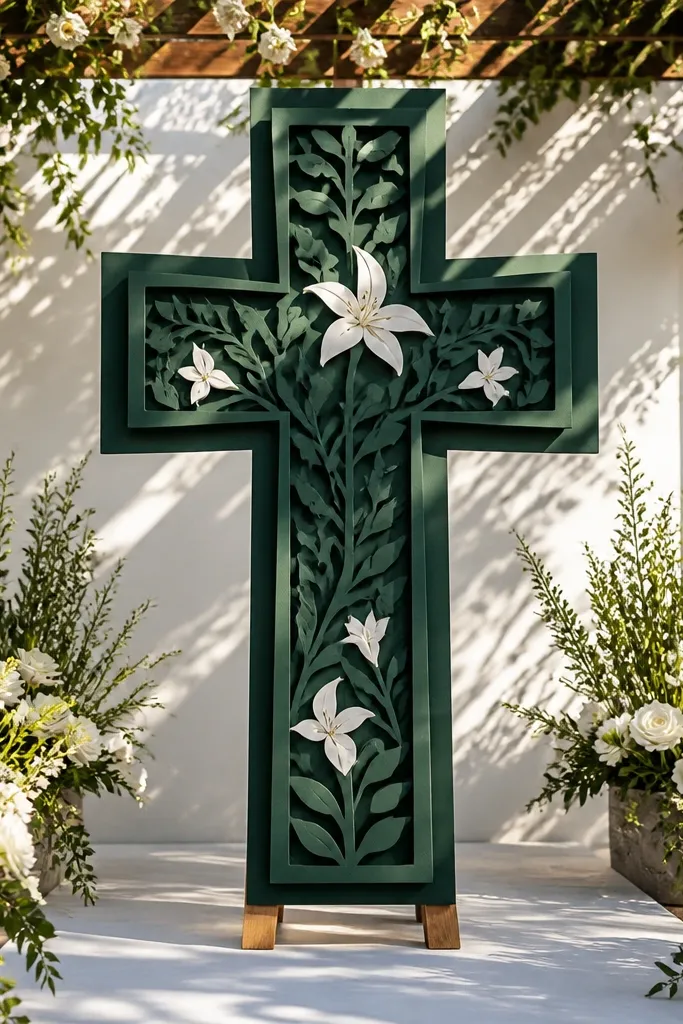
A layered cutout cross gives the invitation real depth in hand. Forest green looks rich and elegant, and the cutout makes the design feel intentional rather than decorative. If you want a photo or monogram spot, keep it simple — one rectangle area with clean edges so the overall card stays crisp. This style is a strong pick for winter and early spring because deep green reads formal and photos look dramatic. The best part is the tactile silhouette of the cross, which shows even when lighting isn’t perfect.
Start by selecting a layering stock with enough weight to hold the cutout shape cleanly. Then place the cutout cross on a center layer and keep the text on the top layer where it won’t overlap the cut edges. Finally, order proofs that include die-cut alignment, since cutout registration is the one thing that can ruin a layered look.
Quick tipChoose a photo spot that doesn’t require heavy cropping — crisp edges matter more than the image itself.
Skip thisAvoid very small cutout details; they look sharp on screen but get fragile on paper.
14. Rose Gold Foil Cross with Blush Dusty Rose Background
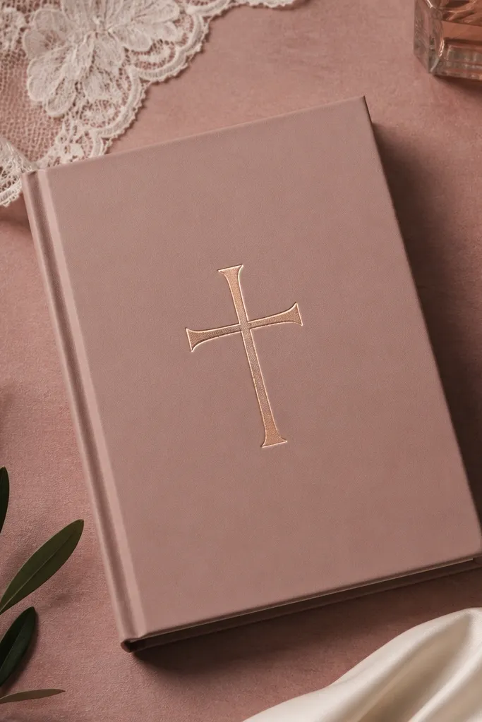
Rose gold foil is flattering with dusty rose backgrounds because it looks warm, not metallic-cold. The Christian cross stays the focal point, and the rest of the layout should be quiet so the foil doesn’t feel like a gimmick. This design is ideal for spring and early summer weddings where you want a romantic tone that still feels polished. Keep your text in a darker gray-brown so letters don’t get lost against the background. The result feels elegant because it’s controlled and color-coordinated.
Start by picking a dusty rose stock that’s not too saturated; overly bright pink can make rose gold look dull. Then set the foil cross as a single shape with clean edges and avoid stacking foil over patterned backgrounds. Finally, request a proof that checks how the foil looks at an angle, since rose gold can shift with lighting.
Quick tipUse one warm neutral for text, like espresso, instead of pure black — it reads softer on rose backgrounds.
Skip thisDon’t use thin hairline fonts under rose backgrounds; they fade and look uneven.
15. Neutral Linen with Cross Stamp Motif and Address Panel
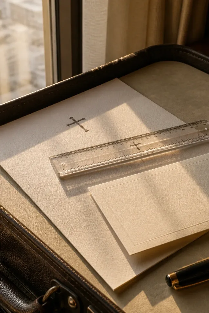
A neutral linen look with a cross stamp motif feels intentional and tidy, especially when you include a clear address panel. The stamp motif adds a handmade vibe, but the layout stays organized so the card looks elegant in photos. This is a great choice for destination weddings because the design reads clean and travel-friendly, and it doesn’t overwhelm the details. Pair it with a structured typography system: names centered, event details in a separate block, RSVP line clearly placed. It works well in summer and fall because the linen texture looks flattering outdoors.
Start by using a neutral linen stock and keep the stamp motif to one color so it doesn’t look muddy. Then design a dedicated address panel area with enough spacing for guest names and street lines. Finally, do a test print for the stamp motif density; some printers make “stamp” art too light to read.
Make RSVP info the same width as the main text block so it lines up on every card.
Skip busy textures behind text; stamp motifs already add visual grain.
16. Classic Black Text with White Embossed Cross Seal
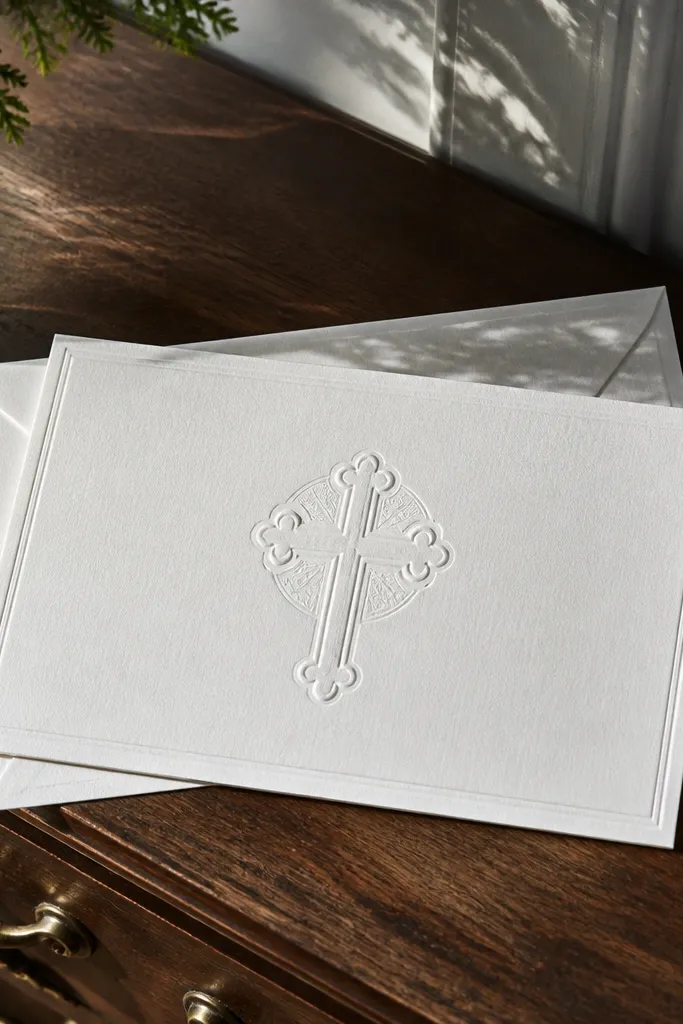
This is the “church program” look, but upgraded with modern typography and a clean seal. White on white emboss can look gorgeous when the seal is large enough to catch shadows and the text uses strong spacing. The Christian cross seal gives a formal touch without cluttering the design. This style is excellent for winter weddings and indoor ceremonies because the contrast is still clear when lighting is low. Keep the rest of the design simple — the seal does the work.
Start by choosing a smooth white stock that holds emboss crisp edges. Then position the cross seal near the top or center and keep the text block away from any embossed area to avoid visual distortion. Finally, approve a proof under the lighting conditions you expect at the venue — the seal shadow is the whole point, and it needs to show clearly.
Use a consistent font size hierarchy: names larger, date medium, location small but not tiny.
Don’t rely on super-light gray text; on white stock it can look washed out.
17. Celadon Green with Gold Cross Frame and RSVP Strip
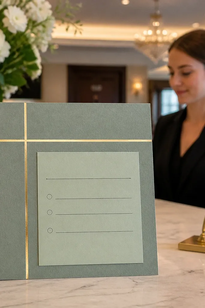
Celadon green is calm and modern, and the gold cross frame keeps it anchored in Christian symbolism. The RSVP strip is what makes it feel elegant for real-life use, because guests find the reply details quickly. Keep the frame thin and the RSVP strip aligned with the main text so the card looks designed, not assembled. This works well for spring and summer because celadon reads fresh without being bright. In photos, the gold frame adds contrast without turning the card into a full glitter look.
Start by designing a clear grid: header, main message, event details, then the RSVP strip at the bottom with a single strong line. Then create the gold frame and RSVP strip as foil layers so they match in warmth and density. Finally, proof for straight alignment of the strip and confirm that the foil doesn’t creep into text areas.
Quick tipLeave extra white space around the RSVP strip; it makes the foil look intentional instead of crowded.
Skip thisAvoid multiple foil accents; it makes the card feel busy and reduces readability.
18. Soft Cream with Blue Cross and Watercolor Corner Flowers
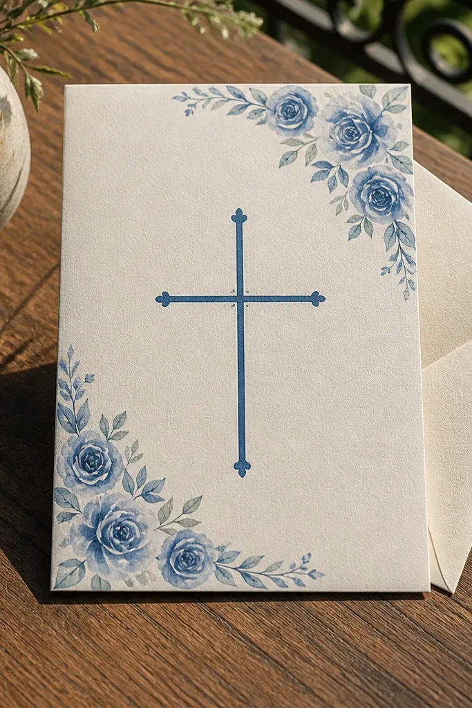
This is a gentle, modern Christian design that still looks refined. The blue cross is clean and readable, and the watercolor corner flowers add personality without covering the text. Corner art is the trick because it gives you decoration while protecting the main typography from messy print textures. This design suits spring weddings and daytime ceremonies where soft colors feel airy. Use a darker navy or slate for text so it stays crisp and the blue cross doesn’t look washed out.
Start by placing the flowers in only one corner and keeping them light enough that they don’t touch the text area. Then set the blue cross as a solid color element rather than a gradient. Finally, proof the corner art for edge sharpness — watercolor-like graphics can bleed if the printer uses the wrong ink settings.
Quick tipChoose a matte finish so the corner art doesn’t glare under sunlit photos.
Skip thisDon’t place watercolor elements behind the date block; it makes the date harder to read.
19. Monochrome Silver Cross on Pearl White with Thin Border
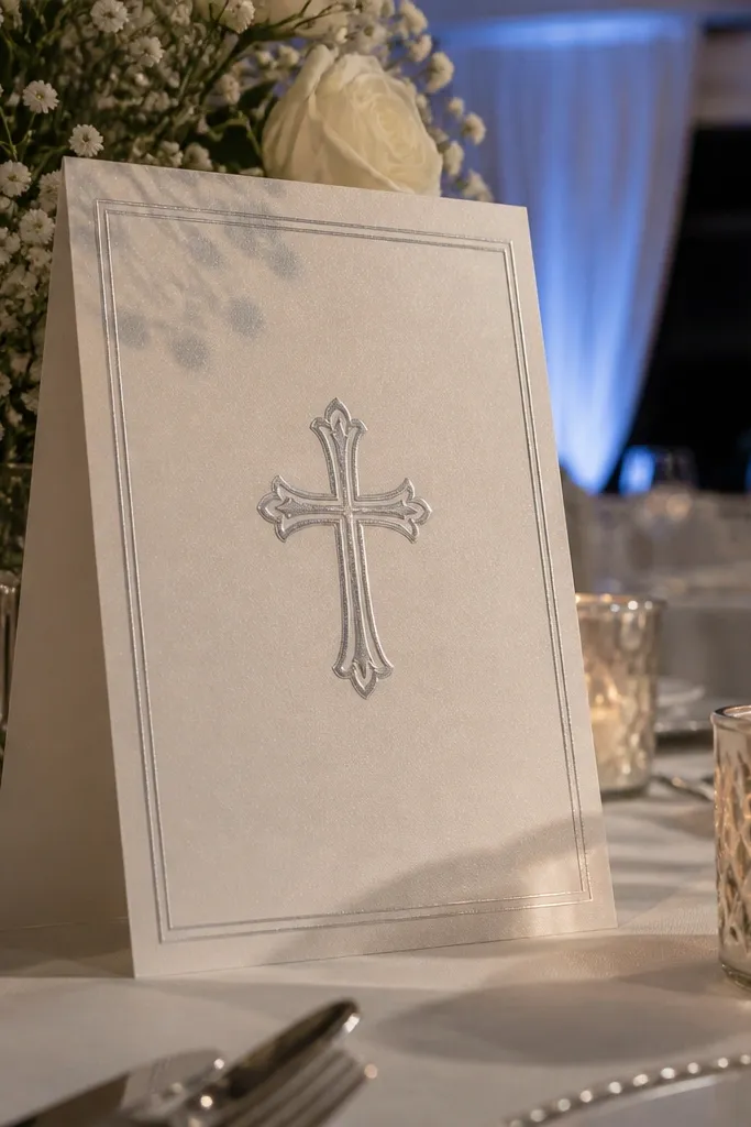
Silver on pearl white looks elegant when the border is thin and the layout is disciplined. The monochrome cross stays the focus, and the thin border gives a finished frame without shrinking the content. This style works for winter weddings, formal indoor venues, and even evening receptions where cool tones look sharp. Keep the typography monochrome too — use one gray-black tone for all text so the card feels cohesive. The silver cross catches light in a subtle way, giving you that “premium” feel without heavy decoration.
Start by choosing pearl white stock and keep the cross size medium so it doesn’t look like a tiny icon. Then use a thin border and make sure your text-safe margin is at least 3-5 mm from the edge. Finally, request a proof focused on the cross coverage and border alignment, since silver effects can look uneven if the file is too light.
If your venue lighting is warm, add a slightly darker text tone so the card doesn’t look washed out.
Avoid multi-gray typography; too many shades make silver accents look accidental.
20. Sandstone Card with Cross Etched Line Art and Centered Names
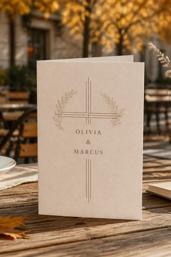
Sandstone paper tones make Christian invitations feel grounded and calm. Etched line art — thin, controlled strokes — gives faith symbolism while keeping the card airy. Centered names make the design feel balanced, and the neutral background helps the ink look clean in photos. This works well for fall weddings and outdoor ceremonies where natural light makes textured paper look expensive. The real elegance is the restraint: line art stays small, and typography gets the space it needs.
Start by selecting a warm neutral paper and using dark ink with strong contrast for names and event details. Then keep line art to a single cross and place it above the event info so it doesn’t compete with the date. Finally, proof the etched lines for minimum stroke thickness — if lines are too thin, they can disappear when printed.
Use centered alignment for names but left alignment for addresses; it reads cleaner and reduces visual clutter.
Don’t add lots of extra line icons around the cross — it turns into pattern instead of symbolism.