
1. Cream Linen Wash with a Soft Vignette
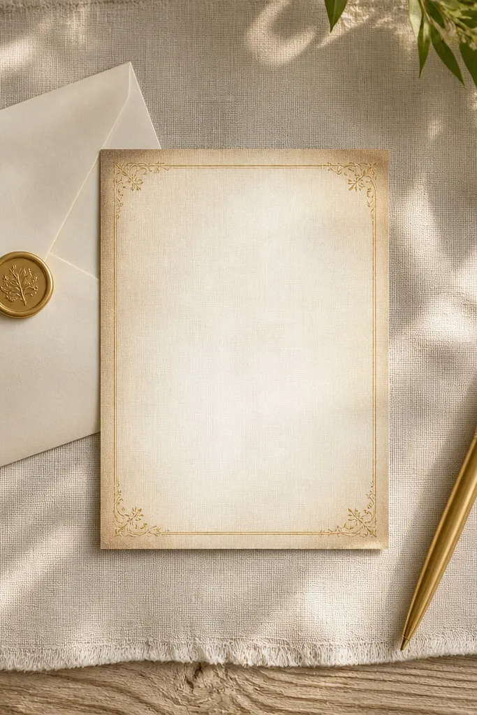
This background is the fastest way to make a card feel expensive without adding complexity. The linen texture gives you that “real paper” look even when your design is simple. The soft vignette naturally frames your names and date in the center without needing extra graphics. It’s especially good for weekend RSVP cards because it stays calm under bold serif fonts. Choose this when you want a warm, grounded vibe that photographs cleanly in daylight.
Start with a cream or ivory base at 3000-4000px wide for crisp printing. Add a vignette layer that darkens the corners by 15-25% using a feathered edge, then keep the center bright. Place your text in the brightest middle band, and add a thin border in a matching tan or warm gray. Export at print size and check readability at 100% zoom before you send it.
Use charcoal or deep brown text on this background; pure black can look harsh next to linen.
Don’t put the names directly over the vignette edge where contrast gets uneven.
2. Charcoal Gradient with a Halo Center
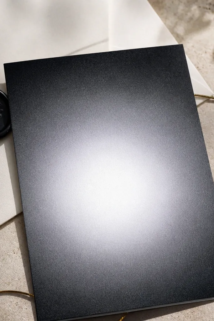
A gradient with a halo center is a cheat code for quick wedding card design in 5 minutes because it gives you built-in focus. The center glow acts like a spotlight for your names, while the darker edges keep the card feeling formal. This works well for modern wedding stationery and looks great in phone photos where lighting is unpredictable. It’s also forgiving because even if your font isn’t perfectly centered, the glow draws attention. Pick this if you want a sleek RSVP card that still looks romantic.
Create a charcoal-to-gray gradient background first, then add a radial glow centered behind the names. Keep the glow subtle so it doesn’t look like a filter; aim for a 20-35% brightness lift at the center. Add a thin light border or corner dots in a warm gray to keep the edges from melting into the gradient. Use white or warm ivory text and a slightly heavier font weight for clarity.
If you’re printing on matte paper, this background hides minor print banding better than pure solids.
Avoid bright neon accents; charcoal gradients look best with muted, wedding-safe tones.
3. Soft Dusty Rose Watercolor Frame
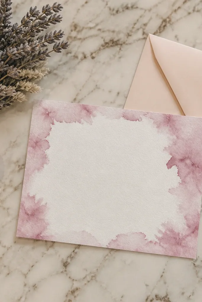
Watercolor frames look artsy but still structured, which makes them ideal for RSVP cards that need readable text. The trick is to keep the watercolor mostly at the edges so your typography has a clean, calm middle. Dusty rose gives a romantic feel without screaming “pink party.” This background is great for spring and early summer weddings, especially if your wedding palette is blush, mauve, or dusty pink. It also photographs beautifully because the edges catch light differently than the center.
Quick tipChoose a slightly off-white background instead of pure white to keep the rose softer on camera.
Use a white or very light blush center as your main text zone. Paint or overlay a watercolor texture only on the outer 10-15% of the card area to form a loose frame. Add your text in the untouched center, then include one small accent line (like a thin rule) in rose to tie it together. Export with high resolution so the watercolor edges don’t turn into pixel blocks.
Skip thisDon’t fill the whole card with watercolor; full-coverage watercolor makes fonts harder to read.
4. Garden Green Leaf Silhouette Border
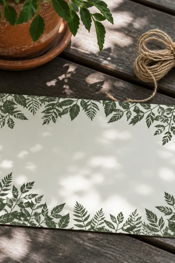
Leaf silhouettes give you an instant botanical wedding look without the mess of detailed illustrations. Keep the leaves as a border near the top and bottom so the center stays clear for names and RSVP details. Dark garden green feels fresh and formal, and it pairs well with cream envelopes and gold foil accents. This is a strong choice for outdoor venues, garden ceremonies, and daytime receptions. The silhouette style also prints more cleanly than thin-line leaf art, which is a big deal for quick turnaround.
Start with a solid off-white or parchment base. Add a leaf silhouette strip across the top and bottom edges, leaving at least 40-50% of the card height open in the middle. Use a simple font color like deep green or dark brown and keep your line spacing tight for a neat look. Add a thin divider line under the names so the RSVP text stays organized.
Use fewer leaf elements than you think — a small, dense border looks cleaner than a scattered one.
Skip tiny leaf details in the border; they disappear on standard home printing.
5. Black and Ivory Marbled Corners
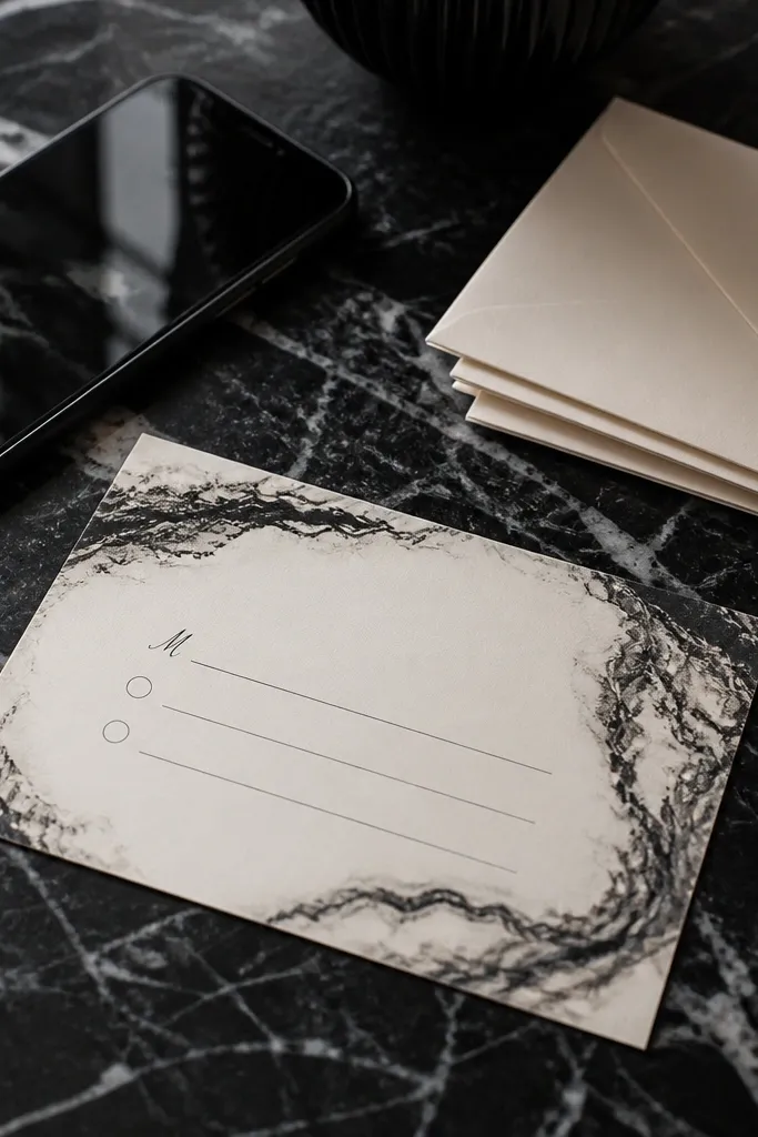
Marble corners make a card feel high-end while keeping the middle simple and readable. This design works because the heavy texture is only where your eyes won’t fight the text block. Black-and-ivory marble is also forgiving: it hides slight printing inconsistencies and still looks intentional. It suits modern, indoor venues and winter weddings when you want a moody but clean look. If you’re aiming for an aesthetic that looks good in both dim reception lighting and bright daylight, marble corners do that.
Quick tipUse an off-black instead of pure black for the border to avoid harsh edges on cream paper.
Set your main background to ivory or light cream. Add a marbled texture as overlays in only the four corners, each corner covering about 20-25% of its corner space. Keep the center totally solid with no extra texture. Add a thin black border or a soft gray border if you want less contrast, then place text inside the clean area.
Skip thisDon’t spread marble across the whole card; full marble makes text look crowded.
6. Muted Blue Horizontal Stripe Band
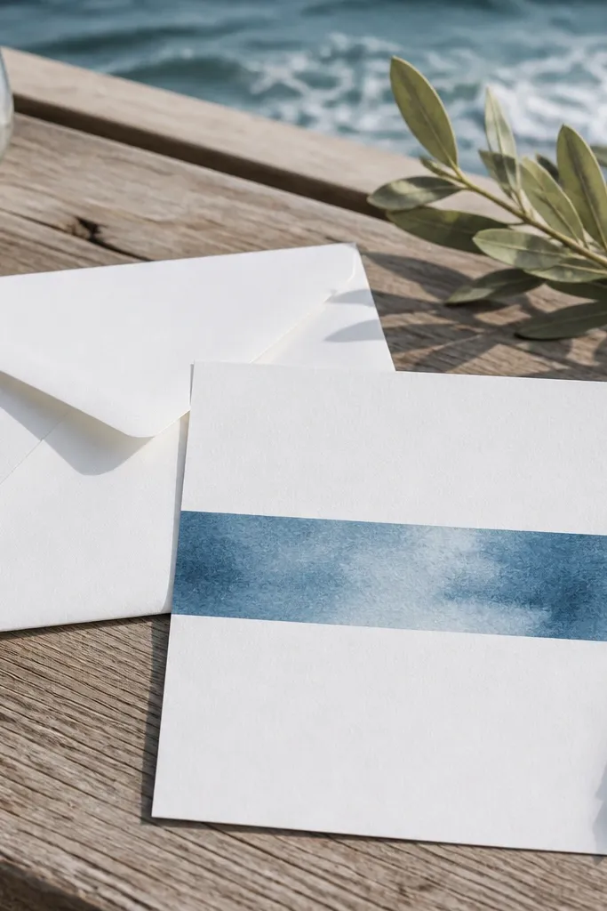
Horizontal stripe bands are fast and look designed because they create an obvious structure. The key is to keep stripes muted and only across a middle band, leaving top and bottom as clean solid space. Muted blue feels airy and works with lots of wedding palettes, especially navy accents. This style is great for RSVP cards because it gives you built-in alignment for names and event details. It also reads well in photos because stripes create a clear visual rhythm.
Quick tipUse slightly wider spacing between stripes so the text doesn’t visually blend into the pattern.
Pick a light base color like pale blue or warm white. Create a center band that covers about 35-45% of the card height and fill it with stripes at a medium thickness (around 6-10px per stripe in your design file). Keep stripe colors to two tones max, like slate and powder blue. Put your text on the stripe band but add a subtle white or cream text shadow if your font looks thin.
Skip thisAvoid very thin stripes; they can moiré on some printers and screens.
7. Blush Blotches with Crisp White Center
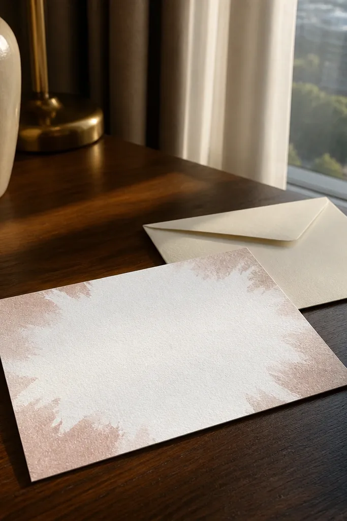
This is a playful background that still stays professional because it leaves a crisp white center for text. The blotches add texture and movement without needing fine illustration skills. Blush blotches feel modern and sweet, and they work well when your RSVP text is short and bold. It’s also one of the best options for quick wedding card design in 5 minutes because you can place blotches quickly and stop caring about perfect symmetry. Choose it for casual receptions, brunch weddings, and any palette with blush or soft pink.
Quick tipKeep blotches clustered more on the corners than the sides so the center stays visually calm.
Start with a pure white or near-white base. Add 6-10 blotch shapes in dusty blush around the outer edges only, keeping the center clear for at least the middle 50% of the card. Use a slightly textured brush or noise overlay so the blotches don’t look like flat stickers. Add your typography in a dark color like charcoal and keep your font weight medium-bold for readability.
Skip thisDon’t let blotches cross into the text area; even a little overlap makes the card look cluttered.
8. Sage Green Paper Cutout Corners
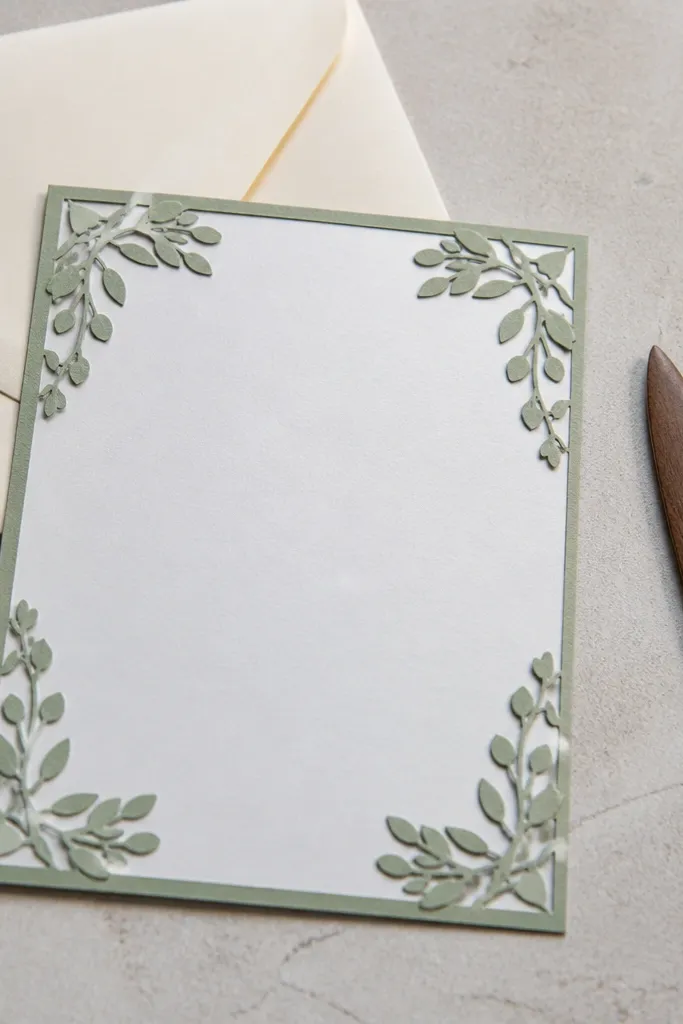
Paper cutout corners look tactile and intentional, which is hard to fake with plain backgrounds. The center stays clean, so your RSVP details look sharp and easy to scan. Sage green gives a calm, outdoorsy feel without going full botanical. This background is great for fall weddings and transitional seasons because sage sits nicely between warm and cool palettes. It also gives you a subtle 3D effect on camera, since the corners feel layered.
Use a warm cream base. Add two-tone cutout shapes in sage and a slightly darker sage shadow, placed only in the corners so they frame the center. Keep the cutouts small enough that they don’t cover where names sit, and add a thin inner border in a matching sage line. Choose dark green or espresso text and keep your RSVP lines short to avoid wrapping.
If you have foil elements, place them near the cutouts since corners photograph more clearly than flat centers.
Don’t add cutouts on all four edges; it can turn into a busy border.
9. Gold Foil Dot Confetti on Black
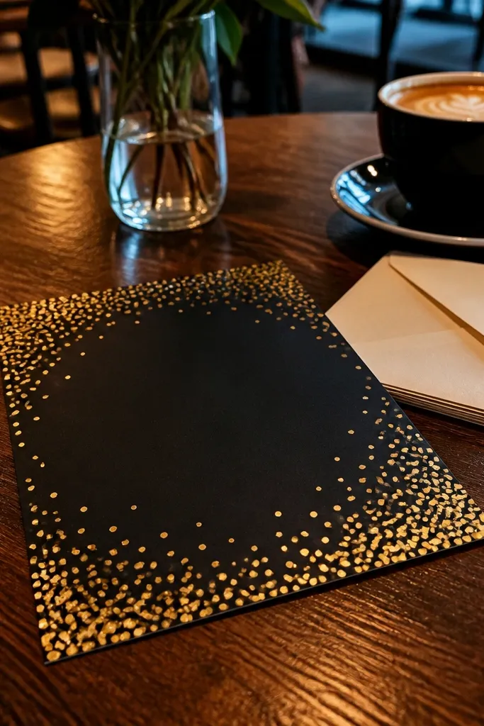
Black with gold dots looks instantly celebratory, and it’s one of the quickest ways to make RSVP cards feel party-ready. The dot pattern is consistent and doesn’t fight your typography if you keep the density higher at the corners and lighter in the center. Gold reads well with script fonts, but it also works with clean sans serif if you want modern style. This background is a strong pick for evening weddings and winter receptions. It also holds up in low light because the gold dots catch highlights.
Quick tipIf you’re printing at home, use a gold color that’s slightly muted (not bright yellow) to avoid cheap-looking neon dots.
Start with a deep black base. Add a dot pattern where dots are about the size of small punctuation marks, and increase density by 20-30% near the corners. Keep the center area mostly clear so text stays the star. Use warm ivory or cream text and consider a thin gold border line if you’re printing with a metallic accent.
Skip thisAvoid full-coverage dot confetti; it makes RSVP text feel cramped.
10. Ocean Blue Wave Wash
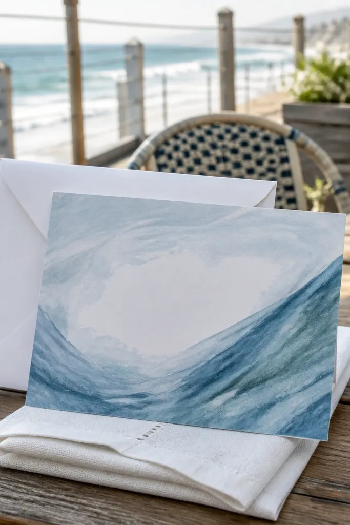
Wave wash backgrounds give “coastal wedding” energy without needing a full beach photo. The waves should be soft and semi-transparent so your text stays crisp. Ocean blue looks great with white envelopes and pairs with nautical fonts or elegant serif type. This design is perfect for summer weekends and beach-adjacent venues. It’s also good when you want something that feels romantic but not overly floral.
Pick a light blue base and blend in a darker blue wave pattern at 20-35% opacity. Place the strongest wave band behind where your names go, then fade it before it reaches the RSVP details section. Add a thin white border around the card to keep edges clean. Use navy or dark slate text and keep your font size larger for the best readability.
Keep the waves horizontal or diagonal consistently; random wave directions look messy fast.
Skip high-contrast, sharp-edged wave art; it can look harsh and distract from RSVP info.
11. Monochrome Botanical Watercolor Sprigs
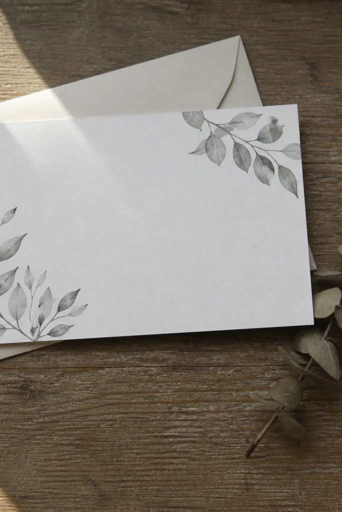
Monochrome botanical sprigs look tasteful and calm, and they’re a lifesaver when you want a floral vibe without color chaos. Use gray-green tones so the sprigs feel soft rather than loud. Place sprigs in the corners only, then keep the center mostly blank for your RSVP text. This style works year-round and looks great with minimal typography. It also photographs well because the palette stays restrained, so your card reads clearly at small sizes.
Start with a near-white background. Add watercolor sprigs only in the four corners, keeping each corner cluster under 15-20% of the corner area. Leave the middle open and add a thin border line in the same gray-green. Use dark charcoal text and consider a light text shadow if your sprigs get too close to the type zone.
Choose sprigs with fewer leaves; dense botanicals look cluttered at RSVP sizes.
Don’t place sprigs behind the RSVP lines; keep them as framing elements only.
12. Terracotta Diagonal Paper Texture
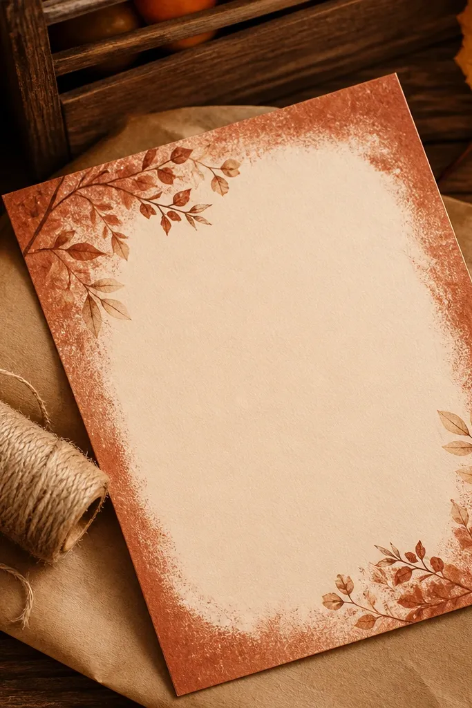
Terracotta diagonal texture feels modern, warm, and photogenic without being overly decorative. The diagonal direction adds movement, while a lighter center panel keeps the RSVP text readable. This works beautifully for fall and late-summer weddings, especially if your palette includes clay, rust, or warm neutrals. It’s also a great pick for destination weekends because it looks good in both indoor and outdoor lighting. The texture helps the card look finished even when you use a simple font.
Quick tipIf you want maximum readability, use a slightly lighter center panel than you think you need.
Set a terracotta base with a subtle paper texture overlay. Add a lighter center panel band that runs diagonally behind where your names and RSVP details go. Keep the panel width large enough for all text lines without crowding. Add a thin border in a deeper terracotta shade and use cream or off-white text for contrast.
Skip thisAvoid pure orange terracotta; it can look too casual and less wedding-like.
13. Soft Gray Concrete with Corner Numbers
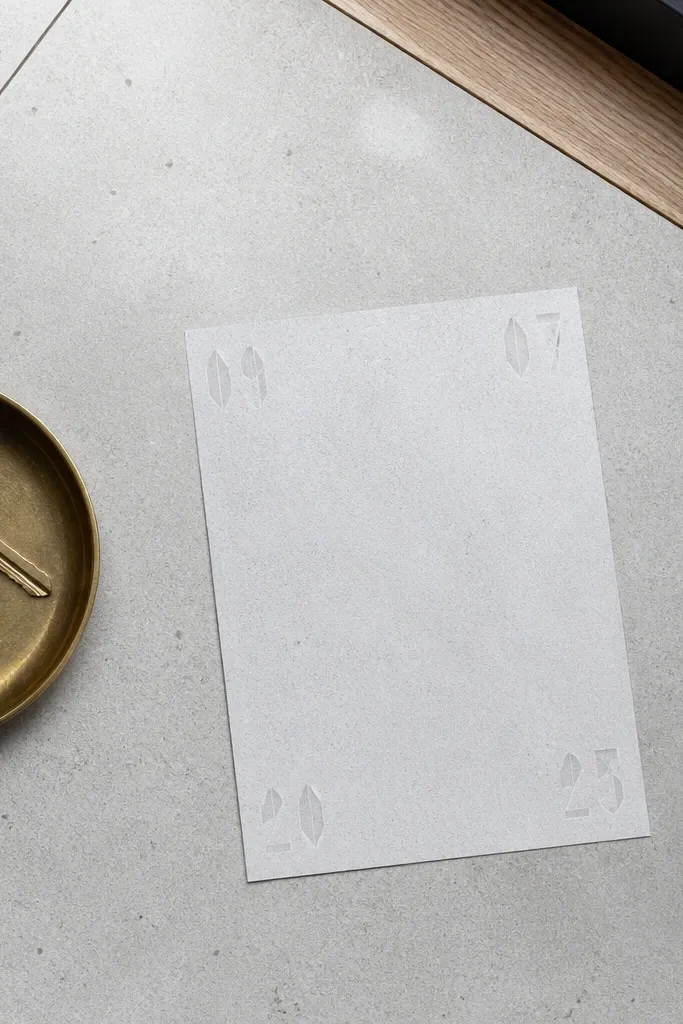
Concrete texture backgrounds give a clean, modern wedding aesthetic and they’re surprisingly classy for RSVP cards. The trick is to keep the texture light so it doesn’t turn into noise behind text. Adding small decorative numbers in the corners makes it feel designed without adding clutter. This style works for minimalist ceremonies and city venues. It also pairs well with modern sans serif fonts and tight spacing, which helps your RSVP details fit cleanly.
Quick tipKeep corner numbers small; big numerals dominate the RSVP card quickly.
Start with a light gray concrete texture at low contrast. Add small corner elements like “1, 2, 3” style numerals or simple typographic marks, placed in the top corners and bottom corners only. Keep the center free for text, and add a thin border line in charcoal. Use dark gray text and increase font weight slightly so letters stay crisp over texture.
Skip thisDon’t use heavy concrete texture; high-contrast concrete makes text look gritty.
14. Ivory Lace Pattern Edges Only
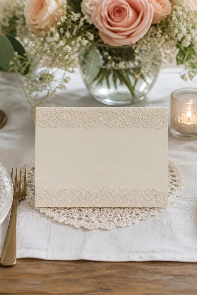
Lace edges give you a classic wedding feel without turning the card into a busy scrapbook page. Keep the lace only on the top and bottom so the center stays readable and modern. This design is perfect for traditional weddings and for anyone who wants romance but still wants clean typography. Lace edges also frame your names nicely, especially with a serif font. It’s photogenic because lace creates delicate highlights and shadows on paper.
Quick tipIf your printer tends to smear fine detail, choose a lace pattern with thicker lines.
Use an ivory base at a slightly warm tone. Add lace pattern overlays along the top and bottom edges, leaving the middle 45-55% without pattern. Add a thin rule line in a darker ivory or soft gold tone to separate your name block from RSVP details. Use dark brown or charcoal text so the lace doesn’t blend into the background.
Skip thisAvoid lace across the entire card; it turns text into a low-contrast blur.
15. Sunrise Gradient with Blush Cloud Texture
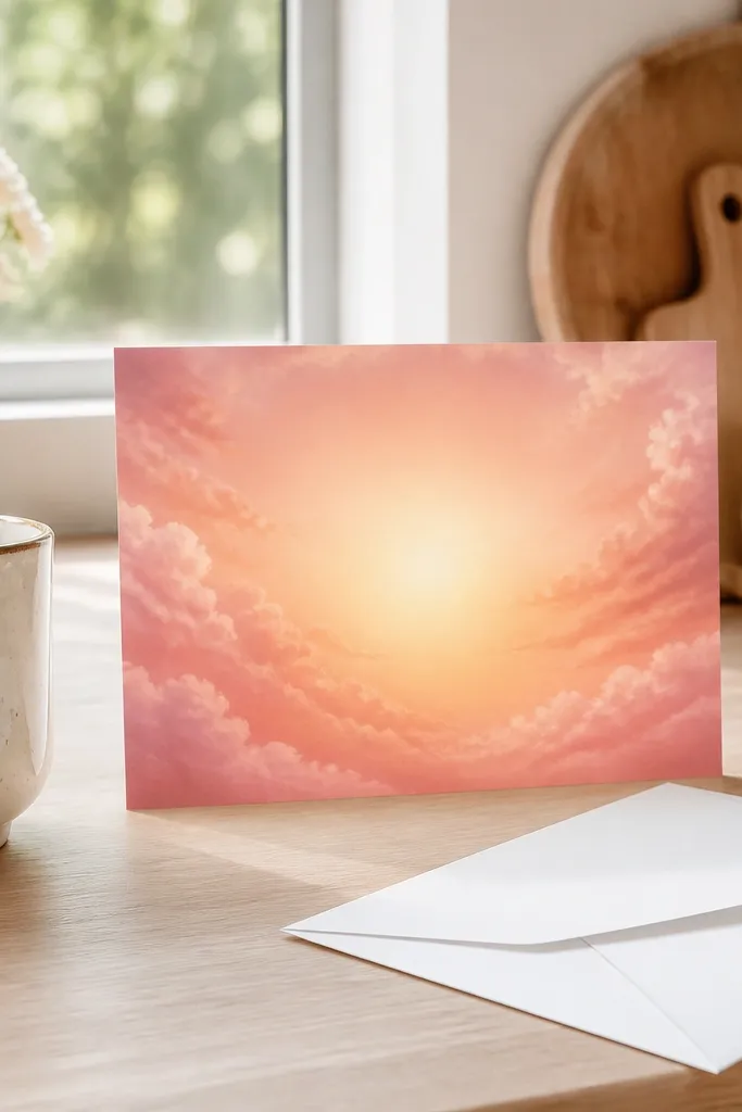
A sunrise gradient with cloud texture feels romantic and celebratory without needing floral illustrations. The gradient naturally creates a center focus, while the cloud texture adds softness that looks good on camera. This is a great choice for morning weddings, brunch receptions, and spring weekend celebrations. It also pairs well with script fonts and gold accents if you’re going for that warm, hopeful vibe. Keep the cloud texture subtle so your RSVP details stay sharp.
Quick tipPick a gradient that stays readable in grayscale too; it prevents surprises when you test print.
Create a vertical sunrise gradient from peach at the top to blush and cream toward the center. Add a soft cloud texture overlay at low opacity, mainly around the center behind your names. Keep the bottom portion cleaner so RSVP lines sit on a calmer field. Use dark brown text and consider a thin cream border if your gradient has low contrast near the edges.
Skip thisDon’t use extremely bright pink gradients; they can look cheap and wash out details.
16. Pale Sage Geometric Corners
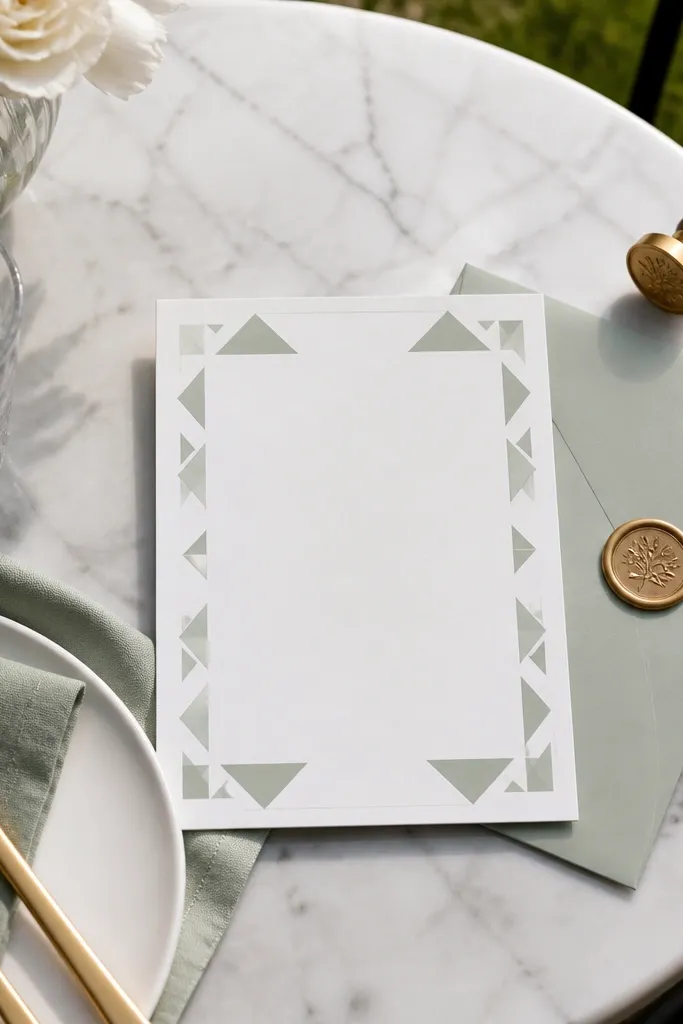
Geometric corner designs are clean, modern, and fast to implement because they’re limited to small areas. Pale sage stays soft and wedding-appropriate, and the triangle shapes create a structured frame around your text. This style works well when you want something contemporary but not harsh. It’s great for minimalist weddings and pairs nicely with simple typography layouts. Because it’s mostly blank in the center, it’s also easy to read in photos.
Quick tipUse line thickness that prints clearly — if your lines are too thin, they disappear on standard cardstock.
Start with a cream background. Add small geometric triangle clusters in each corner using pale sage and one slightly darker sage line. Keep the corner shapes within the outer 15-20% of the card so the middle stays clean. Add a thin border line and place your text centrally with consistent margins. Export at high resolution so the thin lines don’t pixelate.
Skip thisSkip full geometric patterns across the page; corners-only looks intentional and calmer.
17. Chocolate Brown Ombre with Gold Rule
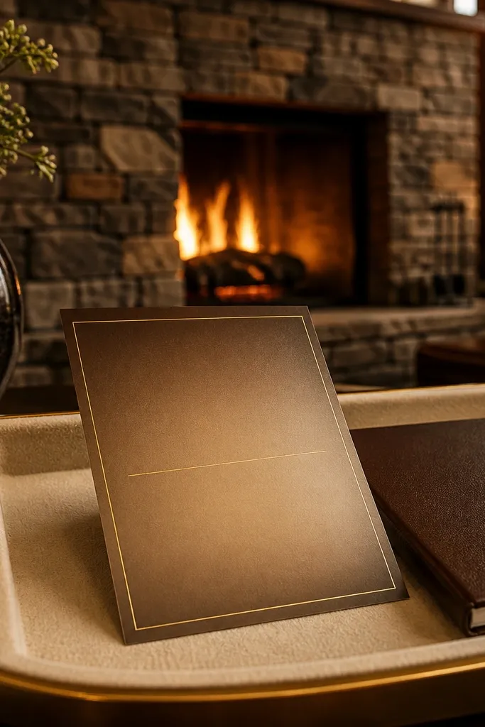
Chocolate ombre looks rich and warm, but it stays readable when you fade toward a lighter center. The gold rule line adds a clean divider so your RSVP details don’t feel floating. This background is a strong pick for fall and winter weekends, especially if your palette includes warm neutrals, cream, and gold. It also photographs well because the ombre creates depth without clutter. Use it when you want a card that feels cozy and polished.
Quick tipGold rule lines look best when they’re one consistent thickness across the card.
Make a chocolate-to-warm-cream ombre background with the lightest point behind your name block. Add a single thin gold rule line across the card where you separate names from RSVP text. Keep your text centered in the lighter area for maximum contrast. Choose either cream text or dark chocolate text depending on how bright your center becomes. Check the contrast at 100% zoom, then export for print.
Skip thisAvoid placing small text over the darkest ombre edges; it will look muddy.
18. Ivory Paper with Tiny Confetti Specks
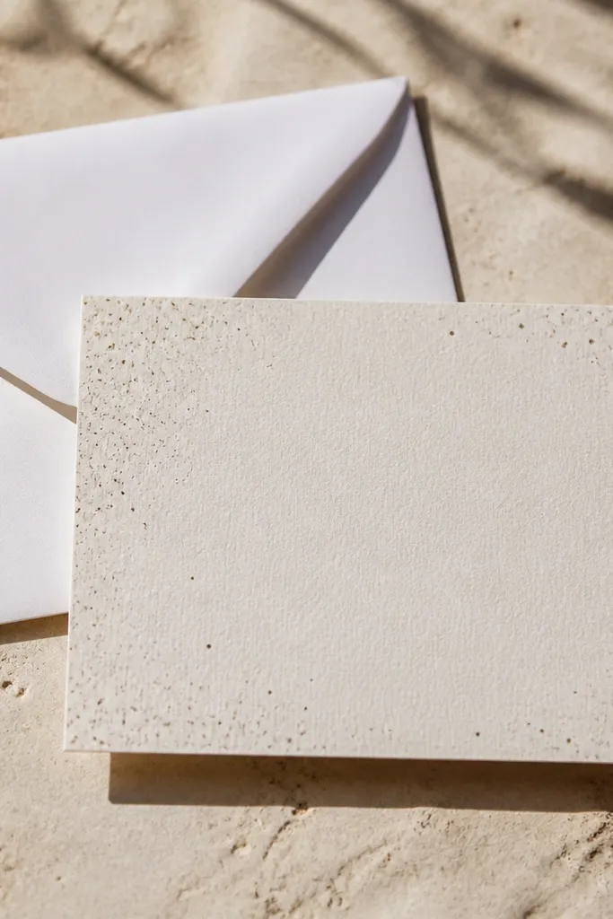
Tiny confetti specks are subtle, but they make an RSVP card feel festive without stealing attention from the message. The specks add texture like printed foil dust, which looks great on matte paper and in bright daylight. Keep the specks small and sparse in the center so the text remains crisp. This style is perfect for casual weddings and destination weekends where you want something light and not too formal. It also works for people who don’t want flowers or themes.
Start with a warm ivory base. Add specks in two colors only, like soft gray and muted gold, with a density that’s heavier near the corners. Keep the center area mostly blank. Add a thin border in gray so the card edges look finished. Use dark charcoal text and keep your font weight medium-bold for clarity.
Use specks at a consistent size; mixed-size confetti can look messy fast.
Don’t use large confetti shapes; they overwhelm RSVP typography.
19. Navy and White Nautical Stripes
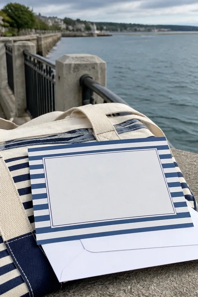
Nautical stripes are classic and they read instantly on camera, especially for beach or waterfront weddings. The key is to use navy and white with a lighter center panel so text stays crisp. This background feels fun but still clean, which is exactly what you want for weekend RSVP cards. It also pairs well with simple line icons like a tiny anchor in the corner if you want one extra touch. Keep the layout minimal and the card will look styled even without extra graphics.
Quick tipIf you’re using a script font, keep it dark navy so it doesn’t fade against white.
Choose a navy base stripe set and create a center panel that’s solid white for the text block. Keep stripe thickness consistent and medium (so it doesn’t blur when printed). Add a thin navy border around the card for structure. Use navy text on the white center and keep your RSVP text in one or two lines max if possible. Export at print size and check at phone scale for readability.
Skip thisAvoid stripes behind the RSVP lines; keep them as a frame or header.
20. Dusty Mauve Solid with Embossed Texture Look
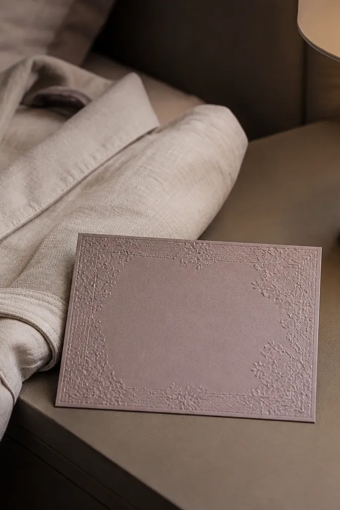
A solid background with an embossed texture look is a clean way to make your card feel dimensional. Dusty mauve is wedding-friendly and flattering in both indoor and outdoor light. The texture gives depth without adding pattern clutter, which is perfect for quick layouts. This style is great when you want the typography to feel intentional and centered. It also looks premium on matte cardstock because the texture catches light gently.
Set your background to dusty mauve and add a subtle emboss-style texture overlay at low contrast. Keep the highlights soft and centered so the edges stay stable for text readability. Add a thin border in a slightly darker mauve or warm gray. Use ivory or cream text and choose a font weight that holds up against the texture. Export and do a quick test print or screen check at normal viewing size.
Use a border line if your texture has low contrast; it keeps the card edges crisp.
Avoid very dark mauve with thin white fonts; the texture can reduce legibility.
21. Soft Cream Grid with Rounded Corners
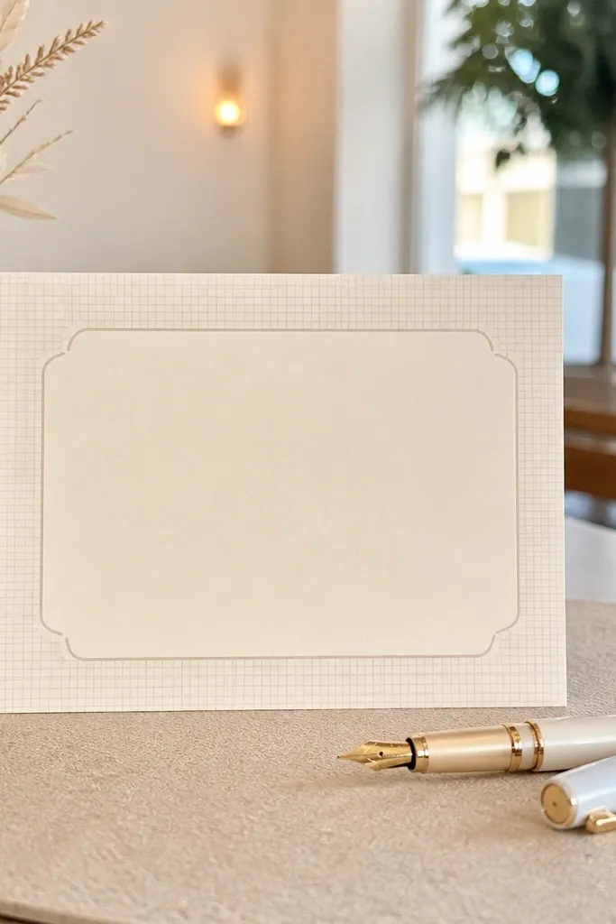
A faint grid background looks modern and organized, which makes RSVP info feel structured even when the card is simple. The rounded corner framing adds a friendly touch so it doesn’t feel too technical. This is a great option for couples who want a clean, minimal aesthetic without going fully blank. It also helps alignment: your names and RSVP lines naturally sit in “columns” visually. Pick this for modern venues and for couples who like typography-heavy designs.
Start with a warm cream background. Add a very light gray grid at a low opacity, with grid spacing wide enough that it doesn’t look busy (think 20-30px spacing in your design file). Add a rounded rectangle border with a slightly darker gray line. Place your text in the center and keep consistent margins. Use dark charcoal text and avoid overly thin fonts on top of the grid.
If the grid shows too much on your screen, lower opacity and increase border contrast instead.
Skip dense grids; they turn into visual noise behind names.
22. Emerald Frame with Blurred Floral Center
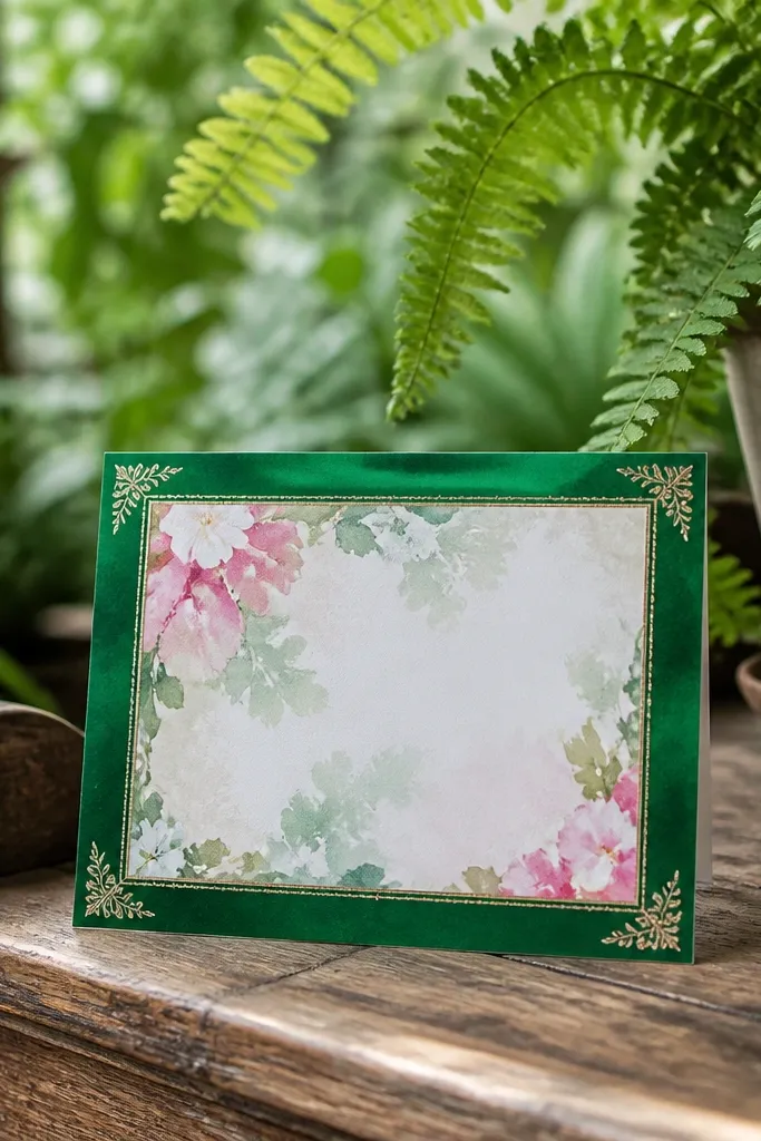
An emerald frame gives you a strong, readable border, while a blurred floral center keeps the vibe romantic without killing clarity. The blur is the point: it adds “garden energy” but doesn’t compete with the RSVP text. This is one of the better options when you want floral style but you’re short on time. It’s also great for evening weddings because the emerald edges feel rich and photo-friendly. Use it if your typography is the main focus and you want the background to support, not distract.
Create a white background and add an emerald frame that covers about 10-15% of the card edge thickness. Add a blurred floral texture in the center at low opacity so it stays behind the text. Keep the RSVP text area clear by placing a semi-transparent light overlay behind the text block if needed. Add a thin lighter green rule line to separate name and RSVP details. Export at high resolution so the blur looks smooth rather than pixelated.
Use a text overlay panel at 70-85% opacity if the floral center is too noticeable behind your letters.
Don’t use sharp, high-detail florals; they make quick RSVP text feel crowded.
23. Champagne Bokeh Circles on Soft Gray
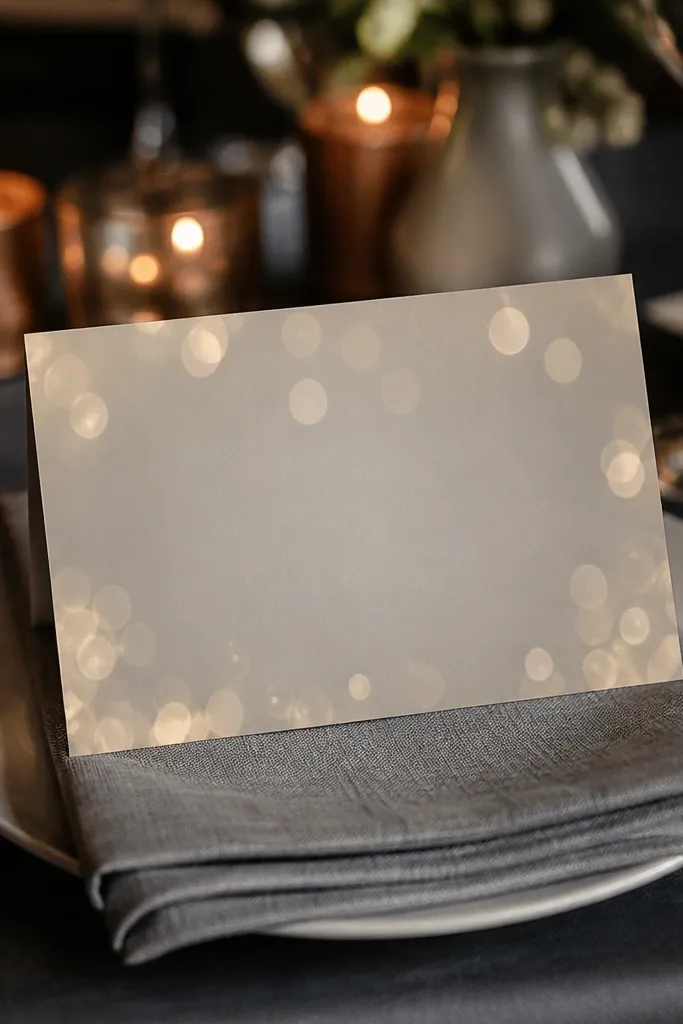
Champagne bokeh circles add a party glow without turning into confetti chaos. The soft gray base keeps everything modern, and the bokeh gives you that “lights in the distance” look that photographs beautifully. This background works well for cocktail-hour weddings, indoor receptions, and evening RSVPs. It also pairs nicely with gold script fonts and clean serif typography. Choose this when you want an aesthetic that looks celebratory but still classy and readable.
Use a soft gray base and add bokeh circles in champagne tones at low opacity. Keep the bokeh larger near the corners and smaller near the center so the text area stays calm. Add a subtle vignette if the center feels too flat. Use dark gray or charcoal text for contrast, and consider a thin champagne border line. Export at a high resolution so the bokeh edges stay smooth.
Keep bokeh limited to 20-40 circles; too many makes the card look foggy.
Avoid bright yellow bokeh; it can look like cheap party lights.
24. Soft Black Brushstroke Corner Accent
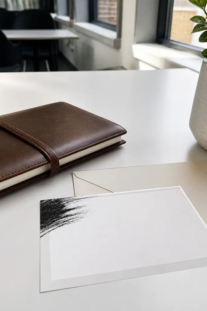
A single brushstroke corner is dramatic without being noisy. It’s also one of the most efficient designs for quick wedding card design in 5 minutes because you place one strong element and keep everything else clean. The brushstroke texture adds movement and an editorial feel, while the white center makes RSVP text readable. This background works especially well for modern weddings and couples who like minimal design with one statement detail. If you’re using bold typography, this corner accent makes it look intentional.
Start with a white or warm ivory base. Add one black brushstroke in the top-right corner, keeping it within the outer 20% of the card area. Blur the brushstroke edges slightly or lower contrast so it doesn’t look like a sticker. Add a thin gray border or a single line under the names to keep the layout structured. Use black or deep charcoal text and keep line spacing tight.
Pick a brushstroke opacity around 60-80% so it looks soft on paper rather than harsh.
Don’t add multiple brushstrokes; one corner looks designed, two corners looks accidental.
25. Pastel Rainbow Sweep with White Text Band
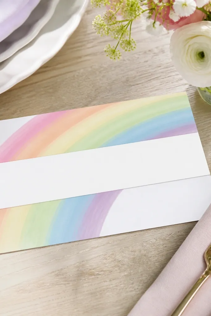
A pastel rainbow sweep is cheerful and photogenic, but it needs structure to stay readable. The solution is a white text band that sits over the rainbow so your RSVP details are clean and high-contrast. This background is great for spring weddings, casual weekend events, and couples who want something sweet without going childish. It also works well for RSVP cards because you can keep the copy short and place it on the band. The rainbow sweep still adds personality in photos even if your text is minimal.
Create a pastel rainbow sweep across the top third of the card using soft, low-saturation colors. Add a solid white band below it that covers the area where names and RSVP lines will go. Keep the rest of the card white or very light so the band stands out. Add a thin border in gray, then use dark charcoal text on the white band. Export at print size and check legibility on a phone screen.
Use rounded font corners or a friendly serif with this design; sharp modern fonts can feel too formal for pastel sweeps.
Avoid putting small RSVP text directly on the rainbow colors.



