
1. Olive Branch Menu Card Style Template
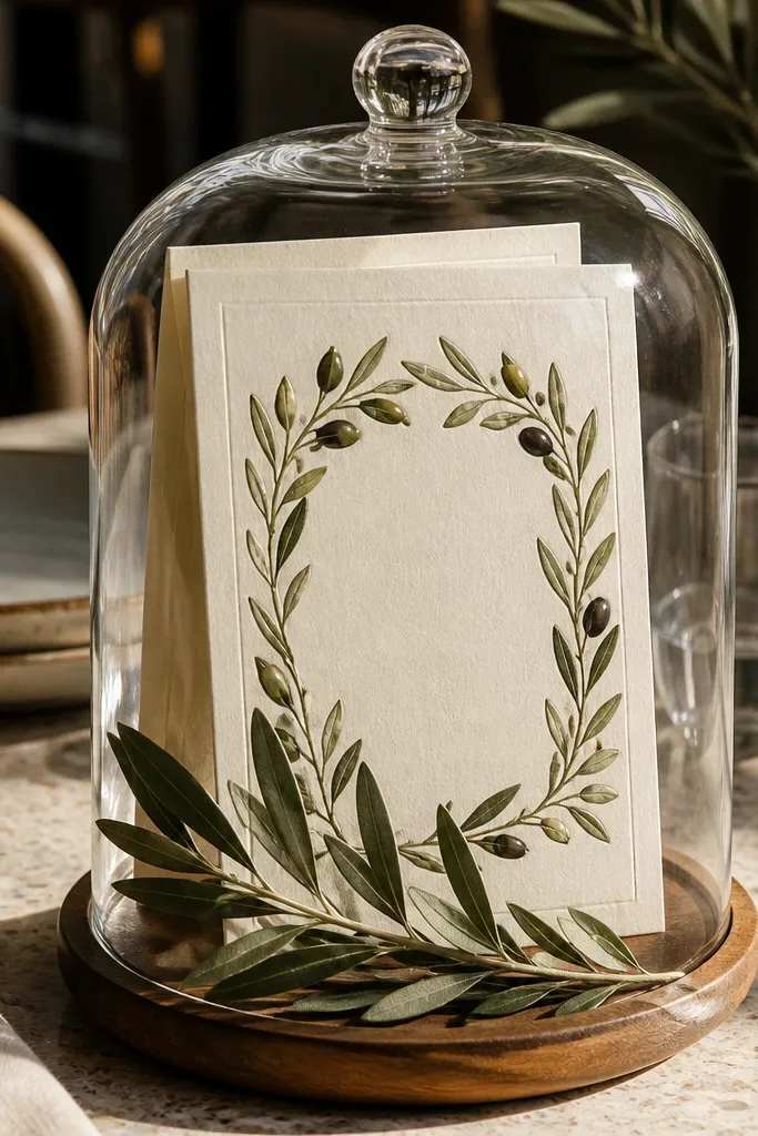
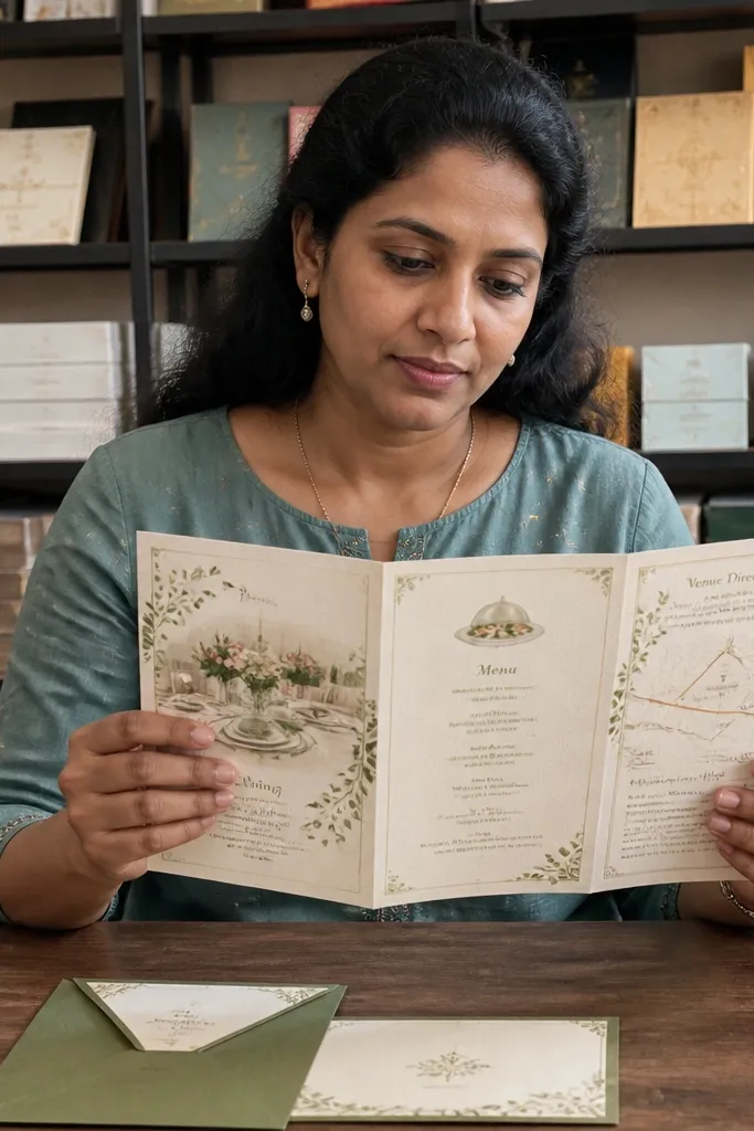
This template looks like a folded menu — which is exactly why it works for food-centered events. The olive-leaf frame gives you a clear visual anchor without crowding the address or RSVP line. The background stays light, so your event details read cleanly even when you add dietary notes. It also pairs well with family-style dinners because it feels “shared” rather than formal and distant. Use it for olive-oil tastings, Mediterranean weddings, or any event where herbs and fresh ingredients are the story.
Quick tipUse dark green or espresso ink for the details; it looks more natural than pure black against cream.
Start by downloading the highest-resolution PDF option or the editable file version if it’s offered. Next, replace the headline with your event name and keep the menu section short — aim for 3 lines max for the first pass. Finally, print a single test sheet on your chosen paper (or order a sample) before sending the whole batch. If you’re adding dietary info, put it in a dedicated short line under RSVP instead of stretching the body text.
Skip thisDon’t add a long paragraph of menu text — this design needs short lines to stay elegant.
2. Citrus Grove Watercolor Border Template
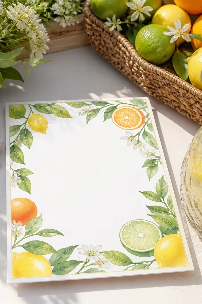
Watercolor citrus borders scream “bright + fresh,” which fits dessert tables, brunch weddings, and summer cocktail hours. The important part is that the border does the decorating, while the center stays mostly blank for readable typography. That balance keeps your RSVP line sharp and prevents the invitation from turning into an unreadable art card. If your theme includes lemonade, citrus mocktails, or a fruit-forward dessert spread, this template makes the invitation match the actual guest experience. It also photographs well because the colors have soft edges.
Quick tipAdd a tiny icon for “brunch start time” or “cocktail hour” only if there’s already space for icons.
Start by choosing the version that includes space for time + location on one line each. Then, swap in your color palette: lemon yellow for accents and a neutral cream for the base. Finally, export or download at print-ready settings, and do a test print to check that the watercolor doesn’t look muddy on your printer. If you plan to add a QR code for the menu, place it in the bottom corner so the border framing stays intact.
Skip thisSkip templates where the center text sits directly on top of watercolor washes.
3. Coffee and Croissants Typography Template
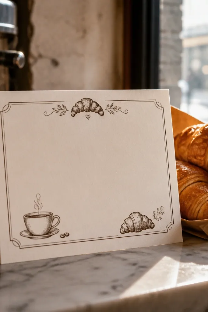
This template is built for breakfast and morning events where the invitation should feel warm, not overly formal. The typography-forward layout keeps it readable, and the pastry/coffee accents add theme without stealing the spotlight. It works especially well if you’re hosting a brunch with a bake-off, a coffee bar, or a croissant service because the design feels like a café sign. Choose it when you want guests to instantly understand the event vibe from the first glance. It also looks great on matte paper because the ink doesn’t glare.
Quick tipUse a matte finish if the template has darker ink blocks; it keeps the text crisp.
Start by selecting the font pairing that keeps the RSVP line larger than the menu text. Then set your schedule in a strict hierarchy: headline, event time, location, RSVP. Finally, keep the menu mention to one short line like “Croissants + coffee bar” so the invitation doesn’t become a flyer. For printing, choose a warm tan or off-white base so the coffee tones feel cohesive.
Skip thisDon’t use bright white paper with espresso text if you want the cozy café look.
4. Farmhouse Red Check and Menu Block Template
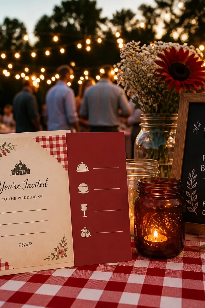
Farmhouse red check instantly signals a rustic dinner, family gathering, or backyard wedding with comfort-food energy. The best versions keep the check pattern limited to corners or a thin band, so your event details sit on a solid panel. This template is ideal when you want to include a short menu highlight like “BBQ + sides” or “pasta bar” without turning the card into a menu itself. It also gives you strong visual contrast, which helps if your guests will read it quickly at a glance. Pair it with kraft envelopes or cream liners for a cohesive look.
Quick tipLimit the check pattern to the top third so the RSVP line stays clean.
Start by choosing the template variant that has a solid rectangle for the main text. Then edit your headline and keep the details font size consistent across the whole card. Finally, test print on kraft or textured stock if you can — the check pattern looks best when it has slight texture. If your print shop offers envelope liners, request a cream liner so the red doesn’t bleed visually into the text area.
Skip thisAvoid full-bleed check backgrounds if you plan to add multiple lines of details.
5. Terracotta Pasta Night Minimal Template
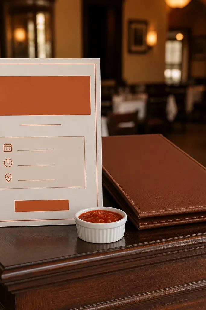
Minimal doesn’t mean boring here — terracotta accents make the card feel warm and food-first. This template works for pasta bars, Italian nights, and events where you want a clean modern look but still want the invitation to hint at the menu. The layout is simple: a headline, one clean block for event details, and a small thematic element that ties it together. It’s a good choice if you’re using a separate insert for the full menu. Guests read it fast, and it still looks good in photos because the color pops against neutral paper.
Quick tipKeep the RSVP line short and bold; it improves readability from a distance.
Start by choosing the editable version so you can adjust line breaks for the address and RSVP fields. Then use terracotta for the headline or a thin underline, not for every line of text. Finally, add menu info as a short subtitle line under the event title so it doesn’t fight the main details. Print on cream or warm white paper to avoid the terracotta looking flat.
Skip thisDon’t use multiple accent colors — the minimalist look collapses when everything is a highlight.
6. Rosemary and Thyme Monogram Template
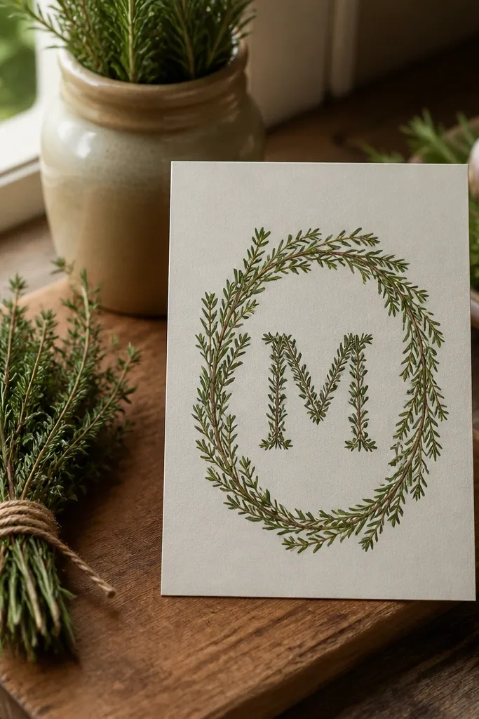
A herb monogram template is perfect when your food theme is ingredient-driven. Rosemary and thyme wreaths look refined without trying too hard, and the monogram keeps the design personal. It’s also practical because monograms give you one strong focal point — you can add menu notes without cluttering the entire card. This design suits candlelit dinners, farm tables, and events where you’re serving herb-forward dishes like roasted chicken, lamb, or seasonal vegetables. The dark green center can look luxurious, especially if you print on a matte stock.
Quick tipChoose a matte paper and dark green ink for the monogram so the herb illustration stays sharp.
Start by placing the monogram as the visual center and keep the event details in a clean block below it. Then add menu text as a single line with keywords like “rosemary chicken + seasonal sides.” Finally, confirm that the template’s margins are wide enough for your envelope — herb wreath edges can get tight. Do a test print in your final ink color to ensure the green doesn’t look too dark.
Skip thisSkip templates where the monogram overlaps the address — it can look messy once assembled.
7. Rustic Chalkboard Dinner Template
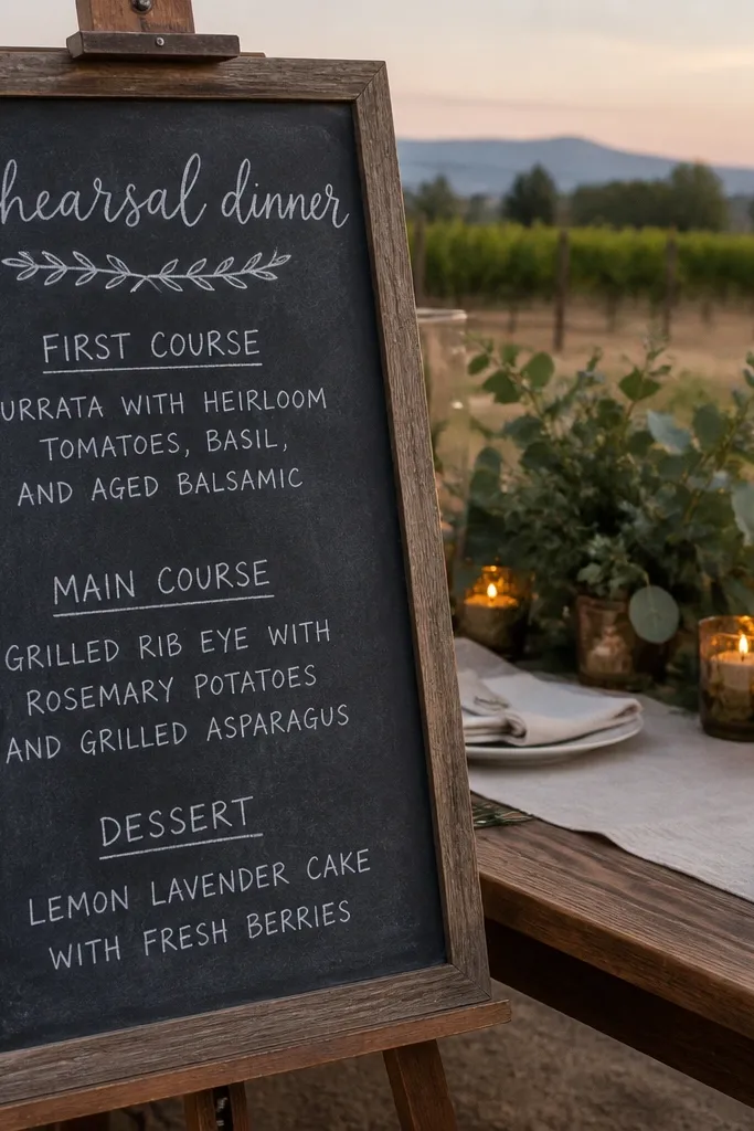
Chalkboard-style templates work when you want a fun, slightly edgy food vibe — especially for casual venues, rehearsal dinners, and late-night dessert service. The trick is to keep the text high-contrast and large enough for quick reading. The best chalkboard designs use a textured dark background with clean white or light gray typography, plus small food icons like forks, plates, or simple desserts. It photographs well under warm lighting, and it feels right for events with a “menu board” theme. If you’re doing a taco night, a ramen bar, or a late dessert buffet, this one fits.
Quick tipUse white ink or a light gray that doesn’t look bluish; it keeps the chalk look natural.
Start by selecting the template variant that includes a clear RSVP line and a separate line for the address. Then keep the menu mention short — use 2-3 keywords, not sentences. Finally, print on a paper that won’t show glare; matte black or dark charcoal stock is ideal. If your print shop offers foil, skip it here — chalkboard textures already look busy.
Skip thisAvoid tiny fonts on chalkboard backgrounds — the texture makes small text harder to read.
8. Berry Dessert Table Frame Template
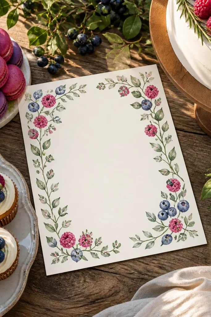
This template is made for dessert-forward celebrations where the invitation should hint at berries, cakes, macarons, or a full sweet spread. The berry frame gives you a soft, romantic border, while the center stays clean so guests can instantly find the date, time, and RSVP. It’s a strong pick for spring and early fall because berry colors feel fresh without going into full “pastel baby shower” territory. If your event includes a dessert table with flavors like strawberry, raspberry, or blackberry, this design communicates it without you writing a paragraph. It also works well for wedding showers that have a dessert bar component.
Quick tipKeep the berry palette to two tones (main berries + leaves) so the frame doesn’t overpower the text.
Start by choosing the template version with a center text block that doesn’t sit too close to the frame. Then set your typography contrast: darker headline, medium-weight body text, and a bold RSVP line. Finally, add dietary notes in a very short line like “Gluten-free options available” if there’s room. Print on a slightly textured cardstock to make the berry illustration look less flat.
Skip thisDon’t add extra icons around the frame; it turns from cute to clutter fast.
9. Champagne Toast Minimal Invite Template
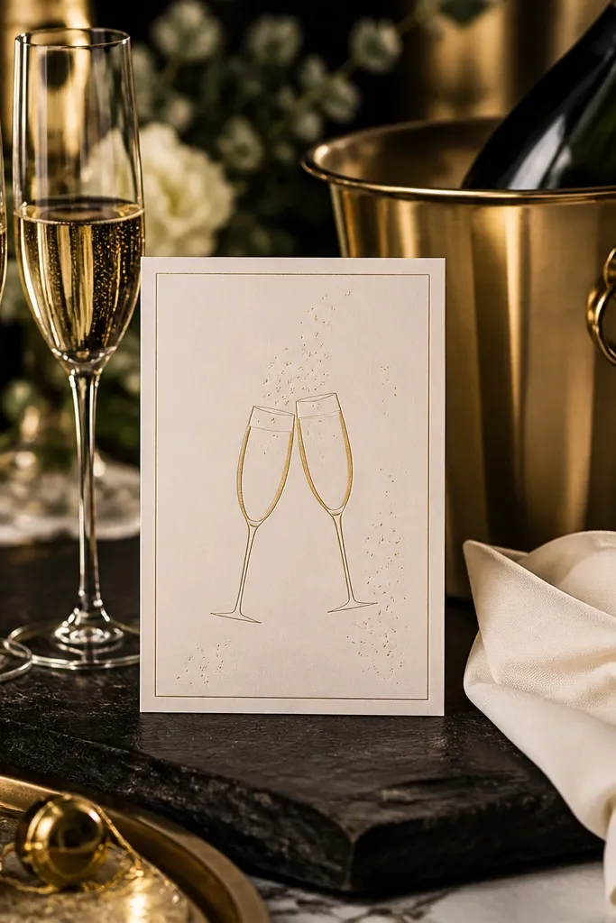
If your theme includes champagne, toasts, and a cocktail hour that feels polished, this template nails the vibe without going overboard. The gold accents give it a celebratory look, and the minimal layout keeps the details readable. It’s a smart choice when you want the invitation to feel like a proper event card, not a themed flyer. The small toast icon is enough to connect the stationery to the drinks. This works well for indoor receptions, winter weddings, and any food-centered event where alcohol and appetizers are part of the story.
Start by selecting a template that uses gold as lines or small icons, not as full background fills. Then edit your headline and keep the details in a single clean grid so spacing stays consistent. Finally, choose a paper finish that won’t dull the gold — matte is fine for gold lines, but avoid super glossy if your text is dark. If you’re adding a menu link, put it on the RSVP line or a short footer.
Use a deep charcoal text color instead of black for a cleaner, more expensive look.
Avoid templates that use gold for body text; it reduces readability in print.
10. Sage Floral + Table Setting Template
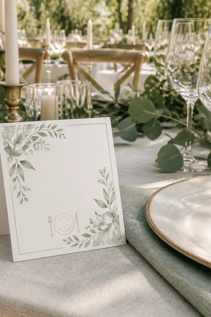
This is a great option when your theme is food but you also want a traditional wedding feel. Sage floral corners and a table setting icon connect it to dinner, plates, and place cards without making it look like a holiday party invite. The design stays airy, so you can add a dress code line and still keep the center uncluttered. It’s especially good for events where you’re serving plated dinners or multi-course meals. If your venue has lots of greenery or neutral décor, sage will blend beautifully and keep the invitation looking cohesive in photos.
Quick tipAdd one line for “Dinner + dancing” if that matches your schedule; it reads better than a long description.
Start by choosing the version with enough margin for your address and return address. Then place the table setting icon near the event details, not near the RSVP, so the RSVP stays obvious. Finally, print on cream cardstock and use a dark ink color that matches your sage accent. If you’re including a secondary insert, keep the invitation itself to date, time, location, RSVP, and one menu keyword.
Skip thisSkip dense floral templates when you know you’ll add dietary and accessibility notes.
11. Maple Leaf Autumn Harvest Template
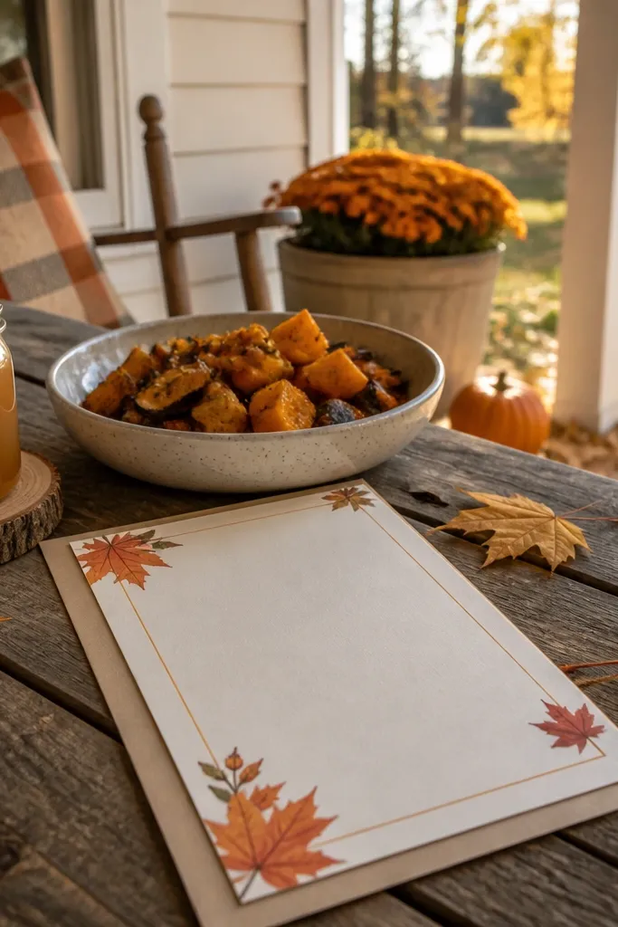
Autumn food themes look best when the invitation uses warm paper tones and simple leaf shapes. This template does that by using maple leaf accents and a clear typographic grid. It’s ideal for events with soups, cider, roasted vegetables, or a dessert table featuring apple, cinnamon, and caramel. Guests understand the vibe fast, and the warm palette looks good under fall lighting. It also works for rehearsal dinners because it feels seasonal without being overly festive.
Quick tipUse a slightly darker brown than you think; it keeps the invitation crisp in print.
Start by choosing the template with a readable headline size — you want the date to jump out. Then set the event details in a two-line structure: time on one line, location on the next. Finally, keep menu notes short and seasonal, like “Cider + warm desserts.” Print on warm white or light ivory paper so the brown text looks smooth instead of harsh.
Skip thisDon’t choose a template that uses orange gradients behind the text.
12. Blueberry Jam Label Template
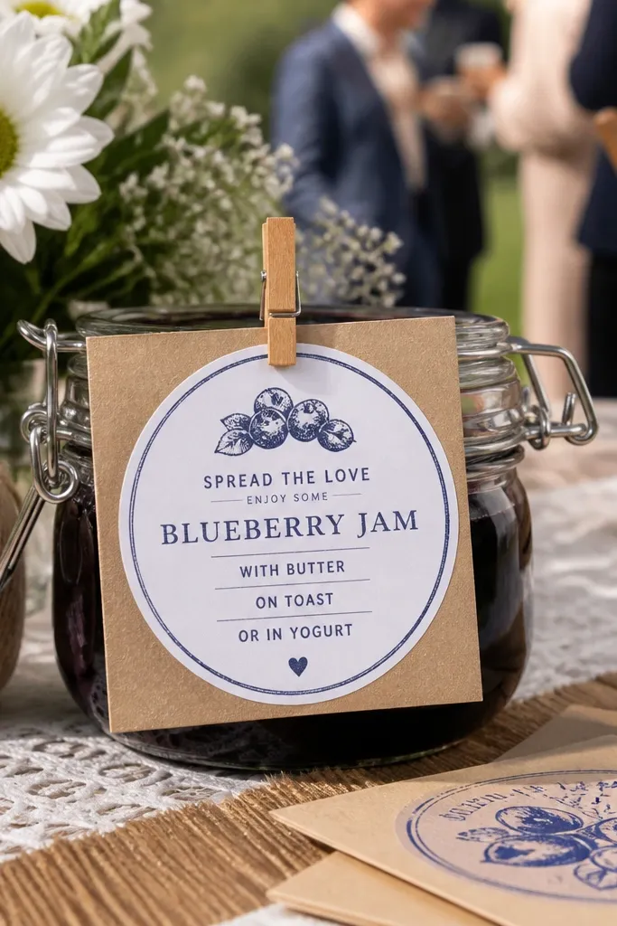
This one is playful and food-authentic because it looks like a jam label. The stamp-style circle gives you a strong focal point, and the label layout naturally supports a short menu mention. It works best for farm-to-table weddings, backyard receptions, and any event with preserves, jam favors, or berry desserts. The design also makes your invitation feel collectible — guests notice it because it looks different from standard wedding cards. Choose it if you want your stationery to feel like part of the food story, not just a matching color scheme.
Quick tipUse a slightly off-white background so the blue stamp looks richer.
Start by selecting the label template variant that includes a clear place for the date and RSVP. Then keep the “flavor” text short — think “Blueberry jam + mini desserts” rather than a full description. Finally, print on matte cardstock so the stamped look stays crisp. If you plan to include a QR code, place it on a small footer so it doesn’t break the label shape.
Skip thisAvoid label templates with too much tiny text; it looks like packaging copy once printed.
13. Olive Oil Bottle Tag Template
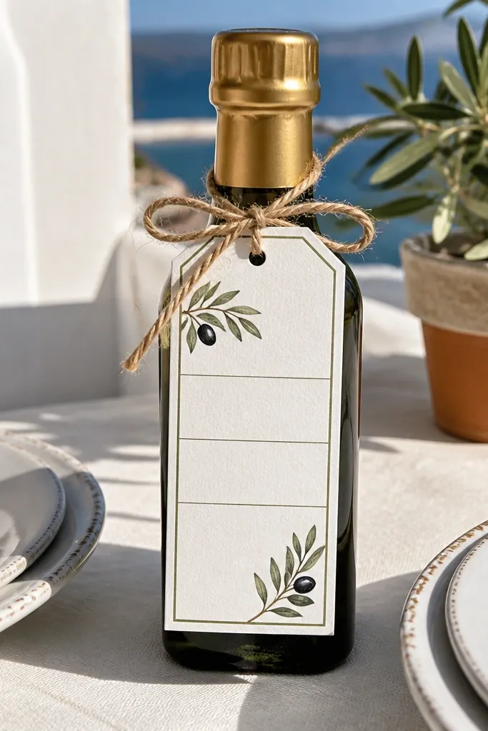
Vertical tag-style templates feel like a favor label, which makes them perfect for events where you’re giving out edible favors like mini olive oil bottles. The layout is structured and easy to read because the text sits in defined bands. This design supports food-centered events like Mediterranean dinners, tasting nights, and weddings with a “bring-home a flavor” vibe. It also looks great when placed on a table setting or clipped to a menu card. If your stationery set includes place cards, this style ties them together.
Quick tipAdd the RSVP URL in one line with a short prefix like “RSVP:” if the template allows it.
Start by downloading the tag template that matches your print size — vertical labels should be printed at the correct scale. Then edit the text in bands: name at top, date in the middle, RSVP at the bottom. Finally, test print one copy to check alignment so the bands don’t shift when you trim or fold. For envelopes, pick a matching kraft or cream color so the tag look stays intentional.
Skip thisSkip templates that require heavy trimming unless you have a reliable paper cutter.
14. Seared Steak Poster Style Invitation
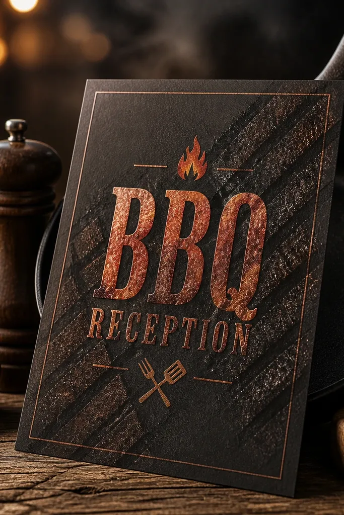
Poster-style invitations work for food events that are a little bold — think steak dinners, BBQ nights, or cookout receptions. The charcoal base makes the typography pop, and subtle grill-mark textures connect it to the theme without turning into a novelty card. This template is best when you want a modern wedding look with a food twist. It also photographs well because the contrast stays strong even in low light. If your menu is heavy on smoked meats, flame-roasted flavors, or late-night comfort food, this style fits.
Start by selecting the template with a large headline area for the couple’s names and the date. Then keep the details in a simple grid so the invitation doesn’t look like a flyer. Finally, print on matte black or dark charcoal paper if you can — the texture makes the design feel intentional. If you’re adding a dress code, place it near the RSVP so guests see it during decision-making.
Use a light cream text color for small details to avoid grainy readability.
Don’t add multiple decorative icons; the poster style needs space.
15. Candlelit Dinner Place Card Insert Template
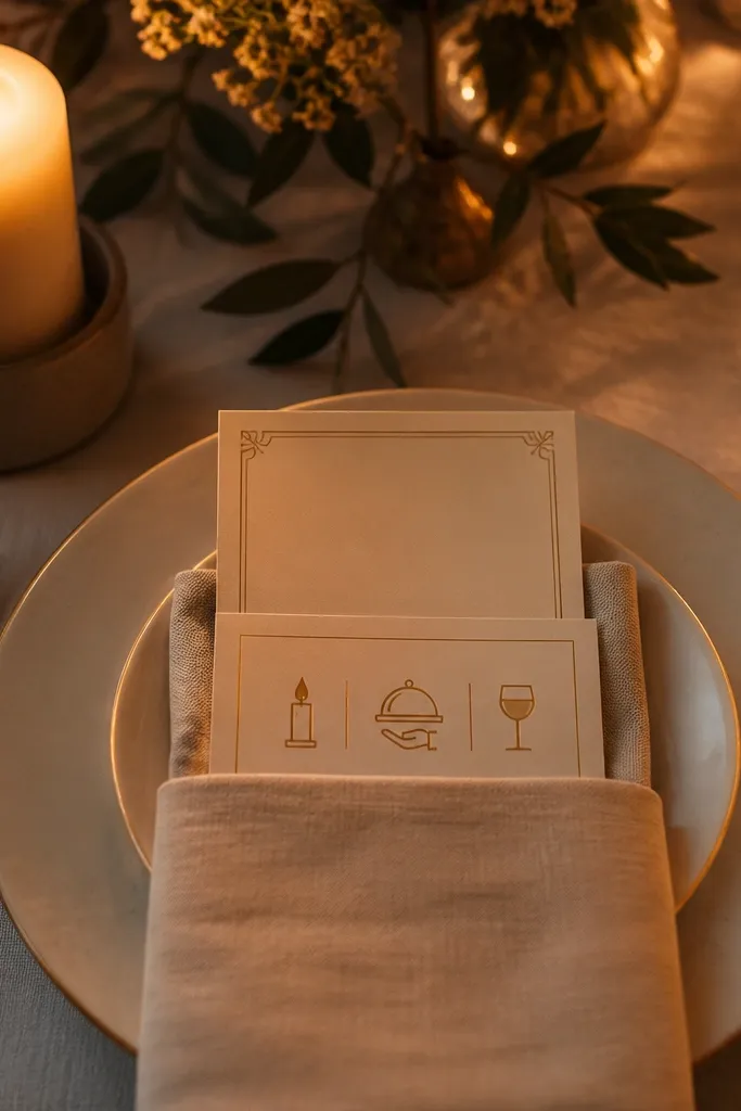
Some invitations look better when the main card stays simple and the food theme shows up in an insert. This template is designed for that job: it gives you a candlelit dinner vibe and a dedicated place for menu highlights, course notes, or dietary line items. It’s perfect for plated dinners where you want guests to know what’s coming without turning the invitation into a menu. The clean typographic blocks also help you keep accessibility notes readable. Choose it when your food-centered event has multiple details and you want the main invitation to stay elegant.
Quick tipUse the insert for menu and dietary info; keep the invitation for date, time, location, RSVP.
Start by downloading the insert template sized to your envelope system so it folds cleanly with your main card. Then insert your menu bullets as short phrases and keep the RSVP line on the main invitation, not the insert. Finally, print inserts first and test fold alignment before you order the full set. If you plan to include dietary options, keep them to one short list line like “GF + vegan available” on the insert.
Skip thisDon’t cram menu text into the main invitation if the template doesn’t give you extra space.
16. Charcuterie Board Illustrated Corner Template
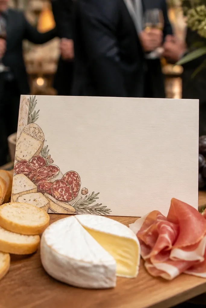
Charcuterie-themed invites are a hit for cocktail hours because guests snack first and RSVP later. A corner illustration keeps the design photogenic while leaving the center readable. This template works well if your menu includes a grazing table, cheese pairing, or cured meats spread across long boards. The best versions balance a small illustrated corner with a strong typographic hierarchy for the details. It also looks good in flat lays — invitation + menu cards + place settings in one frame. If your venue is bright and airy, the white base makes the food illustration pop.
Quick tipPlace the charcuterie mention on the same line as the RSVP so guests connect the food to the event date.
Start by choosing the version that includes a clear RSVP area with enough space for the response method. Then keep the menu mention short, like “Cheese + charcuterie reception.” Finally, print on a smooth matte paper so the illustration doesn’t blur. For travel-friendly shipping, pick a slightly thicker cardstock so corners don’t dent in transit.
Skip thisAvoid templates with busy full-page food illustrations if you need to add lots of logistical text.
17. Cinnamon Stick Border Template
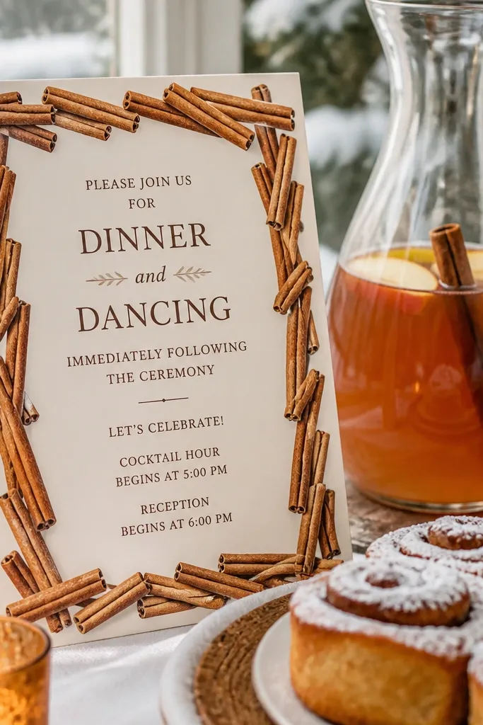
Cinnamon stick borders are perfect for fall weddings and winter receptions when you want food to feel cozy. The border theme adds warmth without covering the text, and the neutral base keeps the typography readable. This template fits cider hours, spiced desserts, and events where the menu includes cinnamon rolls, apple pie, or spiced hot drinks. It also looks great with darker envelopes and cream liners. If you’re going for a warm, inviting aesthetic that still reads like a real wedding invitation, this is a strong pick.
Start by choosing a template that uses a dark script only for the headline and keeps body text in a clean serif or sans. Then set the event details in consistent line lengths so the card stays balanced. Finally, print on warm beige or ivory cardstock and check that the cinnamon border doesn’t look too light on your printer. If you’re adding a QR code, keep it small and place it in the bottom margin on the solid area.
Use a darker brown for the address block to prevent the text from looking thin.
Don’t choose a cinnamon border template with low-contrast pale ink.
18. Sea Salt and Lemon Beach Dinner Template
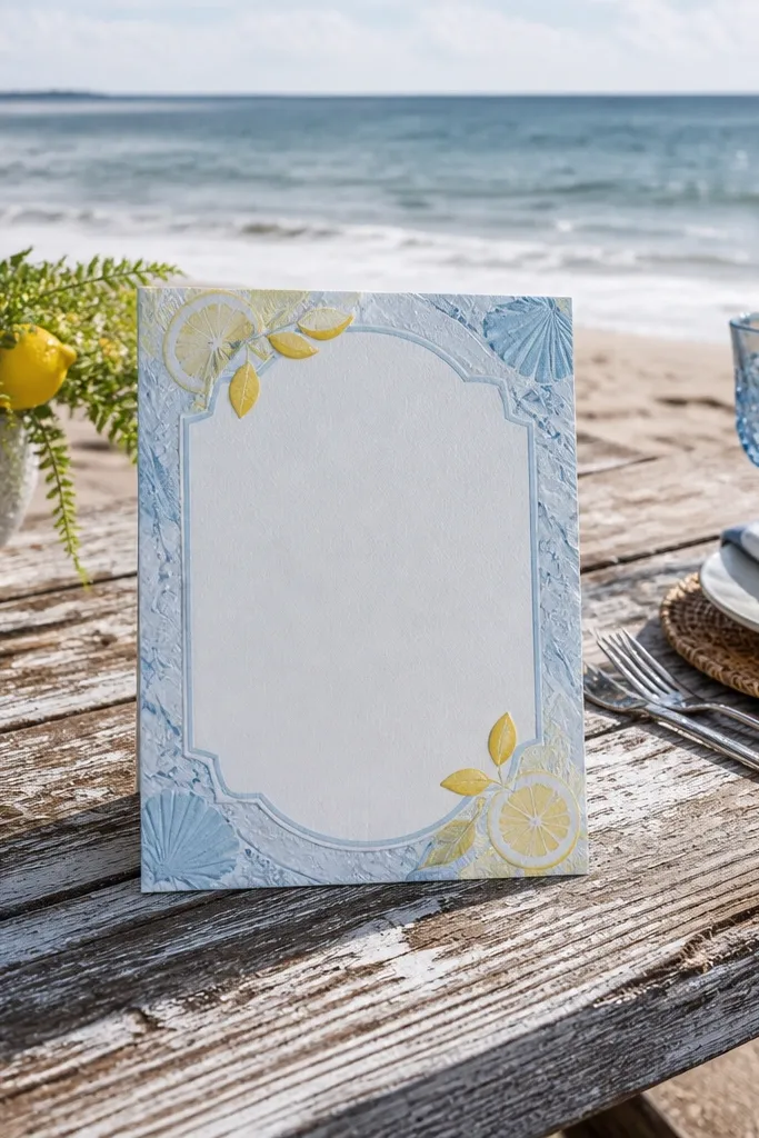
Beach food themes work when the invitation feels fresh and airy, not “nautical clip-art.” This template uses a pale blue or sea-salt texture with lemon accents, which makes it feel like seaside dining and citrus drinks. It’s ideal for seafood dinners, lemon desserts, and summer receptions with ocean views. The key is that the design keeps enough whitespace for readability, so your RSVP line stays easy to find. In photos, the light background also plays nicely with natural light and neutral décor.
Quick tipIf the template offers envelope recommendations, pick them — beach themes look best with simple kraft or white envelopes.
Start by selecting the version that has a clean center text block with a border that doesn’t overlap the details. Then edit your headline to match the menu highlight, like “Lemon + seafood dinner.” Finally, print on a bright white or off-white cardstock so the blue doesn’t look gray. If your venue is outdoors, do a test print at the same brightness setting your shop uses.
Skip thisSkip templates with heavy wave graphics behind the RSVP.
19. Saffron Paella Fiesta Color Block Template
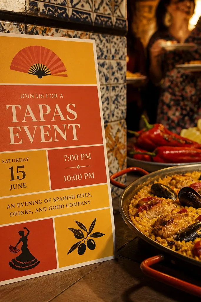
Color-block invitations feel energetic, which is perfect for fiesta-style food events like paella nights, tapas receptions, or Spanish-inspired weddings. The saffron and terracotta palette gives you immediate theme connection, while the structured blocks keep the card legible. This template is ideal when you want your invitation to look like a poster for a great meal. Guests can read the date and location quickly, and the icon adds just enough food personality. It also photographs well because the colors are bold and clean.
Quick tipUse one icon only — if the template has multiple food icons, remove extras so it stays elegant.
Start by choosing the template that has one dominant color block and a neutral area for the details. Then place your event date in the largest text element and your RSVP line in the next-largest. Finally, keep menu text to a short phrase and put full menu info on a separate insert. Print on heavyweight matte cardstock so the color blocks look crisp rather than patchy.
Skip thisAvoid templates with multiple patterned backgrounds; they clash with the color blocks.
20. Rose Tea Ceremony Floral Typography Template
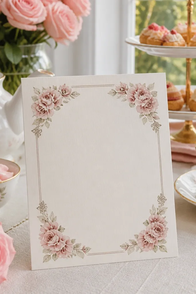
Tea ceremony invitations are a smart route for food-centered events because tea feels like a whole ritual, not just a drink. This template uses blush tones and rose floral typography to connect the invitation to a tea-based menu. It works for weddings with dessert tea, tea service, or a “brunch tea” moment. The layout stays elegant and readable, with a clear footer for RSVP and logistics. If your theme is romantic and soft, this design gives you that look without sacrificing structure.
Start by selecting the template variant that keeps the date and time in a single, centered block. Then edit the menu mention to one line like “Afternoon tea + sweets” so it doesn’t crowd the card. Finally, print on blush or cream cardstock depending on how strong the rose tones are in the file. Do one test print to confirm that your RSVP line remains readable in the chosen ink color.
Use a darker blush or rose-brown for text instead of light pink; it reads better.
Skip templates with very thin script fonts for the RSVP line.
21. Midnight Pasta Night Foil Accent Template
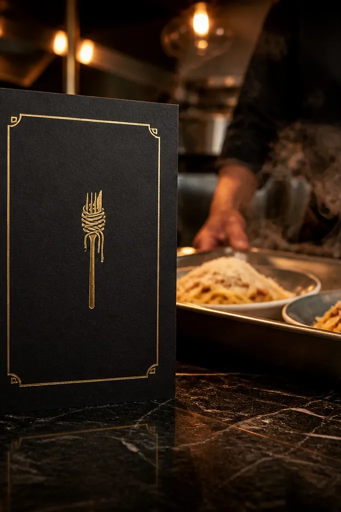
When your event has a night vibe — late-night pasta, midnight snacks, or a more dramatic reception — a dark invitation with foil accents looks sharp and cohesive. The key is controlled foil: small accents around a border or a single icon so the invitation stays classy. This template keeps your details readable by using high contrast typography and generous spacing. It’s perfect for winter receptions and indoor venues where lighting makes black paper look expensive. If your menu highlight is “midnight pasta bar,” this design matches the mood immediately.
Quick tipChoose gold foil accents over silver for warmer food themes like pasta and desserts.
Start by picking the version that clearly indicates foil placement so you can avoid accidentally applying foil over text. Then set your headline and date in a large size and keep body text in a clean font. Finally, ask your print shop for a paper sample — black paper can vary a lot in how it absorbs light. If you’re shipping invitations, use rigid mailers so edges don’t get scuffed.
Skip thisDon’t put multiple foil elements across the card; it can start to look like a party invite.
22. Sushi Night Minimal Icon Template
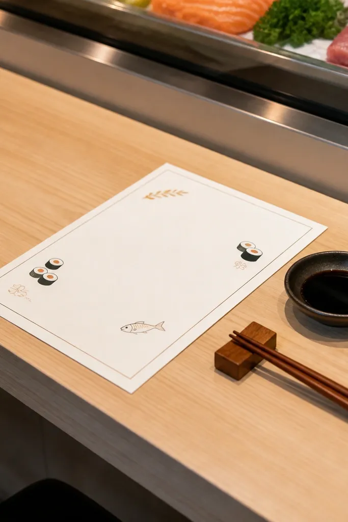
Sushi-themed invitations can look sleek, not childish, when the design uses minimal icons and clean typography. This template is built for that — small sushi icon accents, lots of whitespace, and a straightforward information hierarchy. It’s a good fit for modern weddings with a sushi roll bar, sake tasting, or Asian-inspired appetizers. Guests get the date and RSVP clearly without the card feeling like a restaurant menu. It also photographs well on light backgrounds, which is helpful if you’re doing a flat lay with other stationery.
Quick tipUse one accent color only — a muted red or seaweed green — so the card stays modern.
Start by choosing a template with a sans-serif body font so the details stay readable. Then keep the menu mention to one line like “Sushi + sake tasting” and put any extra dietary notes on the RSVP card or insert. Finally, print on smooth off-white cardstock so the small icon stays crisp. Do a test to confirm that the icon color doesn’t fade when printed at your shop’s settings.
Skip thisAvoid templates with lots of tiny Japanese-style characters in the body text.
23. Spice Market Pattern Invite Template
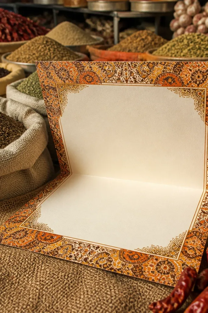
Spice market patterns look gorgeous for food events because they feel like aroma and color, not just decoration. The best templates keep the patterned area to a border or band, while the center stays clean for readability. This design works for weddings with Middle Eastern cuisine, curry nights, or any menu with bold spices and warm flavors. It also makes your invitation set look styled when paired with place cards and menus that share the same palette. Choose it when you want guests to feel like the food is the highlight.
Quick tipIf the template includes multiple pattern options, pick the one with the simplest border — it prints cleaner.
Start by selecting the template that has a solid center panel for the date, time, and location. Then use the pattern palette for accents only — headlines in darker tones, not in light pattern colors. Finally, print on textured matte cardstock so the border pattern looks intentional. Add menu keywords in a short line under the event title so it stays readable.
Skip thisDon’t choose a full-page pattern template if you plan to add many lines of logistics.
24. Bake-Off Dessert Labels Template
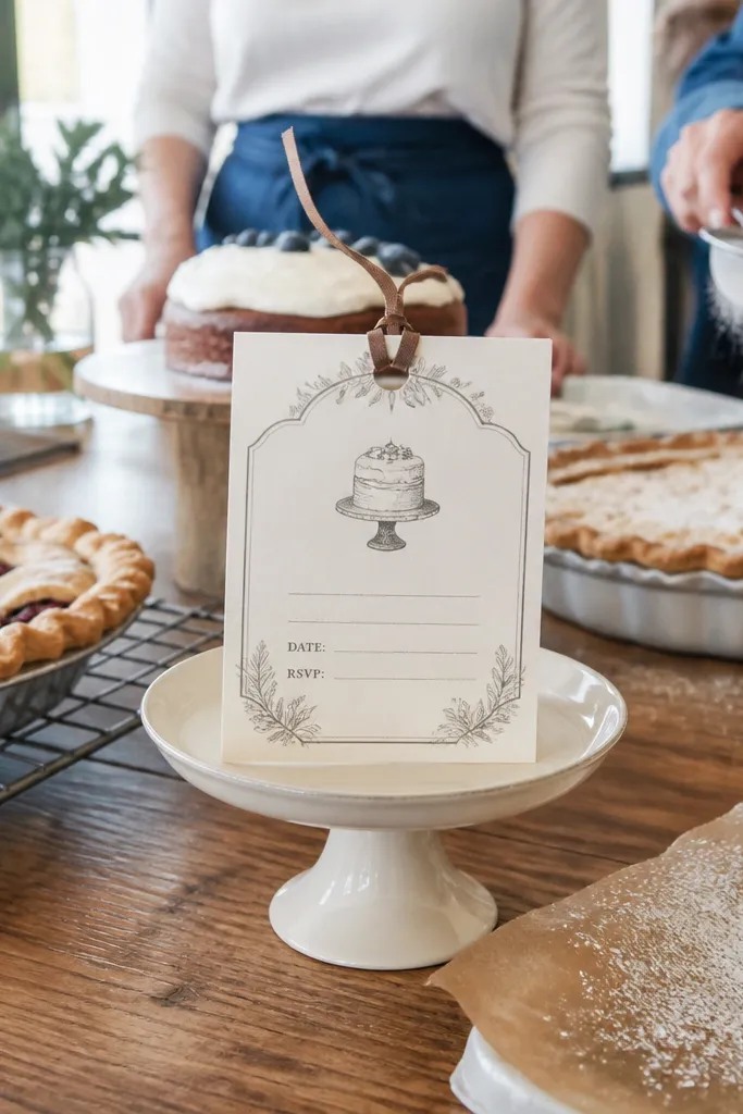
Bake-off and dessert-table weddings need stationery that feels playful but still structured. Label-style templates give you that balance by turning the invitation into a “dessert card” with a clear date block and RSVP line. This works for events with a dessert competition, a pie bar, or a cake tasting where you want the food theme front and center. The best versions include enough whitespace for readability and a small illustration that signals the dessert category. It’s also great when you plan to include a dessert list card separately.
Quick tipPut “Dessert bar” in the headline area — it’s the first thing guests connect to the theme.
Start by downloading the editable version so you can adjust the label text to match your dessert bar names. Then keep the invitation text short: names, date, time, location, RSVP. Finally, print on matte cardstock and use a slightly heavier paper if you want the label look to feel premium. If you’re including a separate dessert list, make sure the label invitation doesn’t duplicate too many lines.
Skip thisSkip templates that force the dessert list into the invitation body text.
25. Rosemary Candle RSVP Card Template
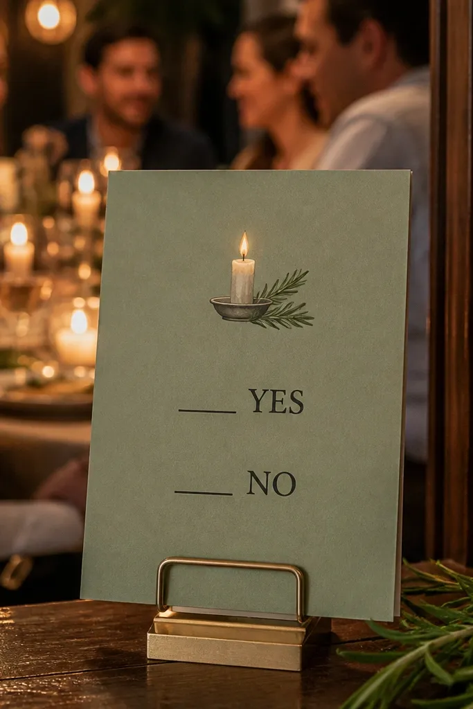
If you want the whole stationery set to feel food-centered, upgrade the RSVP card, not the main invitation. A rosemary candle RSVP template keeps the theme consistent and gives you a practical place for dietary and attendance details. The design is usually compact, so it needs strong hierarchy: RSVP yes/no lines, guest count, and a clear dietary note. This template style works for dinner parties, plated receptions, and events where you need accurate headcount for menus. It also pairs nicely with invitations that have a border or monogram — the RSVP ties it all together.
Start by choosing an RSVP size that matches your mailing method so it fits smoothly in the envelope. Then customize the question wording to match your menu needs, like “Will you attend dinner?” Then add a short dietary line and keep it to one or two fields, not a long form. Finally, print RSVP cards first and check that handwriting space looks good — the font size matters a lot here.
Use a slightly larger font for the dietary note line; it reduces the number of illegible responses.
Avoid RSVP templates with tiny response boxes; guests won’t fill them out cleanly.



