
1. Kraft Card with Dark Brown Ribbon Banner
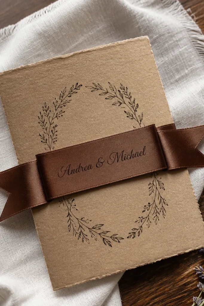
This template is for rustic weddings that still want clarity. The ribbon banner frames the couple’s names so the invitation reads quickly, and the kraft base keeps it grounded in warm tones. It’s especially photogenic when you lay it on white linen or a wooden table with visible grain. If you like the look of old paper goods but don’t want heavy illustration, this is the sweet spot.
Quick tipTest print one line of script before committing — brown ink can still smear if the font is too thin.
Start by choosing a kraft paper shade close to light tan (not orange-brown). Then set the ink to a deep brown (not black) so the script stays soft in photos. Finally, keep the layout simple: use one line for the date and a separate line for the time so it doesn’t look cramped when printed.
Skip thisAvoid pure black on kraft; it turns the whole invite harsh in daylight.
2. Deckled Edge Botanical Frame in Sage and Cream
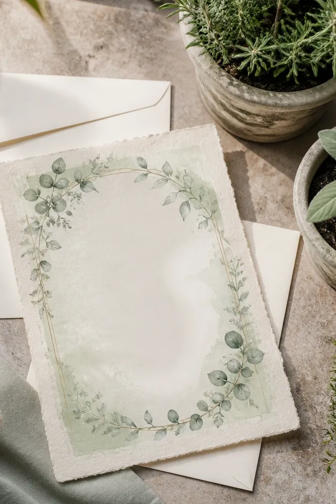
This one leans woodland without going full “forest watercolor.” The botanical frame gives you that cozy garden feel, while the deckled edge makes the paper look handmade. It photographs beautifully on neutral backgrounds because the sage border adds color without shouting. It’s a strong fit for garden venues, backyard ceremonies, and couples who want rustic softness instead of country typography.
Quick tipUse a matte finish for the border ink — gloss makes botanical lines look slick instead of cozy.
Choose a cream cardstock with a deckled edge look, then use two ink tones: sage for the border and dark charcoal for the text. Place your names larger than everything else, then keep address lines smaller but not tiny. When you design the print file, add extra margin at the top and bottom so the deckle doesn’t get trimmed.
Skip thisSkip ultra-fine leaf line art if your printer struggles with small details.
3. Farmhouse Chalkboard Style with Cream Typography
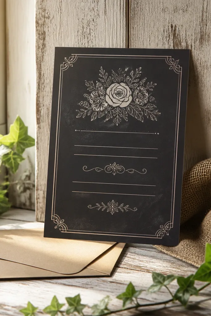
If your wedding vibe is farmhouse and your photos include lots of wood and greenery, this template hits. The chalkboard effect gives a cozy, lived-in feel, and the cream typography keeps it legible. It also stands out when you pair it with kraft envelopes because the contrast looks intentional. This style suits barn weddings and casual formal events where you still want a clean invitation hierarchy.
Quick tipAdd a small border line in the same cream color to make the invitation edge look crisp in photos.
Pick a dark green or near-black cardstock, then set your main text in a warm cream ink. Keep the design in two zones: top for names, bottom for details (date, time, venue). For mailing, confirm the text stays thick enough to read after compression — chalk-like fonts can get faint on cheap printers.
Skip thisDon’t choose thin chalk fonts; they look artsy on screen and unreadable in print.
4. Wood Slice Monogram Layout with Terracotta Accents
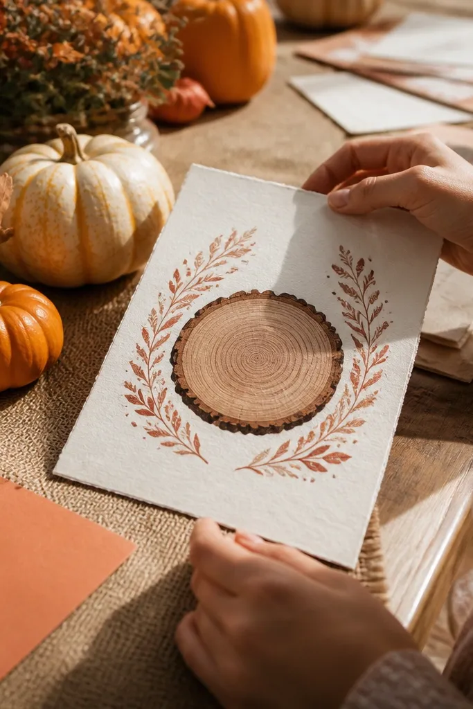
This template gives rustic personality without clutter. The wood-slice monogram is a visual anchor that makes the invite feel handcrafted, while terracotta accents add warmth that complements fall foliage and barn wood. It works well when your venue photos have browns, oranges, and soft shadows. If you want rustic that still looks modern and clean, this layout is a good match.
Quick tipIf you’re printing at home, pick a slightly heavier paper so the monogram circle doesn’t look washed out.
Start with kraft paper or warm oatmeal cardstock, then choose terracotta ink for the monogram details. Use a dark brown or espresso serif for the text so it stays readable. Finally, reduce the number of decorative elements — keep one monogram feature and let the rest be typography.
Skip thisAvoid adding extra icons around the monogram; it turns into a collage fast.
5. Rustic Script + Clean Serif Centered Date Card
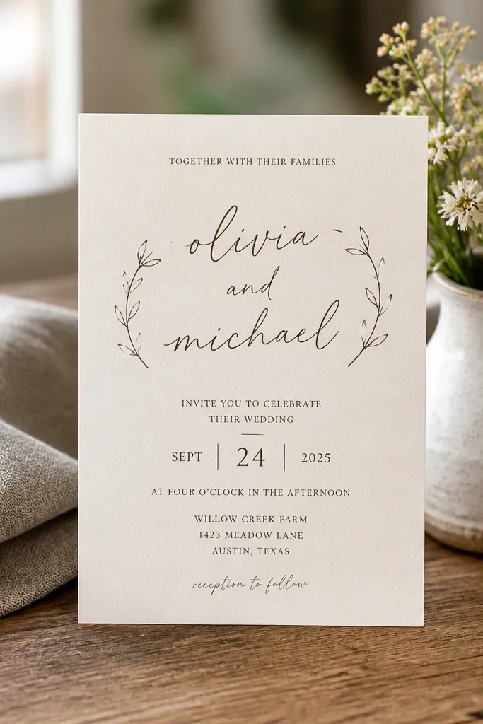
This is rustic that behaves like a modern invitation. The template pairs a handwritten-style script for the couple’s names with a clean serif for the date and venue, so it looks cozy but still crisp. It’s great for couples who want rustic without heavy illustrations or borders. In photos, the centered date block creates a strong focal point even when your background is busy.
Quick tipUse consistent line spacing for the date block; that’s what makes centered rustic look expensive.
Choose warm white cardstock, then set your script in a dark brown ink and your serif text in charcoal. Keep the date lines stacked and centered, with the time slightly smaller. When you export the file, check that your script sits on its own line with enough spacing so letters don’t touch.
Skip thisSkip multi-font chaos — two type styles is enough for this look.
6. Twine Bow Corner Detail on Kraft with Minimal Border
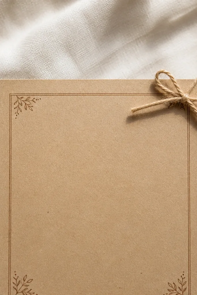
This template is for the “tiny detail, big effect” crowd. A small twine bow in the corner gives you the rustic texture cue without turning the whole invite into a craft project. The minimal border keeps everything legible, and the kraft base makes the bow look like it belongs. It’s ideal for couples who want understated rustic that still looks charming in flat-lay photos.
Quick tipIf you’re adding twine for real, photograph the invitation flat first without it — then add twine only if it doesn’t cast a weird shadow.
Use kraft cardstock around 110-130 lb for a sturdy feel, then print with a medium brown ink for the text. Keep borders thin (one line) so the invitation doesn’t look boxed in. Finally, place your return address and mailing info on the back or on a separate insert so the front stays clean.
Skip thisAvoid thick borders; they make kraft look heavy and dated.
7. Vintage Postmark Frame with Antique Sepia Ink
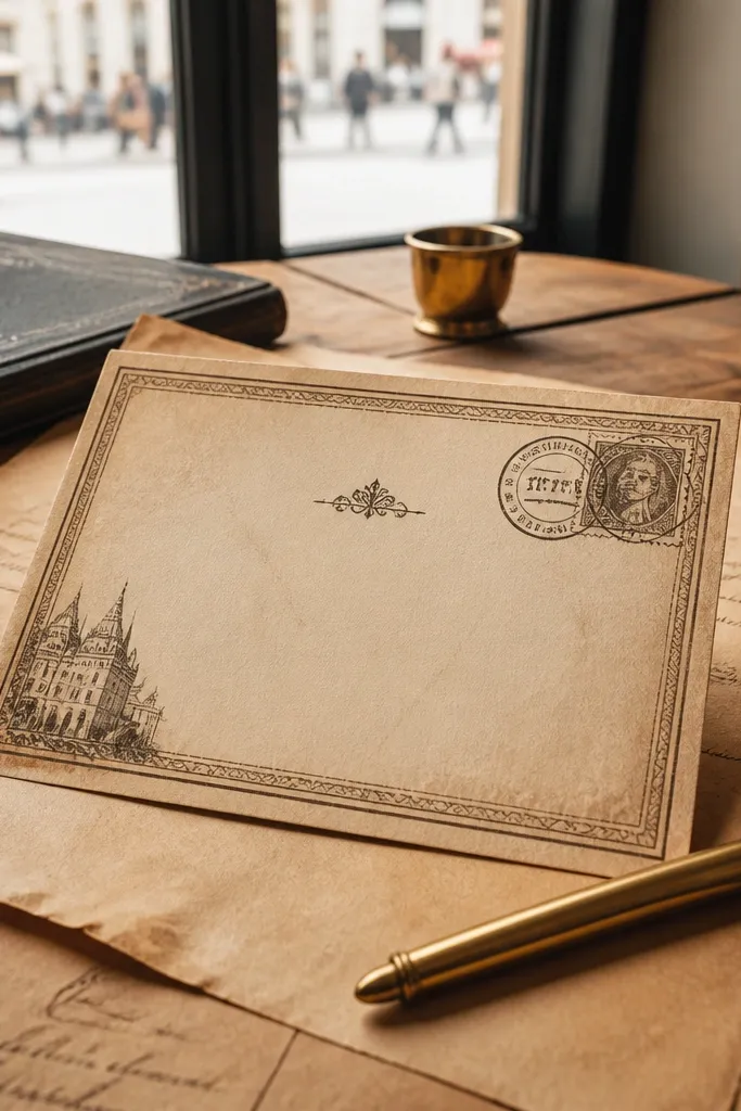
This template feels like a letter from the past, which is exactly why it looks good in rustic wedding photos. The postmark frame adds a vintage stamp vibe without needing a full illustration set. Sepia ink keeps it warm and soft, especially under golden-hour light. It’s a great choice for couples who want rustic charm with a more classic, paper-collector aesthetic.
Quick tipUse matte paper; glossy stock makes stamp textures look fake.
Pick a cream or off-white paper, then use sepia-brown ink for the frame and a darker espresso ink for text. Keep the postmark frame smaller than you think so it doesn’t crowd the names. Add a clear line for the address and venue so the invitation reads like mail, not art.
Skip thisSkip high-contrast black ink; it kills the vintage softness.
8. Woodland Watercolor Arches with Deep Green Type
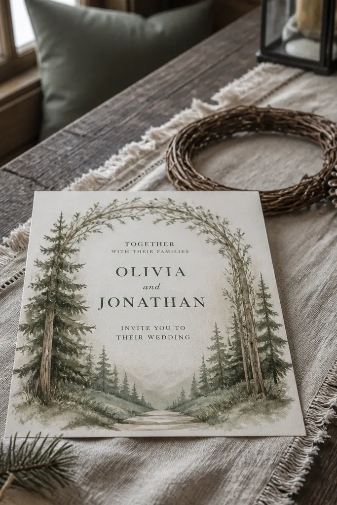
Watercolor arches make your invitation look like it belongs outdoors, even when it’s photographed indoors. The deep green type anchors the watercolor so the invite doesn’t look washed out. This is a solid rustic pick for woodland ceremonies, forest farms, and spring or fall weddings with greenery heavy enough to match. The arch shape also frames the names in a way that reads naturally in photos.
Quick tipIf your printer struggles with watercolor tones, print the text and use the watercolor as a separate layer from a print shop.
Choose a warm cream base and print with deep green ink for names and headings. Set body text in a dark charcoal to keep it crisp against the watercolor wash. When you place the arch art, leave breathing room at the corners so it doesn’t feel squeezed by envelope edges.
Skip thisAvoid bright neon greens; they look modern in a bad way.
9. Lodge Cabin Map Lines with Charcoal Typography
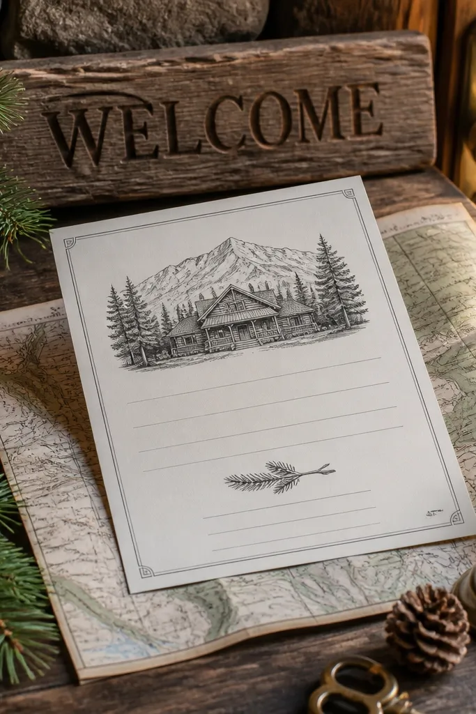
This template is rustic with a sense of place. Map-like lines and cabin-style details look incredible when paired with venue signage photos and wooden textures. Charcoal typography keeps it sharp, so it doesn’t blur into the background. It’s best for lodge weekends, mountain retreats, and ceremonies where your photos include cabins, pines, or stone pathways.
Quick tipPrint one sample on your exact paper; linen texture changes how charcoal looks.
Use natural linen cardstock, then set your main text in charcoal. Keep the map lines light and thin so your guests still read the details quickly. Finally, choose a layout that puts the address block near the bottom — it stays readable when the invitation is photographed at an angle.
Skip thisDon’t crowd the map lines behind the names.
10. Rustic Linen Texture Background with Soft Gold Date
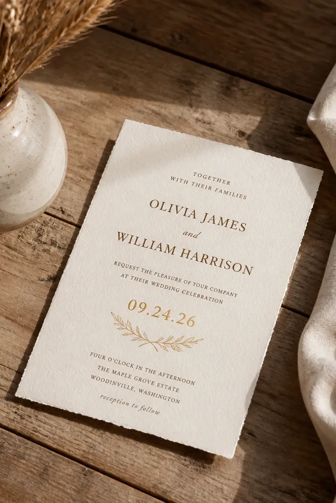
Linen texture gives you the rustic look without adding extra illustration. This template uses a soft gold date highlight, which reads warm in photos and feels special without being flashy. Brown and cream typography keeps it grounded, so the gold feels like a detail, not the main event. It’s a great fit for indoor barns, hotel ballrooms with rustic decor, and couples who want cozy but polished.
Start with linen-textured cardstock and choose a brown ink for headings. For the gold, use a metallic ink option through a print shop, or choose a warm gold tone that prints cleanly. Place the date in a dedicated block with extra spacing so the gold highlight stands out.
If you’re DIY printing, skip metallic effects and use a warm ochre tone instead — it prints more consistently.
Avoid tiny metallic elements; they look grainy when printed.
11. Rustic Mason Jar Floral Border on Warm White
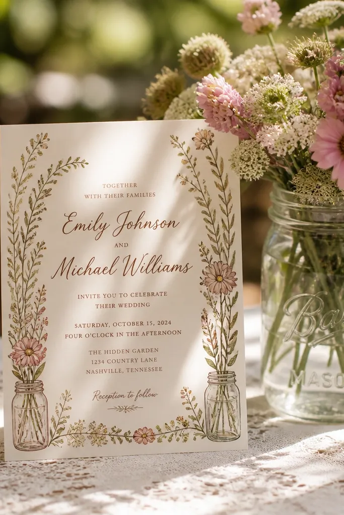
This template gives you a literal cozy theme without looking childish. The mason jar floral border adds a homegrown feel, and warm brown script keeps it classic. It photographs well on kraft envelopes and white tablecloths, where the border stays crisp. Choose it if you want rustic country charm with a clear, welcoming vibe.
Quick tipUse a slightly larger font size for the street address; jar borders can visually distract.
Pick warm white cardstock and print the text in brown ink, then keep the floral border to one ink tone if you’re printing at home. If using a print shop, ask for two-tone printing so the jar and leaves separate cleanly. Keep the main details aligned left for easier reading.
Skip thisAvoid multi-color floral borders if you want a clean, photogenic look.
12. Terracotta Ombré Wash with Minimal Frame
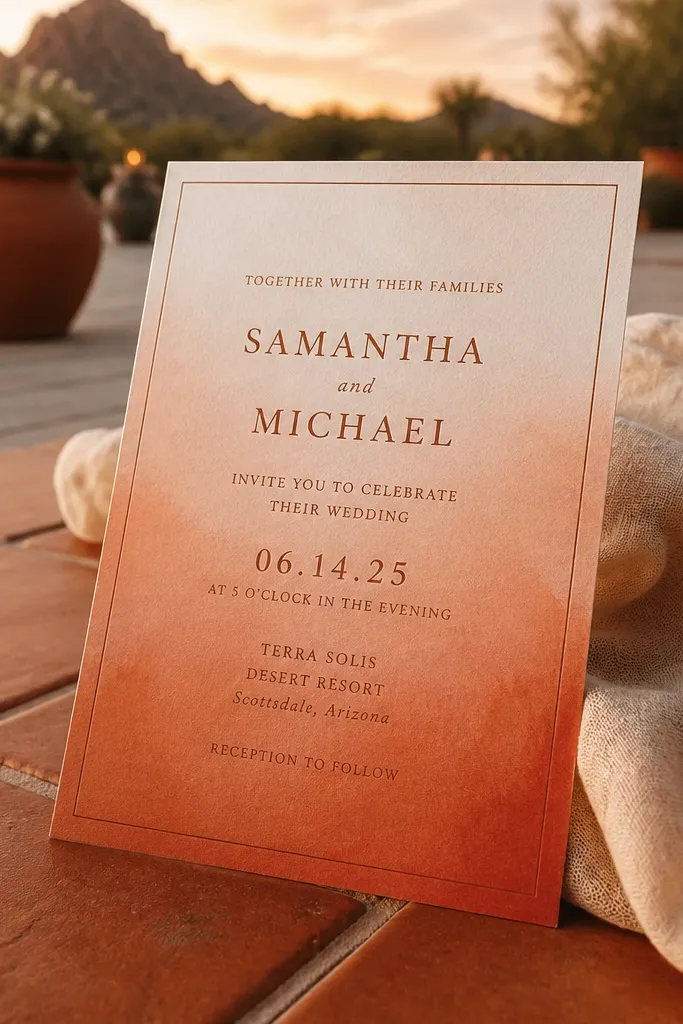
Ombré backgrounds can look messy, but this template keeps it controlled. The terracotta gradient adds warmth that matches desert tones, late summer sunsets, and fall terracotta decor. A thin frame stops the gradient from swallowing the text. It’s a modern rustic pick that still looks soft and inviting in photos.
Quick tipOrder one sample print before printing your full set; gradients are the first thing to fail.
Choose a thick, smooth cardstock so the ombré prints evenly. Set the main text in dark brown and keep it centered or slightly left-aligned for balance. When exporting, avoid low-resolution backgrounds — ombré bands show up as streaks fast.
Skip thisDon’t use black text on terracotta — it looks heavy and less cozy.
13. Pressed Fern Silhouette with Monochrome Ink
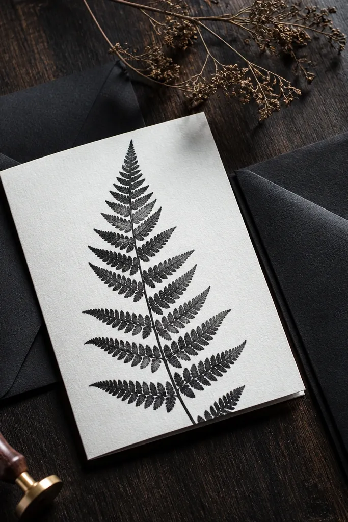
Monochrome fern silhouettes look expensive because they rely on contrast and negative space. This template keeps the design clean while still giving strong rustic nature energy. It’s especially photogenic when photographed against dark wood or black envelopes, where the fern shape pops. If you want woodland calm without watercolor mess, choose this.
Use a warm off-white paper and print in one ink color — deep green or charcoal. Place the fern silhouette behind or beside the names, then keep body text in a simple serif font. Leave generous margins because the fern silhouette needs breathing room to look intentional.
If your printer can’t handle deep greens well, use charcoal; the silhouette still reads clearly.
Skip busy borders — fern silhouettes look best alone.
14. Rustic Arrows and Date Banner on Kraft
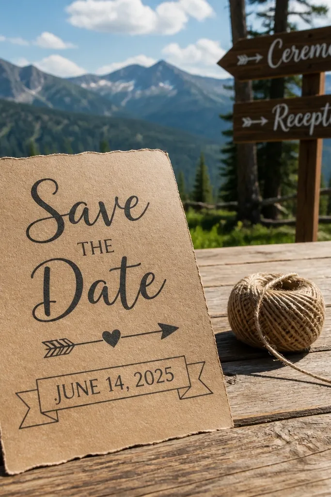
This template is for couples who want rustic but still like a structured, slightly modern layout. Arrow accents point toward the date and location, so guests find the key info fast. The kraft base keeps it warm, while the design geometry makes it feel crisp in photos. It works well for outdoor venues where you have lots of signage and directional cues.
Quick tipUse a plain envelope liner in a matching tone so arrows don’t compete with patterns.
Print on kraft paper and use dark brown ink for the banner and text. Keep arrow elements small and use them to guide the eye toward the date block. Finally, separate the address from the main invitation content — it reads cleaner and looks less crowded.
Skip thisDon’t make arrows too thick; heavy arrows look like a flyer.
15. Vintage Botanical Label Style with Cream Background
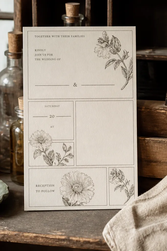
Label-style layouts look like old apothecary cards, and that’s exactly why they photograph well. This template uses small botanical label blocks to frame your event details without turning the invite into a collage. The cream background keeps it soft, while the typography stays readable. It’s a great rustic choice for couples who want nature details but still want a classic, organized feel.
Quick tipReduce micro-text lines if you’re printing at home; label styles can get unreadable quickly.
Choose cream cardstock and print with a single dark ink tone for the labels and text. Use two font sizes max: one for names, one for date and venue details. Keep label blocks aligned in rows so the invitation looks tidy when guests set it on a table.
Skip thisAvoid too many label blocks; it turns into clutter.
16. Rustic Handwritten Names with Corner Leaf Doodles
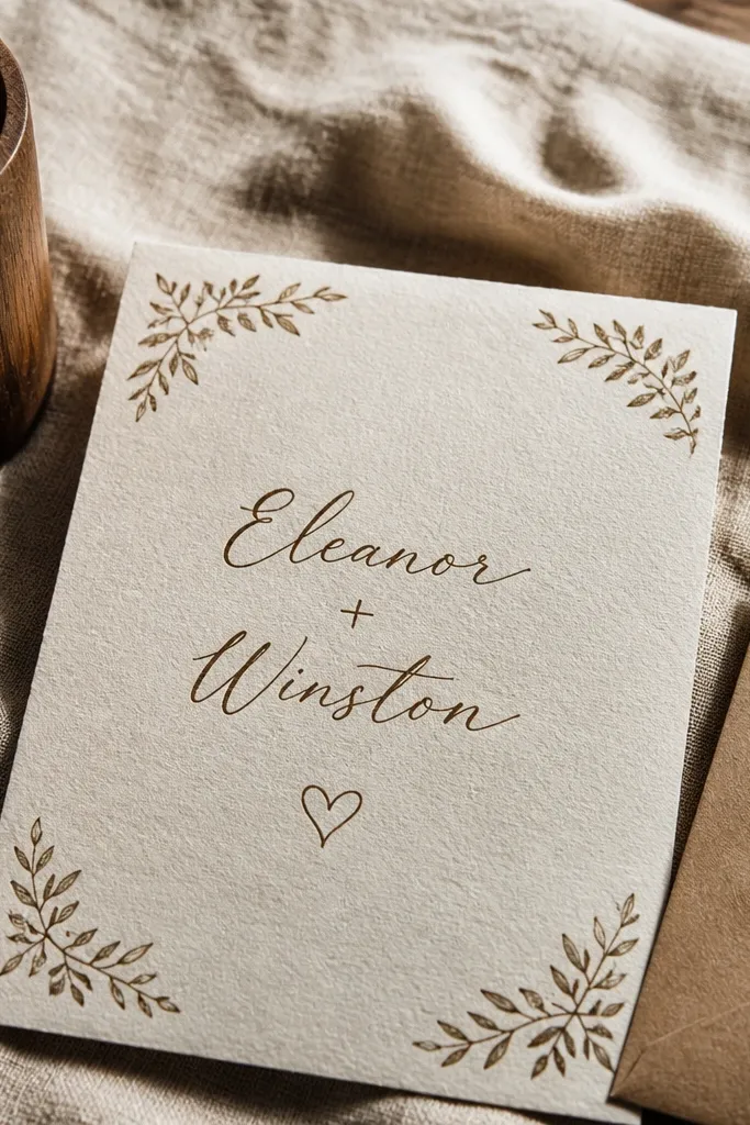
This template nails the “cozy note” vibe. Handwritten names feel personal, and tiny leaf doodles in the corners add rustic texture without dominating the layout. It’s great for small weddings and intimate venues where your invitation should feel like a letter, not a brochure. Photograph it against wood or linen so the paper texture shows.
Quick tipPick one ink color for everything if you want consistent warmth in photos.
Use warm white cardstock and choose dark brown ink for the handwritten names. Keep the doodles light and small so they don’t distract from date and venue. When you set the file, increase line spacing for the address lines so they don’t look packed next to doodles.
Skip thisAvoid adding a full border around the edges; it fights the doodles.
17. Barn Door Vertical Layout with Big Names
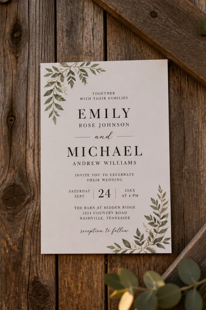
Vertical “barn door” panels create a strong photo composition. This template puts the names front and center with a panel design that looks like rustic architecture. It’s a good pick if your wedding has barn textures, wood beams, or door signage in your decor. The overall look stays clean, so it feels rustic without becoming overly themed.
Quick tipPhotograph it flat against wood; the vertical panel reads best with real grain behind it.
Choose cream or natural paper and print the panel in dark brown or espresso. Place the names in the center of the vertical panel and keep details below in a simple block. Finally, use a slightly larger font size for the venue line — vertical layouts can make it easy to skim past.
Skip thisDon’t shrink the venue and address too much under the names.
18. Rustic Library Card Invitation with Corner Tape
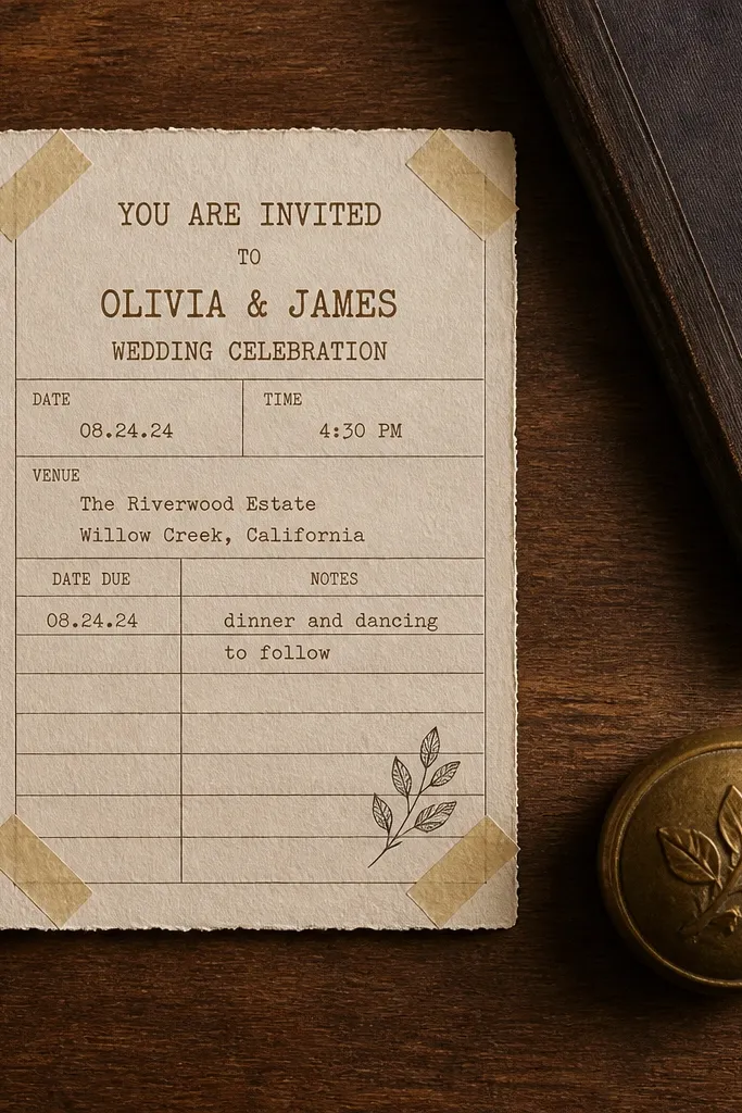
Library-card style invitations are rustic in a clever way. The layout feels organized, and the corner tape detail adds a handmade touch that looks good even in close-ups. It’s ideal for couples who like vintage paper ephemera and want something different from generic barn templates. Because it’s structured like a card, it also reads well when guests glance at it quickly.
Quick tipLeave enough whitespace around the RSVP line so it doesn’t blend into the card edges.
Use kraft or light tan cardstock and print the text in dark brown. Keep the “card” proportions consistent: names should sit near the top, details in a middle block, and RSVP info at the bottom. Add the corner tape element as a single graphic so it doesn’t look like a layered craft project.
Skip thisAvoid too many decorative stamps — one or two stamps look intentional.
19. Soft Watercolor Wildflower Border with Brown Ink Text
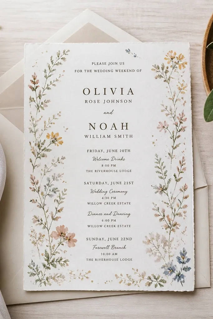
Wildflower borders give you that cozy, romantic rustic look without needing heavy theme props. This template uses brown ink text to keep it warm and readable, while the wildflower border adds movement. It photographs especially well when you use neutral envelopes and let the paper border be the color. Choose this for spring weddings, outdoor ceremonies, and couples who want “garden party” energy.
Pick cream cardstock and print the text in espresso brown. For the border, use a light watercolor palette that doesn’t overpower the text — keep it two to three muted colors. Position the border so it frames the text rather than wrapping around the edges too tightly.
If you’re printing at home, consider printing the text only and adding the border as a separate insert for cleaner results.
Don’t choose bright saturated wildflowers; they look more modern than rustic.
20. Rustic Chalk Lines with Centered Couple Names

This template is subtle rustic. Thin chalk-like lines create texture and direction, while centered names keep it balanced. The look is calm, not busy, which matters if your wedding has lots of decor already. It’s a great fit for modern rustic weddings where you still want warmth but not a heavy illustration style.
Quick tipUse a matte finish so the chalk texture looks grainy and cozy instead of shiny.
Use off-white cardstock and print with dark charcoal ink. Keep the line accents thin and sparse, then center the names on the top half. Put the date and time in one stacked block and keep the venue line slightly larger so it reads instantly.
Skip thisSkip heavy ornaments — the lines do the work here.
21. Cedar Woodgrain Background with Minimal Serif
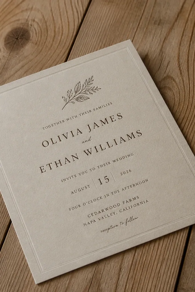
Woodgrain backgrounds can look tacky when they’re too loud. This template keeps the woodgrain subtle and pairs it with minimal serif typography, so the invite feels grown-up and rustic. It works best when your wedding palette includes browns, greens, and soft neutrals. In photos, the woodgrain texture gives depth without stealing attention from your names.
Quick tipBack the invitation with a darker envelope so the woodgrain reads clearly in flat lays.
Choose natural cardstock and print with one dark ink tone for text. Use the woodgrain as a background layer, but keep it low contrast so it doesn’t reduce legibility. Then export at high resolution so the woodgrain doesn’t pixelate and ruin the cozy texture.
Skip thisAvoid busy backgrounds behind script fonts; legibility drops fast.
22. Rustic Photo Frame with Overgrown Edges
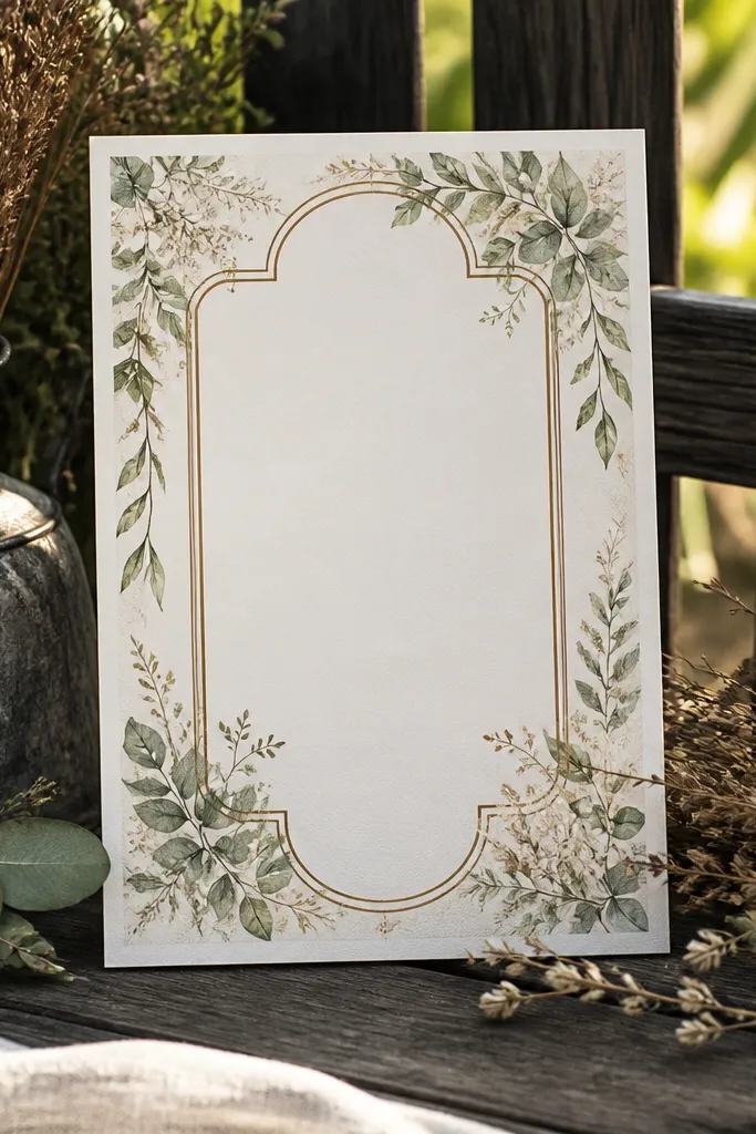
Even without real photos, a framed layout can look like a memory. This template uses overgrown leaf edges to create that “captured on the property” feeling. It’s a strong choice for couples who want rustic charm but still want a clean typographic center. Photograph it with greenery or dried stems nearby so the edges feel natural, not decorative.
Quick tipIf your border is detailed, order printed samples — home printers struggle with thin leaf edges.
Use cream cardstock and print text in dark brown or charcoal. Keep the center area bright so the names and event details stand out from the overgrown edges. Finally, align RSVP details to the same grid line as the date so the frame looks balanced.
Skip thisDon’t place long venue addresses inside the leaf frame; it will jam the look.
23. Rustic Monogram Crest with Pine Needle Border
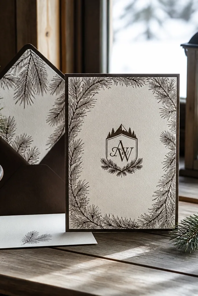
Crest-style invitations feel lodge-adjacent and look great in winter and early fall photos. The pine needle border adds texture, while the monogram crest gives a formal anchor. This template suits weddings with evergreen decor, mountain venues, and cabins where photos already have strong shapes. It’s also a good option for couples who want rustic but not overly cute.
Quick tipUse a darker envelope color like deep green or kraft to make the crest pop.
Pick natural or warm oatmeal paper and print the monogram in deep green. Use charcoal for the body text to keep it sharp and readable. Place the crest near the top, then set date and location in a clean block below with consistent spacing.
Skip thisAvoid mixing pine border with lots of other icons; the crest already carries the theme.
24. Rope-Wrapped Corner Frame on Natural Paper
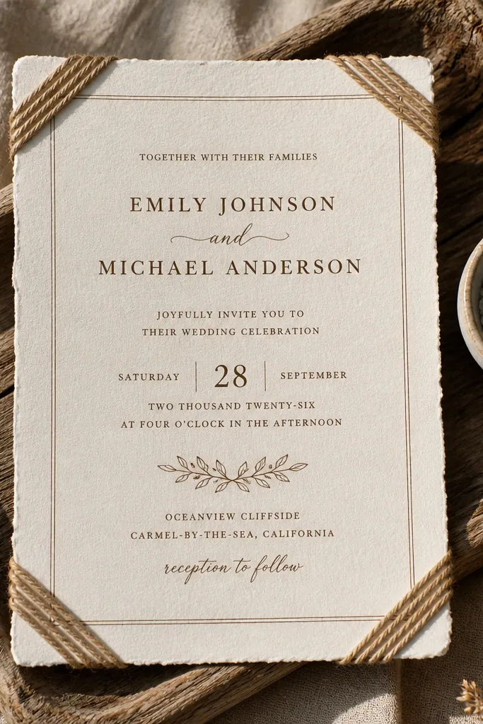
Rope frames scream coastal rustic and country rustic at the same time, and this template keeps it classy. The rope-wrapped corners frame the text without covering it, so your typography stays the focus. Natural paper makes the rope look grounded, and the warm brown ink keeps everything cohesive. It’s a good fit for barn venues with nautical hints, waterfront properties, and outdoor ceremonies with string lights.
Start with natural cardstock and print in warm brown ink. Set the couple names larger and center them so the rope corners feel like a frame, not a distraction. Finally, keep your RSVP line short and punchy — rope frames look best when the center stays clean.
If you’re using real twine, keep it thin and flat so it doesn’t lift and cast shadows in photos.
Don’t use thick rope graphics plus heavy borders; it gets crowded.
25. Rustic Ticket Stub Invitation with RSVP Cut Lines
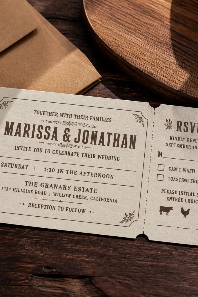
Ticket stub templates make rustic wedding invitations feel playful but still structured. The cut line marks guide the eye to RSVP info, and the typography stays readable because it’s designed like a card. This style works for reception-focused weekends, casual dinners, and couples who want a keepsake vibe. It also photographs well on neutral linens because the “ticket” shape is visually interesting.
Quick tipUse a matching envelope liner in a subtle pattern so the ticket stub doesn’t look plain.
Choose cream cardstock and print with a dark espresso ink for the text and ticket lines. Keep the couple names at the top and separate the RSVP details into the lower ticket section. When you export, ensure the cut line marks are not too thin; they should print as crisp dashes.
Skip thisAvoid tiny venue addresses; the ticket layout crowds small text.



