
1. Cream Card + Black Script Centerpiece
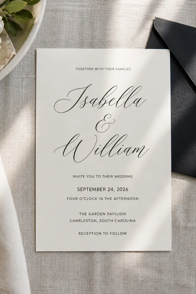
This template style looks polished because it leans on contrast and spacing instead of complicated graphics. The names sit centered with a black script font, while the date and location are set in a clean, smaller typeface so everything stays readable. It works for classic weddings, courthouse ceremonies, and city venues because it doesn’t fight the background of your photo uploads. It also photographs well because the design is mostly typography — your details stay crisp instead of turning into texture mush. Use it when you want “expensive minimalist” without spending time editing.
Start by swapping in your names and date first, then adjust the line breaks so the names stay on one clean line if possible. Then set the detail text to a darker gray or true black and keep the font sizes in the template’s original ratio. Finally, print a single test on the exact paper you plan to use and check that the smallest RSVP line is still readable at arm’s length.
Quick tipIf your printer smudges, switch body text to a slightly heavier weight instead of adding more background color.
Skip thisDon’t add extra icons or extra lines — the clean look comes from restraint.
2. Navy Watercolor Corner Florals
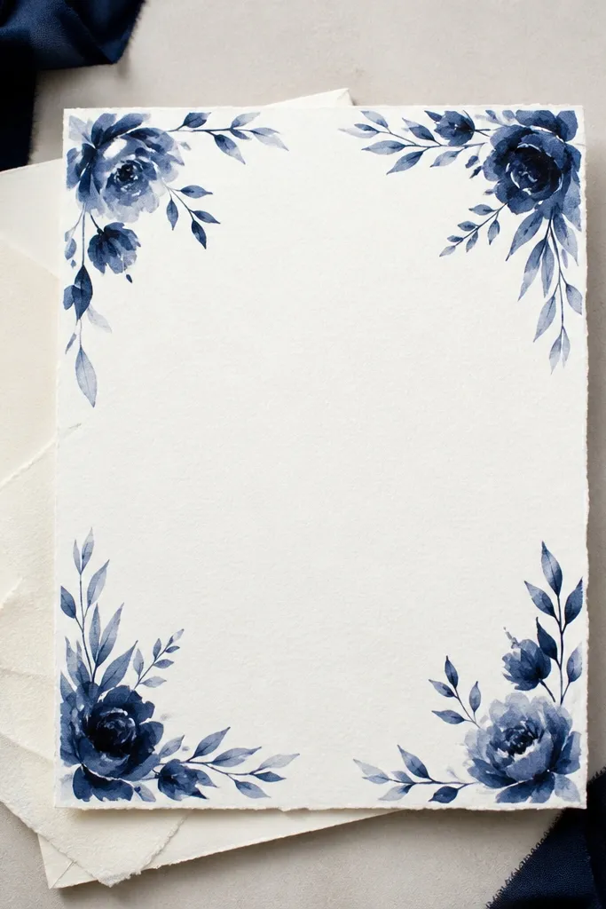
Corner florals look stunning because they frame the invitation without filling the whole page. This design keeps the center area calm, so your names and date stay the visual focus. The navy wash also photographs better than bright colors because it holds detail and doesn’t blow out in bright lighting. It’s a great fit for evening weddings, coastal venues, and any theme that wants romance without full-bleed backgrounds. Choose templates where the floral sits in the corners with a light, airy texture so the paper still shows through.
Start by selecting a template with watercolor corner placement, then keep your text centered and slightly higher than dead-center. Next, set venue and address lines in a smaller, simple font so the florals don’t compete. Finally, print one test sheet and tilt it under a lamp to see if any watercolor edges look too light or too dark on your paper.
Quick tipUse off-white paper with this look; bright white can make navy accents look harsher.
Skip thisAvoid templates with full-bleed watercolor behind the text — they usually print unevenly.
3. Monogram Frame with Thin Line Border
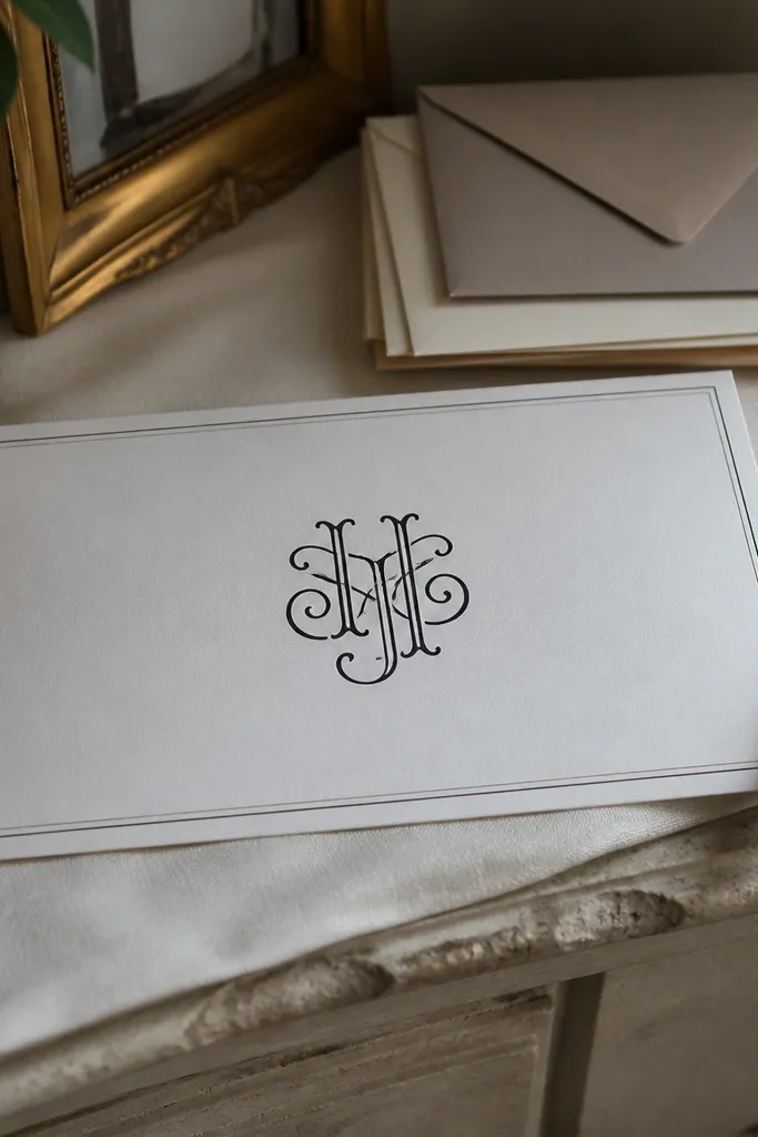
A thin line frame reads expensive because it signals precision. The monogram becomes the hero, while the border adds structure without heavy ink coverage. This template is ideal when you want personalization but don’t want a busy floral pattern. It also works across wedding styles — modern, garden, and even art deco — because the border is the “style engine,” not the graphics. Pick templates where the border lines are light and consistent so they look crisp on real paper.
Start by placing your monogram at the center and keeping it large enough to be seen instantly in a photo. Then align the date and location on a single vertical stack with consistent margins from the border. Finally, check that the border doesn’t get too close to the trim by printing a test and measuring the text-to-edge spacing.
Quick tipIf you’re using a local printer, ask for a “no bleed” setup for thin borders to keep edges clean.
Skip thisSkip templates with thick decorative frames if you’re printing at home; thick lines often look muddy.
4. Art Deco Geometric Bands
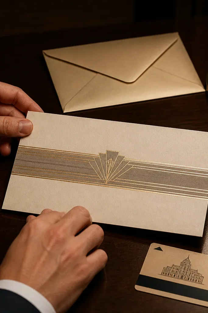
Art deco bands make free templates look premium because the design is graphic and controlled. The geometry creates a clear rhythm, and the gold-ish accents (even if printed as warm gray) mimic metallic foil without needing foil. This template is great for black-tie vibes, ballroom venues, and weddings with a vintage palette. It photographs well because straight lines and bands stay sharp even when your printer isn’t perfect. Choose templates with bands that leave the center text area open.
Start by choosing a template where the geometric bands sit above and below the names, not behind them. Then set the main names in a high-contrast serif or simple caps font and keep the rest in small caps or a clean sans. Finally, print on a slightly textured cream stock so the bands don’t look flat.
Use a warm gray for the “gold” accents if you’re printing at home; it reads richer than pure yellow.
Don’t pick templates where the geometric pattern repeats behind the entire text block.
5. Blush Botanical Frame
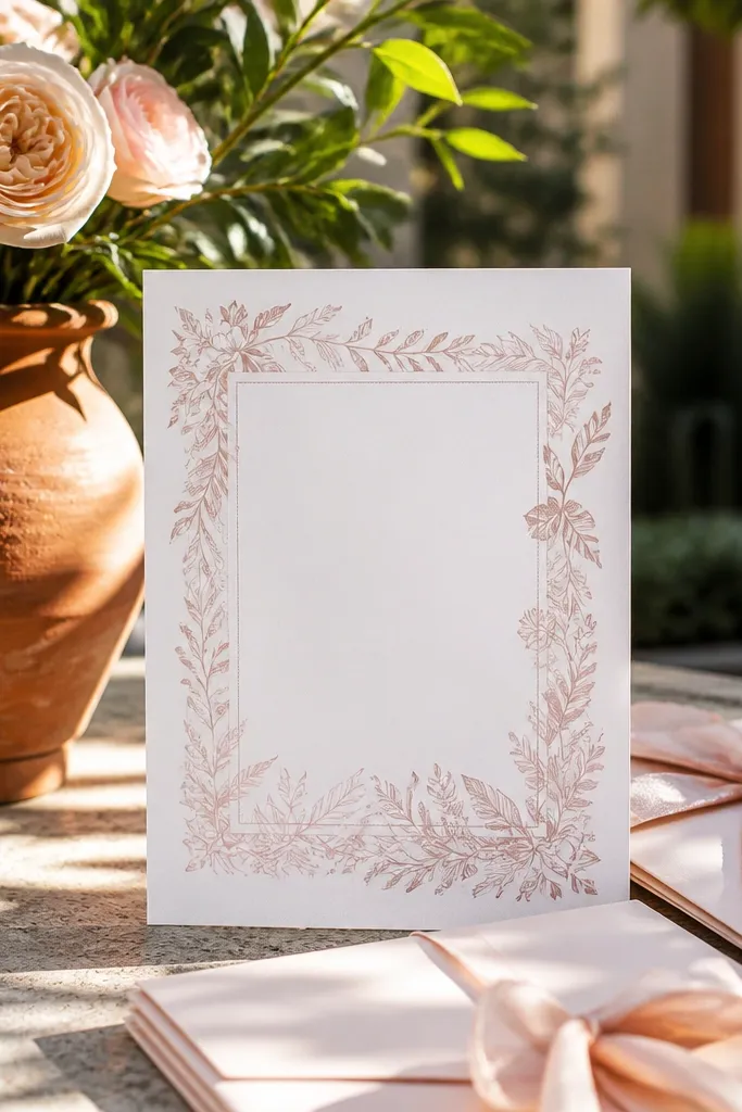
This is the wedding-invite version of “soft and polished.” The blush botanical frame adds romance, but the center stays clean so your wording remains the focus. It works especially well for spring and garden weddings because the palette looks gentle under natural light. The frame also helps with layout balance, so you don’t have to overthink where lines go. Pick templates where the wreath is light and airy, not dark and heavy.
Start by entering your names and date, then keep the rest of the details in a tight but readable block. Next, adjust the text so it sits inside the wreath opening with equal top and bottom breathing room. Finally, test print and check that the smallest line (usually RSVP or time) stays legible at normal reading distance.
Quick tipUse blush or dusty rose envelopes; the color match makes the whole set look intentional.
Skip thisAvoid templates with very small botanical leaves; they blur fast in standard home printing.
6. Single-Line Calligraphy Divider
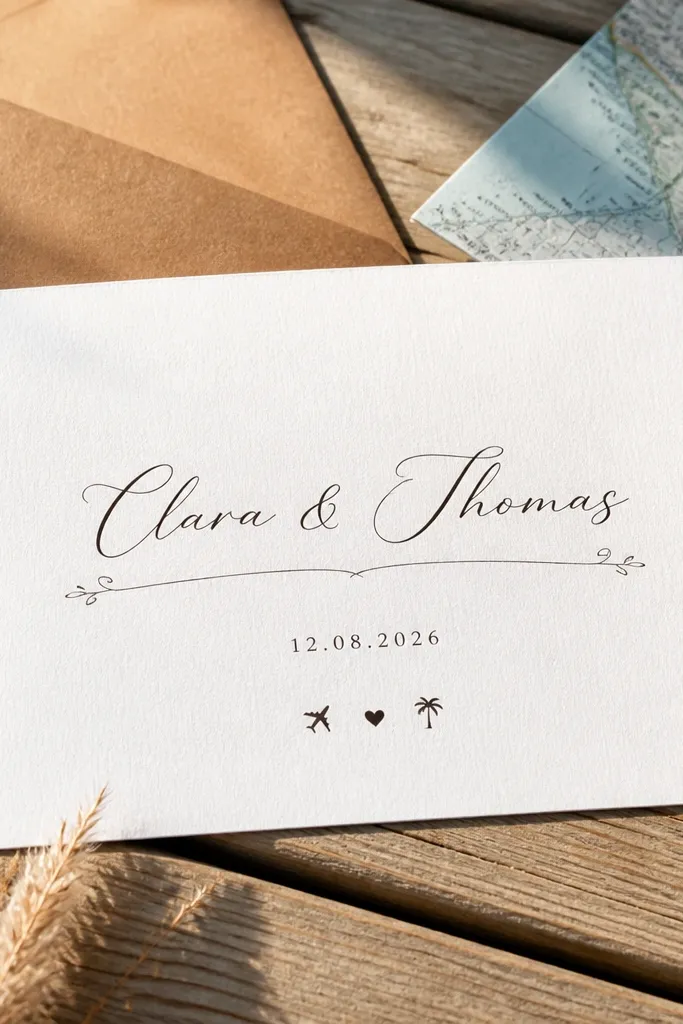
Minimal doesn’t mean boring when the template uses a single calligraphy divider. This design keeps the layout airy: names are centered, and the divider line adds a graceful moment without clutter. It looks polished because your eye tracks a clear path from names to date to details. This template works for modern weddings, elopements, and couples who want “clean romance” over florals. Choose templates where the divider is one continuous line and doesn’t repeat across the page.
Start by placing the names as the largest element and keep the divider directly under them. Then set the date line with generous spacing above and below so it doesn’t feel cramped. Finally, print a test on your chosen paper and verify that the divider line doesn’t break due to low ink coverage.
If your ink runs, print at “best” quality for the first page only.
Don’t add a second divider or extra ornaments; it kills the clean look.
7. Greenery Ribbon Banner Across Top
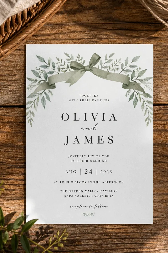
A ribbon banner is a smart way to add personality without covering the whole invitation. The greenery sits near the top, while the center stays white for crisp typography. This layout is great for outdoor weddings and rustic venues because it reads natural and intentional. It also works well for couples who want their names to be the main focus, not a full floral illustration. Look for templates where the banner is a simple strip with clear text alignment.
Start by choosing a template with the banner across the top and keep your main names centered below it. Then align the date and location so they fall into the open center space, not under the banner. Finally, print one copy and check the banner’s text contrast — it should be readable without squinting.
Use dark green text for the banner if your printer can’t handle very light greens.
Avoid templates where the banner has busy patterns; the text becomes hard to read.
8. Black Tie Typography Stack
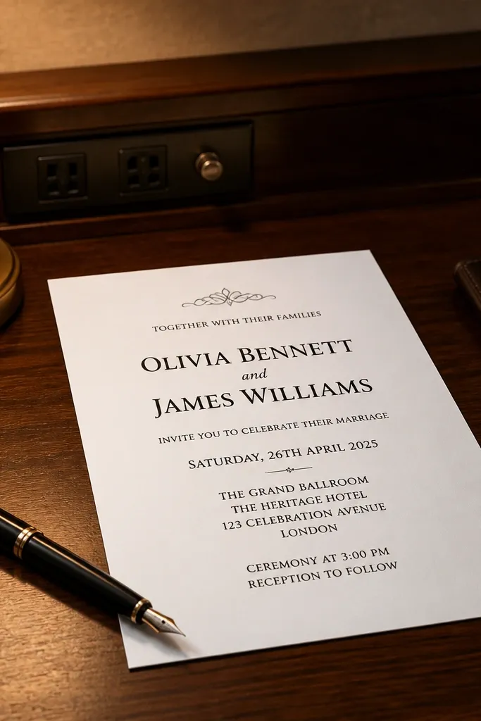
This one is all about typography discipline. The template uses a strong hierarchy: names are larger, date is centered, and the venue/time lines are stacked with consistent spacing. Black-on-white looks clean in photos, and it’s extremely forgiving if your home printer isn’t perfect. It suits formal weddings, modern city venues, and couples who want a sleek look without graphics. Choose a template that keeps the layout symmetrical and avoids multiple font styles.
Start by keeping the names as the biggest text and using one font family for the rest. Then center the date line and use smaller sizes for address and RSVP info. Finally, print a test and read it like a guest would — if you have to squint, resize the smallest line up one step.
Use true black for headings and a dark gray for details to reduce ink bleed.
Don’t pick templates with too many font weights; it makes the hierarchy look messy.
9. Terracotta Minimal Frame
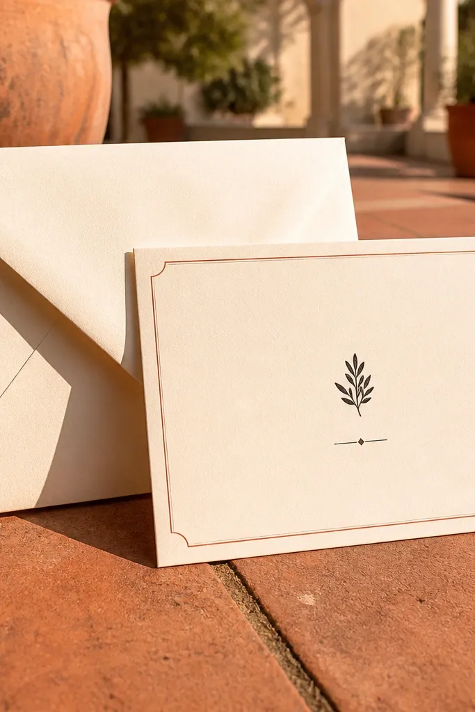
Terracotta frames bring warmth without looking trendy for one season. The color is forgiving in printing and gives your invite a handcrafted feel even if you’re using a free template. This style looks especially good with cream paper and simple serif fonts for the details. It works for desert, garden, and farmhouse weddings where you want the stationery to feel cozy. Select templates where the frame lines are thin and the center text is large enough to breathe.
Start by choosing a template with a thin terracotta border and centered text block. Then set your names slightly above the middle so the overall composition feels balanced. Finally, test print on cream paper and adjust the terracotta shade if it looks too light or too red.
If you’re printing at home, increase text size by 5-8% for the RSVP line.
Avoid heavy background fills; terracotta can look blotchy.
10. Soft Gray Ombre Corner Fade
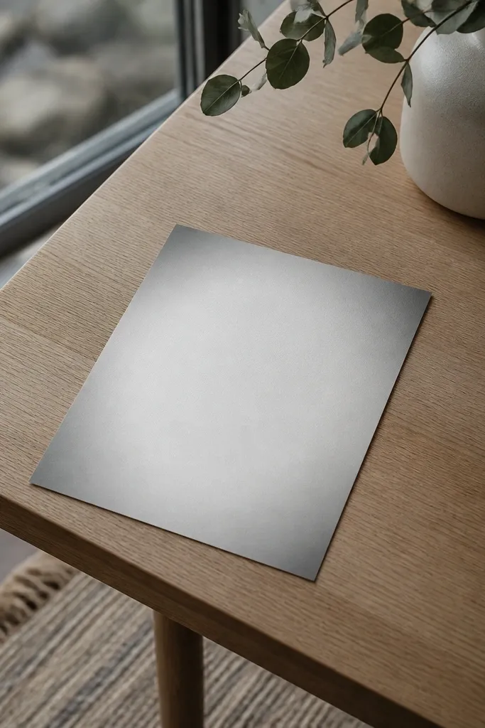
Corner ombre gives you a “premium gradient” look while keeping the center readable. Done right, it adds depth to a free template without turning into a muddy blob. Gray is also a safe palette because it works with nearly every font style and wedding theme. This template suits modern weddings, indoor venues, and couples who want subtle color. Choose templates where the ombre fades gently and doesn’t touch the text block.
Start by selecting a template with ombre limited to one corner or edge. Then keep your main names on the cleanest part of the page — usually centered. Finally, print one sample and hold it next to a white sheet; if the ombre is too strong, reduce its opacity in the editor.
Quick tipUse darker gray text for date and venue so the gradient doesn’t steal contrast.
Skip thisSkip templates where the gradient spreads behind the address or RSVP text.
11. Vintage Lace Border in Warm Sepia
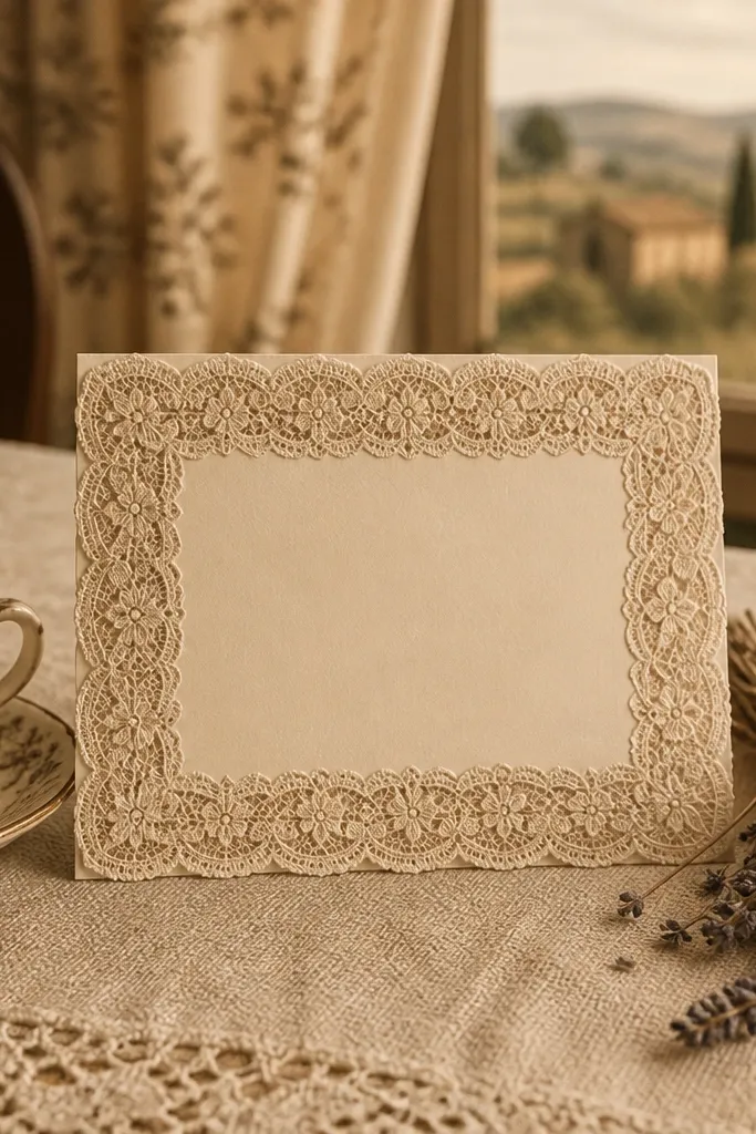
Lace borders look stunning because they add a historical feel while staying visually light. The trick for looking polished is keeping the lace as a border, not a full background, so the center text remains crisp. Sepia tones also photograph well and feel softer than pure black lace. This style works for vintage-inspired weddings, church ceremonies, and couples who like old-world romance. Pick templates where the lace edges are thin and detailed but don’t overlap the text.
Start by choosing a template with the lace border only on the outer edges. Then place the couple names centered and keep the address block smaller so it doesn’t compete with lace detail. Finally, print on off-white paper and check that the lace lines don’t disappear — adjust contrast in the template editor if needed.
Quick tipIf your printer can’t handle fine lace detail, use a slightly heavier paper weight.
Skip thisAvoid lace templates with dark, heavy patterns; they look noisy on cheap paper.
12. Botanical Line Art with No Color Fill
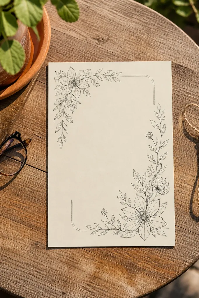
Black line art is the budget-friendly route to “looks like a designer made it.” It stays sharp, prints consistently, and avoids the blotchiness that can happen with watercolor fills. This template works for garden weddings, minimalist couples, and anyone who wants stationery that feels airy. It’s also easy to match with your save-the-date or reception card later because line art styles repeat cleanly. Choose templates where the line art sits around the text rather than filling it.
Start by selecting a template with line art that frames the invite edges. Then set the names in a serif or small caps type and keep the detail text in a single font. Finally, print a test and zoom in on the smallest lines; line art templates usually look best when text size stays generous.
Use line art with lots of white space — it hides printing imperfections.
Don’t choose line art that’s too dense; dense linework makes home prints look gray.
13. Gold Foil Look with Flat Warm Gray
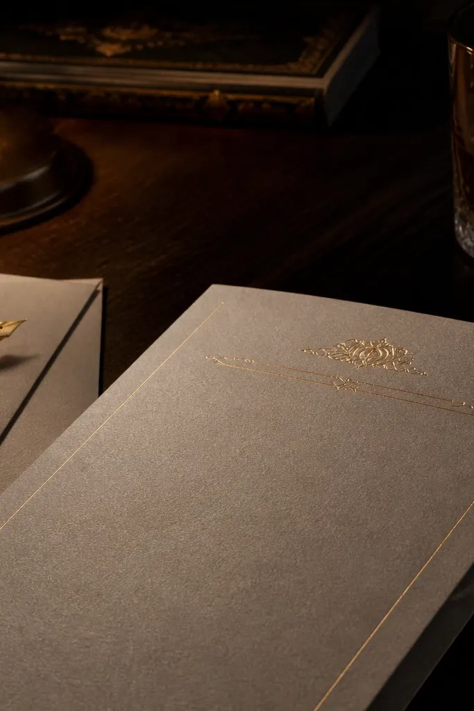
You can get a foil-like look without actual foil by using warm gray for “metallic” text and keeping the design minimal. This template style uses thin dividers and a restrained palette, so it reads premium even when printed normally. It suits evening weddings, elegant venues, and couples who want a modern glam vibe. The best versions keep metallic accents only on headings or monograms, not on every line. Choose templates where the warm gray is subtle — it should look like a sheen, not a bold stamp.
Start by using the template’s warm gray for headings and keep body text in black or dark charcoal. Then place dividers sparingly so the layout feels intentional. Finally, print a test and compare under daylight; if it looks too flat, slightly increase contrast on the warm gray element.
Print on smooth cardstock so warm gray looks more like “metallic” instead of flat ink.
Avoid templates that make the entire background metallic; it rarely prints cleanly.
14. Centered Floral Cluster at Bottom
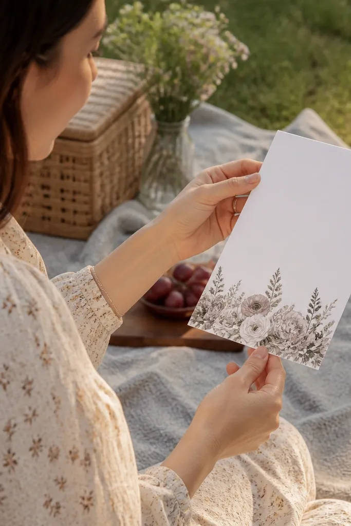
A bottom floral cluster adds charm without stealing attention from the main text. The center remains clear, and the cluster becomes a gentle visual finish. This style works well for spring weddings, backyard celebrations, and couples who want a sweet, feminine look without full-page florals. It’s also easy to read because the text block is uninterrupted. Choose templates where the floral sits below the RSVP or details, not behind it.
Start by placing your names and date in the upper half of the template. Then keep the venue and time lines in the middle, and leave space for the floral cluster at the bottom. Finally, print a test and make sure the bottom cluster doesn’t get cut off by your printer’s margins.
Quick tipIf you’re using a different paper size, recheck margins so the cluster still lands fully on the card.
Skip thisDon’t place the floral cluster directly under long address lines; it crowds the RSVP area.
15. Geometric Arch Top Frame
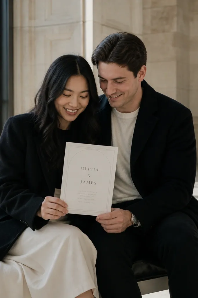
An arch frame gives your invitation a built-in focal shape, like a window for the couple names. The geometry keeps it modern, while the arch adds softness. This design is great for ceremonies in gardens, chapels, and museums because it looks architectural in photos. It also works well for bilingual invitations or longer venue names because the frame guides the eye. Choose templates where the arch is clean and the text block stays centered inside it.
Start by selecting a template with an arch frame at the top and a large open center. Then set your couple names in the middle and keep the date line just below them. Finally, check line breaks for your venue — if it wraps, reduce font size slightly so it stays inside the arch.
Use a short venue name if possible; arch frames look best when lines stay controlled.
Avoid templates where the arch frame touches the names — it looks cramped.
16. Monogram Corner Squares
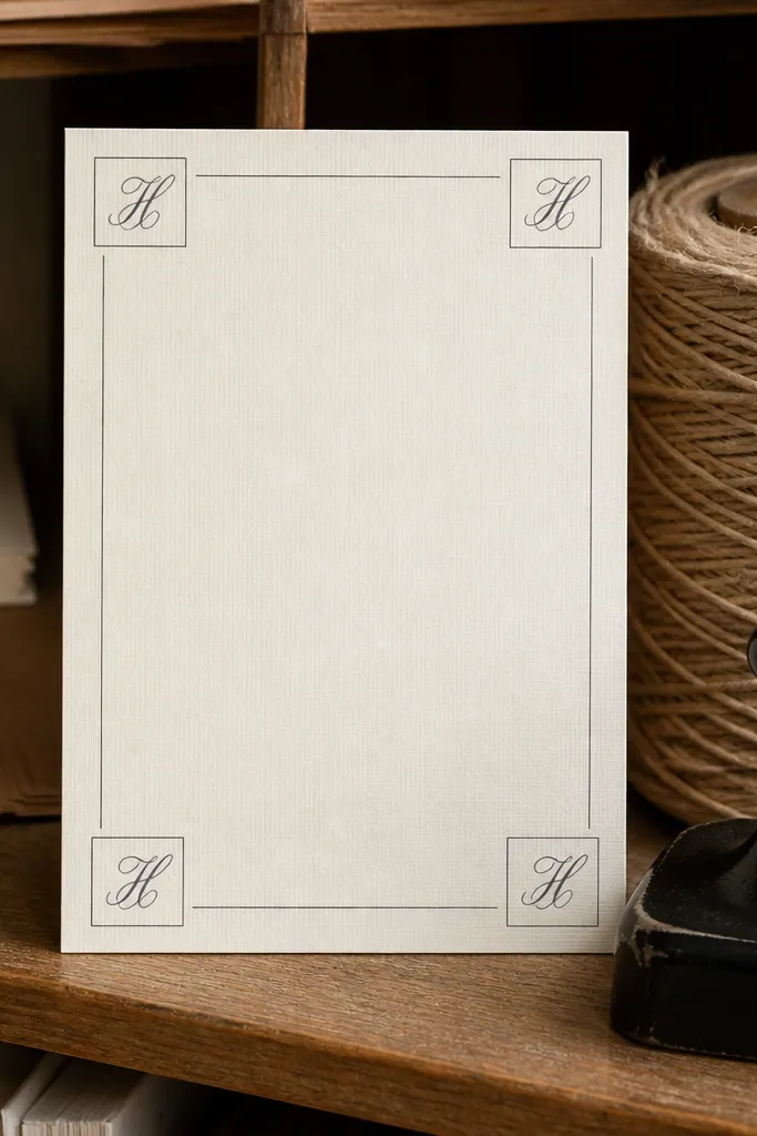
Corner squares create a “designer system” look with very little work. The template uses small monogram placements in corners and leaves the center clean for your wording. This is one of the easiest ways to make a free invitation look intentional, because the layout has structure. It suits modern weddings, minimalist themes, and couples who want a personal touch without florals. Pick templates where the corner squares are subtle and the main text is still the biggest element.
Start by entering the monogram initials into the corner squares and keeping them consistent in size. Then center the couple names and use a simple serif or sans for details. Finally, print a test and confirm the corners don’t get distorted by printer margins.
Use the same ink color for the squares and headings so the design feels cohesive.
Skip templates where the corner graphics are too large; they steal attention from the names.
17. Wedding Crest Shield Layout
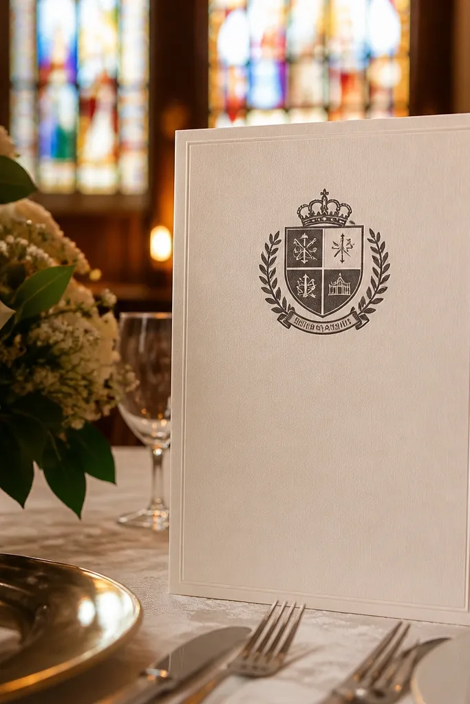
A crest shield template looks impressive because it adds a formal emblem without needing a complex background. The shield works like a stamp for your wedding identity, and the rest of the layout stays clean. This is a strong choice for family-style weddings, church ceremonies, and couples who like traditional stationery. It also photographs well because the crest sits above the text and creates a clear vertical hierarchy. Choose templates where the shield is simple and the typography below is crisp.
Start by placing the crest at the top center and keeping your names as the next largest element. Then stack the date and time lines in a neat column so they align within the shield width. Finally, print one copy and check that the crest doesn’t appear too light; increase contrast if needed.
Keep the crest small enough that it doesn’t compete with your names.
Avoid shields with heavy background patterns; they blur and look cheap fast.
18. Script Names with Dotted Line Details
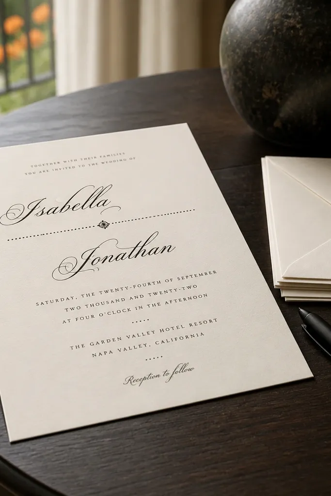
Dotted lines add a handcrafted, stationery-shop feel while keeping the layout clean. This template style looks polished because the dots guide the eye between sections without creating a dense background. It’s a great option if you want something more styled than plain typography but not as busy as florals. The script names give romance, and the dotted dividers keep the details organized for guests. Choose templates where the dots are consistent and the RSVP line sits in a clear block.
Start by inserting your names into the script area and set the date line in a smaller serif or sans. Then add or keep dotted dividers between sections like date, location, and RSVP. Finally, print a test and make sure the dotted line doesn’t look broken; if it does, slightly increase its thickness or contrast.
Use dotted dividers only between major sections; too many dots make it look cluttered.
Don’t use dotted lines next to tiny fonts; the combination is where home prints fail.
19. Soft Floral Frame with Text in Middle Band
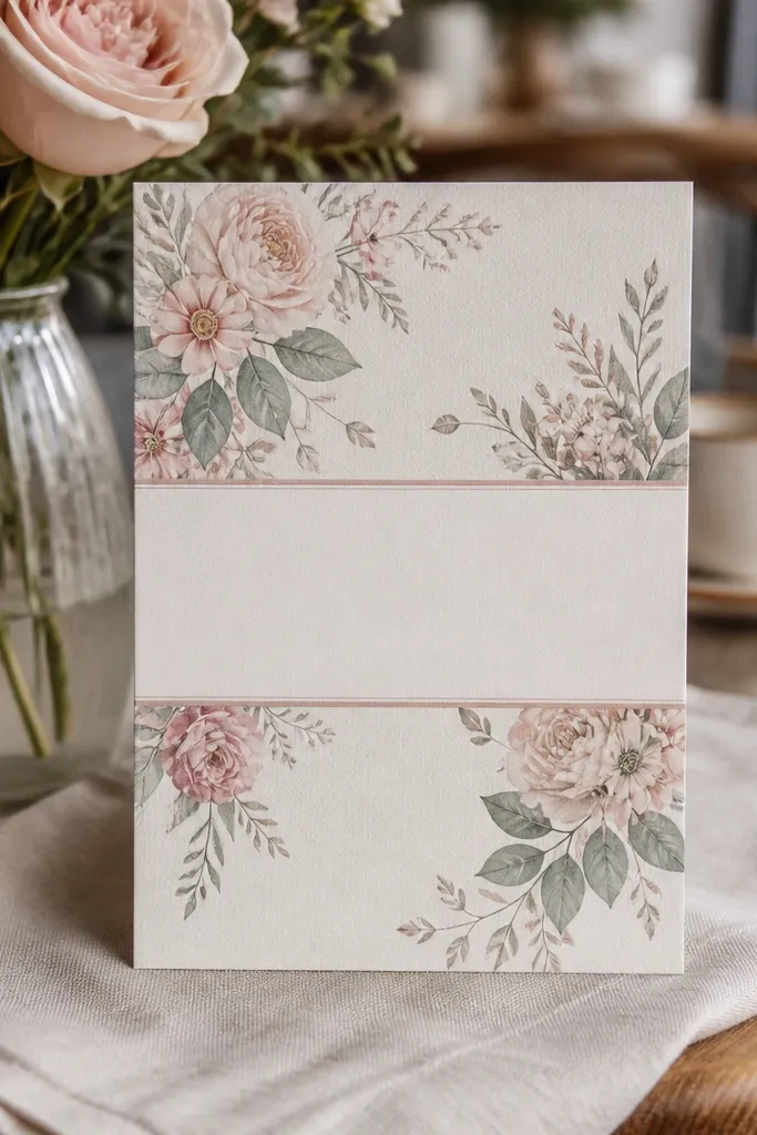
This template looks expensive because it combines a floral frame with a structured text band. The frame adds romance and softness, while the band keeps the typography readable and centered in a neat rectangle. It works well for couples who want floral stationery but hate when text gets lost in busy backgrounds. It also photographs well because the band creates a stable focal area. Choose templates where the middle band is a lighter color or a clear white panel.
Start by selecting a template with a defined middle band and keep your names centered within it. Then place the date and venue lines inside the band so they never overlap floral elements. Finally, print a test sheet and check that the band color doesn’t shift on your paper stock.
If your band is gray, test on your printer settings; gray bands can appear too dark on textured paper.
Avoid templates where the floral frame overlaps the band edges; it makes alignment look sloppy.
20. Modern Minimal Photo-Style Invite Layout (No Photo)
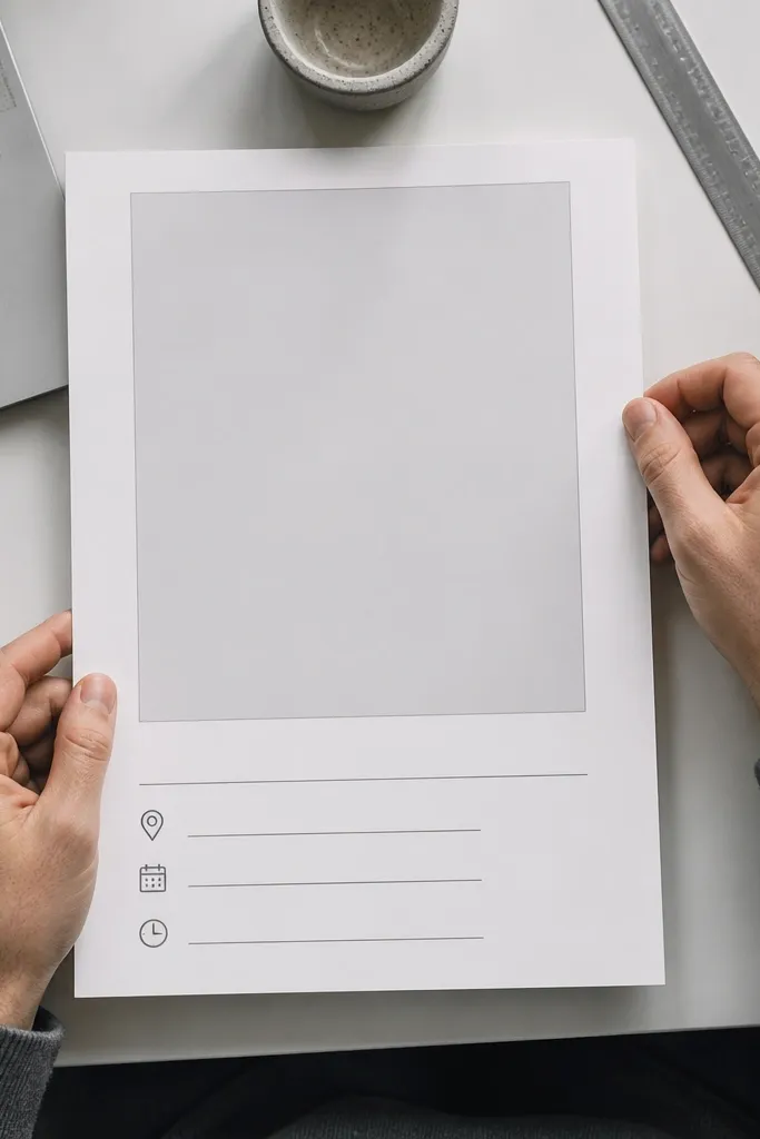
This is a modern layout trick: it uses a “photo” style grid but leaves the image area blank or as a simple pattern. The result looks modern and intentional, even when you don’t add a photo. It’s perfect for couples who want a sleek look with room for long venue addresses or multiple time lines. The empty space makes the typography feel premium. Pick templates with a large top area for names and a smaller details block below.
Start by choosing the template and keeping the top area for the couple names or monogram. Then set the date and time in a clearly separated details block under it. Finally, print a test and confirm that your longest line, usually the street address, still fits without shrinking too far.
Quick tipUse a slightly larger font size than you think for the address block; blank layouts make tiny text stand out.
Skip thisAvoid templates where the details block is too close to the edges; it looks cramped.
21. Tropical Palm Line Art with Navy Details
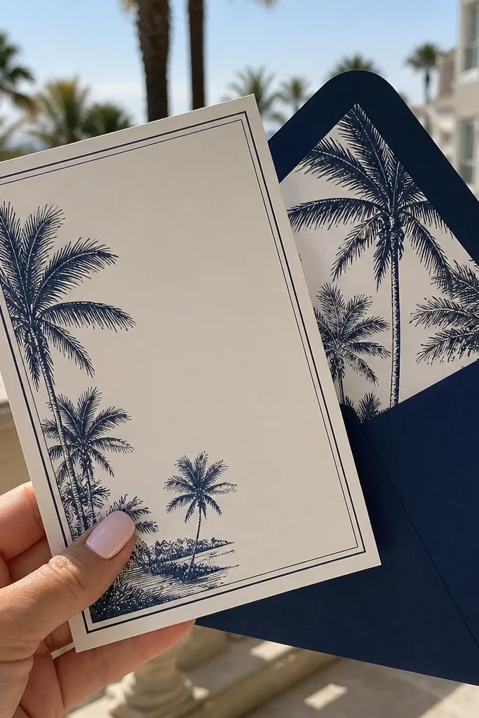
Palm line art gives you a destination vibe without forcing you into bright colors. The navy text keeps everything grounded and reads cleanly, even on a free template. This style fits beach weddings, island travel, and warm-weather ceremonies. It also photographs well because the line art adds motion-like curves while the navy typography stays sharp. Choose templates where palms sit in corners or along the sides, leaving the center text area open.
Start by selecting a palm line art template with navy or charcoal text. Then place your names and date in the center and keep the RSVP details in a smaller, simple font. Finally, print a test and check the line art visibility; if it’s too light, increase contrast in the template editor.
Quick tipUse navy envelopes; it makes the whole suite feel themed without adding extra design work.
Skip thisSkip templates with full tropical backgrounds behind the text; they tend to look muddy.
22. Single Flower Silhouette Side Panel
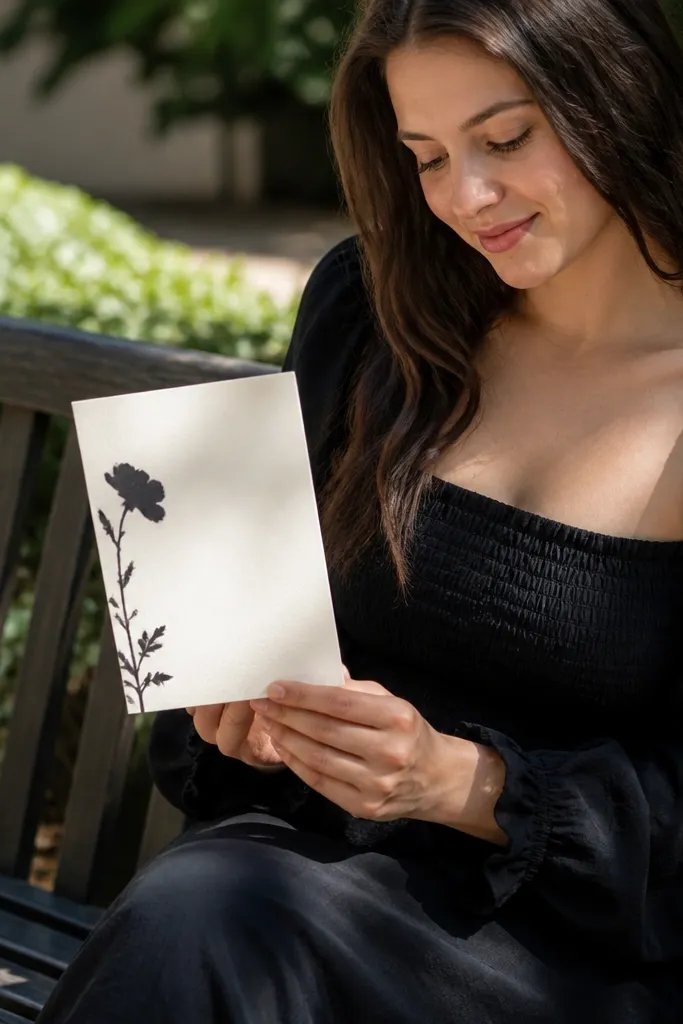
A side panel with one flower silhouette looks chic because it adds a fashion-magazine element while keeping the rest clean. The silhouette is usually a simple shape, so it prints consistently and doesn’t blur like detailed watercolor. This template works for modern garden weddings and couples who want a statement piece without full borders. The side placement also helps if you have longer names or a longer venue line — the center stays flexible. Choose templates where the silhouette is large but not touching the text block.
Start by placing the silhouette in the side panel area and then center the names and date in the open space. Next, keep the address and RSVP lines in a tight block so the center doesn’t sprawl. Finally, print a test and check that the silhouette has enough contrast against your paper color.
Quick tipPick a paper color that matches the silhouette tone; warm white makes gray silhouettes look softer.
Skip thisAvoid templates where the silhouette overlaps the address block; it reduces readability.
23. Minimal Frame + Big Date Typographic Poster Look
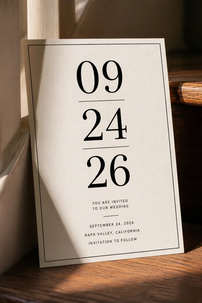
This template style works because it treats the invitation like a poster. The big date becomes the hero, and the rest of the details are smaller but neatly aligned. It looks polished in photos because the typography is the main graphic. This is a strong choice for weddings with a clear date emphasis, like a long-awaited anniversary or a destination weekend. Pick templates where the big date is centered and the supporting details are stacked with consistent spacing.
Start by inserting the date and making sure it stays the largest element on the page. Then place the names above or below the date and keep the venue and RSVP lines in a smaller font size. Finally, print a test and measure the date width; if it’s too wide for your card, reduce font size by one step rather than squeezing letter spacing too much.
Use a bold serif for the date and a plain sans for the details; it keeps the look clean.
Don’t add extra decorative elements around the date; typography already does the work.
24. Classic Flourish Corners in Black
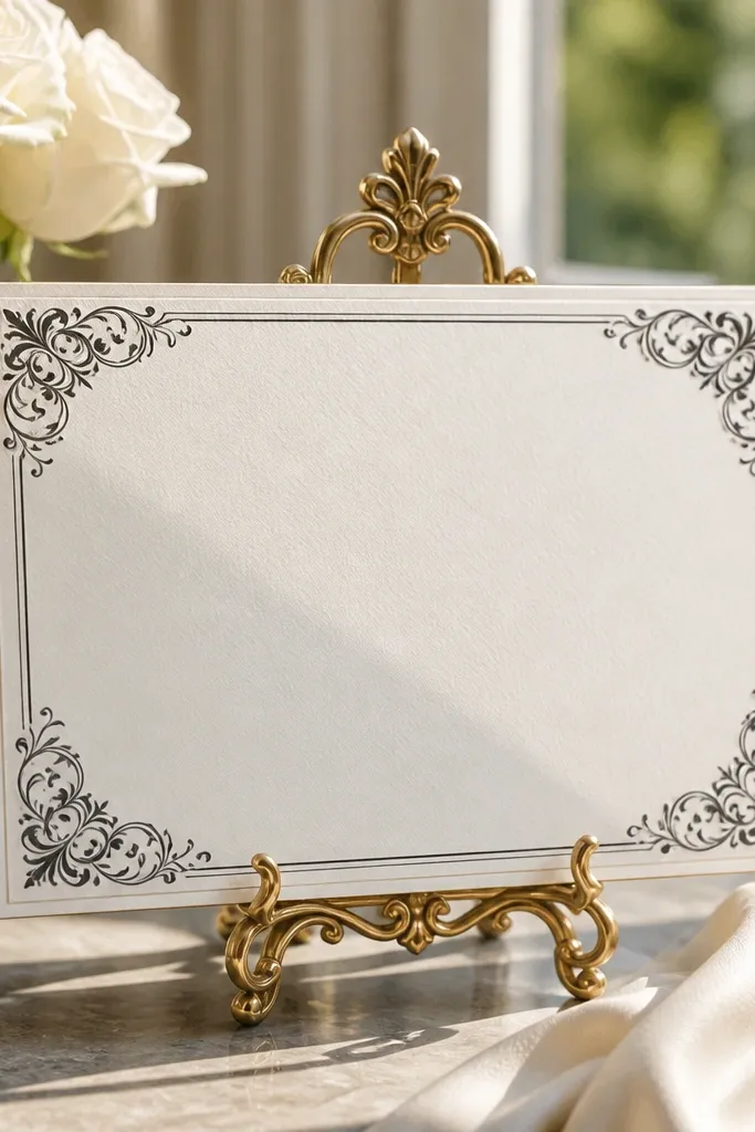
Flourish corners are a reliable way to make free templates look “formal” without printing heavy backgrounds. The corners add elegance, while the center stays readable. This style suits traditional weddings, church ceremonies, and couples who like old-school stationery. It also works well with both serif and script fonts because the flourishes frame the text. Choose templates with flourishes that are thin and symmetrical so they look intentional rather than random.
Start by picking a template where flourishes sit only in the corners. Then center your names and keep the rest of the text in a single column with consistent line spacing. Finally, print one test and check the thinnest flourish lines; if they disappear, switch to a heavier paper or increase contrast.
Use a slightly larger paper size if your printer trims too close to edges.
Avoid flourishes that repeat too many times; repetition makes free designs look busy.
25. Coastal Rope Border + Whitewashed Blue Script
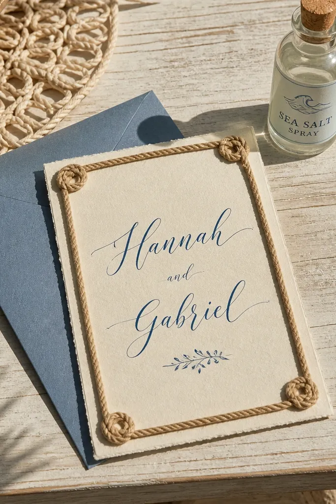
This template feels like a beach weekend without looking childish. A rope border gives you that handmade, coastal texture, and the whitewashed blue script keeps it airy on a clean cream background. It photographs well in daylight because the rope lines catch slight contrast while the text stays crisp. It suits a seaside ceremony, a backyard rehearsal by the water, or any wedding where you want “relaxed” to look intentional. It also works year-round because the palette reads clean in winter photos and bright in summer ones.
Pick a cream or soft ivory card base, then set your names in a whitewashed blue script at least 30-40 pt for legibility. Add the rope border as a thin outer frame, leaving 10-15 mm of breathing room between border and text so it doesn’t feel crowded. Use black or deep navy for the rest of the details like date, time, and venue to keep contrast strong. For a trip that matches this look, choose a coastal town with walkable streets and lots of shaded storefronts for photos. Plan 2 nights at minimum so you get one full day for venue photos and one morning for calmer light; book accommodations 6-8 weeks ahead in peak summer.
Book a place near the waterfront, then schedule invite-photo days for late morning — the blue tones stay true without harsh shadows.
Don’t put the rope border too thick or too close to the names — it makes the design look busy and harder to read.



