
1. Cream Letterpress-Inspired Serif with Dark Ink
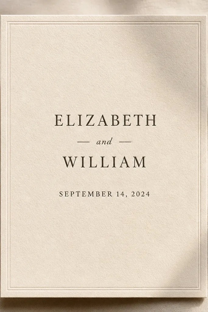
First, open the template and set your background to a true warm cream (not bright white) and your main text to charcoal or near-black. Then, replace only the names and date lines first, and adjust line breaks so the longest line still sits comfortably within the margins. Finally, keep the RSVP line smaller than the main title and add the address block in a single tight paragraph so it doesn’t sprawl.
This template is built for that quiet, high-end letterpress vibe without needing actual presses. The layout uses a warm cream background and deep charcoal text, so names feel grounded and date lines stay crisp. The design keeps most elements in the center column, with generous margins that look expensive on camera and in-hand. It’s a strong fit for classic weddings, city hall ceremonies, and anyone who wants “timeless” instead of “trendy.”
Skip thisDon’t switch the design to bright white or pure black text — it kills the letterpress feel.
Quick tipIf you’re printing at home, choose 100-120 lb cardstock and turn off any “enhance” or “fit to page” options.
2. Black Tie Monochrome with Fine-Rule Divider
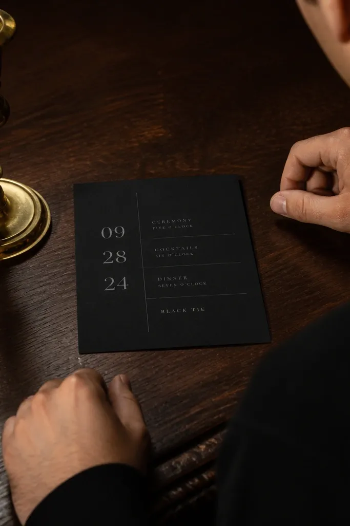
Start by entering your names in the top area and using the template’s existing font sizes as your guide for hierarchy. Then, paste your address and RSVP details exactly as you want them to appear, including line breaks for street, city, and state. Finally, keep any extra info (dress code, registry, website) to one short line so the divider sections don’t get crowded.
This is the cleanest way to look formal without adding heavy ornament. The template uses thin rule lines to separate sections, so the invite has structure even when you keep the copy simple. Everything stays monochrome, which makes it photograph sharply and keeps your details readable. It works especially well for evening weddings, formal receptions, and couples who want minimal graphics but maximum polish.
Skip thisAvoid adding multiple accent colors; the monochrome look breaks instantly.
Quick tipPrint this on smooth matte paper — glossy stock can make the thin rules look harsh.
3. Dusty Rose Script Accent on Blush Background
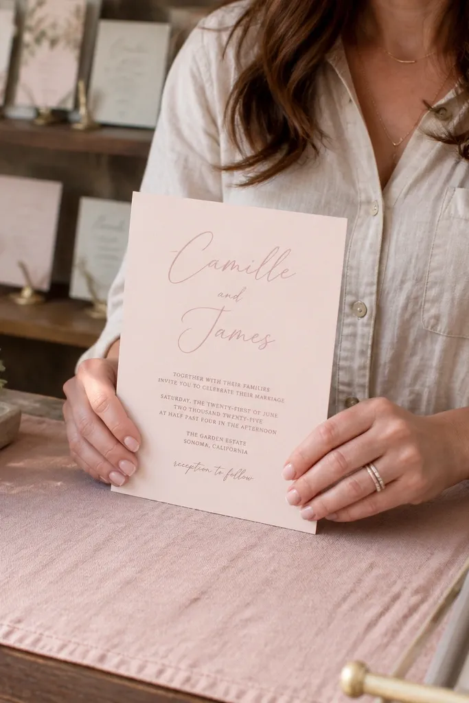
This template nails the soft, romantic aesthetic without going full floral chaos. It pairs a script-style name line in dusty rose with simple sans-serif supporting text, which creates that “boutique couple” contrast. The blush background keeps the overall palette gentle, while the text stays legible. It’s a great match for spring weddings, garden venues, and anyone who wants romance that still looks modern.
First, set your background to a muted blush and keep the script color to a slightly darker dusty rose, not hot pink. Then, place your main date line in the sans-serif style provided and reduce letter spacing slightly if your software allows it. Finally, keep RSVP text aligned to the left of the supporting block so it looks deliberate, not accidental.
If your names are long, shorten the script line (use first names only) so it doesn’t overlap the supporting text.
Don’t add extra flourishes around the script; this template already has the right amount of decoration.
4. Olive Branch Minimal with Single Botanical Sprig
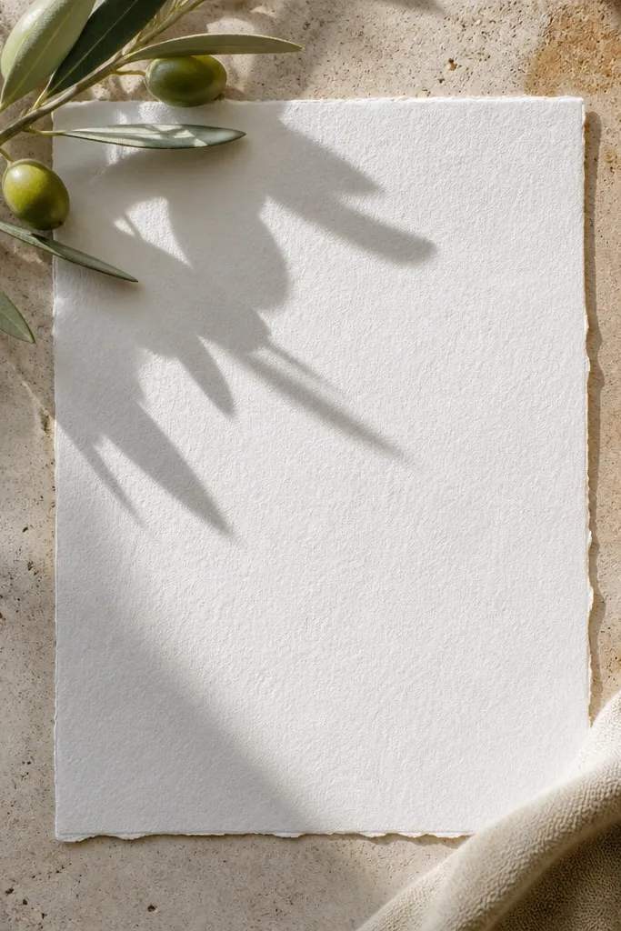
Start by keeping the botanical sprig as the only graphic — don’t add extra icons or extra leaves. Then, choose a neutral text color like slate gray for the body and a slightly darker shade for the names. Finally, set the RSVP and address lines in a smaller size but maintain line spacing so it stays readable from arm’s length.
A single botanical element is the fastest route to an aesthetic wedding invitation that feels grown-up. This template uses a small olive sprig placed near the corner, leaving lots of breathing room around the text. The olive-green accent makes the typography look intentional and keeps the palette earthy. It fits destination weddings, outdoor venues, and modern rustic themes where you want “natural” but still clean.
Skip thisSkip templates with multiple full-page florals if you want a clean, expensive look.
Quick tipPrint with a slightly heavier cardstock and avoid very thin paper; the olive ink can show through.
5. Art Deco Frame with Gold Foil Feel
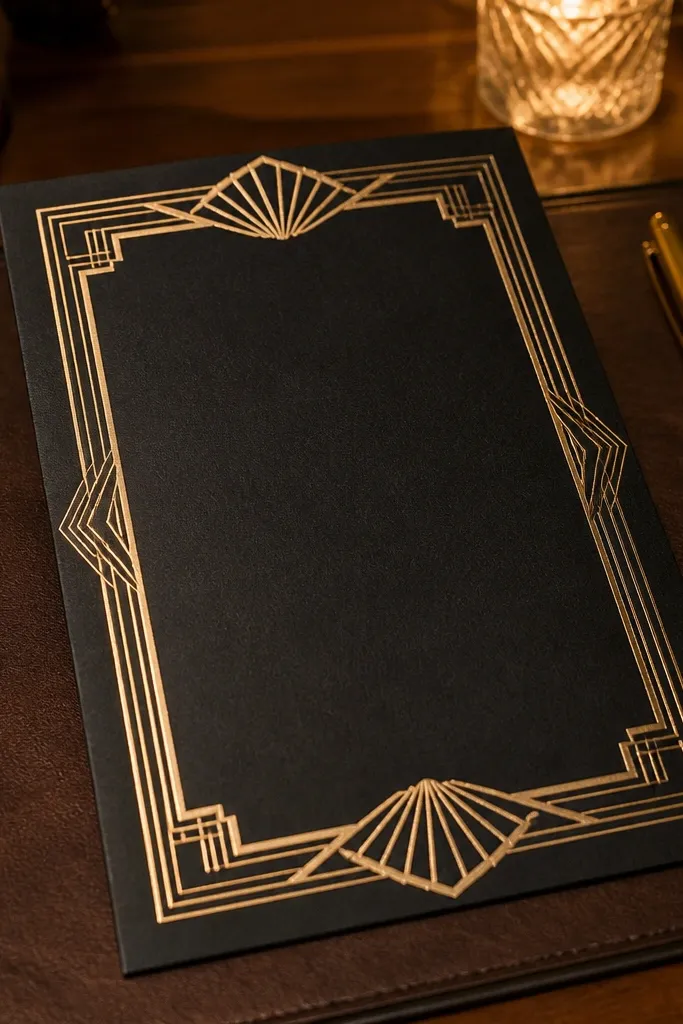
First, set your background to a warm ivory and use the frame color as the only accent (gold or antique gold). Then, align all text lines to the center and keep the names larger than everything else by at least two font steps. Finally, if you add a venue name, place it in the middle section and keep it on one or two lines max.
If you want “expensive” in a noticeable way, art deco geometry does it. This template uses a structured frame around the text, with a metallic-looking accent color that reads like foil in photos. The fonts are sized so your names stay commanding while the event details remain crisp and structured. It’s perfect for black-and-gold venues, ballroom receptions, and couples who love vintage polish.
Skip thisDon’t add a busy background pattern behind the deco frame — it competes with the geometry.
Quick tipFor best results, print at a local shop that can handle metallic inks or use a foil-ready color profile.
6. Navy Nautical Minimal with White Text Block
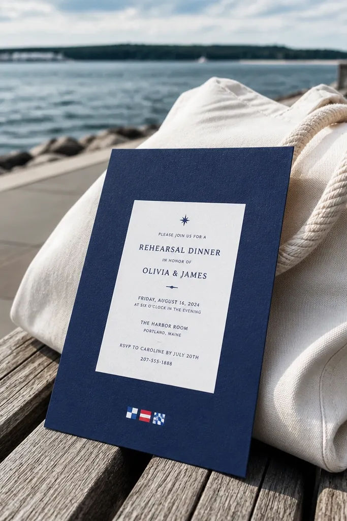
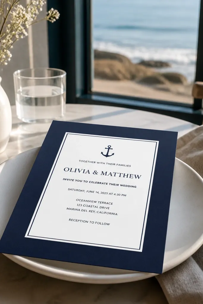
This one looks crisp and modern because it uses a strong navy field plus a clean white panel for the details. The typography remains the star, and any small nautical cues stay subtle so it doesn’t feel like a theme party. It photographs well because the contrast is high and the layout is controlled. Great for coastal weddings, yacht weekends, and couples who want coastal without cartoon anchors.
Start by inserting your names into the top panel and keep the supporting text in the smaller font sizes from the template. Then, check the RSVP line length — if it wraps to a third line, shorten wording or reduce the RSVP label. Finally, keep the address block in one compact block so the white panel stays tidy.
Use matte white cardstock for the panel area so the navy background doesn’t look washed out.
Avoid light gray text on navy; it reduces readability and makes it look cheap.
7. Botanical Watercolor Border with Clean Center Text
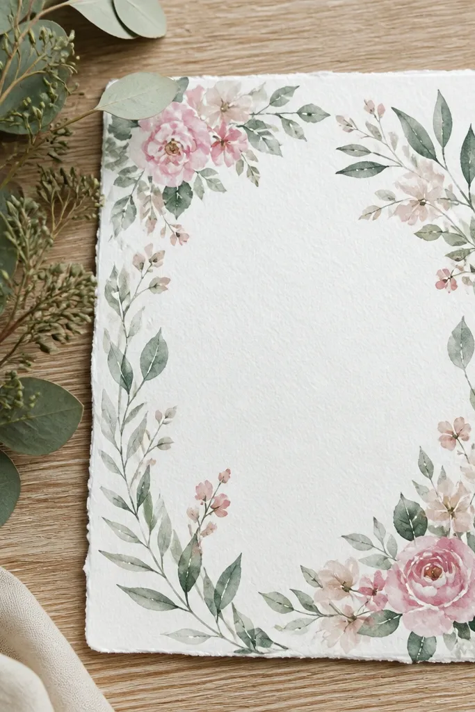
This template uses watercolor florals as a border instead of filling the page, which makes it look airy and expensive. The watercolor edge adds softness and movement, while the center stays clean for reading. The palette is muted, so it doesn’t overwhelm the typography. It works for spring and summer weddings, especially for venues with natural light where the watercolor texture shows beautifully.
First, keep the border as-is and focus on aligning your center text block so it sits perfectly in the middle. Then, choose a font weight for body text that matches the template’s style — don’t swap to a super light font. Finally, add your registry or website as a separate short line at the bottom so it doesn’t clutter the main hierarchy.
If you print at home, test one copy first because watercolor borders can show banding on some printers.
Don’t add multiple borders or extra icons; one frame is what keeps it elegant.
8. Terracotta Modern Serif with Big Date Typography
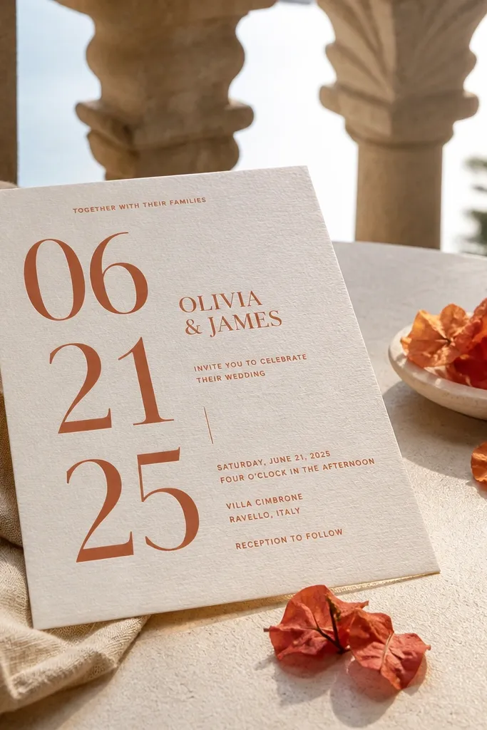
Start by placing your date in the large type area and adjust the line break so it reads like one clean block. Then set names in the serif style and keep the body details smaller, with consistent spacing between sections. Finally, check the font color contrast — terracotta should be darker than your background and not too light to read.
Big date typography is one of the fastest ways to make an invitation look designed, not assembled. This template uses terracotta as a warm accent and pairs modern serif for names with a simpler body font. The date is placed in a way that feels intentional and gives your eye an anchor. It’s perfect for fall weddings, desert venues, and couples who want warm color without going overly rustic.
Skip thisAvoid using a bright orange terracotta; it turns the vibe from warm to carnival.
Quick tipUse a brown or dark gray envelope liner if you’re matching — it makes the whole suite look cohesive.
9. Charcoal Minimal with Rounded Corner Label
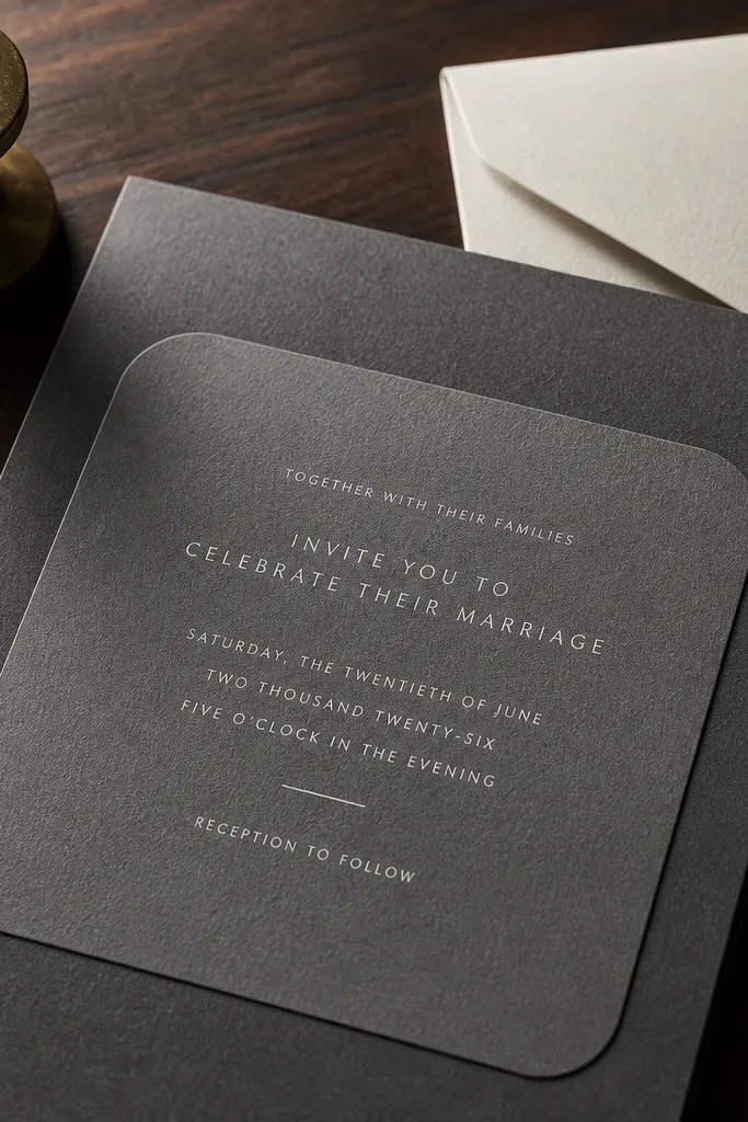
Start by setting your main background to charcoal and your label to a clean off-white. Then place names at the top and keep your date and time inside the rounded label so it stays visually grouped. Finally, move RSVP info inside the label area too if space allows; it keeps the design from looking empty.
This template is all about modern restraint. The charcoal background gives it weight, and the rounded label holds your event details like a premium product card. The typography is spaced so it looks sharp and calm. It’s ideal for modern city weddings, intimate celebrations, and couples who don’t want florals or heavy frames but still want “expensive” styling.
Skip thisDon’t add extra decorative lines — the label shape is the design.
Quick tipPrint on thick matte paper so the charcoal doesn’t show texture through.
10. Ivory + Sage Duo with Tiny Leaf Icons
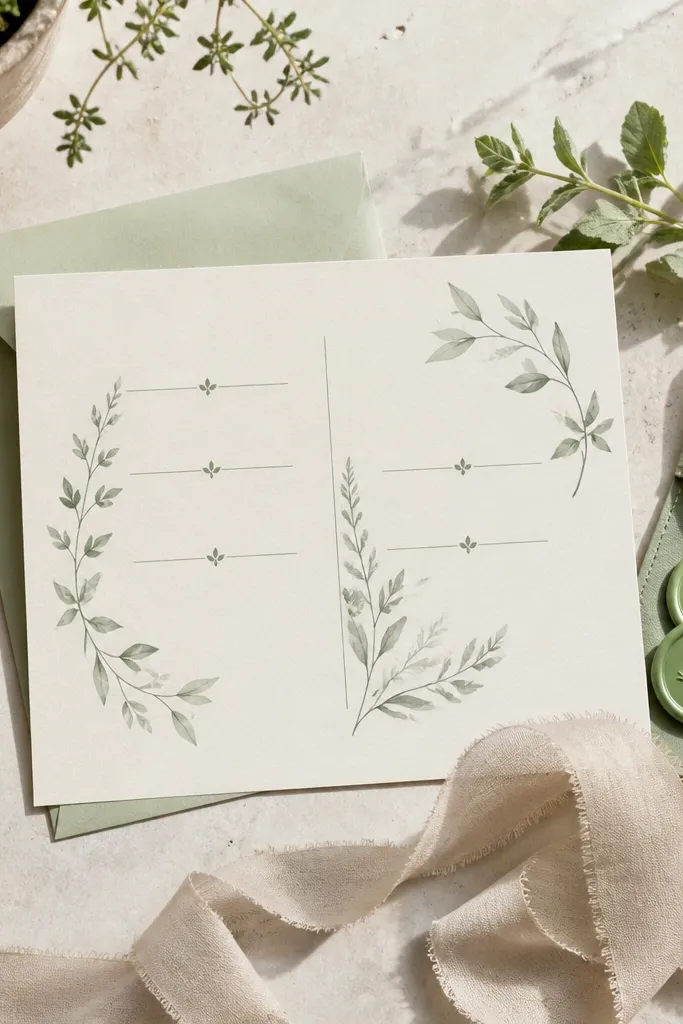
First, keep the sage only for headings or small accent lines, not for the whole body text. Then insert your event details and use consistent line breaks for time, street, and city. Finally, add your RSVP contact in the same accent color as the headings so the template looks cohesive across the page.
If you want an aesthetic wedding invitation template that feels fresh but controlled, this sage-and-ivory combo is hard to beat. The tiny leaf icons act like punctuation, guiding the eye without stealing attention from the details. The palette is soft enough for spring, but the layout stays structured so it doesn’t look childish. Great for garden venues, brunch receptions, and couples who like clean stationery with a hint of nature.
Skip thisSkip neon sage or bright green — it ruins the soft feel immediately.
Quick tipUse envelopes in kraft or soft white; both match sage without fighting it.
11. French Script Romance with Black & Blush Layout
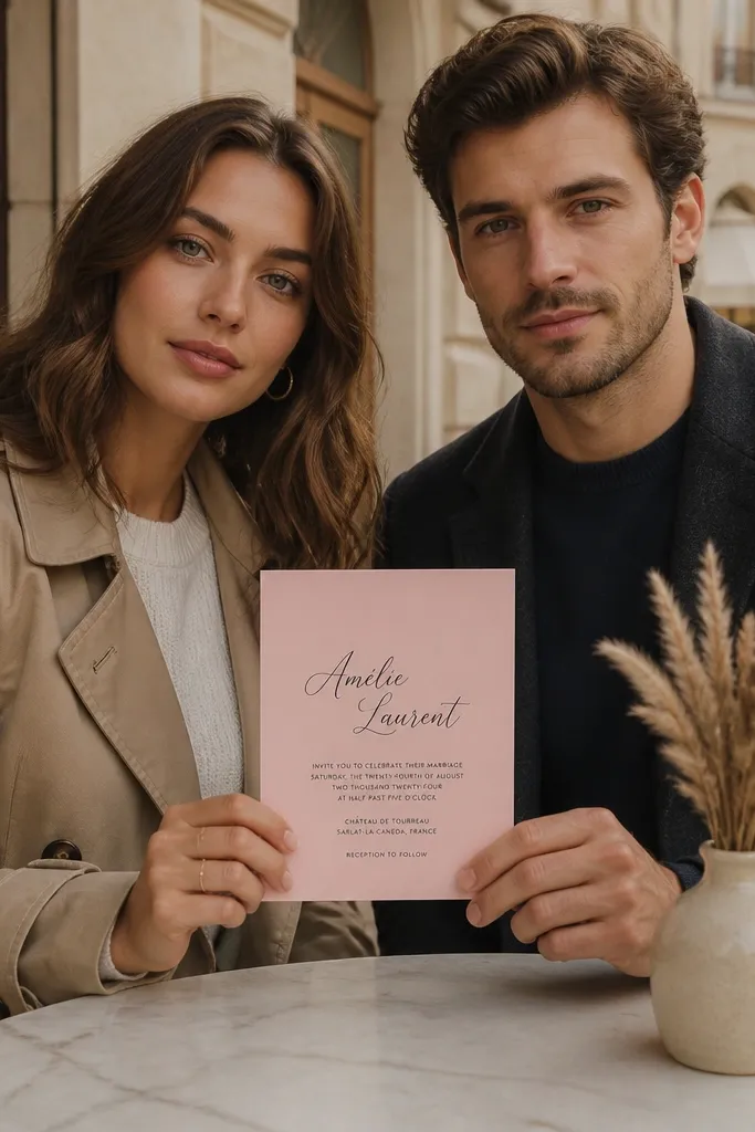
This template reads romantic because the script is used sparingly and the rest is crisp. The blush background softens everything, while black text keeps it sharp and readable. It’s the kind of design that looks great in flat lays because the contrast is strong and the script line catches attention. It’s a good fit for wedding weekends, bridal showers that tie into the same suite, and anyone who wants romance without heavy floral graphics.
Start by placing the couple names in the script line and keep it to one line if possible. Then set the date and location in the clean sans or serif body font, aligned to the same left edge. Finally, keep the RSVP info smaller and place it near the bottom so the invite doesn’t feel top-heavy.
If your venue name is long, drop the street address from the main invite and put it on an insert card.
Don’t enlarge the script until it overlaps other text — legibility drops fast.
12. Minimal Line Art Frame with Monochrome Text
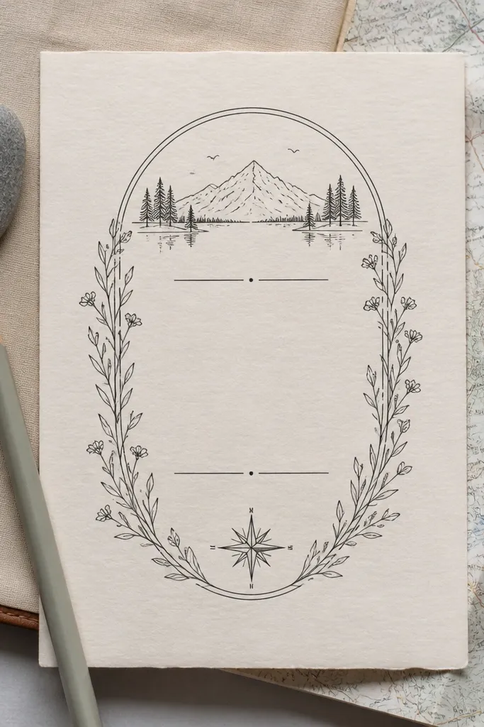
This is for couples who want “designed” but not decorative. The line art frame is subtle and gives the page structure, so the typography looks like it belongs in a magazine. Monochrome keeps it timeless, and the thin lines photograph cleanly. It’s a strong pick for modern weddings, registry-focused couples, and anyone who wants invitations that feel calm and premium.
First, keep your text color consistent across the page — choose charcoal or black and stick to it. Then align your main title and event details to the same grid line so the spacing feels intentional. Finally, don’t add extra icons; if the template includes a frame, the frame is the design.
Use a ruler to check margins in your design tool — a few millimeters change how “expensive” it looks.
Avoid low-resolution line art; it can look fuzzy when printed.
13. Soft Floral Corners with Off-White Background
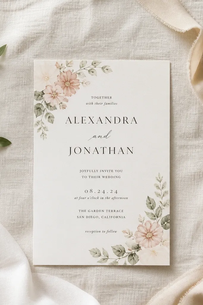
Start by replacing the center text block first so you can see how much space the florals leave. Then adjust the font size slightly so the bottom RSVP line doesn’t creep too close to the corner art. Finally, keep your color palette to the existing floral tones — swap text to the darkest tone for legibility.
Corner florals are the sweet spot between “pretty” and “still readable.” This template keeps florals confined to the edges so the center stays open and the text stays the focus. The palette is light and airy, which makes it feel high-end instead of busy. It works for spring weddings, baby-sister-of-the-bride style celebrations, and venues with lots of greenery or neutral décor.
Skip thisDon’t add a full-bleed background behind the corner florals.
Quick tipPrint on smooth cotton-like paper if you can; corner florals look better with texture.
14. Modern Grid Typography with Geometric Accent Dot
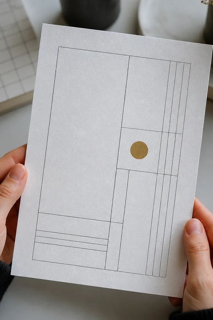
This template uses a strict grid layout and a tiny geometric accent to create an editorial feel. The design looks expensive because the spacing is mathematically consistent and the typography sizes are deliberate. There’s no clutter, but it doesn’t feel empty — the accent dot gives it a focal point. Great for minimalist weddings, courthouse ceremonies, and couples who want modern stationery that still feels warm.
First, enter your names in the top grid area and ensure the longest line stays on one row. Then place date and time in the next grid row and keep the RSVP block aligned to the same left margin. Finally, choose one accent color for the dot only and keep all other text in black or near-black.
Use the template’s default font pair if it’s provided; swapping fonts breaks the grid harmony.
Avoid adding extra lines like “hosted by” unless the grid has room.
15. Champagne Gold Foil Style with Deep Black Type
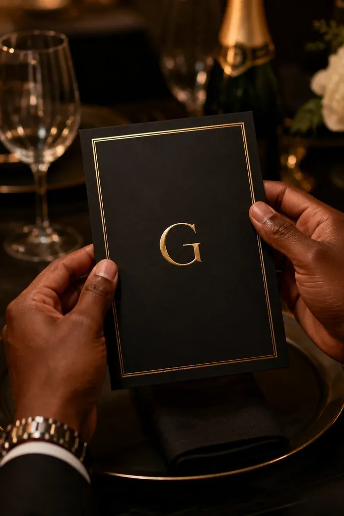
Start by setting your background to true deep black and your accent to champagne gold (not bright yellow). Then, keep the gold limited to headings or the names line, and set the rest of the text to white or off-white. Finally, check that your RSVP phone/email stays readable — gold can be hard on small text.
This one gives you the gold-foil aesthetic without turning into a theme. The deep black background makes the champagne-gold accents look richer, and the typography stays clean so it doesn’t feel like a flyer. It’s ideal for evening receptions, winter weddings, and venues with dark wood or candlelight. If your goal is “looks expensive at a glance,” this is the fastest route.
Skip thisDon’t make every line gold; it looks flat and reduces readability.
Quick tipIf you print at home, use off-white text for body lines; gold should stay for larger type only.
16. Marble Vein Background with Minimal Wedding Copy
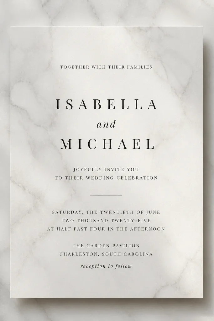
Marble backgrounds can look luxe when they’re restrained. This template uses a subtle marble texture so it feels like a premium surface, while the text stays minimal and high-contrast. The design is especially photogenic under window light because the texture shows depth without overpowering the layout. It suits modern indoor venues, winter weddings, and couples who want a clean luxury vibe without floral clutter.
First, confirm the marble texture stays behind the text block only and doesn’t conflict with your font. Then set your body text to dark gray (not pure black) so it blends with the marble tones. Finally, keep your decorative elements small — if the template has a thin border, use it and avoid adding extra icons.
Print one test sheet and check for muddy colors; marble can dull on some printers.
Avoid bright marble whites with thin fonts — it makes the text look washed.
17. Classic Navy Crest Monogram Invitation
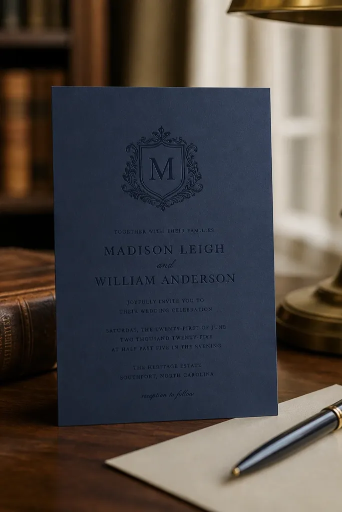
A crest-style monogram instantly signals tradition, but you still get an aesthetic look because the layout stays clean. This template places the monogram near the top and keeps the rest of the details in classic serif type. The navy palette looks sharp and premium, and the crest adds a focal point for photos. It’s a good fit for church weddings, formal family events, and couples who want classic stationery without heavy florals.
Start by inserting your monogram and adjusting its size so it doesn’t crowd the names line. Then, set names and date in larger serif fonts, and keep the address block in a smaller, centered or left-aligned block based on the template. Finally, keep additional details like website or registry to one line at the bottom so the crest remains the hero.
Use a simple RSVP method like email or a single phone number so your invite stays uncluttered.
Don’t add extra badges or multiple crests — one monogram is enough.
18. Terracotta Gallery Card Style with Side Accent Band
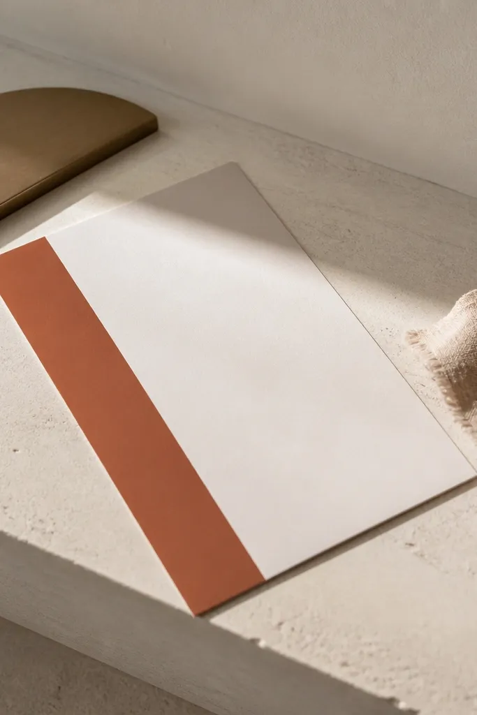
First, keep the side band color consistent and choose a text color that contrasts strongly (dark gray or near-black). Then, paste in your venue name and adjust line breaks so it stays within the center column width. Finally, place the RSVP info at the bottom of the center column and keep it to a compact block.
This template looks expensive because it’s built like a gallery card: clean center, strong edge accent, and confident typography. The terracotta side band creates structure without needing ornaments, and the text is spaced so it reads clearly. It works well for couples who like modern warmth and venues with neutral décor. This is also a great choice if you have longer venue names because the layout keeps lines controlled.
Skip thisAvoid adding a background pattern behind the text — it fights the band.
Quick tipIf you’re sending inserts, match the same terracotta band color across every card for cohesion.
19. Peony-Inspired Dusty Floral Typography Layout
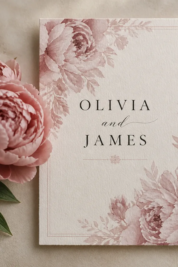
This template leans into peony-like softness while keeping the typography front and center. The floral elements sit behind or beside key lines, so they feel like part of the design system, not random decoration. Muted pinks and warm neutrals keep it romantic without looking childish. It’s ideal for spring weddings, bridal events, and couples who want a soft floral aesthetic that still prints sharply.
First, set your main text in a dark warm gray and keep the floral accent in muted pink or rose. Then, place the names line where the template has the most negative space so it doesn’t fight the floral background. Finally, reduce any extra lines (registry, dress code) to short phrases so the floral stays the secondary layer.
Use envelopes in blush or kraft to match the rose tone and make the suite feel intentional.
Skip deep black body text on muted florals; it can look too harsh.
20. Monochrome Botanical Script with Thin Frame
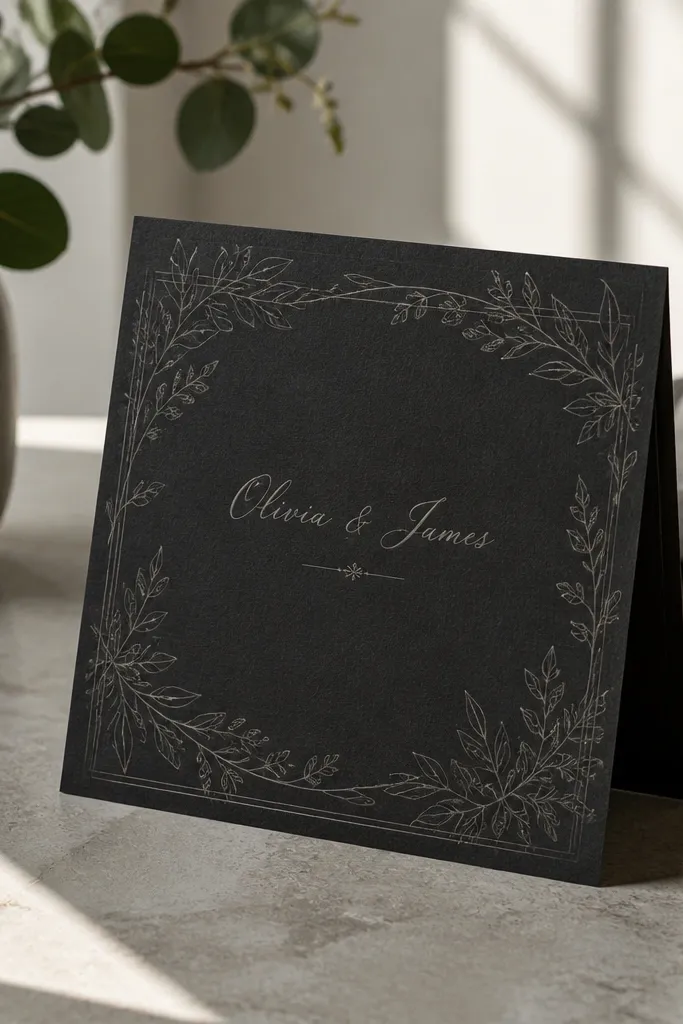
Monochrome botanical styles look expensive because the design is restrained. This template uses thin botanical line art and a script name line in the same color family, so it looks cohesive instead of pasted on. The thin frame keeps everything aligned and makes the typography feel intentional. It’s great for modern garden weddings and couples who want botanical vibes without color clutter.
Start by keeping all elements in one ink color — charcoal or near-black is the sweet spot. Then, place your names in the script style and set the rest of the details in the simple body font. Finally, make sure the RSVP info is large enough to read on printed paper — don’t shrink it just to fit.
Print on matte paper so the line art stays crisp instead of glossy glare.
Avoid using multiple ink colors; monochrome only works when it stays one tone.
21. White-on-Cream Minimal with Tiny Gold Star Accents
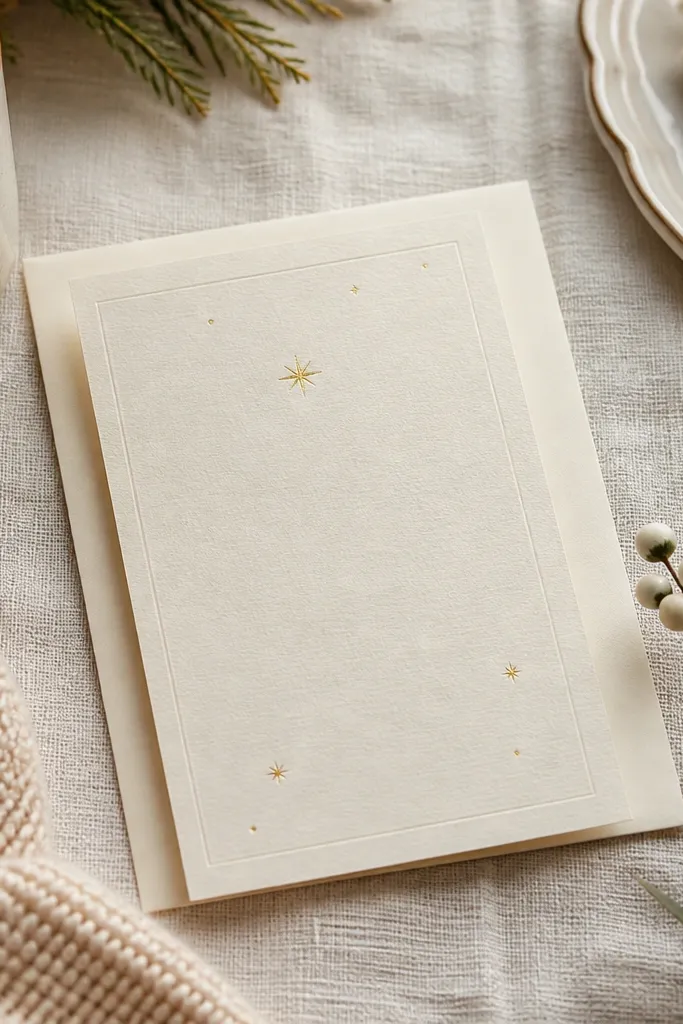
This template looks premium because it uses contrast in a subtle way. White text on cream feels clean and modern, while tiny gold star accents add a little ceremony energy without heavy decoration. The layout is minimal, so it photographs well and doesn’t clutter your details. It’s a great match for winter weddings, evening receptions, and couples who want a “sparkle” moment that stays tasteful.
First, confirm your cream tone is warm and your white text isn’t too light; you want readable contrast. Then, keep the gold stars only as small accents near headings or separators. Finally, check your RSVP text size after you enter your actual details; short names and long addresses can change spacing.
If your printer struggles with white ink effects, print in off-white on cream instead of true white text.
Don’t add extra icons; the star accents are the only decoration.
22. Soft Sage Envelope-Insert Style Details Card
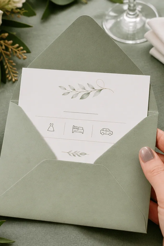
First, use the template for your insert card and keep the main invite text minimal to match. Then, break details into labeled sections like “Ceremony,” “Reception,” or “RSVP” so readers scan quickly. Finally, print inserts on slightly heavier paper than you think you need, because inserts handle more handling and folding.
This is the invitation suite move people miss: separate the details into an insert card with its own design. This template gives you a sage-green details card that looks cohesive with the main invite but keeps the main card clean. It’s particularly good when you have extra logistics like parking instructions, hotel blocks, or a second event. The sage color feels fresh and calm, and the typography stays readable.
Skip thisDon’t cram every detail onto the main invite if you want it to look expensive.
Quick tipIf you’re using an insert, choose the same font pair as your main invite so the suite looks designed, not mixed.
23. Black & Ivory Photo-Style Layout without Photos
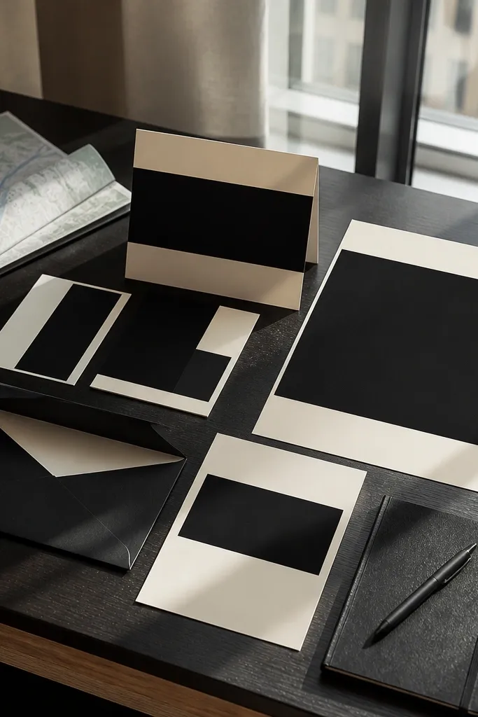
This template gives you that photo-poster energy using typography blocks instead of actual photos. The black and ivory contrast creates a bold editorial look, and the text blocks are sized so they feel like a designed poster. It works for couples who want something modern and graphic, not traditional. It’s also a strong choice for venues with strong architecture where the invitation can echo the clean lines.
Start by placing names in the largest type block and setting the date and time in the secondary block. Then, keep your address and RSVP in a smaller third block so the hierarchy stays clear. Finally, use one accent divider line only if the template includes it; don’t add extra shapes.
Print with a matte finish so the contrast stays crisp and doesn’t glare under lighting.
Avoid thin fonts at small sizes; the black blocks demand clean legibility.
24. Sun-Kissed Mediterranean Tile Border with Linen Type
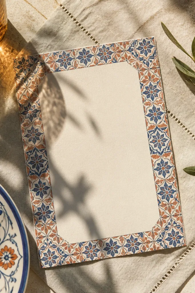
Step 1: Choose a print-ready version that includes a full-bleed border, so the tile pattern doesn’t get chopped on the edges. Step 2: Pair it with a simple insert or RSVP card in the same beige paper so the set looks intentional. Step 3: For travel inspiration, aim for a coastal city weekend and plan two nights — one for sightseeing and one for a relaxed photo session around the old streets. Step 4: If you’re printing at home, use heavyweight cream cardstock (at least 110 lb) and set your printer to “photo” or “high quality” for sharper edges. Step 5: Book your flights and hotel about 6-10 weeks ahead for better pricing, then print invitations a week before you need them so you have time for reprints.
This template looks like a postcard pulled straight from a Mediterranean wedding weekend. The border uses small, repeating blue-and-terracotta tile shapes, while the center stays warm and airy with linen-like texture and clean typography. It reads romantic without getting too fussy, which is perfect if your venue is outdoors or near water. It also prints beautifully because the design has strong contrast and clear spacing. Best for spring and early fall when the light is soft and your photos look sunlit instead of harsh.
Skip thisSkipping a full-bleed file is how you end up with a thin white strip cutting through the tile border.
Quick tipPrint a single test copy on your exact cardstock and check the border alignment before you run the full batch.
25. Forest Canopy Green Monogram with White Space Lines
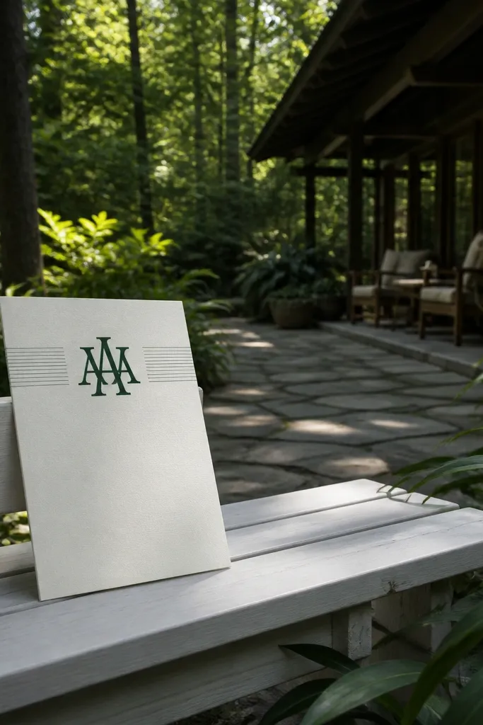
Step 1: Pick a version where the monogram is the main element and the text is smaller — that contrast is what makes it look designer instead of crowded. Step 2: Keep your font colors to forest green plus one neutral (black or charcoal) so the invite doesn’t look busy when printed. Step 3: For the travel side, plan around a forest lodge or mountain town stay for 3 nights so you get one day for exploring and one for slower photos in shaded light. Step 4: Travel costs are usually lower in shoulder season — target late September to early November for cooler weather and fewer crowds. Step 5: Print invitations 7-14 days before you mail them; if you’re using envelopes with a wax seal look, do a test run so ink doesn’t smear.
This one feels like the quiet moment under tall trees — calm, modern, and very photogenic. The template centers a large monogram in deep forest green, then uses thin white line dividers to keep everything crisp. The background is a soft off-white, so the monogram pops without looking harsh. It works especially well for couples who want a clean wedding invite that still feels natural and grounded. It’s a strong fit for fall, when earthy tones look best and the outdoor scenery gives your photos real texture.
Skip thisUsing three or more accent colors with the monogram makes the layout feel cluttered fast.
Quick tipUse a matte finish paper for this template — glossy stock makes the green look flat instead of rich.



