
1. Wide Header Photo With Centered Couple Names
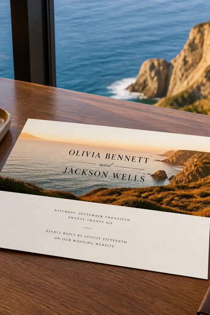
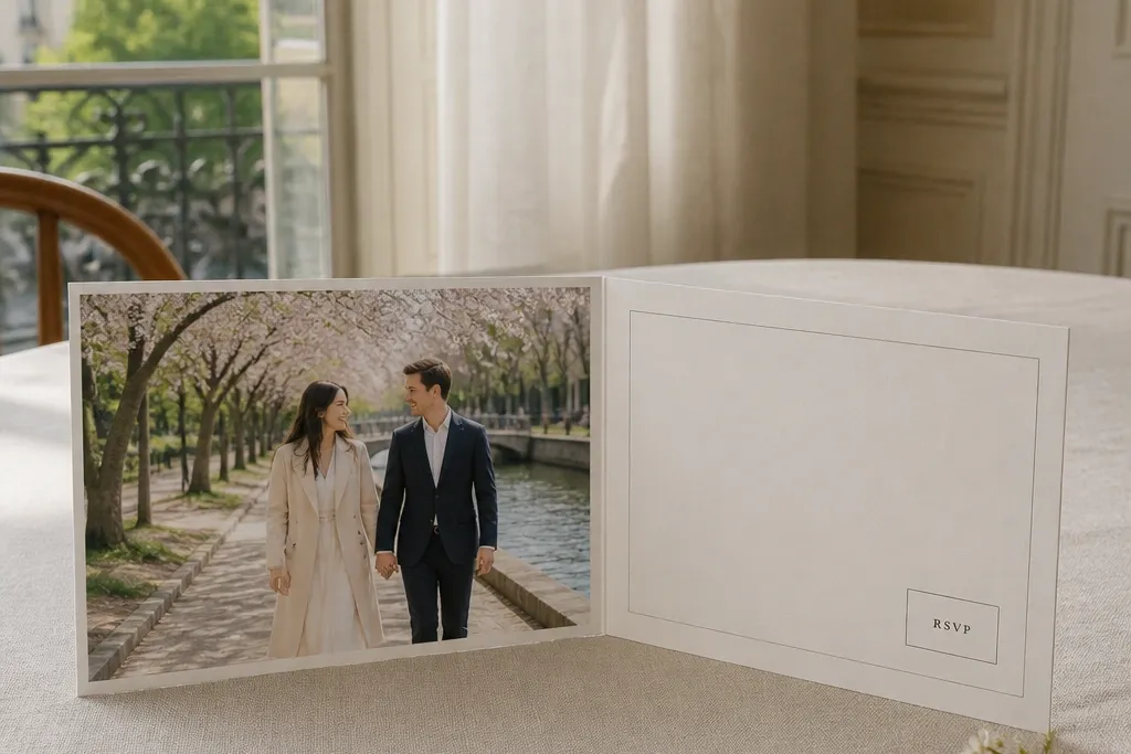
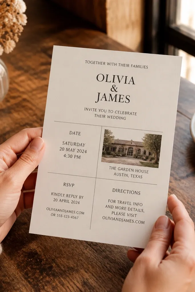
This layout is the easiest way to make a template feel personal because the photo does the heavy lifting. The wide header creates a “cover” moment, so even if you keep text minimal, the invitation still looks intentional. I like it for spring and summer weddings because daylight photos read cleanly in wide bands. It is also forgiving for beginners: you can adjust the photo crop without touching the text alignment. Use this when you want the invitation to feel modern but not cold.
Start by placing your photo as a full-width header and crop it so faces or key scenery sit above the text area. Then set the couple names centered in the top third, and place the event line and date/time in one tight block below. Finally, keep the RSVP and address lines aligned to the same left edge across all cards so the set looks like one suite.
Use a photo with a clear top edge (sky, greenery, or a horizon) so the header text stays readable.
Avoid putting long venue names in the same block as the date and time.
2. Side Photo Strip With Left-Aligned Text Block
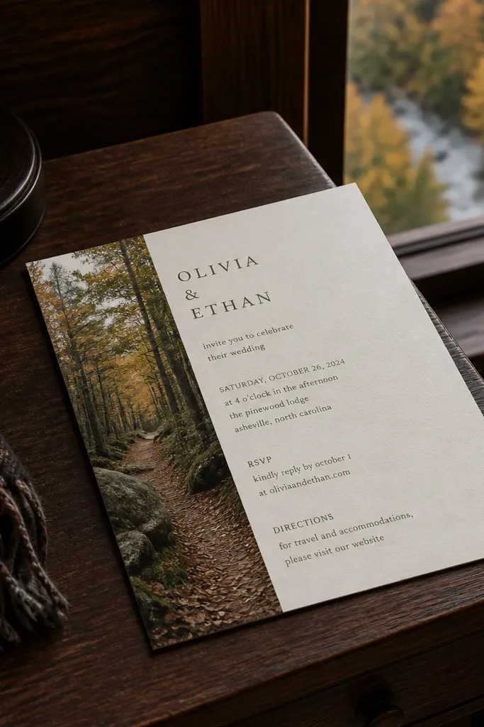
A side strip makes the invitation feel designed without needing fancy decoration. The photo column gives you a personal look, while the left-aligned text keeps it practical for quick reading. This style works great for fall weddings because deeper-toned photos (woods, earthy streets, evening light) look striking in a narrow strip. It also pairs well with serif fonts because the photo adds warmth and the text stays classic. If you want something that feels “boutique stationery,” this is the move.
Start by setting a fixed width for the photo strip, then crop the image so the subject sits in the middle of that strip. Next, align couple names and the event line to the left with consistent line spacing, leaving a clear gutter between photo and text. Finally, keep the RSVP line short and put the RSVP contact on its own line so it does not wrap unpredictably.
Quick tipChoose a strip width that lets your longest line (venue + city) still fit on one line without shrinking fonts.
Skip thisDo not use two different accent colors in the strip and text; pick one palette.
3. Centered Photo Panel With Thin Border Frame
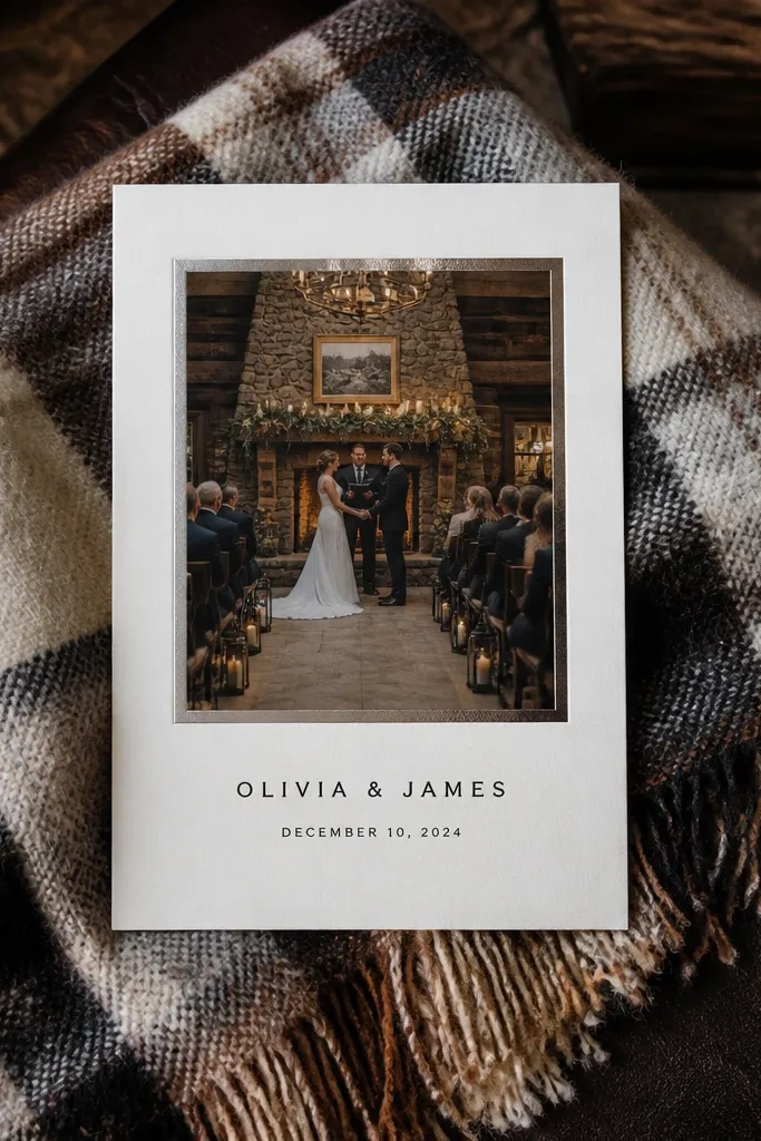
This layout looks polished because the photo is treated like a framed print. The thin border gives structure, so the invitation feels like paper stationery instead of a digital card. It suits indoor ceremonies, winter weddings, and couples who want a calm, editorial vibe. With a centered photo panel, the text stays focused and the invitation reads cleanly even from a distance. It is also great for beginners because the composition is symmetrical.
Start by placing your photo in the center with a thin border line (keep it consistent on all sides). Then put the couple names directly under the panel with the date/time as the next line, using generous line height. Finally, add the address and RSVP on separate lines with the same left alignment so nothing looks “floating.”
Use a border color that matches a detail from your photo (leaf green, stone gray, or warm cream) instead of pure black.
Avoid heavy drop shadows on the photo panel; they make cheap templates look cheap.
4. Polaroid-Style Photo Corner With Clean Typographic Layout
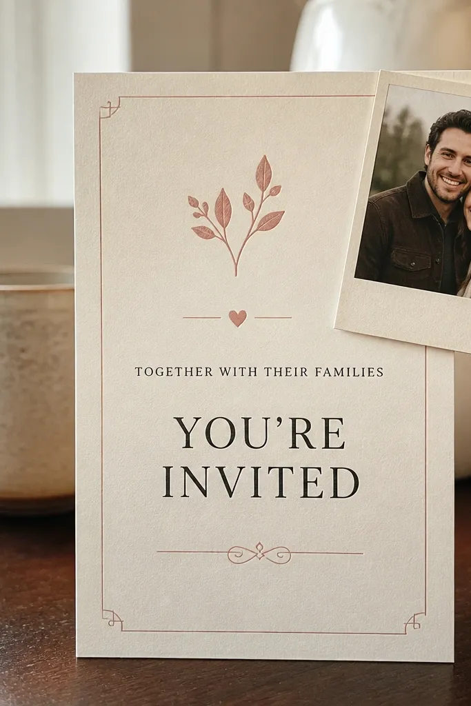
The polaroid corner makes the invitation feel personal fast because it looks like a memory rather than a graphic. Keep the rest of the design clean so the photo corner reads as the accent, not the whole layout. This works well for casual weddings, engagement parties that share an invitation, and couples who like a lived-in, warm look. It is also a strong choice if your photos have a slightly imperfect, candid feel. The typography stays the star, and the photo adds humanity.
Start by placing a smaller photo near the top corner and leave a clear margin around it so it does not feel cramped. Then center the couple names and stack the event line and date/time in the middle area. Finally, place RSVP and address at the bottom with a thin divider line so the page has a clear top-to-bottom reading path.
Crop the photo so the subject sits high in the frame; corner photos look better when the “top” has visual weight.
Skip extra stickers, icons, or layered frames — one photo corner is enough.
5. Two-Photo Layout With a "Then/Now" Feel
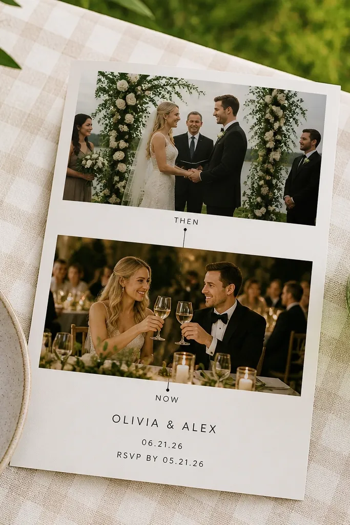
Two-photo templates feel personal because they show more than one moment, without turning into a collage mess. Use one photo for ceremony mood and one for reception mood, then keep spacing consistent so it still looks like stationery. This layout is great for couples who have two distinct vibes: a garden ceremony and a city reception, for example. The best part for beginners is that you can keep text small and rely on photo structure to guide attention. It also looks great in print because stacked photos create a strong vertical rhythm.
Start by selecting two photos with similar brightness so both panels look cohesive. Then place them in two equal-height blocks and center the couple names in a small text band between or above the second photo. Finally, keep the date/time block aligned to the same center line as the couple names to avoid uneven balance.
If one photo is darker, brighten it slightly before uploading so both panels match tone.
Do not use two photos with wildly different color casts (like green vs. Neon pink) unless you’re also changing the text color.
6. Monogram Header With Small Venue Photo Accent
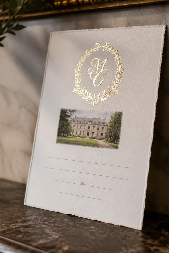
Monogram + photo is a clean way to look custom while still feeling traditional. The monogram gives instant branding, and the small venue photo makes it personal without crowding the layout. This is a strong choice for formal weddings, church ceremonies, and couples who want something that feels timeless. It also works well if you do not have a great portrait photo; use a crisp venue shot instead. The result is elegant and readable, even with lots of details.
Start by placing your monogram in the header area and keep it the same color as your venue photo accents (like slate or deep green). Then add a small photo thumbnail near the monogram, sized so it does not overlap the text area. Finally, stack the event lines and date/time in the center or right third, and put RSVP at the bottom with a thin rule line.
Quick tipChoose a monogram style that matches your font — a simple serif monogram looks best with clean invitation type.
Skip thisAvoid busy monograms with heavy flourishes; they dominate the page.
7. Watercolor Wash Background With One Photo Strip
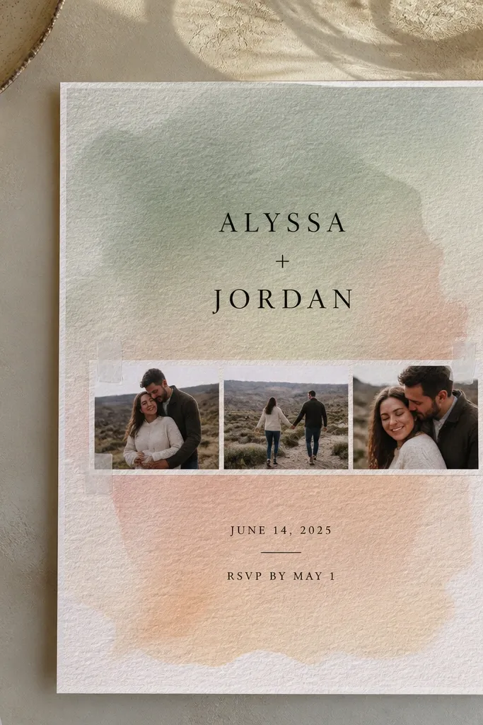
A watercolor wash background makes beginner templates look artsy without requiring complex layout skills. The background texture frames your photo and text, so it feels like a designed paper product. This style suits spring weddings, garden ceremonies, and couples who want a softer look. Keep the photo strip simple and clean so the wash does not compete. If you want “handmade but professional,” this is the sweet spot.
Start by choosing a wash color that matches your photo — warm blush for pink tones, sage for greenery, or pale blue for ocean locations. Then place a photo strip across the middle or upper half with enough padding so text stays readable. Finally, use one dark text color and keep font sizes limited to prevent the wash from making the page feel cluttered.
Check readability by squinting: if the text blends into the wash, switch to a darker ink color or reduce wash opacity.
Skip multiple background textures on the same card.
8. Map-Style Location Header With Photo Background
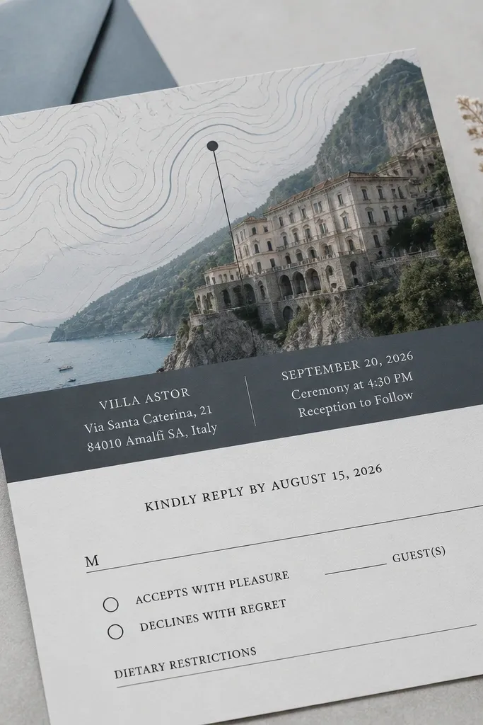
If your venue is the headline, this layout makes that obvious. The map-style header gives context instantly, and the photo background keeps it personal. This works especially well for destination weddings because guests need location cues before they even read the address. Keep the map graphic simple and place the venue name and city right next to it. The look is clean, modern, and still human because of the photo. Beginners like this because it guides the structure for you.
Start by selecting a photo background that is light enough for dark text, then keep it subtle by using the template’s background photo setting if available. Next, add the map-style header and place the venue name and city in the same line as the map graphic. Finally, include the full address in one block and keep RSVP details in a separate bottom section so people can find them quickly.
Use the venue’s official spelling from its website so your invitation and any travel booking pages match.
Do not put the address in tiny type inside the header graphic.
9. Film-Frame Border With Centered Text
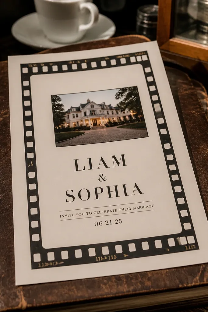
A film-frame border feels personal because it hints at stories and keepsakes. It also gives structure that beginners can follow, since the border naturally sets margins. Pair it with centered text so the invitation looks balanced. This layout works well for engagement shoots, couples who love analog photography, and weddings with a nostalgic vibe. Keep the central photo area small so the text stays the focus. The border does the aesthetic work without forcing you to decorate.
Start by enabling a film-frame border and choose a subtle ink color that matches your photo tones. Then place a small photo in the center area or just above the couple names, depending on your template. Finally, keep the date/time and RSVP in centered stacks with consistent line spacing and no extra font sizes.
Use a photo with visible light grain or soft contrast so the film border doesn’t look out of place.
Avoid thick borders with high-contrast colors; they make the design feel like a poster.
10. Botanical Line Art With One Signature Photo
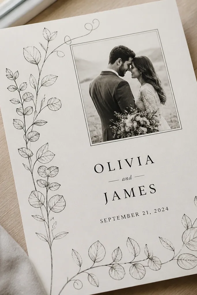
Botanical line art adds personality without adding clutter. When you pair it with one signature photo, the invitation looks custom and thoughtful while staying readable. This is a great choice for spring weddings, tea ceremonies, and couples who want an airy, light feel. Keep the line art monochrome so it looks like stationery and not a sticker sheet. The photo brings warmth; the line art brings polish.
Start by placing botanical line art in the corners and keep it in one color that matches your text. Then add one photo area — either centered top or a small strip — and keep it away from the line art so the elements do not collide. Finally, set the couple names in the largest text size and use consistent spacing for the event details and RSVP.
Quick tipChoose line art that matches your photo mood: delicate line work fits soft portraits and garden backgrounds.
Skip thisDo not add extra icons like hearts, stars, or extra florals.
11. Grainy Paper Look Background With Bold Date
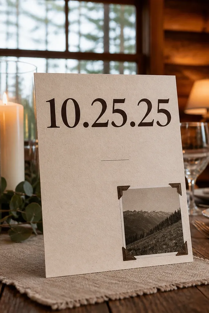
A grainy paper background makes templates look like real printed stationery even when the layout is simple. The trick is making one piece of information bold — usually the date — so the design has a clear focal point. This layout suits rustic weddings, cozy winter ceremonies, and couples who want warmth without heavy ornament. Add a small photo accent or none at all if your venue details are strong. Beginners do well here because the hierarchy does the work.
Start by selecting a grainy background and choose a text color that stays high contrast (charcoal or deep navy). Then make the date the largest line on the invitation and keep the rest smaller and consistent. Finally, add a photo accent behind or beside the date only if the template allows it without reducing readability.
Use a date format like Saturday, October 12, 2026 so the day reads instantly.
Avoid using light gray for the main text on grainy backgrounds.
12. Art Deco Frame With Photo Center Strip
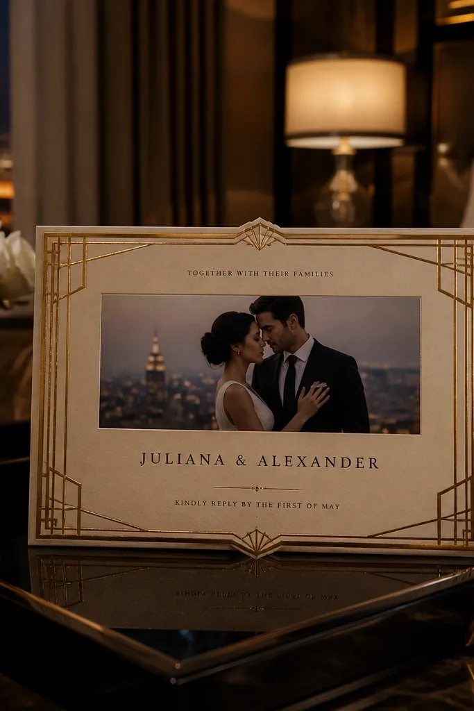
Art deco frames look fancy, but you can keep them beginner-friendly by using a simple photo strip. The frame gives the aesthetic structure, while the photo makes it feel personal. This layout works well for black-tie weddings, evening celebrations, and couples who want a glamorous look without complicated typography. Choose a photo with strong contrast — city lights, dark florals, or a clean portrait against a bright background. The result reads like a printed invitation suite.
Start by turning on the art deco frame and set it to a single gold or warm bronze tone. Then place a center photo strip and crop it so the subject sits in the middle. Finally, align the couple names and event line centered within the frame, and keep RSVP text smaller with clear spacing.
Quick tipIf your photo is colorful, pick a frame color that matches the darkest tone in the image.
Skip thisSkip multiple metallic shades; one frame color is enough.
13. Shadowed Photo Block With Right-Side RSVP
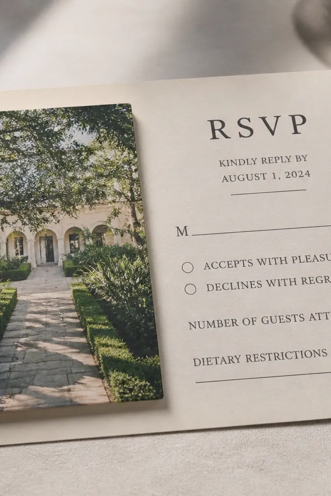
This layout is practical and pretty because it puts RSVP where people look first — the right side. The photo block on the left creates an editorial feel, while the right column keeps details easy to scan. It is ideal for invitations that include extra info like dress code or weekend schedule. Beginners benefit because column layouts reduce alignment mistakes. It still looks personal because the photo is large and treated like a design element, not a background.
Start by placing your photo as a left block with consistent padding around it. Then create a right text column where couple names sit at the top and the date/time follows in a tight stack. Finally, put RSVP on the lower right and keep the RSVP method (email or phone) on one line so it does not wrap awkwardly.
Use a clear RSVP deadline line like RSVP by April 3, 2026 — it reads faster than “RSVP by then.”
Do not put long paragraphs in the right column.
14. Soft Gradient Background With Minimal Photo Circle
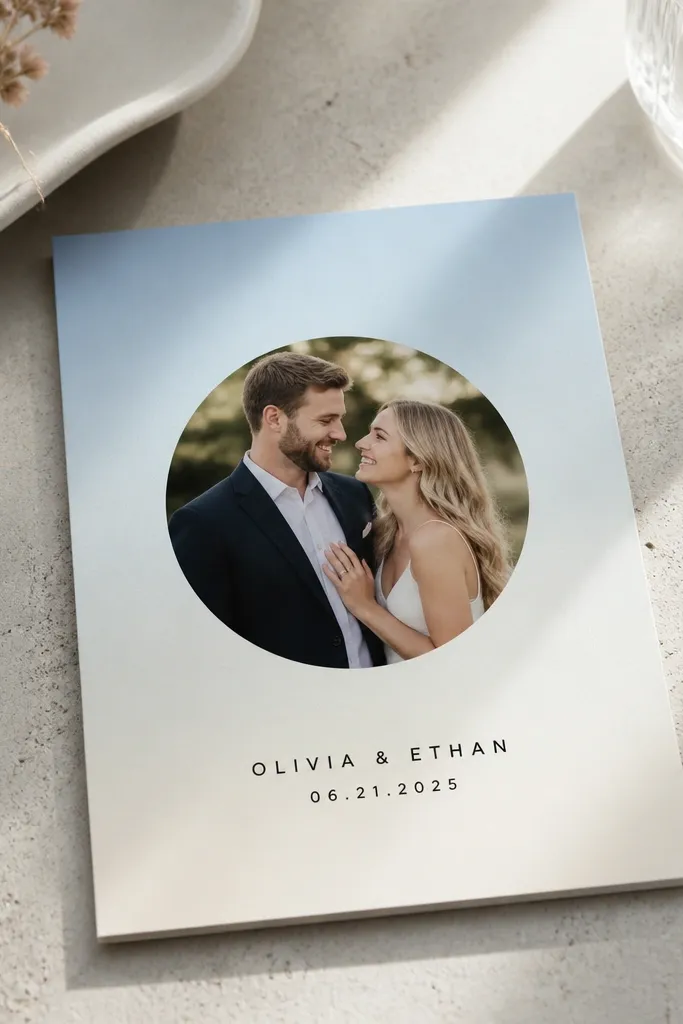
A soft gradient background makes the invitation feel modern, while a small circular photo keeps it personal and light. This style works for indoor ceremonies, city weddings, and couples who like clean aesthetics. The circle photo is forgiving because it hides minor cropping issues and keeps the design from feeling crowded. Keep the gradient subtle and let the text do the reading. It is also a good option if your photo has mixed tones; gradients can smooth the overall look.
Start by choosing a gradient that matches your color palette (cream to blush, or light gray to slate). Then place a circular photo above the couple names, sized so it does not overlap text. Finally, use a clean font stack: couple names larger, event line medium, date/time slightly smaller but bold enough to read.
Make the gradient angle match the direction of your photo subject — diagonal gradients feel more intentional.
Avoid high-contrast gradients; they steal attention from the invitation details.
15. Waterline Photo Background With Centered Event Details
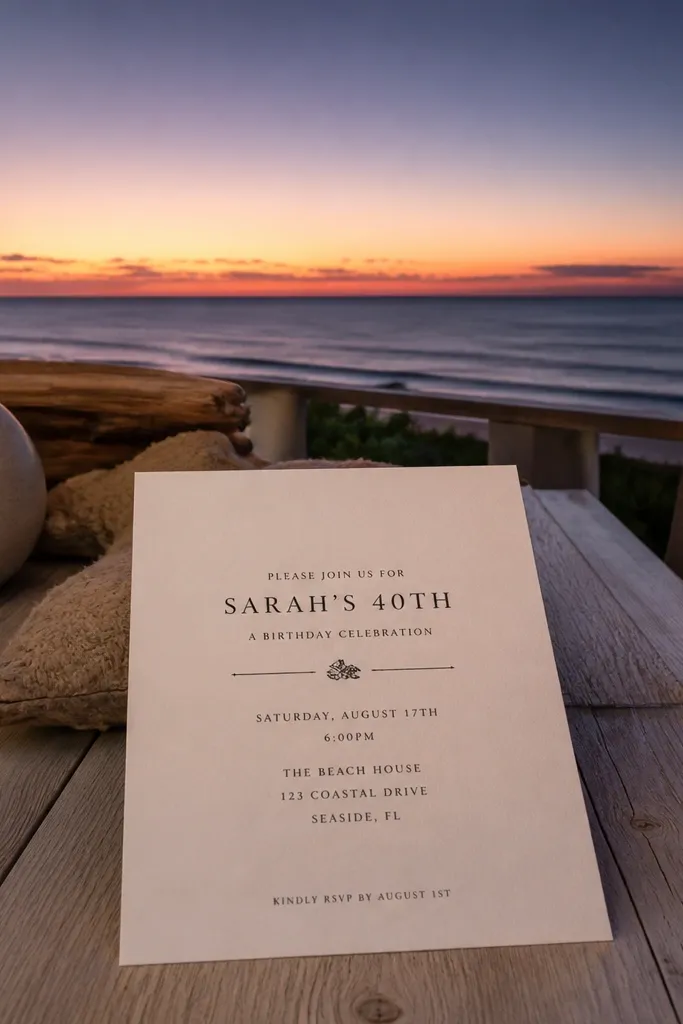
This layout is gorgeous when your photo has a clear horizon line — beach, lake, mountains, or even a city skyline at dusk. The “waterline” look gives a natural separation between photo and text, so readability stays strong. It feels personal because the photo is the scene, not just a decorative element. Great for coastal weddings, sunrise ceremonies, and destination invites. Keep the text overlay minimal and let the horizon guide where your lines sit.
Start by choosing a photo with a strong horizontal line and place it as the full background or a large panel. Then overlay couple names centered just below the horizon and put the date/time in a tight block under that. Finally, place RSVP and address in a slightly darker text container or with a subtle background plate if the template has one.
If your horizon is messy, switch to a framed photo panel instead of full background overlay.
Do not use white text over bright skies without a darker plate behind it.
16. Classic Letterpress Look With Small Photo Corner
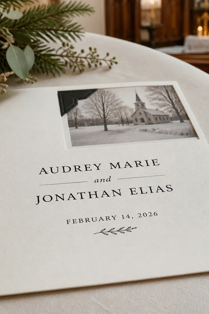
Letterpress-style templates look like real printed invitations because they emphasize texture and spacing. A small photo corner adds personal touch without breaking the classic feel. This is perfect for winter weddings, formal ceremonies, and couples who want a clean, understated look. The white space is doing the aesthetic work, so keep text tight and aligned. Beginners love this because texture backgrounds hide small alignment imperfections.
Start by enabling the letterpress texture and set text to a deep ink color like charcoal or dark brown. Then place a small photo corner near the top right or bottom left and keep it small enough that it never competes with the main text. Finally, align all text blocks to one grid and keep RSVP and address at the bottom with consistent spacing.
Choose paper-inspired colors (ivory, cream, warm gray) so the texture looks intentional on screen and in print.
Avoid adding a lot of extra lines or dividers; letterpress layouts look best when restrained.
17. Modern Grid Layout With Photo Strip and Micro Icons
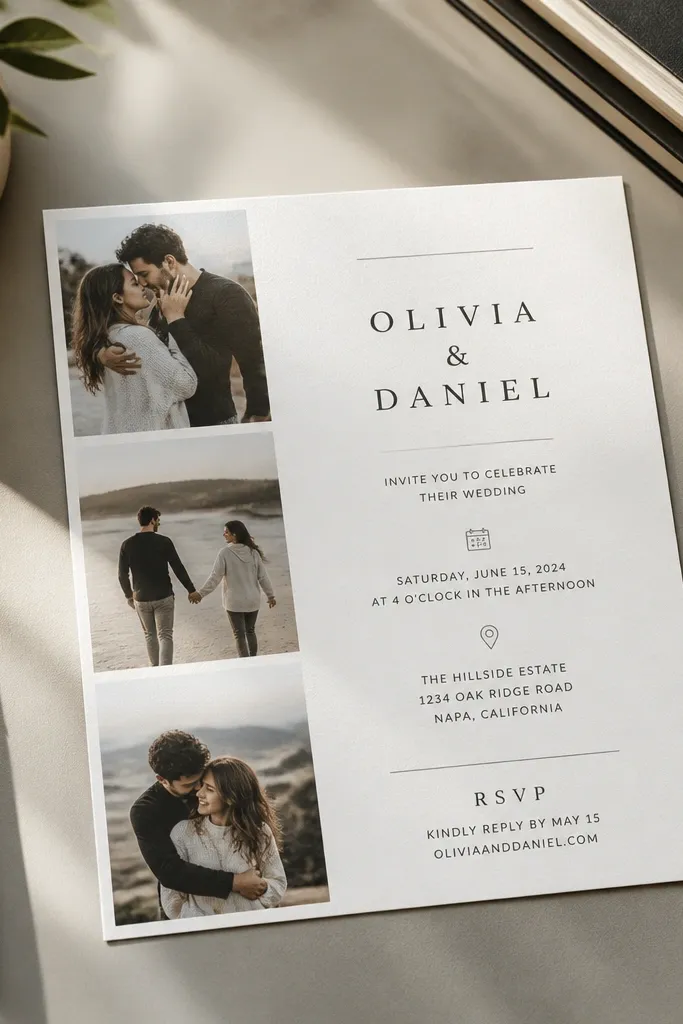
A modern grid makes your invitation look designed even when you only add the basics. The photo strip adds warmth, while micro icons next to key details help reading speed. This works well for busy schedules, multi-day weekends, and couples who want a clean, contemporary look. Keep icons to two categories at most: location and RSVP. It feels personal because the photo strip gives emotion, and the grid gives clarity.
Start by placing a horizontal photo strip near the top and keep its height consistent with the grid. Then set couple names in the first row and stack date/time, venue, and ceremony/reception lines in separate grid rows. Finally, add icons only next to the venue and RSVP lines, then check that none of the lines wrap on standard invite paper sizes.
Use one icon color that matches your text — do not make icons a brighter shade.
Do not add icons for everything; too many turn the invitation into a checklist.
18. Large Date Typography With Full-Width Photo Behind It
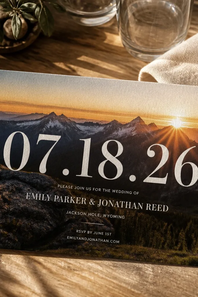
This is a bold, photogenic layout where the date is the hero. When the date is large and placed over a full-width photo, the invitation feels dramatic and personal at the same time. It works best for couples who want a statement invite without clutter. Choose photos with clean contrast so the big date stays readable. It also fits destination weddings well because the scene plus date makes the invitation immediately memorable.
Start by placing the photo as a full-width background and add a subtle dark overlay plate behind the date area if the template supports it. Then set the date as the largest text element and keep the couple names smaller above or below it. Finally, place the event line and RSVP in a clean block with consistent margins so the design stays balanced.
Use a date style with day of week — Saturday, October 12, 2026 — so it reads instantly from across the room.
Avoid long paragraphs near the large date; it will crowd the composition.
19. Coastal Postcard Collage With Stitched Photo Edges
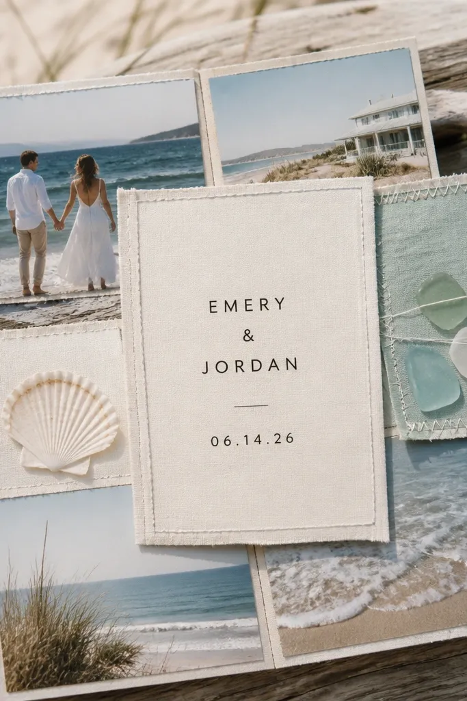
This template feels personal because it looks like you actually saved a stack of postcards from one trip. The stitched photo edges make the photos feel collected, not placed. Use it for beach weekends, boardwalk towns, and salt-air destinations where the color palette stays soft — sand, sea glass, and sun-faded blues. It suits couples who want a casual invitation without losing the photo-first look. The best season is late spring through early fall, when the light is bright and skin tones photograph cleanly. It also works well for rehearsal dinners or welcome parties tied to a single coastal base.
Choose two photos that share the same vibe — one wide shot for the “place” and one close-up for the “people.” Keep the postcard background off-white or very light cream, then add a thin blue or seafoam border around the whole design. For getting there, pick one walkable coastal town rather than hopping between multiple stops; you want photos that look like they came from the same day. Plan on 3 nights for a small collage set (arrival day, golden-hour day, and one flexible day for weather changes). Booking tip — book your lodging and your photo spots first, then lock the photographer only if you want a guided shoot. Expect to spend roughly $180-$320 per night for a mid-range coastal stay depending on the region, and budget $25-$60 per person for transit or parking if you drive.
Pick one “golden hour” location and schedule it for the same time of day you’ll use in the invitation photos — it makes the whole set look cohesive.
Don’t mix photos from different coasts or seasons; the stitched collage looks best when the colors match.
20. Mountain Cabin Key Card With Layered Map Lines
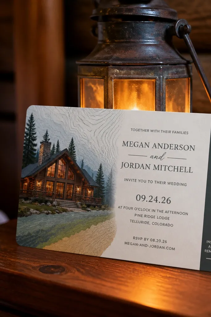
This one feels personal because it turns your destination into a clue, not just a photo. The faux key card layout works great when your trip centers on one cabin, lodge, or resort with a clear address. Layered map lines add texture without crowding your couple names, and they look amazing next to a single hero photo of the mountains. It suits couples who love hiking, scenic drives, and that “we’re going somewhere specific” feeling. It also photographs well in cooler tones — slate, pine green, and warm wood browns. Late summer through fall is the sweet spot because the landscape reads clearly in photos and the invitation palette stays grounded.
Start with one strong landscape photo (wide mountain view) and place your couple names on the “key card” area in a clean, high-contrast font. Add thin topographic lines in a muted ink color so they sit behind the text like paper texture. To get there, choose a base town with one main road access so you can run day trips without constant driving. Give yourselves 2 full days on-site to capture one hiking shot and one lodge or cabin interior shot. Book early for fall weekends; mountain lodging sells out fast, especially for check-in days that line up with travel holidays. Budget about $220-$450 per night for a cabin or lodge depending on region, and plan $40-$90 total for parking or local shuttles if you’re not using a car.
If you’re including an RSVP card, use the same map line color on the RSVP so the set feels like one package even when printed separately.
Don’t use a tiny map that’s hard to read; the map lines should add texture, not replace clear event details.



