
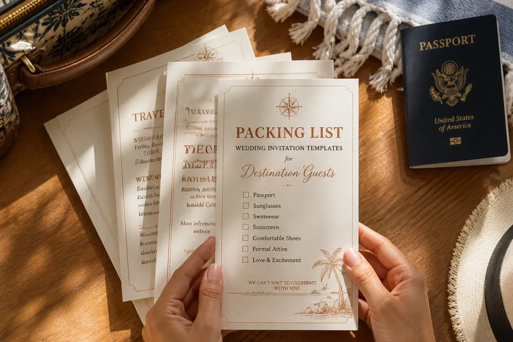
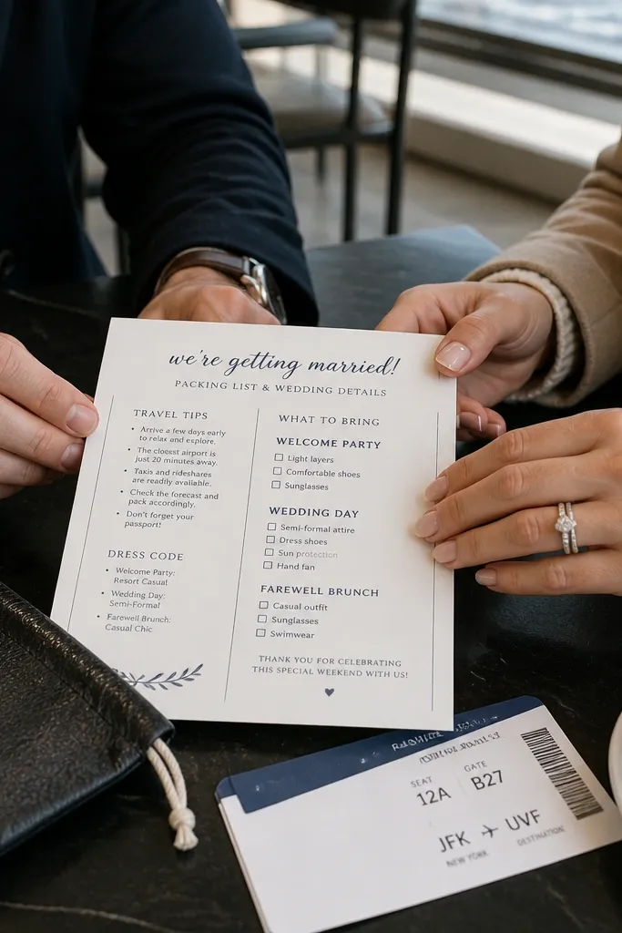
1. Sunset Postcard Packing List With Big Date Band
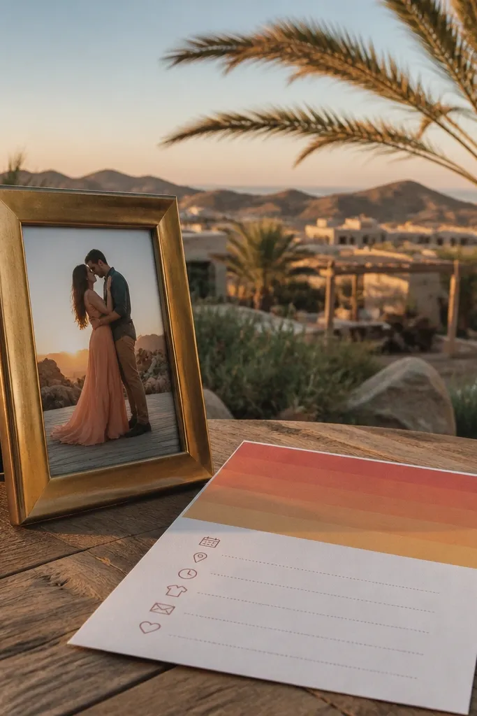
Start by setting your card size to postcard proportions and placing the wedding date in a thick horizontal band across the top. Then add a packing list section with 8-12 items in two columns, each paired with a simple icon (sneaker, sunhat, light jacket, sunscreen). Finally, include a tiny “weather note” line for the month you’re getting married, using plain language like “bring a light layer for evenings.” For travel logistics, keep lodging and arrival instructions to one compact block so the postcard stays clean.
This template works when you want the card to feel like a mini travel postcard. The big date band anchors everything visually, so guests immediately find the “when” before they hunt for the packing list. Use it for beach or desert destination weddings where warm colors match the setting. The checklist icons keep the copy short and readable, even if guests are looking at the card on a kitchen table. It also photographs well because gradients and thick type create contrast.
Skip thisDon’t add paragraphs for weather — guests need quick lines they can act on.
Quick tipIf you’re printing at home or locally, pick a thicker paper (at least 300 gsm) so the gradient doesn’t look washed out.
2. Navy Map Fold With Packing Checklist Margins
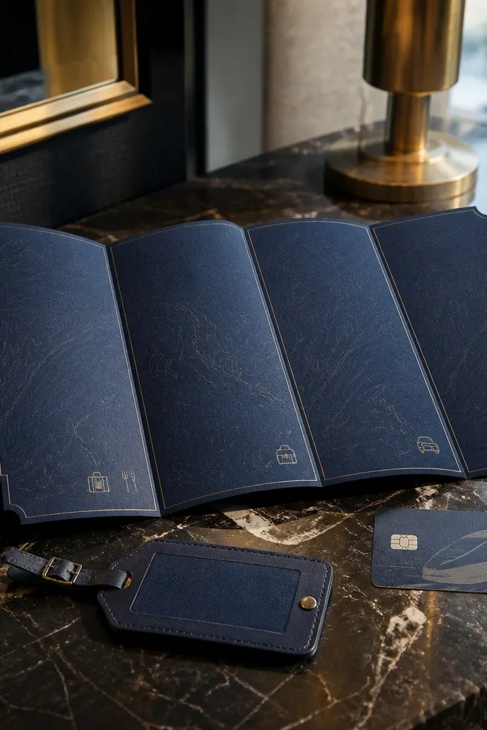
This one is for couples who want “destination” to feel grounded and practical. The faint map lines create travel energy without distracting from the packing list. A folded layout gives you enough space to separate packing by category: daytime, evening, and activities. It’s especially good for city + countryside weekends where guests do more than one thing in a single trip. The navy and white contrast also makes the card look sharp in photos with neutral linens.
Start with a gate-fold or tri-fold and leave the map pattern in the background at low opacity. Then structure the packing list into three labeled boxes, each with 4-6 short items, like “daytime: sunglasses, breathable shirt” and “evening: light sweater, comfy shoes.” Finally, add a small “arrival basics” block on the inner panel with check-in timing and a single airport code line. Keep fonts consistent: one bold heading font and one readable body font.
Use a map pattern that stays subtle — if the lines are too dark, the card reads like a flyer.
Avoid cramming lodging details into the packing boxes; keep logistics separate.
3. Ivory Linen Texture Template With Icon Row Packing
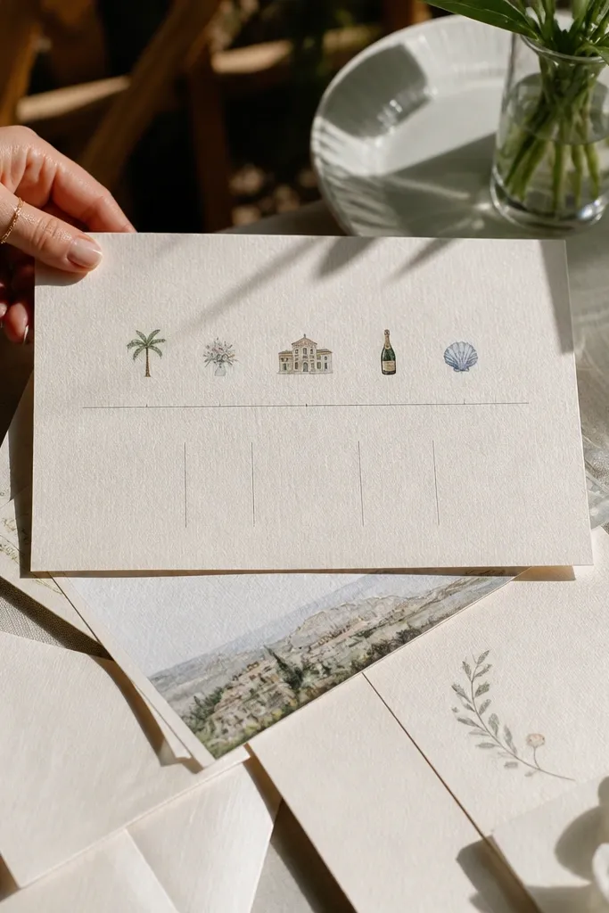
If you want “aesthetic” without trying too hard, this template nails the soft, tactile look. Linen texture backgrounds make the card feel premium and calm, which suits romantic destination weddings and countryside venues. The icon row format works because guests can scan quickly and remember the items. Put the packing list in short label form, like “sunscreen,” “walking shoes,” and “light layer,” each paired with a tiny matching icon. This layout is also great for printing because it hides small print variations better than heavy gradients.
Start by choosing an ivory or cream background texture and keeping it light enough for text to stay crisp. Then design your packing list as an icon row or grid — 10-14 items total — and limit each label to 1-3 words. Finally, add a “what to wear” line with two outfit suggestions, such as “brunch: linen shirt, loafers” and “ceremony: dressy casual.” For travel timing, place arrival and departure reminders in a single footer block so it doesn’t compete with the icons.
Use a matte finish or uncoated cardstock so the texture reads clearly under warm lighting.
Don’t use too many different icon styles; stick to one consistent set.
4. Terracotta Desert Nights Fold With Weather Layers
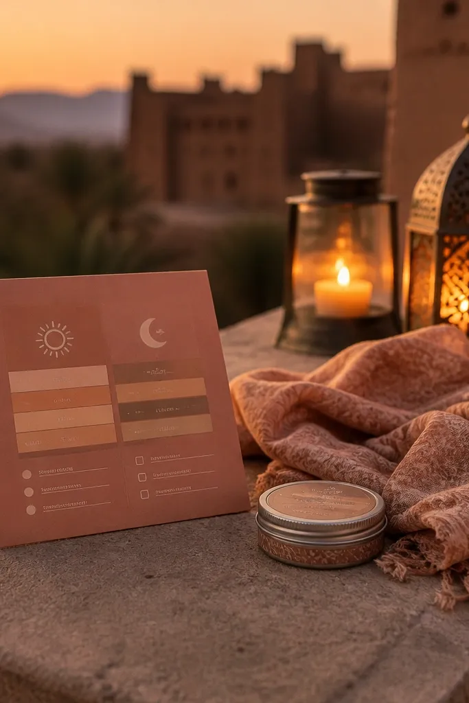
Start by placing the wedding date and location in the front panel using terracotta accents on a cream background. Then create a three-step layers section inside the fold with headings like “morning,” “day,” “evening,” and 3-5 items under each. Finally, add a small “activity shoes” box for any walking-heavy plans, like “trail shoes for sunset hike.” Keep the list tight: if you can’t explain why an item matters, cut it.
This template is built for destinations where temperature swings are real, like desert evenings or inland climates. Instead of listing random items, it teaches guests how to dress by time of day. The layers diagram makes the packing list feel helpful, not tedious. You get the style of warm terracotta tones with a functional “morning/day/evening” approach that guests can follow instantly. It also looks great in outdoor photo sets because terracotta complements sand and stone.
Skip thisAvoid generic “bring layers” wording without listing what counts as a layer.
Quick tipWrite the layer items as weather phrases, like “light jacket” and “socks,” so guests don’t guess.
5. Black Ink Minimal Postcard With One-Column Packing List
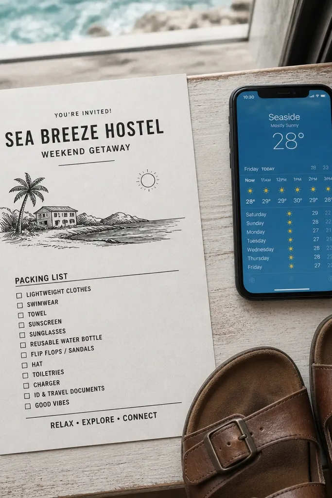
Start by setting a simple grid with a large title at the top and a short line for the location. Then write the packing list as a single column of 10-12 bullets, each bullet starting with a noun like “comfortable shoes” or “light jacket.” Finally, include a “day-of wear” line that’s one sentence long and sits near the bottom. For printing, use a high-contrast palette and keep margins generous so the card doesn’t feel cramped.
This is the template for couples who want modern stationery that feels like a travel itinerary, but prettier. The one-column packing list keeps the card readable even on a busy table. Black ink on a light background looks crisp in flat lays and avoids the “busy” problem that happens with too many colors. Use it for city weddings, winery weekends, and any destination where you want guests to focus on dress notes and timing. It’s also easy to customize because the layout doesn’t rely on background graphics.
Skip thisDon’t add icons on top of bullets in this style; it breaks the clean look.
Quick tipIf your designer tool allows it, use a slightly condensed font for headings — it makes the layout look intentional.
6. Pastel Floral Corner Frame With Packing Checklist Boxes
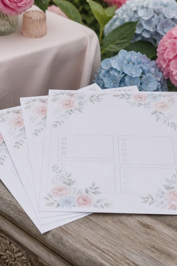
This template gives you a romantic, destination-friendly look without turning the card into a wall of decoration. The floral corner frame keeps the stationery feminine while leaving the packing list area clear and easy to read. Boxed checklist sections help guests understand the structure: packing, dress notes, and optional items. It’s best for spring and fall destination weddings where photos show greenery and soft light. The corner framing also makes the card look balanced from every angle, which matters when guests post it online.
Start by placing a floral frame in one corner only, leaving the rest of the card mostly clean. Then create three boxed sections with headings like “Pack,” “Wear,” and “Optional,” and fill each with 4-6 short items. Finally, put a compact itinerary line under the boxes with dates and key events. Choose one pastel accent color for headings so the card doesn’t look like multiple palettes were mixed.
Use thin line icons inside boxes; they stay readable against floral backgrounds.
Avoid full-bleed florals; they fight with text and reduce legibility.
7. Greenery Leaf Border With "What to Pack" by Activity
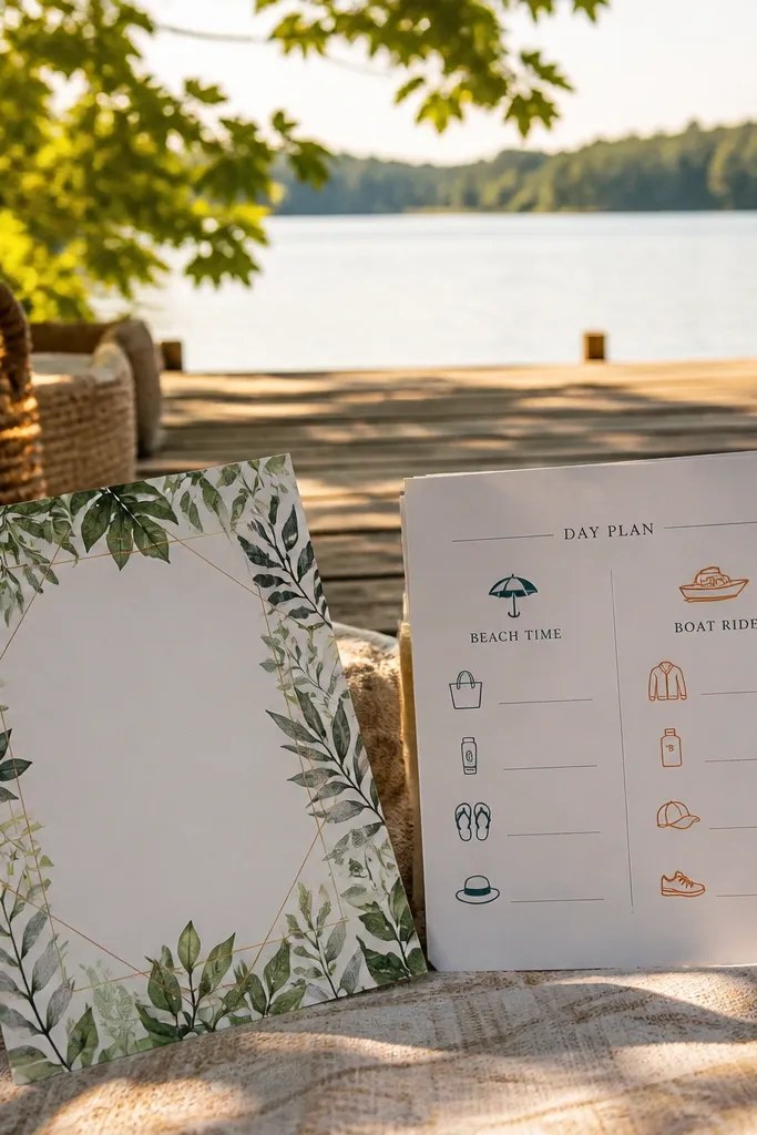
This template is made for destination weddings where guests do different activities across the weekend. The greenery leaf border gives you the outdoors feeling, while the activity-based packing sections keep it useful. Instead of listing items randomly, you tell guests what to pack for each plan — beach time, boat ride, or garden dinner. That structure reduces confusion and helps guests avoid underpacking for a specific activity. It’s also visually satisfying because each activity block has its own heading and spacing.
Start by choosing a leaf border line (thin, not heavy) and keeping it around the edges so it doesn’t compete with the packing text. Then create 3-4 activity blocks with headings like “Ceremony,” “Afterparty,” “Daytime plans,” and list 3-5 items per block. Finally, add one “don’t forget” line near the bottom for universal items like chargers or a reusable water bottle. Keep the total items under 20 so the card stays scannable.
If you have a boat or hike, name the shoe type explicitly: “trail sneakers” or “grippy sandals.”
Avoid listing items without tying them to a plan; guests won’t know what it’s for.
8. Coastal Blue Wave Template With Shoe and Layer Icons
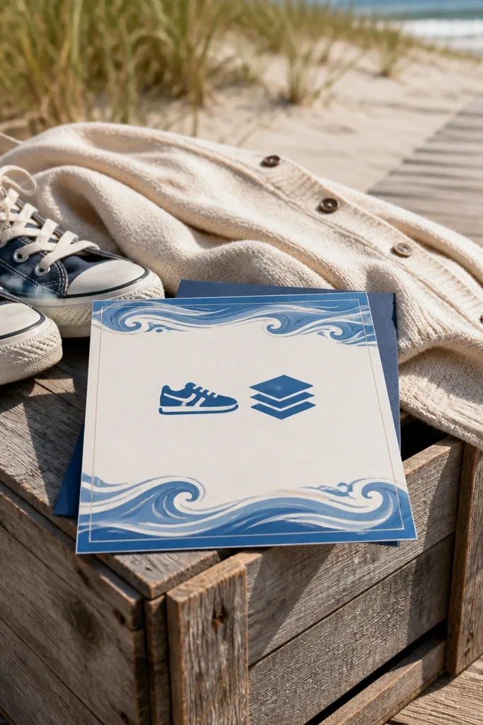
Start by setting a coastal blue background wash with a light wave pattern at low intensity. Then place a “Pack for” section with two columns: left for shoes and comfort items, right for layers and weather. Finally, add a short dress note such as “ceremony: dressy casual, bring a light layer for wind.” To keep it elegant, keep text lines to 4-8 words each.
Coastal weddings need stationery that looks like it belongs near water. This template uses subtle wave shapes in the background and pairs them with icons that communicate packing needs fast. Put shoes and layers front and center because those are the two categories guests mess up at beach destinations. The blue palette looks clean in photos and pairs well with white envelopes. It also stays readable when you print with standard ink because the contrast is controlled.
Skip thisAvoid bright neon accents; they look cheap against a beach palette.
Quick tipIf you’re serving cocktails outdoors, add “small clutch or crossbody” so guests don’t guess what to bring.
9. Gold Foil Look Template With Black Packing Checklist
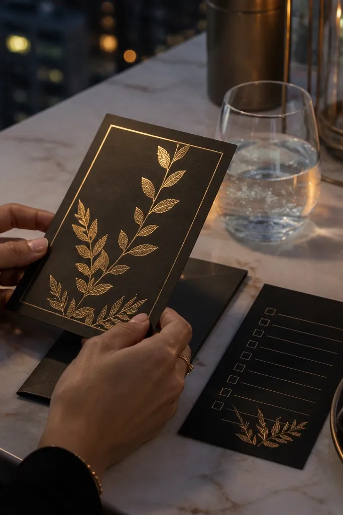
Start by using gold for the wedding name or date only, keeping the rest in black for legibility. Then place the packing list as 12-16 neat checklist rows with consistent spacing. Finally, add a “dress by event” block with two lines for night and day outfits. For printing, choose a finish that mimics foil (or a metallic ink option) and keep the gold limited to headings so it doesn’t smear visually.
This one is for destination weddings that lean glam: rooftop dinners, candlelit venues, and evening events. The gold foil look gives you that upscale feel, but the packing content stays simple and readable in black ink. Use it when you have a mix of dressy and casual events so guests need clear guidance. The checklist layout prevents the card from becoming a decorative invitation that guests ignore. It photographs beautifully because gold catches highlights without clutter.
Skip thisDon’t use tiny gold text; it loses contrast on printed cards.
Quick tipLimit metallic elements to headings; metallic ink everywhere makes the card look noisy.
10. Terrace Dinner Template With "Daytime vs Night" Layout
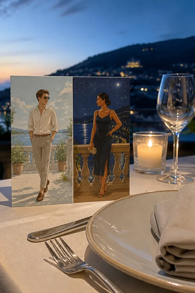
Start by dividing the card into two stacked panels with headings “Daytime” and “Night.” Then fill each panel with 5-8 items, focusing on what changes across the day: shoes, layers, and weather protection. Finally, include one short line at the bottom for “bring a small bag for dinner” or “comfortable walking shoes for photos.” Keep the list items parallel in style so the card feels designed, not thrown together.
This layout is great for destinations where guests move from warm afternoons to cooler evening dinners. It’s clean, practical, and looks intentional because the split panels create a clear structure. Guests understand what to pack without reading a paragraph. It also helps you guide dress choices: breathable outfits for day, dressier layers for night. The template works for Mediterranean-style weekends, mountain towns, and any venue with outdoor dinners.
Skip thisAvoid mixing day and night items in one list; it makes guests pack randomly.
Quick tipIf you know evenings get windy, add “windproof layer” instead of “jacket.”
11. Passport-Stamp Style Template With Travel Checklist Stamp Icons
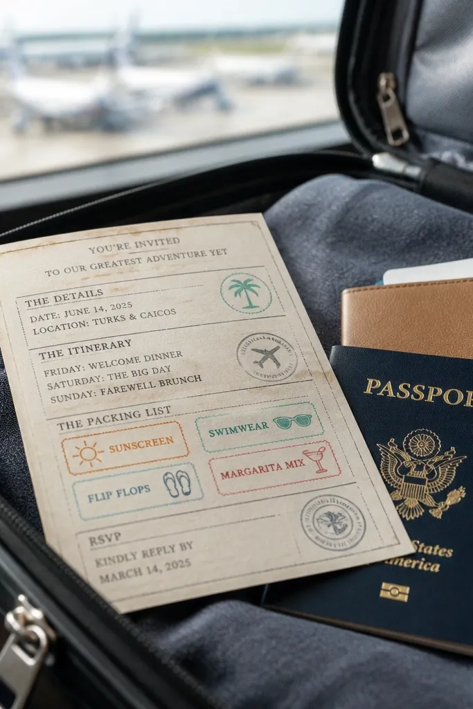
Start by choosing a neutral background and using stamp-style labels for sections like “Essentials,” “Weather,” and “On-the-go.” Then write 4-6 items under each stamp label, using short nouns and no long sentences. Finally, add a footer with the wedding weekend dates and a note about arrival times. For printing, use a font that matches the stamp vibe but stays legible at small sizes.
Passport-stamp visuals look instantly travel-themed and make the stationery feel like part of the trip. The packing list sits in stamped sections, so guests remember it as a checklist rather than reading it like a formal invitation. This is perfect for destination weddings with international guests, where you want to add reminders like chargers, IDs, and comfortable shoes for airports. It also has a fun, photogenic look for group flat lays and social posts. Keep the stamp style restrained so it doesn’t overpower readability.
Skip thisDon’t add too many stamp shapes; 3-4 sections look designed, 8+ looks chaotic.
Quick tipInclude one line about adapters if you’re traveling to a different outlet standard — guests forget until it’s too late.
12. Modern Grid Template With Numbered Packing Steps
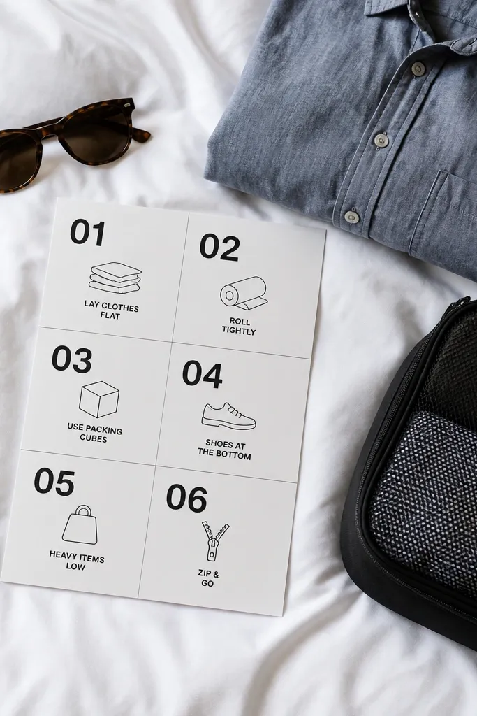
Start by placing a short instruction header at the top, then create a numbered list layout with 3-5 step blocks. Under each step, add 3-5 items and keep the wording consistent in length. Finally, add a small “dress code quick guide” box with two bullets for day and night. When formatting, use a grid so all lines align — alignment is what makes it look premium.
Numbered packing steps make the card feel like a plan, not a list. This template uses a modern grid layout that reads fast, which is what you want when guests are deciding what to pack at the last minute. It’s especially good for weddings with multiple events because you can map items to steps like “pack your base layers,” “add weather protection,” and “finish with dress items.” The clean design looks great with neutral backdrops and minimal typography. It also keeps the card from feeling cluttered.
Skip thisAvoid long sentences in numbered steps; keep items action-ready.
Quick tipIf you have a theme event, put it in the dress code box, not in the packing list, so it stays separate.
13. Botanical Watercolor Border With "Pack Like This" Checklist
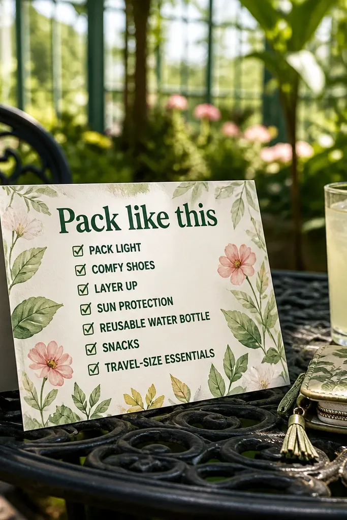
Start by placing the watercolor border along one edge and keeping the center panel mostly white or cream. Then add a large heading and a checklist grid with 2 columns, each item no more than 2-3 words. Finally, include a small “weather note” line near the bottom that matches your month. For a clean look, keep all checklist text in one color and use watercolor only for the border.
Watercolor borders create that soft, artistic travel wedding vibe, especially for garden venues or coastal conservatories. The “Pack like this” heading makes the card feel direct and friendly, so guests don’t wonder what the list is for. The checklist is bold and oversized, designed for quick scanning. This template is best when your packing list is medium length — around 12-18 items — so it fills the space without getting tiny. It also looks good in natural light because watercolor textures soften the overall contrast.
Skip thisDon’t print watercolor too dark; it will swallow the text.
Quick tipUse 2 columns once you pass 12 items; it keeps text readable without stretching the card.
14. Monochrome Photo Strip With Packing Reminders Under Each Event
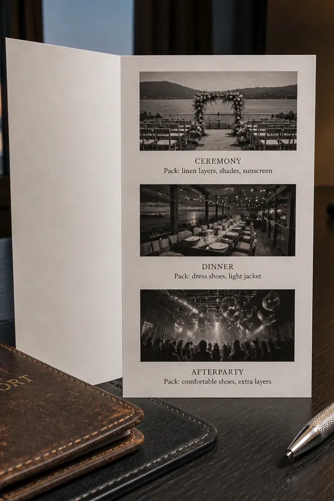
Start by selecting 3 event photos in monochrome tones and placing them across the top or middle of the card. Then create one packing reminder list under each photo with 3-5 items. Finally, add a single footer block for arrival basics like “check-in time” and “transport note.” Keep the text blocks short so they don’t cover the photos — the images are part of the look, not decoration.
This template uses a monochrome photo strip approach to make the stationery feel like a destination preview. Under each event image, you place a short packing reminder list, so guests connect the item to the plan. It’s great when you have distinct moments like ceremony by the water, dinner on a terrace, and an afterparty in a lounge. The monochrome look keeps it stylish and prevents the card from becoming too colorful. Guests also respond well because it feels like they’re choosing outfits and gear, not reading logistics.
Skip thisAvoid using blurry photos; they make the stationery look sloppy fast.
Quick tipChoose photos with clear subjects (sand, stone, clothing textures) so the card reads even from a distance.
15. Art Deco Border With "What to Wear" and Shoes Section
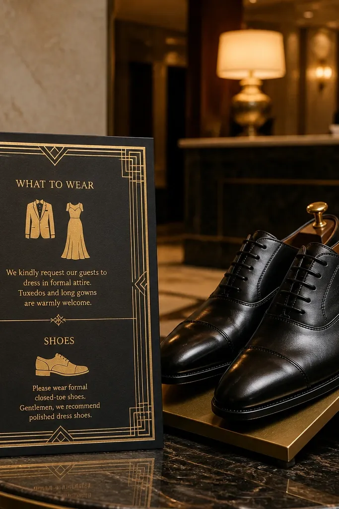
Start by using an art deco border frame around the card edges and keep the center clean. Then add two main sections: “What to wear” with 2-4 outfit phrases and “Shoes” with 3-6 specific options. Finally, include a small note for weather like “evenings cool — bring a layer.” For printing, use high-contrast typography and avoid thin lines that disappear when the border is scaled down.
Art deco borders bring a confident, party-ready feel that works for destination weddings with a formal dinner or evening celebration. This template also solves a common problem: shoes. When guests don’t know what footwear fits the venue, you get chaos. By giving shoes their own section, the packing list becomes instantly actionable. The “what to wear” block keeps the outfit guidance readable and aligned with your wedding vibe. It’s a strong choice for city destinations, historic venues, and resorts with dress-up nights.
Skip thisAvoid one vague footwear line; list shoe types guests can picture.
Quick tipIf the venue has stairs or cobblestones, say it plainly and recommend “grippy flats” or “comfortable boots.”
16. Soft Blush Fold With Toiletry Mini List and Day Kit
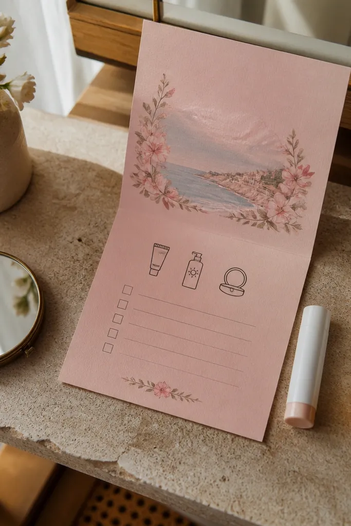
Start with a blush background and a neutral panel in the center for text clarity. Then create two checklist sections: one for toiletry essentials (sunscreen, lip balm, deodorant wipes, hand sanitizer) and one for a day kit (water bottle, sunglasses, small umbrella). Finally, add a short “ceremony basics” list with 3-4 items like “ticket info” or “ID.” Keep the toiletry items short and specific so guests don’t overpack everything.
This template is for destination weddings where guests will be out and about all day and need practical reminders beyond clothes. The soft blush palette feels romantic, and the fold format gives you space for a “toiletry mini list” that looks intentional next to the packing list. It’s especially useful for beach weekends, remote locations, or places where amenities are limited. By separating a “day kit” from “ceremony basics,” you reduce confusion and make the card feel like a helpful guide. The design is also photogenic because blush tones look good against skin and neutral backgrounds.
Skip thisSkip long toiletry lists; 6-10 items look best and stay readable.
Quick tipIf you’re sending guests to a beach location, add “reef-safe sunscreen” if that’s part of your venue rules.
17. Forest Green Map Sidebar With RSVP and Packing Together
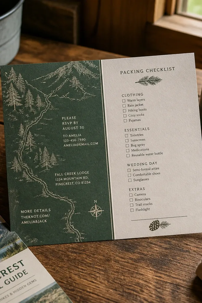
This layout pairs RSVP info with a packing checklist so guests don’t have to cross-reference multiple cards. The forest green map sidebar keeps the destination theme strong while the main panel stays focused. It’s a smart choice when you’re sending just one stationery piece to destination guests and you want it to do the work. The sidebar design creates a clean split: travel vibe on the side, actionable list in the center. It looks high-end and organized, which matters because guests judge stationery by how easy it is to read.
Start by designing a card with a narrow sidebar for the map and a wider main panel for packing and RSVP text. Then place the packing list in the main panel as 10-14 bullets grouped under two headings like “Pack” and “Wear.” Finally, add RSVP instructions in one compact block at the bottom with a deadline and a simple “how to RSVP” line. Keep RSVP text to 2-3 lines so the card doesn’t feel like an invitation plus a pamphlet.
Use one strong deadline line with a bold date so guests don’t miss it.
Avoid mixing RSVP questions into the packing list; it breaks the scan pattern.
18. Champagne Confetti Template With Weekend Packing Timeline
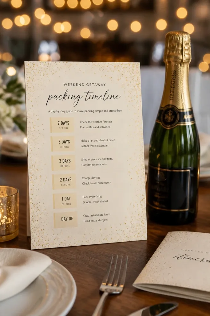
If your destination wedding spans multiple days, this template turns the packing list into a weekend timeline. Champagne confetti gives a celebratory feel without making the card hard to read. Guests like day-by-day guidance because it reduces decision fatigue when they’re packing a suitcase. Each day block includes a short packing list tied to what’s happening that day. It’s best for weddings with rehearsal events, a brunch, and a farewell dinner. The timeline layout also looks great in photos because it creates rhythm and spacing.
Start by setting up a three-day timeline layout labeled “Day 1,” “Day 2,” “Day 3” or with real dates. Then write 3-6 packing items under each day block, focusing on what changes day to day. Finally, add one “all weekend” list at the bottom for items everyone needs like chargers and a reusable bag. For costs, printing this style works well on standard cardstock because the background pattern is light.
Put “shoes” on the day that includes the most walking, not the first day.
Don’t add too many items per day; keep it to 3-6 so text stays readable.
19. Monogram Corner Template With Minimal Packing Bullets
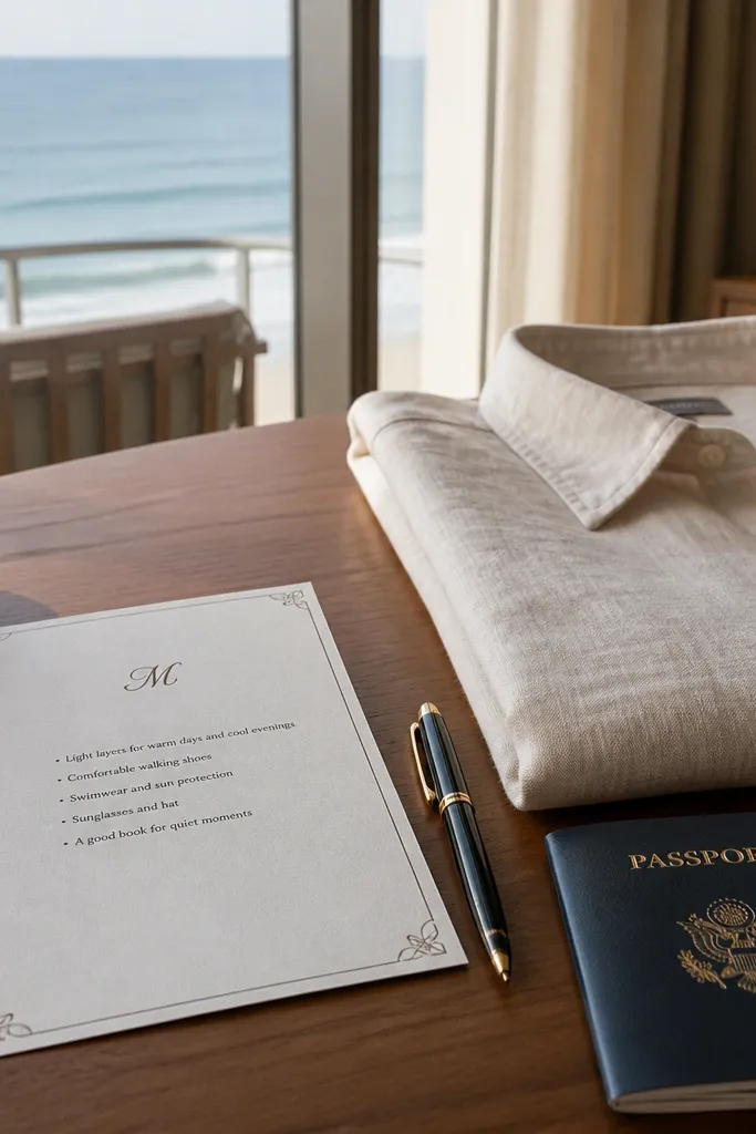
Start by placing a monogram in one corner and keeping the rest of the card mostly white or off-white. Then add a packing list section with 2 short columns or a single column depending on your item count. Finally, include one dress line and one weather line — both short — and keep them near the bottom for easy scanning. Choose one font for headings and one for body text so it stays consistent.
This template is for couples who want a clean, high-end look and don’t need a ton of instructions. A monogram corner adds personality without cluttering the packing list area. The minimal bullets layout is ideal when your packing list is 8-12 items and your main goal is style plus clarity. It also works for destination guests who already know the basics and just need a reminder about a specific dress code or activity gear. White space makes the card feel calm and expensive in photos.
Skip thisAvoid adding extra graphics once the monogram is in; it will look crowded.
Quick tipIf you’re printing on textured paper, stick to dark ink for maximum readability.
20. Terrace Garden Invitation With "Bring This" Photo Icons
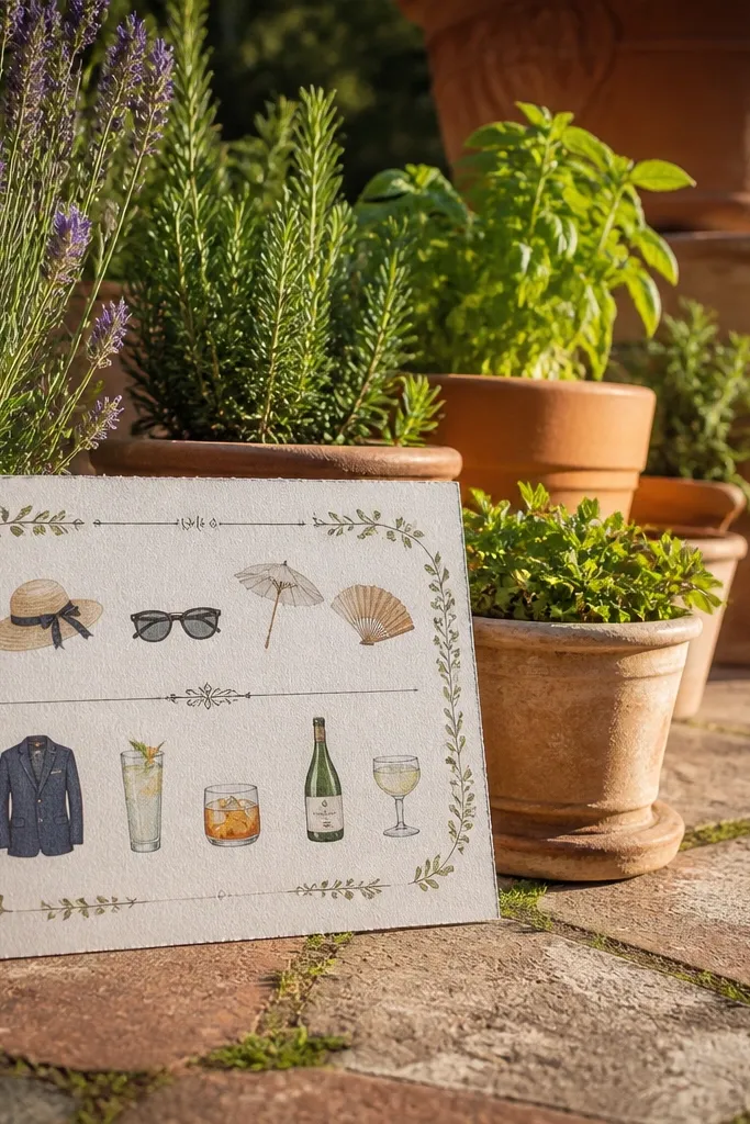
Start by picking a garden color palette: sage, soft green, or muted olive as the base. Then create a “Bring this” section with 12-18 items, each with a small icon and a short label. Finally, add a tiny “activity note” line for any event that needs extra gear, like “trail shoes for the path to ceremony.” Keep the icon size consistent so the card feels designed rather than assembled.
This template blends a garden vibe with photo-like mini icons, so the packing list feels playful but still organized. It’s ideal for destination weddings with a garden ceremony, outdoor cocktail hour, or photo sessions where guests need specific practical items. The “Bring this” heading tells guests exactly what they should do. Each icon anchors a category — sunglasses, hat, layer, comfortable shoes — which makes it easy for guests to pack correctly. The template looks great in daylight because green tones and soft icons feel natural.
Skip thisAvoid tiny icon labels with long text; icons should clarify, not confuse.
Quick tipIf you have a ceremony on grass, say “grass-friendly shoes” so guests don’t bring stilettos.



