
1. Champagne Foil Monogram Frame (5x7)
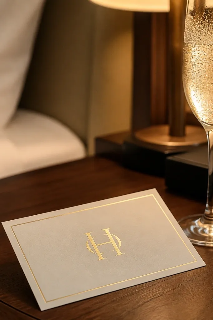
This template looks expensive because the monogram sits inside a crisp, thin frame, and the rest of the card stays quiet. Use a foil-style effect for the initials in a solid block — not scattered flourishes — so the shine catches light without turning into glare. It’s perfect for couples who want classic, formal energy without heavy illustration. In indoor venue photos, the frame keeps the eye locked on the couple’s initials even when the background is busy.
Start by setting your canvas at 5x7 inches and centering a monogram in the top third. Add a thin border rectangle with 0.25-inch safe margins from all edges, then place names and date in the center area with one line per job. Finally, keep RSVP and address lines in a single block at the bottom so mailing labels and photo cropping don’t cut them off.
Choose a cream or warm ivory base with low-texture paper so foil-like ink stays sharp instead of fuzzy.
Don’t put tiny script details inside the frame — they blur when printed.
2. Black Ink Letterpress Stripe Bands
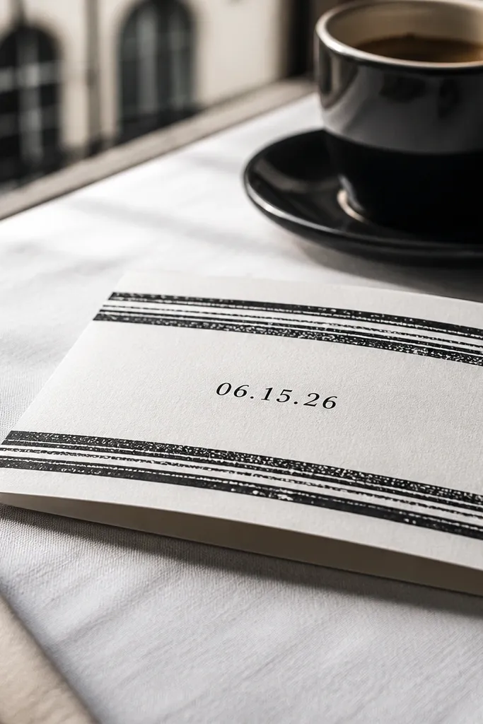
Stripe bands create an instant “designed” look, and letterpress-style contrast reads well in close-up photos. Keep the bands black and the background off-white, then let the date sit in the space between stripes. This design suits city weddings, courthouse vibes, and couples who want modern without going cold. It also photographs well in natural daylight because the bands provide strong geometry.
Quick tipUse slightly textured stock (not too rough) so the ink looks pressed rather than flat.
Set up two horizontal bands across the card width, leaving 0.25 inches top and bottom margin. Place the couple’s names in the upper band gap and the date in the lower band gap using a bold serif or slab serif. Then add location and RSVP in a smaller sans-serif block aligned left so the layout stays tidy when cropped.
Skip thisSkip gradients or thin outlines — they look gray in prints.
3. Botanical Line Art Corner Sprig
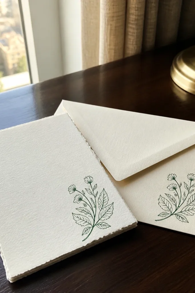
A single corner sprig is the easiest way to make stationery feel romantic without clutter. Line art stays readable and doesn’t compete with the names, which is what you want for photos where hands, envelopes, and menus are in the frame. This works for garden weddings, spring ceremonies, and neutral palettes. Use it when you want a soft theme that still looks tidy on a table spread.
Quick tipIf you’re hand-carrying, keep the cards in a flat folder so the corner art doesn’t get creased.
Place the sprig in one corner only, keeping it at least 0.3 inches away from any text block. Use a centered main header for names and date, then keep location and RSVP in one left-aligned paragraph. Finally, match the sprig color to your ink tone (dark green or charcoal) so it doesn’t look like a different printer job.
Skip thisDon’t scatter multiple botanical elements — it turns into visual noise.
4. Terracotta Watercolor Wash Panel
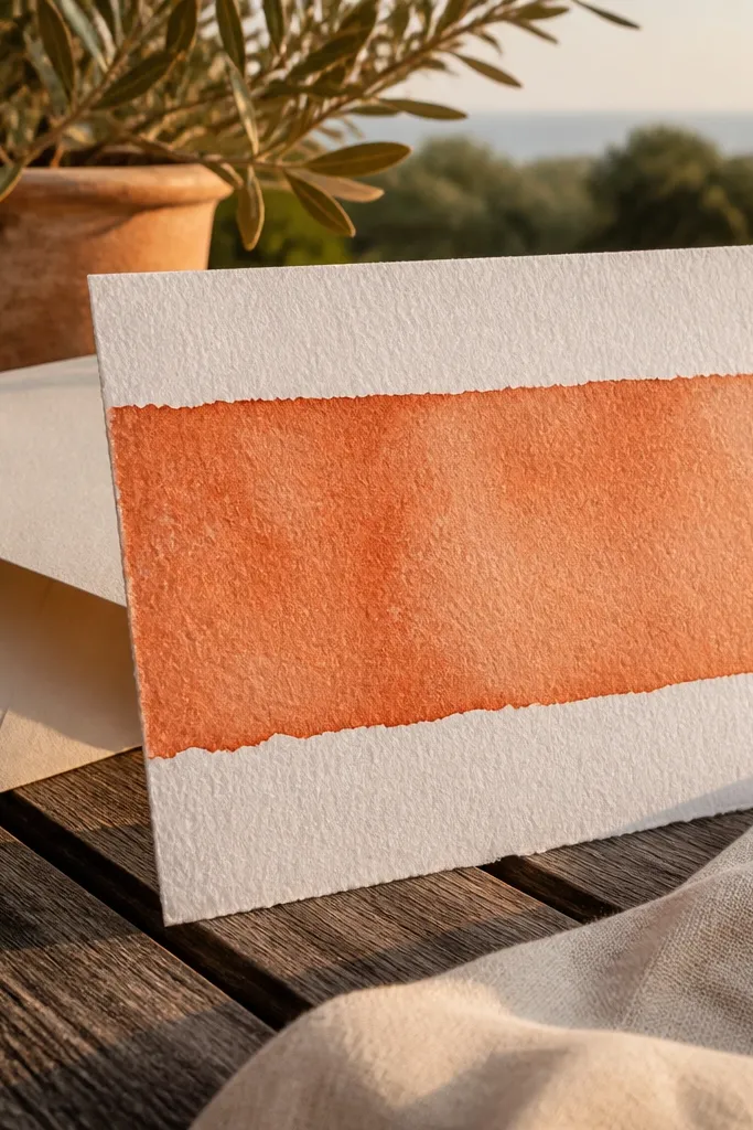
A watercolor wash panel is photogenic because it creates color depth behind the names without needing complicated illustration. Terracotta looks warm in both late-afternoon light and indoor tungsten lighting. The key is to keep the wash in a single band or block so the text stays legible. This template fits desert chic, Mediterranean color schemes, and fall weddings.
Start with a cream base and create a top panel wash that covers about 30-35% of the card height. Place names in the center of the wash area and date just below in clean, dark type. Then keep the rest of the information (location and RSVP) on the unpainted lower half with generous line spacing.
Choose a matte finish so the watercolor panel doesn’t glare under flash photos.
Avoid fully full-bleed washes if your printer can’t handle edge-to-edge accuracy.
5. Midnight Navy Ticket Stub Layout
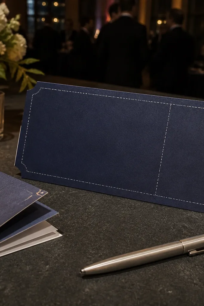
Ticket stub layouts look playful but still classy when you keep the typography crisp. The navy base makes the white type pop in photos, and the “cut line” border gives instant design structure. This works for evening receptions, indoor halls, and couples who want a little drama. It’s also good for themed weekends because you can repeat the ticket style on inserts and RSVP cards.
Quick tipIf you’re mailing, test with your printer on a small batch because dark backgrounds can show slight banding.
Use a midnight navy background and design a central rectangle with a perforation-like border effect. Put names at the top and date/venue in the middle, leaving extra margin for photo cropping. Add RSVP instructions on a bottom strip with a lighter-weight sans-serif so it doesn’t overpower the main message.
Skip thisDon’t use thin white fonts — they look washed out under low light.
6. Monochrome Marble Corner Accent
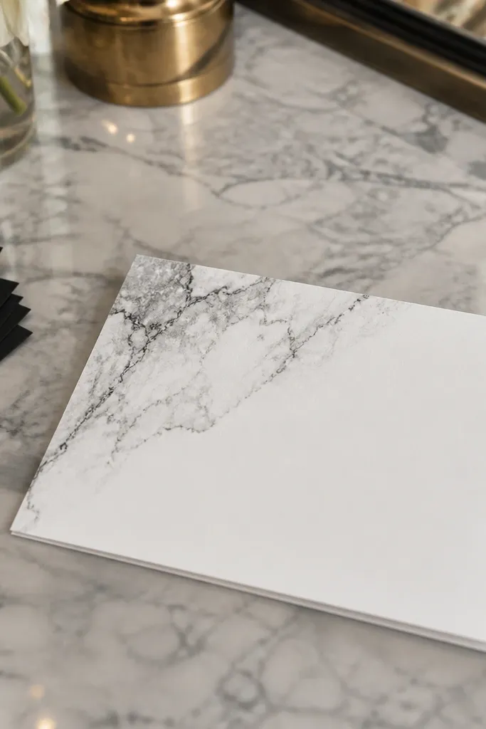
Marble accents look luxe because they add texture without filling the entire card. Keep it monochrome (gray on white) so it reads clean in every photo setting. This template suits modern venues, hotel weddings, and couples who want a minimal look with a little personality. It also plays nicely with black envelopes and neutral florals.
Quick tipUse a simple sans-serif for the main text so the marble texture doesn’t compete.
Create a small marble block in a single corner, about 15-20% of the card area, and keep it away from text by 0.25 inches. Use a centered date and left-aligned location block for balance. Finish with a small horizontal rule separating the RSVP line so the card feels organized even when photographed at an angle.
Skip thisSkip busy multi-color marble images — they print unevenly.
7. Art Deco Frame with Gold Lines
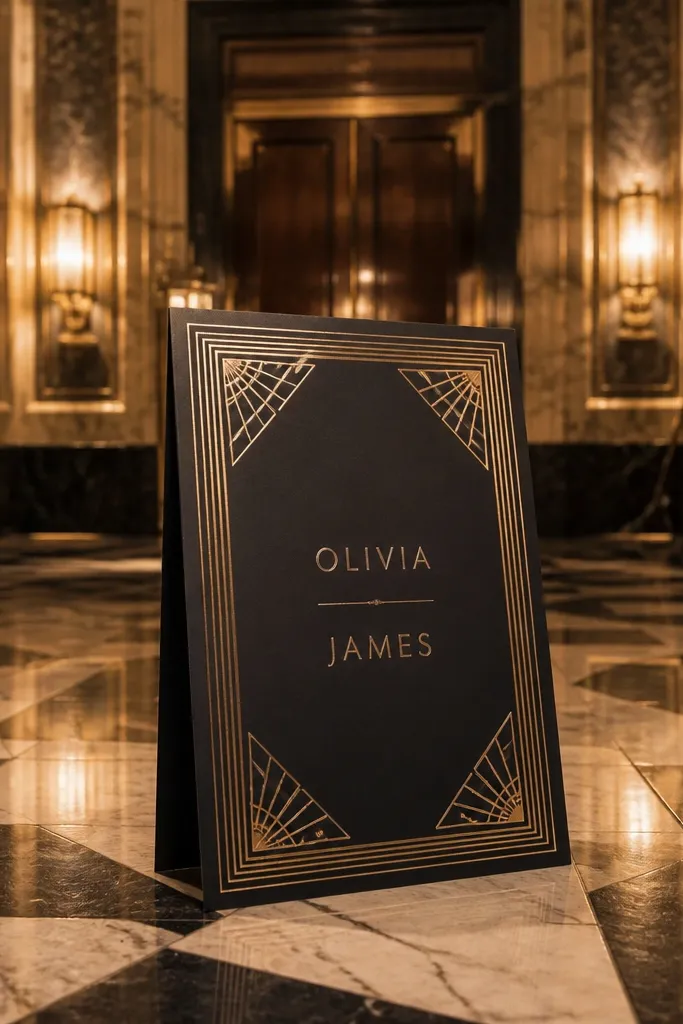
Art deco frames make invitations look like they belong in a ballroom. The secret is discipline: use gold lines only on the frame and let the center text be simple. This template photographs beautifully because geometric corners catch light and create a clean border around your names. It’s ideal for black-tie events, 1920s themes, and weddings with strong architecture.
Quick tipStick to one accent color (gold) so the frame doesn’t look like multiple printing attempts.
Design a symmetrical frame with corner rays and a thin inner rectangle, keeping all frame elements at least 0.2 inches from the text. Place names in the center in a bold serif, date underneath in small caps, and location at the bottom. Add RSVP in a single line, aligned to the same left edge as the location so the layout looks engineered.
Skip thisDon’t add extra deco icons — they make the card feel crowded.
8. Soft Sage Wraparound Border
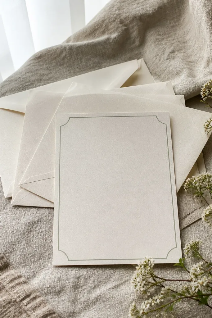
A wraparound border creates a “finished” look because it frames the entire card even when only part is visible in photos. Soft sage feels fresh and works across spring, summer, and early fall. Keep the border thin and consistent so it doesn’t look like a sticker. This template is a strong choice for couples who want calm, garden-adjacent aesthetics without botanical overload.
Start by setting a border thickness of about 0.08-0.12 inches and keep it uniform on all sides. Center names and date in the middle, then place location and RSVP in a single column with left alignment for easy readability. Finally, add a tiny divider line between location and RSVP to keep the spacing tidy.
Choose a border color that matches your envelope liner or wax seal color for a cohesive suite.
Skip overly thick borders — they crowd the text in close-ups.
9. Cream Card with Navy Script Names + Sans Date
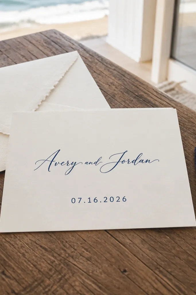
This is one of the cleanest “aesthetic” mixes: script for names, sans-serif for the date. The contrast reads as intentional, and it looks great when photographed against wood tables or neutral linens. Keep the script only for the couple’s names; everything else should be sans-serif so RSVP lines don’t get messy. It suits modern romantic styles and venues with lots of natural textures.
Set the script names centered at the top, then place the date in a straight sans-serif line directly under it. Put location and RSVP in smaller sans-serif text with consistent left alignment so the lines don’t wobble. Leave at least 0.3 inches padding around the script so it doesn’t get trimmed on the edges.
Print a one-card test to check script legibility before you run the full batch.
Avoid script for the entire block — it turns into unreadable blobs.
10. All-Black Minimal Layout with One Accent Dot
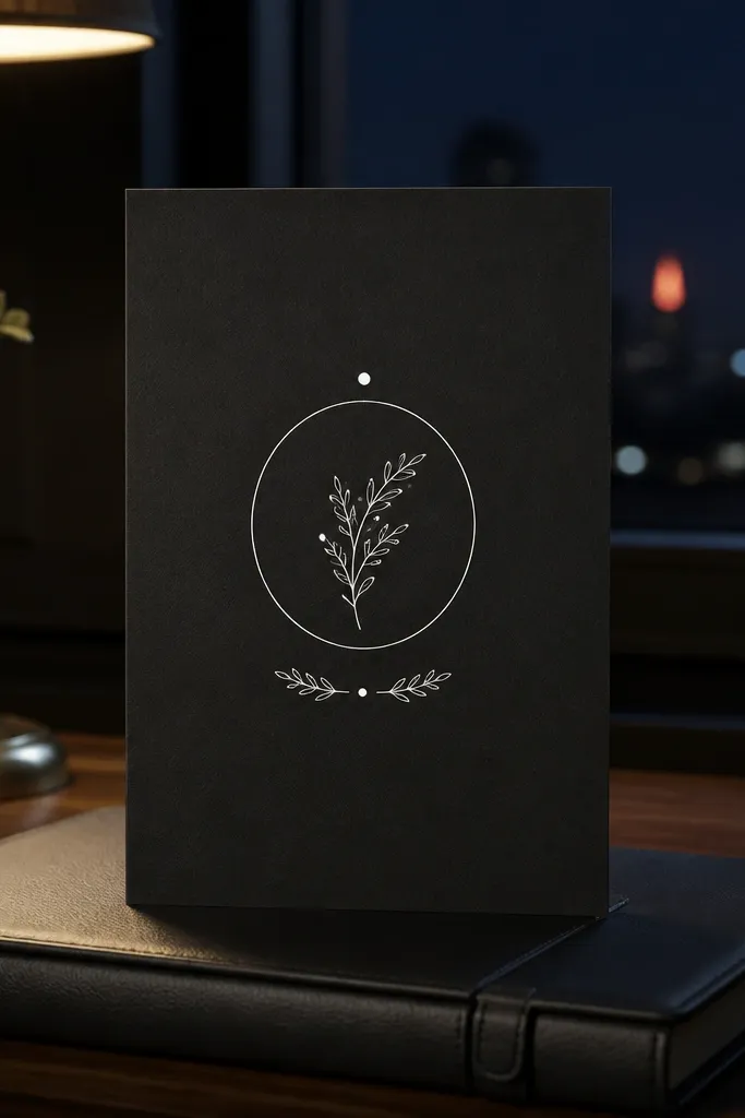
Minimal layouts look stylish because they remove everything that doesn’t earn its place. An all-black card with crisp white text is dramatic under flash and still readable in daylight. The single accent dot acts like a design punctuation mark — small, but it makes the layout feel designed instead of plain. This suits modern venues, industrial spaces, and couples who want a bold look.
Quick tipIf your printer can’t handle full-bleed black cleanly, keep the black as a centered panel instead of edge-to-edge.
Use a black base and set white type with high contrast. Center names and date, then insert one small gold dot (or thin rule) between them. Place location and RSVP in a bottom-aligned block with consistent line spacing, then keep your margins generous so the black edge doesn’t swallow text on trimming.
Skip thisDon’t add multiple accent icons — the card stops looking intentional.
11. Sunset Gradient Top Strip with Monochrome Text
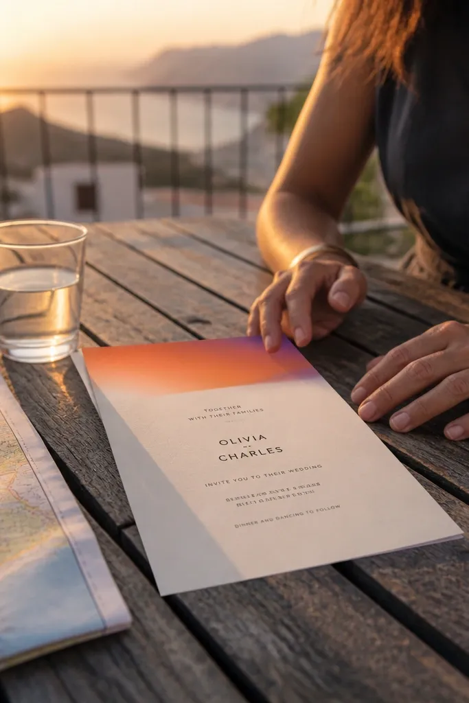
A gradient top strip is photogenic because it creates color momentum right where the viewer’s eye lands. Pair it with monochrome text and you get a clean, modern invitation that still looks playful. This works especially well for outdoor ceremonies at golden hour, but it also looks good indoors because the gradient provides warmth. Keep the gradient subtle so it doesn’t wash out the typography.
Create a top strip that takes up 20-25% of the card height. Put names in the center of the ungraded area just below the strip, then place the date and location in clearly separated lines. Keep RSVP instructions smaller and aligned left so the card is easy to scan when guests sit down with it.
Use matte paper so the gradient strip doesn’t glare during reception table photos.
Avoid using gradient behind the text — readability drops fast.
12. Vintage Sepia Heraldic Crest (Small Center)
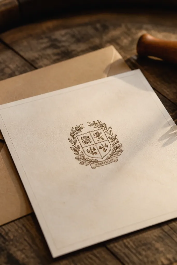
A small heraldic crest gives you a vintage feel without turning the card into a history lesson. Sepia tones look warm in photography, and the crest acts like a visual anchor that keeps the layout from feeling empty. This template suits heritage venues, winery weddings, and couples who want a formal, storybook mood. It also works well with envelope wax seals and thick paper stocks.
Quick tipChoose a crest color that matches your ink tone instead of going fully brown-black.
Place the crest in the center, sized to about 20-25% of the card width, leaving breathing room around it. Use a framed border or thin rules to keep the edges tidy, then set names above and date below the crest. Put location and RSVP in a bottom block with consistent alignment so the card stays legible at a distance.
Skip thisSkip oversized crests — they swallow the names in photos.
13. Geometric Cutout Border with Soft Pastels
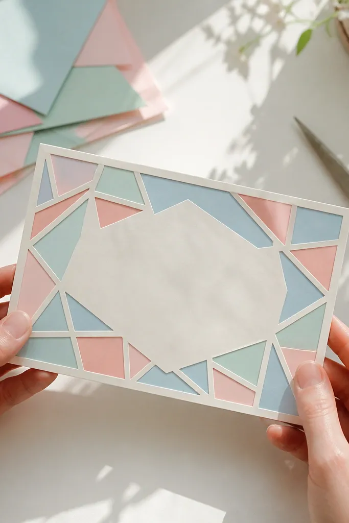
Geometric cutout borders add a handcrafted look without needing actual die-cuts on every card. You can fake the effect with a border pattern that leaves “negative space,” which looks crisp in photos and stays practical for printing. Pastels keep it sweet, while the geometry keeps it modern. This template fits spring weddings, baby-wedding weekends, and anything with a playful table vibe.
Build a border pattern that sits inside the safe area and leaves consistent gaps like cutouts. Keep main names and date centered and big enough to read in a single glance. Place RSVP and address lines in a single left-aligned block on the bottom half so guests can find it quickly.
If you’re packing, use a rigid mailer or flat board so the border doesn’t get scuffed.
Don’t use super light pastel text — it disappears against textured paper.
14. Navy Nautical Anchor + Rope Line (Clean)
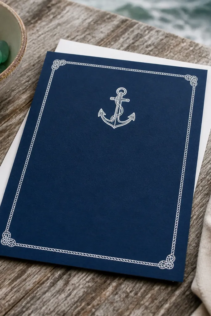
Nautical themes look best when they’re graphic, not cartoonish. A navy anchor paired with a thin rope line border gives a maritime feel while keeping the invitation sophisticated. This template works for waterfront venues, beach ceremonies, and boat weekends. It also photographs well because the icon provides contrast against bright linens and sky-blue backgrounds.
Quick tipChoose dark navy ink instead of teal so it prints consistently across home and local printers.
Place the anchor near the top-left or top-center, keeping it small enough to avoid overpowering names. Add a thin rope-line border that runs along the top and bottom edges instead of all four sides. Use a centered date block, then put location and RSVP in a left-aligned bottom section with a thin divider line.
Skip thisAvoid multiple nautical icons — it turns into clip-art.
15. Monogram Nameplate with Black Ribbon Divider
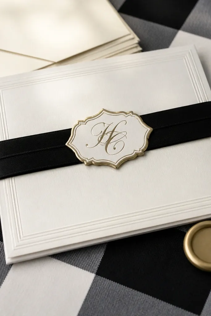
A nameplate plus ribbon divider makes the card feel like a gift tag, which reads great in flat-lay photos. The black ribbon creates a strong horizontal break, so the layout looks organized even when your suite includes multiple inserts. This template fits formal weddings, modern black-and-white palettes, and couples who want a little drama without heavy illustration. It also works well with wax seals and black envelopes.
Quick tipPrint on thicker stock (at least 250gsm) so the ribbon band doesn’t look cheap on camera.
Design a rounded-rectangle nameplate centered on the card and place the monogram or couple names inside. Add a black ribbon divider as a horizontal band across the middle, then set the date and location in the areas above and below the ribbon. Keep RSVP in a clean small text block aligned to the same width as the nameplate.
Skip thisDon’t add extra decorative corners — the ribbon already does the work.
16. Minimal Frame + Big Date Typography
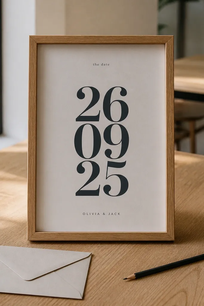
Oversized date typography is one of the easiest ways to make invitations look stylish because it creates a clear focal point. A thin frame keeps everything disciplined, and the rest of the information can stay small and readable. This template suits modern weddings, city ceremonies, and couples who want a clean, high-contrast look. In photos, the big date stays legible even if the background is busy.
Create a thin inner frame with 0.25-inch safe margins. Set the date in a large font centered vertically, then place names in a smaller size above it. Put location and RSVP in a bottom block with tight alignment rules so the card looks structured when guests lay it next to place cards.
Use a condensed font for the date so it fits cleanly on 5x7 without shrinking everything else.
Skip script for the date — it kills readability.
17. Pearlescent Blush Panel with Dark Serif
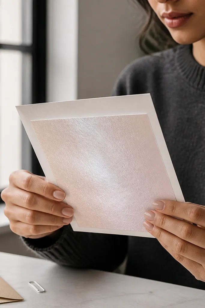
Pearlescent blush panels look soft and premium, especially under window light. The trick is to keep the rest of the card simple so the shimmer stays the star. Dark serif type gives contrast and keeps text crisp. This template suits romantic venues, indoor ceremonies, and color palettes with blush, champagne, and neutral florals. It also makes a great background for a matching RSVP insert.
Quick tipAvoid glossy coatings if you’re photographing with flash; matte pearlescent looks cleaner.
Use a blush panel covering about 40% of the card height, placed behind the names and date. Keep the text color dark (charcoal or deep brown) and center it within the panel area. Put location and RSVP on the plain base below the panel, aligned in one clean block with consistent line height.
Skip thisDon’t use light gray text on blush — it fades in print.
18. Monochrome Photo-Style Texture Background (No Image)
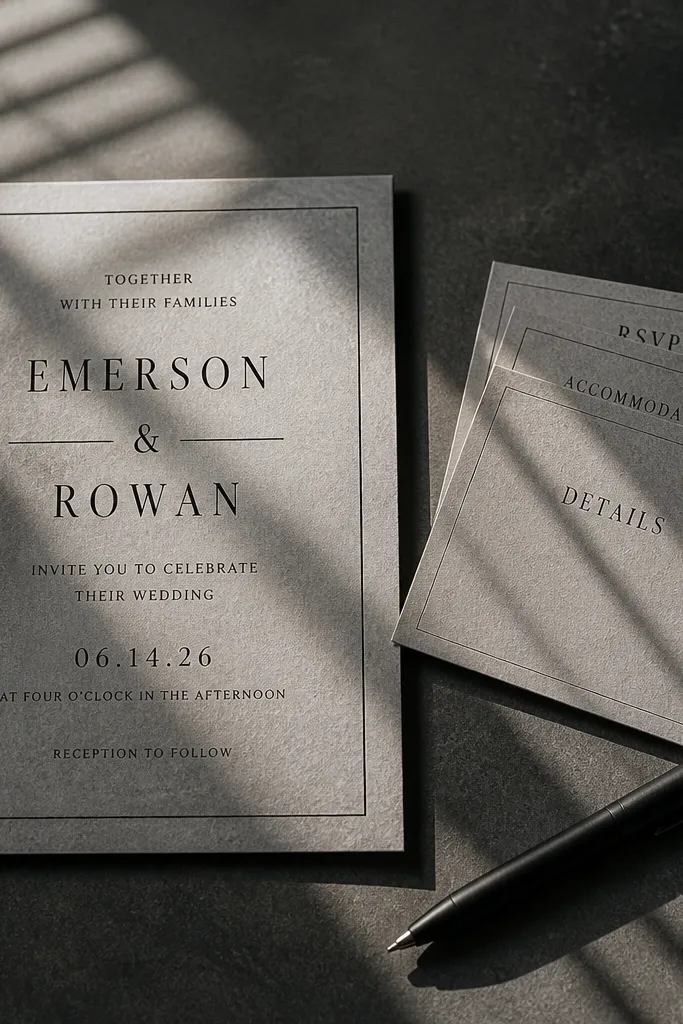
You can get the “photo vibe” without placing an actual photo on your invitation. A monochrome texture background adds depth while keeping the content clean and legible. Pair it with solid black typography and a thin border, and the card looks editorial. This suits couples who want modern, moody aesthetics and venues with dark wood or black-and-white decor. It also photographs well because the texture adds interest without distracting from names.
Quick tipIf you’re using a local printer, request a test print on the exact paper so the texture density matches your expected look.
Choose a single texture pattern in grayscale and set it as a background layer that covers the full card. Add a thin border rectangle and keep your text blocks inside with 0.25-inch safe margins. Use a bold header for names, a smaller date line, and then a bottom RSVP block aligned left for scanning.
Skip thisDon’t mix texture with multiple icons — the card becomes visually busy.
19. Borderless Card with Floating Type Blocks
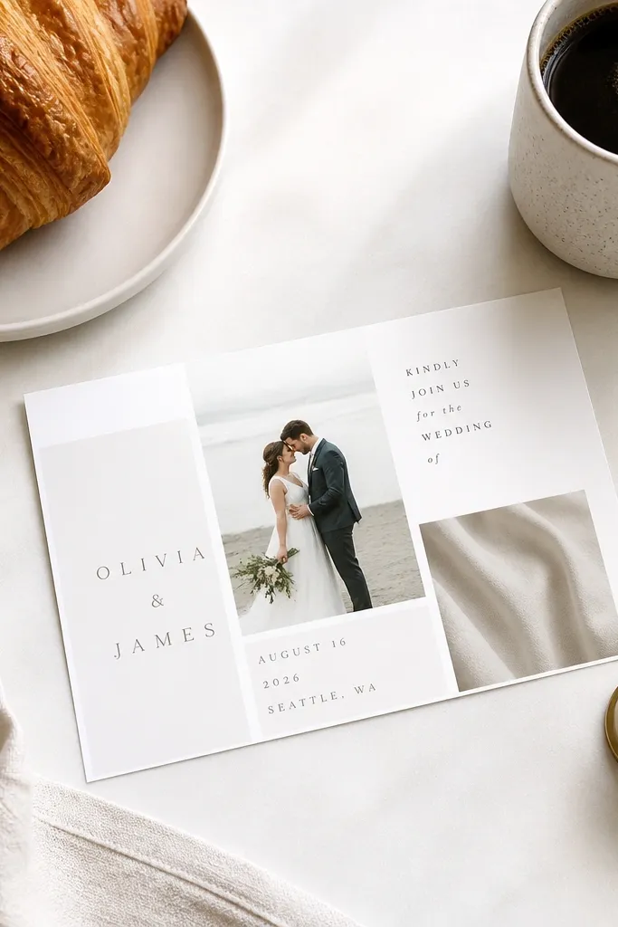
Borderless layouts feel modern and airy, and they look great on tables because the card blends into the background while the type stays crisp. The “floating blocks” approach gives you structure without a drawn border. This template suits minimal weddings and color palettes with lots of negative space. It also works well when guests hold the invite up for photos since there’s nothing decorative near the edges to get cut off.
Quick tipUse a rigid mailer or flat folder when transporting so the borderless look doesn’t get scuffed edges.
Start with a borderless design and place names near the top third, date centered, and the location/RSVP in a bottom block. Use different font sizes and one thin divider line to separate information jobs. Keep consistent alignment across blocks so it doesn’t look accidental, and leave 0.25 inches of margin around all text.
Skip thisDon’t use too many font sizes — it looks messy instead of airy.
20. Forest Green Foil Leaf Mandala (6x8 Folded Wreath)
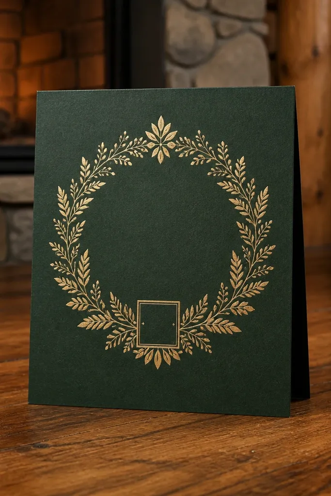
This template looks like a real invitation from a lodge wedding — deep forest green stock, a gold foil leaf mandala, and a tiny date box that keeps it clean instead of busy. The mandala sits inside a soft circular wreath, so it photographs well from straight-on and from a slight angle. It suits fall and winter weddings because the colors read warm and grounded, even in indoor venue lighting. If your wedding vibe is woodland, cabin, or garden paths with string lights, this is the design that matches the setting without needing extra decorations. It also works for couples who want something romantic but not floral-cute.
Step 1: Print a 6x8 folded card on 300gsm forest green paper, then place a gold foil leaf mandala centered on the front panel. Keep the names in a dark serif or small caps, and put the date inside a simple rectangular box so it stays readable on camera. Step 2: For layout, use a bottom-right placement for the location line and leave a lot of open space in the top half — the foil needs breathing room. Step 3: Pair the look with a matching packing list wedding stationery set — put the invitation in a rigid mailer or thick envelope sleeve, then add RSVP cards folded the same way so everything stays aligned. Budget for printing and foil at roughly $2.50 to $6 per card depending on quantity and foil coverage, and plan 2 to 3 weeks for production and shipping. Step 4: Book your printer as soon as you lock the final wording; foil work is where timelines slip, especially near peak wedding season.
Send the final artwork as a single PDF with crop marks and confirm the foil area size in millimeters before you approve a proof.
Avoid heavy full-bleed foil — it looks messy in photos and costs more than a centered mandala.



