
1. Frosted Navy Script with Gold Foil Date
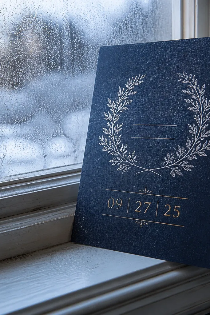
Start by setting the background to a deep navy (not black) so the invite has a cooler base. Then make the date line the largest element and use a gold tone for just that line — keep the rest in off-white or pale cream. Finally, add a thin corner ornament or minimal border so the foil detail has space to catch light. For printing, ask for foil or a metallic ink only on the date line to avoid smearing and alignment headaches.
This template is built for winter and late fall because the dark background makes the date feel grounded, not floating. The script style for names gives a soft romance, while the gold date adds a warm highlight that still reads clearly against navy. The layout stays simple — one hero line, one supporting block — so it looks sharp even in dim venue lighting. It also works for year round because you can swap the date color to champagne or keep it gold for consistent photos.
Skip thisDon’t add extra metallics on every line — the date loses impact fast.
Quick tipUse a matte cream envelope and a navy liner to keep the invite classy in winter photos.
2. Champagne Watercolor Florals on Soft Ivory
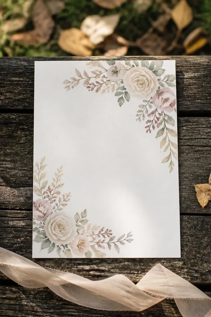
Start by using a soft ivory background and keep the watercolor tones muted, not saturated. Then place florals only in the corners or along a thin top band, leaving a large center block for text. Finally, choose a serif font for names and a simple sans or small serif for details so the watercolor doesn’t compete with readability. Print on heavyweight cotton or uncoated stock so the watercolor texture doesn’t look like it’s trapped under a glossy layer.
This one reads as spring for its light base, but it’s warm enough to survive fall without looking childish. Watercolor florals look best when the palette is restrained — champagne, dusty rose, and pale sage — because the invite stays elegant rather than busy. The corners framing approach keeps the center clean so the names and date still feel like the main event. It photographs well because the texture creates depth without heavy ink coverage.
Skip thisSkip busy full-bleed florals if you want crisp date text.
Quick tipLeave at least 10-12 mm of margin around the center text so watercolor edges don’t creep into the typography.
3. Greenhouse Botanical Frame with Letterpress Feel
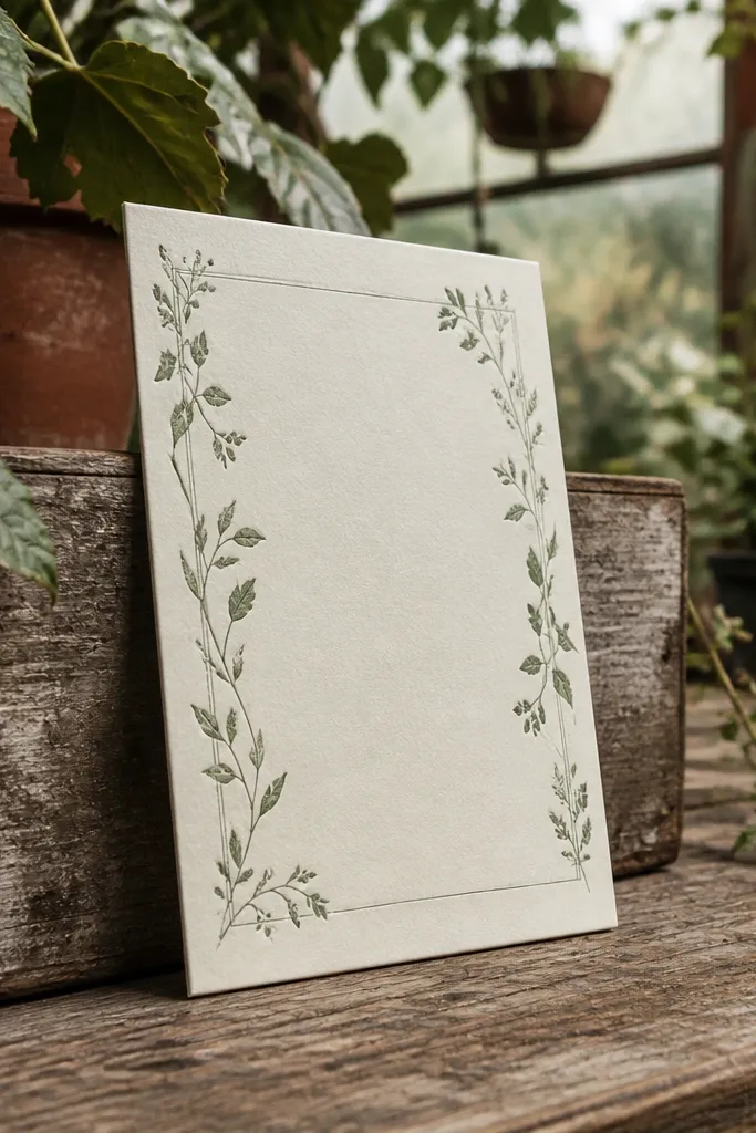
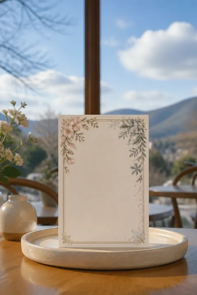
If you want something that works in spring, summer, and even early fall, this botanical frame template is a smart visual choice. The border is the star — thin leaves and small sprigs create a “garden” feeling without making the whole invite look like a theme park. The center stays restrained so your date, time, and venue read cleanly. It’s also great for year round because you can shift the border color from sage to deeper forest green to match the season.
Start by selecting a cream base and a botanical border that sits inside a noticeable margin. Then set the date in a slightly heavier serif and keep the rest in smaller, consistent sizes. Finally, aim for letterpress-like styling by using a subtle darker ink tone (deep green or charcoal) rather than bright black. If you’re printing traditionally, use a spot color for the border so it stays crisp and doesn’t muddy through too many process inks.
Choose a border color that’s one shade darker than your main ink — it looks intentional in photos.
Don’t use tiny leaf details right next to the edge if your printer has tight trimming tolerance.
4. Midnight Minimal with Single-Line Border
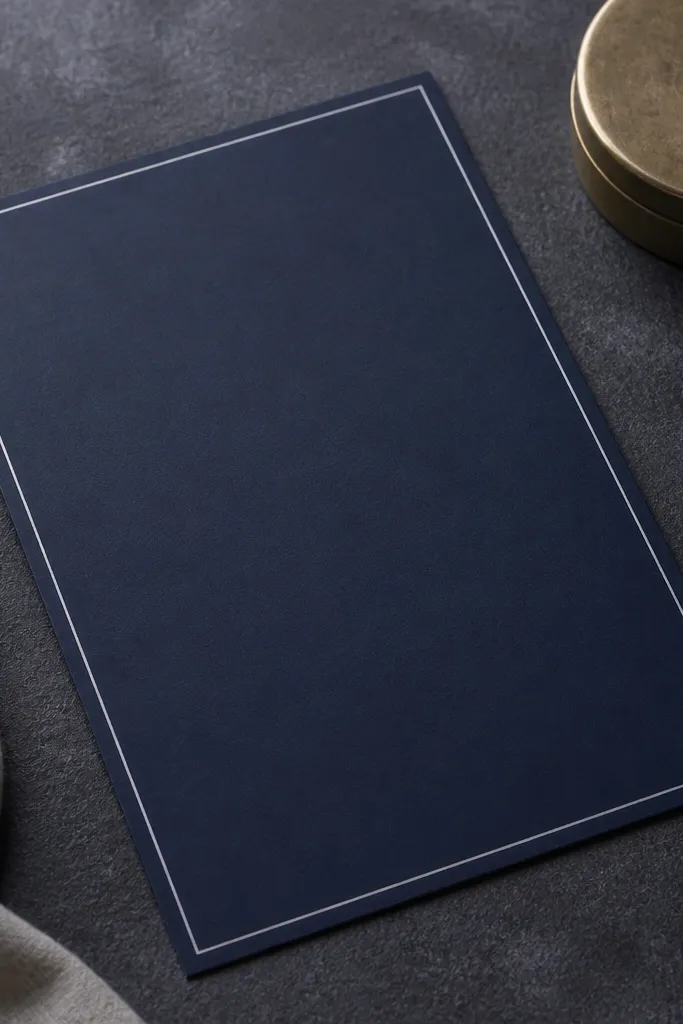
Start by using a near-black background or deep charcoal and keep text in bright off-white. Then add a single border line with consistent thickness and generous padding around the content. Finally, set the date in all caps or small caps with a slightly larger size, and keep address lines tight but readable. For best print results, use a matte finish so light doesn’t bounce off the card and flatten the typography.
This template is for people who want the invite to look expensive year round. Midnight minimal designs don’t depend on seasonal graphics; they rely on spacing and typographic contrast. A thin single-line border gives a clean frame that looks great in both winter and summer because it doesn’t get “washed out” by bright colors. It also photographs consistently because there’s less texture to catch glare.
Skip thisSkip overly thin fonts on dark backgrounds; they disappear in low light.
Quick tipPair with black envelopes and a satin ribbon band only if you can keep the ribbon matte too.
5. Terracotta Linen Look with Serif Date Block
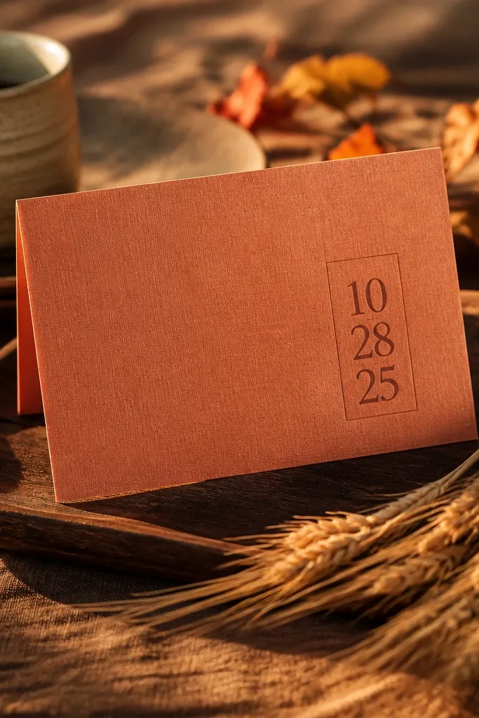
Start with a warm terracotta background that looks like linen texture, not a solid color. Then place the date inside a subtle rectangle or thin-rule box that stands out by 10-20% in darkness. Next, keep the rest of the text in a darker brown or charcoal so it stays readable. Print on uncoated stock so the texture reads as paper, not a screen effect.
Terracotta and linen textures scream fall but still work into early winter because they’re warm, not bright. The key here is the date block — a boxed area gives structure so the invite doesn’t feel like it’s melting into the background. Serif typography keeps it formal, while the textured base adds depth that looks great in flat lays. This is one of the safest year round choices because you can keep the same layout and shift only the accent color for later seasons.
Skip thisDon’t put white text on terracotta if your printer’s contrast setting is weak.
Quick tipUse a slightly smaller font size for the address lines so the texture doesn’t overpower long lines.
6. Blush Peony Corner Spray with Clean Center
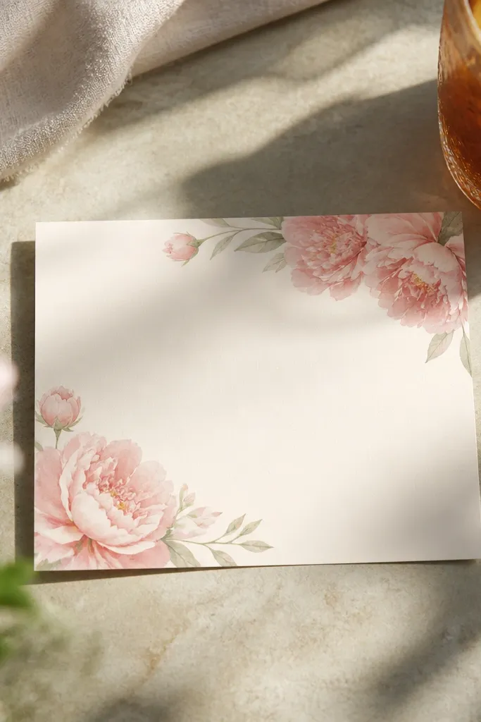
Start by setting the background to bright white or warm off-white for maximum contrast. Then add peony illustrations in only two corners and keep them smaller than you think; less looks more. Finally, use a bold serif for names and a medium-weight sans for details so the center stays sharp. If you’re printing through a local shop, ask for a test print because corner watercolor illustrations can vary in saturation.
This one is tuned for spring weddings and also works for summer because the floral is soft and airy. Corner sprays create a “framed” look without covering the date block, so the invite stays legible and photogenic. The blush palette plays nicely with neutral venues and daylight photos, and it doesn’t feel heavy. It’s a good year round template when you swap the flower tone to mauve for fall or keep it blush for spring.
Skip thisDon’t spread florals along the entire border; it crowds the RSVP lines.
Quick tipUse thick, lightly speckled paper so the blush tones look soft instead of flat.
7. Ocean Blue Waves with Foil Accent Corner
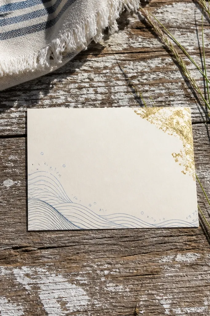
Start by picking an ocean blue that’s medium-dark so cream text stays crisp. Then apply a light wave pattern behind the typography, keeping it under the text layer so it doesn’t compete. Finally, add foil in one corner only — a small frame or dot cluster — and keep the rest solid. Print on matte coated stock if you want the waves to look smooth; choose uncoated if you want a softer, paper-like texture.
For beachy ceremonies and summer receptions, wave patterns look fresh without needing obvious shells or anchors. This template keeps the waves subtle and uses a single foil accent corner so it still feels polished. The contrast between ocean blue and cream text makes it readable in bright daylight and still elegant for evening photos. It also works in early fall if you swap the waves slightly darker and reduce the foil intensity.
Skip thisSkip full-bleed wave backgrounds if you plan to trim by hand.
Quick tipAvoid glossy invitations with foil unless you know your lighting — glare makes wave patterns look muddy.
8. Forest Green Monogram with Gold Rule Lines
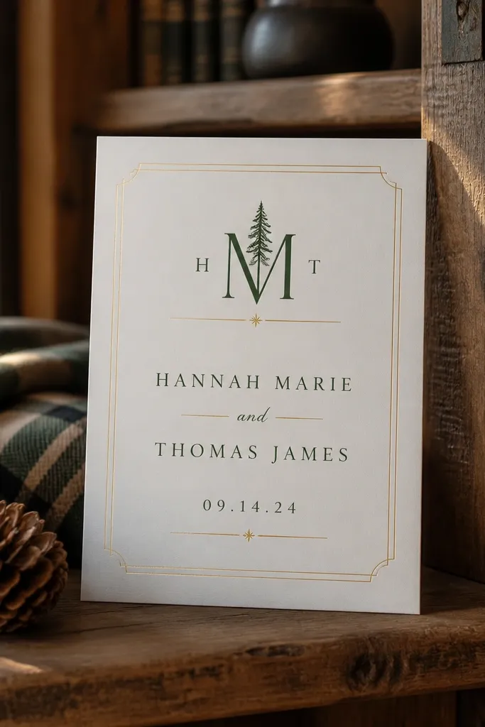
Start by placing a monogram or initial at the top center in gold. Then build the structure with thin gold rule lines above and below the names block. Finally, set the date in a slightly larger type size and keep all other details in a smaller consistent font. For printing, choose a metallic ink or foil only for the monogram and lines; don’t try to make every element metallic.
Monogram templates are reliable for year round weddings because they don’t depend on seasonal imagery. Forest green gives you instant depth for fall and winter, but the gold rule lines keep it festive for spring and summer too. The layout is structured: monogram at the top, names in the center, date emphasized by spacing and line weight. It’s photogenic because the gold lines catch light without needing heavy illustrations.
Skip thisDon’t use too many fonts; one serif and one sans is plenty for this style.
Quick tipUse a cream envelope and keep the return address in black — it makes the gold look cleaner.
9. Pale Sage Pressed Leaf Border
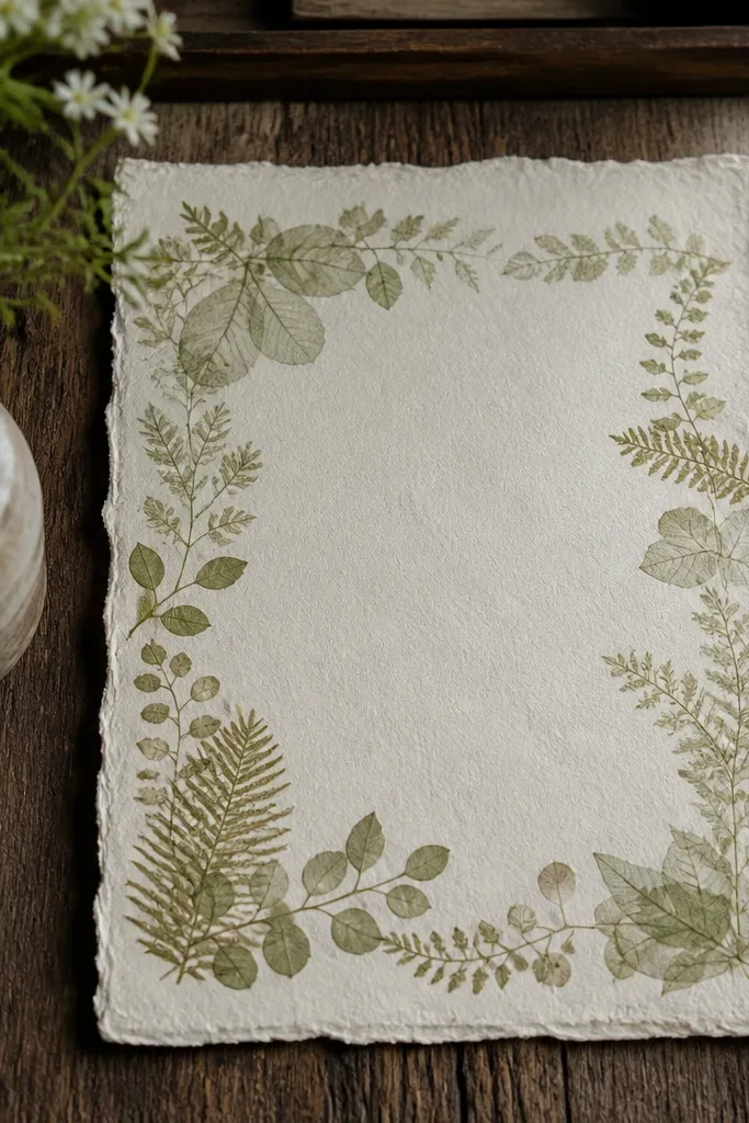
Start with an off-white base and choose a sage tone that’s muted, almost dusty. Then use a pressed leaf border that runs around the edges with consistent spacing, leaving the center open. Finally, set the names in a serif and the details in a small sans, both in a charcoal tone for readability. Print on textured paper if you want the pressed look to feel intentional; otherwise choose uncoated for clean results.
Pressed leaf borders give a botanical look without the watercolor mess. Pale sage keeps it spring and early summer, and the “pressed” style still feels refined for garden receptions. The border gives a frame so your typography has a clear stage. Because the illustration is light-toned, the invite stays airy and looks good on both light and dark tables.
Skip thisDon’t use pure white text over sage if you want crisp edges.
Quick tipKeep the border thin. Thick leaf frames can feel heavy on small cards.
10. Cream Art Deco Panels with Black Date
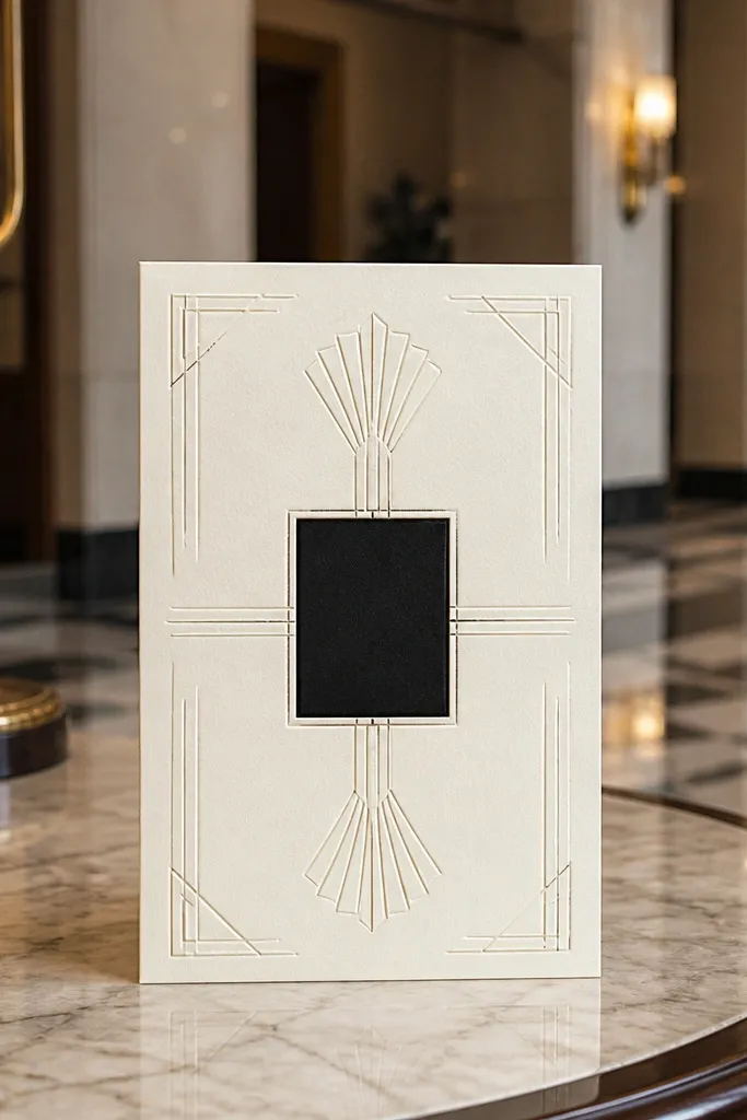
Start by setting a cream background and using black ink as your main color. Then add art deco panels on the left and right sides, leaving the top and center open. Finally, put the date in a bold block or badge and keep the rest of the details small but evenly spaced. For printing, choose a smooth paper stock so the geometry stays crisp and doesn’t blur at the edges.
Art deco panels look good in photos because they create strong geometry and clean lines. This template is year round because black and cream doesn’t scream one season; it reads as classic and formal. The date is placed in a centered block with sharp contrast, so it’s easy to find in a stack of cards. Add small divider lines and the whole invite looks intentional without extra illustration clutter.
Skip thisSkip overly ornate fonts; geometry needs clean typography.
Quick tipUse a consistent line thickness for dividers — it’s what makes deco designs look premium.
11. Autumn Maple Leaves in Copper Ink
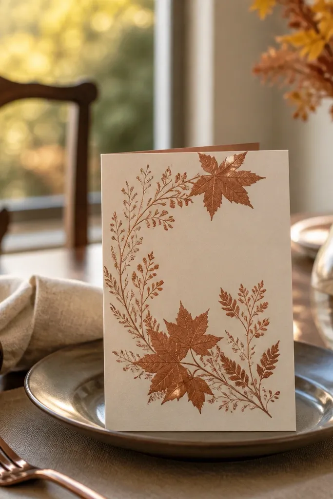
Start with an ivory background and pick copper ink for small leaf details only. Then set your main text in warm brown and keep the date slightly larger with a heavier weight. Finally, place leaves in two corners or as a thin arc above the names. Ask your printer about metallic ink options and request a test strip, because copper saturation varies by paper.
Copper ink accents make fall invitations feel warm without turning orange-on-orange. Maple leaves placed as small sprigs at the corners or along a thin top rule give seasonal cues without overwhelming the text. The warm brown typography keeps it readable and photo-friendly in golden hour lighting. This template also works in winter because copper still feels “festive” even when you switch the leaf tone deeper.
Skip thisAvoid full leaf patterns behind text; they make RSVP lines harder to read.
Quick tipUse matte envelopes so copper doesn’t glare under flash.
12. Summer Citrus Accents with Minimal Type
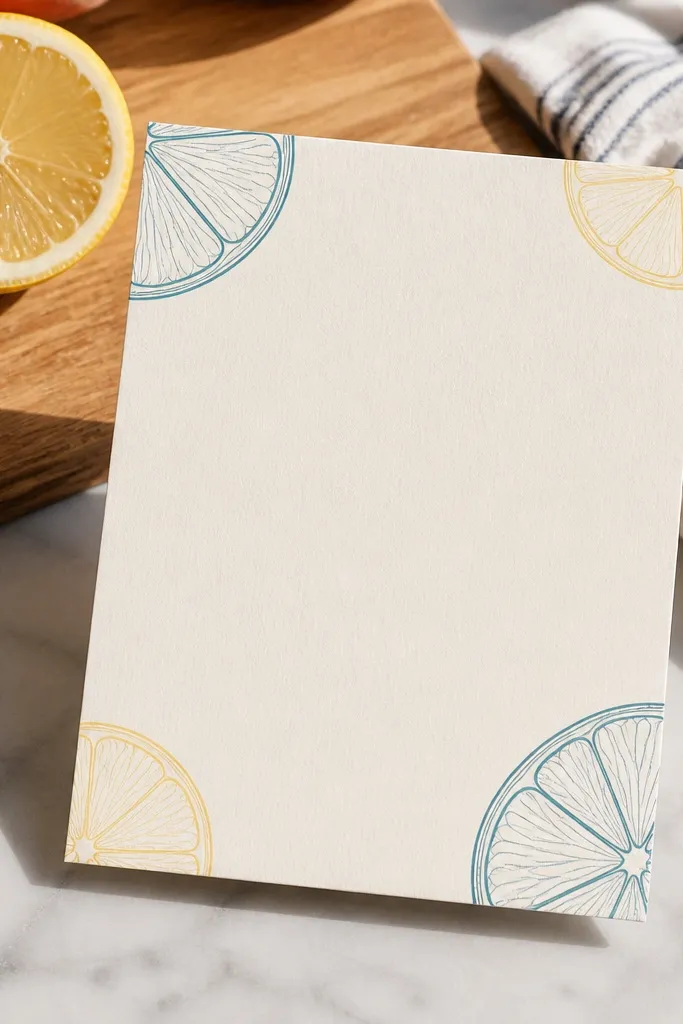
Start with a white or pale cream background and choose a dark ink for all text. Then add small citrus line art only in the top corners, keeping the slices small and light. Finally, emphasize the date using a slightly larger font and extra spacing, not extra colors. Print on uncoated stock to keep the fruit line art crisp and prevent it from looking like a screen print.
This template gives summer energy without using loud colors everywhere. Citrus slices or thin fruit line art in the corners add a playful, bright cue while the center stays clean. Minimal type keeps it elegant and makes it easy to read at a glance. It’s good for year round wedding invitation templates because the same layout can switch to neutral accents for fall by changing the fruit line color.
Skip thisDon’t use bright neon accent colors; they dominate the photo.
Quick tipIf your venue is outdoors, keep text sizes large enough to read from 2-3 feet in daylight.
13. Winter Snowflake Border with Charcoal Typography
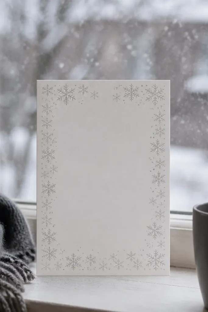
Snowflake borders can look tacky fast, so the trick is subtlety. This template uses a light snowflake pattern around the frame with charcoal typography in the center. The result looks wintery in a classy way, but it doesn’t feel like holiday cards. It also works for year round if you keep the snowflake border light and switch the paper tone slightly warmer for late fall.
Start with an off-white base and use charcoal as your main ink. Then add a snowflake border that sits just inside the edges, keeping it thin and faint. Finally, set the date in a slightly heavier serif and keep details in a smaller sans. Print on thick paper so the light border doesn’t get lost or look patchy after trimming.
Choose a paper with a slight warm tint; pure bright white makes snowflake lines look harsh.
Skip big snowflake icons; they overpower the date.
14. Rose Quartz Marble Background with Soft Serif
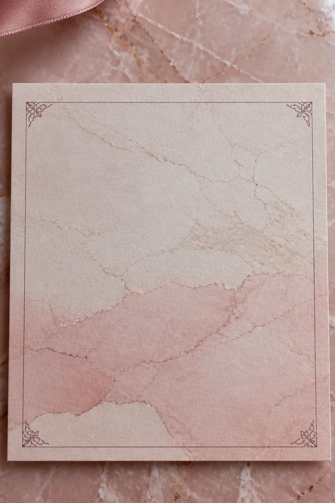
Start by using a rose quartz marble texture at low contrast so your text stays readable. Then place a clean white or slightly translucent panel behind the names and date to anchor everything. Finally, set the date in a darker tone and keep the address lines smaller. Print on a matte finish to reduce glare from marble patterns.
Marble backgrounds look gorgeous in flat lays and close-up photos because they create natural movement without needing illustration. Rose quartz tones read as romantic for spring and summer, but the template stays year round because the typography is controlled. Keep the text in deep charcoal or dark plum so it doesn’t disappear against the pink. This design works well when you want “pretty” without obvious seasonal graphics.
Skip thisDon’t put text directly over the darkest marble swirls.
Quick tipUse fewer font weights; marble already adds visual complexity.
15. Pearl White Lace Frame with Black Ink
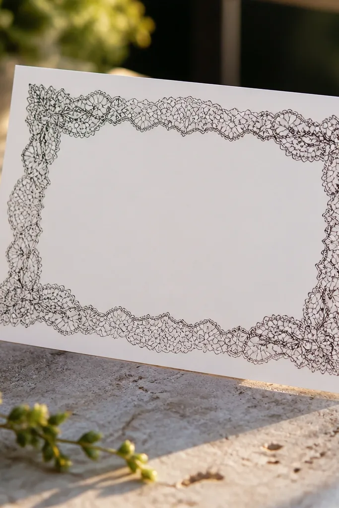
Start with a pearl white background and choose black ink for all text. Then add a lace frame around the edges using a light pattern that doesn’t touch the center text block. Finally, place the date in a bold font size and use a consistent line spacing for time and location. For printing, choose uncoated or lightly textured paper so the lace frame feels like stationery, not a flat graphic.
Lace frames feel wedding-y without being seasonal, which is why they belong in year round wedding invitation templates. The trick is making the lace look like linework or subtle pattern, not heavy illustration. Pearl white plus black ink gives a high-contrast look that photographs cleanly in both indoor and outdoor lighting. The center stays simple so the date is still the focal point.
Skip thisDon’t use gray text; lace frames need real contrast.
Quick tipPair with a black envelope liner if you want the lace to pop in photos.
16. Blended Sunset Gradient with Bold Date Type
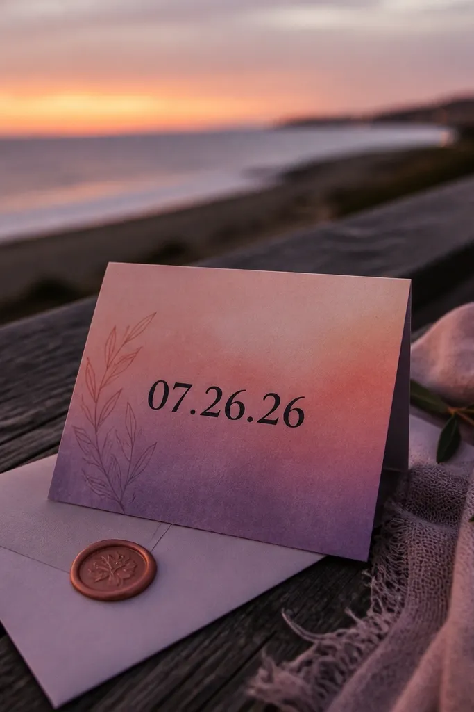
Start by using a muted gradient (think dusty peach to soft mauve) rather than bright orange. Then add a light panel behind the names and date so text stays crisp. Finally, make the date the biggest element and keep other details in a smaller, high-contrast font. Print on matte cardstock to prevent the gradient from looking shiny under flash.
A soft sunset gradient gives you a wedding glow that works in late summer and fall, but it also works year round if you keep the gradient muted. This template uses a gradient behind the main text, then anchors everything with bold date type. The center panel approach keeps readability high, so the gradient stays decorative instead of distracting. It’s photogenic because the color shift creates depth even with minimal graphics.
Skip thisAvoid full-bleed gradients with tiny RSVP text.
Quick tipTest the gradient on your exact printer settings; cheap printers band gradients badly.
17. Cedar and Cream Botanical Corners
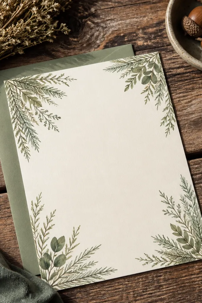
Start with a cream background and choose cedar green for corner sprigs. Then set a strong serif for names and a smaller sans for the details. Finally, keep the date in a slightly larger size with extra spacing above it. For printing, use a paper that holds color well — uncoated cotton or heavyweight matte — so the green stays smooth.
This template is a fall-friendly choice that still works in spring because the botanical elements are minimal and the palette stays classic. Cedar green corners add a natural feel without turning the invite into a “holiday” card. The center is calm, and the typography is set to be readable at a distance. It’s a good option when you want a nature look but you hate heavy illustrations.
Skip thisDon’t add extra greenery lines around the whole border.
Quick tipKeep corner sprigs away from the folds so trimming doesn’t cut them off.
18. Classic Black Tie Invitation with White Rules
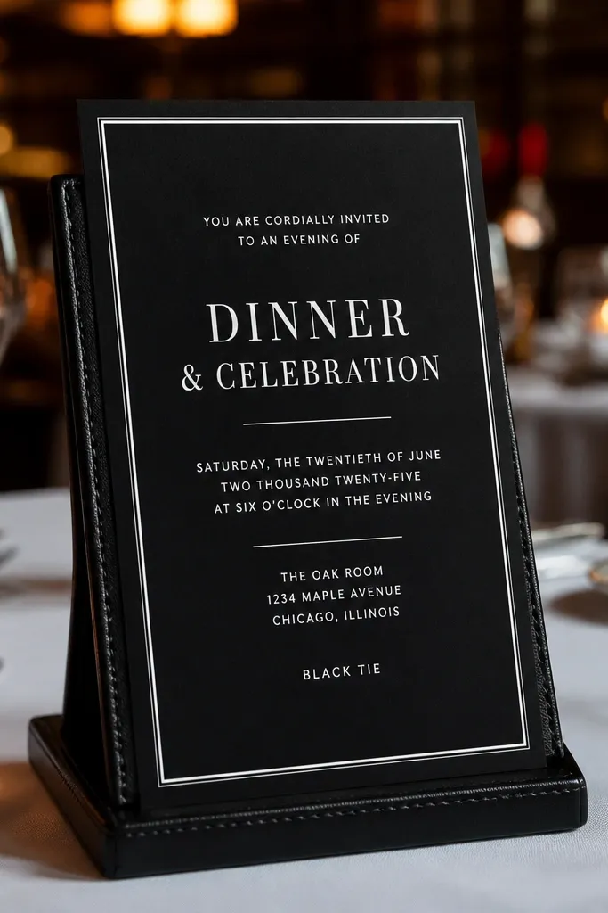
Start with a black or deep charcoal background and set your main text in white. Then add white rule lines above and below the center text block to create a tidy rhythm. Finally, choose a high-contrast font pairing: a refined serif for names and a simple sans for the rest. Print on matte cardstock and use a thick envelope so the invitation doesn’t look thin in photos.
This is the template for formal weddings that want a clean, expensive look every season. Black tie styling works year round because it doesn’t rely on flowers or weather imagery. White rule lines add structure and help the eye move from names to date to details. The typography stays sharp, so the invite looks good in both daytime and candlelit photos.
Skip thisSkip busy decorative icons; white rules already do the job.
Quick tipIf you plan to add a ribbon, stick to black or ivory — metallic ribbons can steal attention from the date.
19. Salt-Air Seashell Border with Deep Teal Foil Date
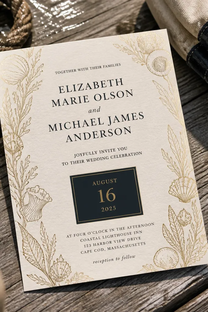
This template uses a salt-air shell border drawn in thin, believable linework, then pairs it with a deep teal date block finished in warm gold foil. The result looks like something you’d find in a seaside stationery shop — crisp, airy, and photogenic even in flat lay photos. It works best for beach weddings where you want a little texture without going full “nautical clip-art.” It also photographs beautifully year-round because teal and gold keep their contrast in both bright sun and indoor reception lighting. If you’re planning a coastal ceremony, this is the kind of design that matches the setting without needing extra styling.
Start by choosing a card size in the 5x7 inch range and set the date in a single bold line (no stacked numbers) inside a rectangular deep teal panel. Add the seashell border only on the outer edges so the center stays clean for names and venue details. For printing, ask for gold foil only on the date — foil on the whole border makes the card harder to read and costs more. Travel-wise, base your invitation on a coastal weekend vibe by planning a beach town stay during late spring through early fall for the clearest weather. Book your stationery proof 4-6 weeks before you need envelopes and plan your trip for the same window so you’re matching the paper look to the photos you’ll take right after the ceremony.
Pick a beach town with a walkable main strip and reserve lodging with free early check-in when possible — it saves you the rush of last-minute photo sessions.
Don’t spread foil across the entire border — it kills readability and makes the card look busy in photos.
20. Autumn Orchard Ticket-Stub Frames with Warm Copper Type
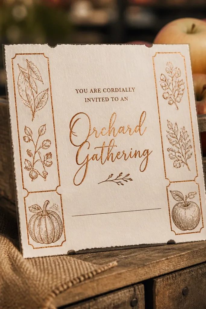
This design borrows from orchard ticket stubs and vintage labels: torn-edge frames on the sides, a clean center, and warm copper typography that looks like ink on paper. It feels seasonal without turning into a generic “fall leaf” card, because the frame texture does the work while the middle stays modern and easy to read. It’s perfect for vineyard and orchard venues where you want a slightly nostalgic, grounded look for year-round wedding invitation templates. The copper tones photograph beautifully in golden hour lighting, and the torn-edge frame adds texture even when your photos are taken indoors. Best match is late September through November when the venue grounds actually look like the card.
Choose a cream or off-white stock so the copper type looks like printed ink, not orange neon. Place the couple’s names in the center with a clean serif or small caps style, then run the venue line in a smaller size under it. Build the ticket-stub frame only on the left and right edges, leaving the top and bottom open for balance. For travel, plan a short trip to an orchard or wine region with a main road that’s easy to drive — aim for a 2-night stay so you can do a ceremony rehearsal and a separate photo time. Book venue tours and tasting reservations 3-4 weeks out in peak fall, and keep your driving radius tight to avoid wasting your best daylight.
Schedule one photo session at 45 minutes before sunset — the copper letters catch light without blowing out like gold foil can.
Skip bright white paper with copper — it looks harsh and cheap next to the warm tones of autumn venues.



