
1. Monogram in a Rounded Square with Date Band
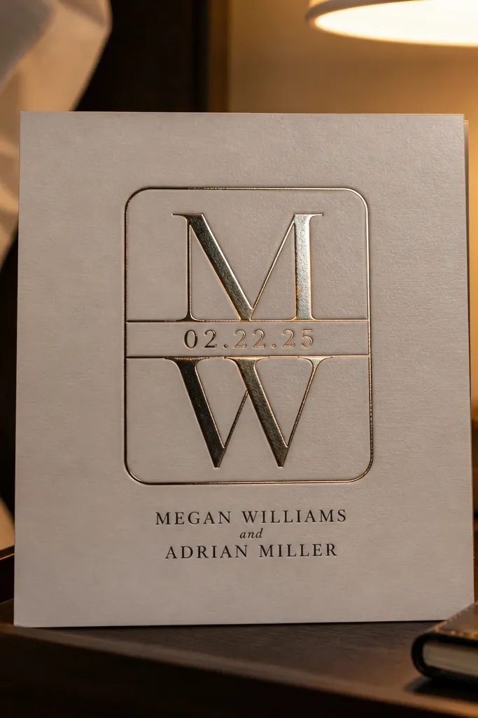
This layout looks expensive because it creates a single, obvious focal point. Put a large monogram centered in a rounded square, then add a horizontal date band across the middle or lower third. Choose a metallic ink or foil look for the monogram so it catches light when the card is turned. Keep the couple names either small under the band or tucked into the band itself, so the monogram stays the hero. It suits classic weddings, city venues, and people who want a clean front without a busy illustration.
Quick tipIf you’re using foil, keep the date band text thicker (avoid hairline strokes).
Start by designing a rounded square shape that takes up about 45-55% of the card width. Place the monogram in the center and keep it large enough to read from a few steps away. Then add a solid band across the date area at roughly 12-18% of the card height and set the date in all caps or small caps with strong letter spacing. Finally, keep the rest of the text to one line each: “Request the honor of your presence” and the venue line, both in a smaller sans-serif. For travel and printing, this works well on matte cream paper with dark ink and gold foil or gold-foil simulation.
Skip thisAvoid thin script monograms — they get noisy next to a bold date band.
2. Full-bleed Photo Window with Lower Text Overlay
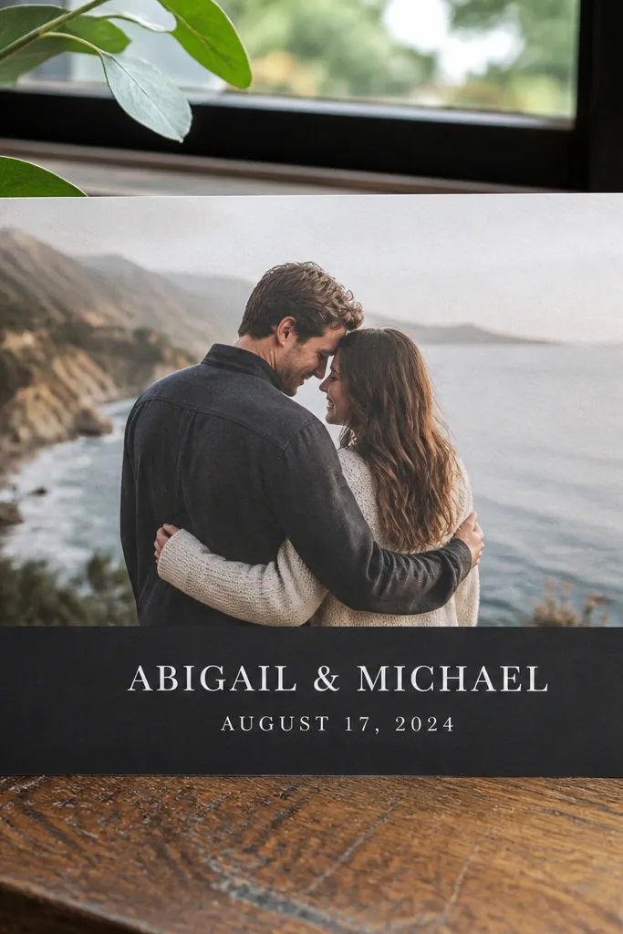
A photo window front-page invitation looks modern and personal because the image becomes the first thing people notice. The secret is the overlay: place a wide dark or light band behind the text so the typography stays crisp. Keep the text on the overlay only, not scattered on the photo — that’s what makes it look polished instead of accidental. Use the couple names large and centered on the overlay, then set the date in smaller type just below. This design fits destination weddings, engagement photos, and couples who want their card to feel like a printed keepsake.
Start by adding your photo so it touches the card edges (full-bleed), then crop it to keep faces centered or keep the background clean. Add a rectangle overlay across the lower third with opacity if needed, but keep the final contrast strong. Place the couple names centered in the overlay at the largest size on the card, then set the date line in a clean sans beneath. Keep the venue line to one short line and avoid extra statements on the front. Print-ready tip: export at 300 DPI and set a 3 mm bleed if your printer requires it.
Choose photos with darker backgrounds for easier white text on the overlay.
Don’t place text directly on busy areas like bright sky or patterned clothing.
3. Art Deco Frame Border with Names Centered
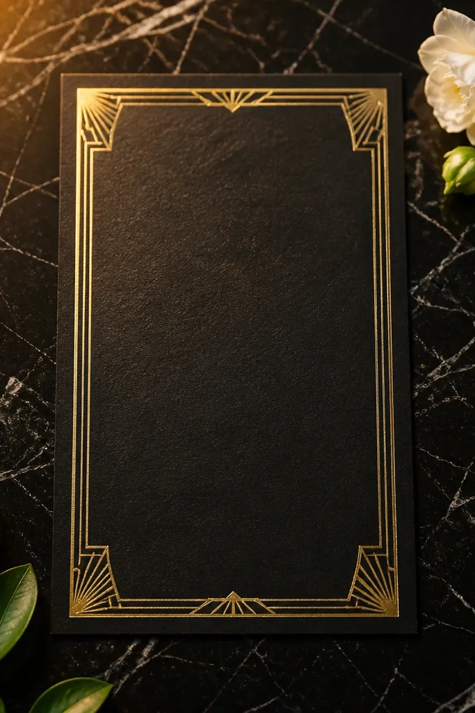
Art Deco borders make a card feel instantly designed because the geometry creates structure. Use a thin-to-medium deco frame around the edges and keep the center clean for the couple names. Set the names in a high-contrast serif or an art deco-inspired type so the letters match the border vibe. Add the date at the bottom center in a smaller all-caps sans. This one looks especially good for weddings in historic buildings, ballrooms, and venues with arches or marble.
Quick tipKeep the border line weight consistent; mixed weights look cheap fast.
Start by drawing or selecting an Art Deco border that leaves at least 12-16% padding from each edge. Place the couple names centered in the middle, using a font that has strong thick-and-thin strokes. Put the date on the lower center and keep it short — one line only. If you want a little extra, add a tiny monogram or a single divider star between name and date. For printing, use matte black ink with gold accents on off-white paper to keep the contrast elegant.
Skip thisSkip full-bleed patterns behind the names — the center needs breathing room.
4. Vertical Gallery Layout with Left Rule Line
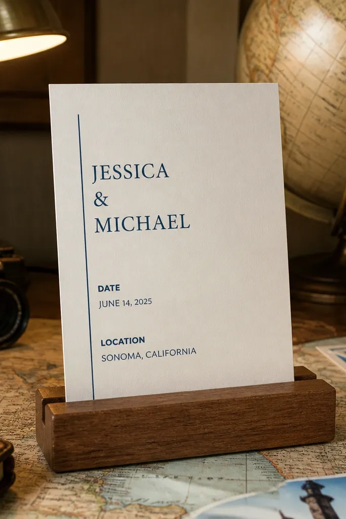
This layout is modern and photo-friendly because it creates a gallery-like column structure. The left vertical rule line acts like a guide, so the eye moves down the card in a clean sequence. Put the couple names in the upper half, then place date and location blocks below with consistent left alignment. Use a serif for names and a sans for event details so the typography feels intentional. It suits minimal weddings and couples who want something that reads well from a distance.
Quick tipUse one font pair max: serif for names and one sans for everything else.
Start by setting a left margin of about 10-14% of the card width and place a vertical rule line at that margin. Align all text to the left edge of the rule, keeping line breaks consistent. Set the couple names in the top third using a larger size, then add the date and venue as two separate blocks with clear spacing. Add a short line like “Reception to follow” only if it fits one line without shrinking everything else. Print it on thick cotton paper for best letter sharpness.
Skip thisDon’t center everything; the left rule only works when text is aligned.
5. Single-Line Typography Across the Top Third
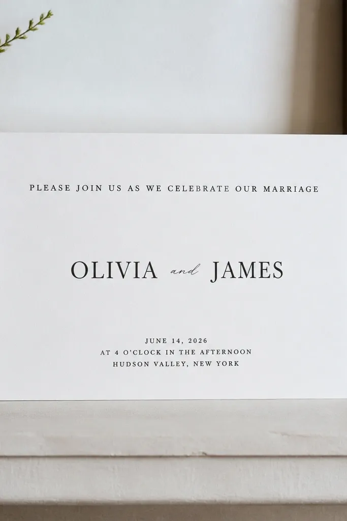
This is the “graphic design” card front: it looks sleek because it relies on spacing and typographic rhythm instead of illustrations. Put a single long line of copy across the top third — usually the request line — then let the couple names sit larger in the center. The date goes near the bottom as a compact block. Use wide letter spacing on the top line so it reads like a design element, not like body text. This is great for courthouse weddings, city halls, and couples who want understated luxury.
Quick tipTest the final export at actual print size; if the top line wraps, shorten the copy.
Start by writing your top copy and keeping it short enough to stay on one line at print scale. Place it across the top third, then increase letter spacing until the line feels airy. Put the couple names centered in the middle, using a bold serif or a clean display font. Add the date in a smaller sans near the bottom, centered, with enough margin that it doesn’t feel cramped. Keep the card background solid and avoid patterned textures.
Skip thisAvoid adding extra decorative elements — typography needs space to look premium.
6. Wreath Outline at Top with Names Under
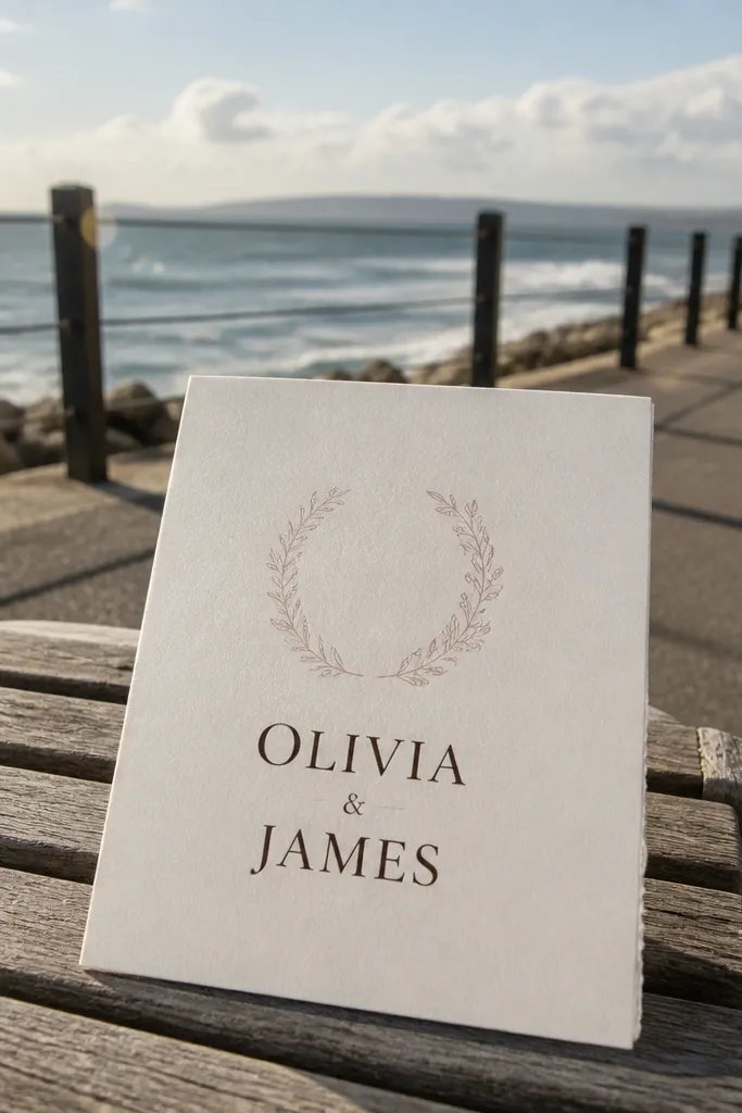
A thin-line wreath outline is photogenic because it frames the names without stealing attention. Keep the wreath small and positioned at the top center, then let the couple names take the main space below. Use a soft blush or sage accent color for the wreath line if you want it to feel modern, but keep the names in a darker ink for readability. Add the date in a neat line under the names. This style fits spring weddings, garden venues, and stationery that looks good in daylight photos.
Start by placing a wreath outline that spans about 35-45% of the card width. Keep the wreath line thin enough to look delicate but thick enough to print — aim around 0.5-0.7 pt equivalent in your design file. Position the couple names centered below the wreath with a larger serif size. Place the date on one line directly beneath, plus the venue line if it fits. Print on textured cotton paper if you want the wreath line to look crisp.
Choose one accent color max; two accents makes wreath designs look busy.
Skip heavy filled wreath graphics — they look muddy on small cards.
7. Curtain Fold Look with Centered Ribbon Band
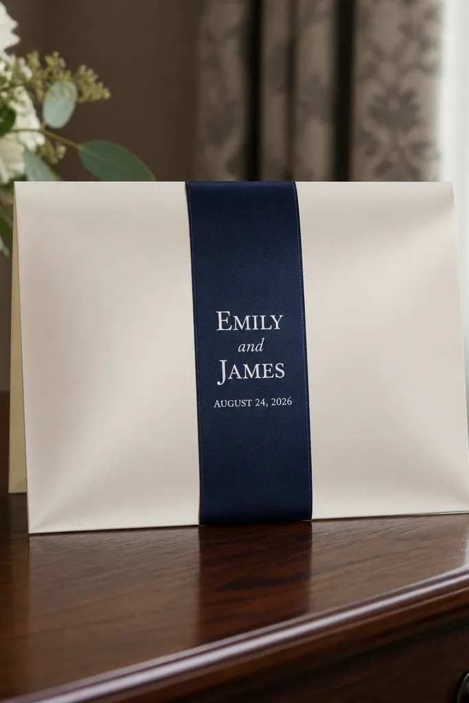
This layout mimics a classic invitation reveal: a vertical ribbon band divides the card visually and makes the names feel framed. Use a thin top and bottom “curtain” motif or a simple gradient shadow to suggest the fold, but keep it subtle. The ribbon band should run from near the top margin to near the bottom margin, with the names centered inside it. Add the date in a smaller line below the names, still inside the band. It’s a good match for formal weddings and winter ceremonies because the contrast feels classic.
Start by drawing a vertical band that covers about 40-50% of the card width and leaves equal side margins. Place the couple names centered inside the band and use a serif with solid stroke weight so it reads on print. Add the date under the names in a clean sans, also centered. If you want the curtain look, add a faint shadow gradient behind the band edges instead of a busy pattern. For printing, use black ink on cream and keep the band solid rather than textured.
Make the band edges crisp. Soft edges can blur in print and look off in photos.
Don’t add too many lines outside the ribbon — the center band already does the work.
8. Corner Monogram Stamp with Big Date
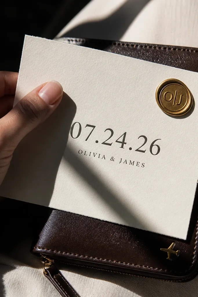
This front page works because the date becomes the hero — bold, readable, and easy to photograph. Put a small monogram stamp or seal in one corner, then center the date in large numerals. Keep the couple names smaller and placed underneath the date, or in a single line just above it. Choose a serif for the date numerals and a simple sans for the names to keep the hierarchy clean. It’s great for couples who want their wedding day to feel like an “event” rather than a paragraph.
Start by selecting a typeface for the date that has strong numeral shapes (think classic old-style serif). Place the date centered and large — it should take up about 25-35% of the card height. Add a small monogram seal in the top-left or bottom-right corner with a circular or rectangular outline. Put the couple names in one line beneath the date. Keep the remaining text to one short line, like city/venue, so the date stays dominant. Print on smooth matte paper for clean numeral edges.
If your date has “2026” or a long year, reduce font size slightly so it stays on one line.
Avoid pairing a detailed stamp with lots of extra icons — it becomes clutter fast.
9. Letterpress Typography Blocks with Soft Shadow
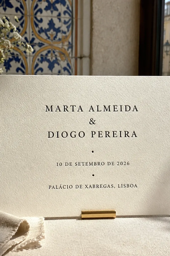
Letterpress-style typography blocks look stunning because the impression effect adds texture and depth. Build the front page with two or three solid text blocks: one for the couple names, one for the date, and one for the venue line. Keep everything aligned to a grid so the blocks feel structured. Use a darker ink that shows a soft shadow or impression edge. This style is best for fall and winter weddings because the muted tones photograph like vintage editorial.
Quick tipKeep block edges straight; rounded blocks make the letterpress look less intentional.
Start by setting a simple grid: one large block for names, one smaller block for date, and one for venue. Choose a font with strong forms and set the names larger than the rest by at least 2x. Add a subtle offset shadow or impression edge effect so the blocks look pressed, not flat. Keep the background solid and avoid patterns behind the blocks. For printing, request a letterpress or letterpress-simulated proof and confirm line thickness survives the press.
Skip thisSkip tiny type in the smallest block — letterpress hides fine details.
10. Watercolor Wash Background with Crisp Name Serif
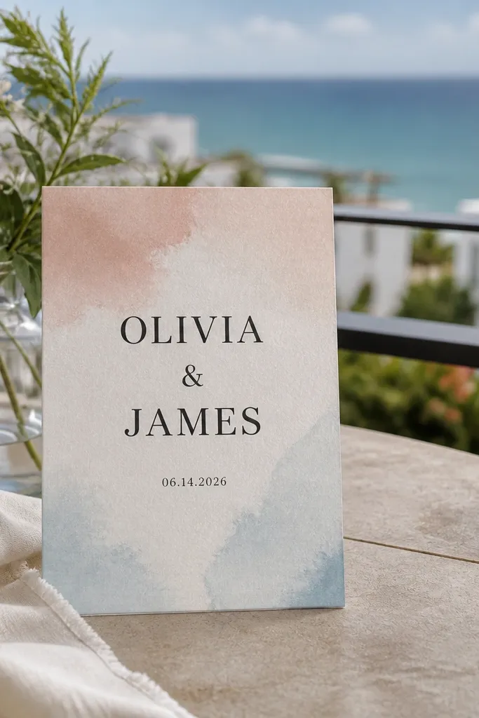
A watercolor wash background looks romantic and still clean when you keep the text crisp. The trick is to use a wash that stays light and smooth behind the names, then set the typography in a dark color with generous margins. Keep the names in a serif with a slightly larger size so the contrast doesn’t get lost in the paint texture. Put the date in a smaller sans below, aligned center. This works well for beach weddings, spring receptions, and destination cards where you want a soft, airy feel.
Quick tipUse a wash that is lighter in the exact text area; readability matters more than beauty.
Start by choosing a watercolor wash in a limited palette: one main color plus a faint neutral. Place the wash so it fades slightly toward the center where the names sit. Add a centered text column with wide side margins, then set the couple names in dark ink. Add the date below with a smaller sans and keep it to one line. Print on heavier paper so the wash doesn’t look too thin and so the text stays sharp.
Skip thisAvoid placing the names on the darkest part of the watercolor.
11. Foil-Accent Border with Minimal Center
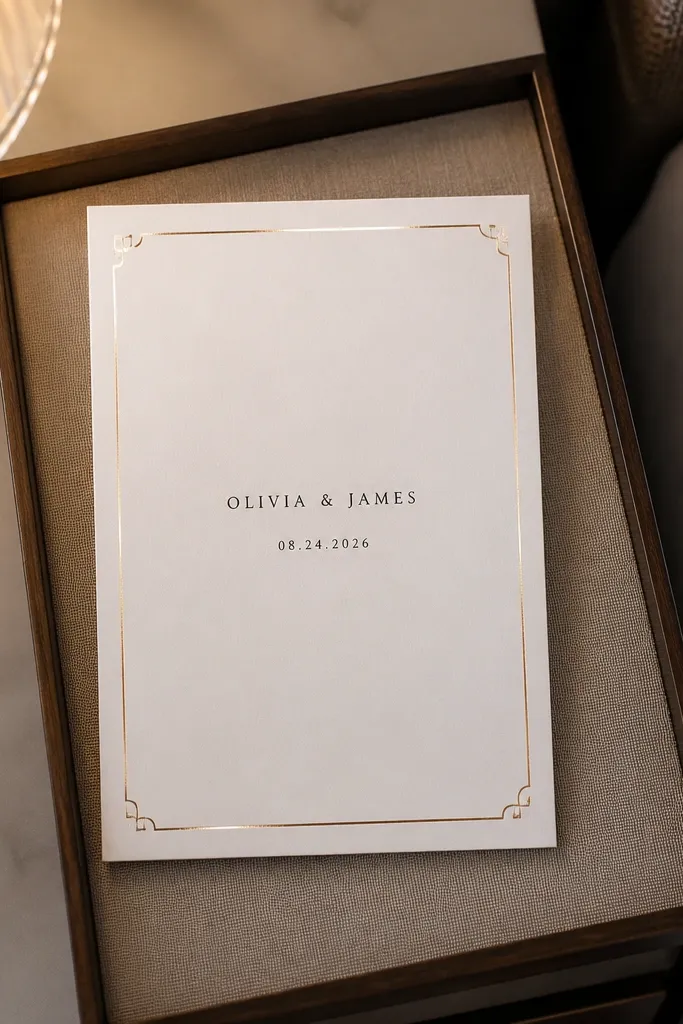
Minimal center layouts look high-end when the border is doing the heavy lifting. Use a thin foil-accent border around the edges and keep the center almost empty. Put the couple names centered and slightly above the vertical midpoint, then place the date in a single line below. The border catches light during handling, so the card looks luxurious even before someone reads it. This is a strong pick for couples who want modern elegance without illustrations.
Start by setting a border margin of 6-10 mm from the edges so it doesn’t get cut off. Use a thin line weight for the border and keep it consistent on all sides. Place the couple names centered in the middle and set the date below in a smaller font. Keep any extra line like “Saturday” or “Reception” off the front if it makes the typography feel crowded. Use matte paper with dark ink so the foil border looks intentional rather than flashy.
If your printer can’t do true foil, use a metallic ink simulation but keep the border line thicker than you would for foil.
Don’t add icons inside the border — the border already frames everything.
12. Staggered Date and Names with Asymmetric Spacing
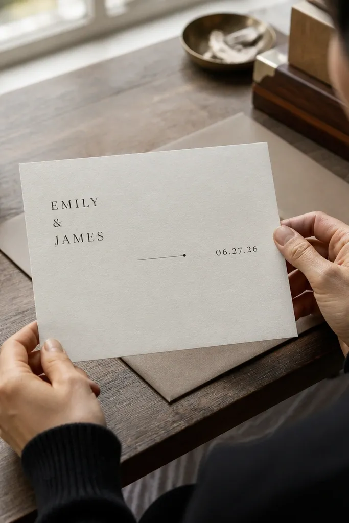
Asymmetry looks modern when it’s controlled. Instead of centering everything, put the couple names left-aligned in the upper half and the date right-aligned in the lower half. Add one small divider line or dot between the blocks so the layout feels connected. Use a serif for names and a clean sans for the date, with consistent line spacing. This design photographs well in flat lays because the eye has a clear path across the card.
Start by dividing the card into two zones: top and bottom. Place the couple names in the top-left area with a left margin of about 12-16% and keep the lines tight. Put the date in the bottom-right area with right alignment and similar margins. Add a small horizontal rule or a single icon mark near the center gap to visually “hold” the layout together. Keep the venue line on the same side as the date to prevent the card from feeling scattered.
Use one alignment style per zone (left in top, right in bottom) — mixing alignments makes it look accidental.
Avoid lots of different font sizes; asymmetry needs restraint.
13. Round Stamp Seal with Curved Text
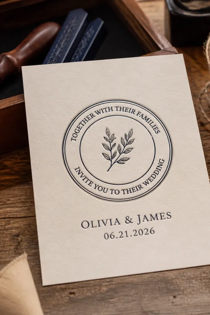
A round stamp seal makes your card front feel like an official invitation. The curved text around the seal gives it motion, while the straight couple names beneath keep it readable. Use a dark ink for the seal and either match it to the names or choose a metallic accent for the seal outline. Keep the curved text short: wedding year, city, or a short request line. This is a great match for rustic-chic weddings, vintage themes, and people who like stationery that looks like it came from a print shop.
Quick tipIf your tool struggles with curved text, reduce the font size and increase letter spacing slightly for clean arcs.
Start by creating a circle outline and placing curved text around it using your design tool’s “text on path” feature. Keep the curved text to one or two short phrases so it doesn’t turn into a blur. Place the couple names centered below the seal in a larger serif. Set the date beneath the names in a smaller sans. For printing, choose a paper that holds ink well and avoids heavy texture that can blur the seal edges.
Skip thisAvoid long curved sentences; they turn into illegible rings.
14. Diagonal Ribbon Banner with White Text
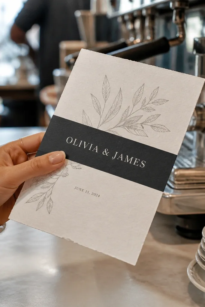
Diagonal banners feel energetic and modern, and they photograph well because they create a strong angle across the card. Use a dark banner across the center at a clear diagonal, then set the couple names in white or light ink. Keep the date smaller and placed below the banner, centered. This design works for weddings that want a clean, graphic look — think black-tie glam, city venues, and couples who love high contrast.
Quick tipUse a slight padding around the text inside the banner so letters don’t touch the banner edge in print.
Start by placing a diagonal rectangle that covers the middle third of the card. Set the banner color to a deep black, navy, or charcoal so white text stays crisp. Place the couple names centered on the banner and choose a bold serif or clean display font. Add the date below in a smaller sans, centered with enough margin so it doesn’t feel squeezed. Print on smooth matte stock to keep the diagonal edge clean.
Skip thisSkip gradients on the banner; gradients often band and look messy at small sizes.
15. Two-Column Grid with Venue Left and Names Right
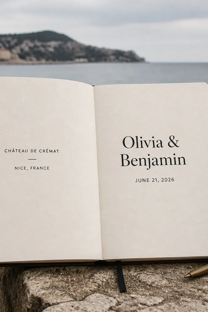
A two-column grid gives your invitation front a “magazine spread” feel without needing illustrations. Put the venue and city on the left column in smaller text, then put the couple names bigger on the right. Add the date under the names in the right column so the hierarchy is clear. This layout is readable and looks sharp even when someone takes a quick photo in mixed lighting. It fits travel weddings because the location line gets the attention it deserves.
Quick tipShorten the venue name on the front if it runs long — move full address to the back or insert.
Start by creating a vertical grid line that divides the card into two columns with about a 35/65 split. Place the venue and city in the left column, using a smaller sans and tight line spacing. Put the couple names in the right column with a larger serif and a little extra line spacing for breath. Add the date under the names in the right column. Keep all text left-aligned within each column for a crisp look.
Skip thisAvoid stacking multiple venue lines in both columns; it breaks the grid.
16. Classic Centered Serif with Two Thin Dividers
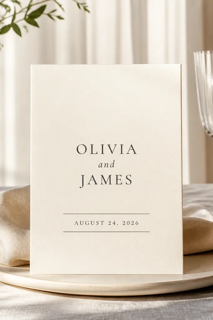
This is the “clean and timeless” front that looks good because it’s controlled. Use a centered serif for the couple names, then place two thin divider lines above and below the date block. Keep the date in a smaller size but with clear letter spacing so it remains legible. The background stays plain, and the dividers add just enough structure to look designed. It’s a safe pick for nearly any wedding style, especially if you want your invitation to feel formal and easy to read.
Quick tipUse divider lines that are thick enough to survive printing — aim for a minimum of 0.5 pt equivalent.
Start by setting the couple names centered in the middle of the card with generous line spacing. Add the first thin divider line above the date and the second below it, keeping both lines the same length. Place the date between the dividers in a small caps or all-caps sans. If you include the venue, put it under the second divider as one short line. Use a paper with a smooth surface so divider lines print cleanly.
Skip thisAvoid decorative fonts for names on this layout; the dividers already create the “ornament.”
17. Top Crest Icon with Names in a Tight Stack
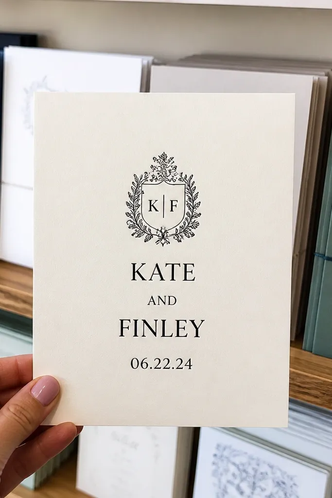
A top crest icon adds personality without cluttering the center. Keep the crest small and monochrome, then stack the couple names tightly in the middle with consistent baseline alignment. The date goes directly under the names as a single line. This design is great for couples who want a traditional feel but still want modern typography and clean spacing. It’s also a good option when you don’t have a photo you want to use.
Quick tipChoose a crest icon that matches your venue vibe — churchy crests and art deco crests don’t mix well.
Start by placing a simple crest icon at the top center with width about 20-25% of the card. Then stack the couple names in the center with one line per name, keeping the spacing tight but not touching. Add the date beneath as one line in a sans-serif with a slightly smaller size. Include the venue line only if it fits one line; otherwise move it to the inside card. Print on a paper that holds crisp edges for the crest.
Skip thisSkip multiple icons; one crest is enough.
18. Photo + Script Overlay with Transparent Band
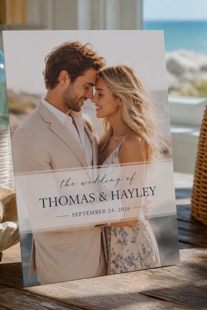
This front page blends personal photo energy with readable typography. Place the couple photo as the background, then add a semi-transparent band across the center so the script and serif names stand out. Use dark ink for the script if the band is light, or white ink if the band is dark. Keep the band height enough for comfortable line spacing. It works for spring and summer weddings where you want something soft and story-like while still looking clean.
Start by placing the photo full-bleed and choose a crop that leaves open negative space behind where the text will sit. Add a semi-transparent rectangle band across the center and adjust opacity until the text is readable. Put the couple names in a script or elegant serif centered on the band, then add the date in a smaller sans below the band. Keep the rest of the text off the front so the photo doesn’t compete with typography. For print, request a proof because transparency can shift on paper.
If the text looks faint in your mockup, increase contrast with a darker band instead of changing fonts.
Don’t rely on thin script over low-contrast photos — it disappears in print.
19. Beach Glass Border with Centered Crest and Raised Date
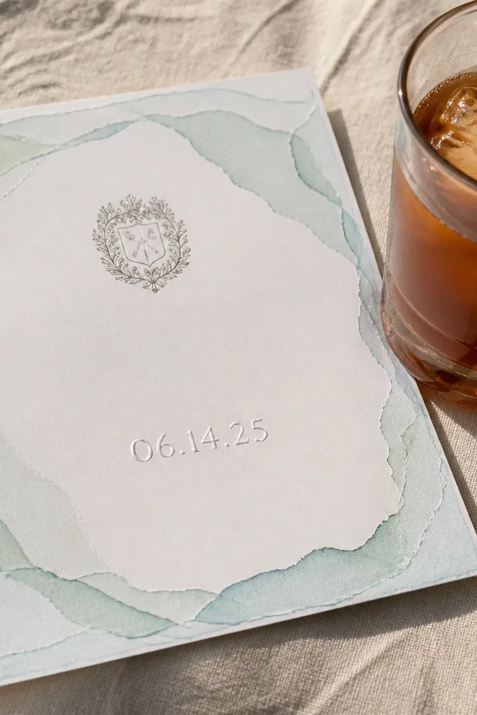
This design feels like a coastal keepsake because the border looks like layered beach glass — pale mint, seafoam, and cloudy aqua — with soft, uneven edges. The center has a tiny crest icon above the names, then the date sits in a slightly raised style so it catches light the way real glass does. It works best for couples getting married near the water, or anyone who wants their invitation to look airy and sun-warmed instead of formal and heavy. The vibe fits a beach town weekend, a boardwalk ceremony, or a cliffside dinner when the light is bright and golden. It suits guests who like clean layouts with one clear focal point, not busy illustrations.
Quick tipIf you’re choosing a coastal venue, pick one with parking or a nearby drop-off — beach towns punish last-minute logistics.
Pick a border palette that stays within three tones: seafoam, pale aqua, and one cloudy gray for contrast. Put the names in a classic serif centered under the crest, then set the date in a raised ink style or a thicker type weight so it reads from across the table. For the travel part, choose a coastal base within 30-45 minutes of your ceremony spot so you are not commuting on a tight timeline. Book your venue and lodging early for spring and early fall, then aim for late morning photos since the light is less harsh than midday. A realistic budget for a short coast trip is $250-$450 per night for a decent room in popular areas, plus $50-$120 for local transport, and 2-3 nights is enough to do both the ceremony area and one scenic meal nearby.
Skip thisSkip a busy multi-color border. Too many shades make the invitation look cheap instead of like real sea glass.
20. City Night Skyline Strip with Names in a Neon-Look Band
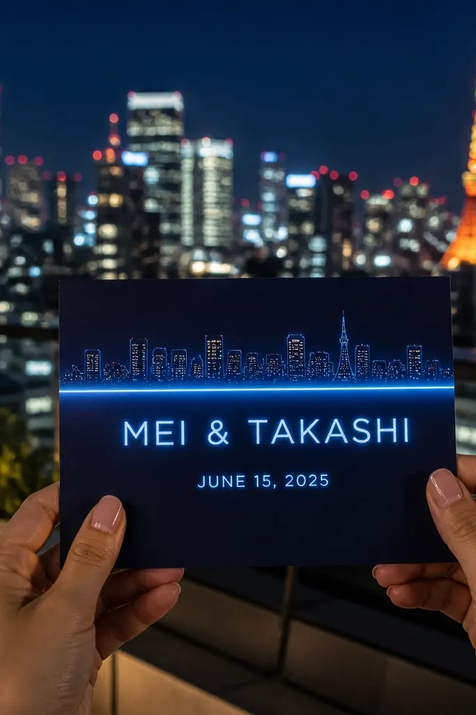
This front page looks like a postcard from a night out. A thin skyline strip runs across the top in deep navy and charcoal, then a neon-look band in hot pink or electric cyan holds the names — clean enough to read, bold enough to photograph. Add the date in smaller type inside the band so the whole design stays balanced, not crowded. It is a strong fit for city weddings, rooftop receptions, and waterfront neighborhoods where the atmosphere is more electric than formal. It also works well for couples who want their invitation to feel modern and graphic without turning it into a cartoon.
Quick tipPick one primary color for the neon band and repeat it in your RSVP card or envelope liner. Matching color beats matching theme every time.
Choose a skyline style that is simple and flat — think silhouettes, not detailed building windows — so the names remain the main focus. Set the neon band as a single horizontal rectangle and keep the names in a high-contrast font color that matches the band glow. For your trip, base yourself in the neighborhood where you want photos, then walk or use one predictable transit option so you do not waste time zigzagging across town. Book hotels 2-4 months ahead for peak weekends, and consider a weekday stay if your dates are flexible to cut rates. Plan 3-4 nights if you want a rehearsal dinner plus two photo spots; budget around $300-$650 per night depending on the city, plus $15-$30 per day for transit or rideshare. If the wedding is in a major downtown area, confirm elevator access and loading rules for any delivery day so you do not get stuck.
Skip thisAvoid tiny skyline details under the neon band. If the skyline competes with the names, the whole front page stops reading instantly.



