
1. Champagne Foil Monogram in an Oval Frame
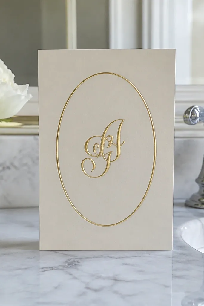
This cover type looks expensive because it combines one high-value material (champagne foil) with a simple, flattering shape (an oval). The monogram should be the hero — bigger than you think — and the oval frame should be thin enough to feel airy, not heavy. It suits classic weddings, winter weddings, and any invite suite where you want a timeless tone without adding photos. For photos, foil catches light in a way that matte inks never do, so your cover reads premium even when lighting is imperfect.
Start with a 5x7 cover and place the oval so it sits about 12 mm up from the bottom edge. Choose a monogram font with thick-and-thin contrast, then foil only the monogram and the oval outline. Finally, keep the rest blank or add one small line under the oval (names or wedding date) in a dark brown ink using a clean serif or a quiet small-caps style.
Quick tipIf you’re ordering foil, ask the printer to use a foil die that includes the oval border — it looks sharper than foil applied to separate pieces.
Skip thisDon’t add corner flourishes; the oval already gives the ornament without clutter.
2. Black Ink Arch with Gold Corner Dots
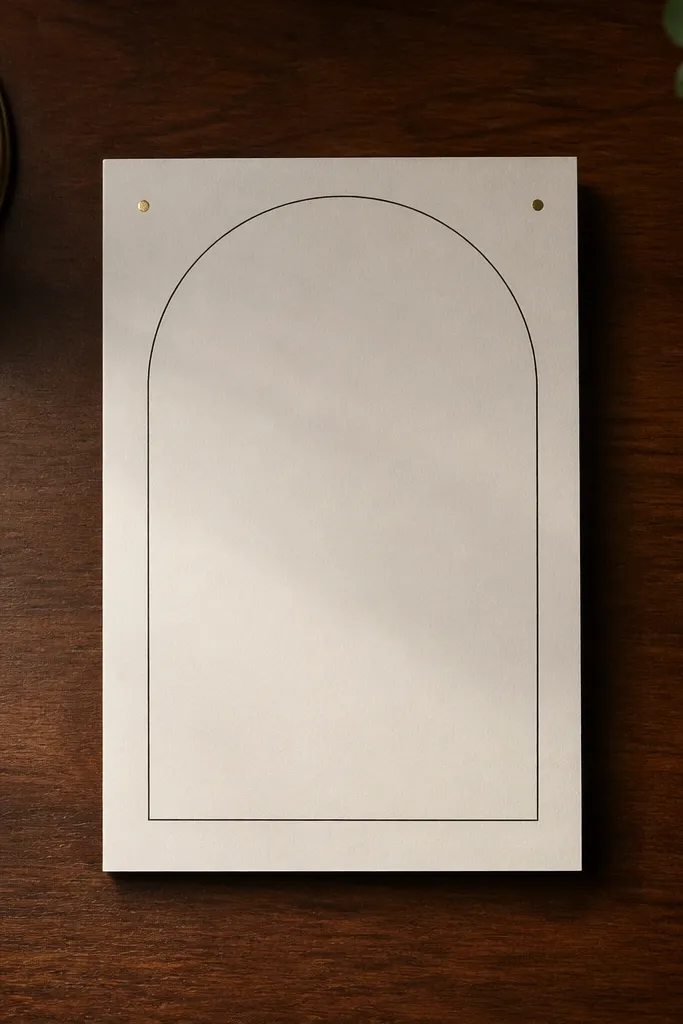
An arch frame makes the cover feel structured and elegant because it naturally guides the eye to the center. Keep the arch line thin and black, then add two tiny gold dots in the top corners to create a subtle luxe signal. This design works especially well for beach-to-city weddings where you want “formal but modern” rather than overly romantic. In daylight photos, the black line reads crisp and the gold dots add just enough sparkle to feel intentional.
Start by drawing (or choosing) an arch line that leaves a 15-18 mm gap between the arch peak and the top edge. Place the couple names centered under the arch with a serif font, tracking slightly wider than normal. Then add two gold foil dots at the top corners, 8-10 mm from the edge, and stop there — no extra icons.
Use gold foil dots at the corners, not a full border — it’s cheaper and still looks high-end.
Avoid thick arch lines; heavy strokes make the cover look like a generic template.
3. Full Bleed Photo with a Soft White Type Band
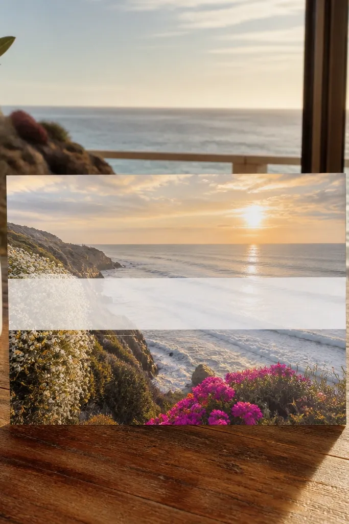
Full-bleed photos look expensive when the typography has a deliberate background band. The photo gives emotion, and the soft white band gives readability plus a clean, designer feel. This works for couples who want the invite to feel personal without turning the cover into a collage. It also photographs well because the band creates contrast and prevents the text from getting lost in busy areas of the image.
Start with a photo that has negative space near the center (sky, wall, or blurred background). Add a semi-opaque white band across the middle — around 35-45% opacity — leaving 10-12 mm padding above and below the band. Finally, set the names in a high-contrast serif or a refined modern serif, centered on the band, and keep the rest of the cover clean.
Quick tipCrop the photo so the band sits over the cleanest part, not the darkest part — it keeps the text crisp.
Skip thisDon’t place text directly on the darkest pixels; you’ll lose the premium look fast.
4. Pressed Flower Silhouette with Tiny Date Script
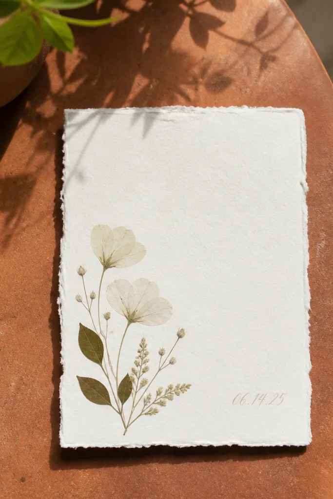
Pressed-flower silhouette covers look elegant because the artwork is restrained and the texture feels tactile, even in a photo. Use a single flower silhouette in a corner — small enough to feel curated, not scrapbook-y. Pair it with tiny date text in an airy script or light calligraphic style. This suits garden weddings, fall weddings, and anyone who wants soft romance without going full illustrated cartoon.
Start by choosing one flower silhouette (olive branch, eucalyptus, or a single wildflower) and place it 20-25 mm from the left edge and 25-30 mm from the bottom. Add the couple names centered in a neutral serif, then put the wedding date in tiny script 10-12 mm above the bottom edge. Finally, print the flower silhouette in a muted sage or warm gray ink so it looks like it’s been pressed, not colored in.
Quick tipTry sage ink instead of green — it reads more “stationery” and less “wedding clipart.”
Skip thisAvoid multiple flowers; one silhouette beats a scattered bunch.
5. Monogram Band Wrap with Thin Side Rules
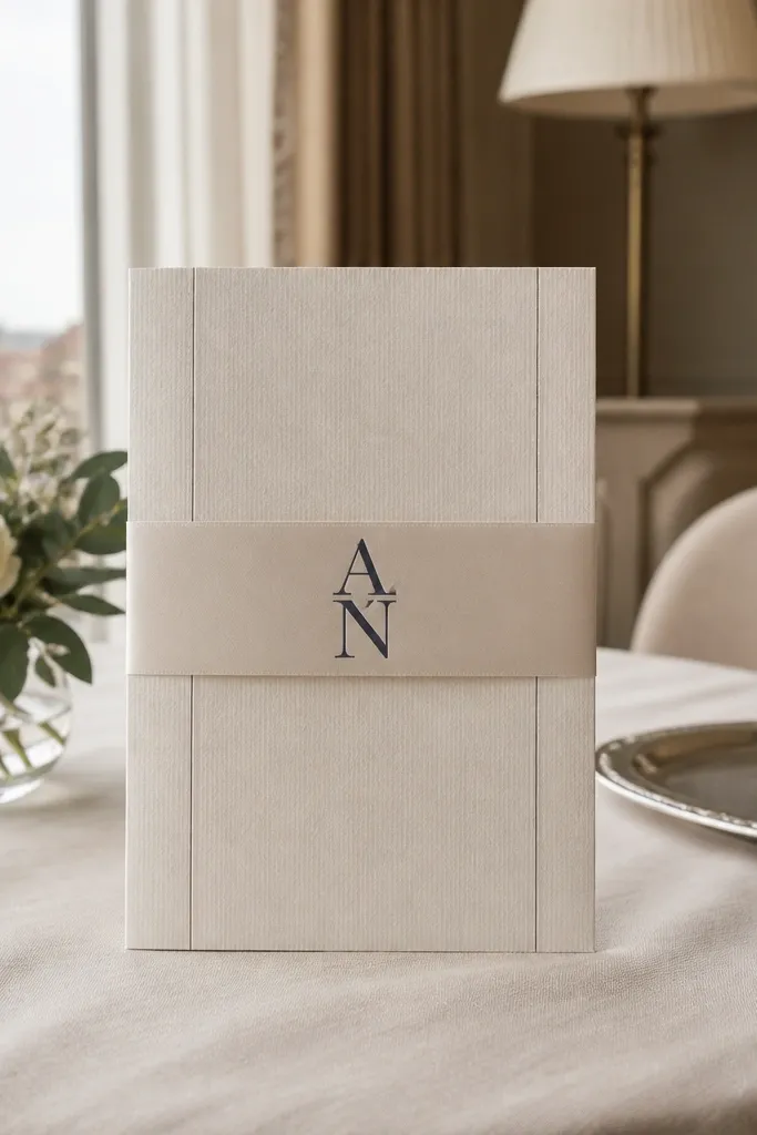
This cover looks expensive because it uses a band to create a designer grid. The monogram stays centered, while thin side rules frame it like a magazine layout. It works great for modern weddings and for couples who want clean typography without ornaments. In photos, the band creates a strong contrast zone, so your cover reads “designed” even if the rest of the stationery is simple.
Start by adding a horizontal band across the middle of the cover, about 38-45 mm tall on a 5x7. Put the monogram centered in the band, in a font with strong vertical strokes. Add two thin rules on the left and right edges of the band, 1-2 mm thick, and keep the names/date below the band in small caps. Finally, align everything to a single center axis.
Use band color that matches your wedding theme fabric (dusty blue, warm blush, or deep charcoal) instead of a random bright shade.
Don’t rotate the monogram or use more than two weights; it starts to look like a flyer.
6. Letterpress Script Names with Deckled Edge Mock
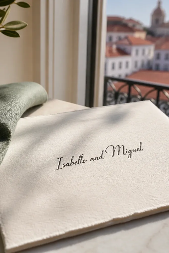
Letterpress-style script names look expensive because the impression creates subtle shadows that feel handmade. The key is restraint: one line of names, centered, with a lot of paper showing around it. Add a deckled edge on the mock (or choose a deckle paper) to raise the tactile feel. This is perfect for intimate ceremonies, weekday weddings, and couples who want an understated cover that still looks beautiful in close-ups.
Start with a cream cover paper and choose letterpress ink in a warm gray or deep brown. Set the couple names in one script line, centered, with the first line about 85-95 mm from the top edge on a 5x7. Add the date in tiny small caps under the names, then leave the corners blank. If you can, choose a deckle-edged option for the cover so the border feels intentional.
Quick tipLetterpress reads best when your design is simple — fewer elements mean the impression has room to show.
Skip thisAvoid adding borders; letterpress borders often look muddy in print.
7. Gold Leaf Type Only with Matte Black Border Line
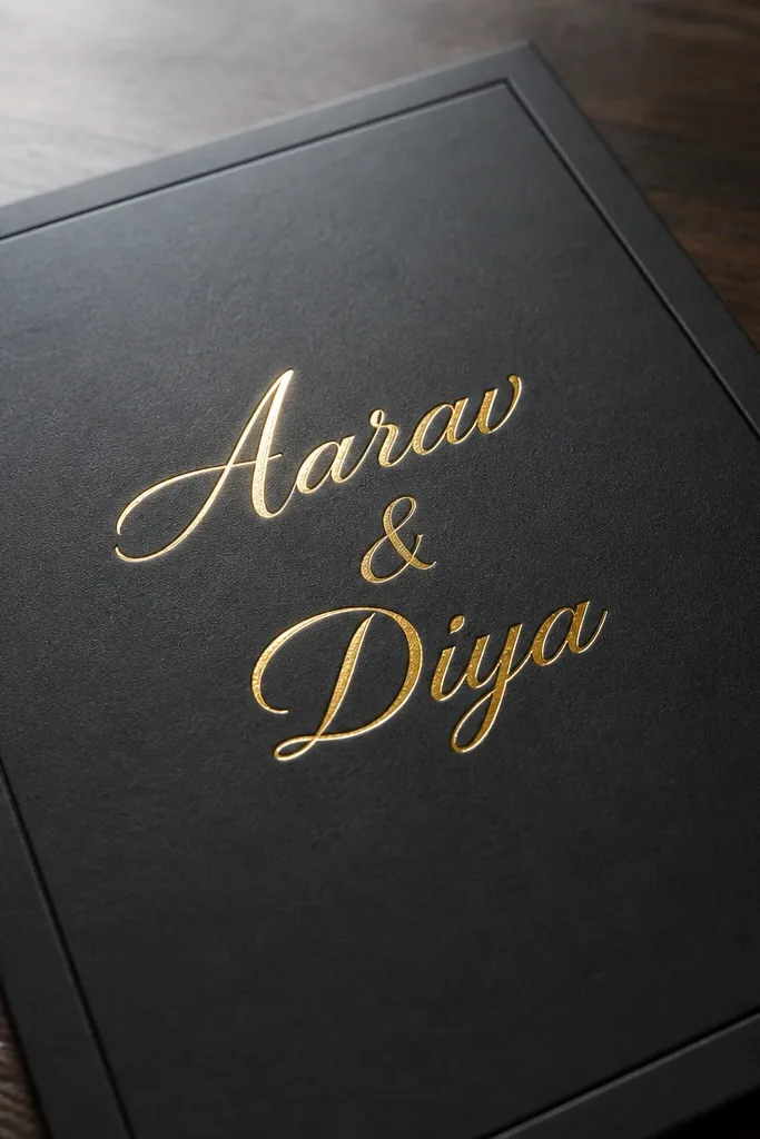
Type-only covers look expensive when the contrast is controlled. Use gold leaf or gold foil for the names and keep the rest strictly typography, then add a single matte black border line around the edge. The black line frames everything and stops the gold from floating. This works for modern glam weddings, New York-style black-tie, and couples who want a clean, graphic look without illustrations.
Start by setting a thin black border line 6-8 mm inside the card edge. Place the names centered between the border lines in gold foil, using a serif with clean terminals. Add the date in black ink beneath, with small caps and tight line spacing. Keep the cover text limited to three lines max so the gold stays the visual headline.
Ask for gold foil on the largest text only; foil on small details drives cost without adding legibility.
Don’t add icons or monograms; the gold type plus border is already the design.
8. Two-Column Typography with a Tiny Flower Separator
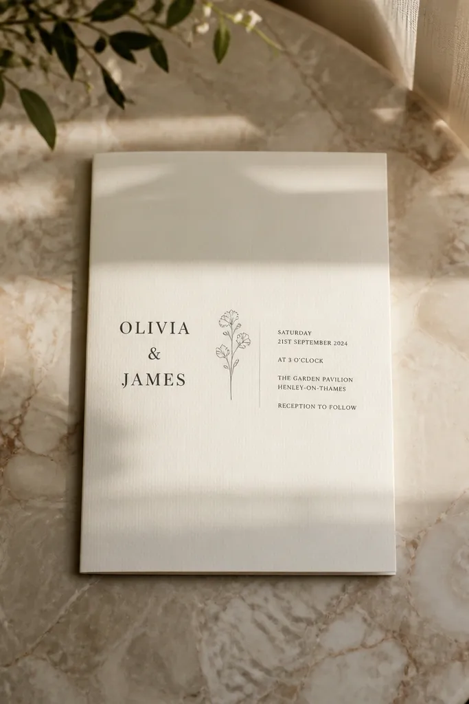
Two-column layouts feel expensive because they look like editorial design, not wedding templates. The trick is keeping the columns narrow and using one tiny separator motif for personality. Put names on the left, wedding details on the right, then add a tiny line-art flower between sections. This is great for couples who want information visible on the cover without turning it into a full information card.
Start by creating two columns with a gap of about 10 mm in the center. Put the couple names in the left column, larger than the right text. Add the wedding date and location snippet on the right in smaller type, using a consistent line height. Insert a tiny flower separator icon (single-line art) between the name block and the date block, centered across the columns.
Quick tipUse one icon only, and keep it line-art thin (under 1.5 pt) for a premium look.
Skip thisDon’t use three different font styles; two fonts plus one icon is enough.
9. Deep Teal Border with Blush Script Center Name
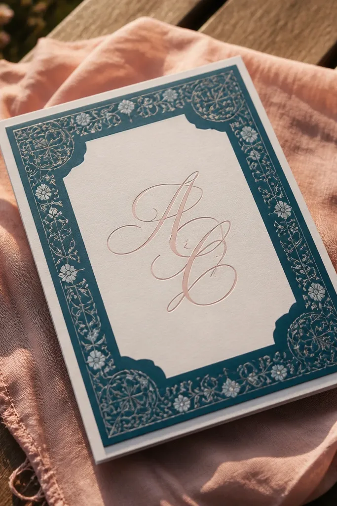
Color-block borders can look very luxe when the palette is disciplined. A deep teal border creates authority, while blush script makes it romantic. This cover is ideal for bridesmaids-brides or modern romantic themes where you want color but not glitter. In photos, teal reads rich and blush reads soft, so the center name pops without needing photos or extra graphics.
Start with a white or ivory cover and draw a border that sits 8-10 mm from the edge on all sides. Use deep teal ink for the border, then center the couple names in blush script with a tall ascender so it feels elegant. Add the date in a simple sans serif under the names, keeping it one size smaller than you think. Finally, leave the corners empty so the border stays crisp.
Test blush ink on your printer — some blush shades look gray; you want warm, not dusty.
Skip gradients; they make borders look cheap on home-printed invites.
10. Pearl-White Background with Shadowed Monogram Frame
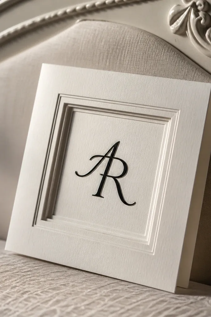
Shadowed monogram frames look expensive because they add depth without using glitter or heavy texture. Use a pearl-white background and a monogram in dark ink, then add a subtle shadow effect behind the monogram frame. The cover feels layered and premium, especially in angled photos. This works well when you want a modern look with a little softness — not farmhouse, not too formal.
Start with pearl-white paper and choose a dark ink for the monogram (charcoal or espresso). Add a thin frame around the monogram and apply a very soft shadow offset by about 1-2 mm. Center the names in the monogram space, then put the date below in small caps. Keep the rest blank so the depth effect is the focal point.
If your printer can’t do real shadow, use a second ink layer in a slightly different shade to mimic depth.
Avoid strong shadows; harsh shadows look like a design app filter.
11. Watercolor Wash Corner with Black Date Type
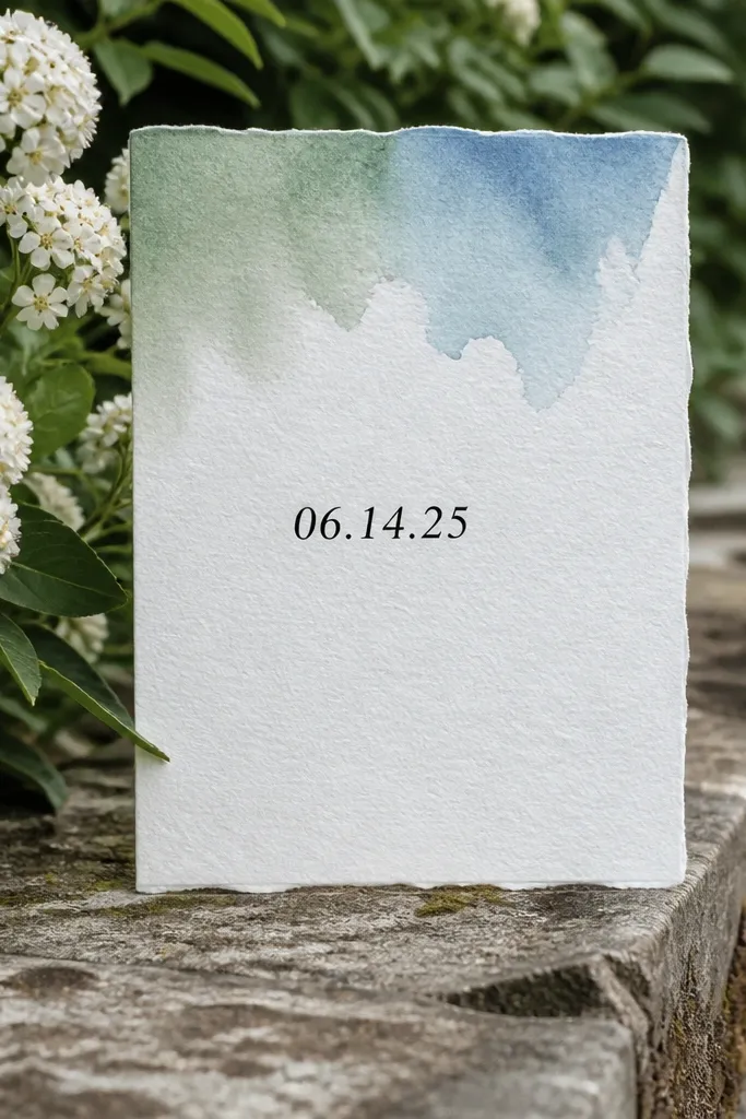
A watercolor wash corner looks aesthetic because it creates color movement while keeping most of the card clean. Keep the wash limited to one corner so it doesn’t compete with the typography. Pair it with black date type for sharp readability. This design suits spring and summer weddings, and it also works for couples who want color without using photos. In bright daylight, the wash looks airy and the black text looks crisp.
Start by placing the watercolor wash in the top right corner, leaving at least 25 mm clear space from the center. Choose a muted wash color like dusty rose, sage, or periwinkle — not neon. Add the couple names centered in black serif, then put the wedding date at the bottom in a simple sans serif. Finally, add a thin black line above the date, about 30 mm long, to tighten the layout.
Use watercolor that looks dry-brushed, not fully saturated blobs; dry-brush reads more like stationery.
Avoid full-card watercolor; it makes the cover feel like a poster.
12. Botanical Border Line Art with One Foil Name
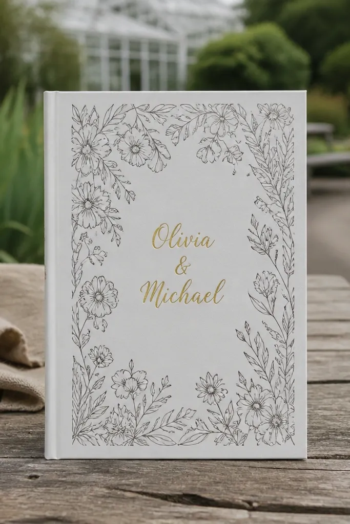
Botanical borders look expensive when the line art is thin and the foil is limited to the couple name. This cover gives you romance without turning the whole thing into a busy illustration. The border frames the card like a print, and the foil draws attention to the names. This works for garden weddings, woodland themes, and spring ceremonies where you want nature cues but still want a clean, modern layout.
Start by choosing a botanical line-art border with small leaves, not big flowers. Place the border 8-10 mm from the edge, then keep the center mostly blank. Set the couple names in gold foil, centered, using a serif with high contrast. Add the date in small black text underneath, aligned to the center axis.
Ask the printer to keep the border lines under a specific thickness (around 1 pt) so they don’t fill in during printing.
Don’t foil the border too; mixed foil coverage can look messy.
13. Geometric Frame Grid with Centered Date Only
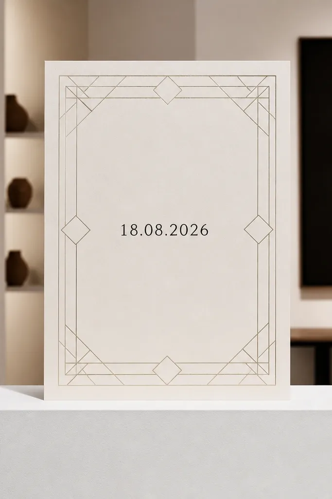
This one is for couples who want a graphic, high-fashion look. The cover uses a geometric frame grid but keeps the text minimal: only the wedding date in the center. Minimal text looks expensive when the alignment is perfect and the grid lines are consistent. It also photographs well because the design has strong shapes and a single focal line. This is a strong choice for modern venues, city weddings, and couples who don’t want their names front-and-center.
Start by building a grid frame using thin lines at 1-1.5 pt, leaving a clear inner margin of about 18-22 mm. Put the date centered in the middle using a clean modern serif or a high-legible sans serif with wide tracking. Add no other text, or add the couple names on the inside panel only. Keep the grid symmetrical so it looks intentional, not decorative.
Use numerals with consistent style (all-lowercase month or all-caps month) so the date block looks designed.
Avoid mixing line styles (dashed + solid) — it breaks the premium, controlled look.
14. Pearl Monogram Topper with Tiny Star Accents
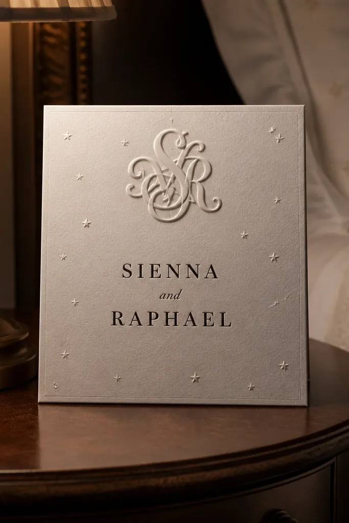
This cover feels expensive because the decoration is small, high-contrast, and placed with intent. A tiny monogram topper at the top gives identity, while star accents add a little magic without turning it into a theme. Keep the main names centered and simple. This suits evening weddings, winter weddings, and couples who want a “soft glam” look. In photos, the small details show up when the card is held at an angle, making it feel curated.
Start with a cream or ivory background and place a small monogram near the top center, about 18-22 mm from the top edge. Add two or three tiny star accents around it, no larger than the monogram height. Center the couple names below in a serif, then place the date underneath in small caps. Keep all text aligned to the center axis and leave the corners empty.
If you can, print stars in silver ink or use a subtle foil — tiny sparkle reads luxe better than glittery borders.
Don’t use lots of stars; three accents max keeps it classy.
15. Matte Black Cover with White Foil Script Names
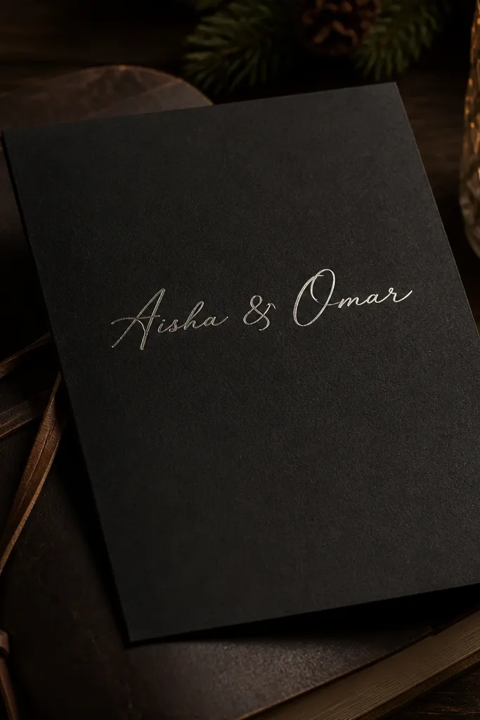
Matte black invites look expensive because the background is already dramatic. White foil script gives you that high-contrast, editorial feel, and it reads clearly in low indoor lighting. This is a great choice for winter weddings, modern receptions, and venues with dark wood or black-and-white decor. The cover also handles photography well because the foil reflects light sharply and the black background hides messy fingerprints compared to lighter colors.
Start by choosing a matte black paper stock (not glossy). Place the couple names centered in white foil script, with the baseline about 105 mm from the top edge on a 5x7. Add the date below in a thin white sans serif or small caps. Keep the rest blank — no borders, no extra icons. If you want a border, use a single thin line only.
Order a sample in the exact paper — matte black stocks vary, and some show a green cast under lights.
Avoid adding colored foil; white foil keeps the look sharp.
16. Soft Gray Photo Frame with Rounded Corners
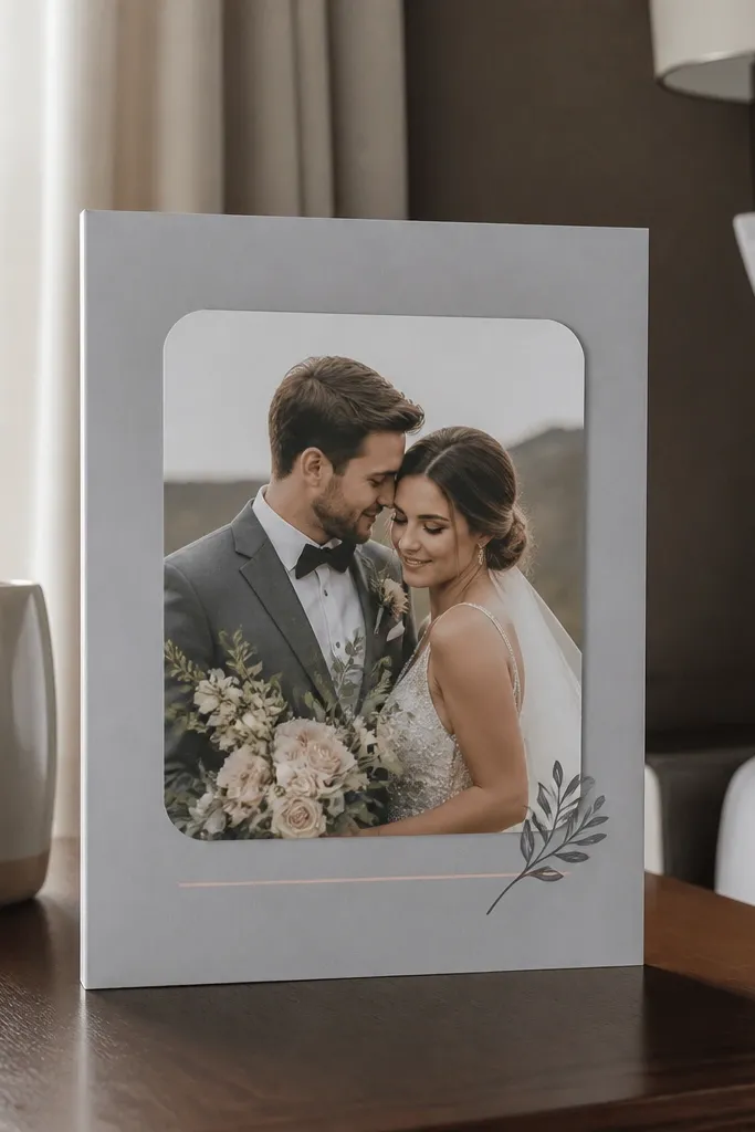
A soft gray base makes photo elements feel calm and intentional. Use a rounded-corner photo frame so the card looks modern and gentle at the same time. Keep the frame and text in the same palette: gray frame, dark gray text, and one subtle accent color if needed (like muted blush). This cover works for couples who want a photo but don’t want it to dominate. It also makes skin tones and florals look cleaner in photos.
Start with a soft gray cover, then add a photo frame centered with rounded corners (radius around 10-12 mm). Place the couple names below the frame in dark gray serif, centered. Add the date in a smaller sans serif, also centered. Finally, keep the photo crop consistent — aim for a portrait with soft background or blurred edges so the card doesn’t look busy.
Use rounded corners consistently across the suite so the invitation feels like one system, not random parts.
Don’t use a frame with sharp corners; it clashes with the soft gray mood.
17. Two-Line Crest with Thin Gold Outline
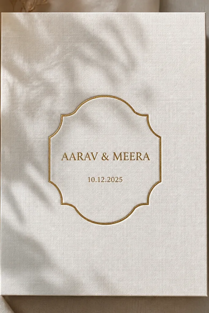
Crests can look cheap when they’re overly detailed. This one stays expensive by using a simple crest shape with a thin gold outline and only two lines of text inside. The couple names can go in the center, with the wedding date in a smaller second line. It’s a good option for traditional families who still want a modern print feel. In photos, the thin gold outline gives a premium edge without turning into a heavy emblem.
Start with a crest outline that is mostly geometric — shield or semi-circle — and keep line thickness around 1-1.5 pt. Place the crest centered on the cover, leaving 15 mm clearance around it. Put the couple names inside in gold foil, then add the date in dark ink beneath the crest. Keep the rest of the cover blank so the crest reads crisp.
Quick tipThin gold outline looks best when the crest is large enough to see — don’t make it tiny.
Skip thisAvoid complex illustrated crests; they blur at small sizes.
18. Corner Ribbon Banner with Oversized Date
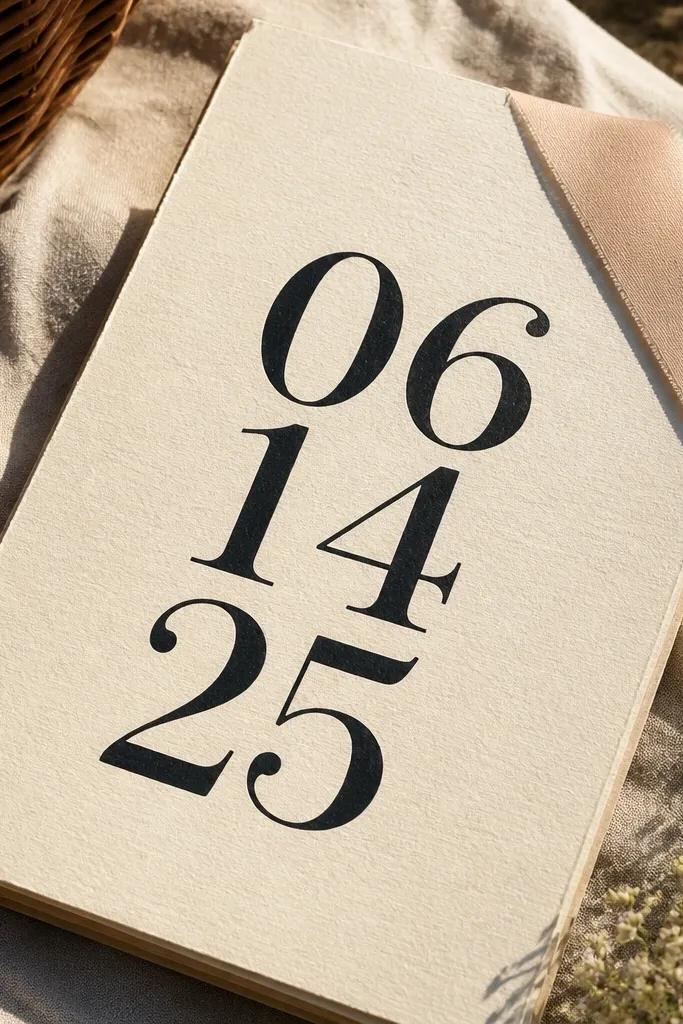
Oversized date typography looks bold and expensive when you pair it with a simple corner accent. The corner ribbon banner adds personality but stays small, so the date stays the hero. This cover is great for couples who want the date to feel like a headline on the stationery. It also works well for couples who have a shorter name line; the date fills the visual space without clutter.
Start by placing a small ribbon banner in the bottom left corner, about 45-55 mm wide on a 5x7. Use a solid color ribbon in muted tones like deep burgundy or dusty navy. Then set the date in large type centered, with the month in a smaller weight. Finally, add the couple names in small caps above the date, keeping it to one line if possible.
Quick tipChoose a date font with strong numerals; the numbers are what people notice first.
Skip thisDon’t add extra lines or venue text on the front; the oversized date needs breathing room.
19. Cream Paper with Single-Line Border and Name in Small Caps
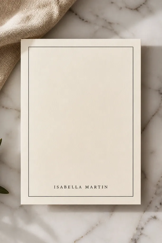
This is the clean, expensive look that comes from typography discipline. A single-line border gives structure without decoration overload, and small caps make the names feel formal. It’s a strong choice for couples who want the invitation to read “editorial” and not overly romantic. In photos, the thin border and crisp type create a sharp silhouette that looks premium even without foil.
Start by using cream paper and drawing a single-line border 10-12 mm from the edge. Center the couple names in small caps, using a serif family with consistent letter shapes. Add the date underneath in the same font but smaller, keeping line spacing tight. Leave the corners empty and keep the border unbroken — no ornaments.
Quick tipIf you want more luxe without foil, increase contrast: use deep espresso ink instead of dark gray.
Skip thisAvoid double borders; two lines make many designs look like formal stationery from a template.
20. Monogram Corner Cluster with Negative Space Center
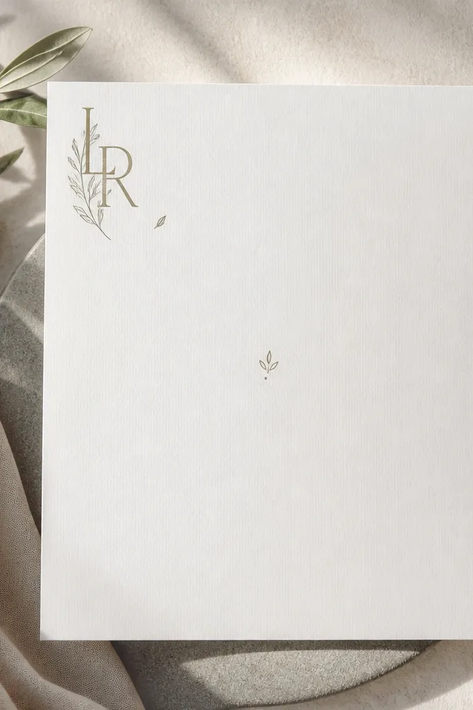
Negative space is what makes this feel expensive. Instead of crowding the center, you place the monogram cluster in one corner and let the rest of the cover breathe. Add one small symbol (like a tiny leaf or dot) to make it feel designed, not empty. This cover suits minimal modern weddings, destination weddings, and couples who want a premium look without heavy ornament. It also makes the text inside feel more intentional because the cover is already calm.
Start by placing a monogram in the top left corner, sized so it takes about 20-25% of the cover width. Add two small matching accents next to it — keep them aligned to a grid. Put the couple names in the center in a simple serif, with generous line height. Keep the date small at the bottom center and stop there.
Use one accent shape only (dot or leaf), not multiple icons — it keeps the negative space classy.
Don’t fill the center with extra rules; it cancels the premium breathing room.



