
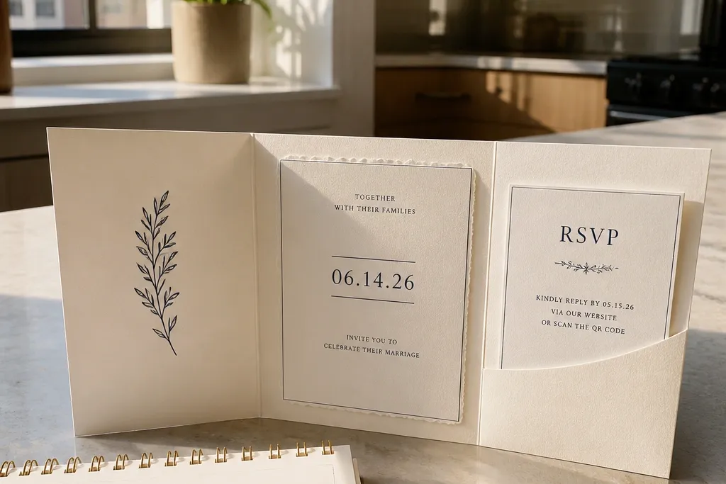
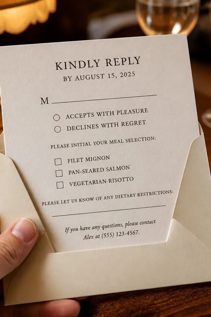
1. Big Date, Small Details (Typographic Bold)
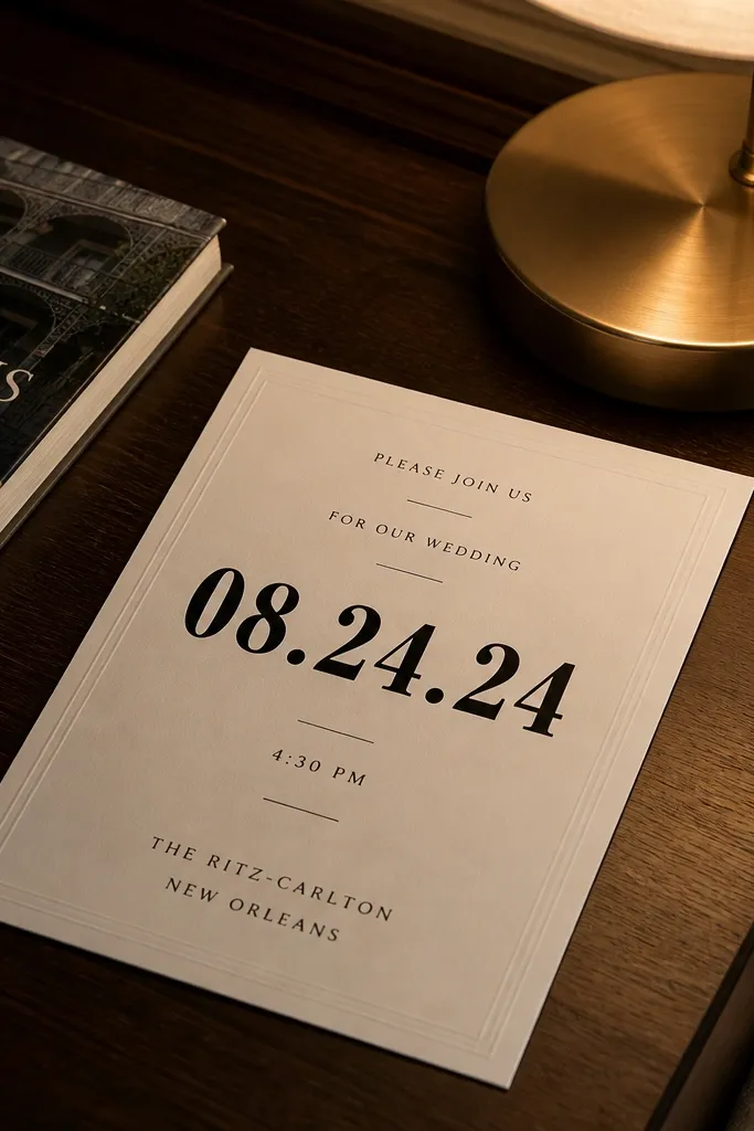
This style puts the date where guests' eyes land first. You get fast scanning, which matters when people skim invitations on a busy kitchen counter. The best version uses a single bold date line, then keeps time and location in short, separate lines instead of one sentence. It’s also forgiving for printing because the typography is doing the work, not thin decorative elements. Choose it if your invitation wording is straightforward and you want RSVP instructions to feel like a command, not an afterthought.
Start by typing the date as a single line and matching the template’s font size to your print size (keep it readable at a glance). Then paste your real time and location text and check how it wraps — if your venue name pushes past the margins, shorten the line to city + venue name. Finally, place the RSVP method and deadline in one block at the bottom so it stays visually separated from the event details. For getting it to print cleanly, use black text on an off-white background and avoid super light gray for the RSVP line.
If you’re using an online RSVP form, write the URL in full and add a short label like RSVP by Aug 18 — guests hate guessing links.
Avoid centering the RSVP block when your RSVP address or URL is long enough to wrap — that’s where response drops.
2. Classic Two-Block Formal (Ceremony + Reception)
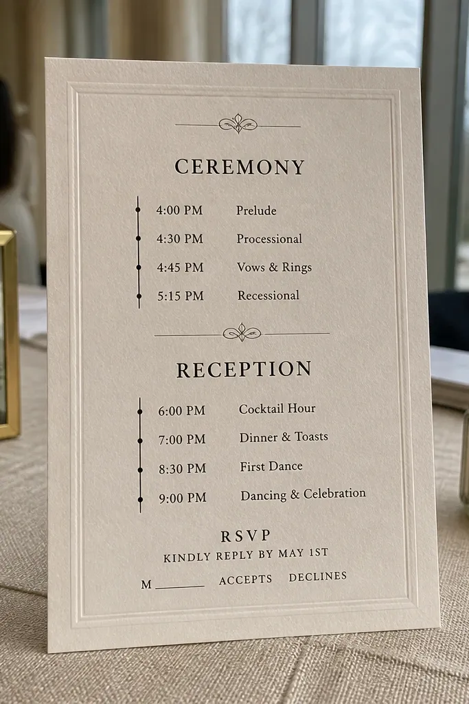
Start by listing ceremony date/time/location in the top block with short lines, not commas. Then add a second block for reception details, including any dress code line right under the reception time if you have one. Finally, put the RSVP instruction block at the bottom with deadline first, method second. For layout stability, keep each block to 2-4 lines and use abbreviations sparingly; if you need “Street” or suite numbers, let the line wrap instead of shrinking the font.
This is the cleanest option when you have two distinct parts to the day. The invitation reads like a schedule: ceremony first, then reception, then RSVP. Guests don’t have to decode where one event ends and another begins, so fewer people show up at the wrong time. It also looks polished with traditional wording and works well for older family members who prefer clear structure. Choose this if your schedule is real-world messy and you want the invitation to keep guests calm.
Skip thisSkip the template that crams ceremony and reception into one paragraph — it’s the fastest way to create RSVP confusion.
Quick tipUse a different line break between date and day-of-week so the day doesn’t look like it belongs to the time.
3. Modern Minimalist Single Column (No Frills)
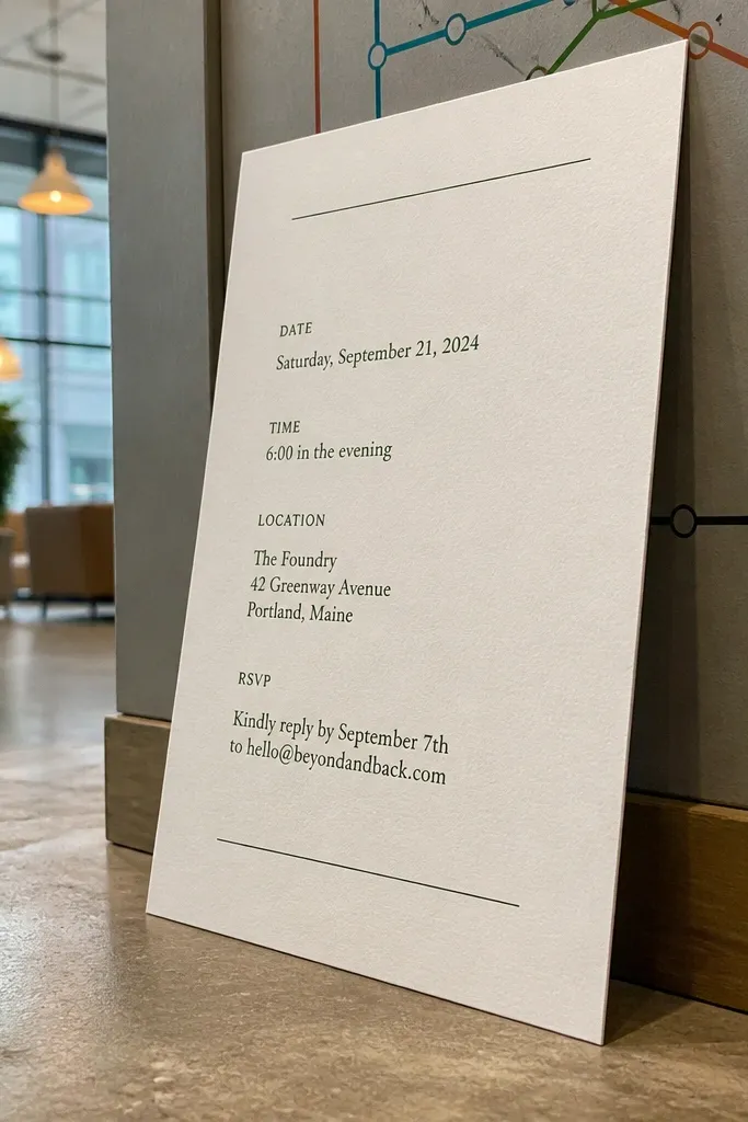
Start by entering your date, time, and venue as separate lines in the template so the hierarchy is obvious. Then keep addresses left-aligned and avoid forcing extra lines into the same block; if it wraps, let it. Finally, place RSVP instructions in a dedicated last line or last two lines with a clear deadline. For printing, choose a template with solid black text and a font that stays crisp at small sizes, especially on matte paper.
Minimalist single-column templates are great when your wedding details are short and your print setup is basic. The whitespace does the work: guests can find the date and location without hunting for a decorative cue. This style also holds up across different guest lists because you can adjust line breaks without fighting frames and borders. Pick it for city weddings, small ceremonies, or any event where you don’t need a lot of extra messaging. If you want the invitation to feel calm and modern, this is the one.
Skip thisDon’t use minimalist templates with decorative separators that steal space from the RSVP line.
Quick tipIf your venue has a long name, shorten it on the invite to the commonly used name and keep the full address for the RSVP confirmation page.
4. Rustic Stacked Info (Warm Script + Block Text)
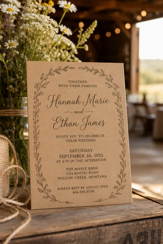
Rustic stacked layouts work well because they separate the mood from the information. You get a script line for the names, but the actual details live in clean blocks that guests can read fast. This style is a strong fit for barn venues and outdoor ceremonies because it doesn’t look sterile next to greenery. It also helps RSVP clarity since the RSVP block can be set apart visually from the event text. Choose this when you want something slightly romantic without turning the invitation into a hard-to-read typography experiment.
Start by keeping the script line short — only names or a short phrase — because long script lines get messy when text wraps. Then use block text for date/time/location and keep it left-aligned so addresses don’t drift. Finally, add RSVP instructions in a separate block with a deadline line above the RSVP method. For the best print result, choose a template that uses medium-weight lettering for the details instead of ultra-thin strokes.
Print a test with your longest guest-facing venue name before ordering — rustic templates often have fixed line heights.
Skip templates where script overlaps the details block — it looks pretty on screen and smears in print.
5. Destination Location Emphasis (Map-Style Header)
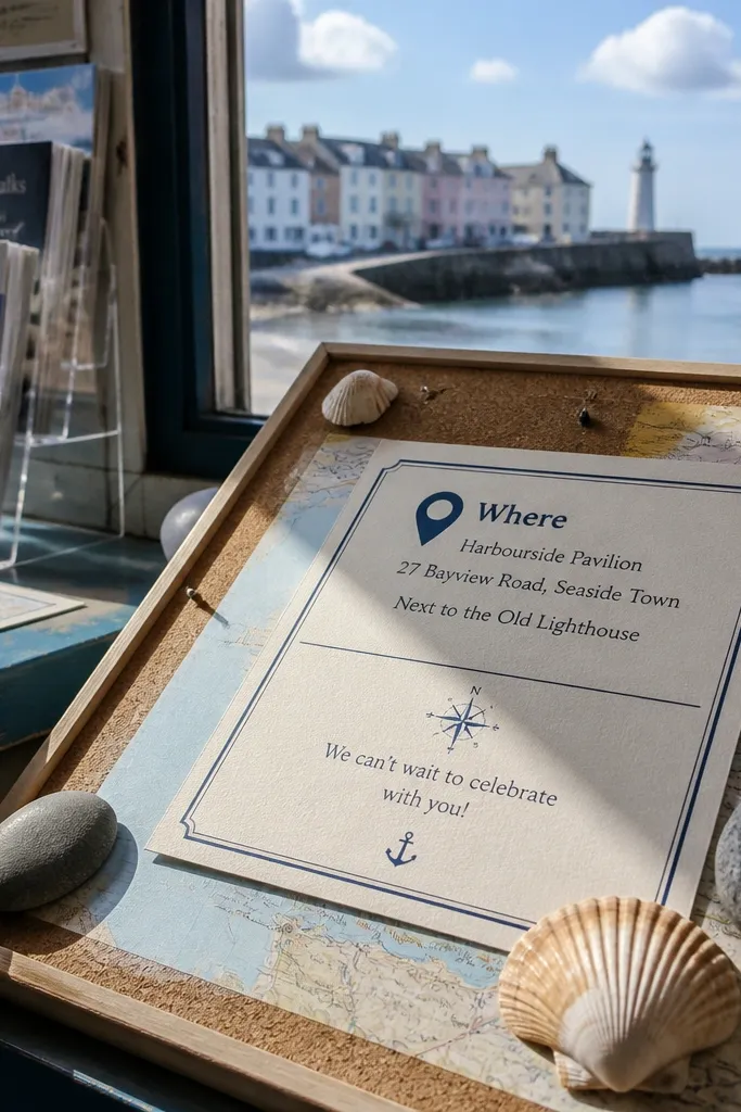
Start by entering the city and neighborhood or island name in the header line, then add the venue name below it. Then paste the full street address into the next line and verify wrapping — if it wraps, keep it left-aligned and don’t shrink the font. Finally, put RSVP instructions in a separate bottom area and include a clear deadline. For travel practicality, plan the RSVP deadline so it lands at least 6-8 weeks before you need final headcount.
For destination weddings, guests need help with the “where,” not just the “when.” Destination map-style headers make the location the first thing to check, which reduces the classic confusion of “Is this the beach or the town?” The best templates pair a location header with a short address line and optional neighborhood text. Keep the rest of the invitation simple so the map element doesn’t crowd the RSVP instructions. Choose this style when you expect guests to travel and you want fewer calls about directions and check-in timing.
Skip thisAvoid destination templates that bury the RSVP line under a big decorative header.
Quick tipAdd “Parking info” to your RSVP confirmation page instead of the invite if your invite template is text-tight.
6. Art Deco Panels (Framed Sections)
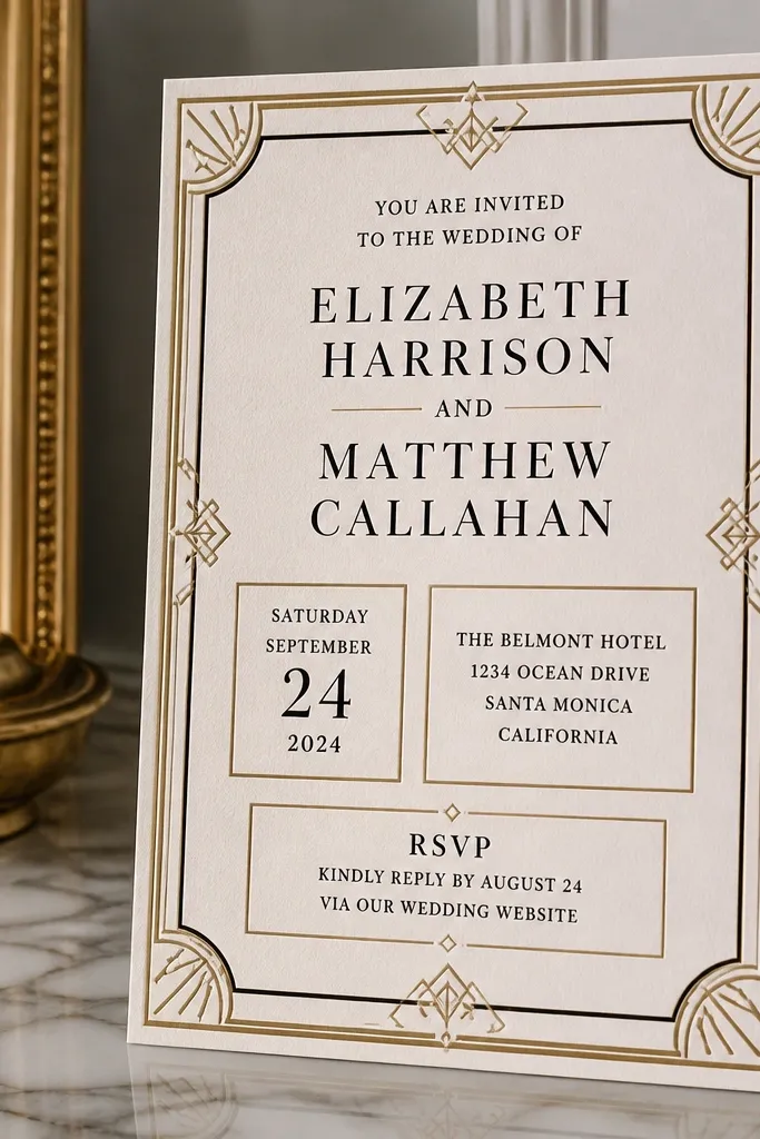
Art Deco panel templates are great when you want structure without a full formal suite. The framed sections guide the eye — date in one panel, location in another, RSVP in its own area. That separation reduces the chance guests miss the RSVP deadline, because it’s visually boxed. This style works well for weddings with a glam vibe, black-tie themes, or venues with ornate architecture. Choose it when you like bold design but still want RSVP clarity.
Start by placing date and day-of-week in the same panel so they don’t drift when the day name changes length. Then put the venue and address in one panel, keeping it left-aligned within the frame. Finally, keep RSVP instructions in a third panel with a deadline line above the RSVP method. When you customize, check panel padding — if you reduce margins too much, borders get tight and text looks crowded.
Use a heavier font weight for RSVP so it stays legible inside the frame lines.
Skip templates where the RSVP panel shares the same font size as the decorative lines — it reads like decoration instead of instructions.
7. Illustrated Border Minimal (Corner Motifs)
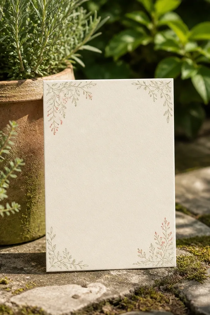
Start by placing your main text block in the template’s center area and keep it short: date, time, venue, RSVP deadline, RSVP method. Then check the side margins for your longest line — especially the address line. Finally, set the RSVP block as its own small section, not a line tucked into the middle of event text. For print reliability, avoid templates that use very light illustration colors for the corner motifs.
Corner-motif illustrated borders add personality without taking over the whole page. The best versions keep the main text block clean and readable, with illustrations staying in the corners or along a thin edge. This style works for garden weddings, beach weddings, and themed invites where you want the design to feel intentional. It’s also a decent choice for printed invitations because the illustrations are usually bold enough to reproduce without fading. Choose it when you want something pretty but still focused on RSVP response.
Skip thisAvoid full-bleed illustration borders — they squeeze the text and make RSVP easy to miss.
Quick tipIf your venue name is long, keep it to the commonly used version and put the rest on the RSVP confirmation page.
8. Formal Script + Centered Paragraph (Classic Look)
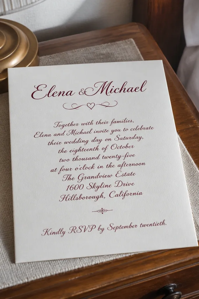
Start by entering date, time, and venue into one centered paragraph block as separate sentences, not a single wall of text. Then add the RSVP line as the last sentence and keep the deadline in the same line. Finally, preview the invite with your real venue name and address to confirm line breaks look clean. If the address wraps into three lines, switch to a left-aligned template style because centered blocks get cramped.
This style looks traditional because it reads like a formal announcement. The script header adds romance, and the centered paragraph gives a formal rhythm. It can still drive RSVP response if the RSVP sentence is clearly labeled and placed at the end in its own line. The trade-off is that centered paragraphs are harder to read when addresses or venue names are long. Choose this if your event details are short and you want a classic, ceremony-first tone.
Skip thisSkip centered paragraph templates when you have two locations or a long address.
Quick tipUse a clear RSVP verb like “RSVP by” rather than a vague “Please respond” line.
9. Photo-First Invite with Hard Text Hierarchy
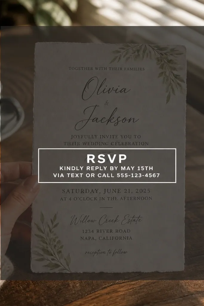
Start by selecting a photo with low busy detail in the area where text will sit, then apply a dark or light overlay so the text contrast is consistent. Then paste your date/time/venue and ensure the RSVP box has enough padding that letters don’t touch the border. Finally, print a proof to check glare and legibility — matte paper helps. For costs, expect photo-first designs to take longer to finalize because text placement is less forgiving.
Photo-first templates can look gorgeous, but RSVP response depends on whether the text stays readable over the image. The best versions keep the photo muted behind a solid overlay and place the RSVP instructions in a clear box or high-contrast bar. If the RSVP line is hard to read, guests miss it and reply late. Choose this style when your wedding brand is visual and you can keep the text short: date, time, venue, RSVP deadline, RSVP link. It’s also a good pick for couples who want the invitation to feel like a mini announcement rather than a schedule card.
Skip thisAvoid templates where RSVP text sits directly on an un-faded photo background.
Quick tipKeep the RSVP box separate from the photo overlay; it should look like a label, not a suggestion.
10. Minimal Watercolor Wash (Soft Background, Crisp Text)
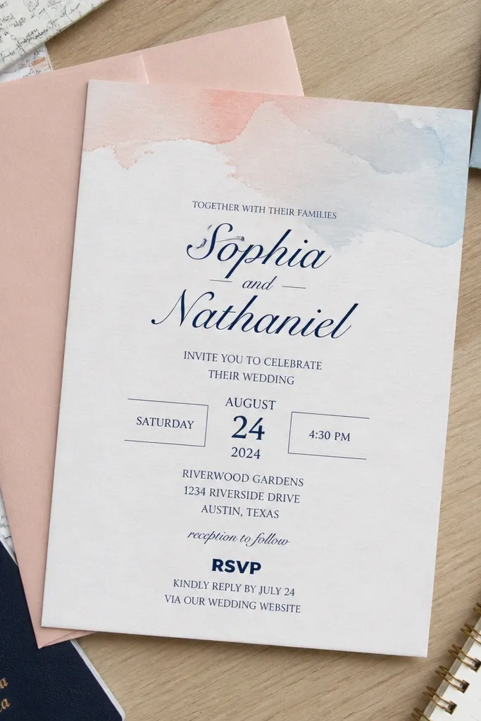
Soft watercolor wash templates add color without turning into a readability problem. The trick is that the background stays light and the text stays dark and heavy enough to print cleanly. This style is a strong choice when your wedding palette is pastel and you want invitations that feel airy. It’s also forgiving for RSVP response because the text can be set in a simple left-aligned block. Choose it when you want a gentle design that still behaves like a functional card.
Start by placing the watercolor wash behind the text area, then choose a template with a text block that has a clear background (even if it’s slightly tinted). Then enter your date/time/venue as separate lines so guests don’t have to parse a sentence. Finally, put the RSVP deadline and method in the last two lines and keep them the highest contrast in the design. For printing, avoid very light gray for RSVP — black or near-black reads better.
If your printer tends to fade colors, choose a template where the watercolor is subtle and the text is bold.
Skip watercolor templates where the RSVP line is the same color as the background.
11. Monogram Header + Organized Address Block
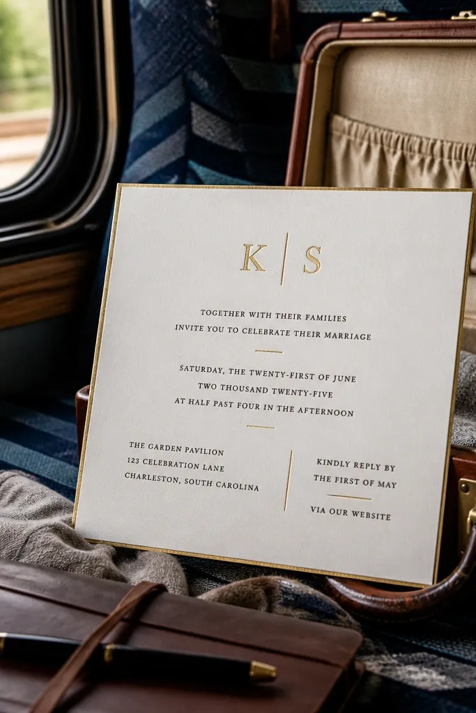
Monogram header templates feel personal without adding chaos. The real win is the organized address block — guests can see the event location and then find the RSVP instructions right after. This style is especially helpful when you have a venue with a confusing address or when you’re mailing invites and need the address lines to look tidy. It also looks good on both classic and modern paper stocks. Choose this if you want your invitation to feel intentional and polished while staying readable.
Start by placing the monogram or couple initials at the top and keeping the event details in a structured block underneath. Then enter the venue name on one line and the full address on the next lines, left-aligned. Finally, add RSVP instructions in a separate block with the deadline first. When customizing, don’t reduce font sizes to squeeze in text — switch to a left-aligned template if your address wraps too much.
Use a consistent format for dates and times across invitation and RSVP card so guests don’t misread the deadline.
Avoid templates where the address block is centered — wrapped addresses look messy and guests miss the street line.
12. Three-Line RSVP Tag (Deadline First)
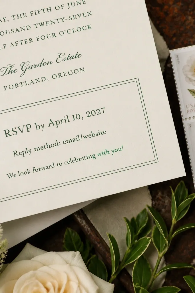
A dedicated RSVP tag area is one of the simplest ways to improve response. Guests see it fast because it’s visually separated and reads like an instruction. The strongest versions split RSVP into three lines: deadline, method, and any short note like “Meal choice on RSVP.” That structure reduces emails that ask for the deadline or how to respond. Choose this if you want a clean invitation that still feels modern and action-oriented.
Start by putting date/time/venue above the RSVP tag and keep those lines short. Then build the RSVP tag with three lines: “RSVP by [date]”, “Online: [URL]” or “Mail: [address]”, and a short optional note. Finally, check that the RSVP tag fits without shrinking the font — if it doesn’t, shorten the note or remove extra wording. For printing, choose a template with a solid background behind the tag so it stays readable.
If you’re doing online RSVP, put the URL on its own line so it’s easy to type.
Avoid RSVP tags that include too much text; guests read the first line and ignore the rest.
13. Timeline Strip (Ceremony, Cocktail, Reception)
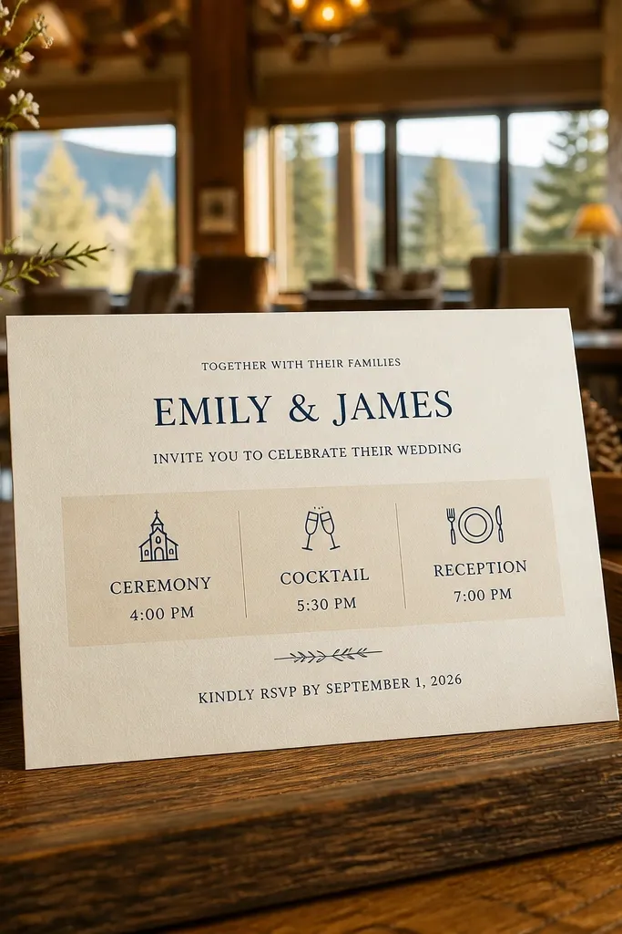
Start by listing each checkpoint with a short label and time, like “Ceremony 4:30 PM” and “Cocktails 6:00 PM.” Then place the venue address block near the timeline so guests don’t have to jump around. Finally, add RSVP instructions at the bottom with the deadline on a separate line. When customizing, keep each timeline segment short so the strip doesn’t wrap — wrapping ruins the clean timeline look.
If your day has multiple checkpoints, a timeline strip reduces confusion. Guests can quickly see what happens first and how the evening flows, which helps when you have a cocktail hour before dinner. The timeline also makes the invitation feel organized without going full multi-block formal. Choose this style for weddings with a clear schedule and a guest list that wants the “what time should I arrive” answer instantly. It’s a strong fit for venues where timing matters, like museums or beach houses with limited access.
Skip thisAvoid timeline strips when you have only one event — they waste space and push RSVP down.
Quick tipIf you have a hard arrival time, include it in the timeline label instead of burying it in the fine print.
14. Envelope-First RSVP Card Look (Invitation Simple, RSVP Clear)
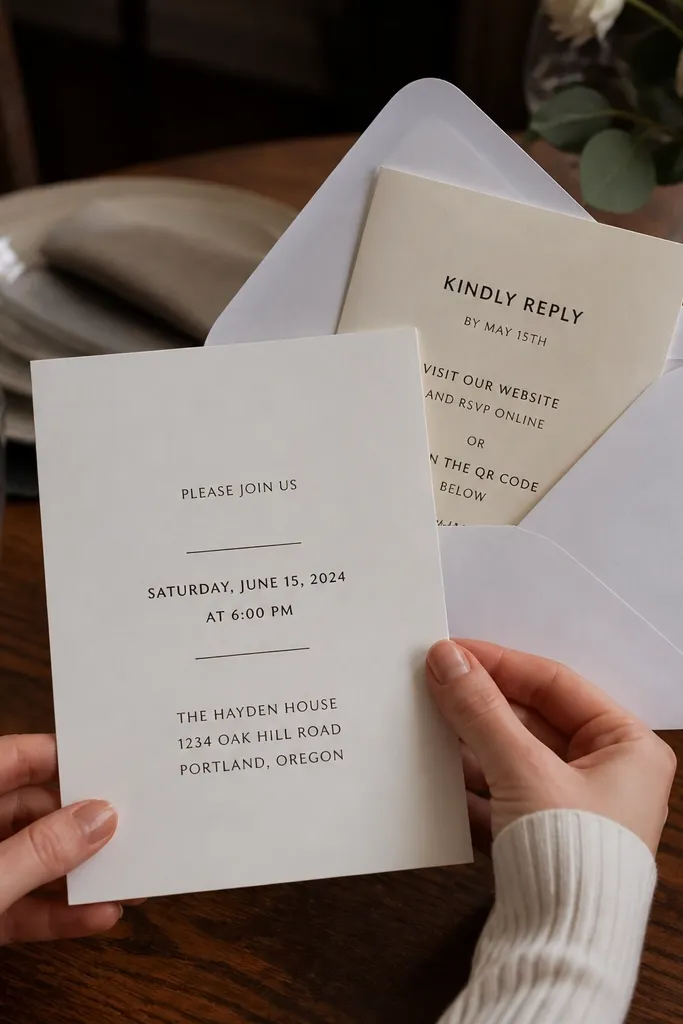
This style works when you’re using a separate RSVP card inside the envelope. The invitation itself stays simple and focused on date/time/location, while the RSVP instructions are designed to be obvious when guests open the set. The benefit is that your main invitation doesn’t get crowded by RSVP methods, links, and deadlines. It also helps readability because each piece has a single job. Choose it when you want better RSVP response without stuffing the main invite with small text.
Start by using the invitation template for only the core info: date, time, venue, and a short line like “RSVP card enclosed.” Then design the RSVP card separately with a large “RSVP by [date]” line and a clear method line. Finally, proof both pieces with your real deadline and address/URL so the guest sees the same information twice. For mailing, keep the RSVP card format compatible with standard envelopes so you don’t create insert bulk issues.
If you mail RSVPs, include a pre-addressed return envelope on the RSVP card set — it cuts friction.
Avoid putting full RSVP instructions only on the main invitation if you’re also including an RSVP card.
15. Beachy Bold Minimal (High Contrast, Sun-Ready)
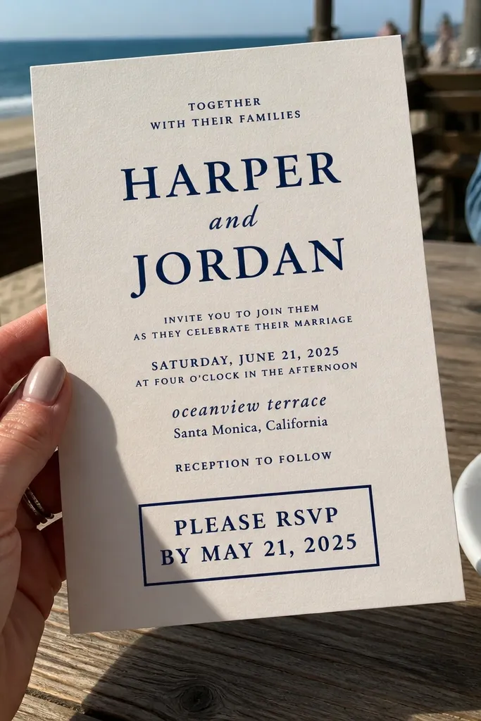
Start by selecting a dark ink color for details and RSVP, then keep the font weight heavy enough to survive printing. Next, place RSVP instructions in a bottom block with the deadline on its own line. Finally, keep the event text short and use line breaks instead of long sentences. For travel practicality, include city + venue name in the location line so guests can recognize it quickly when they’re searching directions.
Beachy bold templates are about readability in daylight and on matte paper. High contrast navy-on-white (or dark green on cream) makes text easy to read during travel, which is when people often look at invitations on the go. The best versions keep the RSVP line bold and separate from the rest of the info. You get a fun vibe without sacrificing the practical stuff guests need. Choose this style for coastal venues, destination weekends, and casual weddings where the invitation still needs to be functional.
Skip thisSkip beach templates that use light teal or pastel text for RSVP — it reads too faint.
Quick tipIf you’re printing on matte paper, test a darker RSVP color — matte can make mid-tone inks look faded.
16. Black Tie Formal Grid (Structured, No Guessing)
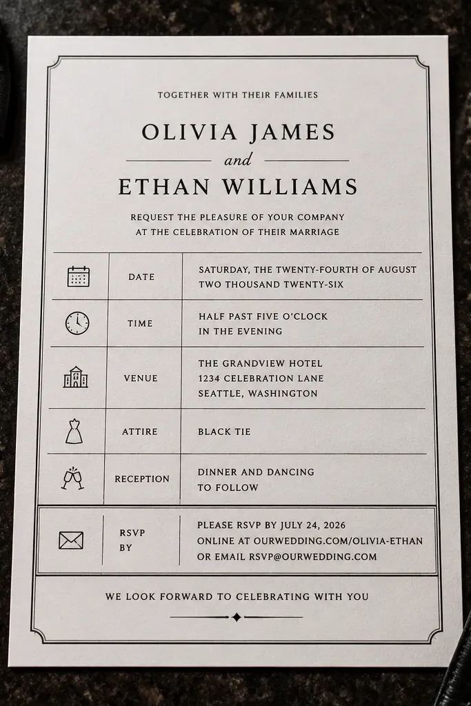
Formal grid templates are built for guests who like structure and couples who want a confident, serious tone. The grid layout keeps every piece of information aligned, so it’s easy to read and easy to proof. RSVP clarity improves when the RSVP method and deadline are aligned in their own row, not scattered. This is also a strong choice when your paper is dark and you want typography to carry the design. Choose it when you want high contrast, clear spacing, and an invitation that feels like it belongs to a dressy event.
Start by using the grid to place date/time in the top section and venue in the next section with left-aligned address lines. Then set the RSVP method and deadline in a dedicated bottom row with a slightly larger font size than other lines. Finally, keep the copy tight and avoid extra phrases like “We can’t wait” on the invite itself. For print, choose a template that uses a limited palette so gold or accent colors don’t muddy the RSVP text.
If your guests are older or international, add a second RSVP method on the invitation set (like URL plus phone number).
Avoid templates that put RSVP in a thin gold font on dark backgrounds — it looks stylish and reads poorly.
17. Garden Frame with Clean RSVP Footer
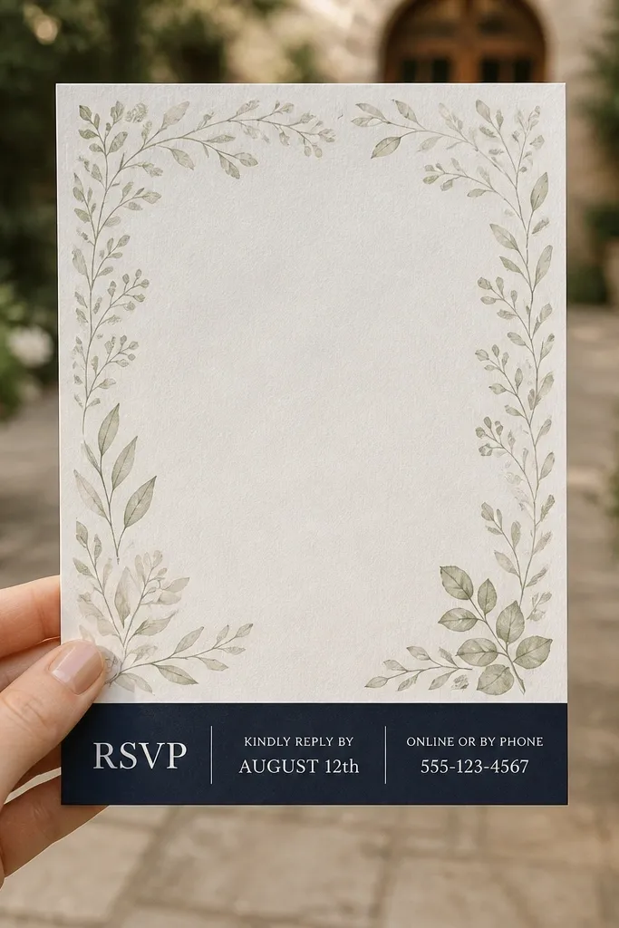
Start by selecting a frame template where the border stays in the corners or edges and doesn’t intrude into the text area. Then keep event details in a centered block with generous line spacing, but make the RSVP footer a separate block with left alignment. Finally, add RSVP deadline and method in the footer so it’s the last thing guests read. For printing, keep the decorative border color darker than you think — light borders can fade and stop looking intentional.
Garden frame templates add a theme without turning the invitation into clutter. The strongest versions keep the decorative border light and place a plain RSVP footer at the bottom. That separation matters because RSVP is the one thing guests must not miss. This style works for spring and summer weddings, especially when you want the invitation to feel like it belongs with flowers and outdoor settings. Choose it when you want a soft, romantic vibe and a layout that still behaves like a schedule card.
Skip thisSkip garden frames that place RSVP inside the decorative border area — it competes with the leaves.
Quick tipUse a short RSVP footer like “RSVP by [date] — [method]” and move any extra info to your website.



