
1. Black Tie Minimal with Gold Foil Type
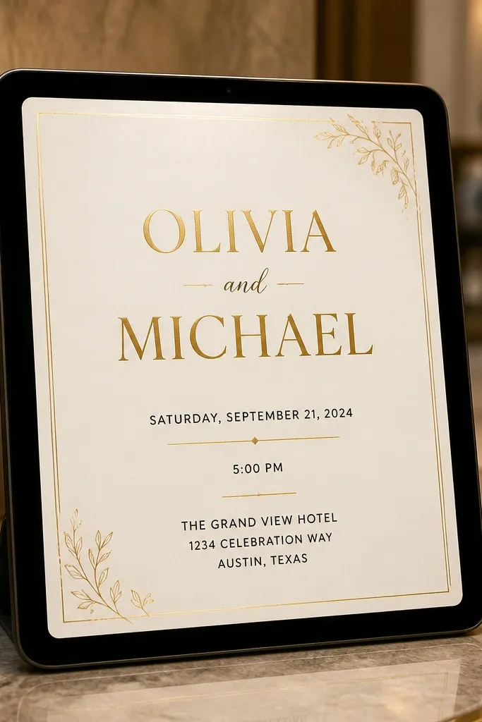
This one looks expensive because it uses restraint. A cream or warm ivory background gives your typography room to breathe, and gold-style letter accents make the names feel like foil without needing real foil. Put the couple’s names at the top with a serif, then keep the date, time, and location in clean sans-serif lines beneath. The key is contrast: black text stays crisp even after compression, and the gold accents are limited to initials or a thin rule line so they don’t blur on phones.
Start by setting a 1080x1350 canvas for the main card, then add a 60-70% sized text block centered vertically. Choose two fonts: one serif for the names and one sans-serif for everything else, and keep font sizes large enough that the date is readable from arm’s length. Export as PNG for WhatsApp, then also export a 1080x1920 story crop where the names sit above center so the RSVP line stays visible.
Quick tipUse a soft shadow at 10-20% opacity on the gold accents so they don’t disappear on bright screens.
Skip thisDon’t add extra ornaments around every line; it kills the luxury feel.
2. Sunset Photo Card with Text on a Gradient Band
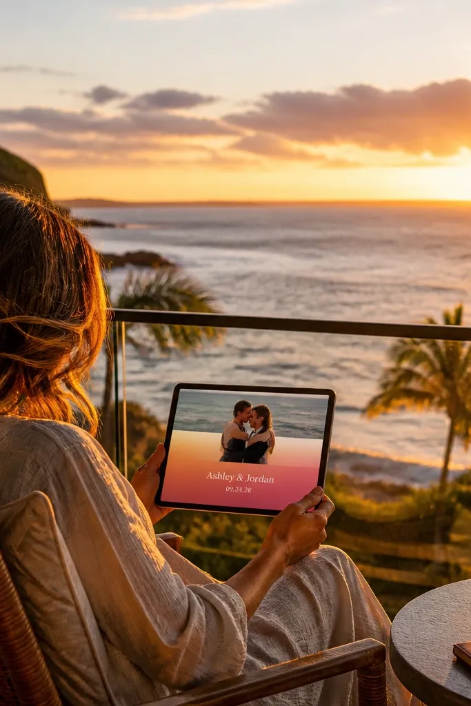
This design works because your photo already does the emotional heavy lifting. Put the wedding details on a gradient band that runs horizontally across the lower half of the image, so the text stays readable no matter how bright the sky gets. Use white or off-white type for the names and date, then a slightly smaller off-white for the address. If you pick a sunset photo with a clear horizon, the layout feels balanced and looks great in stories where only the top portion is visible.
Start by selecting a sunset image with a strong horizon line, then place a semi-transparent gradient rectangle over the bottom third (dark at the bottom, lighter at the top). Add the couple’s names in the top of the band and the date/time/location lines underneath, keeping consistent left alignment. Finally, export three versions: full card (4:5), story crop (9:16), and a square (1080x1080) for feed posts.
Quick tipPick photos where the brightest area is above the gradient band, not behind the text.
Skip thisAvoid white text directly on bright clouds; the readability will collapse.
3. Terracotta Line Art Invitations
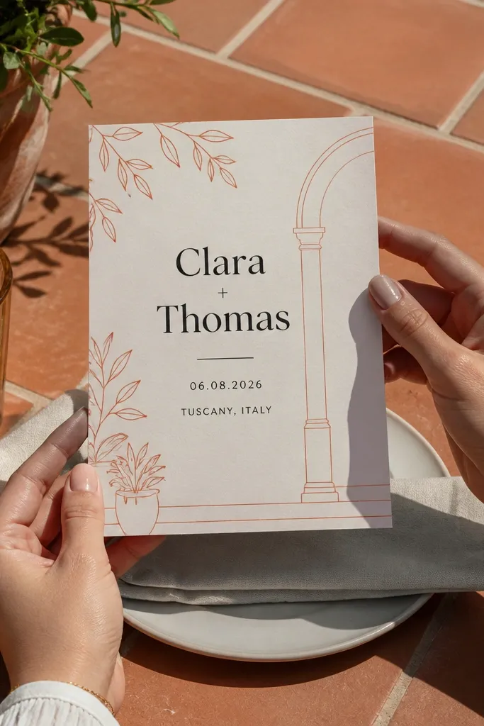
Line art borders look modern and soft without turning into clutter. Use terracotta line drawings of leaves, arches, or simple florals along the corners, then keep the center almost empty. The couple’s names sit as the headline, with the date and location in spaced-out lines. This style is photogenic because the line weight is consistent and doesn’t pixelate much when shared.
Start by choosing line art in a single color (terracotta #C46A4A range) and place it in the corners only. Create a centered layout with a large headline and a compact details block; keep the details block width around 70% of the card. Export a PNG for messaging and a JPG for social to reduce file size without losing the line quality.
Quick tipUse a thin terracotta rule line under the date; it makes the card look like real stationery.
Skip thisDon’t add multiple flower styles; stick to one line-art set.
4. Deep Green Botanical Frame
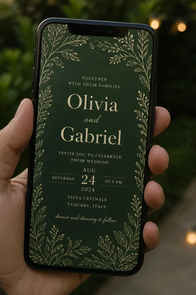
A deep green background instantly reads as “garden wedding” even before anyone knows your theme. Add a thin botanical frame around the edges, then use cream text for the names and details. Keep the typography clean and generous, because the green field already provides visual weight. This one is extra good for evening ceremonies or indoor venues with dark décor, where the card will look polished next to your wedding photos.
Start with a solid deep green (#0F3D2E style) background, then add a botanical frame at 8-10% from the edges. Place the names at the top third and the details in the middle, using left alignment for easier scanning. Export at 1080x1350 and also export a story version where the frame stays visible but the text block stays centered.
Quick tipUse a slight warm tint in your cream text (#F2E7D8) so it doesn’t look icy.
Skip thisAvoid bright white on dark green; it can look harsh on phones.
5. Modern Swiss Grid with Big Date Typography
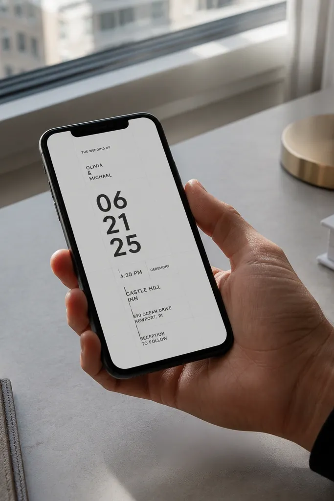
This is the “graphic designer” look — sharp, balanced, and super readable. The trick is making the date the hero with oversized numbers, then placing the location and time in small, aligned labels. Use a light background (white or pale gray), thin grid lines (very low contrast), and plenty of spacing. It looks good in every crop because the date stays central and the text is structured.
Start by turning on a grid in your design tool and set margins of about 90-110px on a 1080x1350 canvas. Put the date in a bold font at the center and keep the address lines in a narrow column under it. Export separate versions for story and feed, but keep the same date position so it feels consistent.
Quick tipUse tabular numbers if your font supports it; dates line up cleaner.
Skip thisDon’t center every line; the grid needs one clear hierarchy.
6. Champagne Confetti with Monochrome Type
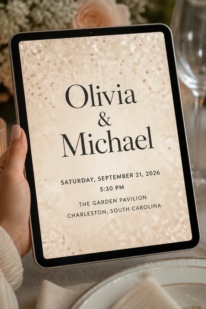
Confetti backgrounds feel celebratory without needing a photo. Choose a champagne-toned confetti texture (small, subtle pieces) so it doesn’t distract from reading. Keep the type monochrome — deep charcoal or black — and use a single serif for the names so it looks like an actual invitation suite. This style is great for daytime events and for couples who want “party energy” without going full playful.
Start by adding a confetti texture layer at low intensity, then place a faint translucent rectangle behind the text block (about 70-80% width). Set the names in the top half and the details in the center, with spacing between lines around 8-12px. Export as PNG and JPG; JPG is fine for social shares because the confetti texture compresses well.
Quick tipKeep confetti density low; dense confetti makes small text unreadable.
Skip thisAvoid colored text on confetti; contrast drops fast.
7. Navy Nautical Map Style
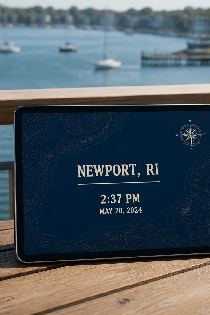
If you’re doing a destination wedding, a map-style card looks thoughtful and still clean. Use a navy base with faint map lines, then add a compass or line compass rose in a small corner. The text stays cream, and the location line gets the most emphasis. This is one of the best looks for giving guests a “where exactly?” feel, especially when you include a map link.
Start by selecting a map texture image and reducing its opacity to 25-35% so it doesn’t fight the text. Add a compass rose icon at one corner and keep it small (around 80-120px). Build a centered details block with the city and venue name in larger type, then export a version where the URL line sits in the bottom third for easy copying.
Quick tipUse a short link like a branded bit.ly so the URL fits cleanly.
Skip thisDon’t use busy landmarks inside the text area; it makes reading hard.
8. Cream Paper Texture with Embossed Effect Type
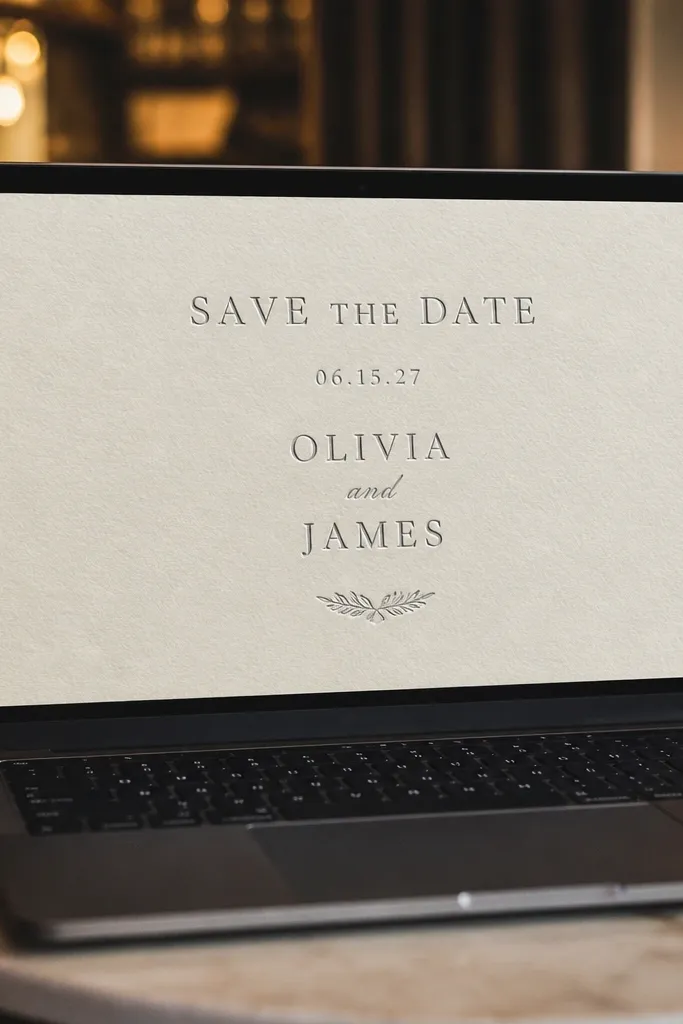
Paper texture makes digital cards feel more “real” because it removes the flat, screen-only look. Go with a cream texture and keep the type dark charcoal. For an embossed vibe, use subtle highlights and shadow on the letters only, not across the whole background. This design is perfect for classic weddings where you want a traditional feel without heavy ornamentation.
Start with a paper texture background and keep your text color around #2B2B2B. Apply a light emboss style to the names only (small highlight offset and low opacity shadow). Place details in a clean sans-serif under the names, then export at high resolution (PNG) so the texture holds up when guests zoom in.
Keep emboss effects under control; too much makes text look muddy.
Avoid using ultra-thin fonts on textured backgrounds.
9. Pastel Watercolor Wash with Clear Type Blocks
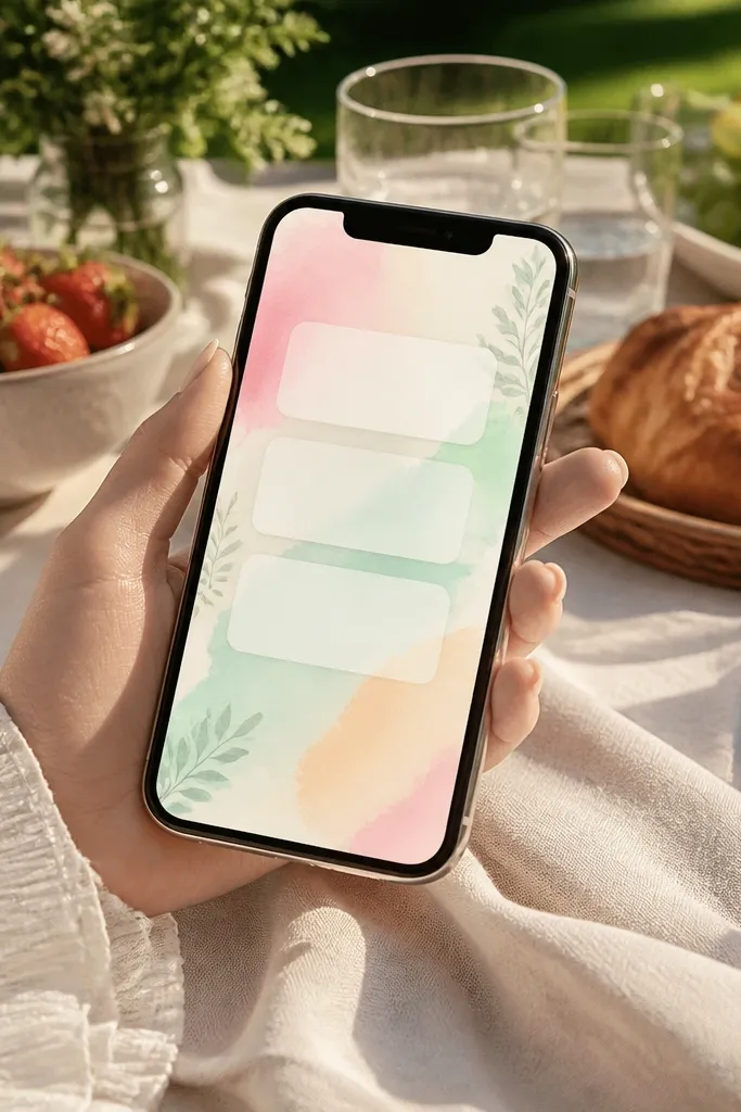
Watercolor looks gorgeous on phones when you keep it behind text blocks. Use a watercolor wash in one direction (top-left to bottom-right) and then place white or cream rectangles behind the names and details. The card feels airy, and the text stays readable. This style suits spring weddings and brunch receptions where you want “soft and romantic” without heavy florals everywhere.
Start by choosing one watercolor palette (sage + blush, or dusty blue + peach) and set the wash to cover the full background. Add two type blocks: one for names and one for date/location, with rounded corners if you want a softer look. Export a story version where the bottom type block sits higher so the venue line doesn’t get cut off.
Quick tipUse one watercolor image, not multiple layers, to avoid muddy colors.
Skip thisDon’t put text directly on the watercolor; always use a type block.
10. Monochrome Photo Strip Wedding Card
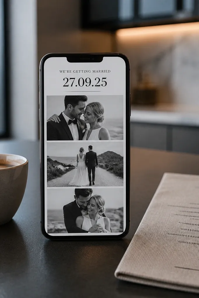
A photo strip gives your invitation a personal feel while staying structured. Make the photos black-and-white so the typography can be crisp and monochrome. Add thin separators between photos and the text, then keep the headline large and centered. This design looks great for couples who want their invitation to feel like a mini album cover, especially when the photos have strong faces or clear silhouettes.
Start by picking two photos with similar lighting and convert them to monochrome. Place them in stacked frames at the top half, then add a details section below with a single column layout. Keep the text area width to about 80% of the card so it doesn’t stretch on wide screens. Export as PNG for messaging and as JPG for social.
Use a consistent photo aspect ratio so the crop doesn’t look accidental.
Don’t mix color photos with monochrome type unless you add a unifying overlay.
11. Art Deco Frame with Geometric Corners
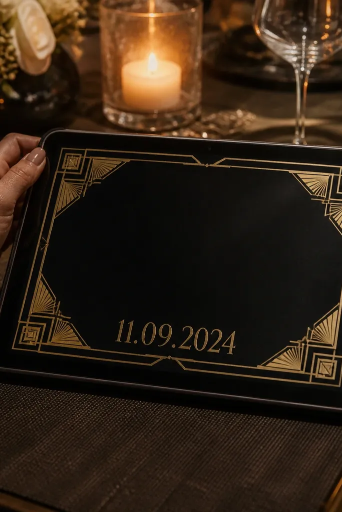
Art deco corners scream “evening party” and they look sharp in digital form because geometry stays crisp. Use a black background, add gold geometric corner shapes, and keep the center clean for readability. The headline can be an art deco-style font, but keep the rest in a simple sans-serif. This is a standout choice for ballroom venues, city weddings, and any ceremony with a dressy vibe.
Start by setting a black background and placing gold corner shapes at the four corners, leaving a gap of at least 40px from the text area. Add the names in the center top and details aligned left under them. Export a story crop where the corner shapes remain visible but the text block stays centered. Keep gold elements to lines and corners so they don’t pixelate.
Quick tipUse gold as a single accent color and keep everything else cream and black.
Skip thisAvoid full gold borders; they can overwhelm small screens.
12. Terracotta and Olive RSVP Card Inside Frame
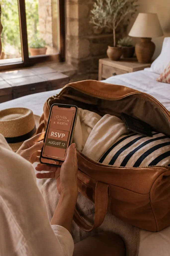
This design is built for guests who need action fast. Put a thin olive border around a terracotta center, then highlight the RSVP line with a bold label like “RSVP BY” in uppercase. The couple’s names sit above, and the RSVP deadline sits in a separate, high-contrast block. It looks good because the border gives structure and the RSVP block gives urgency without clutter.
Start with an olive border frame on a 1080x1350 canvas, and keep the inner margin around 70-90px. Place names at the top of the inner area and create a dedicated RSVP block with a darker shade of terracotta. Add the deadline and link/phone line at the bottom third for easy scanning. Export PNG for sharing and a story crop where the RSVP block stays in the top half.
Quick tipUse a short RSVP link and keep the phone number on one line.
Skip thisDon’t hide RSVP details in the middle of the paragraph.
13. White-on-Black Minimal Names Only Card
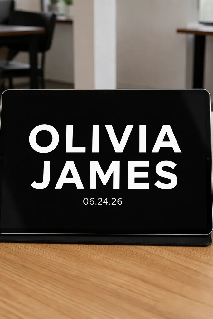
Sometimes you don’t need a full invitation yet. A minimal names-only card looks sleek and gives you an immediate “announcement” moment, which is perfect for the first day of your 3-day publishing plan. Use white type on black, keep the names huge, and add only the date at first. When you send the full info later, you reuse the same typography and layout so everything feels like one suite.
Start by placing names centered horizontally, using a bold font size that fills about 35-45% of the card height. Add the date line directly under the names with smaller font size and generous letter spacing. Export the names-only card as a story-first format (1080x1920) since people see it there first. Then reuse the same fonts in your full details card so it matches.
Quick tipKeep the date line to one format like “Saturday, Aug 24” so it reads instantly.
Skip thisDon’t cram time and venue into this version; it’s meant to be fast and clean.
14. Blush Floral Corners with Bold Venue Name
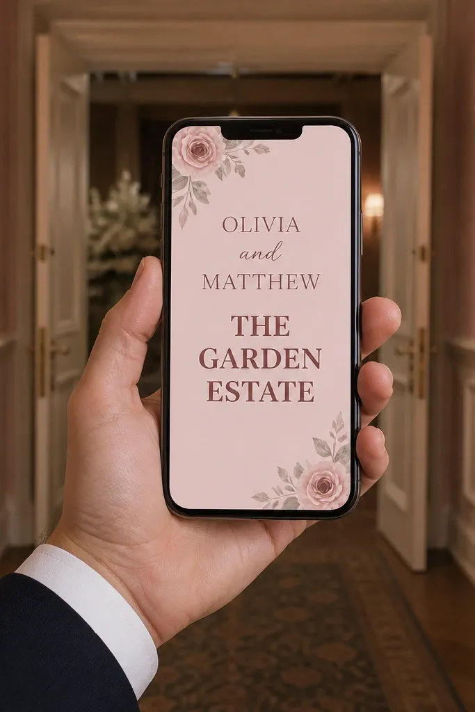
Floral corners give romance without turning the whole card into a collage. Choose blush as the main background, then place small floral illustrations in two corners only. Make the venue name the boldest line besides the couple’s names, because guests want the place clearly. This is a smart option when your venue name is unique or hard to spell; big type prevents “wait, is it spelled right?” messages.
Start by selecting floral corner art in a limited palette (blush + light green). Set the couple’s names at the top and make the venue name the biggest line in the details section. Keep the rest of the details in smaller sans-serif lines and align them left for quick scanning. Export a version where the venue line sits above the center so it stays visible even when cropped for stories.
Use a consistent venue name line break so it doesn’t wrap awkwardly on mobile.
Avoid full-bleed floral backgrounds; they make small text unreadable.
15. Sea Glass Color Blocks with Rounded Labels
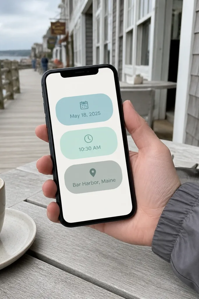
Color blocks look modern and keep your details organized. Sea glass tones — aqua, mint, and soft gray-green — create a calm, coastal vibe without needing beach photos. Use rounded label shapes for date, time, and location, then keep the main names on a clean background. This one is great for outdoor ceremonies and casual receptions where you want a playful but still classy look.
Start by picking two main colors and one neutral, then build a simple background with one soft color gradient or texture. Create three rounded rectangles for date, time, and location, and keep the text centered inside each label. Put the names above the labels and export in 1080x1350 plus a 1080x1920 story version. Keep label height consistent so the design looks tidy when shared.
Quick tipUse dark text on light blocks and white text on the darkest block for instant contrast.
Skip thisDon’t use too many colors; three tones is the limit for a clean look.
16. Vintage Postcard Layout with Realistic Stamps
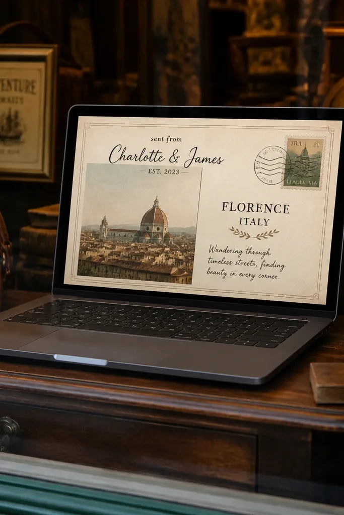
Postcard style feels personal and travel-friendly, which is perfect for destination weddings. The stamp graphic and the “sent from” style layout add charm, while the typography stays legible. Use a light paper background with a subtle border, then put the couple’s names like a signature at the top. If you include a photo, place it like a postcard photo window and keep it monochrome or lightly tinted for cohesion.
Start by creating a bordered postcard frame with margins around 60-80px. Add a stamp icon in one corner and place the date line near it, then put the venue and city in the main text area. If you use a photo, crop it to a rectangle that matches the postcard window proportions. Export a full card and a story crop where the stamp corner remains visible.
Quick tipUse a slightly darker ink color (#3A2F2A) to mimic printed text.
Skip thisAvoid tiny cursive for the address; keep the address in a readable sans-serif.
17. Kinetic Typography Date Countdown Style
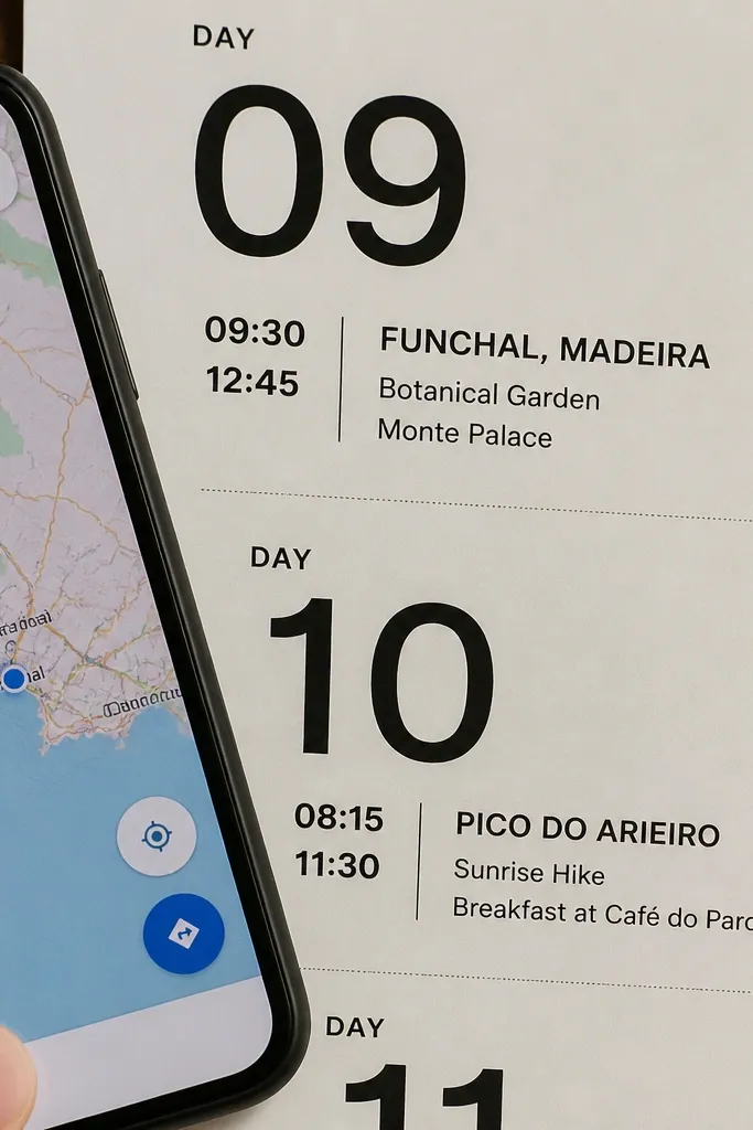
Countdown-style design creates urgency and excitement, which is exactly what people respond to on day one of sharing. You can do it without animation by using bold typographic hierarchy: massive date numbers, then smaller lines for time and location. Keep the background simple and the typography sharp. This design is great when you’re sharing across multiple channels and want the date to be instantly recognizable even if someone only glances.
Start by formatting the date in two lines so the numbers are huge and centered, like “24” on one line and “AUG” on the other. Add time and location underneath in one or two lines, then place RSVP info in a small block at the bottom. Use one font family for the big numbers and a second for the details. Export three sizes: 1080x1350, 1080x1920 story, and 1080x1080 square.
Quick tipUse only one emphasis color for the date — like deep green or black — so it stays readable.
Skip thisDon’t add extra countdown words; keep it to date, time, and place.
18. Monogram Initials with Soft Shadow Over Photo
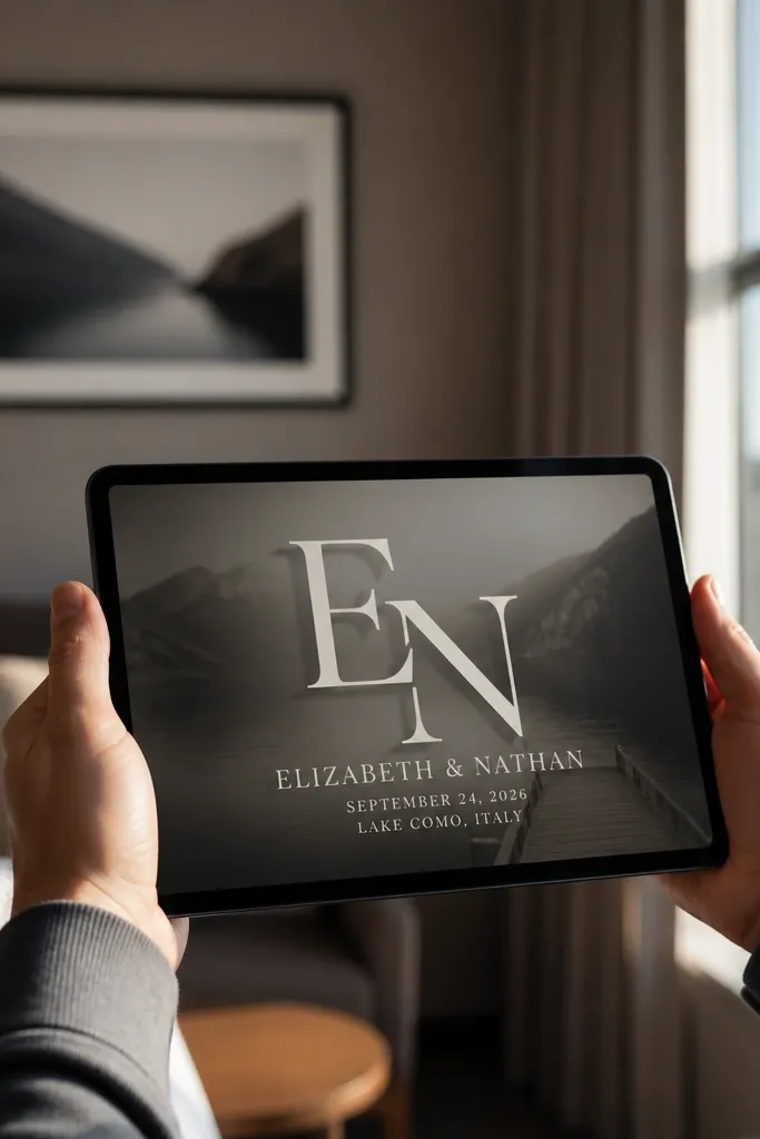
A monogram initials card looks classy and personal without looking busy. Put a large couple monogram in the center, then lay wedding details over a slightly darkened overlay so the text stays crisp. This works best when your background photo has soft tones — think light window light, neutral walls, or blurred flowers. It’s also a great choice when you want your card to match a logo or branding style for a consistent suite.
Start by choosing a background photo and adding a dark overlay at 20-35% opacity behind the text area only. Place the monogram initials large enough to fill the middle, then set the names and date in smaller text above or below the monogram. Align everything to a single center axis so it looks intentional. Export PNG for messaging and keep the text font size large enough that the date line reads on small phones.
Quick tipUse a monogram font with thick strokes so it doesn’t get fuzzy after compression.
Skip thisAvoid thin monograms; they blur in WhatsApp compression.
19. Minimal Arch Frame with Single Accent Flower
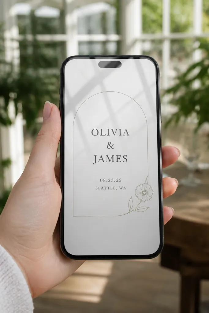
This is clean, modern, and still romantic because the frame does the work. A thin arch line around the names creates a “venue detail” feel without needing a full border. Add one small accent flower icon or leaf in the corner, not across the background. The typography stays the focus, with the date and location in a tight, readable block. It looks great for chapel ceremonies and city weddings because it feels structured.
Start by drawing a thin arch frame centered on the card and keep it around 65-75% of the card width. Place the couple’s names inside the arch, then add date/time/location below with consistent line spacing. Add the accent flower in one corner and keep it small so it doesn’t compete with the text. Export as a story-friendly version where the arch top stays visible.
Quick tipUse a single accent color for the flower and keep the rest monochrome.
Skip thisSkip full floral borders; one accent is the cleaner look.
20. Bold Rainbow Gradient with Black Wedding Type
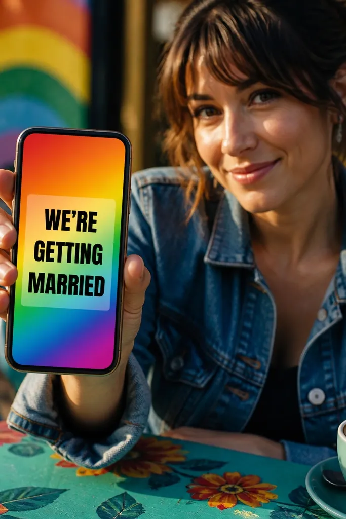
This one is for couples who want their invitation to feel like a celebration poster. The trick is pairing a bold gradient with solid black type so readability stays strong. Use the gradient as a full background, then add a semi-transparent white rectangle behind the text block if your gradient is too bright. Keep the layout simple: names at top, date/time/location in the center, RSVP at the bottom. It’s photogenic because the gradient creates high contrast and catches attention in feeds.
Start by generating or choosing a rainbow gradient image and test it under phone brightness — if the text disappears, add a white overlay behind the text block. Place the names in a bold font and keep details in a simpler sans-serif. Export in 1080x1350 and 1080x1920, checking that the RSVP line doesn’t get cut off in stories. Keep the text block height around 45-55% of the card so it doesn’t crowd the gradient.
Quick tipUse a white overlay behind text at about 60% opacity for instant legibility.
Skip thisDon’t use light gray text on bright gradients.



