
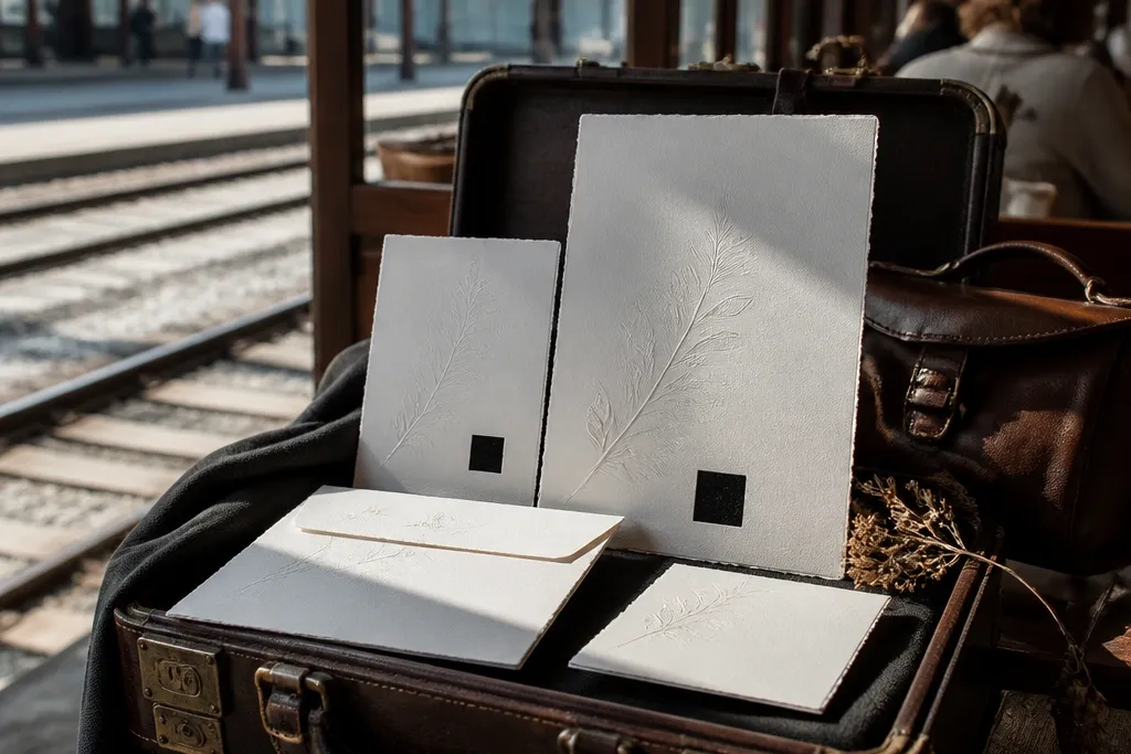
1. Matte charcoal card with oversized serif invite block
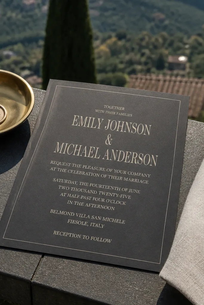
This is my go-to year-round wedding card design when you want the set to look expensive without leaning on specialty printing. Matte charcoal hides fingerprints and reduces glare, so it photographs well in both bright summer venues and dim winter halls. The oversized serif invite block gives you a strong read at arm’s length, which matters when guests skim quickly. It also works across themes — pair it with gold ink for formal, or leave it monochrome for modern minimal.
Start by choosing a 300-350 gsm matte stock in charcoal gray and keep the ink palette to cream plus one accent (either warm gold or deep green). Then set your typography in a grid: center the main names and date, and keep body copy at least 9 pt for RSVP lines. Finally, print a matching RSVP card in the same ink set so the suite feels uniform in the envelope and on the table.
Quick tipUse a matte varnish on the main text area only if your printer offers it; full-card gloss makes charcoal look patchy in humid weather.
Skip thisDon’t use thin white type on a dark background — tiny letters disappear under indoor lighting.
2. Soft-gloss wedding photo invite with a single color-safe band
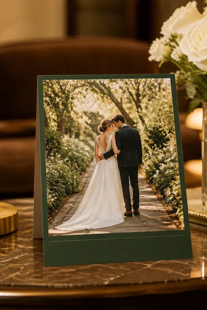
If your wedding theme includes portraits or a meaningful venue photo, soft-gloss printing keeps skin tones and greens looking smooth without the harsh mirror glare of high-gloss. The key is to avoid full-bleed text — you want one solid band for the date and names so readability stays consistent. This card direction shines in spring and summer because daylight makes photo details pop, while the band keeps the typography from looking washed out. It also works for destination weddings where you want one signature image across the whole suite.
Start by selecting one hero photo and cropping it so the top third has negative space for names and the bottom third has room for the event text. Then choose a band color that matches a dominant tone in the photo — like sage, terracotta, or midnight blue — and print the text on that band in a crisp sans serif. Finally, keep the card size standard (5 x 7 or 4.25 x 6.25) to avoid envelope fees and shipping damage.
Ask your printer for a test print with your exact paper finish; photo invites look different on matte vs soft-gloss under venue lights.
Skip multi-color script text over busy photo areas — it reads as noise on RSVP day.
3. Cotton letterpress on warm ivory with small crest seal
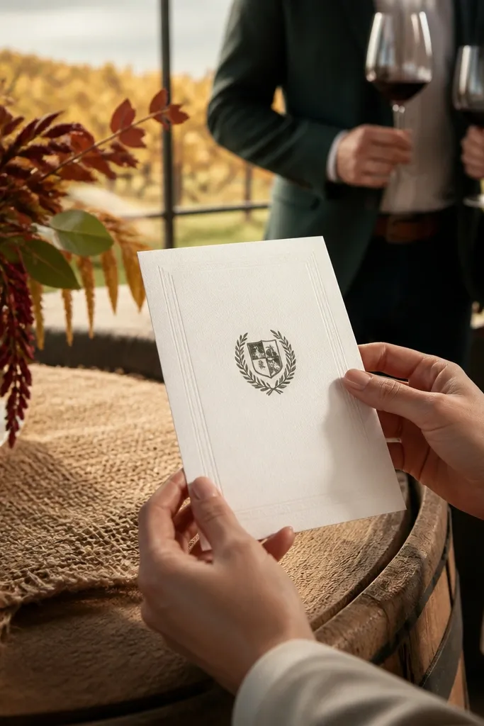
Letterpress gives you a tactile look that still feels right in cold months. Warm ivory cotton stock plus crisp but restrained layout makes the card feel calm and intentional, not loud. The raised impression catches side light, which means it looks best when guests tilt it slightly — great for fall winery weddings and winter ceremonies. If your theme is vintage, church, or garden-classic, letterpress keeps everything elegant without relying on heavy foil.
Start by choosing a letterpress-capable printer and pick a cotton stock in warm ivory (not bright white). Then limit the design to 1-2 text weights and a small crest or monogram seal so the impression stays sharp. Finally, proof the smallest type carefully; letterpress can soften fine details if the plate or paper registration isn’t dialed in.
Quick tipUse slightly larger line spacing than you think you need; letterpress impressions can look cramped when lines are too tight.
Skip thisDon’t flood the card with dense blocks of ink — deep coverage can fill in and lose the relief.
4. Gold foil frame border with matte blush center
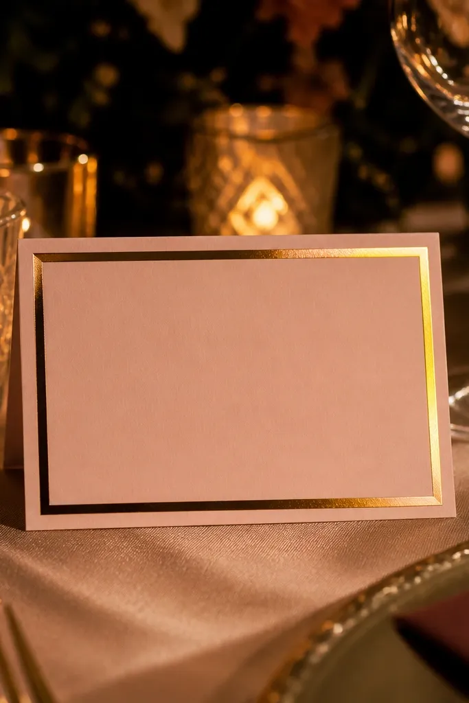
A thin gold foil frame border is a clean way to add winter sparkle without making the whole card feel flashy. Matte blush in the center keeps it flattering and readable, and the frame gives you structure for any theme — modern, romantic, or even minimal. This direction also photographs well at night because foil catches points of light and draws the eye to the names and date. It’s especially strong for December weddings, but the design still works in spring if you switch the accent color to sage or champagne.
Start by choosing matte blush stock around 300-350 gsm and keep the foil to a border or corner accents (not full-coverage foil). Then set your main names in an elegant serif at a large size, and keep body copy in a simple sans serif for clarity. Finally, include a gold foil matching RSVP envelope label or sticker so the suite feels cohesive when opened.
Use foil only on the border lines and headings; it stays crisp and avoids that “over-foil” look that can feel cheap.
Avoid thick foil blocks — they can look uneven and heavy when folded into envelopes.
5. Deckle-edge rustic invitation with deep green ink
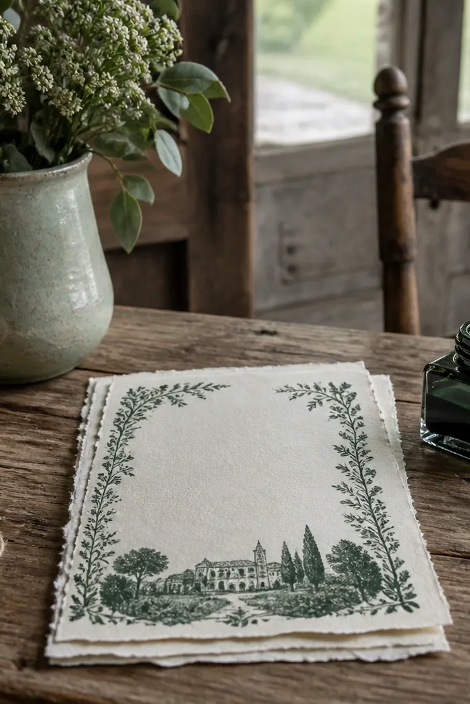
Deckle-edge paper creates instant texture, and deep green ink makes it feel natural instead of generic. This is the year-round wedding card design direction I’d pick for woodland, farm, and garden themes because it matches the paper’s irregular edge with organic typography choices. In spring and early summer, the green stays fresh and looks intentional; in fall, it reads cozy. The trick is to keep the design restrained so the edge texture does the work.
Start by choosing a deckle-edge stock in warm cream and test your ink color on that exact paper (deep green can shift on different bases). Then use a limited palette: deep green for names and date, and brown or charcoal for details. Finally, wrap the card in a belly band or use a wax-seal style sticker so the deckle edge doesn’t snag on envelope liners.
Choose a slightly larger card size than your standard (like 5 x 7.25) if you want the deckle edge to feel intentional, not trimmed.
Don’t pair deckle paper with tiny type; the edge and texture steal attention from microtext.
6. Die-cut window card with layered botanical insert
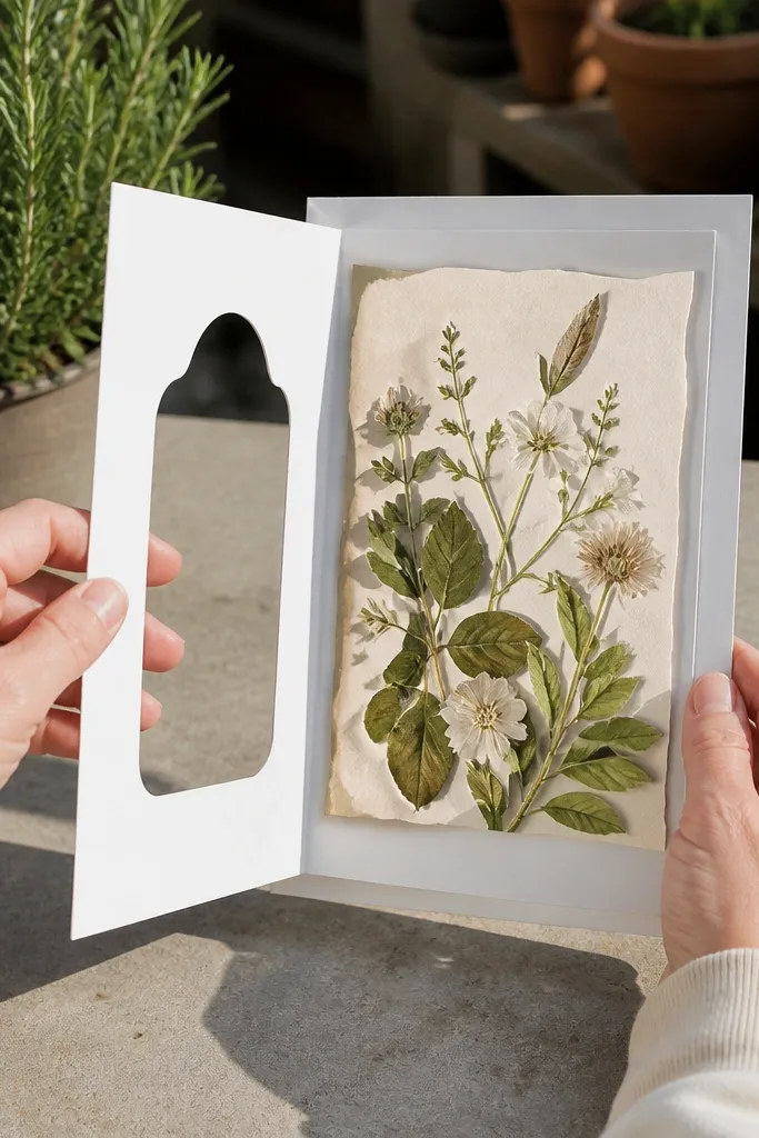
A die-cut window card creates a reveal, which is great for spring and garden themes where you want the design to feel like a moment. The window lets you show one controlled element — like a botanical illustration, pressed-leaf style graphic, or watercolor sprig — while keeping the rest clean. That balance matters for year-round use because complex full-bleed art can fade or smear on some finishes. This style also gives you a place to hide your event details in the insert, keeping the front uncluttered.
Start by picking a single window shape (rounded rectangle or scallop) and decide what will sit behind it — the insert should be printed on a slightly thicker paper so it doesn’t buckle. Then design the front with only the names and date, leaving plenty of margin around the cutout. Finally, order a proof with the exact envelope you plan to use; die-cuts can shift slightly and you need the window to align with the insert.
Use a darker insert behind light botanicals so the window stays readable in indoor lighting.
Skip this option if your guest list is huge and you need ultra-fast assembly; die-cuts add handling time.
7. Folded tri-card with pocket RSVP and belly band
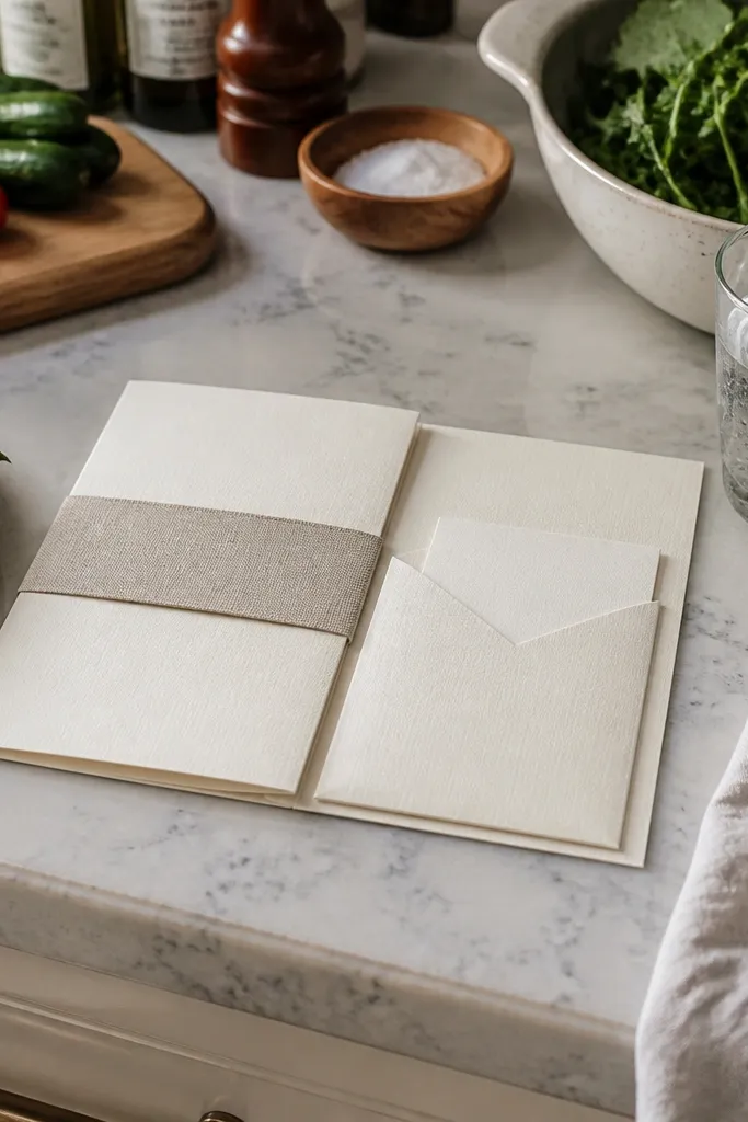
A folded tri-card with a belly band gives you structure and keeps everything tidy, which is why it works for any theme across seasons. The pocket RSVP sits flat and protects the smaller card from bending, so winter mail handling doesn’t ruin it and summer humidity doesn’t make it feel flimsy. This direction also gives you more real estate for typography — great if you have location details, dress code, or weekend schedule. It’s the best choice when you want your invitation to feel like a little folder, not a single sheet.
Start by choosing a tri-fold layout that keeps the main names and date on the front panel and puts event address details inside. Then include a pocket insert for the RSVP card and matching response envelope; aim for a pocket depth that holds without forcing the paper to crease. Finally, order the belly band in the same stock and set your band width so it covers the fold cleanly without crushing the paper.
If you’re printing multiple pieces, keep the same paper stock across invite, RSVP, and pocket liner so the suite opens smoothly.
Don’t overload the inside panels with paragraphs — guests skim; use bullet-like lines with consistent spacing.
8. Monochrome line-art invitation with soft watercolor wash background
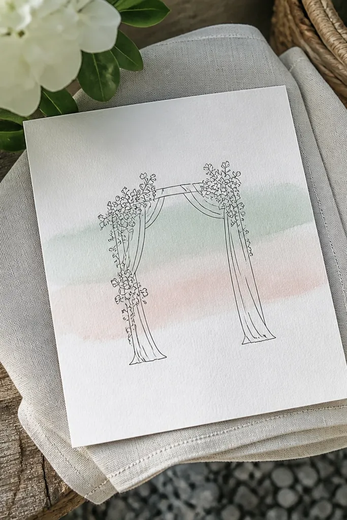
This design direction hits a sweet spot for year-round wedding card design because it stays light visually while still feeling themed. Thin line art keeps the card modern, and the watercolor wash gives season-coded color without covering the whole surface. In spring, choose a pale blush or mint wash; in winter, go for muted slate or smoky taupe. The wash works best when it’s subtle — it should support the typography, not fight it.
Start by picking one line-art motif that matches your theme (single branch, skyline outline, or minimal floral sprig) and keep it in black or deep charcoal. Then add a watercolor wash background at low opacity and place your text on the cleanest area, not over the darkest pigment. Finally, print on a textured or lightly coated paper so the wash looks smooth instead of grainy.
Use a darker text color than you think you need; watercolor washes lighten under indoor lighting.
Avoid full-coverage watercolor backgrounds with small type — those edges can look fuzzy after printing.
9. Matte white card with black ink and red envelope seal dot
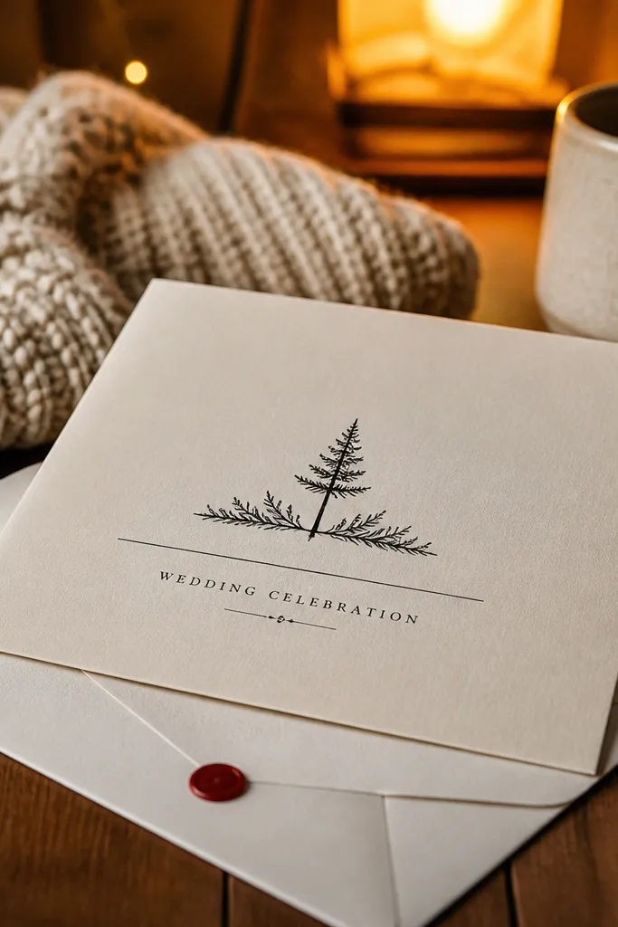
If you want a clean, year-round design that still feels special, this is the one. The card stays readable in any season because it’s high contrast and matte, so glare doesn’t mess with the text. The red envelope seal dot is a tiny design moment that ties the suite together without adding cost to the entire card. It also works for destination weddings where mail handling matters — matte ink and simple layouts are more forgiving if the envelope gets a little scuffed.
Start by choosing a matte white stock and printing the invitation in black ink with a simple hierarchy: names biggest, date next, details smaller. Then add the red seal dot as either a printed circle on the envelope flap or a small sticker seal on the back flap. Finally, keep the typography grid consistent across any extra inserts so the suite looks intentional even when pieces are separated.
If your printer offers it, use a slightly textured matte stock; it hides micro-smudges from handling.
Don’t rely on colored ink for body copy; black and deep navy stay readable when guests glance quickly.
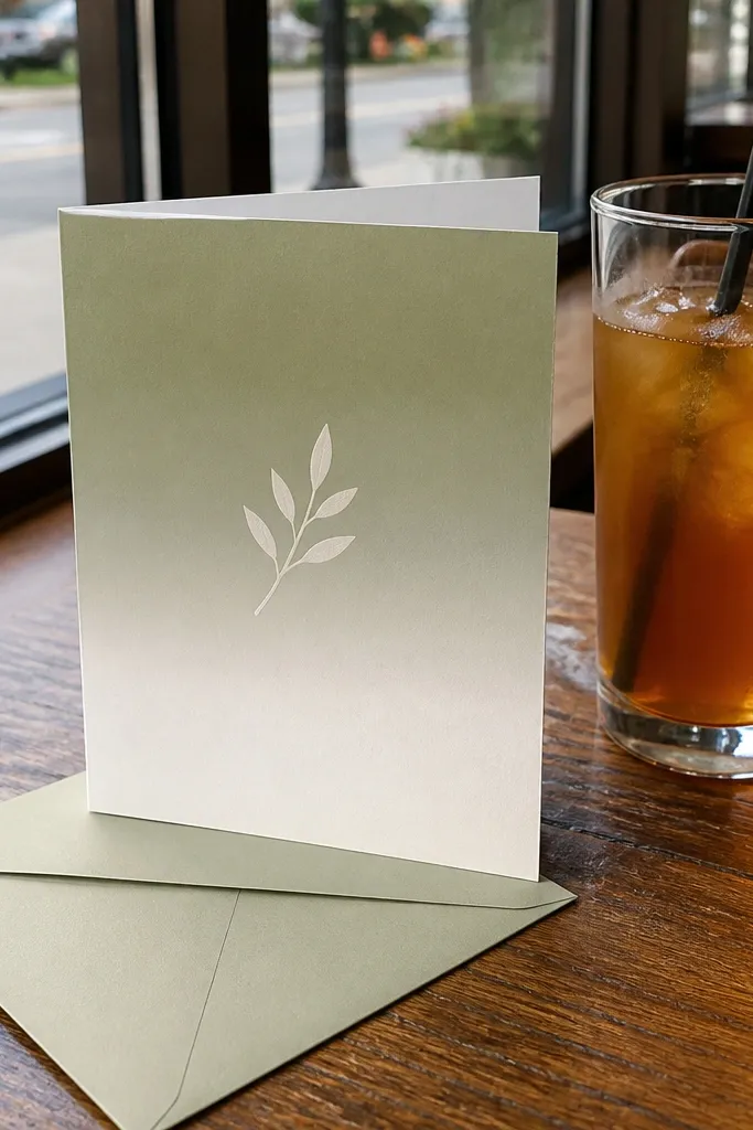
10. Sage green card with white ink typography and minimal icons
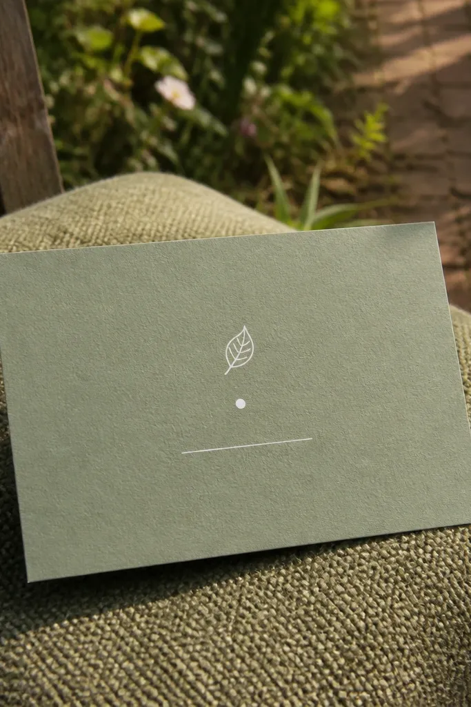
White ink on sage green looks modern and seasonal, especially for garden ceremonies and spring weekends. The card is still year-round because sage is soft and doesn’t feel winter-only the way deep jewel tones can. Minimal icons — a tiny leaf, a dot separator, a simple line divider — give you theme without clutter. This direction also photographs well in shaded outdoor locations because the white text stays crisp against the mid-tone background.
Start by selecting sage stock that isn’t too light; you need enough contrast for white ink to read. Then use white ink for headings and keep body copy in a dark neutral like charcoal so RSVP lines don’t look washed out. Finally, choose a font with strong letterforms — thin fonts can break when printed over colored paper.
Ask for a white-ink test on the exact sage paper; some whites look creamy instead of clean bright.
Avoid tiny white dots or hairline dividers; they can disappear in print.
11. Terracotta watercolor wash with bold black date block
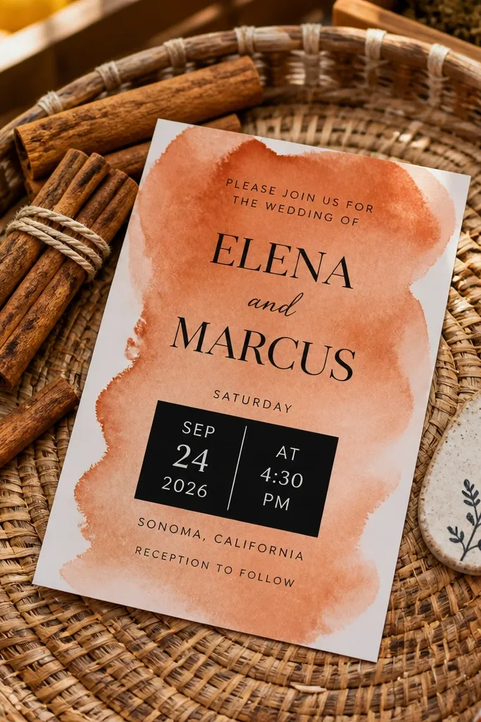
Terracotta watercolor wash backgrounds feel warm in fall and still work in summer because the palette is earthy, not heavy. The bold black date block is the readability fix — guests always need the date without hunting. This is a strong option for couples who want a theme-coded look but don’t want specialty printing like foil or letterpress. It also pairs well with invitation wording that includes weekend schedule lines.
Start by printing a terracotta wash at low coverage so it leaves a clear area for the date block. Then place the date in a rounded rectangle or simple block in black ink, and keep the rest of the text in a clean sans serif. Finally, use a heavier paper (around 350 gsm) so the watercolor texture doesn’t look thin or see-through.
Quick tipKeep your wash away from the edges by at least 0.25 inch so trimming doesn’t create uneven pigment bands.
Skip thisDon’t put long paragraphs over the watercolor — keep body copy on cleaner zones.
12. Navy night sky card with subtle star speckle and foil accents
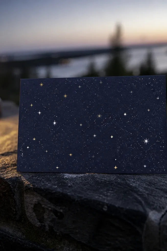
This is a strong winter-to-new-year wedding card direction because the navy base makes the foil feel intentional, not random. The star speckle is subtle, so it doesn’t look like a cheap holiday card, and it gives you texture that reads well in dim indoor venues. Use it for themes like formal winter weddings, modern black-tie, or destination celebrations where the night vibe is part of the story. The design stays year-round as long as the typography is clean and the foil is limited.
Start by choosing a deep navy cardstock and printing a light star speckle pattern at low opacity across the background. Then add foil only to key elements like initials or the date line, and keep the body copy in a crisp white or pale cream. Finally, test the foil placement so it doesn’t land on the densest speckle areas where it could look patchy.
Quick tipLimit foil to less than 10% of the card surface for a polished look that doesn’t feel overdone.
Skip thisAvoid full-foil backgrounds — navy plus heavy foil can look muddy under lighting.
13. Classic black tie gatefold with ribbon tie and inner map line
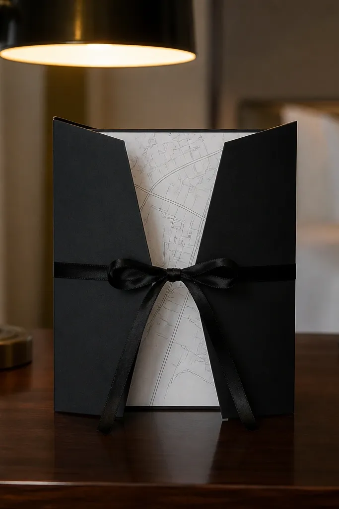
Gatefold invitations feel formal, and the ribbon tie gives you that “ceremony ready” moment without needing a complicated pattern. The inner panel is perfect for venue and weekend logistics, which helps guests navigate destination or multi-event weddings. For year-round wedding card design, gatefolds work because the thicker structure protects the paper from bending in winter mail and keeps it crisp in summer handling. Choose a neutral palette so it doesn’t lock you into one season.
Start by picking a gatefold size that fits standard envelopes (like 5 x 7 folded) and plan your inner text so it’s readable when opened. Then add a ribbon tie in a color that matches your wedding palette — black satin with a thin gold edge looks sharp. Finally, include a simple line map reference or neighborhood name inside and keep the main invitation text on the outer panels.
Use a small ribbon width (about 1/4 inch) so the ribbon doesn’t make the envelope bulky and pricier to ship.
Skip long ribbon ties that wrap around the card; they snag and make assembly slow.
14. Translucent vellum overlay with printed invitation layer
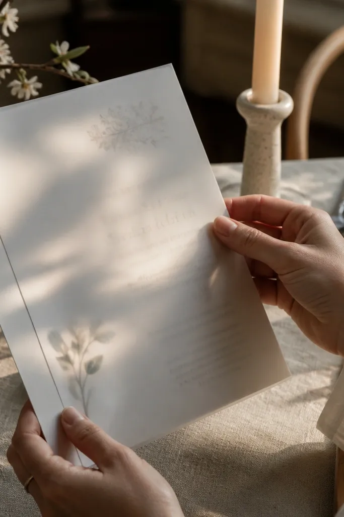
Vellum overlays create a layered look that feels special without being tied to one season. The translucent top sheet makes the card feel airy in spring and gives a soft glow effect in winter when guests open it under warm indoor lights. This is a great design direction for couples who want a clean, modern typography layout but still want a tactile surprise. Keep the vellum design restrained so it stays readable and doesn’t turn into a messy stack.
Start by printing the main invitation on a solid card stock base and choosing vellum in a warm tone like soft cream, not bright white. Then place a single element on the vellum — like the names or a thin border line — so the overlay adds texture without covering the text. Finally, secure the vellum with a small corner glue dot or a belly band so it stays aligned in the envelope.
Quick tipUse a darker base ink under vellum; light ink can fade when seen through translucent paper.
Skip thisDon’t add full-bleed watercolor to vellum; it looks cloudy and can blur the typography.
15. Edge-painted invitation with neutral photo and minimal type
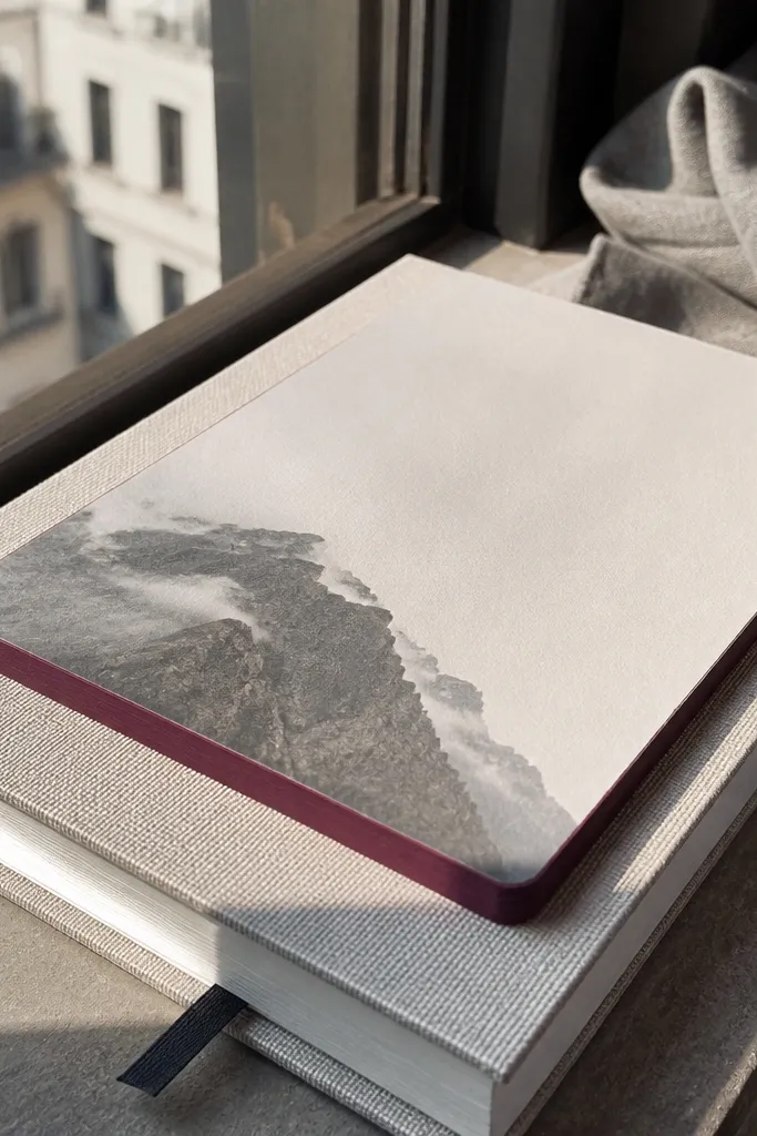
Edge-painted cards feel custom and they handle seasons well because the color sits on the border, not the text. Choose a neutral photo or calm background and let the edge color do the seasonal coding. In winter, a deep burgundy edge looks cozy; in summer, a soft sage edge feels light. This style is also forgiving if your printer’s colors shift slightly, because the edge paint stays consistent visually.
Start by selecting a standard card size and ordering edge paint in a color that matches your theme palette. Then keep the interior design simple: names, date, location, and one clean line divider. Finally, order matching envelope liners or a sticker seal in the same edge paint color so the suite feels intentional when opened.
Quick tipPick edge paint colors that look good in natural daylight, not just on a screen.
Skip thisAvoid busy multi-photo layouts; edge paint can’t save a cluttered design.
16. Black-and-cream art deco fan pattern with foil date
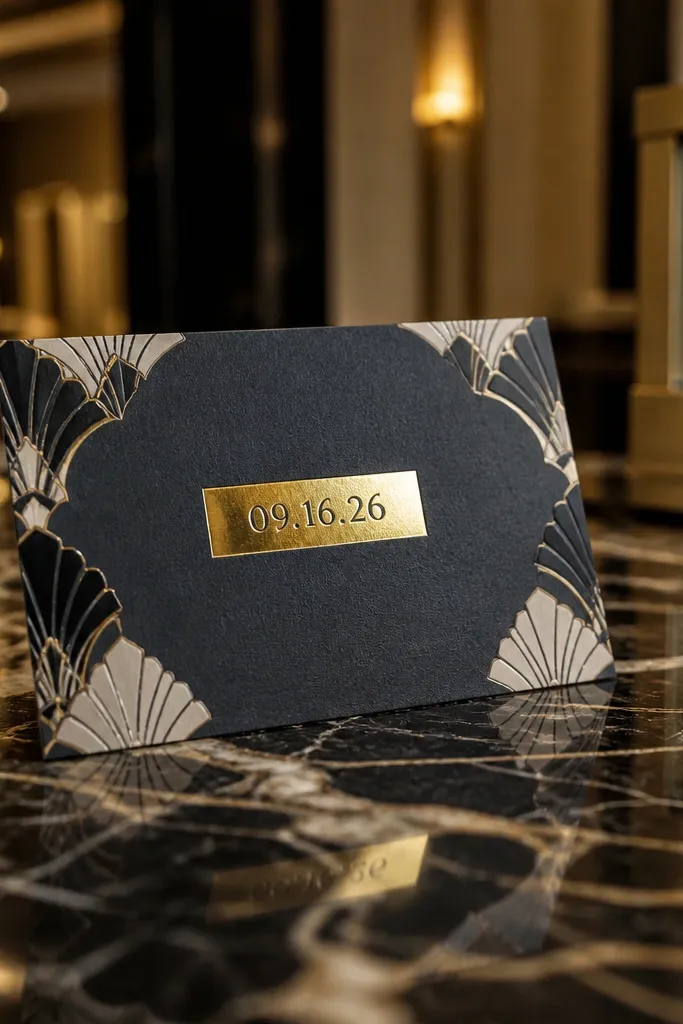
Art deco patterns are built for formal settings, and they stay year-round because the design is about geometry, not seasonal imagery. The fan pattern adds movement while black-and-cream keeps it classic. Use foil only on the date so it feels celebratory without turning the whole card into a shiny sheet. This style works well for fall and winter events where indoor lighting makes patterns look crisp, but it also works in spring if your theme is modern and not overly floral.
Start by choosing a cream or warm ivory base and designing an art deco fan pattern in black with low opacity so it doesn’t overwhelm the text. Then place the date in the center and add gold foil to that single element. Finally, keep your fonts in one family — a deco-inspired display for the names and a simple sans for the details.
Use thin rules and consistent spacing; art deco looks best with strict alignment.
Don’t mix too many font styles; deco patterns plus multiple fonts quickly look chaotic.
17. Spring garden seed paper card with stamped location line
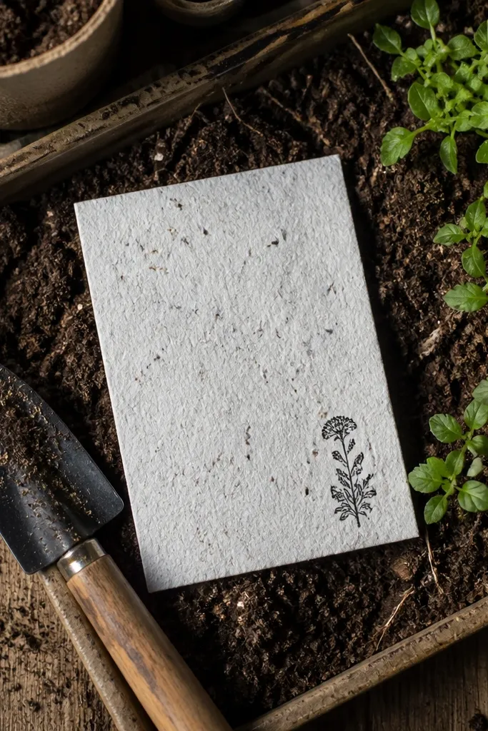
Seed paper cards feel like a theme statement, but you still need readability for day-to-day use. The best version keeps the design minimal: a stamped location line, names and date, and one small botanical mark. This direction is especially good for spring and summer weddings because guests love the idea of planting after the event. It also works year-round if your ink is dark and your typography is large enough to remain legible when the paper is slightly textured.
Start by choosing seed paper stock that’s designed for printing, then pick a deep ink color like dark charcoal or espresso. Then use a stamp-style typography layout — simple and slightly bold — and keep the design to one front panel. Finally, include a separate RSVP card in a more stable stock so the texture doesn’t make the response piece feel rough to write on.
Order a sample and check that the ink density holds on the textured surface before committing to your full run.
Don’t put ultra-fine script on textured seed paper; it prints blotchy and loses the crisp look.
18. Minimal white-on-cream typographic card with corner relief emboss
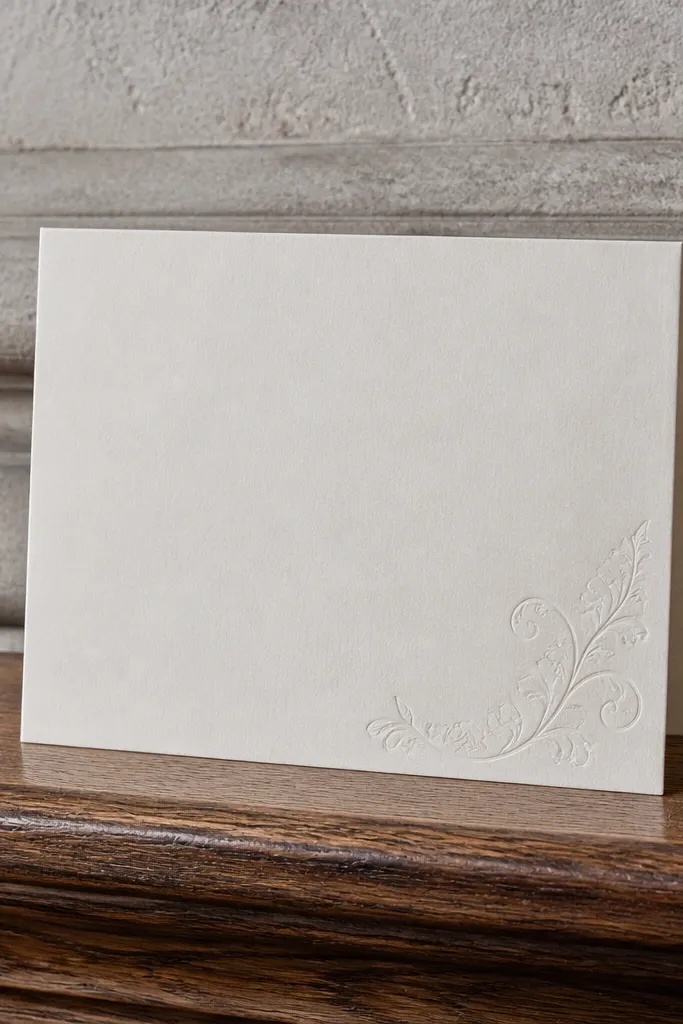
This is the cleanest option for couples who want a year-round wedding card design that looks good everywhere. White-on-cream gives you soft contrast without the harsh glare of glossy white, and the corner relief emboss adds interest without crowding the design. It’s a strong fit for modern venues, courthouse ceremonies, and destination weddings where you want the card to feel light and calm. Because it’s subtle, it also works across themes — just change the ink tone or emboss motif to match your palette.
Start by selecting a warm cream stock and using white ink for headings, then switch body copy to a darker neutral like taupe or charcoal for RSVP readability. Then add a small corner emboss or relief line motif — keep it to one corner so it doesn’t distract. Finally, include a matching envelope with a simple return address format so the suite looks finished even when guests don’t notice the emboss.
If you’re printing white ink, ask for a proof under warm indoor lighting; some whites look gray on certain stocks.
Don’t rely on white ink for long text blocks; keep it for headings only.
19. Tonal foliage illustration card with layered vellum belly band
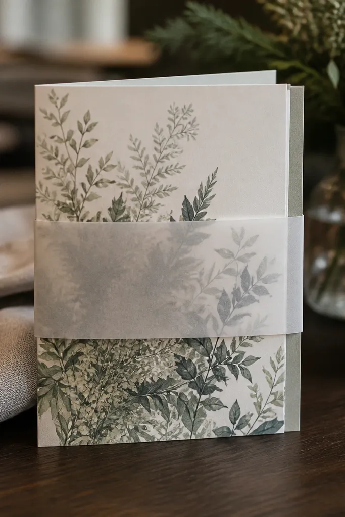
This option gives you a garden look that still works in winter because it’s tonal and not season-specific. The tonal foliage illustration sits in muted greens and warm grays, and the vellum belly band adds soft translucency that feels elevated without being fragile-looking. It’s a good pick when you want your wedding invitation to feel “put together” even if you’re not doing foil or full letterpress. Spring and fall both benefit, because the palette reads natural in daylight and warm indoor settings.
Start by printing the main invitation on a warm cream stock with a low-contrast foliage illustration behind the text area. Then attach a vellum belly band around the closed invite — keep the vellum design minimal, like a thin line or small monogram. Finally, choose a band width that holds the papers snugly so the vellum doesn’t slide inside the envelope.
Keep the foliage illustration slightly desaturated; bright greens look neon under indoor lighting.
Avoid heavy full-color artwork on vellum; it tends to look cloudy and dull.
20. Holiday-style layered label card with ribbon and minimal type
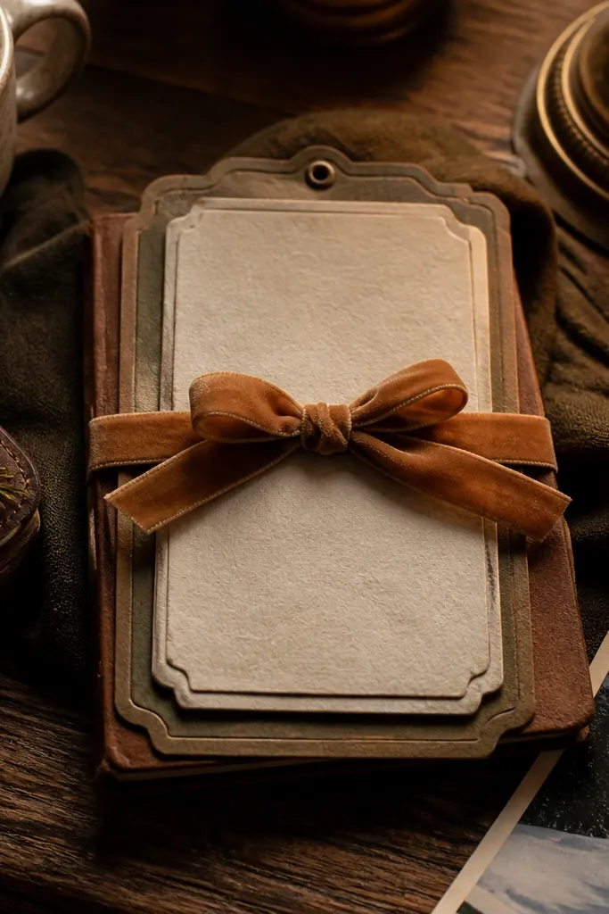
Layered label cards are a smart way to get a holiday feel in December without going full foil everywhere. The layered panel gives you dimension, while ribbon adds warmth and softness to a clean typographic layout. This works in winter because textured elements read well under warm lights, and it still works in fall because the palette can shift to bronze, pine green, or neutral tan. It’s also practical: guests can find the date fast because your main text sits on one clear label area.
Start by choosing a base card and adding a smaller top label panel for names and date. Then print the label in a high-contrast ink color and keep the rest of the card minimal so the label is the focal point. Finally, finish with a short ribbon tied around the closed card or attached as a sticker-style ribbon tab on the envelope flap.
Use a ribbon color that matches your envelope seal or return address color so the suite looks coordinated.
Skip long multi-layer stacks; they add thickness and can cause envelope fitting issues.



