
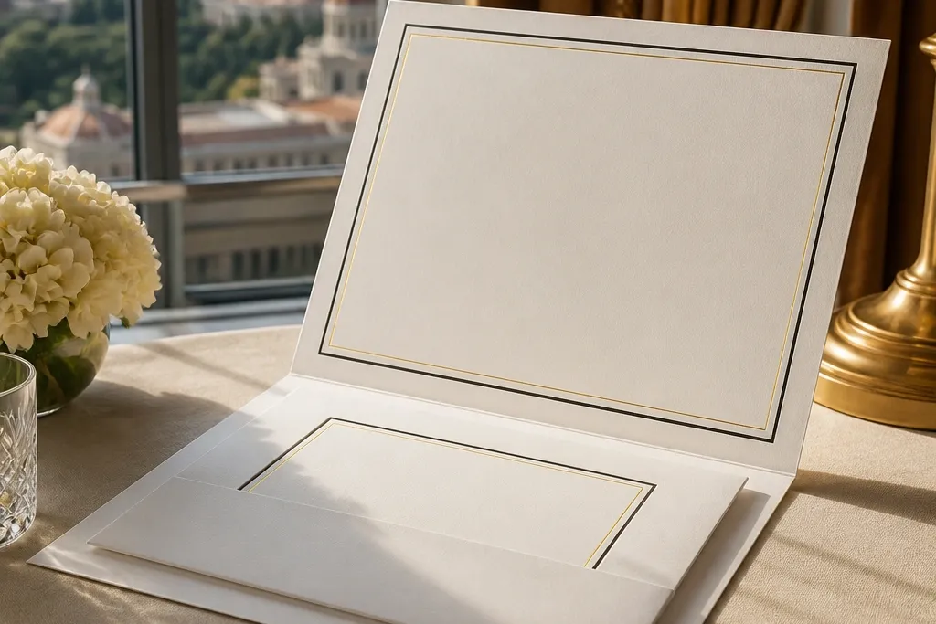
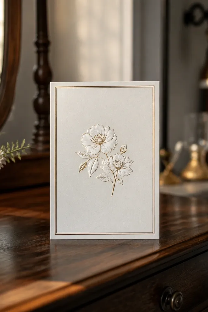
1. Double-Line Frame With Gold Foil Inner Rule
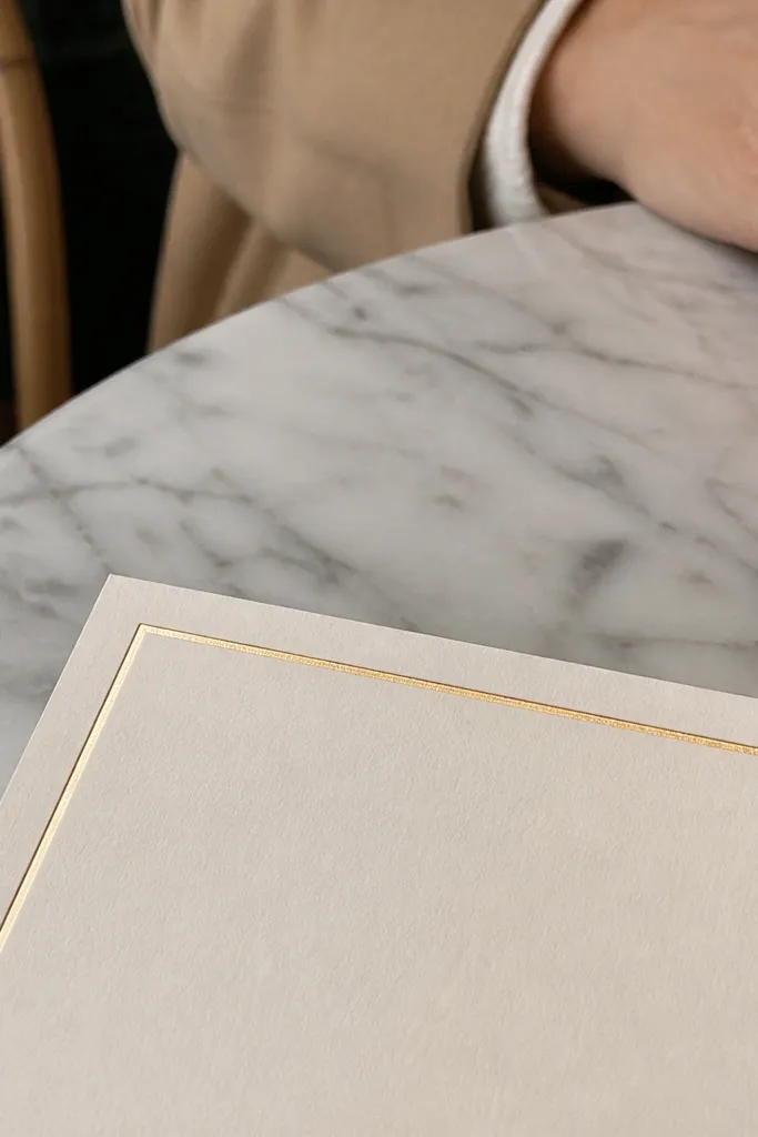
This frame is the fastest way to get “high end” without turning the card into a craft project. The outer rule should be a clean, thin line, while the inner rule uses gold foil so it catches light when the card tilts. Keep the inner rule slightly inset from the outer line so it looks intentional, not like a printer accident. It works especially well for classic fonts and monochrome layouts because the border adds shine without competing with your text.
Start by picking a cream or warm white base and request two separate vector rules: one for the outer line and one for the inner line. Then set your inner margin for typography at 6-10 mm from the inner foil rule so names and dates don’t feel boxed in. Finally, ask the printer to foil only the inner rule and leave the outer rule as printed ink or blind emboss for contrast control.
If you’re unsure, choose a thin foil rule (around 0.25-0.35 pt) so it stays crisp after trimming.
Don’t make both lines thick — it turns “luxury frame” into a heavy outline.
2. Ornate Corner Medallion Frame (Four Small Motifs)
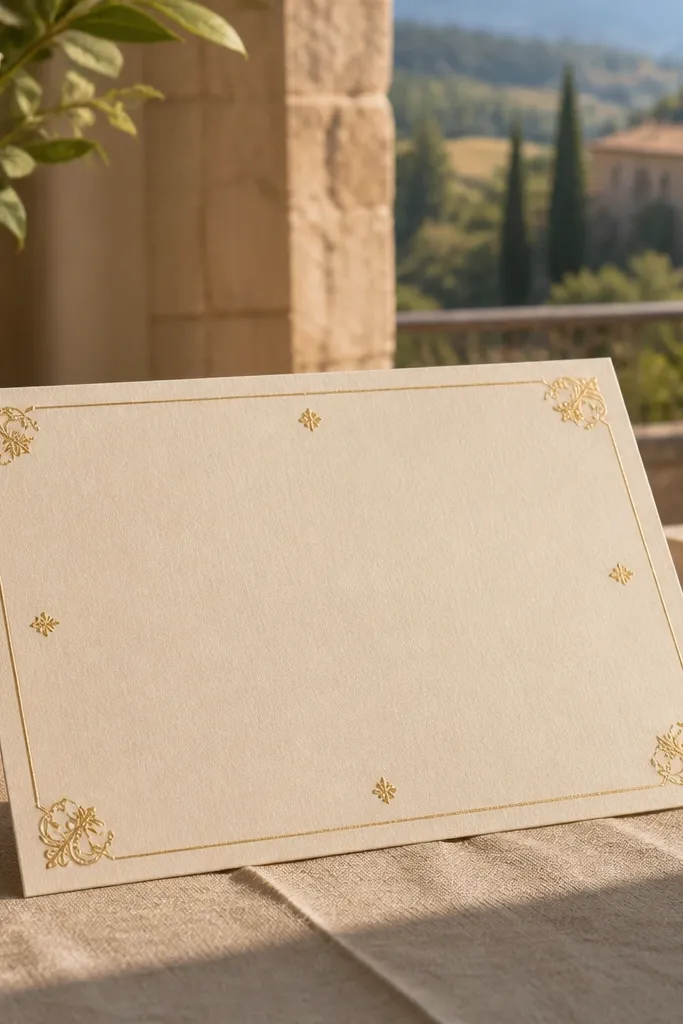
Corner medallions give you that old-world wedding invitation look without filling the whole card with busy ornament. The trick is using small, repeating motifs at all four corners so symmetry does the heavy lifting. Pair the medallions with a restrained border line so your typography remains readable. This frame style looks best with short, elegant text blocks like “Ceremony” and “Reception” because the corners guide the eye back to the center.
Start by choosing a thin border line (printed ink) and place four identical corner medallions at consistent distances from each edge, usually 12-18 mm. Then keep the medallion size small enough that it doesn’t overlap the inner margin; aim for around 10-14 mm tall for each corner. Finally, request gold foil or metallic ink for the medallions only, and keep the border line matte to avoid glare.
Use the same motif for all corners; mixed styles look like mismatched clip art.
Skip oversized medallions — they make the card feel crowded and harder to read.
3. Lace-Style Border Frame With Soft Deckled Edge
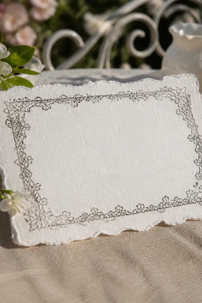
Start by choosing a deckled-edged stock or a print technique that simulates a torn/feathered edge, then design a lace border that stays inside the safe trim area. Next, keep your inner text margin wide at 8-12 mm because lace patterns need breathing room. Finally, print the lace border in a light ink tone (warm gray, soft black, or muted gold) so it doesn’t fight with your main typography.
A lace-style border feels romantic and photogenic because it adds texture that shows up even in flat light. Add a soft deckled outer edge and the card looks handcrafted, but still clean if you keep the typography minimal. This works beautifully for spring and summer weddings, especially with pastel palettes or black-and-cream contrast. The border should be delicate enough to frame the center without swallowing it.
Skip thisDon’t place lace right up against the trim — it gets chopped and looks sloppy.
Quick tipTest glare: metallic ink on lace can look messy in photos; matte lace ink usually photographs cleaner.
4. Geometric Frame With Raised Ink Lines (Art Deco Grid)
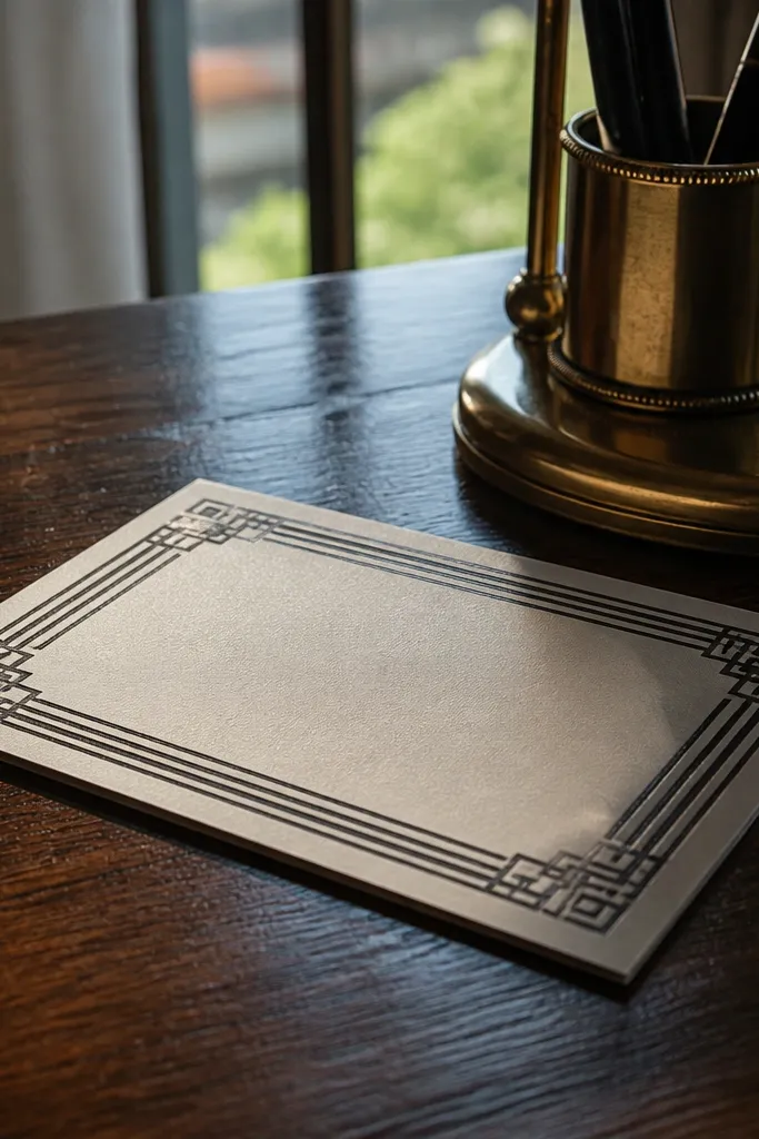
Start by selecting a dark base and requesting raised ink (spot UV or raised varnish) for the border lines only. Then use a strict grid: keep line thickness consistent and align corner angles so the frame looks engineered. Finally, set your typography inside a 7-10 mm margin from the raised border so text doesn’t look squeezed.
Art Deco-inspired frames look high end because they’re structured and photogenic from multiple angles. Raised ink lines add a tactile quality that shows up under raking light, making the border feel dimensional even when the rest of the card stays simple. Use a geometric layout that keeps corners sharp and spacing consistent. This frame style suits black, deep navy, and emerald palettes, and it pairs well with bold serif or small-caps typography.
Skip thisAvoid tiny repeating shapes — they blur when trimmed and lose the Deco feel.
Quick tipAsk for a proof under angled light before final printing if you’re using raised varnish.
5. Watercolor Wash Frame With Crisp White Mat Border
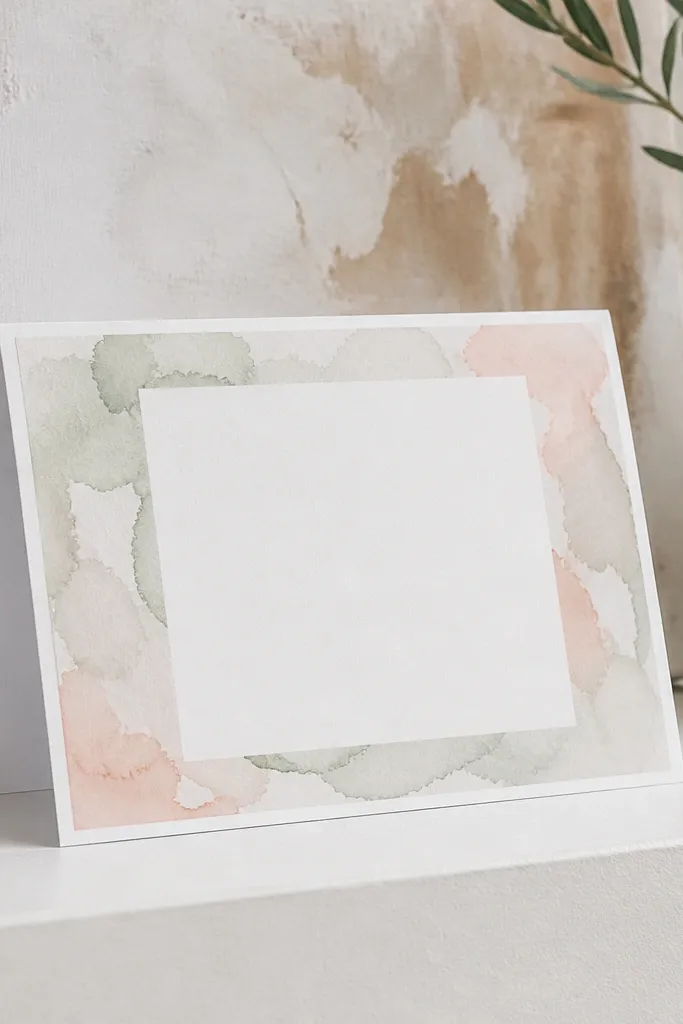
This is a modern “gallery print” frame that looks premium because it combines a soft edge effect with a crisp mat line. The watercolor wash creates movement, while the white mat keeps the center clean and readable. Choose one main wash color and keep it light enough that your typography stays the focus. This frame is great for outdoor weddings and destination weddings because it looks airy in bright daylight.
Start by designing a watercolor wash area as a background border layer, keeping it away from the trim by at least 4-6 mm. Then add a crisp inner mat line in white (or a near-white tint) so the typography sits on a calm field. Finally, print the watercolor in a controlled palette (one hue plus a soft neutral) so it doesn’t look like a random splash.
Limit the wash to one color family; multi-color washes look messy on small invitation sizes.
Don’t use heavy watercolor all the way to the edge — it kills legibility.
6. Monogram Frame With Centered Initials and Thin Outer Rule
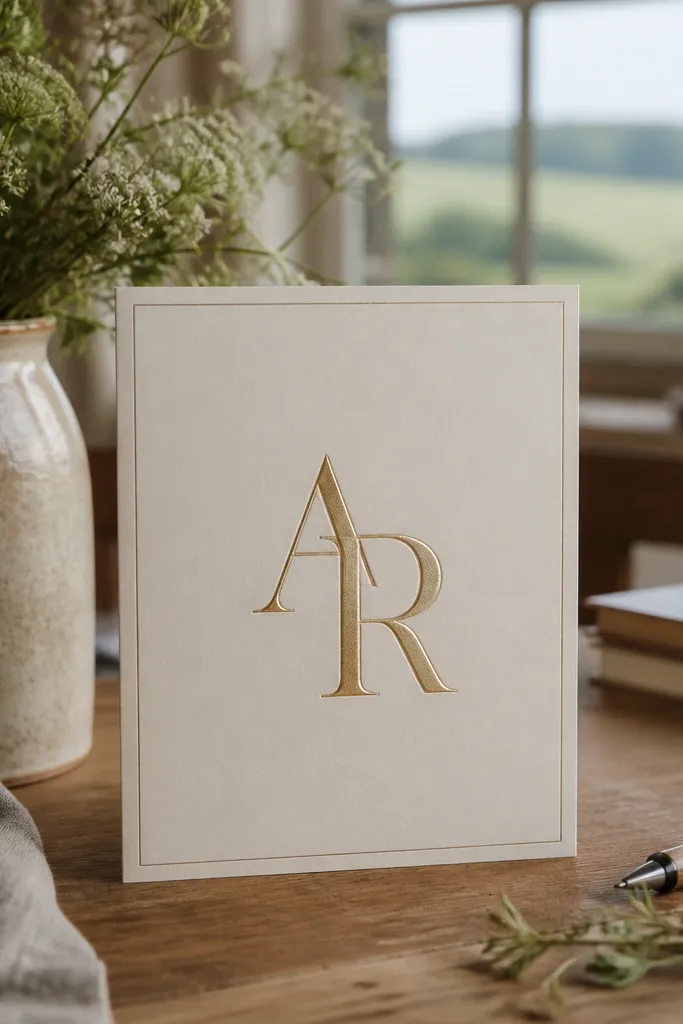
Start by choosing the initials and sizing them so they sit inside the inner margin, typically 25-35 mm tall depending on card size. Then add a thin outer rule and keep consistent spacing from all edges, usually 10-14 mm. Finally, print the monogram in a slightly different tone than the border (black-on-ivory with a subtle gray, or deep navy with ink-matched border) so it looks intentional.
A monogram frame looks high-end when it’s restrained and properly centered. The outer rule should be thin and quiet, letting the monogram do the visual work inside the frame. This style creates instant personalization without turning the card into a cluttered logo. It’s also a great choice when your invitation text is short, because the monogram holds attention while the details stay readable.
Skip thisSkip thick boxed frames around monograms — it makes everything feel heavy.
Quick tipUse one monogram, not multiple decorative letters. Multiple initials crowd the center fast.
7. Botanical Frame With Single-Line Vines (Clean and Modern)
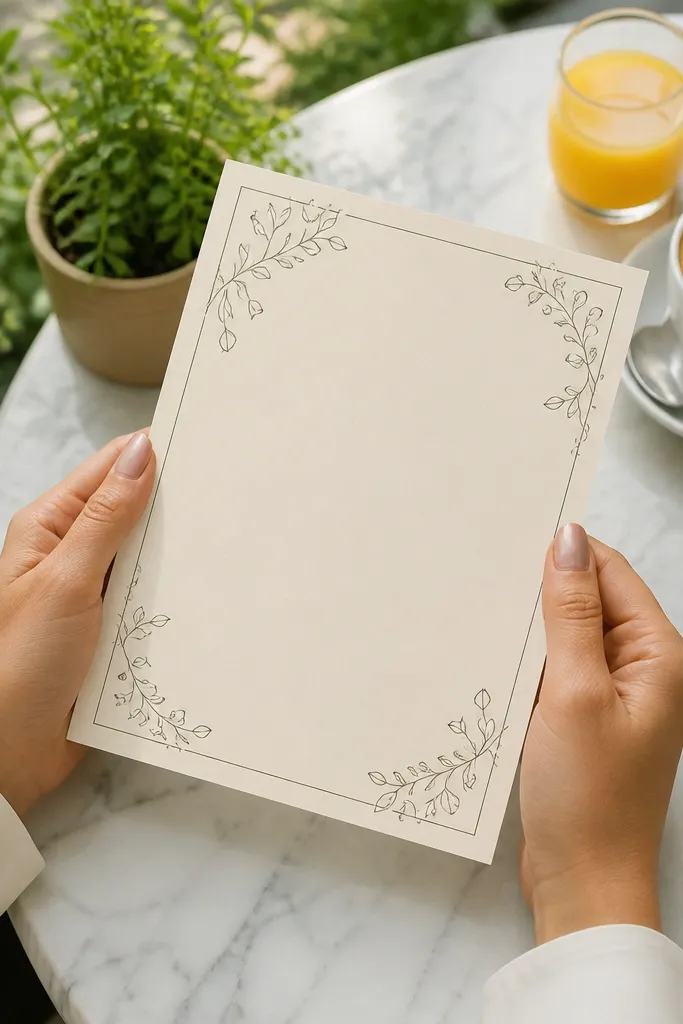
Start by selecting a single vine line weight and keeping it uniform across all corners, usually around 0.5-0.75 pt. Then place the vines so they never cross into the 6-10 mm inner margin reserved for names and dates. Finally, print in one muted green or deep olive ink, and keep the background matte so the line art reads clearly.
Clean botanical frames look expensive when the linework is minimal and consistent. Use single-line vines that curl into the corners, rather than dense illustrations that fill the entire border. This gives you a fresh, nature-forward look that stays elegant in photos. It pairs well with spring weddings, garden venues, and soft typography, and it works even on smaller card formats because the line art stays light.
Skip thisDon’t use multi-color florals in a frame — the border becomes busy and unreadable.
Quick tipIf you want extra luxury, use a matte olive ink and add a subtle foil dot accent on a few leaves only.
8. Pearl-White Frame With Soft Embossed Border Line
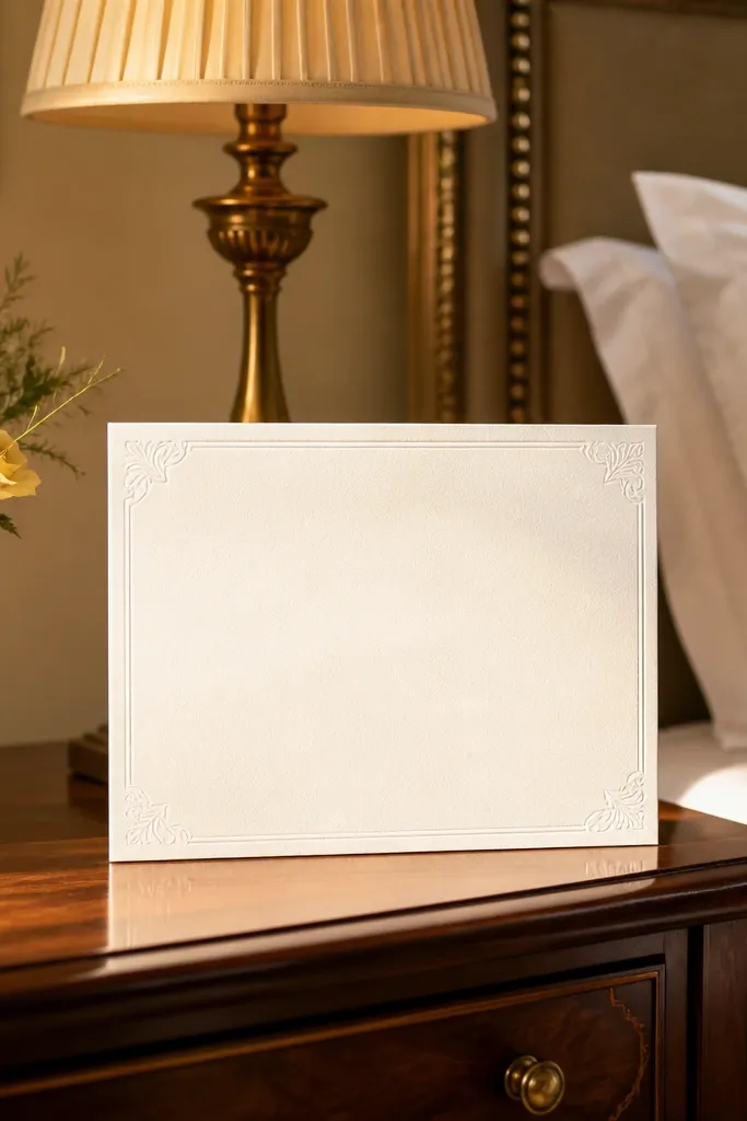
Start by choosing a pearl or textured stock and requesting a blind emboss (no ink) for the outer border line. Then set your typography margin at 8-10 mm so the raised edge doesn’t visually compete with the text. Finally, keep your inner design simple and let the embossed border be the only “special” element on the card.
Subtle emboss frames look high end because they rely on texture, not heavy decoration. A soft embossed border line creates a premium feel when the card catches light, but it stays quiet and refined. Use pearl-white or warm white paper so the emboss reads as a gentle lift rather than a dark outline. This frame is ideal for weddings that want understated luxury — think minimalist typography and neutral palettes.
Skip thisAvoid adding foil on top of a subtle emboss frame — the shine can look uneven.
Quick tipAsk for a sample of the emboss under both indoor and outdoor lighting if you’re going minimalist.
9. Sculpted Border Frame With Corner Brackets (Modern Luxury)
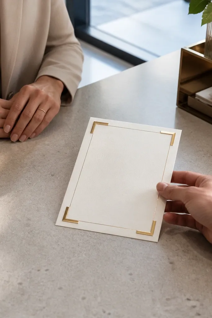
Corner-bracket frames feel modern and expensive because they use negative space like a designer. Instead of full border lines, you place short brackets at each corner and let the sides breathe. This keeps the card light while still giving structure, and it looks great with bold typography or monograms. Use this when your invitation has lots of text — the frame guides the eye without boxing every edge.
Start by designing four corner brackets with consistent lengths and thickness, then leave the center sides open. Next, align brackets to a consistent inset, around 12-16 mm from the card edge, so the geometry looks crisp. Finally, print the brackets in a matte dark ink and keep your main text at least 7-10 mm away from the bracket endpoints.
If you’re printing double-sided, make sure the frame sits far enough from the fold so it doesn’t warp visually.
Don’t use corner brackets with tiny, delicate type — the contrast between bold frame and small text can feel off.
10. Marble Vein Frame With Thin Black Outline
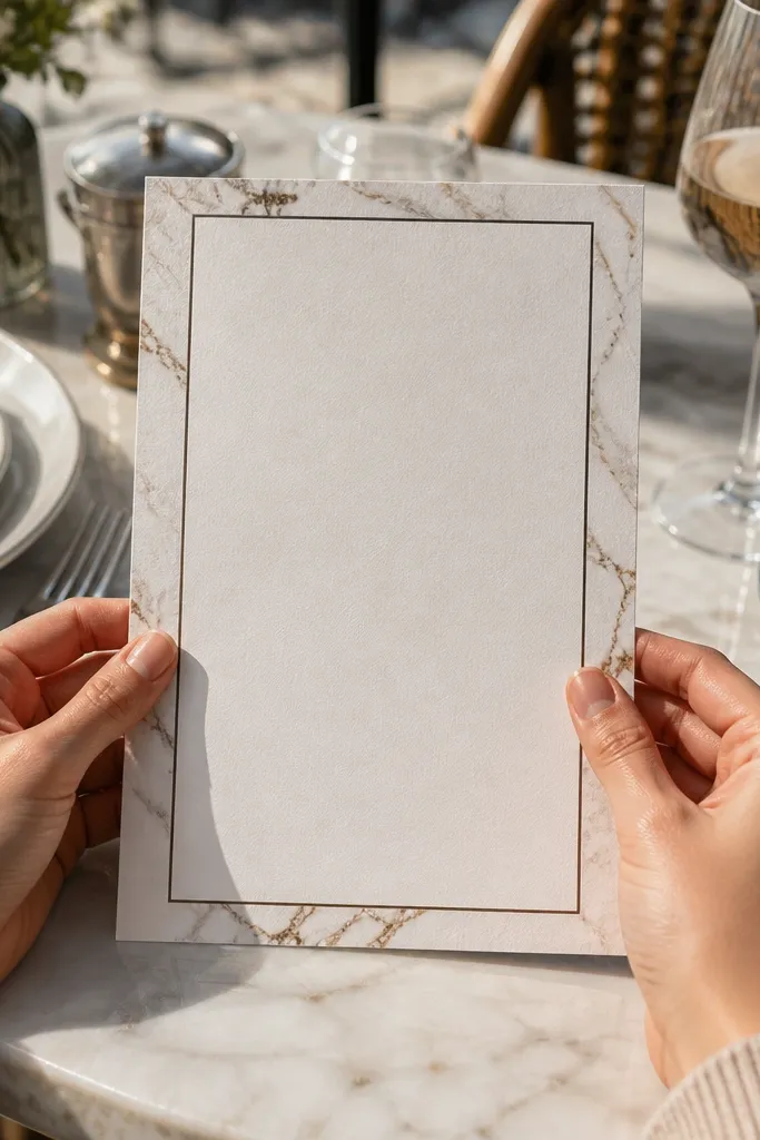
Marble frames look luxe because they mimic expensive materials while staying graphic. The key is keeping the marble confined to the border area and using a thin black outline to define the edges. Choose a light marble pattern with soft gray or warm beige veining so it doesn’t overwhelm your text. This frame style works across seasons and looks especially good with metallic accents like champagne foil.
Start by creating a marble texture that sits only in the border region, leaving a clear inner margin for text. Then add a thin outline in black (or deep charcoal) so the border doesn’t fade into the background. Finally, keep the marble scale moderate so the veining isn’t too busy for the card size.
Use a single marble variation for the whole batch if you’re ordering multiple invitations — matching matters in photos.
Avoid dark, high-contrast marble — it turns the frame into noise.
11. Chalkboard Style Frame With Chalk White Typography
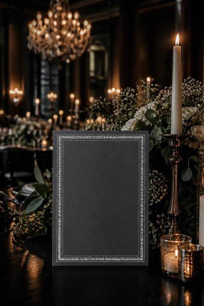
Chalkboard frames are high end when the border is clean and the texture is intentional, not messy. A slate-gray or deep charcoal border in chalk-like texture looks dramatic and reads well in moody venue photos. Keep the border simple: a single thick chalk line with a subtle double line inside, not a decorative doodle frame. This style suits winter weddings, candlelit receptions, and venues with dark wood or industrial interiors.
Start by selecting a matte slate stock and designing a border in chalk-texture ink or simulated chalk effect. Then keep the border thickness consistent and add only one extra line for depth. Finally, place your typography in chalk-white or off-white and keep it 7-10 mm from the border so the textured edge doesn’t smudge into letters.
Choose matte paper — glossy stocks make chalk textures look like plastic.
Skip thin chalk borders — they disappear and look like a printing defect.
12. Black Velvet Look Frame With Subtle Spot UV Shine
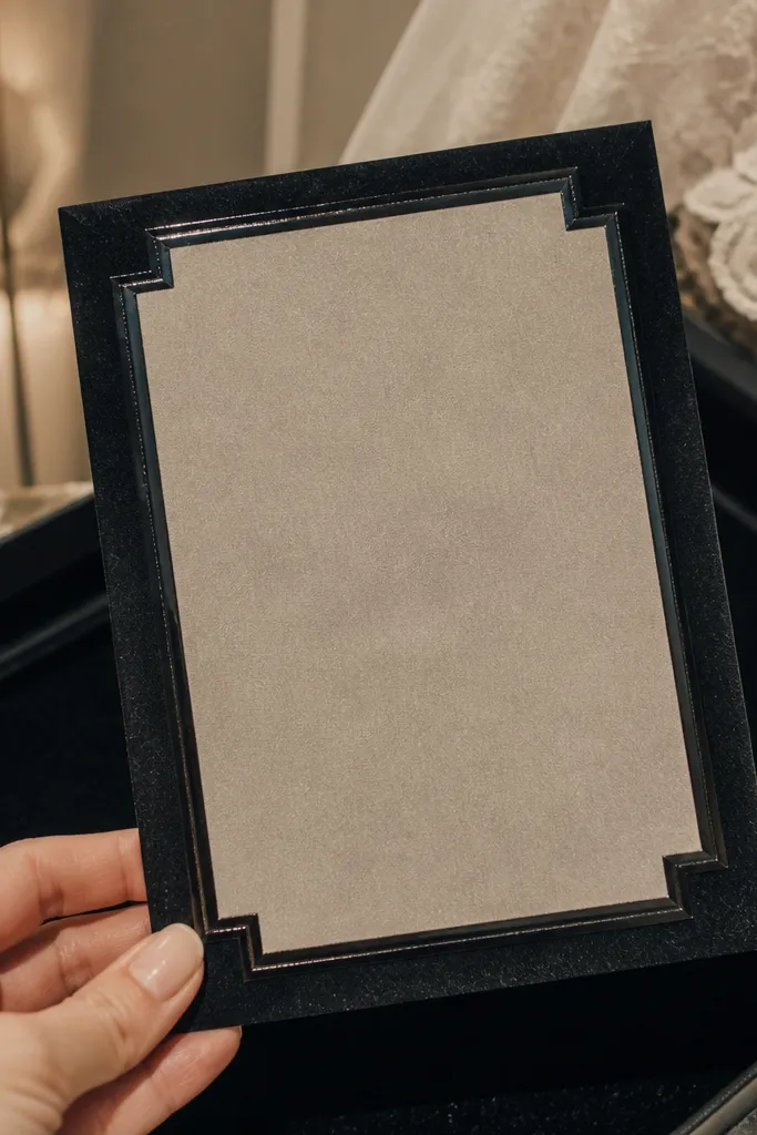
Start by choosing a black matte or velvet-finish stock and designing a thin border line around the card. Then request spot UV on short sections of the border, not the entire line, so it doesn’t look shiny all over. Finally, keep a 7-10 mm inner margin for text and ensure the spot UV segments align evenly on all sides.
Velvet-look frames feel premium because they combine matte body and tiny glossy highlights. You get that “luxury finish” effect without covering the card in heavy ornament. Keep the border mostly matte, then add spot UV on small segments of the frame line so it catches light like jewelry. This frame style is striking with white or champagne typography and works well for evening ceremonies.
Skip thisDon’t put spot UV on large areas — it reads cheap and glare-heavy.
Quick tipAsk for a physical sample under warm indoor lighting; velvet finishes can look flat under cool light.
13. Pastel Ombre Frame With Crisp Center Panel
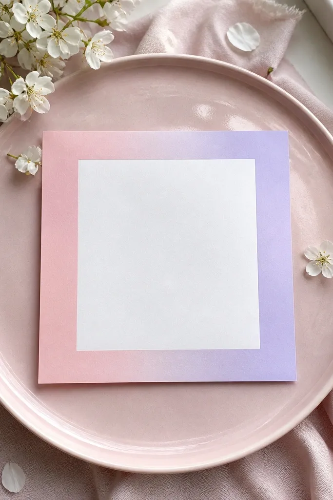
Start by designing a border area that holds the ombre gradient, keeping it inside the safe trim by 4-6 mm. Then add a solid inner panel (white or near-white) where names and details go, with a margin of 8-10 mm from the ombre edge. Finally, print the ombre in a way that avoids banding — request high-quality gradient output if your printer offers it.
Ombre borders look gorgeous when the center stays clean. The frame gradient adds softness and color movement, while a crisp white center panel keeps text readable and makes the overall design feel intentional. Choose two pastel tones max, and keep the gradient direction consistent from left to right or top to bottom. This is a great choice for modern weddings with light palettes and minimal typography.
Skip thisDon’t let the ombre run behind text — it kills legibility in photos.
Quick tipIf your invitation text is small, avoid ombre that gets too dark near the center panel edge.
14. Vintage Engraved Frame With Guilloche Lines
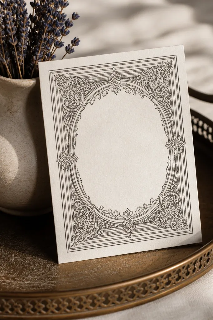
Start by selecting a border pattern that uses thin, repeating curves, and keep the pattern confined to a border band no wider than about 12-16 mm. Then add a thin outer outline so the engraved look stays defined after trimming. Finally, print in deep black or charcoal ink on warm cream paper for the best vintage contrast.
Guilloche linework gives instant vintage-luxe texture because it’s dense, precise, and visually complex even when it’s subtle. Keep the border pattern fine and controlled, with a clean outer rule so your typography stays readable. This frame style looks great with serif fonts and black ink, and it photographs well because the linework creates micro-contrast. It’s a strong fit for classic weddings that want sophistication without heavy florals.
Skip thisSkip guilloche frames with thick borders — they look like security-document design.
Quick tipAsk whether the printer can hold fine lines at your final card size; if lines are too tight, the pattern will blur.
15. Sunburst Gilded Frame With Hand-Painted Center Rays
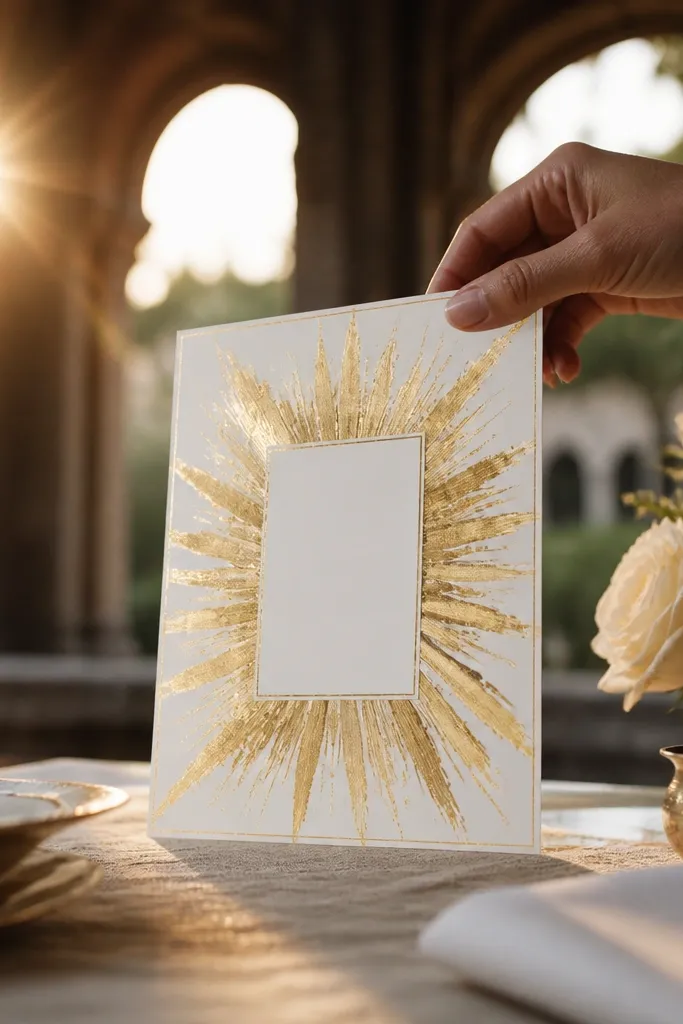
Step 1: Pick a frame template that has a thin outer rule and a separate sunburst layer so the text area stays crisp. Choose warm gold foil for the rays plus a soft off-white center mat (not bright white) to keep the border from looking harsh in photos. Step 2: For travel, aim for a place with reliable craft workshops and good paper suppliers like Florence or Rome, where you can order custom stationery directly from a studio or through a local print shop. Plan 2 to 3 hours for design approval and a same-day proof if you book early; budget about 120 to 220 EUR for a custom frame run of 25 to 50 cards depending on foil and paper. Step 3: Book the workshop or print appointment 3 to 6 weeks ahead, and bring your wedding date in the exact type size you want so they can match spacing on the center panel. If you’re mailing invitations, add 7 to 10 days for shipping and proof changes.
This frame design is built around a sunburst that radiates from the center — think gold foil rays that look like they were painted with a steady hand, not printed flat. The border stays clean so the rays can do the drama, and the center panel stays readable for names and dates. It looks high end because the gold has depth and the rays have slight variation in thickness, which makes the whole card feel dimensional. It suits destination weddings where you want a warm, celebratory mood without going overly ornate. Book it for late spring through early fall, when the light outside matches the golden palette and your photos look extra cohesive.
Skip thisDon’t choose a sunburst that covers the whole card — you want a readable center panel with breathing room.
Quick tipBring a printed sample of your wedding invitation font and a color swatch in the same lighting as your venue. It prevents the gold from turning too yellow against your suite colors.



