
1. Centered Names With a Thin Vertical Rule
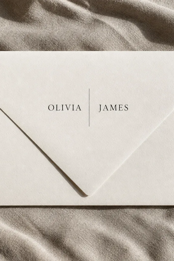
This is the cleanest beginner friendly wedding card design because it creates a built-in visual grid. Put both names centered on the front flap, then use a thin vertical rule as the separator. Keep the rule narrow, around 1 to 2 mm if you’re printing, so it reads as a design detail instead of a border. Use one serif font for the names and a simple sans for the date if you add it, but keep the date small. It looks polished in photos because the eye lands on the names first, then the rule guides it down.
Quick tipIf you’re ordering printed envelopes, request a proof with the vertical rule — it’s the detail that shows print quality.
Start by choosing your envelope base first: a matte white or soft ivory envelope looks best with black ink. Then set your text alignment to centered and place a vertical line between the first and last name groups. Finally, print or hand-letter the names at a size that fills about the middle third of the flap, leaving at least 0.5 inches of space above and below.
Skip thisSkip thick borders or multiple lines; they make the front flap feel crowded fast.
2. Monogram Crest on the Flap With Address-Style Script
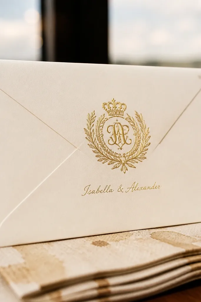
A monogram crest gives you instant structure, which is why it works for beginners. Place a single crest or large monogram at the center of the front flap, then add the couple’s names in a smaller script underneath or to the side. Gold foil (or gold ink if budget is tight) looks especially good on ivory because it catches light without needing extra colors. Keep the script short and readable — long flowing loops look pretty but can get messy at small sizes. This style is great for formal weddings and for anyone who wants a “family heirloom” vibe without complicated design work.
Start by picking a monogram style that’s already balanced (one letter over another, or an interlocking symbol), then size it to sit in the middle of the flap. Next, add the names using a script that stays legible at about 10 to 12 pt on envelopes. Finally, keep your return address and mailing address in a separate clean type if you’re using labels, so the crest stays the hero.
Use gold foil only on the monogram area; foil everywhere makes designs look flat and can smear on envelopes.
Don’t add extra icons (flowers, rings, stars) around the crest — it breaks the clean hierarchy.
3. Diagonal Corner Label With Wax-Style Seal Sticker
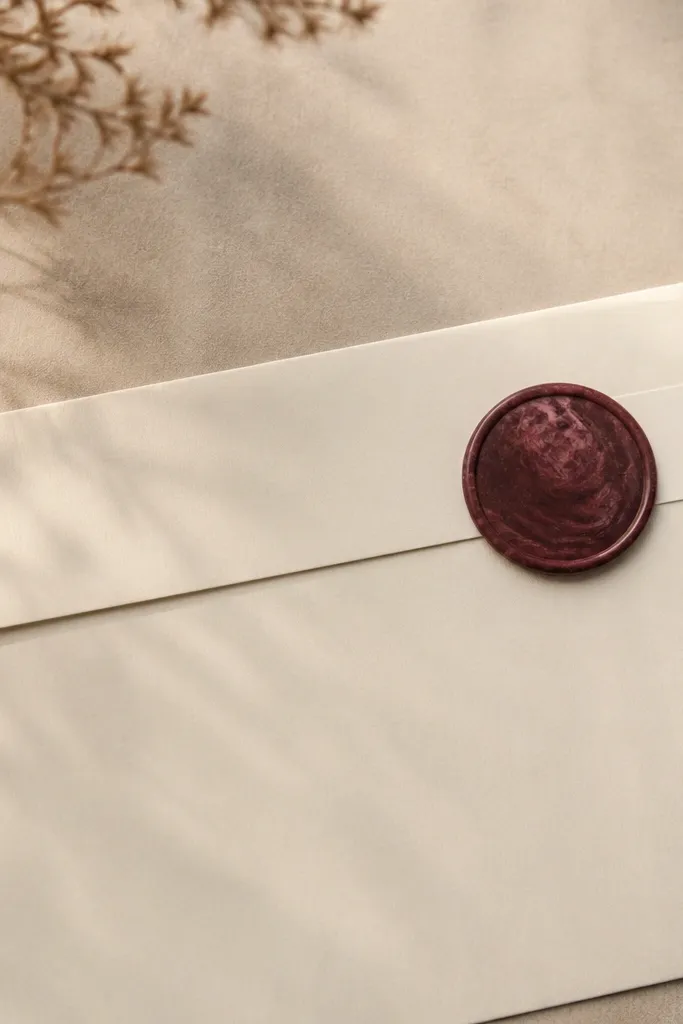
This one is a beginner friendly wedding card design cheat code because you’re using shapes to create composition. Put a small label in the upper corner area (top left or top right), angled slightly, then add a round wax-style seal sticker near the label edge. The seal acts like a focal point and makes the whole envelope look styled even if the card text is simple. Kraft envelopes also hide minor printing imperfections better than bright white. It looks best with black or deep brown ink labels and a single accent color like terracotta or muted burgundy.
Start by buying kraft envelopes and a label sheet (or pre-cut label stickers) that matches the accent color you want. Then position the label diagonally with a small gap from both top and side edges, and place the wax seal sticker so it overlaps the label slightly. Finally, keep the names either printed on the label or written on the label in one short line, using a size that stays readable.
Choose a wax sticker with a matte finish, not glossy; glossy reflects light and can look cheap in photos.
Avoid placing the seal too close to the envelope fold; it can make the sticker lift.
4. Two-Tone Border That Frames the Flap
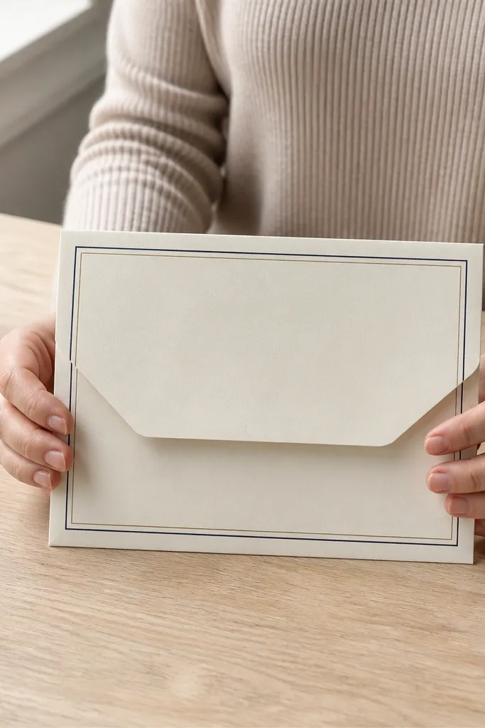
A two-tone border gives you structure without requiring a complex layout. Use a thin double-line border: one line in your main ink color and the second line in a softer accent (sage, dusty blue, or blush). Place the border so it frames the front flap area, leaving equal space from the edges. Center the couple’s names inside the border, and keep the date either off to the side or small under the names. This style looks great for garden weddings and spring palettes because the soft accent reads light in photos.
Quick tipPick one accent color and stick to it for the whole invitation suite, including liners and stamps, so it looks intentional.
Start by measuring the flap area on a single envelope and set your border so it leaves at least 0.5 inches from the envelope edges. Then use two ink colors with clear contrast; black plus a muted accent is the easiest combo. Finally, print the border and names together so alignment stays exact, or use a border template if you hand-apply stickers.
Skip thisSkip thick borders; they swallow the flap space and make the text feel cramped.
5. Botanical Line Art Only on the Bottom Half
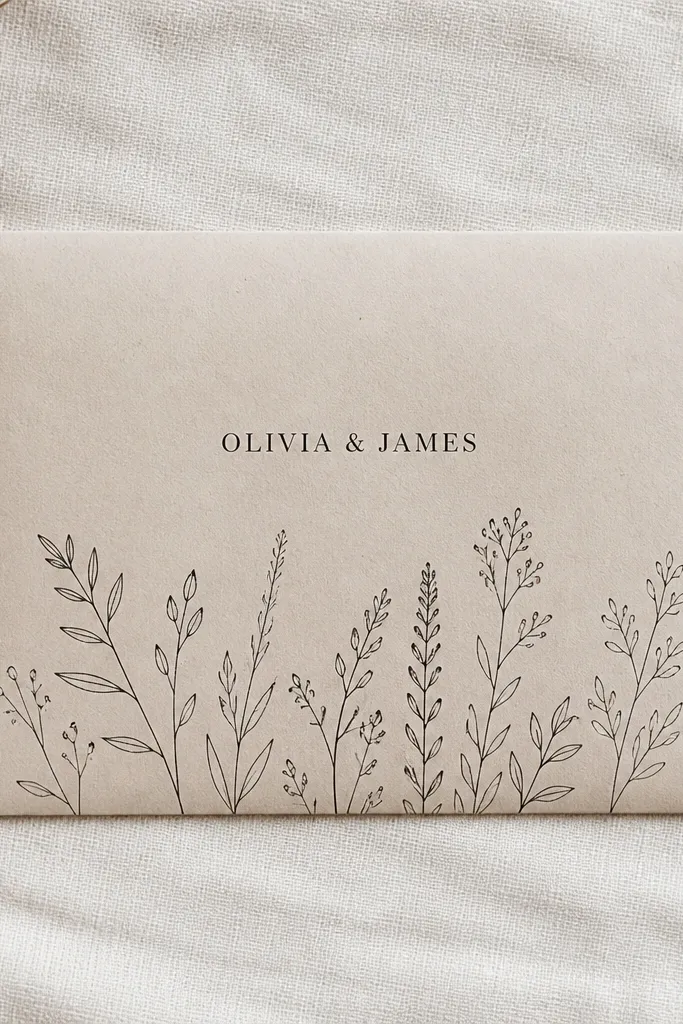
Botanical line art looks expensive when it’s restrained. Put a strip of minimal line art along the bottom half of the envelope front, then keep the names centered above it. The trick is to avoid full-bleed florals; those can look busy and distract from the couple’s names. Use black line art with one small accent color if you want (like olive green), but keep the rest monochrome. This style is a good fit for outdoor ceremonies, because it reads airy while still staying clean and readable.
Quick tipIf you’re ordering printed envelopes, request a test print on the exact envelope paper you’ll use — line weight matters.
Start by choosing line art that stays thin and consistent (single-line style, not filled illustrations). Then place it along the bottom edge with about 0.25 to 0.5 inches of padding from the fold line. Finally, print names centered in the empty upper space so the composition stays balanced.
Skip thisDon’t add more than one botanical element cluster; two clusters usually turns into clutter.
6. Art Deco Frame With a Single Centered Initial
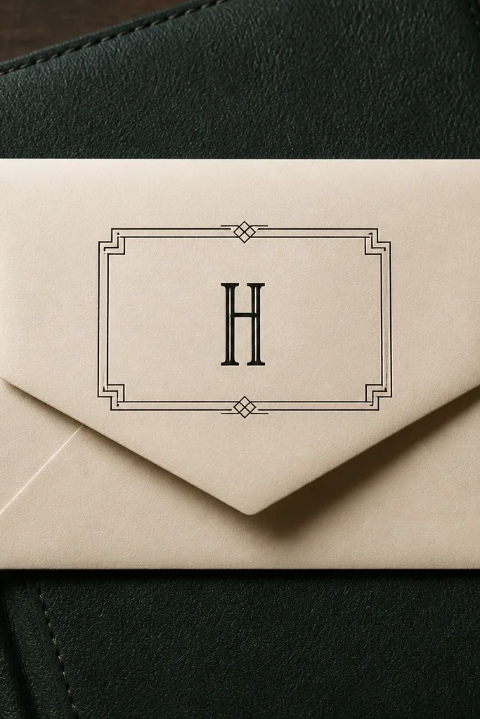
Art deco frames are beginner friendly wedding card design because they create a defined rectangle. Use an art deco-style border around the flap area and leave the center mostly empty, with only one centered initial (or a monogram) inside. This keeps the design from becoming crowded, and it looks striking in photos because the geometry catches attention. Choose black frame lines and a gold initial for contrast. It’s great for modern, evening, or venue-heavy weddings where you want the stationery to match a “clean architecture” feel.
Start by selecting an art deco frame template that fits your envelope front area without overlapping the flap seam. Then place one initial in the center at a size that fills about 30 to 40% of the frame’s height. Finally, keep your names off the frame and put them under the initial if you want them, using a smaller font that doesn’t compete with the geometry.
Use a font for the initial that has sharp corners (geometric or art deco style) so it matches the frame.
Skip adding date, venue, and extra icons inside the frame — the geometry is the feature.
7. Modern Grid Layout With Big Date and Small Names
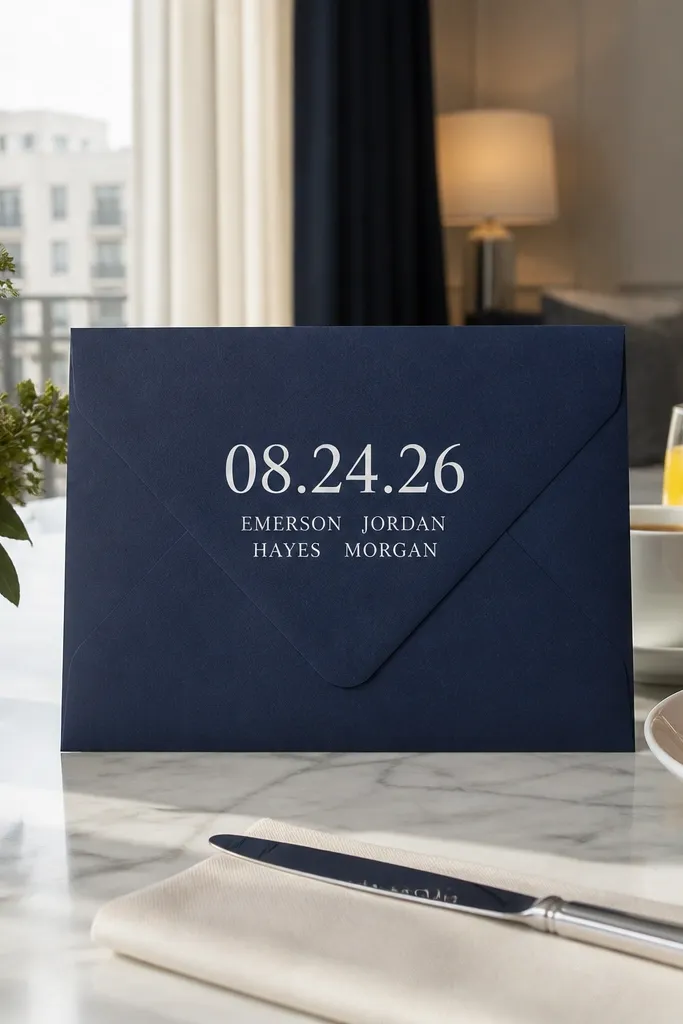
This is a strong option if you want the envelope to look modern but still readable. Put the date as the biggest element on the envelope front, then add the names in smaller text below. Use a simple grid layout: two lines for names, date on its own line, and plenty of whitespace. Navy ink on white looks crisp and premium without needing foil. This design is especially good for couples who want minimal typography and a clean photo look.
Start by choosing a date format you can print cleanly, like 09.14.2026 or 14 September 2026. Then build a grid with left alignment for the date and centered alignment for the names, using consistent spacing. Finally, keep the total front text to three lines max so it stays airy and doesn’t look like a flyer.
If you’re handwriting addresses too, keep envelope front typography in the same ink color family for a cohesive set.
Don’t mix script for names and condensed sans for date; it usually looks mismatched on envelopes.
8. Center Flap Label With Rounded Corners
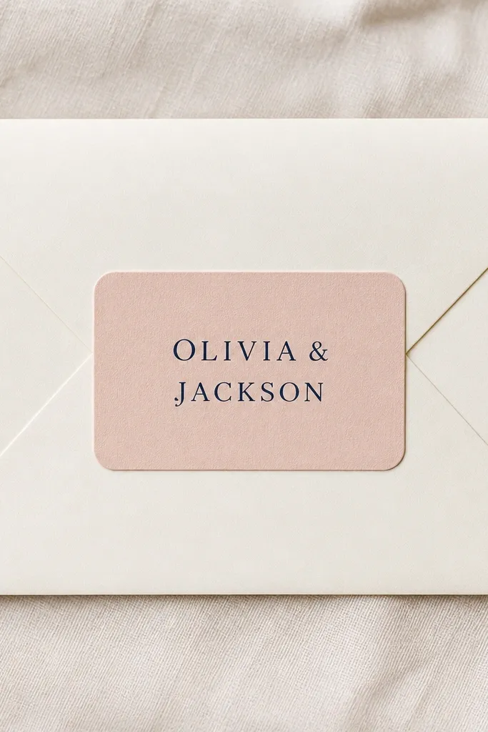
A centered label is the easiest way to get a finished, designer look. Use a rounded rectangle label and print the couple’s names on it, leaving the rest of the flap clean. The rounded corners make the design feel friendly, and the contrast between label and envelope base creates depth in photos. Choose a label color that matches your wedding palette, like white on gray or cream on kraft. This works for nearly any wedding style because it’s typography-forward and doesn’t rely on complicated graphics.
Quick tipUse matte label paper; glossy labels reflect light and can wash out ink when photographed.
Start by picking label size that covers about half the flap width, then keep it centered. Next, print names in a readable font and use one line break only, so you don’t end up with awkward wrapping. Finally, if you add a date, place it in small caps under the names inside the label.
Skip thisDon’t choose a label color too close to the envelope color or the label disappears.
9. Wrap-Around Monogram Band at the Back Flap
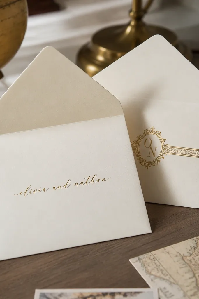
This design looks extra because it uses the envelope as a two-sided canvas. Put a slim band across the back flap area (where the envelope opens) with a small monogram or icon centered on it. The front can stay minimal with names only, while the back flap adds a hidden detail that’s still visible when the envelope is held. Dark green, burgundy, and navy look best for bands because they read as intentional color blocks. It’s a great fit if you like the idea of “surprise detail” without making the front cluttered.
Quick tipIf your envelopes are thin, avoid heavy foil on the band; it can crack near the seam.
Start by planning your printing so the band matches the envelope flap seam angle; test on one envelope if you can. Then place the band so it sits straight across the back flap and leaves equal padding from the edges. Finally, add a tiny monogram at the center of the band and keep the front text separate and simple.
Skip thisDon’t put the band on the front and back at the same time; it usually overwhelms the layout.
10. Hand-Lettered Look With Stamped Oval Address Label
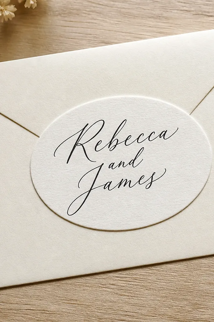
You get the charm of hand-lettering without committing to messy handwriting. Use an oval address-style label on the front and print names in a script font that looks like ink. The oval label feels traditional, and it’s a beginner friendly wedding card design because the label edges hide alignment issues. Keep the label centered and use black or deep espresso ink for the script. This style is flattering for rustic venues and indoor ceremonies where you want stationery that feels personal but clean.
Quick tipIf you’re using ink-like script, increase letter spacing slightly in the design file to prevent blobs at small sizes.
Start by selecting an oval label shape and size that fits your envelope front without covering the flap seam. Then print names in a script style at a size that stays readable, with the date as a smaller line. Finally, leave the rest of the envelope front blank and keep any additional icons off so the label stays the focal point.
Skip thisSkip overly thin script fonts; they disappear once printed on envelope paper.
11. Single-Line Monogram Stamp in the Lower Left
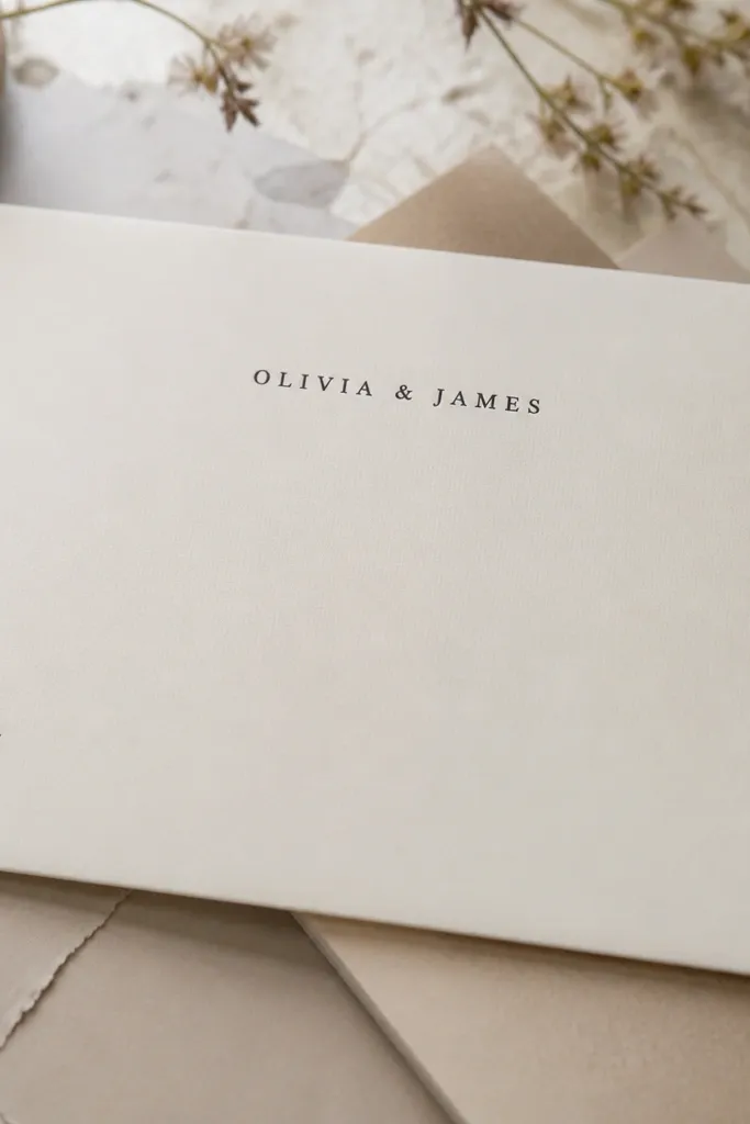
Small and intentional wins here. Place a single-line monogram stamp in the lower left corner, then center the couple’s names above it. The stamp adds character without taking over the layout, and it’s easy for beginners because you’re only styling one small area. Use a stamp-like font or a pre-made monogram stamp graphic, with black ink for the stamp and names in a complementary serif. This looks great for minimal weddings and for couples who want clean typography but still want a “designed” detail.
Start by choosing where the stamp sits: keep it about 0.75 inches from the left edge and 1 inch above the bottom edge. Then center the names in the upper middle of the flap so the stamp doesn’t compete. Finally, keep the stamp size small enough that it doesn’t look like a mistake — it should feel like a signature.
Use the same ink color for stamp and typography so the envelope looks like one set, not two different ideas.
Don’t add a full border around the envelope; the stamp style breaks when everything frames everything.
12. French-Style Corner Flourish in One Color
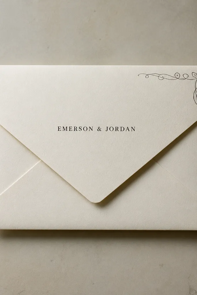
Corner flourishes give you a classic look with minimal effort. Add a delicate flourish to one corner only — top right or bottom left — and keep the rest of the envelope clean. Use one ink color, like black or charcoal, and place names in small caps centered on the flap. The flourish acts like a decorative signature, and it reads elegant in photos because it sits close to the corner framing. This design works well for formal weddings and for couples who want traditional stationery without heavy ornament.
Quick tipIf you’re unsure, choose charcoal instead of pure black; it looks softer on ivory envelopes.
Start by picking a flourish graphic that stays thin and doesn’t fill the corner completely. Then place it so it doesn’t touch the flap seam and keep a small gap from both edges. Finally, use small caps for names and keep them centered, with consistent letter spacing so the flourish doesn’t look too busy.
Skip thisAvoid adding flourishes to both corners; symmetry there often makes it look like a template.
13. Navy Envelope With White Cutout-Style Label
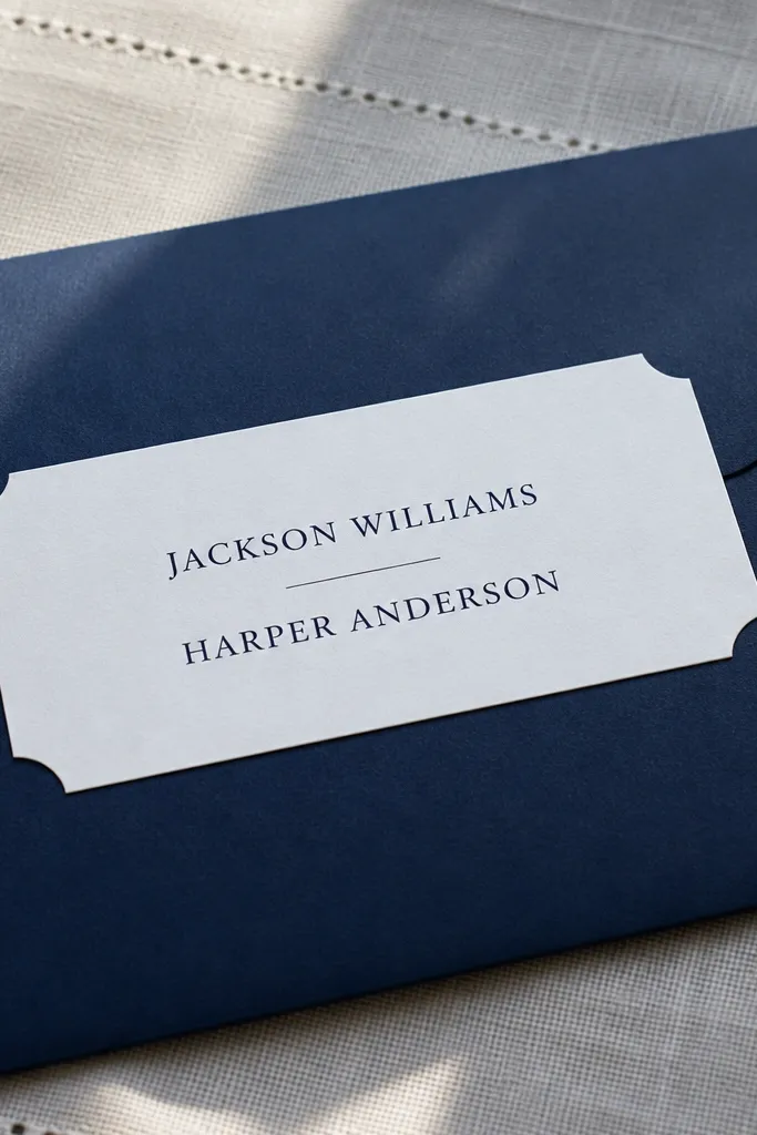
Color-block envelopes look dramatic even with simple typography. Use a deep navy envelope base and apply a white label that feels like a cutout rectangle (clean edges, minimal texture). Then print names in navy or black to keep contrast strong. This style is photogenic because the envelope color gives you the background drama, and the label gives you structure. It fits modern, nautical, and winter weddings where you want the stationery to look bold without adding lots of graphics.
Start by selecting a navy envelope shade that isn’t too dark to read through — you want crisp contrast with the label. Then place the white label centered on the front flap, sized so it covers about half the flap width. Finally, print names in a bold readable font and keep the date either off or small under the names on the label.
Choose a label with a matte finish so white doesn’t glare under flash photography.
Don’t use lighter ink colors like gray for names; they lose contrast on navy.
14. Geometric Triangle Trio Above the Names
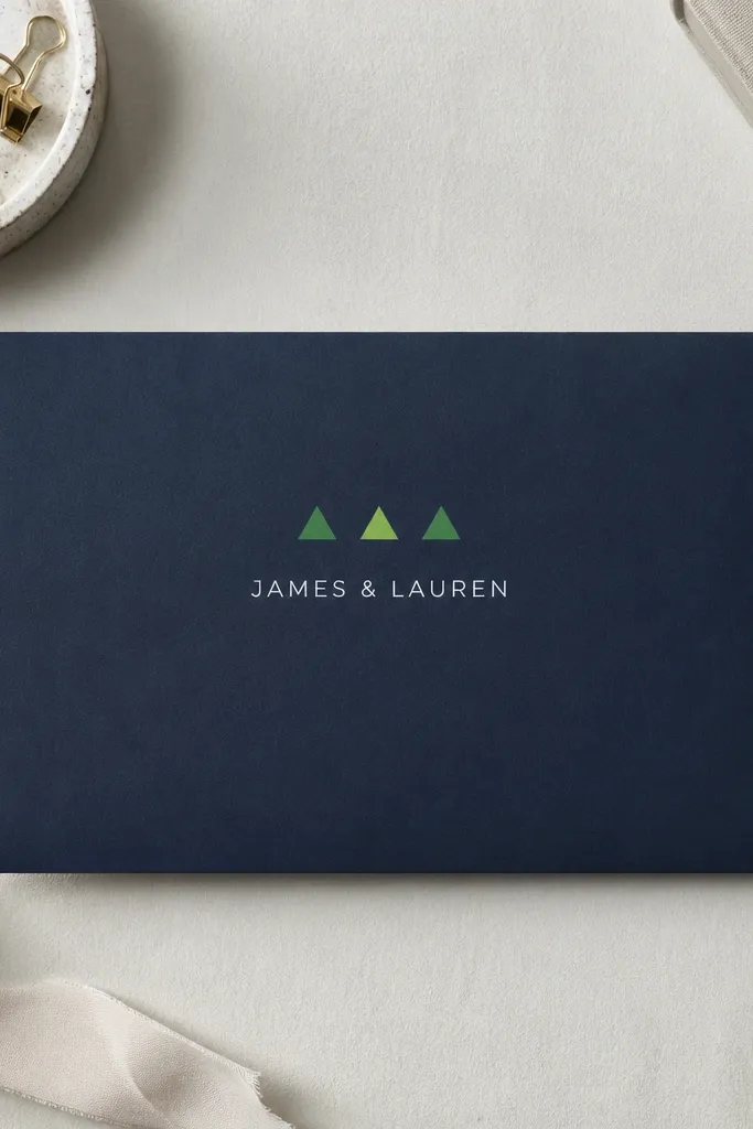
This is a beginner friendly wedding card design that looks modern without becoming loud. Place three small triangles in a tidy row above the names, using one color (navy, black, or deep green). The triangles add motion and guide the eye downward to the typography. Keep the names centered and use one simple font, like a serif for the names and a tiny sans for the date. It photographs well because the shape cluster creates a focal point that’s graphic, not decorative clutter.
Start by choosing the triangle size based on envelope scale: keep each triangle small and evenly spaced. Then place the triangle trio above the names with consistent top padding so it doesn’t feel random. Finally, print the names in the middle of the flap and keep the date on one line at most.
Use triangles in the same color family as the wedding palette, but don’t add a second accent color unless you’re repeating it elsewhere.
Skip extra shapes like circles or lines; the trio works because it’s the only graphic element.
15. Foil Script Date on the Front Flap Only
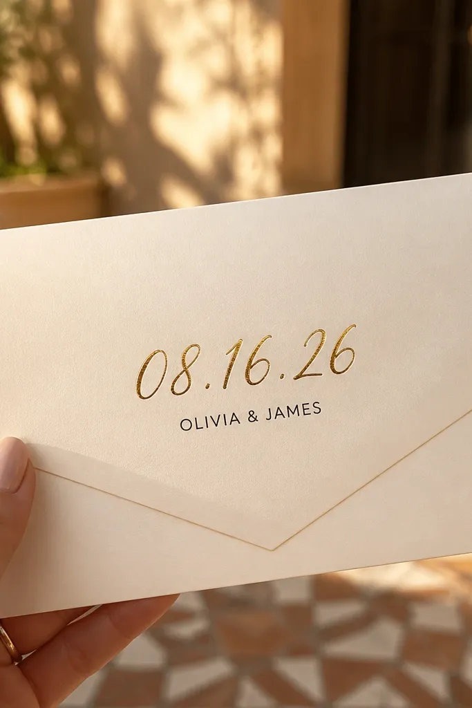
Foil is the fastest way to make a beginner design look premium, and keeping it to one element makes it look intentional. Put the date in foil script centered on the front flap, then place the names in small black text underneath. The foil catches light and gives you that “special occasion” feel without needing a full border or heavy graphics. Use a script that stays readable — avoid ultra-thin swashes that break up at small sizes. This style is great for evening weddings, winter weddings, and couples who want a clean envelope with one glossy moment.
Quick tipOrder a single sample envelope with foil before you commit, since foil can look different across envelope paper finishes.
Start by choosing the exact foil color you want: gold and champagne foil look best on cream, while silver can work on cooler palettes. Then set the date in the center at a size that fills the middle third of the flap. Finally, add names below in a simple font and keep the rest blank so the foil stays the focus.
Skip thisDon’t foil the border and the date together; multiple foil zones often look flat and crowded.



