
1. Warm Ivory Foil-Style Frame With Modern Serif
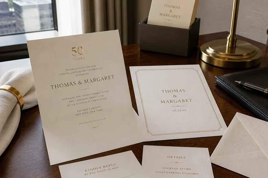
This template is the easiest path to “high end” because the frame is thin, spaced, and repeatable — exactly what makes printed stationery look expensive. The heading uses a modern high-contrast serif so the names read like a keepsake, not a flyer. Body text stays in a clean sans serif, which keeps the details crisp even on smaller screens. It works beautifully for 5th through 25th anniversaries because the layout feels formal without being stiff.
Start by setting your paper tone to warm ivory (not pure white) and your ink to deep charcoal or black. Then add your couple names as the hero line and keep the date in the center block so it visually “anchors” the invite. Finally, update the frame color to a muted antique gold, and run a quick check that the address block has at least one extra line of space for long venue names.
Use a slightly smaller font size for the venue name so it doesn’t crowd the frame.
Avoid bright yellow-gold accents; they make the design look like party branding.
2. Dusty Rose Ribbon Banner Over Chalky Lettering
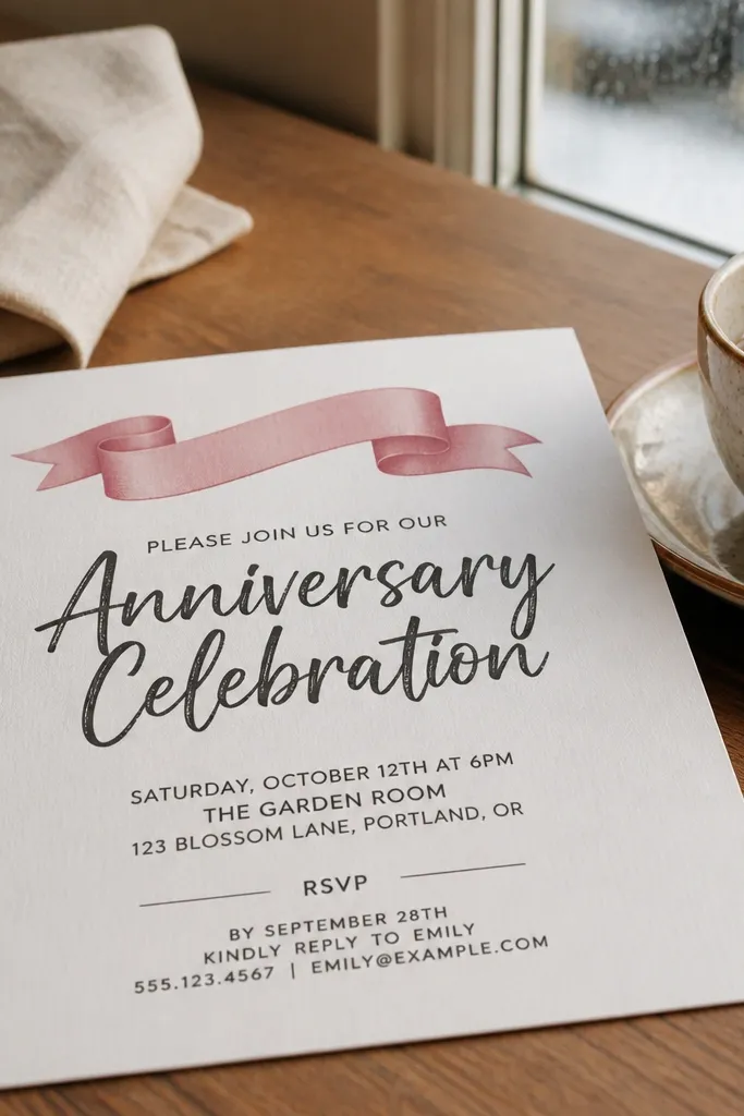
If you want anniversary charm that feels romantic but controlled, this design uses a ribbon banner that sits above the text block like a printed label. The headings have a softer texture feel, which reads as “paper ink” rather than digital typography. The details are kept minimal, so RSVP and address information stays legible. This one suits couples who want a little sweetness for 10th, 15th, or 20th anniversaries without turning the invite into a full-on spring wedding.
Begin by selecting a dusty rose accent color for the ribbon and keep the rest of the palette in cream and charcoal. Next, place the anniversary line (like “Celebrating 10 Years”) inside the banner area so it doesn’t wrap awkwardly. Finally, set your RSVP line to a single block with a clear label and a matching font weight so the information scans quickly.
Choose one accent only — rose for the ribbon, gold only if the template includes it already.
Don’t use long venue names on this layout without checking the banner wrap.
3. Classic Monogram Crest With Black Ink and Soft Gold
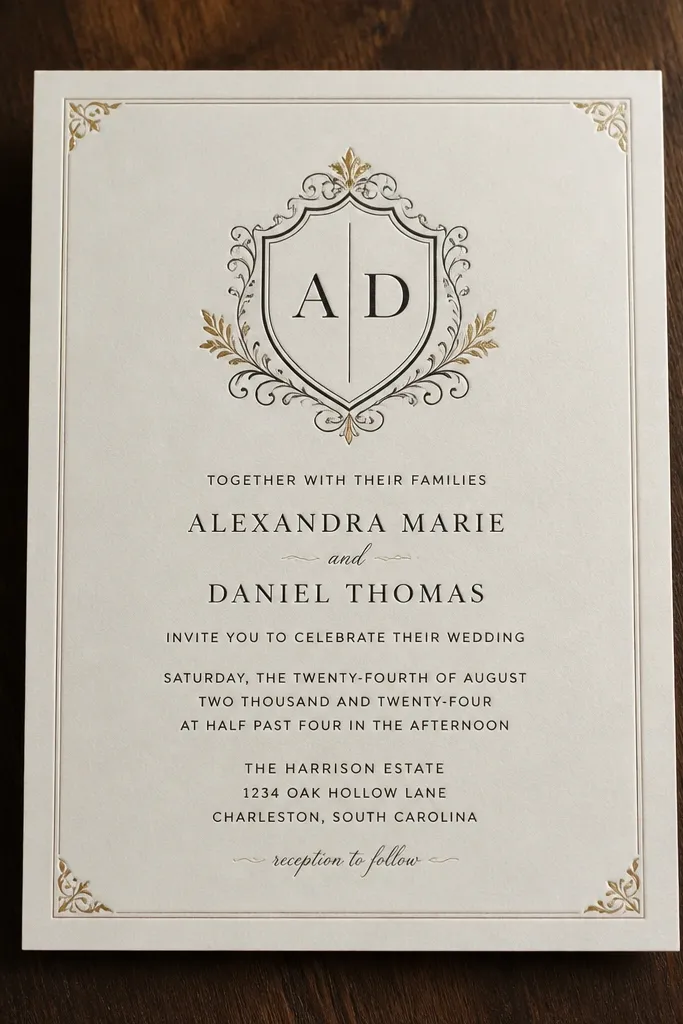
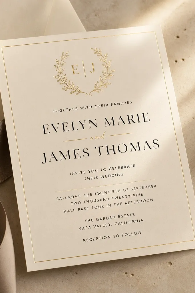
Crest designs look luxury when they’re restrained. This template centers a monogram crest at the top, then builds the date and address blocks underneath with clear spacing. The black ink base makes everything feel formal, while the soft gold accents keep it anniversary-appropriate rather than funeral-invitation formal. It’s ideal when you want the invite to feel like a family heirloom, especially for 25th anniversary celebrations.
Start by entering your monogram initials and keeping them large but not touching the crest edges. Then set the couple names in a serif heading and keep the anniversary wording slightly smaller so it doesn’t compete. Finally, update the crest accent to a soft gold tone and verify that the RSVP line stays on one or two lines max.
Use a short RSVP sentence like “Please RSVP by May 12” instead of a long paragraph.
Avoid adding extra decorative lines or icons — the crest already carries the visual weight.
4. Greenery Corner Etching With Off-White Background
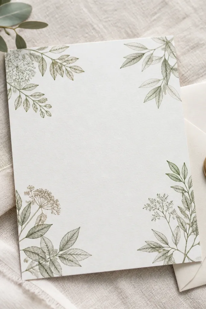
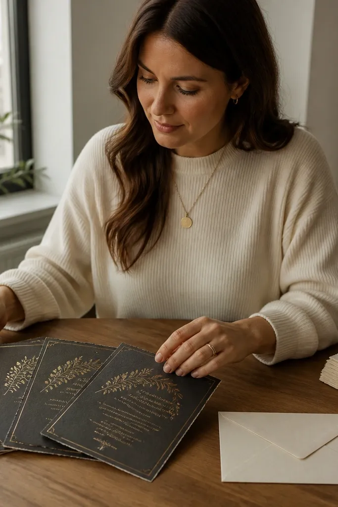
Corner greenery feels premium when it’s drawn like etching instead of printed like a sticker. This template places leaf details in the corners only, leaving the center clean for names and event information. The typography looks crisp against the off-white background, which keeps the invitation readable and photo-friendly. It’s a strong pick for 7th through 20th anniversaries when you want “timeless” without heavy gold foil visuals.
Start by setting your background to off-white and your text to a dark olive or charcoal for a softer luxury tone. Then place the couple names as the main line and keep the date block centered with consistent line spacing. Finally, adjust the greenery opacity if the template allows it, so it looks like print ink rather than a loud graphic.
If you’re printing, choose matte paper; glossy paper turns corner art into glare.
Skip full-bleed greenery; it makes the template look like a modern template pack.
5. Art Deco Black-Gold Divider Lines
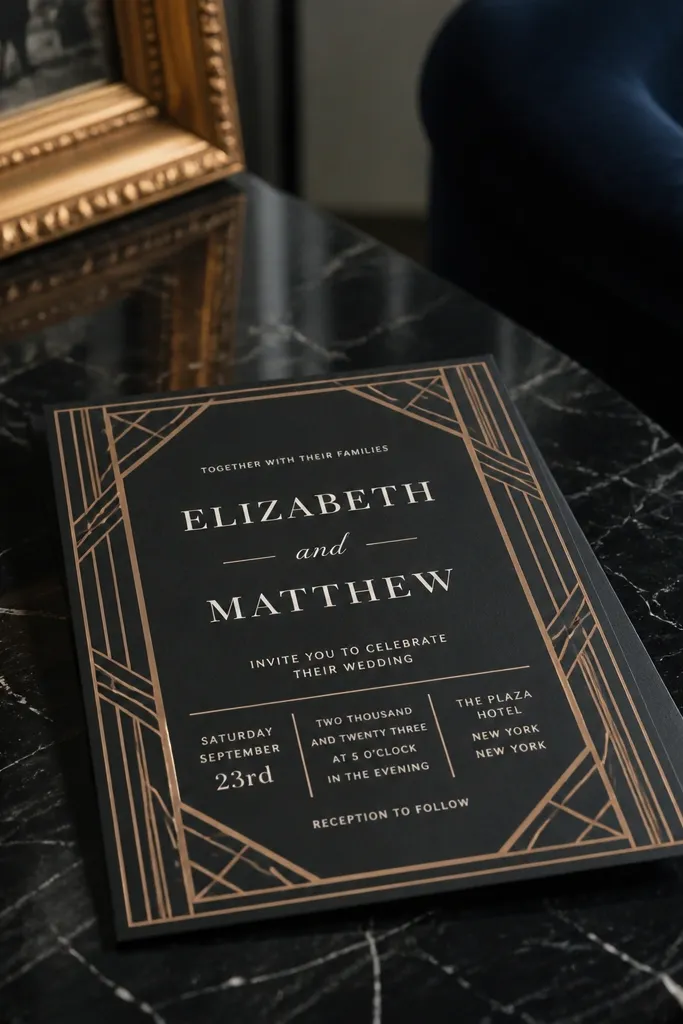
Art Deco is timeless by design, and this template uses geometric divider lines instead of busy patterns. The dividers frame your names and date blocks, creating a structured, expensive look. The font pairing leans classic: a sharp serif for headings and a simple sans for details. This one works especially well for 10th, 20th, and 30th anniversaries because the style reads formal and celebratory without being overly romantic.
Begin by setting your palette to black plus muted gold and keep the gold limited to dividers. Then place the anniversary line between the top and middle dividers so the hierarchy is clear. Finally, check your date formatting so it stays short (for example, “Saturday, June 14” instead of a long sentence) and doesn’t break the divider spacing.
Quick tipUse all-caps for the location label only; keep the venue name in title case.
Skip thisDon’t add extra decorative sections — the dividers already do the job.
6. Champagne Gold Script With Minimal Layout
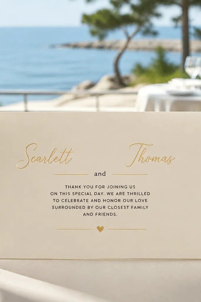
This template proves that minimal can look high end when the spacing is right. The names use a script style in champagne tones, while the body text stays clean and straightforward. The design keeps lots of breathing room, which makes it feel like a real printed card instead of a crowded digital graphic. It’s a great choice for couples who want “luxury” to come from typography and restraint, not heavy ornament.
Start by turning your background to cream and setting the script color to champagne gold with medium opacity. Then choose a simple layout: names at the top, date and time in one block, location in the next block. Finally, set your RSVP line in sans serif with a slightly larger font size so it’s easy to read from a photo.
Quick tipKeep the script to names only — use sans serif for any extra phrases to prevent readability issues.
Skip thisAvoid long multi-line script phrases; they look messy on prints.
7. Pressed Flower Top Band With Clean Center
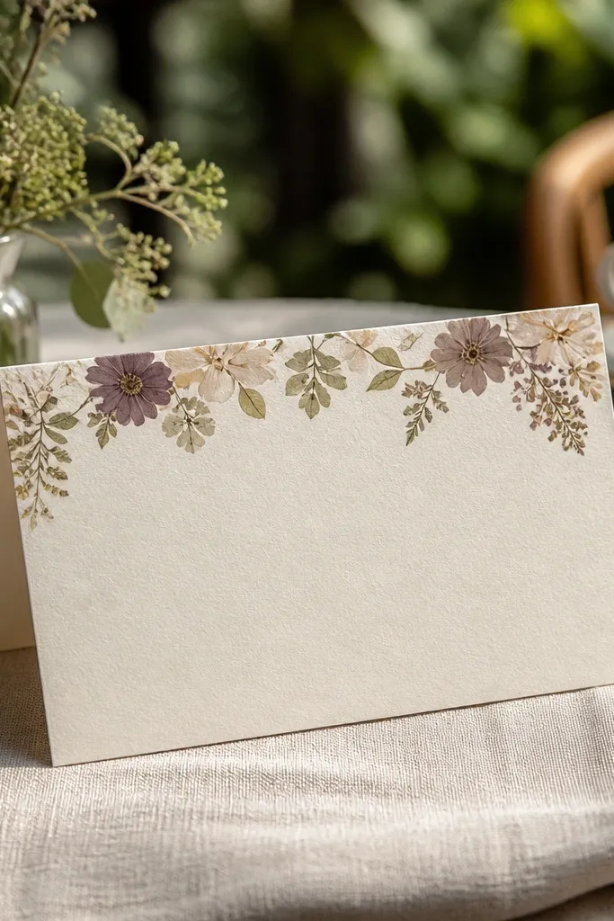
Pressed flower art looks premium because it feels like a botanical print rather than a generic floral background. This template uses a top band so the center stays empty enough for crisp typography. The flower art is muted and sits behind the header area, which makes the names pop. It fits anniversary invites where you want soft romance, like 3rd, 5th, 8th, and 12th years, without turning everything into a wedding-meets-birthday look.
Start by selecting a pressed-flower palette: muted blush or sage works best against ivory. Then enter your anniversary message in the center header area and keep it short so it doesn’t push into the band. Finally, align the date and RSVP blocks to the same left margin so the invite looks designed, not assembled.
Quick tipIf your venue name is long, shorten it in the invite (for example, “The Grand Hall” instead of the full street address).
Skip thisDon’t use super saturated flower colors; they kill the “printed” feel.
8. Navy Sailor Theme With Gold Nautical Corners
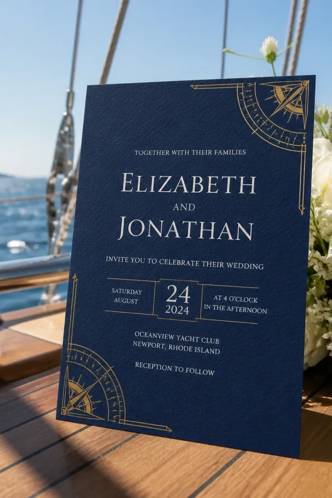
Navy and gold can look surprisingly luxurious when the design stays minimal. This template uses corner accents inspired by nautical engraving, then keeps the typography clean and high contrast. The contrast between cream text and navy background makes it readable and camera-friendly at event RSVP time. It’s perfect for couples who want a classic anniversary vibe with a hint of adventure, especially for beach weddings or lake venues.
Start by setting the background to deep navy and the text to warm cream for a softer luxury look. Then place the couple names at the top and keep the date and location as two clear blocks in the middle. Finally, set the corner accents to a muted gold tone and reduce their opacity if the design looks too busy.
Quick tipChoose a dark ink RSVP contact method (email or phone) so it stays legible against navy.
Skip thisAvoid bright teal accents; they make the theme look like a generic nautical party set.
9. Ivory Lace Border With Modern Sans Details
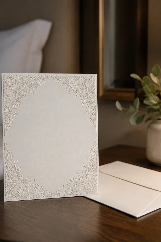
Lace borders look expensive when the border is thin and the center typography is modern. This template keeps the lace effect around the edges while the main text uses a crisp sans serif, so it reads fresh instead of old-fashioned. The result feels like a high-end invitation suite that could have come from a boutique print shop. It works well for anniversaries that want romantic texture, like 10th, 15th, and 20th years, especially if you’re styling the event in neutral florals.
Start by setting the background to ivory and using a deep gray or charcoal for all text. Then place the names in a serif heading only if the template includes it; otherwise, keep them in sans serif but increase font size slightly. Finally, set the RSVP and address blocks with consistent line height so the lace border doesn’t make the center feel cramped.
Quick tipPrint on a warm matte stock; lace borders look flatter on matte paper.
Skip thisDon’t add extra decorative borders if the template already has a lace edge.
10. Marble-Inspired Grey With Gold Type Specimen Look
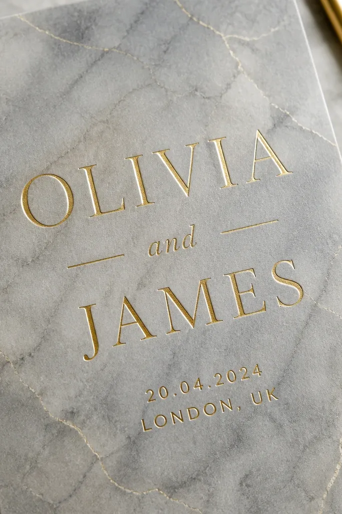
Marble backgrounds can turn cheap fast, but this template keeps the effect subtle and uses gold typography like a type specimen. The design stays modern while still reading timeless because it’s mostly neutral and restrained. The typography hierarchy is strong: names are the hero, date and location are clear blocks, and RSVP is easy to find. If you like a more contemporary luxury feel for anniversary celebrations, this is a smart pick.
Start by selecting the marble tone that matches your event palette (cool grey or warm greige). Then set the names in gold and the rest of the text in charcoal or near-black for contrast. Finally, keep the marble background at low intensity so it doesn’t overpower the typography, and check that the RSVP line has enough spacing to stay readable in photos.
Use shorter RSVP wording so the marble doesn’t visually compete behind it.
Avoid turning the marble effect up; high texture makes the invite look like a phone wallpaper.
11. Pearl White Minimal With Double-Line Divider
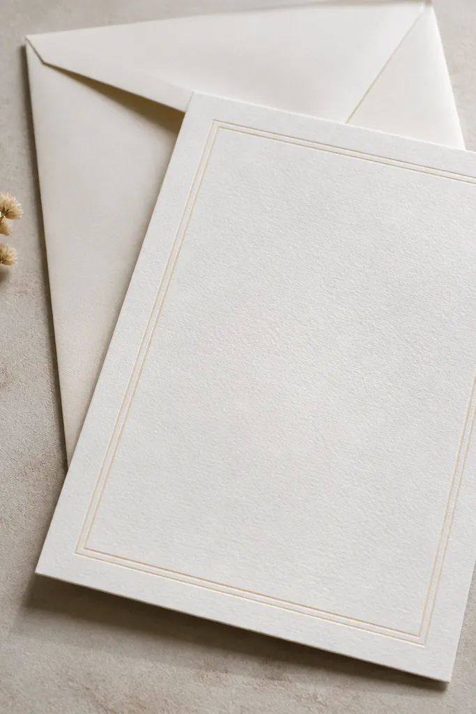
This is the “quiet luxury” option. It uses a pearl white base, double-line dividers, and very restrained typography to create a premium feel. Because there’s almost no ornament, your wording and spacing have to be clean — that’s exactly why templates like this look better than DIY layouts. It’s great for couples who want an anniversary invite that feels formal and modern at the same time.
Start by setting the background to pearl white and using black or deep charcoal for text. Then place your couple names at the top and use the double-line divider to separate the date block from the details block. Finally, keep the font sizes consistent: names largest, anniversary line medium, everything else smaller but not tiny.
Use a single RSVP method label like “RSVP” plus the date on the same line for clarity.
Don’t cram too many details into one text block; it ruins the luxury spacing.
12. Rose Quartz Wash With Gold Foil Corner Marks
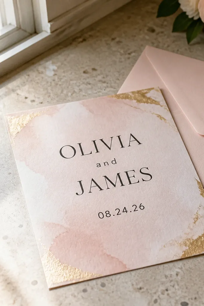
Rose quartz wash looks expensive when it’s soft and uneven like watercolor, not flat and bright. This template uses gold corner marks to frame the card without covering the text. The typography sits on top of the wash with good contrast, so names and date are still readable. It’s a strong choice for 5th, 10th, and 15th anniversaries when you want romantic charm but still want the invite to look like a serious keepsake.
Start by choosing a rose wash that stays pale; you want blush, not bubblegum. Then set the gold corner marks to a muted champagne tone and reduce their intensity if the design feels too loud. Finally, keep the center text in a single column with generous line height so the wash doesn’t make the text feel crowded.
For readability in photos, increase text weight slightly for the date and venue line.
Avoid using white text on a wash background; it fades in lighting.
13. Classic Black Tie With Cream Typography and Frame Corners
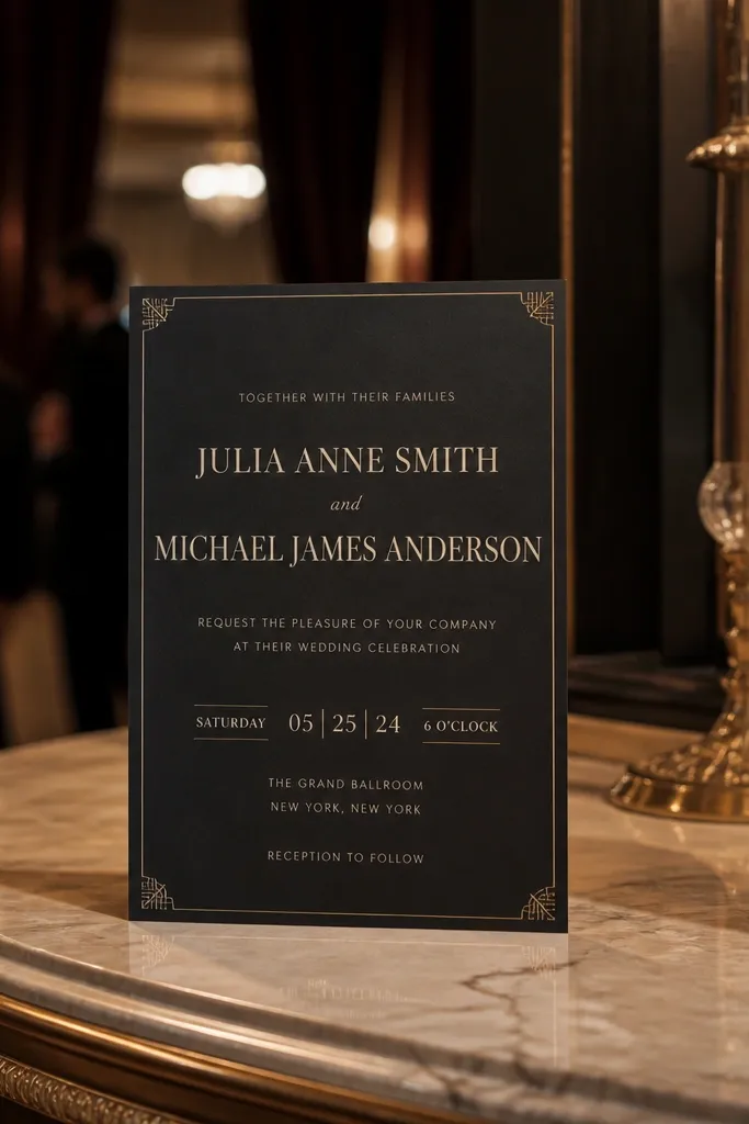
This design reads “black tie” without looking like a generic formal party invite. The template uses cream typography on a light background with subtle frame corners that guide the eye. The fonts are classic and balanced, which keeps it timeless for anniversary wording. It’s a great option when your anniversary event has a dinner, ballroom, or plated-cocktail vibe and you want the invitation to match the formality.
Start by setting the base to warm cream and the text to deep black. Then place the date and time in one centered block and keep the RSVP details in a smaller but clear sans serif. Finally, use the frame corner accents lightly and make sure they don’t overlap with the return address area if you’re mailing.
Quick tipAdd “Reception to follow” as a short second line if the template supports a second detail line.
Skip thisSkip heavy script on this layout; it makes the black-tie feel less consistent.
14. Gold Branch Silhouette With Clean RSVP Block
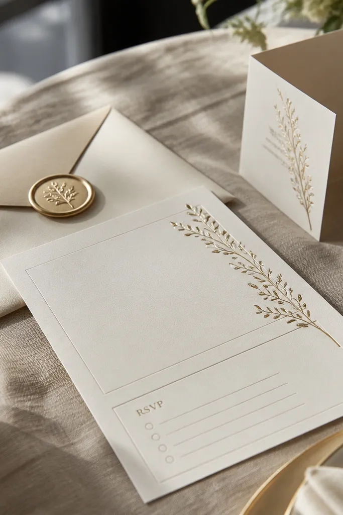
Branch silhouettes look luxe because they’re simple shapes, not detailed clip art. This template places a gold branch across one side, leaving the center open for names and key event information. The RSVP block is designed as a separate area, so it’s easy to spot in a photo and easy to read for guests. This works for anniversary parties where you want a refined botanical look without full floral coverage.
Start by setting the background to ivory and choosing a gold tone that looks like brushed metal, not bright foil. Then place the names at the top and anchor the date and location in the center column. Finally, keep the RSVP block as its own paragraph with clear labels, and check that the RSVP contact line doesn’t wrap into the gold branch area.
Quick tipUse a single RSVP contact method (email or phone), not both, to keep the RSVP block clean.
Skip thisDon’t add extra registry lines if the RSVP block already feels full.
15. Vintage Ticket Stub Layout With Modern Type

This one is timeless because it borrows structure from old paper ephemera, but it keeps the text modern and readable. The ticket-stub frame gives you a built-in hierarchy: names sit in a main panel, while date and RSVP fit into the “tear-off” style sections. It’s fun without looking childish, which makes it a strong pick for anniversary celebrations that feel a little playful. If your event has a casual dinner or cocktail night, this template can still look high end when you choose muted colors and crisp fonts.
Start by selecting a muted palette: ivory background, charcoal text, and a single gold accent line. Then enter the couple names in the main panel and keep the date and time in the designated stub section so alignment stays consistent. Finally, set the RSVP line with a clear deadline and keep the font size slightly larger than the surrounding details for quick scanning.
Use the ticket-stub style only for the main invite, not for separate inserts, to keep the look consistent.
Avoid bright colors like neon green; the ticket vibe depends on muted ink tones.



