
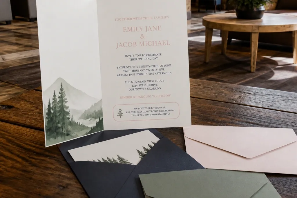
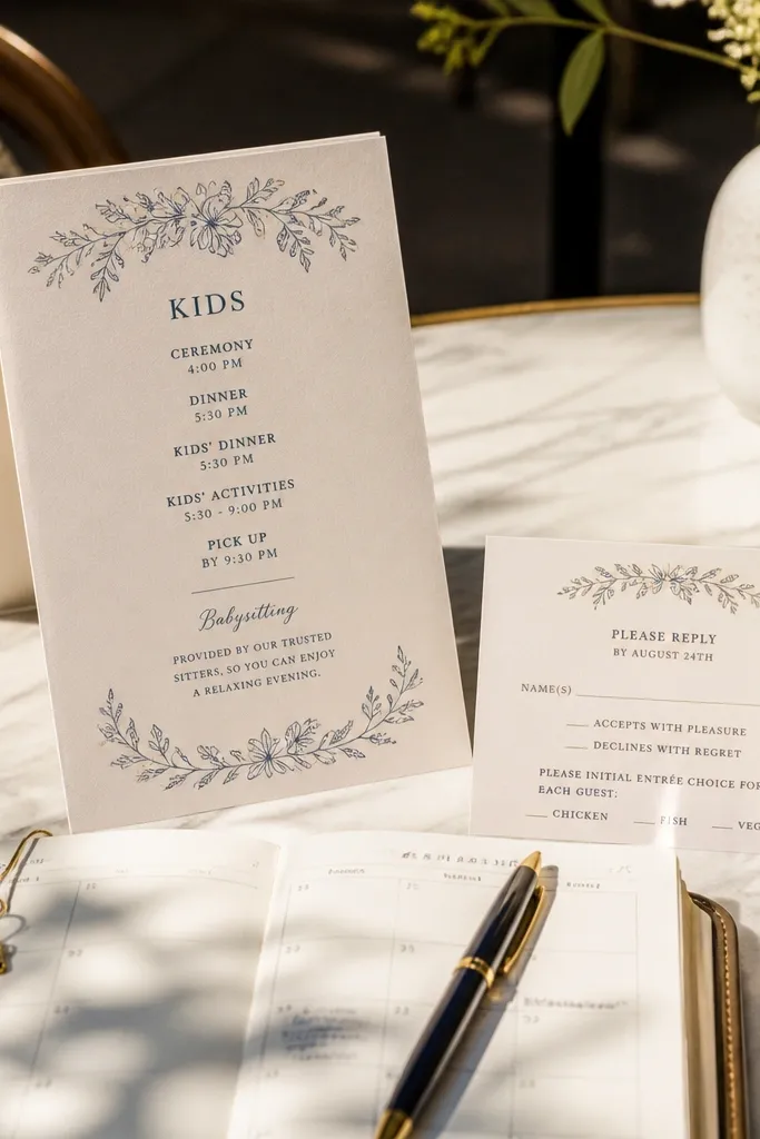
1. Blush Script + Navy Ceremony Header
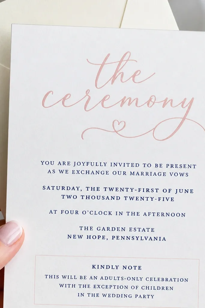
This look works because it keeps the adult tone polished while giving kids a gentle, friendly vibe. The blush script header is eye-catching, but the body text stays in navy for easy reading from across a table. For family friendly wedding invitation templates, you want the kids' line to live in a small, separate block so it doesn’t compete with the couple’s names. Add a short “Kids' Activities Begin at 4:00 PM” line in smaller navy text with a single icon like a tiny star or balloon. It stays cute without turning the whole invite into a children’s craft project.
Start by selecting the template and changing only three parts: names, date/time, and the kids' activities line. Then set the adults' body text color to navy and keep the kids' line in the same navy but reduce the font size by 20-30% so it reads as a note. Finally, export a PDF at the same paper size you plan to print on, then zoom to 125% to check that the RSVP block isn’t too tight for return addresses.
If your printer struggles with thin script fonts, choose a slightly heavier script weight in the template settings.
Don’t put the kids' note in the same font size as the main ceremony time — it makes the invite feel cluttered.
2. Olive Green Minimal Frame with Kids Corner Note
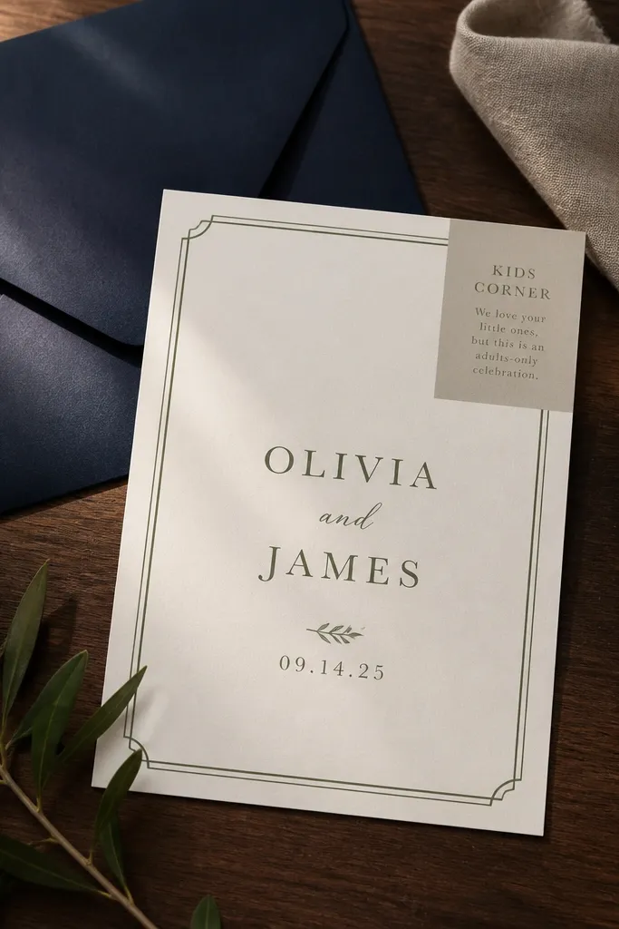
Minimal frames look expensive, and they’re forgiving when you add family details. Olive green is calmer than bright pastels, so the invite reads mature for parents but still soft enough for kids. Use the frame to anchor the layout: names and date stay centered, while the kids' note sits in a corner box with a lighter green background. Keep the kids' message to one or two lines so it doesn’t fight the frame. This template style is great for families who want an invite that feels welcoming without turning into a “party” poster.
First, replace the frame color with olive and set the body text to a dark gray-black for print clarity. Then add the kids' corner note as a short block: “Kid Activities 4:30-6:00 PM (Supervised)” and keep it aligned to the corner guides. Finally, adjust margins so the border never touches the printer’s safe area; export as PDF and print one test sheet before you run the full batch.
Use dark gray-black instead of pure black for smoother printing on textured paper.
Skip busy patterns inside the frame — they make small text hard to read for parents quickly.
3. Terracotta Sunset Gradient with Photo-Safe Typography
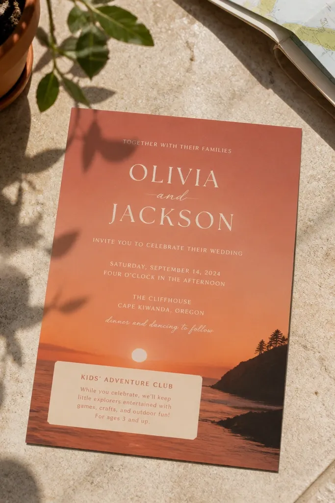
A gradient background can be stunning in photos, but only if the text stays high-contrast and the kids' line is separated. Terracotta to warm peach gradients feel inviting and family-friendly, especially for outdoor weddings or late-afternoon ceremonies. Keep the couple’s names in white or cream, and put the kids' activities note in a small semi-transparent label or solid patch so it doesn’t blend into the background. The key is to treat the kids' note like a label, not a paragraph. That keeps it readable and keeps the design looking intentional on camera.
Start by selecting the template and setting the gradient to the softer, lighter end so white text remains readable. Then change the main text to a cream/white color and add the kids' note in a label shape that you can recolor to a solid terracotta or warm beige. Finally, run a quick contrast check: if the RSVP line looks even slightly gray on your screen, increase text weight or darken the label background before exporting.
Choose matte paper for gradients; gloss makes text glare in outdoor photos.
Don’t place the kids' note directly on the darkest gradient band — it looks messy and is harder to read.
4. Sky Blue Watercolor Wash with "Bring-Your-Own" RSVP Card
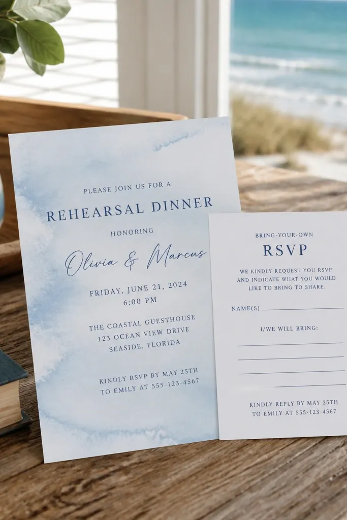
First, edit the main invite background watercolor color to a sky blue tone and keep the body text in dark navy. Then open the RSVP insert template and add a checkbox line for kids meals or kids attendance. Finally, export both files as separate PDFs and print a single RSVP card first to confirm the checkbox spacing works for real handwriting.
Watercolor washes add softness for kids while still feeling wedding-appropriate when the rest of the typography stays clean. This look is especially good when you’re using family friendly wedding invitation templates with separate inserts. The main invite can set the tone with a watercolor wash, while the RSVP card stays crisp, plain, and easy to fill out. For the kids section, use one line that points parents to the RSVP question that matters, like “Kids Meals Included — Select Yes/No.” That keeps logistics organized and reduces back-and-forth.
Skip thisSkip tiny watercolor details behind the RSVP insert instructions — it makes writing look cramped.
Quick tipUse thick lines for checkboxes so they don’t blur on lighter paper stocks.
5. Cream Card with Navy Polka Dot Top Band
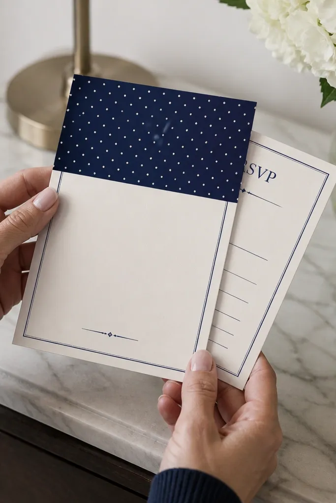
Polka dots can feel childish, but the right placement makes them charming instead. Put the polka dot pattern only in a top band, then keep everything else neutral and structured. That’s how you get a family friendly wedding invitation template that feels playful for kids and still respectful for parents. Use navy for the pattern and for the body text to unify the design. Add the kids' note as a small badge under the band, like “Kids Welcome” plus the activity start time.
Start by setting the background to warm cream and applying the polka dot band only to the header area. Then replace the couple’s names and event details, and insert the kids badge text into the dedicated badge box. Finally, check alignment: the dot band should sit level with the date line; export and print one proof to confirm your printer doesn’t shift the pattern.
If your design tool has a “pattern scale” control, reduce the scale so dots don’t look like noise.
Don’t spread polka dots across the whole card — it kills readability.
6. Monogrammed Corner Accent with Playful Kid Line
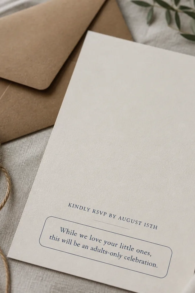
First, upload or select your monogram and size it to fit within the corner guide area. Then edit the kids' note text in the dedicated rounded rectangle and keep it to one sentence. Finally, adjust the RSVP typography so the return address block and RSVP deadline are on the same baseline rhythm — export and print a proof with your actual envelope size.
A monogram corner accent makes the invite feel custom without needing extra illustrations. It’s a strong aesthetic choice for families who want something classic but still warm. Keep the monogram subtle and small — it should frame the layout, not dominate it. Put the kids' note in a rounded rectangle under the RSVP line so parents see it right away when they scan. Use language that’s clear and calm, like “Supervised activities during the reception.” This template style looks good in family photos because it stays tidy and not overly themed.
Skip thisAvoid adding extra icons because the monogram already takes up visual attention.
Quick tipUse a monogram color that matches your body text color for a cleaner look.
7. Pastel Floral Border with One-Line Kids Promise
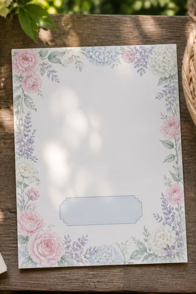
Start by choosing a floral border template that has a fixed central text area. Then type your kids' promise into the provided short text line and keep it to under 45 characters if possible. Finally, export to PDF and check that your RSVP deadline sits fully inside the center safe zone; print one test on your chosen paper to confirm the border doesn’t get cut.
Floral borders are photogenic, but they only work when the kids content stays short. This layout puts a delicate floral border along the edges while the center stays clean for adult logistics. The kids' promise should be one line that tells parents what happens, not a paragraph. Think “Activities Provided, Supervision Included” plus the start time. Keep the kids' line in a font color that matches one flower tone, like dusty rose or soft sage. This keeps the invitation cute without sacrificing readability.
Skip thisDon’t try to fit a full kids schedule into a single short line box.
Quick tipUse dusty rose or sage for kids text instead of bright pink so it prints smoothly.
8. Navy and White "Kids Welcome" Sticker Label Style
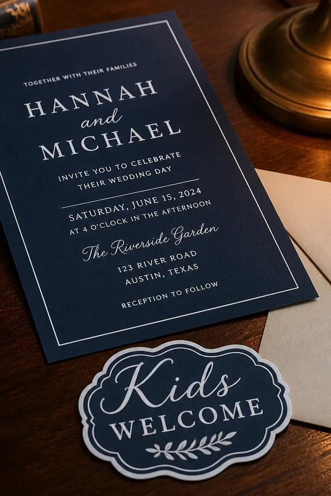
Sticker label style is a smart way to signal kid-friendliness without adding cartoon imagery. It looks modern, and it’s easy to customize across multiple family friendly wedding invitation templates because the label is a separate element. Keep the base invitation navy and white for crisp contrast. Then add a label that says “Kids Welcome” and a second label beneath it with “Activities start at [time].” This gives parents quick answers while keeping the visual system consistent and photo-ready.
First, set the background to white and the main text to navy. Then edit the sticker label text and adjust the label background color to a slightly lighter navy or warm off-white for separation. Finally, align both labels to the same left edge as the date line so the invite looks designed, not pasted together. Export and print one proof to check label edges on your printer.
Use rounded labels with enough padding so text doesn’t touch the border.
Skip complex label shapes — they can look jagged when printed.
9. Charcoal Typography with Thin Gold Rules and Kids Schedule Box
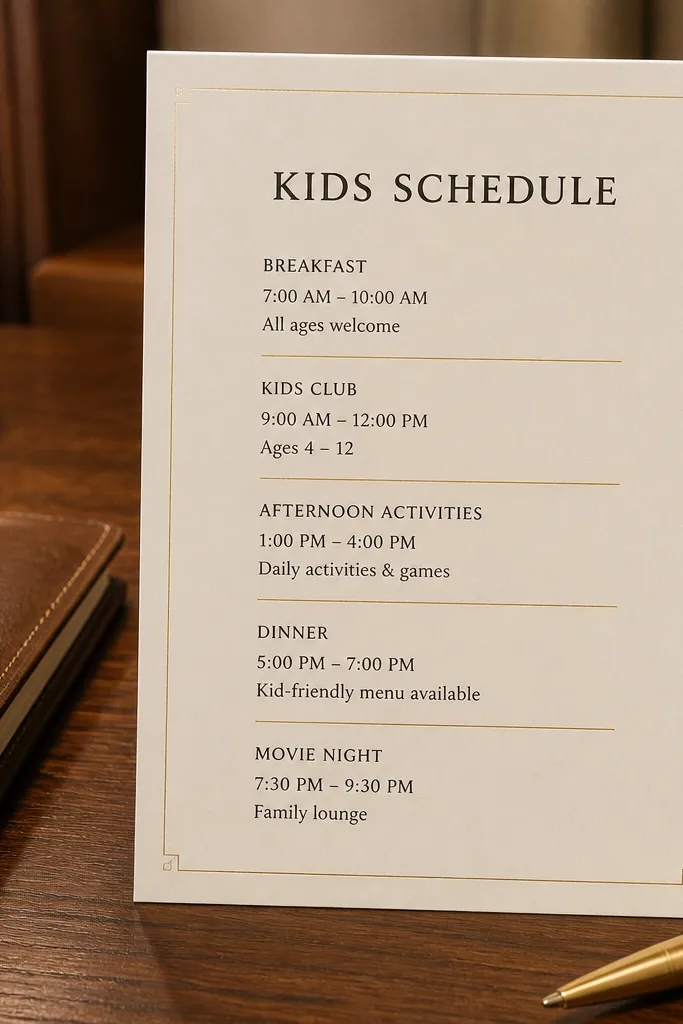
If you want the invite to feel grown-up and still family friendly, this is the look. Charcoal type with thin gold rules reads clean and premium, and it photographs well under warm indoor lighting. The kids schedule box should be separate and bordered, so parents can spot it instantly. Put the kids' info in a short format: “Kids Activities 5:00 PM — 6:30 PM” and “Supervised.” Keep gold as a thin rule color only, not a full background — it stays elegant and avoids print issues.
Start by setting the main body text to charcoal and enabling the thin gold rule elements in the template. Then place the kids schedule into the boxed note area and adjust font size so it matches the body text rhythm, not the headline. Finally, export a PDF and print one sheet to see if your printer can handle gold-like colors; if it looks dull, switch rules to a warm beige line color.
Use warm beige for “gold” if your printer can’t reproduce metallic tones cleanly.
Don’t make the gold rules thick — thick lines look cheap fast.
10. Rust Linen Texture Background with Simple Kids Note
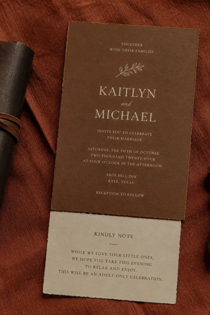
Texture backgrounds can add warmth, but you need restrained typography. Linen-style rust backgrounds feel grounded and family-friendly for fall weddings, and they make the invite look tactile in photos. Keep text in dark cream or off-white for the clean contrast, and place the kids note in a solid patch so it stays readable. This is a strong choice when your family has mixed ages and you want the invite to feel welcoming without being overly themed. Keep decorations minimal — the texture already does the work.
First, apply the linen texture background and reduce its intensity if the template has a “texture strength” slider. Then edit the kids note into the solid patch element, using one short sentence plus the start time. Finally, export and print on a paper stock that won’t fight the texture look; matte paper keeps the typography crisp and prevents glare.
If the template lets you adjust texture opacity, aim for 70-85% so small text stays readable.
Don’t add extra icons on top of a textured background — it turns busy quickly.
11. Soft Sage Green with Arrows Pointing to RSVP
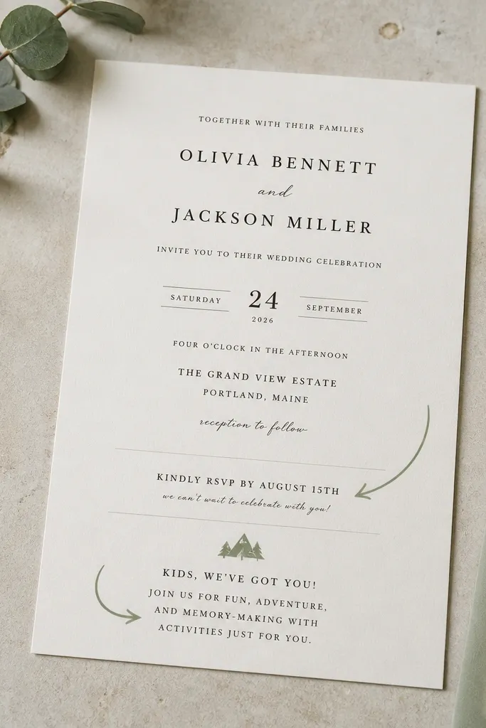
Arrows are underrated for family friendly wedding invitation templates because they reduce questions. Sage green feels calm, and it pairs well with kid-focused info because it doesn’t scream “party.” Use arrows to guide parents to the RSVP deadline and to the kids activities line. The kids message should be short and practical, like “Kids Activities during Reception — RSVP for meals.” When the invite visually points, parents find the right information faster, and kids feel included without being the theme. This layout also looks great in flat lays because the arrows create a clear structure.
Start by setting the background to soft sage and keep the main text in a dark gray-green. Then edit the kids activities line and place it where the template’s arrow points, so you don’t have to move elements around. Finally, adjust arrow thickness and spacing so they don’t overlap letters; export as PDF and do a quick zoom check on the RSVP line.
Use arrow color that matches the kids note color so the design feels intentional.
Don’t point arrows at tiny text blocks — arrows should guide, not clutter.
12. Black and White Photo-Ready Minimal with Kids Info Tag
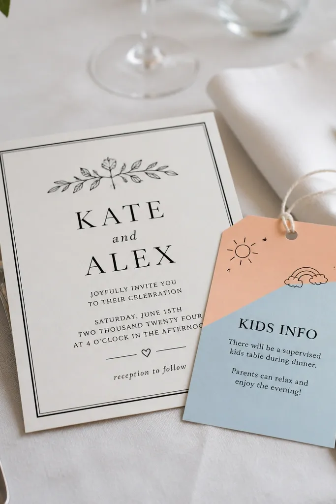
Black and white is the fastest route to a clean, modern look that photographs well. It’s also the easiest style to keep readable when you add family details. Use the kids info tag as the only colored element if the template allows it, like a small tag in light blue or soft peach. Keep the rest strictly black text on white, with a clear hierarchy: couple names first, event details second, RSVP third, kids tag last. This is the right choice when you’re printing at home or on a tight budget because it stays sharp and doesn’t depend on fancy color calibration.
First, set the template to black text on white background and pick a single accent color for the kids tag. Then replace the kids tag text with a short logistics line: “Kids Welcome — Activities 4:30 PM.” Finally, export and print one invite and one envelope label to check alignment; black and white layouts hide fewer alignment problems, so proofs matter.
Choose a font weight that stays bold at small sizes; thin fonts disappear on cheaper paper.
Avoid adding multiple accent colors — it ruins the black and white clarity.
13. Pastel Geometry with Structured Kids Meal RSVP Section
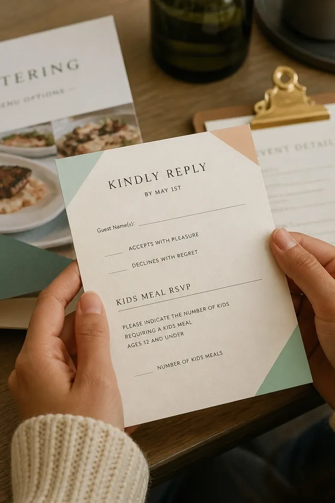
Geometric accents feel playful for kids but still modern for adults. The trick is to keep geometry in the corners or behind a single header strip, not scattered all over. For family friendly wedding invitation templates, this look is great when you need a dedicated RSVP line for kids meals or kids attendance. Make that section a boxed mini-table with two lines: “Kids Meals” and “Yes/No.” Parents like it because it’s easy to answer, and it looks organized in photos. Keep colors pastel and limited to two — more than two makes geometry look noisy.
Start by editing the header strip color and setting the body text to dark gray-black for readability. Then find the template area for the kids RSVP section and format it into two short lines with clear yes/no options. Finally, export the PDF and print one invite; check that the boxed section isn’t too small for real handwriting.
Use pastel shapes that sit behind the header only; they won’t interfere with the kids RSVP box.
Don’t put the kids meal RSVP inside a patterned area — it makes answers harder to read.
14. Classic Script Couple Names with Printed Index-Style Schedule
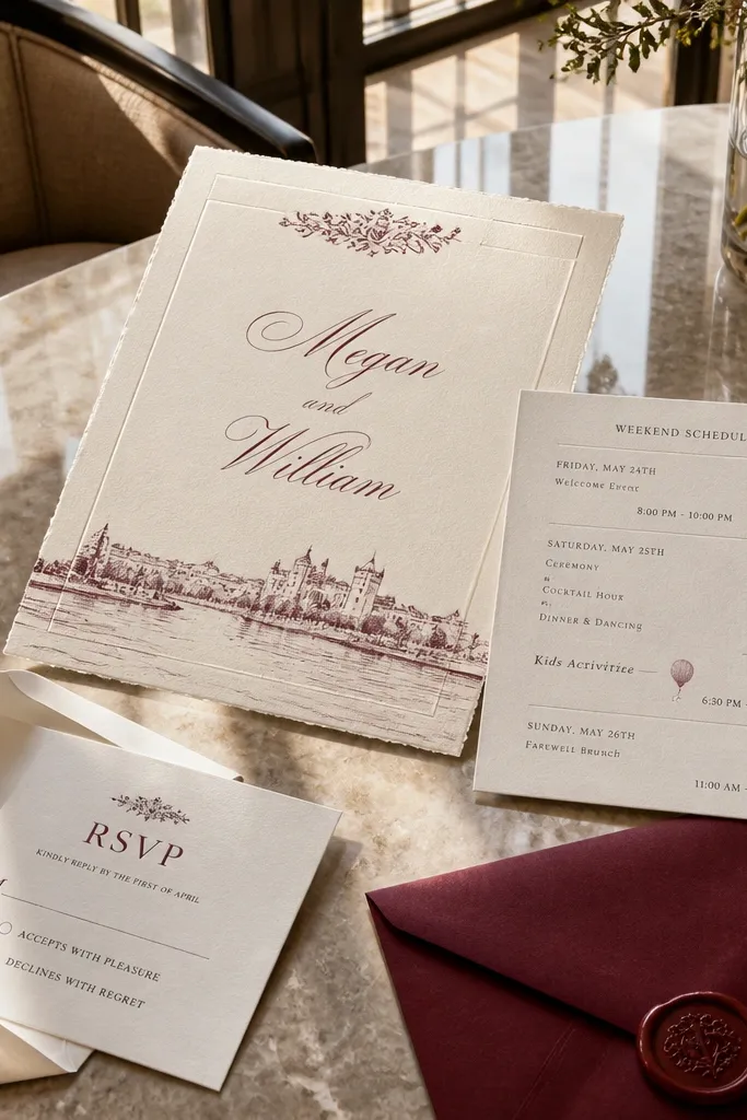
This is how you make kids-friendly details feel organized instead of tacked on. The couple names use classic script for romance, while the event details are formatted like an index or schedule list with consistent line spacing. For the kids section, add one line in the schedule list: “Kids Activities — Start 4:00 PM (Supervised).” That keeps the invite structured and readable for parents scanning quickly. It also looks great in close-up photos because the text rhythm is clean and predictable.
First, keep the script names as the largest element and set the schedule list text to a single serif or clean sans font. Then insert the kids activities line into the schedule list so it matches the same font size and spacing rules. Finally, set the RSVP deadline on its own line with a clear label like “RSVP by” and export a PDF at the final print size.
Use consistent punctuation for the schedule list (commas or none) so the formatting looks intentional.
Don’t mix three different text styles in the schedule list — it breaks the index look.
15. Sunflower Yellow Accent with Reception Timing Ladder
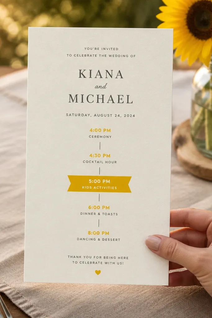
Start by applying sunflower yellow to only one element type in the template, like separators or a small header underline. Then edit the reception timing ladder text and insert the kids start time as one of the ladder steps. Finally, export and do a quick check for spacing between ladder lines; if lines are too close, your print will look cramped.
Sunflower yellow is cheerful without being childish when you use it as an accent, not a full background. The ladder-style timing (stacked times with small separators) is great for families because it clarifies the day for kids and parents. Put the kids activities start time in the same ladder so it feels like part of the plan. Keep the kids message short: “Kids Activities Start at 5:00 PM.” Parents read it fast, and kids feel included because the schedule is clear. This style is especially photogenic at outdoor venues and golden hour.
Skip thisSkip full-bleed yellow backgrounds — they reduce contrast for RSVP text.
Quick tipUse dark navy for ladder text so yellow accents don’t wash out the schedule.



