
1. Arch Frame Minimal Invite
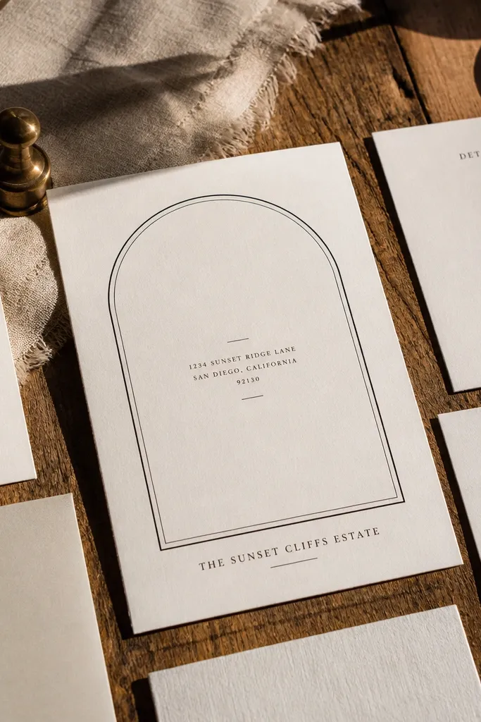
This layout feels expensive because the arch frame creates a natural boundary for your text without adding clutter. The design works great when you have a lot to fit like street address plus venue name — the arch guides the eye so lines don’t sprawl. Use it for couples who want classic and clean instead of floral-heavy. It also photographs well because the frame creates a visual “stop” in the center, so the card looks crisp in flat-lay shots. Choose off-white cardstock and matte black text for the most polished budget result.
Quick tipPrint a single test sheet on your exact cardstock so you can judge how thin the arch line looks.
Start by setting your card size to 5x7 inches (or A5) and create margins at least 0.5 inches from the edges. Place the arch line as a single thin stroke, then center the couple names inside the arch and keep the date/time in one tight block below. Finally, add RSVP and address details in a smaller font under the main block, aligned to the same center grid. Keep line lengths short; if an address line is too long, break it into two lines before you print.
Skip thisDon’t use thick borders or multiple frame lines — they eat space and make the card look busy.
2. Two-Tone Diagonal Band
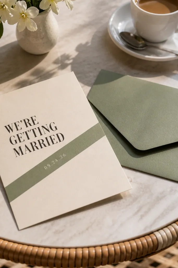
A diagonal band is one of the fastest ways to make a simple card look designed. The band creates contrast, so your typography pops even if you keep the layout minimal. This style suits modern weddings and couples who want color without a full pattern. It also handles extra info well because the band can hold your date and time while the rest stays clean. For photos, the diagonal shape catches light and gives your card that “graphic poster” vibe.
Quick tipUse one band color only and keep it consistent across save-the-date and RSVP so your set looks intentional.
Start with a 5x7 or 4x6 card and choose two colors that print cleanly: navy plus a warm ivory background. Add one diagonal band across the middle at a steep angle, then place the couple names on the ivory area above or below the band. Put date/time on the band itself in a lighter color for contrast, and keep location details in a single block on the opposite side. Export at print resolution and avoid gradients; solid colors look sharper on budget printers.
Skip thisSkip busy color palettes — three colors plus small text makes the card feel like a brochure.
3. Minimal Wreath Ring
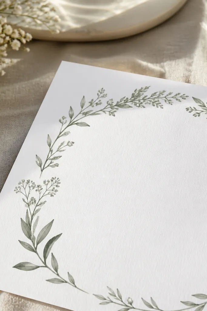
A wreath ring gives you a soft, romantic frame without the overhead of full illustrations. The trick is keeping the wreath thin and spaced — think a simple botanical outline rather than a dense floral cluster. This is ideal for garden weddings, spring dates, and couples who want “pretty” but not overly decorative. The ring also photographs beautifully because it creates symmetry around the couple names. Use a muted green or sage line so it looks calm and not like a sticker.
Start by placing the wreath ring as a light outline centered on the page, leaving space inside for names. Add the couple names in the center at a larger size, then place date/time and location in two short lines below. Finally, put RSVP details in a small footer aligned center, leaving at least 0.35 inches from the bottom edge. Keep the wreath color to one tone and use a clean serif or classic sans font for the best readability.
If your printer struggles with light greens, switch to dark gray-green instead of pale sage.
Don’t add extra flowers around the edges — it turns the ring into a busy border.
4. Handwritten Script Header
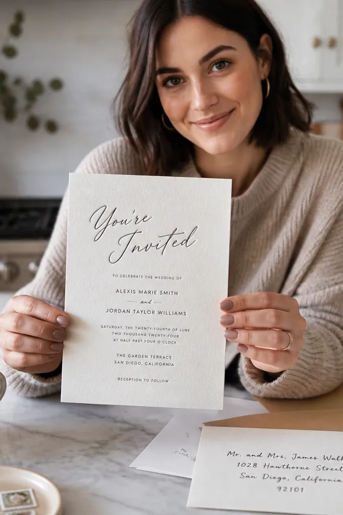
This design works because you get the charm of script without the mess of script everywhere. Put the main phrase like “You’re Invited” or your names in a script-style font, then keep all details in a clean sans serif. The contrast looks intentional and stays readable for older guests. It’s great for budget wedding card design templates because you don’t need complex graphics — typography does the heavy lifting. For photos, beige or ivory paper makes the script look richer, even with standard ink.
Start with an ivory or warm beige background and set your script header large at the top center. Use one sans serif font for the date/time/location lines, with consistent line spacing. Keep the body text to 1-2 blocks so it doesn’t sprawl under the script. Export with crisp edges and do a test print to confirm the script isn’t too thin for your printer.
Choose a script font with solid strokes; thin scripts look faint on matte paper.
Avoid using script for addresses — that’s where readability breaks.
5. Dot Grid Accent Card
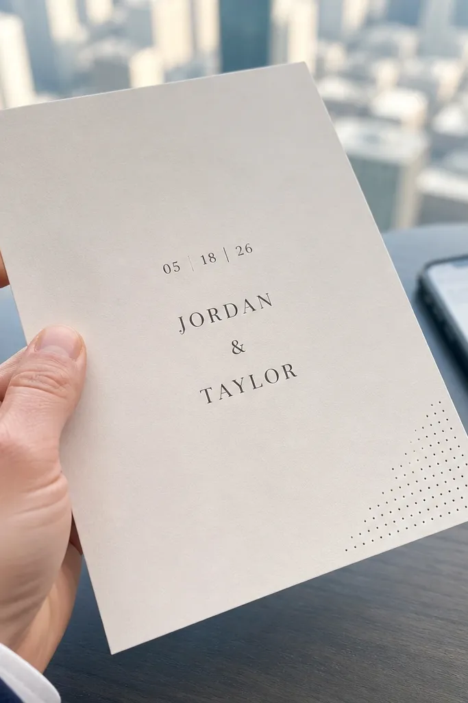
A dot grid corner looks modern and tidy, and it’s one of the most reliable ways to make a plain invite feel styled. Keep the dot grid small and confined to a corner so it acts like a design accent rather than a background pattern. This suits casual weddings, city venues, and couples who like clean visuals. It also helps you with spacing because you can anchor text away from the dots. The card stays readable, and it still looks great in top-down photos where patterns can otherwise blur.
Start by adding a dot grid pattern only in one corner, sized so it occupies about 20% of the card area. Place the couple names centered, then put date/time and location in a single stacked block. Add RSVP details in a smaller font at the bottom, centered or left-aligned with the main block. Keep dot color neutral like gray or charcoal, not bright green or neon.
If your printer moirés with patterns, reduce dot size or lower the pattern density in the template.
Don’t fill the whole background with dots — it makes budget cards look noisy.
6. Monogram Corner Stamp
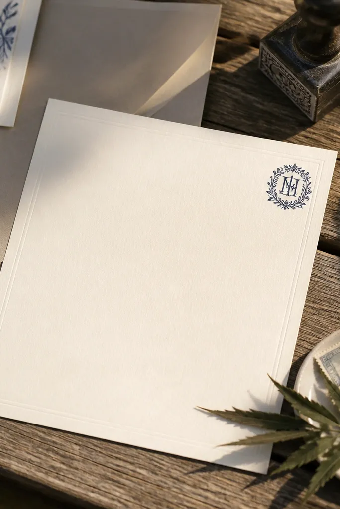
A corner monogram stamp gives you branding without taking up space. You get a strong visual identity — the initials — while the rest of the card stays clean and easy to read. This is a great option for couples who already have a wedding logo or want simple personalization. It also prints well because you can keep the monogram as a single solid shape. For photos, corner placement frames the card and keeps the center uncluttered.
Start by selecting a monogram style that is bold and legible at small sizes, then place it in the top corner with consistent padding. Center the couple names in the middle, with date/time directly underneath. Put venue and address in a smaller block, aligned to the same center grid. Export and print a test to make sure the monogram doesn’t turn into a gray blob.
Use one monogram color and one text color only. Two-tone looks best with budget print.
Avoid thin-line monograms — they disappear on matte cardstock.
7. Minimal Line Art Venue Strip
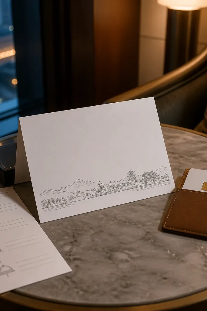
Line art strips look classy because they add a sense of place without turning into a full illustration. The best versions use a single horizontal band at the bottom — a skyline silhouette, a mountain outline, or a simple building line. This works well for destination weddings and venue-specific invites where you want guests to feel the setting. Because the art is confined to one strip, your typography stays clear. It also photographs well since the bottom illustration anchors the composition.
Start by choosing one line art element that matches your venue style and simplify it to a single color. Place it as a bottom strip that takes up about 15% of the card height. Center the main invitation text above, and keep date/time in one block. Add RSVP details below the main text, not over the line art strip. If your line art is too tall, it will swallow the address area.
Use a darker gray instead of pure black if the line art looks too harsh on matte paper.
Don’t use detailed illustrations — they blur when printed cheaply.
8. Classic Serif Center Stack
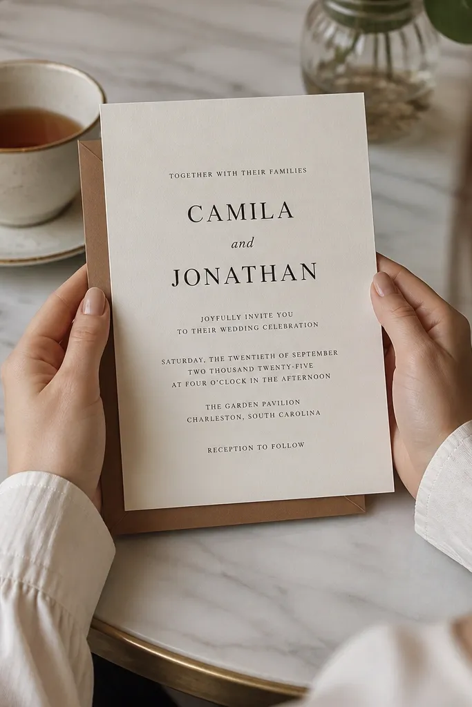
This is the “boring on screen, polished in real life” template. A classic serif stack relies on typography, spacing, and clean alignment rather than decorative elements. It’s perfect when you want a timeless invitation that doesn’t depend on trendy graphics. The center stack also makes it easy for guests to scan — names up top, date/time next, details below. In photos, high-contrast serif text on off-white paper looks expensive even without foil.
Start by picking one serif font for names and one simpler serif or sans for details. Center the couple names, then add the date/time in a slightly smaller size with tight but readable line spacing. Keep the address and RSVP details in one or two lines only, using abbreviations like “St.” and “Ave.” to save space. Finally, set your margins so the text block sits about 0.6 inches from the edges.
If you’re printing at home, turn off any “enhance” settings in your print dialog to prevent fuzzy type.
Don’t add extra dividers or icons — the stack already has enough structure.
9. Soft Floral Corner Cluster
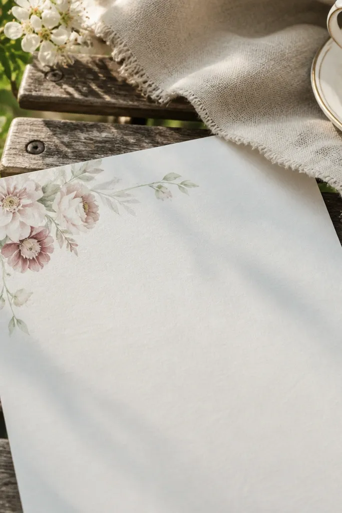
A corner floral cluster gives you the romance of florals while keeping the card readable. The key is keeping the cluster small and in one corner, with plenty of negative space for the text block. This style suits spring, bridal showers, and garden ceremonies where you want a gentle look. It also helps your budget because you aren’t printing a full background — just a small graphic accent. For photos, the corner cluster adds depth and makes the card feel handmade.
Quick tipLimit the floral palette to two tones so the card prints cleanly.
Start with a light blush or pale cream background and place the floral cluster in the top right or bottom left corner. Keep the couple names centered and sized so they don’t collide with the flowers. Add date/time and location in the middle, then RSVP in a footer block. Use dark ink for text so it stays readable against the soft background. Export with high resolution and avoid watercolor gradients that can band on budget printers.
Skip thisSkip full-bleed florals — those hide layout errors and often look muddy on cheap paper.
10. Geometric Corner Frames
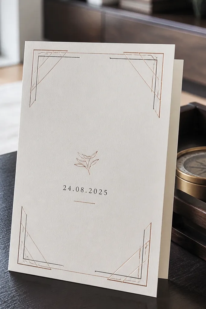
Corner frames make a simple card look designed because they create structure without heavy borders. Use thin geometric lines in one accent color like muted gold, bronze, or charcoal. This style works for modern weddings and couples who like clean design with a hint of glam. Because the frame sits only in corners, your text stays the main focus, and your card remains easy to scan. It also looks great in photos where the corners catch light from the paper texture.
Quick tipIf you don’t have gold ink, use a printed bronze tone and stick to matte paper for the best look.
Start by adding corner lines that sit 0.4-0.5 inches from each edge, leaving the center open. Place the couple names in the center and keep the date/time in a block directly beneath. Keep RSVP details smaller and aligned to the same center axis. Use one accent color for the lines and one text color for everything else. Print a test to see if your accent color is too light; if so, switch to charcoal for readability.
Skip thisDon’t add multiple geometric patterns — corners only. Too many shapes make it feel busy.
11. Ribbon Banner Title Strip
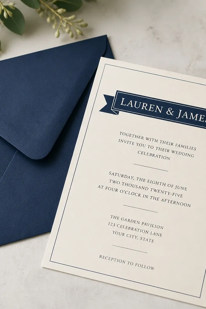
A ribbon banner is a simple trick: it gives you a header area that feels formal without needing a full illustration. Keep the ribbon flat with clean edges, not a glossy 3D effect. Use it for the couple names or a phrase like “Wedding Celebration,” then let the rest of the card be plain. This is especially helpful if your details are longer, because the ribbon separates the hierarchy clearly. In photos, the ribbon creates a crisp band that stands out against matte paper.
Start with a 5x7 card and add a horizontal banner strip across the top third, leaving margins around it. Put the couple names centered inside the banner, then place date/time and location below in a stacked layout. Keep the RSVP details at the bottom in smaller text with consistent line spacing. Use one banner color and one text color, then export at high resolution. If your template includes a shadow, remove it for a more budget-friendly print result.
Choose a banner color that matches your wedding palette, then use the same color in RSVP cards.
Don’t use a patterned ribbon — solid edges print cleanly and look sharper.
12. Single Florals Divider Line
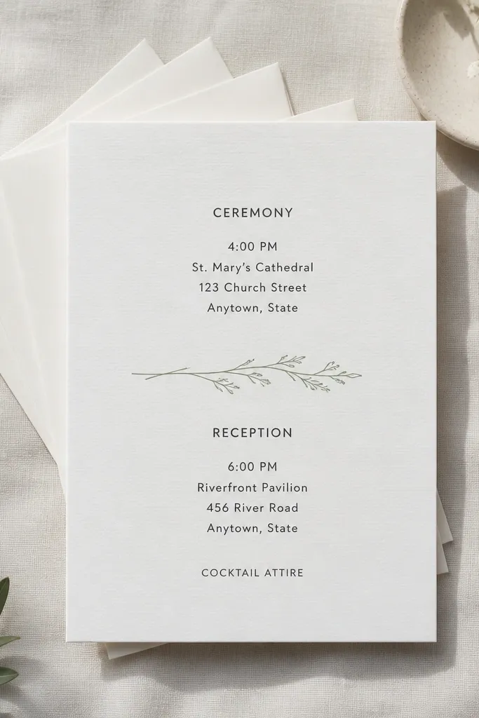
Instead of putting florals all over the card, use a single divider line — one thin botanical motif that separates sections. This makes the card feel thoughtful without adding visual weight. It works well for invites with multiple sections like ceremony details and reception details. The divider also improves readability because it creates a visual break between text blocks. For photos, the divider line draws the eye horizontally, which looks good in angled shots and flat-lays.
Start by laying out two text blocks: ceremony details on top, reception details below. Place a thin floral divider line between them, sized so it spans roughly 60-70% of the card width. Use consistent fonts across both sections, with only size changes for hierarchy. Keep RSVP info in a short footer block at the bottom. Export cleanly and do a test print to confirm the divider line isn’t too faint on your paper.
If the floral divider looks too light, switch to a dark gray-green so it stays visible.
Avoid adding multiple dividers — one line is enough.
13. Monochrome Photo-Style Backdrop (Minimal Text)
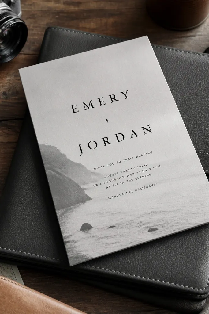
This style uses a subtle monochrome texture behind the text so the card looks more dimensional than a flat white background. Keep the texture faint enough that the text remains the star. It suits couples who want a modern, editorial look without full illustration work. Because the background is muted, it stays readable and it still looks clean when printed on standard matte cardstock. In photos, the texture catches light in a way that makes simple typography look intentional.
Start by choosing a monochrome texture at low contrast, so it reads as a background wash. Place the couple names in the center in black or charcoal, with date/time and location in a smaller, clean font. Keep text blocks short so the texture doesn’t compete. Finally, print a sample to check legibility under your lighting — textured backgrounds can look fine on screen but too light in real life.
Use charcoal text instead of pure black if the background is gray; it looks smoother on matte paper.
Don’t use bright white text on a textured gray background — it usually looks washed out.
14. Letterpress-Look Border Lines
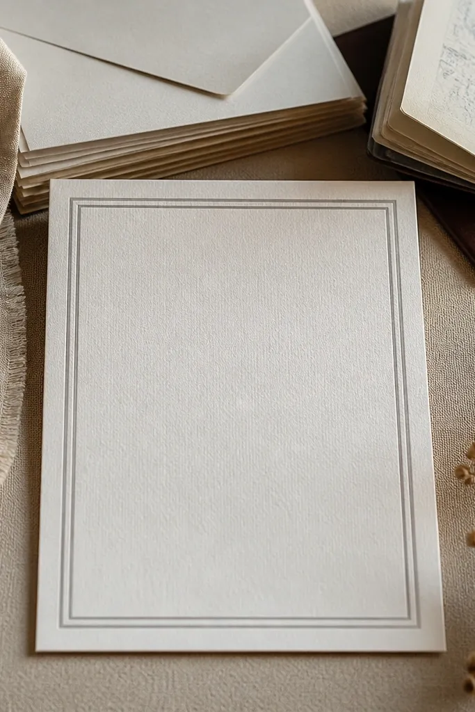
You can get a letterpress look without paying for letterpress by using a double-line border in a gray tone. This template style feels refined because the border frames the text like a stationery set. It works for traditional and semi-formal weddings where you want classic structure. The double lines also help you keep margins consistent across your entire invitation suite. In photos, the soft gray border adds depth and makes the centered text feel crisp.
Start with off-white cardstock and add two thin border lines around the card, leaving a gap between them of about 0.08-0.12 inches. Put the couple names in the center and keep date/time and location as short lines beneath. Add RSVP info in a small footer block aligned center. Use dark gray or charcoal text so the border and typography harmonize. Export and print a test to confirm the border lines don’t get too light.
Keep the border lines thin; thick borders look like a cheap frame.
Skip decorative corners if you already have double borders — it becomes over-designed fast.
15. Terracotta Ticket Stub Card With Tiny Names
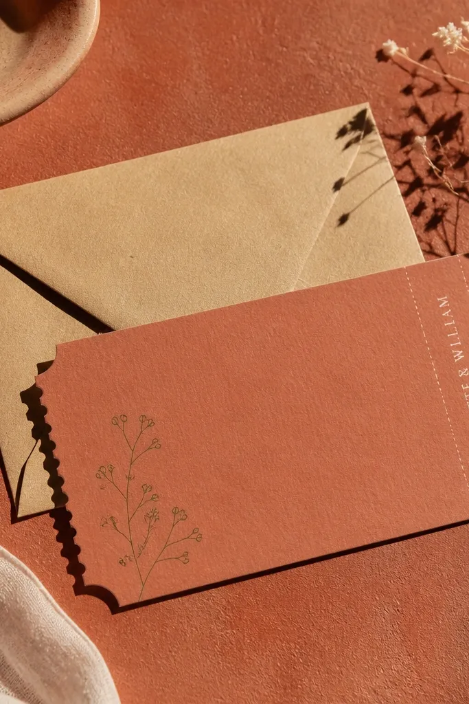
This design looks like a little keepsake you could pull from a pocket — a ticket stub shape with a warm terracotta base and clean, tiny name text. The charm comes from the contrast: small typography for the couple names and date, plus one delicate accent like a micro sprig in the corner. It reads as simple, but it photographs like a special find because the color feels earthy and different from typical white-and-cream invites. It suits couples who want something modern and warm without going full “rustic.” The best time to use it is late spring through early fall, when terracotta tones match the light and the greenery looks crisp.
Quick tipOrder a small sample run of 5-10 cards on the exact paper you want. If the terracotta looks too dark in person, lighten the background by one step before printing the full batch.
Start with a template that has a ticket-stub outline — straight top edge, slightly notched sides — and set the background to terracotta (#C86B4A) with a subtle off-white (#F5EFE7) border. Keep the couple names small and centered, then add the date in a lighter weight font size 10-12 pt equivalent, plus one tiny floral sprig in the lower-right corner. Print on 300 gsm textured cardstock so the edges look intentional and not glossy. For travel and timing, plan your card design work after you book your venue — the ticket stub works best when the venue name is short enough to fit cleanly. If you’re ordering prints, place the order 2-3 weeks before you need them and ask for a proof the first time; it prevents font and color surprises. Expect roughly $0.70 to $1.50 per card for DIY templates with local print shops, depending on paper and whether you add envelopes.
Skip thisDon’t cram long venue names into the stub — it makes the card look busy instead of charming.



