
1. Lavender Watercolor Corner Frame
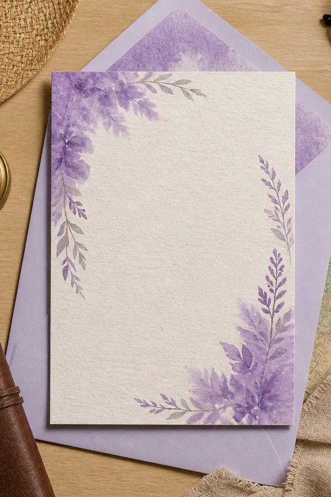
This template works when you want “dreamy” without clutter. The watercolor corner frame gives you a soft, romantic edge while the center stays clean for names and the wedding date. The purple wash is light enough to feel airy, and the cream base keeps text readable on phones. It also photographs well because the corner detail catches light without competing with the typography. Choose it for spring weddings, bridal showers, or any invite where you want a gentle, floaty look.
Start by replacing the names and date in the center text boxes, keeping the line breaks the same as the template. Then swap the venue and location lines, but keep them in one or two lines so the layout doesn’t feel squeezed. Finally, add your RSVP details into the pre-sized area and keep the font weight consistent with the sample. For printing, use a lightly textured cardstock so the watercolor effect looks intentional, not flat. Budget time: once you pick your fonts and spacing, you can update a full set in one sitting.
Quick tipUse cream envelopes and a purple wax seal sticker if you want the invite to look styled in photos.
Skip thisDon’t put long venue names on this layout without shortening them.
2. Deep Plum Ribbon Band Invite
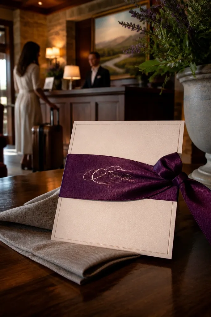
If you want purple that looks polished and a little dramatic, this is the one. The deep plum ribbon band creates a strong horizontal anchor, so the card feels designed even when you change the wording. The script-style headline sits on the ribbon while the details stay in a simpler font, which keeps it readable. This layout also handles different wording lengths better than fully floral designs because the structure is the ribbon. It’s a great pick for evening weddings, winter dates, or venues with dark wood and candlelight vibes.
Start by editing the headline line that sits on the ribbon — keep it to two short lines max. Then update the date and time block beneath, using the template’s alignment so everything stays centered on the band. Finally, paste your RSVP info into the footer area and adjust only the text size, not the placement. For printing, choose smooth cardstock so the ribbon edge looks crisp and doesn’t look fuzzy. Plan for 5 minutes per card if you copy the same formatting and just replace the names.
Quick tipKeep the time format consistent, like 4:30 PM, so the card looks neat across the whole set.
Skip thisAvoid adding extra icons or extra lines that weren’t in the original ribbon band layout.
3. Lilac Floral Sprig + Minimal Type
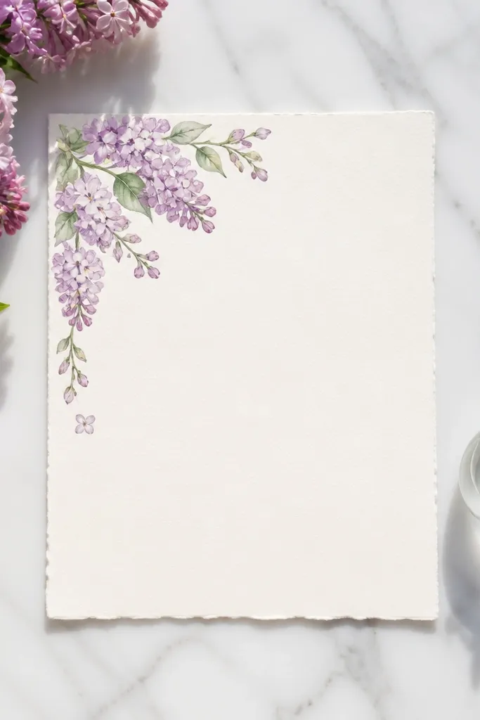
This template is for people who want purple flowers but refuse clutter. A lilac sprig sits in one corner, framing the typography without covering it. The background is bright white, so your names and date pop immediately and stay legible in low light photos. The minimal style also makes it easy to match with other stationery later, like menus or place cards. Use this for modern garden weddings, courthouse-to-party formats, or any theme where you want clean and pretty.
Start by typing your names into the main headline box, then keep the font size the same for every invite. Next, fill in the date, time, and location fields, using the same line order as the template. Finally, add RSVP information in the bottom area and keep it short enough to fit without shrinking too much. For best results, print on white cardstock and keep the envelope liner simple so the floral sprig stays the star. You’ll get that “made it look expensive” feel with very little effort.
Quick tipUse one consistent purple hex tone across your suite if you’re also editing RSVP cards.
Skip thisDon’t use a dark purple headline on a too-cool gray background if the template offers multiple base colors.
4. Purple Gradient Arch Frame
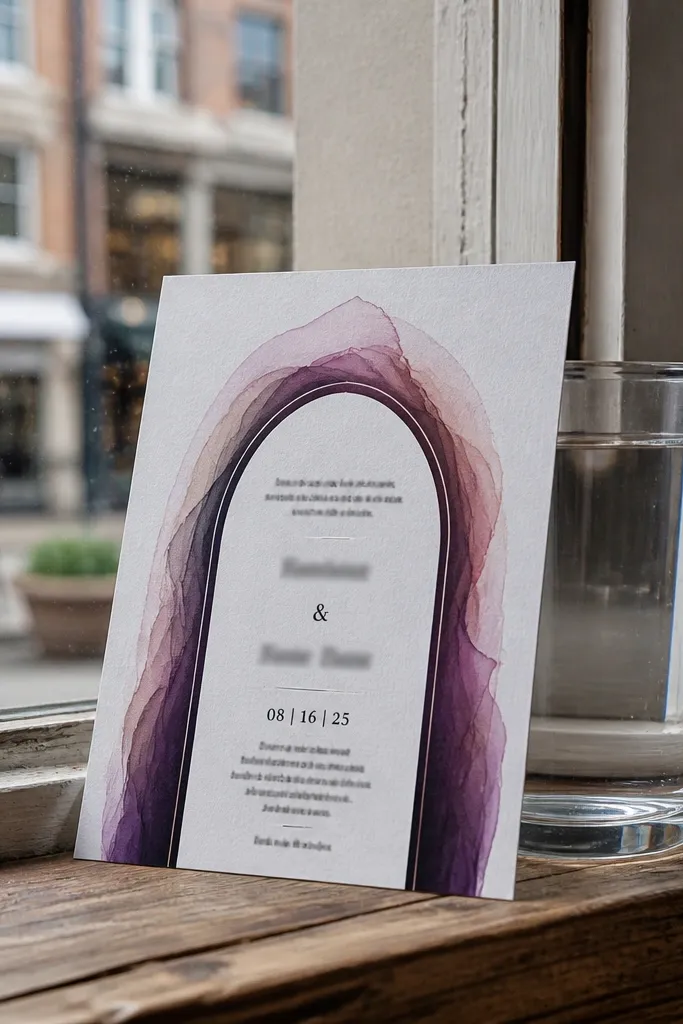
An arch frame makes invites look formal fast, and the purple gradient adds softness instead of harshness. The gradient arch frames your names and creates a clear visual hierarchy, so the card feels complete even with minimal details. It’s especially photogenic because gradients show depth on camera and look smooth when printed. The layout also works for couples who want something classic but not boring. Pick it for indoor venues, fall weddings, or anyone who wants a “storybook” vibe without full-on watercolor mess.
Start by replacing the main names and keeping them centered under the arch. Then swap in the date line and adjust only the text size if your names are longer than the sample. Finally, add venue and RSVP info in the lower text boxes and keep them to two lines each. Print on slightly thicker cardstock so the gradient edge looks smooth and doesn’t show banding. This template is fast because you’re editing a few fields, not redesigning anything.
Quick tipIf your printer shows banding, export the final file at high quality and avoid resizing after export.
Skip thisDon’t add extra decorative elements outside the arch — the frame already does the heavy lifting.
5. Plum Monogram Medallion Invite
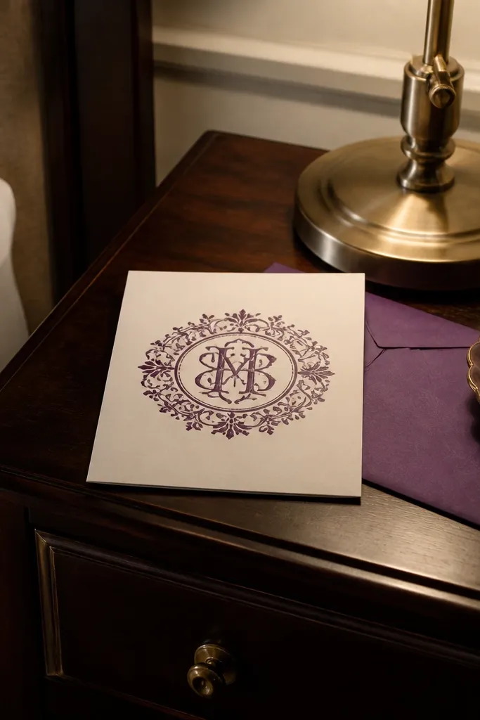
Monogram invites look intentional, and this one makes purple feel like a signature color. The medallion sits at the center, so it naturally draws the eye to the names and date. The surrounding text is clean and spaced, which is what helps these look good when you change details for each guest. This style also works well for couples who want personalization without adding more graphics. Choose it when you want a classy, modern invitation that still feels romantic.
Start by entering the initials into the monogram area and keep the letter spacing as shown. Then fill in the couple names and wedding date, using the same line breaks so the medallion stays centered. Finally, update the venue and RSVP line at the bottom and check that the text doesn’t wrap onto a third line. For printing, use cream or ivory cardstock so the plum looks deep and rich. Plan to do all edits with the same font sizes across the set for a consistent look.
Quick tipUse a single RSVP contact method like email or phone, not both, to keep the bottom text clean.
Skip thisAvoid long titles like “and their families” — this layout is best with short, direct wording.
6. Lavender Frame With Tiny Stars
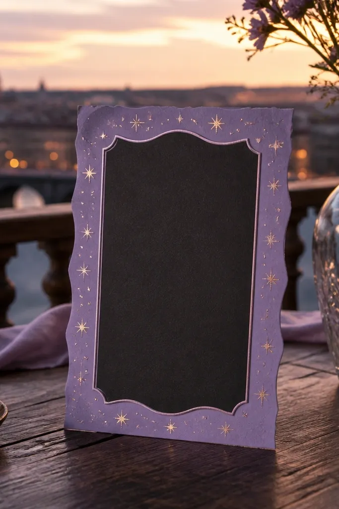
This template is for a “soft night sky” look without turning into a theme party. The lavender border keeps everything structured, while the tiny star accents add sparkle that reads well in photos. Text stays dark and crisp, so even if you’re editing quickly, the card remains readable. It’s also a good pick if you have a night-time ceremony and want the invite to match the mood. Use it for evening weddings, engagement parties, or winter celebrations.
Start by replacing the headline names and date, then keep the text centered within the lavender border. Next, update the time and venue lines, and shorten anything that pushes to a new line. Finally, add RSVP details in the bottom area and check that the star accents don’t overlap important text. Print on smooth cardstock for sharp border edges. Export at high quality so the star specks look crisp, not blurry.
Quick tipChoose a deep purple ink for your return address label so it matches the border tone.
Skip thisDon’t pick a light gray RSVP font — it makes the stars look louder than the details.
7. Purple Botanical Label Tag Style
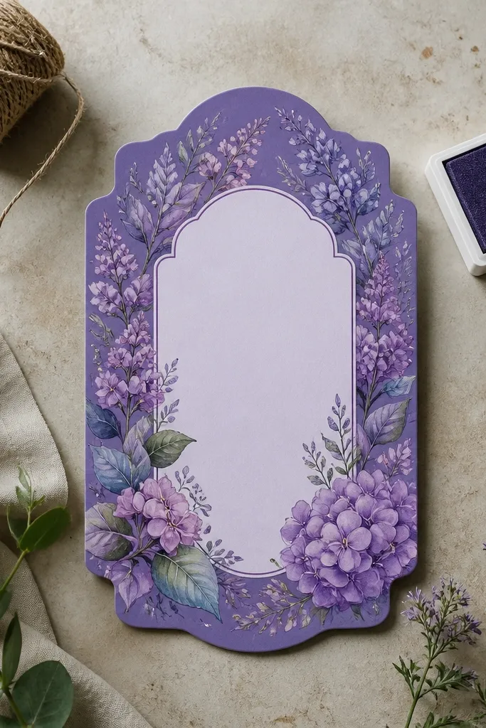
Label-style invites look cute and organized, like you’re stamping the important info into place. Purple botanicals around the label give it a handmade feel, but the label shape keeps it clean for fast editing. The typography sits inside a defined area, which helps when you swap names and addresses across a full guest list. This is a strong choice for destination weddings and travel-forward stationery because the label style reads clearly even at a glance. Pick it for garden venues, outdoor ceremonies, or any invite that needs to feel friendly and approachable.
Start by editing the label headline and date first, then keep the rest of the text within the label boundaries. Next, fill in the venue and RSVP lines, using the same order as the template to avoid pushing content outside the label. Finally, add any registry or travel info into the optional text area only if it’s already sized for it. Print on matte cardstock so the botanical accents don’t glare under lights. This template is quick because the label shape controls the layout.
If you’re adding travel details, put them on a separate insert so the main invite stays uncluttered.
Don’t force long registry lines into the label — keep it short or split it.
8. Soft Lavender Frame With Script Names
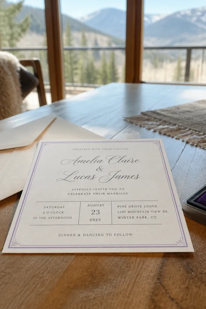
This layout balances romance and clarity. A thin lavender frame outlines the card, while the script names add that dreamy look people associate with purple wedding stationery. The center text is structured, so your date and venue stay readable even if your handwriting-style font is decorative. It’s also easy to keep consistent across the suite because the frame and typography placements are fixed. Use it for indoor ceremonies, bridal showers, and couples who want a feminine look without heavy floral coverage.
Start by swapping in the couple names in the script box and check how it wraps — keep it to the same two-line style as the template. Then update the date/time block and location line using the provided text boxes so alignment stays perfect. Finally, add RSVP info in the footer and adjust the font size only if it spills. Print on white cardstock with a smooth finish for a clean frame edge. This is one of the fastest formats when you’re sending a lot of invites.
Match your envelope liners to the lavender frame tone for cohesive photos.
Don’t use extra decorative lines under the script names — the frame already gives structure.
9. Purple Luxe Marble Background
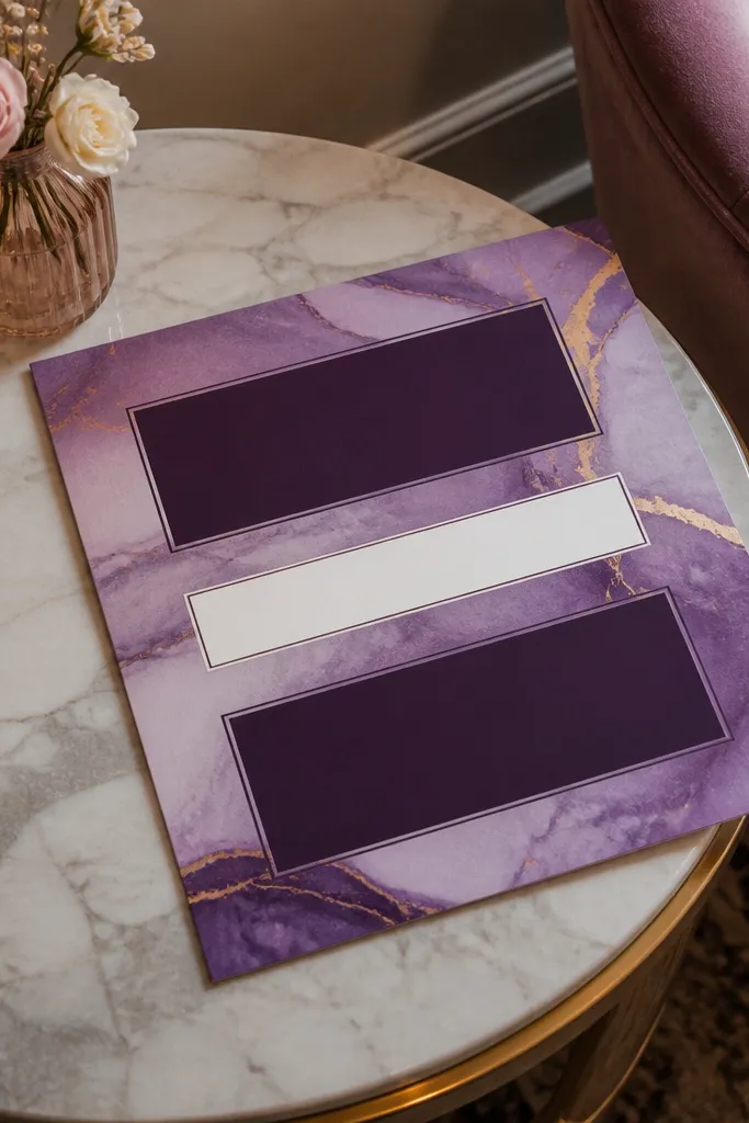
Marble backgrounds look expensive, and purple marble gives you drama without adding extra graphics. The best part is that the background pattern hides minor printing imperfections, so your invite still looks good even if your printer isn’t perfect. Text is arranged in clean blocks, which keeps it readable and lets you edit names and dates quickly. This template is ideal for couples who want a modern, upscale look that still feels romantic. Choose it for city weddings, modern venues, or anytime you want the invite to feel like a statement card.
Start by updating the main headline and date in the large text blocks, keeping the font sizes unchanged. Then fill in the venue and RSVP lines in the smaller blocks below, checking that words don’t wrap awkwardly. Finally, export at high quality and print on thicker cardstock so the marble texture looks smooth. For cost savings, print a test page first because marble backgrounds can reveal printer alignment issues. Once the test looks right, you can run the full set quickly.
Quick tipUse a matte finish cardstock to reduce glare from the marble pattern in photos.
Skip thisAvoid thin fonts over darker marble sections — keep the template’s text colors.
10. Lilac Ribbon Bow Topper
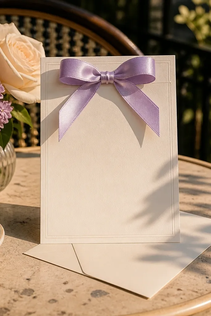
A ribbon bow gives instant “event stationery” energy. The lilac bow sits at the top as a focal point, while the rest of the card is clean and structured for fast edits. The purple tone is light enough to feel sweet, not heavy, and the cream base keeps everything readable. This is a great choice for spring weddings and bridal showers, especially if you want invites that look cute in flat lays. It also works well for couples who want a more traditional silhouette without going full lace.
Start by replacing the couple names in the center line and keep the length similar to the sample so it doesn’t crowd the bow. Then add the date/time and venue lines, using the same line breaks as the template. Finally, fill in RSVP details at the bottom and check spacing so it doesn’t drift toward the frame. Print on smooth cardstock so the bow edges look crisp. You can finish a set quickly by copying your finalized text formatting across every card.
Quick tipUse white envelopes with a lilac or purple return address label for a matching look.
Skip thisDon’t add extra RSVP lines; this layout needs breathing room under the bow.
11. Violet Night Sky With Purple Frame
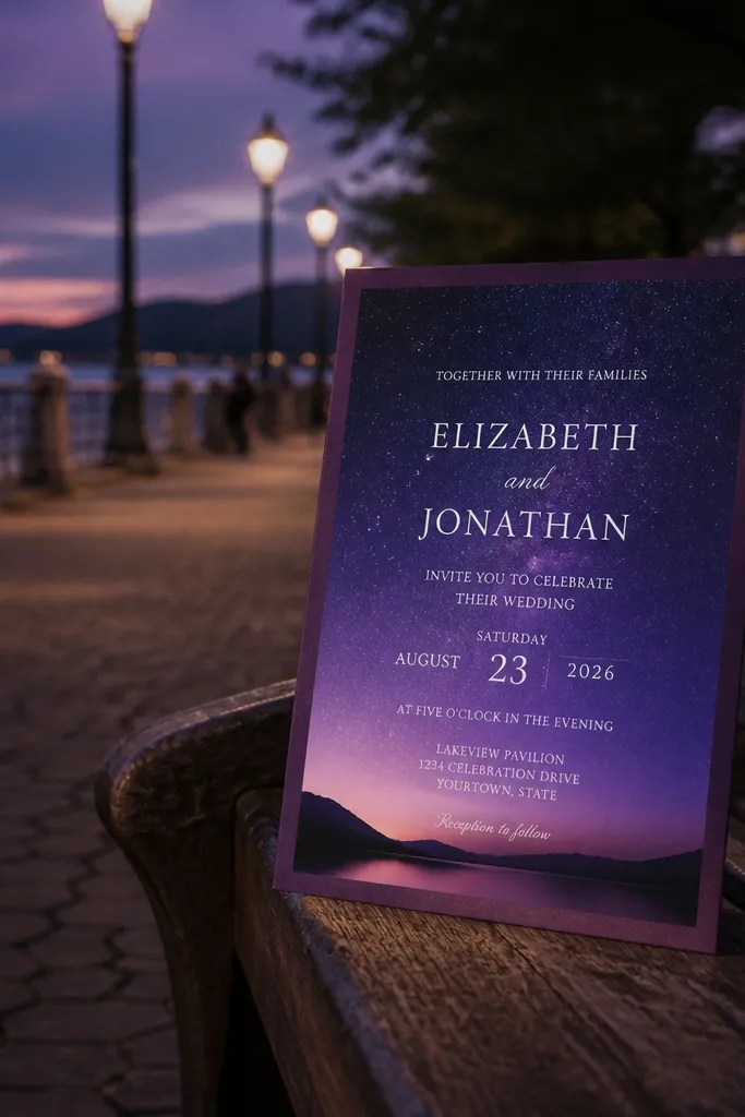
This template is for couples who want purple to feel cinematic. The night-sky background creates depth, and a purple border keeps the card from looking like a poster. White text is used for readability, which matters if you’re sending invites for an evening ceremony or a venue with dim lighting. The design is photogenic because the background texture makes the typography stand out. Pick this for winter weddings, late ceremonies, or any event where candles and warm lights are part of the vibe.
Start by editing the names and date in the white text areas and keep the text centered to preserve the look. Then update time and venue lines, checking that the font doesn’t overlap any background speckles. Finally, add RSVP info in the bottom area and keep it short. Print on high-quality cardstock and do a test run, because dark backgrounds can show printer streaking. Once your test is clean, the rest of the cards are quick edits.
Quick tipUse a dark purple envelope liner so the invite looks cohesive when opened.
Skip thisAvoid changing the text color to something other than white — readability drops fast.
12. Purple Floral Corner + Gold Foil Text Look
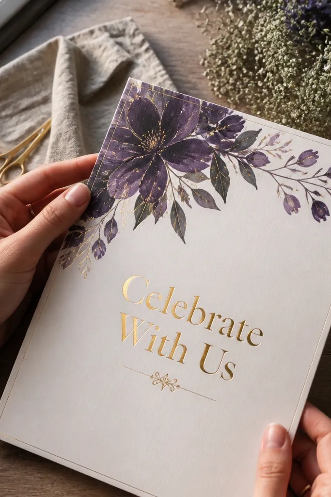
This one is built for “pretty in photos” invitations. A purple floral corner frames the card, while gold-style headline text gives a luxe effect without needing actual foil printing. The background stays light, so the gold effect looks warm and the details remain readable. It’s a strong choice if you want purple with a slightly glam mood, like a modern ballroom or a candlelit outdoor reception. This layout also pairs well with RSVP cards that use the same floral corner motif.
Start by placing your couple names into the gold-style headline area and keep the font size the same across all cards. Then update the date/time and venue lines in the smaller text boxes, watching line breaks for longer venue names. Finally, add RSVP info at the bottom and keep the spacing consistent. Print on smooth cardstock and test one card first if your printer struggles with metallic-like colors. After that, you can batch edit quickly by duplicating the formatted file and swapping names only.
Quick tipIf you’re using a return label, keep it simple in a single purple tone so it doesn’t fight the floral corner.
Skip thisDon’t add extra gold accents or icons — the floral corner already fills the visual space.
13. Lavender Frame With Clean RSVP Footer
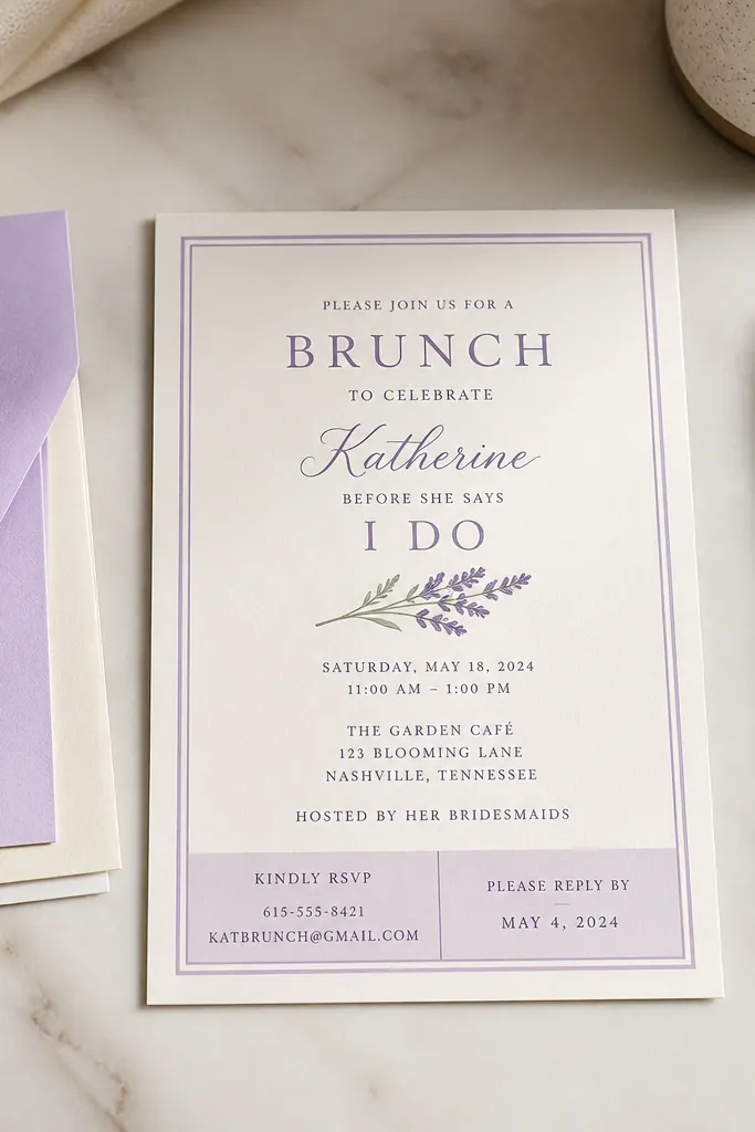
This template is built for people who want the RSVP info to be easy to read and easy to find. The lavender frame is soft and pretty, while the footer is designed as a clear block for phone/email and RSVP date. That structure matters because guests actually scan invites — they look for the date and the response instructions first. The typography is simple and high-contrast, so it stays legible even when you change guest names or add apartment numbers. Choose it for weddings with lots of guests, shared households, or anyone who wants fewer RSVP questions.
Start by editing the main headline and wedding date in the top area, keeping the text aligned to the frame. Then fill in the location and time lines in the mid section, using the template’s two-line limits. Finally, update the RSVP footer and keep the RSVP deadline short and centered inside the block. Print on white cardstock and use a dark ink pen for any handwritten guest addresses so they don’t compete with the lavender frame. You’ll finish quickly because the RSVP block is already laid out.
Quick tipUse a single RSVP deadline line like “RSVP by Oct 12” to reduce guest confusion.
Skip thisAvoid placing RSVP info anywhere else on the page — keep it in the footer block.
14. Purple Watercolor Band Across Center
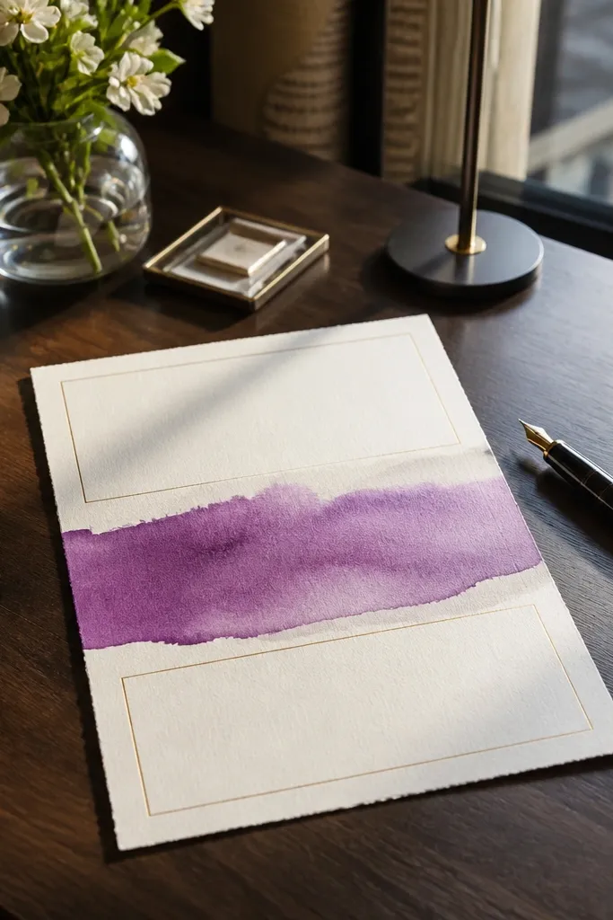
A watercolor band gives you movement without busy patterns everywhere. The purple band runs through the center, so it acts like a visual ruler: names sit in the band, and the details sit above and below. This layout stays readable because the band has a soft edge, not a dense texture behind the text. It’s also a good match for couples who want a modern card with a watercolor feel. Pick it for couples who want purple to look artsy, but still clean and organized for a full guest list.
Start by replacing the couple names in the band area first, then adjust the font size if your names push too wide. Next, fill in the date/time and venue lines in the sections above and below, using the template’s existing spacing. Finally, add RSVP info in the bottom area and keep it to one or two lines. Print on medium-weight cardstock so the watercolor band doesn’t look flat. Export at high quality and avoid resizing after export to keep the band texture smooth.
Quick tipIf your venue name is long, shorten it for the invite and put the full address on a separate details card.
Skip thisDon’t place long registry lines under the band; it turns the center into clutter.
15. Violet Monochrome Minimal Card
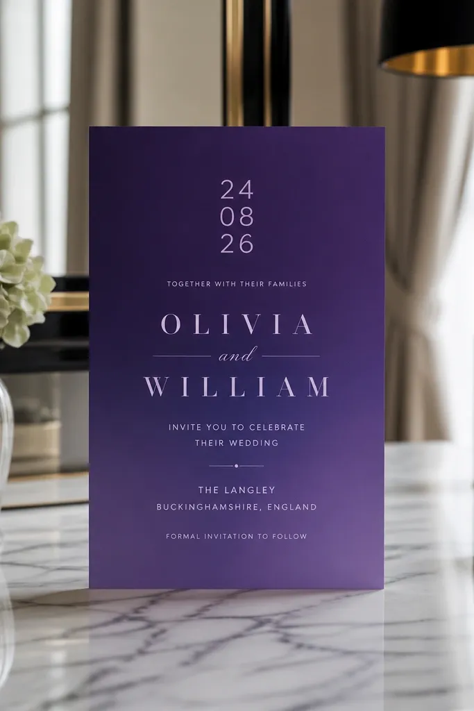
Minimal doesn’t mean boring. This monochrome violet design uses one shade family and strong typography contrast, so it looks sleek and modern while still feeling wedding-appropriate. The layout is built so your date reads first, then your names, then the venue details. That hierarchy is what makes it feel “finished” even when you edit fast. It also fits destination weddings well because it looks clean and doesn’t compete with any travel insert you might include. Choose it for modern venues, city weddings, and couples who want purple without florals.
Start by editing the date typography line and keep it bold as shown in the template. Then replace the couple names and venue lines, using the same alignment and line breaks so the card stays balanced. Finally, add RSVP info in the footer and adjust only the font size if needed. Print on smooth cardstock and use a high-contrast ink setting so the violet text doesn’t look washed out. This template is quick because there are fewer decorative elements to worry about.
Quick tipUse a dark purple envelope or a deep plum label so the minimalist invite looks intentional when mailed.
Skip thisAvoid adding extra borders or icons — the clean look depends on restraint.



