
1. One-Grid Center Layout That Never Looks Off

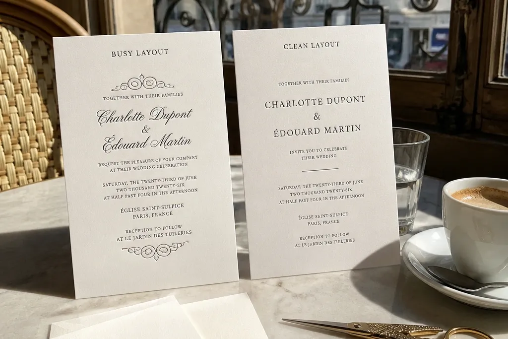
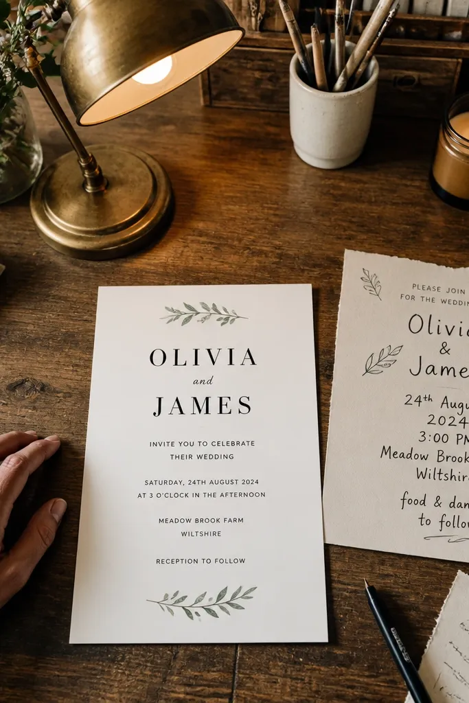
A center layout looks polished when every element snaps to the same invisible grid. Put the couple’s names on the same vertical center line, then keep the date and location on evenly spaced rows below. This approach makes the card feel calm instead of crowded, which is exactly what you want for photos. It also helps printing because long names wrap more predictably when you control line breaks and spacing.
Start by choosing a card size like 5x7 inches or 4.25x6 inches and set a grid with 12- or 8-column guides. Then place names first, using one font for names and a second for supporting text, with consistent line spacing. Finally, add a thin border or corner accents that align to the outer safe area so nothing looks like it’s floating or getting cut.
If your names are long, plan a line break rule now so the second line stays centered.
Avoid “eyeballing” spacing — drifting elements is one of the most common mistakes to avoid wedding card design.
2. Contrast Ladder for Names and Dates
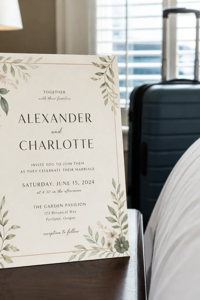
High-contrast typography is the difference between a card that reads instantly and one people squint at. Use a contrast ladder: darkest text for the names, slightly lighter text for the details, and a background that’s light enough to keep everything crisp. Cameras love contrast, and print presses do too, because fine light-gray text tends to lose definition. When you get the hierarchy right, even a simple design looks expensive.
Pick your background first, then choose two ink tones: one dark (navy, charcoal, or deep black) and one medium (gray or muted color). Set names in the darkest tone and the date in a medium tone, then test by zooming out to about 25% on your screen. Finally, export a proof and print one sample so you can check if the medium tone stays readable under real lighting.
Quick tipUse a white block behind the date if your background is textured or patterned.
Skip thisAvoid light gray names or pastel date text — that’s a classic common mistake to avoid wedding card design.
3. Safe Margins That Keep Text From Getting Trimmed
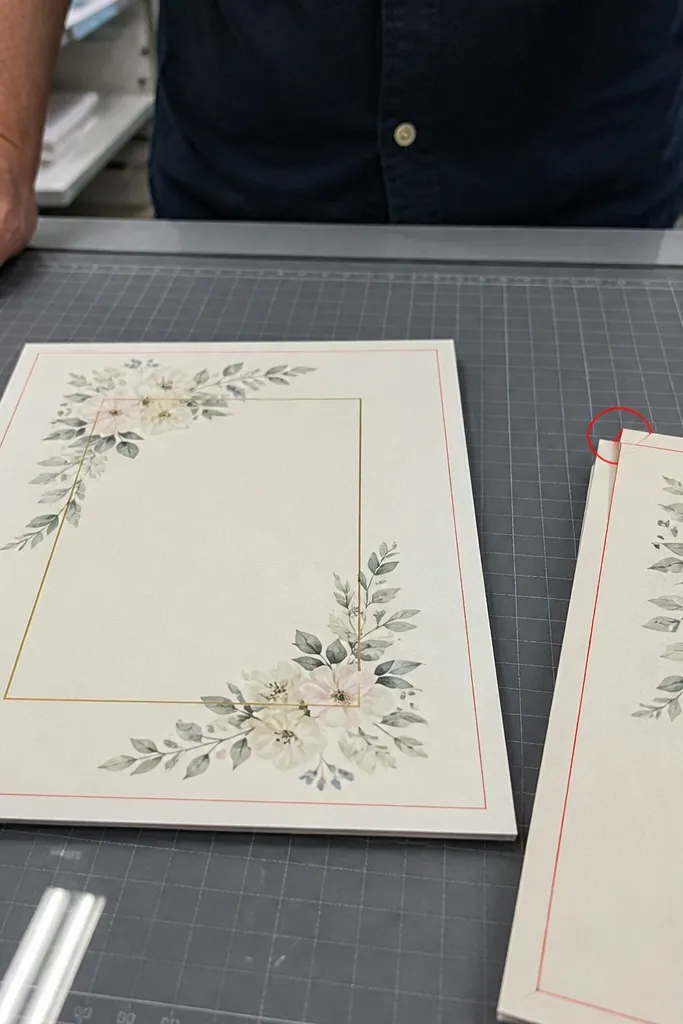
Most “pretty” designs fail because the text sits too close to the trim. Printers cut to a tolerance, and even a small shift can clip letters or chop off punctuation. Safe margins give you breathing room so the design stays intact across batches. In photos, tight edges also look messy because the card border becomes uneven.
Start by setting bleed (usually 0.125 inches on each side) and then set a safe margin of at least 0.25 inches for text and thin lines. Place your border line inside the safe area, not right on it. Finally, run a checklist: zoom to the edges and confirm no letter or decorative element crosses the safe boundary.
Quick tipIf you use a border, make it thicker or move it inward rather than pushing it to the edge.
Skip thisAvoid placing names or dates within the bleed — it’s one of the common mistakes to avoid wedding card design.
4. Bleed + Background Pattern That Fills Cleanly
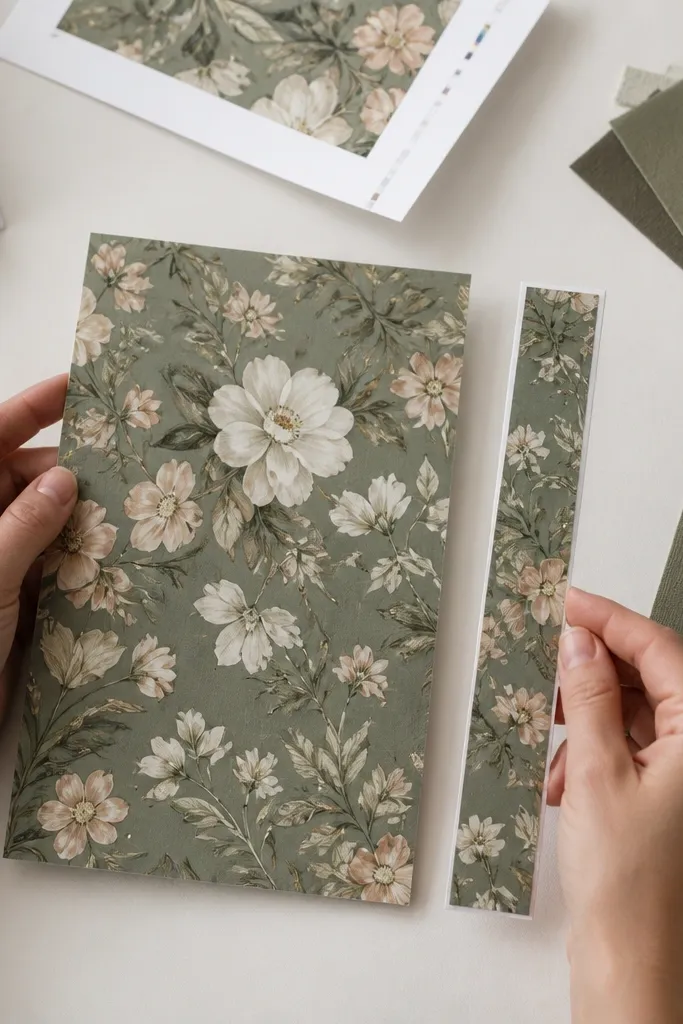
A pattern background looks gorgeous when it truly reaches the edge. If you don’t use bleed correctly, you’ll get tiny white gaps where the paper is trimmed, and those show up badly in close-up photos. The goal is a full-coverage background with no haloing. When your pattern aligns well, the card feels intentional instead of DIY.
Start by extending your pattern artwork past the trim line using bleed, then ensure the pattern scale doesn’t create awkward repetition near the center text. Next, turn off any “artboard” cropping and confirm the export includes the full bleed area. Finally, request a digital proof or print a test card because pattern files can shift between software and printers.
Quick tipIf your pattern is directional, rotate it so the pattern flow supports the text block.
Skip thisAvoid exporting without bleed — that’s a common mistake to avoid wedding card design.
5. Font Pairing With Real Roles (Not Random Styles)
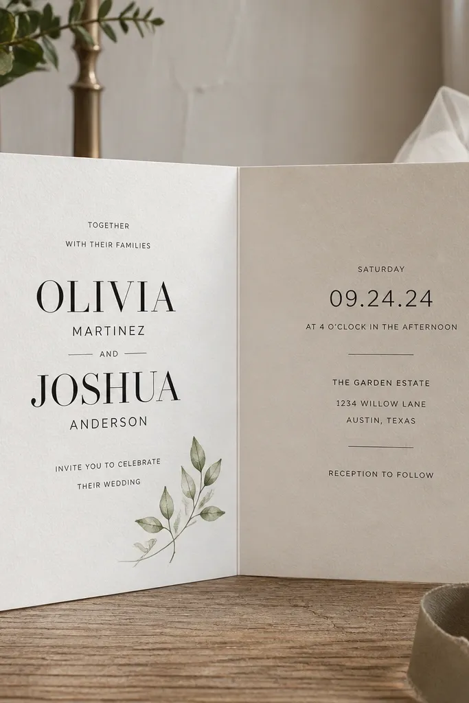
The best wedding cards use fonts like a team. One font does the headline work (names), while the other handles readability for date, time, and location. When you mix too many styles, the card looks chaotic and hard to scan. The cleanest look is two fonts plus one size hierarchy rule: names are the largest, details are smaller, and everything aligns to the same grid.
Pick a script or serif for names, then choose a simple serif or sans for details so the text stays readable. Limit yourself to two font families, then set sizes so the date is at least 10-12 pt equivalent for typical 5x7 cards. Finally, adjust line spacing manually so the date block doesn’t feel cramped next to the names.
Quick tipIf your script has thin strokes, add a stronger contrast color behind it.
Skip thisAvoid using three or four fonts — it’s a common mistake to avoid wedding card design.
6. Lettering Size Rules That Actually Print Legibly
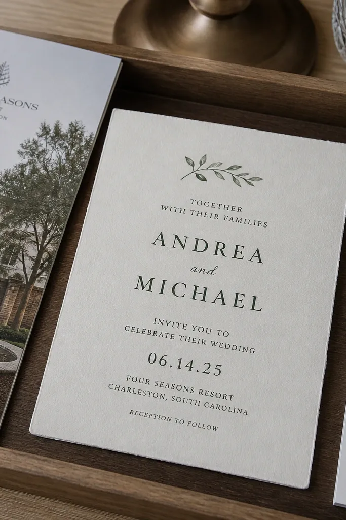
Legibility is the whole point of stationery, even when you want a delicate look. Small type looks gorgeous on screen and then turns into a gray smear on paper. The fix is simple: set a minimum size for each text category based on your card size. When your type is properly scaled, the card feels thoughtful, not fragile.
Choose your card size, then set names to be the clear focal point and details to a readable minimum (for 5x7, RSVP and address lines should not be tiny). Use consistent font weight for detail text so it doesn’t look uneven across lines. Finally, print a one-card test and hold it at arm’s length to confirm you can read it without squinting.
Quick tipTreat RSVP and address text like “utility text” — prioritize clarity over style.
Skip thisAvoid detail text that’s too small — it’s one of the common mistakes to avoid wedding card design.
7. Thin Borders and Corner Lines That Don't Fight the Text
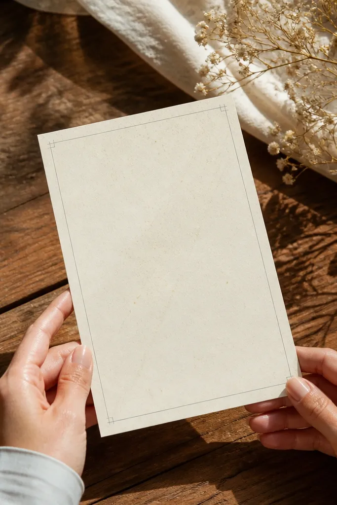
Borders can look luxe or cheap depending on weight and placement. Thin lines create structure without stealing attention from the names, and corner ticks add polish when they’re subtle. If the border is too thick or too close to the text, the card feels cramped and the typography loses focus. Photographically, a thin border also gives the image a clean frame.
Start with a border line weight that looks light on paper, then place it inside the safe margin. Add corner accents only if they align with the grid and don’t overlap descenders from the script. Finally, check spacing between border and text by measuring the gap in your design software, aiming for a consistent distance all around.
Quick tipUse one border style only — don’t stack a border and decorative shapes at the same time.
Skip thisAvoid thick borders or multiple competing frames — that’s a common mistake to avoid wedding card design.
8. Monogram Placement That Looks Intentional, Not Random
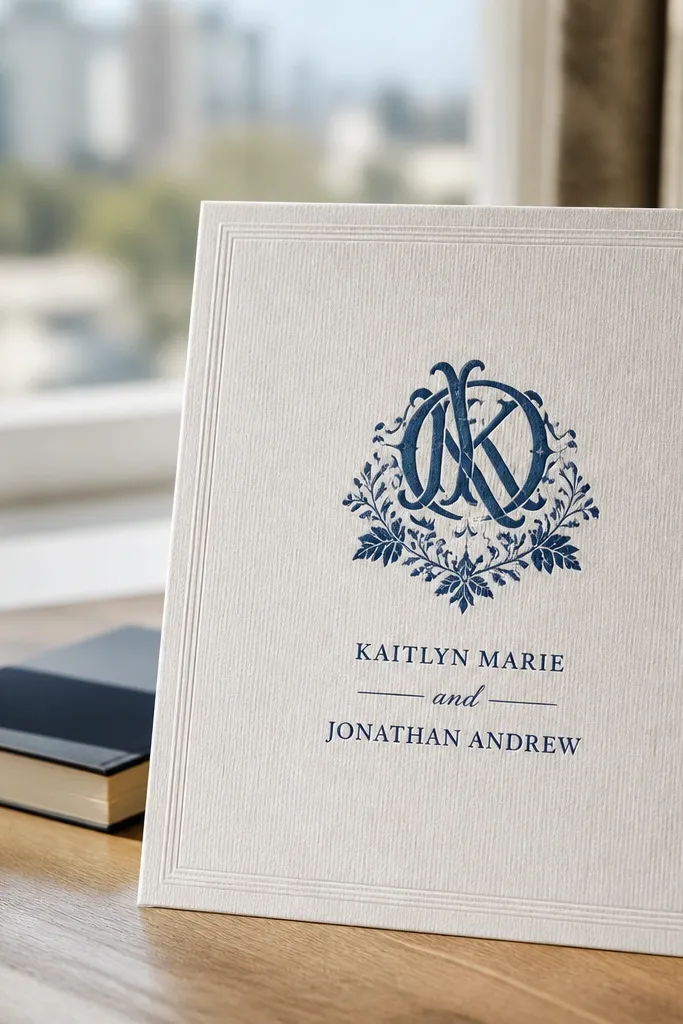
A monogram is a strong visual anchor, but placement decides whether it looks tailored or like an afterthought. Put it near the headline area, where it can support the names instead of covering them. Size it so it reads at a glance, then keep enough whitespace around it so the lines don’t blur. In photos, monograms look best with a single color and a clean finish.
Start by choosing a monogram style that matches your font vibe, then place it between the names and the details block. Set monogram size so it spans about the same width as the longest line of names. Finally, if you use a patterned background, keep the monogram in a flat color so it stays crisp against texture.
If your monogram overlaps text, switch to a smaller size rather than reducing opacity.
Avoid tiny monograms or monograms jammed into the corner — it’s a common mistake to avoid wedding card design.
9. Envelope Address Layout That Matches the Front
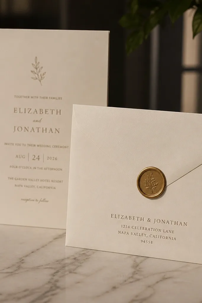
Your front design can look gorgeous and still feel off if the envelope address styling clashes. Address placement is part of the visual story, and it also affects what people photograph when they post your invite. Match the ink color and typography style between the card and envelope so the set looks like one system. Keep the address block aligned and readable so it doesn’t look like a label slapped on.
Start by choosing an envelope layout: centered or top-left, then mirror the alignment from your card design. Use the same font family for street lines and city lines, with a clear hierarchy for names. Finally, add a simple return address style and keep the ink color consistent with the card’s main text color.
Send your address file to the printer as a final PDF only after you confirm abbreviations and line breaks.
Avoid mismatched styles between card and envelope — it’s a common mistake to avoid wedding card design.
10. Foil and Emboss Effects That Don't Kill Readability
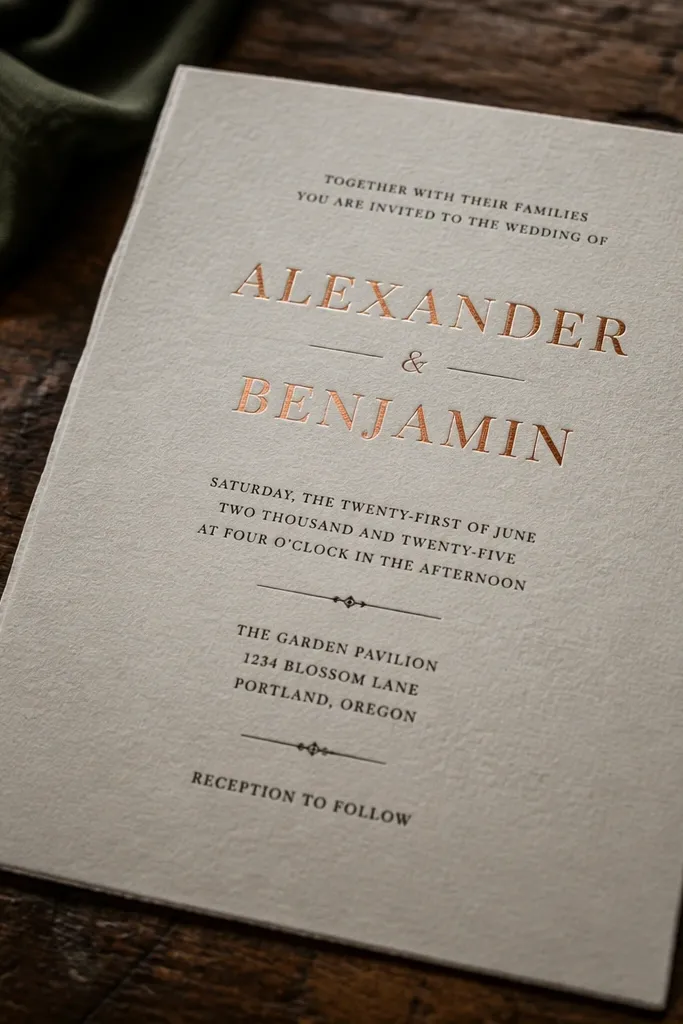
Foil and emboss look incredible when they’re used for headlines, not for every line of text. Metallic finishes can reduce contrast under certain lighting, especially if you use foil on light backgrounds or thin fonts. The best look is foil for names or a key word, then solid ink for date and details. That keeps the card photogenic without sacrificing legibility.
Start by picking one element for foil or emboss, like the couple’s names or a single border line. Then choose solid ink for all other text so it stays readable in both bright and dim conditions. Finally, ask the printer how they need the file separated by color — you’ll get cleaner results when special finishes are correctly mapped.
Quick tipUse foil on dark backgrounds only if you’re sure the contrast holds in photos.
Skip thisAvoid foil on small body text — it’s one of the common mistakes to avoid wedding card design.
11. Matte vs Gloss Paper Choice Based on Your Ink Colors
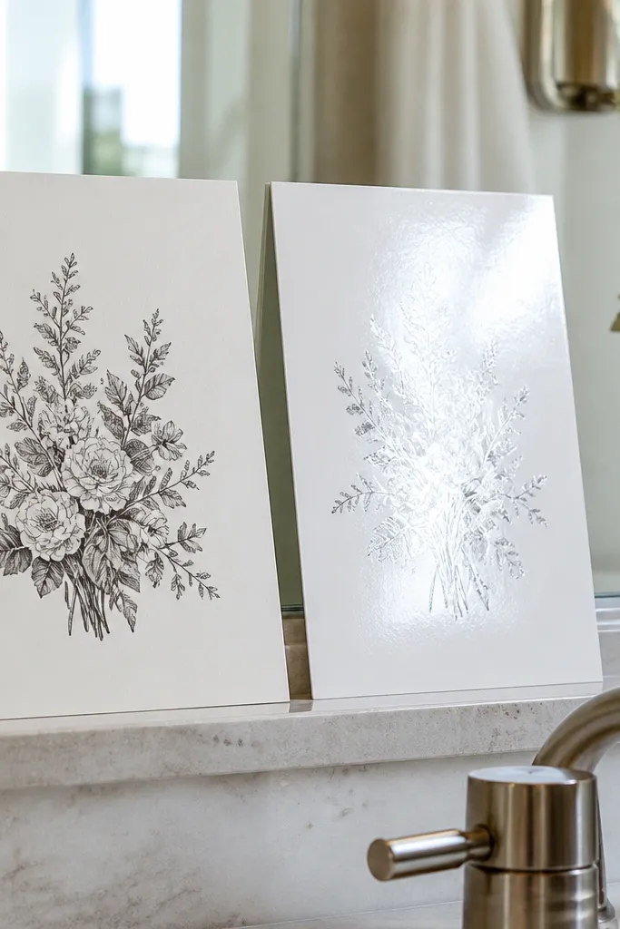
Paper finish changes how your ink looks in real life. Matte paper reduces glare, which makes light colors and fine details look cleaner in photos. Gloss paper makes dark colors pop, but it also reflects highlights that can wash out delicate typography. If you’re using light pastels or thin lines, matte usually behaves better. If your design uses strong dark ink, gloss can look dramatic, but only if the type is bold enough to survive reflections.
Start by matching finish to your palette: matte for light text and delicate borders, gloss for dark, high-contrast type. Request a paper sample if the printer offers multiple stocks, then compare under daylight and indoor lighting. Finally, print one proof and take a quick photo from an angle — if reflections hide text, switch the finish before you order the full run.
Quick tipIf your design relies on subtle gradients, matte is safer than gloss.
Skip thisAvoid choosing finish after the design is finished — it’s a common mistake to avoid wedding card design.
12. Color Palette With One Neutral and One Accent
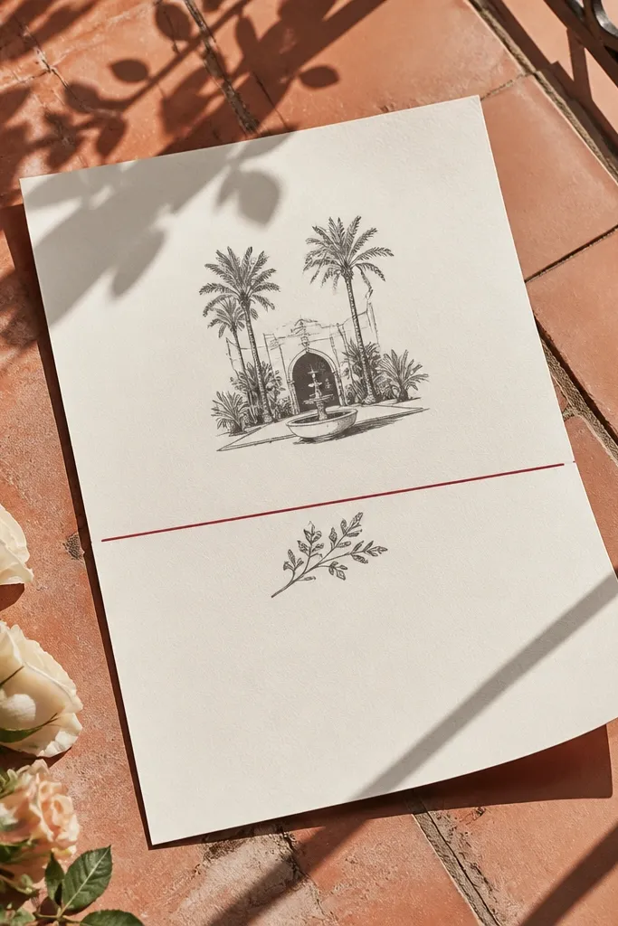
A wedding invite looks elegant when the palette has a clear job. Use one neutral for the background and most text, then one accent color for a line, date emphasis, or small icon. Too many colors makes the design feel like a collage, and cameras amplify that chaos. A restrained palette also helps you keep contrast consistent across the card and envelope.
Pick a neutral first like cream, warm white, or light gray, then choose a dark ink color for names. Add one accent color that supports your theme, like muted sage, dusty rose, or deep terracotta, and use it in small doses. Finally, convert your palette into your design files and check that all text meets readability in grayscale.
Quick tipDo a quick grayscale test: if your date disappears, your accent is too light.
Skip thisAvoid using more than two colors for text — it’s a common mistake to avoid wedding card design.
13. Icon and Ornament Limits That Keep the Card Airy
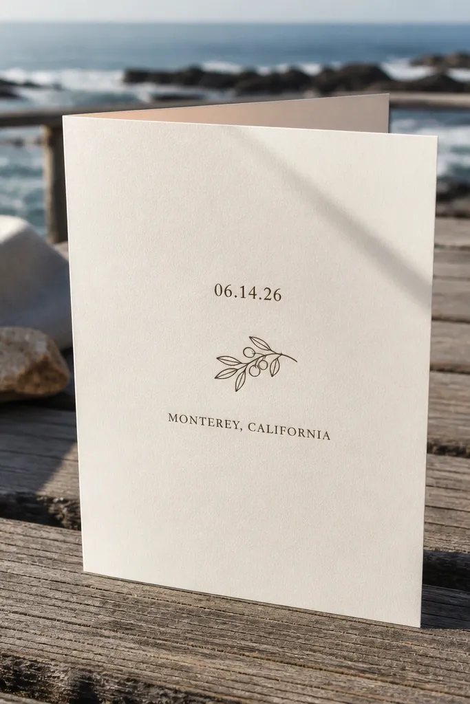
Ornaments look best when they behave like punctuation. If you scatter icons around every margin, the card becomes visually loud and your typography loses authority. One icon in a strong location — between date and location, or beside a single divider line — adds charm without clutter. In photos, ornaments also create a focal point, so viewers understand the layout instantly.
Start by choosing one ornament type: a tiny floral divider, a small leaf icon, or a simple line dot pattern. Place it at one of two zones: between headline and details, or as a divider line above the RSVP block. Finally, keep ornament size smaller than the smallest font size so it supports rather than competes.
Quick tipIf you add a second ornament, remove a divider line — keep the card’s visual rhythm simple.
Skip thisAvoid stacking multiple ornaments — it’s a common mistake to avoid wedding card design.
14. Photo-Ready Alignment for Full Bleed Photos
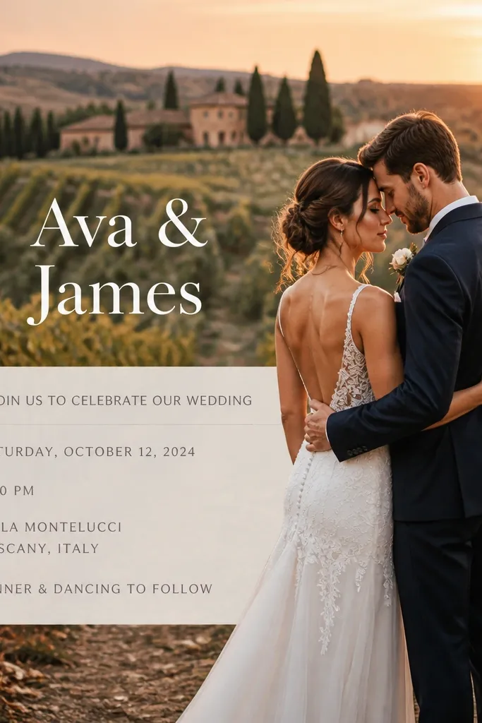
If you’re using a photo background, the text needs a safe zone with predictable contrast. The easiest photogenic approach is a full-bleed image with a single overlay band behind the text block. That keeps the design from looking like floating letters over busy visuals. It also prevents the text from disappearing when the camera exposure shifts.
Start by placing your photo to fill the card with bleed, then create a semi-opaque overlay rectangle behind the text area. Keep the overlay tone consistent with your palette so it doesn’t fight the image. Finally, export and test on multiple devices or lighting conditions, then print one proof to confirm the text stays readable.
Quick tipUse the overlay only behind text, not across the whole card — it keeps the photo feeling fresh.
Skip thisAvoid putting dark text directly on a busy photo without an overlay — it’s a common mistake to avoid wedding card design.
15. Photo-Edge Frames That Make the Card Look Professionally Finished
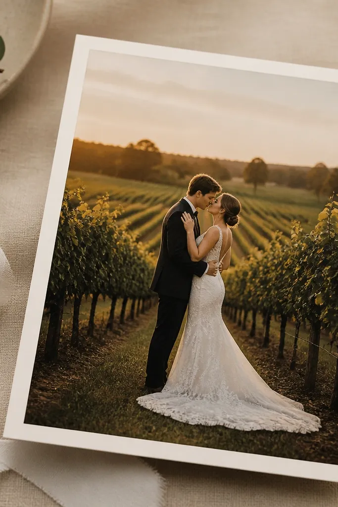
A gorgeous wedding card looks finished even when it has a photo. The trick is a photo-edge frame — a thin, deliberate boundary that tells the eye where the image ends and the design begins. It fixes the most common “my photo looks pasted on” problem and makes the whole layout feel intentional. This style also looks great in real life because it hides minor trimming differences when the card is cut. It suits couples who want a modern look with soft texture, and it works especially well for destination weddings where the photo is the emotional hook.
Step 1 — Build the frame in your layout file: place your photo full height, then add a rectangle frame on top with a 10-15 mm inset from every edge. Use a single stroke line weight of 0.25-0.35 pt in a neutral that matches your palette (not pure black). Give the frame a subtle shadow only if your printer supports it; otherwise keep it flat so it prints cleanly. Step 2 — Add a second boundary for depth: create a second line just 1-2 mm inside the first, using 40-60% opacity of the same color. This gives the photo edge a “matte” feel without adding clutter. Step 3 — Export with print-safe settings: turn on bleed in your document, set total bleed to 3 mm, and keep all frame lines at least 2-3 mm inside the trim. If you’re using patterned backgrounds, stop the pattern under the frame so the photo edge stays the hero. Step 4 — Choose the best paper to keep the frame crisp: pick matte card stock if your photo has lots of bright highlights, and choose a soft-touch or satin finish if your ink is darker. The frame line should stay sharp — if it looks fuzzy on your proof, the line weight is too thin for your printer.
Quick tipAsk your print shop for a paper-and-ink proof that includes line strokes, not just color blocks. If they can’t, print a one-card test with the frame lines at your final size.
Skip thisAvoid letting the photo run to the trim edge without a boundary — it makes trimming errors show up as messy white gaps or uneven edges.



