
1. Evergreen + Ivory + Pine Needle Gold
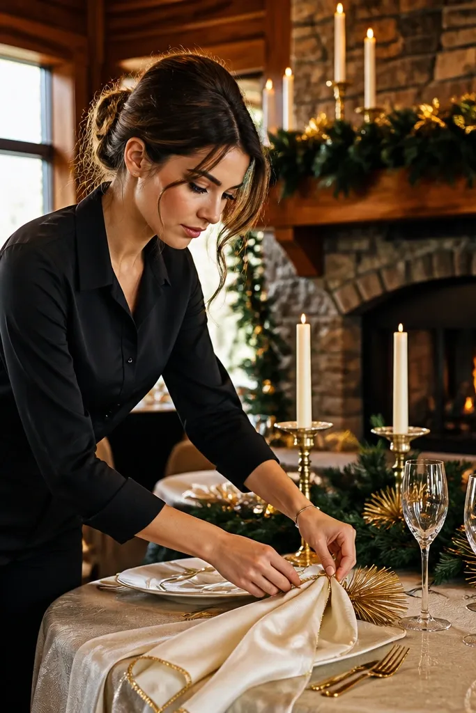
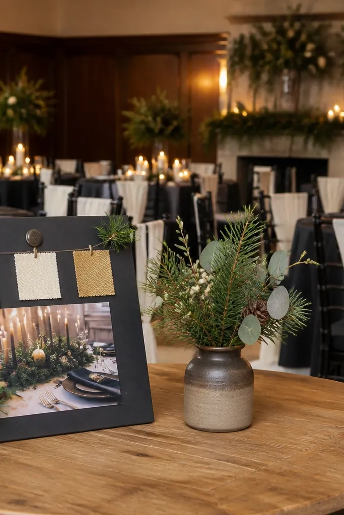
This scheme looks expensive in winter because evergreen stays dark and readable when the room goes dim. Ivory keeps it clean without turning icy, and a pine-needle gold accent adds warmth under candlelight. It suits venues with wood, stone fireplaces, and window light that turns soft in the afternoon. If you want classic without looking like “holiday dinner,” keep gold to small hits: candle holders, flatware details, or a thin border on signage.
Start by choosing evergreen as your anchor fabric color for napkins or a runner. Then add ivory for linens and plates so the palette doesn’t feel heavy. Finally, use gold only in small areas like menu cards, place card frames, or taper candle sleeves so it doesn’t look costume-y.
Bring one evergreen swatch to your florist consultation so they can match stems to your exact green tone.
Don’t pair evergreen with bright lime greens — it looks neon in winter photos.
2. Burgundy Velvet + Warm White + Charcoal Ink
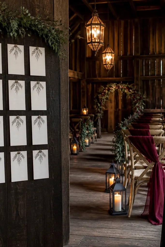
Start by picking a burgundy fabric that’s either velvet or matte with a deep tone (not wine-red that’s too bright). Then set warm white for linens and paper so your text has room to breathe. Finally, use charcoal ink for signage and place cards to sharpen the whole look.
Burgundy is a winter color that photographs well because it holds depth instead of washing out. Warm white keeps the vibe soft, and charcoal ink makes signage and seating charts look crisp. This is great for rustic venues and also for indoor ceremonies where you want drama without relying on heavy florals. If you’re using candles, burgundy gains richness rather than turning flat.
Skip thisAvoid mixing burgundy with cool silver — it can make the palette look gray.
Quick tipIf your venue is already dark, go with matte burgundy instead of shiny satin to avoid glare.
3. Midnight Navy + Champagne + Frosted Silver
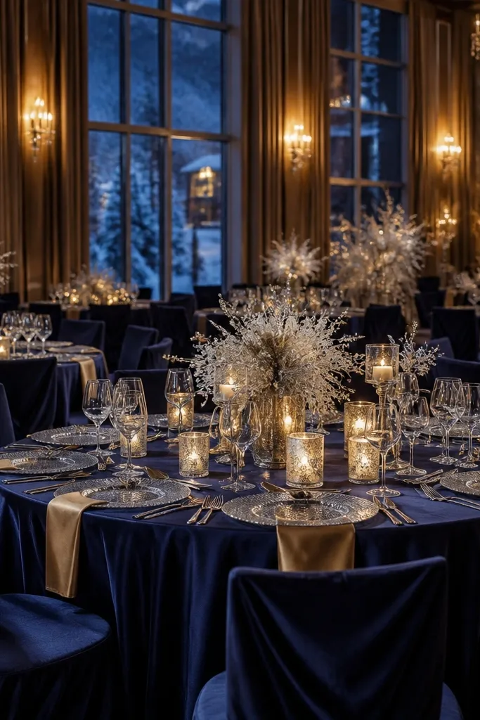
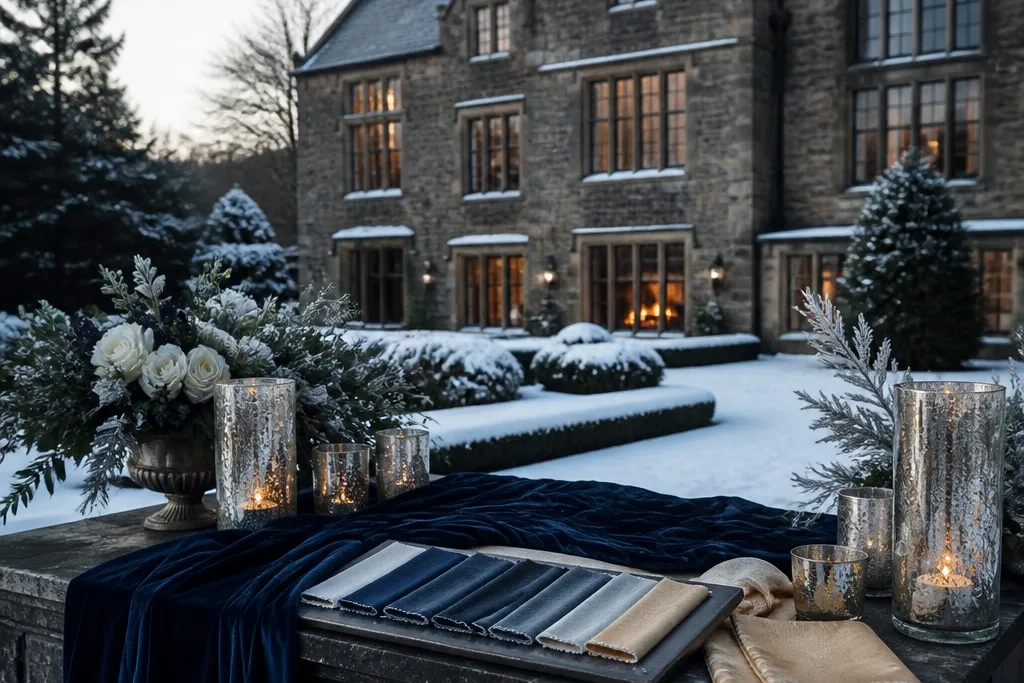
Midnight navy is a dependable winter anchor because it reads as true blue under warm lighting. Champagne keeps it celebratory without going bright, and frosted silver adds a wintery sparkle without looking like cheap tinsel. This works well for formal venues and for weddings that feel more like an evening party than a cozy cabin. If your florals are limited, this palette still looks intentional because the fabrics do the heavy lifting.
Start with midnight navy as your main textile color — napkins, a runner, or chair accents. Then choose champagne for paper suites, glassware tint, or candle wax color. Finally, keep silver to frosted elements like candle sleeves or small metallic accents rather than large shiny balloons.
Test your navy swatch under warm light; if it turns purplish, choose a slightly more black-based navy.
Don’t use bright royal blue in place of midnight navy — it looks harsh indoors.
4. Slate Gray + Cream + Espresso Brown
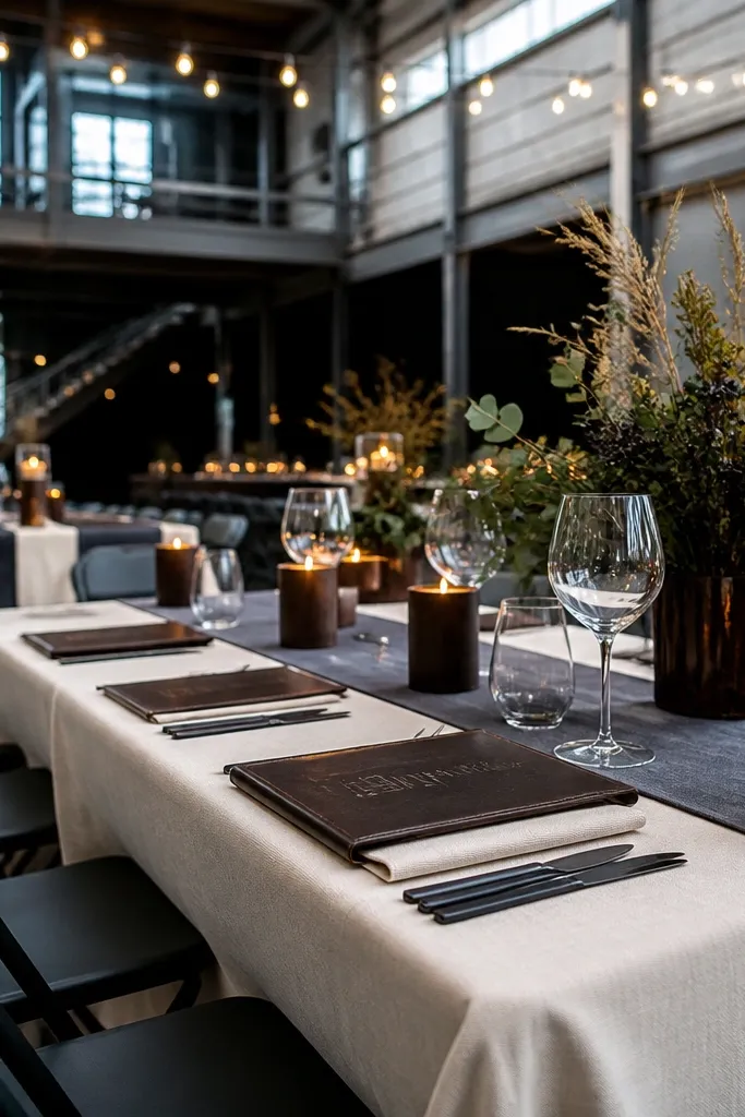
Start by picking slate gray as the anchor for linens or a table runner. Then use cream for plates, napkins, or table numbers so the palette stays soft, not stark. Finally, add espresso brown through wood chargers, leather straps, or ribbon so the look doesn’t drift into cold gray.
If you want modern and calm, slate gray plus cream is the easiest winter combo that still looks “wedding.” Add espresso brown to keep it grounded and to give the room a warm center when it gets dark early. This palette fits industrial venues, warehouses, and minimalist spaces. It also works when you want fewer flowers because the neutrals still look styled.
Skip thisAvoid pure white with slate — it can make the gray look dirty.
Quick tipChoose matte finishes for slate (linen or cotton) so it doesn’t look shiny and flat in photos.
5. Ice Blue + Navy + Silver-Grey
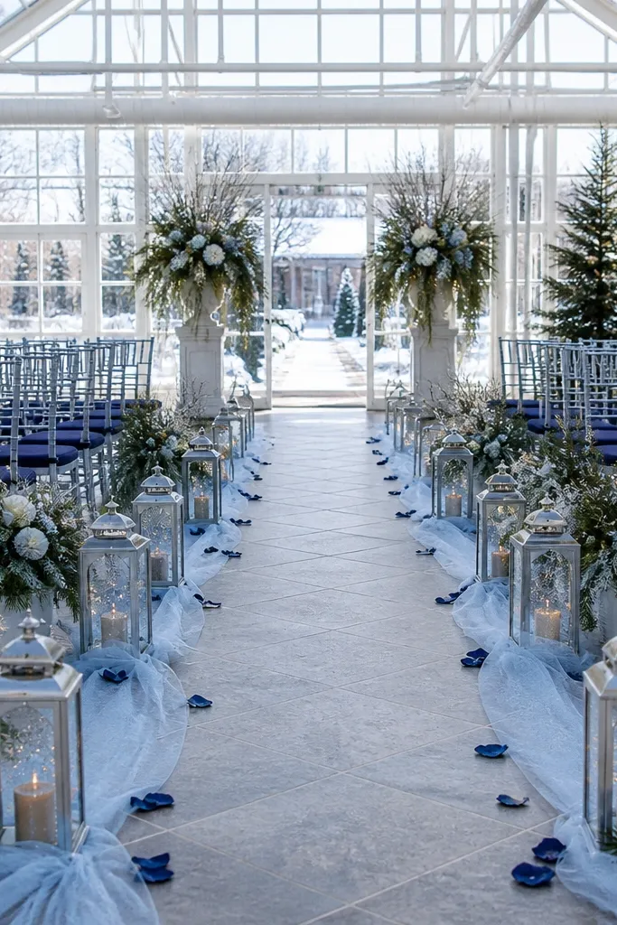
Ice blue gives that winter feel without going full “frozen.” Navy keeps contrast strong, and silver-grey adds a cool shimmer that matches snow light. This is a good choice for winter gardens, glass venues, and ceremonies that want a clean, airy look. The trick is to keep ice blue from turning washed-out by using navy and textured neutrals.
Start with navy as your anchor for ribbon, signage text, or chair accents. Then add ice blue through florals, table runners, or bridesmaid dresses if you’re coordinating. Finally, use silver-grey as a secondary neutral in candle holders, vases, or metallic paper details.
Use textured ice-blue elements (matte silk ribbon or frosted glass) so it doesn’t look flat.
Don’t pair ice blue with bright teal — it clashes under warm lighting.
6. Forest Green + Black + Gold Leaf
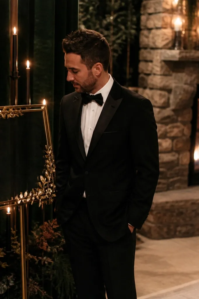
This palette is for winter weddings that want punch. Forest green stays deep, black adds drama, and gold leaf makes details look intentional even when flowers are sparse. It suits moody venues, night ceremonies, and couples who like a darker, editorial vibe. If you keep gold leaf to small areas, it looks like design, not decoration.
Start with forest green for a runner or napkins so the base is clearly defined. Then use black for napkins, menus, and table number font so everything reads sharply. Finally, add gold leaf as tiny accents on place cards, candle tops, or a thin border on signage.
Choose gold leaf accents in matte or lightly reflective finishes so they don’t blow out in flash photos.
Avoid using black on everything — it can swallow the green.
7. Terracotta + Cream + Evergreen Sprig
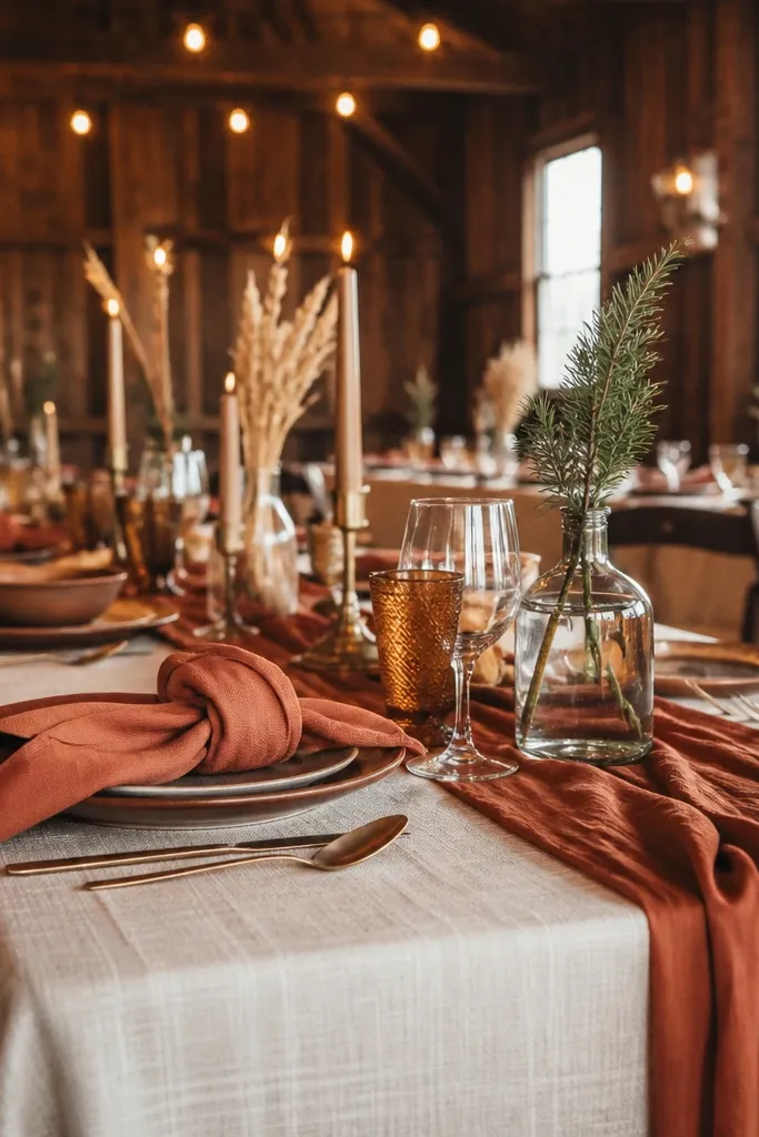
Terracotta is warmer than it looks, which makes it great for winter when venues heat up fast. Cream keeps it bright and soft, and a touch of evergreen adds seasonal credibility. This scheme works in rustic barns, garden venues with indoor receptions, and venues with earthy stone. It also pairs well with dried elements like wheat, palms, or eucalyptus for a low-maintenance look.
Start by selecting terracotta as your main warm color for napkins or table linens. Then use cream for paper and tableware so the look doesn’t go orange-heavy. Finally, add evergreen sprig accents in small bunches around candles or along the runner edge.
If terracotta is too orange for your taste, choose a clay-red with a brown undertone instead of bright terracotta.
Avoid pairing terracotta with icy silver — the temperature clash looks off.
8. Rose Quartz + Dusty Mauve + Charcoal
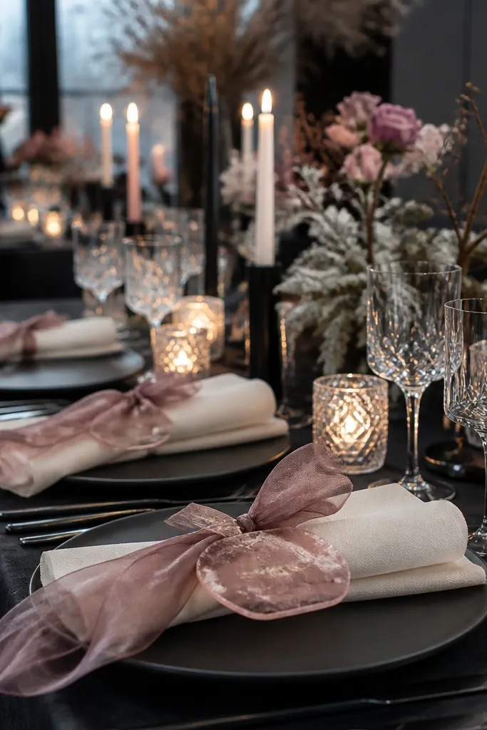
This is a softer winter palette that still photographs cleanly because charcoal gives it structure. Rose quartz makes the room feel romantic, dusty mauve keeps it from looking too pink, and charcoal keeps signage readable in low light. It suits indoor winter weddings where you want “candlelit romance” rather than bold jewel tones. Use fewer flower types and focus on shape — roses, ranunculus, and soft greenery.
Start with rose quartz as your floral or table color, then bring in dusty mauve through ribbons or napkins. Next, use charcoal for place cards, menus, and table numbers so the palette doesn’t blur. Finally, add a neutral white or warm ivory depending on your paper suite.
Use matte mauve fabric for napkins; shiny satin turns pink under warm lighting.
Don’t skip charcoal — without it, the whole palette looks pastel and flat.
9. Cranberry + Ivory + Antique Brass
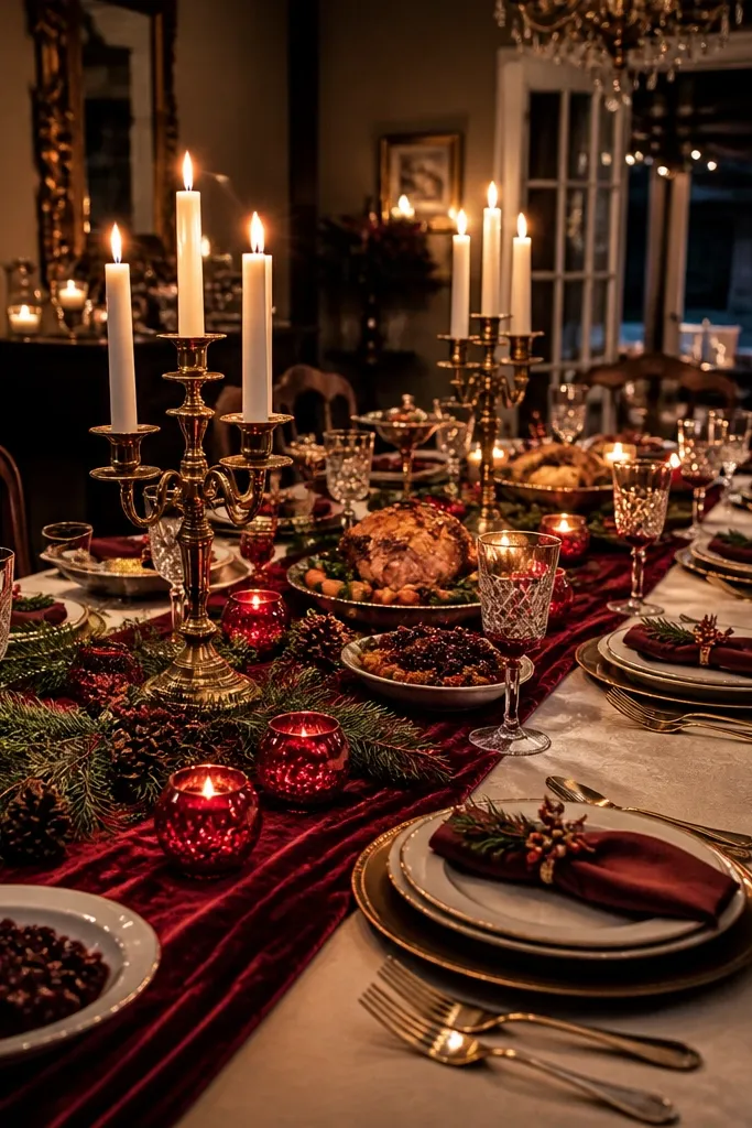
Start with cranberry for a runner or napkins — choose a deep berry tone, not bright cherry. Then set ivory for plates and paper. Finally, use antique brass only in hardware-like details: candle holders, frame edges, or a thin metallic border on menus.
Cranberry is winter’s version of a bright red that still feels cozy. Ivory keeps it classy and prevents the room from looking too holiday. Antique brass adds depth and looks warm under string lights. This palette works for formal halls and also for family-style dinners where you want the table to feel rich, not loud.
Skip thisAvoid pairing cranberry with bright teal — it screams theme party.
Quick tipIf your venue has a lot of chrome, swap to antique brass so the metals don’t fight.
10. Sage Green + Oat Milk + Soft Gold
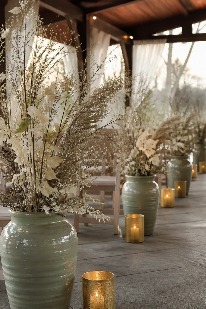
Sage green reads winter-friendly because it’s subdued and natural. Oat milk keeps the palette warm and modern, and soft gold adds a gentle glow that looks great with candlelight. This works for outdoor venues that are heated inside, as well as for light, airy spaces. Keep florals airy too — think loose arrangements rather than tight, heavy bouquets.
Start by choosing sage as your main green in linens, bridesmaid dresses, or the base of your bouquet. Then use oat milk as your neutral — it’s warmer than cream and photographs better than stark white. Finally, add soft gold through small candle accents, vases, or a thin line on signage.
If sage looks too gray in daylight, pick a slightly more yellow-based sage.
Avoid pairing sage with stark black — it can make the look feel harsh.
11. Charcoal + Blush Pink + Silver
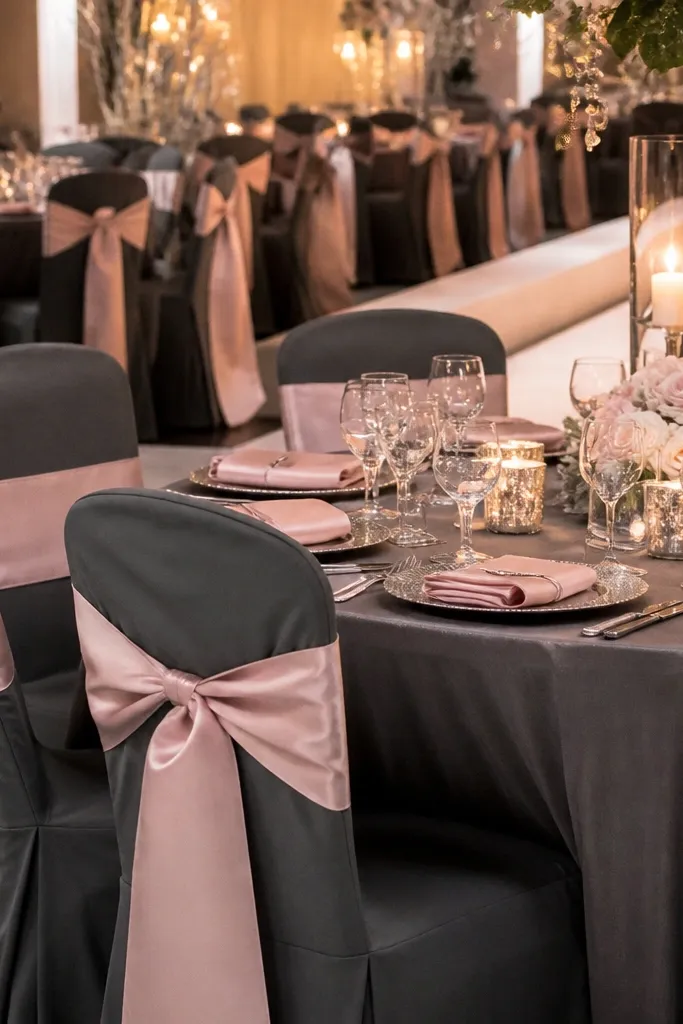
Charcoal and blush make a winter palette that feels modern, not snowy. Silver adds winter sparkle without needing lots of flowers. This is a smart pick for couples who want a clean look but still want a romantic accent. It also works well for winter weddings with mixed seating, since the darker base hides wrinkles and wear.
Start with charcoal as your anchor for tablecloths, chair sashes, or signage. Then add blush pink through napkins, florals, or a small number of balloon clusters. Finally, use silver in small metallic touches like candle sleeves or metallic ink on place cards.
Use blush with a mauve undertone if your venue is cool-toned; it keeps the blush from turning bubblegum.
Don’t go heavy on silver foil — it can look cheap in warm indoor light.
12. Pine Green + Cream + Blackberries
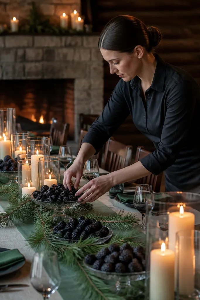
Start with pine green as the base — greenery-heavy bouquets or green table runners. Then use cream for linens and paper so the palette stays bright enough for photos. Finally, add blackberry accents through berries, deep plum ribbon, or a berry-toned floral ring around candles.
This palette is for winter weddings that want a “forest dessert” vibe. Pine green gives you the seasonal anchor, cream stays elegant, and blackberry adds a rich pop that looks great against dark wood. It suits rustic venues, cabins, and ceremonies with candle clusters. Use berry tones in small doses so they don’t overpower greenery.
Skip thisAvoid mixing pine green with bright fuchsia — it looks overly themed.
Quick tipIf blackberry looks too purple, choose a berry with red undertones so it reads warmer.
13. Champagne Gold + Ivory + Dark Green
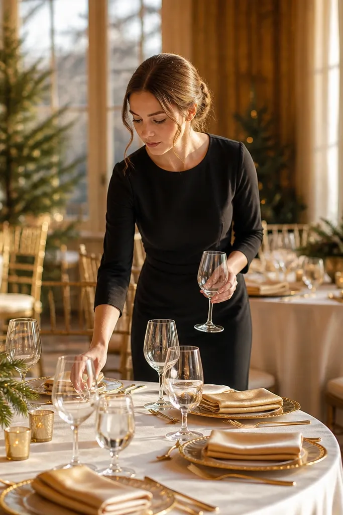
This palette is a “soft luxury” winter look that still feels seasonal. Champagne gold gives glow, ivory keeps it clean, and dark green adds the winter anchor so it doesn’t turn into generic celebration. It works well for indoor receptions, especially where you have tall windows or warm wall lighting. Keep the gold more metallic and the green more muted for a cohesive feel.
Start with dark green for napkins or chair accents. Then use ivory for table linens, menus, and place cards. Finally, add champagne gold in candle holders, metallic paper details, or a thin gold runner stripe.
Match gold tones: if your table has brass hardware, pick champagne gold instead of rose gold.
Avoid pairing ivory with bright white — it makes the room look mismatched.
14. Emerald + Ivory + Antique Copper
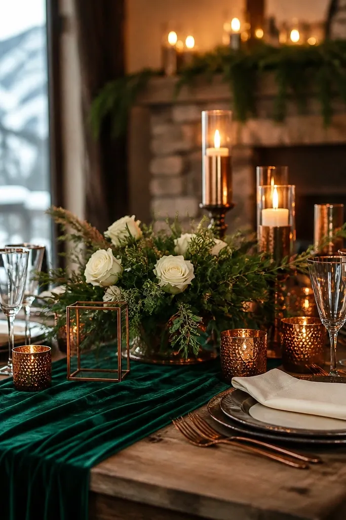
Emerald is one of the strongest winter jewel tones because it stays saturated in warm light. Ivory keeps it timeless, and antique copper adds warmth without going too yellow. This palette suits upscale venues and weddings that want a rich, dressed-up feel. Use copper mainly in textured metals like holders and frames so it looks handcrafted instead of shiny.
Start with emerald as the dominant color in florals or linens. Then use ivory for everything paper-related so the jewel tone stands out. Finally, add antique copper through candle holders, bud vases, or a copper-toned accent on signage.
If emerald looks too blue, choose a greener emerald with a yellow undertone.
Don’t pair emerald with cool pink — it can make the whole palette look washed.
15. Dusty Teal + Cream + Bronze
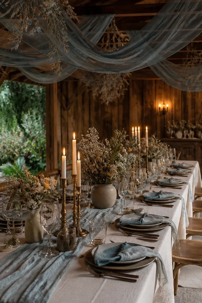
Dusty teal feels wintery because it’s deeper than aqua and calmer than turquoise. Cream keeps it soft, and bronze adds warmth that matches wood and warm bulbs. This is a great palette for couples who want something different from burgundy and navy. It also looks good with dried florals, which fit winter schedules when fresh blooms are pricier.
Start with dusty teal as your anchor for napkins or table runners. Then use cream for linens and paper suites. Finally, add bronze in small elements like candle holders and metallic ink on place cards.
Use matte teal fabric; shiny teal reflects light and looks uneven in photos.
Avoid bright teal paired with bronze — it turns too contrasty and off-season.
16. Sapphire + Oat Cream + Pewter
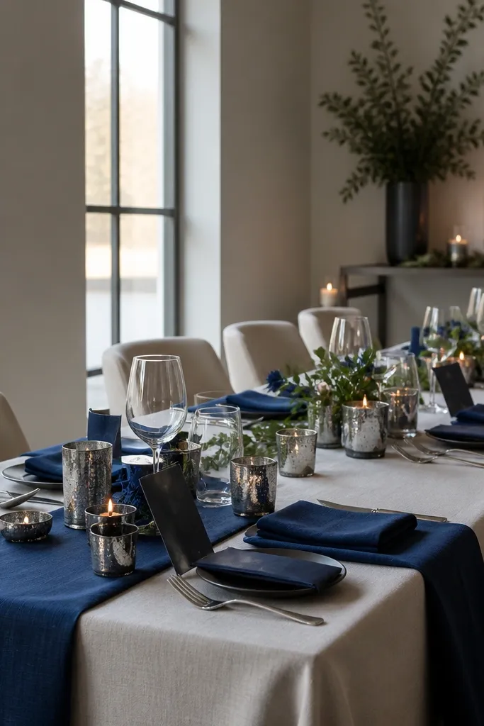
Sapphire brings strong color without feeling childish, and oat cream keeps it warm enough for winter. Pewter adds a metallic cold-weather feel that works with both daylight and candlelight. This is a smart option for modern weddings that want structure and color clarity. If you’re doing a short winter daylight window, this palette holds well because sapphire reads even in low light.
Start with sapphire as your main accent in florals or chair ribbons. Then choose oat cream as your neutral for linens and paper. Finally, add pewter in vases, candle sleeves, or metallic detail on signage.
Test pewter with your sapphire swatch under warm light; if it goes too gray, swap to silver-grey instead.
Don’t use pure white with sapphire — it can look icy and sterile.
17. Rust Orange + Deep Green + Ivory
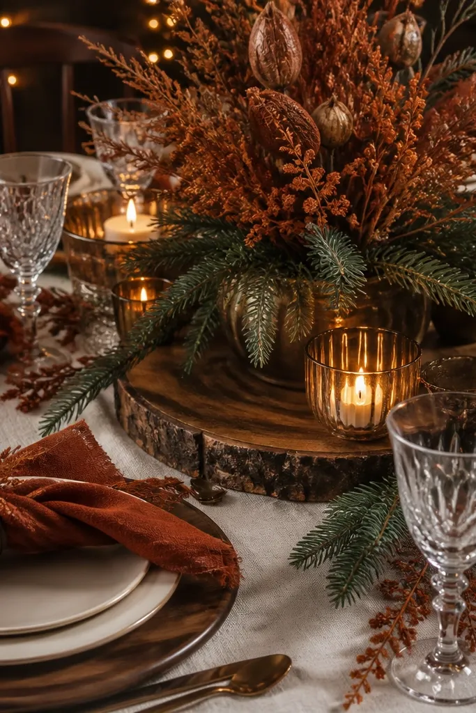
Rust orange is a winter favorite because it looks like baked spices and candle glow. Pair it with deep green for the seasonal anchor and ivory for balance. This palette suits barn weddings, garden venues with greenery walls, and intimate receptions where the table is the focus. Use rust in textiles and florals, then keep the green darker so the orange stays the star.
Start with deep green as your anchor for florals and greenery. Then add rust orange as the accent through napkins, ribbon, or flower petals. Finally, keep ivory as your neutral for plates and menus so the palette doesn’t become too earthy-brown overall.
Choose rust with a brown base (not bright orange) so it looks natural in winter light.
Avoid rust + black only — it can feel like a sports theme unless you add ivory.
18. Black Cherry + Cream + Soft Gold
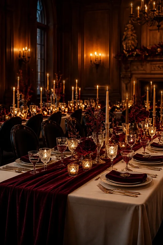
Start with black cherry as your anchor color in napkins or a runner. Then choose cream for paper and table linens. Finally, add soft gold through candle holders and small signage accents rather than full metallic table decor.
Black cherry is deeper than burgundy and reads like a winter dessert color. Cream keeps it bright and prevents it from looking too goth. Soft gold adds warmth and makes the color look richer under warm lighting. This palette is perfect for evening ceremonies and for venues with dark wood or textured walls. Keep the gold gentle and the cream matte so the contrast looks expensive.
Skip thisAvoid bright red next to black cherry — it makes the palette look uneven.
Quick tipUse matte cream cardstock for menus; glossy paper catches glare under string lights.
19. Silver Sage + Charcoal + White Birch
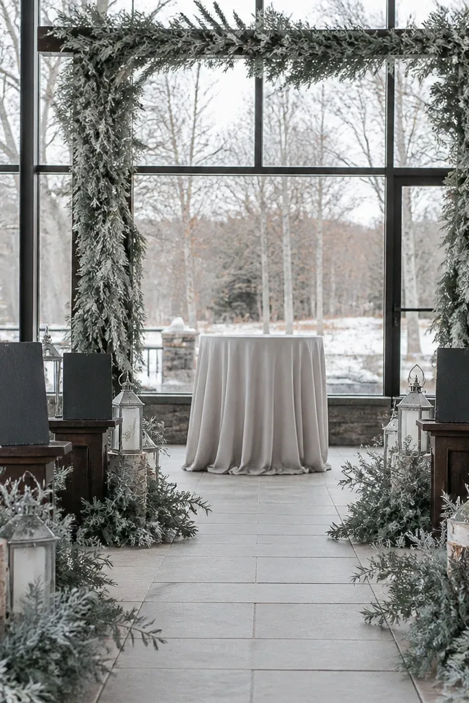
Start with silver sage as your main floral tone and repeat it in table runners or napkin colors. Then use charcoal for linens, chair accents, and signage text. Finally, add white birch sticks or birch-pattern paper as texture around centerpieces and place cards.
This is a winter palette that feels outdoorsy without going full “snowy.” Silver sage looks modern, charcoal gives it contrast, and white birch accents add texture that reads on camera. It’s ideal for ceremonies that want a nature vibe but still look clean and curated. Use it when you want florals to look airy and light, even in a darker season.
Skip thisAvoid pairing silver sage with bright white — it can look like flat ice instead of winter greenery.
Quick tipKeep the birch accents small and strategic so it stays elegant, not like a craft project.
20. Blush Sand + Olive Green + Espresso
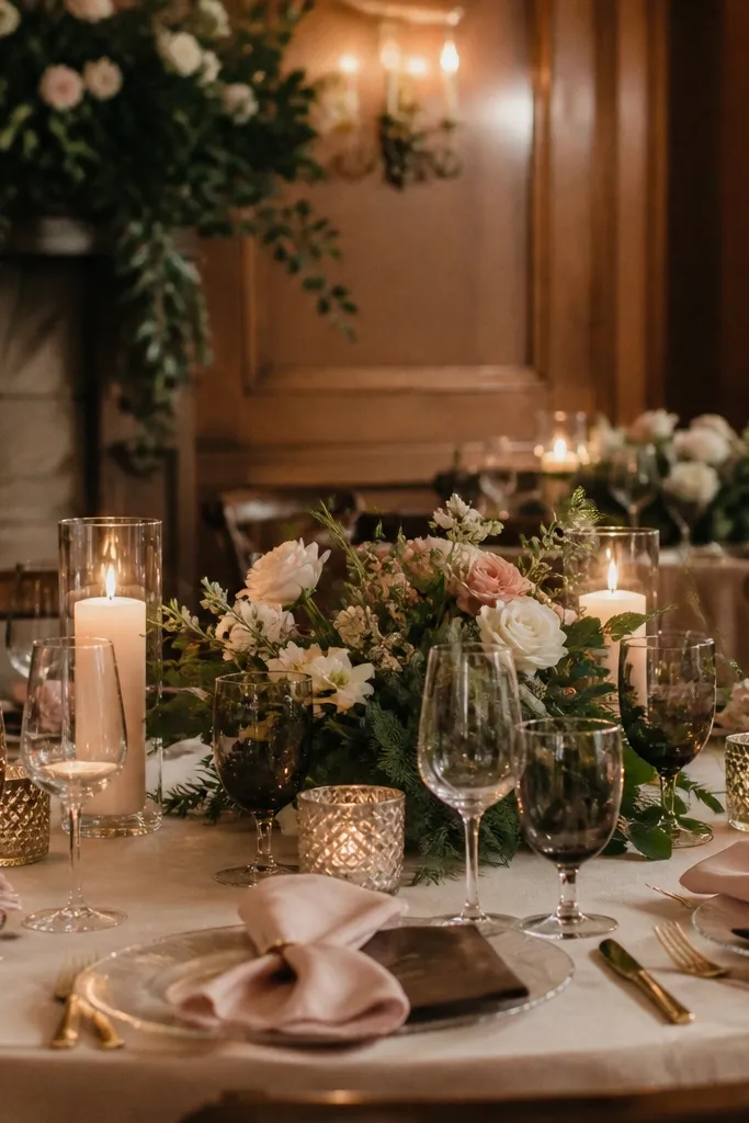
Start with olive green as your anchor in florals and greenery-heavy arrangements. Then use blush sand for napkins or tablecloths and keep it matte. Finally, add espresso through wood elements, ribbon edges, or menu card font.
Blush sand is a warmer, muted pink that looks good in winter because it doesn’t scream “spring.” Olive green adds depth and keeps the palette natural, while espresso ties it together like dark coffee. This works best for cozy venues, candlelit receptions, and couples who want a grounded palette instead of jewel tones. It also pairs well with textured florals and greenery because the colors are already blended.
Skip thisAvoid pairing blush sand with icy blues — the palette loses its cozy winter feel.
Quick tipIf olive looks too gray in daylight, pick a slightly greener olive with more yellow undertone.



