
1. Black Cherry + Antique Gold
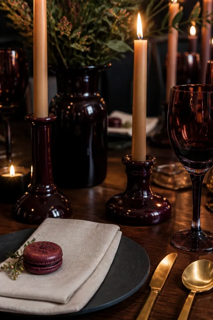
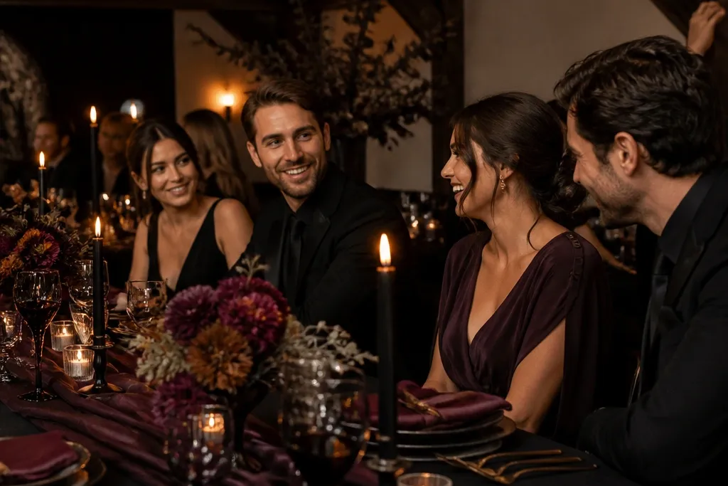
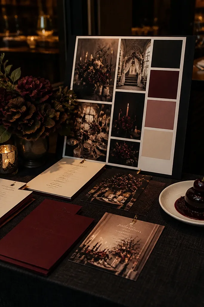
This is the moody palette that looks expensive without going gray. Black cherry reads glossy and romantic, especially when the table has warm metals that catch highlights. The scheme is strong for wedding dinners where you want candlelight to feel intentional, not dim. It also works well for desserts because black cherry sauce, berries, and chocolate plating all harmonize with the same undertone. If you’re aiming for rich reds in photos, this is the cleanest choice.
Start by choosing a deep base fabric in charcoal or very dark brown, then add black cherry napkins or a black cherry runner. Next, request antique gold accents — brass candlesticks, gold-rimmed glassware, or gold foil on menus. Finally, build a “color echo” on the plates by matching garnishes: black cherry jam, dark berries, or a berry compote on the dessert course. Keep the cream tablecloth or charger plates in the mix so the red doesn’t swallow the frame.
Tell your venue you want warm bulbs or candle-style lighting for the dining area; it makes black cherry look like wine, not paint.
Avoid pairing black cherry with pure white linens — it can look harsh and flatten the romance.
2. Espresso + Warm Ivory + Brass
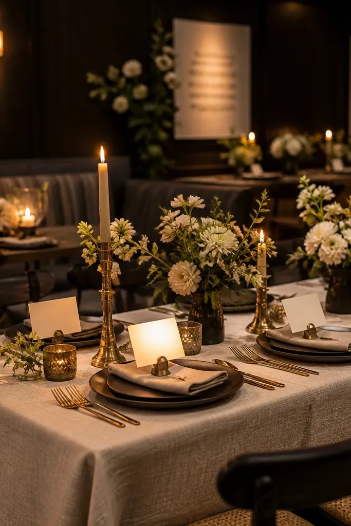
If you want dark romantic without obvious “red vs purple” drama, espresso and warm ivory is your best bet. Espresso gives the depth, and warm ivory keeps the scene bright enough for faces, signage, and place cards to read clearly. Brass accents add a soft glow that looks great against dark wood tables and in low light. This scheme also photographs cleanly because it relies on contrast rather than multiple competing dark tones. It suits minimalist wedding decor that still feels intimate.
Start with espresso-colored linens or a dark brown table runner, then add warm ivory napkins folded with a simple crisp edge. Next, set brass candle holders or brass flatware accents so there’s always a highlight near centerpieces. Finally, print menus and place cards on warm ivory paper with dark ink (espresso-brown or deep charcoal) so text stays readable. For florals, pick dark greens and brown-tinted stems so the bouquet doesn’t introduce a random color.
Use espresso-brown ink instead of black ink on paper; it looks softer and matches the palette better in photos.
Skip gray table decor — it fights espresso and makes everything look colder and flatter.
3. Ink Navy + Cream Lace Texture
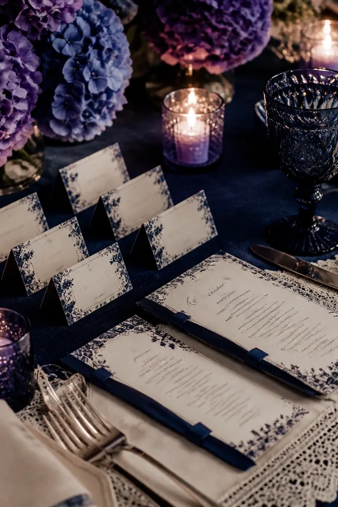
Ink navy is romantic in a quieter way. It creates a “night sky” mood that works beautifully when the flowers lean blue-purple and the lighting is low. Cream lace texture prevents the navy from turning heavy or too corporate. The palette is especially photogenic for escort cards, menus, and signage because navy ink and cream paper create crisp contrast without neon vibes. It’s a strong choice for venues near water, where you’ll get natural dusk light.
Start with ink navy napkins or a navy tablecloth, then layer a cream lace runner or cream textured overlay (not plain white). Next, choose florals that sit in the same family: deep hydrangea, lisianthus, or dark thistle tones. Finally, use cream paper for menus and place cards with navy lettering, and add taper candles in dark glass holders. If the venue is cool-lit, keep cream textiles closer to the camera so faces stay warm.
Ask for navy napkins with a visible texture — matte fabric reads better than shiny satin under restaurant lighting.
Don’t pair ink navy with bright teal — it pulls the scheme toward “coastal” instead of moody.
4. Oxblood + Dark Green + Candle Smoke
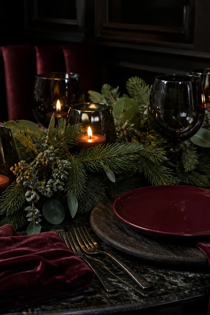
Start by laying a warm neutral base (warm gray or beige) so oxblood doesn’t look bruised. Next, add oxblood napkins and a dense dark green foliage garland across the table (magnolia leaves, olive-like greens, eucalyptus). Finally, place black glass candle holders at intervals and add a few oxblood accents — ribbon around menus or a small cluster of berries. For the dessert moment, serve a berry-forward course and keep garnish colors consistent with oxblood.
Oxblood is the dark romantic color that feels like autumn romance and winter candlelight at the same time. The key is pairing it with deep green so the palette has natural depth, not just red-on-black. Candle smoke — meaning black glass or dark ceramic holders — makes the reds look richer because the flames reflect in the glass. This works best when your centerpiece is foliage-forward, with berries or dark blooms scattered sparingly. It’s also great for wedding ideas that want a moody, slightly dramatic vibe without going purple.
Skip thisSkip bright red accents like cherry candy wrappers; they look out of place against oxblood.
Quick tipUse thicker candle holders so the flame sits slightly above the table — it throws warmer light onto napkins and menus.
5. Deep Plum + Charcoal + Soft Rose Gold
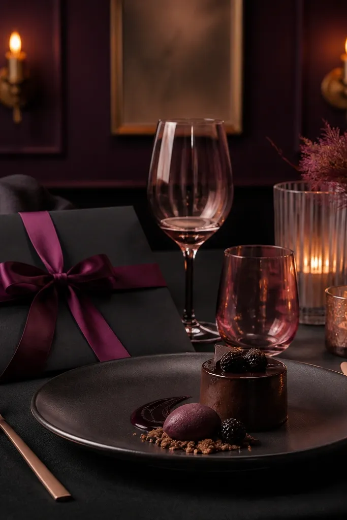
Start with charcoal table linens or a charcoal runner, then place deep plum napkins as the main color hit. Next, swap to rose gold accents for cutlery, candle holders, or a small rose gold element on menus and place cards. Finally, keep florals in deep purples plus dark greens so the palette stays tight. When you plan the food, choose plating that has a dark base — chocolate, berry reduction, or purple-toned garnishes — so the colors repeat naturally.
This scheme gives you drama without looking like Halloween. Deep plum brings the romantic “night” feeling, charcoal anchors it, and soft rose gold adds glow without turning everything into pink. It’s photogenic because plum has enough saturation to hold up under low lighting, and rose gold catches highlights on glassware. This is a great choice when your venue is dim and you want the table to look intentional, not like it’s struggling for visibility. It also looks good with modern, clean table styling.
Skip thisAvoid mixing plum with bright magenta — it creates a “two different moods” problem on camera.
Quick tipUse matte charcoal instead of shiny black so plum doesn’t look muddy next to reflections.
6. Black + Cream + Smoke-Gray Florals
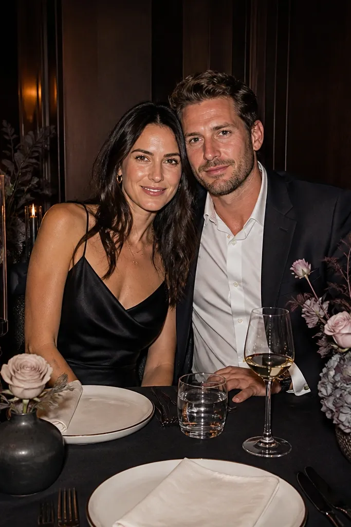
This is the moody, editorial look that reads “dark romance” without leaning on one specific color. Black creates the drama, cream keeps it readable, and smoke-gray florals add texture instead of extra color. It’s excellent for restaurants with dark wood interiors because the palette blends with the room while still looking styled. The contrast helps menus, place cards, and dessert plating pop. If you like a clean aesthetic with cinematic shadows, this is the scheme.
Start with a black table runner or black tablecloth, then add cream napkins and cream chargers if the venue allows. Next, choose smoke-gray florals and foliage — dusty miller, gray-green eucalyptus, or pale smoky blooms — so the arrangement looks dimensional. Finally, use black or charcoal ink on cream paper for menus and signage, and add candles in black glass holders. For a food tie-in, ask for dessert garnishes in dark chocolate and neutral tones like toasted nuts.
Keep the number of colors to three: black, cream, and one gray-green floral family. Photos look sharper.
Don’t add bright metallics like chrome — they make the black feel harsh instead of romantic.
7. Forest Green + Blackberries + Warm Gold
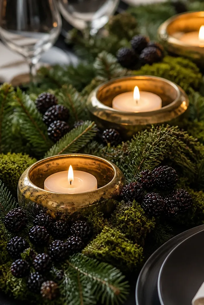
Forest green makes dark romantic feel lush and grounded. Add blackberry tones for a jewel effect, and warm gold for that soft glow that looks great in restaurant candlelight. This scheme is especially good when you want greenery-heavy centerpieces and a slightly wild, romantic vibe. It photographs well because the greens hold texture and depth even when the scene is dim. For food moments, blackberry compote, dark chocolate, and berry garnishes naturally repeat the palette.
Start with forest green linens or a deep green runner, then place small blackberry accents on napkin rings or around menu cards. Next, add warm gold elements — brass candlesticks, gold-rimmed glassware, or gold foil on menus. Finally, build a centerpiece with dense greenery and a few blackberry-like touches (clusters of dark berries or deep purple blooms). Coordinate dessert styling by asking for blackberry compote or a berry reduction on the plate so the color shows up in the shot.
Use real or faux dark berry picks with a matte finish; glossy berries can look too plastic under flash.
Skip bright chartreuse greenery — it reads “garden party,” not dark romantic.
8. Rust Brown + Cream + Antique Brass
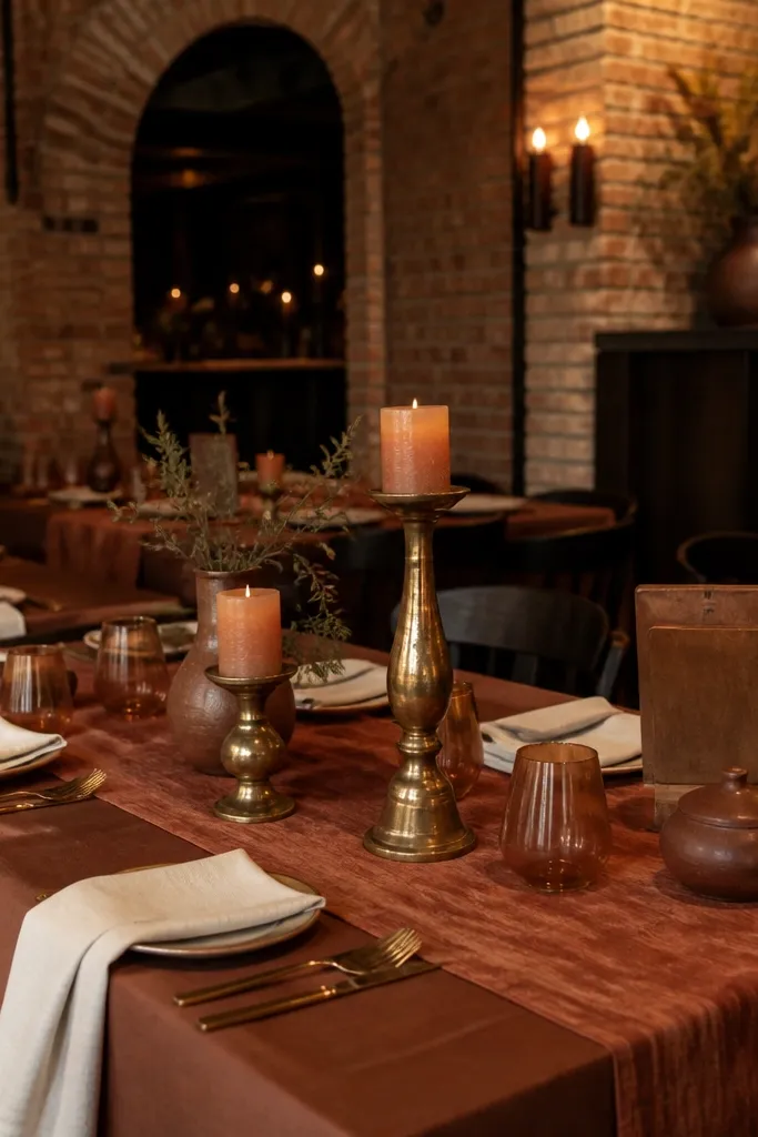
Start with rust brown napkins or a rust runner on top of a darker base (espresso or dark brown). Next, choose cream chargers or cream paper for menus so there’s a clear light area for typography and place cards. Finally, add antique brass accents — candle holders, utensil details, or a brass ribbon around the menu stack. For food, prioritize warm-toned dessert flavors like caramel, toasted nuts, and cocoa so the palette looks consistent from savory to sweet.
Rust brown is a dark romantic color that feels warm and intimate, not cold. Pair it with cream for softness, and antique brass for that golden highlight that makes skin tones look better in photos. This scheme works beautifully in restaurants with warm wood and brick, where the palette blends with the room. It also suits wedding ideas where you want centerpieces to look like they belong in the space, not like they arrived from another planet. If you’re trying to keep it moody but still cozy, this is the one.
Skip thisDon’t pair rust with icy silver — it makes the whole table look colder than the lighting.
Quick tipPrint menus with a cream background and rust-brown lettering; it reads clean and matches the napkins.
9. Deep Teal + Charcoal + Pearl White
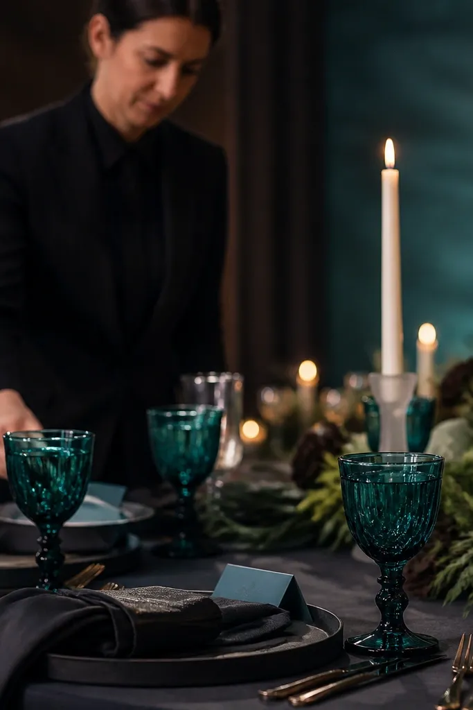
Start with charcoal linens or a charcoal runner, then add deep teal napkins as the main color. Next, introduce pearl white elements: pearl-toned paper menus, pearl candle holders, or white orchids with a creamy center. Finally, keep florals in teal-adjacent shades — deep blue hydrangea, dark green eucalyptus, and a few white blooms. Coordinate dessert by asking for dark blue-purple fruit elements or chocolate plating with white drizzle so pearl white shows up.
Deep teal gives you moody color with a slightly romantic, ocean-night mood. Charcoal keeps it grounded, and pearl white adds just enough brightness so the teal doesn’t disappear on camera. This scheme is photogenic for wedding dinners because teal holds color under low light better than many blues. It also looks striking next to dark glassware and candle holders. If you want dark romantic but hate pure black-and-red, deep teal is a strong alternative.
Skip thisAvoid mixing teal with bright lime accents; it breaks the mood instantly.
Quick tipUse pearl white instead of bright white — it looks warmer under restaurant lighting.
10. Blackened Gold + Espresso + Black Rose
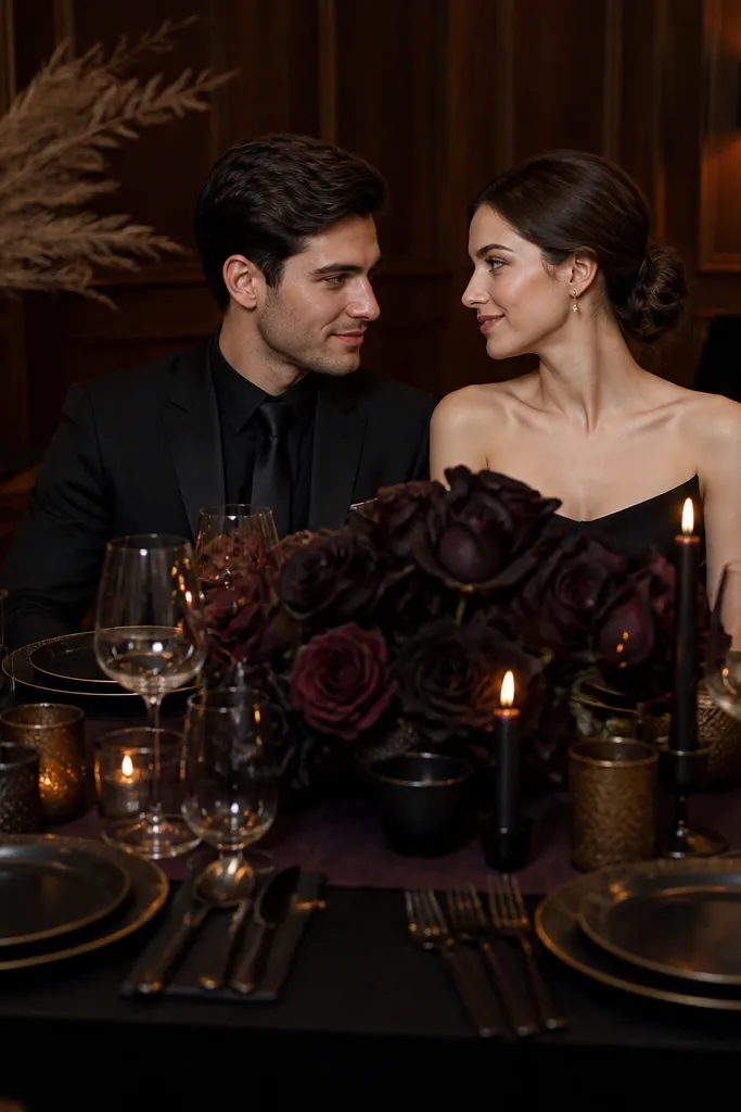
This is “dark romantic, but make it modern.” Blackened gold gives a muted metal tone that doesn’t scream glam, and espresso provides the deep base. The centerpiece should lean toward dark roses, burgundy blooms, or nearly-black petals so the palette stays cohesive. This scheme is great for venues with sleek interiors because it matches the vibe while still looking warm under candlelight. It also photographs well because the blackened metal creates subtle highlights instead of glare.
Start with espresso linens and black or dark brown table runners. Next, add blackened gold accents — black-gold taper holders, gold foil on menus with a dark background, or blackened gold ribbon around napkins. Finally, style the centerpiece with dark rose tones and dark greens, leaving negative space so the centerpiece doesn’t look crowded. Plan dessert plating with dark chocolate and a small gold-toned element like edible gold dust or a warm caramel drizzle.
If the venue has reflective mirrors or shiny walls, keep metal accents limited to one area per table to avoid glare.
Don’t use bright champagne gold — it clashes with blackened gold and makes the look feel inconsistent.
11. Velvet Plum + Chocolate Brown + Warm Cream
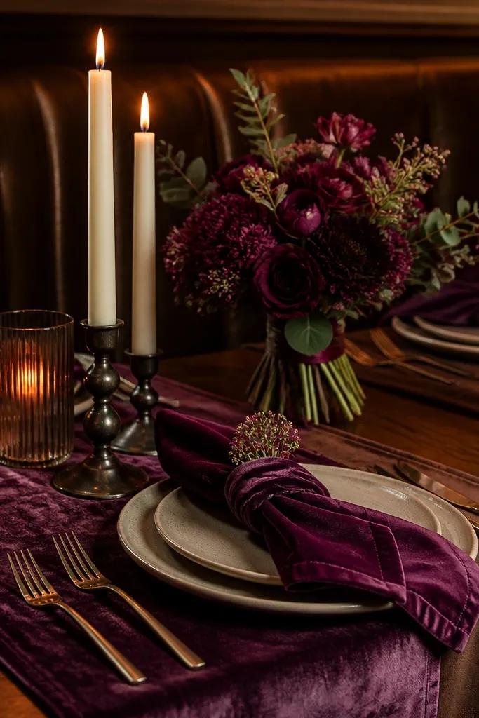
Velvet plum is a texture-forward scheme, and texture is what makes dark romantic feel luxe in photos. Pair plum with chocolate brown so the palette feels layered, then bring in warm cream to keep the scene from looking heavy. This works best when you can use velvet or velvet-like fabrics — napkins, table overlays, or ribbon — because the fabric absorbs light and creates depth. It’s also a strong choice for indoor restaurants where the light is low and you want the table to look plush. Chocolate-toned desserts and warm spices fit perfectly.
Start with a chocolate brown base and add velvet plum napkins or a velvet-like runner. Next, bring in warm cream for menus, place cards, and a few chargers so there’s a soft highlight. Finally, choose florals in plum and deep berry tones with chocolate-brown stems or dark greenery. For a food tie-in, request a chocolate-forward dessert and keep garnish warm — toasted nuts, cocoa nibs, or caramel drizzle.
Use matte fabrics, not satin, for the plum — satin catches light and can look shiny instead of velvet.
Skip bright pink accents; velvet plum looks best with warm neutrals and deep browns.
12. Charcoal + Burgundy + Burnt Sugar
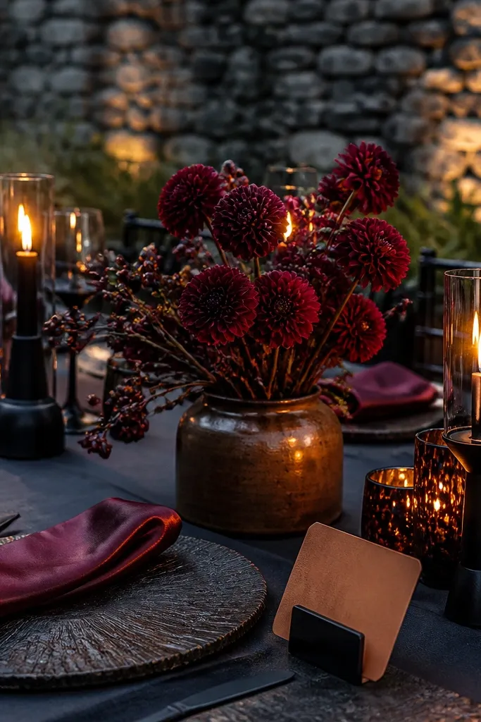
Burgundy plus charcoal is classic dark romance, but the trick is adding “burnt sugar” warmth so it doesn’t read like a sports bar. Think caramel-colored accents in wood, paper, or candle holders. The burgundy stays rich, charcoal keeps it dramatic, and warm caramel tones make the palette feel cozy. This scheme is great for wedding dinners because it pairs well with dark wood interiors and candlelight. It also looks good on menus and signage because burgundy ink and warm paper sit nicely together.
Start with charcoal linens and add burgundy napkins or a burgundy table runner. Next, add burnt sugar accents through wood elements (natural wood menu stands), caramel-toned ribbon, or warm amber glassware. Finally, print menus and place cards on warm cream paper with burgundy ink. For dessert, ask for caramel or toasted sugar elements — drizzle, brittle, or a caramel sauce — so the palette shows up in the food moment.
Match the dessert garnish color to the paper ink tone; it creates a visual “thread” through the whole table.
Don’t use cool gray paper — it can make burgundy look bruised.
13. Cocoa Brown + Black Tea + Cream
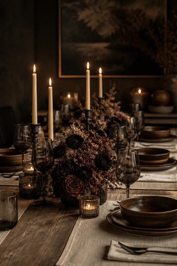
This palette is about tea-and-cocoa warmth, still moody, but softer than black-and-red. Cocoa brown gives depth, black tea tones add a dark, slightly smoky look, and cream keeps it airy enough for photos. It’s photogenic because it relies on tonal variation — brown layers look rich even when the scene is dim. This scheme is great for restaurants with warm lighting where you want a romantic, comforting vibe rather than a dramatic jewel look. It also pairs naturally with spice-forward menus and desserts.
Start with cocoa brown linens and add black tea colored accents like dark glass candle holders or black tea tinted napkin rings. Next, keep cream as your contrast — cream chargers, cream menu cards, and cream ribbon. Finally, style florals with brown-tinted greens and deep warm blooms, not bright purple. For the food moment, coordinate dessert styling with cocoa — chocolate cake, cocoa dust, or spiced caramel — so the table colors match the plating.
Use cream paper with a warm tone, not bright white; it keeps the scene romantic under warm bulbs.
Don’t add navy or bright magenta — it pulls focus away from the cocoa warmth.
14. Midnight Purple + Smoke Gray + Silver Candle Caps
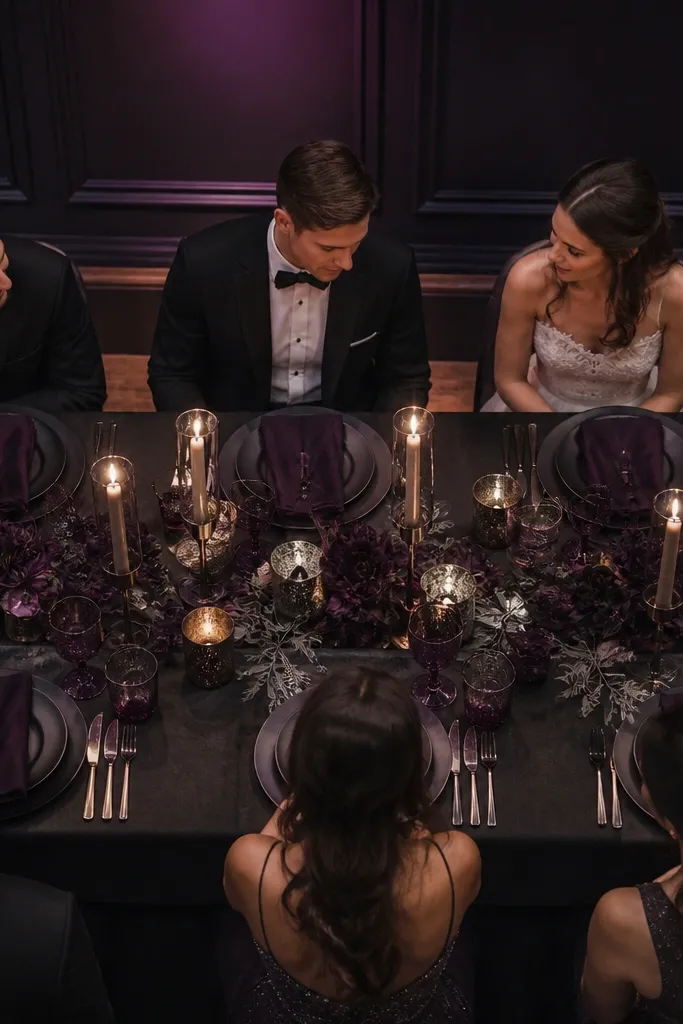
Midnight purple is the “night sky” version of plum, and it looks dramatic under low lighting. Smoke gray florals add texture and keep it from becoming one-note. Silver candle caps give you a cool highlight that works when the venue has dark walls or metallic trim. This scheme is excellent for wedding dinners where you want the table to look like a moody painting — deep purple depth with gray texture. It also photographs well because the purple holds saturation and the gray adds softness around faces.
Start with dark charcoal or deep gray linens, then add midnight purple napkins as the main color. Next, use smoke gray florals and foliage so the arrangement looks layered rather than flat. Finally, add silver candle caps or silver-rimmed glasses and print menus on light gray paper or cream with dark purple ink. For dessert, choose plating that includes dark berries and a neutral garnish like powdered sugar or cocoa dust to echo the gray tones.
Keep silver accents small and intentional — too much silver makes the palette feel icy instead of romantic.
Skip bright white candles; they can blow out highlights and flatten the purple.
15. Burgundy Velvet + Black + Antique Mirror Glassware
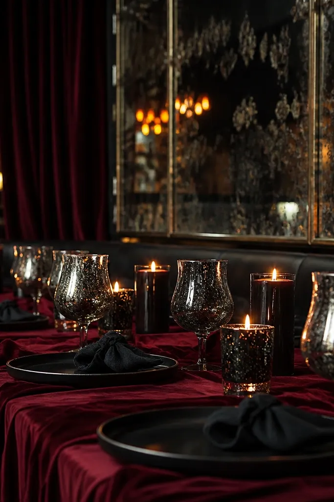
Start with black linens or a black table runner, then add burgundy velvet-like napkins (matte, not shiny). Next, use antique mirror glassware or dark-toned glass cups so reflections stay warm and low. Finally, print menus on black or very dark chocolate paper with cream lettering, or use cream paper with burgundy ink. For dessert, choose a burgundy-ish element like berry compote or a berry reduction so the color shows up in the final course shots.
This scheme is all about reflections and shadow. Burgundy velvet-like fabric absorbs light, black adds depth, and antique mirror glassware gives you soft, controlled highlights. It’s a great match for restaurants with dark walls and good candle placement because the glass catches flame glow without looking flashy. The result is a table that looks cinematic in photos — dark, plush, and intentional. If you want dark romantic that feels “fashion editorial,” this is the palette.
Skip thisDon’t use shiny satin burgundy — it reflects overhead light and can look cheap in photos.
Quick tipAsk the venue to keep glassware away from direct overhead lights; you want candle glow, not glare.
16. Dark Rose + Espresso + Warm Walnut Wood
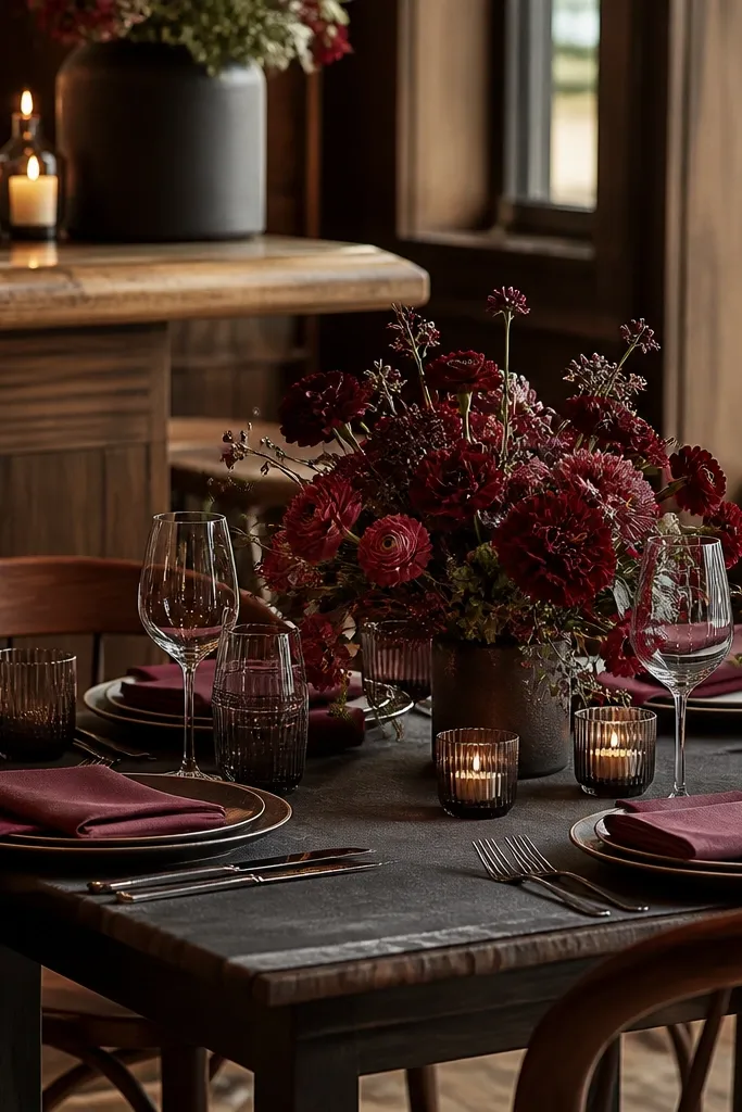
Start with espresso linens and add dark rose napkins or a dark rose ribbon on menus. Next, incorporate warm walnut elements — small wood menu cards, walnut chargers, or wood candlesticks if the venue allows. Finally, choose florals in dark rose tones and deep greens, and keep the rest of the palette neutral so the roses look intentional. For dessert, pair with a rose-adjacent flavor like berry and keep garnishes in warm neutrals, like toasted nuts or cocoa.
Dark rose sits between deep pink and burgundy, and it gives dark romantic a softer face. Espresso keeps it grounded, and warm walnut wood accents make everything feel cozy and tactile. This scheme is especially photogenic in restaurants with wooden chairs, walnut bars, or brick-and-wood interiors. It also works well when your florals are rose-forward, because the color family stays consistent from centerpiece to place cards. The table looks warm even when the lighting is dim.
Skip thisSkip bright coral — dark rose needs deep undertones, not orange warmth.
Quick tipUse dark rose ink on cream paper instead of white ink; white ink can look washed out under candlelight.
17. Smoky Burgundy + Black Tea Brown + Gold Leaf
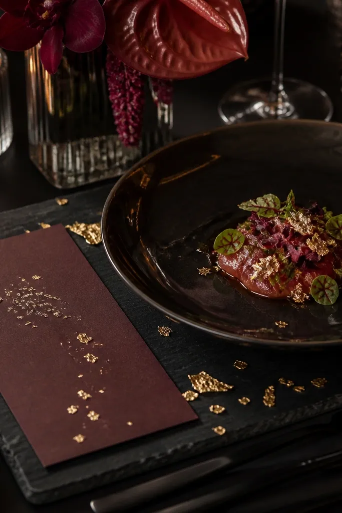
This is a “paper and plating” heavy scheme that looks incredible when you plan for menu shots. Smoky burgundy is muted and cinematic, black tea brown adds depth, and gold leaf accents bring a delicate glow. It’s photogenic because gold leaf catches light in a soft scatter rather than a hard reflection. This works best for venues where the tables have natural textures — linen, wood, or stone — so the gold leaf looks like it belongs. It also makes signage and menus look like part of the decor.
Start with smoky burgundy linens or napkins, then add black tea brown paper for menus and place cards. Next, request small gold leaf touches — a thin gold leaf border, gold foil on menu cards, or gold leaf on a dessert garnish card. Finally, keep flowers in smoky burgundy and deep green, not bright red, so the palette stays muted. Coordinate dessert styling so there’s a dark berry or chocolate element plus one gold-toned highlight, like gold leaf on a cake or a gold-dusted plate edge.
Keep gold leaf to one focal area per table — menus or dessert — so it doesn’t overwhelm the photo.
Avoid chunky metallic confetti — it reads like party decor, not wedding decor.
18. Smoked Fig + Tortoiseshell + Old-World Copper
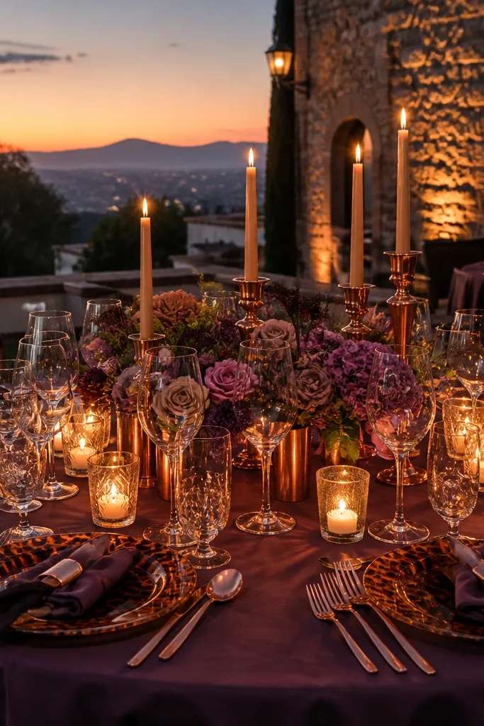
1. Choose a venue area with dark wood, terracotta tiles, or aged stone, then build the palette around smoked fig linens or napkins and copper flatware or candlesticks. Add tortoiseshell by using resin or horn-look elements on menus, escort cards, or small tray details. 2. For getting there and around, stay central so you can walk between dinner and photos; this palette looks best after dusk, and you do not want to burn time on transit. Plan 2 nights minimum to cover an arrival day, a rehearsal dinner, and one full evening for photos. 3. Cost-wise, expect copper-toned rentals to be pricier than flat gold finishes, so set aside a line item for 30-60 pieces of cutlery or candle holders. Book rentals and florals 6-10 weeks ahead, and lock your venue lighting schedule early so the copper does not photograph too orange. 4. To save money, rent copper in the form of candlesticks and one serving set, then use fig linens and tortoiseshell napkin rings to do most of the visual work.
This scheme looks like candlelight in a velvet room — smoky fig purple on the table, tortoiseshell accents near the place settings, and old-world copper that turns warm when the sun drops. It reads romantic without going full black, so it photographs well in both indoor venues and outdoor evenings. For the travel angle, pick a destination with stone courtyards or historic houses where the walls are warm-toned; the copper pops against aged plaster and dark wood. This is a strong fit for couples who want moody, grown-up color but still want the palette to feel soft and wearable. The best time is late fall through early spring when you get earlier sunsets and fewer bright daytime shadows.
Skip thisDo not pair this palette with bright white balloons or icy-blue signage — it kills the smoky mood fast.
Quick tipBring or rent one dark-brown runner or tablecloth that covers the full center — it makes copper look intentional instead of scattered.
19. Night Forest + Moss Glass + Tarnished Silver
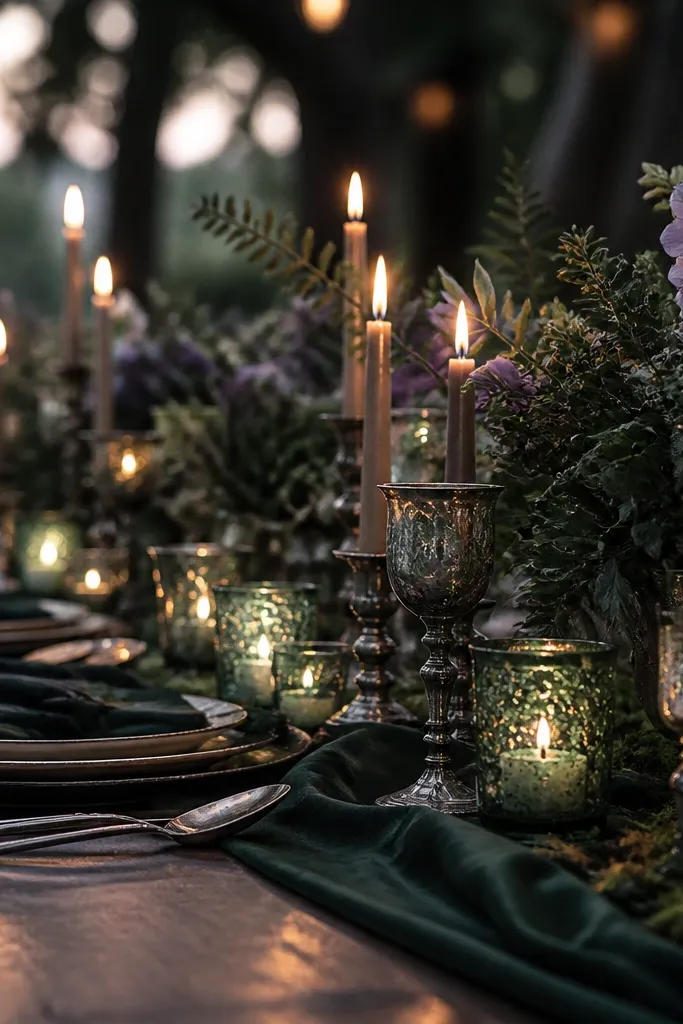
1. Build the base with deep forest linens or a dark green runner, then add moss-glass vases in different heights so the table looks layered. Use tarnished silver candlesticks or flatware for contrast, and keep flowers in low-saturation tones like dark olive, dusty mauve, and blackened greens. 2. Pick lodging near the venue so you can do a quick lighting check before guests arrive; this palette looks best when you control shadows. Plan 3 days if you can — one for decorating, one for portraits in the garden, one for the main dinner. 3. For rough costs, moss-glass rentals vary a lot, so price them early and consider mixing rentals with DIY: buy a few plain glass bottles and tint them with moss-green glass paint. Book 8-12 weeks ahead for vases and candles, especially if the venue has a preferred vendor list. 4. Save money by using moss-glass as statement pieces only — 8-12 vases on key tables beats trying to cover every surface.
Night forest green gives you that moody, cinematic feeling, and moss-glass details add depth without turning the whole look heavy. Tarnished silver keeps the palette cool and romantic, like old cutlery under low lights. This scheme is perfect for destinations with gardens, woodland paths, or riverside venues where the background already has texture — you want the tables to match the setting, not compete with it. It suits couples who want dark romance that still feels fresh and slightly airy because the moss tones read organic. Late spring and early autumn are the sweet spots since you get enough daylight for setup and a calm evening for photos.
Skip thisDo not add bright neon greens or citrus-colored florals; they turn the palette into a “garden party” instead of a dark romantic look.
Quick tipUse warm white candles, not LED strips — tarnished silver looks dull under cool light.
20. Salted Charcoal + Pearl Smoke + Antique Brass Candelabras
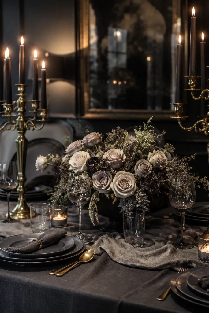
This color scheme is for people who want moody and clean at the same time — salted charcoal as the anchor, pearl-smoke accents for softness, and antique brass candelabras for that slow, golden glow. It reads modern-romantic in photos because the charcoal is neutral and the pearl tones catch light instead of overpowering it. Choose a destination with contemporary interiors, old industrial buildings, or seaside hotels with dark stone and reflective surfaces; the brass and pearl details look extra good against that architecture. It suits couples who want dark wedding vibes without the heavy plum or black-cherry look. Spring evenings and winter nights both work since the pearl smoke effect looks strongest when the background is darker and less sunlit.
1. Use charcoal as the base across linens and chair covers, then add pearl-smoke elements through sheer overlays, misty organza runners, or pearl-toned candle glass. Bring in antique brass through candelabras at the head table and on a dessert station for visual focus. 2. Get there and around by choosing a venue with easy drop-off access; charcoal fabrics show dust and you want quick, clean setup. Budget 2 nights if you are local to the city, and 3 nights if you need travel days plus a rehearsal dinner. 3. Expect brass candelabras to be the most expensive rental item here, so limit them to 2-4 focal points and repeat the shape elsewhere with smaller candle holders. Book candelabras 10-12 weeks ahead, and confirm the venue has enough outlets if you plan to use dimmable lighting. 4. Save money by renting the candelabras but buying the pearl-smoke layers — sheer fabric is cheap, and you can attach it to runners and centerpiece bases for the same look.
Ask the venue for a floor plan with lighting positions before you finalize centerpieces; you want the brass glow to hit the table, not the ceiling.
Do not mix in cool chrome silverware or bright white tablecloths — they break the charcoal-and-pearl mood immediately.



