
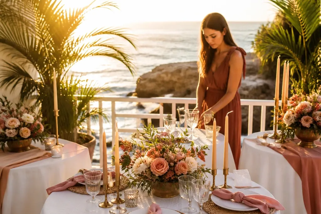
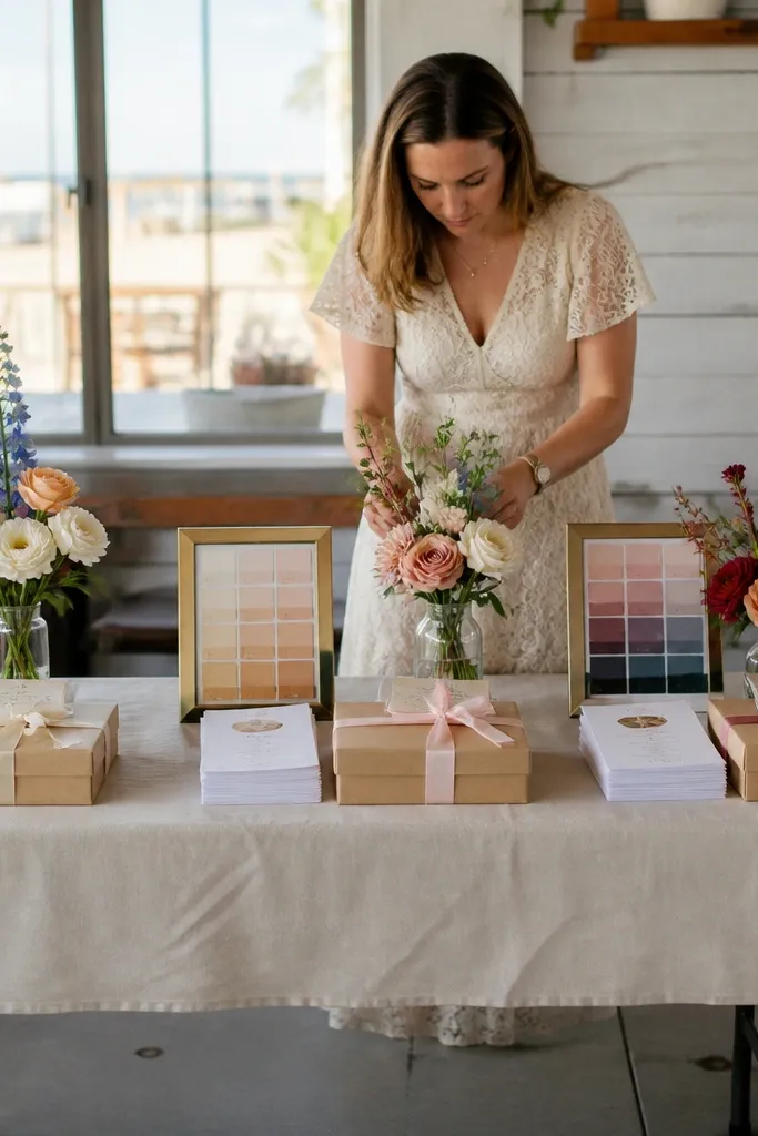
1. Cream + Cornflower Blue + Navy
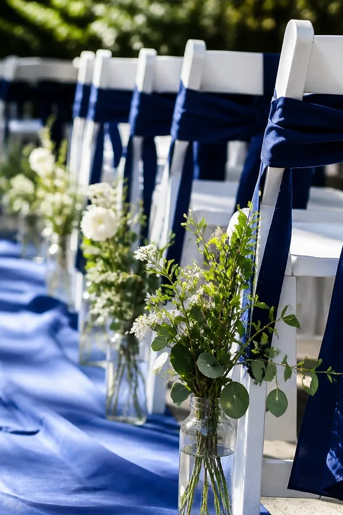
This scheme looks crisp in summer because cornflower blue stays bright without going neon, and navy adds contrast that reads well in photos. You get a clean, coastal vibe that works for beach towns, garden venues, and even rustic barns with white walls. Use it for ceremonies where you’ll have lots of greenery — navy makes the greens look richer, not dull. It’s also forgiving with flower choice since you can lean on white blooms plus blue accents.
Start by choosing cream as your base for linens, tablecloths, and stationery. Then pick cornflower blue for the napkins or a table runner, and add navy through candle jars, ribbon on menus, or chair sashes. Finally, keep florals simple: use white flowers (or cheap white filler) and add blue elements like cornflower stems, hydrangea-type clusters, or painted-dip greenery tips.
Buy navy ribbon in a wide roll and cut it into chair sash lengths — one purchase covers ceremony and reception.
Don’t swap navy for black; black makes the palette look harsh and cheap in daylight.
2. Ivory + Sage Green + Dusty Blue
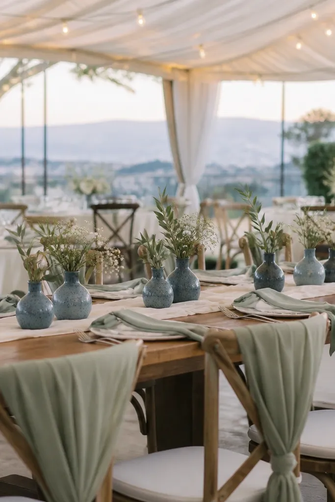
Start with ivory paper goods and a sage-forward floral plan using eucalyptus or other silvery greens. Then bring in dusty blue through small flower clusters in bud vases, plus a few scattered ribbon loops on chairs. Finally, use a matte white or ivory candleholder so the blue reads as a color accent, not as a dark shadow.
Ivory and sage make everything feel airy, and dusty blue adds a soft summer sky tone that photographs well behind greenery. This palette suits outdoor ceremonies and tented receptions where you want calm, not loud. It also works great if your venue already has lots of natural textures like wood beams or linen draping. The key is keeping dusty blue slightly cooler so it doesn’t turn purple in warm sunlight.
Skip thisSkip fully dried lavender stems; they can look patchy and dull in bright outdoor light.
Quick tipChoose sage greenery with a silvery cast — it looks more expensive than flat green on camera.
3. Sand + Terracotta + Soft Olive
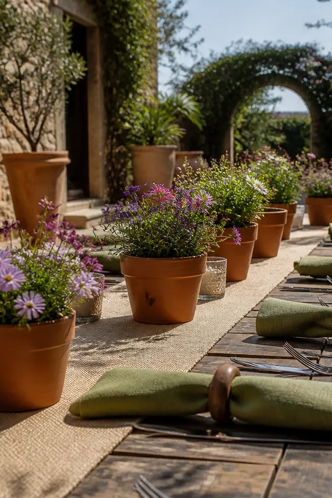
Start by using sand as your neutral base for linens, signage boards, and candle bases. Then choose terracotta for napkins, table runners, or a large statement piece like a balloon garland with terracotta accents. Finally, soften it with olive through greenery, olive-painted vases, or a few olive ribbon wraps around jars.
Terracotta warms up the whole day, and sand keeps it grounded. Soft olive makes the palette feel intentional instead of orange-heavy, especially in garden settings with trees and terracotta pots. This color scheme is gorgeous for late-summer weather when you want photos that look sun-baked but still clean. It also works with both modern and boho decor because terracotta sits in the middle.
Skip thisDon’t add rust + brown + terracotta together; it turns into one muddy “earth” blob.
Quick tipIf you’re renting flatware, wrap olive ribbon around the utensil bundle for a fast, cohesive detail.
4. White + Coral + Light Peach
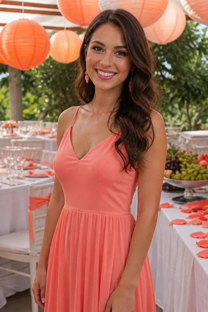
Start with a white base for tablecloths, chair covers, or rented linens. Then use coral for napkins, floral focal stems, or a runner strip down the center of the table. Finally, add light peach through small details like candles, paper menus, or a few peach blooms mixed with white flowers.
This is a summer classic because coral pops against white without looking harsh. Light peach keeps it playful and warm, and the whole palette reads sweet in photos even when the background is green. It’s ideal for outdoor receptions, poolside venues, and ceremonies with bright daylight. The trick is to keep peach lighter than coral so the main color stays coral.
Skip thisSkip hot pink shades; they compete with coral and make the palette look louder than intended.
Quick tipUse coral ribbon on signs and menus; it’s the easiest way to repeat color across the room.
5. Blush + Dusty Rose + Champagne Gold
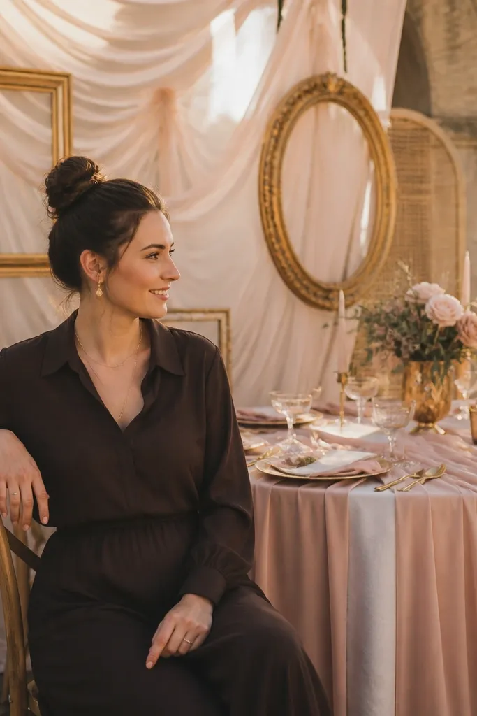
Start with blush as the base for linens or table overlays, plus blush stationery if you’re printing. Then place dusty rose in the florals and add it through a few larger elements like a bouquet cluster or a balloon strip. Finally, add champagne gold via candle lids, gold foil on menus, or metallic pens for signage.
Blush and dusty rose create a romantic summer look, while champagne gold adds warmth that glows in late-afternoon light. This palette is flattering for venues with neutral walls and for photo spots with soft backdrops like arches or draped fabric. It also photographs well because gold catches highlights without turning the whole scene too shiny. Keep it from looking flat by making sure the dusty rose is clearly darker than blush.
Skip thisDon’t use both dusty rose and mauve — pick one darker rose tone or it blurs.
Quick tipUse matte gold accents, not mirror gold; mirror gold can look cheap in flash photos.
6. Ocean Teal + White + Charcoal
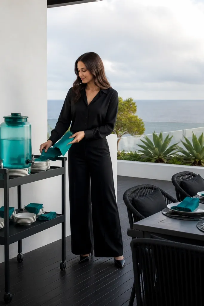
Start with white linens and white table runners for a bright base. Then add ocean teal through napkins, a teal runner, or painted glass candle holders. Finally, use charcoal in signage, menus, or chair ties so the teal doesn’t feel like a standalone pop.
Teal gives you that “vacation” feel, and charcoal keeps it modern instead of beachy. This scheme is great if you want something photogenic against stone walls, dark wood, or outdoor shade. It reads crisp in both bright sun and indoor lighting because teal has enough saturation to hold its color. Charcoal also hides scuffs on rented chairs and tables, so the look stays clean.
Skip thisAvoid pairing teal with brown; it makes everything look dirty in daylight.
Quick tipIf you’re doing a ceremony backdrop, hang white fabric and clip teal paper fans or fabric squares — it’s cheap and looks full.
7. Mango Yellow + White + Terracotta Brown
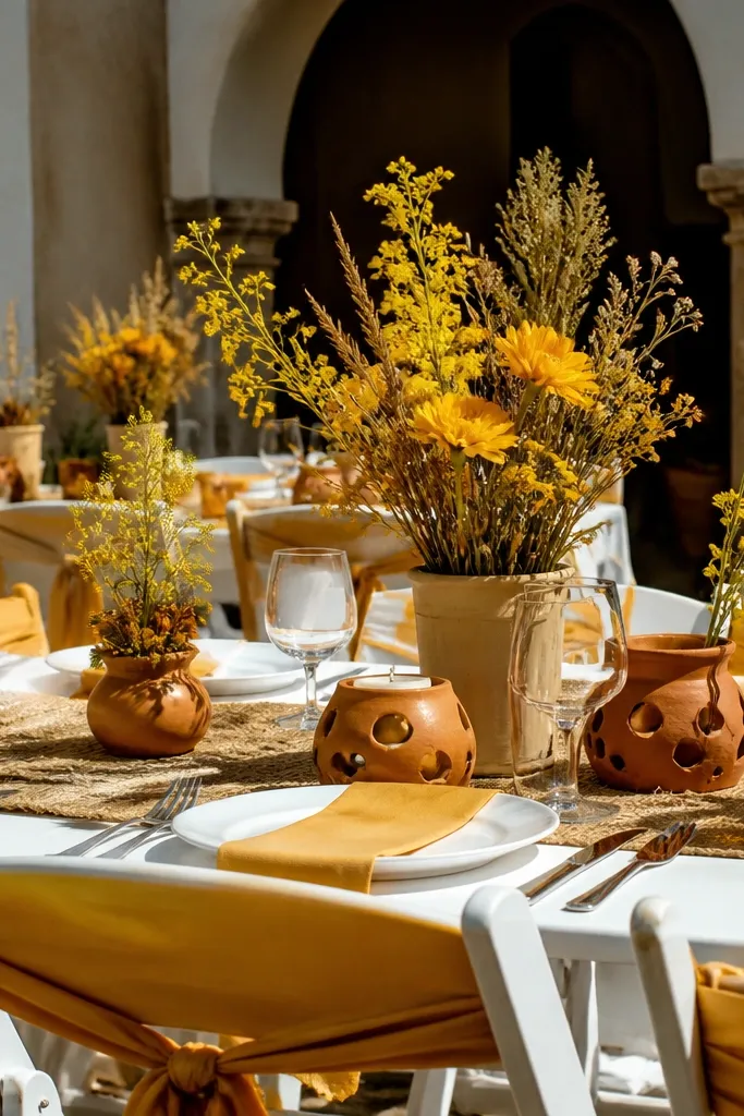
Mango yellow is bold without being neon when you choose a medium tone, and white keeps it fresh. Add terracotta brown for depth, and you get a summer palette that looks warm and lively in photos. This works especially well in outdoor venues with natural wood, straw textures, or cream-painted buildings. It also pairs nicely with seasonal blooms like sunflowers and marigold-type flowers without needing rare imports.
Start with white as the base for linens and tableware. Then choose mango yellow for napkins, signage accents, and a few larger floral elements like sunflower stems or yellow blooms. Finally, bring in terracotta brown via terracotta planters, brown ribbon, or a thin border on place cards.
Pick place cards with a simple white background and print the names in mango — it looks intentional without expensive paper.
Don’t use lemon yellow; it reads too sharp and can look washed out in midday sun.
8. Lilac + White + Soft Gray
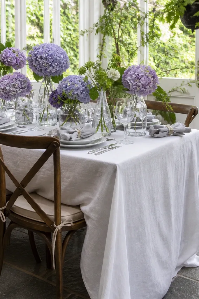
Start with soft gray as your neutral for tablecloths or chair cushions. Then add lilac through bouquets, bud vases, or a lilac runner strip down the center. Finally, use white in the flowers and paper goods so the lilac doesn’t darken the scene.
Lilac looks romantic in summer and still feels modern when you anchor it with soft gray. The palette is perfect for indoor venues with lots of window light or outdoor events with a pastel background. White keeps it airy, while gray stops it from looking too sweet. This is a smart choice if you want your photos to look soft, not bright.
Skip thisSkip lavender-purple that’s too dark; it can look bruised in warm lighting.
Quick tipUse lilac ribbon on the aisle or on chair ties — it creates a repeating line in photos.
9. Forest Green + Cream + Gold Leaf
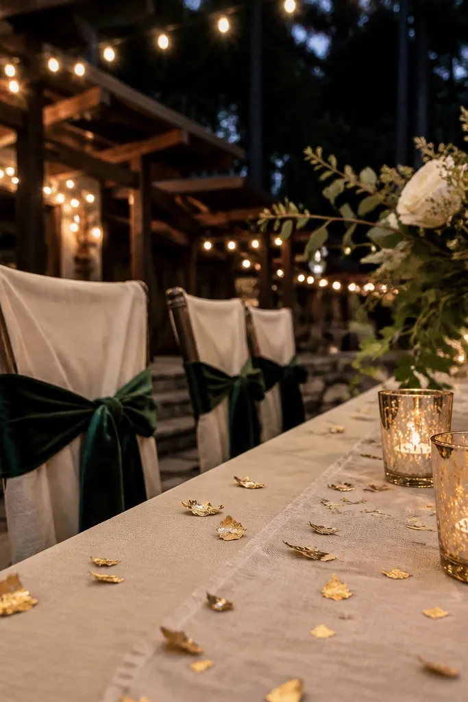
Forest green makes the whole wedding feel grounded and lush, and cream keeps it bright. Add gold leaf for a premium glow that shows up even when flowers are inexpensive. This palette is great for summer evenings because the deep green looks rich under string lights. It also photographs well against dark wood, stone, and greenery backdrops.
Start with cream tablecloths and cream stationery. Then use forest green for napkins, table runners, or large greenery bundles at the center of each table. Finally, add gold leaf accents using gold foil paper on menus, gold-painted candle sticks, or real gold leaf on a few signage pieces.
Choose gold accents in small areas — a little leaf looks luxe more reliably than covering everything.
Don’t pair forest green with burgundy; the palette turns heavy and reads muddy outdoors.
10. Royal Blue + White + Silver
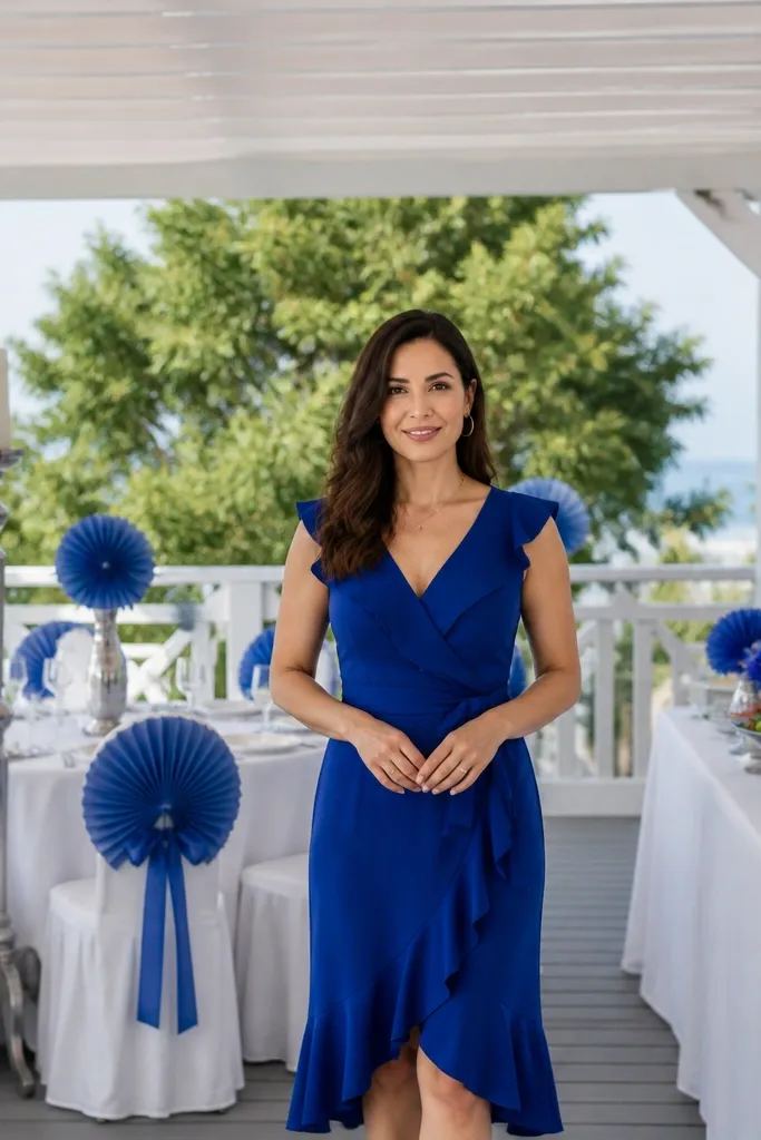
Start with white linens and simple white plates. Then add royal blue through napkins and a runner or backdrop fabric at the ceremony. Finally, bring in silver using foil details on menus, silver-painted vases, or metallic candle trays.
Royal blue is photogenic and reads clearly in both shade and sun, which is why it’s such a reliable budget scheme. White gives you clean contrast, and silver adds a cool highlight that feels crisp. This setup suits summer venues with modern lines — think white walls, minimal décor, or a clean outdoor terrace. It also works with lots of budget flowers because the blue is carried by linens and paper, not rare blooms.
Skip thisSkip powder blue; it looks washed out in direct sun.
Quick tipUse silver foil on one item only, like menus or seating cards, so it doesn’t look scattered.
11. Coral Pink + Blush + White
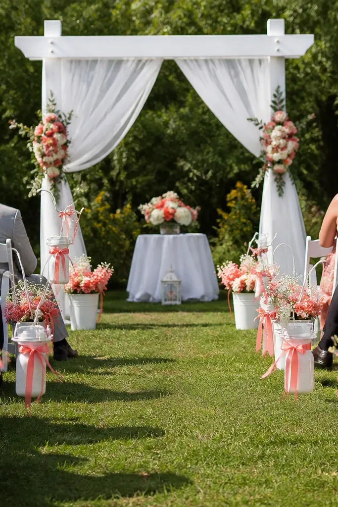
This is an all-summer “soft punch” palette. Coral pink gives you the energy, blush keeps it romantic, and white makes it feel airy instead of heavy. It’s ideal when you want a bright wedding without dark accents. The best part for budgets: you can build it with inexpensive white flowers plus coral/blush ribbons and painted vases.
Start with white linens and white signage bases. Then choose coral pink for the main floral clusters or for a table runner, and keep blush as the secondary color in smaller details. Finally, repeat the coral through napkins, ribbon on bouquets, and a few candle wraps.
Paint cheap glass jars coral (thin coats) so candles match even if your flower budget changes.
Don’t add too many third colors like peach and rose together; it muddles the look.
12. Peach + Cream + Olive Green
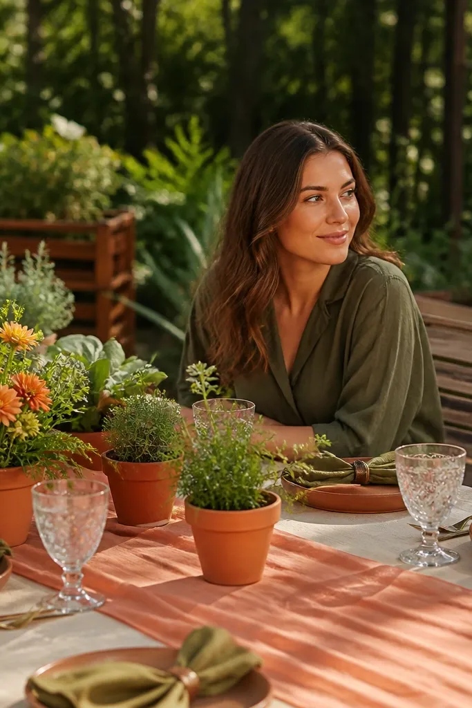
Start with cream as the neutral base for cloth, plates, and invitation backgrounds. Then use peach as the accent color via table runners, napkins, and a peach ribbon on menus. Finally, add olive through greenery types (olive branches, eucalyptus with olive tint) and olive-painted candle holders.
Peach reads warm and flattering in summer photos, and cream keeps everything bright. Olive green adds a natural depth that makes peach look more intentional instead of sugary. This palette works for garden receptions and outdoor terraces where greenery is already part of the background. It also works if you’re using lots of greenery because olive tones blend without turning everything the same color.
Skip thisAvoid bright neon peach; it can look orange in photos.
Quick tipBuy olive ribbon in 1-inch width; it’s easy to cut into uniform pieces for place cards and jars.
13. White + Sage + Butter Yellow
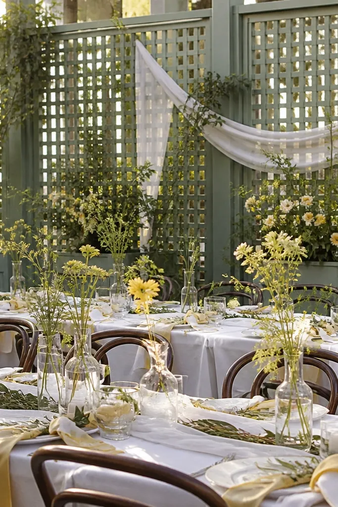
Butter yellow is gentle, and it looks sunny without turning into a loud theme. Pair it with sage and white for a light, garden-friendly look that photographs well in late afternoon. The palette feels fresh because the yellow is softened by sage, and it’s easy to build with inexpensive greenery-heavy centerpieces. If you want your wedding to look like summer air, this is the scheme.
Start with white linens and white paper. Then add butter yellow through napkins or a thin runner strip and keep the rest mostly neutral. Finally, use sage greenery as the connector between yellow and white by leaning on eucalyptus, ruscus, or olive-tinted leaves.
Choose butter yellow ribbon over fabric with patterns — solid color reads cleaner in photos.
Don’t add lots of gold if your yellow is already warm; too many warm metals can make the scene look flat.
14. Navy + Cornflower + White Stripes
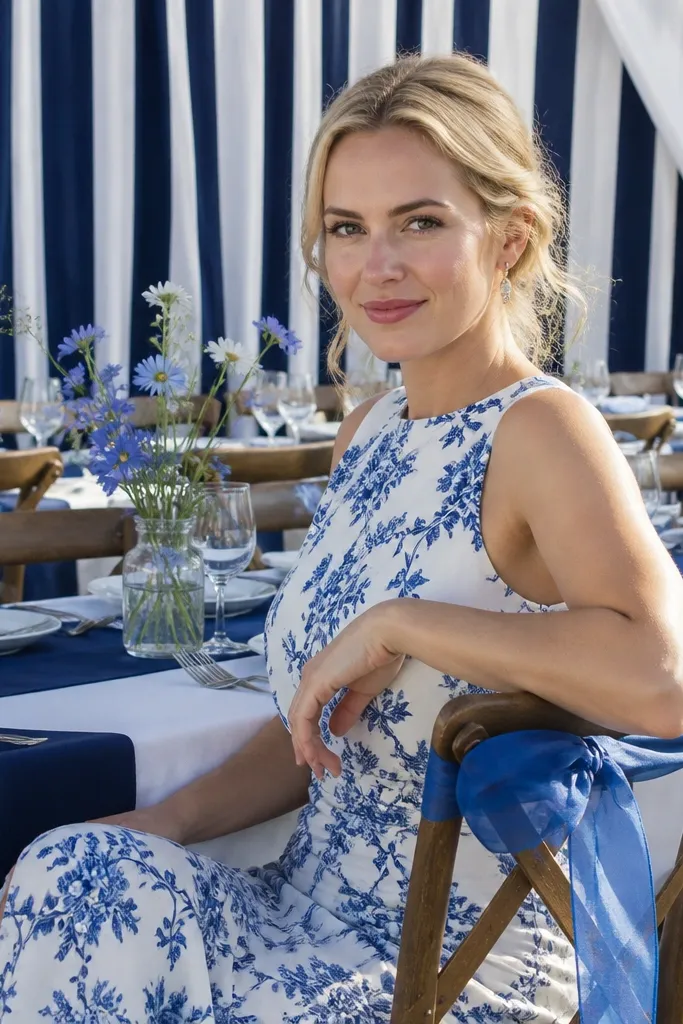
Start by choosing a white base with a striped element — either striped table runners or printed paper goods. Then use navy for napkins or chair ties and cornflower for a few larger floral stems. Finally, repeat cornflower through signage accents (menu borders or seating cards) so the scheme feels connected across the room.
This is a “graphic” palette that looks sharp in pictures because stripes and high-contrast colors create clear lines. Navy anchors the look, cornflower adds brightness, and white stripes keep it summery without needing expensive florals. Use it for beach towns, sailcloth venues, and outdoor receptions where you want a polished, slightly playful feel. It’s also great when you’re working with limited flower budget because the pattern does the heavy lifting.
Skip thisSkip adding beige or taupe; it breaks the crisp, graphic look.
Quick tipIf you’re renting linens, bring one striped item with you. One pattern piece makes the whole palette feel designed.
15. Black + Cream + Lime Green
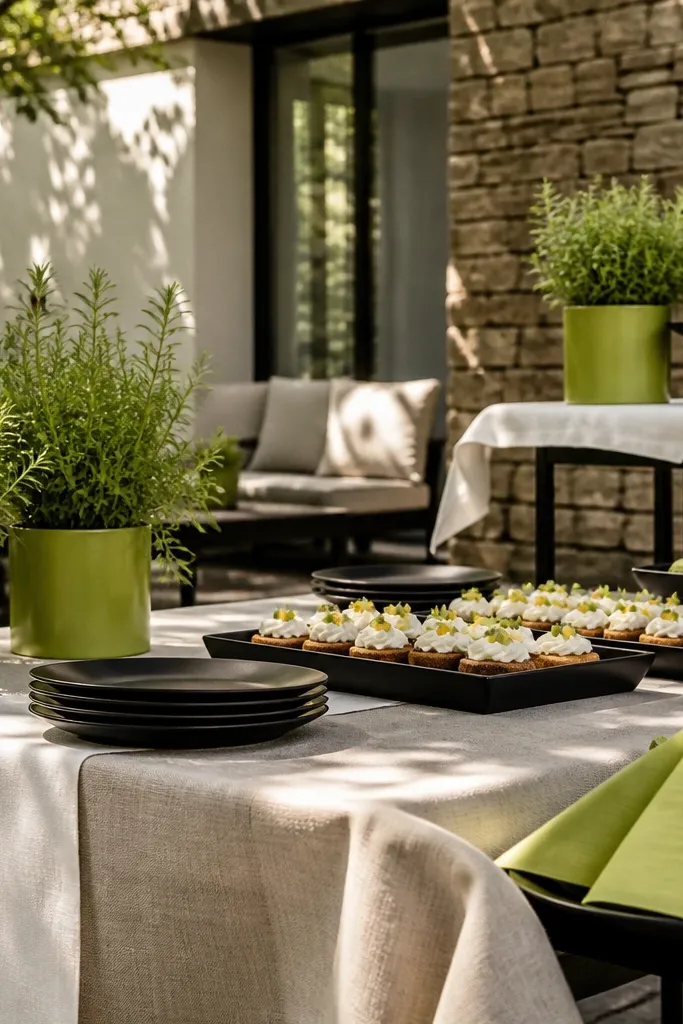
Start with cream linens and white paper goods. Then use black for chair ties, candle jars, or a black table runner strip. Finally, add lime green through small bouquets, lime ribbon, or a few lime-painted vases at the head table.
This is the scheme for people who want summer to look modern, not sweet. Lime green gives you a fresh, energetic pop, and black + cream keeps it high-contrast and readable in photos. It looks especially good in venues with clean walls, modern furniture, or darker outdoor shade. Keep it controlled: lime should appear in small, punchy places or it can dominate everything.
Skip thisDon’t use bright neon lime across every table; it turns the wedding into a theme park.
Quick tipUse lime as the accent on 2-3 focal points only: ceremony arch, head table, and one photo backdrop.
16. Dusty Teal + Blush + Ivory
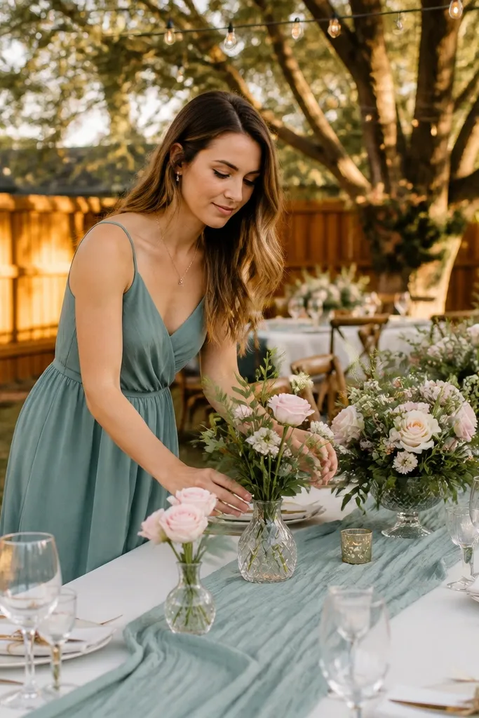
Dusty teal is a summer shade that feels grown-up, and blush keeps it romantic. Ivory ties the whole palette together so it looks soft instead of gloomy. This works beautifully for backyard weddings where you have lots of wooden textures and warm sunlight. The palette also pairs well with “green-forward” centerpieces, since teal sits nicely with eucalyptus tones.
Start with ivory linens and ivory stationery. Then choose dusty teal for napkins or a table runner, and keep blush for bouquets and small candle accents. Finally, add a little white in the flowers so teal doesn’t look too dark in shade.
Use blush ribbon on menus and teal napkins on tables. Repeat those two items and the palette stays coherent.
Skip dark burgundy; teal + burgundy makes the scene look heavy in summer light.
17. Rose Gold + White + Coral Confetti
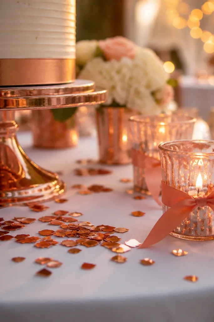
Rose gold is a summer-friendly metal because it warms up the whites and makes everything look flattering. Pair it with white as your base, then bring in coral for the fun color hit. This scheme is great for receptions that have lots of glass, mirrors, or fairy lights because rose gold catches those highlights. It’s also forgiving with flower budgets since you can rely on white blooms and coral accents.
Start with white linens and white florals as the base. Then add coral through napkins, ribbon, or small clusters of coral flowers in bud vases. Finally, incorporate rose gold with metallic candle lids, rose gold foil on menus, or rose gold confetti on tables.
If you’re using rose gold balloons, keep most of them white and place a few rose gold clusters behind the head table.
Don’t mix rose gold with too much champagne gold; it can look like two different metals fighting.
18. Aqua + White + Pale Sand
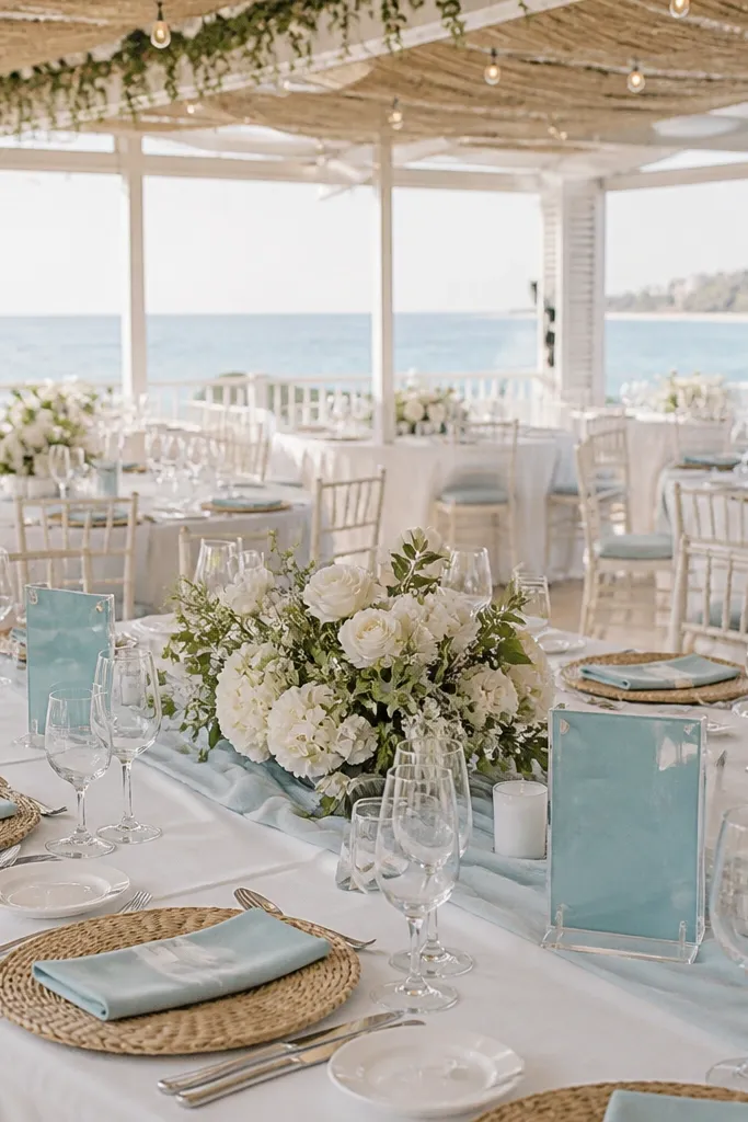
Start with white linens and a few aqua accents in paper goods like table numbers. Then use aqua for napkins or a runner strip down the center of each table. Finally, use pale sand through candle holders, linen overlays, or sand-colored vases.
Aqua and white give you that clean, airy beach look, and pale sand keeps it warm so it doesn’t feel like a cold pool party. This scheme works in seaside venues and also in inland gardens if you have light-colored furniture. It’s photogenic because aqua stays bright but not neon, especially against white tablecloths. Keep the accents light and let the greenery fill in the rest.
Skip thisAvoid adding dark navy accents; it makes aqua feel heavier and less summery.
Quick tipPick aqua fabric that’s slightly muted. Bright aqua cloth can look harsh in flash.
19. Sunflower Yellow + White + Teal Leaves
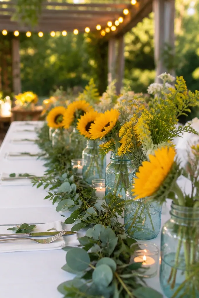
Sunflower yellow brings instant summer energy, and white keeps it fresh and bright. Teal-green leaf accents add a cooler counterbalance so the yellow doesn’t look flat. This palette is perfect for late-summer weddings when you want “field flower” vibes without paying for rare blooms. It also photographs well because sunflower faces act like natural focal points across the table.
Start with white tablecloths and simple white plates. Then build centerpieces around sunflower heads or sunflower-style blooms, and use teal-green leaves (like dyed or naturally teal-tinted foliage if available) to frame them. Finally, repeat yellow in small details: napkins, a few table numbers, or ribbon on glass jars.
Use teal leaves sparingly — they should frame the sunflower, not replace the greenery.
Skip orange marigolds if your yellow is already strong; the palette can turn into one messy warm blob.
20. Plum + Cream + Dusty Gold
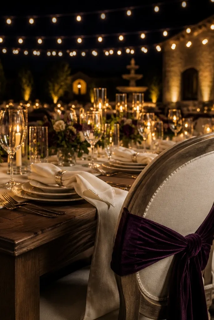
Start with cream linens and cream paper goods. Then use plum for napkins or a plum table runner, and choose a few larger plum-toned blooms or dyed plum stems. Finally, add dusty gold via candle holders, gold foil on signage, or a thin gold border on menus.
Plum is a strong summer color when you pair it with cream and avoid too much dark brown. Dusty gold adds warmth, and the combo looks especially good for evening receptions with string lights. This is a smart choice if you want your wedding to feel dramatic but still classy. The palette also handles low flower budgets because plum reads even when the arrangement is mostly greenery and a few statement blooms.
Skip thisDon’t add black; plum + black turns into holiday mode.
Quick tipUse matte dusty gold, not shiny metallic. It looks better in daylight and doesn’t glare in photos.
21. Coral + Turquoise + White
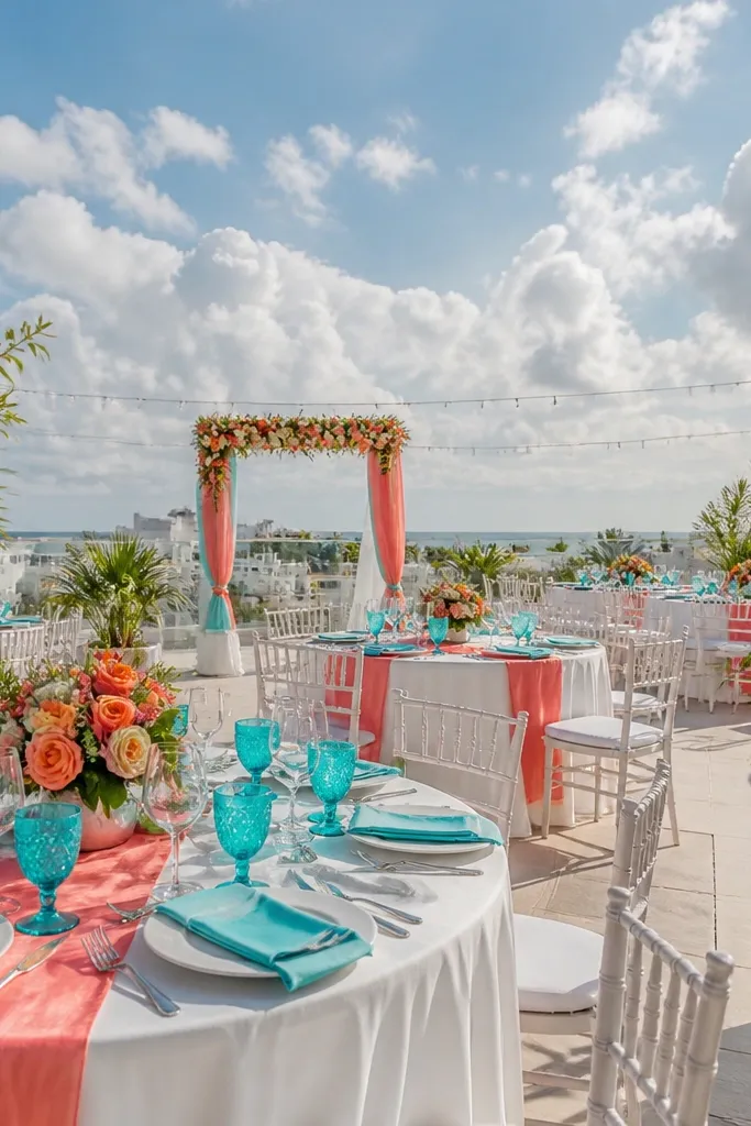
Coral and turquoise is a “vacation” palette that looks bold without needing dark accents. White keeps it clean, and the two colors create strong contrast against greenery. This scheme is ideal for beachy venues, rooftop weddings, and anywhere you’ll have bright skies. It’s also easy to build because turquoise can come from ribbon, acrylic signs, or painted vases, not only from flowers.
Start with white linens and white signage bases. Then choose coral as the main accent through napkins, larger floral clusters, or a statement balloon strip. Finally, add turquoise through smaller details like ribbon, bud vases, or table number plaques in turquoise acrylic or painted wood.
If your turquoise flowers are pricey, use turquoise ribbon and painted vases to carry the color instead.
Avoid pairing coral with teal-green (too close to turquoise). It blurs the contrast.
22. White + Olive + Navy Dots
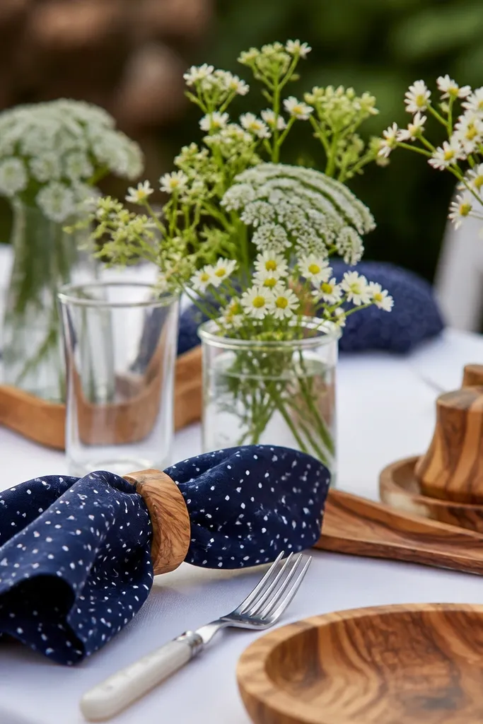
This palette is understated but still looks styled because the navy dots give a graphic pop. Olive keeps it grounded and natural, and white keeps it airy. It works well for garden weddings and venues with lots of texture since navy adds clarity and definition. If you want photos that look clean and editorial without big flower spending, this is the move.
Start with white linens and mostly white florals, then build out greenery-heavy arrangements using olive-toned leaves. Next, add navy through dotted elements: place cards with navy dots, menu borders, or a navy dotted table runner. Finally, repeat navy in small décor like candle labels or a navy ribbon around jars.
Choose a dotted pattern with small dots. Large dots look busy up close and can blur in photos.
Don’t use solid navy everywhere; dots plus repetition look designed, solid navy can feel heavy.
23. Burgundy + Blush + Ivory
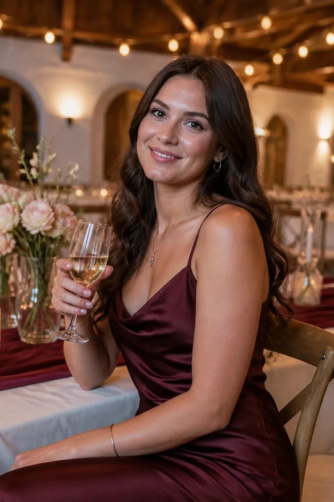
Burgundy in summer sounds risky, but paired with blush and ivory it looks romantic instead of heavy. The blush softens the burgundy so it doesn’t dominate, and ivory keeps the scene bright. This scheme is great for evening receptions and venues with warm lighting where burgundy glows. It also looks strong in photos because burgundy has deep contrast that stays visible even when the background is busy.
Start with ivory linens and ivory stationery. Then use burgundy for napkins or table runners, and keep blush for bouquets and small candle accents. Finally, add a few white blooms so the burgundy doesn’t pull everything darker.
Use burgundy in fabric, not just paper. Fabric reads fuller and makes the palette feel intentional.
Skip adding brown wood tones into the palette. Let burgundy be the only deep color.
24. Sky Blue + White + Pale Coral
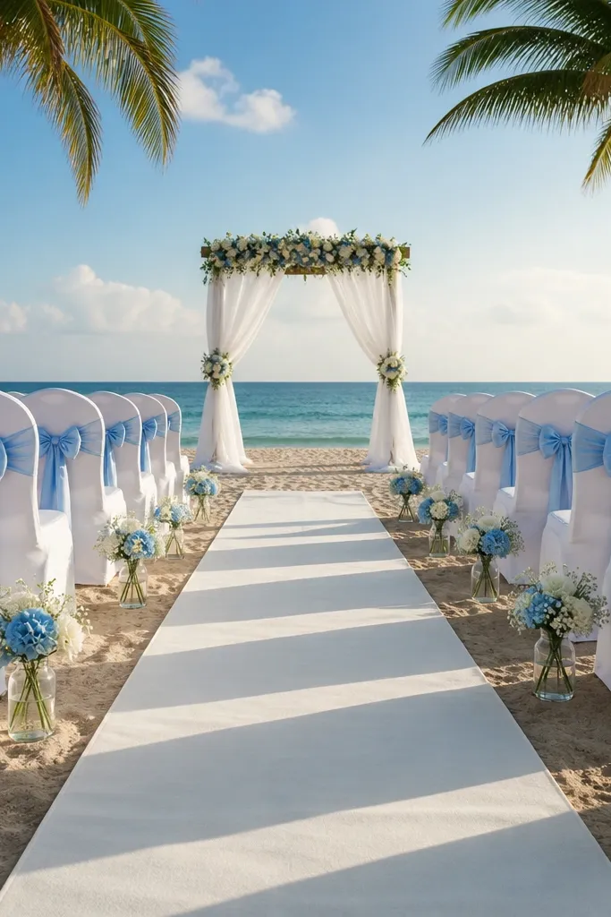
Sky blue is cheerful, and white keeps it crisp. Pale coral adds a gentle warm note that makes the palette feel summer-friendly without screaming. This combo is ideal for outdoor ceremonies with lots of open sky or bright daylight because it matches the visual temperature of the day. It also works for budgets since you can build the look with white florals and color through linens and signage.
Start with white as your base for linens and paper. Then pick sky blue for napkins or a runner, and add pale coral in small doses like ribbon on vases or a few coral blooms. Finally, keep the florals mostly white so the blue and coral stay clearly separated.
Print seating cards in sky blue ink on white cardstock. It looks clean and costs less than fancy paper.
Don’t mix sky blue with strong red tones; it turns into a sports palette fast.
25. Champagne + Deep Emerald + Emerald Velvet Ribbons
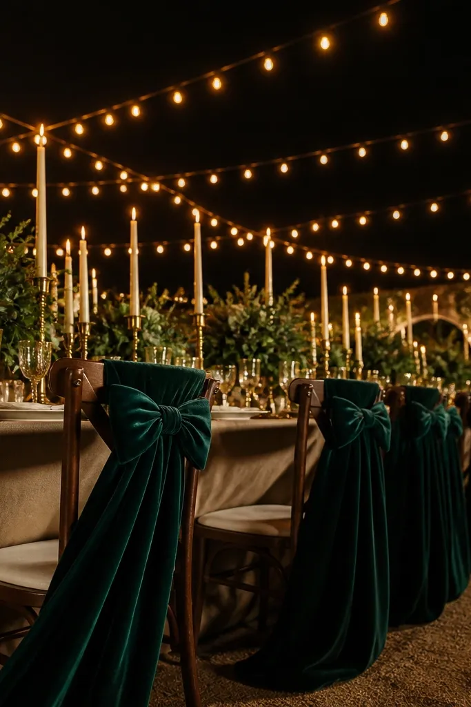
Pick a venue with natural greenery or plan to bring it in — evergreen hedges, potted olive trees, or a simple aisle run of mixed greens. Build the scheme like this: champagne base for linens and napkins, deep emerald for florals and bridesmaid dresses, and velvet ribbon on signage, programs, and chair ties. For travel, target places within a 2.5 to 4 hour drive from a major airport so you can do a quick scouting trip and still keep costs sane. Budget roughly $150 to $300 per person for a long-weekend depending on distance and whether you need a rental car, and plan on 2 nights so you can set up décor without rushing. Book the venue and photographer first, then lock in any florist travel and rental furniture 6 to 8 weeks ahead for summer availability. If you need to save money, rent velvet ribbon and candles locally at the destination instead of shipping them from home.
This color combo makes summer weddings look expensive without trying too hard. Champagne gives you warm light that photographs well in late-afternoon sun, and deep emerald reads rich against greenery — think glossy leaves, dark stems, and candles that glow. The velvet ribbon element is the difference between “pretty” and “memorable” because it adds texture that catches highlights and looks great in close-ups. Choose it for garden venues, vineyard patios, and seaside terraces where you want a luxe mood but still feel fresh for summer. It suits couples who want a classic palette with a bold green twist and guests who like clean, readable color blocks. The best time to plan around this look is late June through August when the light is strong and the greenery stays crisp.
Skip thisDon’t use emerald in every surface — keep champagne as the dominant base so the palette reads clean on camera.
Quick tipOrder a small swatch kit from your florist or rental company before you pick the final fabric — emerald velvet can look blue-green or flat green depending on dye lots.



