
1. Terracotta + Sage + Oatmeal
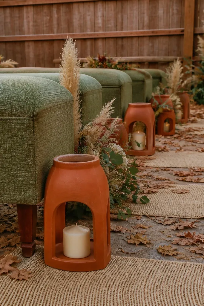
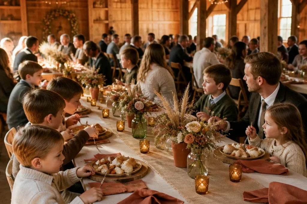
This palette reads cozy without being loud. Terracotta gives you that fall warmth, sage keeps it fresh, and oatmeal makes everything look soft in photos. It works especially well for barns and outdoor receptions where the background already has wood tones. For families, it stays gentle on the eyes for kids during long dinners, and it doesn’t create harsh color blocks that stress people out. Pair this with cream candles and simple greenery so the palette feels curated but still relaxed.
Start by choosing terracotta as the anchor in your linens or bridesmaid dresses, then pull sage in through garland and small floral accents. Next, use oatmeal for tablecloths, menus, or signage so the whole thing has a calm base. Finally, keep your centerpieces low and wide — ceramic bowls with sage sprigs look tidy and are harder for kids to bump than tall glass vases.
Use terracotta ribbon on chairs instead of bright signage; it photographs better and hides scuffs.
Avoid pairing terracotta with bright red or hot pink — it turns the look into a Halloween theme.
2. Cinnamon + Dusty Blue + Cream
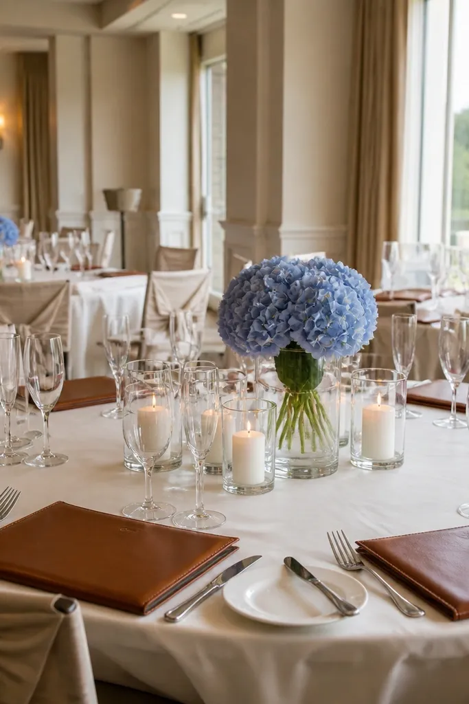
Cinnamon brings warmth, dusty blue adds calm, and cream keeps it soft and family-friendly. This is a great choice if you want fall color but your venue has neutral walls or beige carpet. It photographs beautifully in window light because the dusty blue stays muted instead of turning gray. The cream neutral also helps dark hair and lighter skin tones look balanced in group photos. If you’re worried about the palette feeling too “autumn,” this mix solves it.
Begin with cream as the base for linens, plates, and paper goods. Add cinnamon through napkins, wooden chargers, or a cinnamon-toned floral wrap. Then weave dusty blue into your bouquets with dried seed heads or hydrangea-like blooms and top the tables with cream pillar candles for warmth after sunset.
Quick tipPick dusty blue flowers that read gray-blue in daylight; they won’t look off under tungsten lights.
Skip thisSkip navy as the blue — it can look heavy and make the room feel smaller.
3. Mocha + Blush Rose + Charcoal
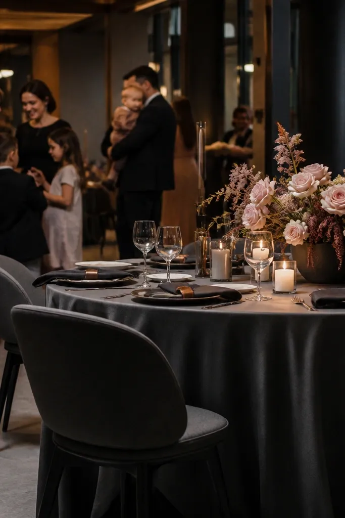
This scheme feels cozy and grown-up without turning dark. Mocha warms the room, blush rose gives you that romantic softness, and charcoal adds structure so everything doesn’t blend together. It’s ideal for receptions in hotels, restaurants, or indoor spaces where you need the palette to look intentional under overhead lighting. Charcoal also hides minor spills better than white, which matters with kids around. Keep the blush limited to florals and small accents so the room still reads fall, not spring.
Choose charcoal for the most visible “frames” — menus, chair ties, or candle bases. Use mocha for table runners or napkins so the color feels grounded. Then add blush rose through bouquets and bud vases, and keep the rest of the decor simple and matte to avoid glare.
Quick tipIf you’re doing escort cards, use charcoal cardstock with blush ink for a clean look that doesn’t stain easily.
Skip thisDon’t go full blush everywhere; it makes the palette look pink-heavy and less fall.
4. Deep Plum + Champagne + Creamy Ivory
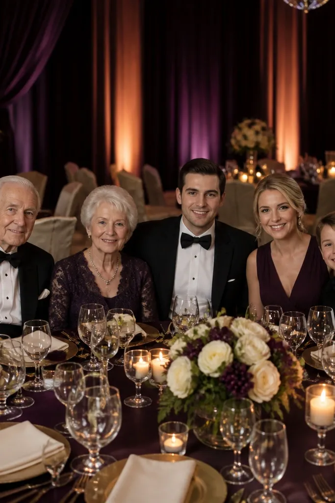
Deep plum is a fall power color, but it needs a light neutral to stay flattering. Champagne adds sparkle in a controlled way, and creamy ivory keeps the palette bright enough for family photos. This works well for evening weddings where you want richer tones without losing clarity in pictures. Kids also benefit from a lighter neutral base because it keeps the room from feeling too dim or gloomy. Use plum as the dominant color in florals or linens, then keep the “glam” to metallic candle holders or subtle ribbon.
Start by selecting deep plum for linens, bridesmaid dresses, or a floral ribbon wrap. Add champagne through metallic accents like votive cups or flatware finishes on menus. Then keep tablecloths and signage in creamy ivory, and place champagne candles at multiple spots so the glow is even across the room.
Quick tipUse matte plum fabric for napkins; glossy satin catches flash and can look streaky in photos.
Skip thisAvoid pairing plum with bright orange — it can look like a sports team color scheme.
5. Rust + Olive + Warm Linen
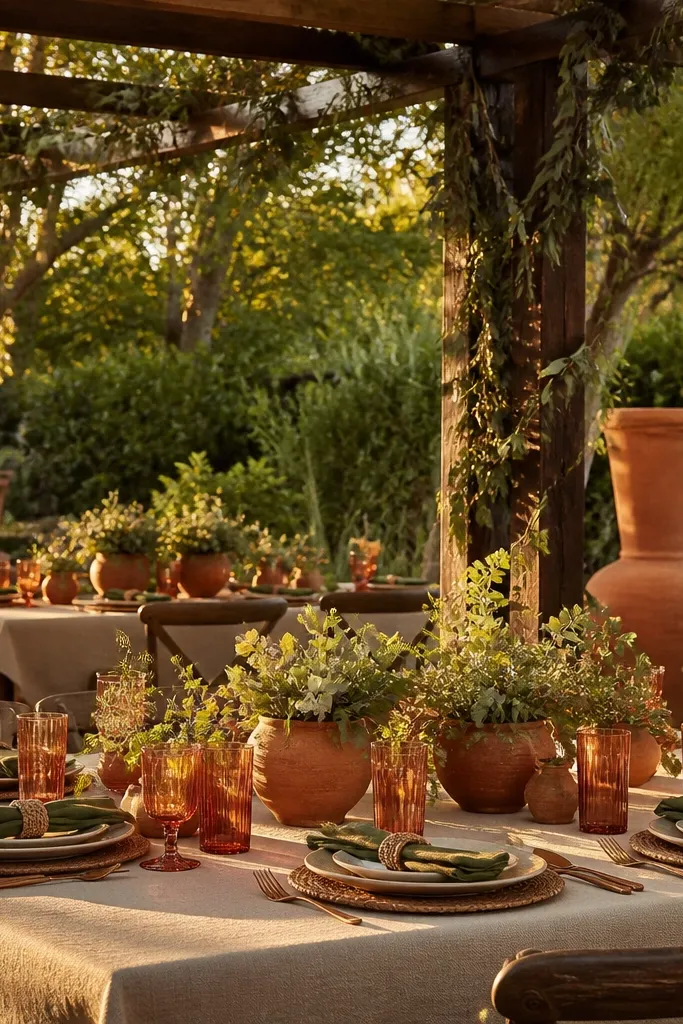
Rust and olive look like they belong in an outdoor fall dinner. Olive tones down the intensity of rust, and warm linen keeps the whole thing soft and inviting. This palette is excellent for garden venues and outdoor receptions where greenery already exists. It’s also forgiving for family setups because olive hides dirt and scuffs better than light colors. Add small pops of gold through candlelight and your photos will look cohesive without feeling over-decorated.
Use warm linen for your base — tablecloths, overlays, or a neutral runner. Add rust through napkins, bridesmaid florals, or a rust-toned ribbon on centerpieces. Then use olive as the primary greenery and add gold accents in votive holders and frame edges for signs.
Choose olive garlands with thick leaves; thin greenery looks sparse in wide shots.
Skip neon rust shades; they read too orange and fight the olive.
6. Forest Green + Cream + Copper
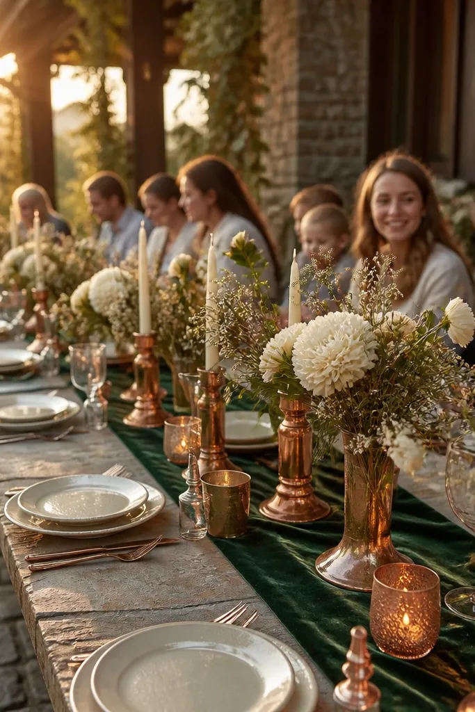
Forest green makes fall feel lush, and cream keeps it bright enough for daytime family photos. Copper adds warmth that looks amazing in golden hour light, especially with candlelight later. This palette suits venues with brick, dark wood, or stone because it harmonizes with the background instead of clashing. It also looks great for kids because the colors aren’t harsh — no screaming reds. Keep copper details small and intentional so it reads cozy, not festival.
Start with cream linens and paper goods so the palette has a soft base. Add forest green via table runners, chair accents, or large greenery installations. Then use copper for candle holders, small bud vases, and a thin metallic border on signage.
Quick tipIf you’re using copper spray accents, do it on accents only — over-spraying can look messy on camera.
Skip thisAvoid pairing forest green with bright white; it makes the palette look too stark and cold.
7. Burnt Orange + Slate Gray + Ecru
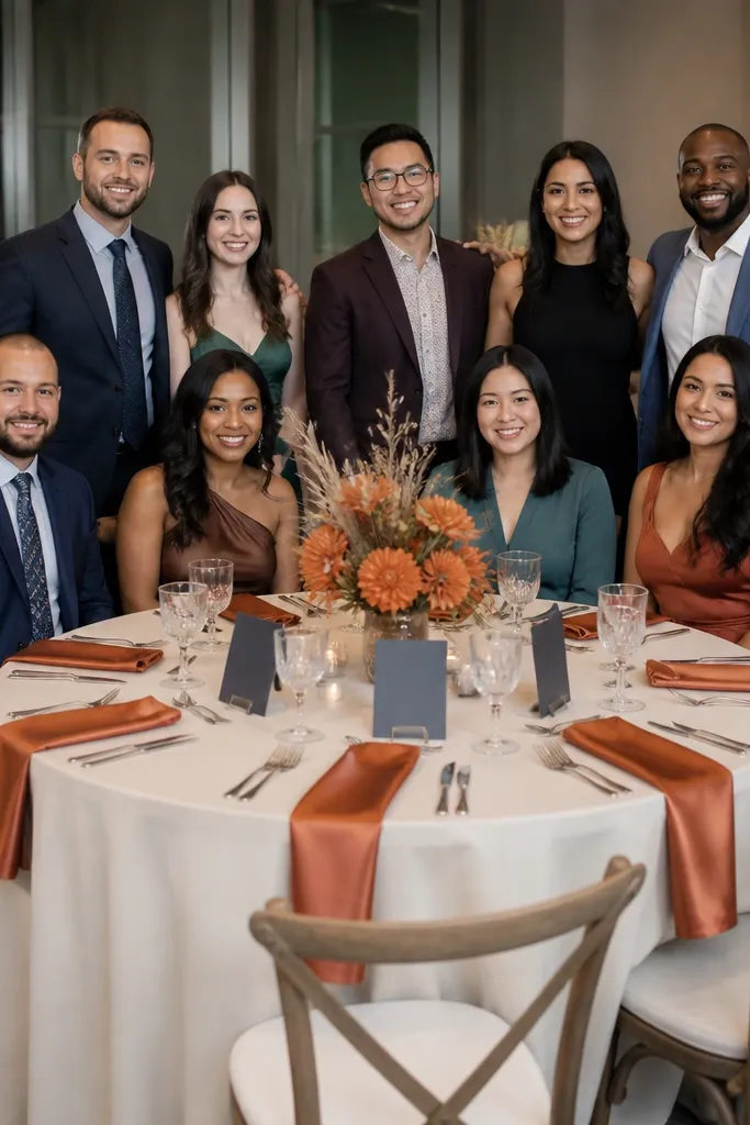
Burnt orange is classic fall, but slate gray is what keeps it from feeling like a theme. Ecru gives you a warm neutral that still photographs light and airy. This scheme works well for indoor venues that have cool-toned floors or lots of gray in the decor. It also creates clear color separation in group photos, which helps families because kids often move around and you still get consistent visual structure. Use burnt orange in medium doses so it reads intentional, not overpowering.
Choose ecru for tablecloths and backdrops so the room stays bright. Add burnt orange through napkins, floral ribbon, or an accent wall for photos. Then bring in slate gray with candle holders, escort card frames, or small ceramics so the palette has contrast.
Test burnt orange fabric against your venue lighting; some oranges go too red under tungsten.
Skip black as the base; it makes slate look harsh and can feel gloomy for kids.
8. Camel + Sage + Soft White
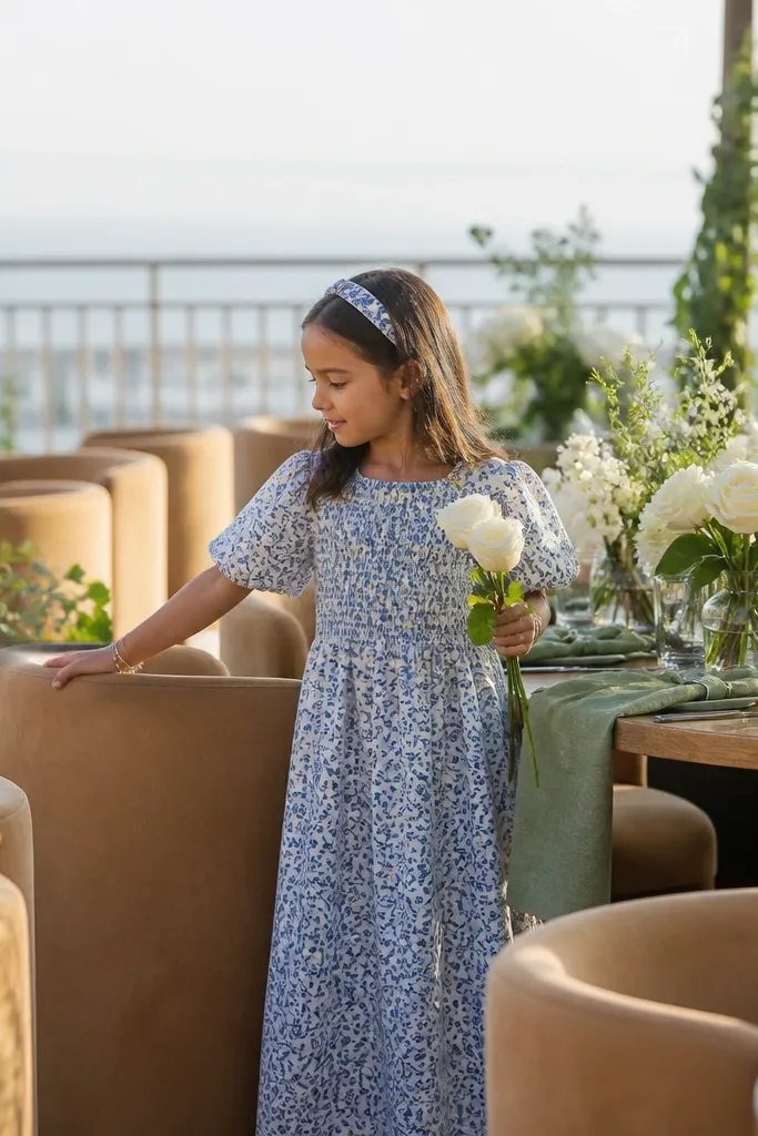
This is a calm fall palette that looks expensive without trying. Camel reads warm like suede, sage keeps it fresh and natural, and soft white makes it feel clean for family photos. It suits modern venues, boutique hotels, and receptions with minimalist decor. The best part is how it handles stains and mess — camel tones hide small spills and fingerprints better than bright neutrals. Keep florals natural and let the textures do the work.
Start with soft white linens and simple paper goods. Use camel for chargers, napkins, or the base of your centerpieces like woven trays. Then add sage through garlands, bud vases, and small sprig clusters, keeping the overall look airy with negative space.
Use woven textures like jute or linen napkins; they read warm in photos and hide wrinkles.
Avoid mixing camel with mustard yellow; it can turn the palette too earthy and dull.
9. Burgundy + Champagne + Espresso Wood
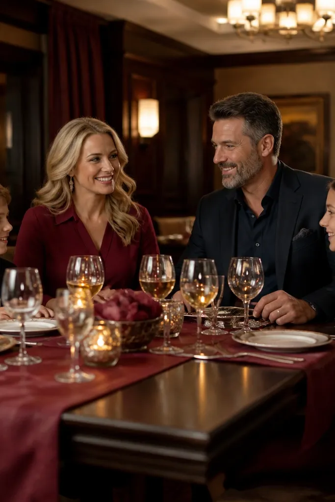
Burgundy gives you deep fall drama, champagne keeps it light enough for family-friendly brightness, and espresso wood adds grounded texture. This palette is great for evening weddings with candlelight and darker venue interiors. Kids also look good in these tones because burgundy and champagne create flattering contrast without neon intensity. Make sure you keep the champagne visible in several spots so the room feels alive, not just dark. Burgundy should lead, but the neutrals do the heavy lifting for cohesion.
Use espresso wood for tables, signage frames, or decor trays. Add burgundy through napkins and large floral elements, then introduce champagne with votive holders or metallic ribbon. Finally, place candles in a few clusters across the room so the lighting is balanced for photos of families at different tables.
Quick tipChoose burgundy fabrics with a matte finish; satin can look blotchy under flash.
Skip thisSkip gold glitter everywhere; it looks chaotic when kids run through the photo area.
10. Sage Green + Terracotta + Wheat Gold
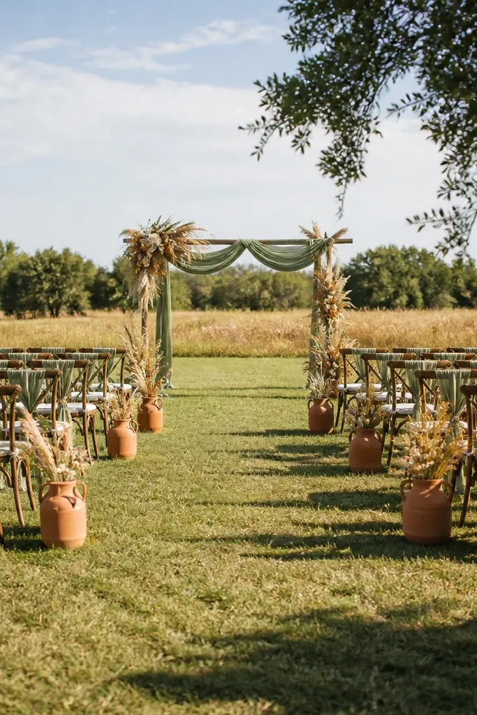
This palette looks like late-summer wheat fields but still reads fall. Sage and terracotta are a friendly mix, and wheat gold adds a soft glow that works for both daytime and evening. It’s especially photogenic for outdoor ceremonies where you have natural backgrounds. For families, the colors are warm but not aggressive, so kids don’t visually blend into the decor. Use wheat gold as ribbon and small stem accents rather than as a dominant paint-like color.
Start with sage greenery as the base in bouquets and garlands. Add terracotta in flowers or lantern accents, then use wheat gold for ribbon, dried wheat stems, and small metallic touches. Keep your tablecloth in a neutral cream so the wheat gold doesn’t look yellow-orange on camera.
Quick tipDried wheat looks best in tall, narrow bud vases; it keeps the shape and avoids messy clumping.
Skip thisDon’t overuse terracotta on table linens; too much reads orange-brown and can look heavy.
11. Dusty Rose + Olive + Oat Milk
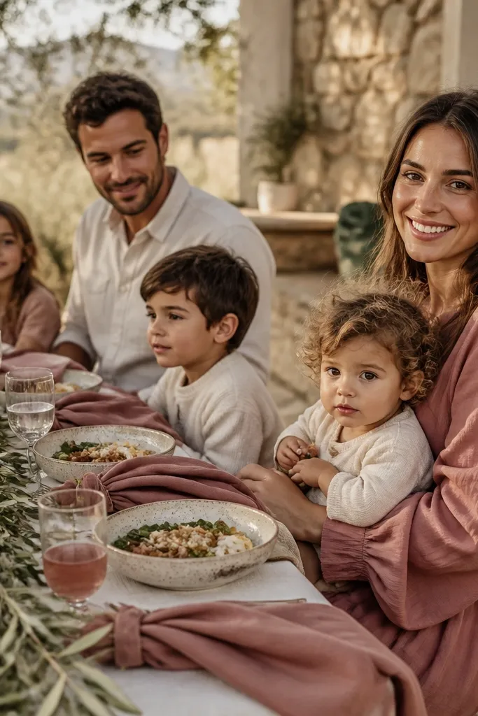
Dusty rose makes fall feel gentle, olive anchors it in nature, and oat milk keeps everything soft and bright for family photos. This palette is great if you want a romantic look but your venue has lots of wood or neutral stone. It also works well for mixed-age groups because it doesn’t rely on harsh contrast. Dusty rose is also forgiving in pictures — it doesn’t look too pink under warm lighting when paired with oat tones.
Choose oat milk linens for the base — tablecloth or runner. Add olive through greenery and heavier floral stems, then insert dusty rose in bud bouquets and small table clusters. Finish with simple white candles or warm-toned bulbs so the palette stays cozy and not overly romantic.
Quick tipIf your dusty rose looks too purple in daylight, swap to rose with a peach undertone.
Skip thisAvoid pairing dusty rose with bright burgundy; it makes the palette look crowded.
12. Teal + Copper + Warm Sand
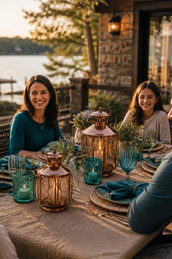
Teal is an underrated fall color because it reads rich without being dark. Copper warms it up, and warm sand keeps the palette grounded and family-friendly. This scheme works well for venues near water, rustic lodges, and places with textured stone or wood paneling. It also creates a nice contrast for kids' clothing — teal doesn’t clash with denim the way some reds do. Use teal in fabric and florals, then let copper show up in candle holders and small signage details.
Start with warm sand for table linens or runners and keep paper goods in cream. Add teal through napkins, bridesmaid dresses, or teal-toned flowers like thistles or dark hydrangea. Then place copper votives at regular intervals so lighting looks consistent from every table.
Choose teal with a darker tint, not bright turquoise, so it stays fall-appropriate.
Avoid pairing teal with icy silver; it can make the room feel cold.
13. Pale Blue + Clay + Buttercream
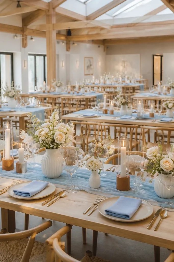
This palette feels airy while still honoring fall. Pale blue keeps it calm for family photos, clay adds warm earthy tone, and buttercream makes it look soft instead of dusty. It’s a smart choice for daytime weddings where you want color that doesn’t look heavy under skylight. Kids also look good in these colors because nothing is too dark near the tables where they sit and eat. Keep the clay in smaller doses so the pale blue stays the star.
Use buttercream as the base for linens, florals, and signage paper. Add clay through napkins, terracotta-like vases, or ribbon wrapped around centerpieces. Then bring pale blue into your florals and small decor elements, like bud vases and table cards, keeping everything matte for a clean look.
Quick tipIf your pale blue is too gray, swap to one with a slightly more green undertone for warmth.
Skip thisSkip charcoal; it can overpower pale blue and make the palette look wintery.
14. Ivory + Cocoa + Burnt Sienna
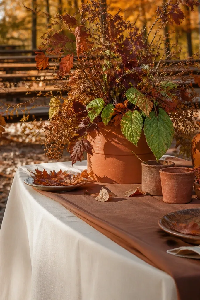
This is the cozy-chocolate palette that looks great in both rustic and elegant venues. Ivory keeps it bright, cocoa grounds it, and burnt sienna adds fall color with a painterly feel. It’s especially photogenic for autumn outdoor ceremonies because it blends with leaves and wood. Families like it too because it doesn’t create high-contrast zones that pull attention away from people. Use cocoa in candles and wood elements, and keep burnt sienna in dried stems or small floral clusters.
Start with ivory tablecloths and cream signage. Add cocoa through candle holders, wooden chargers, or ribbon on chair backs. Then place burnt sienna dried florals in bud vases or low arrangements so they look intentional without blocking kids' views.
Dried stems should be secured with floral tape and a weight at the base; loose stems look messy fast.
Avoid bright red accents; they fight the warm chocolate tones.
15. Marigold + Olive + Cream
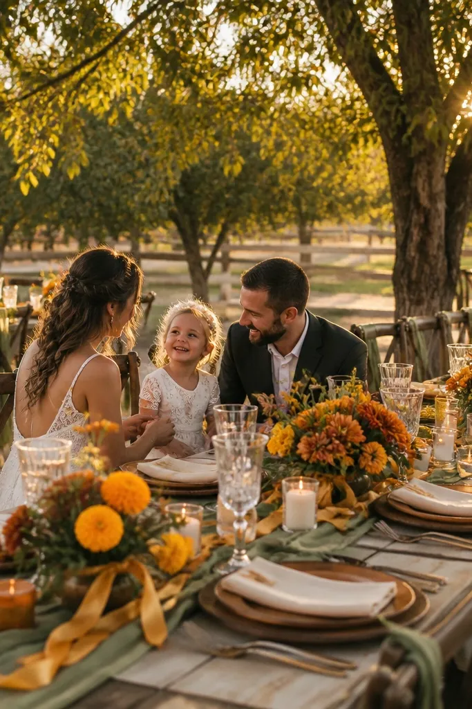
Marigold is cheerful fall color, but olive keeps it from reading like a festival. Cream makes the palette look clean and family-friendly for photos, especially with kids who wear bright clothes. This palette works for outdoor receptions and casual venues where you want warmth and energy without going orange-only. It also looks great in golden hour because marigold glows and olive stays grounded. Keep marigold mainly in florals and small decor accents so the room doesn’t feel too intense.
Use cream for your table base and paper goods. Add olive greenery as a consistent background across bouquets and garlands. Then introduce marigold through sun-like blooms, small bud vases, and a few statement centerpieces. Finish with simple warm lighting — amber bulbs or candles — so the marigold reads golden instead of harsh.
If you’re worried about staining, choose marigold-like blooms with thicker petals and avoid loose confetti-style pieces.
Skip yellow-gold metallic everywhere; it can look too shiny and distracting for kids.
16. Black Tea + Sage + Oatmeal
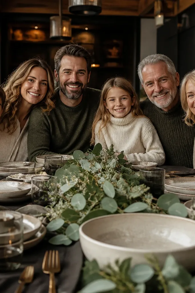
This palette is modern-cozy: black tea is a soft dark brown, sage adds freshness, and oatmeal makes it inviting. It’s perfect if your venue has dark wood, brick, or a lot of black metal details. The family-friendly part is that sage and oatmeal keep the scene from feeling too heavy for kids. It also makes group photos look crisp because the dark frames help separate people from the background. Keep black tea in linens or signage, not in everything, so it stays elegant rather than gloomy.
Start with oatmeal tablecloths and cream paper goods. Add black tea through napkins, runner fabric, or signage text boxes. Then use sage greenery across centerpieces and aisle decor, keeping it consistent so the look feels designed. For photos, place a sage-and-oat backdrop near the ceremony so kids aren’t against a fully dark wall.
Use black tea as a text color on cream menus; it reads classy and hides smudges better than lighter ink.
Avoid pure black as your main color; it can feel too harsh for fall weddings.
17. Ocean Mist + Rust + Cream
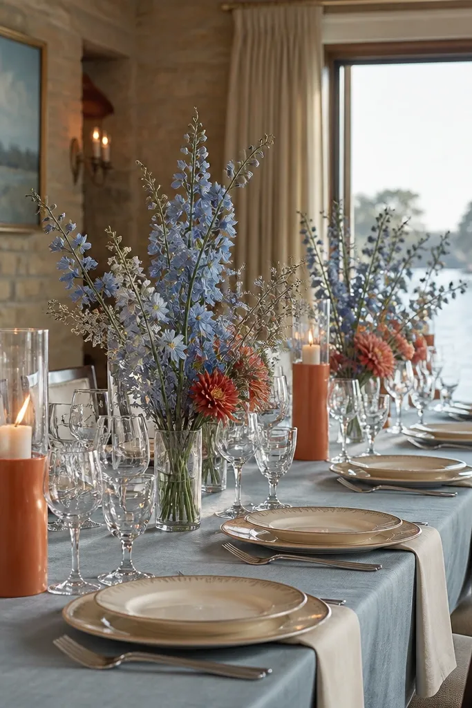
Ocean mist is a muted blue that feels fall-friendly, especially when you pair it with rust and cream. The rust adds warmth, and cream keeps it family-friendly and bright. This palette is beautiful for venues with coastal vibes, lakeside lodges, or places with pale stone. It also works for families because it doesn’t turn the room too dark in afternoon light. Use ocean mist mainly as fabric and flower tones, and keep rust in smaller floral moments.
Use cream for linens and signage so the palette stays airy. Add ocean mist through napkins, table runners, or bridesmaid dress tones. Then bring in rust via bouquets, small terracotta accents, and a few statement centerpieces that sit low and wide.
Quick tipOcean mist looks best with matte fabrics; shiny satins turn bluish under flash.
Skip thisSkip bright orange; rust should look muted and earthy.
18. Dusty Teal + Rosewood + Ivory
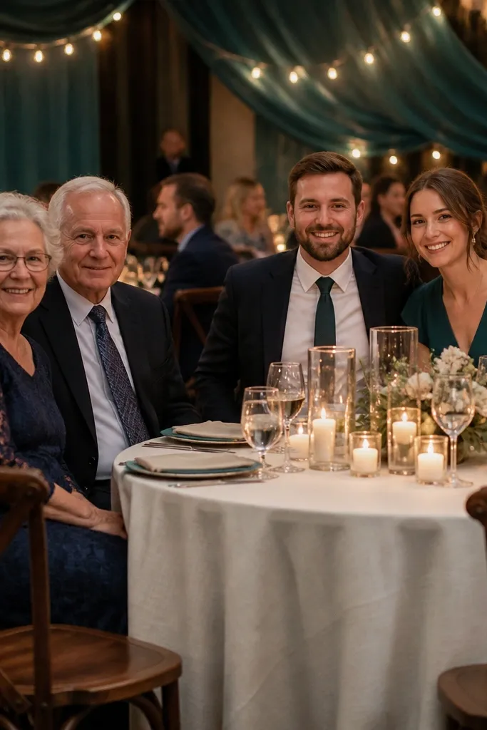
Dusty teal feels autumnal when you pair it with rosewood and ivory. The teal reads calm, rosewood adds depth, and ivory keeps it bright for family photos. This is a solid pick for receptions where you want mood but not darkness. The palette also hides crumbs and small mess better than stark white because ivory is warm, not icy. Use rosewood mainly in florals and ribbon, then keep teal consistent across table elements.
Start with ivory tablecloths and simple white candles. Add dusty teal through napkins, chair ties, or a greenery-and-teal garland. Then introduce rosewood in bouquets, bud vases, and sign lettering accents. Keep the color distribution even across the room so kids' photos don’t all look like they’re in different weddings.
Quick tipUse rosewood ribbon on the aisle or ceremony area; it gives you a clear photo background for families.
Skip thisAvoid mixing dusty teal with neon pink — it looks off in fall light.
19. Coral Clay + Olive + Soft White
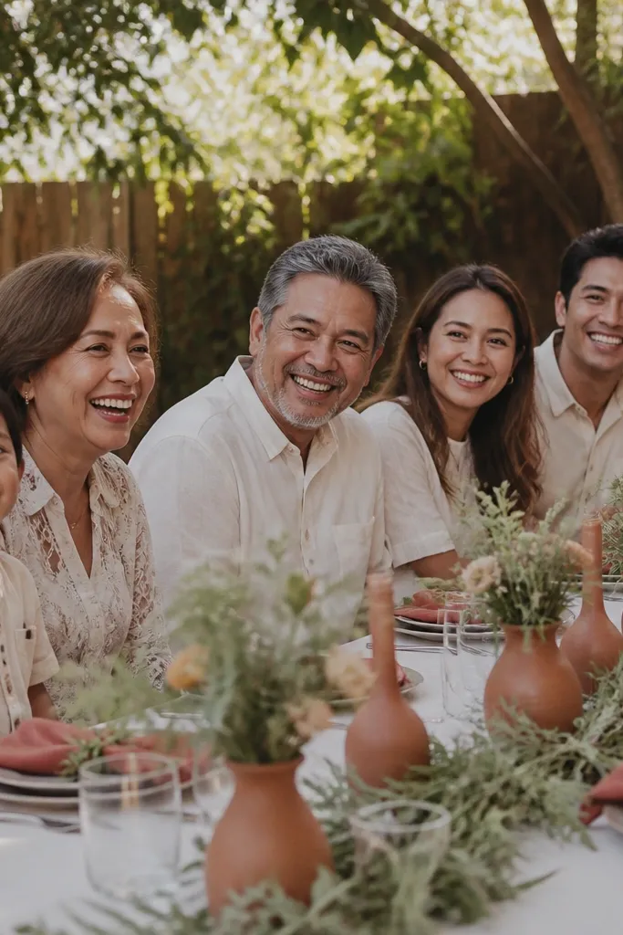
Coral clay is like a warmer cousin to terracotta — it reads friendly, not harsh. Olive brings an earthy balance, and soft white keeps the palette bright and clean in pictures. This scheme is great for family-friendly weddings where you want color that looks happy but still fall-appropriate. It also works well for outdoor receptions because coral tones glow against greenery. Keep the coral in fabrics and smaller floral moments so it doesn’t overwhelm the room.
Choose soft white for linens and signage. Use olive greenery as the consistent backdrop across tables and bouquets. Then add coral clay through napkins, ribbon, and small flower clusters, placing them in low centerpieces so kids can still see across the table.
Quick tipIf you’re using faux florals, pick ones with matte petals; glossy petals look plastic under sunlight.
Skip thisAvoid pairing coral clay with cool lavender — it makes the palette look random.
20. Emerald + Cream + Dark Gold
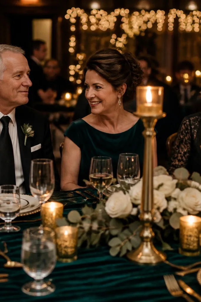
Emerald is a bold fall color that looks stunning in indoor venues with warm lighting. Cream keeps the palette family-friendly and bright, and dark gold adds warmth without going too flashy. This combination is excellent for weddings that happen later in the day, when candles and string lights make emerald look rich instead of heavy. Kids also look great in emerald settings because it frames outfits without screaming. Use emerald in greenery or fabric panels, then keep gold to small metallic details.
Start with cream tablecloths and paper goods. Add emerald through napkins, floral accents, or a greenery-heavy garland that repeats along the ceremony space. Then bring in dark gold with candle holders, menu frames, and a thin border on signs. For maximum photogenic coverage, place candles at different heights so the gold catches light around kids and adults.
Use dark gold in matte finishes; shiny gold can blow out in camera flash.
Skip bright yellow gold; it looks too summery for fall.
21. Lilac Mist + Cocoa + Oatmeal
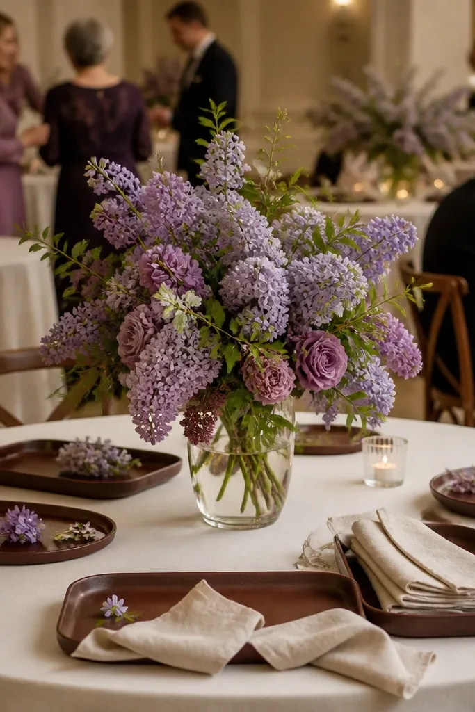
Lilac mist is a softer alternative to plum, and it photographs beautifully when you pair it with cocoa and oatmeal. Cocoa grounds the palette, while oatmeal keeps it cozy and not too sweet. This works for indoor receptions where you want a fall palette that still feels airy and not too dark. It’s also a strong choice for mixed-family groups because the colors don’t overwhelm kids' outfits. Keep lilac mostly in florals and small decor so the cocoa and oatmeal do the framing.
Use oatmeal for the table base and signage paper. Add cocoa through napkins, candle holders, and wooden elements like frames or trays. Then introduce lilac mist with bouquets, bud vases, and a few hanging or wall-adjacent accents so the color reads without cluttering tables. Keep the lilac matte and avoid shiny satin — it can reflect harshly.
Choose lilac tones with a gray undertone so they don’t look pink under warm bulbs.
Avoid pairing lilac with bright orange; it turns the palette into a Halloween mismatch.
22. Pear Green + Honey + Cream
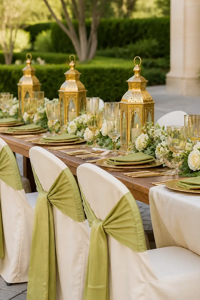
Pear green is bright but still fall-ready when it’s paired with honey tones and cream. The honey adds warmth, and cream keeps everything light and family-friendly. This palette works especially well for daytime receptions with lots of natural light because pear green stays fresh instead of looking yellow. It also gives you a clean color separation for kids in bright sweaters and denim. Use honey in small amounts like candle flames and metallic ribbon so the palette stays cozy, not overly festive.
Start with cream linens and simple table settings. Add pear green through napkins, greenery, or small floral accents that repeat across centerpieces. Then use honey-gold touches in metallic elements, like frames and votive holders, and keep them spaced so they don’t create visual clutter. For a good photo area, place a pear green garland behind the ceremony seating and add cream candles in front.
Quick tipUse pear green in thick fabrics or greenery; thin shades can look washed out under overhead lighting.
Skip thisAvoid pairing pear green with icy blue; it shifts the palette away from fall.
23. Sienna Brown + Soft Teal + Ivory
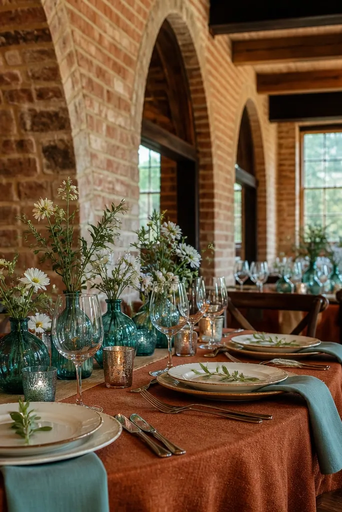
Sienna brown is a warm, earthy anchor that looks good with almost any fall venue texture. Soft teal adds a calm pop, and ivory keeps it bright and family-friendly for long dinners. This scheme works when you want a cozy look but your venue already has strong colors like brick or dark wood. It also keeps photos balanced because ivory prevents the teal from looking too saturated. Use sienna in table textiles and wood elements, then add teal in flowers and small decor touches.
Choose ivory for linens, plates, and signage. Add sienna brown through napkins, table runners, or a wood-toned centerpiece base. Then bring in soft teal with bouquets and small bud vases placed around the table perimeter so kids can still see faces across the table. Finish with warm candlelight to make the teal look rich instead of cold.
Quick tipIf soft teal looks too green, swap to a more gray-teal flower tone for a steadier color on camera.
Skip thisSkip bright turquoise; it can look out of place next to sienna brown.
24. Cream + Burnt Umber + Sage Smoke
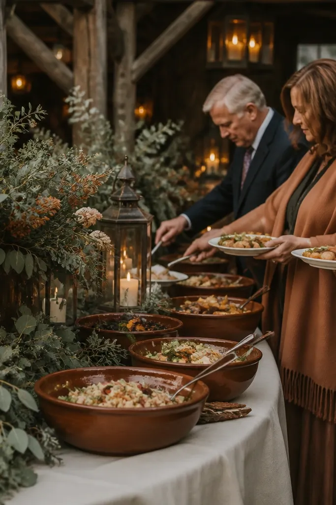
This is the “cozy neutral with fall color” palette that still looks styled. Burnt umber gives warmth without shouting, sage smoke adds a soft green haze, and cream keeps it clean and family-friendly for photos. It’s a great choice for couples who want their wedding to look like a fall editorial but still feel approachable for kids. The smoke tone also hides dirt and wear better than bright greens. Use burnt umber in wood, ceramics, and deeper floral petals.
Start with cream tablecloths and minimal paper goods in warm white. Add burnt umber through ceramics, wooden chargers, or darker floral clusters. Then use sage smoke greenery as the connecting thread across arrangements, aisle decor, and photo backdrops. Keep the overall contrast moderate — the look should feel warm and soft, not high-contrast and intense.
Quick tipUse sage smoke in garlands that repeat in the ceremony and reception spaces so the palette feels continuous.
Skip thisAvoid pairing with stark black; it fights the cozy warmth.
25. Olive Drab + Rust + Warm Cream
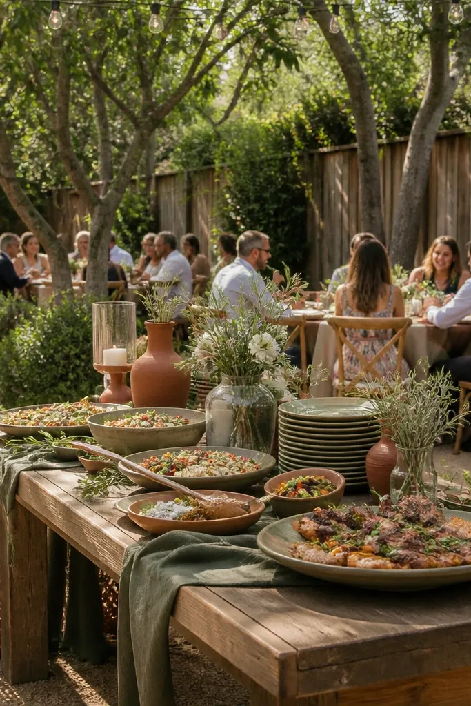
Olive drab plus rust is the outdoorsy fall combo that looks great in barns, backyards, and rustic venues. Warm cream keeps it family-friendly and prevents the room from feeling too heavy. This palette is especially photogenic when you have natural backgrounds like trees, hedges, or wooden fences. Kids also look good here because the colors are muted and don’t compete with outfits. Use rust as the “pop” and olive drab as the base, then let warm cream tie it together across place settings.
Choose warm cream for the table base and signage. Add olive drab through greenery — garlands, wreaths, and bud vases. Then place rust accents in napkins, floral stems, and a few statement centerpieces that are low and stable. For movement-friendly decor, keep everything off tall stands and use wide bases so it survives busy family photos and kids wandering.
If you’re doing aisle decor, use garlands instead of tall arrangements; they stay photogenic and safer around kids.
Avoid pairing rust with bright teal; it can look mismatched under warm fall lighting.



