
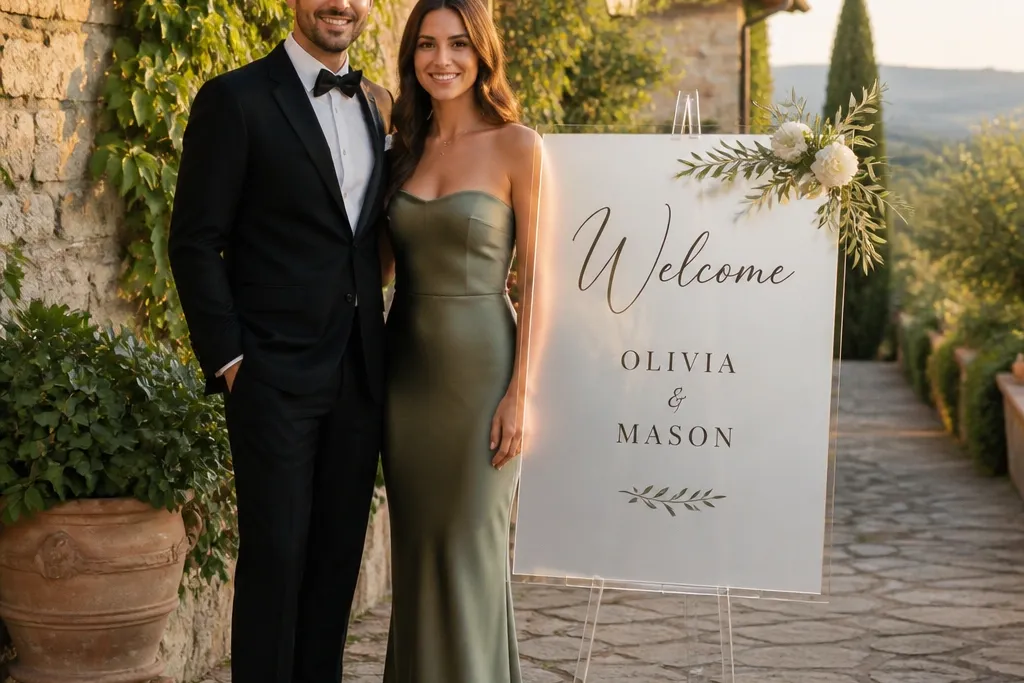
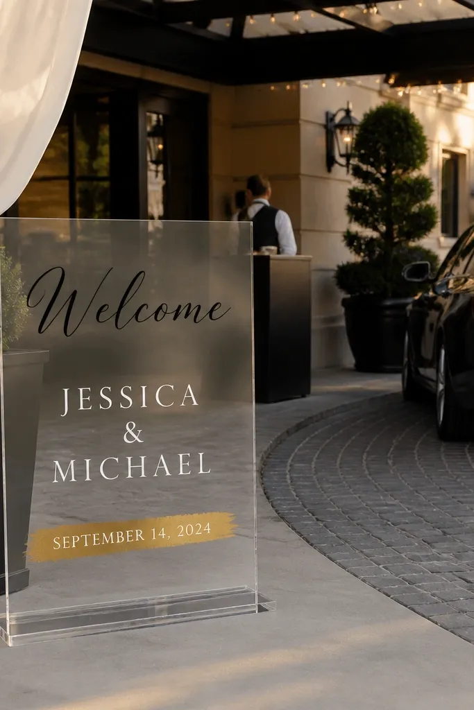
1. Frosted acrylic with white vinyl Welcome + gold date band
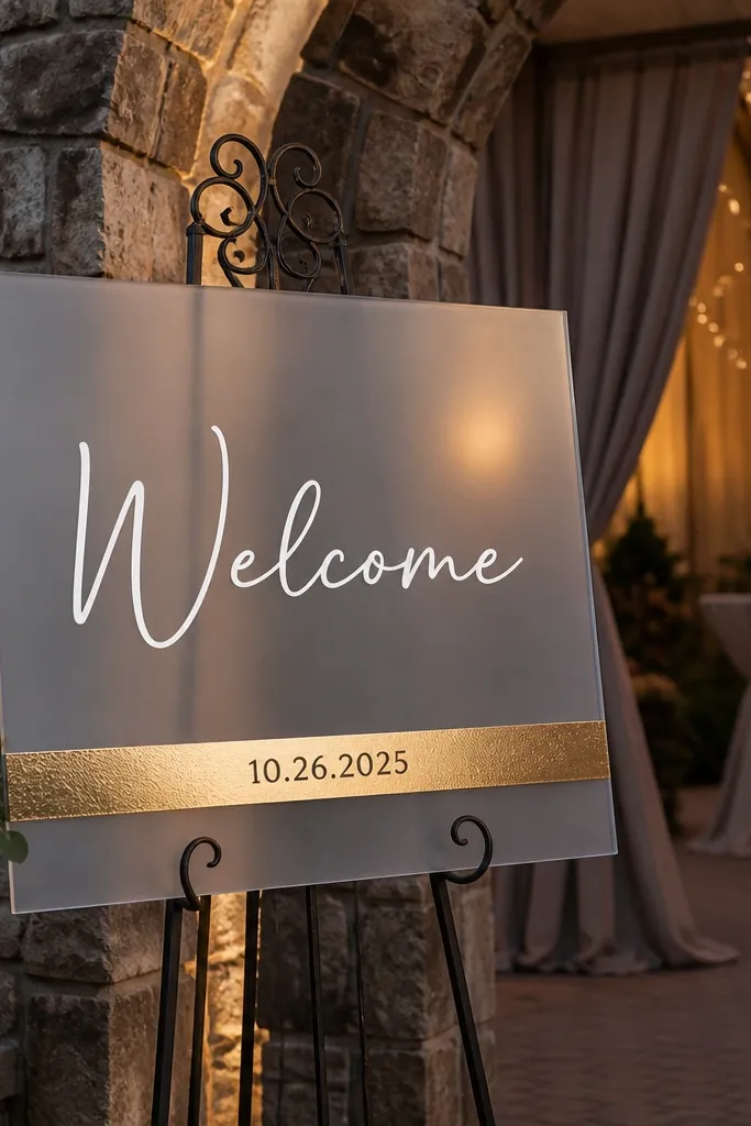
Start by picking a frosted acrylic sheet and placing the word “Welcome” as the largest text block centered at eye level. Then add a single horizontal gold band across the lower third and put the date inside it in a bold sans font. Finally, apply vinyl carefully with a squeegee and remove transfer tape slowly to avoid lifting edges.
This look is clean, modern, and forgiving for beginners. Frosted acrylic gives you that soft glow in photos, and white vinyl stays crisp against the muted background. The gold date band adds a warm accent without turning the whole sign into glitter overload. It’s especially good for evening weddings and venues with neutral décor, because the sign reads as “intentional” instead of flashy. Pair the date band with a simple typeface — no tiny flourishes — so guests can read it at a glance as they arrive.
Skip thisSkip thin script for the word “Welcome” — it blurs in bright light.
Quick tipIf you’re outdoors, mount it so it faces slightly off from direct sun to cut glare.
2. Clear acrylic with mirror-foil script for the couple's names
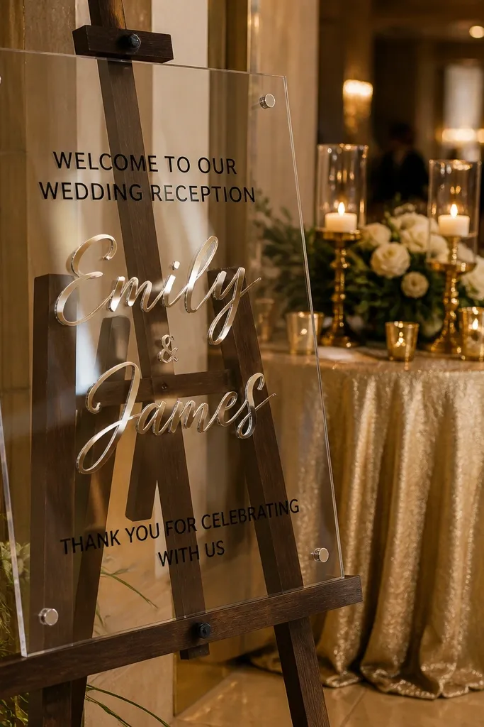
Clear acrylic plus mirror-foil lettering looks luxurious and very “designed,” even when you’re keeping the layout simple. The foil catches light and creates a high-end sparkle that shows up in venue photos. Use the mirror foil for the couple’s names only, so the rest stays readable with a solid color like black or deep charcoal. This style fits glam, modern, and hotel ballroom weddings where you want a polished welcome moment. It also photographs well at night because the foil reflects ambient lights instead of washing out.
Start with a clear acrylic base and keep the “Welcome” line small, centered, and in a solid font color. Then place the couple’s names in mirror-foil lettering as the hero element, centered and slightly larger than the welcome line. Finally, add the date and location details in a simple sans font below, using a non-foil color to maintain contrast.
Before final mounting, test the sign under the same lighting where photos will happen.
Don’t mirror-foil every line — full-foil text turns into a glare mess.
3. Layered acrylic monogram with frosted backing
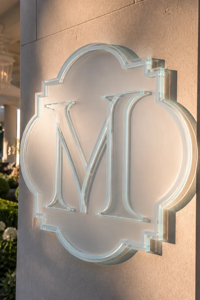
Start by choosing a monogram size that fills most of the sign, leaving a small top margin for “Welcome.” Then layer the monogram on top of frosted acrylic using standoffs or a layered adhesive spacer so it casts a visible shadow. Finally, add a short line under the monogram like the date or “Our Wedding Weekend” in a single small font.
Layered acrylic looks expensive because you get depth. The frosted backing softens the background while the top layer (clear or colored acrylic) makes the monogram pop. This is perfect if you want a wedding welcome sign that matches a monogram style used on menus or napkins. It also works for couples who don’t want a lot of text — the monogram carries the design. In photos, the shadow and edges create a clean outline that reads well from a distance.
Skip thisSkip tiny flourishes around the monogram; they get lost once the layers cast shadows.
Quick tipPick one font style for the monogram — mixing styles makes layered acrylic look busy.
4. Black acrylic with white cutout letters and tiny gold dots
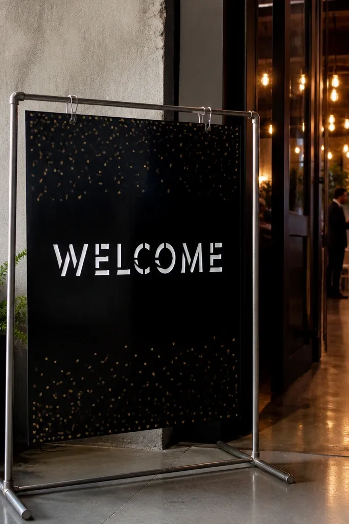
Black acrylic makes white lettering look bold and graphic, which reads instantly in photos. Cutout letters (or vinyl that looks like cutout) give you sharp edges instead of a flat sticker look. The tiny gold dot accents add a sense of celebration without cluttering the layout. This style fits modern venues, industrial spaces, and weddings that lean monochrome. It’s also great for daytime outdoor events because black background prevents the text from washing out.
Start by selecting black acrylic and mapping the layout so the “Welcome” line sits in the top half. Then apply or cut white letters large enough to be read from across the entrance. Finally, place a small row of gold dots as a divider between the welcome line and the date.
Use gold dots sparingly — 7 to 12 dots looks intentional, 30 looks like confetti.
Don’t use gray text on black acrylic; it dims in bright sun.
5. Frosted acrylic with pressed-flowers illustration in vinyl
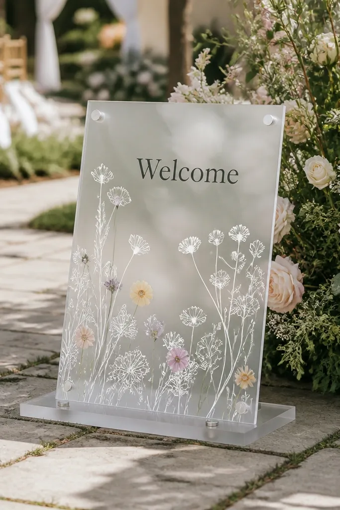
Start by placing “Welcome” as your center line in a readable serif or clean sans font. Then add a single-side pressed-flower cluster in vinyl along the edge of the sign, leaving clear space around it. Finally, add names and date in two lines below, using solid black or deep charcoal for contrast.
Pressed-flower illustrations give a soft, romantic look without needing real florals near the sign. The frosted base keeps the artwork muted and elegant, while vinyl allows the design to stay crisp and clean all day. Keep the botanical art small and placed on one side so the welcome text stays the focus. This works beautifully for garden weddings, spring weekends, and venues with lots of greenery. In photos, the botanical linework looks detailed but not messy, which is a big win over real dried flowers that can wilt or drop petals.
Skip thisAvoid full-coverage floral backgrounds; they blur when acrylic reflections hit.
Quick tipChoose line-art florals with fewer than 10 distinct stems so they don’t look crowded at scale.
6. Clear acrylic with skyline outline + Welcome text
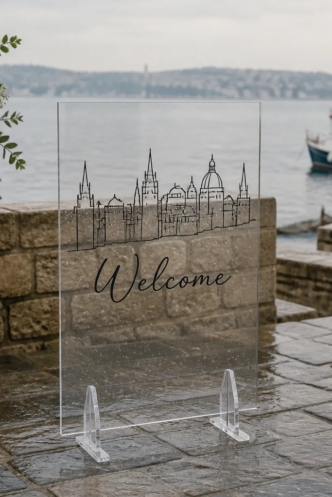
Start by selecting a skyline graphic in a single color that matches your wedding palette. Then place the outline near the top or behind the welcome line, with “Welcome” centered and larger than the skyline. Finally, add the date and location details below in a clean sans font, keeping spacing generous.
A thin skyline outline gives the sign a personal, travel-ready feel without turning it into a map poster. Clear acrylic makes the line art feel airy, and the outline style stays readable even from the back of a crowd. This works for destination weddings where the venue city matters, and it’s also a good option for couples who want something “modern travel” rather than florals. Keep the skyline simple and monochrome so it doesn’t compete with the welcome message. It’s photogenic because the outline catches light on the edges of the acrylic.
Skip thisSkip multi-color skyline art; reflections make it look messy in photos.
Quick tipIf your venue has a lot of signage nearby, go monochrome and thin-lined to avoid visual noise.
7. Acrylic sign with wedding weekend schedule blocks
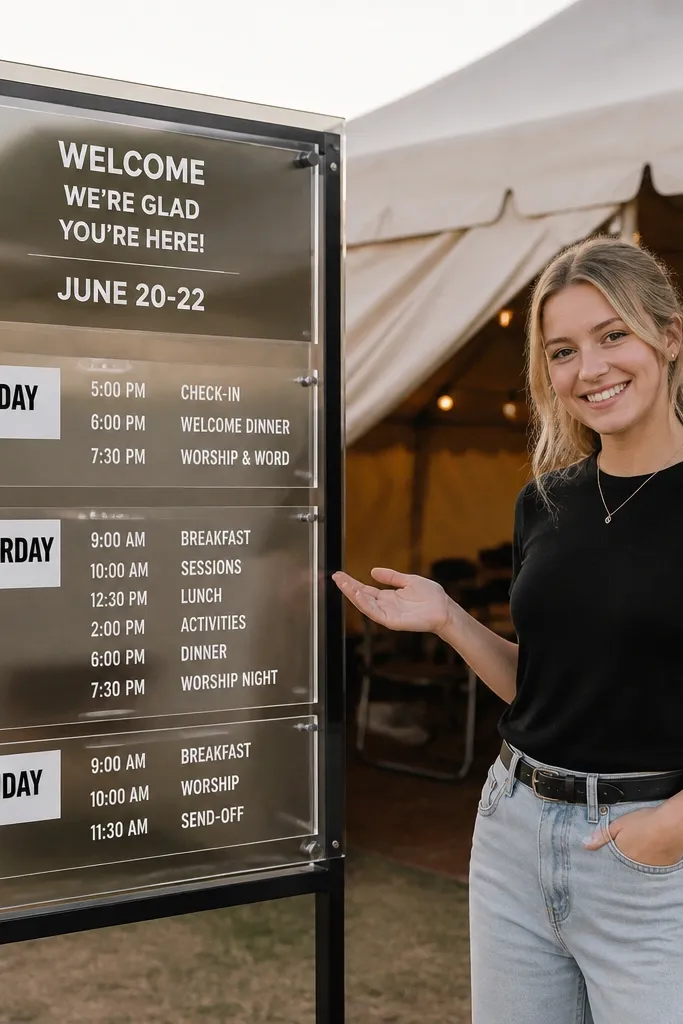
Start with a clear or frosted acrylic base and put “Welcome” at the top. Then create 3 to 5 stacked schedule blocks using solid rectangles or lightly outlined boxes, each with a bold time line and smaller event name. Finally, add a short line at the bottom like “See you at check-in” with contact details in a small font.
A welcome sign that includes a weekend schedule is practical and looks great if you keep the design structured. Use acrylic for the “floating” feel, then rely on crisp typographic blocks to make it photo-friendly. This is a strong choice when guests arrive on different days and need clear timing without hunting through emails. The look is modern and helpful in destination settings. Make the headings bold and the times larger than the event descriptions so the sign reads quickly at events.
Skip thisDon’t use tiny font sizes for event names — guests will squint, and photos won’t show the text.
Quick tipLimit to 5 blocks; too many lines shrink readability and kill the clean look.
8. Frosted acrylic with oversized Welcome script and monogram corner
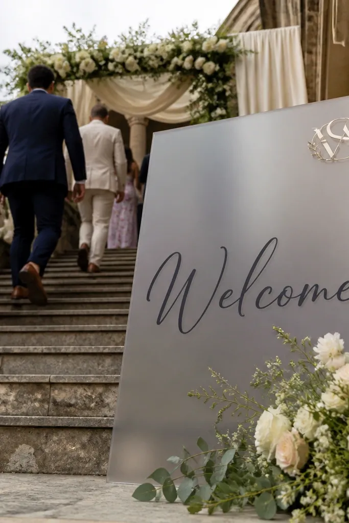
Start by placing “Welcome” as the largest element, centered vertically, using a legible script with thick strokes. Then add a monogram in one corner at about 15 to 20 percent of the sign width. Finally, put the date and names in a single small block along the bottom edge.
This design balances softness and clarity. Frosted acrylic makes the big script feel dreamy, while the monogram corner detail keeps it personal. It’s a photogenic choice because the large “Welcome” takes up space and frames guests as they walk in. The monogram corner adds a refined finishing touch without crowding the center. This style suits beach weddings, garden ceremonies, and any venue where you want the entry sign to feel light and airy.
Skip thisAvoid placing the date too close to the monogram; it makes the bottom feel cramped.
Quick tipChoose a script font with thick downstrokes; thin scripts look elegant up close but disappear in photos.
9. Clear acrylic with layered arrow route line to ceremony
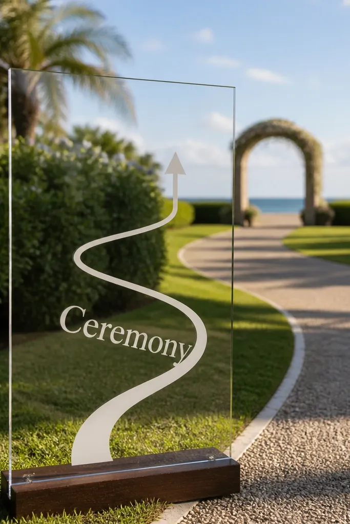
Start by placing “Welcome” at the top and “Ceremony” as the main destination label. Then draw a single route line with one arrow head, using vinyl or line-cut lettering in a strong color like black or deep green. Finally, add the time and location details in two short lines under the destination label.
An arrow route line makes a welcome sign feel helpful and intentional, especially for venues with multiple areas. Clear acrylic keeps the route looking like it’s floating, which photographs cleanly against grass, stone, or wood. Keep the arrow simple — one line, one direction — and let the text do the rest. This is great for outdoor weddings where guests need guidance from parking to ceremony. In photos, the arrow creates a directional visual that leads the eye toward the next step of the day.
Skip thisSkip multiple arrows and detours on one sign; it stops reading like a guide.
Quick tipIf your ceremony space is far, add a second sign at the fork instead of making one sign too crowded.
10. Black acrylic with gold foil frame border and white names
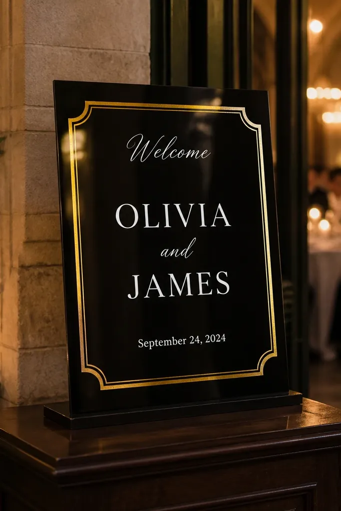
Start by choosing black acrylic and placing a gold vinyl or foil-look border around the edges with a consistent margin. Then center “Welcome” near the top and set the couple’s names in the largest white lettering in the middle. Finally, add the date in smaller white text in the bottom third, aligned to the center.
A gold frame border instantly makes acrylic feel formal. The black base makes the gold look deeper and the white names look crisp, which is why this works so well for evening weddings and indoor receptions. Keep the interior text simple: welcome on top, couple names in the center, date at the bottom. This style also photographs well because the border creates a defined rectangle that cameras love. It’s a strong option if you want a “classic ceremony entrance” look without adding a ton of decor.
Skip thisDon’t add extra gold icons inside the frame; the border already does the heavy lifting.
Quick tipKeep the border thickness around 1/2 to 1 inch so it reads as a frame, not a sticker.
11. Frosted acrylic with watercolor-style gradient date text
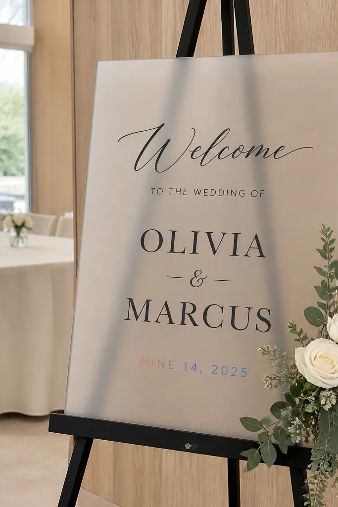
Start with frosted acrylic and set “Welcome” in solid black at the top. Then place the couple’s names in solid black or off-white in the center. Finally, apply a gradient effect only to the date line using pre-made gradient vinyl or layered color vinyl, then finish with small location text in black.
This look gives you color without turning the sign into a rainbow. Frosted acrylic keeps everything soft, and a watercolor-style gradient just on the date line adds movement that still reads cleanly. Use black or deep charcoal for the welcome and names so the gradient stays the accent. This is ideal for neutral wedding palettes where you want one pop of color. It also looks great in daylight because gradients blend smoothly rather than looking harsh.
Skip thisAvoid gradient for the full names; it makes letters less legible in photos.
Quick tipPick one gradient pair from your palette and stick to it (for example, dusty rose to peach).
12. Clear acrylic with bold typography only (no florals)
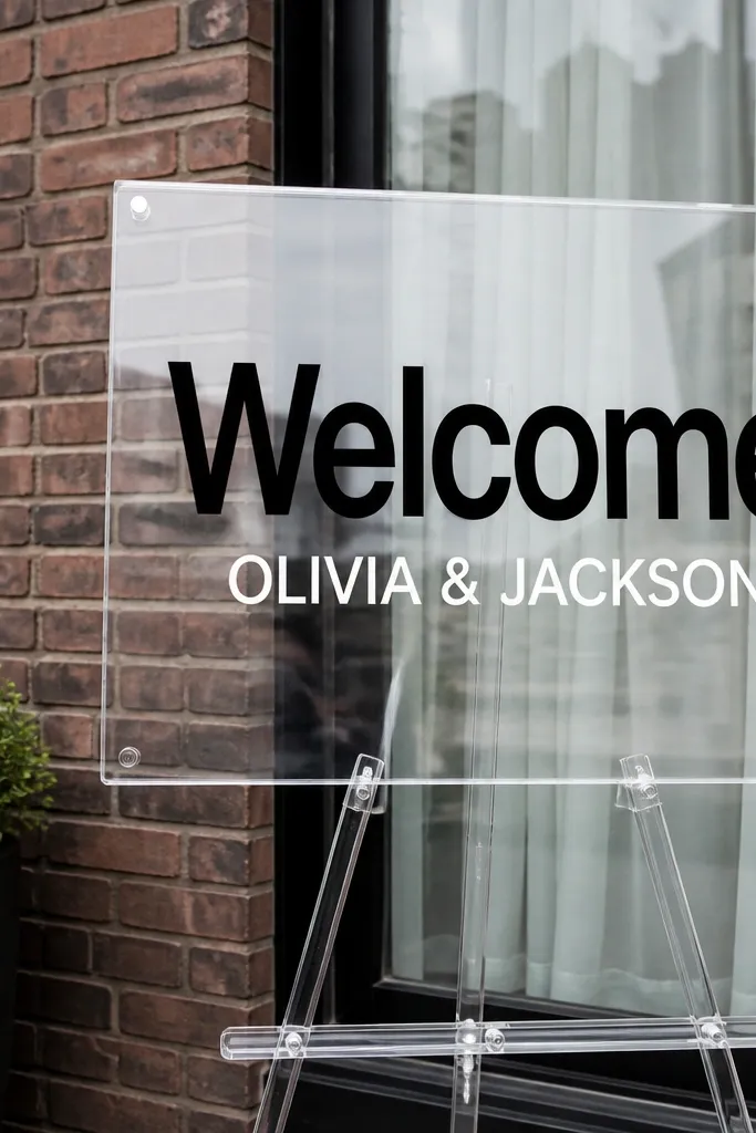
Start by selecting a clear acrylic base and choosing two fonts max: one for “Welcome” and one for names. Then set the layout in a strict grid: centered alignment, equal margins, and consistent line spacing. Finally, add a thin divider line between welcome and names, then include the date in a smaller size at the bottom.
Sometimes the cleanest acrylic welcome sign is just typography. Clear acrylic makes the text feel like it’s floating, and bold lettering reads sharply against almost any background. This is a beginner-friendly choice because you’re not relying on complex artwork. It fits modern, minimalist, and city weddings. Keep the design to 3 lines: Welcome, couple names, date, with one small divider line. The lack of decorative elements keeps the photo crisp and easy to crop.
Skip thisDon’t cram extra lines like venue address unless you have space for large text.
Quick tipChoose fonts with thick strokes; thin letterforms look good on paper and fail in real lighting.
13. Acrylic sign with monogram + citrus slice illustration
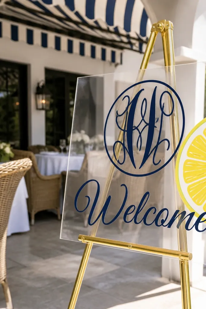
Start with frosted acrylic and place the monogram centered, sized to take up about half the sign height. Then add a small citrus slice illustration on one side, using one color that matches your palette. Finally, set “Welcome” above the monogram and put the date below in a bold, solid font.
Citrus slice accents make acrylic feel playful and summer-ready without needing real fruit. The monogram anchors the design so it doesn’t look like a generic summer poster. Use a single illustration style — simple line or flat vinyl — and keep it off to the side so the welcome text stays dominant. This works for outdoor weddings in warm months and destination beach weekends. In photos, the bright citrus line art pops against frosted acrylic and looks fresh even when the rest of the decor is simple.
Skip thisSkip multiple illustration types (no citrus plus florals plus stars) — it starts looking like a sticker sheet.
Quick tipPick one citrus color (lime, tangerine, or lemon) and match it to one other detail in your wedding decor.
14. Clear acrylic with subtle texture background and black text
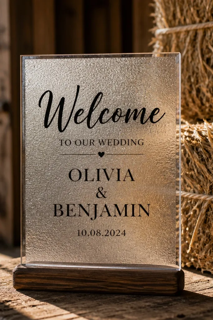
Start with clear acrylic and add a textured vinyl layer or frosted stencil behind the lettering area. Then apply black vinyl text in a centered layout, using thick fonts for the welcome line. Finally, add names and date below with consistent alignment and spacing so the sign looks like one clean block.
A subtle texture behind the text makes clear acrylic stop looking “empty” while still staying modern. It’s an easy way to get depth without adding heavy graphics. Black text stays readable, and the texture catches light in a gentle way that looks good in both indoor and outdoor photos. This style fits weddings where you want a clean look but don’t want plain clear acrylic. It’s also a practical choice because texture hides tiny imperfections and micro-scratches better than fully glossy clear surfaces.
Skip thisDon’t choose a textured background that’s too dark; it can make the text lose contrast.
Quick tipUse a texture that stays light and airy — heavy texture can reduce contrast.
15. Frosted acrylic with beach sand speckle and script names
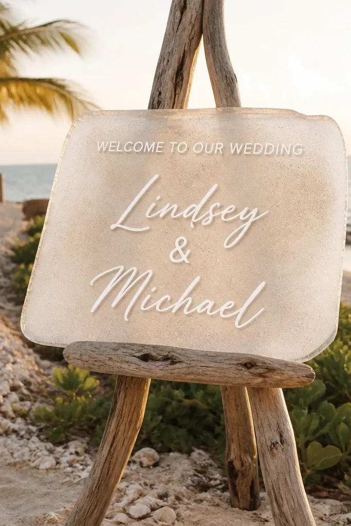
Sand speckle texture gives beach weddings a believable, grounded look. Frosted acrylic already softens glare, and the speckle adds a tactile feel that looks great on camera. Put your couple’s names in a readable script and keep the rest simple in solid type. This is a strong choice for destination ceremonies, especially if your welcome vibe is “relaxed but styled.” The speckle also makes the sign feel like it belongs in outdoor photos with grass, sand, or stone.
Start with frosted acrylic and apply or print a sand speckle texture only on the lower half of the sign. Then set “Welcome” and the date in solid black at the top, leaving a clear margin around the texture. Finally, place the couple’s names in script across the speckled area so the letters sit on a textured background.
Test the speckle density — too heavy makes the names look noisy.
Skip tiny script sizes; sand texture makes small letters harder to read.
16. Clear acrylic with watercolor florals in one corner
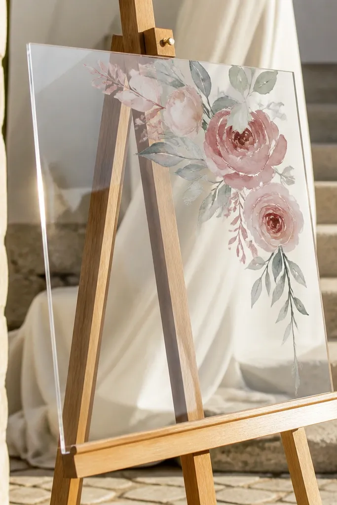
Watercolor florals in one corner add softness while keeping the sign easy to read. Clear acrylic makes the florals feel airy, and the one-corner placement prevents the design from fighting with the background. This style looks great when your venue has wood, stone, or neutral draping because the florals bring color without turning the whole sign busy. It’s also a beginner-friendly layout: you’re repeating one visual element rather than building a complex collage. Keep the welcome text in solid, high-contrast colors so it stays legible.
Start with clear acrylic and place “Welcome” centered near the top in a bold, solid font. Then add the watercolor floral cluster in the upper corner, leaving at least 2 to 3 inches of breathing room from the main text. Finally, put names and date in two lines centered below, using solid black or deep charcoal for clarity.
Use florals that are mostly one color family (like blush and rose) for cleaner photos.
Don’t spread florals across the entire sign; reflections make watercolor look smeared.
17. Acrylic welcome sign with map-pin icon and coordinates
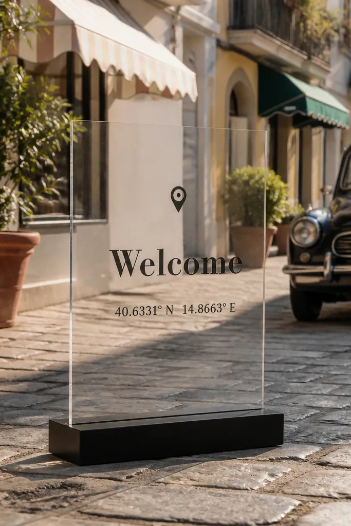
Coordinates and a map-pin icon make the welcome sign feel like a travel keepsake. The best part is it still reads like a wedding sign, not a travel blog graphic. Use the map-pin as a small icon near the top and keep the rest typographic. This style is ideal for couples who love destination weddings and want a subtle nod to where they’re celebrating. In photos, the icon adds a focal point while the coordinates add personality without crowding the layout.
Start with frosted acrylic for reduced glare, then place “Welcome” at the top and a small map-pin icon near it. Next, include the coordinates in a large, readable font (make them bigger than you think). Finally, add the couple’s names and date below in two lines, aligned center.
Write coordinates in decimal format and keep the digits consistent so it looks intentional.
Skip tiny coordinate text; guests need to read it, and cameras need it to show up.
18. Frosted acrylic with geometric border and bold date
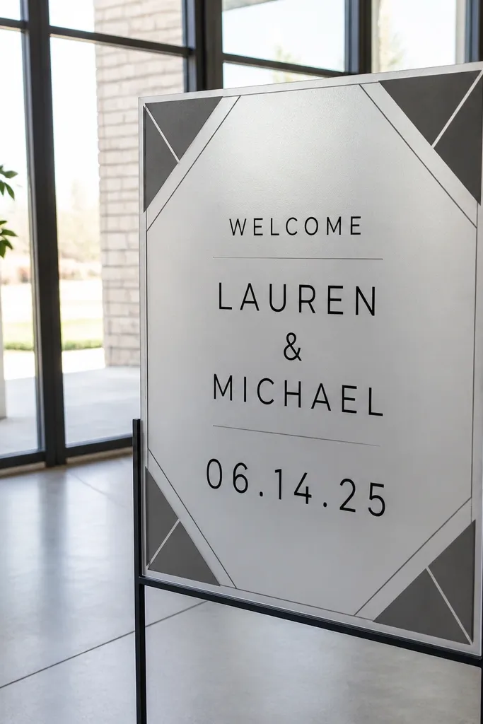
Start with frosted acrylic and add a geometric border using vinyl that matches your wedding accent color. Then center “Welcome” and the couple’s names inside the frame, using a clean sans font with thick strokes. Finally, make the date the largest text line under the names, aligned center within the border.
Geometric borders make acrylic feel modern and structured, which is great for receptions with clean lines and minimal florals. Frosted acrylic keeps the border from looking harsh, and a bold date becomes a visual anchor. This is a good choice for couples who want a graphic look that still feels wedding-appropriate. In photos, the border frames the text and helps the sign read as a finished design even when the background is busy. Keep the geometry simple so it doesn’t turn the sign into a pattern wall.
Skip thisDon’t add a second border style (like florals around geometry); it looks like mixed templates.
Quick tipUse one accent color for the border and one neutral for text so the design stays readable.
19. Clear acrylic with vintage-style emblem and script Welcome
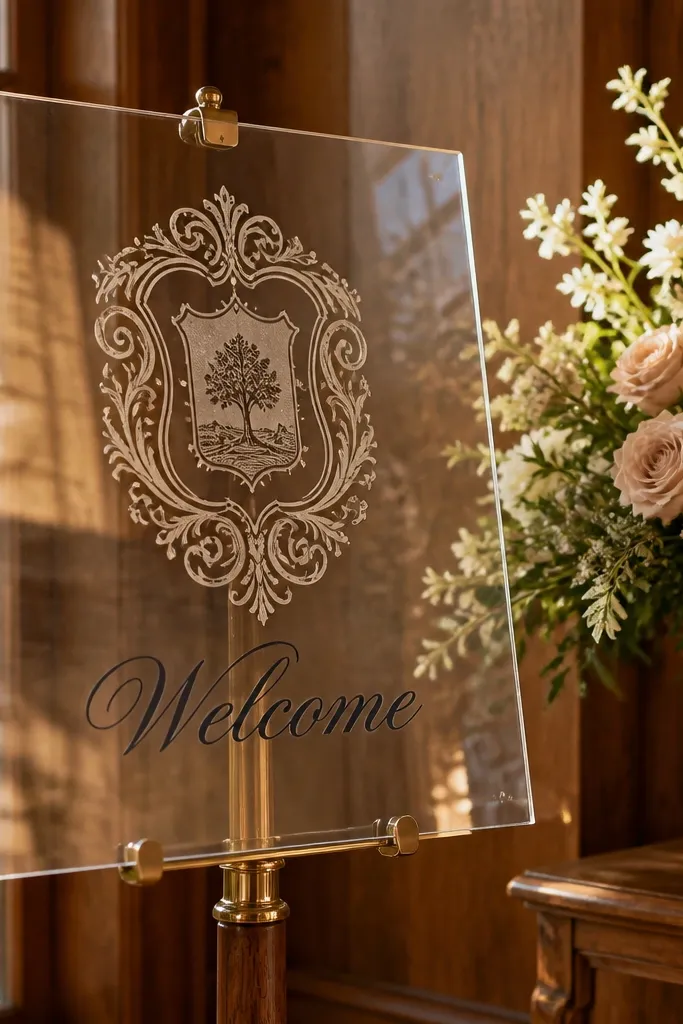
A vintage-style emblem gives you that old-soul wedding vibe without messy decor. Clear acrylic makes the emblem feel light, and script “Welcome” adds charm as long as the script is legible. Keep the emblem centered and limit extra decorative lines so it doesn’t look crowded. This style fits indoor ceremonies, classic venues, and couples who want romantic details but still want acrylic’s clean look. It also photographs well because the emblem creates a strong focal point for the camera to grab.
Start by choosing a vintage emblem graphic in one or two colors and placing it in the center of the sign. Then write “Welcome” in script above the emblem, sized to be readable from a few feet away. Finally, add names and date below in solid type, using spacing that keeps the emblem from touching the text.
If your venue is bright, avoid super-thin script strokes — they wash out.
Skip heavy scrollwork — it turns into visual clutter once reflections hit.
20. Pearl-ink acrylic with raised gold "WELCOME" and RSVP pocket
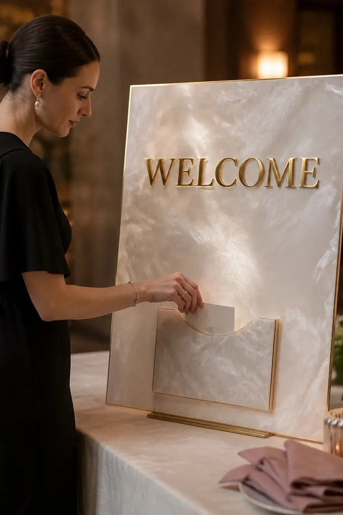
First, choose a pearl-ink acrylic sheet in 1/4 inch thickness so the gold vinyl has enough room to look raised. Cut or order a single-word “WELCOME” in gold vinyl, then add a small clear or pearl-ink pocket panel under it for RSVP cards; keep the pocket width around 5 inches so it’s easy to use. Second, mount the sign on a freestanding acrylic stand or standoffs and place it where guests naturally stop — near the entry or check-in. For travel planning, book your venue arrival day earlier than you think so you can set the sign in daylight; plan 30-45 minutes on-site for placement and quick photos. Expect to spend roughly $60-$140 total for acrylic, vinyl, and a pocket kit depending on size, and plan 1-2 hours to assemble if you’re doing it yourself.
This design looks expensive because the letters feel dimensional. Start with pearl-ink acrylic so the whole sign has a soft glow instead of a flat shine, then add raised gold vinyl for “WELCOME” so it catches daylight and looks great in photos. The extra RSVP pocket panel is practical and pretty — guests can slide cards in without hunting for a table. It’s a strong match for beach weddings, hotel lobbies, and garden venues because it reads clean from a distance but still feels romantic up close. It suits beginners because you’re using simple shapes and layering, not tiny cutwork.
Skip thisDon’t place the sign in direct harsh shade — pearl ink looks washed out unless it has soft daylight.
Quick tipIf you’re traveling, pack the acrylic in a flat box with rigid cardboard on both sides — pearl acrylic scratches easier than clear.



