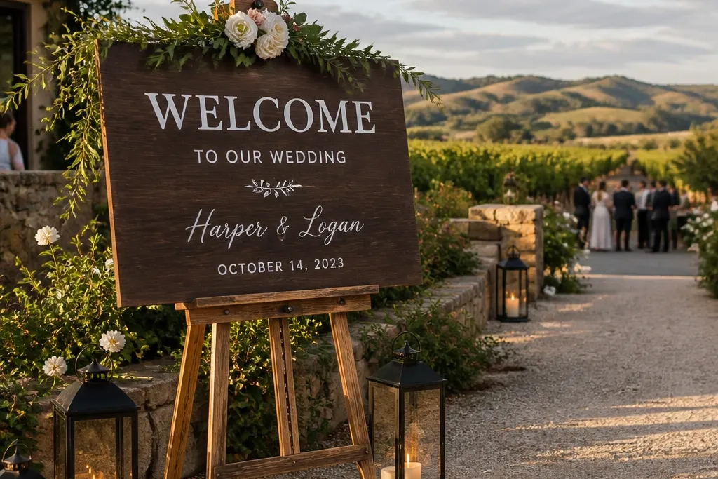

1. Charcoal-framed wood welcome with white vinyl script
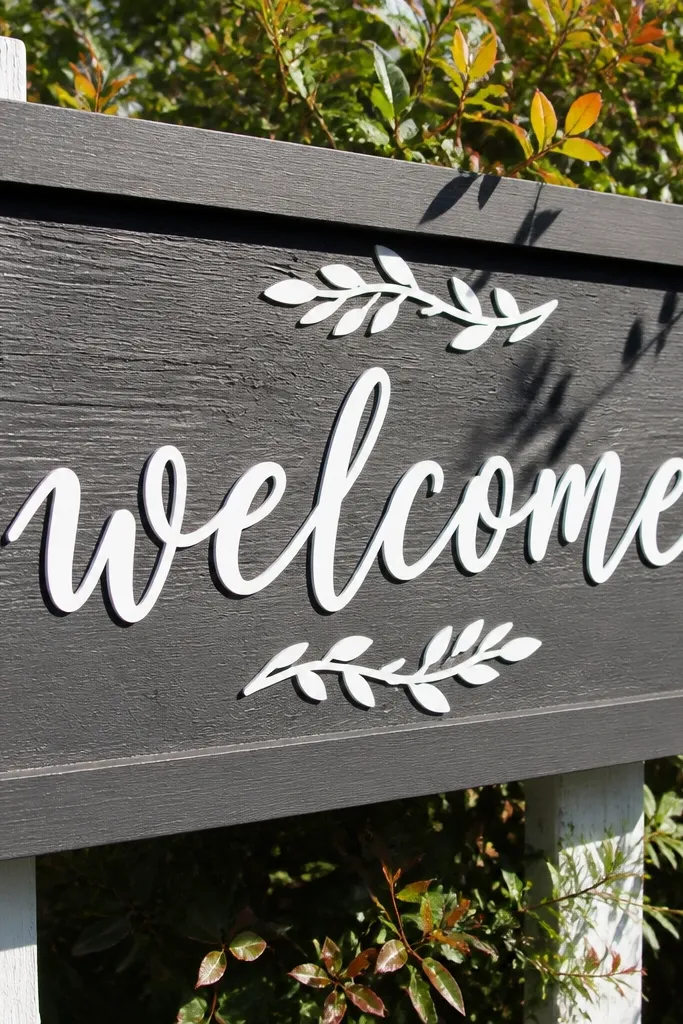
Start with a sealed wood board sized to your entry space, then add a charcoal frame around the edges so the sign reads as one unit. Cut white vinyl lettering for the main “Welcome” line and keep the supporting text smaller and centered. Place it on a door or easel so the sign is level with eye height from the approach path, not tilted upward.
This look works because it gives you a strong border that the eye locks onto, even when the background is busy like shrubs or a fence. The white vinyl script pops in both shade and sun, and the charcoal frame keeps the sign from looking washed out next to light-colored walls. It feels classic without being boring, which matters when your entrance photos include people in bright outfits. Use it at venues with natural textures — wood doors, garden gates, stone paths — where the frame visually “anchors” the scene.
Skip thisSkip thin, light-gray lettering — it looks pretty up close and disappears in wide entrance photos.
Quick tipIf your venue has strong overhead light, add a thin shadow effect under the script vinyl so the letters don’t blend into glare.
2. Acrylic welcome sign with printed insert and gold edge line
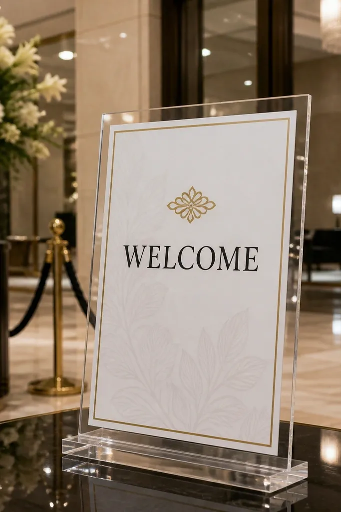
Order or cut a clear acrylic panel and insert a printed card behind it so the text stays sharp. Add a gold line border in the design file so it frames the message. Mount it on a stand at the entrance, then check readability from the sidewalk or driveway — acrylic can catch glare, so angle it until the letters look solid.
Acrylic reads clean in hotel lobbies and modern venues, where the background is smooth and bright. The printed insert gives you crisp typography, and the thin gold edge line adds that “designed” finish without going full glam. Photos love acrylic because it reflects ambient light and creates depth, especially when the sign is angled slightly toward the camera. This is a strong choice for itinerary 3 day wedding decor when you’re setting up once and want it to stay photogenic through multiple lighting conditions.
Skip thisDon’t go with all-white text on clear acrylic — it looks elegant in your hand and fades on camera.
Quick tipUse matte-finish acrylic or add a small anti-glare film if your venue has direct sun hitting the sign.
3. Chalkboard welcome on reclaimed door with aged frame
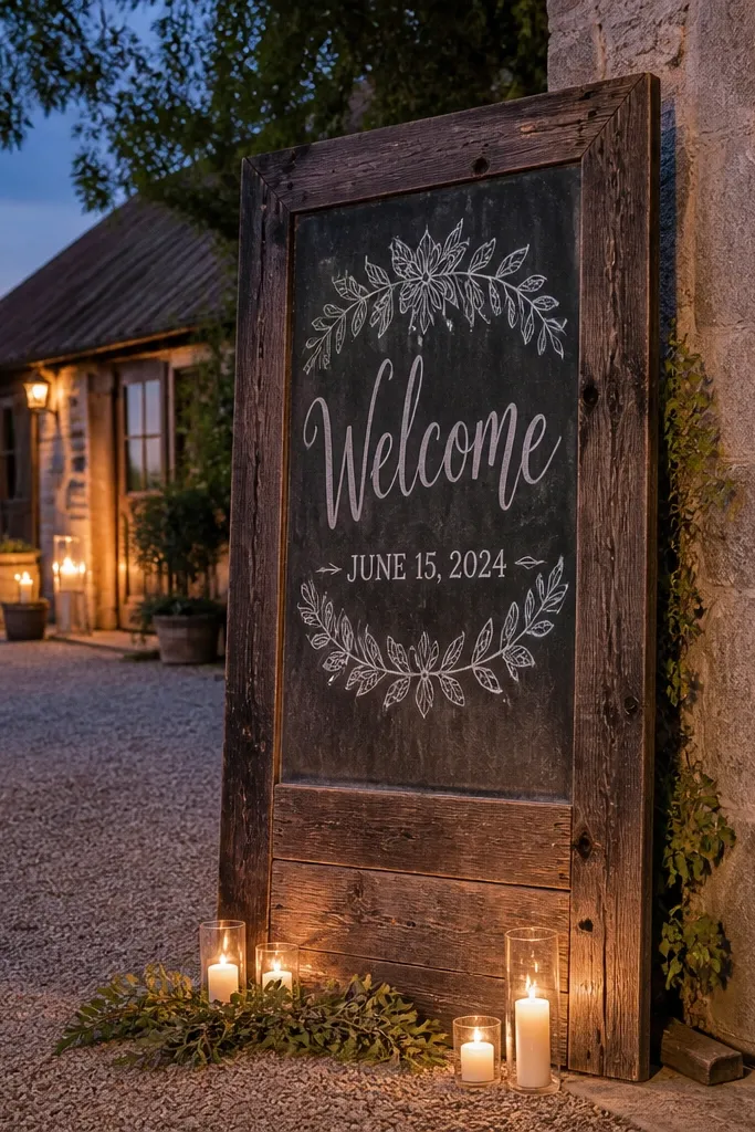
This is the “entrance story” option. The reclaimed door texture makes the sign feel like part of the venue, and chalk lettering adds a soft, handwritten vibe that looks great in outdoor evening photos. It also covers imperfections — small scuffs on the door add character instead of looking sloppy. Choose it for rustic barns, garden courtyards, and any space with warm wood tones where guests will gather for pre-ceremony photos.
Pick a door or door section, then mount a chalkboard panel on top with secure screws. Write your “Welcome” in large chalk script and keep the rest to a short line like date and location. Seal the chalkboard with a chalkboard-safe sealer if your venue is humid, then hang or prop the sign so the chalk text faces the main guest path.
Use a chalk pen for the thinnest details, so your date line stays crisp from a distance.
Avoid tiny font sizes — chalk reads softer, so small letters disappear fast.
4. Black foam board sign with oversized serif welcome and date block
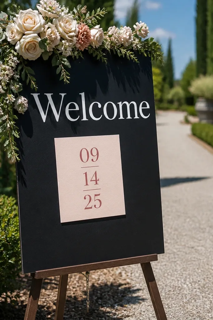
Cut foam board to a size that fits your entrance wall or easel, then add a bold “Welcome” in large white vinyl. Put the date and location in a smaller block with tight alignment so the layout looks intentional. Mount it on an easel or hang it flat using standoffs so it doesn’t bow and distort the text.
This is the “clean and readable” choice for outdoor light and mixed backgrounds. Black foam board with white lettering gives you maximum contrast, and oversized serif type looks expensive even when the materials are budget-friendly. Add a date block in a contrasting color like cream or dusty rose to prevent the sign from looking flat. It’s perfect when you want itinerary 3 day wedding decor to look consistent across days — the sign stays photogenic whether guests arrive in bright sun or late-day shade.
Skip thisSkip multi-color confetti lettering — it looks cute up close and messy in wide shots.
Quick tipPrint your date line on vinyl with a slightly condensed font for a sharper look at distance.
5. Greenery garland welcome sign with white backdrop board
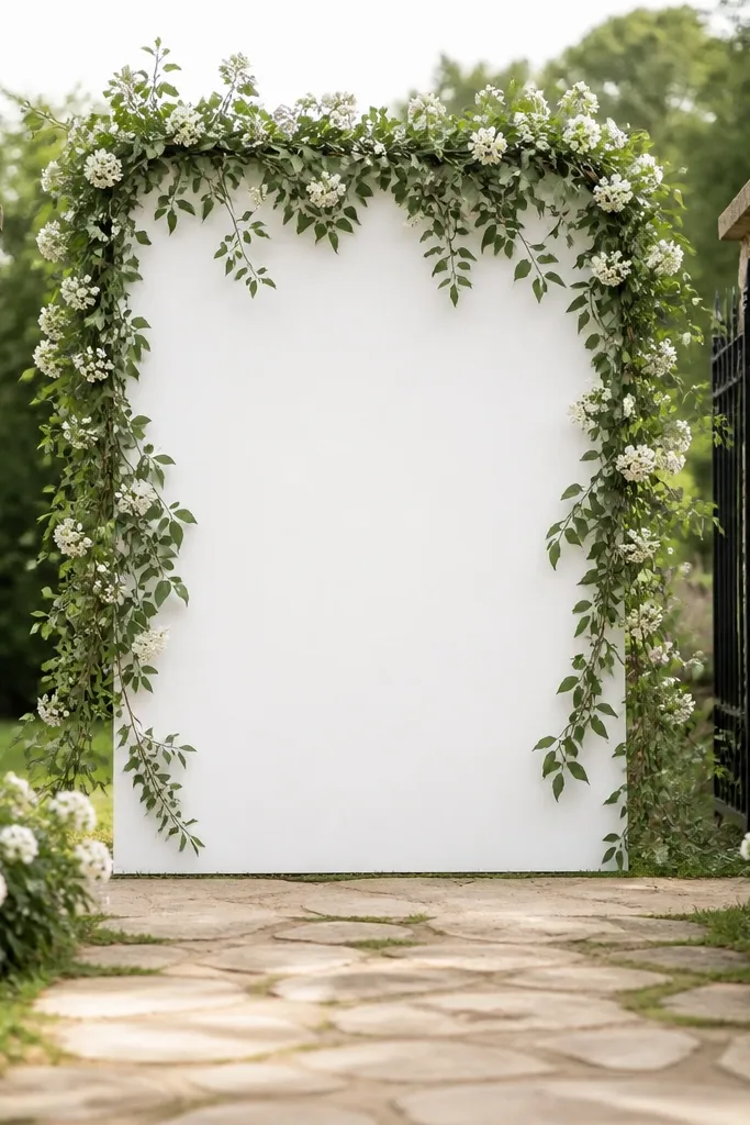
Start with a white board or framed white panel for contrast. Add your “Welcome” text in black or dark green, then drape a greenery garland across the top and down the sides using floral wire. Place it on a welcome table or an easel near the pathway so the garland frames guests as they pass.
Garland framing is one of the fastest ways to make a welcome sign feel “done” without building a whole display. The white backdrop keeps the main text readable, while greenery adds texture and motion that shows up in photos. Use this when your entrance is plain — a blank wall, a simple table, or a temporary setup. It also works for weddings where you want the sign to match aisle florals, because you can use the same greenery tones.
Skip thisDon’t let greenery cover the lettering — keep at least 2-3 inches of clear space around the text.
Quick tipAttach the garland with floral wire points every 6-8 inches so it doesn’t sag after an hour in heat.
6. Mirror welcome sign with printed script and faux gold corner accents
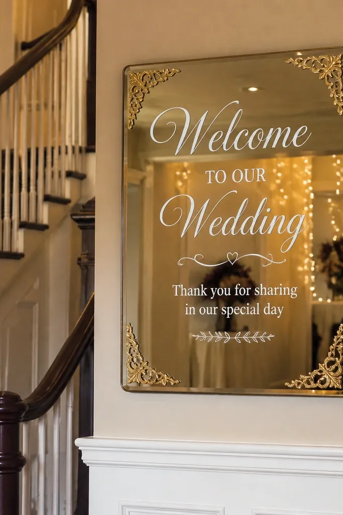
A mirror-style welcome sign gives you instant glam and also helps the sign look brighter in dim venues. Printed script stays readable, while the reflective surface adds depth behind guest faces in photos. It’s a smart pick for indoor entrances where the background is cluttered — the mirror visually “cleans” the scene. Keep the design minimal so the reflection doesn’t turn into visual noise.
Choose a small mirror panel or mirror-like acrylic stand sign. Apply a printed insert or vinyl script centered on the surface, then add simple gold corner accents to frame the message. Position it so it reflects the entrance lighting, not a bright window that causes glare — angle it slightly until the letters look solid.
Test in the actual venue lighting: mirror glare is the #1 reason this looks great in staging and bad in photos.
Skip busy borders — reflections amplify clutter.
7. Oversized watercolor-style welcome sign in blush and sage
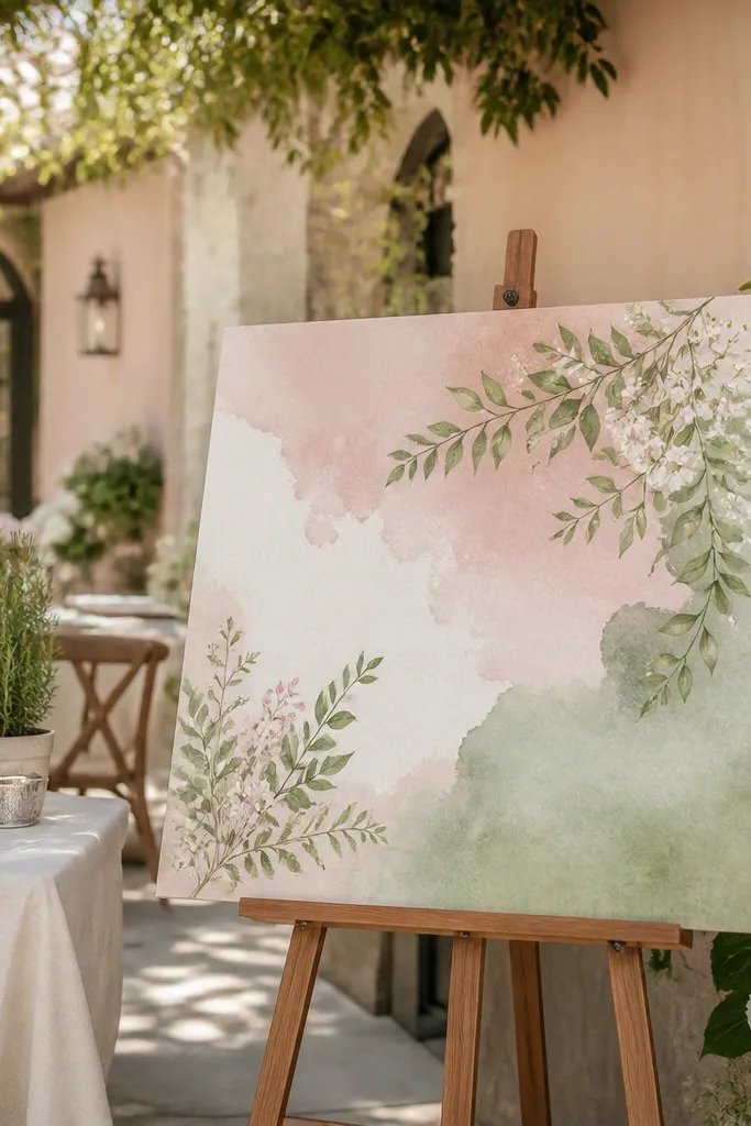
Print the watercolor background on cardstock or foam board and mount it to a backing for stability. Use dark charcoal or deep green for the “Welcome” text so it reads cleanly. Add a small date line in a simple sans serif, then place the sign on an easel or wall where it won’t be hit by direct sun.
If you want soft, aesthetic entrance photos, watercolor backgrounds do the job better than flat solid color. Blush and sage is a forgiving palette because it looks good with both warm and cool skin tones in photos. The trick is to keep the lettering darker than the background, so you don’t lose contrast. This style looks especially good for spring and early fall weddings and for indoor entrances with light walls.
Skip thisAvoid white lettering on watercolor — it looks airy up close and vanishes in wide shots.
Quick tipUse matte paper or matte laminate to stop the watercolor from shining under flash.
8. Terracotta tile welcome with black vinyl lettering
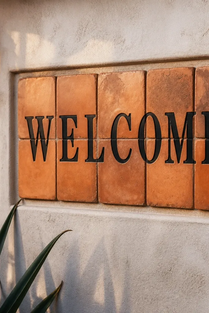
Terracotta tiles look grounded and photo-friendly because they add natural color variation that reads well in wide frames. Black vinyl lettering gives you strong contrast and a crisp edge, which is what you want for readability. This is a great option for outdoor entrances with stone, stucco, or desert landscaping. If your decor theme leans warm and earthy, this sign ties everything together without needing extra props.
Use a terracotta tile board or a set of tiles mounted to a backing panel so the sign is stable. Apply black vinyl lettering for the main “Welcome” and keep the date line short. Set it on a sturdy easel or mount it to a wall near the entry so guests see it as they approach.
Seal the tile backing and vinyl edges if it will face morning dew.
Skip glossy tile finishes — reflections can wash out the text.
9. White ladder welcome sign with framed print inserts
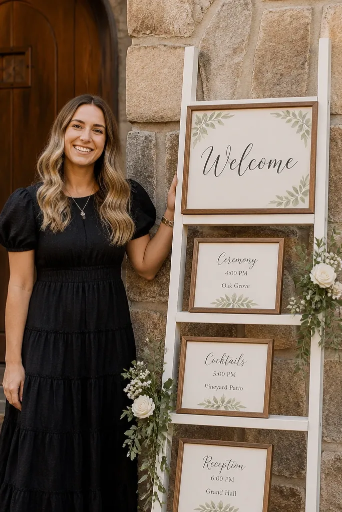
Find a stable ladder (leaning or standing) and place it where guests naturally line up for photos. Add framed prints with a bold “Welcome” on the top frame and a smaller date/location on the lower frame. Decorate the bottom with a short garland or greenery cluster, then secure frames so they don’t shift when people brush by.
A ladder setup gives you height and layered composition, which is why it looks so good in entrance photos. The framed print inserts keep the typography clean and consistent, and you can swap inserts for different events if you’re using the same setup across days. This works especially well for outdoor ceremonies with a clear photo line — the ladder creates a vertical anchor that the camera loves. Choose a ladder in white or natural wood so it doesn’t fight your wedding palette.
Skip thisDon’t overcrowd the ladder — too many elements make the welcome text hard to read.
Quick tipUse UV-protective frame glass or matte acrylic inserts if the sign will sit in bright sun.
10. Rustic burlap banner welcome with black hand-lettering
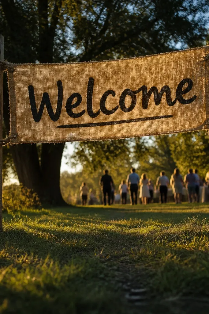
Measure the span between posts or use a frame so the banner hangs taut. Paint or letter the burlap with black fabric paint using a stencil for consistent letter shapes. Add a short date line in the same style, then attach with grommets and tie-down cords so it doesn’t sag.
Burlap banners look right at outdoor weddings because the fabric texture matches grass, wood, and warm lighting. Black hand-lettering feels personal and photogenic, and the stretched banner creates a clear line across the entrance. Keep it simple: big “Welcome” plus one short line underneath, so the banner reads in a single glance. This is a strong pick for ceremonies that start on a lawn or near a barn doorway where you want a visible arrival marker.
Skip thisAvoid long paragraphs — fabric banners read best with one message.
Quick tipSeal fabric paint with a fabric sealant so it doesn’t smear if anyone touches it.
11. Navy welcome sign with gold foil effect vinyl
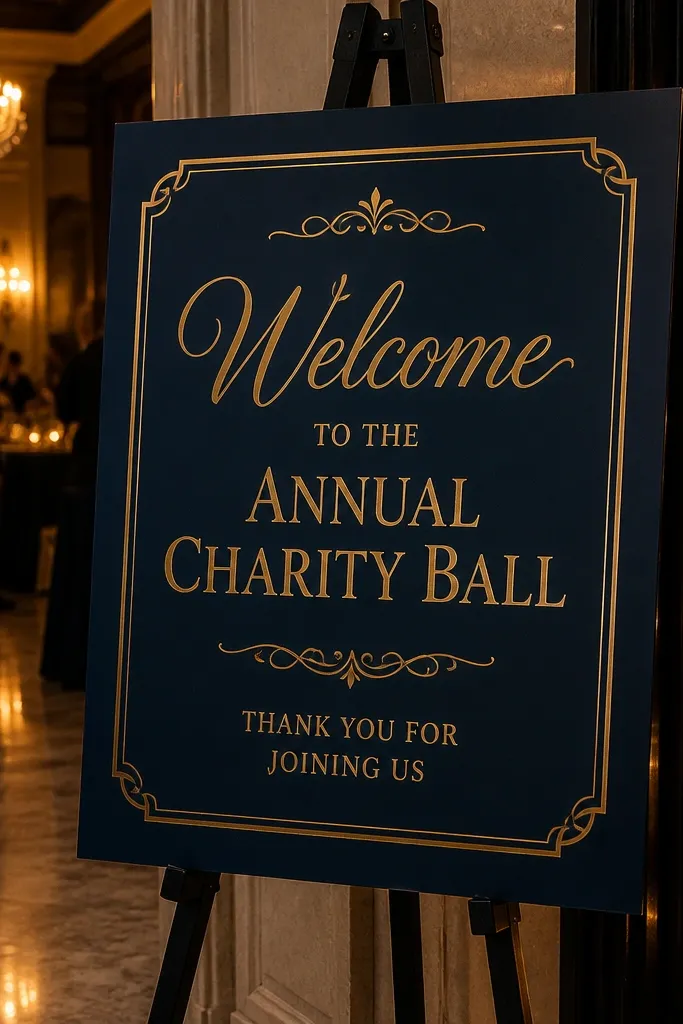
Choose a navy backing panel like foam board or painted wood. Apply a large “Welcome” in gold foil effect vinyl and add your date in smaller matching gold or cream. Mount it on a wall or easel and keep the sign centered on the main photo angle so the lettering stays straight.
Navy + gold reads instantly upscale in photos, and it stays legible in shade. Gold foil effect vinyl adds sparkle without the mess of real foil transfers. Use this for evening receptions, indoor ballrooms, and any venue where you want the entrance to look dramatic. The navy background also hides scuffs from transport, which matters when your itinerary 3 day wedding decor includes repeated setups.
Skip thisDon’t use thin gold outlines — they look like noise once the camera compresses the image.
Quick tipUse a vinyl cutter font with thick strokes so the gold lines don’t break in photos.
12. Terracotta arch welcome sign with cutout lettering
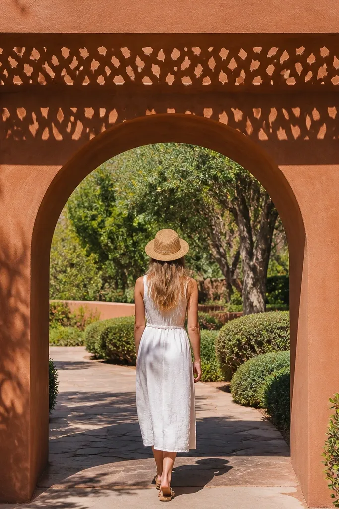
Build or buy an arch frame and attach a backing panel in a terracotta shade. Cut or apply lettering as solid vinyl or layered cutouts so shadows form behind the letters. Place the arch at the entry point where guests pass, then secure it with sandbags or weighted feet so it doesn’t wobble in wind.
An arch shape frames the guest path like a photo prop, so you get a natural “stunning entrance” composition. Cutout lettering adds shadow depth that looks great even with harsh lighting. This style suits garden gates, outdoor ceremony paths, and photos where guests walk through the entrance. Keep the palette warm and simple so the arch doesn’t fight your floral colors.
Skip thisAvoid tiny decorative cutouts — they look like clutter from across the lawn.
Quick tipUse matte backing for reduced glare — cutouts already create shadows, and shiny surfaces add unwanted highlights.
13. Farmhouse whiteboard welcome with black dry-erase style lettering
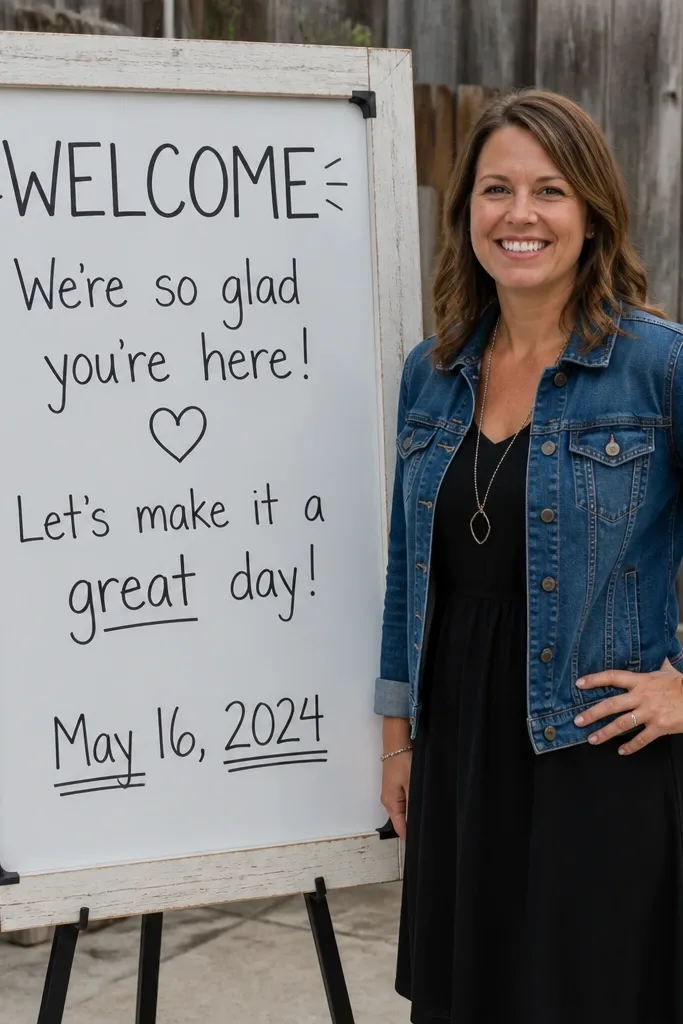
Use a real whiteboard or a painted board with a smooth surface. Write the “Welcome” line in thick black marker style (or apply black vinyl that mimics dry-erase thickness). Add a small date/location line at the bottom, then prop the board on an easel angled slightly toward the camera.
This one is practical and photogenic because the font style reads like a crisp hand label. The whiteboard surface reflects light evenly, which helps in cloudy weather or shaded courtyards. It’s also forgiving for revisions if your itinerary 3 day wedding decor includes itinerary changes like updated ceremony time or pickup instructions. Keep the design minimal so the welcome line is the hero.
Skip thisSkip small script — dry-erase style looks best with bold, chunky letterforms.
Quick tipIf you’re using vinyl, press firmly around corners so edges don’t lift and catch light.
14. Sequin-framed welcome sign with clear acrylic insert
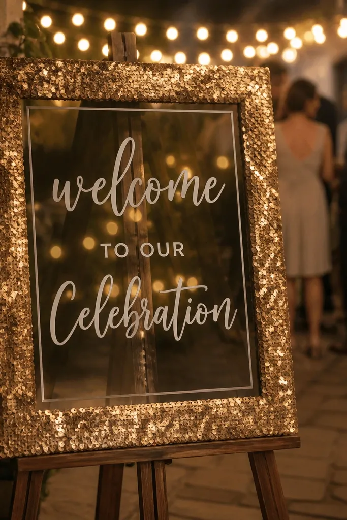
A sequin frame gives you that party sparkle right at the entrance, and it shows up in photos without needing heavy lighting. The clear acrylic insert keeps the typography crisp and readable, so you get glam and function. This is a great move for evening weddings, indoor receptions, and venues with string lights where reflections look intentional. Keep the center text simple and large so guests don’t have to search for it.
Start with a clear acrylic panel or acrylic stand and build a sequin frame around it using hot glue or a stitched fabric border. Apply a bold “Welcome” text in a contrasting color inside the insert. Place it near a warm light source, then angle it so sequins glitter but don’t create lens flare over the letters.
Use larger sequin sizes (not micro) so the sparkle reads as texture instead of random noise.
Don’t add extra text — the frame is the decoration, the welcome line stays clean.
15. Black-and-white striped welcome sign with red date stamp
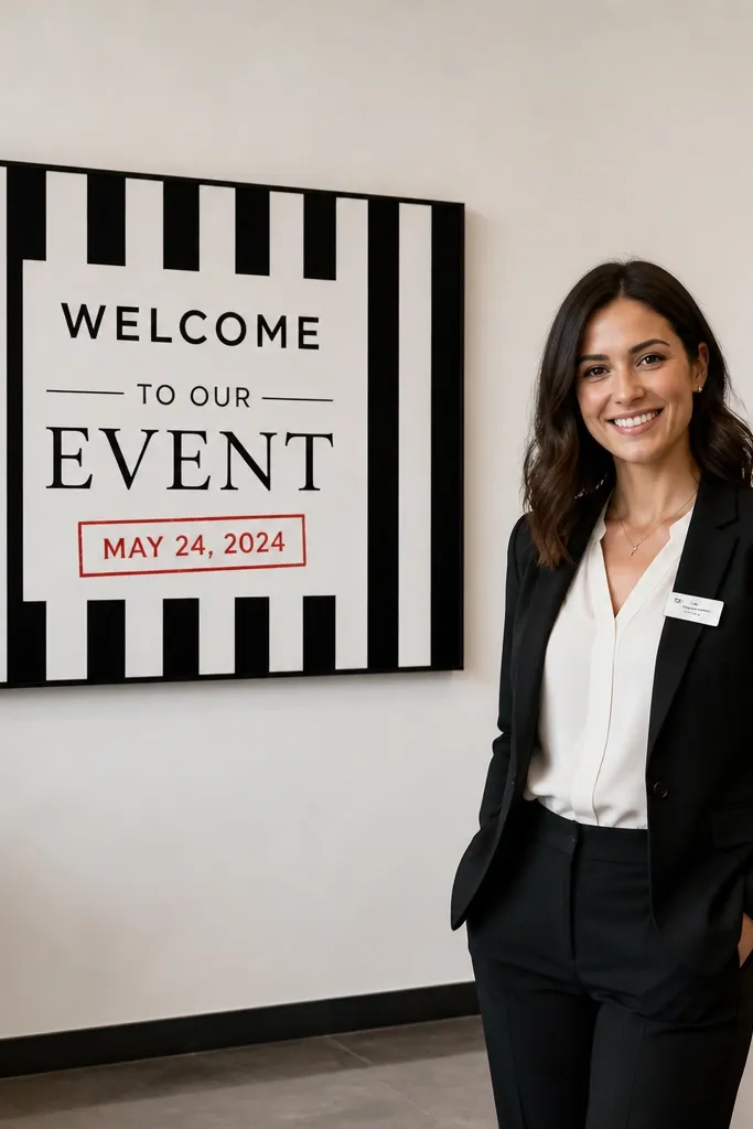
Print or paint a black-and-white striped background on a backing panel. Add a centered “Welcome” in a bold sans serif in black or white, then include the date/location in a red circular stamp style. Mount on an easel and place it where guests line up for the first wide photo.
This is the “graphic design” option that stands out fast in entrance photos. Stripes create motion and guide the eye, while a red date stamp acts like a visual stamp of approval. It’s perfect for modern venues and for weddings that want a playful, fashion-forward vibe without adding a lot of props. The key is keeping the main message clean and centered so the stripes don’t compete with readability.
Skip thisSkip cursive for the welcome line — stripes already add personality, so keep the lettering simple.
Quick tipUse a matte finish on the stripes so the red stamp doesn’t look shiny under flash.
16. Soft sage fabric banner welcome with gold thread effect
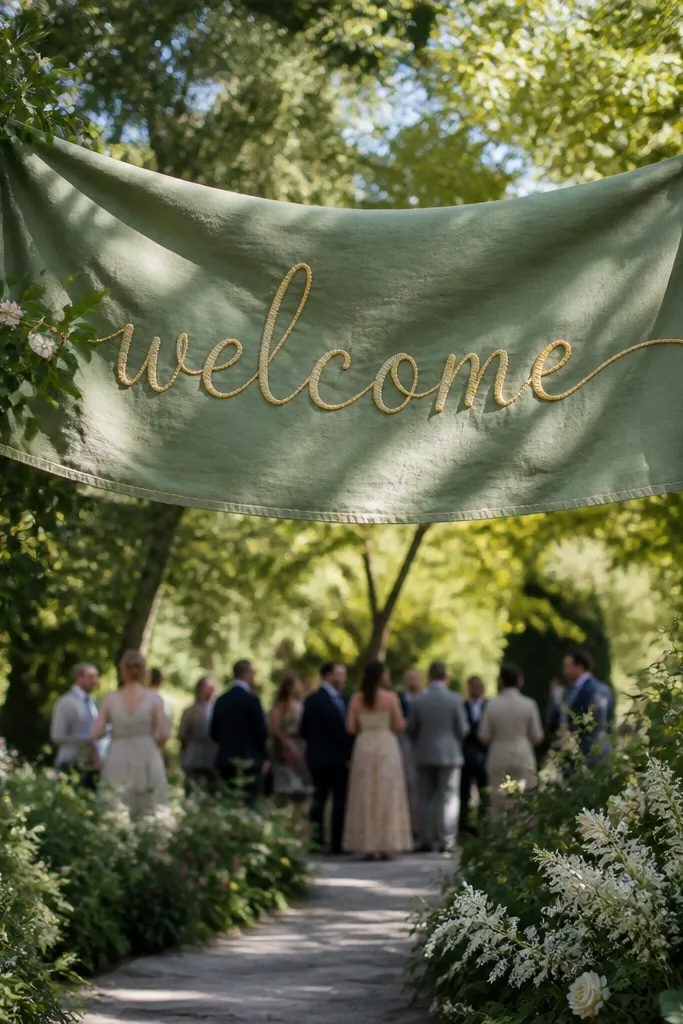
Use a soft sage fabric strip and attach it to a simple frame or two hooks so it hangs evenly. Apply gold thread effect vinyl or embroidered-style lettering in the center for a premium look. Add a short date line in a smaller font, then position it at the entry where it catches airflow from a door or walkway for natural movement.
Fabric banners feel romantic and photograph beautifully when they hang with gentle folds instead of looking stretched tight. Sage keeps it calm and modern, and a gold thread effect text adds warmth without turning into full glam. This works for outdoor entrances with natural light and also for indoor venues with warm wall colors. It’s especially good if you want your welcome sign to match table linens or bridesmaid dresses in the same palette.
Skip thisAvoid stiff fabric — stiff banners look like a flag and read harsh in photos.
Quick tipHang it so the folds fall across the text area — flat fabric looks less photogenic.
17. Long welcome bar sign for entry tables with layered florals
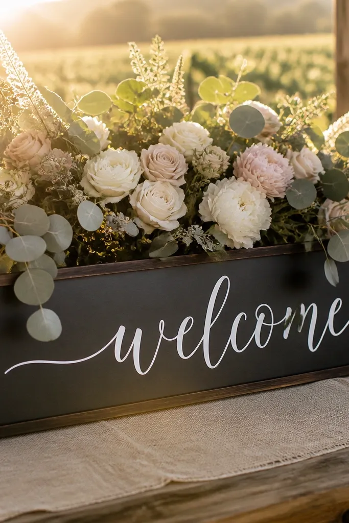
If your entrance setup includes a welcome table, a long bar sign gives you a strong horizontal composition that looks good in both portrait and landscape photos. The layered florals behind it create depth, while the long shape makes the message visible even when guests stop at different spots. Choose this style when your venue has a lot of movement around the sign, like a lobby with foot traffic or a garden entry with a check-in table. Keep the typography bold and centered so it doesn’t get lost in floral texture.
Start with a long backing board that matches your table width, then mount it at the back of the welcome table. Put “Welcome” in large lettering, then add date and location in a smaller line underneath. Build a simple floral layer behind the sign using greenery first, then add a few bigger blooms so the sign stays readable.
Use a matte backing board to prevent reflections from the table surface.
Don’t place the sign too low — if guests take photos while standing, the letters will be cut off.
18. Vintage postcard collage welcome sign with bold header
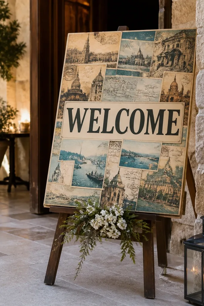
Choose a backing panel and arrange postcard-sized prints in a grid so the collage doesn’t look random. Add a bold “Welcome” header at the top in a contrasting color, then keep the date line smaller and clean. Seal the collage with a clear matte laminate or protective spray so it doesn’t scuff when handled for setup.
A postcard collage makes the welcome sign feel story-driven and photo-worthy without needing elaborate florals. The vintage prints add texture and color variation that fills the frame, while a bold header keeps the message clear. This style works best for weddings with travel themes, city venues, or destinations where guests will recognize the vibe. It’s also great for indoor entrances because paper textures photograph well under soft lighting.
Skip thisAvoid too many different font styles in the header — keep it to one strong font.
Quick tipUse a consistent border color around each postcard to keep the collage looking designed, not messy.
19. Monogram welcome sign with oversized initials and small date
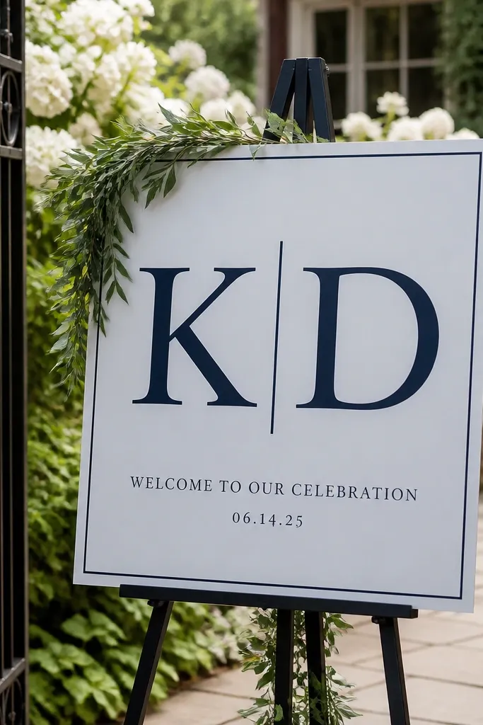
Design a layout with oversized initials centered and a smaller welcome line underneath. Print or cut the lettering in a high-contrast palette, then mount it on a backing panel that matches your venue colors. Place the sign at the main photo angle and ensure the monogram is at least chest-height so it fills the frame.
Monograms look stunning in entrance photos because they create a focal point that stands out even when the background is busy. The trick is to keep the welcome text present — guests should still know it’s a welcome sign, not just decor. Pair oversized initials with a smaller “Welcome to our celebration” line so the sign reads instantly. This is a strong choice for upscale indoor venues and for weddings where you want a brand-like look that matches invitations.
Skip thisAvoid monograms only — guests still need a clear welcome message from far away.
Quick tipUse one color for the initials and one for the text line to keep the look crisp.
20. Florals clipped to a frame welcome sign with craft paper backing
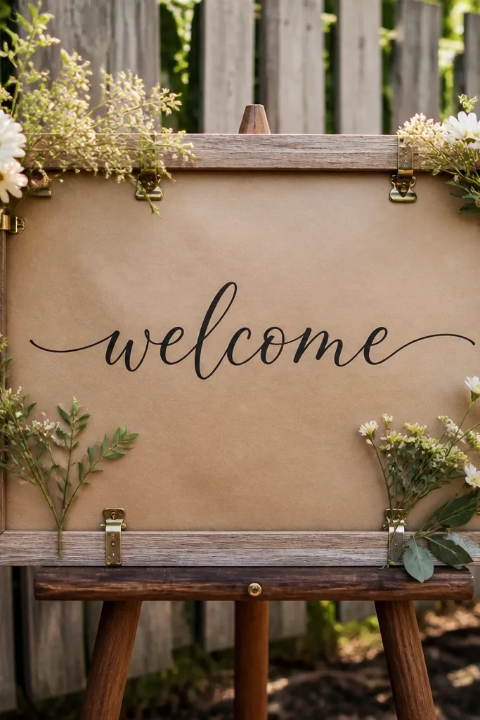
Use a simple wood frame and attach craft paper inside with staples or clips. Add your “Welcome” text in dark ink vinyl or paint, then clip small greenery and blooms to the frame edges using binder clips or floral clothespins. Place it on an easel or wall mount so the paper stays flat and the clipped florals don’t droop.
This is the “soft, artisanal” welcome sign that looks hand-made but still reads clean in photos. Craft paper backing warms up the image, and clipped florals add a casual texture that feels intentional. It’s best for garden weddings and venues with rustic wood or neutral interiors. The frame keeps everything aligned, so the sign looks neat even if the florals are airy.
Skip thisDon’t let the florals cover the text block — keep them around the edges.
Quick tipClip florals in clusters of three, not single stems, so the frame fills the space nicely on camera.
21. White frame chalk welcome with terracotta accents
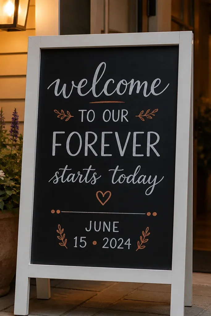
Start with a chalkboard panel in a white frame so the border stays crisp. Write “Welcome” in large chalk script and add the date in terracotta-colored chalk or paint with a stencil. Mount it at eye level and angle it slightly away from direct light to reduce chalk glare.
A white-framed chalkboard gives you that airy contrast that works in both bright outdoor light and indoor evening lighting. Terracotta accents on the date line add warmth and make the design feel cohesive with clay or terracotta table decor. Chalk lettering looks soft and human, but the frame keeps it from looking messy. This is a good fit for spring weddings and for venues that already have a lot of neutral surfaces.
Skip thisAvoid smudged chalk — wipe and rewrite right before setup.
Quick tipUse a stencil for the date so it stays readable from 20 feet.
22. Modern typography welcome sign on black slatted wood
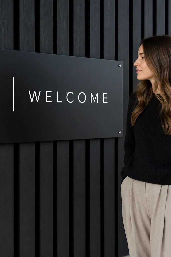
Black slatted wood gives you a built-in texture that looks expensive in photos without adding extra decor. White modern typography stays crisp against the dark background, and the slats create subtle lines that guide the eye toward the main message. This style suits modern venues, city lofts, and indoor entrances where you want a clean, graphic look. It also stands up well to busy backgrounds because the sign’s texture is part of the design.
Use a slatted wood backing painted black and mount it on an easel or wall. Apply white vinyl typography in a bold sans serif, keeping letter spacing consistent. Add the date and location in a smaller line and place the sign where it won’t be blocked by people taking photos.
Matte paint on the wood prevents reflections that can blur the letters.
Skip overly thin fonts — the slats already add texture, so the lettering needs weight.
23. Rattan-framed welcome sign with woven texture background
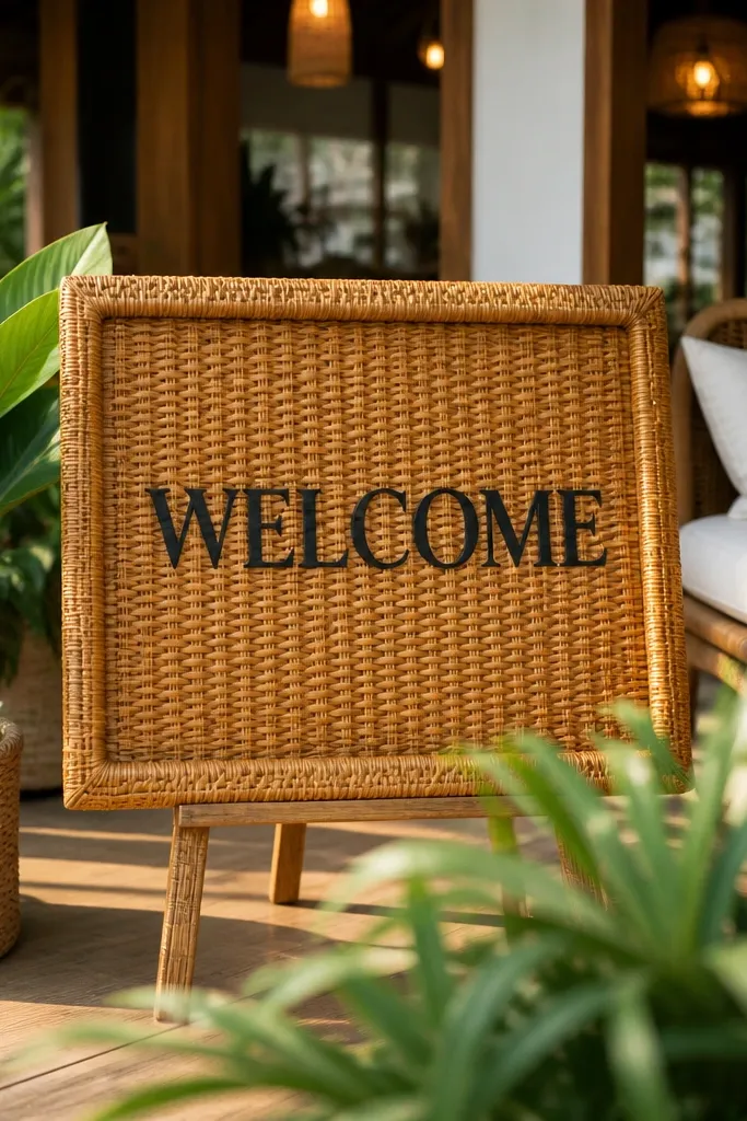
Choose a rattan or woven frame and insert a flat backing panel in a similar neutral tone for the lettering. Apply dark vinyl for “Welcome” and add a small date/location line underneath. Place it on a weighted stand near the entry path so it’s visible as guests approach, not tucked beside a table.
Woven texture makes the welcome sign feel warm and intentional, especially in outdoor or patio entrances. A rattan frame gives you a natural border, and a woven background adds depth that looks good in golden hour photos. Pair it with dark lettering so the text stays readable against the texture. This is a great choice for destination weddings, beach-adjacent venues, and any setting where you want the decor to feel tactile rather than flat.
Skip thisAvoid light lettering on light weave — contrast disappears fast.
Quick tipUse a backing panel behind the woven texture so the letters don’t sink into the weave.
24. Vintage suitcase welcome with airport-style gate board
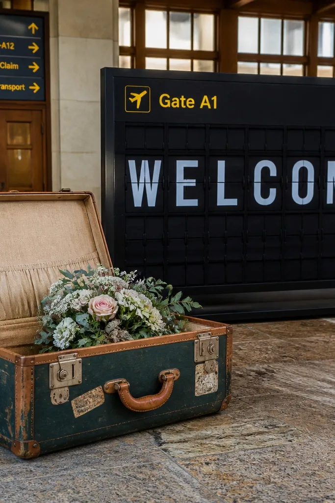
This setup looks like you walked straight out of a travel terminal — but it’s still soft enough for a wedding entrance. The suitcase reads nostalgic and personal, and the gate board gives you that big, readable “welcome” from across the walkway. Add a small floral spray inside the suitcase lid and the whole thing photographs cleanly because the colors stay contained. It fits couples who want a travel theme without going full cartoon. It works best in spring through early fall when you can lean into fresh greens and daylight photos. Plan for it at an outdoor entry, a courtyard, or a hotel driveway where you’ll have space to step back for the shot.
Step 1: Choose a real vintage suitcase or a high-quality faux one with a sturdy lid. Put a gate-style board inside (foam board or thin plywood painted matte) and write “WELCOME” in large block letters, then add your names and date in smaller lines. Step 2: Place the suitcase on a low stand or crate so the top sits at about 48-52 inches tall for camera-friendly sightlines. Step 3: For travel logistics, aim to build it the day before arrival and pack it in one hard-sided case; the gate board is the part that needs protection. Step 4: Budget about $35-$70 for materials if you already own the suitcase, and $20-$40 for florals; spend 60-90 minutes total assembly. Step 5: Book your venue and any rental furniture early if you’re using a courtyard or driveway with limited access.
Use matte paint or matte vinyl for the gate board so it doesn’t glare in bright sun. Pack a small roll of painter’s tape — it helps you re-center the sign quickly at the venue.
Don’t pick glossy vinyl or laminate on the board — it looks great indoors and turns into glare outdoors.
25. Terrarium glass frame welcome with moss base and hanging tags
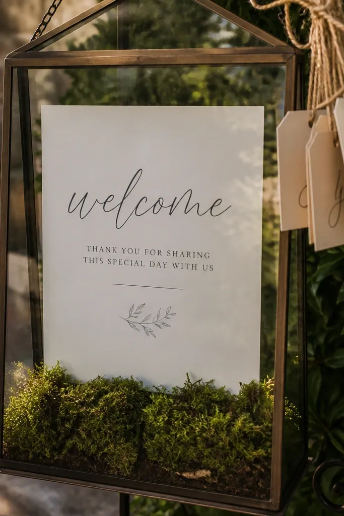
This is a welcome sign that feels like an installation, not a flat board. A glass-front frame catches light and gives you layers — moss under the sign, then hanging tags that move slightly when people walk by. It’s photogenic from multiple angles because the background stays textured even if the camera shifts. This suits couples who want a botanical feel without the “just greenery on a white board” look. It also fits a 3 day wedding decor plan because you can keep reusing the frame for welcome tags, place cards, or small seating cues. Pick it for early spring, fall, or any place where you get soft natural light and cooler air.
Step 1: Use a clear picture frame or a small glass-front shadow box and mount a printed welcome card behind the glass. Build a moss base using sheet moss or faux moss mats so the bottom looks lush without needing piles of loose pieces. Step 2: Add 5-10 hanging tags from thin twine attached to the frame top; write “WELCOME” or your names on the top tag and leave the rest for dates, city names, or short notes. Step 3: For getting there, carry the frame in a flat rigid mailer or wrap it like a mirror — glass damage is the only real risk here. Step 4: Materials usually run $45-$120 depending on frame size and whether you buy real moss; plan 45-75 minutes assembly. Step 5: Book your printing slot early so you don’t rush the night before — card text has to be crisp behind glass.
Print your welcome card in a slightly warm off-white (not pure white) so it doesn’t look harsh through the glass. Bring a microfiber cloth — it’s the difference between “clean and premium” and “smudged and sad” in photos.
Don’t skip a solid backing — loose moss chips and makes the frame look messy in close-up photos.