
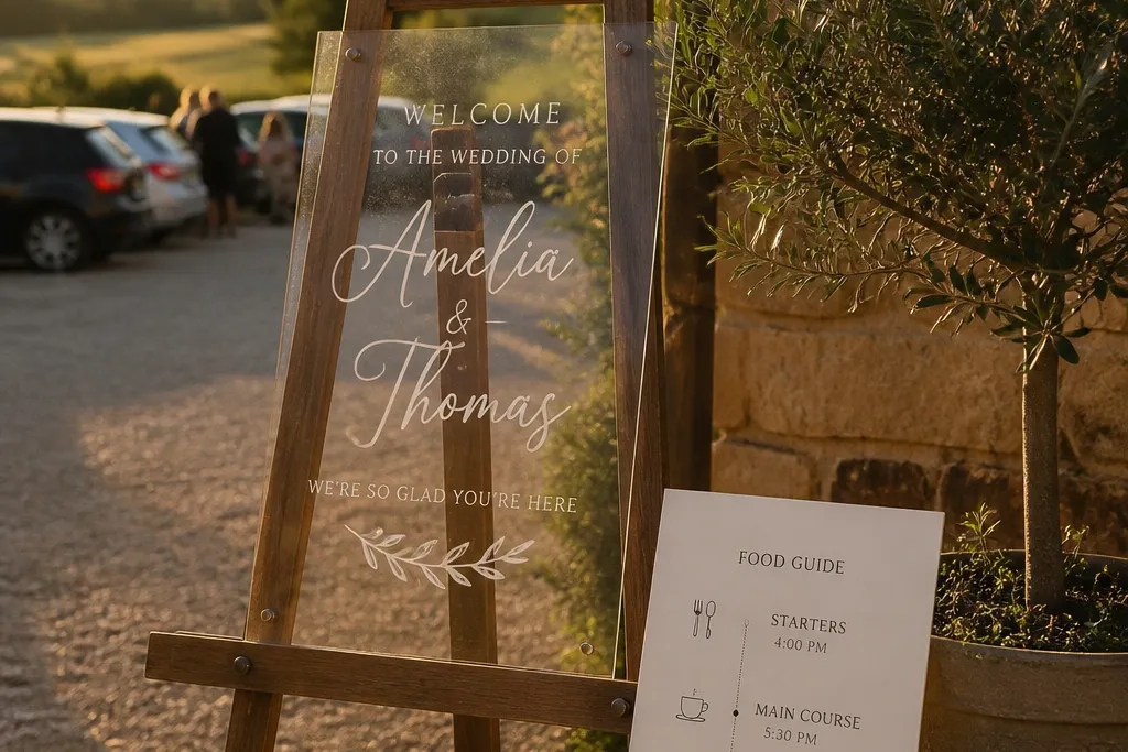
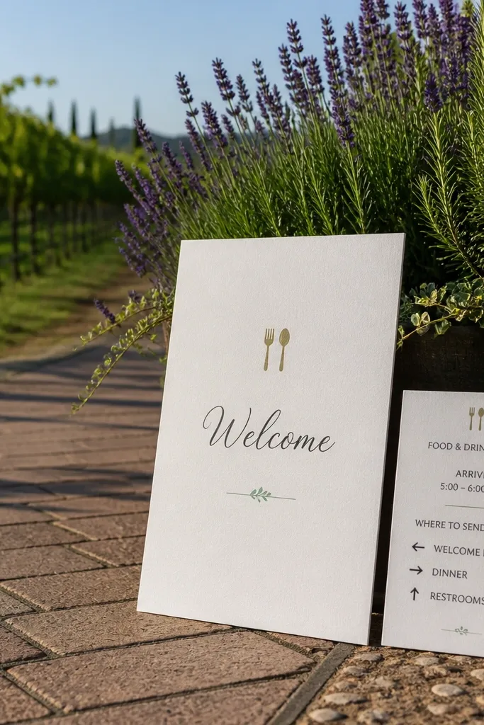
1. Cream Paper Welcome + 3-Stop Food Map Block
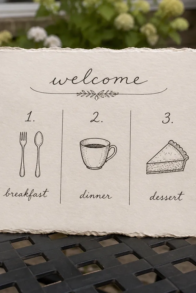
This look works because it turns a food guide near wedding venue into something guests can use in 10 seconds. Start with a cream cardstock base and a clean title, then add three numbered blocks for breakfast, dinner, and dessert. Use thin line icons (fork and spoon, a cup, a pie slice) so it reads even in busy lighting. The numbered layout also photographs well because each block creates a clear “photo path” from top to bottom.
First, print your title and the three section headers in one consistent font size, then leave generous margins so the blocks don’t feel cramped. Next, draw simple route lines between the blocks using a straight-edge and a light pencil, then trace with a fine black marker or vinyl line. Finally, add 1-2 lines per restaurant: name + one ordering cue, plus a short drive/walk note only if you’re sure.
Quick tipUse a matte finish for the paper sign; it reduces glare in sunset photos.
Skip thisSkip tiny fonts — if guests need to lean in, it won’t read in pictures or in real life.
2. Dark Navy Acrylic Welcome Sign with Gold Vinyl Food Picks
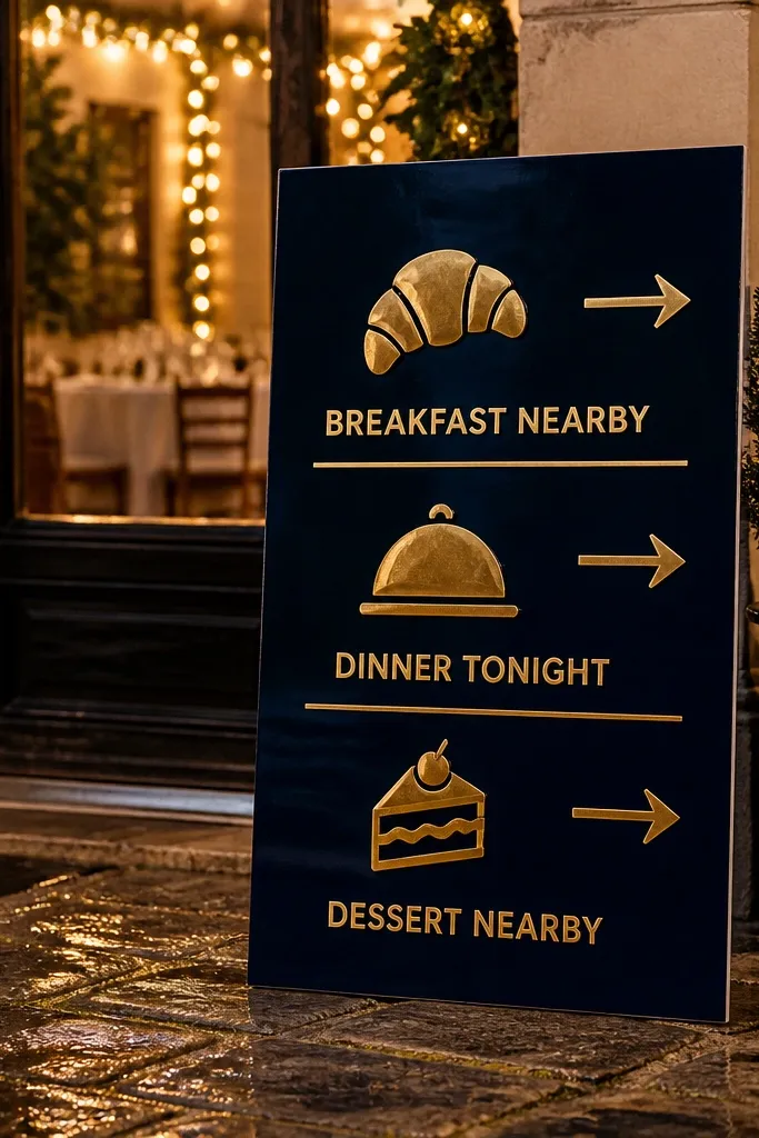
If your wedding is at night or in a moody space, this is the sign style that looks expensive without being fussy. Dark navy gives you instant contrast, and gold vinyl catches light in photos without looking glittery. Format the food guide into three rows with a bold category label: “Breakfast Nearby,” “Dinner Tonight,” “Dessert After.” Each row gets one restaurant name and one specific order cue — that’s what makes it feel helpful, not generic.
First, choose a navy acrylic sheet size that fits your display stand (24x18 inches is a good sweet spot for photos). Then apply gold vinyl lettering in two font weights: one for the header, one for the food rows. Finally, seal the vinyl edges with a clear vinyl-friendly transfer tape removal step so it stays clean under venue lights.
Set the sign slightly angled toward the camera, not perfectly flat, so the gold reads clearly.
Don’t use more than two gold tones; extra colors turn it into craft clutter.
3. Wood Frame Welcome Sign with Chalkboard Food Guide Squares
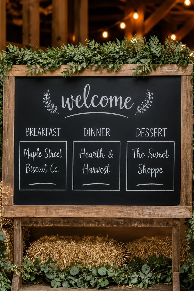
This one is great for barn venues and cozy outdoor receptions because it looks at home next to real wood and greenery. The chalkboard surface makes writing feel casual and warm, and the square blocks keep everything readable. Put the food guide in three labeled squares and keep each entry to two lines max: restaurant name and one ordering cue. Guests love it because it feels like a local recommendation, not a brochure.
First, use chalkboard paint or a pre-made chalkboard panel inside a wood frame, then sketch the square grid lightly with a pencil. Next, write the three category labels first, then fill each square with bold restaurant names and smaller order cues. Finally, add a simple arrow under each square pointing to where the sign is “meant to guide” (like “Check-in first” or “Ask for directions at the front”).
Use a chalk marker for restaurant names; it stays crisp longer than powder chalk.
Avoid overcrowding — chalkboards look messy fast when you add addresses.
4. Botanical Line-Art Welcome with One-Page Restaurant Menu Layout
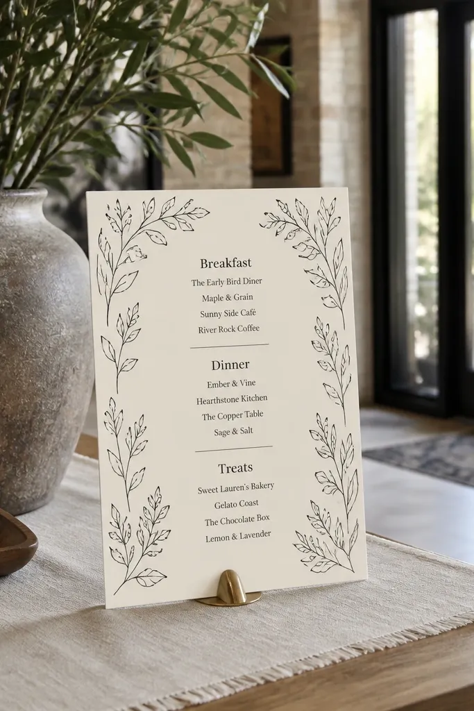
This look is for couples who want “pretty” without sacrificing usefulness. Line-art botanicals around the edges frame the content, while a menu-style layout makes the food guide feel intentional. Put “Breakfast,” “Dinner,” and “Treats” as section dividers, then list each restaurant like a menu item with a short order suggestion. It photographs softly, especially in daylight, and it doesn’t look like you pasted a list — it looks designed.
First, pick a cream or warm white background and print your line-art border in black at low opacity. Next, lay out the restaurant list in a two-column feel: restaurant name on the left, order cue on the right. Finally, keep your dividers consistent by using one divider style (thin lines or small leaf icons), not a mix of shapes.
Quick tipChoose one botanical theme and repeat it — the consistency looks cleaner in photos.
Skip thisDon’t add full addresses; the sign should guide, not replace a map app.
5. Terracotta Welcome Sign with Photo-Friendly Check-In Map Notes
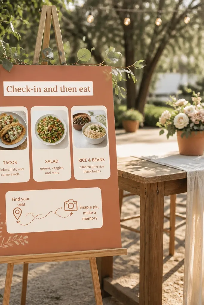
Terracotta reads warm and intentional, which makes it perfect for late spring through early fall. This sign style works best when your food guide near wedding venue includes a short “where to go first” note. Add a top strip that says “Check-in and then eat” and include three food picks underneath in a simple card layout. The warm background makes skin tones look better in photos and keeps the sign from blending into beige venues.
First, create a terracotta background (printed card stock or painted board) and pick a dark text color like charcoal or deep brown. Next, design your content in four blocks: heading, check-in note, breakfast card, dinner card, dessert card. Finally, add tiny map note icons (pin for location, clock for time) next to each entry.
Quick tipUse a matte text color; glossy text reflects venue lights and looks washed out.
Skip thisSkip bright neon accents; terracotta already does the heavy lifting.
6. Modern Minimal White Sign with Black Grid + Food Guide Cells
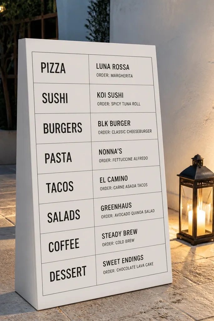
If you want something clean that still helps, a grid-based layout is the answer. The black grid creates structure, and the food guide lives in neat “cells” that guests can scan quickly. Use big category labels and keep each restaurant to one line plus one order cue. This style is also camera-friendly in venues with busy decor because the sign stays visually calm.
First, set your sign size so the grid fills the frame (20x16 inches works well for most entry tables). Next, draw a 3-row grid with consistent cell widths, then place the category label at the top of each cell. Finally, print or write the restaurant name in bold and the order cue in a smaller weight, keeping alignment tight.
Quick tipUse thick grid lines (at least 2-3 mm) so it reads in photos from a distance.
Skip thisDon’t add decorative icons everywhere; the grid is the decoration.
7. Vintage Recipe Card Welcome with Cutout Food Guide Titles
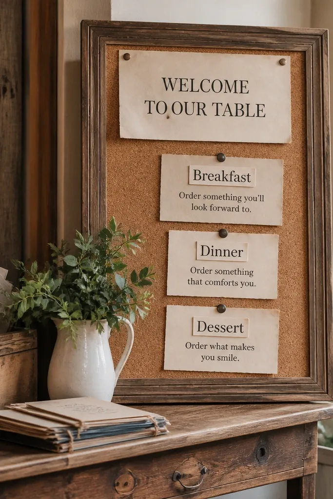
Recipe-card styling makes food recommendations feel personal, which is exactly what you want from a food guide near wedding venue. This look uses a vintage layout: slightly off-white cards, faux paper texture, and cutout-style headings. Put the food guide into three “recipe cards” with a bold title and a one-line ordering cue. It photographs well on rustic tables and looks great next to floral arrangements.
First, design three cards with the same width and different heights, then stack them with a small gap like real recipe papers. Next, print the restaurant names large and place the order cue under each like “Try the signature...” Finally, add one short line at the bottom: “Ask staff for directions if you need help.”
Quick tipUse a slightly uneven edge style on the card outlines so it reads vintage, not digital.
Skip thisSkip long paragraphs — recipe cards only look right when each card has tight content.
8. Soft Sage Welcome Sign with Watercolor Food Icon Clusters
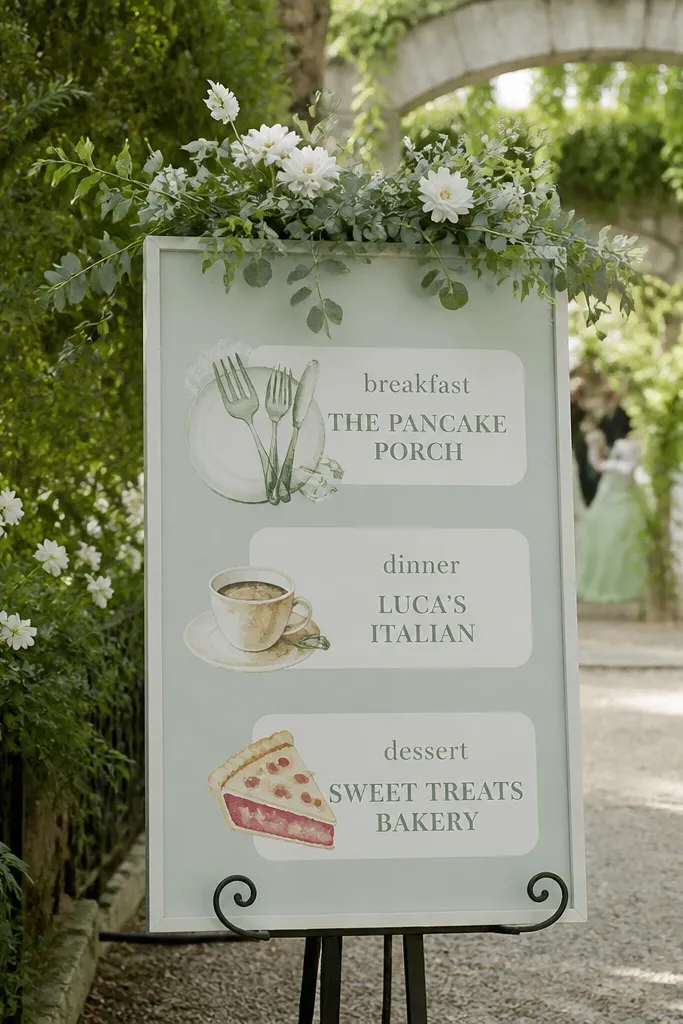
Sage makes your welcome sign feel fresh and calm, especially for garden weddings and outdoor ceremonies. The watercolor food icon clusters give it a hand-painted look while the restaurant blocks keep the food guide usable. Place breakfast, dinner, and dessert each inside a rounded rectangle so guests can read them quickly. This style is great when your venue has lots of greenery because it doesn’t fight the background.
First, pick a sage background and use black or deep charcoal for text to keep contrast high. Next, add watercolor icons around each section label, then keep each restaurant entry to two lines. Finally, finish with a thin gold or beige underline under each section to tie it together visually.
Quick tipChoose one watercolor palette (sage + blush + cream) so the sign doesn’t look random.
Skip thisAvoid tiny icons; they blur in photos.
9. Rattan Backdrop Welcome Sign with Bold Food Guide Callouts
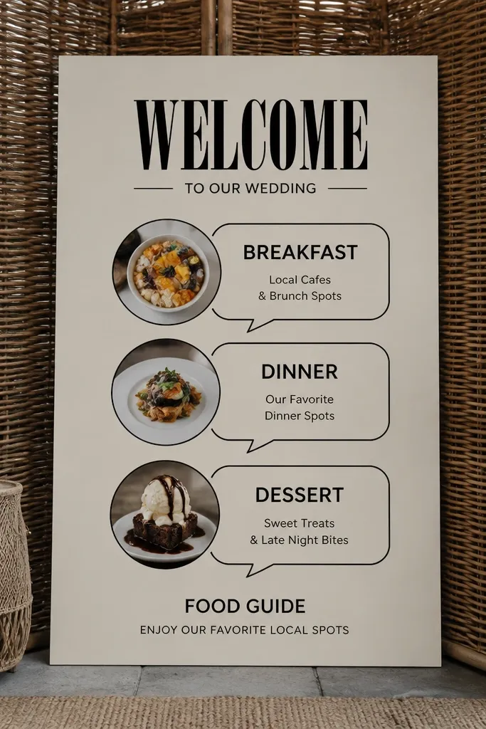
This look is all about texture. A rattan or woven backdrop makes the sign pop in photos, and it gives your food guide near wedding venue a “local market” feel. Keep the typography bold and high-contrast, then use callout bubbles for each category. Guests can spot the sign quickly because the bubbles look like they’re pointing to somewhere. It’s especially good for outdoor welcome areas where the background would otherwise be empty.
First, mount your sign on a rattan backing board and choose a text color that stands out (black, deep brown, or dark green). Next, write the three categories and place each restaurant name inside a bubble shape, not a paragraph. Finally, add one short line of guidance under the bubbles: “Start here for nearby bites.”
Place the sign in front of the rattan, not on top of it — a small shadow gap makes text look sharper.
Don’t use pastel text on rattan; the texture steals contrast.
10. Black-and-White Photo Strip Welcome with Restaurant Captions
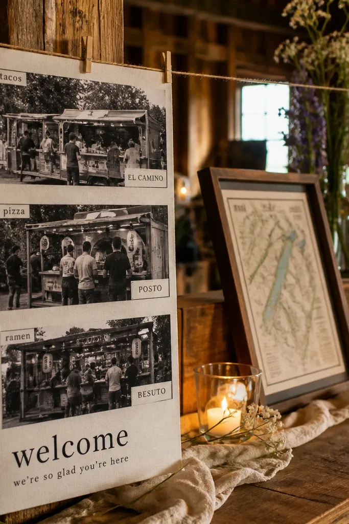
This is a fun, modern option that still serves the practical goal. Instead of listing restaurants in a block, you create three photo-strip panels, each with a category label and one restaurant caption. The photo strip look makes the sign feel like a curated guide, not a checklist. It’s also great for couples who want fewer words and more visual rhythm — guests glance at the panels, then read the caption.
First, pick three simple black-and-white images that match the venue vibe (no need for restaurant photos; use neutral scenes). Next, overlay category labels and restaurant names on each panel, then add a one-line order cue under the name. Finally, print the whole layout with thick margins so it doesn’t look cramped when displayed on an easel.
Keep captions under 8-10 words so the sign stays readable at a distance.
Skip busy fonts; photo strips already add visual weight.
11. Gold Foil Accent Welcome Sign with "Order This" Buttons
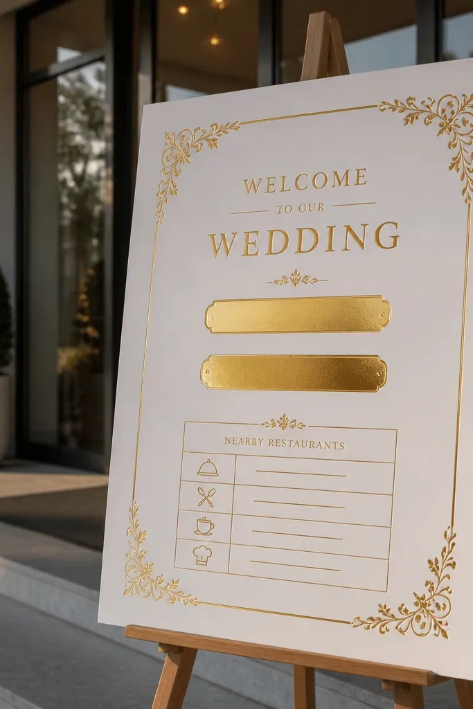
This is the sign style that feels like a curated concierge. White background keeps it clean, and gold foil accents make it look special without needing lots of decorations. The “Order this” buttons are a perfect way to present a food guide near wedding venue because they translate each restaurant into one clear action. Put breakfast, dinner, and dessert as three big buttons with the restaurant name and one signature order cue.
First, choose a white base and a gold foil header line, then design three button shapes with rounded corners. Next, put the restaurant name in the button and keep the order cue as a smaller line below it. Finally, add a tiny note at the bottom: “Ask for directions at the welcome table.”
Quick tipUse a foil header line only; too much foil makes the sign look flat in photos.
Skip thisDon’t use thin gold text; it disappears under harsh lighting.
12. Terrarium-Themed Welcome Sign with Hanging Tag Menu
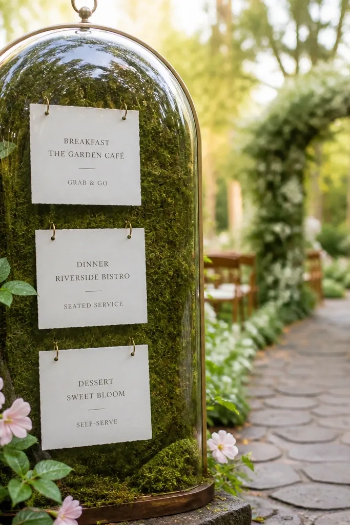
If you want something that guests will actually photograph, hanging tags do it. The terrarium-themed frame gives a whimsical feel, while the hanging menu makes the food guide near wedding venue feel light and interactive. Use three tags labeled breakfast, dinner, dessert, each with one restaurant name and an order cue. Because the tags hang at different angles, they photograph with depth even in busy venues.
First, build or buy a terrarium-style frame and attach three tags with thin ribbon in matching lengths. Next, write category labels large on each tag, then add the restaurant name and one cue in smaller text. Finally, place the frame where guests enter so the tags are visible from the side in photos.
Quick tipUse matte tag paper so the ribbon doesn’t reflect venue lights.
Skip thisSkip glossy laminated tags; they glare under spotlights.
13. Neon-Look Welcome Sign Using Dark Acrylic + Color Blocks
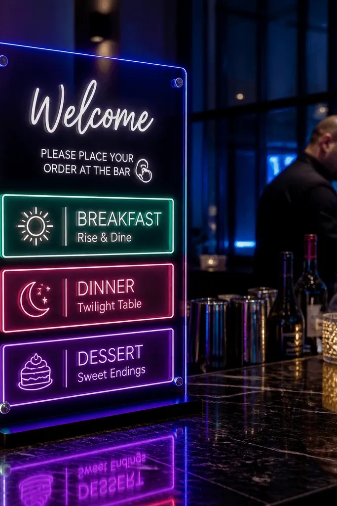
This one is for modern receptions with a lively bar setup or a night ceremony. Dark acrylic gives you the clean base, and color blocks add a punch without clutter. Build the food guide into three bold blocks with category labels and restaurant names, then add a tiny ordering cue line. The result is graphic, photogenic, and easy to read even when people gather around the sign with drinks.
First, choose a dark acrylic base and decide your three accent colors (one teal, one coral, one cream works well). Next, design three blocks with category labels in black or white depending on block color, then layer restaurant names on top. Finally, keep the ordering cue to a single short line per restaurant so the sign doesn’t turn into a poster.
Use thick block shapes; thin outlines look like noise in photos.
Don’t add more than one font style; neon looks cheap when typography is messy.
14. Hand-Lettered Welcome with Underlined Food Guide Sections
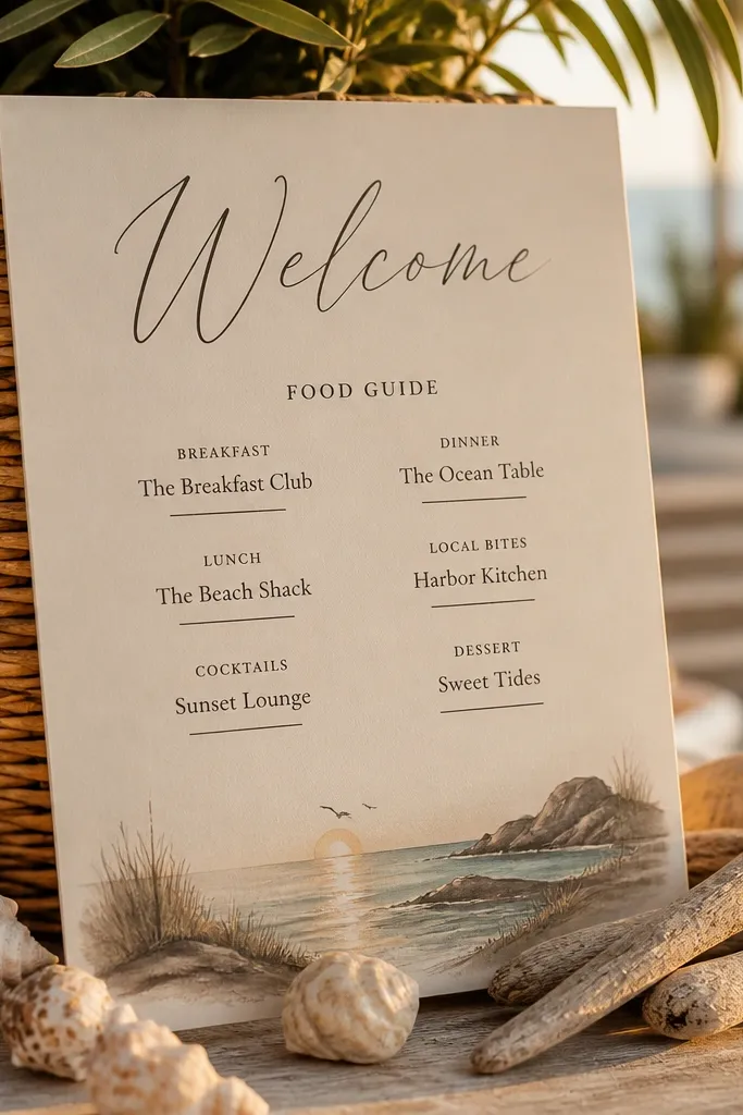
Hand-lettered style makes a welcome sign feel intimate, but you still need structure. Underlines are the secret weapon: they separate the food guide into clear sections while keeping the design airy. Put the restaurant names on their own lines and underline only the restaurant name, not the whole section. This makes the sign look charming up close and readable from across the welcome area.
First, pick one handwriting-like font or style and stick to it for the entire sign. Next, underline the restaurant names and keep the order cue on a smaller line below each. Finally, choose a background that matches the venue — cream paper for gardens, off-white for barns, or black for night receptions.
Quick tipLeave a full blank line between categories; it keeps the sign from feeling crowded.
Skip thisAvoid writing in cursive for every line; it becomes hard to read quickly.
15. Sunburst Welcome Sign with Center Star Food Guide Picks
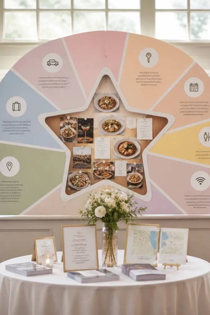
Sunburst layouts look great in photos because the center grabs attention immediately. Use a sunburst background in a soft pastel tone and put a star in the center containing the food guide near wedding venue. Around the edges, keep short guidance like “Parking tips” or “Where to check in,” but let the center star be the main focus. Guests read the center first, then glance outward for the rest.
First, choose a sunburst background style and keep it subtle so text stays readable. Next, write “Breakfast,” “Dinner,” and “Dessert” inside the center star in three lines, each with one restaurant name and one order cue. Finally, add a thin border around the sign so it doesn’t blend into bright venue walls.
Quick tipUse a darker sunburst color than your background so the star’s contrast stays crisp.
Skip thisDon’t overload the sunburst with extra shapes; keep it to one motif.
16. Gallery Wall Welcome Sign with Three Restaurant Cards
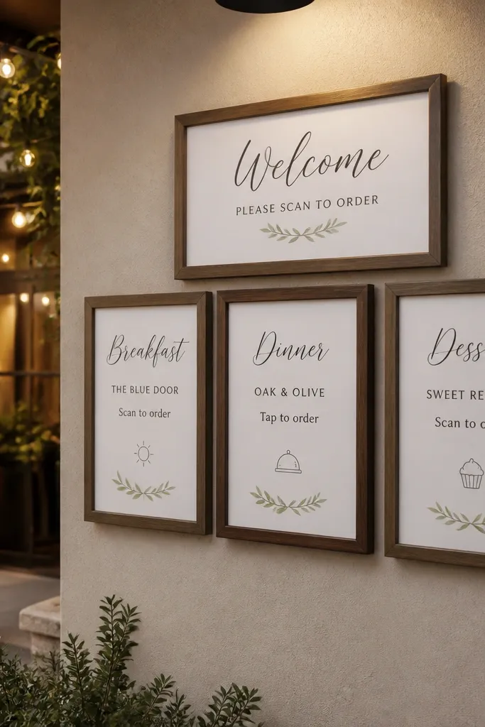
This look is for couples who want the welcome area to feel like a photo wall. Instead of one big sign, you create a small gallery cluster: three framed cards for breakfast, dinner, and dessert plus a simple header card. The food guide near wedding venue becomes a set of collectible pieces, and guests naturally take pictures because the layout is intentional. It also works when you have multiple entrances — each card can be placed to match sightlines.
First, choose frames with the same color finish and print three card layouts with matching typography. Next, place them in a staggered grid and align the header card above the three food cards. Finally, keep each card short: restaurant name, one ordering cue, and a tiny note like “Ask for the weekday special.”
Use the same paper size across all cards so the wall looks cohesive in photos.
Skip mixed frame finishes; it makes the cluster look like random decor.
17. Café Menu Board Welcome with Chalk-Style Icons
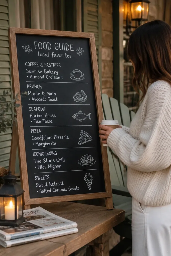
A café menu board style fits a food guide near wedding venue perfectly because it already follows how people read menus. Use a chalkboard or chalkboard-look board, then structure the food guide like a menu: category headers, restaurant names, and one best order item. Add small chalk-style icons next to each section and keep the rest of the sign clean. This one looks especially good next to a bar cart or coffee station.
First, pick a menu board size around 30x20 inches so it’s readable from the welcome line. Next, write three sections with clear header lines and leave space between entries. Finally, add a small “Tonight’s plan” line with the order cue for dinner, then place the board where guests naturally wait.
Quick tipUse two chalk colors only (white and one accent) so the board stays crisp.
Skip thisDon’t add prices unless you’re 100% sure — guesswork looks messy.
18. White Linen Texture Welcome with Embroidered-Look Food Labels
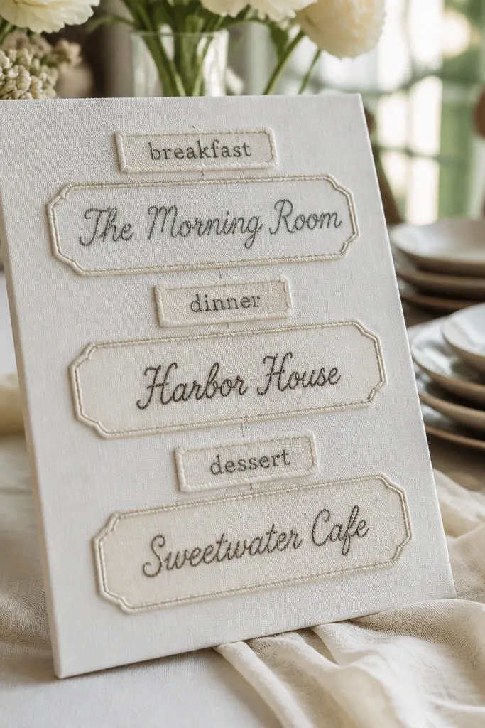
Texture is the whole point here. A linen-look background makes the sign feel soft and high-end, and the embroidered-look food labels help the food guide near wedding venue feel curated rather than pasted. Use three large labels with a slightly raised, stitched look for breakfast, dinner, and dessert. Keep the restaurant name bold and the order cue short so the sign still reads quickly in photos.
First, choose a linen-textured printable background or a fabric panel behind your lettering. Next, create three stitched-look label shapes and place one restaurant entry inside each. Finally, add a simple header at the top in a clean font and keep all edges aligned to avoid a DIY mess.
Quick tipMount the fabric panel flat and taut; wrinkles make text look sloppy in photos.
Skip thisSkip thin lettering on fabric; it disappears once the fabric texture shows.
19. Modern Serif Welcome with Curved "Nearby Bites" Bands
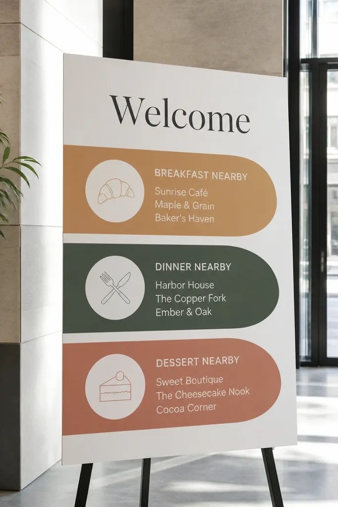
Curved bands add movement without adding clutter, which is perfect for a welcome sign that also needs to carry a food guide near wedding venue. Use a modern serif for the heading and a clean sans for the restaurant entries. Put three curved bands across the sign for breakfast, dinner, and dessert, each with a restaurant name and one order cue. This style photographs beautifully because the curves create soft lines that contrast with straight venue architecture.
First, pick a sign size with enough width to draw three clean curves (24 inches wide works well). Next, design the bands first, then align text inside each band so the baseline stays consistent. Finally, add one small icon at the end of each restaurant line to keep it playful without taking over.
Quick tipKeep the curves smooth and wide; tight curves look like sticker edges.
Skip thisDon’t add drop shadows under every element; it makes it look cheap.
20. Paper Fan Welcome Sign with Food Guide Menu Panels
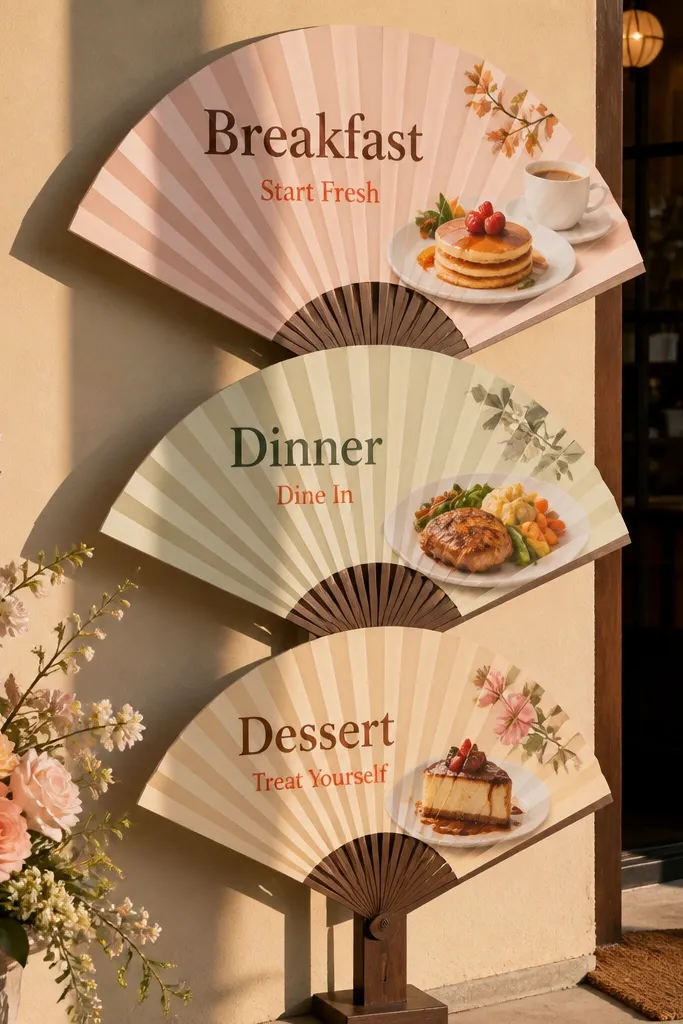
A paper fan structure gives you height and drama, which is what you want for a welcome sign that guests actually photograph. Put three menu panels on the fan — breakfast, dinner, dessert — and keep the text big enough to read even if people stand close. This format is perfect for venues with flat walls because it creates dimension. When the fan is angled toward the entrance, your food guide near wedding venue becomes the visual centerpiece.
First, build a simple paper fan backdrop and attach three panels with matching spacing. Next, print the category labels and restaurant names on each panel, leaving room for one order cue line. Finally, place the fan on a stand or easel so it faces the walkway and doesn’t get blocked by tall decor.
Quick tipUse stiff cardstock for the fan folds so it holds shape all night.
Skip thisDon’t use thin poster paper; it sags and ruins the crisp look.
21. Map-Style Welcome Sign with Highlighted Food Pins
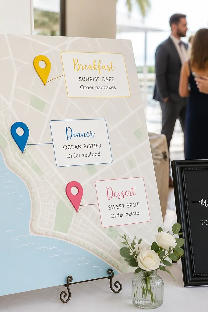
A map-style sign looks smart and photo-ready when your food guide near wedding venue includes places close enough to justify a quick trip. Use a simplified map background (no need for full street detail) and highlight three locations with pins. Label each pin with category headings and include one ordering cue under each restaurant name. Guests love this because it answers “where is it?” without pulling out phones.
First, create a simplified map outline using a basic map template or a printed map crop, then remove most street labels. Next, place three pins and connect them with a faint circle radius so it looks intentional. Finally, add your restaurant names and order cues beneath each pin in a clean two-line format.
Print the map in muted tones so the pins and text stay readable.
Skip tiny street names — they turn into illegible noise in photos.
22. Check-In Clipboard Welcome with Clip-On Food Cards
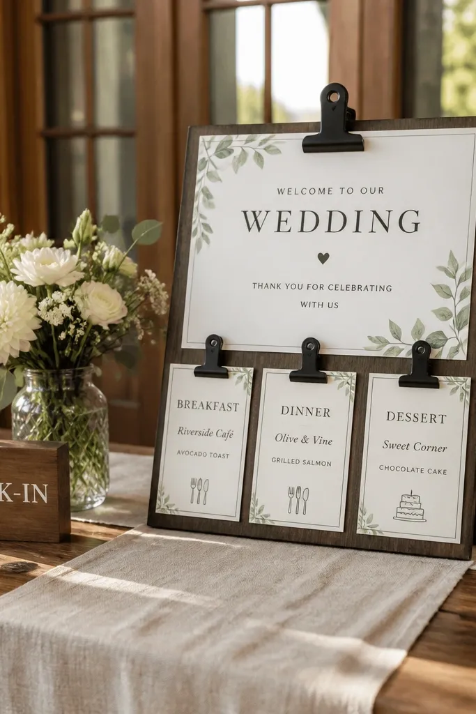
Clipboard-style signage looks practical and cute, and it fits the reality that guests move quickly. The clip-on cards let you separate the food guide near wedding venue into three neat pages without cramming everything onto one sheet. Put a main welcome sheet on the clipboard and clip three smaller cards underneath for breakfast, dinner, and dessert. The layered look photographs well because it has depth and clear sections.
First, use a real clipboard or a wooden clipboard-style board and mount a main welcome sheet with big readable text. Next, attach three clip cards with restaurant names and one order cue each, keeping the cards the same size. Finally, place the clipboard at the check-in table so guests see it right when they arrive.
Quick tipUse a consistent card color for all three sections so the food guide looks intentional.
Skip thisDon’t let cards overlap; overlapping text looks messy in pictures.
23. Acrylic Stand Welcome with Frosted Menu Panels
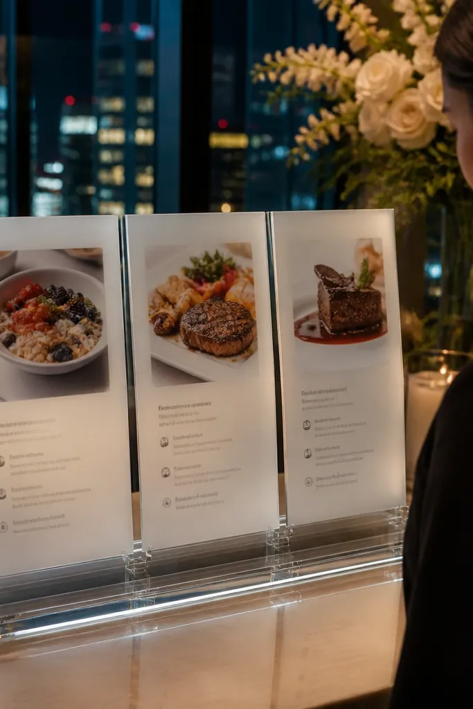
Frosted acrylic panels look sleek and modern, and they’re great for venues with clean lines or city backdrops. The frosted panels soften the visual noise behind the sign while keeping text readable. Use three frosted panels for the food guide near wedding venue and keep each entry to restaurant name plus one ordering cue. This design is photogenic because the panels create a layered, glossy depth without adding lots of decorations.
First, choose an acrylic stand that holds panels securely and plan your text size based on panel width. Next, create three frosted panel inserts and print the category headers and restaurant entries with high contrast. Finally, place the stand near the entrance with a slight angle so the text catches light but doesn’t glare.
Test glare by placing a phone flashlight at the sign — if it washes out text, adjust the angle.
Avoid light-gray text; it vanishes on frosted surfaces.
24. Floral Arch Welcome Sign with Hanging Ribbon Food Guide Tags
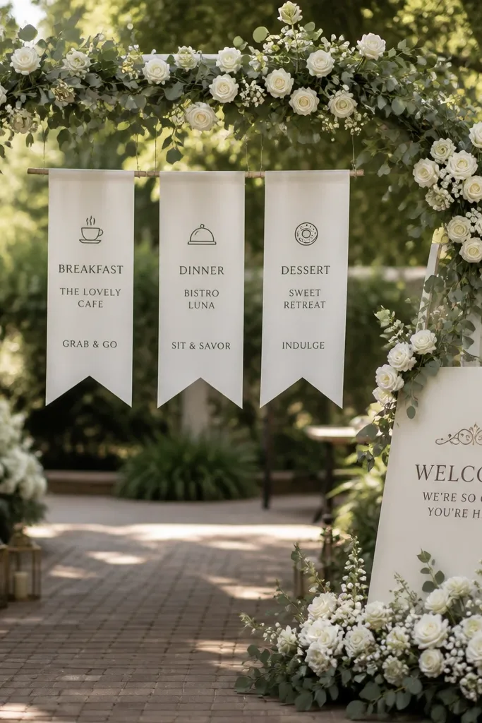
If you’re already using a floral arch or entrance installation, hang your food guide tags from it. This look is pure “dreamy celebration” because it blends with the ceremony decor while still delivering practical info. Use three hanging ribbon tags labeled breakfast, dinner, dessert, each with one restaurant name and a specific order cue. Guests photograph it because the tags move slightly and frame the sign area naturally.
First, attach ribbon to the arch at three heights so tags don’t overlap and each tag stays readable. Next, write the category label on top of each tag and keep the restaurant name bold with the order cue below. Finally, position the arch so guests enter beneath it and the tags face the walkway.
Quick tipUse heavier ribbon so tags hang straight and don’t twist in outdoor wind.
Skip thisSkip long restaurant names; they wrap and become unreadable.
25. Terracotta Tile Welcome Sign with Painted Food Categories
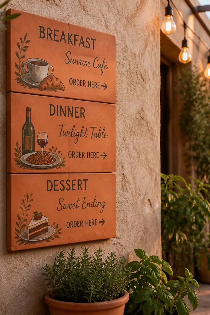
Tile-style signage feels grounded and handmade, which matches outdoor patios and rustic modern venues. This look is especially good when your food guide near wedding venue includes small local spots, because it feels like you’re sharing neighborhood favorites. Paint three category areas on terracotta tiles and write each restaurant name in a contrasting paint color like cream or deep green. It’s photogenic under warm light because the surface texture adds depth.
First, use a terracotta-toned board or individual tiles and arrange them in a simple grid. Next, paint category headers and then add restaurant names and order cues with a steady brush or paint marker. Finally, seal the finish with a matte clear coat so the text doesn’t smear when handled or cleaned.
Quick tipKeep the tiles small and the text large; texture helps the sign, but only when text is bold.
Skip thisAvoid glossy sealant; it reflects venue lighting and washes out lettering.



