
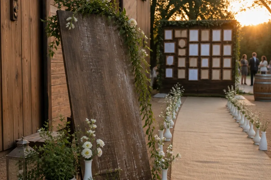
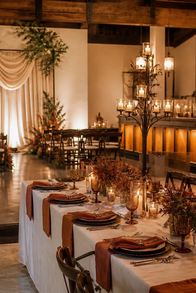
1. Weathered wood welcome board with iron arrow clips
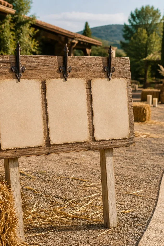
A welcome board like this reads vintage without needing heavy “distressing.” The weathered wood gives you that soft, uneven grain that looks real in photos, and the iron arrow clips add dark contrast near the top where people look when they arrive. Use cream or oat paper for the lettering so it matches linen and kraft textures elsewhere. This is ideal for outdoor venues, rustic barns, and any place where guests walk straight into the reception zone. If your venue has plain walls or a blank entrance, this board gives the first photo a clear anchor.
Start by finding a plank-style board with visible grain and a slightly uneven stain. Then attach printed or handwritten text on cream paper and secure it with black iron arrow clips so the paper looks gently layered. Finally, mount the board at eye level in bright shade or near the entrance lights, and keep the lettering large enough to read from 8-10 feet.
Quick tipPrint your text at a slightly smaller size than you think, then test readability from the guest path before committing.
Skip thisSkip glossy vinyl lettering — it reflects light and ruins the aged look.
2. Milk glass bud vases in a staggered aisle runner
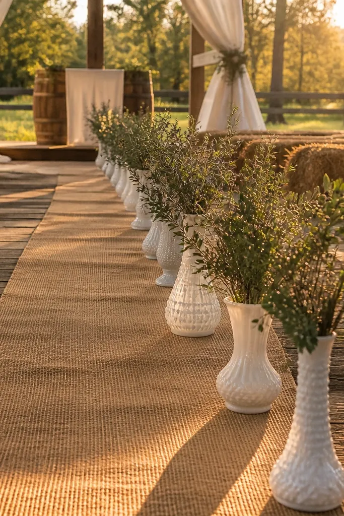
Milk glass is the easiest way to make rustic flowers look vintage and expensive without trying too hard. The translucent white softens color and makes stems look airy in photos, especially in golden hour light. Stagger the vases along an aisle runner so the perspective lines lead toward the ceremony space. This works best when the ceremony has long sight lines, like a garden path, barn aisle, or backyard with a natural corridor. Choose small blooms and lots of negative space so the aisle doesn’t look cluttered.
Start by buying or renting 18-30 milk glass bud vases in two similar shapes so it looks collected, not uniform. Then place them along a runner or directly on the floor with consistent spacing, using the same flower palette in each vase. Finally, attach thin floral foam or chicken wire supports only if needed, and mist lightly before the ceremony so stems don’t look dry on camera.
Quick tipUse one flower type per vase plus greens — fewer decisions means cleaner photos.
Skip thisDon’t use bright white blooms that match modern lighting too perfectly; warm off-whites photograph better.
3. Antique frame gallery wall for ceremony photos
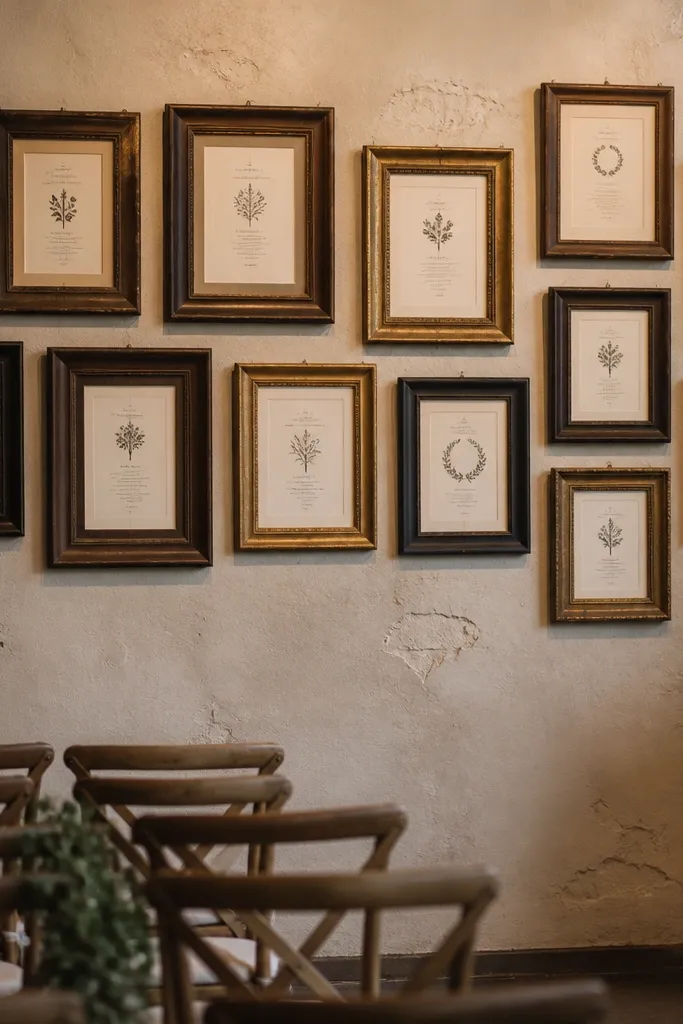
An antique frame gallery wall turns a plain ceremony backdrop into a vintage photo moment. Mix frame sizes from 8x10 to 11x14, and keep finishes within a tight range: dark walnut, blackened iron, and faded gold. Inside the frames, use simple paper inserts like vows, dates, or names — the frame does the work. This is a strong pick when you want an aesthetic that looks good even if your ceremony arch is minimal. Guests will naturally photograph next to it, and you’ll get consistent background texture across the whole event.
Start by setting frames on a large backing board or hanging them from a stand so the spacing is even at a distance. Then insert printed pages on thick cream cardstock so the paper doesn’t curl. Finally, position the gallery where sunlight hits from the side, not straight-on, to keep glare off the glass.
Quick tipUse matte cardstock, not glossy paper, for frames — it keeps the vintage vibe.
Skip thisSkip heavy busy quotes in every frame — one or two lines per frame looks intentional.
4. Candlelit iron candelabra cluster at the bar
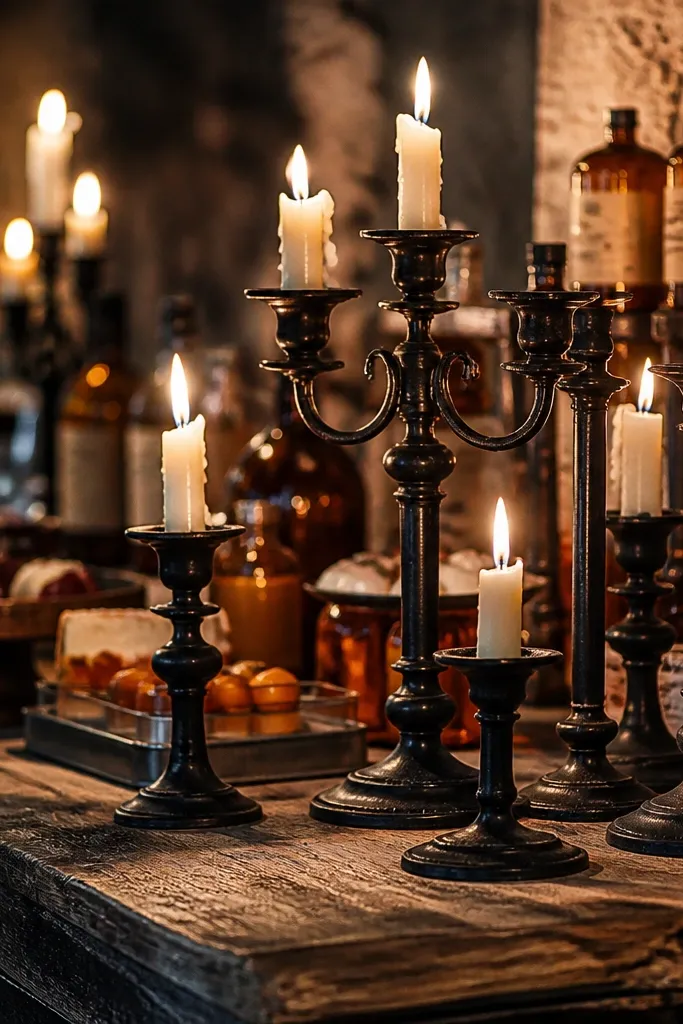
Iron candelabras give you drama without needing a huge installation. The dark metal reads rustic, and the candlelight creates warm shadows that make everything around it look more vintage. Place a cluster near the bar or dessert area where guests linger and get photos. This works especially well in dimmer reception spaces because candle shadows add depth that overhead lighting can’t. Use cream taper candles for consistent color across the scene.
Start by renting or sourcing at least three matching candelabras in different heights so you get a tiered look. Then set them on a weathered wood table or a dark cloth runner to ground the cluster. Finally, plan the candle count for the space you have and use LED candles if open flame isn’t allowed, keeping the warm color temperature at 2700K.
Place candles slightly behind the bar signage so the light frames the text instead of competing with it.
Don’t put candelabras right in front of bright overhead fixtures — glare flattens the whole look.
5. Rust-stained runner with linen table overlays
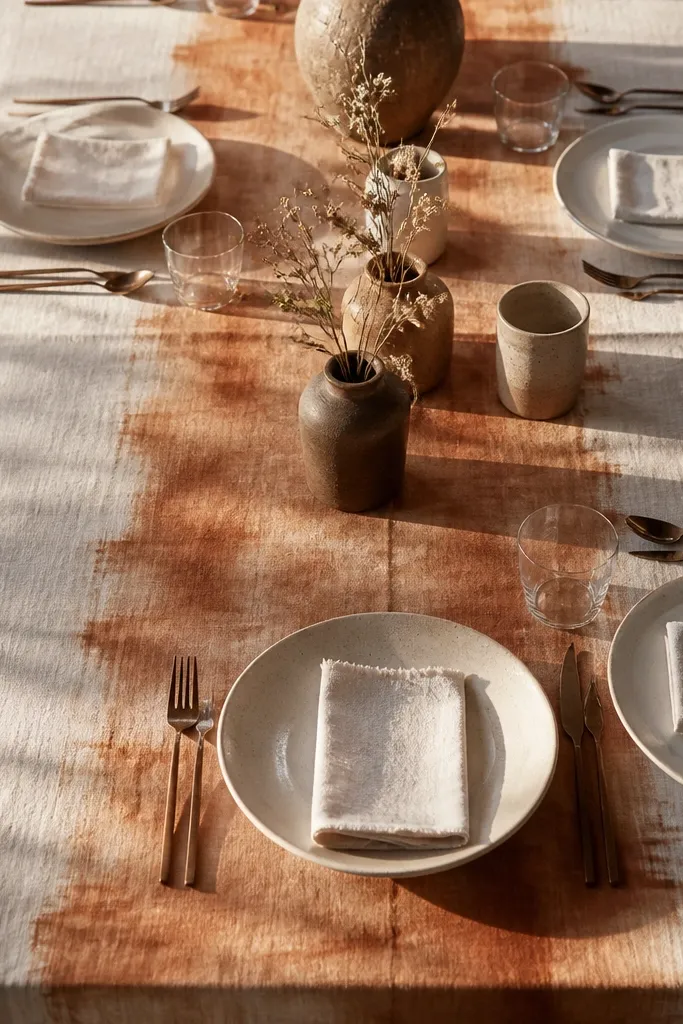
A table overlay is where rustic weddings become visually cohesive. Choose a rust-stained or clay-toned runner and layer it over warm white linen so the color looks aged, not neon. The texture matters: linen with visible weave catches light in a way smooth polyester never will. This idea works on long banquet tables, sweetheart head tables, and even buffet tables. Keep the runner centered unless you want a more casual “laid by hand” look.
Start by measuring your table length and width, then add 10-12 inches of overhang on each side for the right drape. Then layer a heavier linen runner on top of lighter cream cloth so you see dimension in photos. Finally, iron or steam the fabric lightly and place flatware and chargers after the drape is set so nothing shifts.
Quick tipBring a lint roller — linen shows fuzz and it reads on camera.
Skip thisSkip heavily starched tablecloths; they look stiff and modern.
6. Rustic escort cards on kraft paper tabs with twine
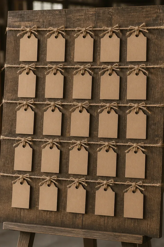
Escort cards are small, but they’re photographed when guests search their names. Kraft paper tabs tied with twine look vintage and handmade, and they match almost every rustic palette. Use a simple font and keep the layout clean so the board doesn’t look messy. This is best for venues where you have a wall or standing display near the entrance. It’s also a practical option if you’re doing assigned seating because you can swap names fast if RSVPs change.
Start by building a display board from weathered wood or using a pegboard with dark stain. Then punch small holes in kraft tabs, print names in black ink, and tie each tab with short twine lengths. Finally, hang cards in alphabetical order and leave a 1-2 inch gap between names so guests can read quickly.
Print names in slightly larger type than you think you need — distance matters under venue lighting.
Don’t use colored cardstock; it breaks the vintage paper look.
7. Terracotta and antique brass bud vases for low centerpieces
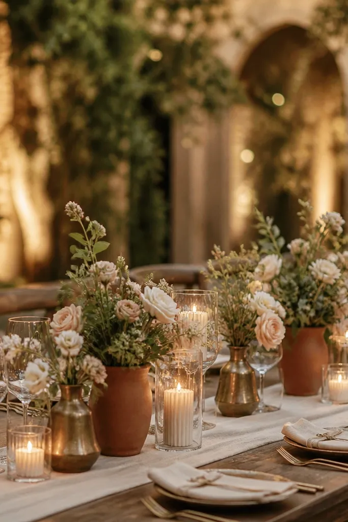
Low centerpieces keep sightlines open and make the room feel airy, but they still need a strong visual surface. Terracotta adds warmth and looks naturally aged, while antique brass brings a soft golden flash when candles or lights hit it. Use a mix of small bud vases and one or two slightly taller pieces so the table looks layered, not flat. This works great for receptions in barns where overhead lights can feel harsh. The result is a vintage rustic look that photographs cleanly from both table-level and guest-level angles.
Start by grouping 3-5 vases per centerpiece, all in a tight palette: terracotta, brass, and warm off-white. Then add low stems like stock, baby’s breath alternatives, or small garden roses, keeping heights under 8 inches. Finally, place the group on a runner of burlap or linen so the base texture shows in photos.
Quick tipUse one color of flower per table and let vase color do the variation.
Skip thisSkip tall centerpieces taller than 10 inches — they block faces and ruin photo composition.
8. Vintage brass candlestick with foraged greenery
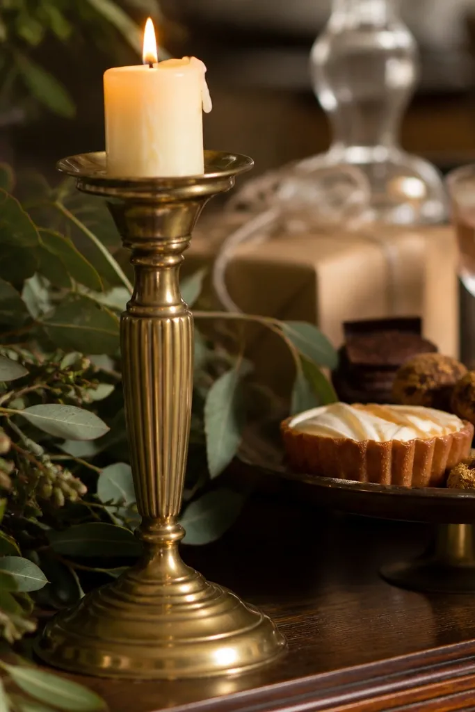
This is the detail that makes rustic decor look intentional. A vintage brass candlestick adds warmth and shine, while foraged greenery gives you that lived-in, countryside feel. Place it on side tables, the gift table, or the dessert table so it shows up in multiple photo angles. Choose greenery that’s matte and textured, like seeded eucalyptus or olive branches, not glossy dyed leaves. In photos, the brass catches highlights and the greenery fills gaps without turning into a loud centerpiece.
Start by selecting a brass candlestick with a stable base and a cream taper that fits the holder snugly. Then add greenery around the base using floral tape or a small piece of chicken wire hidden under the candle. Finally, position it where side lighting hits, and keep the rest of the table styling simple to avoid competing textures.
Quick tipBring a small spray bottle and re-mist greenery the day of so leaves look fresh under warm lights.
Skip thisDon’t add glittery ornaments; they read modern and cheap on camera.
9. Aged parchment menus tied to twine on a rustic easel
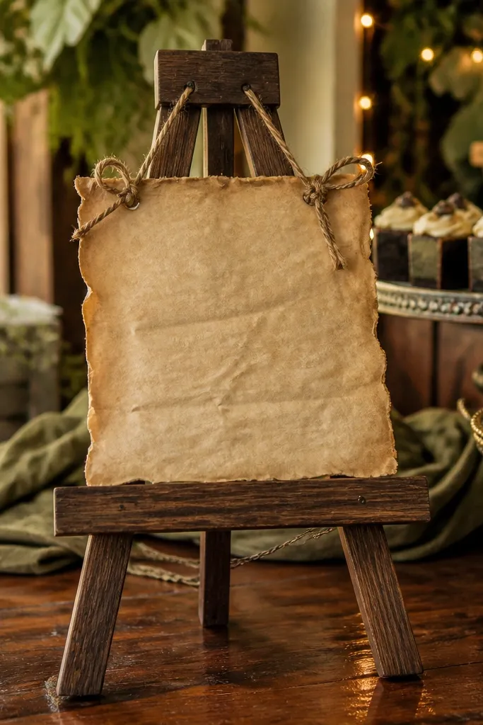
Menus are functional, but they also frame the dessert and reception vibe. Aged parchment-style paper tied with twine looks vintage because the string creates visible texture and movement. Use a dark wood easel so the menu looks grounded and doesn’t float. This works best at the dessert table, bar, or main dining entry where guests line up and take photos. Keep the wording short and readable, with simple headings and a calm layout.
Start by printing menus on thick cream paper that has a natural, matte finish, then trim edges cleanly. Then tie each menu to the easel with twine threaded through two holes so it hangs straight. Finally, place the easel slightly off-center from the main display so it creates a layered look in photos.
Use one font style and consistent capitalization — menus look more vintage when they look orderly.
Skip tiny text; menus get photographed at an angle and need legibility.
10. Rustic linen napkin folds with tied sprig accents
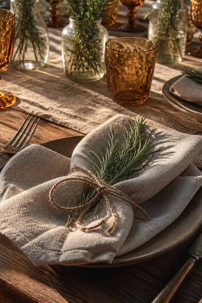
Napkins are one of the fastest ways to add “hands-on” texture to a tablescape. Linen napkin folds look better when they’re slightly imperfect, like a soft roll or a simple envelope fold, not a rigid origami shape. Tie a small sprig — like rosemary or seeded eucalyptus — to each napkin with twine so every place setting looks cohesive. This is especially photogenic in close-up table shots and overhead drone angles if you’re doing them. It also helps your tables look styled even if you’re keeping centerpieces low.
Start by steaming linen napkins flat and choosing a fold you can repeat quickly across all tables. Then prepare sprig bundles with twine, keeping each bundle under 3 inches so it doesn’t block people’s hands. Finally, place forks and plates after napkins so you don’t shift the fold, and keep the sprig direction consistent for photos.
Use rosemary if your venue is warm; it holds up better than delicate greens.
Don’t use long stems that poke guests — they look messy in candid photos.
11. Hand-painted wooden signs for bar and directions
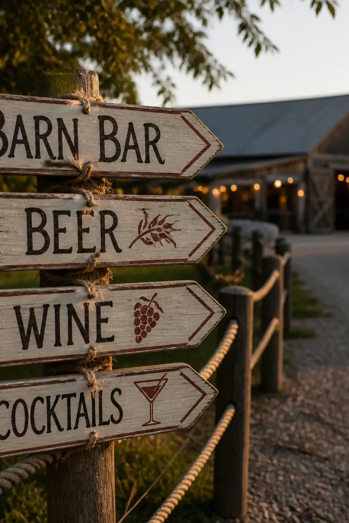
Directional signage is where rustic decor becomes practical and photogenic at the same time. Hand-painted wooden signs look warmer than printed acrylic because the brush texture shows. Use black or dark charcoal lettering with rust accents, and keep arrow shapes simple. Put one sign at the parking-to-entrance path and one at the ceremony-to-reception route. This also prevents “where is it?” moments that create chaos and bad photos.
Start by making two sizes: a larger 18x24 board for the main direction and smaller 8x10 signs for table or bar cues. Then paint with matte craft paint and seal lightly so the finish doesn’t glare. Finally, mount signs with stakes or a base so they stand steady, and place them at decision points where guests naturally slow down.
Use the same paint colors across all signs so your whole weekend looks like one set.
Skip mirrored or reflective seal — it turns signage into glare under flash.
12. Vintage crate shelving for dessert table styling
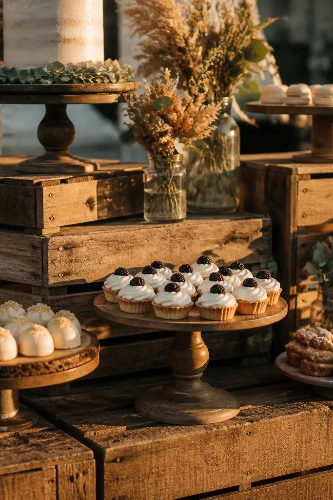
A dessert table needs height and texture, not just more desserts. Vintage wooden crates give you instant vertical layers, and they photograph better than flat tables because they create different planes. Style with cake stands, small jars, and a few greenery sprigs for softness. This works well for rustic weddings where you want a vintage feel without building a full backdrop. It’s also a great solution if your dessert table is in a tight space and needs structure.
Start by choosing crates with sturdy corners and similar stain tones, then stack them with a stable base or a hidden platform. Then place cake stands and serving platters on top, keeping the largest piece on the middle crate for balance. Finally, add small details like jam jars or bud vases so the table looks finished even from the sides.
Quick tipMeasure crate top dimensions before ordering cake stands so they don’t wobble.
Skip thisDon’t overcrowd every crate — leave one or two surfaces mostly empty for a clean look.
13. Rustic arch backdrop with linen drape and pampas-like plumes
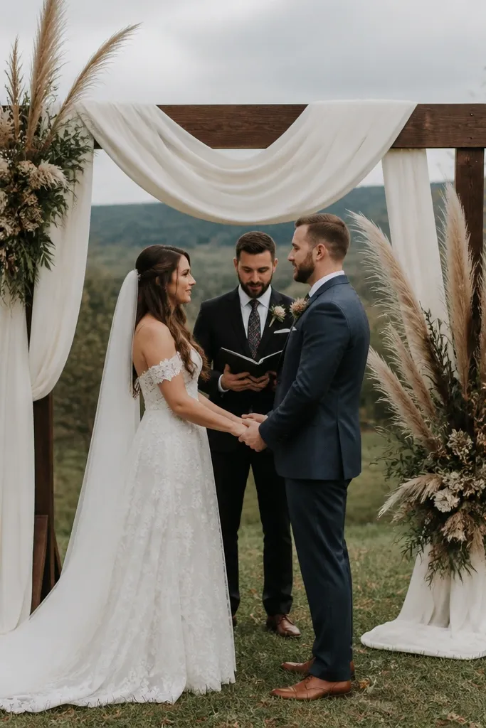
If you want a true photo magnet, a draped arch is it. Linen drape makes the arch look soft and vintage, while tall feathery plumes add movement and height without needing lots of color. Keep the palette muted so it reads rustic, not boho festival. This is perfect for outdoor ceremonies, especially when you want a clear frame for the couple and a clean background for family photos. The linen also helps the arch look expensive even if the frame is simple.
Start by choosing an arch frame size that fits your space and staging area, then drape cream linen in long panels so it falls naturally. Then add 2-3 clusters of tall plumes and tuck dark greenery at the base for contrast. Finally, secure everything tightly at the top and sides so wind doesn’t lift the fabric during vows.
Quick tipUse two layers of linen: one sheer-like layer for softness and one heavier layer for structure.
Skip thisSkip bright dyed fabrics; they read modern and fight with vintage textures.
14. Burlap and linen mixed runner with iron lanterns
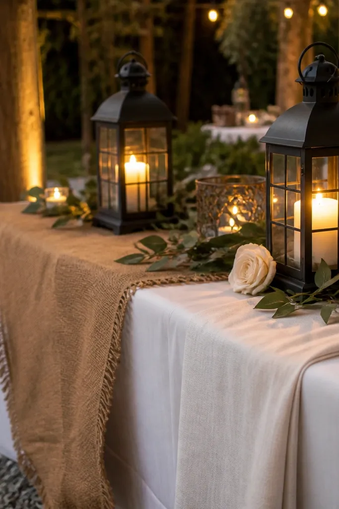
Mixing burlap and linen gives you rustic texture without making everything look like a farmhouse costume. Burlap adds rough, aged texture, while linen keeps the look soft and photo-friendly. Iron lanterns add a dark frame around the light source, which makes the scene feel cozy and vintage. Place this styling at the entrance, around the cake, or as a side vignette where guests can take pictures. It’s especially good when your venue lighting is dim because lantern light adds depth and warmth.
Start by laying a base runner of burlap and layering a linen strip on top in the center. Then place two or three iron lanterns along the runner at equal intervals, with warm LED candles inside if needed. Finally, add small greenery bundles tucked into the runner edges so the vignette looks anchored.
Quick tipCut burlap edges cleanly with sharp scissors so the fray looks intentional, not messy.
Skip thisDon’t use only burlap — it can look too rough and dark in photos.
15. Vintage teacup place card holders
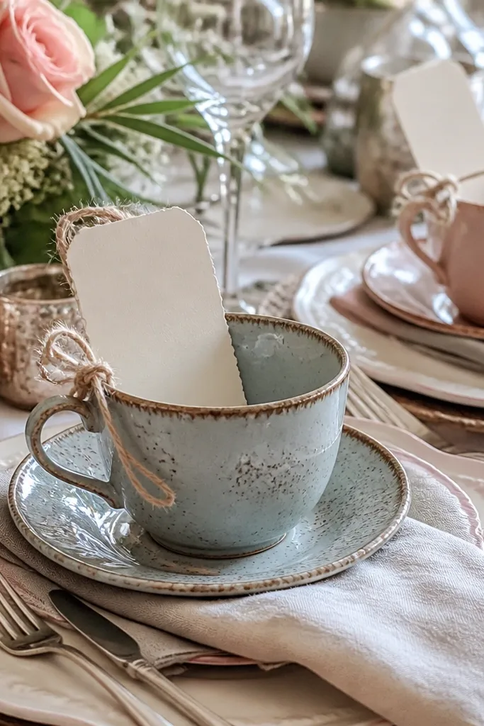
Teacups instantly read vintage and they make place settings feel special without adding clutter. Use mismatched cups in warm whites and soft pastels, then place a place card tucked inside or tied to the handle with twine. This works well for small guest counts, micro weddings, and intimate receptions where tables are close enough for guests to notice details. In photos, teacups create a delicate texture that contrasts nicely with linen and dark metal. Keep the number of cups consistent so the table looks styled, not random.
Start by sourcing 2-3 sets of matching cups in a tight color palette so your table doesn’t look like a thrift store explosion. Then write or print names on thick cream cardstock and insert them into each cup or tie them securely. Finally, place cups on top of chargers or beside plates so the card is visible from the seated angle.
Use twine in one thickness across the entire table so the texture looks uniform.
Skip flimsy cups that tip — a safe, weighted base matters for photos and guest comfort.
16. Rustic bar cart with aged glass bottles and kraft bottle labels
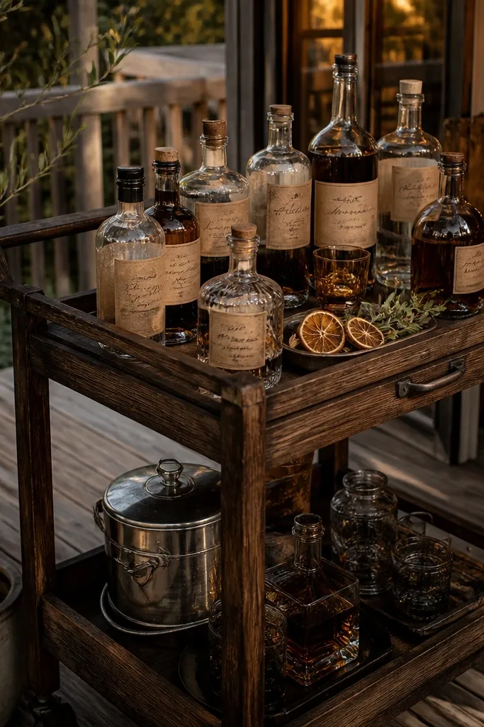
A bar cart becomes a decor element when it looks like a styled collection. Use aged or amber glass bottles and add kraft labels in black ink, then place small dried citrus slices or sprigs for color. This is a win for rustic weddings because it feels like “found” styling instead of a theme. It photographs well because glass catches highlights and the kraft labels add paper texture. Put the cart near the reception entry so it appears in lots of candid shots.
Start by selecting a bar cart with dark metal or wood finishes and clean glass shelves. Then fill it with a few statement bottles and cluster smaller bottles so the labels face outward. Finally, add a simple menu card on the side and keep a small tray for garnishes so the cart stays tidy during the night.
Quick tipLabel bottles with consistent spacing and label size — it looks intentional even if bottles are mismatched.
Skip thisDon’t crowd every shelf — empty space makes glass and labels pop.
17. Muted wildflower bouquets in brown paper wrap
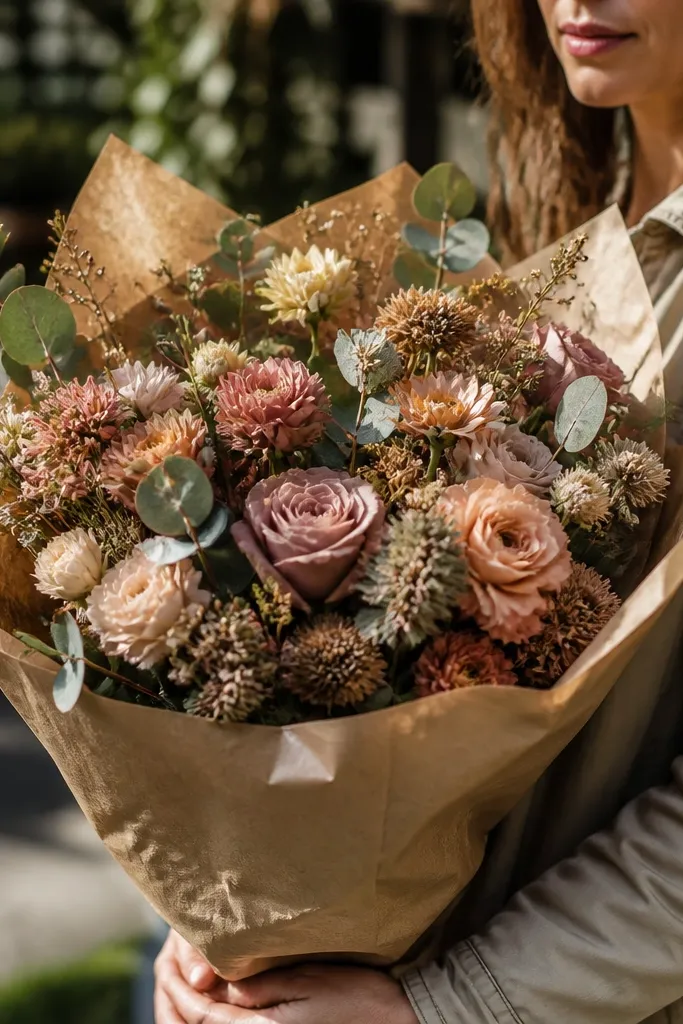
Brown paper wrap is one of the fastest ways to make florals look vintage rustic. It hides the modern stems, softens color, and adds a tactile background for photos. Choose bouquets with muted tones: dusty rose, warm peach, cream, and dried gold with olive or eucalyptus greenery. This works for aisle pieces, bud vases, and even as standalone decor on a welcome table. Keep the wrap simple and tight so it looks gathered, not messy.
Start by selecting small bunches of wildflower stems with a consistent palette, then trim stems evenly. Then wrap each bouquet in brown paper and secure with twine, leaving a little paper tail for texture. Finally, place bouquets in milk glass or dark vases and position them where side light hits so the paper texture shows.
Quick tipUse thicker brown paper for bouquets; thin paper wrinkles too fast on camera.
Skip thisSkip bright neon flower colors — they clash with the aged paper and linen look.
18. Overhead string lights with linen shade lanterns
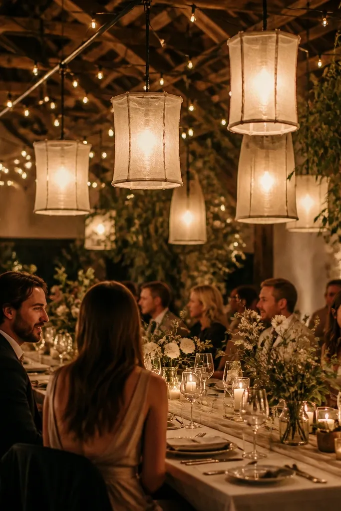
Lighting is the hidden ingredient for “timeless beauty.” Warm string lights plus linen shade lanterns make rustic decor look softer and more vintage, especially around tables and the dance floor. Linen lantern shades diffuse light so you don’t get harsh hotspots on glass bottles or shiny metals. This is a strong pick when your venue lighting is bright or white — warm it up with a layered setup. Even simple tables look styled when the light has texture and glow.
Start by hanging string lights in a grid or gentle arc above the reception area, keeping spacing consistent. Then add linen shade lanterns at table clusters or along pathways so guests see a warm gradient. Finally, use warm bulbs around 2700K and test brightness with the room lights off before guests arrive.
Quick tipTurn off overhead lights when possible — rustic decor looks best in warm, diffuse light.
Skip thisDon’t mix cool white bulbs with warm lanterns; the mismatch makes everything look washed out.
19. Vintage-inspired place setting with mismatched chargers
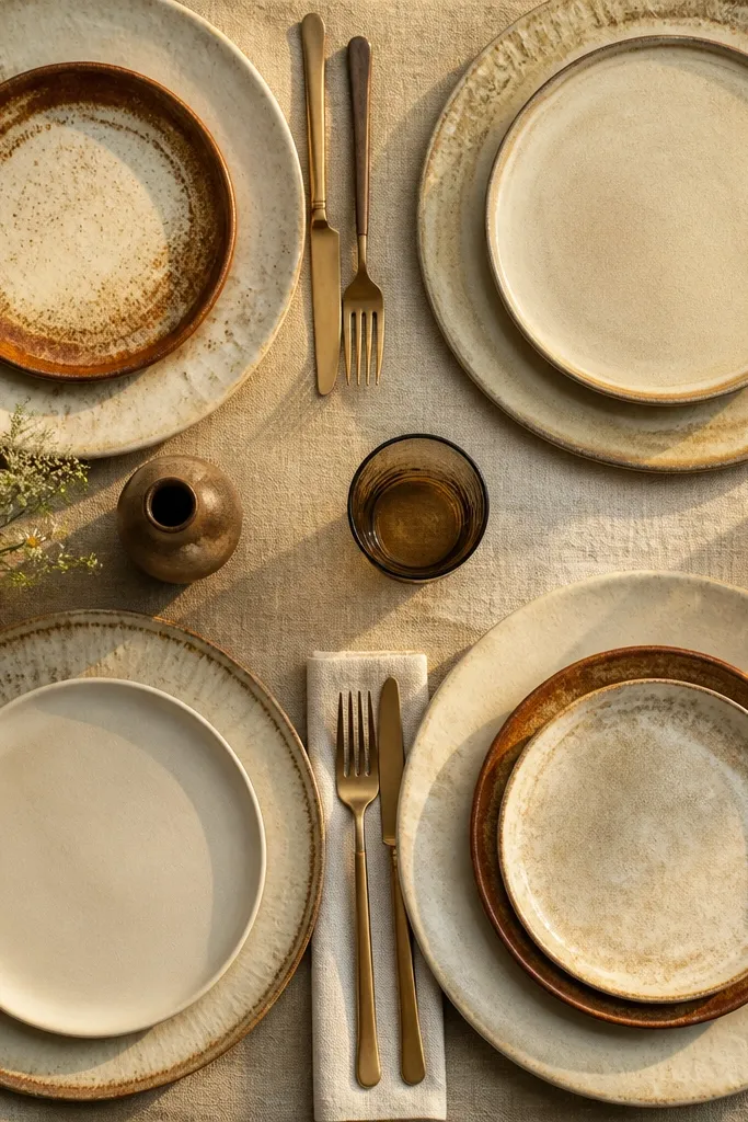
Mismatched chargers create a vintage table rhythm without adding more florals. Choose chargers in warm whites, oat tones, and subtle rust-brown accents so they match your palette even if the designs differ. The key is keeping the finish consistent: matte or lightly textured ceramic, not shiny lacquer. This setup looks great in both close-ups and wide shots because it gives the table a layered base. It also makes your reception photos look collected and intentional instead of cookie-cutter.
Start by selecting 2-3 charger styles and limiting the colors so the mix stays cohesive. Then place chargers under plates centered on the table so the table still looks orderly. Finally, coordinate napkins and flatware so the chargers don’t steal focus from the place setting details.
Use the same flatware finish across the room so mismatched chargers don’t look chaotic.
Skip high-contrast neon chargers; they look modern even if the pattern is old.
20. Rustic seating chart board with chalk ink on wood
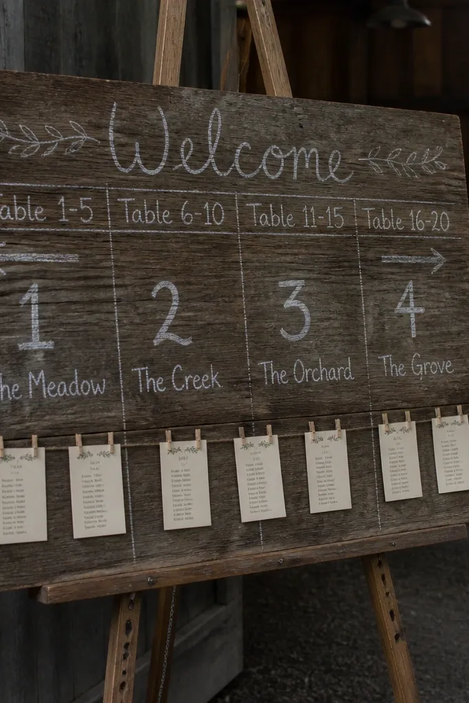
A chalk seating chart on wood is both functional and photogenic. The matte chalk look blends with linen and paper textures, and the wood grain adds authenticity. Use table numbers or section labels in large lettering, then pin small cards for guest names or seat blocks. This works best when you have a high-traffic area like near the entrance or just outside the reception hall. Guests photograph it while searching, and the wood background keeps the look consistent with vintage decor throughout.
Start by choosing a large wood board with a dark stain so chalk lettering shows clearly. Then write table numbers with thick chalk lines and add pinned name cards using small binder clips or thumbtacks. Finally, place the board at a slight angle so it catches side light and doesn’t reflect under flash.
Use a chalk marker for the lines and a softer chalk for names so the hierarchy looks crisp.
Don’t use metallic chalk; it creates glare and looks less vintage in photos.
21. Rustic cake table with dark wood riser and iron scroll stand
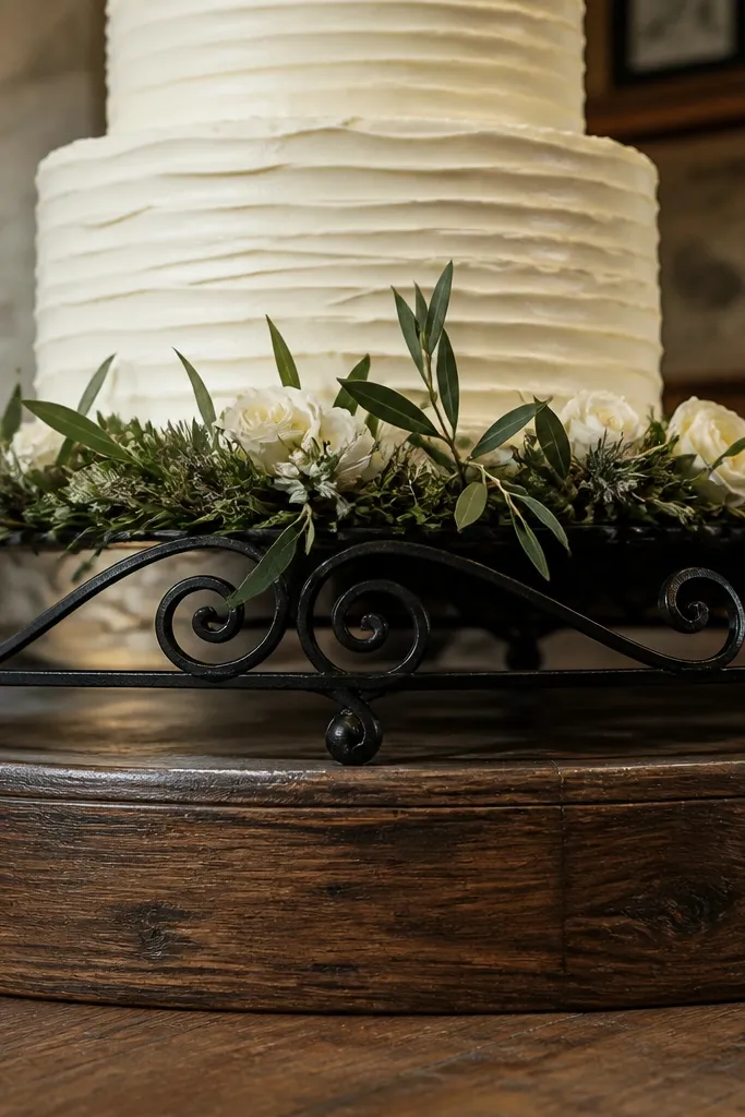
Your cake table is a big photo moment, and a dark wood riser immediately makes the cake look grounded and vintage. Add an iron scroll cake stand or frame piece so the metal brings contrast against the soft cream and warm greenery. Keep florals around the cake simple: a few cream blooms and olive branches near the base, not a full dense wall. This works for barn receptions and outdoor evenings where you want the cake to stand out without an elaborate backdrop. It also helps if the cake table is on a flat floor — the riser adds height so it reads clearly in wide shots.
Start by placing the cake on a sturdy dark riser at least 10-12 inches tall for good sightlines. Then style around the base with a small arrangement tucked low, plus a couple of candle accents on either side. Finally, keep the background behind the cake uncluttered, using a linen runner or simple wood panel so the cake becomes the focal point.
Add a small strip of linen under the stand edge so the metal doesn’t look like it’s floating.
Skip tall floral walls behind the cake; they compete with the cake and hide the tiers.
22. Ceremony aisle markers with weathered hymn books and candles
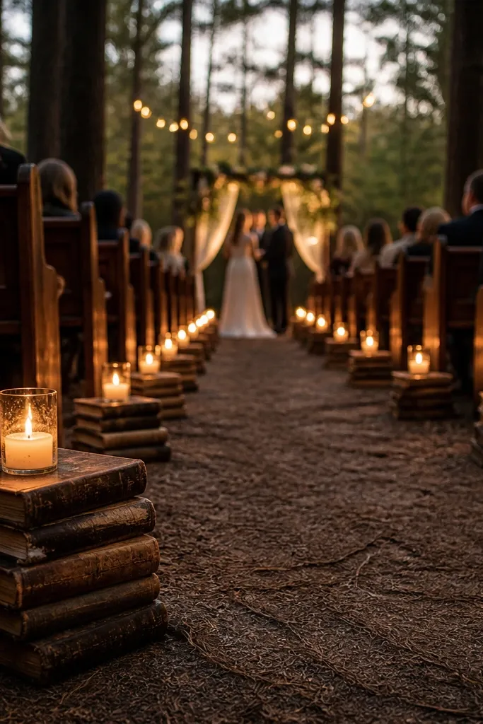
Aisle markers make your ceremony look styled from the moment guests arrive at the front. Weathered hymn books add real vintage paper texture, and small candles give warm glow that shows up in aisle photos. Use book stacks as bases for lanterns or candle holders so the look feels intentional, not like random decor. This works best for indoor ceremonies, church halls, and outdoor spaces with calm wind where candle placement stays safe. The paper texture reads on camera and adds depth in photos where flowers alone can look flat.
Start by sourcing hymn books or vintage books with intact covers, then stack them in pairs so they look symmetrical. Then place battery candles or small covered candle holders on top, keeping the flame-free option when needed. Finally, set markers at consistent intervals and keep the aisle clear for guests and photographers.
Quick tipUse LED candles with warm flicker for the same glow effect without worrying about wind.
Skip thisDon’t use loose candles without a holder — tipping looks bad fast.
23. Vintage linen backdrop for sweetheart head table
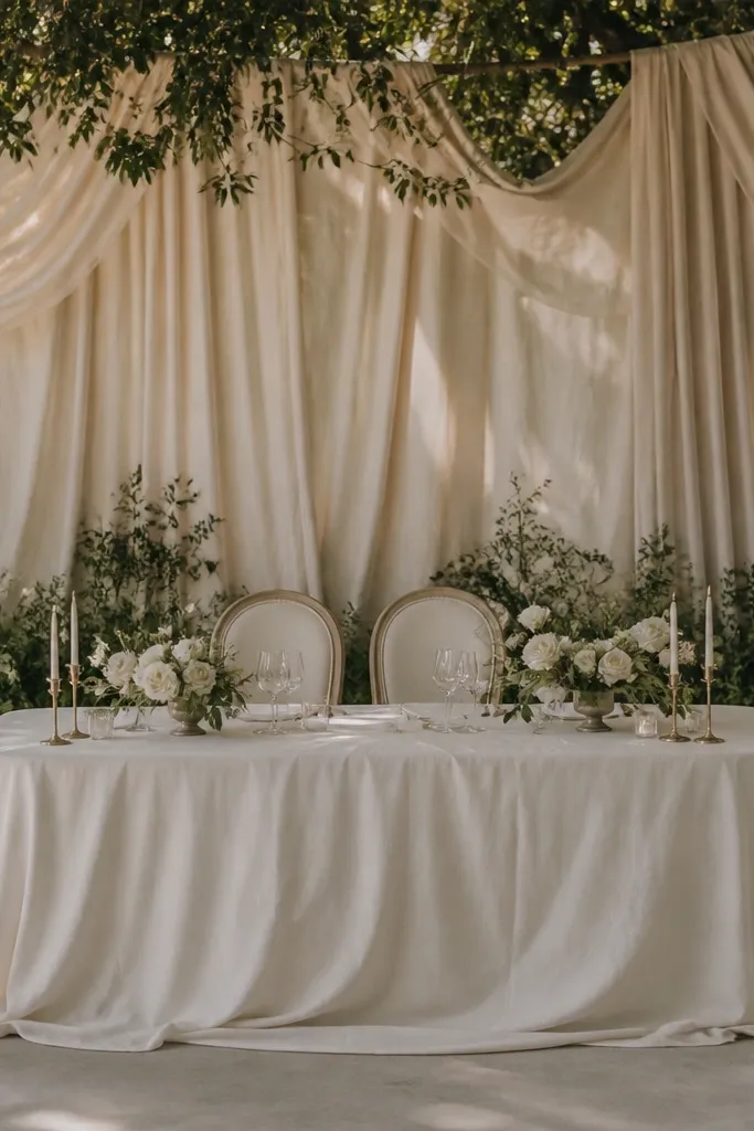
A linen backdrop behind the sweetheart table makes the couple’s area look finished even if your flowers are modest. Choose cream linen with visible folds and drape it in long sections so it looks soft and aged. Add dark greenery at the base, then keep florals minimal — a few clusters are enough. This is ideal when the venue background is plain or busy, like white walls or open rafters. In photos, linen creates a calm, vintage stage that makes the couple stand out without harsh contrast.
Start by measuring the head table width and building a backdrop panel or hanging linen so it covers the space evenly. Then attach greenery in a low band behind the table and leave the center open for clean couple photos. Finally, secure everything tightly and check from guest height to ensure the folds look natural, not stretched.
Quick tipSteam the linen right before setup; wrinkled linen that’s too dry looks gray on camera.
Skip thisSkip shiny satin backdrops; they reflect overhead light and flatten the vintage feel.
24. Weathered Barrel Head Seating Plan With Copper Thumbtacks
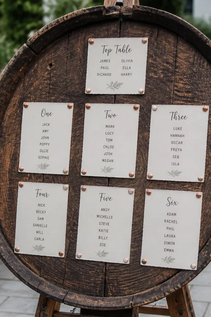
This is the kind of seating display that looks like it belongs in an old barn — because it is. A cut barrel head gives you natural rings, dents, and a dark stain that photographs warm and textured without needing extra decor. Copper thumbtacks catch light better than black pins, so the names pop on camera even in shade. It suits weekend vintage rustic wedding decor itineraries when you want one central “arrival moment” that also helps guests find their seats fast. It works best in fall and early winter because the lighting feels cozy and the dark wood reads rich in photos.
Step 1 — pick a barrel head size that matches your guest count: 24-inch is good for about 60 seats, 30-inch covers roughly 80. Handwrite names with a grease pencil or paint marker, then pin each card with copper thumbtacks so the spacing stays neat from a distance. Step 2 — source the barrel head locally if you can: look for reclaimed whiskey barrel heads at farm shops or salvage yards near your venue, or order from a maker that ships flat-packed. Step 3 — plan time on arrival day — budget 30 to 45 minutes to mount the board and lay out cards so it looks intentional, not rushed. Step 4 — book early if you’re ordering online because barrel heads are often one-off pieces; aim to place the order 6 to 10 weeks before your wedding.
Carry a small roll of painter’s tape and a ruler so you can align rows before you start pinning. Copper pins are easy to drop — bring a small tray so you don’t lose them on the floor.
Avoid printing tiny fonts that you can read only up close — guests need to scan from 6 to 10 feet.
25. Vintage Milk-Can Flower Wall With Twine Hangers
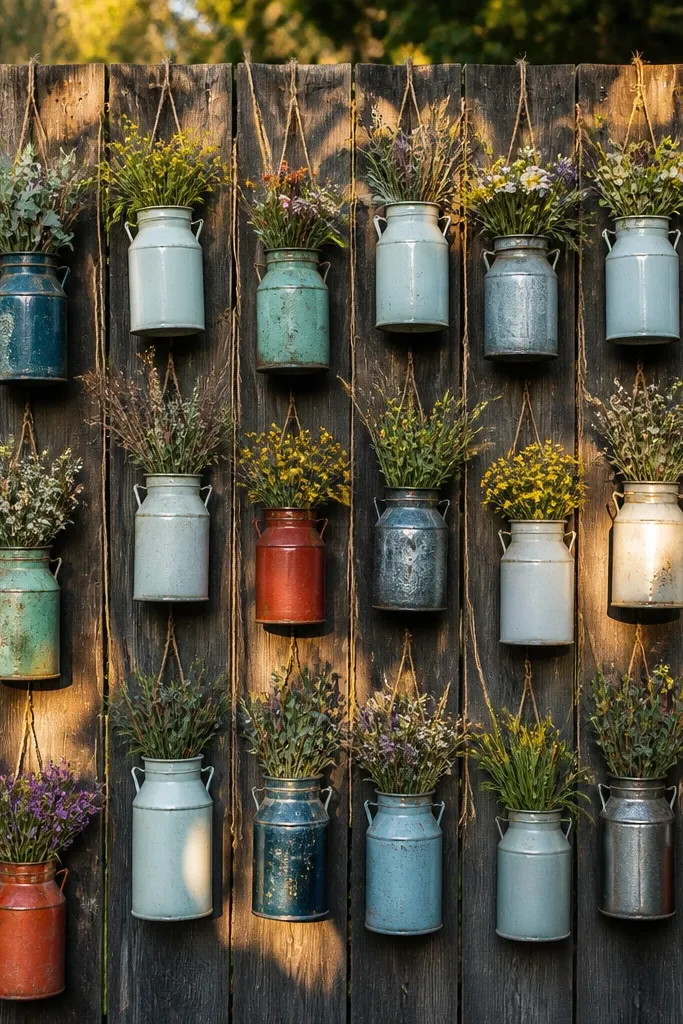
A milk-can flower wall is a rustic photo magnet because each container has its own dents, paint chips, and shape. Instead of one big arrangement, you get a grid of small blooms that looks full from every angle and keeps the background interesting when guests step closer. It photographs especially well in morning light or golden hour because the metal catches highlights while the flowers stay soft and natural. This fits a weekend vintage rustic wedding decor itinerary when you want something that feels “found” but still looks styled. It suits outdoor weekends on porches, barn doors, and garden paths — places where a wall installation can frame candid shots.
Step 1 — decide on a tight grid: use 9 cans (3x3) for a 6-foot wall section, or 12 cans (4x3) for a wider entrance. Hang each can by drilling two small holes near the top and tying with thick cotton twine, then add a small liner (plastic cup or waterproof insert) so water doesn’t stain your wall. Step 2 — arrange flowers in batches based on height: place taller stems in the back row, shorter blooms in the front, and leave a little “air” between cans so the dents show. Step 3 — get your cans first, then build your flower list around what you actually have — mismatched can sizes create more visual texture than perfectly identical ones. Step 4 — plan for a 2 to 3 hour setup window the day before if the venue allows — it’s faster when you can lay out the grid on the floor and then hang from a ladder.
Buy twine by the spool and cut longer than you think — you can shorten after hanging once you see the height from guest eye level.
Avoid using all the same flower and same stem length — uniformity makes it look like a craft project instead of a vintage display.



