
1. Backlit frosted acrylic with a hand-lettered welcome
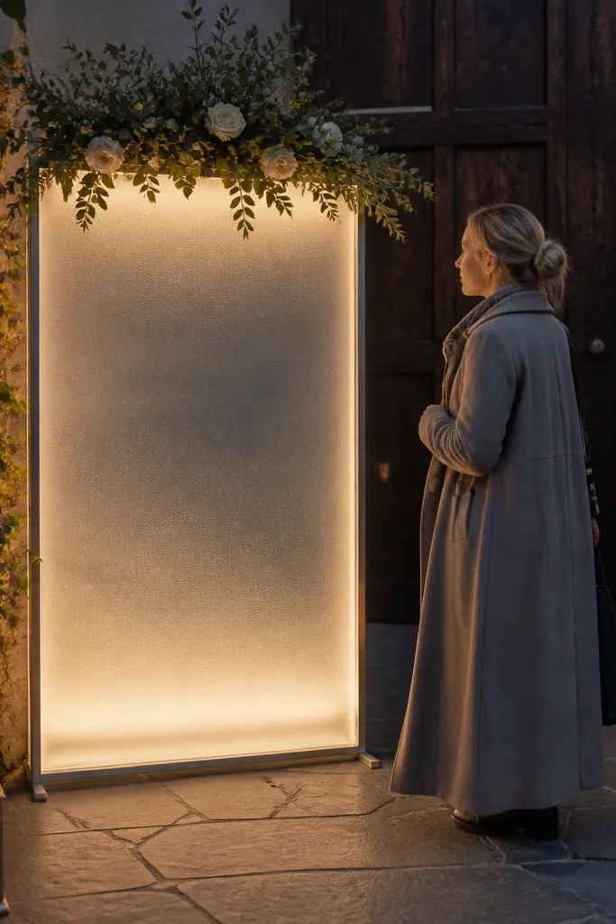
This is the cleanest year-round option because light makes the text readable in every season. Frosted acrylic diffuses glare, so the letters look smooth in bright outdoor sun and warm indoor lighting. The photo advantage is huge: you get a halo effect behind the lettering without harsh hotspots. It also feels special without needing heavy decor. For a creative entrance, pair it with a dark metal stand or a matte wood base so the glow looks intentional, not random.
Start with a frosted acrylic panel in clear or white frost (about 12-18 inches tall for an entrance sign). Then add backlighting using a slim LED light box or an edge-lit LED strip mounted behind the panel. Finally, use permanent vinyl or printed lettering on the front so you can swap names later by replacing only the top layer. For travel, choose a panel that fits in a flat shipping sleeve and bring a small battery pack or extension cord depending on venue rules.
Quick tipUse white or warm-white light; cool blue LEDs make skin tones look odd in entrance photos.
Skip thisSkip glossy acrylic with tiny fonts — it creates glare and the message washes out.
2. Layered wood frame with a removable floral top insert
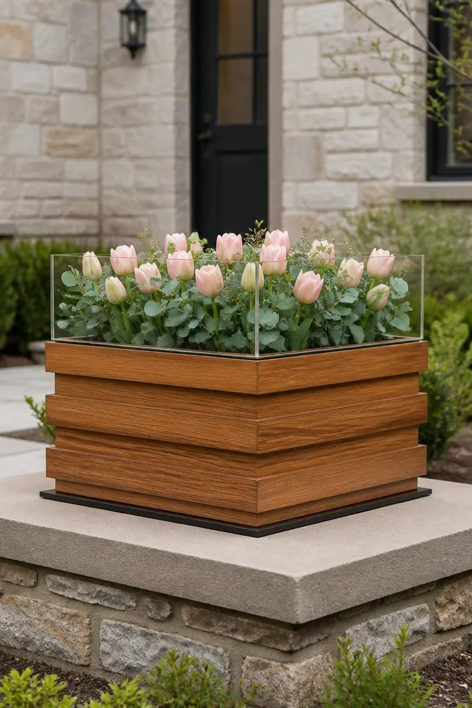
Layered wood gives you depth that reads well in photos, and the removable insert keeps it year-round unique. The base stays consistent — a warm timber frame — while the top insert changes with season (spring florals, summer greenery, fall dried accents, winter evergreen). This is a smart way to keep the entrance looking designed instead of “same sign, different flowers.” It also photographs beautifully from the side because the layers cast soft shadows.
Start by building or buying a two-piece wood frame with a 3-4 inch depth and a lip that holds an insert. Then create seasonal inserts on lightweight plywood or foam board, sized to slide into the frame. Finally, keep the message on a fixed center plate so the lettering stays aligned no matter what floral insert you use. For travel, wrap the frame in a moving blanket and pack inserts separately in flat sleeves.
Use a lip or magnetic tabs so the insert seats the same way every time.
Skip cheap plywood with warping edges; the insert won’t sit flush and the sign looks sloppy.
3. Oversized linen banner on a wooden ladder stand
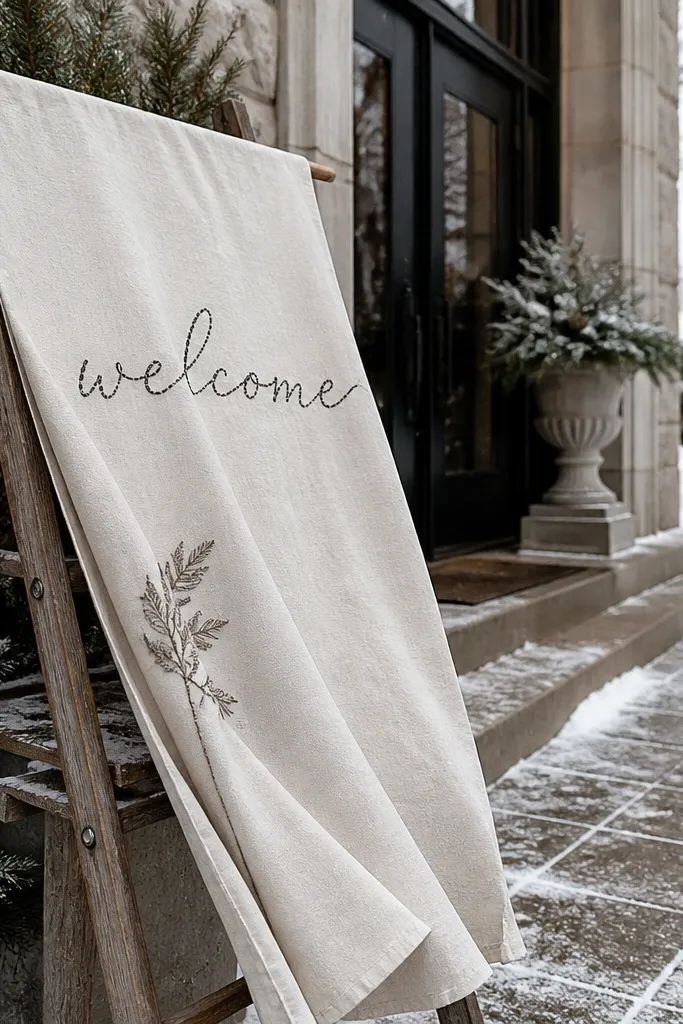
Linen reads soft and expensive on camera, and it works in every season because it’s neutral. A ladder stand gives you height without blocking doorways, and the drape creates movement in outdoor photos. This setup also feels creative without going overboard on props. In winter, linen plus evergreen sprigs looks cozy; in summer, linen with fresh greenery looks airy. The photo win is the texture — it catches light differently than paper.
Start by selecting a linen banner about 24-30 inches wide with a top sleeve for a dowel or clips. Then mount it on a small wooden ladder stand (or two sawhorse-style legs with a crossbar) that you can stabilize with a weighted base. Finally, use fabric-safe paint markers or printed transfer vinyl for crisp text. Bring binder clips to re-drape quickly if wind or travel wrinkles it.
Quick tipSteam the linen right before the ceremony; wrinkles look charming only when they’re intentional.
Skip thisSkip glossy vinyl letters on linen — they look plasticky up close.
4. Vintage window frame with chalkboard panes
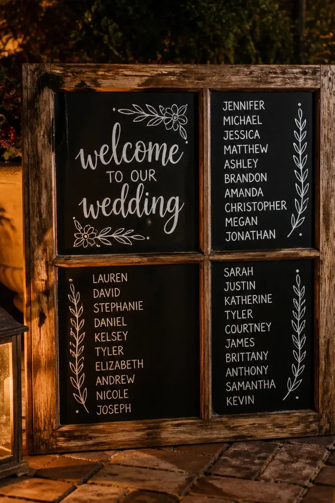
A window frame looks like a real photo prop, not a generic sign. The chalkboard panes give you high contrast and the ability to update names even if your guest list changes. This works year-round because wood tones and black chalk look good in spring, summer, fall, and winter. It also creates a layered, story-like entrance, especially if the ceremony area already has old architecture or rustic decor. For photos, the window shape naturally frames the text.
Start by finding a vintage-style window frame and sanding any rough edges so it doesn’t snag fabric. Then attach two chalkboard panes (or paint panels) into the frame so the text stays flat and readable. Finally, use a chalk pen for lettering with thick strokes and add a small date or short welcome line. For travel, secure the panes with felt tape and pack the frame upright in a protective box.
Write the message the night before and store it covered so chalk doesn’t dust off on hands.
Skip thin chalk lines; from 10 feet away they vanish.
5. Neon-style welcome in a clear acrylic frame
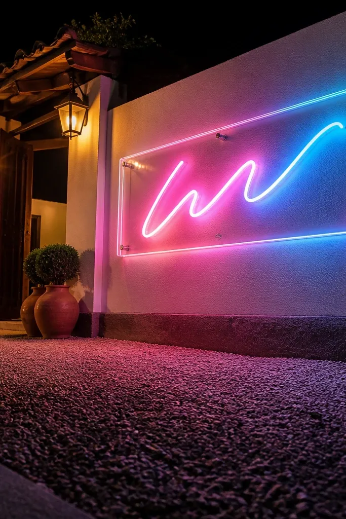
Neon-style signage looks unreal in photos because it adds color and motion without extra decor. Put it near the entrance where people naturally pause, and you’ll get instant “night reception” shots that still look good in daylight. Clear acrylic keeps the frame clean so the sign doesn’t feel messy. For year-round, choose a color that works in every season — warm amber or soft pink looks great against greenery, wood, and winter whites. This idea is for couples who want the entrance to feel modern and a little playful.
Start by choosing a neon-style letter kit or flexible neon tube mounted behind a clear acrylic sheet. Then arrange the lettering so the baseline sits at about 48-56 inches from the ground for easy guest photos. Finally, add a weighted base or wall clamp depending on venue rules. For travel, pack the acrylic flat and coil the tube carefully in tissue paper.
Quick tipIf you’re outdoors, keep the power cable taped down with gaffer tape — it reads clean on camera.
Skip thisSkip super-bright blue neon; it can wash out faces in warm indoor lighting.
6. Terracotta clay welcome tile with carved lettering
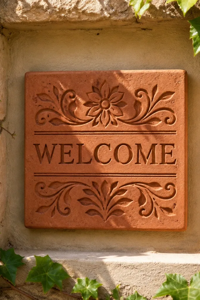
Terracotta looks grounded and warm, and it photographs beautifully against stone paths and outdoor greenery. Carved lettering gives you shadow depth, which means the message reads even when lighting is uneven. This is a great year-round unique wedding welcome sign for venues with natural textures — stucco walls, brick steps, garden paths. In summer, it looks sun-kissed; in winter, it looks cozy and earthy. You can keep it minimal so it doesn’t fight with florals.
Start by getting a terracotta tile or ordering a ceramic tile with carved or stamped lettering. Then seal it with a matte ceramic sealer so it resists light moisture and doesn’t smear. Finally, mount it on a small stand or attach it to a lightweight backing board for stability. Travel-wise, wrap the tile with bubble wrap and keep it in a rigid box so it doesn’t chip.
Use matte sealer; glossy finishes glare in photos.
Skip painted lettering that flakes — carved or sealed text holds up better.
7. Giant monogram welcome on reclaimed barn wood
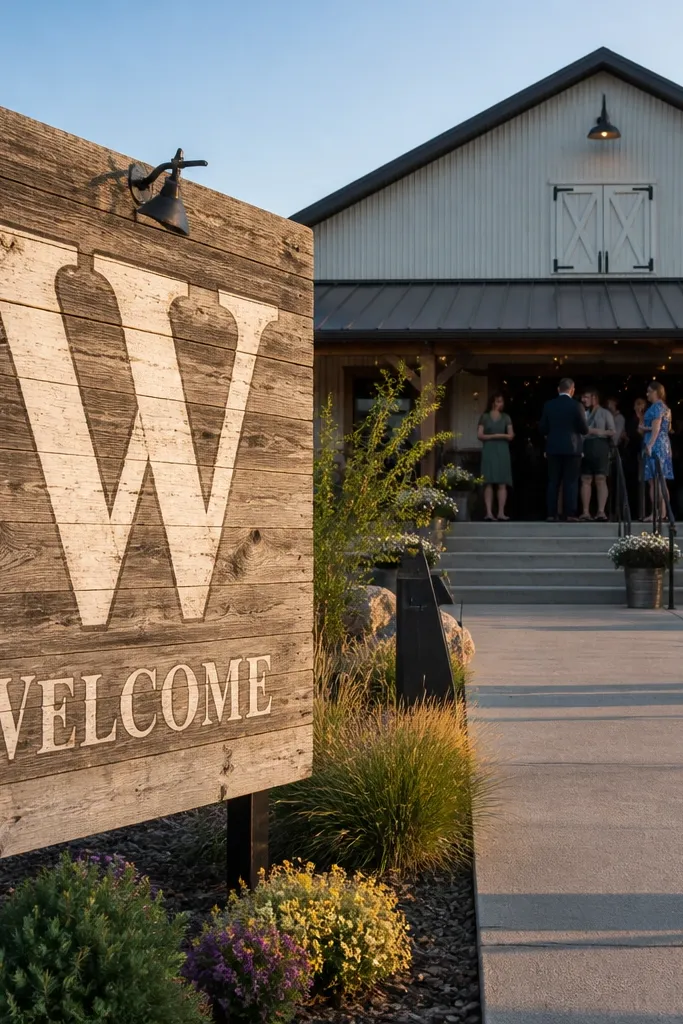
A giant monogram acts like a landmark, and the welcome line keeps it functional. Reclaimed barn wood adds character that looks good in every season because the grain and knots stay consistent. It’s a strong entrance choice when you want guests to recognize the vibe quickly — rustic, warm, and photo-ready. For year-round uniqueness, pair it with seasonal greenery tucked around the base rather than changing the sign itself. The big advantage is how well wood grain catches side light, giving you depth in photos.
Start by choosing a board width around 30-36 inches and sand it lightly so paint or vinyl adheres. Then apply a monogram in vinyl or paint, followed by a smaller welcome line below. Finally, mount it on a freestanding frame or attach it to two sturdy legs for outdoor stability. For travel, treat it like a fragile plank — wrap edges and corners and transport upright when possible.
Quick tipPick one main color for the lettering (black, oxblood, or cream) to keep the look cohesive year-round.
Skip thisSkip tiny fonts; wood textures can swallow fine lettering.
8. Pressed flower welcome in resin on a thick board
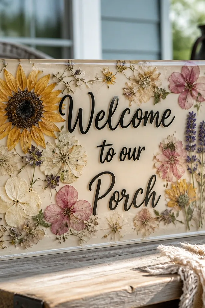
Pressed flowers under resin look like small art pieces, and that makes the entrance feel intentional without needing a big setup. The resin provides a glossy layer that makes colors pop in both bright and low light. For year-round uniqueness, design the flowers to match the season you’re in, but keep the layout and base the same for future swaps. It also photographs well from close range, so guests who stop for selfies get a detailed background. Choose flowers with strong shapes — think calendula petals, eucalyptus leaves, or small wildflower clusters.
Start by pressing flowers flat and selecting a resin board or pouring mold sized for your design. Then create your welcome lettering on top of the resin surface using a printed guide or raised letters, and place the pressed flowers around it. Finally, seal with a clear, UV-resistant resin top coat so it doesn’t yellow. For travel, use a thick board (at least 3/4 inch) and wrap it with foam corners to prevent impact.
Quick tipUse UV-resistant resin and keep it out of direct sun for long setup times to reduce color shift.
Skip thisSkip thin resin pours; they look wavy and catch glare.
9. Chalk lettering on a curved mirror sign
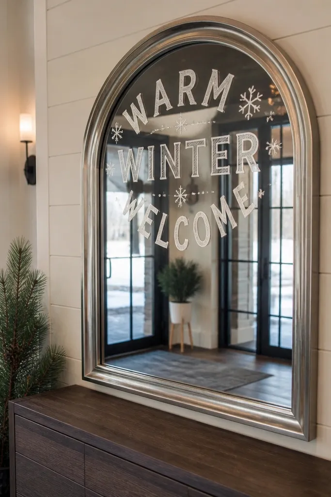
A curved mirror gives you instant “wow” photos because it reflects the entrance and makes the space look bigger. Chalk lettering stays readable and you can update names quickly, which matters for year-round events when details change. The mirror also works in winter — it catches interior light and brightens gloomy venues. Keep the lettering bold and centered so it doesn’t get lost in reflections. This is the best option when you want the welcome sign to double as a photo moment.
Start by choosing a small-to-medium curved mirror (around 18-24 inches wide) with a sturdy frame. Then use chalk markers for the welcome line and a simple date script below, keeping strokes thick. Finally, place it on a weighted floor stand or clamp it to a stand so it can’t tip. For travel, carry it upright in a mirror box and bring microfiber cloth for quick smudges.
Quick tipWrite the message with chalk markers, then spray a light matte fixative to reduce smearing on hands.
Skip thisSkip super-thin script; reflections make delicate strokes hard to read.
10. Metal welcome sign with laser-cut leaves
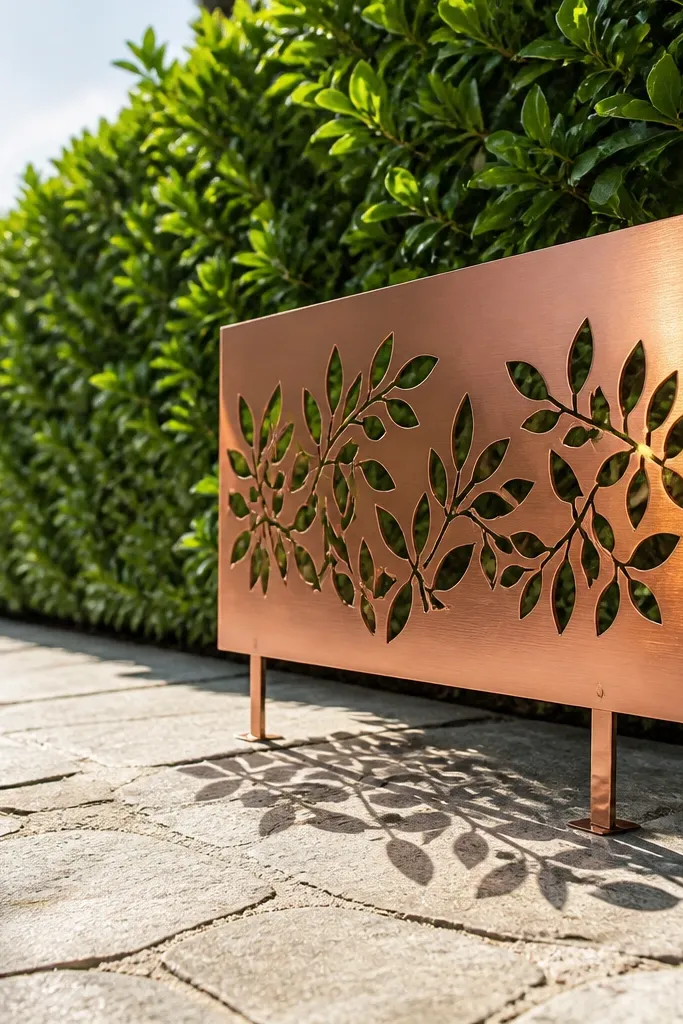
Laser-cut metal brings a crisp, architectural look that still feels organic because of the leaf cutouts. The cutouts create shadows on the ground, which gives your entrance visual depth even when the sign is simple. This is a strong year-round option because metal works with every season’s color palette. Choose a warm finish like brushed bronze or antique copper so it doesn’t look cold in winter photos. It’s also durable for outdoor venues where paper signs get wrinkled.
Start by selecting a metal sign with a laser-cut welcome line and leaf pattern, sized around 20-28 inches tall. Then attach it to a freestanding stand or stake mount for outdoor stability. Finally, add a small base weight or sandbag if the venue is windy. For travel, keep it wrapped in cloth and store it in a hard case to avoid dents.
Quick tipPair with warm string lights at ground level so the leaf shadows look intentional at night.
Skip thisSkip glossy painted metal; it shows glare spots in midday photos.
11. White ceramic tile welcome with a gold nameplate
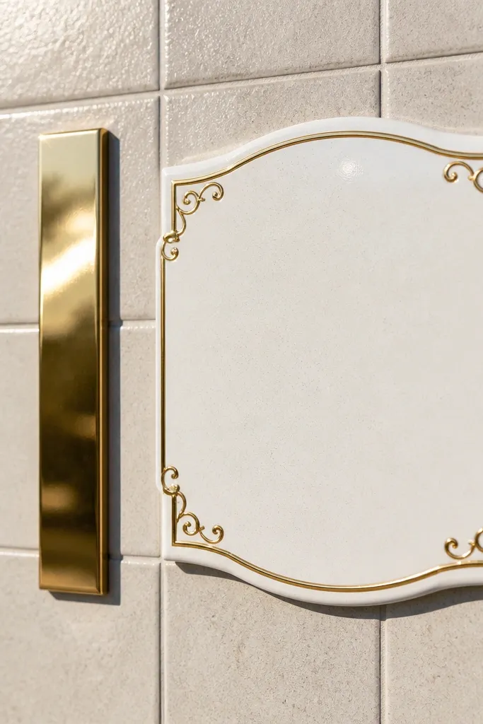
Ceramic tile looks polished and clean, and the gold nameplate adds a luxe touch without heavy decor. This style is great for year-round unique wedding welcome sign because it stays bright and readable in winter light and doesn’t fade in summer heat. The photo advantage is the crisp edges and smooth surface, which contrast nicely with greenery, wood, or stone. Keep the welcome line in a simple serif font and let the gold plate carry the couple’s names. It reads like a real event detail, not a craft project.
Start by getting a white ceramic tile or ordering a printed ceramic panel in a similar size (about 12x18 inches). Then affix a gold acrylic or metal nameplate in the top or center area using strong adhesive made for ceramics. Finally, mount the tile on a small easel stand so it faces the entrance path. For travel, protect corners with foam sleeves and keep the stand packed separately.
Use matte gold for photos; shiny gold can blow out in bright daylight.
Skip overly busy designs on ceramic; the surface already looks busy on camera.
12. Watercolor wash welcome on thick watercolor paper with clip frame
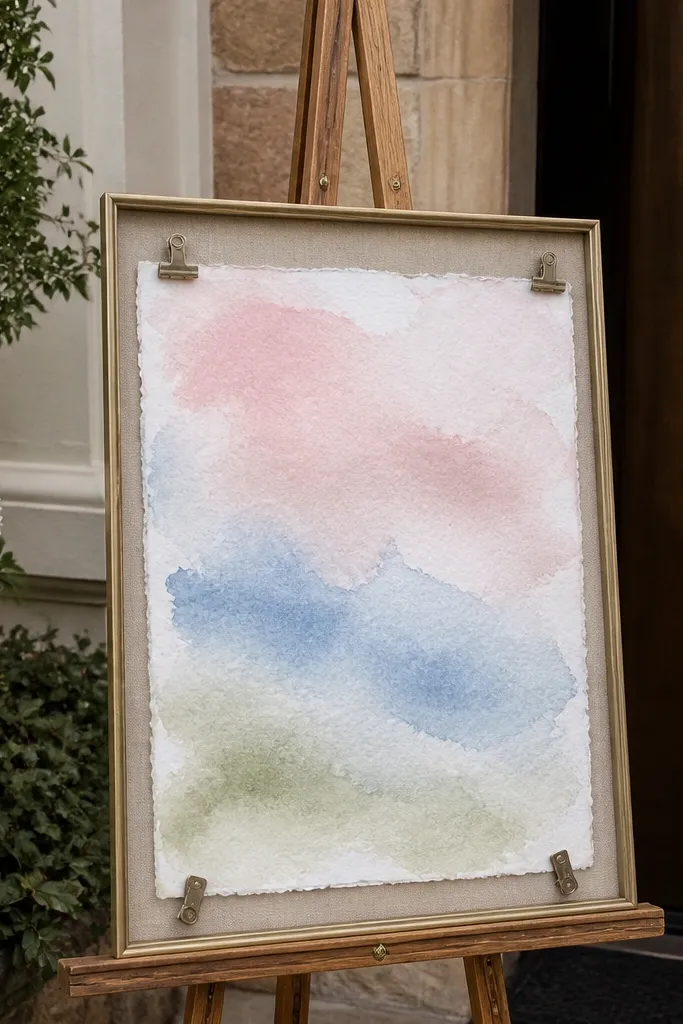
Watercolor looks soft and artistic, and it’s a great year-round unique wedding welcome sign when you want something that feels custom but not heavy. The trick is to use thick paper and a frame that creates depth — the sign should sit off the background. Watercolor also plays nicely with seasonal palettes: blush and peach for spring, sage and sky for summer, dusty rose for fall, and cool grays plus evergreen for winter. The photo advantage is the gentle gradients, which look good in both bright and shaded areas.
Start with 300gsm watercolor paper and paint a simple wash background leaving space for bold text. Then mount the paper behind a clear acrylic or glass sheet inside a clip frame so it stays flat and protected. Finally, place it on a stand with a neutral backing so the watercolor doesn’t look washed out. Travel tip: roll the paper only if it stays flat after unrolling; otherwise transport flat in a rigid art portfolio.
Choose fonts with thick terminals; watercolor backgrounds make thin script disappear.
Skip flimsy printer paper; it buckles in humidity and ruins the look.
13. Oversized fabric map welcome with route line
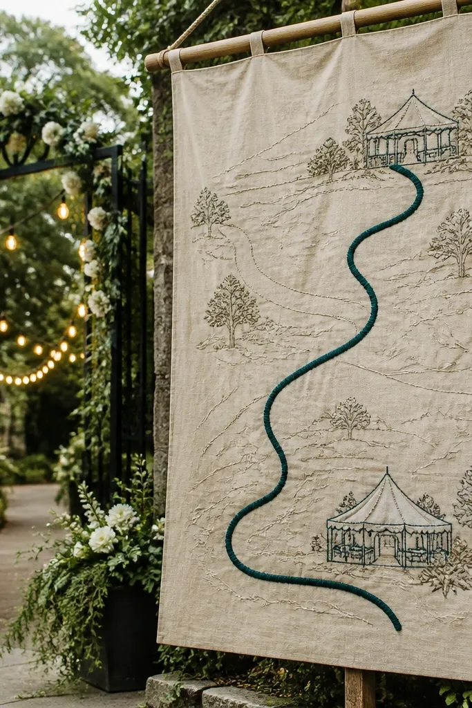
A fabric map style welcome sign feels creative and personal, and it’s genuinely photogenic because it has pattern and direction. Add the venue location, a short welcome line, and a route line from ceremony to reception. It’s year-round unique because you can change the route graphic for each wedding while keeping the same fabric base. The look works best for destination weddings or places with a scenic story. In photos, the route line gives the eye somewhere to go, so the sign doesn’t look empty.
Start by printing a simple topographic map graphic onto fabric or using a fabric panel as your base. Then stitch or iron-apply a bold route line with an arrow and add the welcome text using fabric-safe transfer vinyl. Finally, mount it on a lightweight foam board backing and display it on an easel. For travel, pack it in a garment bag to avoid creases, and bring a small travel steamer.
Quick tipUse one route color (deep green or terracotta) so it matches your wedding palette.
Skip thisSkip tiny map labels; they look like noise in photos.
14. Blackboard on a rolling cart with fresh greenery base
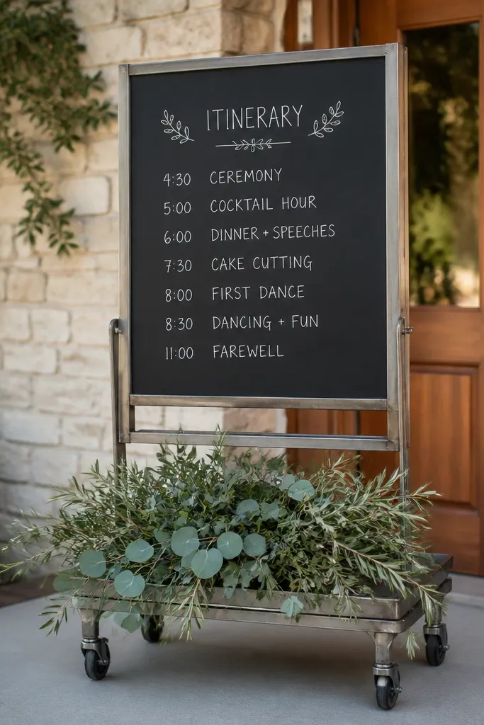
A rolling cart makes the welcome sign feel like a functional event detail, not a static decoration. The blackboard surface gives you contrast and lets you add a short itinerary line like ceremony time or cocktail hour. Greenery at the base keeps the look seasonal without rebuilding the sign. This is especially good for venues where you can place the cart near the entrance without worrying about wind — the cart has weight. Photographically, carts add charm because they create a “movement” feel even in still photos.
Start with a medium blackboard panel sized about 18-24 inches wide and mount it on the cart using brackets or a secure frame. Then write your welcome message in chalk marker with thick strokes and include one simple line of info. Finally, hide the cart’s lower shelf with greenery garland or seasonal stems tied in place. For travel, keep the cart folded or use a collapsible stand if you’re transporting it by car.
Dust chalk off lightly with a soft brush the morning of to keep it from smudging on hands.
Skip overcrowding the blackboard; too many lines make it unreadable at a distance.
15. Acrylic sign with photo strip guestbook insert
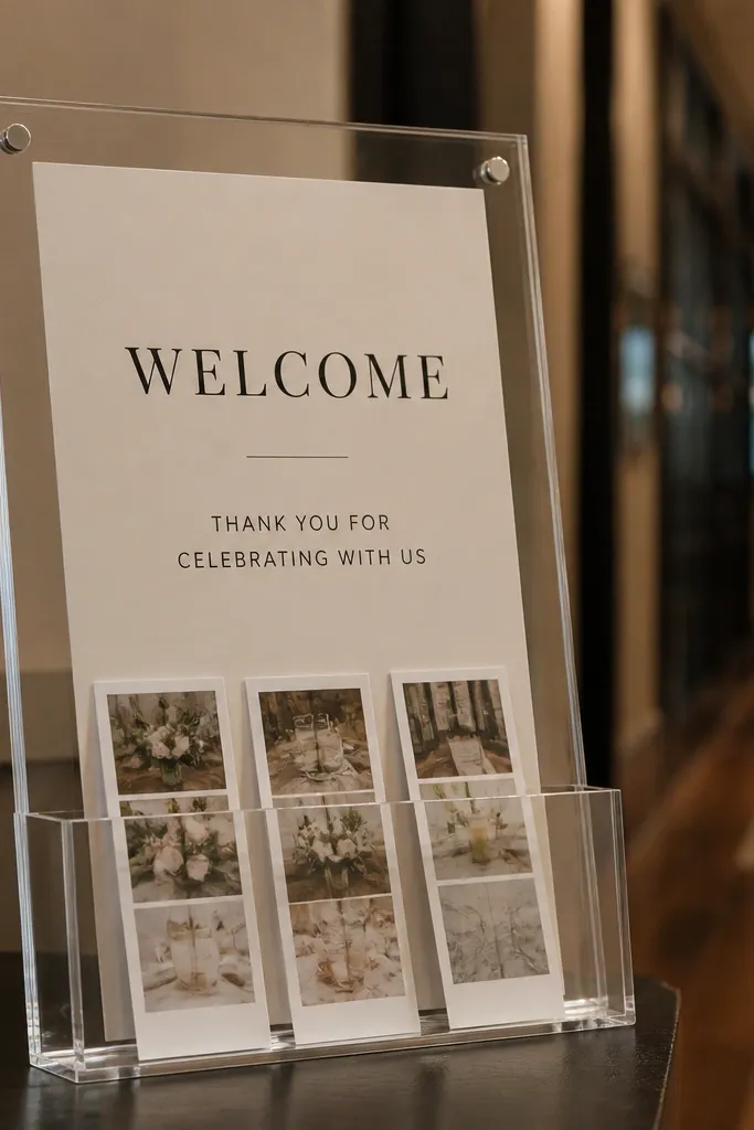
This idea turns the welcome sign into an interactive entrance moment, and photos capture that interaction because guests naturally look at the insert. Use a clear acrylic sign with a slot that holds photo strip cards or mini Polaroid-style notes. The welcome text stays clean and readable, while the insert adds year-round uniqueness because you can change the card set for each season. It also reduces the need for extra decor since the sign already has a second visual layer. For creative entrances, this is one of the most “different” options that still looks polished.
Start with a clear acrylic base and add a routed slot or clipped holder for 4x6 cards. Then print a themed welcome card backer (seasonal colors, same typography) and place it behind the slot so it looks finished. Finally, include a small stack of blank cards for guests to add messages or photos. Travel tip: pack acrylic in a protective sleeve and store cards in a flat box so corners don’t bend.
Quick tipPick a font style with bold capitals; clear acrylic backgrounds make thin fonts disappear.
Skip thisSkip open slots with no cover; glare and smudges ruin the crisp look.
16. Gold-framed wedding monogram with linen backing
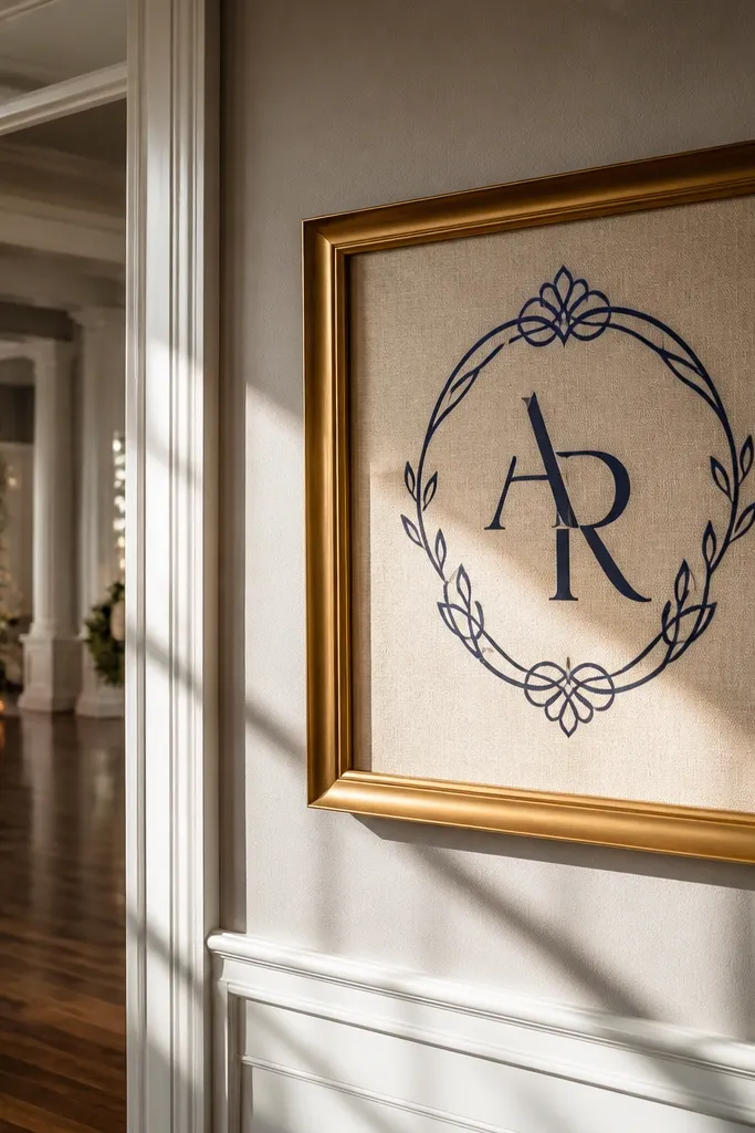
A gold frame over linen gives you a gallery feel at the entrance, and that’s what makes it look good in photos. The linen texture prevents the sign from looking flat, while the monogram keeps it instantly recognizable. This works year-round because you can swap the monogram color by changing ink vinyl or a removable overlay panel. Keep the welcome line small and the monogram big, so the entrance doesn’t become clutter. If your wedding decor is minimal, this will still photograph with impact.
Start with a large gold or brass-toned frame (roughly 24-30 inches wide) and replace the back with linen stretched tight. Then add the welcome text in vinyl or painted lettering on a removable overlay so you can change it later. Finally, hang or stand the frame so it faces the walkway at a slight angle to reduce glare. For travel, wrap the frame corners carefully and keep the linen backing flat inside the frame.
Use matte gold or brushed metal finishes; polished gold reflects too much light.
Skip thick glossy backing behind the linen; it creates glare and makes letters look washed.
17. Terrace-style welcome on stacked slate slabs
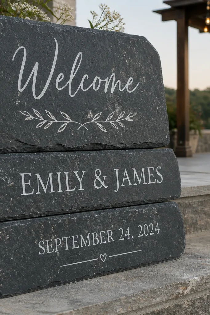
Stacked slate looks like a destination detail, even when it’s simple. The stone surface holds contrast well, and slate has a natural range of grays that work in every season. The stacked layout gives you depth, and each slab can carry a different line: welcome, names, and date. It’s one of the best options for outdoor entrances near rock walls, patios, or modern architecture. Photos look dramatic because slate naturally creates darker shadows and crisp edges.
Start by getting two or three slate slabs cut to similar widths, with smooth edges for safe handling. Then paint lettering in a chalk paint or enamel rated for stone, keeping the strokes thick for readability. Finally, stack them on a stable base or use small risers so the top slab sits at about 4 feet high. Travel tip: pack slate in rigid foam or a slate carrier to avoid chips.
Quick tipSeal the slate after painting so water from morning dew doesn’t dull the text.
Skip thisSkip thin slates; they crack in transit and the finish looks uneven.
18. Seasonal wreath welcome on a tall standing easel
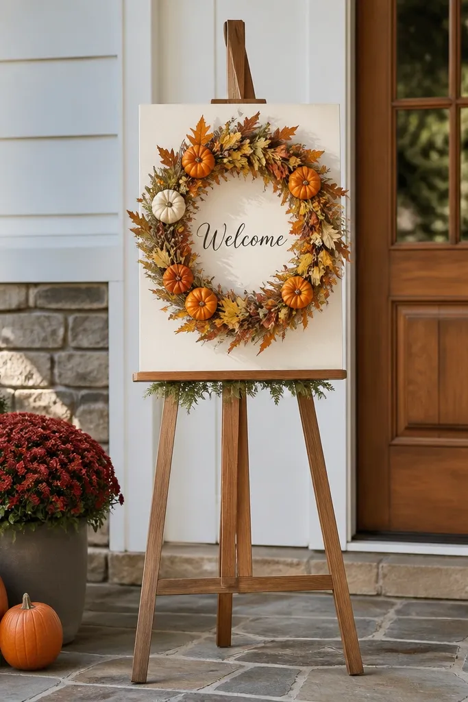
A wreath-centered welcome sign is classic, but the year-round unique part comes from changing the wreath material while keeping the same easel and text plate. Use a central sign plate for names and date, then swap the outer wreath: spring flowers, summer greenery, fall dried stems, winter evergreen. The easel height gives you strong framing in photos because it sits above people’s heads. This works best at entrances where you have enough vertical space — think garden gates, hotel lobbies with tall corners, or outdoor patios.
Start with a tall easel and attach a small sign plate in the center (wood, acrylic, or ceramic). Then build a removable wreath that can clip onto the easel with zip ties or a hook system. Finally, keep the welcome text on the plate so the spelling never changes and the wreath only updates seasonally. For travel, pack the wreath in a circular box or wrap it carefully in breathable paper to avoid crushing.
Use removable clips instead of wiring — it’s faster to set up and looks cleaner on camera.
Skip loose wreaths that shed — dried materials drop fast in outdoor photos.
19. Hand-painted ceramic arrow sign pointing to ceremony
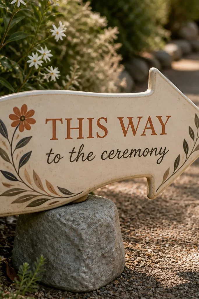
An arrow sign is both functional and photogenic, and it helps guests find the ceremony without extra staff. Ceramic arrow shapes look custom and look good in close shots, especially on patios and garden paths. Put a small welcome message inside the arrow curve and add names near the base. This is year-round unique because arrows don’t depend on seasonal florals — you can keep the style and switch colors or accents each time. It also creates a clean visual line in photos, guiding the eye.
Start by choosing ceramic arrow tiles or ordering a ceramic arrow panel with a flat back. Then paint a simple welcome line with ceramic-safe paint and seal it. Finally, stand it on a stake or weighted base so the arrow points clearly toward your ceremony spot. Travel tip: protect the painted surface with a rigid cover and pack in a box with foam dividers.
Place it at a decision point, not right at the entrance — photos look more intentional when guests follow the arrow.
Skip arrows that point too close to the sign; guests need a visible walking line.
20. Chalkboard panel with gilded corners and linen ties
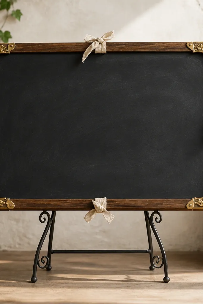
This is a “soft formal” entrance look that still photographs clearly. The chalkboard gives contrast, while gilded corners add structure that frames the text. Linen ties add a tactile detail that looks good in photos and hides mounting hardware. It’s year-round because the chalk color and corner accents can match season palettes without changing the main structure. Place it on a stand near the entrance so guests can read it while walking in.
Start with a chalkboard panel sized about 20-26 inches wide and add gold leaf or gilded tape only at the corners. Then use linen ribbon ties to secure the panel to a stand or frame so it looks intentional from the side. Finally, write the welcome message with chalk marker, keeping line breaks short so it’s readable. Travel tip: store in a flat cover and bring chalk eraser pads for quick fixes.
Quick tipUse one accent color in the writing (like deep green) for a photo-friendly pop against black.
Skip thisSkip heavy smudging; chalkboard messages look messy when they’re not crisp.
21. Paper-cut welcome on layered matte cardstock with shadow gap
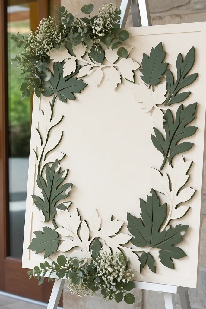
Paper-cut signs are photogenic because they create crisp edges and a shadow gap that adds depth. The year-round unique part is the design: you can cut seasonal motifs (snowflakes, leaves, flowers) into the top layer while keeping the base the same. Matte cardstock is key because it avoids glare, especially under venue lights. This is a great option for couples who want a handcrafted look but don’t want something fragile like resin or ceramics. It reads clean in photos when the contrast is strong.
Start with a matte cardstock base and cut a top layer using a craft knife or plotter for clean shapes. Then mount the top layer with spacers (like 1/4 inch foam tape) to create a visible shadow gap around the edges. Finally, place the sign in a simple frame or attach to a stand with a neutral backing. Travel tip: keep the sign flat in a rigid portfolio to prevent warping.
Quick tipUse thick black or deep charcoal for the welcome line; it stays legible under mixed lighting.
Skip thisSkip glossy cardstock; it reflects and makes the cut edges look muddy.
22. Wood dowel photo banner welcome with mini name tags
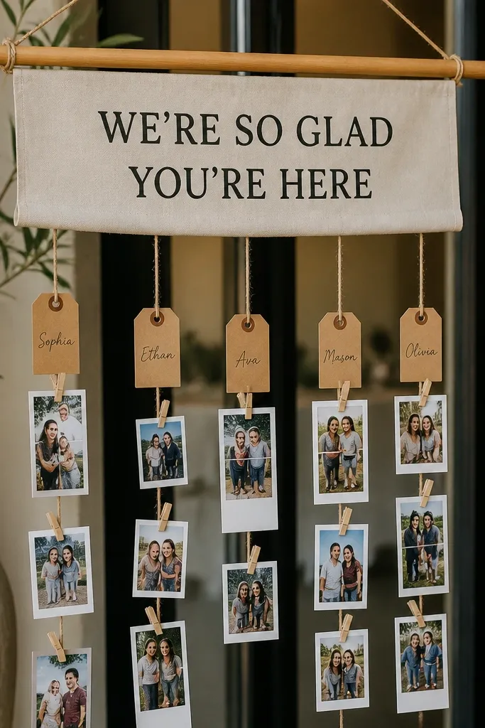
A photo banner is a creative entrance that feels personal without being cluttered. Use mini photo strips or short captions on small cards attached to a dowel, and add a bold welcome line in the center. This works year-round because you can swap the card set seasonally and keep the same banner structure. The photo advantage is movement: it looks lively in wind and catches light on the cards. It also gives guests a reason to stop and read, which improves your entrance photo lineup.
Start with a sturdy wood dowel and hang cards from it using clips or twine so each card has a little space. Then print or write the welcome text on a central card and add names or table numbers on small tag cards around it. Finally, secure the banner on a stand or between two posts so it stays at head height. Travel tip: pack cards flat in a box and attach them at the venue to keep corners crisp.
Quick tipUse matte photo paper so reflections don’t blow out faces in the prints.
Skip thisSkip flimsy clips; they pop open and the banner looks uneven fast.
23. White plaster welcome plaque with pressed leaf border
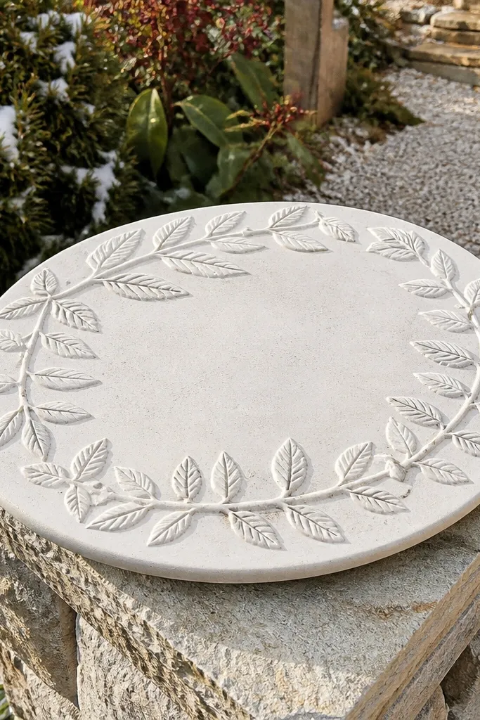
Plaster looks modern and soft, and the pressed leaf border adds an organic frame that photographs well. The matte surface keeps glare down, which is a big deal for year-round unique wedding welcome sign photos in bright venues. This design also looks great in both winter and summer because the plaster stays neutral and the leaf border can be swapped. If your wedding palette is minimal, the texture does the heavy lifting. The plaque shape feels gallery-like and creates a clean entrance focal point.
Start with a plaster plaque or a plaster-look resin plaque and lightly sand the surface for paint adhesion. Then press real leaves into a border mold or apply a leaf texture using a stencil method, keeping it subtle. Finally, paint the welcome lettering in a single dark color and seal with a matte finish. Travel tip: keep it in a padded box and avoid stacking heavy items on top.
Choose a dark charcoal or deep green for lettering; it stays readable against white.
Skip shiny sealers; they turn plaster into a glare magnet.
24. Modern acrylic sign with vinyl typography and a mirrored name strip
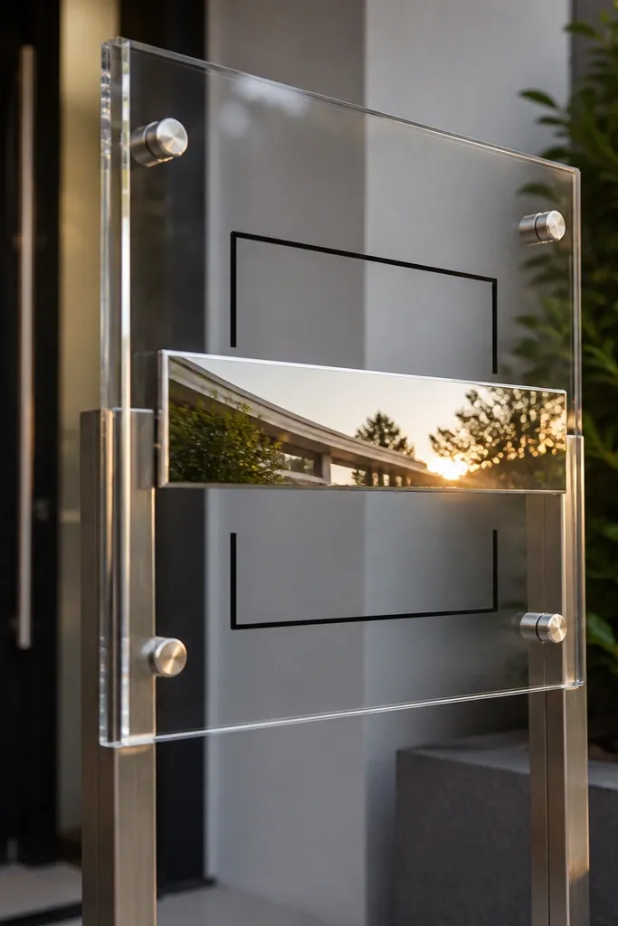
This is a sleek option that looks expensive in photos without floral clutter. The mirrored name strip adds a “light catch” effect, while vinyl typography stays crisp and readable. It’s year-round because the mirrored strip works with any season’s palette — it reflects warm and cool tones depending on lighting. Use it when your wedding style is modern, minimal, or city-chic. The entrance looks sharp and contemporary, and the sign doesn’t compete with background decor.
Start with a clear acrylic panel and apply vinyl lettering for the welcome line on the front. Then add a mirrored strip (small rectangle) for the couple’s names so it catches light when people move. Finally, mount the sign on standoffs or a minimal metal base to keep it floating visually. Travel tip: pack with anti-scratch film and keep it in a hard case so it doesn’t pick up micro-scratches.
Quick tipAngle the sign slightly toward the walkway so reflections don’t hit camera lenses.
Skip thisSkip mirrored foil that’s too wide; it can overpower the text.
25. Dried flower garland welcome on a reclaimed ladder shelf
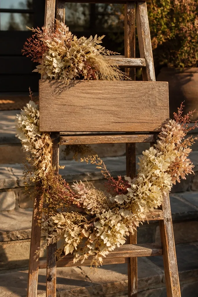
Dried flower garlands look great in photos because they hold shape and don’t wilt, which makes them a reliable year-round unique wedding welcome sign option. A ladder shelf adds structure and keeps the sign off the ground, so it’s easier to photograph without people blocking it. Choose a warm, cohesive palette (cream, rust, muted green) so it doesn’t look random in winter or summer. This setup is perfect for outdoor entrances with open sky light because the textures show up clearly. It also feels intentional when your reception has similar dried or natural elements.
Start with a reclaimed ladder shelf and place a small welcome sign plaque on the top rung or center shelf. Then attach a dried flower garland along the ladder rails using twine or zip ties at the back so it doesn’t show. Finally, add a simple seasonal accent like a single dried palm frond or a cluster of pinecones depending on the month. Travel tip: pack the garland in a box so stems don’t snap; assemble at the venue.
Use a neutral base cloth behind the ladder to prevent the background from stealing attention.
Skip bright neon dried flowers; they look harsh under natural daylight.



