
1. Cream linen table runners with gold cutlery and taper candle blocks
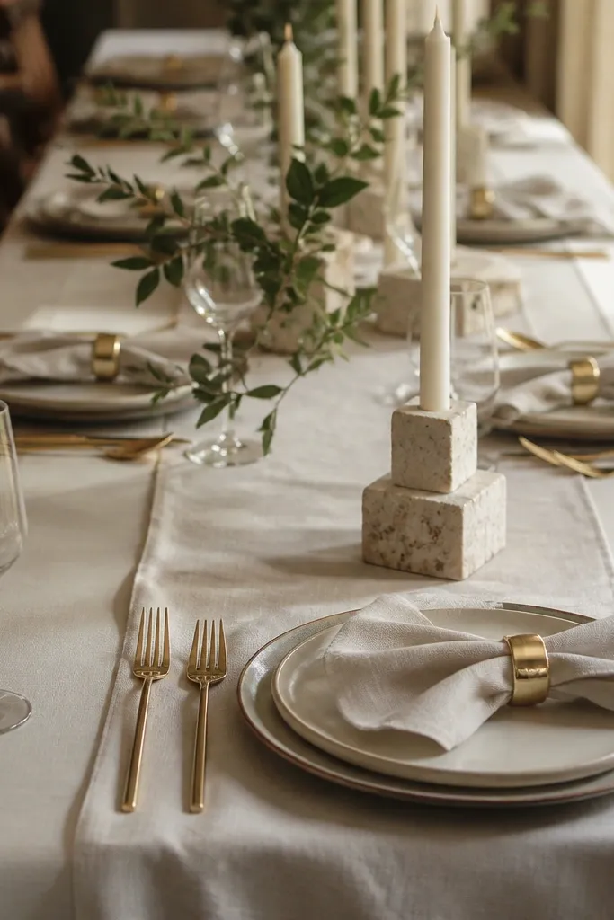
Start by choosing a runner width that hits the camera: 14-16 inches wide for most round or rectangular tables. Then plan taper blocks by using weighted candle holders in a tight row (five to seven candles per block) so they look like a designed unit, not separate items. Finally, assign a setup time: place linens and candles the morning of the reception, then add any final wax drips or greenery touch-ups 60-90 minutes before guests arrive.
This is one of the most reliable traditional looks because it reads classic even in mediocre lighting. Cream linen softens everything — it makes skin tones look warmer and makes gold tones look intentional instead of flashy. Grouped tapers give height without taking floor space, so your tables still feel open for dinner service. It’s also photogenic from multiple angles: overhead shots show the runner lines, and guest-level shots show candle glow.
Skip thisDon’t mix candle colors (white and ivory) across tables — it looks accidental in photos.
Quick tipBuy taper holders with wide bases so they don’t wobble when staff moves chairs.
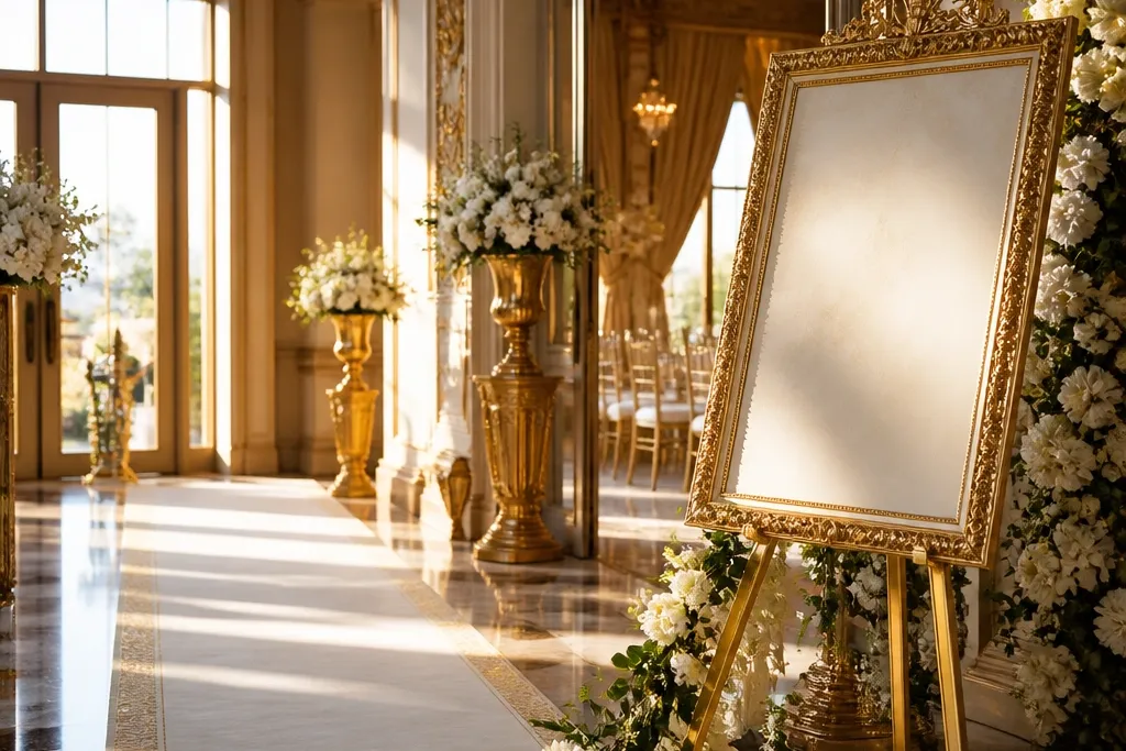
2. Traditional gold-framed welcome sign on a freestanding easel
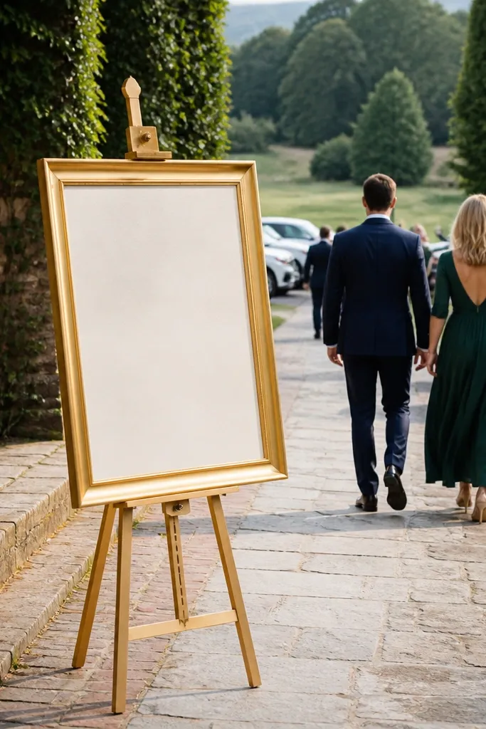
Start by picking a frame size that reads from 6-10 feet away (around 20x30 inches is a safe bet for most entrances). Then mount the sign on a stiff backing board so it stays flat and doesn’t ripple in humidity. Finally, place the easel so it faces the main flow of arrivals, and test with your phone camera at eye level — if the frame edges cut off in the viewfinder, shift it before you lock the layout.
A gold frame over a welcome sign looks formal without needing a wall. It gives you a clear photo focal point at the entrance, which matters because guests take their first weekend pictures right when they walk in. Traditional framing also brings order: your typography reads clean, and the frame edges catch light for a classic glow. Keep the content simple — the frame does the work.
Skip thisAvoid cheap acrylic frames — they reflect harsh light and ruin the classic look.
Quick tipUse matte paper for the sign so glare doesn’t erase the text in daylight.
3. White taper candle aisle markers with small brass holders
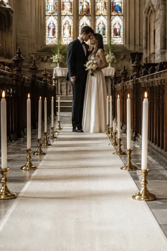
Aisle markers are traditional, but they only look expensive when they’re consistent. Small brass holders with white tapers create a repeating rhythm down the aisle, which is exactly what camera lenses love. The glow also photographs well during vows, because the candles become a soft foreground layer. This decor works for both indoor and outdoor ceremonies — indoors because it feels formal, outdoors because it adds warmth against daylight.
Start by measuring your aisle spacing so markers don’t crowd chairs; aim for a clear walkway width and keep holders aligned in pairs. Then place holders on a stable mat or weighted base if the floor is uneven or outdoor grass. Finally, light candles 15 minutes before the ceremony so the flame settles and you don’t rush while guests are seated.
Use LED backup candles in case of wind — you still get the same shape for photos.
Skip tall candles on narrow aisles — they block guests and create messy sightlines.
4. Classic floral pedestal arrangements in ivory and blush
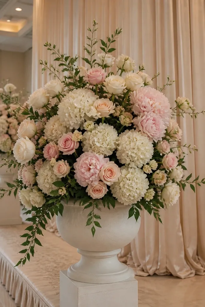
Pedestals give you the traditional “church flower” feeling without needing a full altar setup. Ivory and blush florals keep the look soft and timeless, and the vertical height frames guests in reception photos. Pedestal arrangements also solve a planning problem: you can place big focal points in key locations (stage corners, entry points) without covering every surface. That keeps the weekend looking designed, not busy.
Start with pedestals that match your venue height; for most stages, 30-36 inch pedestals look right in photos. Then choose a simple palette: ivory base flowers plus a blush accent, with greenery that has a consistent leaf size. Finally, stage them with a 6-10 foot buffer from main traffic lines so guests don’t bump the bases when they walk to the bar or dance floor.
Ask your florist for a water reservoir or a removable foam-free insert so the arrangement stays fresh through Day 3.
Don’t mix too many flower types — it reads modern and messy instead of traditional.
5. Shepherd hook greenery with white ribbon at the ceremony entry
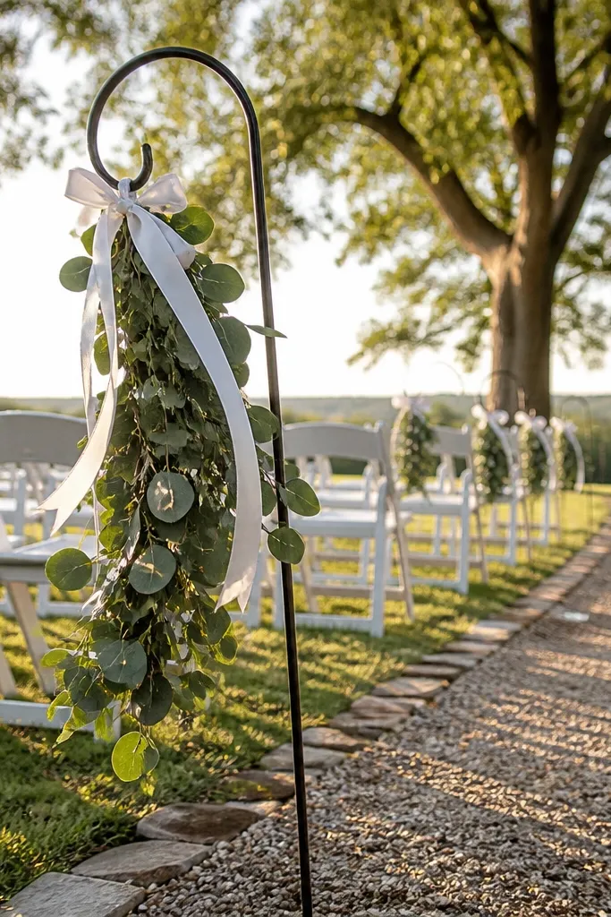
Start by spacing hooks evenly along the entrance path, leaving enough room for guests to walk through without squeezing. Then tie ribbon in long tails (about 24-36 inches) so it shows up in images and doesn’t collapse flat. Finally, do a weather check: if it’s breezy, use heavier ribbon or add a small weight at the bottom edge so the tails don’t tangle.
This is a traditional way to frame the entrance without building an arch. The greenery gives texture and depth, while white ribbon adds motion and a classic finish in photos. Shepherd hooks are practical for a three-day plan because they’re fast to set up and easy to move between ceremony and photos. It also works for outdoor ceremonies where you can’t hang decorations from trees or ceilings.
Skip thisSkip thin ribbon — it looks flimsy and doesn’t hold shape on camera.
Quick tipBring a handheld steamer — ribbon creases show up fast in wedding photos.
6. Vintage-style mirror welcome table with stacked bud vases
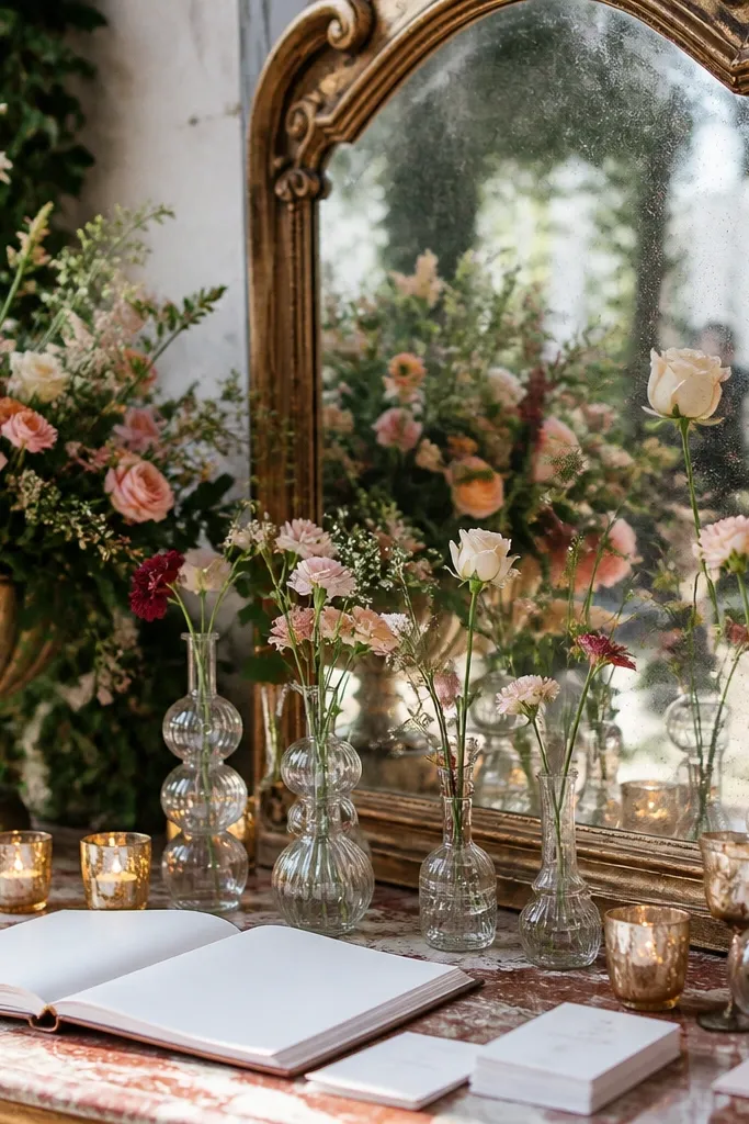
Start by choosing a mirror size that fits your table — aim for a mirror that covers at least half the tabletop so the reflection looks full. Then set bud vases in descending heights (three to five vases) so the table has depth. Finally, place the mirror near a light source (window or warm lamp) and avoid direct overhead glare that washes out your signage.
A mirror table is traditional and photogenic because it doubles light and reflects florals back into the frame. It also gives you a practical station for welcome cards, menus, or a guest book without cluttering the entrance. Stacking bud vases looks styled and intentional, and you can keep it cohesive by using one metal finish and one flower type. This arrangement shines in both morning and evening because the mirror catches ambient light.
Skip thisDon’t put reflective signage on the mirror — it creates unreadable glare.
Quick tipUse a dark tray or runner under the vases to keep reflections from turning into a blurry mess.
7. Blush rose and white hydrangea ceremony arch with weighted base
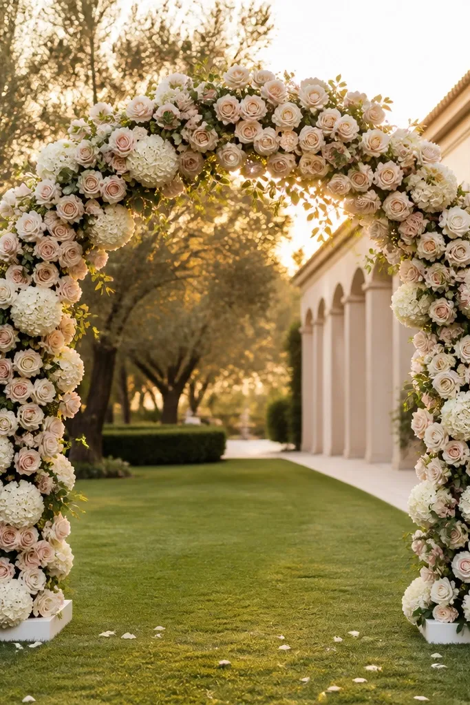
Start by selecting an arch width that frames the couple without crowding; 6-8 feet wide is a common sweet spot for most outdoor ceremonies. Then build a layered floral plan: larger blooms at the center, smaller clusters toward the sides, and a greenery border that hides the base mechanics. Finally, cover the base with a fabric skirt or drape so the support isn’t visible in photos; set it up the day before and do a quick straightening check on ceremony morning.
An arch is the traditional centerpiece, and it photographs like one. A blush and white mix looks romantic but still classic, especially when you keep the structure clean and the greenery controlled. Weighted bases matter because they keep the arch stable for the full three-day window — ceremony, couple portraits, and sometimes a photo hour after. When it’s built with a clear silhouette, it looks expensive even with a simpler flower count.
Skip thisSkip airy, uneven clusters — they look unfinished in wide shots.
Quick tipKeep one side slightly denser — it reads balanced in camera angles from the aisle.
8. Traditional aisle runner in ivory fabric with gold border tape
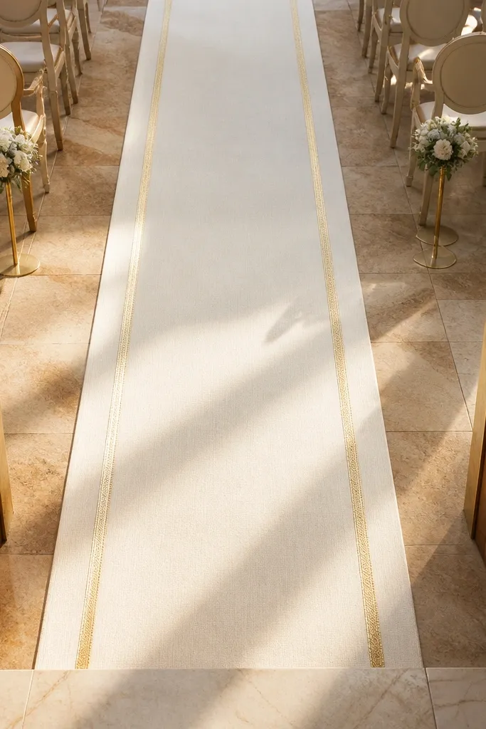
An aisle runner makes everything look more formal instantly, and it gives you a clean line for wedding photos. Ivory fabric looks softer than patterned rugs, and a subtle gold border adds that traditional touch without turning it into a theme. It’s also practical: you can reuse the runner across photo spots by moving it for portraits after the ceremony. If your venue floor is less photogenic, this is the fastest fix.
Start by measuring the aisle length so you don’t end up with a runner that stops early in wide shots. Then choose a fabric with weight so it lays flat; lightweight tulle bunches and creates wrinkles in photos. Finally, secure edges with grip strips or hidden weights so it doesn’t shift while guests walk and the bridal party moves through.
Bring a small lint roller — fabric fuzz shows up under strong lighting.
Don’t use a glossy border that glares under lights.
9. Classic brass and white garland mantle for the reception stage
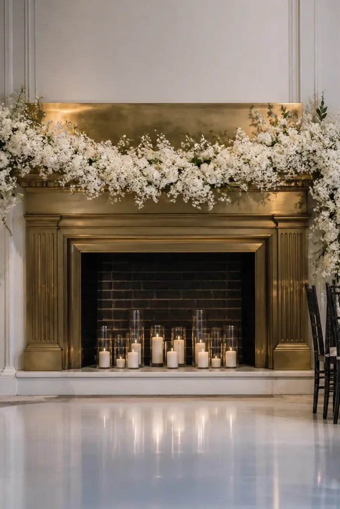
Start by building the garland with a mix of greenery and small white blooms so it has texture, not flat coverage. Then add brass candle sconces or brass lanterns evenly spaced to avoid empty gaps. Finally, hang or place the garland at a height that sits behind the speaker’s head level — too low makes it look like a border, too high hides it from photos.
A mantle look behind the stage is traditional and gives you a consistent background for toasts, cake cutting, and first dance moments. A white garland keeps the stage bright and prevents the background from looking heavy. Brass accents add warmth and match gold frames elsewhere in your decor. This setup is especially photogenic because stage cameras and guest phone pictures both aim at the same backdrop.
Skip thisSkip oversized decor pieces that block the DJ or officiant view.
Quick tipUse battery candles with flicker if the venue lighting is dim; real flames can be tricky under stage lights.
10. White floral napkin rings with pearl accents for guest tables
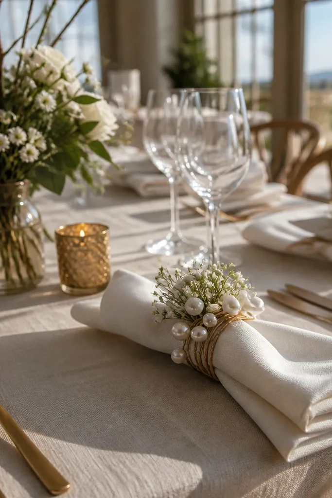
Start by choosing napkin rings that sit flat against the folded napkin, not ones that twist and flop. Then coordinate the flower color with your centerpieces so the table looks unified. Finally, set up napkin rings after the table is covered and place settings are arranged; that way you don’t risk breaking petals during the earlier build.
Napkin rings are small, but they read beautifully in close-up photos and they make place settings look intentionally styled. White floral napkin rings with pearl accents feel traditional and polished, especially when your table linens are cream or ivory. This decor also helps the “three-day” problem: it’s easy to place and replace without rebuilding larger installations. It’s a high-impact detail that looks good even when guests don’t take a wide shot.
Skip thisDon’t use glitter accents — they look cheap under flash.
Quick tipKeep a small bag of extra pearl stems in case one breaks during transport.
11. Black-and-cream seating chart board with gold frame and serif font
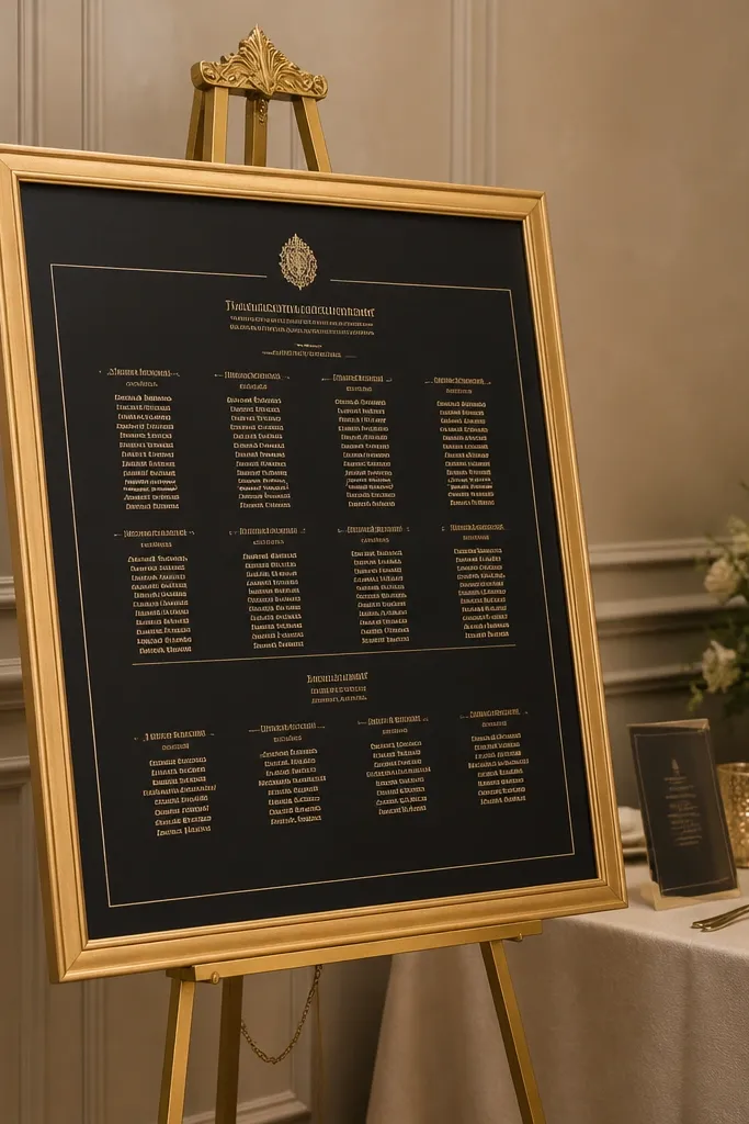
Start by using a board size that’s readable from 8-12 feet away; 24x36 inches works well for many reception spaces. Then print on cream cardstock and keep font sizes consistent: larger names, smaller table numbers, no dense blocks. Finally, frame it and place it at the main guest route from cocktail hour to reception seating; position it so you don’t block the bar line.
Traditional seating charts look best when they’re readable and framed like art. A black-and-cream palette with a gold frame makes the board pop against neutral walls and instantly signals “formal wedding.” Serif typography feels classic and matches the rest of the traditional styling. It’s also a practical decor win: guests spend time here, so the board needs to look good up close and from across the room.
Skip thisAvoid script-only fonts — they get hard to read in evening lighting.
Quick tipUse removable adhesive corners on the paper so you can swap updates without wrinkling.
12. Garden-style white lantern clusters with warm fairy light inside
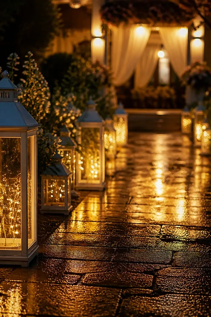
Start by choosing lantern sizes that step from small to medium (for example, 8-10 inch and 12-14 inch) so the cluster has dimension. Then group them in odd numbers like 3, 5, or 7 — pairs look flat in wide shots. Finally, test brightness before the event: if the lights are too strong, they blow out the lantern glass; if too dim, they vanish in photos.
Lantern clusters bring a traditional, cozy feel and they photograph warm even after sunset. White lanterns soften the scene, while warm interior lighting adds depth and shadow — which makes everything look more expensive. Place them along the path from cocktail hour to the reception entrance to create a guided photo line. This is also a strong choice for a three-day itinerary because lanterns are reusable and don’t depend on fresh florals.
Skip thisDon’t mix cool blue bulbs — the whole traditional look turns modern and harsh.
Quick tipUse warm white bulbs set to a consistent color temperature across all lanterns.
13. Classic macramé-style white chair ties with satin bows
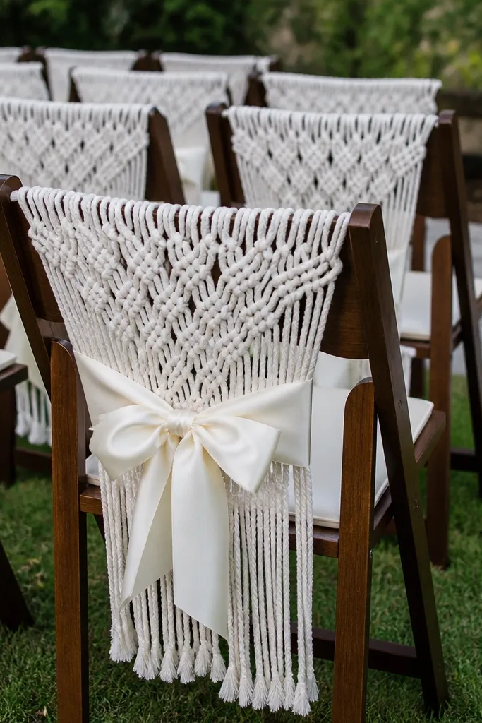
Start by using ties made for chair backs so they hold shape; measure chair height and choose tie length accordingly. Then tie satin bows with the same knot style on every chair so the spacing looks uniform. Finally, schedule installation for the day before the ceremony if possible, or early ceremony morning if you’re limited — you want time to adjust bow placement before guests arrive.
Chair ties are traditional when they’re simple and tied neatly. White with satin bows reads formal, and it frames the ceremony space with a consistent texture. This decor works for both indoor and outdoor ceremonies because it adds visual softness without needing wall access. It also helps in photos: chair backs create a patterned foreground that makes the couple stand out.
Skip thisSkip overly long tails that drag — they look messy in close photos.
Quick tipPack a small steamer for the satin bows — wrinkles show under flash.
14. White and gold welcome drink station with tray displays and menu cards
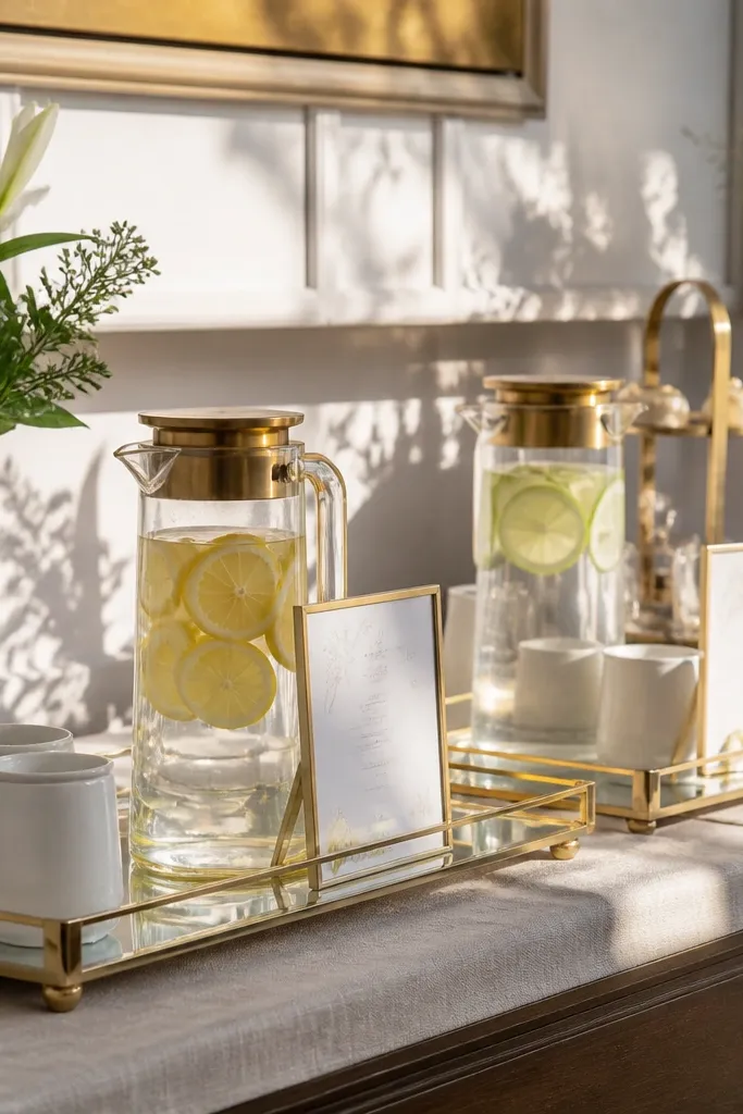
Start by picking trays in one metal finish and using white linens or neutral paper underneath the display. Then set up a simple structure: one large tray at the center with two smaller trays flanking it, and keep drink labels consistent in size and font. Finally, place the station near the entrance but not blocking the main line; leave space for staff to pour without bumping the props.
A welcome drink station is traditional when it’s styled like a display, not a random table. Trays make it look curated, and gold accents connect it to frames, candle holders, and cutlery. Menu cards add a classic touch and give you a clear photo moment as guests arrive. This idea also solves a three-day logistics issue: you can reuse the station layout for a brunch or post-ceremony refresh with minimal changes.
Skip thisDon’t crowd the station — too many items make it look like supplies, not decor.
Quick tipUse waterproof menu card holders so condensation doesn’t warp the paper.
15. Traditional cake table with ivory cloth, gold cake stand, and floral runner
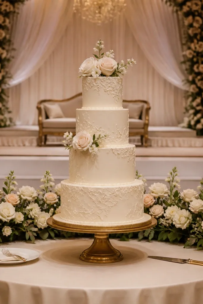
Start by covering the table with an ivory cloth that drapes evenly; smooth folds matter more than extra decoration. Then place the cake stand centered and add a narrow floral runner along the back edge so the background looks styled in wide photos. Finally, schedule final styling 30-60 minutes before cake cutting so flowers don’t dry out and cloth doesn’t shift.
The cake table is the traditional centerpiece for reception photos, and it needs to look clean and elevated. Ivory cloth makes the cake stand out, and a gold cake stand gives that classic formality. Adding a floral runner underneath or behind the cake creates depth without turning it into a dense wall of flowers. This setup is also practical: you can style it quickly right before service and it still looks intentional.
Skip thisDon’t use a patterned cloth — it competes with the cake and looks busy.
Quick tipUse a fabric-safe barrier under the stand if your venue allows — it prevents accidental scratches.
16. Classic escort card display using gold-framed grid on easel
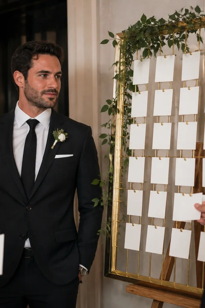
Start by choosing an easel that can hold the weight without wobbling; test stability before the event. Then design the cards with consistent spacing and a serif font so the grid looks uniform. Finally, place the display near the reception entry where guests naturally gather, and assign someone to keep it tidy while guests move through.
Escort cards are traditional and practical, and a gold-framed grid makes them look like real decor. It’s photogenic because guests interact with it, and the grid structure creates a clean background for candid photos. A gold frame also ties it to other gold elements, so the weekend feels consistent. If your seating chart is separate, this gives you a second classic touchpoint that doesn’t look redundant.
Skip thisDon’t scatter cards randomly — alignment is what makes it look classy.
Quick tipUse thicker cardstock for cards so they don’t curl when handled.
17. Traditional monogram napkin printed with black ink and wax-seal detail
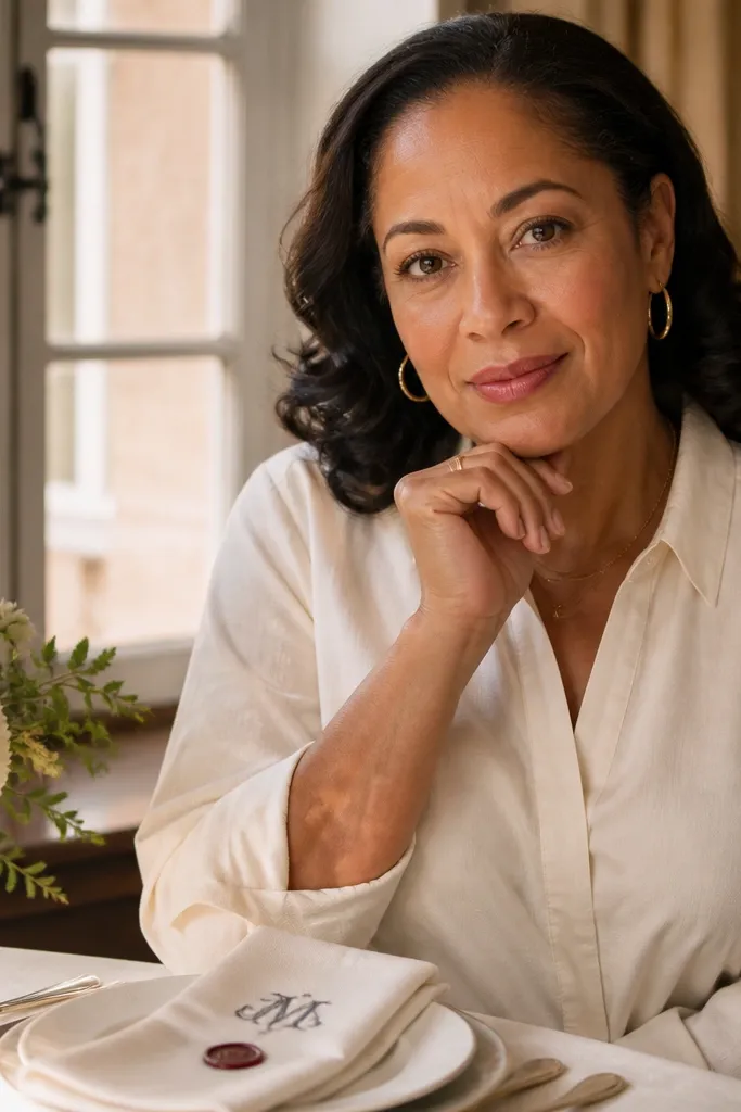
Start by choosing a monogram design that stays readable at small sizes; keep the ink area compact. Then coordinate the font style with your signage so everything feels like one set. Finally, put napkins on tables after linens and tableware are arranged; avoid handling them earlier when staff is still moving equipment.
Monogram napkins are a traditional way to add personality without breaking the classic look. Black ink on ivory reads crisp in daylight and flash, and it looks sharp in table close-ups. A wax-seal style detail adds a classic finishing touch that feels intentional rather than trendy. This decor also makes your tables feel like they belong to the same wedding story across three days.
Skip thisDon’t choose a monogram that’s too thin — it disappears in photos.
Quick tipTest a single napkin under flash — if the ink reflects, switch to a matte finish.
18. White floral hoop with greenery rim for cocktail hour photo spot
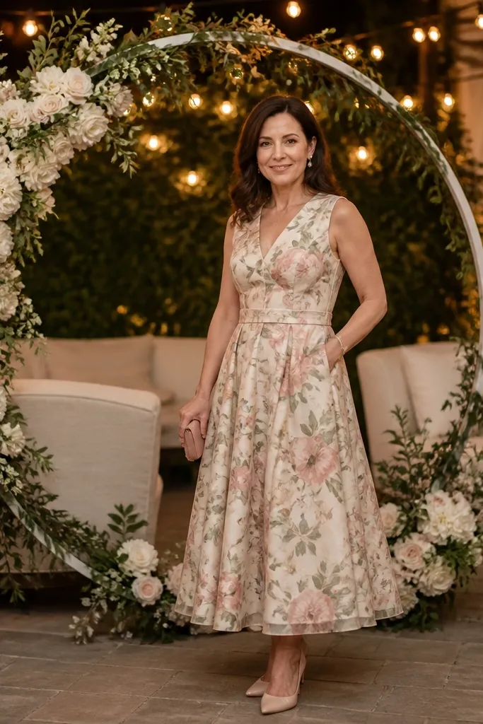
Start by selecting a hoop size that fits your space; 30-36 inch hoops look good for single-person portraits, while 40-48 inch works better for couple shots. Then add white blooms in a concentrated band around the rim so the hoop reads as one unit. Finally, anchor the hoop on a weighted stand and place it where the background is simple — plain wall or greenery backdrop is best.
A floral hoop gives you a traditional frame for portraits without the bulk of a full arch. It looks clean, photogenic, and easy to position near cocktail hour seating where guests already gather. The greenery rim adds depth and makes the floral cluster pop against plain walls. This is a smart three-day move because it works for cocktail hour photos, then can be reused for a couple portrait session before the reception starts.
Skip thisAvoid busy backgrounds — the hoop gets lost and the photo looks cluttered.
Quick tipPosition the hoop so it catches side light; flat front light flattens flowers in pictures.
19. Traditional gold votive clusters on mirrored trays
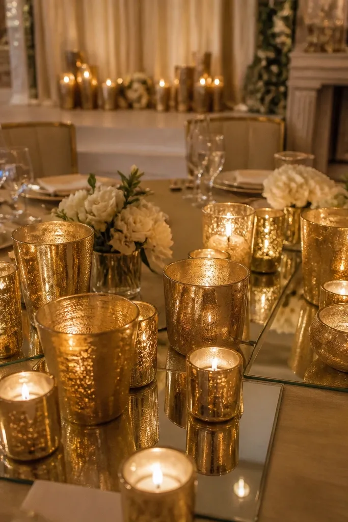
Mirrored trays make votive candles look like a designed installation, not a random set of lights. Gold votive holders tie in with frames, cutlery, and stage décor, keeping the weekend classic. The light reflection adds depth to tables and entryways, which is exactly what makes reception photos feel rich without adding more objects. It’s also easy to manage across three days because you can reuse trays and only swap the candle arrangement.
Start by using mirrored trays sized to your table — 18-24 inches for cocktail tables, 24-30 inches for larger tables. Then place votives in a tight cluster pattern (like 9, 12, or 15) so the light reads as one shape. Finally, arrange trays 45-60 minutes before guests arrive so the glow looks steady by the time people start taking photos.
Keep a spare pack of votives in the same batch color temperature for quick replacements.
Skip clear glass votives on warm venues — they can look too icy under amber lighting.
20. Ivory tulle and greenery table centerpieces with lantern candle cups
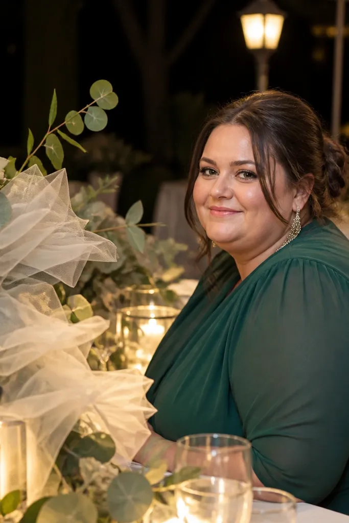
Start by tying a light ivory tulle loop around a simple centerpiece base or vase so it floats upward. Then place one lantern candle cup in the center and flank it with small greenery clusters so the arrangement has a clear triangle shape. Finally, keep the centerpiece height under 12-14 inches if guests need to talk across the table; taller looks beautiful but can block faces.
Tulle adds that traditional soft volume you want in photos, especially when paired with lantern-style candle cups. The greenery grounds it, so it doesn’t look like a costume decoration. Lantern cups also create a warm focal point that reads well in evening light. This centerpiece style is ideal for a three-day itinerary because tulle looks good even if it’s slightly wrinkled, and lantern candles keep the mood consistent from cocktail hour to late night.
Skip thisDon’t add too many loose petals — they stick to tulle and look messy.
Quick tipUse watered-down floral foam alternatives or a removable insert so you can move the centerpiece without crushing tulle.
21. Classic framed menu cards on acrylic stands with greenery base
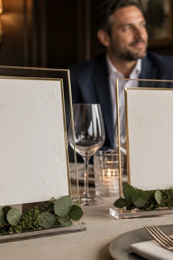
Start by keeping menu card size consistent across tables so the layout looks intentional. Then use a single frame color finish and match it to your other gold elements. Finally, place the acrylic stand on a small greenery base or tray insert so it doesn’t wobble and doesn’t tip during service.
Menu cards are traditional, but the delivery matters. Framed cards on clear acrylic stands look clean and elevated, and the greenery base adds softness that feels wedding-appropriate. This is great for reception aesthetics because menus sit at the exact height people photograph from their seats. If your venue lighting is uneven, the frame edges still catch light and keep the design readable. It also helps guests find their place faster, which reduces time spent hovering and taking awkward photos.
Skip thisAvoid handwritten menus — they look charming in person but blur in flash.
Quick tipPrint on matte paper and laminate only if the venue is humid; glossy menus glare.
22. Ceiling-to-candle uplighting with warm gels for the reception entrance
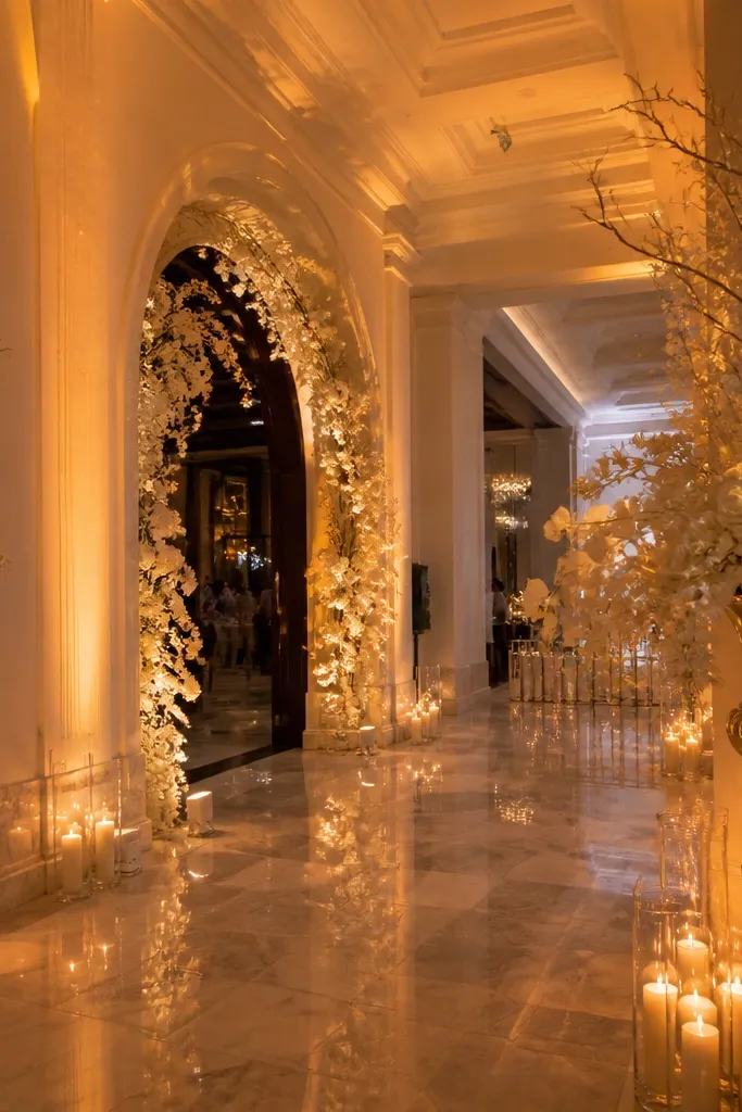
Start by placing uplights at floor level pointing upward along walls or columns near your main photo path. Then choose warm gels that match candlelight — aim for a warm amber tone rather than pink or blue. Finally, test the brightness with your phone camera from guest height; if the lights wash out greenery, lower intensity or move fixtures farther from the decor.
Uplighting is the least “decor” looking option until you see the photos. Warm gels create a candle-like mood that makes traditional florals and gold frames look richer without changing your theme. Use it for entrances and stage edges so the background feels intentional in every wide shot. It also helps unify decor across rooms in a three-day itinerary because the same lighting tone makes different spaces match.
Skip thisDon’t use cool white uplighting — it makes gold look dull and skin tones look grey.
Quick tipAsk your lighting tech to provide a quick pre-ceremony test so you’re not guessing at evening color.
23. Traditional brass bar sign with cream chalk lettering and serif flourishes
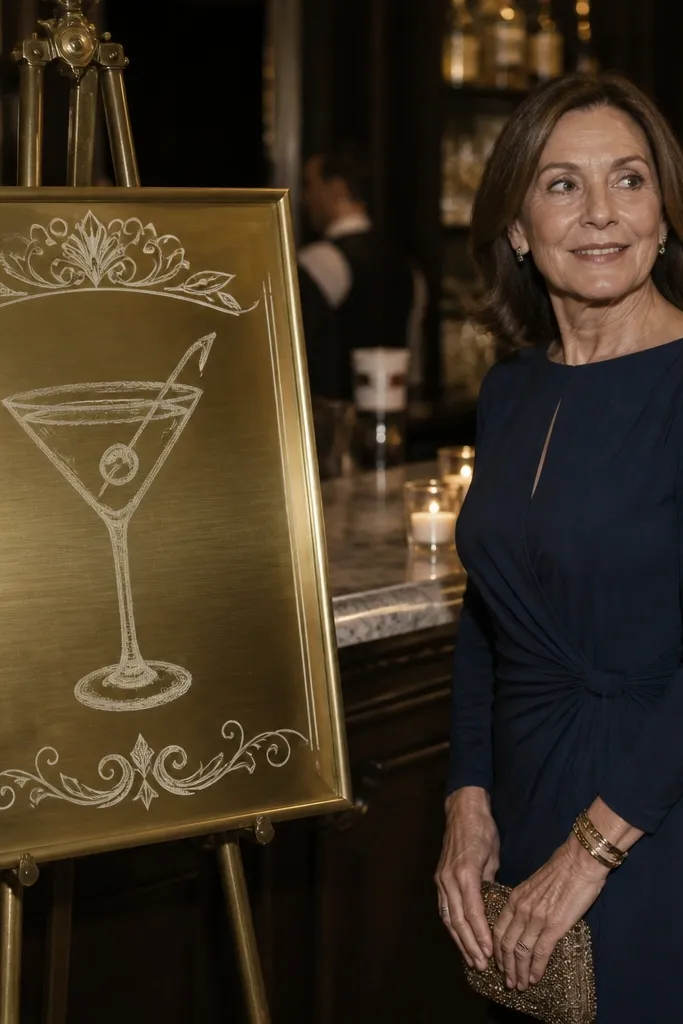
Start by using a sign size that reads from about 8-10 feet; 12-18 inches wide is usually enough for bar backdrops. Then set chalk lettering style with consistent line thickness so it doesn’t look uneven under flash. Finally, place the sign where it won’t reflect harsh overhead lights; move it a few inches if glare hits the chalk and ruins the contrast.
A bar sign is small, but it’s one of the most photographed traditional items because guests line up and take pictures while waiting. A brass sign with cream chalk lettering looks classic and warm, and serif flourishes match the rest of the traditional typography theme. It also creates a consistent brand-like look across welcome drinks, cocktail hour, and late-night refills. When the lettering is readable and the metal finish matches your candle holders, the bar area looks designed instead of functional.
Skip thisAvoid neon-colored chalk — it kills the traditional tone immediately.
Quick tipSeal chalk with a matte fixative so it doesn’t smear if someone touches it or a drink station gets humid.
24. Classic unity candle station with white pedestal and greenery candle ladder
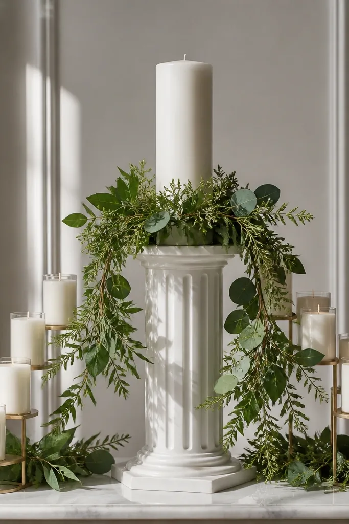
Start by choosing a pedestal height that aligns with the couple’s hand level so the candles are visible in video and photos. Then build a candle ladder using holders of the same metal finish and keep spacing consistent for symmetry. Finally, position the station where the background is simple and not cluttered with chairs or equipment — you want the candle group to stand out.
Unity candle stations are traditional by nature, but the look becomes stunning when it’s styled like a centerpiece rather than a basic setup. A white pedestal makes the candle group the star, and greenery adds texture that looks good in both wide and close photos. A candle ladder arrangement gives symmetry and height, which frames the couple during the moment. This idea also plays well with a three-day itinerary because it’s easy to keep clean, transport, and reset for any portrait session.
Skip thisSkip mixed metal finishes — it reads mismatched in the candlelight.
Quick tipUse drip guards or trays under holders to protect the pedestal from wax marks.
25. White floral table number stands with gold tops and small greenery ribbons
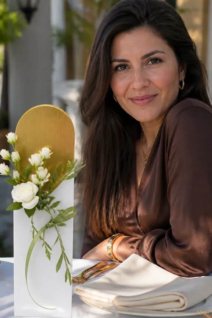
Start by selecting stand heights so the numbers are readable above dinner plates; 10-12 inches works for most tables. Then print table numbers in a serif font and mount them cleanly on a flat panel so they don’t warp. Finally, place stands after centerpieces are set so you don’t accidentally bump arrangements while positioning numbers.
Table numbers are a traditional necessity, and they look 10 times better when they’re treated like decor. White floral stands with gold tops match the wedding’s classic metal theme and give each table a clear visual anchor. Adding a small greenery ribbon detail keeps the look soft and natural instead of overly rigid. In photos, table numbers show up in group shots and place-setting images, so they need to be crisp and camera-friendly.
Skip thisDon’t use reflective number surfaces — they glare under flash.
Quick tipPrint a few extra number cards — if one gets smudged, you swap fast.