
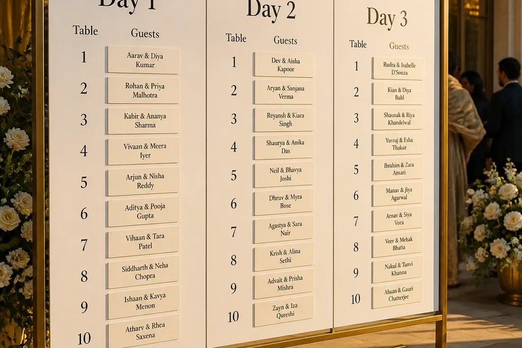
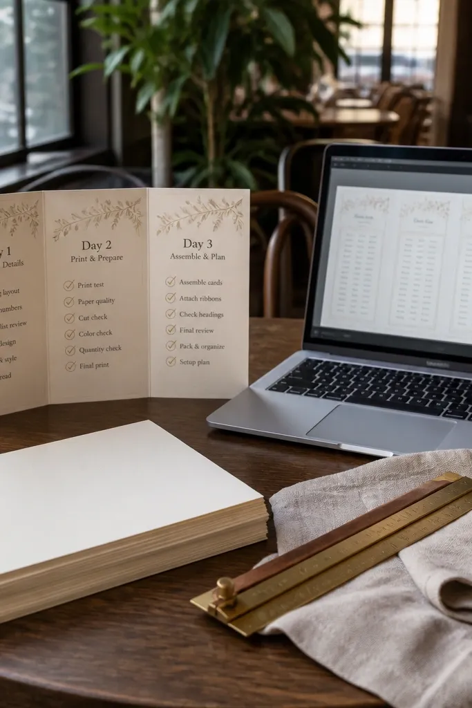
1. Acrylic Sleeve Seating Bands by Day
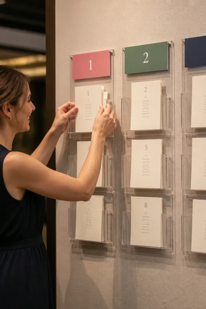
This setup looks sleek and stays organized because the chart lives inside clear acrylic sleeves. You print your table numbers and guest names on thick paper, then slide updates into the sleeves for each day. The visual is clean: the clear fronts catch light, while the colored labels at the top keep Day 1, Day 2, and Day 3 instantly obvious. It’s great for venues with bright lighting or modern interiors because the chart doesn’t look like paper taped to a wall. It also suits weddings where you expect changes, since swapping sleeves is faster than remaking a display.
Quick tipPrint Day 1 and Day 2 with slightly lighter ink (gray or muted navy) and keep Day 3 bold black so the final day reads like the “answer key.”
Start by choosing a base board (white foam core or stained wood) and lay out three horizontal bands for Day 1, Day 2, and Day 3. Then measure your sleeve size and print inserts that match the band width exactly, with guest names aligned to a grid so edits don’t shift the whole look. Finally, place the acrylic display near the check-in point and assign one staff member to update the correct band at the same time each day.
Skip thisDon’t use thin copy paper in sleeves — it wrinkles and looks cheap under venue lighting.
2. Magnetic Table Number Grid with Swapable Name Cards
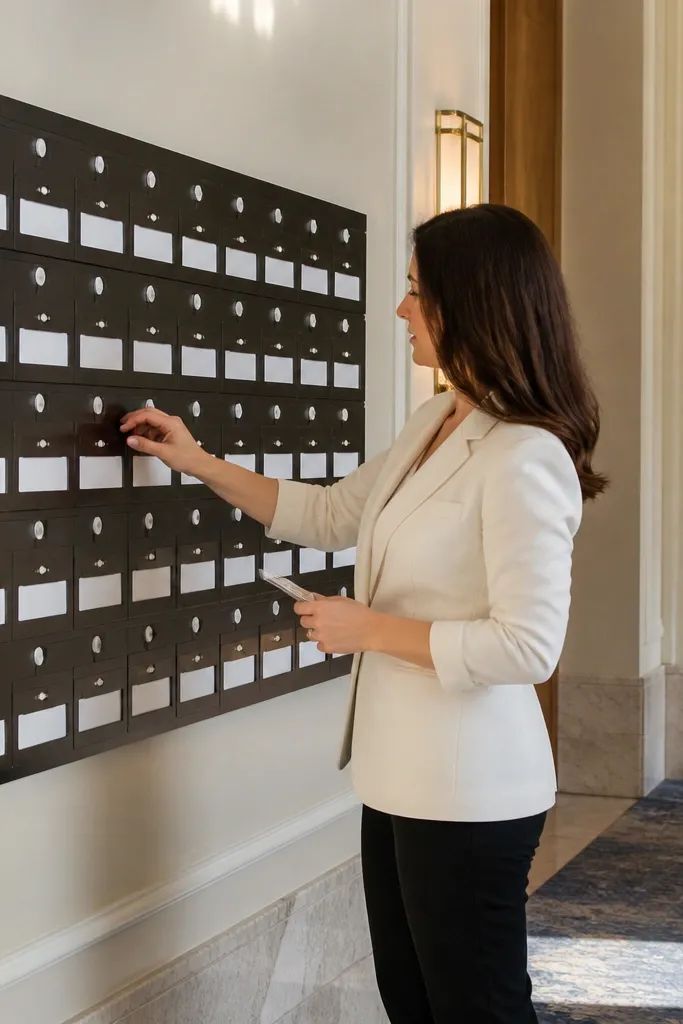
A magnetic grid gives you a crisp, gallery-style look and makes updates fast without visual clutter. You set up a board with table numbers in consistent positions, then move only the name cards when assignments change. The design reads cleanly because the magnets keep every card perfectly aligned. It’s especially good for three day weddings because you can show early assignments on Day 1, adjust on Day 2, and lock the final layout on Day 3. Guests also like it because they can scan the table number first and then scan names within that section.
Quick tipUse a matte finish board if you’re in a venue with strong overhead lights — glossy boards glare.
Start by buying a magnetic board large enough for your table rows, then mark a grid with painter’s tape so names line up. Next, print name cards in the same font and size, and attach each card to a magnet or magnetic strip so you can relocate them cleanly. Finally, create a simple color system: one color for Day 1 cards, another for Day 2, and final Day 3 in bold black so the board doesn’t look like a mess of mixed ink.
Skip thisSkip handwritten name cards — spacing gets inconsistent and the board stops looking intentional.
3. Layered Escort Card Wall with Day 1 to Day 3 Sections
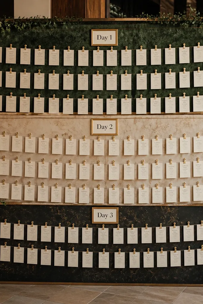
If you love a full-on decorative wall, this is the cleanest way to keep it organized across three days. You hang escort cards on a layered backing so each day has its own clearly labeled section, like a “story” guests can follow. The look is dramatic because the wall fills with cards, but the structure keeps it readable and prevents the mix-up that happens when you update by adding more cards over older ones. This works well when your venue has a prominent corridor or staircase landing where guests linger. It’s also a strong pick when your theme is paper-forward, like botanical, modern minimal, or classic black-and-cream.
Start by choosing a backing material like foam board or a fabric-covered board, then divide it into three equal height zones labeled Day 1, Day 2, Day 3 at the top. Next, mount card holders (clear acrylic pockets or small clips) so each guest card sits flat and doesn’t curl. Finally, update by removing only the cards that change for the next day, leaving the rest in place so you don’t rework the entire wall.
Use identical card sizes across all days; change only the day label color so the wall looks consistent.
Don’t hang cards directly with random knots or twine — the wall looks messy once you remove and reattach.
4. Seating Chart Ladder Stand with Numbered Steps
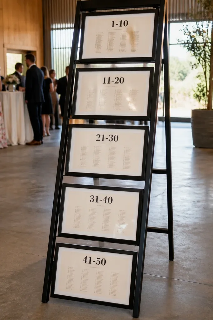
A ladder stand makes your seating chart look architectural, not flat. Each rung holds a framed section for a range of tables, and you update each frame as the seating changes. The ladder structure gives guests a natural scanning path from top to bottom, which helps when people are tired and rushing to find their table. It’s a great option for outdoor receptions or venues with open space because the stand reads well from several angles. For a 3 day wedding seating chart, you can keep Day 1 and Day 2 frames in place and swap only the final frame content for Day 3.
Quick tipPick a black or dark walnut stand so the printed cards pop and the display stays crisp in shade.
Start by selecting a ladder stand with enough rungs to hold table ranges, and decide your table split (example: tables 1-5 on the top, 6-10 on the middle). Next, print each range as a single insert sized to the frame so it updates quickly. Finally, place the ladder near the bar or entry so guests see it while they’re in line, and assign one person to swap the Day 3 inserts at the same time every morning.
Skip thisDon’t choose a ladder with narrow rungs — frames look unstable and the chart reads cluttered.
5. Framed Table Blocks on a Gallery Wall Grid
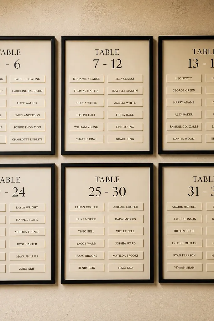
This is a clean, design-forward way to turn seating assignments into a gallery wall. Instead of one giant board, you use multiple matching frames, each labeled with a table number range. The look is elegant because every frame has the same spacing and finish, so it reads like decor even before guests find their name. It’s also practical: you can replace only the frames that change between days. This suits modern venues, hotel ballrooms, and any space where you want the seating chart to look like part of the event styling rather than a functional sign.
Quick tipUse UV-resistant inserts if the display sits in direct light — the text stays sharp.
Start by picking a frame size that matches your table density, then group tables into blocks (example: tables 1-3, 4-6, 7-9). Next, design each frame insert with a consistent header and a tight name list format so it stays readable. Finally, label the back with the day version you’re using, and store extra inserts in flat sleeves so Day 2 and Day 3 swaps take minutes.
Skip thisSkip mixed frame sizes; the wall looks random after the first update.
6. Chalkboard-Style Seating Chart on Cream Board
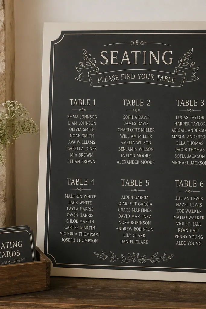
Chalkboard-style charts look cozy and wedding-appropriate, but you need a version that still looks clean on Day 3. The trick is to use a cream board with a chalk-like font and keep the design printed, not hand-chalked. That gives you the aesthetic without the smudging that happens when people touch or brush past. It’s perfect for rustic venues, outdoor patios, and barn weddings where handwritten style fits. For three days, you can use removable overlays or swap the entire board content each day so the final chart looks finished, not layered.
Quick tipAdd a small legend for meal cards or special notes with the same chalk font so guests don’t interpret handwriting differently.
Start by choosing a cream board size that’s easy to read, like 24x36 inches, and draft the layout with table headings in a bold chalk-like font. Next, print the chart on thick matte paper and mount it under a clear cover or in a frame so it doesn’t get dusty. Finally, plan the Day 1, Day 2, and Day 3 versions as separate boards or overlays and store them flat so the final day stays crisp.
Skip thisDon’t hand-write the final Day 3 update — it usually looks rushed and smudges under venue lighting.
7. Wood Slat Seating Chart with Laser-Cut Table Numbers
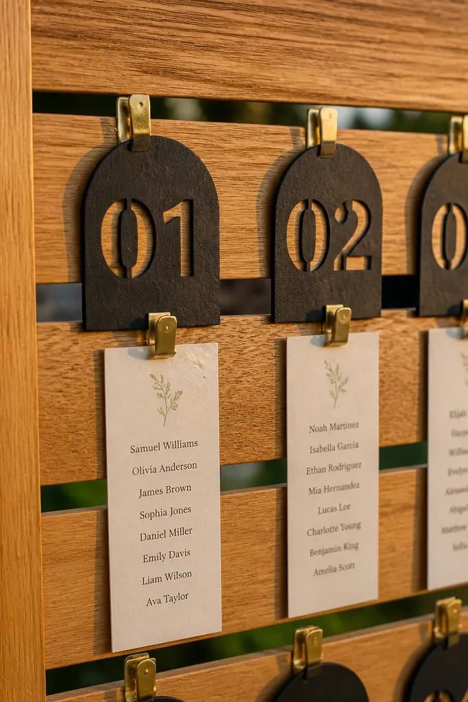
This design looks warm and intentional because the chart is built into the material. Laser-cut table number tags sit on a wood slat board, and the guest names hang in neat strips or clip-on cards. The texture reads beautifully in photos, especially in golden-hour light, and the structure keeps everything aligned. It’s a solid pick for three day weddings because you can clip and swap name cards without tearing down the whole system. Also, the wood gives you a forgiving background if your venue lighting is mixed or dim.
Quick tipUse a dark stain and white cardstock for max contrast in evening venues.
Start by selecting a wood slat board size and decide your spacing per table number tag so cards don’t overlap. Next, print names on cardstock and use small binder clips or acrylic mini-clips that match your table number finish. Finally, create separate name sets for each day and label storage by table number range so the swap is fast on Day 2 and Day 3.
Skip thisSkip glossy name cards; reflections make the text harder to read.
8. Seating Chart in a Vintage Suitcase Stack
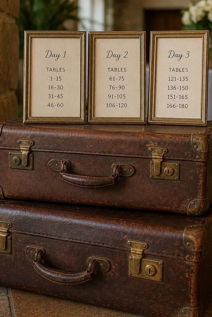
This is a travel-themed seating chart idea that looks instantly storybook. You stack two or three vintage suitcases and place framed seating sections inside, each labeled for Day 1, Day 2, and Day 3. The aesthetic is photogenic because the suitcases add texture and height, and the frames keep the content readable. It’s a great fit for destination weddings, travel-inspired themes, and venues where you want decor that looks collectible. For three days, swap the inserts inside the frames rather than redoing the whole display, keeping the suitcases as the stable “stage” for your chart.
Start by choosing suitcase sizes with enough depth to hold a frame without wobble, then mount the frames so they sit flat inside. Next, design each day’s seating content as an insert that slides into the frame backing. Finally, place the suitcase stack near a welcome sign so guests naturally stop and scan it before heading to cocktail hour.
Use neutral cream paper inside the frames so the suitcases don’t fight with busy colors.
Don’t put the chart too low; guests should see it without crouching.
9. Table Number Topper Centerpiece with Side Name Cards
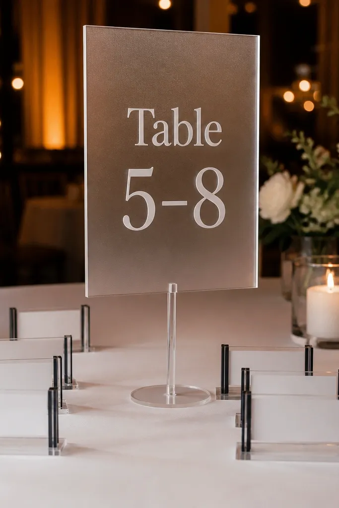
This idea turns the seating chart into something you’d normally see at a styled event centerpiece. A tall table number topper anchors each cluster, and side card holders list names for that table range. The look is modern and photo-friendly because the display has height and clean lines, not just a flat board. It works well for small to mid-size weddings where you want a high-end, curated feel. For a 3 day wedding seating chart, you update only the name cards in the holders and keep the toppers in place all three days.
Quick tipUse one consistent table number font across all clusters so the whole display feels like a set.
Start by choosing a stand height that puts the table number at eye level, then create clusters that hold 4-6 tables each. Next, print name cards in a consistent grid and slide them into clear acrylic holders attached to the stands. Finally, map the cluster locations to your venue flow so guests don’t have to walk back and forth — place clusters where they’ll naturally pass between areas.
Skip thisAvoid oversized toppers — if the stand dominates, the text becomes the minor detail.
10. Suspended Acrylic Name Strips Over a Welcome Table
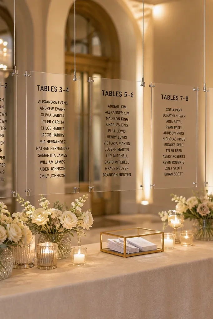
Hanging name strips look dramatic because they create movement in photos and keep the chart separate from the floor clutter. You suspend clear acrylic strips above a welcome table, with each strip showing a table range and aligned name lists. It reads cleanly because the transparency keeps the background visible while the text stays sharp. This works best when you have ceiling clearance and a controlled area where guests gather. For three days, you swap only the acrylic strips, not the entire setup, which keeps updates fast and keeps the display looking styled instead of patched.
Start by measuring ceiling height and choosing a hanging mechanism like clear monofilament or metal hooks so strips hang straight. Next, print table range content on inserts sized to the acrylic strip width, then slide them into the strip frames. Finally, set up one strip per table range and keep a labeled bag of Day 2 and Day 3 inserts so the swap takes minutes.
Hang strips so guest heads sit below the lowest strip, or people block the text while they search.
Don’t hang too low — it becomes annoying and people bump it during check-in.
11. Chic Clipboard Seating Chart Wall with Day Labels
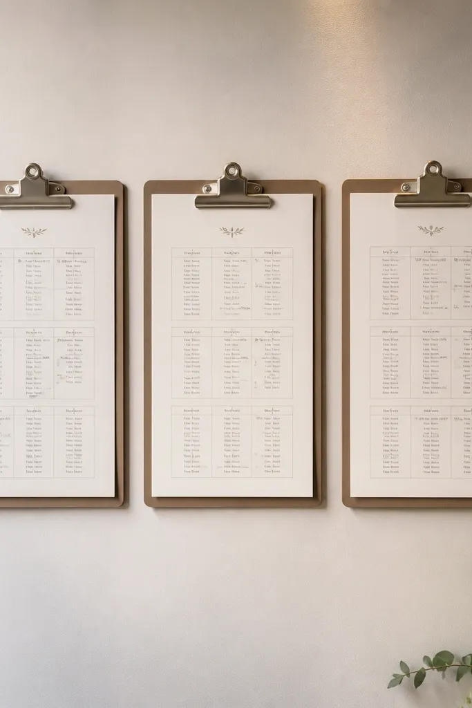
Clipboard walls look stylish and practical because they’re meant to hold paper without curling or glare. Each clipboard holds a seating chart page for a specific day, and you can clip in the updated version quickly. The look is clean because the clipboards create consistent borders, and the Day labels keep everyone from mixing versions. This is a great pick when you want a budget-friendly setup that still photographs well. It also works for weddings where the seating chart changes multiple times across the weekend, because staff can swap pages without dismantling anything.
Start by mounting clipboards in a vertical grid on a board or directly on the wall, with each row assigned to Day 1, Day 2, or Day 3. Next, print your seating chart pages on thick matte paper and insert them into protective sleeves if your venue is humid. Finally, update by unclipping the old page and clipping in the new one, keeping the layout and margins identical across days.
Choose clipboards in matte black or warm wood tones so they don’t look like office supplies.
Skip glossy sleeves — reflections make names hard to read in bright venues.
12. Neon-Edge Lightbox Seating Chart with Magnetic Numbers
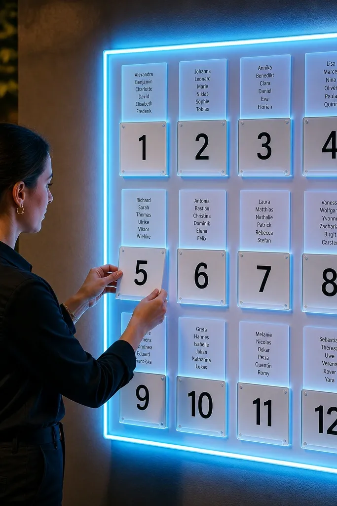
If you want the seating chart to look like a modern event installation, a lightbox does that job better than any board. You build a backlit frame and attach magnetic table number plates, then place name cards into matching slots. The glowing edges make it stand out from background decor, which helps if your reception has busy lighting. This is best for evening ceremonies, rooftops, and venues with dimmer ambiance. For a 3 day wedding seating chart, you keep the lightbox structure stable and update only the magnetic inserts for Day 1 through Day 3.
Quick tipUse warm white backlighting — it looks better on skin tones in photos than icy blue.
Start by picking a lightbox size that’s readable at 10-12 feet, then plan your table layout into sections with a consistent slot grid. Next, print name cards on matte cardstock and use magnets or metal clips that hold them flat against the backlit surface. Finally, schedule updates at transitions so Day 3 is the only bold version showing at dinner time.
Skip thisDon’t crowd the design — too many names make the glow look messy.
13. Watercolor Table Map Seating Chart with Photo-Ready Names
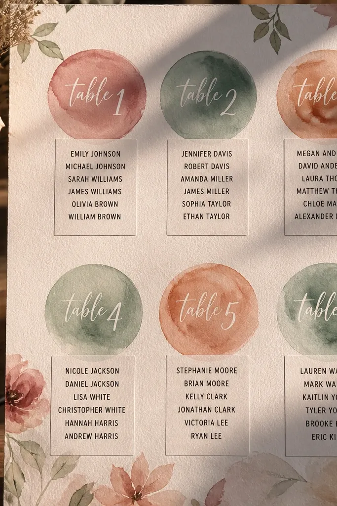
This one looks like art, not paperwork. You create a watercolor-style “table map” where each table is a painted circle or shape, and guest names sit in neat blocks under each table label. The aesthetic is soft and romantic, and it photographs beautifully because the background has texture while the text stays readable. It’s a great fit for spring weddings, garden venues, and couples who want a more artistic look. For three days, you keep the watercolor map as the same base and swap only the name blocks for Day 1, Day 2, and Day 3.
Quick tipUse dark ink for names even if the watercolor is light — contrast matters more than matching the art palette.
Start by designing a single watercolor base with fixed table labels and printed name boxes sized for your guest count per table. Next, print the name blocks as separate overlays or inserts that align exactly under each table label. Finally, mount the base in a frame and store the day inserts flat so you can swap quickly when assignments change.
Skip thisDon’t use script fonts for names; they look pretty up close but fail at distance.
14. Ceremony Program Style Seating Chart Fold-Outs
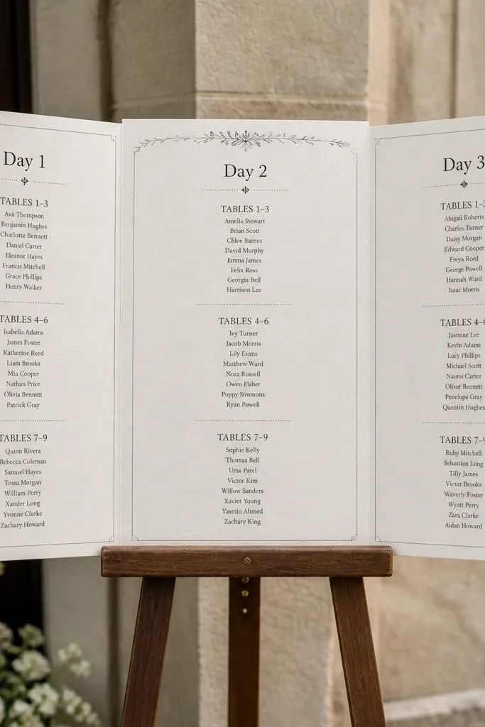
Fold-out seating charts look intentional and feel like part of the wedding paper goods. You design a fold-out that opens into table sections, with a cover that reads cleanly for Day 1, Day 2, and Day 3. It’s photogenic because it looks like a keepsake, and guests can flip to find their table without crowding a board. This works best when you have a welcome table where people naturally stop and browse. For three days, you can display Day 1 fold-outs, swap them to Day 2, and keep the same cover design while changing the interior table assignments.
Quick tipAdd a tiny QR code on the back that links to the final Day 3 seating if you want a backup for late changes.
Start by picking a tri-fold or bi-fold format that fits the number of tables you have, then design an index page that lists table numbers clearly. Next, print the interiors for each day so the cover stays consistent and only the seating content changes. Finally, place the fold-outs on a stand with a sign that tells guests to take the matching day version.
Skip thisSkip cheap paper — fold-outs look thin and bend after people handle them.
15. Botanical Frame Seating Chart with Transparent Name Layers
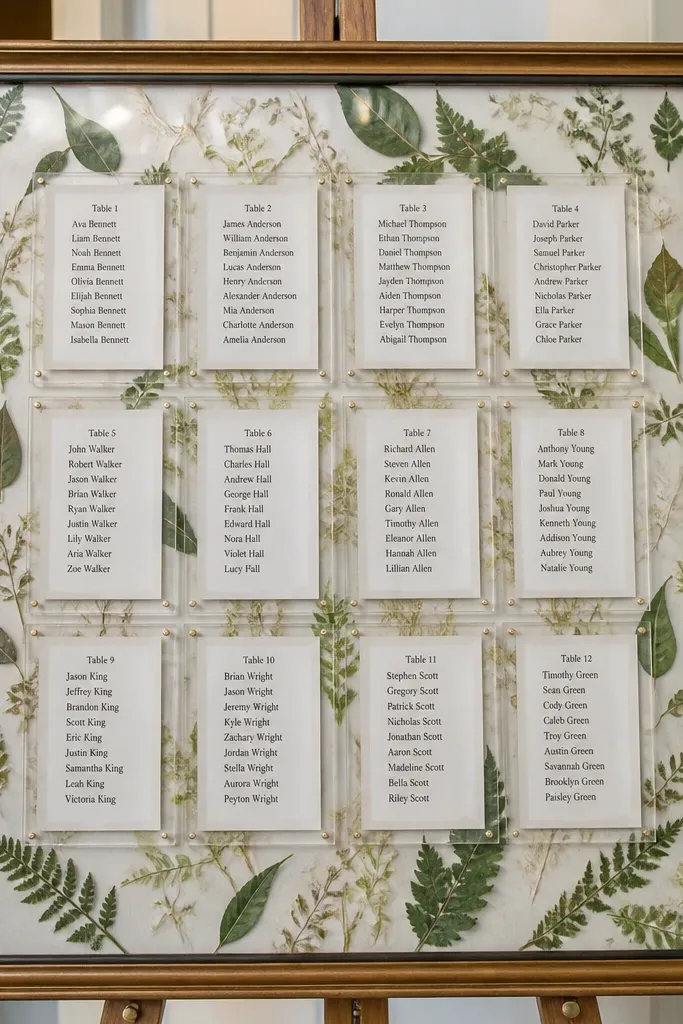
This idea gives you the soft botanical look without messy taped paper. You frame a botanical background and place transparent overlays or sleeves with the names, so the art stays constant while the seating content changes. The display looks airy and premium because the background has texture and the names sit cleanly on top. It’s perfect for garden weddings and venues that already have greenery styling. For a 3 day wedding seating chart, you can show the Day 1 overlay, swap to Day 2, and then lock in the Day 3 overlay without disturbing the frame.
Quick tipUse a dark green or charcoal for table headings so they pop over light botanical backgrounds.
Start by choosing a frame size and building a botanical backing that matches your theme colors. Next, print name overlays on acetate-like clear sheet or use clear sleeves that fit the frame opening. Finally, store each day’s overlay in a labeled flat folder so you swap quickly and keep alignment consistent.
Skip thisDon’t use watercolor text over busy leaves; it blends and becomes unreadable.
16. Table Number Tiles on a Chalkboard Base
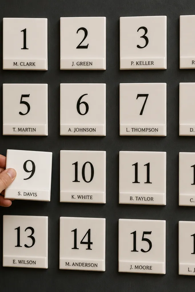
Square tiles look modern and structured, and they give you a neat way to update seating without smearing ink. You set a chalkboard-style base, then attach square tiles for each table number. Each tile holds a small name strip or card, so only the affected tile changes between days. This design is photogenic because the tiles create a grid pattern that looks intentional in photos. It’s a strong choice for rustic-modern venues and couples who want a clean, graphic look rather than a wall of paper.
Quick tipUse matte black tiles for a sharp contrast against light chalkboard backgrounds.
Start by planning how many tables you have and choosing tile sizes that fit your guest count per table. Next, attach tiles to the base using removable adhesive or magnets, then insert name strips for each table. Finally, update by replacing only the name strips that change on Day 2 and Day 3, keeping the tile grid stable the whole weekend.
Skip thisDon’t write names directly on the base — tiles and strips keep the look consistent.
17. Seating Chart on a Rotating Stand with Day Panels
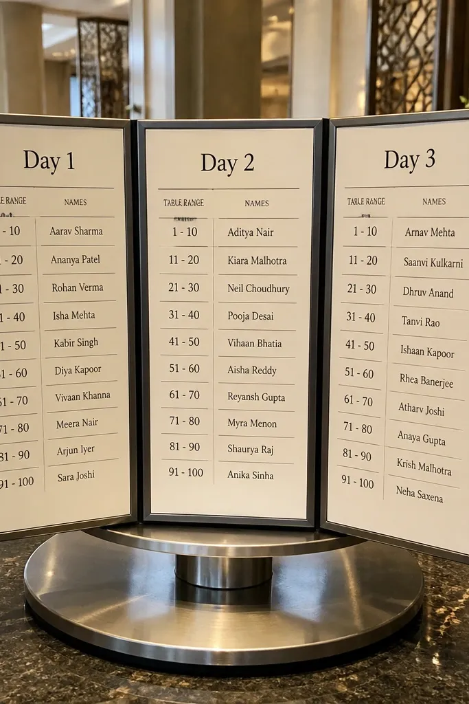
A rotating stand is a smart aesthetic choice for guests who arrive at different times. You build the seating chart on a stand with three panels, one for each day, so the display looks tidy instead of stacked. Guests look up, find their table number on the correct panel, and move on. It’s especially good for venues with a dedicated check-in corner where people queue. For three days, you keep the stand in place and rotate to the correct day panel, then update panels only when needed behind the scenes.
Quick tipUse a stand with a weighted base so it doesn’t wobble when guests bump it.
Start by measuring the space so the stand has clearance for guests to walk up without blocking traffic. Next, design each panel as a consistent table grid with the same font and spacing, then mount them onto the rotating mechanism. Finally, label the stand base clearly and assign a staff member to rotate and update the panel content on schedule.
Skip thisSkip tiny text for guest names; rotation makes it tempting to pack more in, and it turns unreadable.
18. Ceremony Arch Seating Chart Sign with Hanging Name Tags
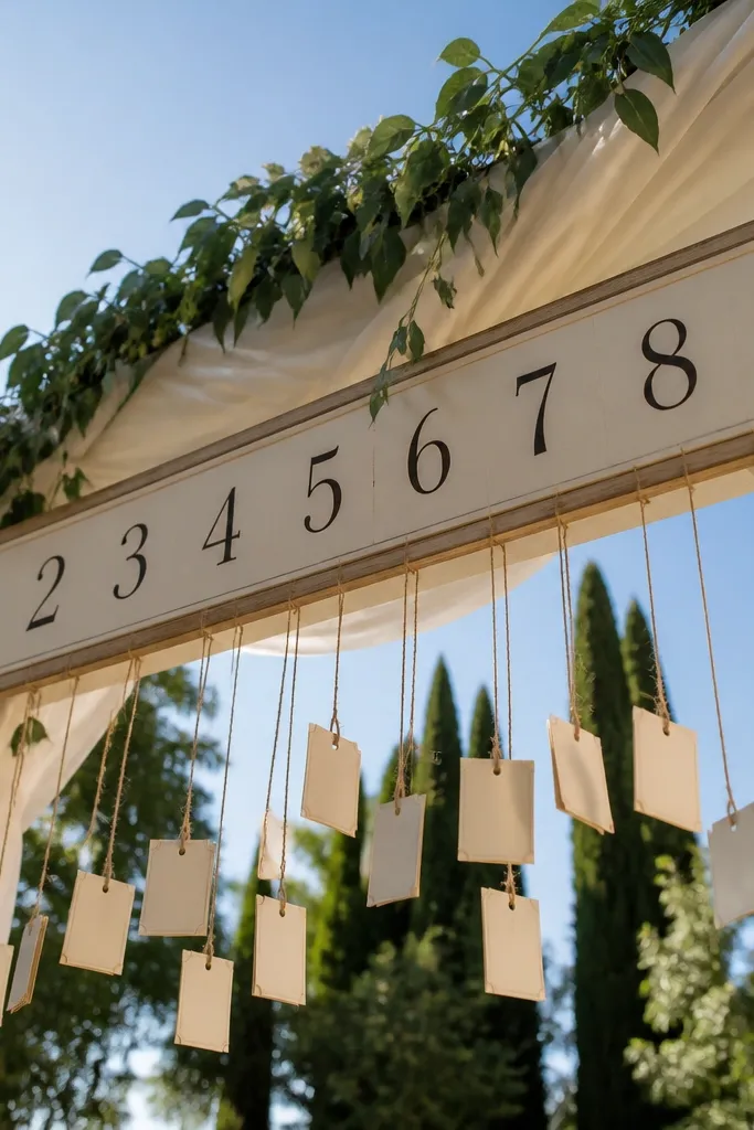
Turn your ceremony arch into a seating chart moment. You mount a sign or board at arch height and hang name tags or small cards by table number, so the display feels like part of the event structure. It’s dramatic in photos because guests are already used to looking up at an arch, and the hanging tags create depth. This works well when you have a venue with an arch, frame, or tall structure you can repurpose after the ceremony. For three days, you keep the arch styling constant and swap the hanging tags for Day 1, Day 2, and Day 3.
Quick tipUse a consistent ribbon color for all days and change only the day label card at the top.
Start by selecting hanging tag lengths that keep names readable without touching each other, then plan table number groupings by the arch sides. Next, print table number tags and guest name tags on consistent cardstock sizes, and hang them using clear clips or small rings. Finally, store replacement tag sets in labeled envelopes by day so updates happen quickly and neatly.
Skip thisDon’t let tags swing freely in wind; secure the bottom edge so they hang straight.
19. Garden-Path Seating Chart with Numbered Stakes and Card Pockets
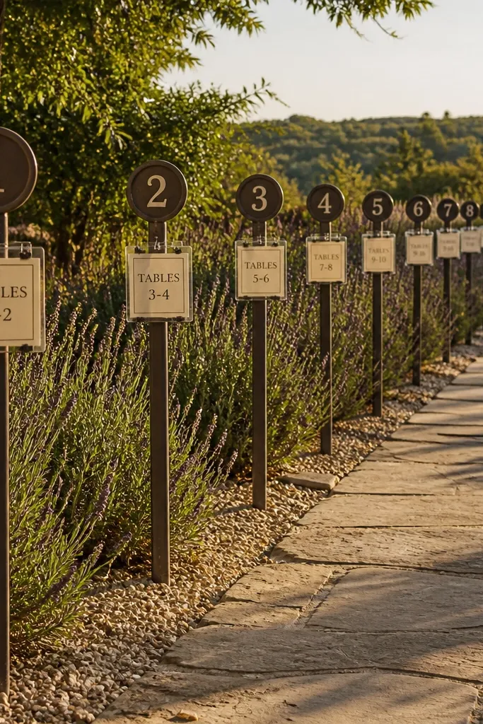
If your venue has outdoor pathways, this idea makes the seating chart feel like part of the walk, not a static sign. You place numbered stakes along a path leading to dinner, with each stake holding a card pocket for a table range. Guests scan while walking, which reduces crowding and improves flow. It looks great in photos because stakes create a natural line and depth through greenery. For a 3 day wedding seating chart, you swap the card pocket inserts for Day 2 and Day 3 while keeping the stake numbers and design consistent all weekend.
Quick tipPut stakes where guests already slow down, like near a seating entrance or cocktail pickup point.
Start by mapping your guest route and placing stakes so each one is visible from the previous stop. Next, use weather-resistant card pockets and print inserts with high contrast so text stays readable in daylight. Finally, schedule updates for each day early so guests aren’t searching with outdated info at peak arrival times.
Skip thisSkip flimsy stakes; unstable signs look messy and can tip in wind.
20. Seating Chart on a Mirror with Backed Name Cards
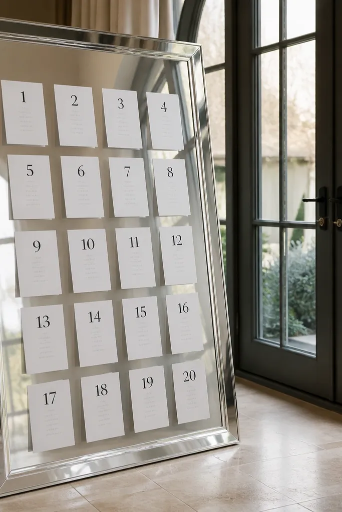
Mirrors make seating charts look instantly more expensive because they multiply light and add depth. You set a mirror at a slight angle and place backed name cards in a grid, each table number clearly labeled. The result is photogenic in both indoor and outdoor settings, especially near an entry where guests pass by. It’s also functional for three days because you can keep the mirror framing constant and swap the backed cards for each day. This is a strong choice for weddings that want glamour without going full neon.
Quick tipAvoid placing the mirror where overhead fixtures glare directly into camera lenses; tilt it slightly.
Start by choosing a mirror size that fits your table count without making the cards too small, then build a grid layout on a backing panel behind the mirror. Next, print name cards with consistent spacing and attach them to the backing using removable adhesive tabs or small clips. Finally, update by swapping the card sets for Day 2 and Day 3 while keeping the grid positions identical.
Skip thisDon’t use low-contrast text; reflections make faint colors disappear.
21. Gold Frame Seating Chart with Chalk Labels and Acrylic Name Clips
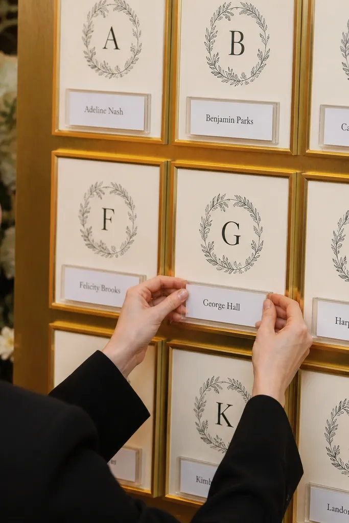
This design nails the upscale look while staying update-friendly. You use gold frames with chalk-style headings for table numbers, then attach acrylic name clips where guest names slide in and out. The gold border photographs beautifully and the clear clips keep the content looking neat even after multiple swaps. It’s ideal for indoor ballrooms, hotel weddings, and couples who want classic decor with a modern update system. For a 3 day wedding seating chart, clips let you replace only the names that change, which keeps labor low and the chart clean.
Quick tipChoose charcoal or deep navy text for table headings so it stays legible against gold frames.
Start by selecting frame sizes that match your table ranges and decide how many clips per table you need. Next, print guest names on uniform cardstock and slide each into acrylic clips aligned under the correct table heading. Finally, keep Day 1, Day 2, and Day 3 name clip sets in labeled trays so the update is quick and consistent.
Skip thisSkip mixed paper finishes; glossy names look mismatched in flash photos.
22. Rattan Board Seating Chart with Color-Coded Table Tags
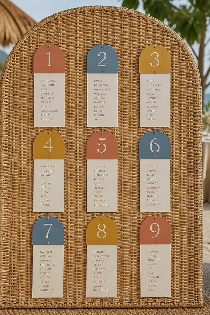
Rattan adds texture and warmth, and it makes your seating chart feel like decor instead of paperwork. You attach color-coded table tags to the rattan board and clip guest name cards beneath each tag. The color system makes it easy for staff to update the right section quickly across three days. It’s best for beachy, boho, and destination weddings where natural materials are already part of the styling. For a 3 day wedding seating chart, you can keep table tags in place and clip in updated name cards for Day 2 and Day 3 without disassembling the board.
Quick tipUse cream cards with dark ink so the rattan texture doesn’t blur the text.
Start by measuring your rattan board and planning table tag spacing so the board doesn’t look crowded. Next, print name cards in a matching neutral font and use small clips that don’t snag the texture. Finally, assign one color per day or per table range and keep extra name card sets organized by color so updates are fast.
Skip thisDon’t pick too many colors; three colors max keeps it readable in photos.
23. Seating Chart Display in a Bookshelf Frame
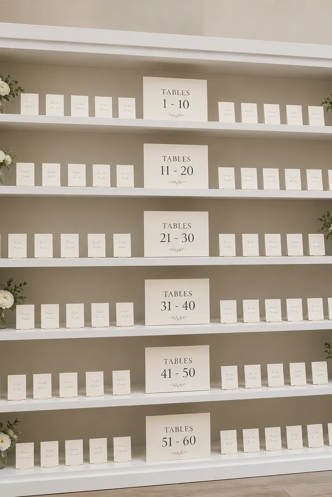
A bookshelf-style frame turns seating into a staged display. Each shelf holds a table range with labels, and the name cards sit neatly inside so they don’t curl. It looks like intentional decor because the shelf grid gives structure, and it’s easy for guests to scan. This is especially good for indoor venues where you want a vertical, photo-ready centerpiece area. For three days, you swap shelf inserts rather than rebuilding the chart. The result looks consistent even when seating changes.
Start by choosing a frame with shelves deep enough to hold thick inserts, then calculate your table ranges per shelf based on guest density. Next, print shelf inserts with table headings and aligned name lists, then slide them into clear sleeves or place them on ledges. Finally, label each insert by day on the back so the swap for Day 2 and Day 3 is fast and error-free.
Use a light wood frame so the text stands out and photos look bright.
Skip shelves that are too shallow; card edges lift and ruin the clean look.
24. Seating Chart on a Fabric Banner with Clip-On Panels
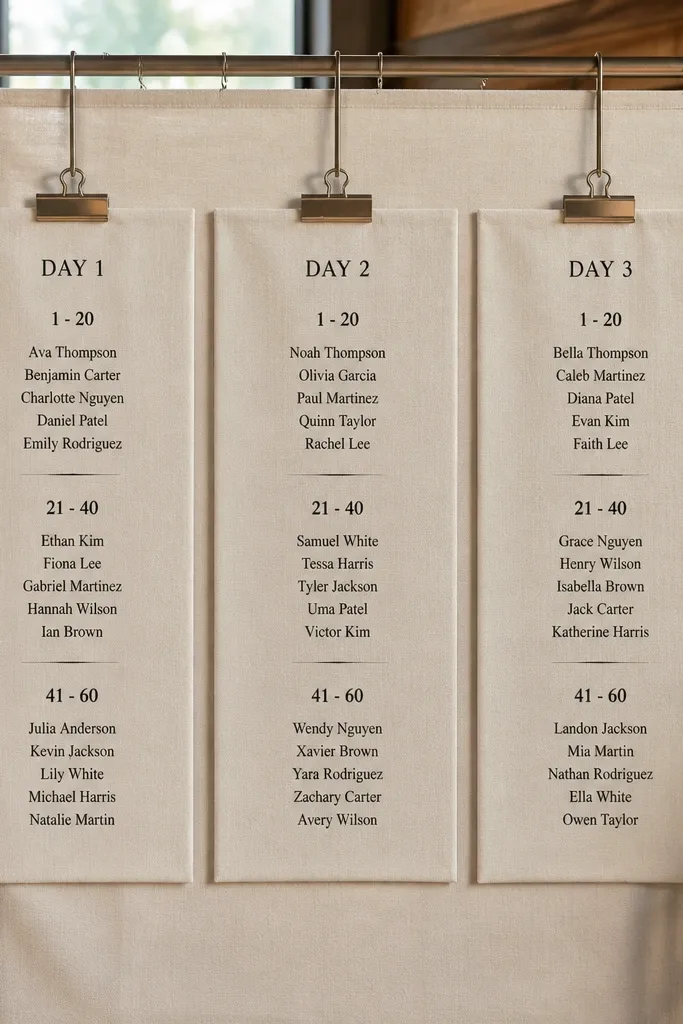
Fabric banners look soft and romantic, and clip-on panels make them update-friendly for three days. You hang a neutral fabric banner as the base, then attach table sections as separate panels that clip on and off. The texture makes it photogenic, and the modular panels keep the display from turning into a layered paper disaster. This works well for outdoor receptions, spring weddings, and venues where you want the chart to blend with draping. For a 3 day wedding seating chart, you update by swapping only the panels that change, keeping the banner base in place the whole weekend.
Quick tipUse matte fabric-backed panels instead of glossy paper; glare makes text harder to read.
Start by choosing a fabric color that matches your theme and build a simple banner frame or drape so it hangs flat. Next, design table panels as separate printed pieces with consistent sizes, then attach them with sturdy clips spaced evenly. Finally, store Day 2 and Day 3 panels in labeled sleeves so staff can clip and replace quickly between events.
Skip thisDon’t let the banner sag; a wrinkled base makes names look crooked in photos.
25. Numbered Table Escort Card Vitrine with Sliding Trays
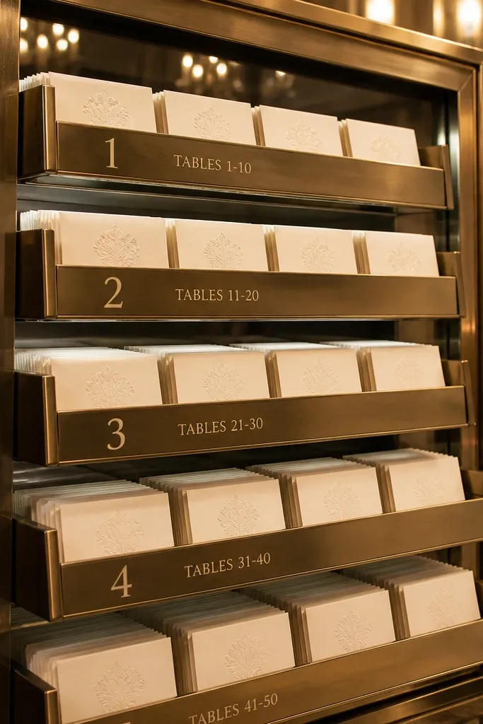
A vitrine-style display looks high-end and keeps escort cards protected from spills and foot traffic. You build a frame with numbered trays for table ranges and slide in the card sets for each day. The clean, glassy look is photogenic and feels intentional, especially for evening receptions. It’s a great option when you want guests to browse at their own pace without crowding behind a board. For three days, trays let you swap only the card sets that change while keeping the display structure consistent.
Quick tipUse frosted acrylic trays if you want less glare and easier reading in bright venues.
Start by choosing a vitrine or display case with tray access that staff can reach quickly. Next, print escort cards on thick cardstock and arrange them in trays by table number with consistent spacing. Finally, set up the vitrine near the welcome area and run updates by swapping tray inserts for Day 2 and Day 3 at scheduled check-in times.
Skip thisSkip flimsy tray dividers; when trays shift, the card layout looks sloppy.



