
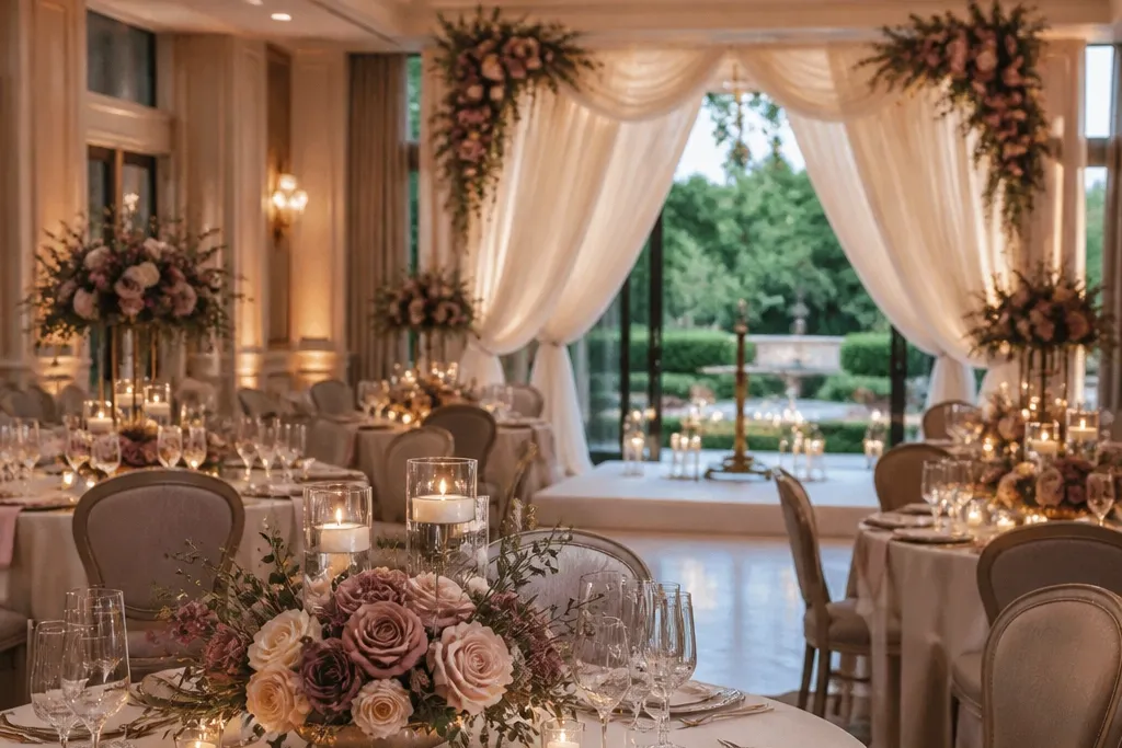
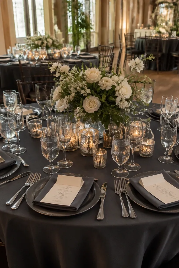
1. Ivory + Blush + Dusty Mauve (soft romance set)
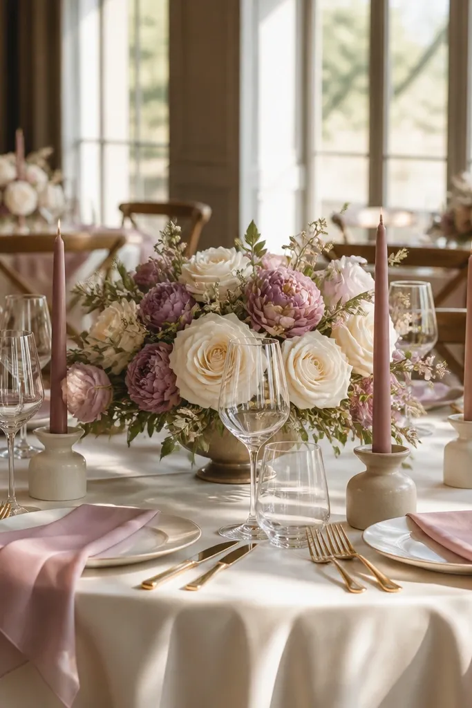
This palette reads romantic without looking childish. Ivory keeps everything bright in daylight, blush adds warmth, and dusty mauve brings depth to photos so the color doesn’t flatten. It’s especially good for indoor receptions, ballroom weddings, and spring ceremonies where you want a gentle, polished look. The flowers look “designed,” not random, because mauve gives contrast against creamy linens.
Quick tipChoose mauve flowers with a dusty tone like lilac-leaning stock or mauve lisianthus so they don’t go too purple under warm venue lighting.
Start with ivory linens (tablecloth or runner) and add blush napkins. Then pick one mauve focal point: either the bridesmaid bouquets, the ceremony arch florals, or a mauve runner down the head table. Finally, bring it together with pale candles (pink or ivory) and signage on white cardstock with mauve ink.
Skip thisDon’t add a bright fuchsia accent — it fights the softness and makes the scheme look loud.
2. Cream + Sage + Antique Gold (garden-luxe)
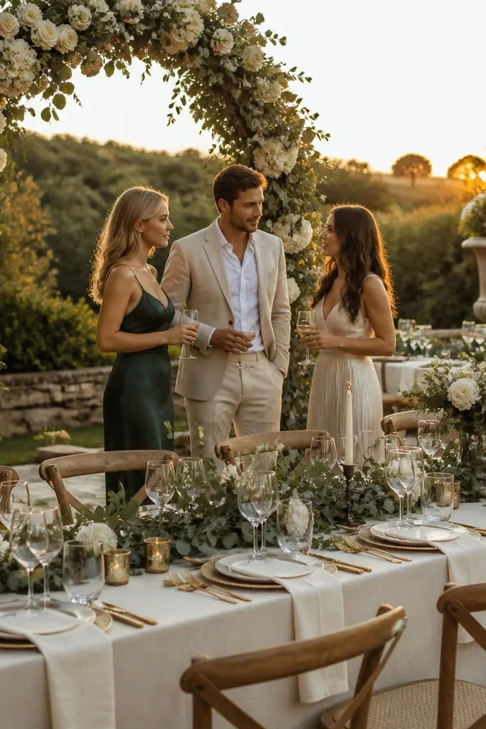
Cream and sage give you that “fresh garden” vibe, but antique gold makes it look styled instead of casual. Sage’s gray undertone photographs cleanly next to cream, and gold accents create warm highlights in evening shots. This is a strong choice for outdoor weddings, farm venues, and late-summer dinners where you want a natural look that still feels elevated. It also works well when you have lots of greenery already, like vines or hedges.
Quick tipIf your venue is very green, use more cream and less sage so the palette stays readable in photos.
Start with cream base pieces: tablecloth, menus, and escort cards. Add sage through greenery-heavy florals and ribbon (use sage satin or organza). Then sprinkle antique gold via candle holders, charger plates, or metallic ink on place cards.
Skip thisSkip bright yellow-gold; it can make sage look sickly under mixed lighting.
3. White + Charcoal + Silver (modern city wedding)
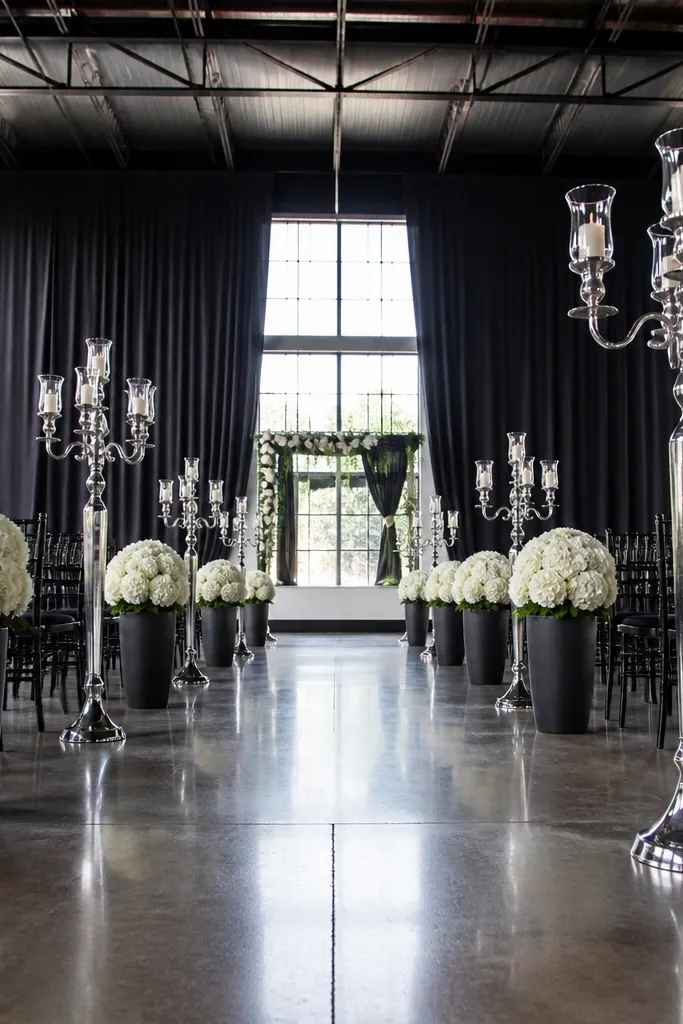
White, charcoal, and silver is the cleanest aesthetic Wedding Color Schemes for modern venues. White keeps it crisp, charcoal gives structure and contrast, and silver adds a cool glow that looks sharp on camera. This palette works best for urban lofts, hotels, and warehouse venues where you want the decor to look intentional against dark walls. It’s also excellent if you want minimal florals, because the palette does the heavy lifting.
Quick tipUse matte charcoal fabric for chair accents; shiny fabric catches light and makes photos look harsh.
Start with a bright white table runner or linens and keep your floral palette mostly white with a little gray. Add charcoal via chair sashes, signage frames, or place card holders. Finish with silver candle trays, metallic ink, or mercury-glass style votives.
Skip thisDon’t add warm copper or orange accents — they break the cool, modern balance.
4. Soft Blue + Navy + White (coastal but grown-up)
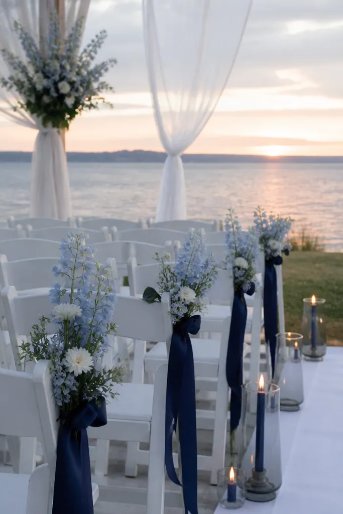
Soft blue and navy look coastal without turning into beach-themed costumes. White ties everything together, and navy gives you deep contrast for candlelight and evening photos. This scheme is great for seaside venues, lakeside ceremonies, and spring weddings where you want airy color but still need depth. It also flatters a wide range of skin tones in bridesmaid photos.
Start with white linens and choose either soft blue or navy for the main floral color (not both equally). Add navy through napkins, ribbon, or a navy-and-white striped runner. Then use white flowers plus blue accents like delphinium or hydrangea to keep it cohesive.
If your florals are all blue, add white petals in the center so the bouquet reads bright in pictures.
Skip teal-heavy mixes; they can look muddy next to navy under warm indoor light.
5. Blush + Champagne + Espresso (warm minimal)
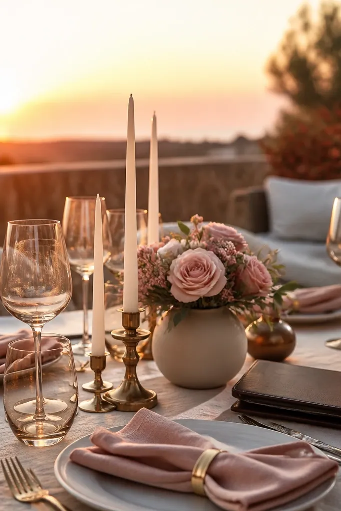
This palette is for couples who want “soft and expensive” without going full blush overload. Champagne reads warmer than cream, espresso adds grounded contrast, and blush keeps it romantic. It’s especially flattering for sunset ceremonies and indoor venues with golden lighting. Photos look calm and high-end because espresso prevents the scheme from floating away.
Quick tipUse thick paper stock for signage; the warm undertone shows up better on camera than thin, glossy paper.
Start with champagne or warm ivory linens, then add blush napkins or blush ribbon on chairs. Choose espresso for typography: menus, seating cards, and table numbers on thick paper. Finally, keep metallic accents minimal with rose-gold or champagne-toned candle holders.
Skip thisDon’t add bright red flowers; they fight espresso and make the palette look off-balance.
6. Terracotta + Cream + Olive (desert garden)
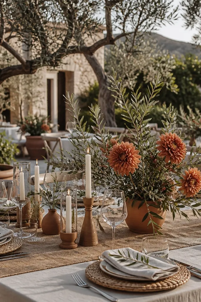
Terracotta plus cream and olive looks like a styled weekend in the countryside. Cream keeps it light, terracotta adds that earthy warmth, and olive greenery makes the palette feel intentional rather than “rusty.” This is a great pick for fall weddings, outdoor ceremonies, and venues with stone or wood. It also photographs beautifully against warm backgrounds like desert landscapes or tan walls.
Quick tipBring terracotta in at three points: bouquet, ceremony install, and one small detail like napkin rings.
Start with cream tablecloths and choose terracotta as your accent through centerpieces, terracotta pots, or terracotta ribbon. Add olive via greenery and wreaths, not via random olive drapery that can look flat. Finish with warm white candles or clay-toned glass to keep the warmth consistent.
Skip thisSkip rust-orange accents; dusty terracotta reads more modern and less “expired autumn.”
7. Emerald + Ivory + Black (jewel contrast)
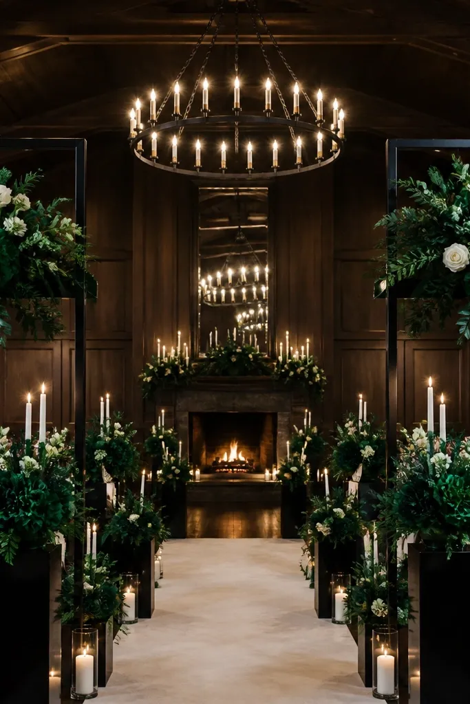
Emerald and black make photos punchy, and ivory stops it from feeling heavy. This is one of the strongest aesthetic Wedding Color Schemes for winter weddings, dark halls, and dramatic ceremony lighting. Emerald flowers look richer under evening lights, and black frames signage so everything reads crisp. If you want a “wow” effect in a single color family, emerald is the one.
Start with ivory linens and use emerald in napkins or a table runner. Then add black through candle holders, flatware tone, or chair accents. Keep florals mostly white with emerald leaves and deep green blooms like eucalyptus for contrast that stays readable.
Use matte black candleholders; glossy finishes reflect venue lights and can blow out highlights in photos.
Don’t mix emerald with bright neon greens; it makes the jewel tones look cheap.
8. Rose Pink + Steel Gray + White (modern romance)
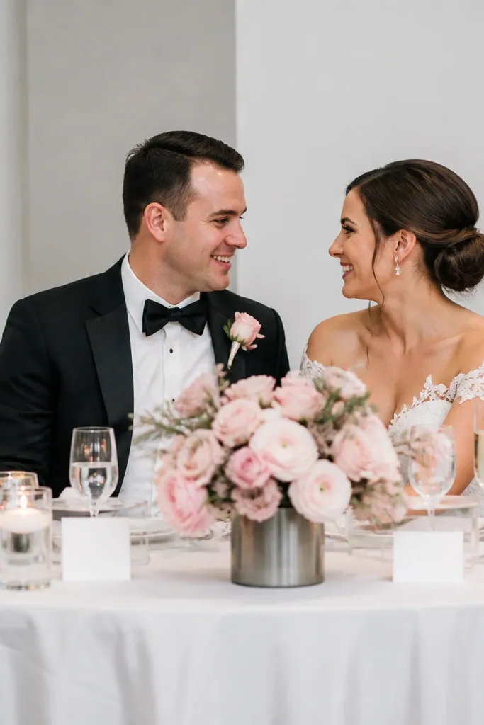
Rose pink is harder to style than blush because it can go too bright. Pairing it with steel gray keeps it modern and controlled, while white keeps everything airy. This palette looks especially good in contemporary venues with clean lines and neutral walls. It’s ideal if you want a romantic color story but don’t want the decor to look overly traditional.
Start with white linens and place cards in steel gray ink. Then choose rose pink for napkins and one floral element, like rose stems or peonies. Add steel gray through small decor like vases, acrylic signage frames, or ribbon on aisle markers.
Test rose pink fabric in venue lighting; some reds go orange fast under warm bulbs.
Skip gold accents; they can turn the whole palette into “warm pink + shiny” instead of modern.
9. Mauve + Cocoa Brown + Cream (cozy editorial)
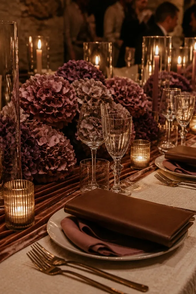
This scheme looks like a magazine spread because it’s built around texture and undertones. Cream is your light base, mauve adds a soft purple mood, and cocoa brown gives depth without going full black. It’s perfect for fall and winter weddings where you want cozy photos that still feel stylish. The brown makes the mauve look richer and more intentional.
Quick tipUse mauve flowers with a grayish tone (lilac, dusty mauve) for a more editorial look than bright purple.
Start with cream tablecloths and add cocoa brown via runners, chair covers, or signage frames. Put mauve in the florals and maybe one ribbon detail so the color has a clear anchor. Finish with warm candles in amber or brown glass to keep the scene cohesive in low light.
Skip thisDon’t add cool blue accents; it makes the palette feel random and less warm.
10. Mustard + Cream + Black (retro dinner party)
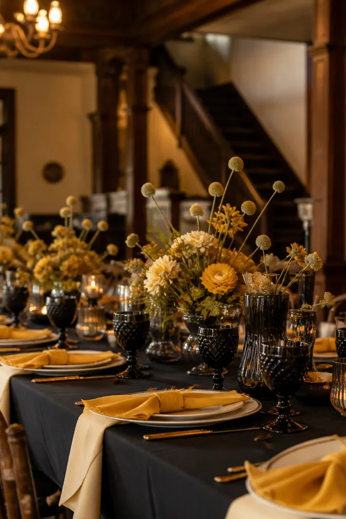
Mustard is bold, but paired right it looks retro-chic instead of messy. Cream keeps it bright, and black gives it structure so the color reads intentional. This aesthetic Wedding Color Schemes option is great for indoor receptions, especially in venues with wood floors or vintage decor. It also makes yellow-toned flowers look richer and more photogenic.
Start with cream linens and choose mustard for napkins or a table runner. Add black through typography on place cards and table numbers. Finally, use mustard-adjacent florals like ranunculus or dried wheat accents plus cream candles to balance the brightness.
If mustard feels too loud, use it for napkins only and keep centerpieces more cream-and-green.
Skip orange-heavy marigold tones; they push mustard into a “Halloween” direction.
11. Nude Blush + Ivory + Soft Gold (minimal champagne)
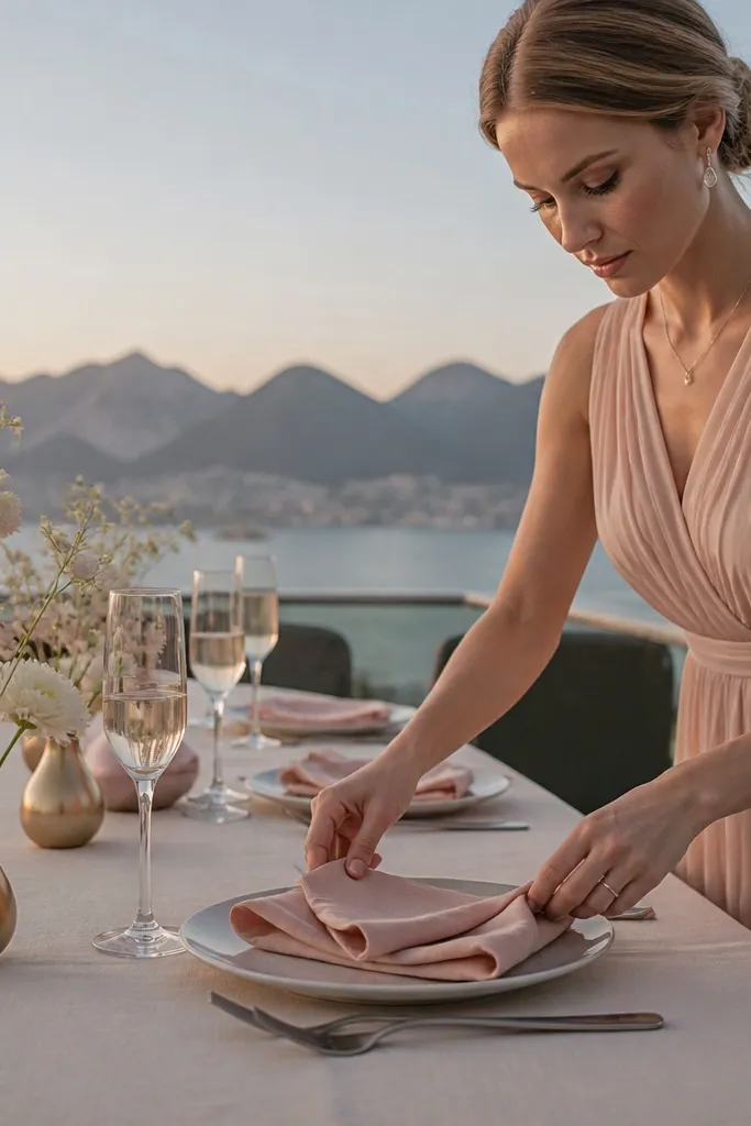
This is the palette for “barely-there but expensive.” Nude blush is quieter than most pinks, ivory keeps it clean, and soft gold adds a gentle highlight without screaming metallic. It looks best with minimal florals, modern stationery, and lots of negative space in photos. Choose this if you want your wedding to look airy, not crowded with color.
Quick tipUse matte gold, not shiny — it reads calmer in daylight and evening photos.
Start with ivory linens and keep your stationery in warm off-white paper. Add nude blush only through florals and a few ribbon details so the look stays light. Finish with soft gold through candle tops, pen ink, or a thin gold border on menus.
Skip thisDon’t add dark espresso accents; it makes the scheme lose its airy feel.
12. Sage + White + Natural Linen (coastal farmhouse)
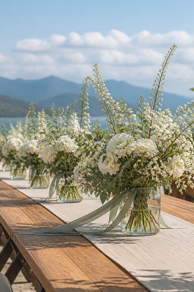
Sage and natural linen is a calm, coastal farmhouse look that still photographs beautifully. White florals and greenery keep the palette light, and linen adds texture that reads in close-ups. This works well for beach-adjacent venues, barns with lots of natural light, and outdoor ceremonies with open skies. It’s also great if you want your decor to blend with the landscape instead of competing with it.
Start with natural linen runners and off-white plates or chargers. Add sage through eucalyptus, olive branches, or sage-toned ribbons. Then keep florals mostly white with small green accents so the color stays cohesive.
Choose greenery that’s actually gray-green; bright lime sage can look harsh against linen.
Skip patterned napkins; the texture mix can overpower the calming palette.
13. Navy + Coral + White (sunset romance)
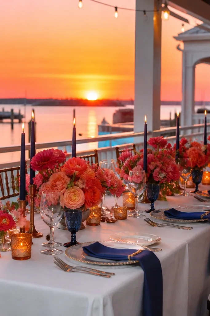
Coral with navy is a bold contrast that reads like sunset in photos. White keeps it clean and bright so coral doesn’t look too heavy. This palette is great for warm-weather weddings where you want energy without going full tropical. The navy grounds everything, especially in evening light when coral can otherwise fade.
Start with white linens and choose navy for a table runner or chair sash. Add coral through bouquets, centerpieces, and maybe one patterned detail like coral-striped napkins. Finish with small white candle clusters so the palette stays light in wide shots.
Use coral with a peachy undertone, not pink-red; it photographs more flattering and less intense.
Don’t pair coral with teal; it turns the palette into a beach cocktail theme.
14. Black + Cream + Red Berry (dramatic winter)
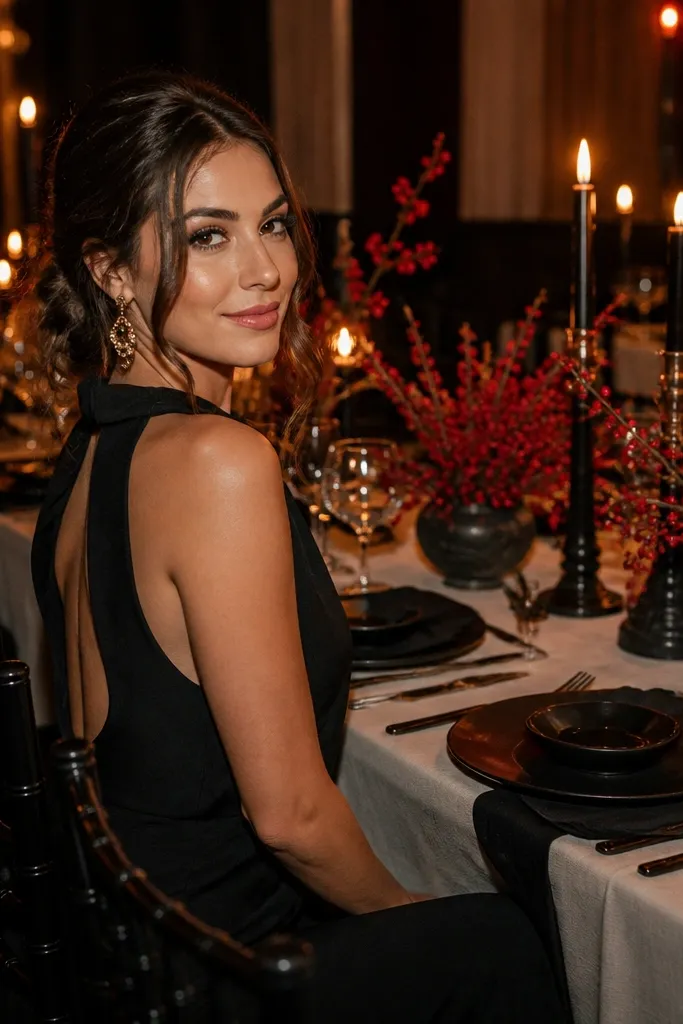
This is the aesthetic Wedding Color Schemes choice for drama without glitter. Cream gives brightness, black adds contrast, and red berry tones add a festive pop that reads beautifully in winter photos. It works well for candlelit receptions, evening ceremonies, and venues with dark wood or stone. The berries also add shape and texture, which makes centerpieces look full even with fewer flowers.
Start with cream linens and black candleholders or black napkins. Add red berry in garlands, aisle markers, or a single statement centerpiece. Keep florals mostly cream or white so the red berries stay the focus.
Use battery candles if the venue is strict about open flames; you’ll still get the cozy look in photos.
Skip bright cherry-red everywhere; concentrate it in the berries and garlands.
15. Purple + Lavender + White (soft field blossoms)
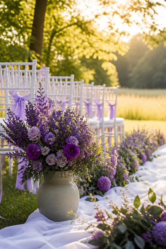
Lavender and purple can go either dreamy or messy. The key is using white as the photo-breaker so the palette stays airy. This scheme is perfect for spring and early summer ceremonies, especially outdoors where the colors blend with greenery. Lavender provides a gentle glow, and deeper purple adds just enough contrast for a styled look.
Start with white linens and add lavender through napkins or ribbon. Then choose one deeper purple element like purple delphinium or dark lilac blooms in the ceremony focal area. Finish with lots of white filler flowers so the arrangement doesn’t look too heavy.
Pick florals with similar undertones (cool purple, not warm violet) to avoid color mismatch in bouquets.
Don’t mix lavender with peach or orange florals; it wrecks the cool, soft mood.
16. Teal + White + Bronze (arthouse coastal)
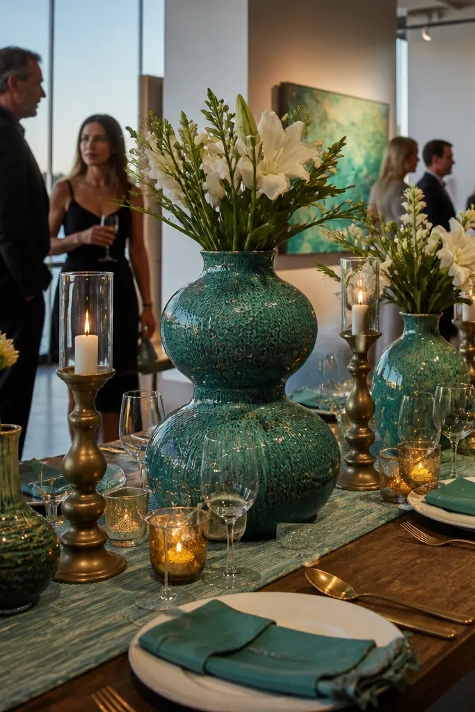
Teal looks premium when you pair it with white and bronze instead of gold. Bronze warms the teal slightly, so the palette feels cohesive in both daylight and evening. This is great for waterfront venues, art galleries, and modern receptions where you want color that feels grown-up. It also plays well with glassware and textured ceramics.
Quick tipUse matte bronze or brushed bronze; shiny metallics can create harsh reflections in photos.
Start with white linens and choose teal for napkins or a table runner. Add bronze through candleholders, flatware tone, or metallic ink on place cards. Keep florals mostly white with teal accents like hydrangea or thistle so the scheme stays clean.
Skip thisSkip bright turquoise; it can look cheap next to bronze and under warm indoor lights.
17. Peach + Cream + Soft Brown (sunlit minimal)
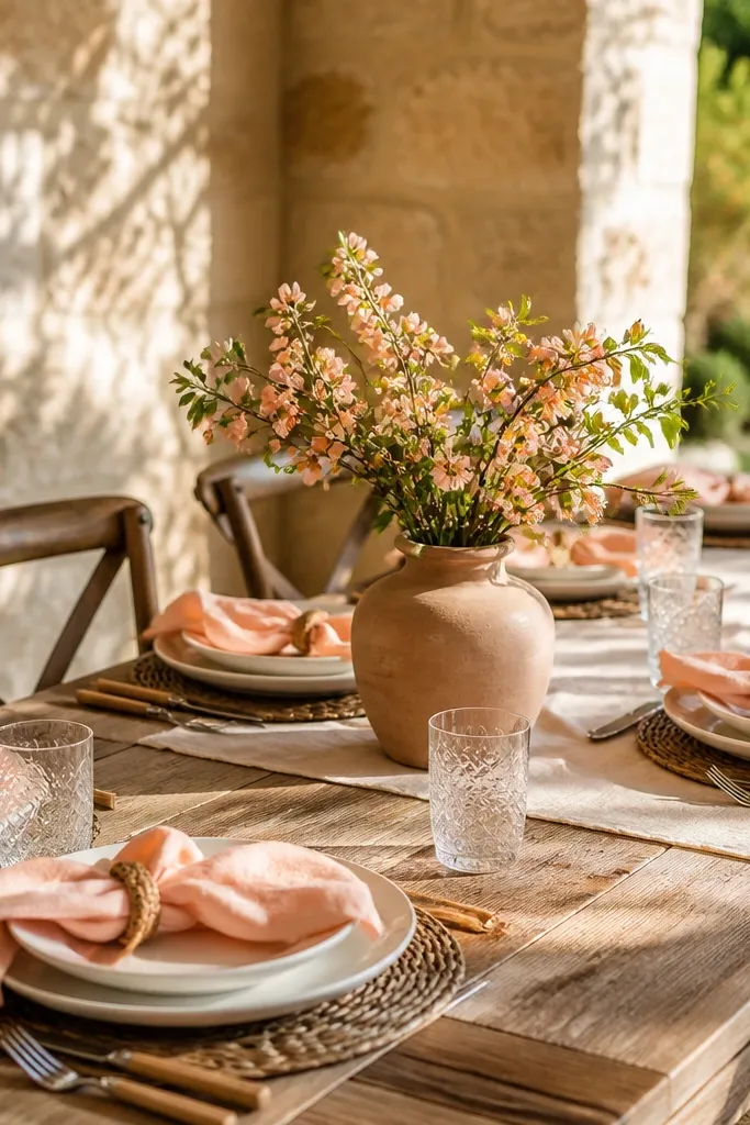
Peach and cream read warm and friendly, while soft brown keeps it grounded. This palette is ideal for daytime weddings, brunch receptions, and outdoor ceremonies where you want a sunlit look. It’s also a safe choice if your venue has beige walls or lots of wood — the colors blend instead of clashing. Photos come out bright without looking washed out.
Start with cream linens and choose peach for napkins or a floral accent like peach ranunculus. Add soft brown through typography on signage and table numbers. Finish with cream candles and small brown details like cork place card holders or natural wood trays.
Pick peach with a dusty undertone; neon peach can look orange on camera.
Don’t add bright magenta; it makes peach feel dated and too loud.
18. Deep Burgundy + Ivory + Antique Brass (winter romance)
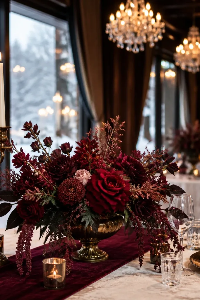
Burgundy is romantic and photo-friendly when it’s paired with ivory and antique brass. The brass warms the deep red so it looks rich, not flat, especially at night. This aesthetic Wedding Color Schemes option is great for fall and winter weddings, especially in venues with chandeliers, dark beams, or velvet seating. Burgundy also makes greenery look darker and more dramatic.
Start with ivory linens and choose burgundy for napkins or a ceremony backdrop fabric. Add antique brass through candleholders and metallic signage accents. Keep the florals mostly burgundy with ivory filler blooms so the bouquets look full but not heavy.
If you use velvet, keep it matte; shiny velvet can look black in photos under low light.
Skip bright red accents; burgundy needs depth, not candy colors.
19. Powder Pink + White + Baby Blue (baby shower energy, wedding-ready)
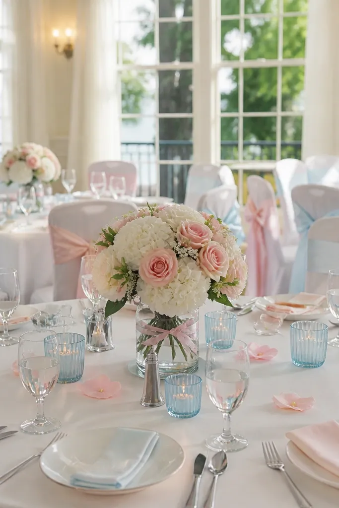
This palette is playful, but you need tight control to make it wedding-appropriate. Use powder pink and baby blue as accents, then let white do most of the visual work. It’s great for spring ceremonies, indoor receptions with lots of natural light, and venues with airy decor. Photos look cheerful, and the colors stay soft instead of turning neon.
Quick tipChoose baby blue that leans slightly gray; bright sky blue can overpower powder pink.
Start with white linens and white floral bases. Add powder pink through napkins and baby blue through ribbon or a small portion of the bouquets. Finally, keep signage in crisp dark gray so the pastels don’t blend together.
Skip thisDon’t add saturated purple; it makes the palette look like a theme party.
20. Olive + Terracotta + Bone (Mediterranean tablescape)
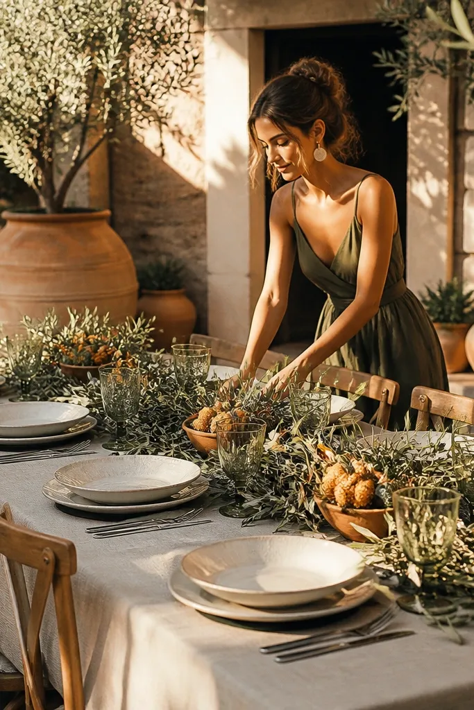
Bone, olive, and terracotta look like Mediterranean food and late sunsets. Bone keeps the palette elegant, olive adds earthy depth, and terracotta brings that clay warmth that feels handmade. This scheme works well for outdoor receptions, courtyard venues, and weddings with lots of natural texture like stone walls and woven chairs. It’s also a strong pick for couples who want earthy colors without going rustic.
Quick tipUse the same terracotta tone in at least two places so photos don’t show “different rusts.”
Start with bone-colored linens and dishes. Add olive through garlands, olive branches, and greenery-heavy arrangements. Then bring terracotta in via terracotta vessels, warm orange-rust flowers, or clay-colored candles.
Skip thisSkip bright orange; terracotta should look dusty and clay-like.
21. White + Sage + Black Ink (editorial stationery look)
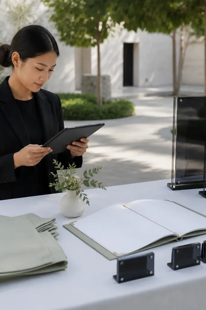
This palette is about typography and clean contrast. White and sage keep it fresh, and black ink makes signage and menus look crisp in every photo. It’s perfect if you like minimal decor but still want the wedding to look intentional. This scheme also works incredibly well for modern outdoor weddings where you want the landscape to be the backdrop and the paper to be the style.
Start with white linens and choose sage for greenery and a few small floral accents. Then use black ink on thick paper for menus, table numbers, and escort cards. Finally, keep metallics out or minimal; let black do the contrast instead of adding gold.
Use matte paper for menus; glossy paper reflects overhead lights and can ruin photo clarity.
Don’t add too many colors in florals; keep it white blooms plus sage to protect the clean look.
22. Charcoal + Smoke Gray + Blush (moody modern)
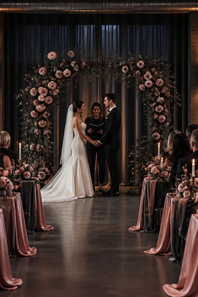
If your venue is modern and dark, this scheme makes it look designed instead of gloomy. Charcoal gives structure, smoke gray adds soft depth, and blush provides a gentle contrast that still reads romantic. This is a strong choice for evening receptions, lofts, and indoor ceremonies with dramatic lighting. Photos look moody and polished, and the blush details keep faces looking warm.
Quick tipIf you’re unsure about blush shade, go for dusty blush, not neon pink — it looks better under warm lights.
Start with charcoal linens or a charcoal runner and keep the tableware mostly white. Add blush through napkins, florals, or a blush ribbon on aisle markers. Then use smoke gray candle holders or glass to create a consistent gray tone across the scene.
Skip thisSkip bright white everywhere; pure white with charcoal can look too stark unless you balance with blush.
23. Coral + Blush + Warm White (romantic garden glow)
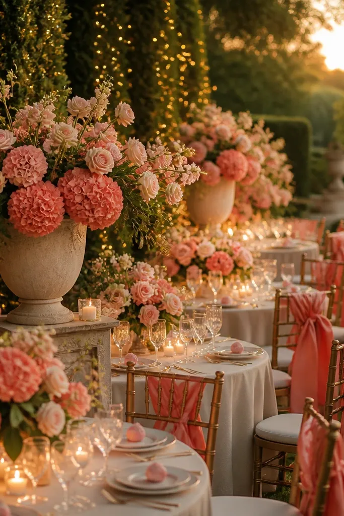
This is the palette for a garden wedding that wants to feel romantic, not beachy. Coral brings warmth and energy, blush softens it, and warm white keeps the whole scene flattering. It’s great for spring and summer ceremonies with lots of greenery because coral stands out without feeling harsh. In photos, the coral looks like sunset highlights rather than a loud primary color.
Quick tipUse coral flowers that lean peach if your venue has warm walls; they blend instead of clashing.
Start with warm white linens and use blush as the secondary color in napkins or ribbon. Add coral through centerpieces and bouquets, aiming for a dusty coral instead of bright orange-coral. Finish with warm white candles and cream glass so the lighting matches the color story.
Skip thisDon’t pair coral with icy blue; it makes the warm palette feel disjointed.
24. Gold + Ivory + Black (classic luxe)
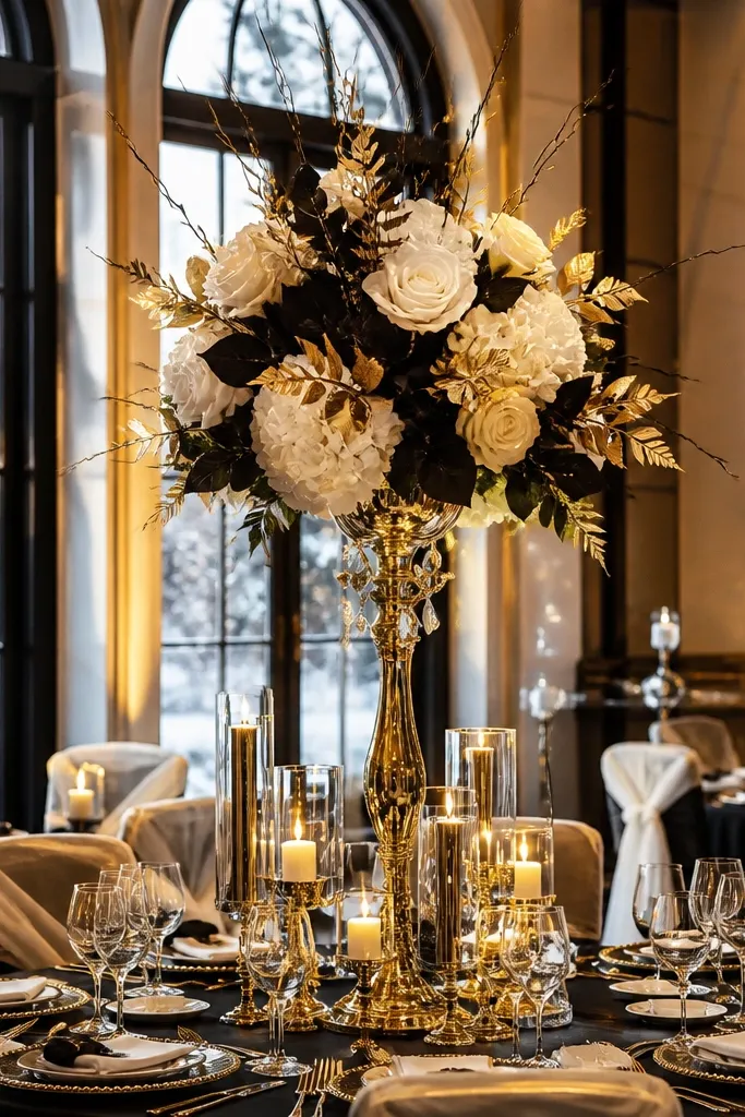
Gold, ivory, and black is a timeless aesthetic Wedding Color Schemes option that photographs like luxury. Ivory keeps the look bright and clean, black makes the gold pop, and gold adds sparkle without needing lots of color. This palette works across seasons and venues, from winter ballrooms to elegant outdoor receptions at night. It also makes your stationery and table numbers look sharp in close shots.
Quick tipUse thin gold borders on signage instead of heavy gold foil — it looks more refined in photos.
Start with ivory linens and black napkins or black table runners. Add gold through candle holders, frame accents, and metallic ink on place cards. Keep florals mostly ivory with greenery so the gold and black remain the visual anchors.
Skip thisAvoid mixing gold tones (yellow gold and rose gold together); pick one direction so it reads cohesive.
25. Sandstone Beige + Espresso + Burnt Orange (desert-modern warmth)
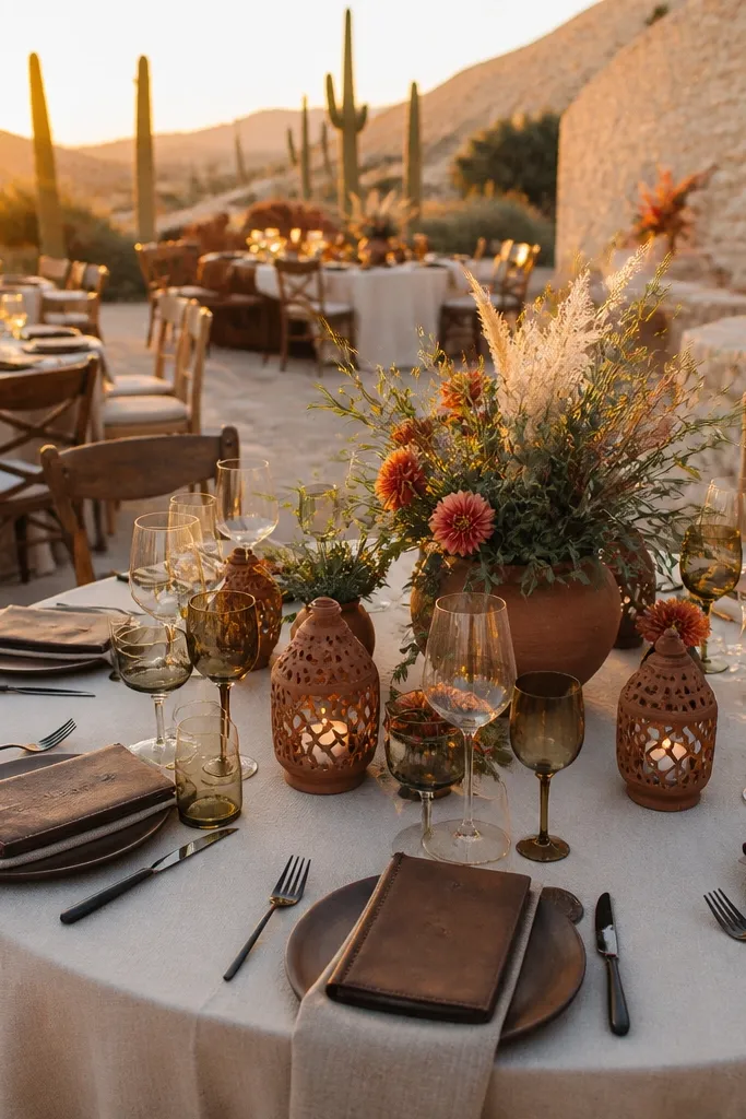
This scheme looks like golden hour on stone — warm beige, deep espresso, and burnt orange that reads rich in photos without turning into “fall theme.” Pick it if you want a desert-meets-modern vibe: clean neutrals for most of the styling, then one bold color family for florals, linens, and signage. It suits outdoor venues with natural textures — stone courtyards, desert gardens, or places where the background is already doing the work. The best time is late fall through early spring when the light is softer and your guests are comfortable. It also works for couples who want warmth in the color story but do not want red or burgundy dominating the whole day.
Quick tipBring a small swatch kit (beige, espresso, burnt orange) and match it to your venue lighting before committing to fabric dye lots; warm tones shift fast under sunset light.
Step 1 — Choose your neutrals and anchor color: sandstone beige for tablecloths or ceremony drape, espresso for wood tones, menus, and seating cards. Add burnt orange only in the “statement items” like bouquets, napkins, and one signage element so the palette stays elegant. Step 2 — Plan the venue and timing: aim for a ceremony start 60-90 minutes before sunset so the orange flowers glow and the beige looks creamy, not flat. Step 3 — Travel logistics and cost: choose a base within 45 minutes of your venue (rideshare is fine if your location is centralized). Spend 2 nights minimum for this look — you want one day for setup photos in daylight and one for evening portraits. Book 3-4 months ahead for popular desert venues, especially if you need specific vendors for florals in burnt orange.
Skip thisAvoid using burnt orange in everything — it turns “warm” into “orange-heavy” and looks messy in group photos.



