
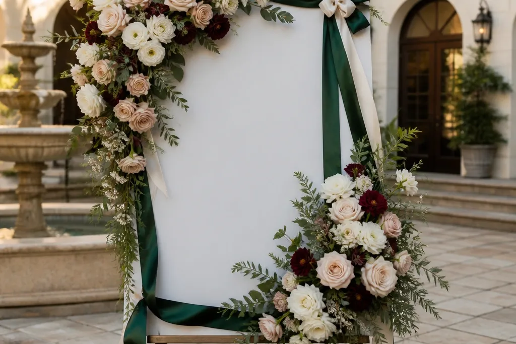
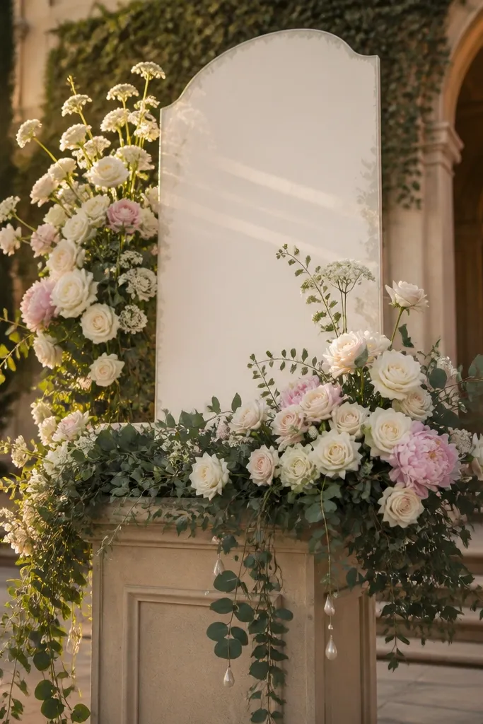
1. Cream peony + dusty blush hydrangea split
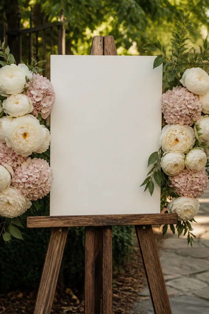
This look reads expensive because it’s symmetrical and soft. Use cream peonies as the main focal blooms, then stack dusty blush hydrangea heads behind them so you get volume without harsh color jumps. Keep greenery minimal and matte so the florals do the talking. It works beautifully for garden venues and indoor ballrooms where you want a romantic glow in photos. Best season pairing is spring through early fall, but the color palette also works in winter with a candlelit setup.
Start by tracing an imaginary rectangle behind the sign text and keeping that center area clear. Then attach two foam-backed floral clusters to the left and right edges, with peonies slightly higher than the hydrangea. Finally, fill gaps with a thin layer of eucalyptus-style greenery only along the outer edges so the center stays clean. For travel, pack the two side clusters separately and mount them on arrival using zip ties or removable adhesive hooks.
If the sign is white, choose cream peonies with a warm undertone, not icy white. It prevents the whole thing from looking washed out.
Don’t add tiny white baby’s breath all over — it makes the sign look cluttered at distance.
2. Olive eucalyptus ribbon frame with white blooms
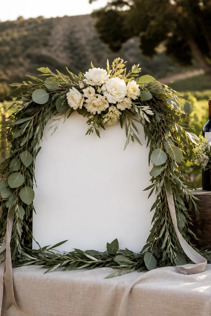
A eucalyptus ribbon frame is the cleanest way to make a welcome sign look styled, not decorated. Wrap olive-toned eucalyptus leaves around the border like a soft wreath, then place a small cluster of white blooms at the top center for balance. The luxury effect comes from the consistent leaf color and the controlled placement of flowers. It suits modern venues, outdoor ceremonies with greenery everywhere, and couples who want “fresh” without bright colors. It also photographs well at golden hour because the matte leaves catch light without glare.
Quick tipUse olive eucalyptus in two shades — one darker and one lighter — for depth that looks “real” in photos.
Start by choosing a border width that matches your sign size, usually about 2-4 inches around the edges. Then create a continuous eucalyptus ribbon by wiring stems into a loop, leaving a gap at the bottom so the sign doesn’t feel heavy. Finally, hot-glue or tie a compact white cluster at the top center and secure it with a hidden zip tie to the backing. If you’re mounting on a stand, add two small anchor points on the back so the ribbon doesn’t shift in wind.
Skip thisSkip shiny leaves and overly bright green varieties; they can look plastic in daylight.
3. Black velvet roses with burgundy accents
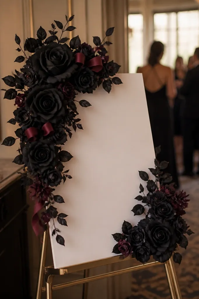
If you want luxury that looks intentional and bold, go dark. Black velvet-style roses plus deep burgundy accents create high-contrast drama that reads expensive immediately, even from across a reception space. Keep greenery sparse and dark — think dark olive or near-black leaves — so the roses stay the hero. This look fits fall and winter weddings and also modern industrial venues. In photos, it gives strong color blocking behind the sign text, which makes the message pop.
Start by placing the largest roses in a staggered V pattern behind the sign corners, not directly centered. Then add burgundy filler blooms in between to bridge the gap and avoid empty space. Finally, secure everything to a foam backing with hidden ties so the roses don’t droop during setup. If you’re traveling, keep each rose cluster in a separate compartment so petals don’t crush.
Pair with a matte black frame or wood stain. Glossy frames can reflect light and flatten the dark florals.
Don’t mix in bright pink or coral — it breaks the luxury mood and looks off in photos.
4. White garden roses + soft gray lamb's ear
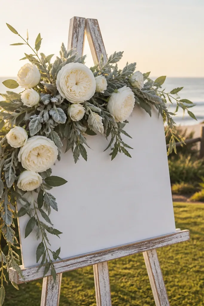
This is the “quiet luxury” flower look. White garden roses give classic form, while lamb’s ear-style leaves add soft gray texture that reads upscale on camera. The trick is texture variety: matte leaves plus structured rose petals means your arrangement has dimension without needing loud colors. It works for coastal venues, neutral wedding palettes, and couples who want elegant but not overly romantic. Best in spring and summer because the palette feels airy.
Start by building a base layer of lamb’s ear leaves around the sides of the sign, about 1-2 inches thick. Then add white garden roses as focal points at the top and bottom corners, with one rose slightly larger. Finally, fill small gaps with a few sprigs of greenery to keep the edges even. For setup, attach the base layer to the backing first so you’re not wrestling with leaves while holding the sign.
If your sign is beige or wood-toned, choose roses that are warm white with a slight cream tint to keep it cohesive.
Skip too much leaf overlap. Overstuffing makes the texture look messy instead of luxe.
5. Peach ranunculus cascade corners
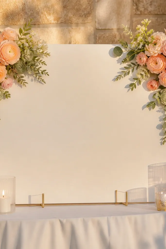
Corner cascades look expensive because they create motion while keeping the center clean for readable text. Use peach ranunculus blooms as the main flowers, letting a few stems subtly drift inward, not straight down. Add light cream greenery for support and keep the palette to peach, cream, and one muted green tone. This look is perfect for beachy ceremonies, spring brunch receptions, and weddings with soft lighting. It also flatters photos because peach warms skin tones without looking neon.
Quick tipChoose ranunculus with semi-open petals; fully closed blooms look too stiff behind the sign.
Start by marking four anchor points — two top corners and two lower corners. Then attach the ranunculus clusters at the corners, letting the top clusters sit slightly higher so the cascade reads. Finally, connect the cascades with a thin line of greenery along the outer edges only. Pack the sign backing flat and bring the flowers separately if you’re traveling — it prevents crushed petals.
Skip thisDon’t add dark burgundy mixed in. Keep it peach-cream to avoid a “random florist bin” look.
6. Blush rosebud + dusty sage topiary band
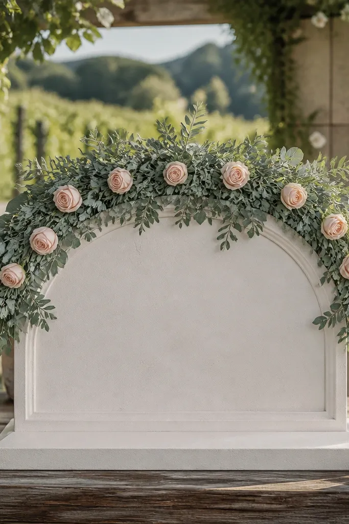
A topiary band is one of the most expensive-looking choices because it frames the sign like a crown. Use dusty sage greenery as the band across the top edge, then tuck blush rosebuds evenly along the band so they form a gentle arc. The center stays open, keeping the welcome text crisp. This works well for outdoor weddings where you want the florals to echo the landscape. It’s also great when the sign is tall because the top band balances the composition.
Quick tipMatch the greenery tone to your venue’s main foliage. If the venue is olive-heavy, go olive-sage; if it’s lighter, go dusty sage.
Start by building the greenery band first using wired stems, keeping it taut across the sign width. Then attach blush rosebuds at intervals of about 3-5 inches so they read evenly in photos. Finally, add two small clusters at the ends to make the band feel anchored, not floating. If wind is an issue, secure the ends with extra ties and keep the band closer to the sign surface.
Skip thisDon’t place rosebuds randomly. Uneven spacing makes it look like a last-minute addition.
7. White hydrangea globe + greenery half-moon
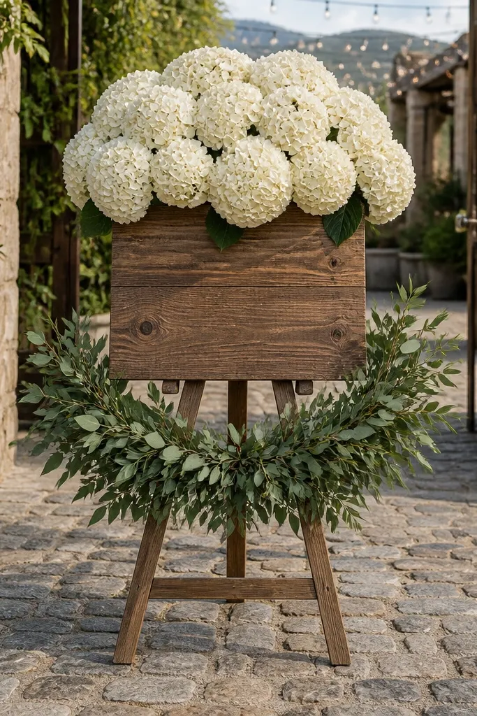
A hydrangea globe centered above the sign feels like a florist installation without covering the text. Choose white hydrangea heads with a slightly rounded shape so they read as one “globe” rather than scattered blooms. Pair it with a half-moon of greenery beneath so the composition has a base. This is a strong choice for indoor venues, especially where you’ll have photos taken straight-on. It also looks great for winter weddings because white stays clean and bright.
Quick tipUse hydrangea with slightly varied petal sizes. One-size clusters look artificial on camera.
Start by placing the hydrangea globe at the top center, leaving at least 2-3 inches of clear space above the welcome lettering. Then build a half-moon greenery layer directly under the globe so it frames the sign. Finally, add small filler buds only where the greenery meets the sign edges to hide attachment points. For travel, keep the globe in a rigid box and assemble the half-moon on site.
Skip thisDon’t add multiple competing flower types. Stick to hydrangea + greenery for the luxury look.
8. Terracotta roses + cream filler + olive leaves
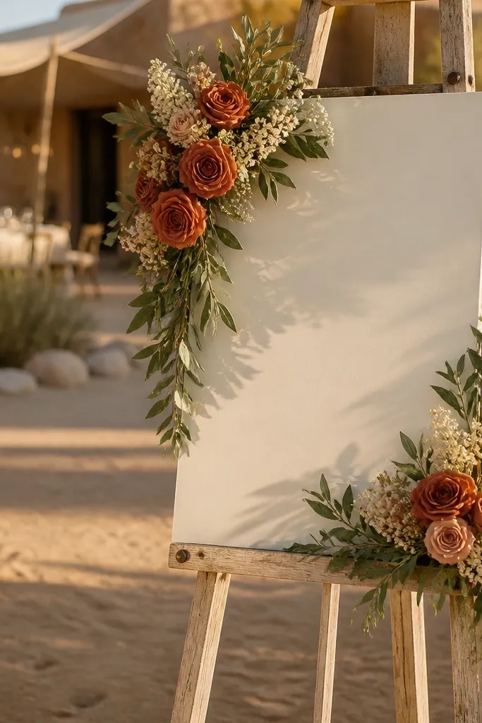
Terracotta reads warm and expensive when you keep the palette tight. Use terracotta roses or garden blooms as the focal flowers, then add cream filler flowers for softness. Olive leaves bring depth and stop the orange from looking too bright. This look works for desert venues, rustic-chic barns, and late summer weddings where the light is golden and warm. It’s also a great choice if you want a “heritage” feel without going full dark and moody.
Quick tipIf your venue has warm wood tones, terracotta + cream is the easiest match. It looks cohesive without extra décor.
Start by selecting two terracotta tones: one burnt and one lighter clay. Then place the lighter terracotta blooms higher and the burnt ones lower so the arrangement looks layered. Finally, tuck cream filler into gaps and keep olive leaves mostly along the outer border. When you mount the sign, angle the flowers slightly upward toward the text so they don’t droop in photos.
Skip thisSkip bright coral. It can look too casual next to terracotta.
9. Champagne blooms with gold-toned greenery tips
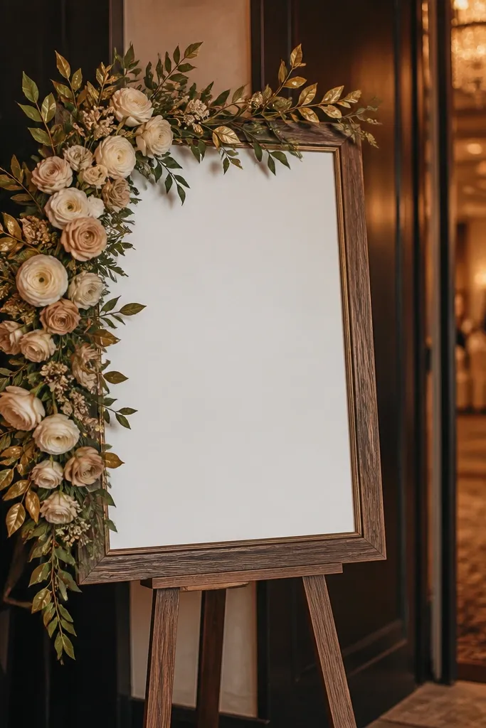
This is the “glam but not sparkly” luxury look. Use champagne-colored blooms (cream-beige with a warm undertone), and add greenery that has subtle gold-toned tips or aged-gold accents. The effect is photo-friendly because gold reads classy in warm lighting without turning into party glitter. It works for ballroom weddings, hotel lobbies, and couples who want luxury visuals without heavy black. Also, champagne flowers hide dirt and scuffs better than bright white during setup.
Start by building a soft border using champagne blooms spaced 4-6 inches apart. Then add gold-toned greenery tips in the gaps so the border looks intentional rather than random. Finally, keep the center clear and add only a small cluster at the top center for symmetry. For setup, attach border sections in two halves so you can adjust alignment quickly.
Use matte champagne flowers. Shiny petals can create glare on white sign boards.
Don’t add metallic confetti or extra gold ornaments. The greenery tips are enough.
10. White calla lily vertical lines with minimalist greenery
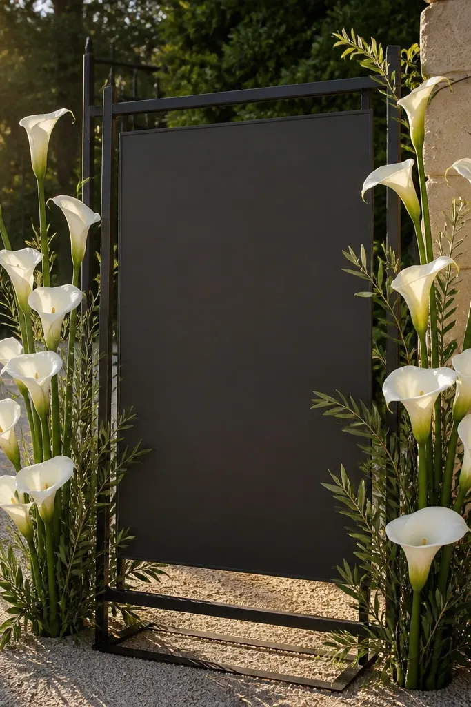
Vertical calla lines look expensive because they’re graphic and clean. Place tall white calla lilies along both sides of the sign, keeping them mostly vertical so the arrangement feels structured. Use minimal greenery — just a few olive stems — so the calla lines stay the visual focus. This is perfect for modern weddings and for couples who want “luxury hotel” vibes rather than romantic cottagecore. It also photographs well in front of plain walls because the shapes stand out.
Quick tipPair with a simple serif sign font or clean uppercase lettering so the look stays tailored.
Start by choosing calla lilies with sturdy stems so they don’t droop. Then place two vertical columns on the left and right, spacing them about 6-10 inches apart depending on sign width. Finally, anchor a small greenery accent near the bottom corners and hide ties behind the sign backing. If you’re mounting on a stand, secure the bottom anchors so the stems don’t swing.
Skip thisSkip mixed-size filler flowers. They ruin the graphic luxury lines.
11. Dusty mauve peonies with soft blush spray roses
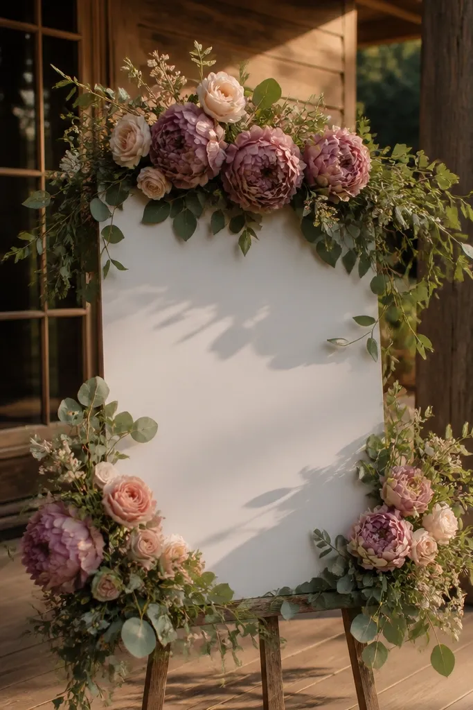
This look is romantic but still reads high-end because the tones are muted and cohesive. Dusty mauve peonies give body and shape, while blush spray roses add a finer, airy texture that fills without bulk. Keep greenery in a muted sage so it doesn’t fight the mauve. It works for spring and fall weddings where you want a sophisticated color story. In photos, the mauve tones show up beautifully under indoor lighting and don’t look harsh.
Quick tipUse spray roses with small petals. Big, open spray blooms look less elegant on a welcome sign.
Start by placing peonies first — two anchors on opposite sides, slightly higher than the text. Then tuck spray roses between peonies and along the outer edges to soften the border. Finally, add sage greenery in thin layers so the colors blend rather than separate. For travel, assemble the peony anchors and keep spray roses separate until you’re at the venue.
Skip thisDon’t mix in bright purple or hot magenta. It turns dusty mauve into party color.
12. Garden greenery + white berries + faux ivy drape
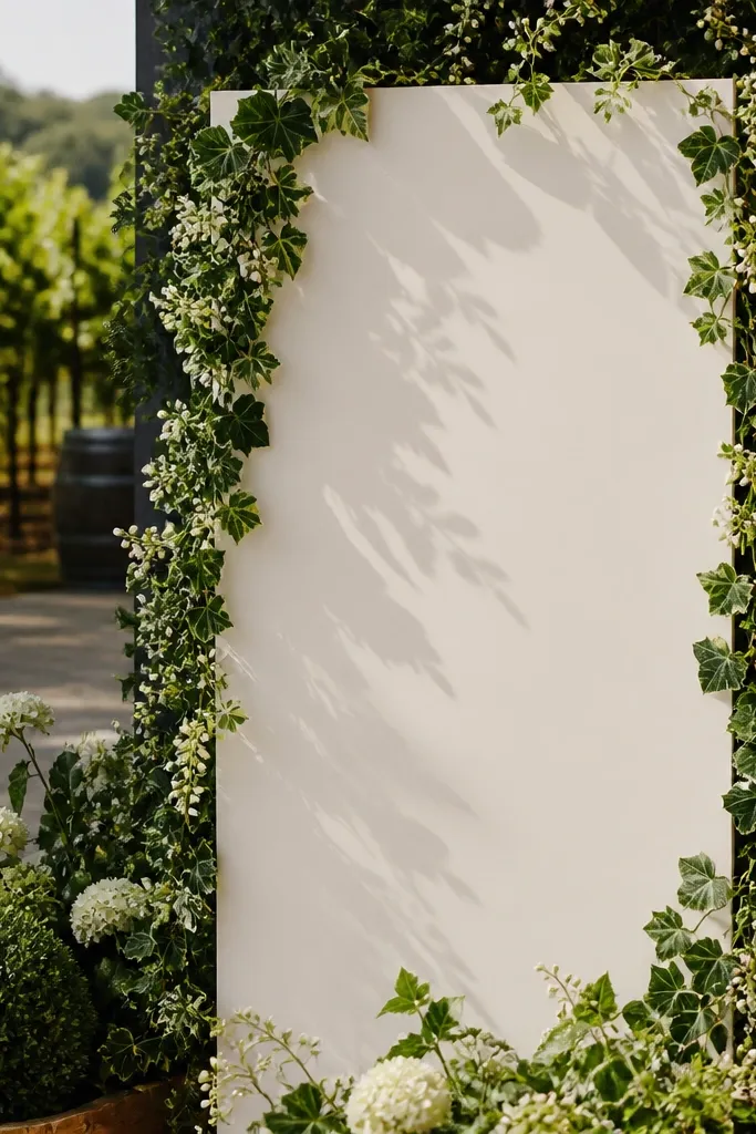
Greenery + berries is a luxury cheat code because it adds “story” without needing multiple flower types. Use garden greenery as the base, then add white berries to create little points of light across the arrangement. Add faux ivy drape at the edges so the border feels alive and slightly wild, but still controlled. This is great for outdoor ceremonies, especially if your background has trees or stone. It also looks stunning at night with warm string lights because berries read bright.
Quick tipIf the venue is windy, shorten the ivy drape. Too much hang makes it flutter in photos.
Start by building a thick greenery base around the sign edges, leaving the center open. Then weave ivy drape along the outer border so it hangs slightly — only 1-2 inches beyond the sign surface. Finally, tuck white berry clusters into the greenery at 2-3 focal spots so they don’t scatter everywhere. Pack the ivy separately so it doesn’t tangle in transit.
Skip thisSkip dense berry coverage. A few bright spots look expensive; lots of berries look like a craft project.
13. Cream roses + baby's breath-free airy filler
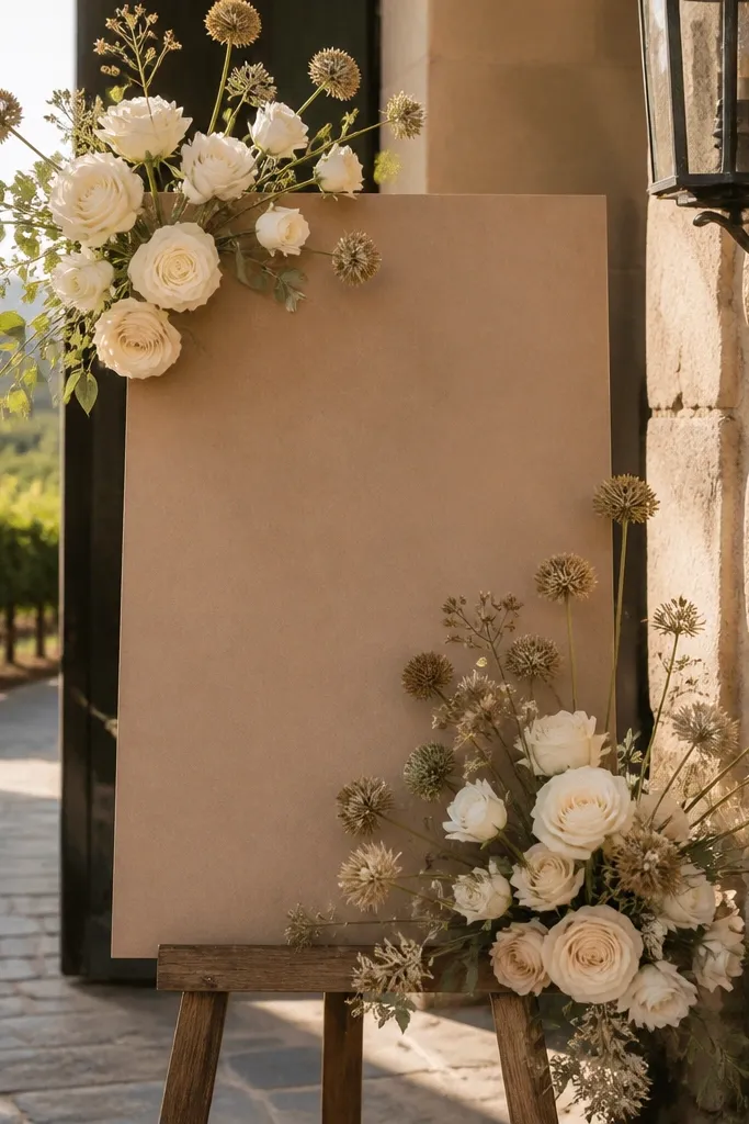
Baby’s breath is common, but it often makes welcome signs look cheap because it turns into a snowstorm in photos. This version keeps the airy feel using cream roses plus a lighter filler that doesn’t create tiny white dots everywhere. Look for airy filler with larger, spaced blossoms or seed-pod shapes. The luxury effect comes from clean spacing and visible rose structure. It suits minimalist weddings, indoor receptions, and couples who want soft romance without the “wedding aisle spray” look.
Start by anchoring cream roses at the top corners and one center-top focal spot. Then add airy filler stems in between, spacing them so you can still see the sign behind. Finally, use a thin, matte greenery layer to connect everything at the edges. For best results, assemble on the backing with the sign text facing up so you control coverage.
If you must add anything white, keep it to one filler type. Mixing too many white textures makes the sign look flat.
Don’t cover the sign with airy filler all the way to the text. The center needs breathing room.
14. Peach + ivory mixed rose garland with ribbon bows
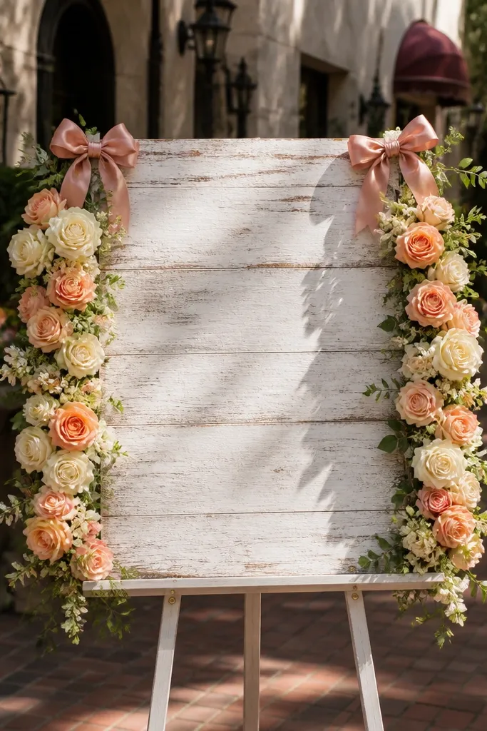
Ribbon bows add a formal, photo-ready finish when they’re placed with restraint. Use a peach and ivory mixed rose garland along the sides of the sign, then tie two small ribbon bows at the upper corners. Choose satin ribbon in dusty blush or soft peach — avoid high-shine ribbon that reflects harshly in photos. This look is perfect for traditional venues, outdoor receptions with floral arches, and couples who want a classic ceremony feel. It reads expensive because the garland has consistent texture and the bows look like finishing work.
Quick tipUse ribbon widths around 1.5-2 inches for a luxury look. Narrow ribbon looks too casual at distance.
Start by creating two side garlands that match in height and thickness, roughly 3-5 inches wide depending on sign size. Then attach garlands to the backing and tie ribbon bows over the top attachment points so the hardware disappears. Finally, add a small cluster at the bottom corners to make the garland feel grounded. Pack garlands flat, and pre-tie ribbon bows so you don’t fight them on site.
Skip thisSkip oversized bows. Big bows overwhelm the sign and steal attention from the welcome text.
15. Monochrome white orchids with sculpted greenery
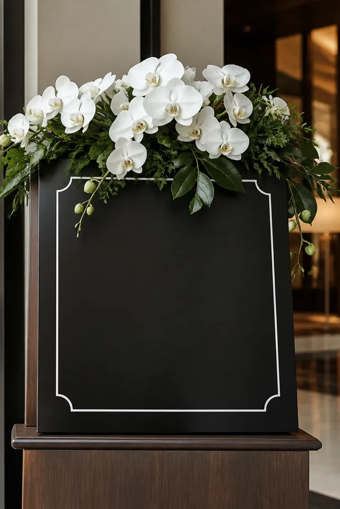
White orchids look expensive because they have a sleek, architectural shape. Keep everything monochrome: white orchids plus sculpted greenery like ruscus or leatherleaf-style leaves. This creates a clean, luxury-hotel aesthetic that works for modern venues and indoor receptions. It’s also a great choice when the couple’s palette is neutral and you want the welcome sign to be the only “statement” floral. Best season is year-round because orchid color doesn’t depend on weather.
Quick tipChoose ruscus-style greenery with a matte finish. It looks crisp and doesn’t glare like glossy leaves.
Start by selecting orchids with multiple blooms per stem so you don’t need a huge quantity. Then place one orchid cluster on each side of the sign, with stems angled slightly inward. Finally, add sculpted greenery beneath to hide ties and create a smooth base. For travel, store orchids in a small box upright and attach at the venue so petals don’t crush.
Skip thisDon’t mix in colorful filler flowers. Monochrome orchids lose their luxury feel when you add random color.
16. Champagne pampas feather fringe with pale greenery
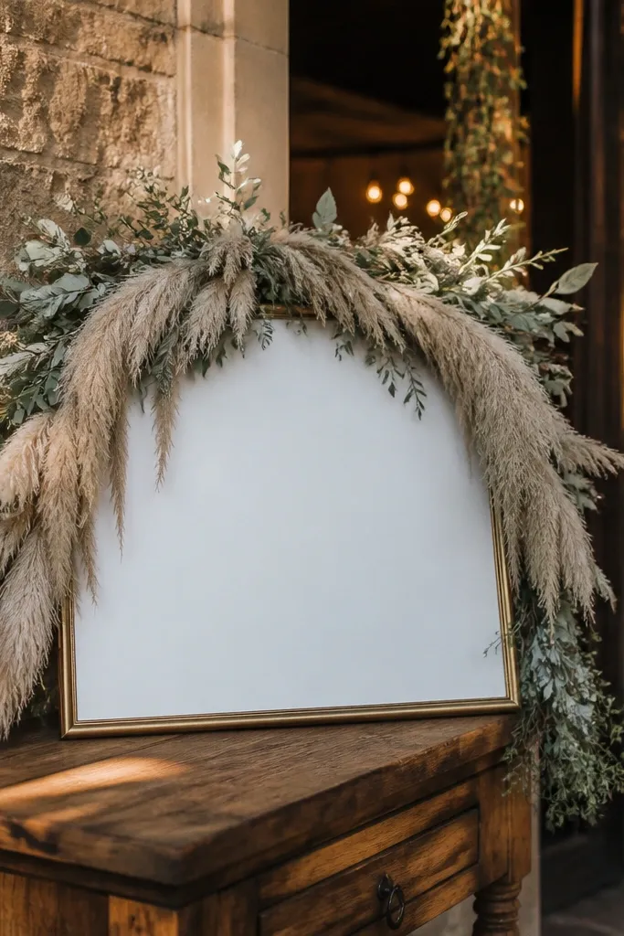
This is a modern luxury look that reads “designer” even if you keep the sign simple. Champagne pampas feather fringe gives texture and movement, while pale greenery keeps it grounded and wedding-appropriate. Place the fringe along the top edge and let it soften down toward the sides, but keep it away from the text area so letters stay readable. It works extremely well for boho-modern venues, desert weddings, and winter receptions with warm lighting. In photos, the feather texture creates depth that feels higher-end than flat flower clusters.
Start by choosing fringe pieces that are pre-stabilized (not wispy loose bundles) so they hold shape. Then attach fringe to the backing along the top center first, and spread it to the left and right. Finally, add pale greenery along the lower edges to hide fastening points and smooth the transition. Bring a lint roller for feathers — you’ll thank yourself when setup happens fast.
Use a matte sign background (wood or off-white) so the champagne feathers don’t look washed out.
Skip heavy glitter or metallic feather mixes. They can look costume-y in daylight.
17. Emerald mini roses with white waxflower clusters
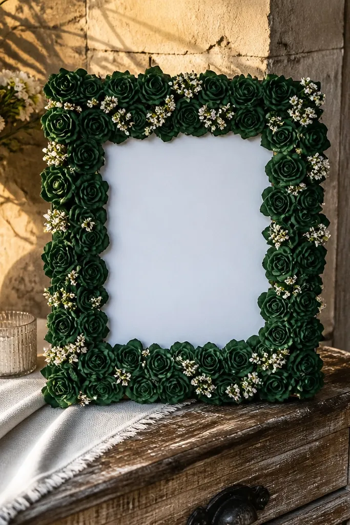
Emerald mini roses plus white waxflower clusters gives you a luxury look that feels fresh and expensive without going pastel. The green is deep enough to look intentional, while the white waxflower adds small, clean texture points. Keep the arrangement structured: small roses in a tight border and waxflower used as accents, not a full coverage blanket. This works for holiday-season weddings, indoor receptions, and venues with dark wood or stone. It also photographs well because the white accents give crisp highlights.
Quick tipChoose waxflower with firm, matte petals. Shiny white can reflect and look harsh behind text.
Start by building a border of emerald mini roses around the sign edges at about 2-3 inches deep. Then tuck white waxflower clusters at the top corners and a couple of spots along the sides. Finally, add a thin line of greenery only where you need to blend transitions. If you’re traveling, transport the sign backing assembled and keep the waxflower clusters separately until the last minute.
Skip thisDon’t let the white accents spread everywhere. Concentrate them for a designer finish.
18. Dusty blue delphinium spikes with cream roses
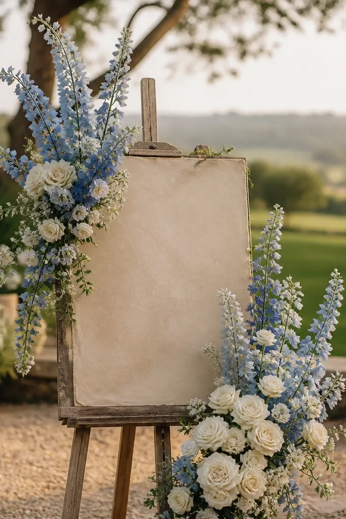
Spiky blooms make a welcome sign look couture because they add vertical rhythm. Use dusty blue delphinium spikes as the main element, then anchor cream roses at the base so the spikes don’t look floating. The luxury effect is in the contrast: one cool accent color against warm cream. This look is stunning for spring weddings, garden estates, and venues with light stone walls. It also works in photos because the spikes create a clear shape behind the welcome text.
Quick tipMatch dusty blue to your table linens or bridesmaid dresses. Even a small echo makes the sign look planned.
Start by placing delphinium spikes in a gentle upward V on both sides, keeping the tallest tips just above the sign top edge. Then place cream roses at the lower corners where the spikes originate. Finally, add minimal greenery between so the transition feels smooth rather than abrupt. For travel, keep spikes in a separate sleeve so they don’t snap or bend.
Skip thisDon’t add multiple blue shades. One dusty blue tone looks expensive; a mix looks random.
19. Ivory rose + pearl string "cathedral" frame
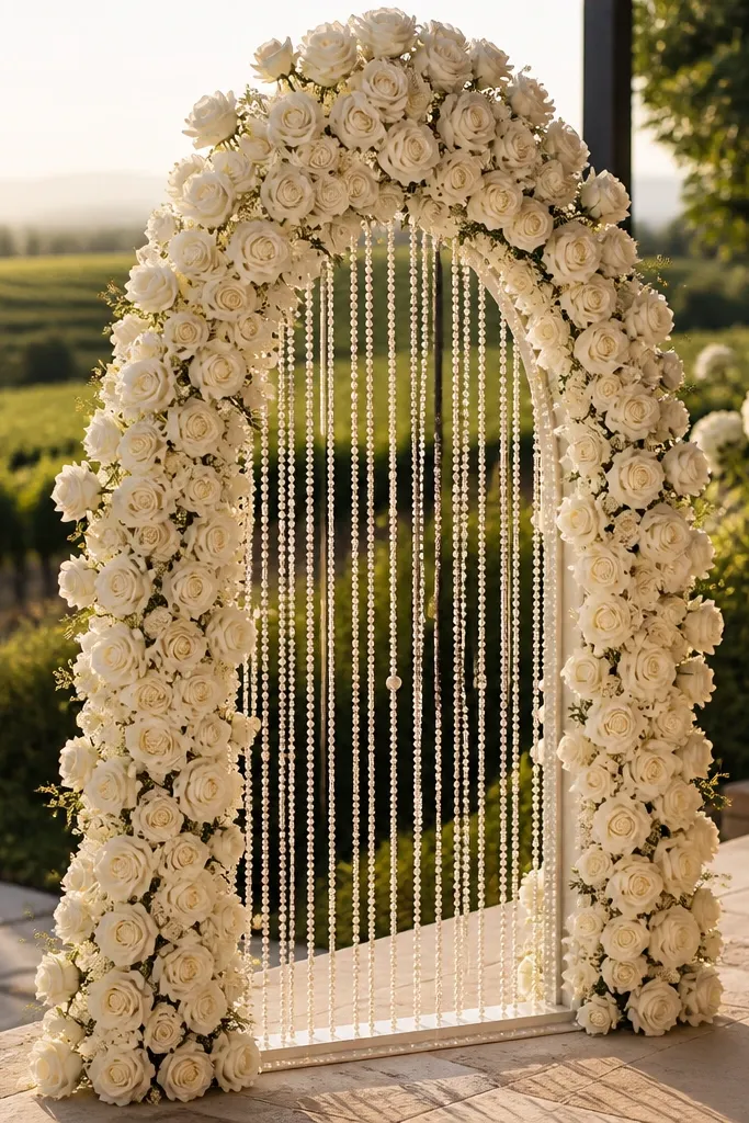
This is the luxury wedding welcome sign look that reads expensive even in photos because the texture is layered and the lines are tall. Start with ivory roses as the main body, then add pearl string in a vertical drape so the frame feels like jewelry, not “just flowers.” The cathedral shape also works well if your sign is tall or you’re using a wooden or black metal frame. It suits classic weddings, hotel lobbies, and outdoor ceremonies with soft daylight. Aim for late spring through early fall so the roses stay full and the whites look clean instead of flat.
Step 1 — Build the base: place ivory roses in a tight vertical cluster on both sides of the sign so the center stays open for the pearl drape. Then connect pearl string (or pearl bead garland) from top corners down in two to three strands, letting it fall in gentle arcs across the lower third. Step 2 — Add a small amount of greenery only where it supports the structure: use dusty green olive leaves or olive sprigs behind the roses so the whites pop without turning the whole thing “forest green.” Step 3 — Travel planning: if you’re sourcing locally, book a florist 3-4 weeks ahead because pearl elements need custom placement; if you’re buying wholesale, order pearl string and roses together to match shades. Rough cost is $180-$350 for the floral portion plus $25-$80 for pearl string, and you’ll want 60-90 minutes on site for setup and adjustments.
Bring a small pack of clear zip ties and floral tape for quick fixes — pearl strands shift when the breeze hits.
Don’t use too many different flower types — the pearl drape looks messy when the bouquet is already busy.
20. Red velvet anthurium + white calla "modern hotel" arch
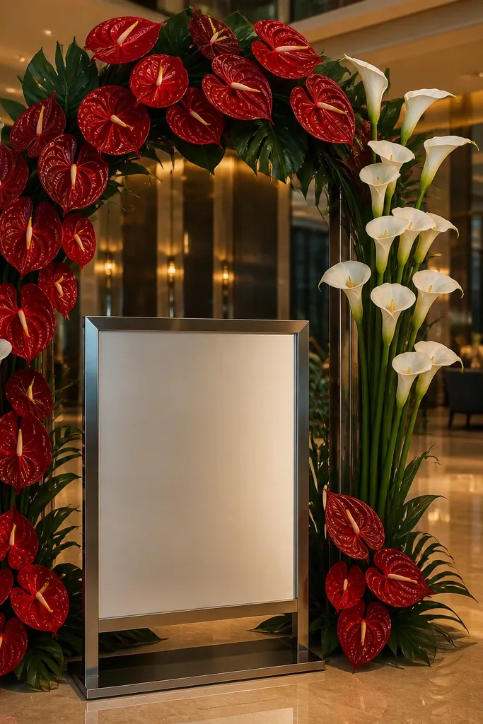
This look is bold and expensive-looking because it mixes a glossy, sculptural flower with clean, graphic blooms. Red anthurium has that deep, almost lacquered surface that photographs like luxury fabric, while white calla lilies create crisp vertical rhythm. The arch shape makes the welcome sign feel like an entrance, which is exactly what you want for a “gorgeous display” that people stop for. It suits modern venues, city weddings, and indoor receptions with good lighting. Winter to early spring is the sweet spot for this color story because whites stay bright and reds don’t look washed out.
Quick tipPack a handheld steamer or a lint roller for your sign fabric or frame — anthurium and calla look best when the backdrop is clean and wrinkle-free.
Step 1 — Get the structure right: anchor a thin foam or chicken-wire arch behind the sign frame, then place red anthurium as the main “columns” along the curve. Add white calla lilies in straight lines, spacing them 2-3 inches apart so they read as clean stripes in photos. Step 2 — Keep greenery minimal and intentional: tuck a few dark green leaves only at the base and between anthurium clusters so the background doesn’t compete with the red. Step 3 — Travel logistics: if you’re bringing flowers from a destination, plan arrival 6-10 hours before setup and store in a cool room; if you’re sourcing on site, book a florist 4-6 weeks ahead and ask for anthurium availability specifically. Budget $220-$420 depending on anthurium size, and plan 75-105 minutes for assembly because calla spacing needs small adjustments.
Skip thisDon’t crowd the arch with lots of filler flowers — the expensive look comes from spacing and clean vertical lines.



