
1. Matte Black Table Grid on Cream Cardstock
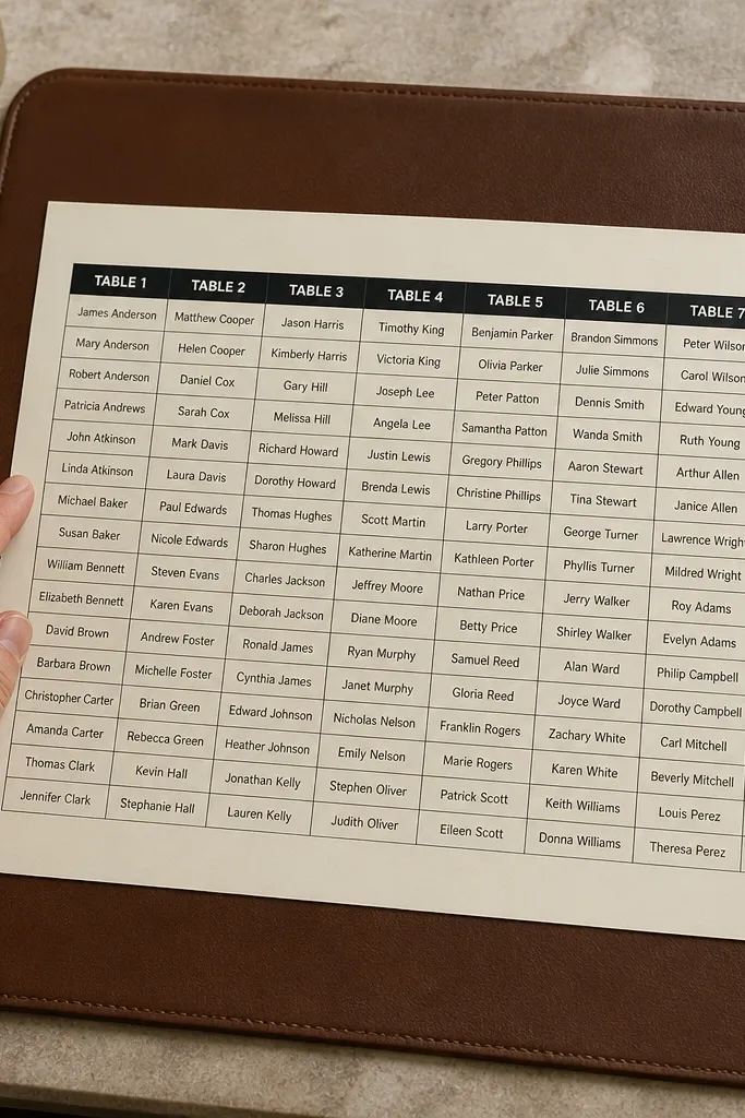
This one looks sharp because it’s basically typography. Cream cardstock softens the contrast so it still feels warm, but matte black keeps it crisp in flash photos. Build it like a simple spreadsheet: table number in a bold header row, then neatly stacked names in uniform lines. It suits modern rustic venues, hotel ballrooms, and any reception where the decor is clean and not too busy.
Start by printing your seating chart on cream cardstock (8.5x11 or A4) using black text only, with one font weight for names. Then put the sheet into a rigid clear folder for transport and flatten it under a book for 30 minutes before setup. Finally, mount it on a stand or clip it to a board so the grid is straight, not angled.
Use painter’s tape at the corners; it removes cleanly and doesn’t lift paper edges.
Avoid multi-color fonts; they look cute up close and turn into a blur in photos.
2. Wood Slice Seating Chart with Burned-Edge Table Numbers
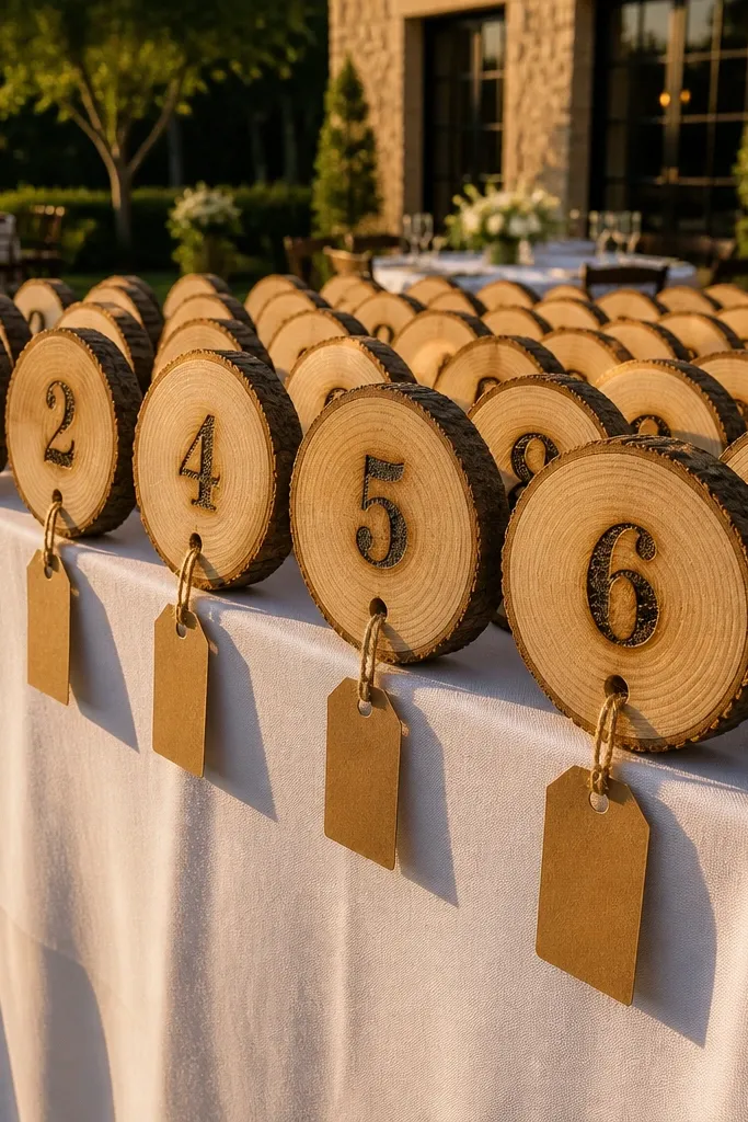
Wood slices give you instant warmth and texture, and the seating chart becomes part of the decor instead of a separate sign. The key is to keep the layout disciplined: rows for table numbers, each row aligned so camera angles don’t look crooked. Names should be on small tags that hang straight, so the chart reads quickly without looking cluttered. This works best for outdoor receptions and barns where you already have wood tones in place.
Start by cutting or buying uniform mini wood slices (think 3-4 inches) for table numbers and using a permanent marker or wood-burning stencil for clean lettering. Then print names on small kraft tags and attach them with twine so each tag hangs vertically. Finally, place the slices in a grid on a larger base board or tray and secure everything with hot glue or removable putty so it doesn’t shift.
Bring a small lint roller; wood slice surfaces pick up dust that shows up under evening lighting.
Skip uneven slice sizes; mismatched shapes make the whole chart look improvised.
3. Acrylic Stand with Frosted Name Blocks
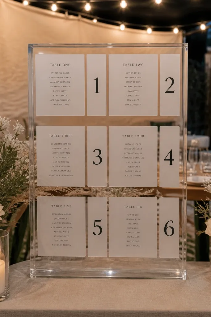
Acrylic looks polished and expensive, and it photographs well because it creates a clean 'see-through' layer. Use frosted label paper or frosted vinyl for the name blocks so the text stays readable under overhead lights. Table numbers should be bold and centered so guests don’t squint. This suits modern venues, beach weddings with neutral decor, and any reception where you want the seating chart to feel light and airy.
Start by printing names on frosted label sheets in black text, then cut into uniform rectangles. Next, mount table numbers on the clear stand using adhesive labels or vinyl so everything lines up at eye level. Finally, pack the acrylic flat in bubble wrap and set it up last, after other decor so it doesn’t get bumped.
Quick tipWipe acrylic with a microfiber cloth right before the chart goes out; fingerprints show instantly.
Skip thisDon’t use glossy name paper; glare makes names hard to read from a distance.
4. Chalkboard Sheet with White Name Lists and Table Tabs
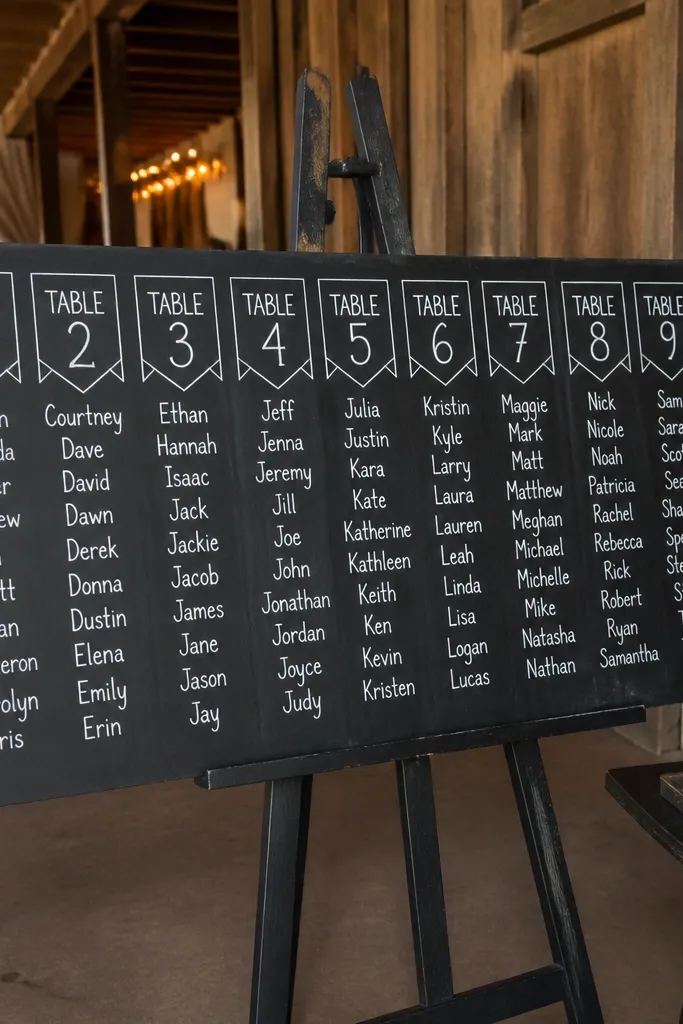
Chalkboard is dramatic in photos, and it gives you a handmade vibe without being messy. The trick is to keep the design structured: table tabs on top, names in straight rows below. Use a chalk marker in crisp white so it doesn’t look smudged under flash. This works for rustic, vintage, and cottage-style receptions where you want the chart to feel like part of the party.
Start with a chalkboard sheet or framed board in letter size, then write table numbers at the top in large text and names in smaller rows. Next, make a consistent tab for each table using painter’s tape as a guide before writing. Finally, transport it in a rigid box and set it up before guests arrive, away from direct wind or humid air.
Quick tipMist the board lightly with a chalkboard-safe spray after writing to reduce smearing.
Skip thisAvoid cursive for names; it looks pretty and reads slow.
5. Gold Foil Table Numbers on Kraft Paper Grid
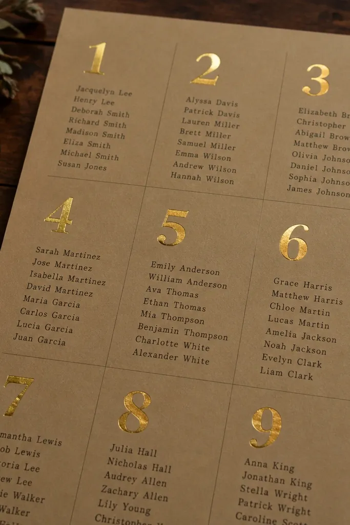
Kraft paper makes everything feel grounded, and gold foil adds that 'wedding' glow that catches candlelight. Keep the grid simple and use typed names in a dark brown or black so guests can read it quickly. Gold should be reserved for table numbers only — too much foil turns into visual noise. This looks best in warm indoor venues, candlelit receptions, and fall weddings with neutral florals.
Start by printing a kraft background with a faint grid or lightly marked columns, then add gold foil table number labels on top. Next, attach name lists as small strips below each table number so the hierarchy is obvious. Finally, mount it on a stiff foam board and pack it flat in a folder to prevent creases.
Quick tipUse a matte label for names; foil glare is real under uplighting.
Skip thisSkip neon ink; it clashes with kraft and ruins the warm tone.
6. Slate Tiles with Mini Name Cards and Numbered Row Base
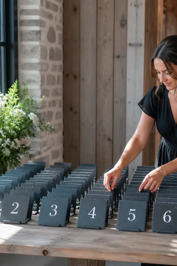
Slate gives you that cool, modern texture that looks great against wood, linen, and greenery. Make it photogenic by aligning tiles in straight rows and using mini name cards that sit at the same height. Table numbers should be large enough for quick scanning, because slate is naturally dark. This works for modern farmhouses, winter weddings, and receptions with dark accents like charcoal or deep green.
Start by buying uniform slate tiles and labeling them with white paint marker or vinyl numbers. Then print mini name cards (about 2x3 inches) and place each card at the base of its tile using removable adhesive dots. Finally, mount the tiles on a larger slate or wooden base tray and wrap the set carefully in paper so edges don’t chip.
Bring extra adhesive dots; a few tiles shifting ruins the photo consistency.
Don’t crowd names onto one tile; spread them so each card is legible.
7. Greenery Framed Seating Chart on White Backdrop
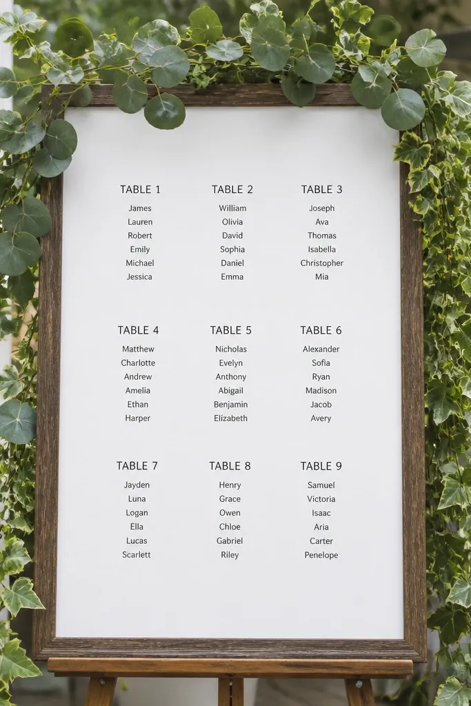
This is the 'Pinterest' look that still stays functional: a clean white chart with greenery framing it like a picture. The chart stays readable because the center is uncluttered, while the frame gives you that photogenic softness. Use dark text and keep names in short lines, so guests scan fast. It suits garden receptions, spring weddings, and any venue where you already have greenery in place.
Start with a white foam board or mat board (8.5x11 or larger) and print your grid or neighborhood layout in dark ink. Then add faux greenery along the edges with zip ties or floral wire so it doesn’t sag. Finally, mount the board on an easel and pack the greenery separate from the chart to avoid crushed leaves.
Quick tipAttach greenery after you set the board; it makes transport easier and reduces crushing.
Skip thisSkip heavy ribbon bows; they block the view of table numbers.
8. Linen-Textured Table Chart with Embossed Table Numbers
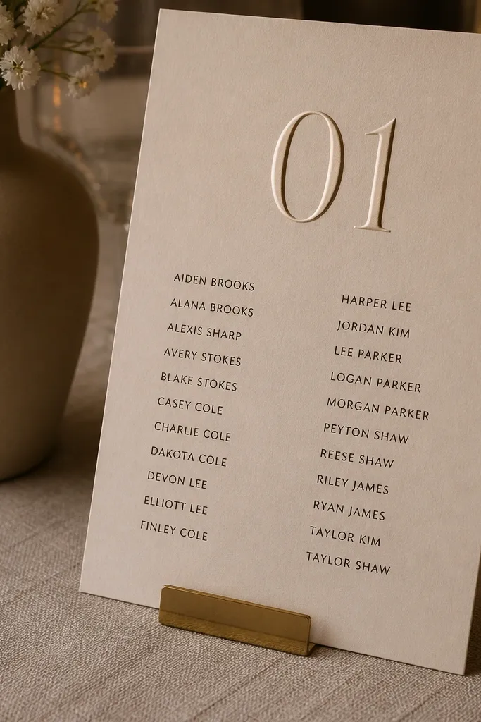
Linen-textured paper looks expensive and soft in photos, especially when the lighting is warm. Embossed table numbers add dimension without making the names harder to read. Keep your name text flat and dark, and reserve embossing for the table number header. This suits upscale simple receptions where the decor is neutral — cream, beige, ivory, and soft wood tones.
Start by printing the name lists on linen-textured cardstock and using embossed table number labels (stick-on or pre-made). Next, arrange the chart as a clean grid with consistent row heights so it doesn’t look handmade-chaotic. Finally, place the chart in a rigid folder and transport it in the same orientation every trip so embossing doesn’t get scuffed.
Use a gel pen for table numbers if you’re hand-finishing — it holds better on texture.
Avoid thin paper; linen texture tears if it gets bent in transit.
9. Neon-Free Museum Label Style for Table Numbers
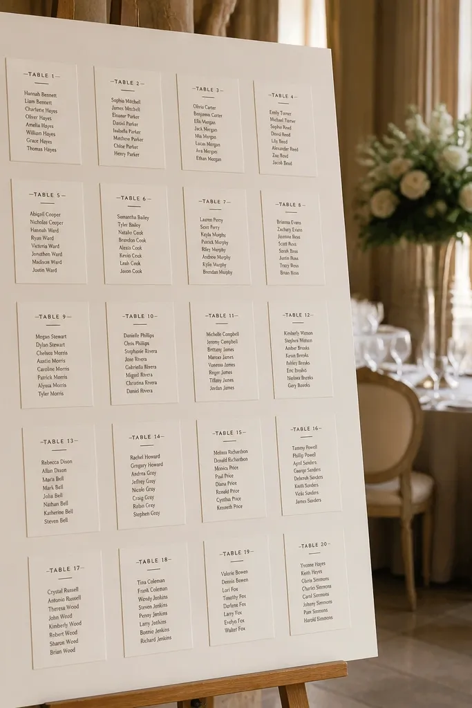
Museum label style looks clean and intentional, and it’s surprisingly readable because each table has a 'label' hierarchy. Use a small label for the table number, then names underneath in a tight but not cramped list. This design works when you have mixed group sizes, because you can scale the list length without breaking the layout. It’s a great fit for modern indoor receptions with minimal decor.
Start by printing table labels on small cards (about 3x5 inches) and names on matching strips. Then arrange them on a large board in a tidy row or two-column layout, leaving consistent gaps between cards. Finally, pack cards in a photo box or flat card sleeves and mount on arrival with removable tape dots.
Quick tipKeep names to one line per row; two-line blocks look messy in portrait photos.
Skip thisDon’t use decorative borders around every card; it reads as clutter.
10. Chalk Marker on White Tile with Numbered Stand
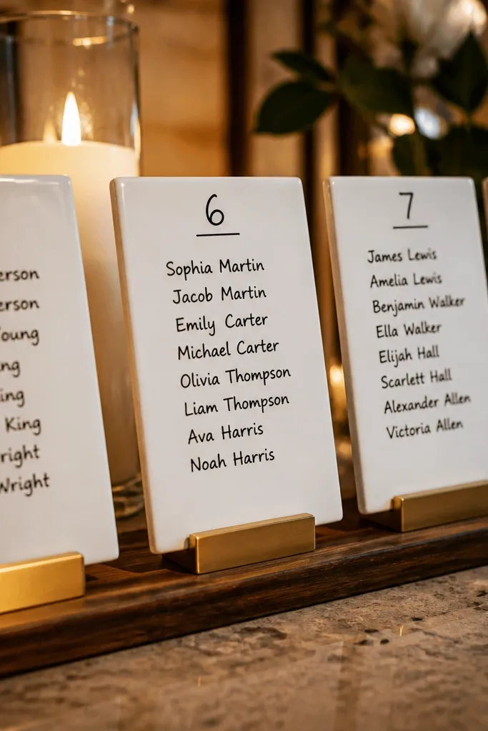
White tile is a cheat code for readability. Even under warm lights, the contrast stays strong, and the chart looks crisp in photos. Use chalk marker for a clean handwritten feel, and keep each tile dedicated to one table number. This works well for small-to-medium seating charts where you want the chart to look like a designed display, not a single poster.
Start by labeling square white tiles with table numbers using a chalk marker, then write names on separate smaller tiles or card slips placed on the base. Next, set tiles on a numbered stand grid so every table sits at the same height. Finally, pack each tile in bubble wrap and set up away from foot traffic so they don’t get bumped.
Quick tipTest one marker on a tile and wipe it off once; some brands streak under flash.
Skip thisSkip glossy tile finishes; reflections make white-on-white fade.
11. Fold-Out Seating Chart Like a Program Gate

A fold-out gate style looks elegant and saves space, which matters when your chart has to fit on a small welcome table. Each panel holds one chunk of tables, so guests can scan without walking far. It’s also photogenic because it creates vertical structure — the camera catches the panels as layers. This suits simple receptions where the seating chart is a focal welcome moment.
Start with thick cardstock and plan panels sized for readability (for example, 4 tables per panel). Then print names for each panel and assemble the gate fold so it stands stable on your welcome table. Finally, pack it in a flat box so the fold stays sharp, and set it up at the welcome area so guests see it immediately.
Quick tipUse a scoring tool so folds stay crisp and don’t crack in transit.
Skip thisAvoid flimsy paper; gate folds sag and look sloppy by evening.
12. Blackboard Menu Style Seating Chart with Divider Lines
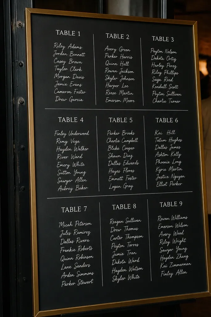
Menu-style layout is built for scanning. You get that restaurant vibe where table headings are easy to spot, and the name list reads like an order board. Thin divider lines stop the chart from feeling like one long block. This works best for receptions with a dark palette, industrial venues, or any setting where you want the chart to look intentional and graphic.
Start by choosing a black sign board and using a chalk marker or white paint pen for headings. Then add table numbers as bold lines and list names in short rows separated by thin dividers. Finally, place the sign on an easel and pack it flat in a sleeve so the edges stay clean.
Quick tipWrite the table numbers first, then fill names — it keeps alignment from drifting.
Skip thisDon’t use tiny font sizes; menu style only works if it’s readable from 8-10 feet.
13. Botanical Watercolor Table Map with Minimal Labels
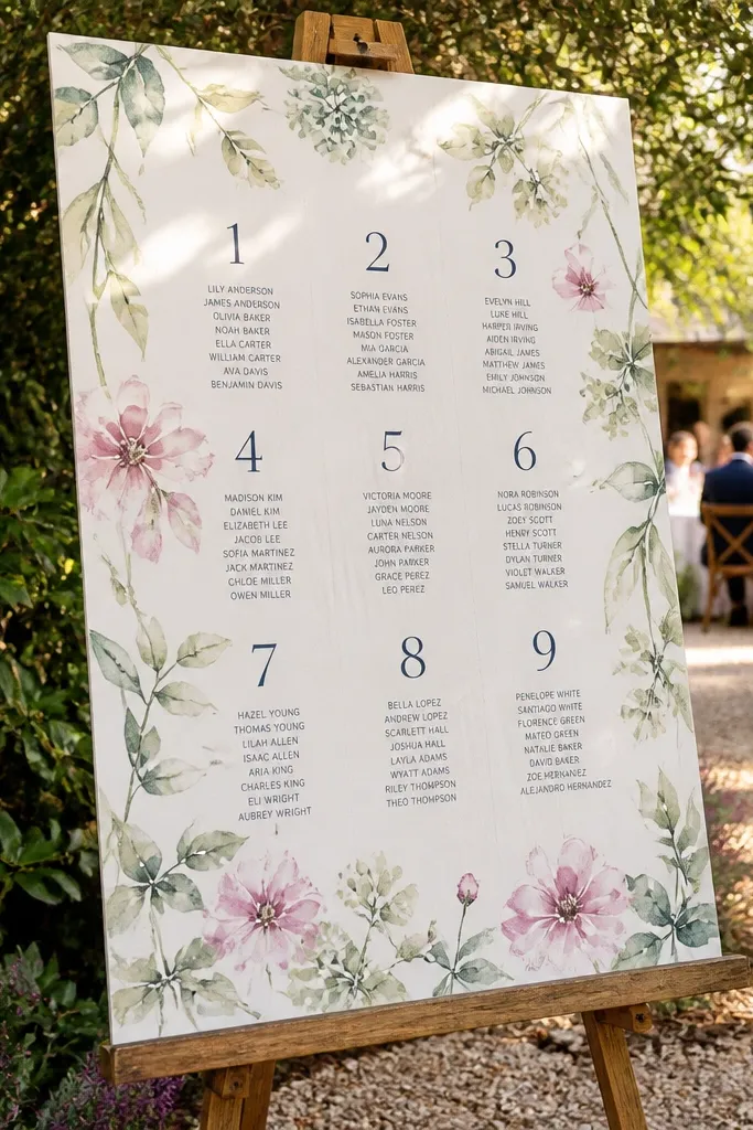
A watercolor background gives you softness and a 'destination' feel without making the chart hard to read. Keep the labels minimal: table number in a dark font with names in a tight list so the art stays in the background. This is a strong choice for garden receptions and outdoor ceremonies where you want the chart to look like part of the scenery. It also photographs beautifully because colors don’t turn into a harsh block under flash.
Start by printing a watercolor background on thick paper, then overlay your table number labels and names in a dark, consistent font. Next, mount it behind a clear acrylic sheet only if glare is low; otherwise, use matte lamination. Finally, pack flat in a rigid folder and transport in the same orientation to prevent edge curling.
If you’re using watercolor, keep names to one font size; mixing sizes makes it look messy fast.
Avoid busy backgrounds with too many branches behind the text.
14. Monogram Header Seating Chart with Two-Column Name Blocks
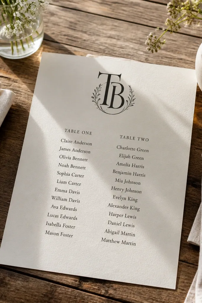
A monogram header makes the chart feel like a designed piece, and two-column name blocks keep it compact. The design stays readable because names sit in aligned columns instead of a single vertical list. Use the monogram only at the top — don’t decorate every table or the whole thing turns into a scrapbook page. This suits simple receptions where you want one signature element that still looks clean in photos.
Start by placing a monogram at the top of a letter-size page and then dividing the rest into two columns for each table’s names. Next, print table numbers in a bold header style and keep names in consistent line length. Finally, pack the page flat in a rigid folder and mount straight on an easel or board.
Quick tipUse a monogram color from your stationery suite so the chart looks like it belongs with your invites.
Skip thisAvoid oversized monograms that push the table list too low on the page.
15. Neutral Fabric Banner Seating Chart with Clip-On Cards
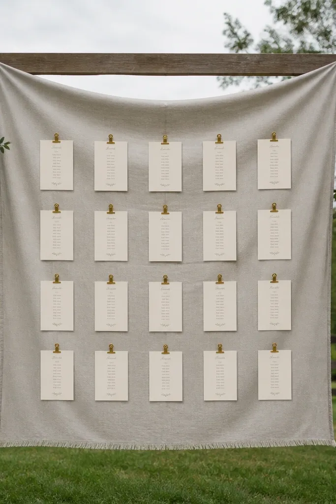
Fabric banners look soft and elevated, and clip-on cards make the chart feel interactive without being chaotic. The best part for photos: the banner background is smooth, so your cards stand out. Choose linen or cotton in a neutral tone and keep card colors consistent — cream cards with dark text. This works for outdoor receptions, rehearsal dinners, and any setup where you want the welcome area to feel cozy.
Start by stretching fabric over a lightweight frame or using a tension rod inside a banner stand. Then attach small clips across the banner and slide in printed name cards for each table. Finally, pack the banner flat or rolled carefully, and bring spare clips so you can replace any that break.
Quick tipRoll fabric with the chart side inward to prevent creases across the cards.
Skip thisSkip flimsy string lights near the banner; they can cast uneven shadows on the cards.
16. Table Number Polaroid Cards on a Pegboard Grid
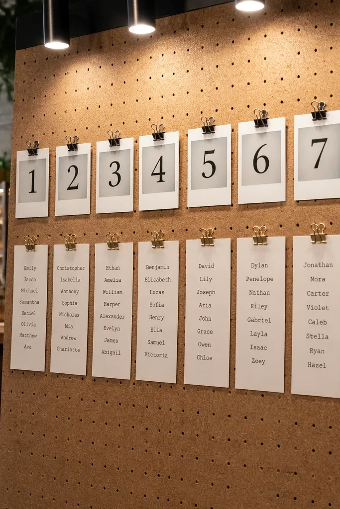
Pegboard with pinned cards gives you a gallery wall look that reads well from multiple angles. It’s also easy to update if you’re still finalizing counts. Use polaroid-style cards only for the table header area; keep the names in a clean typed block so it’s fast to scan. This suits casual receptions, industrial venues, and weddings with a playful but organized vibe.
Start by using a pegboard or perforated board and marking a consistent grid for table numbers. Then print table header cards and attach them with mini clothespins or straight pins, keeping each card at the same height. Finally, pack the board in a protected box and bring an extra pack of pins because one missing pin changes the spacing.
Quick tipLabel the back of each card with the table number so you can fix misplacements quickly.
Skip thisAvoid mixing card sizes; it makes the grid look lopsided in photos.
17. Vintage Framed Map Style Seating Chart with Table Pins
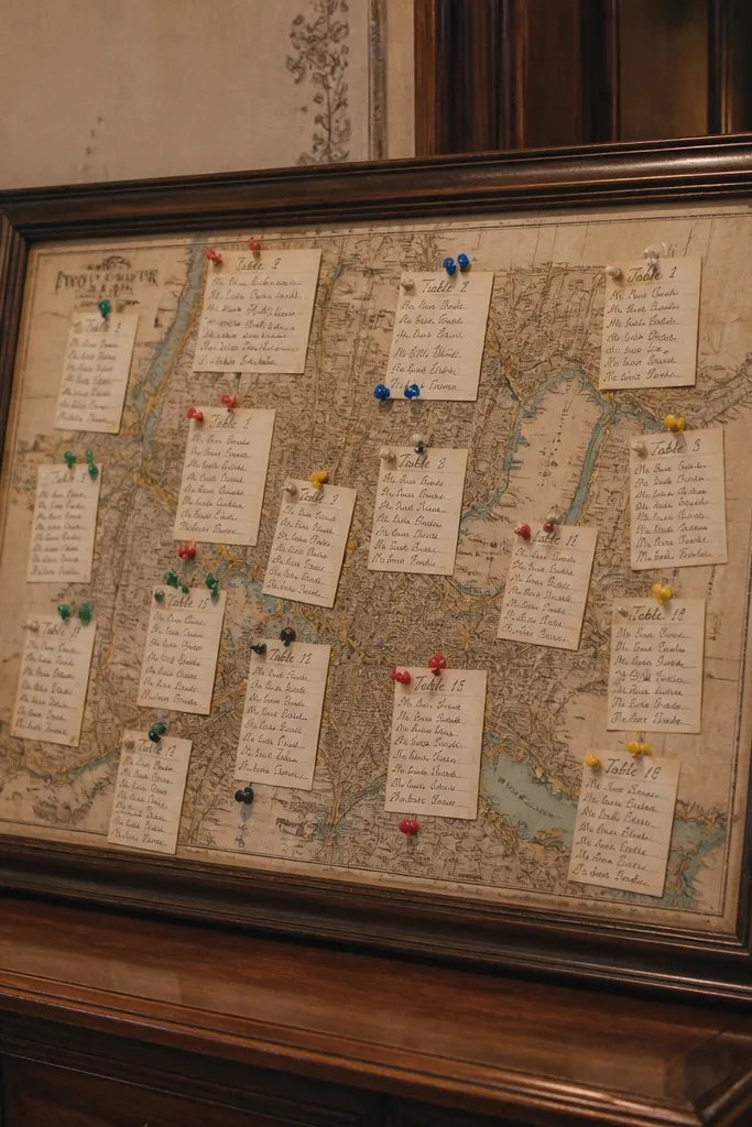
This is a fun option when you want the chart to feel like a story without sacrificing readability. Use a vintage map background muted in color, then pin table numbers onto it with small colored pins and attach a name card near each pin. Choose one pin color for table numbers and keep name cards consistent to avoid visual noise. It looks great for destination weddings and venues with travel themes.
Start by printing a muted map image on a large sheet and framing it with a simple thin frame. Then add pins for each table and attach printed name cards with a small string or adhesive tab behind the frame. Finally, transport the framed chart in a hard frame box and set it up in a shaded area to reduce glare.
Use the same pin color across all tables so the chart looks intentional, not random.
Don’t use bright neon pins; they overpower the names and look messy on camera.
18. Single-Page Seating Grid with Clear Acrylic Overlay for Protection
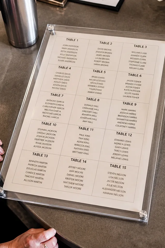
If you want one-page simplicity that still looks polished, this is the move. The grid design stays readable, and the acrylic overlay protects the paper from spills, drinks, and humidity. For photos, the chart looks clean because the acrylic edges create a crisp frame around the design. This suits venues with lots of foot traffic, outdoor receptions, and anyone who wants a low-stress setup.
Start by printing your seating chart on thick matte paper, then place it under a clear acrylic sheet sized to the page. Next, mount the acrylic on an easel with corner supports so it stays flat and doesn’t flex. Finally, pack it assembled in bubble wrap, and set it out early so guests get oriented before the reception rush.
Quick tipIf you see glare in venue lighting, switch to matte acrylic or remove the overlay and use a dry-erase sleeve instead.
Skip thisAvoid glossy laminate if your venue has strong overhead lights.
19. Modern Line-Art Seating Chart with Minimal Icons
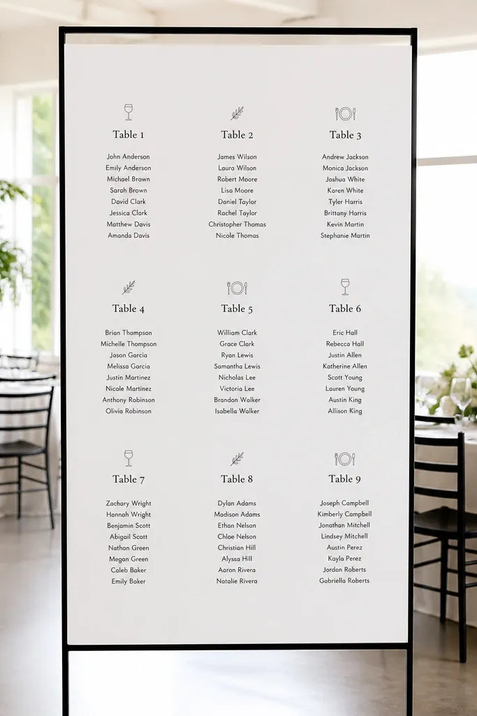
Line art makes a seating chart feel designed without making it decorative chaos. The icons should be subtle — think simple wine glass, leaf, or place setting — and used sparingly next to table headers. Keep names in a strict grid with short line lengths so the chart stays readable. This works for minimalist weddings, city venues, and receptions where the decor is mostly neutral and you need the chart to add personality.
Start by making a clean layout in Canva or a design tool using one icon style and one font pair. Then print on white cardstock and add icons only at the table header row. Finally, mount on a white board so the black text and icons pop, and pack flat in a rigid folder to avoid bending.
Quick tipUse icons at 10-15% of the header height; bigger icons steal attention from names.
Skip thisSkip multiple icon styles; mixed line weights make the page look cheap.
20. Color-Coded Table Rows with Matching Ribbon Flags
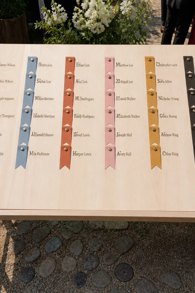
Color-coding helps guests find their table fast, and the ribbon flags add a clean handmade touch that still looks photo-ready. Keep it controlled: use 4-6 colors max, repeat each color consistently for each table number, and keep names black. Ribbon flags look great in overhead and front-facing photos because they create small, tidy highlights. This is ideal for receptions with mixed groups where you want guests to locate their table without asking staff.
Start by printing a monochrome seating grid and adding a small colored ribbon flag next to each table number. Then attach the ribbon flags so they point to the correct row and keep their ends aligned. Finally, pack the chart flat, and bring a small pair of scissors to trim ribbon ends if they fray.
Quick tipCut ribbon ends at a slight angle so they look intentional in close-up shots.
Skip thisAvoid using too many colors; it looks like a kid’s craft board.



