
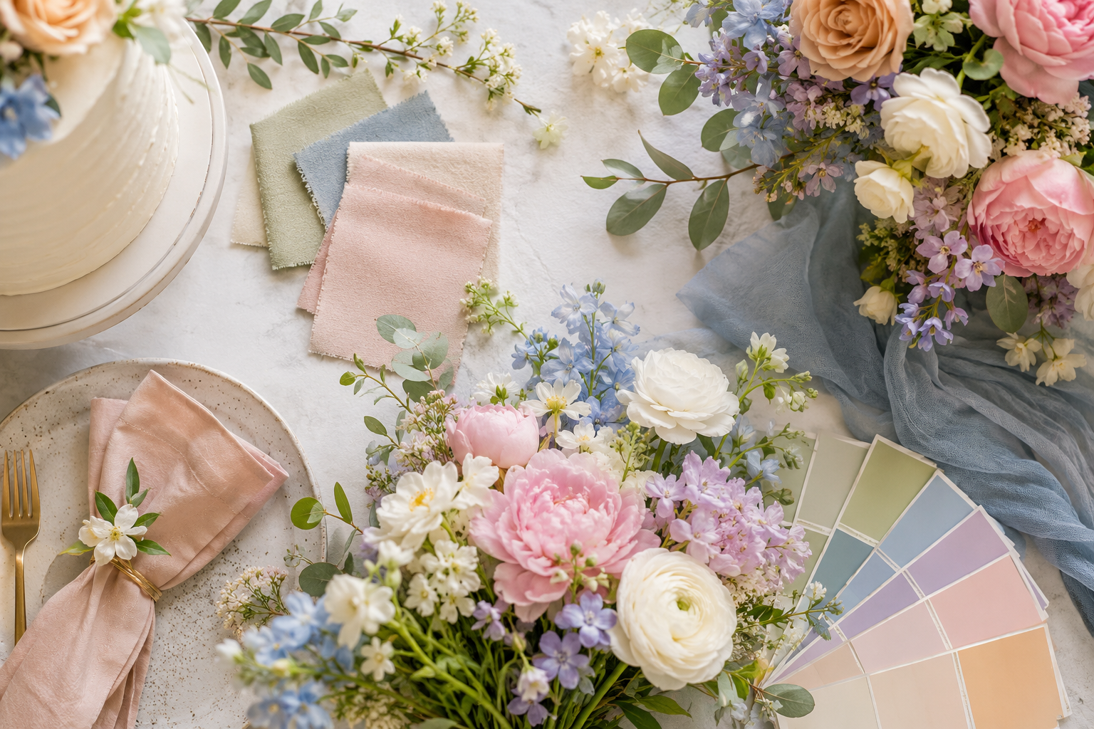
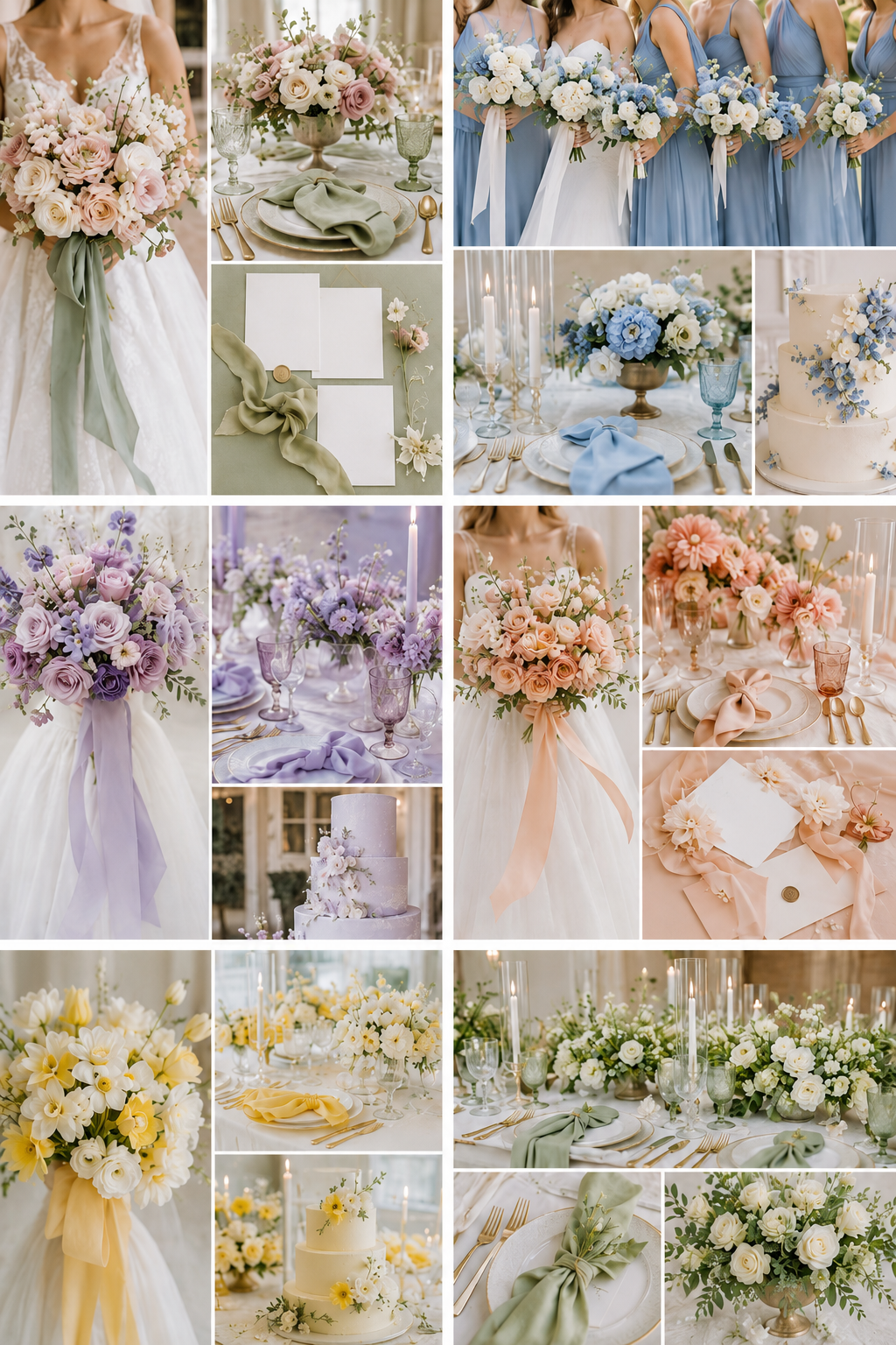
1. Blush + Sage + Warm Ivory
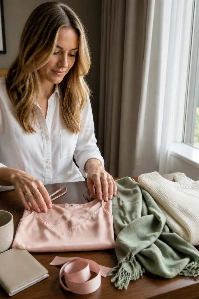
This scheme looks made for spring because blush reads soft and flattering, sage adds fresh calm, and warm ivory keeps everything from turning icy. In photos, blush and ivory sit close together, so you need sage as the visual separation. Aim for at least one matte fabric — blush crepe or satin with a low sheen — so the palette looks expensive instead of glittery. This is a great fit for garden venues, courthouse weekends, and daytime receptions where you want to look romantic without trying too hard.
Start with a blush base (midi dress or skirt set) and choose a sage layer that you can wear in cool morning air. Then add warm ivory shoes or a small bag in a cream tone, not bright white. Finally, pack one simple jewelry choice in gold or champagne metal so it doesn’t fight the softness of the colors. If you’re flying, wear the most wrinkly item on travel day and pack the layer folded with tissue paper to reduce creasing.
Sage looks best with matte finishes; skip shiny satin in this palette.
Avoid pairing blush with stark white — it makes the blush look pinker and the whole outfit harsher.
2. Powder Blue + Cornsilk + Espresso
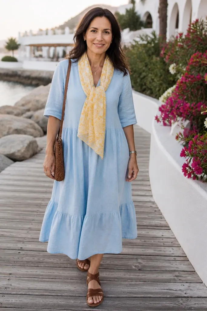
Powder blue is clean and pretty in spring photos, but it can look flat unless you add a warm yellow tone like cornsilk. Espresso gives contrast that makes everything legible in pictures, especially when the venue has lots of white walls or bright florals. This palette works well for coastal settings, outdoor ceremonies, and venues with airy architecture. It also photographs great with denim accents if you’re traveling and want comfort without losing the color story.
Quick tipBring a fabric steamer or hang your outfit in the bathroom while you shower the night before.
Build your outfit around a powder blue piece — a skirt, blouse, or structured jumpsuit. Add a cornsilk top or scarf to warm the palette, then use espresso as the anchor with a belt, shoes, or a bag. Pack a light layer in neutral tan if the weather shifts, and keep the rest of the styling minimal so the three colors stay clear. For getting there and around, choose crossbody bags that stay close to your body so your color blocks don’t get hidden in candid shots.
Skip thisDon’t add silver jewelry — espresso + powder blue reads better with gold tones.
3. Lilac + Dove Gray + Black Tea
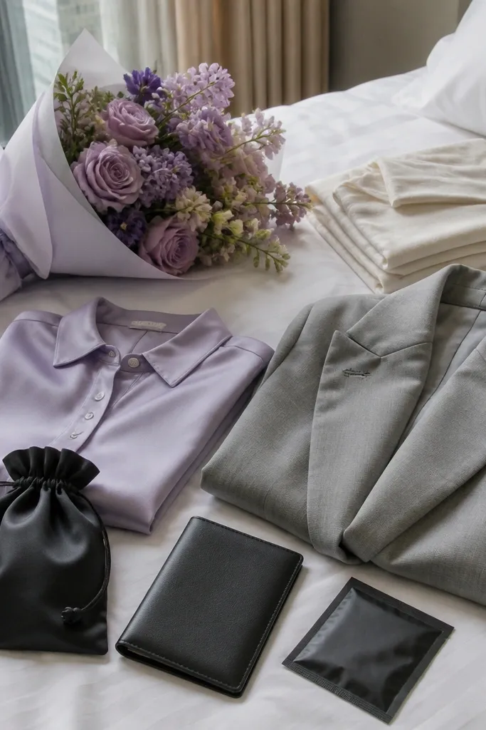
Lilac is spring-forward without being babyish, and dove gray keeps it modern. Black tea — a deep brown-black — adds drama that looks sharp in both daylight and evening candlelight. This scheme is ideal when the wedding invites lean “romantic but grown-up,” or when you want to stand out in group photos. It also holds up well if the ceremony is indoors with warm lighting, because lilac doesn’t turn muddy like some purples.
Quick tipChoose lilac fabrics with a slightly thick weave so the color stays even in photos.
Start with a lilac blouse or fitted top, then pair it with dove gray trousers or a pencil skirt. Add black tea shoes or a small clutch so the palette has a dark edge. Pack a thin wrap or cropped blazer in gray so you can adjust for AC without adding a new color. When traveling, keep the lilac top on top of your bag so it’s the first thing you can pull out and hang immediately.
Skip thisSkip neon-lilac shades; they can look harsh next to soft florals.
4. Coral + Sea Glass + Sand
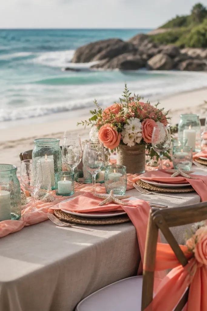
Coral brings energy, sea glass adds calm, and sand keeps the whole look beach-friendly and wearable. This palette is made for spring weddings near water, outdoor receptions, and locations with bright skies. In photos, coral can look too loud if you don’t soften it — sand and sea glass do that job. You’ll look like you planned your outfit, even if you’re only packing a few pieces.
Quick tipSea glass looks best with matte textures; avoid glossy acrylic accents.
Pick a coral dress or set as your base, then choose sea glass accessories like earrings, a scarf, or a small clutch. Add sand-colored sandals or a neutral bag to bridge the warmth and the cool tones. Pack a lightweight cover-up in white or light beige for sun or wind. For travel logistics, bring a nail color in coral or soft pink so your hands match the palette in close-up ceremony photos.
Skip thisDon’t pair coral with bright teal — it makes the sea glass disappear.
5. Emerald + Cream + Gold
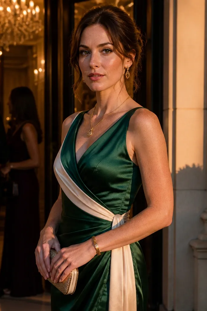
Emerald stands out beautifully in spring because it reads rich without feeling heavy, and cream keeps it clean. Gold ties the warmth together and makes the outfit feel wedding-appropriate. This scheme is a strong choice for evening receptions, ballroom weddings, or any venue where you’ll be photographed under warmer lighting. In group photos, emerald gives you a clear focal point, so your outfit won’t blend into floral backgrounds.
Start with an emerald dress or top with a simple silhouette so the color does the work. Add cream through a cardigan, wrap, or trousers, then finish with gold sandals or a small clutch. Pack a second neutral layer in off-white for cold air, and keep your jewelry to one category — either earrings or a necklace — so it looks intentional. If you’re packing for travel, choose a fabric that resists wrinkles like matte satin blends or crepe.
Gold jewelry should look warm, not icy; match it to your bag hardware.
Avoid pairing emerald with pure bright white — cream is what keeps it flattering.
6. Tangerine + Pale Mint + Charcoal
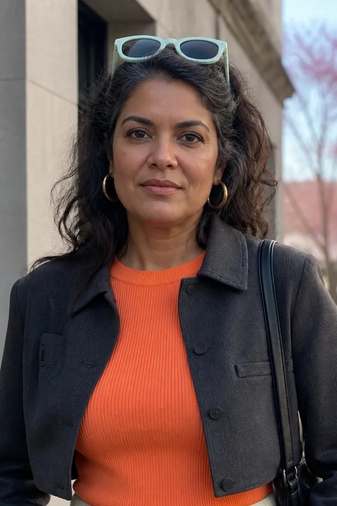
Tangerine is bold and photogenic, pale mint cools it down, and charcoal makes the palette wearable. This is a great scheme for spring weddings where you want a playful look without going full costume. Charcoal is the secret weapon for photos because it anchors the bright tones and keeps skin tones from looking washed out. If the wedding has colorful florals, this palette helps you blend while still looking distinct.
Quick tipBring a mint accessory in a matte fabric so it doesn’t glare in sun.
Choose a tangerine top, dress, or jumpsuit panel as the main color. Then add pale mint through a skirt, scarf, or lightweight layer. Pack charcoal shoes and a small crossbody so you’re not relying on bright accessories to balance the look. For getting around, charcoal sneakers are fine for travel and outdoor ceremonies — just pick a clean, minimal style so the outfit stays elevated.
Skip thisSkip white sneakers — they can make the tangerine look too orange.
7. Rose Pink + Champagne + Cocoa
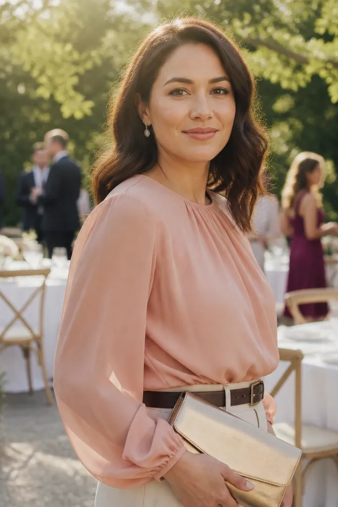
Rose pink feels romantic in spring, champagne adds a soft glow, and cocoa gives grounded contrast. This palette works well for weddings that lean “classic garden” or “soft glam.” In photos, champagne and rose pink together can look dreamy, but cocoa keeps it from becoming too sugary. It also flatters most skin tones because cocoa adds warmth and depth.
Quick tipChampagne hardware and jewelry look best with warm metals like gold or bronze.
Start with a rose pink dress or skirt set that hits mid-calf for an easy, flattering silhouette. Add champagne through a clutch, belt, or even a light scarf, then choose cocoa heels or flats as your anchor. Pack a shawl in a neutral warm tone so you can handle evening breeze. If you’re traveling, keep the champagne item in its own pouch so it doesn’t pick up dark color transfer from other bags.
Skip thisDon’t use cool-toned silver with this palette — it makes champagne look gray.
8. Navy + Powder Pink + Blush Denim
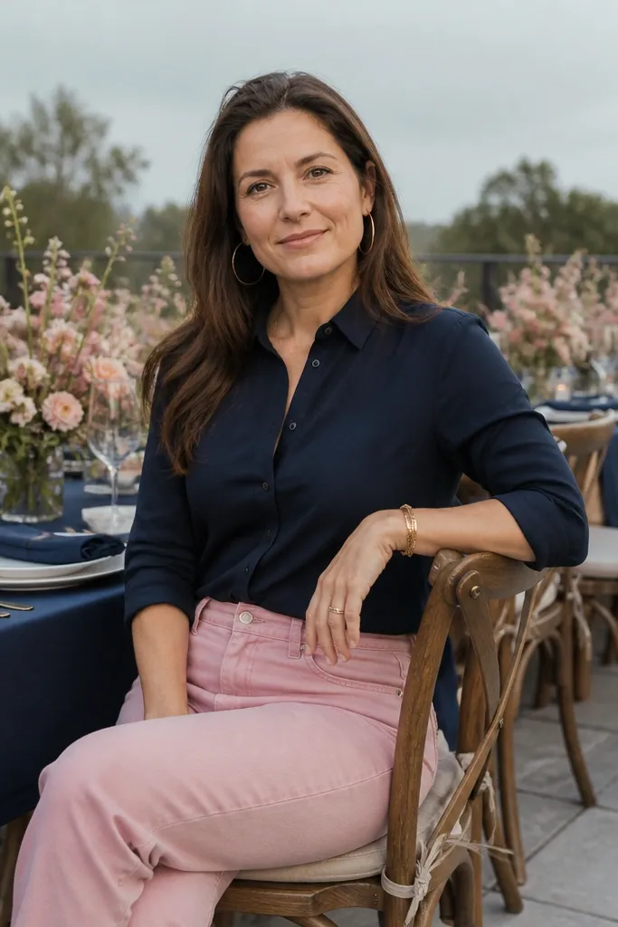
This scheme is the practical one that still looks wedding-ready. Navy is reliable and looks sharp in nearly every lighting, powder pink adds softness, and blush denim reads springy without being too formal. It’s ideal for outdoor venues with casual vibes, rehearsal dinners, or destination weddings where you’ll walk a lot. The photo advantage is clear: navy frames your face, and the pink adds a gentle pop that reads well next to flowers.
Start with navy as the base — blazer, trousers, or a jumpsuit. Add powder pink through a top, camisole, or belt, then bring blush denim as your second spring texture. Pack a compact layer like a cropped cardigan in navy or blush so you can keep the palette consistent. For travel, wear the navy piece on the plane and pack the denim separately folded to reduce creases.
Choose denim with a clean wash; heavy distressing will look too casual for wedding photos.
Avoid mixing navy with bright fuchsia — it competes with florals instead of complementing them.
9. Sapphire + White Peony + Espresso Brown
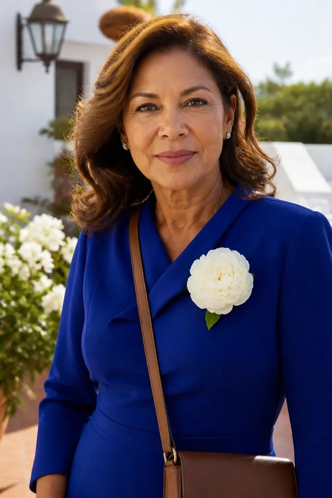
Sapphire is deep and flattering, white peony adds brightness, and espresso brown feels intentional instead of harsh. This palette works when the wedding colors are bold but the venue is bright, like white walls, light wood, and sunlit terraces. It also photographs well in evening because sapphire holds color under warmer lights. You get a strong look without needing a complicated outfit.
Quick tipIf the wedding is in bright sun, keep white fabrics matte to avoid glare.
Pick a sapphire dress or structured top as your main item. Add white peony through a scarf, blouse layer, or clutch — keep it soft, not icy white. Finish with espresso brown boots or heels, then pack a minimal outer layer in the same brown family. For travel, choose shoes you can walk in; you’ll thank yourself during photo sessions and ceremony lines.
Skip thisDon’t pair sapphire with black — espresso brown looks more spring and less severe.
10. Butter Yellow + Soft Blue + Charcoal
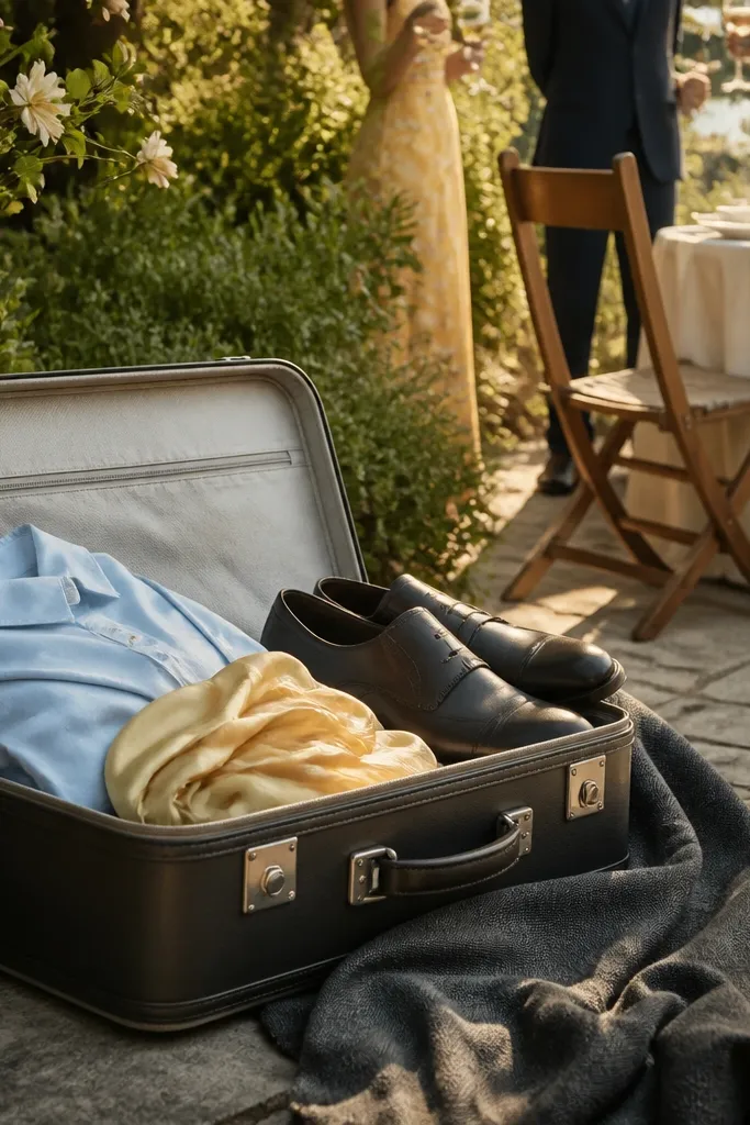
Butter yellow looks cheerful in spring, but it can turn neon in photos if you choose the wrong shade. Soft blue cools it down, and charcoal grounds the brightness so you look intentional. This scheme is great for daytime weddings, brunch receptions, and locations with lots of greenery. The photo payoff is strong because yellow catches light — charcoal keeps the frame from looking washed out.
Start with butter yellow as the hero piece — a blouse, dress, or top with a collar. Add soft blue through a skirt, trousers, or a light layer, then use charcoal shoes and bag to anchor the look. Pack one neutral jacket in a charcoal-adjacent tone so you’re not adding a new color when it gets windy. For getting around, keep your bag small and structured so it looks crisp in close-up photos.
Choose butter yellow with a slightly creamy undertone, not pure bright yellow.
Avoid sky-blue that’s too saturated; it can overpower the yellow.
11. Sage Green + Cream + Dark Brown Leather
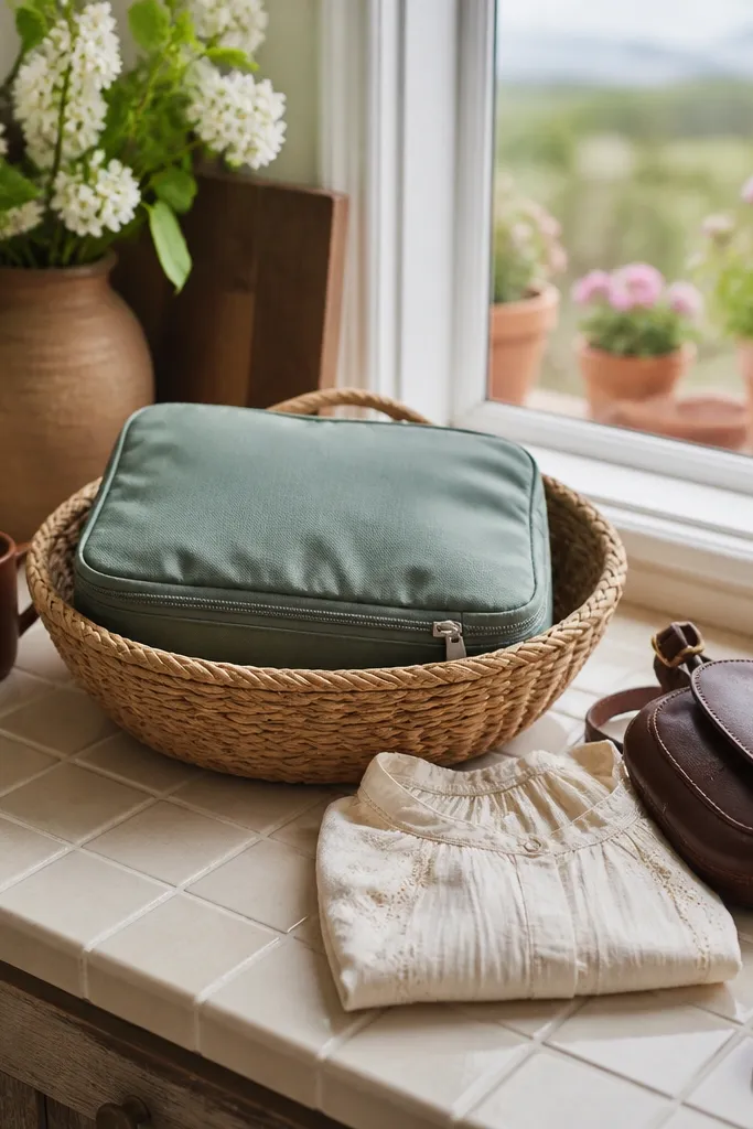
This is the calm, garden-friendly palette that looks expensive because it’s cohesive. Sage green is flattering and blends with spring florals, cream keeps it light, and dark brown leather adds a grounded, natural vibe. It’s especially good for outdoor ceremonies, vineyard weekends, and venues with wood, stone, or greenery. In photos, this combo makes your outfit look like part of the environment rather than a separate costume.
Quick tipBrown leather hardware in the same tone as your shoes keeps the look tight.
Start with a sage dress or jumpsuit in a matte fabric like crepe or cotton poplin. Add cream through a belt, camisole layer, or handbag, then finish with dark brown leather shoes or a watch strap. Pack a cream cardigan for wind and AC without changing the color story. For travel, keep leather items in a separate pocket so they don’t scuff your lighter clothes.
Skip thisSkip camel + bright green; sage needs a muted partner, not high-contrast camel.
12. Charcoal + Dusty Rose + Stone White
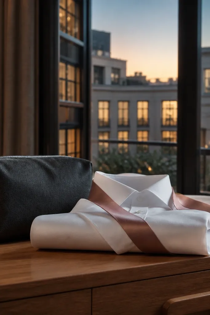
This scheme is for spring weddings that feel a little formal or evening-heavy. Charcoal gives structure, dusty rose adds softness, and stone white keeps the palette light without looking like you’re wearing pure white. It’s also the easiest to style if the wedding colors are muted because it matches the mood. In photos, charcoal frames the face and makes dusty rose look flattering rather than too pink.
Quick tipDusty rose looks best in matte knits or chiffon, not shiny satin.
Choose charcoal as your base with a jumpsuit, tailored trousers, or a midi dress. Add dusty rose via a scarf, earrings, or a fitted top underneath so the color shows up in portraits. Bring stone white through flats, a bag, or a light layer. Pack your dusty rose accessory in a protected pouch so it doesn’t get wrinkled — soft colors show creases quickly.
Skip thisAvoid bright magenta with charcoal; it reads harsher than dusty rose.
13. Peach + Soft Pink + Cocoa Rose
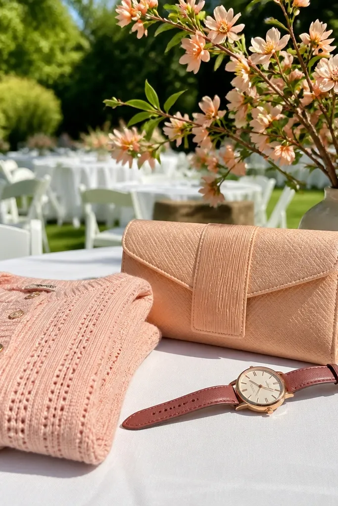
Peach and soft pink together look like spring fruit and blushing petals, and cocoa rose adds depth so the palette doesn’t become all-sugar. This works for weddings that lean feminine but not pastel-only, especially in late spring when the sun is stronger. The peach tone looks great against greenery and white table settings, while cocoa rose keeps your photos from turning washed. It’s a flattering choice if you want to look romantic without looking too “bridesmaid.”
Quick tipBring a nude lip that matches peach undertones, not cool pink.
Start with a peach wrap dress or skirt set that has movement — wrap styles photograph well because they catch light naturally. Add soft pink through a clutch, belt, or delicate jewelry, then use cocoa rose shoes to anchor. Pack a light neutral cardigan in peach-beige so you don’t introduce a new color when it cools down. For travel, choose a dress that doesn’t need ironing; wrap fabrics wrinkle less than you’d expect if you hang them right away.
Skip thisSkip peach that’s too orange; it can clash with pink florals in daylight.
14. Teal + Coral Rose + Cream
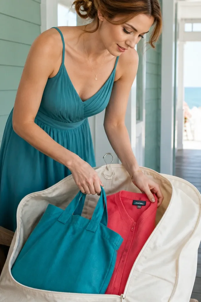
Teal is bold but still spring-friendly, coral rose adds warmth, and cream keeps everything wearable. This palette pops in photos near greenery because teal reads deeper and coral adds a healthy glow. It’s a strong choice for modern venues, beach towns, and weddings with colorful centerpieces. If you want your outfit to look intentional from wide shots down to close-ups, this scheme delivers because it has contrast without going dark.
Quick tipCoral rose accessories look best with matte finishes so they don’t glare in sun.
Pick teal as the base — dress, midi skirt, or tailored top. Add coral rose through statement earrings, a scarf, or a small bag, then keep cream for shoes and crossbody. Pack a simple cover-up in cream or a matching teal tone so you can stay in palette if the ceremony is breezy. For getting there, choose a crossbody that sits high enough that it doesn’t block your waist in photos.
Skip thisAvoid mixing teal with bright red; coral rose is warmer and calmer.
15. Classic White + Sage Veil + Black Ribbon
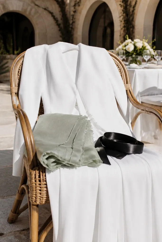
This is the clean, editorial palette for spring weddings when the decor is light and airy. Classic white keeps the look crisp, sage adds softness, and a black ribbon or belt brings contrast that makes the outfit readable in photos. It’s especially good for destination weddings where you want a simple outfit that still looks styled. In pictures, the black detail creates a focal line that helps your silhouette look sharp.
Quick tipIf the wedding is very formal, choose a white outfit with sleeves or a tailored neckline.
Start with a true white outfit in a fabric with structure — cotton poplin, crepe, or a lined jumpsuit. Add sage through a scarf, veil-style headpiece, or a light wrap, then use black as the accent via a belt, shoes, or a small clutch. Pack the sage accessory separately so it stays wrinkle-free and looks fresh. For travel, wear the white item on the plane and pack the black belt flat to avoid creases.
Skip thisSkip sheer white fabrics; they can look unflattering and show lines in bright outdoor photos.
16. Pale Pink + Powder Blue + Navy Night
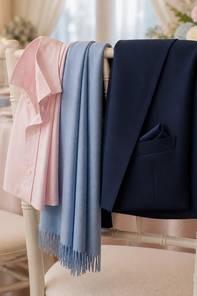
Pale pink and powder blue give you that classic spring weather vibe, and navy night makes it feel put-together instead of childish. This scheme works when the wedding colors are light and when you want a look that matches airy florals and pastel table settings. Navy also helps if you’re photographed in shaded areas — it prevents your outfit from looking washed out. It’s a smart choice for daytime photos that still need a little sophistication.
Quick tipPowder blue looks better in knit or matte fabric than in glossy satin.
Choose a pale pink dress or top as your base, then add powder blue through a cardigan, scarf, or belt. Finish with navy shoes and a bag so the palette has contrast in both bright and shaded shots. Pack a thin layer in navy for evening because spring wind can make photos look chilly and your outfit need structure. When moving around, keep your accessories small and consistent so the color blocks stay clear in candid pictures.
Skip thisAvoid mixing pale pink with bright turquoise — it steals attention from the soft palette.
17. Terracotta + Cream + Olive Leaf
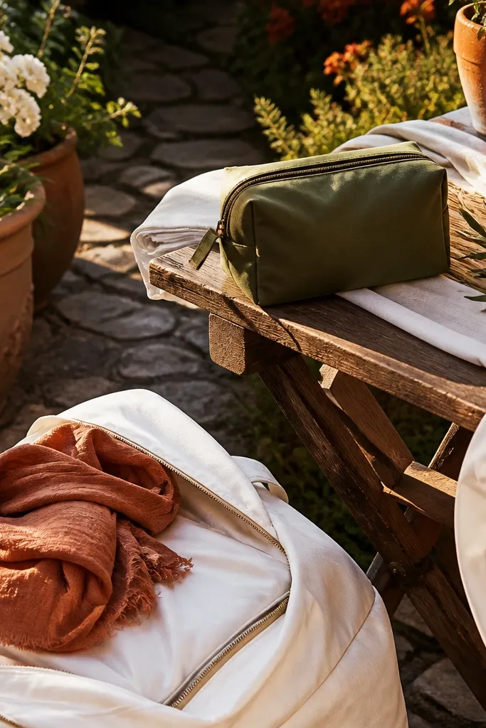
Terracotta feels warm and grounded, cream keeps it light, and olive leaf adds a natural, spring garden vibe. This palette is perfect for outdoor ceremonies, backyard weddings, and venues with stone paths or terracotta planters. It’s also forgiving in photos because terracotta has depth and doesn’t blow out in sunlight the way lighter oranges can. You’ll look stylish without being overly matchy.
Start with terracotta as the base in a linen blend or linen-cotton — it drapes better and looks relaxed in spring photos. Add cream through a tank underneath, cardigan, or a small bag, then choose olive flats to tie into greenery. Pack a light cream layer for evening temps and keep your shoes comfortable since outdoor venues mean more walking. For travel, roll linen blends instead of folding hard; it reduces stubborn creases.
Olive reads better as a muted tone; skip neon olive for photos.
Avoid pairing terracotta with icy gray; it makes the outfit look dull and flat.
18. Cobalt + Cornflower + Tan Leather
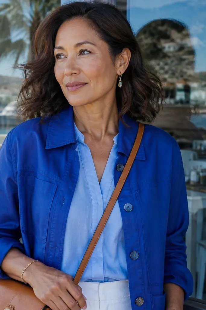
Cobalt is bold and clean, cornflower softens it, and tan leather makes the palette feel warm and travel-friendly. This scheme is a great choice for spring weddings with bright decor, colorful florals, or a beach-chic vibe. In photos, blue tones can look stunning against greenery, and tan leather prevents the outfit from feeling too cold. You get a confident look that still feels springy.
Quick tipChoose matte tan leather or suede; shiny finishes glare in direct sun.
Pick a cobalt dress or structured top as the hero color. Add cornflower through a scarf, small bag, or a lightweight layer, then anchor with tan leather shoes and accessories. Pack a neutral outer layer in tan or cream for wind and AC. For getting there, bring a crossbody that matches your tan leather so the palette stays consistent in every candid shot.
Skip thisAvoid pairing cobalt with black-and-white checker patterns; it competes with the color blocks.
19. Cherry Blossom Pink + Soft White + Espresso
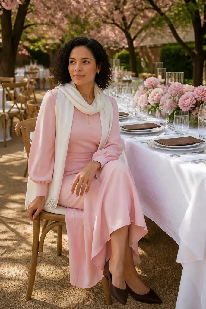
Cherry blossom pink is more grown-up than baby pink, and soft white keeps the look airy without becoming stark. Espresso is the anchor that makes the outfit look intentional in spring daylight, especially when tables are covered in white linens. This scheme is perfect for garden venues, light outdoor receptions, and photo-heavy weekends where you want your outfit to stay flattering across different backgrounds. It also works if you’re wearing a dress that’s mostly one color; espresso ties it together.
Quick tipSoft white should look creamy, not gray; check it in daylight before the wedding.
Start with a cherry blossom pink blouse, dress, or skirt, then pair it with a soft white bottom in a matte fabric. Add espresso through flats, a belt, or a small bag so the palette has a darker edge. Pack a thin layer in cream or espresso if the evening cools down. For travel, keep the soft white item in a garment bag so it stays clean and doesn’t pick up scuffs from other clothes.
Skip thisSkip bright optical white — it can make pink look too loud and photos feel harsh.
20. Champagne Gold + Oyster + Forest Moss
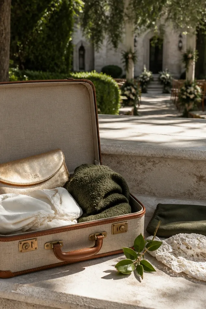
This scheme looks expensive without trying. Champagne gold reads warm in morning light, oyster white keeps everything soft, and forest moss adds that grounded, spring-forest feeling that photographs like a dream. It works especially well for venues with trees, stone, or a courtyard garden because the colors blend into the background instead of fighting it. If you want a spring wedding palette that feels grown-up and romantic, this is the one. It suits couples who like candlelight, textured fabrics, and a slightly moody outdoor vibe.
Pick a venue where greenery is already part of the scene — botanical gardens, an old estate with mature trees, or a rustic courtyard with ivy. Plan on getting there early for photos: the best light for champagne-gold accents is late morning through early afternoon, then switch to candles and lanterns after sunset. Build the color plan using oyster for linens, champagne gold for stationery and metal details, and forest moss in florals like eucalyptus, seeded greens, and mossy stems. In terms of travel cost, look at the price range of your destination first, then spend money on transport to one photogenic outdoor area rather than paying for multiple locations. Give yourself 2 nights minimum so you can do a proper arrival day, a full daylight photo window, and a night shoot with lighting.
Choose one “moss” element that repeats across the day — like green taper candle holders or matching ribbon — so the palette looks intentional in every photo.
Don’t use bright chartreuse greens alongside moss; it makes the whole scheme look cheap and harsh on camera.



