
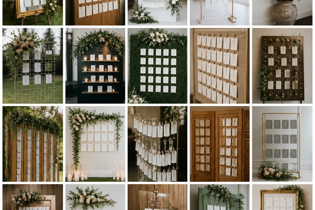
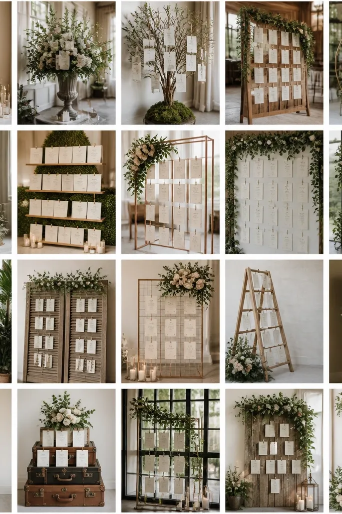
1. Kraft Menu-Card Seating Chart in a 2x3 Grid Frame
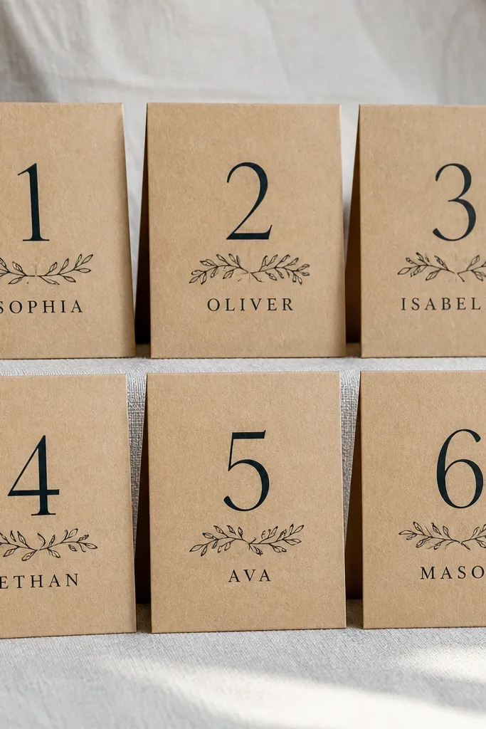
This is the cleanest rustic option when you want the chart to look intentional in photos without turning into a “name wall.” The kraft background gives warmth, while the menu-card cards keep each table’s list contained and easy to scan. Use a thick frame or a hinged display so guests don’t touch the paper directly. It also works well across three days because you can swap only the cards that change instead of rebuilding the whole layout.
Start by choosing a frame size that fits your table count without tiny text — a 2x3 grid works nicely for 6 to 9 tables. Cut kraft cardstock to “menu card” proportions (about 4x6 inches or 5x7 inches), then print table numbers large at the top and names in one column below. Finally, mount the cards with corner adhesive or double-sided dots so you can remove and replace day-specific tables quickly.
Quick tipPrint an extra set of 2-3 blank kraft cards for last-minute name edits so you don’t scramble at setup.
Skip thisDon’t use light gray ink on kraft — it looks muted up close and becomes unreadable in hallway photos.
2. Reclaimed Wood Slat Seating Chart with Brass Label Tags
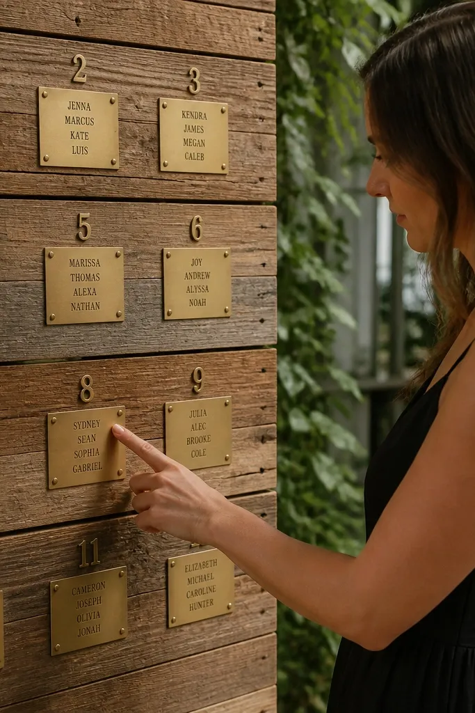
If you want rustic that still reads like a design piece, reclaimed wood slats with brass-style labels are the move. The wood gives texture, but the brass tags create a crisp surface for black text. Guests can scan table numbers fast because each tag is a clear unit. For a 3 day wedding, this setup is great because you can keep the slats in place and swap tags for each day’s seating adjustments.
Start by selecting slats with consistent spacing and securing them to a backboard so the labels don’t sag. Then create small label tags (about 2x3 inches) with table numbers at the top and names beneath, keeping line spacing tight. Finally, attach tags with removable adhesive tabs so you can swap day-specific tags without damaging the wood.
Use an ultra-bold black font for names and keep the label tags limited to 6-10 names so they don’t crowd.
Avoid mixing handwritten script with printed names on the same board — it kills readability in photos.
3. White Linen Table Seating Chart on a Rolling Display Stand
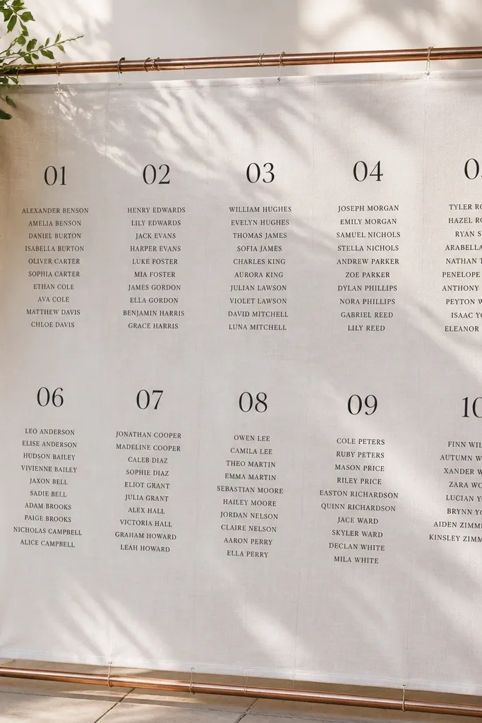
This is rustic without looking like “farmhouse clutter.” White linen gives soft texture that photographs beautifully, and it makes black typography pop. A rolling stand is practical for a 3 day schedule because you can move it between rehearsal dinner and reception areas without reassembling. It also looks polished in both daylight and evening lighting, which matters when guests take photos near it.
Start by stretching linen over a rigid frame or ordering a linen-covered display panel. Then print table numbers large and names in a simple single-column layout, and attach them with fabric-safe Velcro dots so you can swap text blocks. Finally, place the stand near check-in or the bar line — somewhere guests naturally pause — and keep it at chest height for easy scanning.
Quick tipBring a small lint roller — linen shows dust fast in flash photos.
Skip thisDon’t use colored paper labels on linen — the surface already has texture and extra colors make it look busy.
4. Chalkboard-Style Seating Chart with Pre-Printed Name Strips
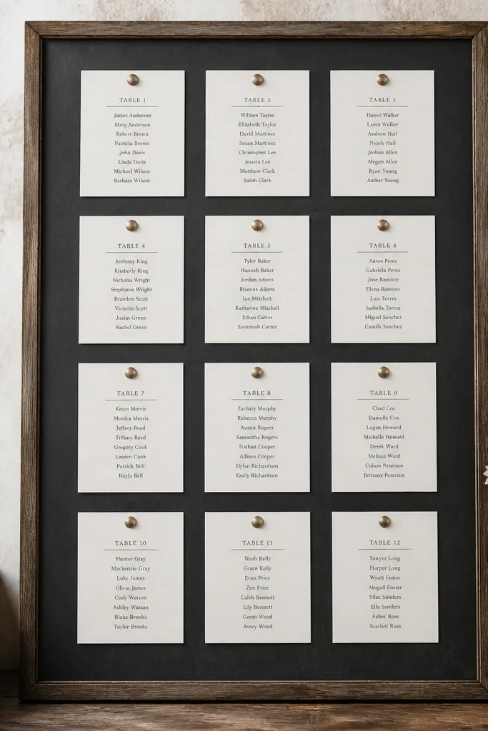
Chalkboard looks rustic and casual, but freehand chalk handwriting is the part that breaks readability. The better version is chalkboard-style background plus pre-printed name strips that look crisp. You get the visual vibe in photos, but the guest experience stays clear. For three days, pre-printed strips let you update names fast — swap strips, don’t rewrite the whole board.
Start with a matte chalkboard panel or chalkboard paint on a board, sized so table numbers aren’t tiny (at least 2.5 inches tall). Then print name strips (about 1 inch tall by 3-4 inches wide) with black text and attach with removable adhesive putty. Finally, group strips under each table number and keep each table list on the same horizontal line so scanning stays consistent.
Use matte black labels on the chalkboard — glossy labels glare under venue lighting.
Skip actual chalk writing for names — it smudges and looks messy in night photos.
5. Tall Table-Number Arrows Pointing to Escort Card Boxes
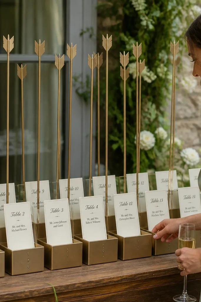
If your seating chart needs to handle changes and still look photogenic, use arrows plus escort card boxes. Guests follow a clear direction, then find their name inside the correct box. The rustic look comes from kraft labels, twine, and simple wood arrow stakes, while the boxes keep everything tidy. This is one of the best formats for multi-day weddings because each day can have separate boxes without the chart getting confusing.
Start by choosing the number of boxes based on table count and placing them in a line with space between for foot traffic. Then create tall arrows with table numbers and secure them above each box so guests understand the flow instantly. Finally, print guest names on small cards and arrange them alphabetically per box so late arrivals can find their seats quickly.
Label the boxes with table number stickers plus a small note like “Find your name” to reduce staff questions.
Don’t stack escort cards loosely inside — guests will flip through and mess up the order.
6. Cedar Board Seating Chart with Hanging Clothespin Name Tags
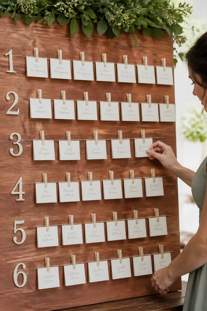
This setup looks like a rustic craft project, but it’s practical. Cedar boards give a warm backdrop, and clothespin-hung name tags show movement and texture in photos without hiding text. It’s also easy to update: swap tags for the day’s seating changes. Guests can scan because each table has a dedicated row of tags, and the table number anchors the list.
Start by mounting a cedar board on an easel or wall at about 4.5-5 feet height. Then create horizontal lines or small hooks for each table number and attach table number plaques above each row. Finally, print name tags on cardstock (about 1.5x3 inches), clip them with clothespins, and keep each table row limited to a manageable tag count so it doesn’t turn into a tangled mess.
Quick tipUse mini clothespins with a natural finish; painted ones can look cheap under warm venue lighting.
Skip thisDon’t crowd tags too tightly — overlapping text looks chaotic fast.
7. Framed Vintage Window Seating Chart with Table Panels
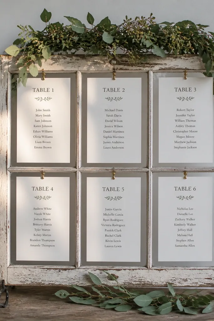
A repurposed window frame instantly reads rustic and elevated, and it’s great for a 3 day wedding because it’s modular. Each window pane holds a table panel, so you can remove just one pane for day-specific changes. The look is photogenic because the frame adds depth, shadow, and structure. Guests also get a clear “where to look” moment because the window shape is familiar and easy to spot.
Start with a window frame that has 6-10 panes or create false pane sections using thin wood strips. Then print table panels sized to each section (keep text large enough for 6-foot scanning) and mount with removable adhesive strips. Finally, hang the window near the ceremony entrance or reception check-in so it catches foot traffic without blocking it.
Quick tipMatch your ink color across all days — consistent black or dark espresso keeps photos uniform.
Skip thisAvoid thin paper behind the glass — it wrinkles and shows glare.
8. Blackboard Table Numbers on White Ceramic Tiles
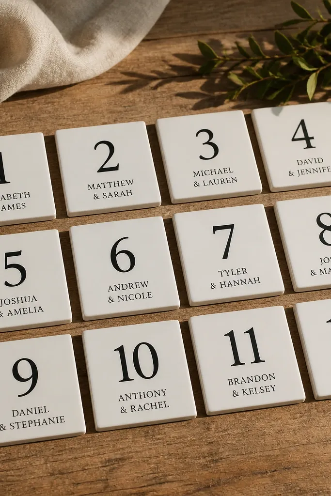
This is rustic with a clean edge. White ceramic tiles make text look sharp and photo-friendly, and black table numbers feel bold without needing extra decoration. You get a grid layout that’s easy to scan and easy to update by swapping tiles for changed tables. It also works when your venue has busy walls because the tiles visually “sit” on a neutral surface.
Start with a board base (wood or foam core) and plan a tile grid that matches your table count. Then print names in a simple single-column format and transfer onto tile labels or directly onto printable sticker sheets designed for ceramic. Finally, mount tiles with removable adhesive pads so you can replace tiles for day 2 and day 3 edits.
Use a matte finish label — glossy stickers reflect flash and make names hard to read.
Don’t add extra flourishes around each tile — keep the focus on the names.
9. Wood Slice Table Seating Chart with Numbered Name Cards
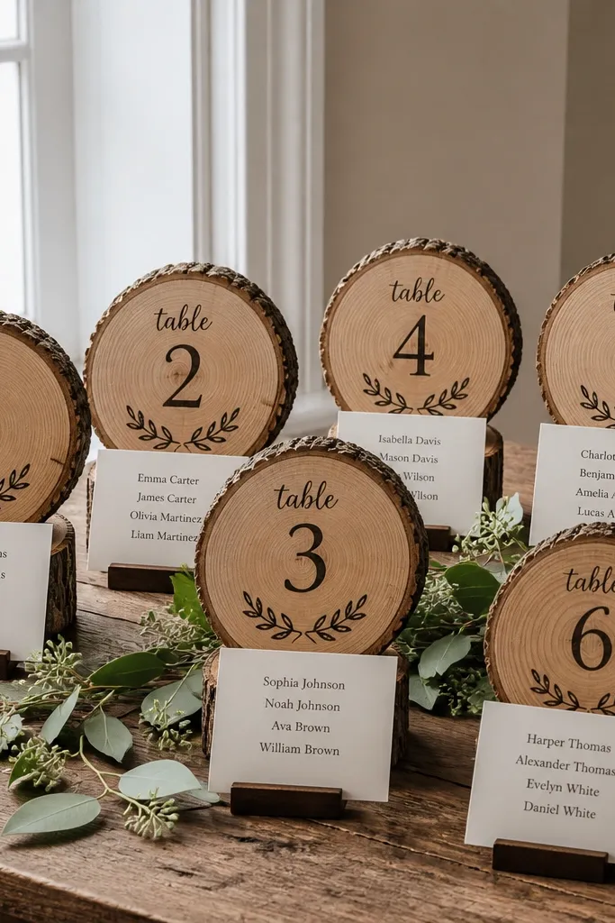
Wood slices look gorgeous in photos, and they give you natural “table markers” that feel handmade. The best version uses slices as table number anchors, while the guest names sit on small cards beneath or beside each slice. This keeps the chart readable because the names aren’t carved into the wood. For a 3 day wedding, you can keep the slices fixed and swap only the name cards.
Start by choosing wood slices with a consistent diameter (around 4-6 inches) so the layout stays neat. Then print name cards that match the number and keep each table’s names in one block, not scattered. Finally, display the slices on a rustic board or easel and attach name cards with removable clips or magnets.
Pre-label the back of each name card with the table number so you don’t mix them during setup.
Skip tiny wood slices — small ones force tiny text and fail the 6-foot scan test.
10. Map-Style Seating Chart on Brown Paper with Table Pins
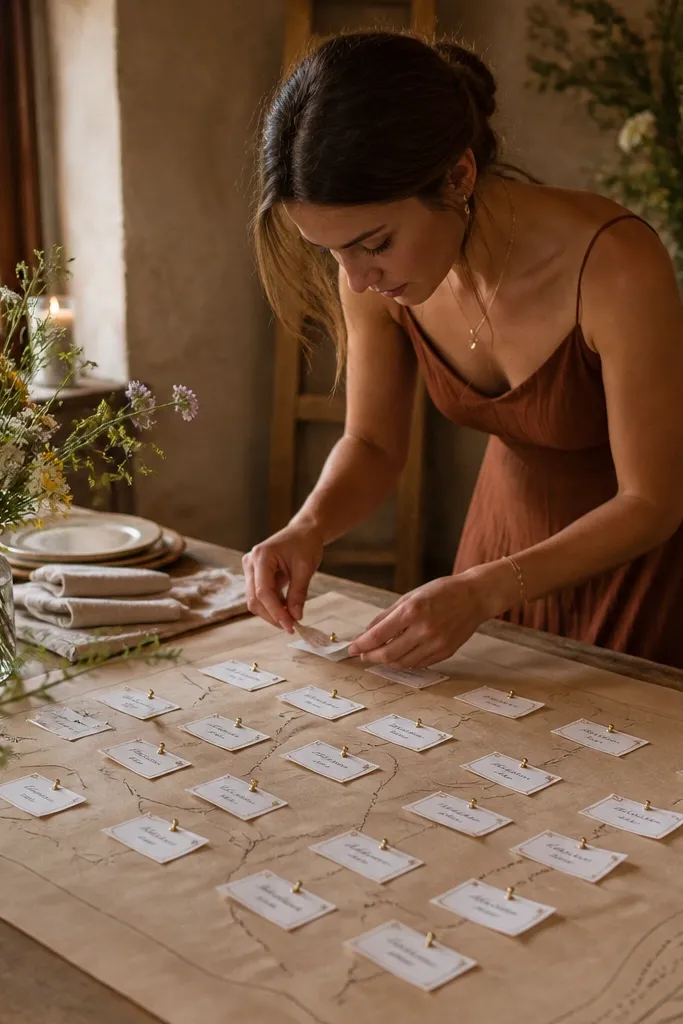
This one looks playful and rustic, and it’s also functional when you expect last-minute changes. Brown paper gives the old-world vibe, and pinned name tags make updates quick without reprinting a whole board. Guests can “hunt” their table number like a map, and the layout looks great in photos because the pins add dimension. It also works for three days because you can swap only the pinned tags that change.
Start with large brown paper taped flat to a board or foam core and mark table zones in a simple grid. Then print name tags on thick cardstock and attach them with pushpins or thumbtacks at the right table zone. Finally, add a clear table number key printed at the top so guests don’t wonder which zone is which.
Use two shades of pin — dark pins for main tables and lighter pins for head tables — for faster scanning.
Don’t over-crowd pins; leave space between zones so names don’t overlap.
11. Linen-Backed Seating Chart with Stacked Acrylic Table Number Blocks
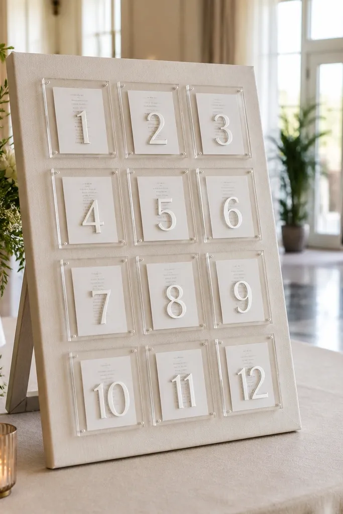
Clear acrylic blocks on a linen background give you rustic warmth with a modern, clean look. It’s photogenic because acrylic catches light and makes the table numbers feel crisp and dimensional. You can print names on paper behind the acrylic so guests read clean text, not reflections. This format is ideal for a 3 day wedding when you want the same backdrop but different name lists each day.
Start by stretching linen over a board and planning your acrylic blocks placement in a neat row or grid. Then print name sheets behind the blocks with large table numbers and one-column name lists. Finally, attach acrylic blocks with small stand-offs or adhesive gel so they stay aligned while you swap the behind papers for each day.
Quick tipTurn off overhead lights briefly during setup to check glare from acrylic in your venue’s lighting.
Skip thisDon’t use glossy paper behind acrylic — reflections make the names hard to read.
12. Rustic Chalk Type on White Shiplap Panels
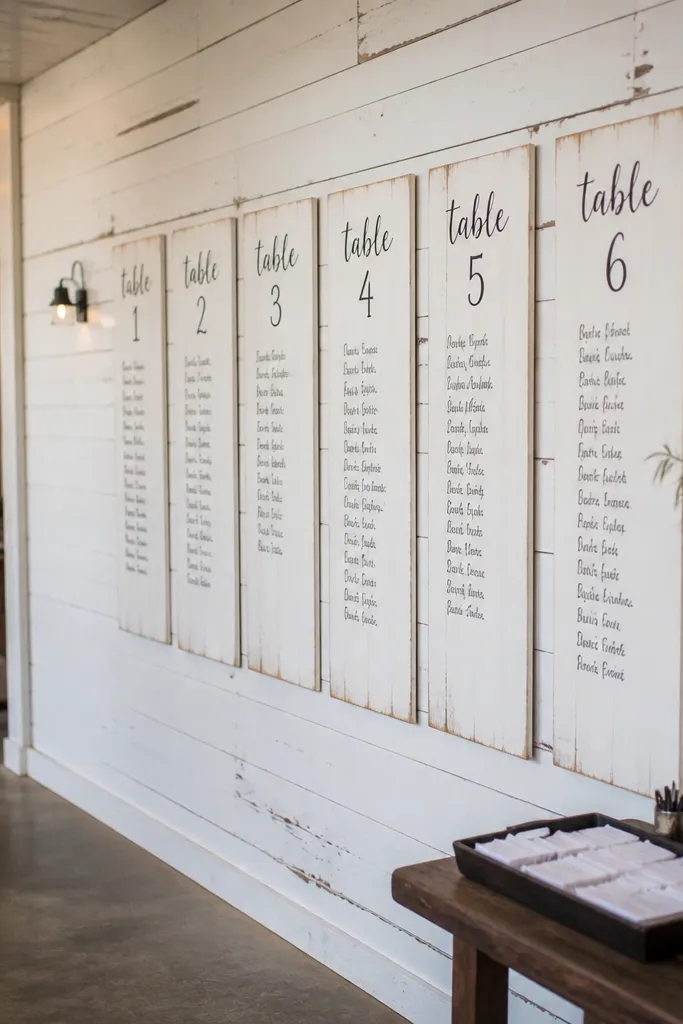
White shiplap gives you the rustic look without the clutter of dark wood. Chalk-style typography on a light panel is readable and looks crisp on camera, especially in bright venues. The panels work for multi-day weddings because you can keep the shiplap wall in place and swap name inserts. It also looks good from the side, which matters when guests approach from different directions.
Start by securing shiplap panels on a stand or wall so the surface stays flat and straight. Then print table number headings in a bold font and attach names in one column under each heading using removable adhesive strips. Finally, split the layout into two panels if you have many tables so text size stays legible.
Use a single chalk-style font across all days so the photos look consistent.
Don’t cram 20 tables into one panel — text shrinks and becomes a blur.
13. Rustic Table Number Mason Jars with Name Tag Lids
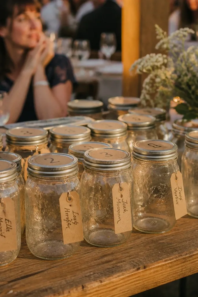
Mason jars are classic, but the version that looks good is the one that displays names clearly, not just stores cards. Label the jar lids or fronts with table numbers and hang name tags around the jar opening on small clips. The jars create repetition, which reads as intentional in photos. For a 3 day wedding, you can keep the jars in place and swap the name tags for each day’s seating plan.
Start by placing jars in rows on a long table or wall ledge with consistent spacing. Then print name tags (about 1.25x2.75 inches) and attach each tag to a clip that hangs from the jar lid area. Finally, label each jar with table number stickers in bold black and keep each jar’s names alphabetical so guests don’t search blindly.
Quick tipUse jar sizes that match your table count — small jars for 8-12 names, larger jars for 15+ names.
Skip thisAvoid mixing multiple handwriting styles on jar labels — it reads messy fast.
14. Rope-and-Clip Seating Chart on a Wooden Backdrop
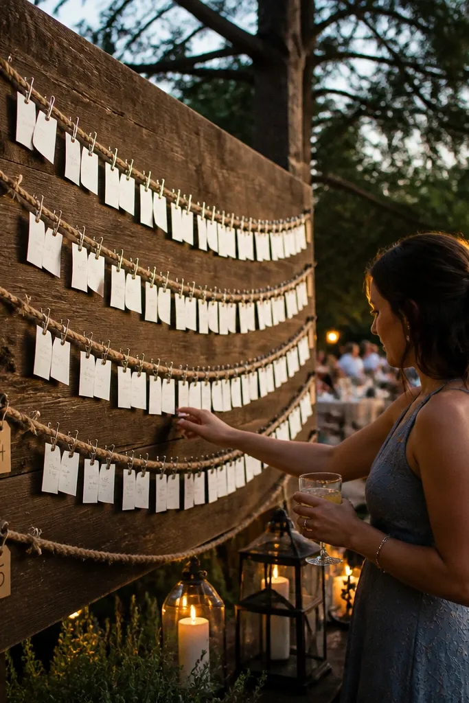
This looks rustic and airy, with a clean structure that keeps names readable. Rope lines create natural rows, and clips let you swap name cards without reprinting whole pages. It photographs well because the lines guide the eye, and the clipped cards show depth instead of flattening into a board. It’s one of the easiest formats to maintain across three days when seating changes happen.
Start by mounting a wood backdrop board and marking table rows with small nails or eye hooks. Then string rope across each row and attach table number plaques at the start of each rope line. Finally, clip printed name cards onto the rope in one column per table, and keep the card font large enough for quick scanning.
Clip names in the same order every day (alphabetical) so guests don’t get confused.
Don’t use flimsy rope — it sags and makes rows look crooked in photos.
15. Vintage Frame Seating Chart with Replaceable Name Sheets
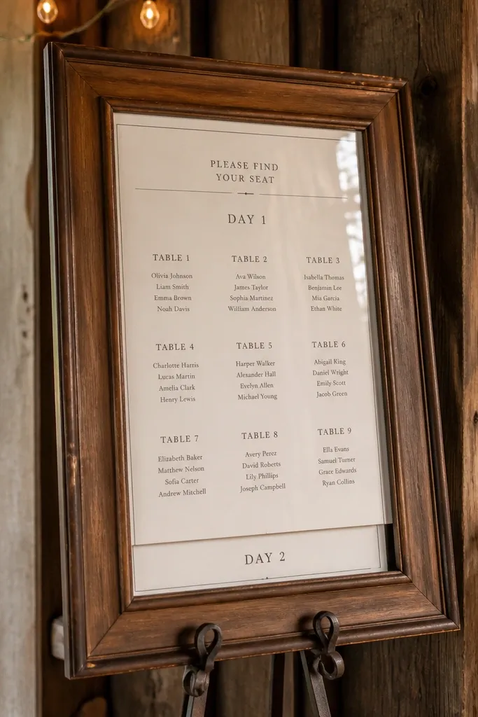
If you want rustic that still feels designed, use a vintage frame and focus on crisp typography. The trick is replaceable name sheets: print each table list on a sheet sized to the frame, then swap for day 2 and day 3. This keeps the look consistent across the wedding and avoids the “new board every day” vibe. It also works when you have a smaller guest count because the frame can keep text big.
Start by picking a frame with thick glass or acrylic so the board stays flat and protected. Then print a seating layout on heavy cardstock and mount it behind the glass; keep table numbers large and names in one clean column per table. Finally, make separate insert sheets for each day and store them in a labeled folder for quick swaps.
Put the chart under warm lighting or near a lamp — typed text stays sharp and doesn’t wash out.
Avoid tiny frames — a small frame forces small text and makes guests crowd the display.
16. Shadow-Box Seating Chart with Layered Table Number Cutouts
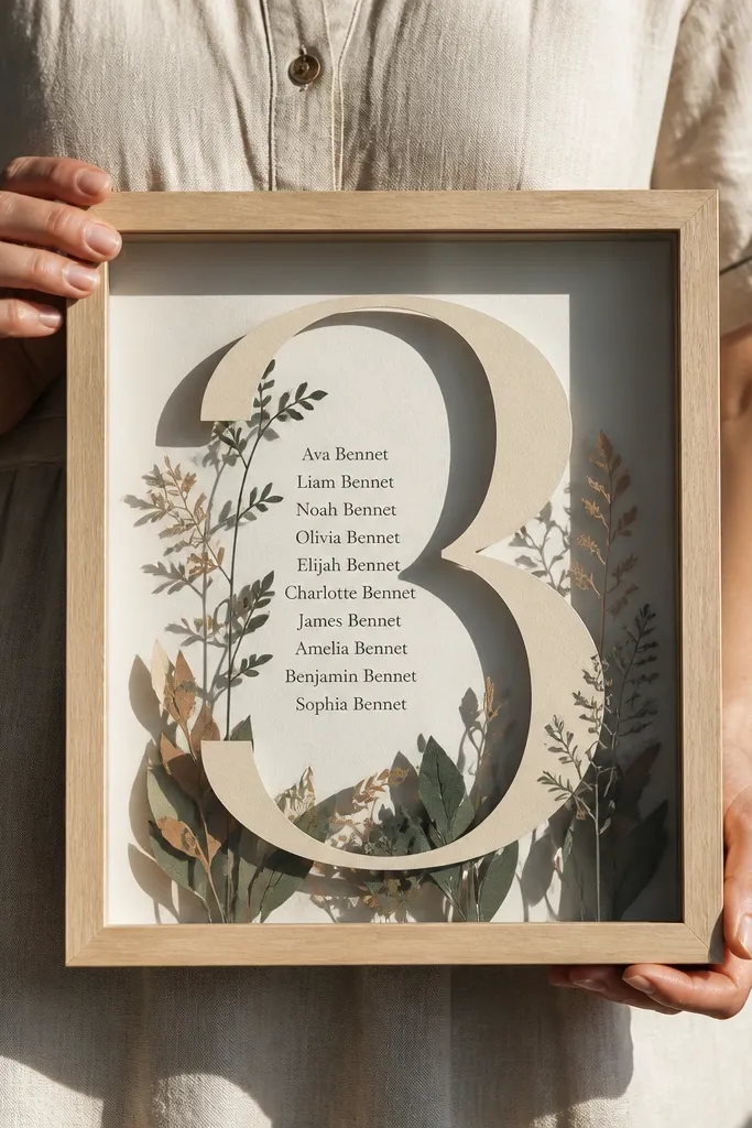
Shadow boxes make seating charts look like decor, not paperwork. Layered table number cutouts create depth and a clear focal point, while printed name lists behind keep text readable. It’s especially photogenic when the venue has soft lighting because shadows fall naturally around the layers. For a 3 day wedding, you can swap only the name layer inside while keeping the cutouts fixed.
Start by building or buying a shadow box with enough depth to hold a name insert behind cutout numbers. Then print guest names in a single column on a cardstock insert aligned to the cutout numbers. Finally, glue or velcro the name insert so you can remove it for day-specific seating changes.
Use matte cardstock for the name insert to prevent glare inside the box.
Don’t layer too many decorative elements — the depth looks cool until it hides text.
17. Rustic Chalkboard Easel with Table Number Tags in a Side Grid
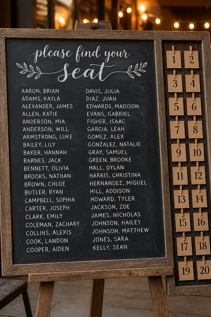
This is a great compromise when you need the chart to be easy to update but still rustic. The chalkboard provides the vibe, and the side grid keeps table number tags organized. Guests scan the side grid for their table, then locate the name list on the chalkboard panel. It looks good because the layout is structured, not scribbled, and it stays readable at different angles.
Start by setting up a chalkboard easel with a clean panel for name lists and a separate side area for table tags. Then print table number tags on cardstock and attach them with removable magnets or clips. Finally, write or print names in neat columns on the chalkboard panel and update the side tags for each day’s seating changes.
Quick tipUse a thick chalkboard marker and test it under venue lighting before the wedding.
Skip thisSkip handwritten names — chalk smears when guests touch the board.
18. Brown Paper Roll Seating Chart with Twine-Stamped Table Zones
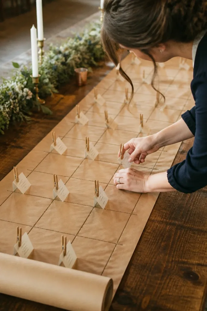
A brown paper roll adds that rustic, “found on purpose” look, and twine-stamped zones make it structured. Instead of a flat board full of text, you get clear zones that feel handmade. Name cards clip to each zone, so updates for day 2 and day 3 stay fast. It also photographs well because the twine creates a grid texture that reads nicely in close and wide shots.
Start by taping a brown paper roll to a board, smoothing it so there are no waves. Then mark table zones with twine lines and label each zone with a bold table number sticker. Finally, attach guest name cards to each zone with small binder clips so you can swap them without disturbing the rest of the chart.
Keep name cards the same size across all days so the grid looks consistent in photos.
Don’t use too many twine colors — one natural twine line keeps it cohesive.
19. Small Gallery-Style Seating Chart with Multiple Table Frames
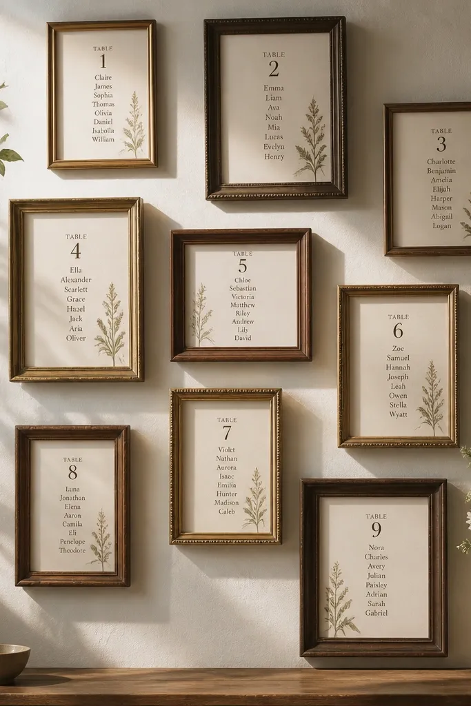
If you want rustic that looks like decor, go with multiple small frames instead of one big chart. Each table has its own mini “card,” which makes it easier for guests to find their table without scanning a dense board. The gallery wall effect looks great in photos, especially when you keep frame styles consistent. For a 3 day wedding, you can swap only the frames that change rather than reprint a full master board.
Start by picking frames in the same color finish (black, dark walnut, or natural wood) so the layout looks intentional. Then print table pages sized to each frame and include table number large at the top with names in one column. Finally, hang the frames in a tight grid at eye level and update day-specific frames by swapping the inserts behind the glass.
Use the same spacing between frames every day so your photo angles don’t look different.
Avoid mixing frame sizes wildly — it makes guests hunt and makes the wall look chaotic.
20. Rustic Clipboard Seating Chart with One Table per Clipboard

Clipboards look casual, but the right styling makes them look designed. One table per clipboard keeps text legible and prevents the “wall of tiny names” problem. It’s also one of the fastest formats to update across three days because you can swap a single clipboard page. In photos, clipboards add texture and depth — guests can also take quick looks without touching the paper directly.
Start by buying clipboards with a consistent rustic finish and arranging them in a neat grid or line, leaving space between for foot traffic. Then print each table list on a sheet sized to the clipboard and punch it into the clipboard with a clip-friendly margin. Finally, label the clipboard top with a bold table number and keep names in one column with tight line spacing.
Quick tipUse tab dividers behind the scenes so your staff can grab the correct day’s clipboard pages in under a minute.
Skip thisDon’t use thin paper inside clipboards — it curls and looks sloppy on camera.



