
1. Lantern Aisle with Dark Iron + Warm Bulbs
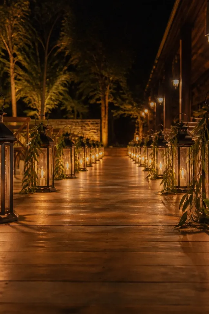
This is the rustic look that always photographs like a movie scene. Dark iron lanterns create a strong outline along the aisle, and warm bulbs keep the whole corridor glowing instead of flat. For a cozy celebration, pair them with simple greenery strips tied to the lantern handles so nothing looks cluttered. The best time to plan this setup is spring and early fall, when outdoor venues feel comfortable for guests and you’re less likely to deal with heavy humidity.
Start by measuring your aisle length and spacing lanterns every 4 to 6 feet so you get an even rhythm in photos. Then pick rental lanterns that use warm bulbs around 2700K, and test one near the ground to confirm it doesn’t look washed out. Finally, reserve at least 2 weeks ahead for popular dates and ask the company if they include bases or stakes for wind stability. If you’re doing DIY, build in time to label each lantern so setup is fast.
Use 2700K warm bulbs and keep lantern heights consistent — uneven heights make the aisle look messy on camera.
Avoid mixing lantern finishes like brass and bright silver in the same aisle.
2. Burlap Runner with Linen Napkin Stacking
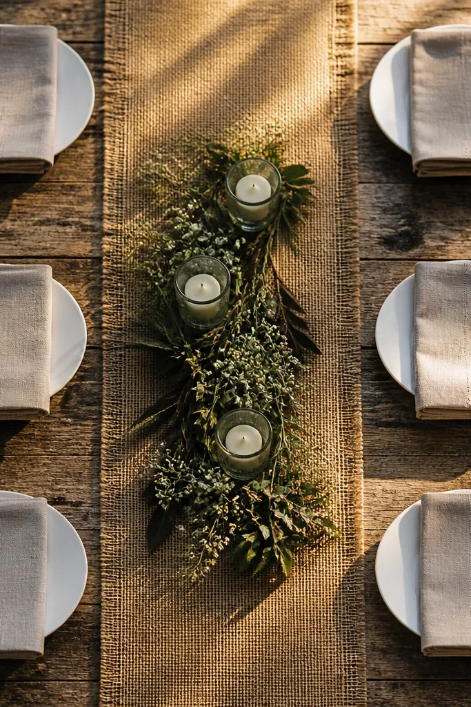
Burlap is the quickest path to rustic, but it gets sloppy fast when you overdo it. A burlap runner laid straight down the center gives texture without covering the whole table, and linen napkins add softness that photographs well against wood tones. Stack napkins in a repeatable style like a simple folded rectangle so every place setting looks intentional. This look shines in fall and winter, when warm neutrals feel cozy and dried greenery accents look right beside it.
Start by choosing burlap with a tight weave and a consistent width, then center it on the table with even overhang on both sides. Next, select linen napkins in cream or oat and stack them the same way at each seat, not randomly. Finally, plan a small lighting moment — a candle or low lantern centerpiece — so the burlap texture catches light instead of looking dull.
Quick tipIron the burlap lightly on low heat with a pressing cloth so it lies flat in photos.
Skip thisSkip frayed, uneven burlap unless you’re intentionally going for a distressed look with matching edges.
3. Wood Slice Escort Cards on a Twine Line
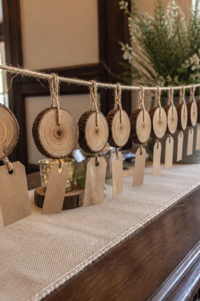
Escort cards can look rustic instead of messy, and wood slices do that better than paper. The circular shapes give you a clean visual pattern, and twine hanging adds that handmade charm without taking over the whole table. Use a consistent font style on the tags, then keep names large enough to read from a few feet away. This works year-round, but it’s especially photogenic in fall because the wood tones match the warm palette of dried florals and amber lighting.
Start by ordering wood slices with a flat face and drilling small holes for twine — don’t rely on glue. Then thread the slices onto twine at a spacing of about 3 to 4 inches so they don’t clump. Finally, hang the line at eye level near the entrance, and photograph it before guests arrive to check readability from the side.
Write names with a medium-tip paint marker in dark brown or black for crisp contrast.
Avoid tiny handwriting — guests will crowd and you’ll lose the clean photo moment.
4. Pampas + Dried Grass Photo Backdrop with Linen Drape
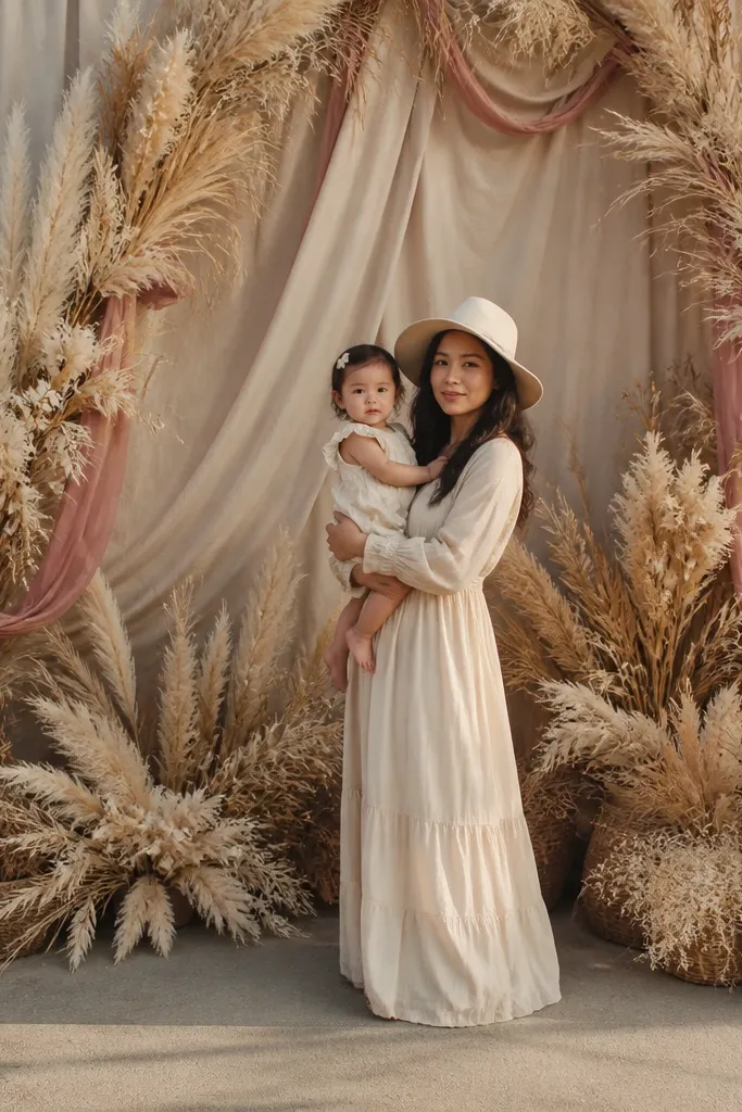
If you want rustic that looks airy instead of heavy, pampas and dried grass are your best friends. The feathery movement reads soft in photos, while linen drape adds structure and warmth. Keep the color palette tight: oat, cream, warm beige, and one muted accent like dusty rose or faded sage. The best time to visit wedding decor for this look is fall and winter, because dried textures photograph beautifully in lower light and you avoid last-minute freshness issues.
Start by choosing a backdrop width that fits your photographer’s framing, then anchor a linen drape across that width with clips or ties. Next, cluster pampas in 3 to 5 tall bunches and vary heights slightly so it looks natural, not uniform. Finally, add smaller dried stems at the bottom to fill the gap without matting — you want separation between plumes for that “soft cloud” look.
Mist the dried grasses lightly with a hairspray-style fixative only if the product allows it; otherwise, handle gently and transport upright.
Skip bright white pampas if your table is warm beige — it can look icy in photos.
5. Mason Jar Candle Clusters with Twine Wraps
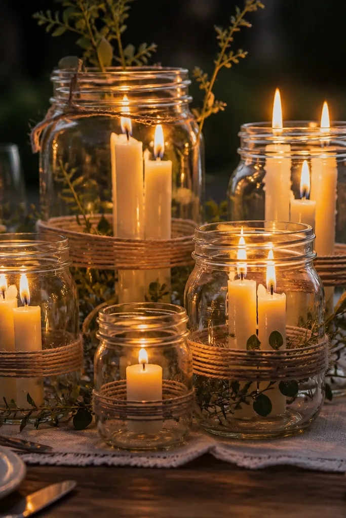
Mason jars look rustic without trying too hard, and the candle cluster makes the whole area feel intimate. Wrapping jars with twine adds texture, while greenery sprigs give color that doesn’t overwhelm. Use varying jar sizes so the cluster looks natural, not like a store display. This setup is strongest in spring and early fall nights when outdoor lighting still feels magical but the air isn’t too humid for paper and fabric details.
Start by grouping jars in clusters of 3 or 5 on a tray or runner so you can move them easily during setup. Then insert battery candles with warm light, and add a small amount of greenery tied at the jar neck. Finally, place clusters along pathways or around the head table, keeping them low so guests can see each other.
Quick tipUse warm white LEDs, not multicolor — rustic looks cheap fast when the light is wrong.
Skip thisAvoid placing candles directly on burlap without a base tray; wax or heat can stain and ruin the look.
6. Reclaimed Wood Head Table with Fabric Skirt
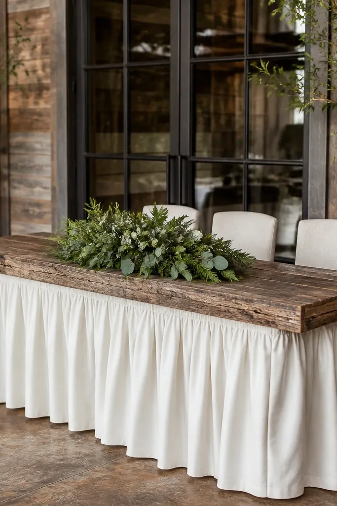
A rustic head table looks best when the “wood” is the hero and the fabric is the soft frame. Reclaimed wood planks give instant texture, and a cream fabric skirt hides chair backs and makes the whole setup look cohesive in photos. Add a single low greenery arrangement so the table doesn’t feel tall and top-heavy. This look is best in fall and winter because warm neutrals and wood tones feel cozy under candlelight.
Start by measuring your head table length and selecting a wood piece that matches, then plan a skirt length that hits just above the floor for clean lines. Next, cover the table top with a neutral runner so the wood grain shows but tableware stays tidy. Finally, place a low centerpiece no higher than 8 to 10 inches so faces stay visible in photos and the room feels open.
Quick tipChoose fabric in matte cotton or linen, not shiny satin, so candlelight doesn’t create glare.
Skip thisAvoid tall vase centerpieces at the head table; they block guests and ruin the cozy vibe.
7. Jute Bow Napkin Rings on Simple Plates
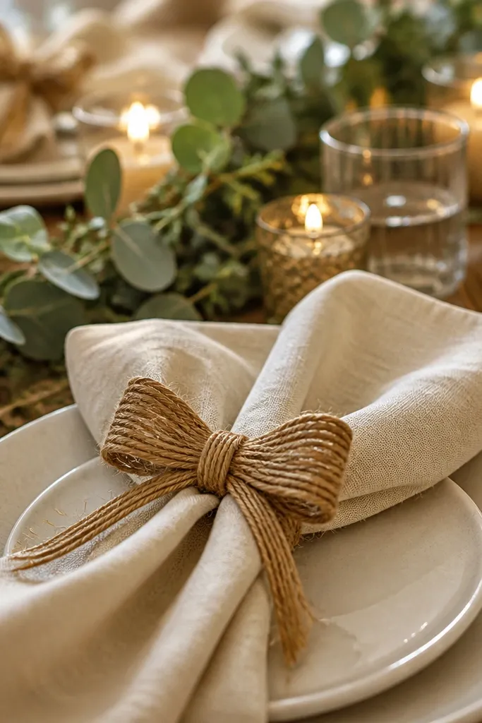
Napkin rings are a small detail that changes the entire table look, and jute bows fit rustic without overloading the table. Keep the plates plain and let the ring do the work, so the scene stays photogenic instead of cluttered. A bow size matters — too big and it looks costume-y, too small and you lose the texture. This works year-round, but it’s especially good in spring because the warm neutrals pop against fresh greenery.
Start by choosing napkin rings that hold their shape, then tie jute bows with consistent loop size around each napkin. Next, place rings on the same side orientation for every setting so photos look uniform. Finally, add one matching accent per place setting, like a small sprig tucked under the napkin or a simple name tag on a thin card.
Quick tipUse coarse jute for texture, but wrap the bow knot with a thin wire tie so it doesn’t droop.
Skip thisSkip metallic napkin rings in the same setup unless your lanterns and signage also use matching metal.
8. Antique-Style Window Frame with Hanging Dried Florals
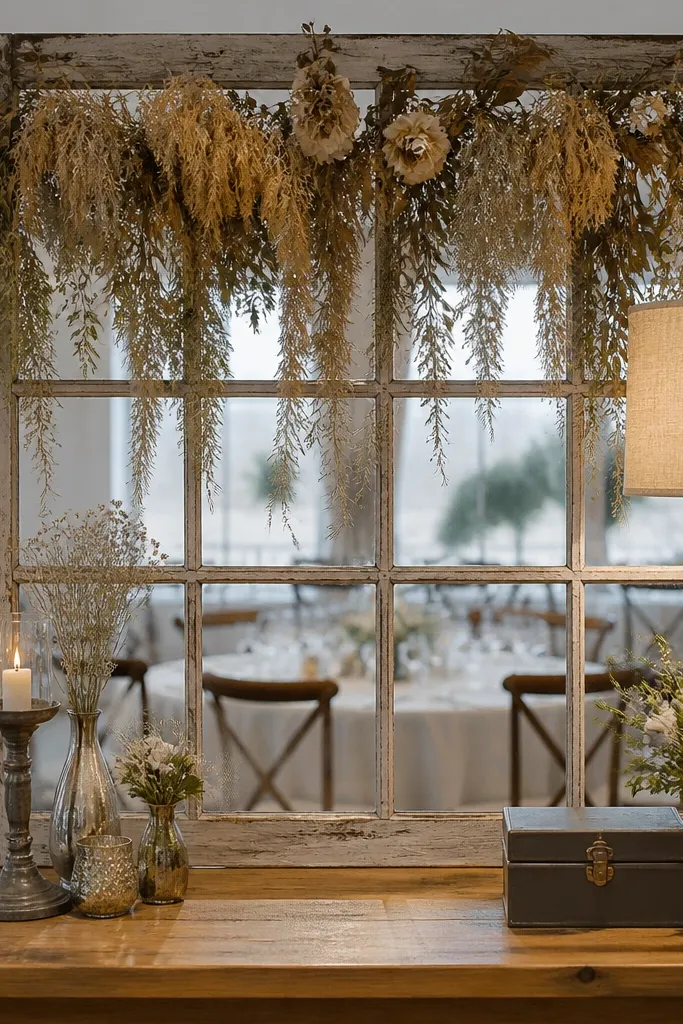
This is a rustic statement that reads like decor, not a prop. The window frame gives a built-in grid for photos, and hanging dried florals create vertical movement that fills space without needing a tall arch. Keep flowers in muted tones — oat, tan, warm gray — so the backdrop doesn’t fight with your table colors. The best time to visit wedding decor for this look is late fall and winter when dried stems are abundant and you want warm textures under softer light.
Start by choosing a frame size that matches your photo area, then hang it securely on a stand or wall with a stable base. Next, tie dried stems in small bundles and attach them at different heights using twine loops so the distribution looks intentional. Finally, place a neutral rug or runner in front so you get a clean “photo stage” line in pictures.
Add one small accent like a brass bell charm or a ribbon tag; it gives close-up detail without clutter.
Avoid mixing too many flower types; stick to two main dried textures so the backdrop looks calm.
9. Hay Bale Cocktail Nooks with Linen Covers
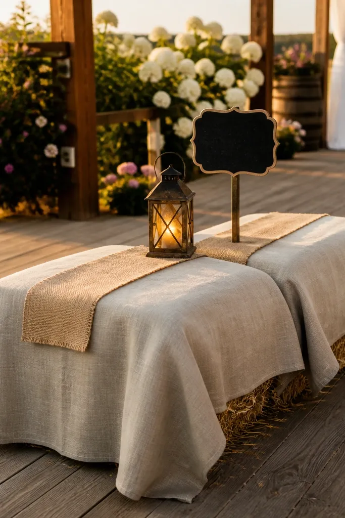
Hay bale seating is rustic in the most literal way, but it looks good only when you dress it. Cover the bales with linen or burlap so the straw doesn’t dominate, then add small lanterns and compact signage for a cozy, lived-in corner. This works especially well at outdoor venues where guests move between lawn and reception. The best time to do it is early fall when the air is crisp and straw doesn’t look dusty or dry under harsh sun.
Start by planning a seating zone that doesn’t block walkways, then cover bales with fitted fabric that tucks tight at the sides. Next, place a low lantern cluster on a tray beside the seating so photos have a warm focal point. Finally, add one sign with a short message like “Welcome” or a drink menu in a consistent font style across the event.
Use a lint roller on linen before the ceremony day; straw bits show up fast on camera.
Skip bare hay bales — they photograph yellow and make the corner look unplanned.
10. Twine-Wrapped Bottles for Table Center Heights
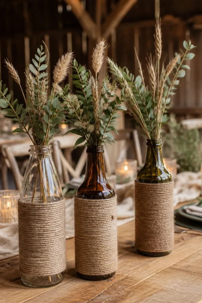
If you want rustic without the “big centerpiece tax,” twine-wrapped bottles are the answer. They give you height and texture, and you can fill them with a small amount of greenery or dried stems so the table stays light. Use bottles in 3 height levels so the arrangement has structure when photographed from the guest perspective. This look is best in fall and winter because warm browns and twine textures match the seasonal palette.
Start by selecting bottles with similar shapes so the set looks intentional, then wrap with twine in consistent rows. Next, fill each bottle with a small amount of greenery so the stems don’t spill — keep it tight. Finally, place bottles on a runner or tray so the table doesn’t look scattered, and cluster them in groups of 3 for each table.
Wrap twine tightly but stop 1 inch below the opening so it doesn’t snag when you arrange stems.
Avoid overstuffing bottles; too many stems makes rustic look messy.
11. Stoneware + Dried Flower Bud Vases on a Long Runner
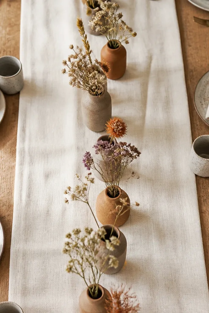
Stoneware bud vases make rustic feel grounded and expensive-looking without being fussy. The matte ceramic absorbs light, which makes dried flowers look softer and more natural. A long runner with a repeating vase pattern gives you that calm, intentional photo look. For the best time to visit wedding decor, plan for fall or winter, when dried florals are easiest to source and the warm tones read cozy under evening lighting.
Start by choosing a runner color that matches your stoneware — oat, cream, or muted beige works well. Next, set out vases in a repeat pattern with one “hero” color accent in every 4 to 5 vases. Finally, place your tallest vases at the ends and keep the middle slightly lower so the center of the table stays readable in photos.
Quick tipUse dried flowers with similar head sizes; mixed sizes look random unless you style them deliberately.
Skip thisSkip glossy ceramic — it reflects candlelight and flattens the rustic mood.
12. Cedar Arch with Dried Greenery Garland
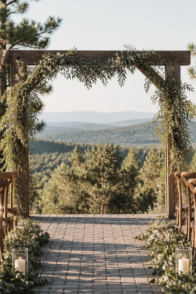
A cedar arch gives you rustic structure without making the ceremony look heavy. Pair it with a dried greenery garland so it reads natural and doesn’t fight wind like fresh might. The arch frames the couple and becomes the main focal point, which is exactly what you want for a cozy celebration. The best time to use this look is fall and early winter because cedar tones and dried textures match the season’s warm light and cooler air.
Start by choosing an arch width that matches your seating area, then anchor the garland at the top center and work down evenly. Next, keep the garland thickness consistent — you want a smooth, full line, not clumps. Finally, add two small lanterns at the base corners for a photo-friendly glow when the ceremony runs into dusk.
Quick tipAsk the rental company if the arch includes weights for outdoor setups; wind is the enemy of arches.
Skip thisAvoid mixing shiny ornaments on a cedar arch; it makes the whole frame look less rustic.
13. Rustic Table Number Frames on Wood Slats
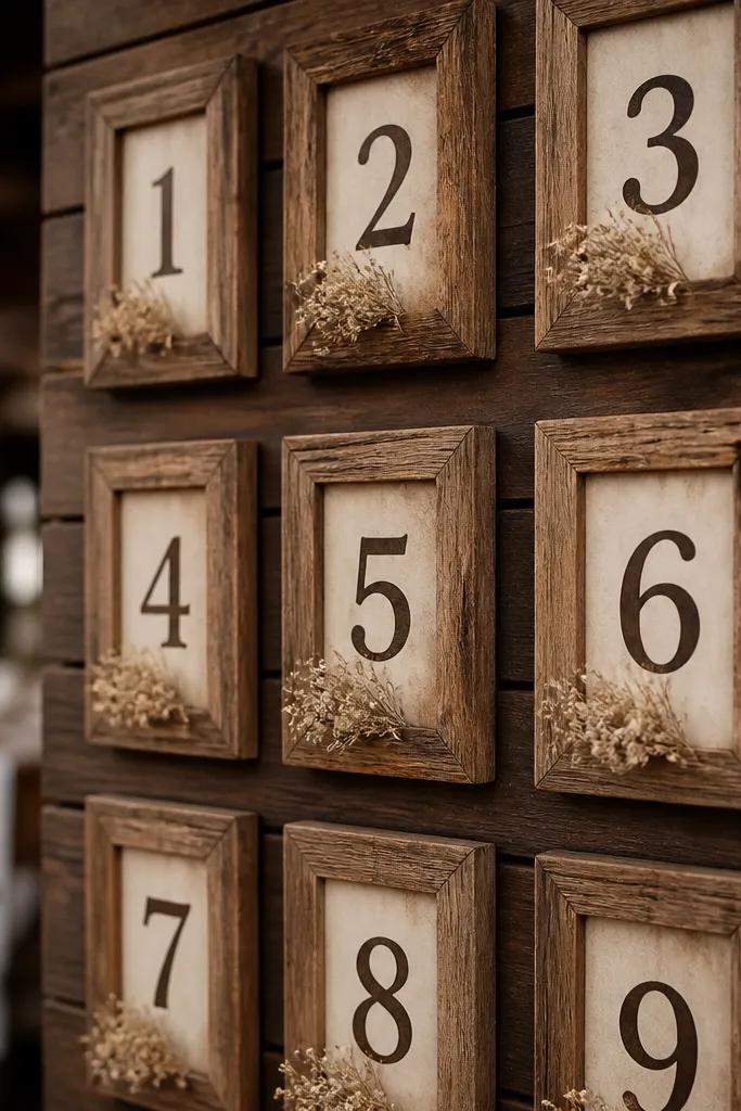
Table numbers are practical, but they’re also one of the most photographed small details during reception. Wood slats with simple frames look cohesive with rustic decor and keep the numbers readable without standing out too loudly. Use dark brown or black numbers for contrast, and add a tiny dried sprig at each frame for texture. This idea shines in winter because warm wood and dark type look crisp against neutral linens.
Start by selecting slats that are flat and sturdy, then paint or stain them in a consistent tone across all tables. Next, mount numbers in frames or directly on the slat using adhesive that won’t warp the surface. Finally, place frames on the end of each table or near the center runner so photographers can capture them without rearranging decor.
Keep number size consistent across tables so guests don’t squint in photos and in person.
Skip tiny table numbers on busy runners; the text gets lost.
14. Linen-Covered Cake Stand with Dried Stem Swag
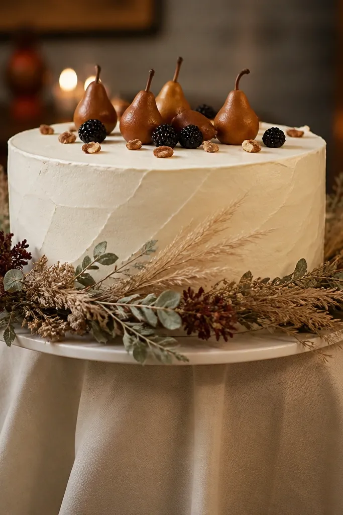
A rustic cake area looks best when it’s soft around the edges and structured at the center. Linen on the cake stand hides visual clutter and adds that cozy fabric texture, while a dried stem swag gives a natural frame to the cake without blocking it. Keep the swag low so it doesn’t interfere with cake cutting photos. This is a fall and winter win because dried tones match the warm palette and look good under candle or lantern light.
Start by covering the base of the cake stand with linen in a way that drapes smoothly, not bunched. Next, attach a small dried stem cluster to the top edge using twine or floral wire so it stays in place. Finally, add one matching element nearby, like a mini lantern or a simple sign, so the cake photo has a complete scene.
Choose linen in cream or oat and keep it matte so light doesn’t glare.
Avoid tall dried arrangements that reach above the cake — they steal attention.
15. Rustic Seating Place Cards with Chalkboard Tags
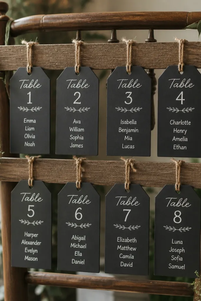
Chalkboard tags add a handwritten feel to seating without making the whole room look like a school project. The key is restraint: keep the layout clean and use one consistent chalk color like white or light gray. Tie tags with twine to a small wood slat or chair back so they look integrated, not taped on. This look works best in spring and early fall because chalk reads well under mixed indoor-outdoor lighting and you’re less likely to deal with wet weather ruining paper signage.
Start by selecting chalkboard tags sized so names are readable at arm’s length, then write with a chalk marker for consistent lines. Next, attach each tag to a chair back using twine loops and keep the tag orientation the same for every seat. Finally, place your seating sign table near the entrance so guests find it quickly and you keep the photo zone uncluttered.
Quick tipUse a chalk marker instead of chalk dust — it stays cleaner and looks sharper in close photos.
Skip thisSkip neon chalk or bright colored markers; rustic needs muted contrast.
16. Dried Floral Table Runner with One Brass Candle Row
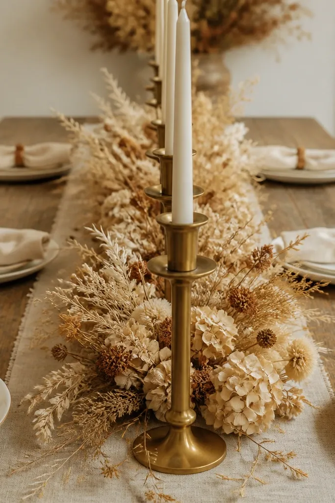
This is for people who want rustic to feel designed, not random. A dried floral runner gives you the organic texture, while a straight row of brass candle holders adds order and makes the table look intentional in every photo angle. Choose brass with a brushed finish so it looks warm, not shiny. The best time to plan this is winter and late fall because the candlelight glow and dried textures match the darker evenings.
Start by laying the dried floral runner centered and trimming stems so the runner stays low and tidy. Next, place brass candle holders in a straight line with equal spacing, then light them with warm LEDs or real candles if the venue allows. Finally, keep tableware simple and neutral so the brass and dried flowers stay the focus.
Photograph the table from the guest’s seat height; if candles block the runner too much, lower the candle holders.
17. Overgrown Greenery Bar Backdrop with Jute Fringe
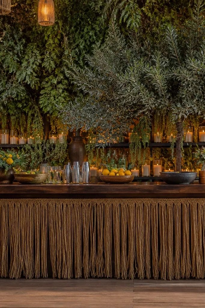
A bar area can look bland fast, so give it a rustic “garden” moment. Overgrown greenery behind the bar creates depth, and jute fringe at the lower edge ties it back to the rest of the event. Keep greenery mixed but muted, like olive and sage, so it doesn’t look like a neon set. This is best in spring and early fall when venues handle fresh greenery well and the color reads fresh without going overly bright.
Start by installing a simple backing panel or using a freestanding frame, then anchor greenery in sections to avoid bald spots. Next, add jute fringe along the bottom edge in a single straight line so the look stays structured. Finally, place your menu sign slightly above the fringe line so it’s readable and doesn’t get swallowed by greenery.
Quick tipUse a matte menu board, not glossy acrylic; glare kills readability in photos.
Skip thisAvoid bright red flowers in the bar backdrop unless your entire palette has the same red.
18. Rustic Welcome Sign on a Ladder with Dried Leaves
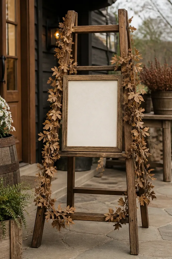
A ladder welcome sign is rustic with instant height, which helps it photograph well near entrances. Add dried leaf garlands to connect the sign to the rest of your decor, and keep the text simple and readable. The ladder’s shape creates a natural frame, so you don’t need extra decorations around it. This works best in fall because dried leaves look like they belong in the season, and the warm palette stays cohesive with your tables and florals.
Start by choosing a ladder with stable feet and a height that matches your entry space so it doesn’t block guest flow. Next, attach a sign board across the ladder with brackets or strong ties, then wrap a small dried leaf garland around the sign edges. Finally, position it where your photographers stand for arrival shots — near the path but not in the middle.
Quick tipUse dark lettering on a light board so it stays readable in late-day photos.
Skip thisSkip overly busy lettering and tiny fonts — it looks cute up close and fails from 10 feet away.
19. Wood Plank + Twine Seating Chart Display
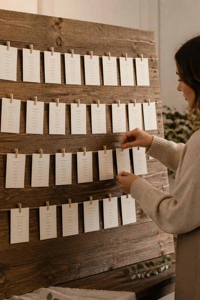
A seating chart can be rustic and clean if you use wood planks and twine lines. The wood gives a solid base, and twine lets you create neat rows for each table or section. Use small cards for names and table numbers so guests can scan quickly. This look is strongest in winter and early spring because the neutral wood and twine stay consistent even when venues have mixed lighting.
Start by measuring the display space and building a grid on the plank with evenly spaced twine lines. Next, hang cards on the twine using small clips or loops so you can adjust if seating changes. Finally, place the display near the guest arrival area and add one small directional sign so people don’t wander into your ceremony path.
Quick tipLabel tables with large numbers on the top row so photographers can capture it clearly in one frame.
Skip thisAvoid paper-only seating charts without a backing; they curl and look sloppy by the time guests arrive.
20. Dark Denim Table Overlay with Leather Coasters
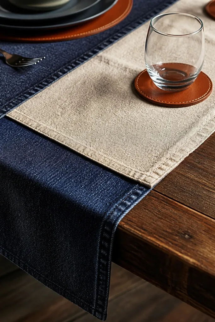
This is rustic with an edge, and it photographs insanely well because denim adds strong texture and depth. Lay a dark denim overlay under your runner so the whole table looks grounded, then add leather coasters or small leather details to keep the palette consistent. Keep the rest neutral: cream linens, warm wood utensils, and simple center pieces. The best time to plan this look is fall and winter when deep fabrics feel cozy and guests are dressed for darker tones.
Start by selecting denim that has a matte finish and lays flat without heavy stretch, then center it on your table. Next, place a lighter runner on top in cream or oat so the denim shows around the edges in a clean border. Finally, add leather coasters in a consistent placement pattern and keep candles low so the table doesn’t look cluttered.
Brush off lint before setup; dark fabric shows dust and it reads badly in flash photos.
Avoid mixing denim with bright patterned linens; keep textures intentional and muted.



