
1. Oatmeal + Espresso + Burnt Orange
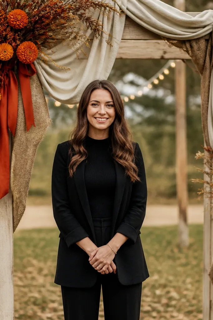
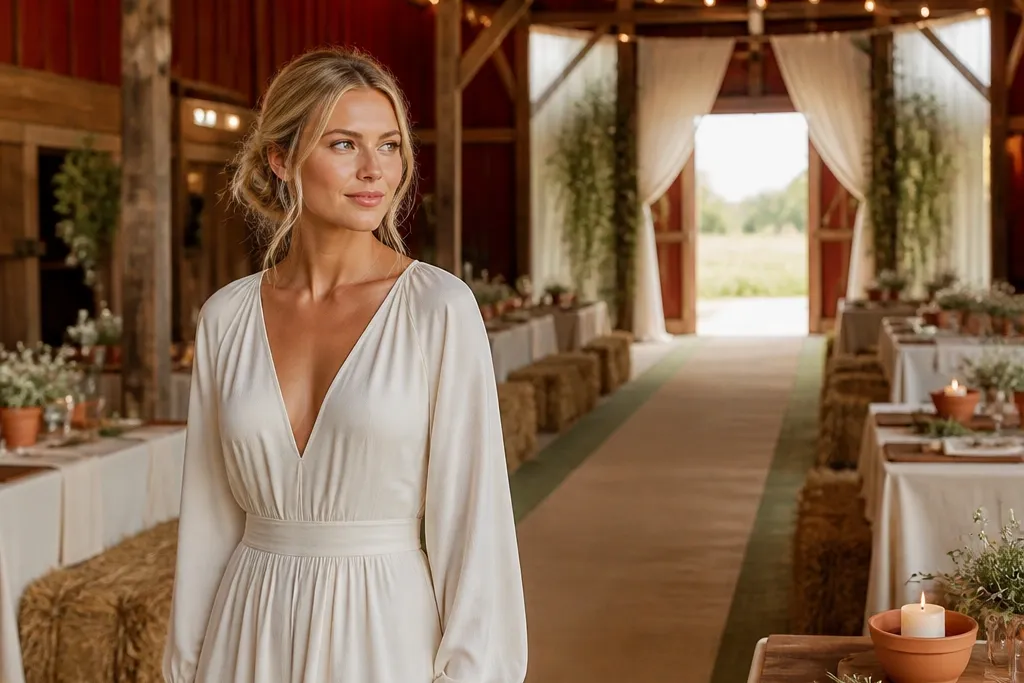
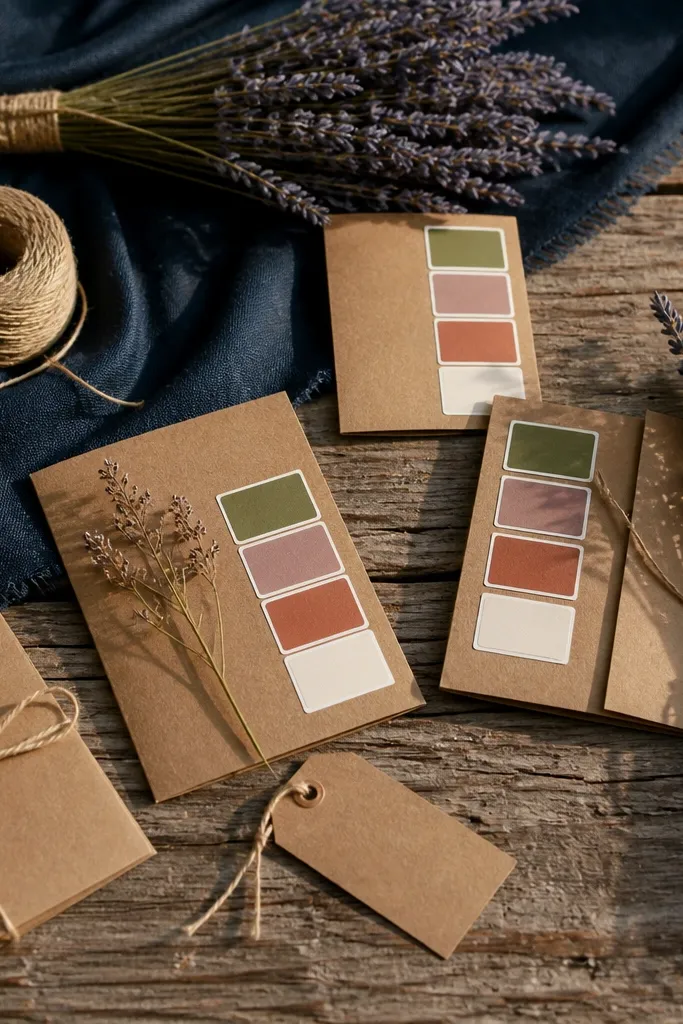
This palette photographs like a fall editorial because the light oatmeal keeps everything airy, while espresso grounds the scene. Burnt orange reads warm and rustic without needing bright, neon colors that clash with barn lighting. It fits outdoor ceremonies with wood beams, hay bales, and string lights. If you want “cozy but not sad,” this is the combo because the orange adds energy without turning the whole wedding into Halloween.
Start by choosing oatmeal as your base for tablecloths or a rental runner. Then set espresso as your anchor through wood signage, dark candles, or espresso-toned frames. Finally, add burnt orange only in florals and one small element like napkin rings or a ribbon on the aisle runner. For budget control, keep the orange limited to 20-30% of the visible decor so it stays intentional in photos.
Buy candles and frames in espresso tones early — you can reuse them across multiple decor setups.
Don’t add bright tangerine — it makes the orange look cheap and mismatched next to espresso.
2. Cream + Pine Green + Gold Leaf
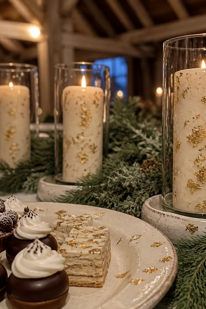
Cream and pine green are a rustic classic because warm light makes pine look deep instead of flat. Gold leaf details add a little shine that shows up beautifully in close-up photos without needing expensive metallics everywhere. This scheme works year-round, but it’s especially strong for winter and early spring when greenery looks crisp. It suits venues with evergreen trees, fireplaces, or any space that already has wood and stone.
Quick tipTake one thrifted frame and test gold spray on a hidden corner before you do the full set.
Start with cream as the backdrop fabric or table linens. Then use pine green through real greenery (garlands, eucalyptus-like branches, or pine sprigs) and ribbon. Finally, add gold leaf via spray paint for thrifted frames or gold-painted candle holders. Keep the gold to small highlights so it reads like intentional styling, not costume jewelry.
Skip thisAvoid mixing pine green with icy silver — it cools the palette and kills the rustic warmth.
3. Dusty Sage + Blush Rose + Oat Milk
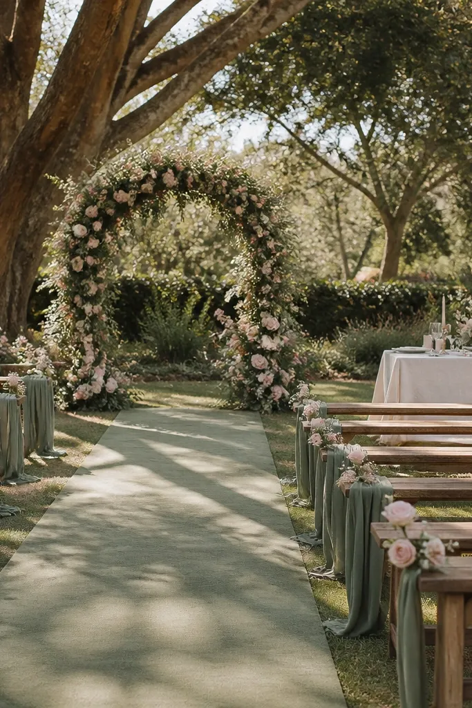
Dusty sage and blush rose look soft, romantic, and still rustic because sage is muted and organic. Oat milk ties it together and keeps the overall look light, which matters for daylight ceremonies. This works best for spring, early summer, and garden venues where you want the decor to feel like it belongs outdoors. It’s a good pick if you’re worried rustic palettes will look too dark.
Start with oat milk linens or a neutral runner as your base. Then choose sage as your greenery and signage color — paint wood signs sage or use sage ribbon in your aisle decor. Finally, add blush rose only through florals or napkins so it doesn’t overpower the greenery. For savings, use bulk dried sage-toned foliage and add a smaller number of blush blooms for contrast.
Match your blush to the undertone of your roses — look for more dusty pink than hot pink for better photos.
Don’t add bright white lace — it makes blush look pinker and sage look gray.
4. Terracotta + Natural Jute + Cream
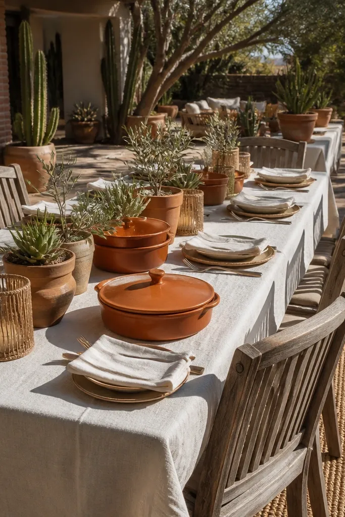
Terracotta is one of the most photogenic rustic colors because it warms skin tones and shows texture in wood and stone venues. Natural jute keeps the palette grounded and cheap-looking decor becomes a style choice. Cream prevents the terracotta from turning heavy. This scheme is perfect for desert-luxe backyards, patios, and farmhouses with lots of natural surfaces.
Quick tipBuy jute in bulk online and cut it to consistent lengths for faster setup and cleaner photos.
Start with cream tablecloths or napkins so your base stays bright. Then use terracotta for terracotta pots, ribbon, or painted wooden letters. Finally, bring jute in through runners, chair ties, and small wrapped bundles for centerpieces. Keep terracotta to one or two focal areas per table so photos don’t look like a craft fair.
Skip thisSkip deep red with terracotta unless you’re using cream to separate them — otherwise it reads muddy.
5. Rust + Charcoal + Warm Ivory
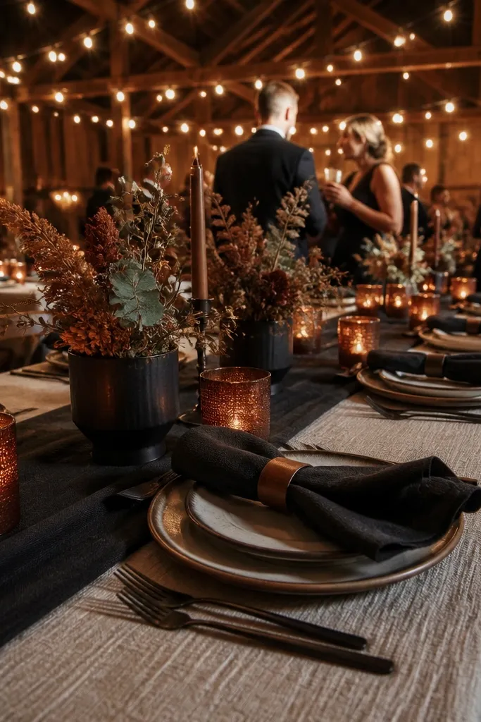
Rust and charcoal is a strong rustic combo because charcoal gives structure and rust gives warmth. Warm ivory keeps it from feeling gothic. This palette is great for evening receptions under string lights where charcoal makes the lights pop. It’s also a smart choice if your venue has darker walls or a barn interior that could swallow lighter colors.
Start by using warm ivory as the main linen color and for signage backgrounds. Then add charcoal through candle holders, table number frames, and dark ribbon. Finally, use rust blooms and dried leaves for texture — think marigold-toned petals and eucalyptus-like shapes. For budget savings, use one rust floral type per arrangement and let dried filler do the rest.
Choose charcoal accents that are matte, not shiny, so they don’t look like plastic in photos.
Don’t add pure black — charcoal is softer and reads more rustic under warm lighting.
6. Moss Green + Oatmeal + Antique Brass
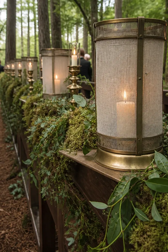
Moss green is the “I want rustic but not fall” answer. It looks natural in photos because it blends with wood and greenery without needing bright flowers. Oatmeal adds warmth, and antique brass gives that subtle glow when candles catch it. This palette suits woodland venues, garden ceremonies, and any space with lots of plants already around you.
Start with oatmeal for table linens and chair ties — you want a creamy neutral, not gray. Then build the moss look with greenery-heavy centerpieces and mossy garlands. Finally, add antique brass through thrifted frames, brass-toned votives, or brass spray paint on small decor. Keep brass to small touchpoints like 5-10% of the visible items so it reads aged, not shiny.
If you’re renting, request “antique gold” rather than “bright gold” — it photographs more rustic.
Don’t pair moss green with bright cobalt blue — it clashes hard under warm venue light.
7. Dusty Plum + Cream + Walnut Brown
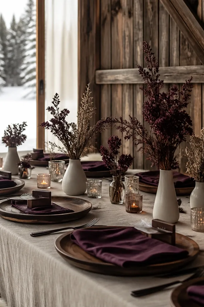
Dusty plum makes rustic decor look richer without going full jewel-toned drama. Cream and walnut brown keep it warm and grounded. This palette is especially good for late fall, winter, and venues with dark wood tables or heavy beams. It also photographs well for portraits because plum adds depth without looking neon.
Start with cream as your linen and backdrop base. Then choose walnut brown for your wood signage, menu boards, and picture frames. Finally, add dusty plum through florals like dahlias, plum-toned berries, or dried thistle-like textures. To keep it cheap, use plum mainly as accent blossoms and lean on dried greenery to fill space.
Bring one sample napkin in cream and plum to your venue — check how it looks under the room lighting before ordering bulk flowers.
Avoid pairing dusty plum with cool gray fabric — the combination turns flat in photos.
8. Sand Beige + Olive + Chocolate
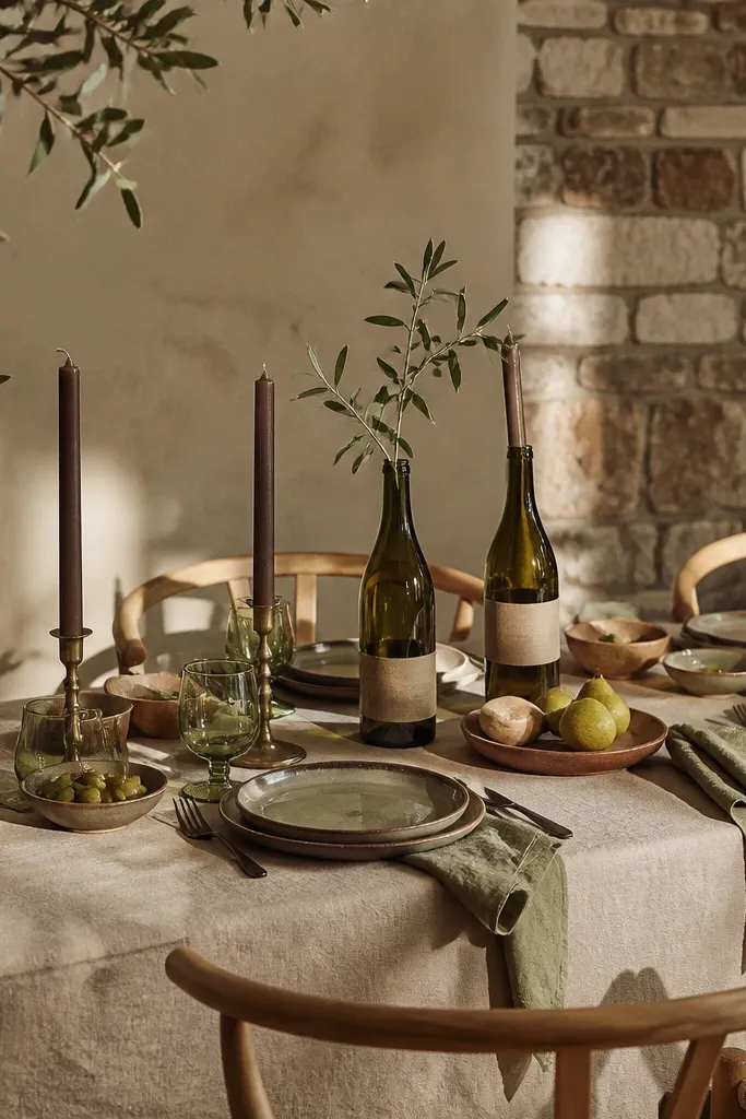
This palette looks like a relaxed countryside dinner. Sand beige keeps it bright, olive adds a natural earthy tone, and chocolate makes it feel intentional and photo-ready. It works for rustic venues that already have neutral stone or tan walls. If you want guests to look like they belong in the setting, this scheme does that because it blends with the environment.
Start with sand beige linens or a neutral table runner. Then use olive through greenery, ribbon, and maybe olive-toned napkins. Finally, anchor with chocolate via candle holders, wood chargers, or dark signage lettering. Keep the chocolate consistent across tables so you get that “designed” feel even with cheap centerpieces.
Use olive ribbon as a tie for multiple items — it’s the easiest way to repeat color without buying new decor.
Don’t add bright yellow flowers — they overpower the olive and make the palette look accidental.
9. Cinnamon + Oat Milk + Soft Black
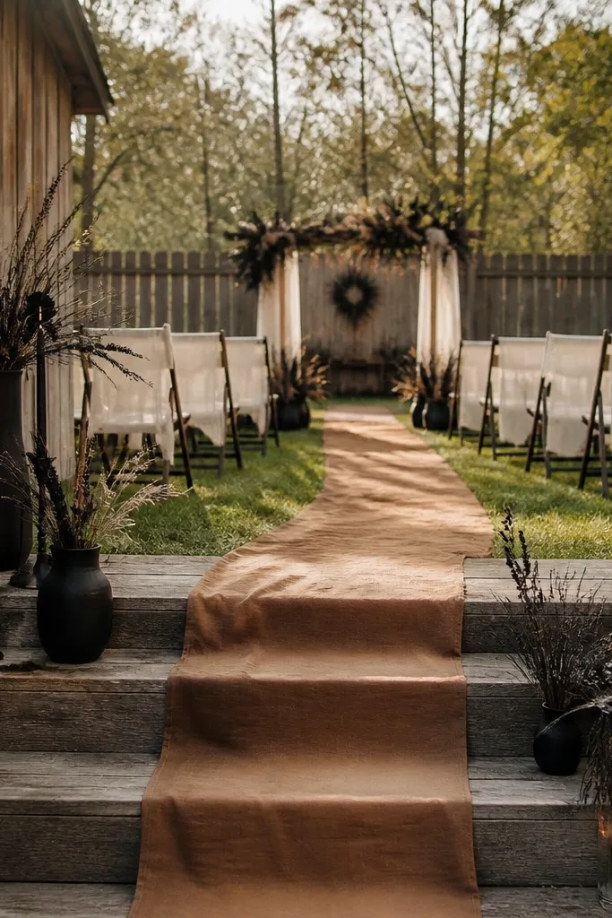
Cinnamon reads warm and cozy, and it’s a great alternative to rust if you want a slightly lighter, more casual feel. Oat milk keeps everything clean and photo-friendly, while soft black adds contrast without going harsh. This palette looks especially good in barns with warm interior lighting and in backyard weddings with lots of wood furniture. It’s also forgiving if your venue has beige walls.
Start with oat milk linens and keep your signage background light. Then use cinnamon in florals and dried elements like cinnamon-colored straw or pods (where appropriate). Finally, use soft black for table numbers, menu text, and candle wicks. For budget, print table numbers on thick paper and mount them on scrap wood painted matte black.
Use matte finishes for black items; glossy black looks slick and cheap in rustic settings.
Skip grayish “taupe” for the base — it dulls cinnamon and makes photos look flat.
10. Red Clay + Cream + Weathered Wood
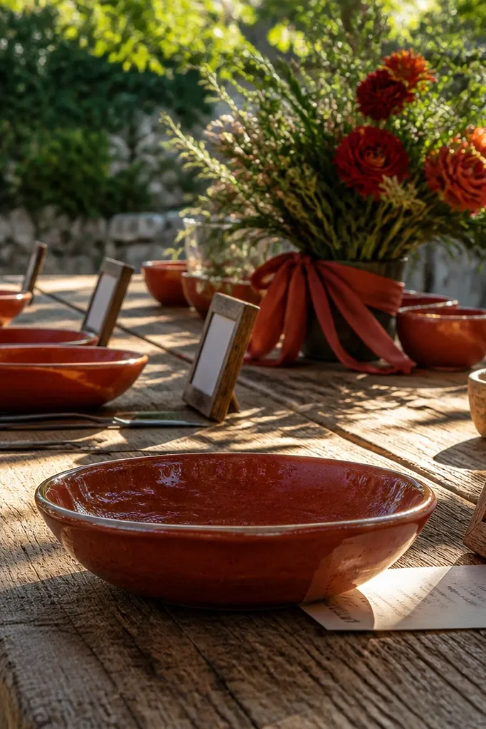
Red clay is bold, warm, and naturally rustic because it matches the color of pottery and old brick. Cream keeps it from getting heavy, and weathered wood gives texture that looks great in photos. This scheme works best at venues with brick fireplaces, clay tile, or outdoor patios with sun and shade. It’s also a strong choice for daytime weddings where you want the colors to hold up against bright light.
Start with cream tablecloths or a cream runner on tables. Then choose red clay accents through terracotta planters, ribbon, and flower petals that lean red-orange rather than pure red. Finally, add weathered wood through cutouts, signage, and simple wooden trays for place cards. Keep the red clay consistent across the event by using it in at least three visible zones: ceremony backdrop, centerpieces, and signage.
If you’re using terracotta planters, spray them with a matte sealer so they don’t look dusty in photos.
Don’t pair red clay with icy white and chrome — it looks modern and mismatched.
11. Charcoal + Ecru + Dried Pampas Feathers
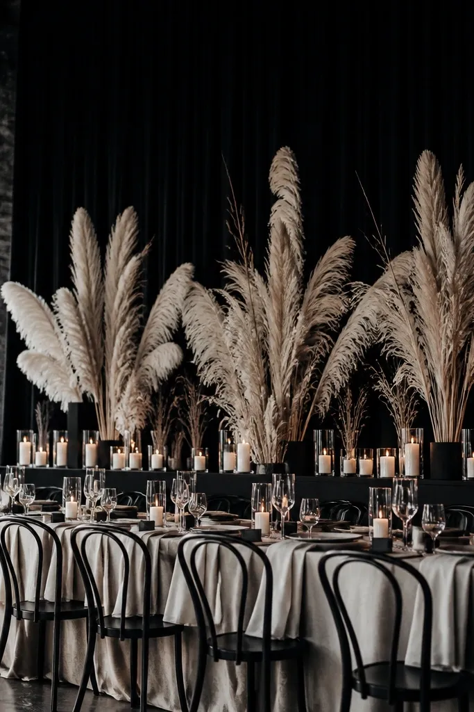
This palette is dramatic without needing fancy florals. Ecru gives softness, charcoal provides contrast, and dried pampas adds height that photographs beautifully behind guests. It suits minimalist rustic venues — think modern barns, warehouse-style spaces with wood beams, or outdoor ceremonies with a simple backdrop. If you want “clean rustic” instead of “farmhouse busy,” this is the move.
Start with ecru linens and neutral napkins so the dried textures stand out. Then use charcoal for table number frames, candle holders, and tie ribbons. Finally, add pampas plumes in tall bunches for a few statement arrangements rather than filling every table. Budget trick: buy pampas in bulk and trim them to consistent lengths for a uniform look.
Tie pampas into bundles with jute and then wrap the stems — it hides the mechanics and looks intentional.
Skip bright white centerpieces here — it clashes with ecru and makes the pampas look yellow.
12. Chai Brown + Cream + Terracotta Rose
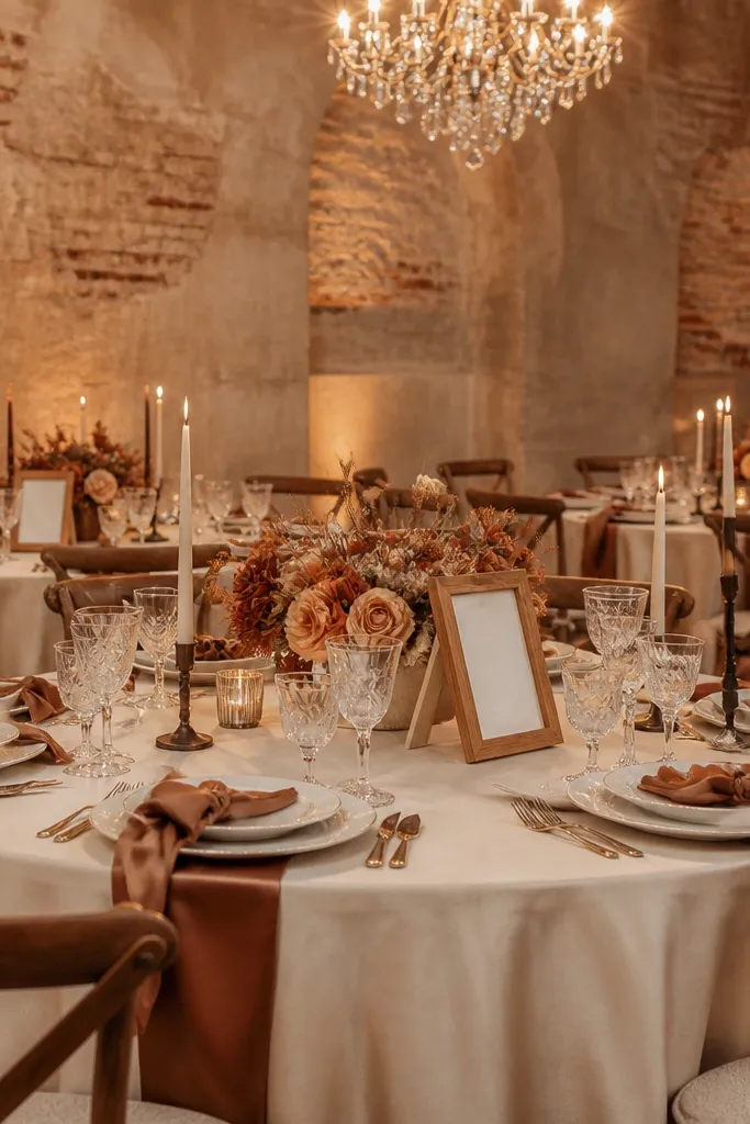
Chai brown is a softer alternative to espresso. It reads warm, almost caramel, and it pairs beautifully with cream for a cozy rustic look. Terracotta rose adds a romantic tint that looks good in both daylight and evening photos. This scheme works for indoor venues with warm walls and for outdoor weddings where the setting is more minimal. It’s a good choice if you want rustic without heavy greens.
Start with cream linens and keep your backdrop light. Then choose chai brown for wood accents, candle holders, and the base color of signage. Finally, bring in terracotta rose through florals and a small ribbon accent so the color repeats. To keep it cheap, use a mix of fresh blooms for the top layer and dried foliage below so arrangements look full without expensive flower volume.
Use warm-toned chargers or placemats — they make chai brown feel intentional instead of random.
Don’t add cool taupe decor — it makes chai brown look dirty.
13. Sage + Wheat Gold + Ivory Crochet
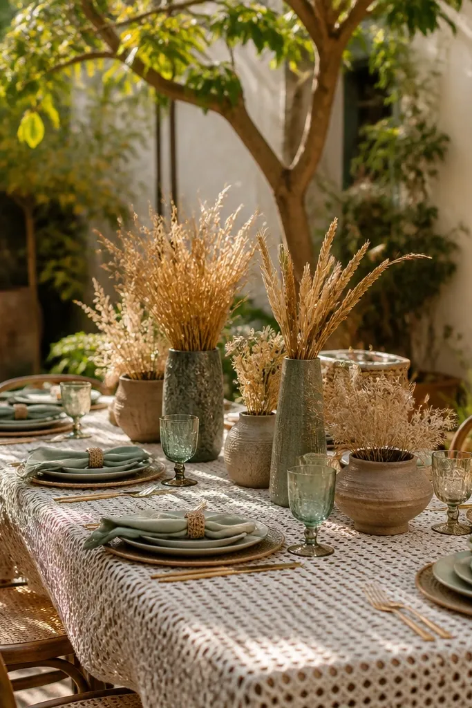
Sage and wheat gold feels like late summer in photos. Ivory crochet adds a handmade texture that looks expensive even when you rent or thrift the fabric. This palette is perfect for garden weddings, open-air patios, and rustic venues with lots of natural light. The wheat gold reads warm and bright without being neon, so it works for daytime ceremonies and golden hour portraits.
Start with sage greenery as the dominant element — garlands and center fillers. Then use ivory crochet fabric for runners or small table overlays where it’s visible in photos. Finally, add wheat gold through dried wheat stems, gold-toned candle holders, or fabric ribbon. For savings, focus crochet on the tables you’ll photograph most — entry table, sweetheart table, and a couple of guest tables.
Steam crochet lightly before setting — wrinkles show up fast in close-up wedding photos.
Avoid mixing sage with bright teal — it pulls the palette away from rustic warmth.
14. Evergreen + Cranberry + Creamy Burlap
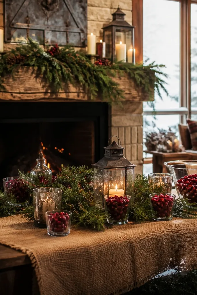
This is the winter rustic palette that looks instantly festive without looking like a holiday party. Evergreen brings depth and structure, cranberry adds a clear pop that shows in both indoor and outdoor light, and creamy burlap gives that tactile farmhouse feel. It’s best for December through February weddings, especially with fireplaces, pine trees, or snow-dusted outdoor photos. If your venue is dark, this palette helps it feel cozy instead of gloomy.
Start with creamy burlap runners or burlap overlays on tables. Then build evergreen garlands for ceremony backdrops and aisle decor — keep it high-impact and concentrated. Finally, add cranberry through berries, ribbon, or small clusters in centerpieces. Budget move: use faux evergreen only for the backdrop if real greenery is too costly, but keep cranberry accents real for better color depth.
Hang garlands with zip ties behind the scenes so the front stays clean for photos.
Don’t go with bright red — cranberry looks more vintage and works better with burlap.
15. Black Tea + Tan Linen + Burnished Gold
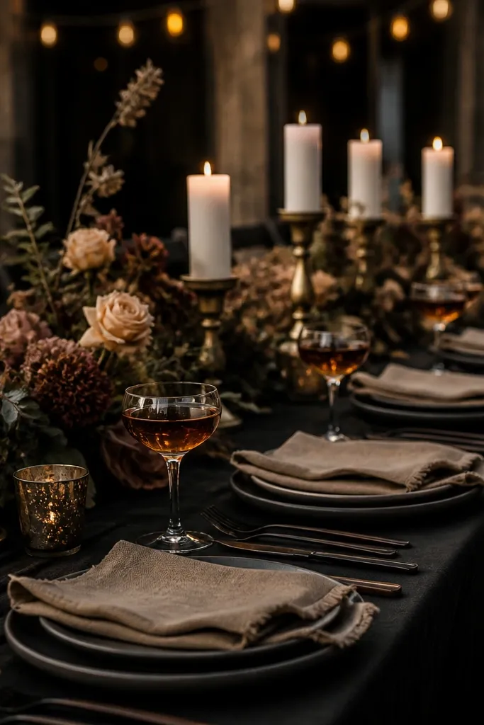
Black tea color is a smoky brown-black that looks luxe on rustic tables. Tan linen keeps it warm and breathable, and burnished gold adds a soft glow that doesn’t look flashy. This palette is great for evening weddings where you want contrast and moody photos without going fully black and white. It also works in venues with exposed brick or dark wood beams.
Start with tan linen — choose a matte fabric so it doesn’t look shiny under lights. Then use black tea tones for signage lettering, candle holders, and dark ribbon. Finally, add burnished gold via small metallic details like gold-painted twine ends, thrifted frames, or gold leaf on place cards. Keep the number of metallic items low; repeat the gold in three places maximum for a clean, expensive look.
Use dark ink pens for menus and place cards; printed black can look too stark in warm lighting.
Skip bright white — it makes tan look yellow and the whole palette look off.
16. Oyster White + Driftwood Gray + Sea Glass Green
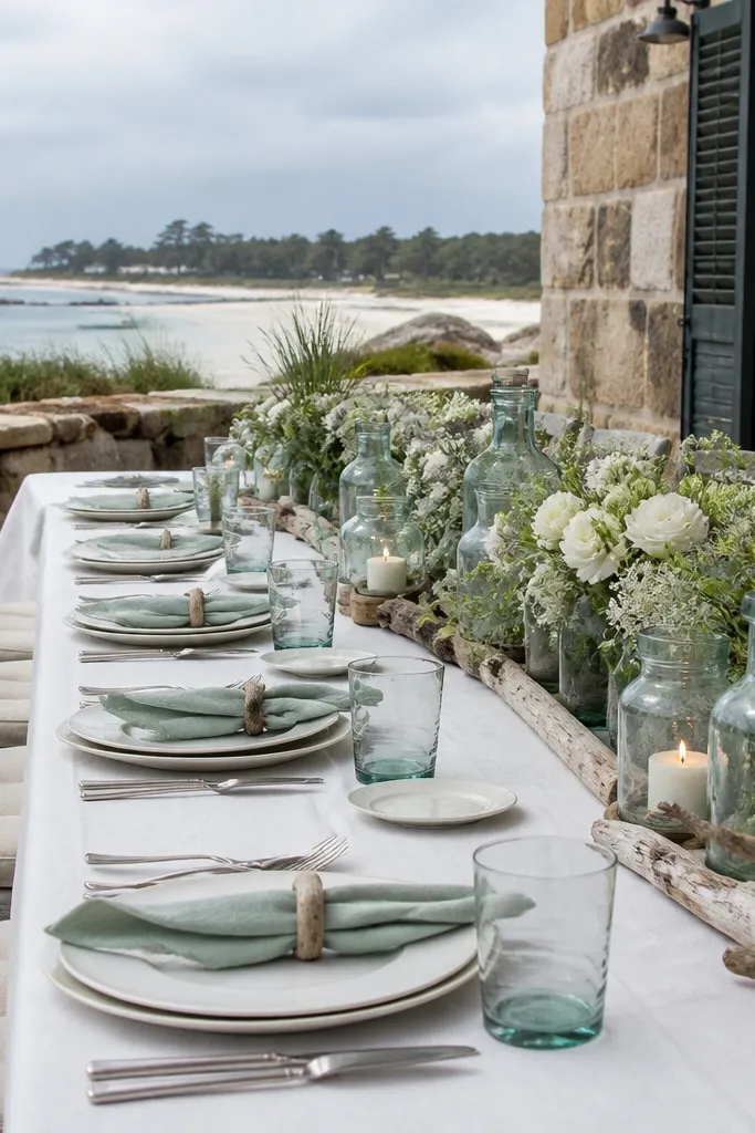
This palette is coastal rustic, but it still reads “wedding” and not beach-party. Oyster white is softer than pure white, driftwood gray adds weathered texture, and sea glass green gives a fresh pop that looks great in outdoor photos near water, sand, or light stone. It suits spring and summer, especially if your venue has outdoor paths, wooden fences, or coastal decor already. It’s a good option when you want rustic but your flowers are seasonal and not fall-heavy.
Quick tipChoose driftwood gray with a warm undertone — blue-gray makes it look cold next to oyster white.
Start with oyster white linens and napkins as your base. Then add driftwood gray through signage boards, candle holders, or painted wood centerpieces. Finally, use sea glass green in small accents like small blooms, ribbon, or a few greenery sprigs so the green doesn’t take over. For cheap wins, buy sea glass-toned fabric ribbon and use it for aisle markers and napkin ties.
Skip thisDon’t add bright ocean blue — it ruins the weathered, sea-glass look.
17. Pale Sage + Honey Yellow + Cream Canvas
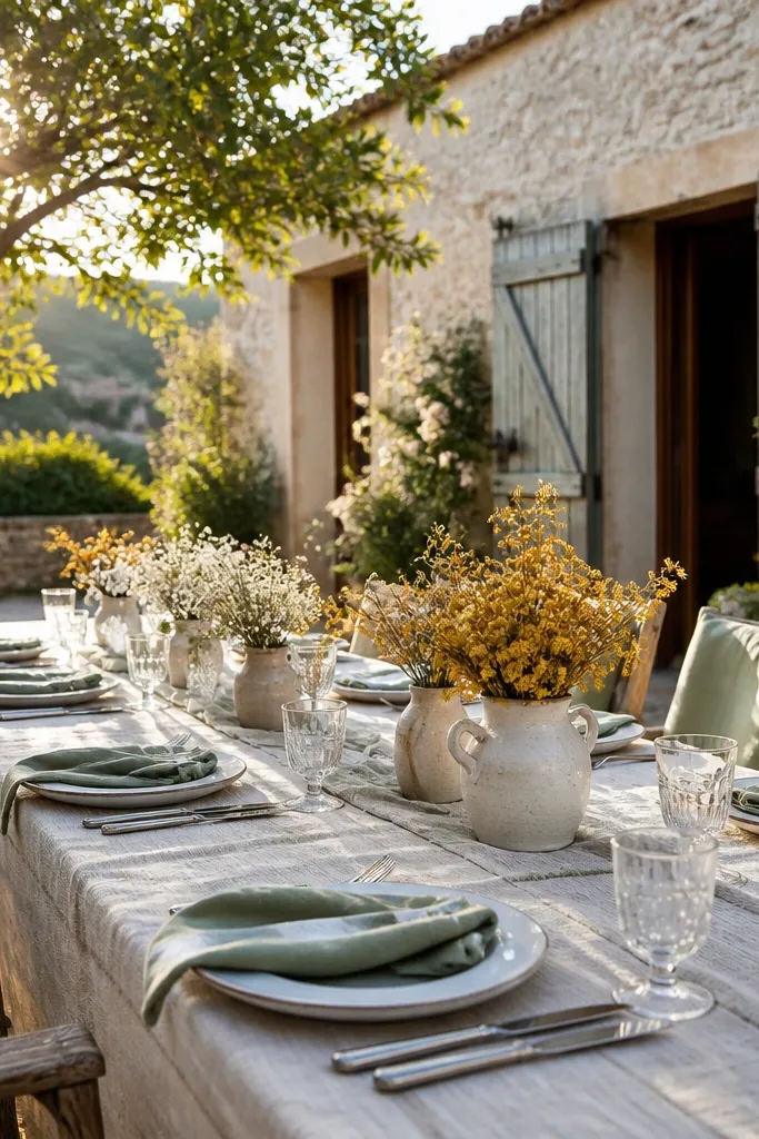
Honey yellow is flattering in photos and reads rustic when it’s muted and warm instead of buttery-bright. Pale sage keeps the palette earthy, and cream canvas adds texture that looks great in sunlight. This scheme works for late spring through early fall, especially in farmhouses and outdoor courtyards. It’s a smart choice if you want light colors but still want a clear rustic vibe.
Start with cream canvas table runners or heavy cream linen if canvas is too expensive. Then use pale sage as your greenery and signage color. Finally, add honey yellow through florals like sunflowers in small doses or dried marigold-like blooms. Budget control is simple here: honey yellow only needs to appear in 1-2 focal arrangements per table group and in bouquet ribbons.
Use canvas or heavy linen on the tables that show in your ceremony photos — it makes every centerpiece look richer.
Avoid neon yellow — it looks like party decor and won’t blend with sage.
18. Ivory Lace + Forest Green + Espresso Accents
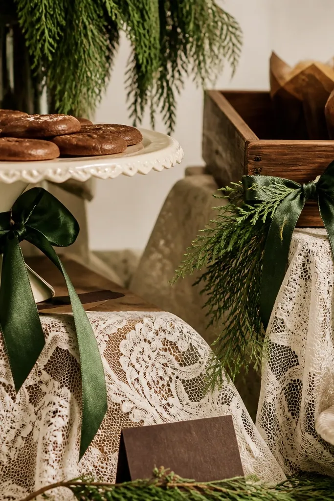
Forest green brings depth and drama, while ivory lace adds softness and a handmade feel. Espresso accents keep it grounded and help it read cohesive in photos. This palette works for both indoor and outdoor rustic venues, especially when you want a romantic look without going all blush and beige. It’s also great if your venue has dark wood furniture because forest green and espresso match that tone.
Start with ivory lace overlays on tables or the sweetheart area. Then use forest green through garlands, greenery walls, and ribbon ties. Finally, add espresso through candle holders, frame colors, and table number bases. For budget, use lace in strategic areas (sweetheart table, cake table, and aisle runner) instead of covering every inch.
If lace is wrinkled, press it with steam and a pressing cloth so it doesn’t get shiny in photos.
Don’t mix forest green with cool silver — the lace turns stark and the palette loses warmth.
19. Antique Rose + Olive Drab + Cream
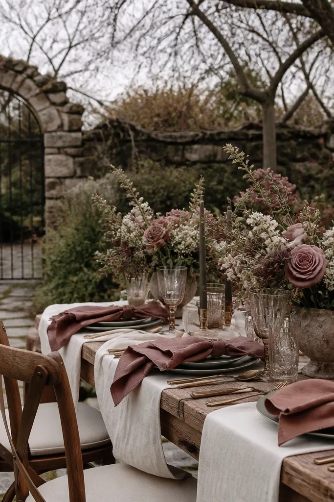
Antique rose is muted and vintage, which makes it perfect for rustic weddings where bright pinks look out of place. Olive drab adds a military-meets-farmhouse vibe that looks intentional, not random. Cream ties it all together and keeps the palette from feeling too heavy. This scheme suits fall and early winter, especially if your venue has dark wood and neutral walls.
Quick tipMatch antique rose to your venue lighting by checking a test photo on your phone under the same light you’ll use for the ceremony.
Start with cream linens and keep your signage light. Then use olive drab greenery and ribbon as the main “green” tone. Finally, add antique rose in the florals and a small accent like napkin rings. To save money, reduce the number of fresh blooms and use dried rose-toned accents where you can — the muted color still reads well in photos.
Skip thisAvoid mixing antique rose with hot magenta — it makes the whole palette look cheap.
20. Cedar + Milky White + Black Walnut Wedding Palette
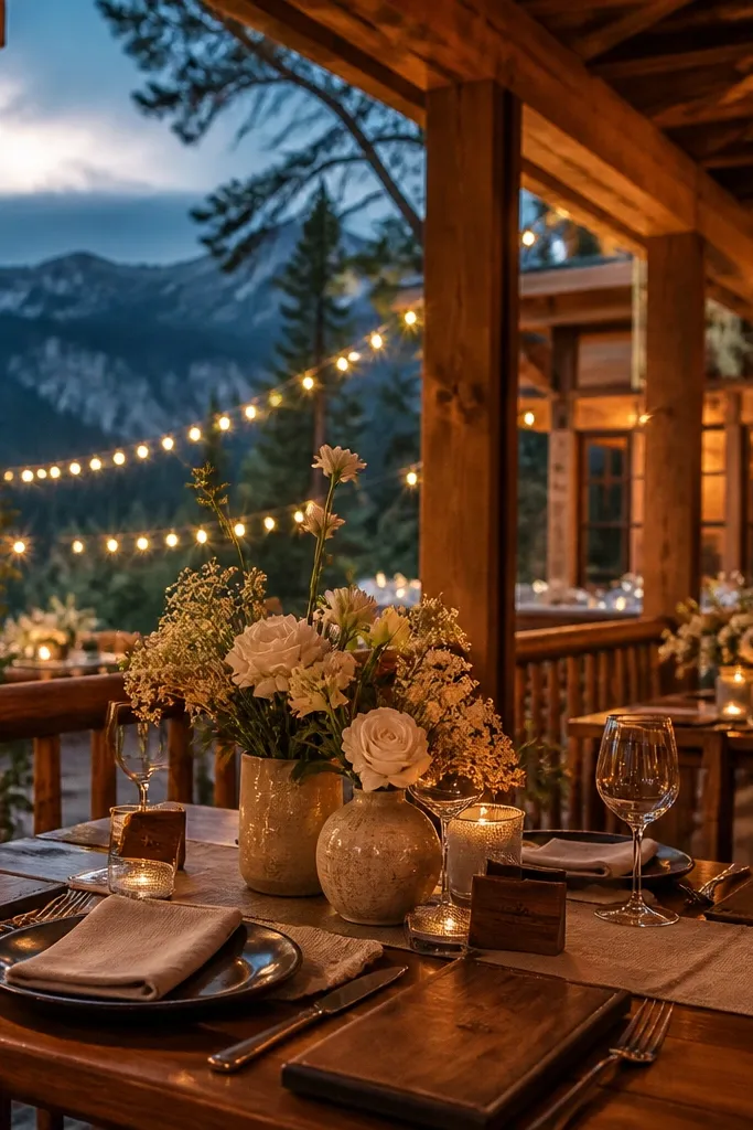
This palette looks like a cabin porch at dusk — warm cedar, milky white blooms, and dark walnut wood details that photograph like leather. It works best when your “rustic” isn’t orange-brown overload. Think creamy table linens, white roses or ranunculus, and real wood textures in frames, menus, and place cards. Pair it with charcoal candles and matte black signage for contrast without going goth. The best trip for this look is a cool-weather destination with visible forests and old lumber — late fall through early spring is when cedar tones read deepest in photos.
Step 1 — pick a base near a mountain town or forest lodge where you can walk to viewpoints and still find wood everywhere. Rent a car if you’re going off the main road; plan a half-day drive loop to a scenic overlook and a local market where you can buy seasonal greenery. Step 2 — budget for the “cheap wedding color schemes itinerary” part by booking lodging with kitchen access and buying decor basics in bulk: 10-12 bunches of greenery, 3-4 large white arrangements, and candle holders from a big-box or thrift store. Expect $120-$220 per night for a simple cabin-style stay depending on season, plus $35-$70 per day for gas and parking. Step 3 — spend 2 nights minimum so you’re not chasing golden hour on day one; book 6-10 weeks ahead for peak fall weekends. If you’re aiming for milky white flowers, reserve them early because off-season whites run pricier and sell out first.
Bring a small roll of painter’s tape and label every rental board or candle holder location before you set up — it saves you from redoing layouts at night. Shop for black walnut color through finishes (stains, matte paint, dark frames) instead of trying to find perfectly matching “walnut” decor.
Don’t lean on orange pumpkins and bright rust fabric — cedar + milky white reads best when the warm tones are muted and the whites stay creamy.



