
1. Over-tall centerpieces that block guest conversations
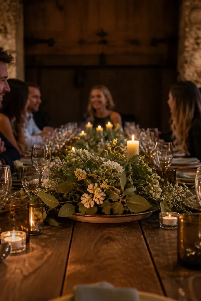
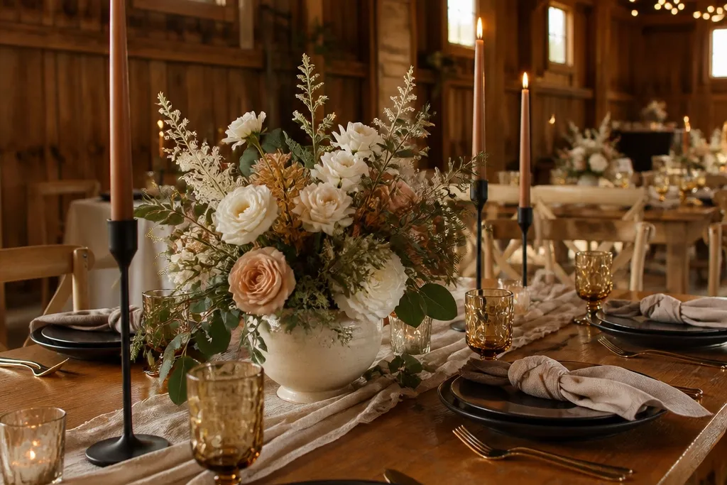
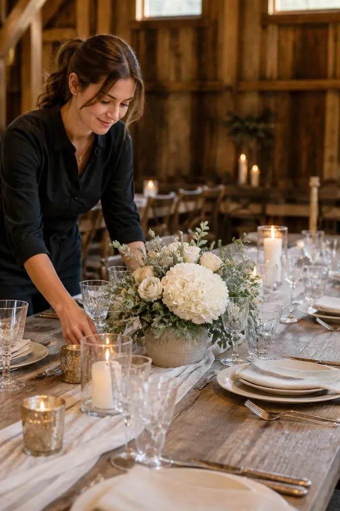
Rustic tables look inviting when people can actually talk across them. If your centerpiece rises higher than about 12-14 inches above the tabletop, you’ll get that “pretty but awkward” effect where guests angle their bodies to see each other. Tall arrangements also make candlelight harder because everything competes for attention. Keep most of the height in the base — a lantern, wide vase, or low container — and let greenery spill just a bit.
Quick tipIf you’re using bud vases, cluster them so the tallest item stays under your height limit.
Start by measuring the table height and then set a hard ceiling: aim for centerpieces that sit around 8-12 inches tall from the tabletop. Then choose containers that widen at the top, like squat glass jars, ceramic bowls, or low wood troughs. Finally, do a quick sightline check: stand where guests sit and confirm you can see faces across the table without craning.
Skip thisAvoid tall bouquets that turn your table into a wall.
2. Mixing too many wood tones in one centerpiece
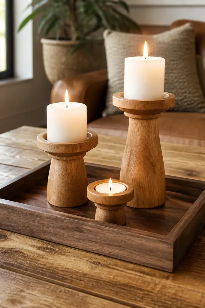
Rustic decor gets messy fast when you mix light pine, medium oak, dark walnut, and painted wood in the same frame. The table stops looking “farmhouse” and starts looking like a craft store haul. Pick one wood direction and commit: either warm honey oak tones, medium reclaimed-style browns, or deep walnut. Then repeat it through chargers, risers, candle holders, and any wood slice accents.
Start by choosing the dominant wood tone you already have — chargers, tables, or signage — and match everything else to it. Then set a rule: only one “lighter” wood element is allowed, like a thin birch slice, otherwise keep the grain color consistent. Finally, if you already bought mixed pieces, unify them with spray stain in one shade (test on a spare piece first).
Bring a white napkin to the store and compare wood pieces under the same lighting as your venue.
Avoid using every wood color you like on the same table.
3. Using a runner that's too narrow for the table
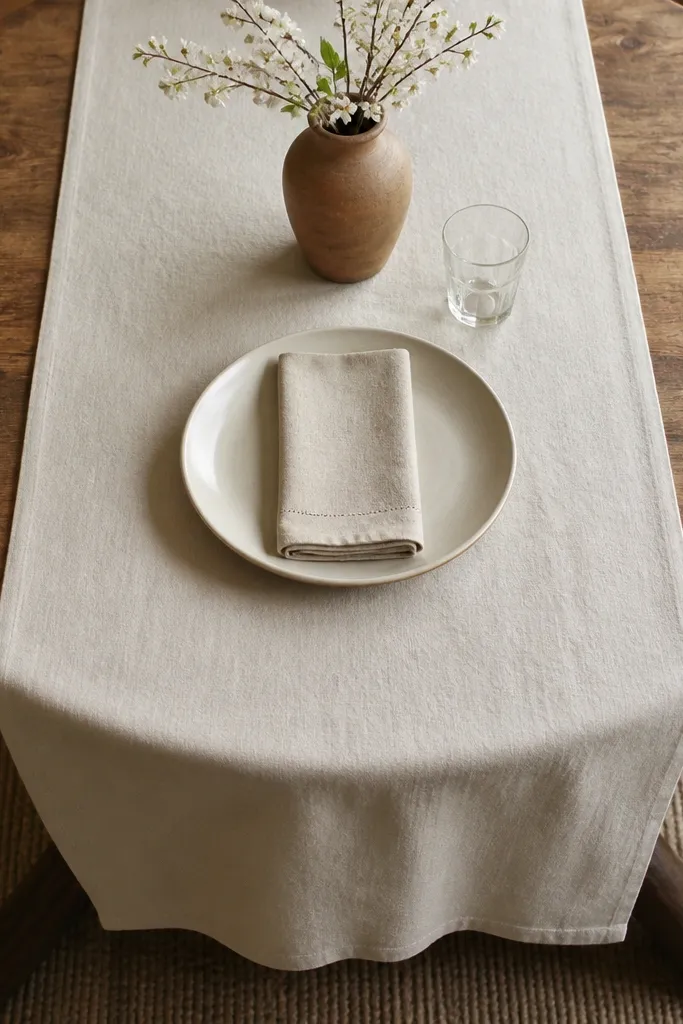
A narrow runner can look like you ran out of fabric, especially on round tables. Rustic decor needs a little “presence” so your centerpiece has a proper stage. If the runner is under about 16 inches wide on a round table, it often leaves empty edges that feel random. A wider runner also helps hide table shape quirks and makes the whole setup look planned.
Start by matching runner width to table size: for round tables, aim for 18-22 inches; for rectangular tables, aim for 14-18 inches depending on the table width. Then center it carefully and smooth out wrinkles — a wrinkled runner reads sloppy under overhead lights. Finally, choose linen or linen-blend in a warm neutral (cream, oatmeal, tan) so it looks intentional rather than costume-y.
If you’re unsure, measure the table and cut a paper mock runner to see the proportion.
Avoid thin runners that don’t cover enough surface area.
4. Cluttering the table with too many small candles
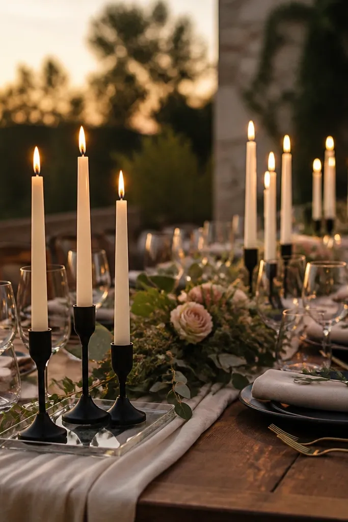
Rustic candlelight is gorgeous, but too many tiny flames look like clutter. When you scatter candles everywhere, your centerpiece loses focus and the table looks crowded even if it’s “technically” not. A better approach is fewer candles placed with spacing and consistent height. One candle cluster per place setting or one per two settings reads controlled.
Quick tipIf you’re using real flames, plan for wind and keep candles under overhangs or inside lanterns.
Start by deciding how many candles you want per table: one cluster in the center and optional candles near the edges, not candles in every open spot. Then keep candle heights consistent — for example, use 3x3x3-inch pillar candles in the same height range. Finally, use a tray or lantern to group them so the flames feel like a design element, not loose objects.
Skip thisAvoid scattering small candles without a grouping plan.
5. Thrift-store mismatches that don't match the room
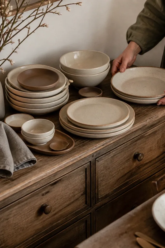
Mismatched pieces can look charming, but only if they share a common thread. When you grab plates with different styles, glazes, and colors, it reads “random” instead of “collected.” Rustic tables look best with variation inside a narrow palette: cream stoneware, matte brown, black accents, and warm gray. You can mix plate shapes if the color family matches and the finish is similar.
Start by choosing a palette of three: for example, cream, warm brown, and black. Then sort thrift pieces by finish: matte vs glossy, and keep them consistent. Finally, do a test table: lay 6 place settings on a flat surface and step back to see if they look cohesive from 8-10 feet.
If you can’t unify the glaze, unify the styling with matching napkins and consistent candle colors.
Avoid mixing glossy and matte ceramic finishes on the same table.
6. Fake greenery that looks plastic under venue lighting
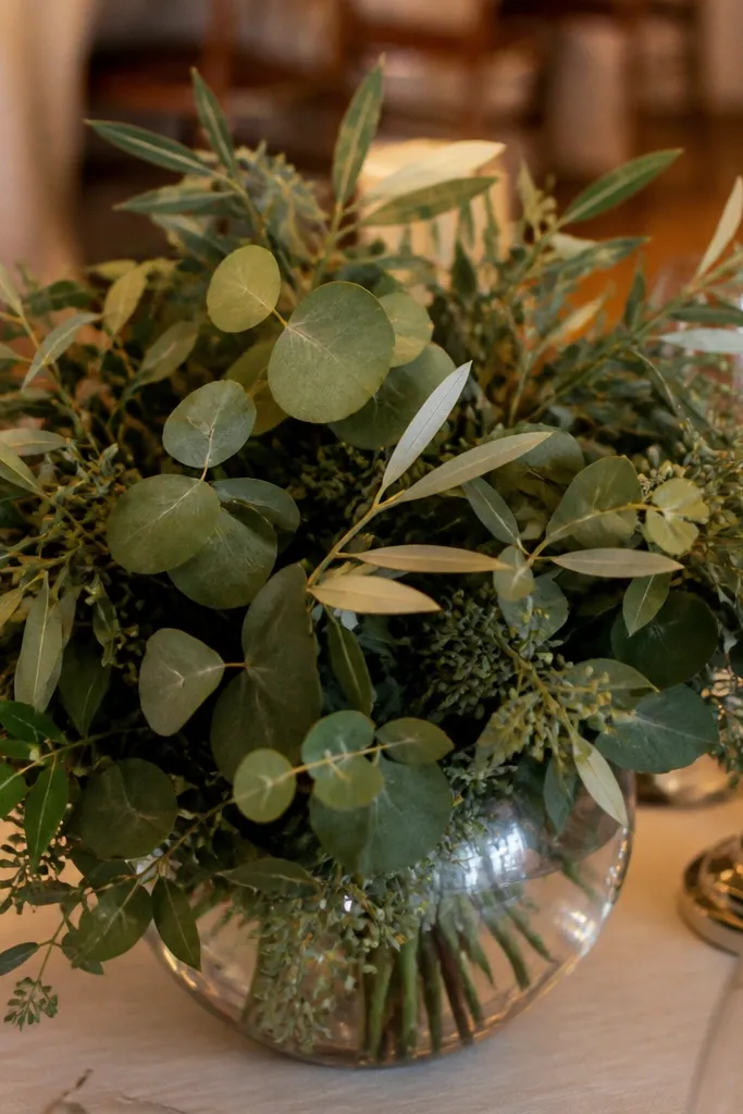
Fake greenery can work, but it has to survive warm lighting and camera flash without turning shiny. Many cheap faux leaves reflect light like plastic and create a “layered sticker” effect. If you want the rustic look without the plastic feel, choose greenery with matte leaves and varied shapes, and keep it concentrated around your base rather than spread everywhere.
Start by checking the leaves for shine — hold them under a phone flashlight or strong overhead light and look for glare. Then build around one focal container so greenery density is higher where it matters. Finally, add one real element if possible, like a single boxwood sprig bundle or dried elements, to break the uniform look of faux.
Use faux for fillers, not for the main stems — the main structure should look real.
Avoid glossy faux greenery spread thin across the whole table.
7. Too much burlap and not enough linen
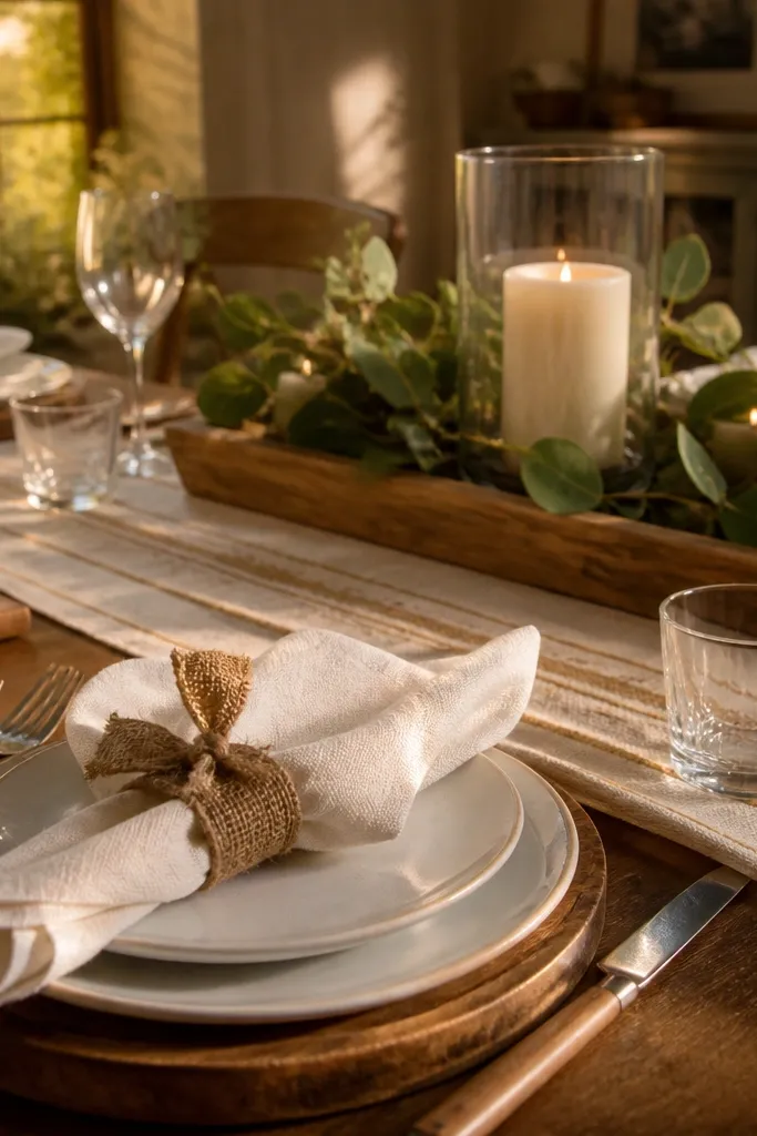
Burlap gives texture, but heavy burlap in multiple places quickly turns the table into a scratchy, dark mass. Rustic decor looks better when burlap is used as an accent — a tied napkin ring, a small strip under a centerpiece, or a single bow — and linen does the heavy lifting. Linen reads softer and brighter, especially in photos. If the table is already dark, burlap can make it feel even heavier.
Quick tipIf you’re using burlap, keep it narrow. Wide burlap runners are where tables start to look costume-y.
Start by choosing one main fabric: linen or a linen-blend. Then use burlap in a single location per place setting, like a narrow napkin tie or a small runner accent strip. Finally, keep burlap in natural color (oat, wheat) rather than deep brown so it doesn’t overpower your flowers.
Skip thisAvoid burlap everywhere, including the main runner.
8. Napkins tied too tight around the wrong fold
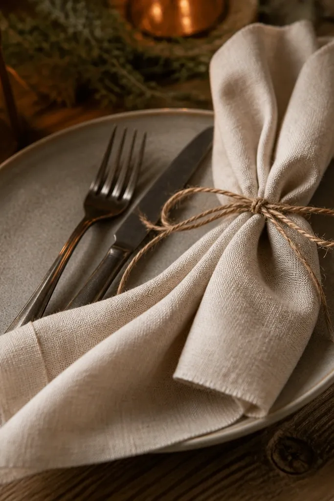
Rustic napkins should look relaxed, not strangled. When ties are too tight or the fold is lumpy, the whole place setting looks chaotic even if your centerpiece is perfect. A clean napkin fold also makes your palette look intentional from across the room. Aim for a soft gather and a consistent knot placement so every setting reads the same.
Quick tipPractice one napkin fold on 2-3 spare napkins before committing to all tables.
Start by choosing a fold that creates a stable rectangle, like a simple tri-fold or a flat rectangle fold. Then tie with a natural twine or linen ribbon and leave a little slack so the fabric falls naturally. Finally, align the knot so it hits the same spot on each napkin — use a pin mark on your work surface to keep placement consistent.
Skip thisAvoid tight ties that create weird bulges and uneven height.
9. Place cards placed randomly instead of aligned with the setting
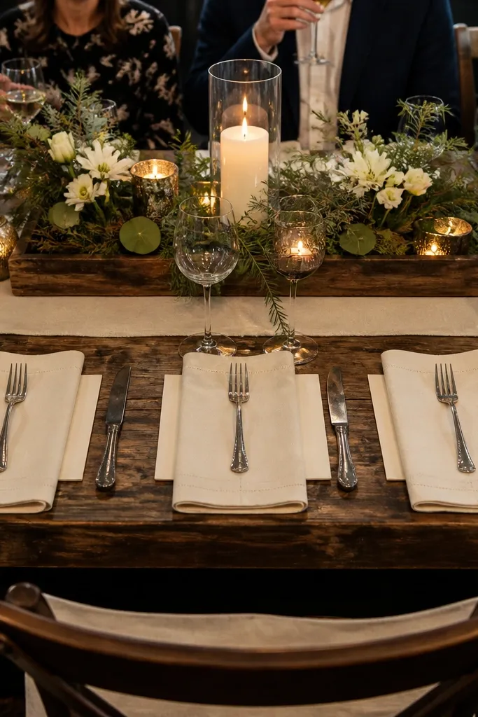
Rustic place cards should look designed, not dropped. Random placement makes the table feel unfinished, especially when guests arrive and start hunting for names. It also clashes with rustic centerpieces because the eye has nowhere to land. Keep place cards aligned with napkins or centered under forks so every setting has a clear order.
Quick tipIf you’re writing names by hand, make them bold and large enough to read from seated height.
Start by choosing one placement rule: either place the card at the top right of the plate or centered above the napkin. Then use a consistent holder like a small clip on a twig, a mini easel, or a card tucked into a napkin ring. Finally, set a spacing standard: keep cards the same distance from the plate edge across all settings.
Skip thisAvoid floating place cards in different spots across the table.
10. Using a foam block floral base that ruins the look
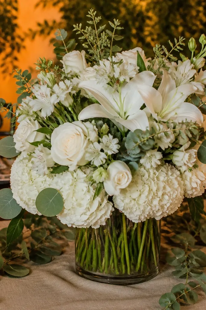
Foam bases can look fine in a workshop but show up at receptions as messy stem holes and uneven coverage. Rustic decor should look like flowers were planted into a container, not jammed into a hidden block. If the foam is visible, it kills the natural vibe fast. Even if it’s not visible, foam can cause droop by mid-evening when you need it to stay full.
Start by choosing a container that can hold water and hide mechanics — like a wide glass vessel or a ceramic pot with a liner. Then use floral tape, chicken wire, or a wet floral frog instead of foam when you can. Finally, do a “shake test” before setup: gently lift the arrangement and check that stems don’t wiggle or shed.
If you must use foam, wrap it tightly and cover with greenery so no stem holes peek through.
Avoid leaving any foam or wet mechanics visible under the flowers.
11. Centerpieces that are too dense and look like a ball of flowers
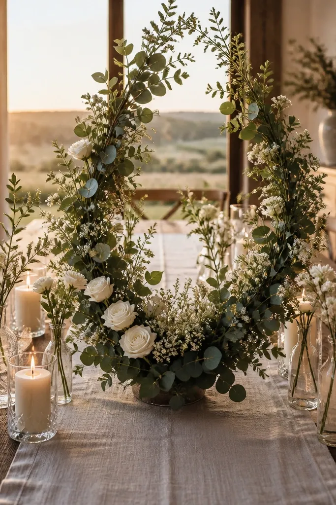
Rustic looks better with breathing room. When arrangements are too packed, they look heavy and can’t show off texture — wood, linen, and candlelight get swallowed. A rustic table needs contrast: soft fabric, clear glass, and greenery that has definition. Let your flowers form a shape, then leave gaps for the container and stems.
Quick tipIf your flowers are expensive, spend on fewer blooms and add more texture with greens and dried elements.
Start by building a base layer of greenery first and then add flowers in clusters, not as a blanket. Then keep one container shape — don’t let stems sprawl out in every direction. Finally, step back and check negative space: you should see some of the container and some of the runner around the arrangement.
Skip thisAvoid packing every inch of the container with no negative space.
12. Wrong candle placement near greenery and fabrics
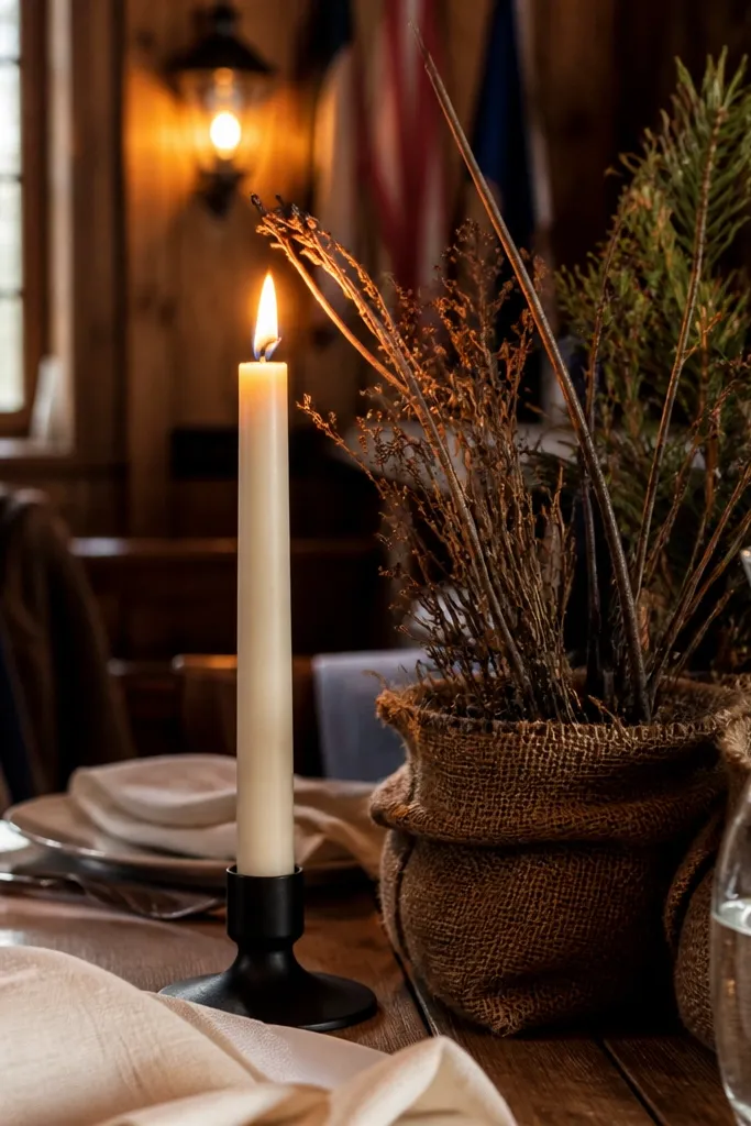
Rustic tables often use candles and greenery together, and that combo is where accidents happen. If flames sit too close to dried branches, burlap, or loose greenery, you risk scorched edges and a panicked reset. Even without an incident, heat can dry out greens and make them look brittle by the end of the night. Place candles in stable glass lanterns or keep them separated from flammable decor.
Quick tipUse LED candles if the venue has strict flame rules or if you’re styling outdoors with wind.
Start by keeping real flames in enclosed holders like hurricane lanterns or glass cloches. Then position candles at least several inches away from dried accents and any fabric runner edges. Finally, do a final check after setup is complete, because greenery shifts during transport.
Skip thisAvoid open flames right next to dried greenery, twine, or burlap.
13. Using the wrong vase shape for rustic table proportions
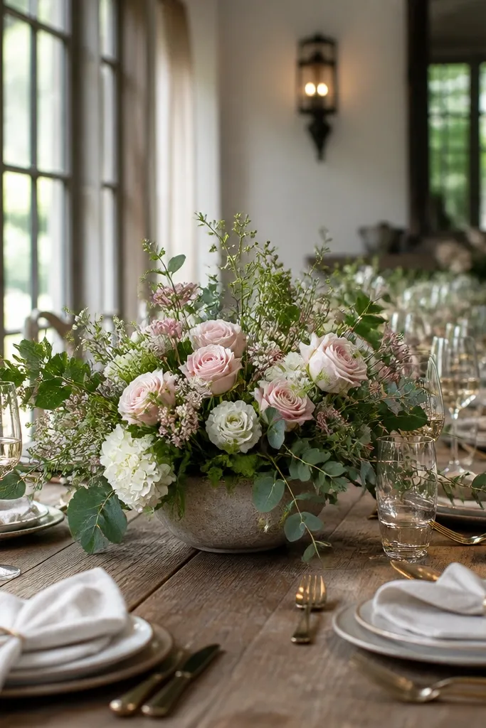
A narrow tall vase can look elegant at home but get lost on a long rustic table. Wide tables need visual weight near the surface so your centerpiece doesn’t look like a single stem floating in the middle. Choose containers that match the table width: squat vessels for round tables and wider bases for long layouts. The container shape affects how greenery spreads and how guests read the centerpiece from a distance.
Quick tipIf your vase is narrow, use multiple bud vases together so the total footprint reads wider.
Start by matching container width to your centerpiece zone. For most rustic tables, choose containers roughly 8-12 inches wide at the base so they hold the look. Then arrange greenery to “hug” the container and allow a slight spill without reaching into place settings. Finally, center the container in your runner zone and confirm it doesn’t drift toward plates.
Skip thisAvoid narrow tall containers that look top-heavy on the table.
14. Overdoing dried flowers without balancing color
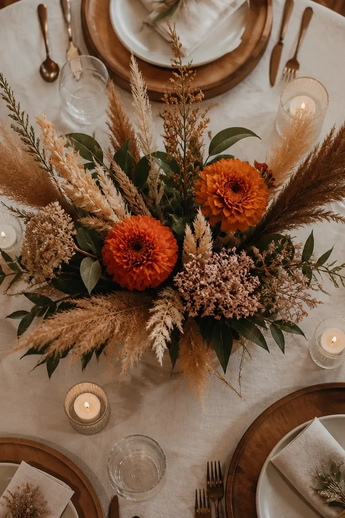
Dried flowers can look perfectly rustic, but if your whole table leans into the same dried-brown palette, it turns flat and dusty. Rustic tables still need contrast — think cream linen, warm greens, and a pop of a different tone like blush or deep terracotta. Use dried elements as texture and focus, not as the only color story. One dried bouquet plus fresh greenery usually looks better than all-dried across every element.
Start by picking one dried hero stem or cluster and keep it to one or two locations per table. Then balance the palette with fresh greenery or fresh-cut flowers in a warm color family. Finally, check color from the seating angle — if it looks monochrome under venue lighting, add one contrasting element like a cream candle or a lighter runner.
Mix dried with fresh greens to stop the table from reading “all brown, no depth.”
Avoid dried flowers everywhere with no fresh or contrasting color.
15. Spraying faux leaves and calling it "misty"
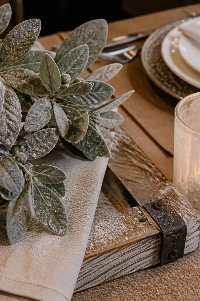
That dusty, misty look is popular, but DIY spraying can turn into a chalky mess that transfers onto linens and hands. Even if it looks cool in your living room, it often looks messy in venue lighting and can shed powder during setup. Rustic decor should look natural without leaving residue. If you want a frosted feel, use pre-made frosted stems or dried materials that don’t shed.
Quick tipDo a quick “white cloth test” before you set anything near fabric.
Start by skipping DIY powder sprays on anything that will sit on or near linens. Then choose pre-made stems labeled as flocked or frosted, and test by gently rubbing a leaf with a white cloth. Finally, place these stems in a controlled zone on the centerpiece so any minor shedding doesn’t land on napkins or place cards.
Skip thisAvoid powdery sprays that can stain or shed onto linens.
16. Forgotten table spacing so everything feels tight
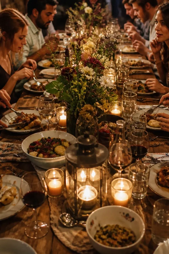
Rustic decor can still feel cramped if the spacing is wrong. People need room for plates, drinks, and serving. If you place centerpieces too close to place settings, guests bump them, and the decor looks messy within minutes. Spacing also changes how the table reads in photos — tight decor looks like a craft table, not a wedding table. Give the centerpiece zone a clear boundary and keep accessories in that zone only.
Start by marking a “no-touch” area around each place setting — measure about 2-3 inches from the plate edge where decor won’t intrude. Then plan your centerpiece footprint so it sits in the middle zone only. Finally, for runners and additional accents, keep them aligned and avoid letting items creep toward cutlery.
Walk the aisle with the serving team in mind — if they can’t pass cleanly, your layout is too tight.
Avoid decor creeping into the serving and eating space.
17. Using oversized signs and forgetting the guest sightline
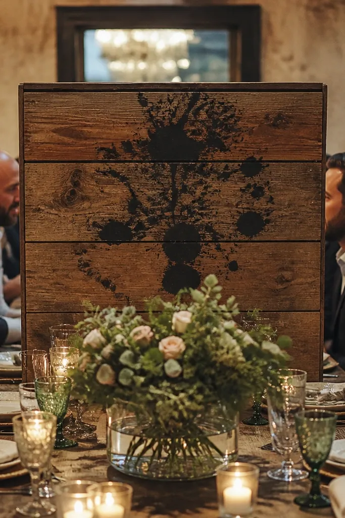
Rustic signs look great, but oversized ones can dominate the table and block views between guests. A sign that’s meant for a photo backdrop shouldn’t sit in the center of the dining experience. If the sign is too tall or too wide, it also makes the table feel staged and not inviting. Keep signs behind the centerpiece or limit their size so they frame the setting instead of stealing it.
Start by limiting sign width to the table’s centerpiece zone, not the whole table. Then place the sign at the head or along the back edge of the table, so guests can see each other. Finally, keep text large and simple, and avoid tiny script that only reads from one angle.
If it’s tall enough to be “noticed,” it’s probably too tall for the table center.
Avoid oversized signs that sit where guests need to see across the table.
18. Table numbers and signage printed in the wrong font size
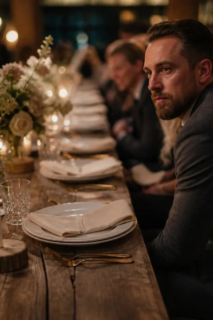
Rustic weddings have a lot of visual texture. That means your table numbers need to be readable fast, or guests will struggle and slow down the reception flow. Small font on a textured wood slice looks cute up close but becomes a blur from across the room. Rustic decor is usually photographed from distance too, and readability matters more than style. Use big, clean typography and keep the contrast high.
Quick tipDo a quick “walk test” — stand 15-20 feet away and read the numbers without squinting.
Start by printing or writing numbers with a font size that reads at a distance. As a rule, plan for at least 4-6 inches tall for table numbers on signage meant for dining rooms. Then choose strong contrast: black on cream, white on dark stain, or dark brown on light wood. Finally, ensure the placement is visible from where guests naturally stand, like near the entrance to the reception area.
Skip thisAvoid tiny table numbers that only work up close.
19. Chargers that don't match the plate color temperature
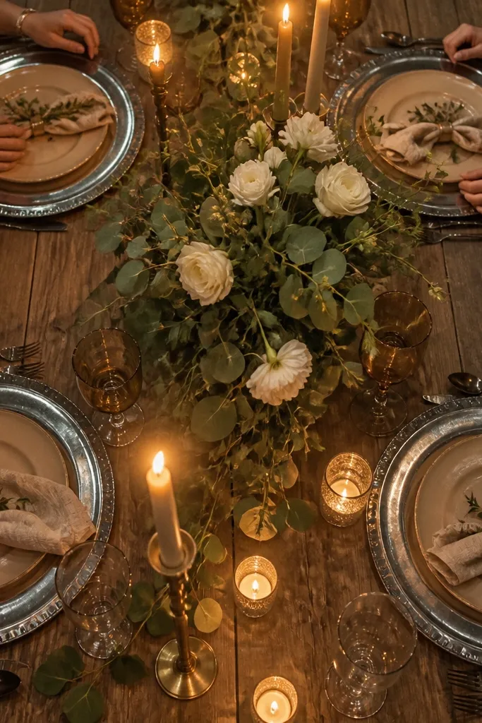
Chargers set the color temperature of the whole setting. If your chargers are too cool (silver, blue-gray) but your plates and napkins are warm (cream, tan, honey), the table looks off even if everything is pretty. Rustic decor usually wants warm neutrals and earthy tones. Match the charger finish to your napkin and plate warmth so the table feels cohesive. Warm matte gold, bronze, or dark brown chargers usually play nicer with rustic palettes than bright silver.
Quick tipIf you’re using gold, avoid mixing in silver candle holders on the same table.
Start by matching metals or finishes: if your napkins are cream and your flowers are warm green, keep chargers warm too. Then test under lighting — warm venue lights can shift silver to a cold tone that looks mismatched. Finally, limit metal variety to one finish per table so you don’t get a “mixed hardware” look.
Skip thisAvoid cool-tone chargers under warm rustic plates.
20. Centerpiece trays that are too small for the arrangement
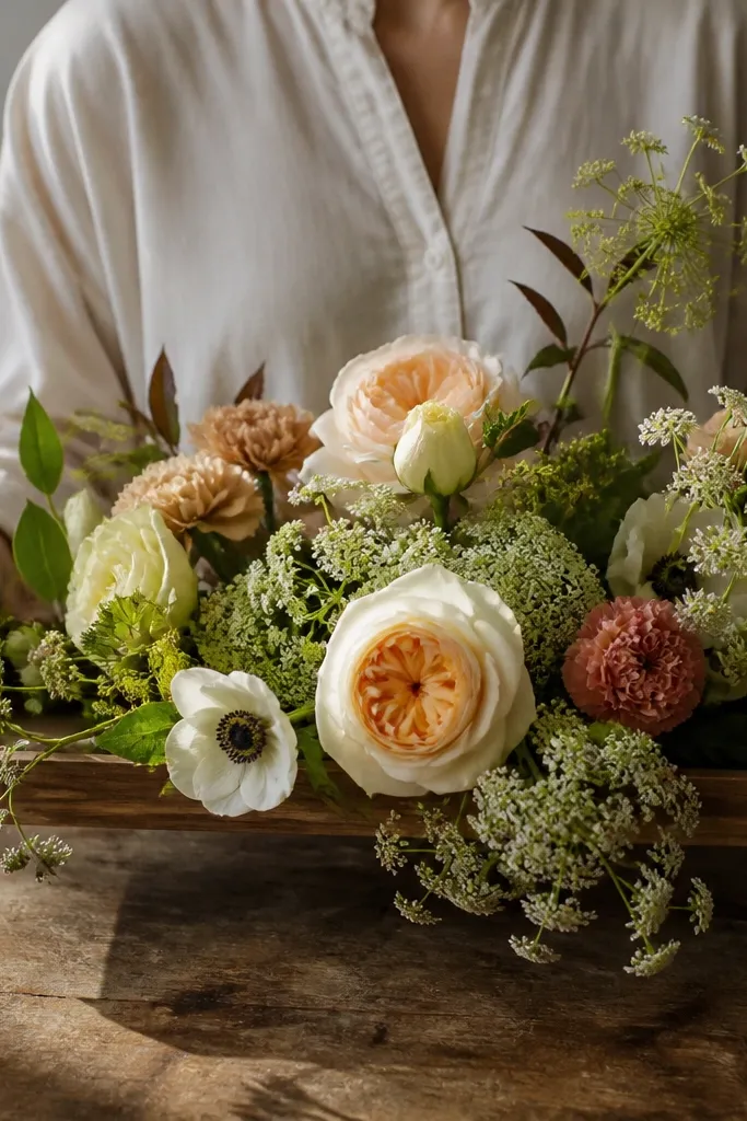
A tray is a control tool. When it’s too small, flowers spill off the edges and the arrangement looks like it’s falling apart. Rustic tables need controlled texture so it looks intentional, not improvised. A tray that’s wide enough also helps you place candles and smaller accents without crowding. Use trays to contain mess — especially if you’re moving arrangements on site.
Start by choosing a tray that’s at least 2-3 inches wider than the widest part of your centerpiece. Then place heavier items in the center and lighter accents around them so nothing hangs off. Finally, check the tray-to-runner alignment: the tray should sit centered so the edges don’t look crooked in photos.
If you’re worried about spills, line the tray with a removable liner before setup day.
Avoid tiny trays that force the centerpiece to spill outside the frame.
21. Wrong napkin color for the flower and lighting combo
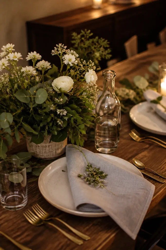
Napkins anchor the table. If the napkin color fights your flowers or looks too gray under warm lighting, your rustic palette collapses. Rustic decor usually looks best in warm neutrals — cream, oatmeal, sand — because they harmonize with wood and greenery. Cooler tones can work, but only when the rest of the palette is built to match. If you’re not sure, pick a warm neutral and let the flowers do the color work.
Start by holding your napkin fabric next to your centerpiece stems in the same lighting you’ll use at the venue. Then choose napkin shade based on contrast: if your greenery is dark, go slightly lighter; if your flowers are light, go slightly deeper. Finally, iron or steam napkins so the color looks smooth and not blotchy.
Avoid choosing napkin color based only on daylight photos — venue lighting changes everything.
Avoid gray or blue-toned napkins that clash with warm rustic flowers.



