
1. Chalkboard menu-style chart with table number "tabs"
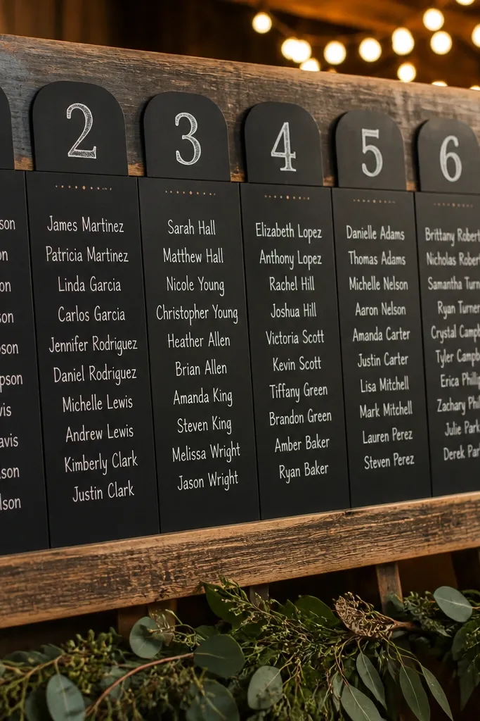
This works because it reads like something guests already understand: a menu. You write table numbers as big, separate “tabs” across the top, then list guests under each table in short, aligned lines. The chalk look is photogenic under warm lighting, and it hides minor handwriting differences better than printed fonts. Pair it with matte terracotta or black frames so it doesn’t glare in photos. It’s especially good for barn venues, garden receptions, and any space with wood tones or soft string lights.
Start by choosing a chalkboard size that’s tall enough for categories: 24x36 inches is a sweet spot for 8-12 tables. Then design it like a menu: one table number per tab, with guest last names grouped alphabetically under each tab. Finally, plan placement where people naturally pause, like near the bar or just past the entrance, and angle it slightly toward the room so the camera catches the headings. Budget stays reasonable because chalkboards are often cheaper than custom signage, especially if you buy a plain board and use your own lettering.
Use white chalk or a chalk marker for names and reserve colored chalk only for table number tabs.
Don’t cram every table into one long block — guests will scan for a start point and fail.
2. White ceramic tile grid with black vinyl names
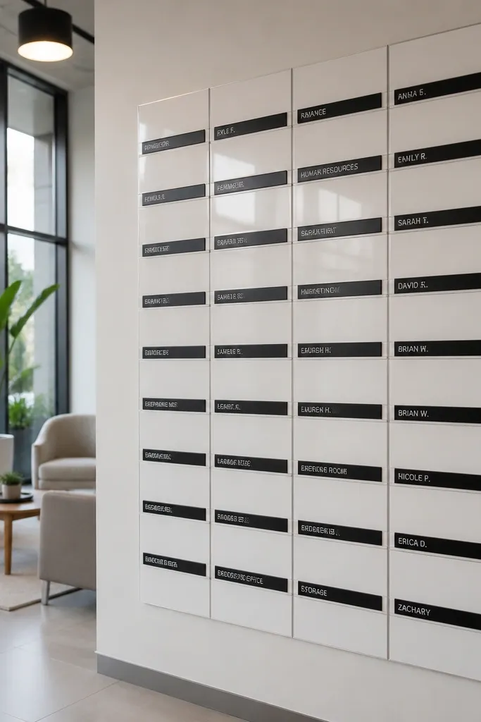
Start by building a board with a pegboard or frame covered in white tiles (or tile-pattern contact paper on a flat board for a cheaper version). Then apply black vinyl labels for table numbers and guest names, keeping line lengths short. Finally, mount it at eye level and add a simple border frame so it doesn’t look like craft supplies. Expect a moderate material cost if you use real tiles, and lower cost if you use tile-pattern paper plus vinyl labels.
A tile grid looks clean and architectural, which makes it great for modern receptions and bright, airy spaces. Each table gets a neat block, and names sit on black vinyl labels that pop against the white background. The grid structure makes it easy to “locate” your table visually, not just read text. In photos, the crisp edges and consistent spacing look expensive even when the build is simple. This is a strong choice for indoor venues with neutral decor, like white walls, light wood, or minimal centerpieces.
Skip thisSkip tiny font sizes; vinyl looks sharp up close but becomes unreadable at reception distance.
Quick tipPrint vinyl labels with extra spacing between rows so names don’t blur when guests move closer.
3. Botanical wreath frame with "table birdcages"
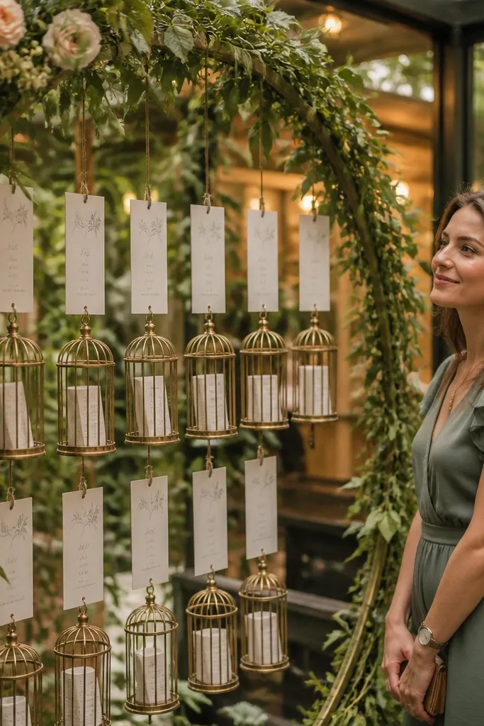
This is romantic without being cluttered. You hang small cards labeled by table number from a botanical wreath arch, then attach guest name strips beneath each table card like mini “birdcages.” It’s a great look for outdoor ceremonies that move indoors, because the greenery theme carries right through. The arch also frames photos naturally, so guests get a background that looks intentional. It suits spring and summer weddings, especially with soft lighting and neutral florals.
Start by choosing a wreath frame that’s sturdy enough to hold weight and decide how many tables it needs to display. Then create one hanging card per table and use name strips that are thick enough to read without glare. Finally, place the wreath where guests naturally gather before seating, like near a welcome table or cocktail station. Costs come from the wreath and the hanging cards; you can save money by using faux greenery and thick cardstock for the cards.
Use clear acrylic blocks or sturdy tabs for the hanging cards so they don’t twist in wind or airflow.
Don’t use thin paper strips that curl — they ruin readability fast.
4. Vintage suitcase row with alphabet dividers
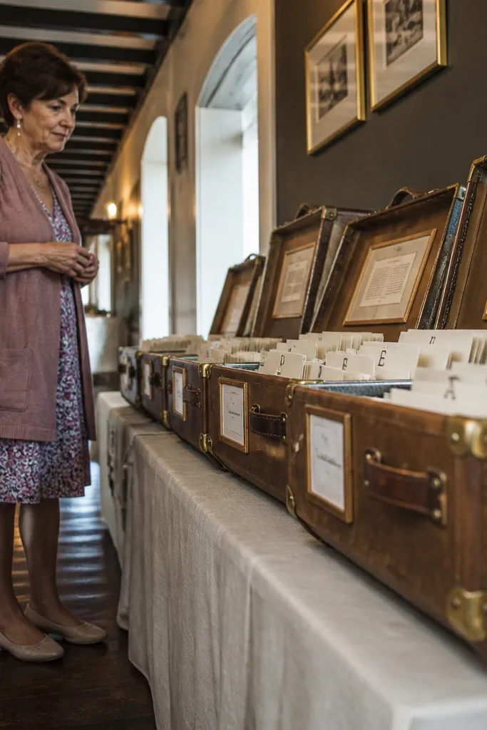
Suitcases look like travel decor, which fits the “Moments, Vows & Petals” vibe perfectly. You set suitcases in a row and label each one with a table number, then organize guest names inside with an alphabet divider card. Guests find their table number by the suitcase label, then scan the inside for their last name. It’s photogenic because the texture and edges create depth, and the open lids create a natural focal point. This works best for rustic venues, vintage themes, and receptions with warm browns or cream linens.
Start with 6-10 suitcases depending on table count, and group tables so you’re not stacking too many labels on one lid. Then paint or vinyl the table numbers on the outside and add alphabet dividers inside. Finally, set them on a long table or console near the entrance and keep the lids angled so guests can read without leaning too far. You’ll pay more if you buy real vintage suitcases, but rentals or faux-leather boxes also look good.
Use dividers with strong color contrast inside (black text on cream cards) to reduce squinting.
Don’t place them too far from the main flow; suitcases look cool but only help if guests can approach.
5. Acrylic "place card" seating map with LED edge lighting
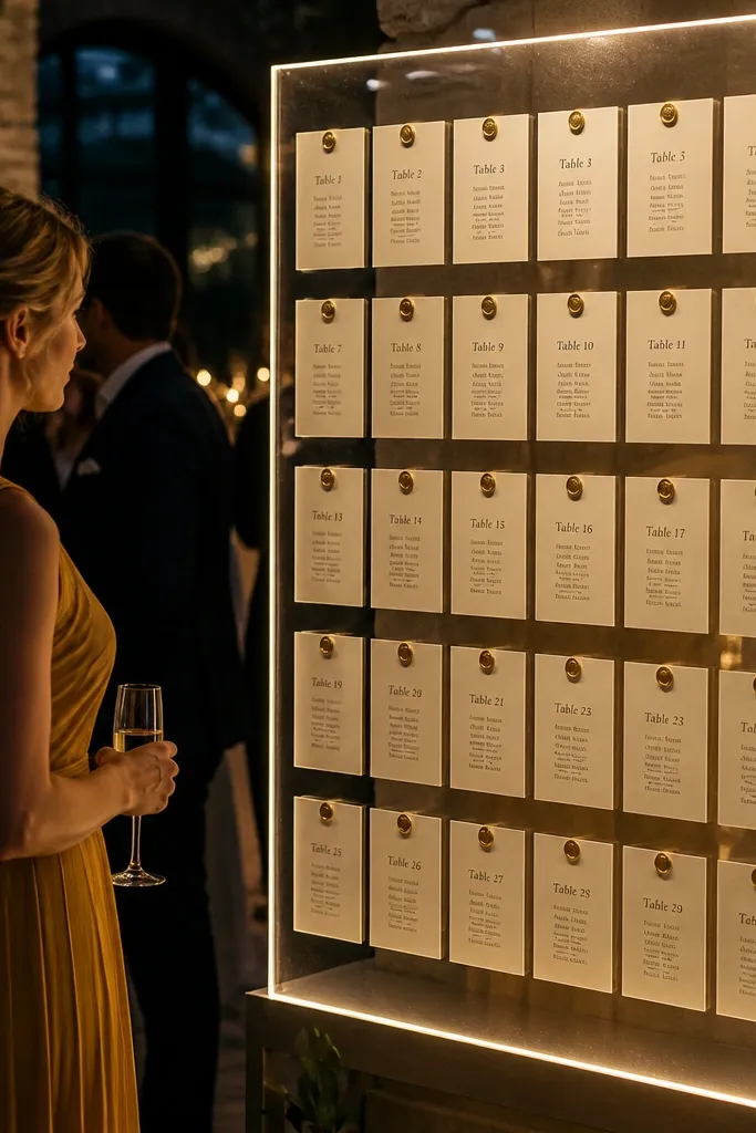
This is the clean, high-end option for evening receptions. You mount a printed seating map behind clear acrylic, then attach place cards (names + table number) in a grid. Add subtle LED edge lighting so the map looks like signage, not a craft project. It photographs beautifully because the edges catch light and the text stays crisp. This suits modern venues, hotel ballrooms, and any space with dark walls or warm uplighting.
Start by designing a behind-the-acrylic print with big table headers and short name lines. Then attach mini place cards with spacers so they float slightly off the surface and stay readable. Finally, put the board on a stand with a slight tilt toward the crowd and run LEDs along the edges only. Costs depend on acrylic and LEDs, but you’ll spend more than paper signs; the payoff is the polished look.
Choose matte acrylic or a low-gloss finish to prevent glare in phone photos.
Skip reflective plastic if your venue has bright overhead lights.
6. Wood slat ladder sign with hanging name tags
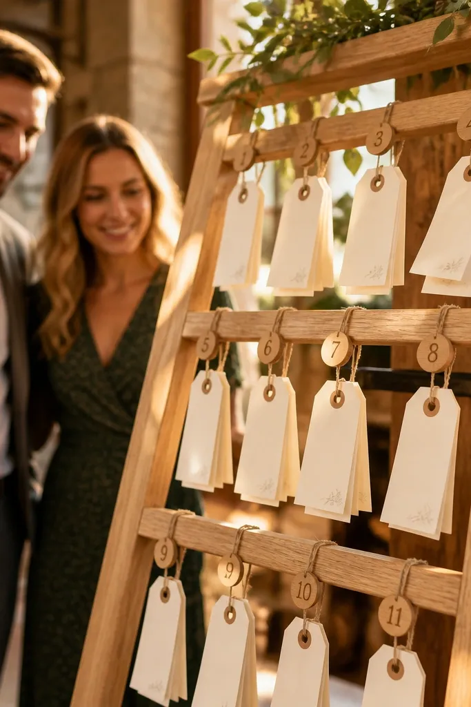
Start by building or renting a small ladder display and deciding how many steps you want to dedicate to table numbers. Then hang table number tags at one level and guest name tags below, using twine or thin ribbon so the look stays airy. Finally, place it near the entrance and keep name tags in alphabetical order within each table section. Budget is moderate if you buy cardstock and ribbon; the ladder is the main cost.
This is one of the best “scan fast” systems because guests can find their table by the hanging row. The ladder shape naturally creates sections, and each section holds a table number tag with guest name tags beneath it. It looks rustic-chic, especially when the slats are light oak and the tags are cream cardstock with black ink. In photos, the vertical lines add height and keep the frame from looking flat. It fits outdoor weddings, garden settings, and venues with wood beams.
Skip thisDon’t use long, thin ribbons that tangle and twist the tags.
Quick tipUse a consistent tag size and spacing so the ladder doesn’t look messy in photos.
7. Botanical "label wall" with linen ribbon and table clusters
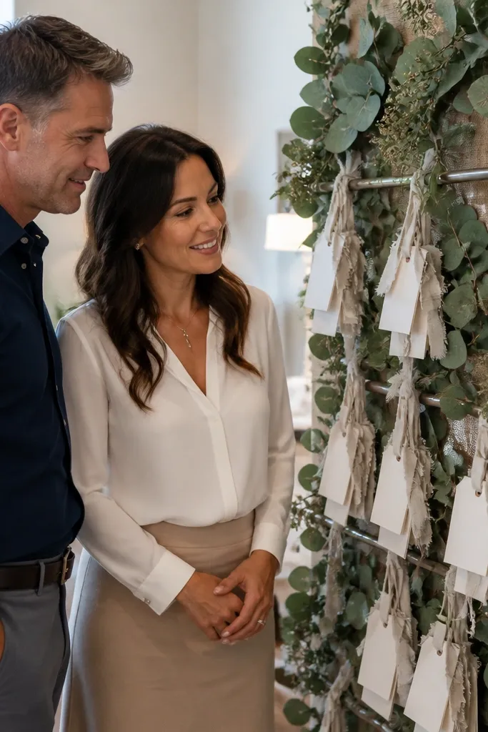
A label wall looks like a styled photo backdrop, not a functional sign that interrupts the decor. You create clusters: one cluster per table number, with guest names on small linen-corded cards hanging from a simple frame or greenery rail. The texture of linen against greenery reads soft and romantic, and the clustering makes scanning easier than a long list. This is ideal for weddings with a “garden” palette — sage, cream, blush, and warm gold. It also works indoors if the wall has natural light.
Start by securing a backing board or frame to a wall or large easel and adding greenery only where the clusters hang. Then write table numbers on larger cards and guest names on smaller cards, all on linen ribbon. Finally, group tables into sections so guests aren’t searching across the entire wall; put the most visually dense clusters near where the line starts. Cost stays manageable because the structure is simple and most spending goes into cardstock and ribbon.
Keep each cluster to 12-20 names so the cards don’t overlap and become unreadable.
Skip overcrowded clusters — guests will give up and wander.
8. Gold foil table header strips on kraft paper board
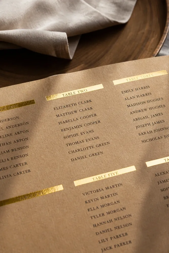
Start with a large foam board or framed cork board covered in kraft paper. Then apply gold foil vinyl strips for table numbers and print guest names on labels or directly with a black marker/ink. Finally, mount it on an easel and keep the layout in columns that match how guests scan left-to-right. You can keep costs low by using vinyl and printed labels instead of expensive custom prints.
Kraft paper gives you that warm, textured look that photographs well next to linen napkins and wood chargers. You create table headers with gold foil strips, then list guest names in clean black type beneath. The gold makes the headings pop without needing a full board redesign, and the kraft background hides minor scuffs better than white paper. This style is great for rustic-modern receptions, fall weddings, and venues with warm, amber lighting. It also pairs well with neutral floral arrangements.
Skip thisDon’t choose glossy paper — it reflects overhead lights and kills readability.
Quick tipUse a matte gold vinyl so phone cameras don’t blow out the highlights.
9. Mirror seating chart with etched table numbers
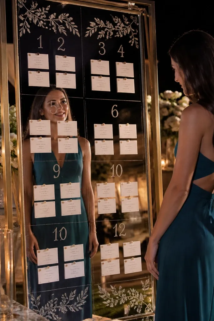
A mirror sign makes the room look bigger and brighter, which is a win for receptions with limited natural light. Table numbers sit in etched vinyl or adhesive lettering, and guest names attach as small cards within each section. The mirror reflects candles and florals, so the chart looks glamorous instead of plain. It’s especially good for evening weddings, ballroom receptions, and any venue where you already have candlelight. Keep the design airy so it doesn’t look like a chaotic collage.
Start by buying a framed mirror panel or a large mirror sign board and planning where table sections go. Then add etched vinyl for table numbers and use small name cards that sit flat within each section. Finally, place it near a light source so it catches glow, but avoid direct sun. Cost can run higher if you buy a mirror, but the visual payoff is strong for photos.
Use black or deep charcoal text so names stay readable against reflections.
Skip overcrowding; mirrors make clutter look worse.
10. Chic scroll-style chart on a rod with hanging index cards
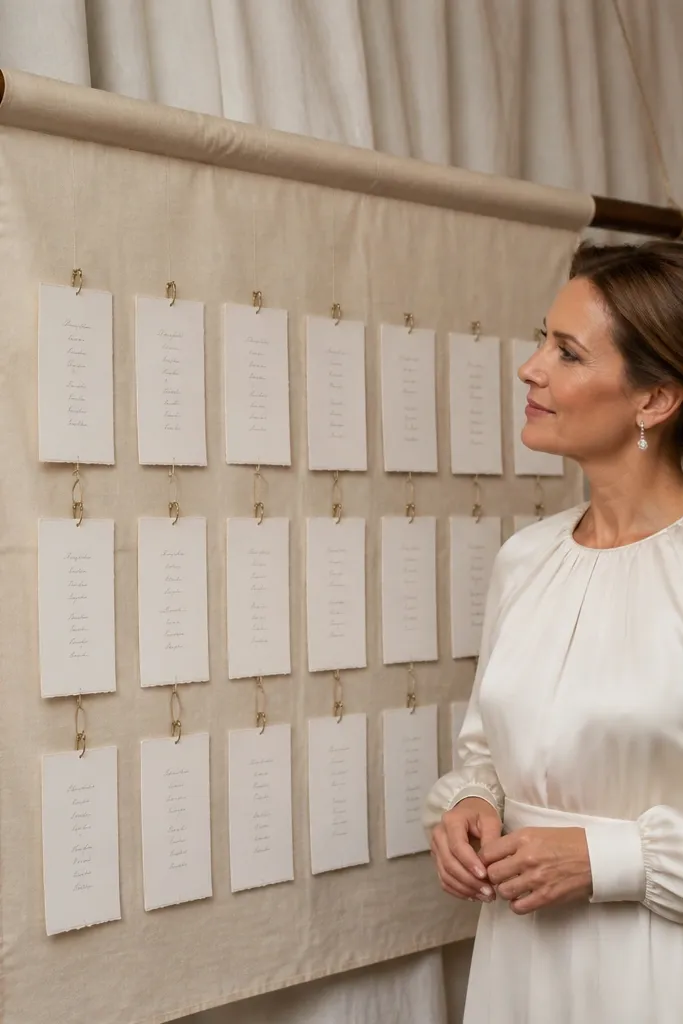
Start with a light fabric banner (cream or blush) and choose a rod length that fits your table count. Then create index cards with table numbers on top and guest names in a tight, readable font. Finally, hang cards in rows so guests can scan by table number without moving too far. Costs stay low because you’re using fabric and cardstock rather than custom frames.
This looks like a fashion accessory, not a sign. You mount a long fabric banner on a rod, and hang index cards below it for each table. The cards are labeled by table number and include guest names, keeping the layout organized while still feeling decorative. Fabric softens the look and makes the whole setup feel coordinated with linens and drapery. It’s a great match for indoor receptions and destination weddings where you want something lightweight and packable.
Skip thisDon’t let cards hang at random lengths; uneven spacing makes it harder to scan.
Quick tipUse clips that match your decor (brass or black) so the attachment points look intentional.
11. Neon sign inspired table headers with matte black board
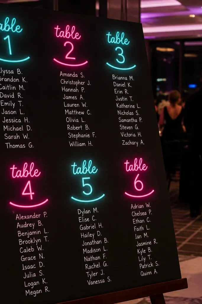
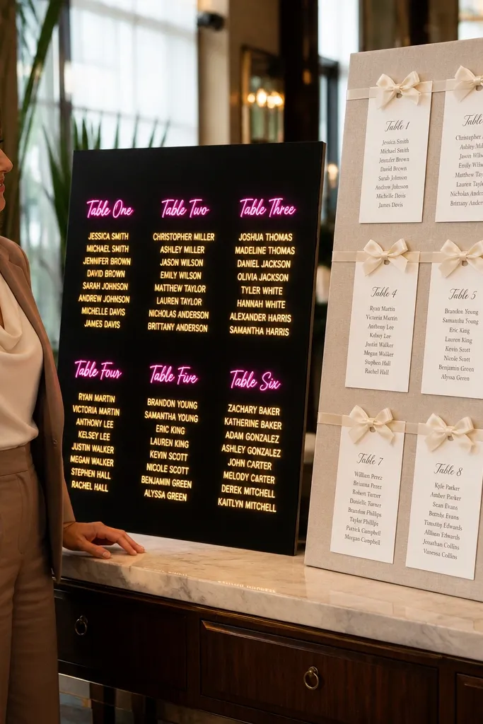
Start by choosing your accent color and matching it to other decor elements like menu cards or signage. Then write table headers using neon-style vinyl or a sign kit, and print guest names in a simple sans font on labels. Finally, hang the board at a height that’s comfortable to read and keep it away from direct flash glare. Budget is moderate if you use vinyl, and lower if you use a neon-style sign kit.
If your reception has a modern, moody vibe, this is the move. You use a matte black board and create neon-style table headers in a color that matches your palette, then list guest names in clean white or light gray. The contrast is excellent for nighttime, and the bright headings look great in party photos. It’s also easy to update if you have last-minute guest changes. This works best for city venues, industrial spaces, and weddings with black, silver, or deep jewel tones.
Skip thisDon’t use neon colors for the guest names — keep names neutral and crisp.
Quick tipTest readability under LED lighting; some bright colors glow too much and reduce name contrast.
12. Watercolor place-setting seating chart with table icons
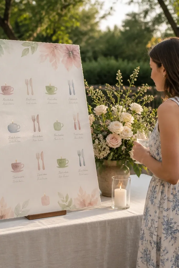
Watercolor place-setting icons make the seating chart feel like stationery, not logistics. You assign each table a small illustrated icon (fork and knife, teacup, leaf, candle) and place guest names under each icon. It’s photogenic because the icons add color without turning the whole board into a busy pattern. This works especially well for brunchy receptions, spring weddings, and venues with soft pastel decor. It also gives you a clear visual system for guests who don’t want to read a dense list.
Start by picking 6-12 table icons that match your watercolor style and keep them consistent in size. Then create a board with one icon per table and list guest names in alphabetical order under each icon. Finally, print on matte cardstock and mount on a board or easel with a simple frame. Cost is mostly printing; you can keep it affordable by using a single printed sheet per section.
Use darker watercolor for icons and black ink for names so guests don’t squint.
Skip light, washed-out icons — they disappear in evening photos.
13. Gallery wall seating chart with framed mini menus
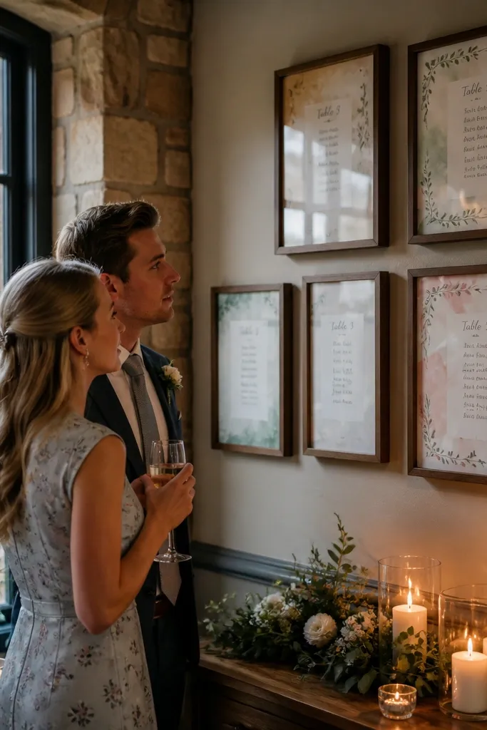
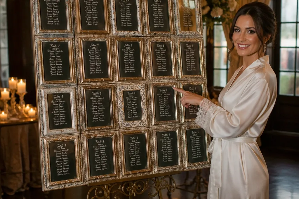
A gallery wall makes the seating chart feel like art, which is exactly what you want for a dreamy reception. Instead of one big board, you create multiple framed mini menus, each for a table number. The framing gives you consistent spacing, and guests can scan by table number like they’re browsing. In photos, the wall looks styled even when guests are walking past. This is best for indoor venues with a real wall and enough time for guests to approach and read.
Start by splitting tables into groups and designing one mini menu per table number. Then frame each mini card in matching frames and hang in a grid pattern with equal spacing. Finally, add a larger header sign above the frames so guests know what they’re looking at. Cost depends on frames, but you can keep it reasonable with uniform cheap frames and high-quality printouts.
Use the same paper stock for all mini menus so the wall looks cohesive in photos.
Don’t hang frames too high; if guests need to crane their necks, the “elegant” look becomes a frustration.
14. Folding fan seating chart with numbered panels
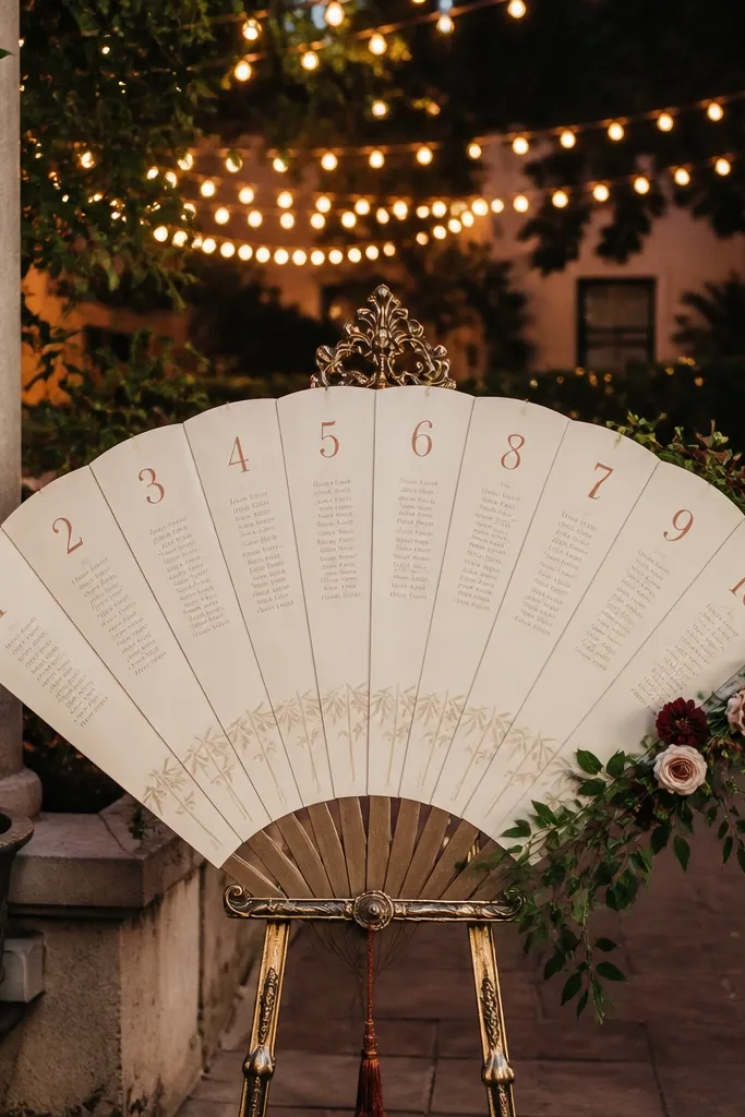
This is a clever way to make a seating chart look like decor you’d actually keep. You build a folding fan board with numbered panels, and each panel lists one table’s guests. When it’s folded, it’s compact and easy to move; when opened, it looks intentional and airy. The fan shape also creates natural visual pauses, so guests don’t feel stuck reading a huge block. Great for destination weddings and venues where you want something lightweight but still gorgeous.
Start by measuring how wide guests need it to be for readability and choose a fan size that opens to at least 36 inches wide. Then create panels with table numbers in bold and guest names in short lines. Finally, stand it on an easel or secure it to a backdrop so it doesn’t wobble. Cost is moderate: the structure is the main spend, and the rest is printing cardstock panels.
Use stiff cardstock or foam board for panels so the edges stay crisp in photos.
Skip flimsy paper panels; a wobbly fan makes the chart feel cheap and unreadable.
15. Linen table-runner seating chart with place cards pinned
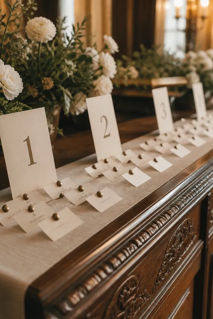
This is the most “reception table” version of a seating chart. You lay a long linen runner on a display table and pin place cards in rows, with a table number header card every few inches. The texture of linen looks expensive in photos, and the pinned cards create a tidy, handcrafted feel. It’s perfect when your decor already uses linen, macramé, or neutral textiles. It also works well when you want the seating chart close to where guests pick up welcome items.
Start by choosing a runner length that covers your whole name list without making cards too small, and keep the color neutral. Then create place cards with table number headers and guest names, and pin them in neat rows. Finally, add a small stand or framed border so the display looks finished rather than like supplies on a table. Costs stay low because you’re using fabric you may already have or can rent, plus cardstock and pins.
Use pearl-head pins or brass push pins so the hardware looks decorative, not random.
Don’t pin cards too close together — overlapping edges kill readability.
16. Terracotta arch with numbered lanterns holding name cards
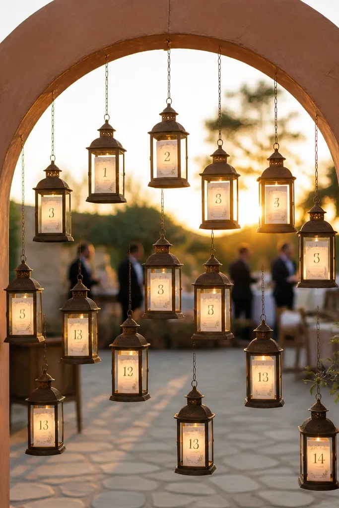
Lanterns add instant atmosphere and make the seating chart feel like part of the lighting plan. You hang small lanterns from a terracotta arch or frame, label each lantern with a table number, and place name cards inside. Guests can search visually by lantern number, then read the card in softer light. The warm tones photograph beautifully at golden hour and after dark. This is a great fit for outdoor receptions, desert-modern themes, and any wedding that already uses candlelight or warm bulbs.
Start by selecting lanterns that open easily so cards can be swapped if you have changes. Then label each lantern with a table number decal and print guest name cards in a consistent layout. Finally, place the arch near the entrance or along the cocktail path and keep lantern heights consistent for easy scanning. Budget is moderate because lanterns are the main cost, but you can reuse them for ceremony aisle decor later.
Use battery candles or LED lights inside lanterns so the display stays safe and consistent for photos.
Skip tiny lanterns; small openings mean guests can’t read quickly.
17. Vintage botanical herbarium folders as table number envelopes
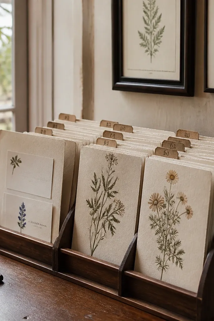
Start by making folders in two or three coordinated paper colors so the rack looks styled. Then label each folder with a table number and put guest name cards inside using a consistent alphabet order. Finally, display the rack at a slightly lower height than a typical sign so guests can open folders without blocking traffic. Costs are mostly printing and paper; you can create a rack with a simple wood display or even a tiered tray.
This is a stationery-forward seating chart that feels collectible. You create herbarium-style folders in a rack, each labeled with a table number on the front, and inside each folder you place guest name cards. The botanical paper texture and labeled tabs look intentional, and guests can browse one folder at a time. It’s especially pretty for weddings with printed menus, botanical invites, or vintage paper textures. The look is also great for daytime receptions with soft natural light.
Skip thisDon’t use glossy paper for the folders; reflections make names harder to read.
Quick tipUse thick divider cardstock inside each folder to keep the name cards from flopping and catching glare.
18. Neutrals-only letterpress-inspired chart on cream board
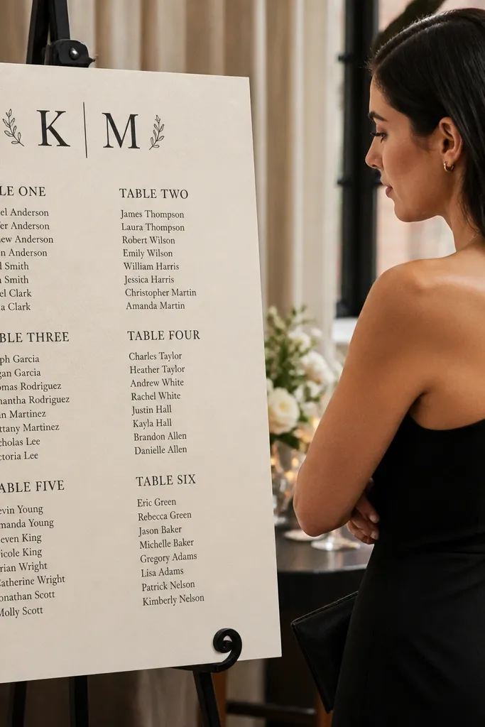
If your wedding palette is neutral and refined, this seating chart looks like it belongs on your invitation suite. You use a cream board with deep charcoal ink and a letterpress-inspired type style for table headers, then list guest names in clean alignment. The matte surface keeps it elegant, and the controlled color palette makes it look classy in every photo. This is best for weddings with modern florals, neutral linens, and minimal decor. It also works in venues with busy backgrounds because the chart stays calm.
Start by picking a board size that fits your table count without shrinking names, usually 24x30 inches for smaller guest lists. Then design table headers in bold charcoal and print names in a consistent, readable font. Finally, mount it on an easel and add a small legend or section header so guests know the format at a glance. Costs are moderate because you’re printing and mounting, but it’s still cheaper than custom acrylic builds.
Print names on matte label paper to keep ink from smearing in warm venues.
Skip super light gray ink; it looks pretty up close and fails at reception distance.
19. Map-style seating chart with printed arrows and table "stops"
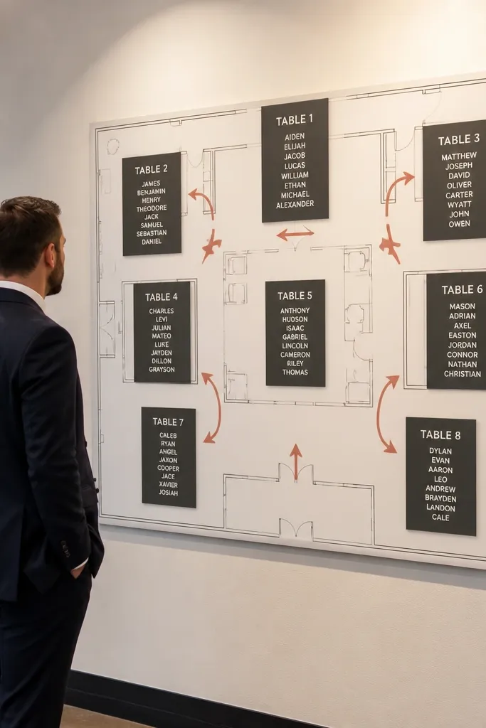
Start by sketching your actual floor plan and marking where tables sit, even if it’s rough. Then design a map sign with big arrows and place each table stop in a readable block with alphabetized names. Finally, put the map near the entrance and add a second small sign at the far end if tables wrap around. Cost is low to moderate since it’s mostly printing and mounting.
This is the best choice when your venue has a layout that makes guests walk around. You draw a simple reception map with arrows leading to table “stops,” and each stop contains a table number plus guest names. Guests follow the arrows like directions, then confirm their table at the stop. It’s both functional and photogenic because maps are visually interesting and feel designed. This works well for outdoor venues, multi-room receptions, and weddings where tables aren’t in a single straight line.
Skip thisDon’t rely on guests remembering directions; the name list must be at each table stop.
Quick tipUse thick arrows and avoid tiny icons; readability beats design flourishes for maps.
20. Terracotta & Sage Terrace Seating Chart on a Balcony Railing
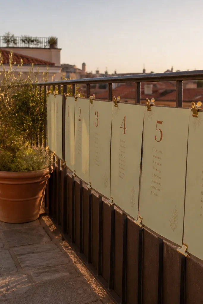
First, measure the railing length and pick a height for the center of each card so guests can read it without leaning. Second, print table numbers in terracotta and guest names in a smaller sage font, then mount each table on a stiff card with a matching color border. Third, get to the venue early enough to secure the clips before daylight fades, and plan to spend about 45-60 minutes setting it up. For travel, choose a location where you can book a venue with an outdoor terrace included in the package, since renting a railing stand separately costs more and looks less integrated. Book the venue and any printing service 4-6 weeks out so the card sizes match your railing spacing and you do not rush the names.
This one is for venues that already have a view — a balcony, terrace, or rooftop rail where guests naturally cluster. The seating chart sits at eye level, clipped along the railing so it reads like part of the setting, not a separate sign. Use sage cardstock with terracotta ink, and clip each table to a small brass clip so the whole layout moves slightly in the breeze. It looks airy in photos, and it feels personal because people can browse without standing in one spot. It suits spring and early fall receptions, especially in warm climates where the ceremony to dinner flow includes outdoor moments.
Skip thisDo not make the cards too small — if guests squint, the whole chart stops being elegant and starts being annoying.
Quick tipBring a few extra brass clips and a small roll of painter’s tape to adjust alignment on-site without damaging the railing finish.



