
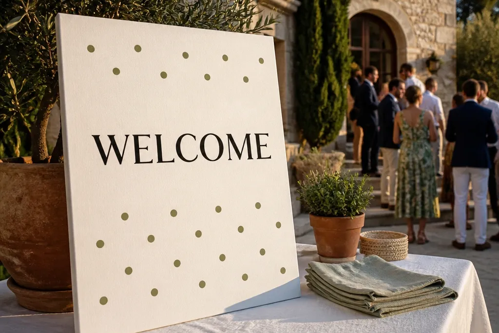
1. Cream Foam Board with Black Brush "Welcome" + Sage Dots
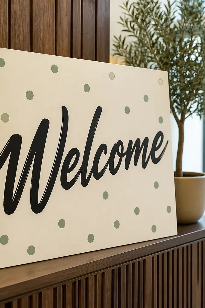
This look works because it’s high contrast without feeling harsh. A brush-style “Welcome” creates motion, while the sage dots give texture that still looks clean at a distance. It suits outdoor patios and bright indoor lobbies because cream doesn’t wash out and black reads fast. Keep the names and date in a simple sans-serif so the brush script stays the hero. It’s also forgiving if your venue lighting is mixed, since matte cream and matte black don’t reflect as much.
Step one: cut a foam board panel to 8x12 inches or 11x14 inches and center a printed “Welcome” template using a pencil guide. Step two: trace the “Welcome” with a black paint pen or brush marker, then add sage dots with a small paint dabber or the tip of a round marker. Step three: print names and date on matte paper, then glue them under the Welcome with even spacing. For transport, wrap the board in a poster sleeve and bring a small craft glue stick. Expect 5-15 minutes depending on how steady your lettering is.
Quick tipDo a quick readability test by holding it at chest height from 6-10 feet away — if you squint, make “Welcome” one size bigger.
Skip thisDon’t add extra flourishes around the edges; the dots already fill the space.
2. Navy Cardstock with Gold Vinyl "Welcome" and Tiny White Starburst
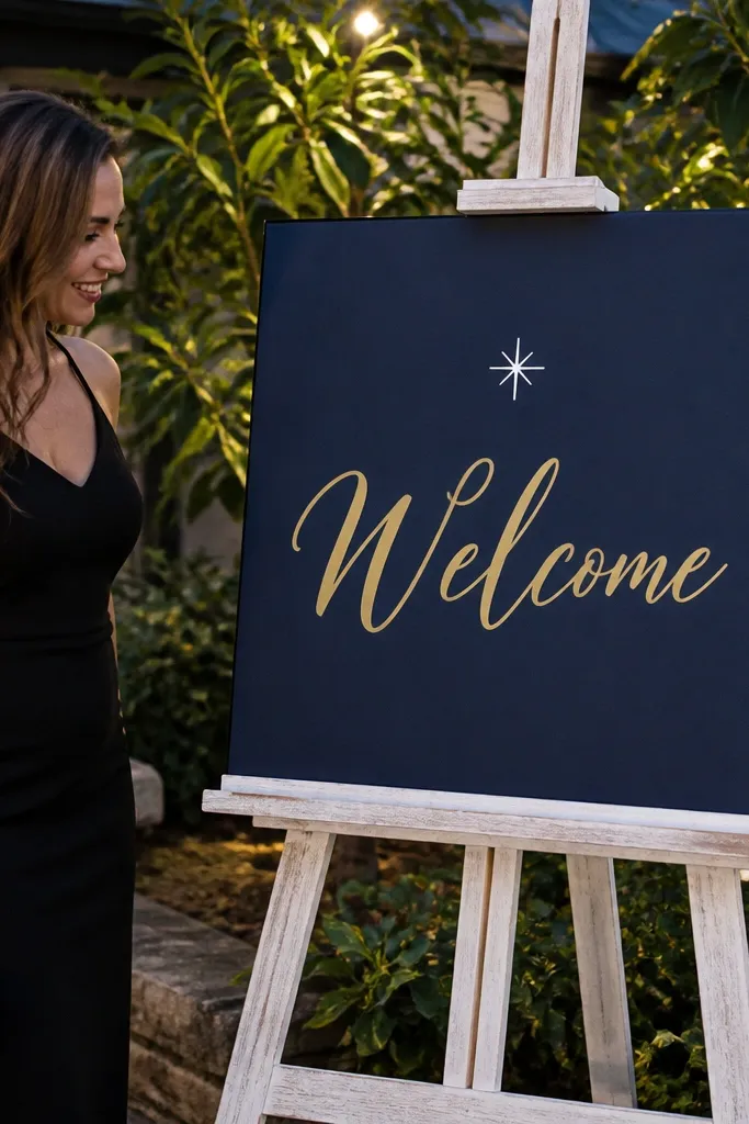
Gold vinyl on navy looks sharp under both warm and cool indoor lighting. The tiny white starburst acts like a focal point without cluttering the layout. This is ideal for evening receptions where you want the sign to feel a little more dressed up but still fast. Guests photograph navy beautifully against greenery, wood, and neutral walls. Keep the rest minimal: names and date in white or cream, no extra icons.
Step one: choose a navy base like 8.5x11 inches or 11x14 inches and wipe it clean so vinyl sticks. Step two: apply gold vinyl lettering for “Welcome” using transfer tape, pressing edges firmly with a credit card. Step three: add a small white starburst sticker or cut vinyl shape near the top corner and place names/date beneath in a single line. Finally, seal the edges with a thin layer of clear craft tape if you’ll be moving it a lot. Total time is usually 5-10 minutes if you already have the vinyl cut.
Pick a vinyl font with thick strokes; thin gold outlines look messy at distance.
Skip glossy vinyl on glossy frames — glare ruins readability in photos.
3. White Poster Board with Balloon-Cluster "Welcome" in One Color
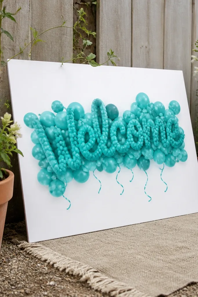
This design reads like a party without needing actual balloons. When “Welcome” is drawn in a balloon-cluster style, it automatically feels playful and celebratory, which fits simple weddings. It also photographs well because the shape variation creates depth. Use one color only — for example, terracotta or teal — so it stays cohesive with your table florals or outdoor garden palette. It’s especially good for daytime ceremonies where you want the sign to pop against sky or bright walls.
Step one: draw or print a balloon-cluster “Welcome” template, then trace it onto white poster board with a pencil grid for even letters. Step two: fill the balloon letters with a single marker color using a thick tip and let dry fully. Step three: add names and date in small, clean text beneath — either hand-lettered with the same marker or printed and glued. Bring a ruler so the bottom text line stays straight; it makes the whole sign look more polished. Budget 10-20 minutes if you’re hand-filling.
Use thicker marker strokes than you think you need; balloon-letter styles vanish if the fill is too light.
Don’t mix three colors inside the balloon letters; the effect turns busy fast.
4. Clear Acrylic Look with Black "Welcome" on Matte Contact Paper
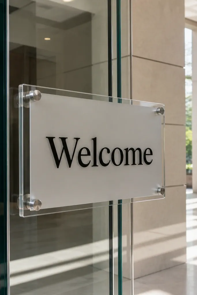
If you want that clean, modern acrylic vibe without buying acrylic, matte contact paper on a clear base gives the same photo effect. The black text stays crisp and doesn’t glare like glossy vinyl. This is a great choice for venues with lots of glass, modern interiors, or a ceremony backdrop with bright highlights. It also works well as a welcome sign that can be placed on an easel or hung behind a table without looking bulky. Keep it minimal so the glassy feel stays the focus.
Step one: cut matte contact paper to your sign size, then apply it to a clear sheet base like a thin acrylic panel or plastic folder cover. Step two: place black vinyl text for “Welcome” or use a stencil and permanent marker for quick lettering. Step three: add names and date in smaller text and press down all edges to prevent lifting. If you’re hanging it, punch two small holes at the top corners and use removable zip ties. The build is usually 5-12 minutes if your text is pre-cut.
Quick tipPress the contact paper edges with a seam roller or the back of a spoon to avoid bubbles.
Skip thisSkip water-based ink on contact paper; it smears when the surface is slightly tacky.
5. Terracotta Base with White Heat-Transfer Letters and a Tiny Olive Branch
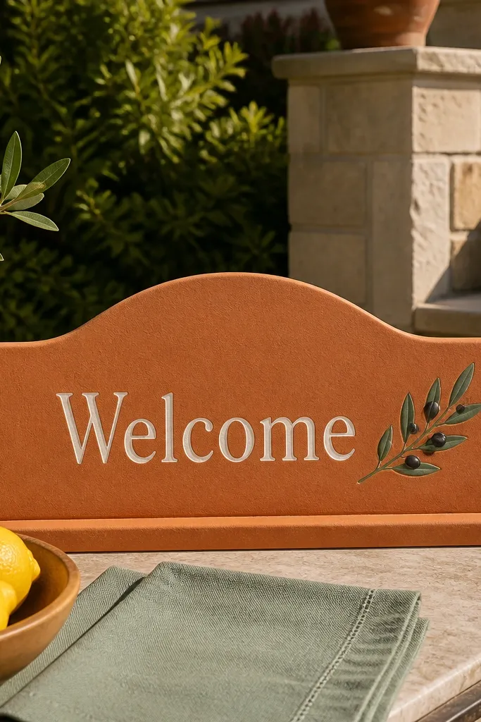
Terracotta plus white looks warm and photo-friendly, especially in outdoor settings with stone, stucco, or greenery. Heat-transfer letters give you smooth edges that look store-bought. The tiny olive branch keeps it earthy without turning into an overgrown wreath. This is a strong match for simple celebrations that have Mediterranean, garden, or neutral boho elements. It also stays readable because the letters are light on a warm background.
Step one: start with terracotta cardstock or foam board, cut to 11x14 inches, and clean it with a dry cloth. Step two: apply pre-cut white heat-transfer letters for “Welcome” using a household iron or heat press on the appropriate setting. Step three: place the olive branch graphic near the top or side and add names/date beneath in smaller white type. Let it cool fully before moving, then seal with a light layer of clear matte tape if the venue is breezy. Plan 10-25 minutes depending on how many letters you’re pressing.
Quick tipDo one test letter first on a scrap; different materials need slightly different heat and pressure.
Skip thisDon’t choose super thin heat-transfer film; it wrinkles under quick pressing.
6. Black-and-White Check Border with Handwritten Names and Date
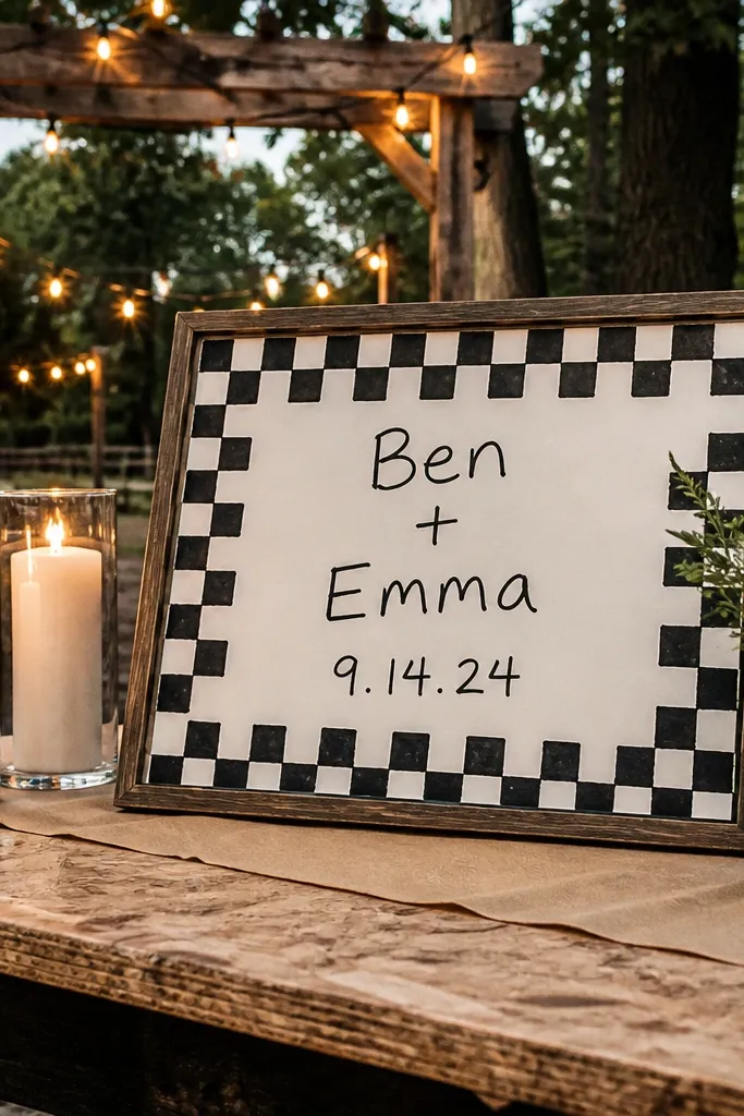
A check border adds instant energy and looks great in photos because it frames the center text. It also hides minor unevenness in your base cut, since the border is the structure. This style works for rustic venues and casual backyard celebrations where you want the sign to feel fun, not formal. Keep the center text black on white for clarity and use the same handwriting for names and date to keep it cohesive. It’s a simple way to make a plain board look intentional.
Step one: cut a white poster board to 8x12 inches and lightly pencil a rectangle inset for the border. Step two: use a ruler and black marker to draw a check pattern around the edges, with each square about 1/2 inch. Step three: write “Welcome” in a bold block style in the middle, then handwrite names and date below with consistent spacing. Finish by wiping away pencil lines and using a glue stick to mount the sign on a thicker board if needed. Expect 10-20 minutes.
Quick tipUse a ruler even for handwriting; your spacing will look cleaner than you think.
Skip thisDon’t make the squares too small; tiny checks blur from guest distance.
7. Pastel Gradient Paper with Cutout "Welcome" Letters
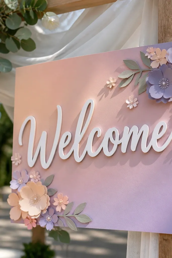
A soft gradient background gives you a photo-ready look without needing fancy paint skills. Cutout letters add dimension and make the sign feel layered instead of flat. This is perfect for spring and summer ceremonies, especially when your venue has light wood, white walls, or lots of greenery. Keep the cutout letters a single solid color so the gradient stays calm. The result feels modern but still wedding-appropriate.
Step one: create a gradient background on matte paper using 3-4 sponge dabs of pastel ink or chalk — start light at the top and deepen at the bottom. Step two: cut “Welcome” letters from thick white cardstock and layer them centered on the gradient using foam dots or thin glue. Step three: add names and date in a small sans-serif font, printed and glued under the letters. Mount the whole thing to a solid backing like white foam board for sturdiness. This usually takes 15-25 minutes if you’re cutting by hand.
Use matte paper for the gradient; shiny paper turns into glare in outdoor shade.
Don’t add more than one layered graphic; the gradient and letters already do the work.
8. Sunburst Frame with Black "Welcome" and Simple Date Line
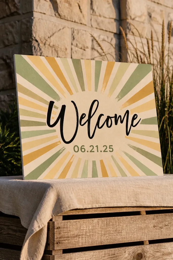
Sunburst frames pull the eye to the center, so your “Welcome” stays readable even if guests walk by quickly. It’s bold without being busy when you keep the burst lines consistent. Choose one color for the burst, like mustard or sage, and keep the text black or dark green. This style looks especially good against neutral venue walls and works for both indoor receptions and outdoor tent entrances. It also makes the sign feel like a real photo prop, not a table card.
Step one: make a sunburst template by drawing evenly spaced lines from a center point on a craft paper sheet. Step two: cut the sunburst frame and glue it behind a white panel where “Welcome” is printed in black. Step three: add names and date in a single straight line under the word. Mount the layered panel onto a foam board backing so it stands up straight. Give yourself 10-20 minutes, mostly for cutting and aligning.
Quick tipMark the center point with a tiny pencil dot before gluing anything — alignment is the whole look.
Skip thisSkip a multicolor burst; it turns into a rainbow blur in photos.
9. Monogram Centerpiece with "Welcome" Banner on Each Side
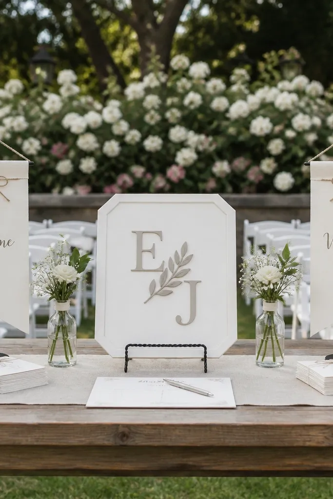
This design is photogenic because it gives you three focal zones: the monogram in the center, and “Welcome” banners flanking it. It works well when you have a couple’s initials you want to feature, but you still need the sign to read clearly. Use a clean serif or simple script for the banners, and keep the monogram bold so it doesn’t look like decoration. This suits indoor venues with a defined background like a curtain, wall molding, or a simple reception table. It’s also a great option if you want the sign to match your invites.
Step one: print the monogram initials and two “Welcome” banner strips on matte paper, then trim them cleanly with scissors. Step two: cut the background rectangle from a solid color cardstock and glue the monogram in the center. Step three: attach the banner strips on both sides at equal height and then add names/date underneath the monogram. Use double-sided tape for the cleanest edges. Plan 10-15 minutes if you’re printing and cutting, and bring a small tape runner for speed.
Quick tipIf you’re using foam dots for dimension, keep the monogram slightly raised and keep the banners flat.
Skip thisDon’t pick a monogram font that’s too thin; it disappears at entry distance.
10. Chalkboard Look on Wood-Textured Foam with White Paint Pen
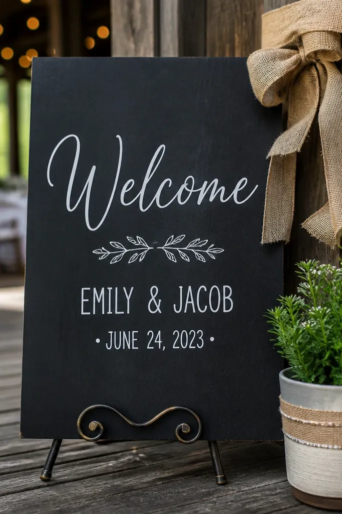
A chalkboard look is timeless, and it photographs well because white lettering creates a strong edge against the dark surface. Wood-textured foam makes it feel warmer than plain black chalkboard, which helps if your venue decor is neutral. This is a solid choice for rustic barn vibes, outdoor evenings, or venues with warm string lights. Keep the design simple: one big “Welcome,” one clean names/date line, and maybe a tiny border. It looks handmade without looking messy if you use a paint pen instead of chalk.
Step one: buy or paint a wood-textured foam board panel in a dark stain-like color and let it dry fully. Step two: write “Welcome” with a white paint pen, using a stencil for the first pass so your letters are even. Step three: add names and date in smaller block letters and draw a thin border line around the edge. If you’re placing it outdoors, seal the surface lightly with a matte clear spray so it doesn’t smudge in humidity. It usually takes 10-20 minutes.
Quick tipTest the paint pen on scrap first; some white tips look gray until they fully coat.
Skip thisDon’t use chalk; it smears when people touch it or when humidity hits.
11. Floral Sticker Sheet Layout with Only Three Blooms
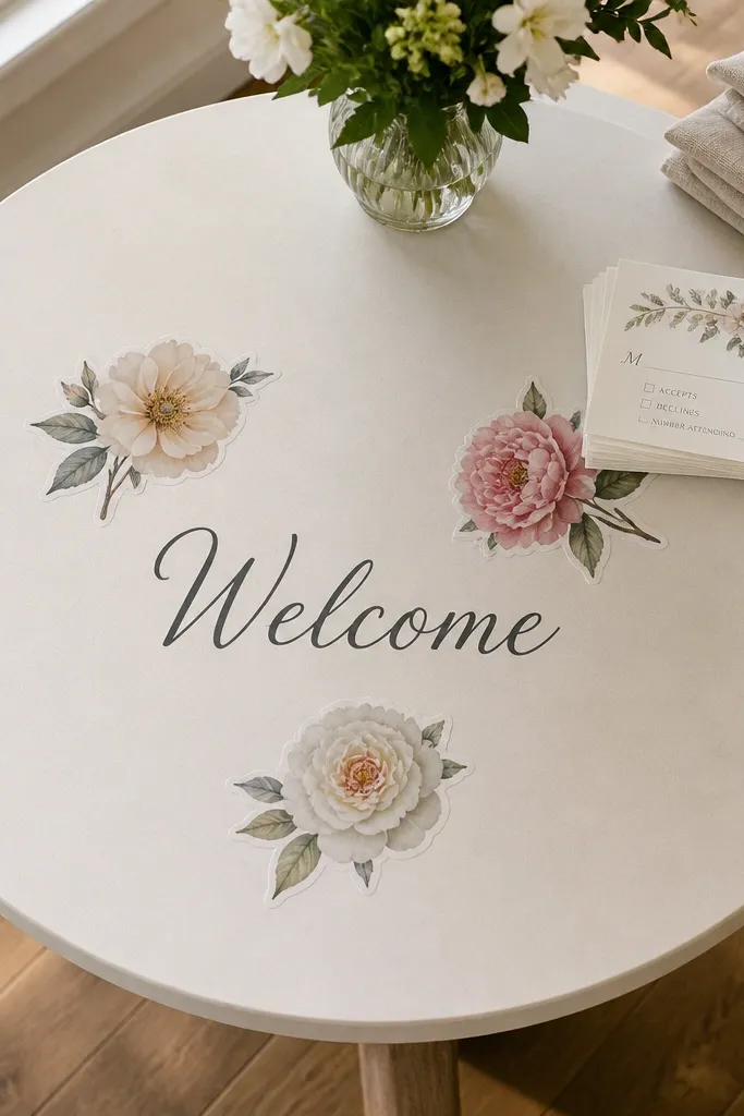
Sticker florals are the fastest way to get a polished, aesthetic look without painting. The trick is restraint: use only three blooms so the sign stays readable and doesn’t look like a craft project. Put the “Welcome” text in the center and place two flowers above and one below, all at balanced angles. This style suits garden weddings and light, airy venues where you want the sign to match centerpieces. It also photographs well because the stickers have consistent color and texture compared to hand-drawn flowers.
Step one: choose a matte background base in cream, blush, or sage and print your “Welcome” and names/date on matte paper. Step two: place three floral stickers like a triangle composition and adjust before you peel the backing. Step three: glue or tape the printed text, then press the stickers firmly and trim any edges that stick out. For sturdiness, mount everything on a thicker foam board and add a stand. Expect 5-12 minutes if you already have the sticker sheet picked.
Use a matte base and matte tape; shiny adhesives show up in photos.
Skip random sticker placement; it reads messy if the blooms aren’t balanced.
12. Watercolor Wash Background with Black Letter Stencil
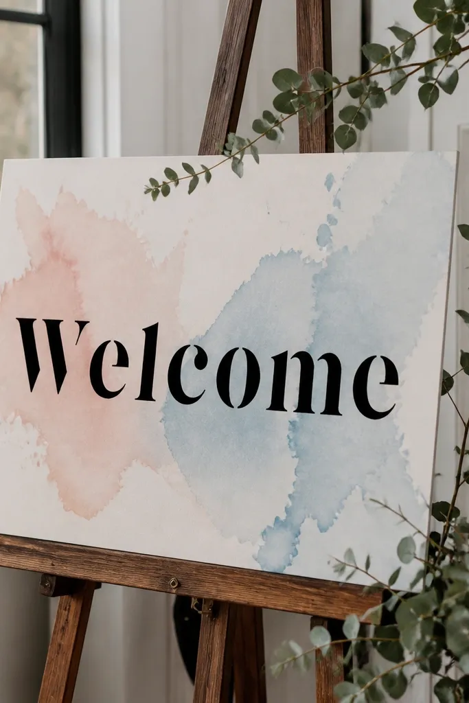
A watercolor wash gives you that soft, artistic feel without needing detailed painting. Pair it with black stencil letters and you get crisp readability plus an artsy background. This works especially well for intimate ceremonies, bridal showers, and venues with lots of natural light. The wash should be loose and light so the text stays the focus. Choose two tones like blush and pale peach for a calm look.
Step one: wet a piece of watercolor paper lightly and apply 2-3 diluted watercolor washes in sweeping strokes, leaving white space. Step two: when it’s dry, place a stencil for “Welcome” and trace with a black paint pen or acrylic marker. Step three: add names/date in smaller stencil text below. Mount the finished piece onto white foam board with glue dots so the edges look clean. Plan 15-30 minutes because you need drying time, but the active work is quick.
Use paper towels to lift color — leave intentional lighter patches for a cleaner wash.
Don’t make the wash too dark; guests can’t read black letters if the background is busy.
13. Fabric Ribbon Banner Across a Cardstock Base
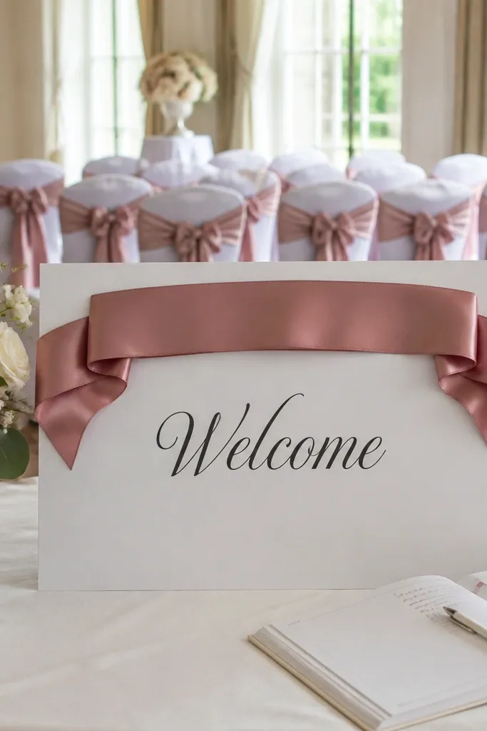
Fabric on a sign looks expensive in photos, even when it’s just a ribbon. A ribbon banner spanning the top or center creates a built-in frame, and it hides small imperfections in printed text. This works for indoor ceremonies, especially when you have matching ribbon in bouquets or chair sashes. Use a single ribbon color and one type of lettering so the look stays cohesive. It’s also easy to transport because the base is flat and the ribbon can be attached with removable tape.
Step one: cut a cardstock base to 8x12 inches and print “Welcome” in a bold font sized to fit the ribbon width. Step two: lay ribbon across the base, mark where you want it, and tape the ends underneath with double-sided tape. Step three: glue or tape the printed “Welcome” onto the ribbon, then add names/date below in a simple line. If you’re using a lightweight ribbon, add a thin backing strip so it stays taut. Total time is about 5-15 minutes.
Quick tipChoose ribbon with a matte finish; satin catches venue lights and creates glare.
Skip thisDon’t use fraying ribbon edges unless you’re deliberately going rustic; frays look sloppy from distance.
14. Vintage Postcard Collage with "Welcome" Over the Top
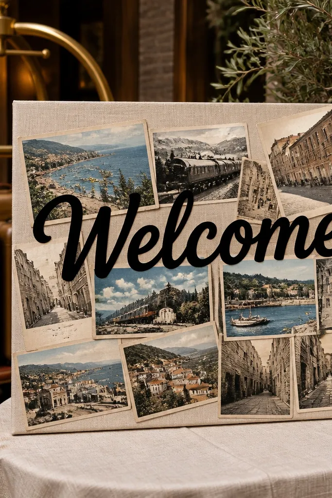
A postcard collage gives you instant story and texture, which makes the sign look interesting even when it’s not huge. The key is to keep the “Welcome” text bold and clean so guests can read it. This style is great for destination weddings, travel-themed celebrations, and venues with lots of neutral decor. Use 3-5 postcard images max, all in similar color tones, so it doesn’t become chaotic. It’s also a clever way to incorporate your city or travel theme without making everything look like a scrapbook.
Step one: pick 3-5 small postcard-style prints and trim them into rectangles that fit a 11x14 inch base with small gaps. Step two: glue them down on a matte cardstock or foam board background, then add a white panel or strip where “Welcome” will go. Step three: place bold “Welcome” text on top of the white strip and add names/date beneath the strip. Finish by smoothing the surface so no edges lift. Plan 15-25 minutes depending on print cutting.
Quick tipUse matte photo paper for the collage prints; glossy postcards reflect light and look washed out.
Skip thisDon’t mix wildly different color palettes; the “travel” look turns into random clippings.
15. Laser-Cut Look with Layered Paper "Welcome" (No Machine)
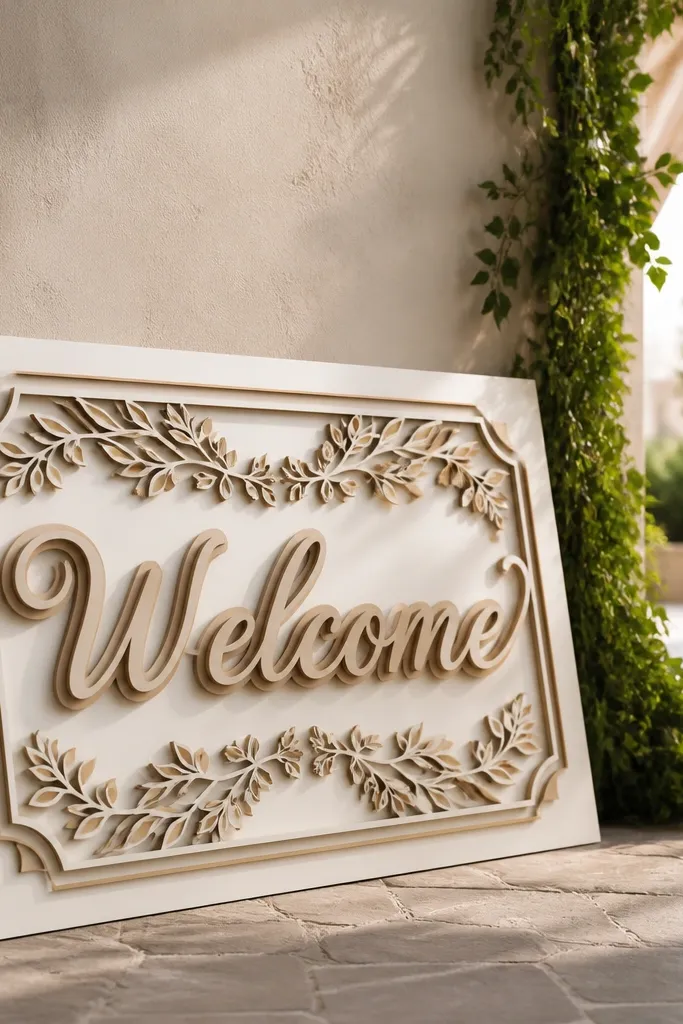
You can get a layered, laser-cut vibe with basic scissors and a few layers of paper. The shadow effect comes from stacking slightly offset letter cutouts, which reads rich in photos. This is a great option if you want something dimensional without buying a cutting machine. Keep the background plain so the layered letters pop. This style suits modern venues and minimalist tables because it adds depth without adding clutter.
Step one: print “Welcome” in a thick font, trace it onto 3 layers of colored cardstock, and cut each layer cleanly. Step two: glue the bottom layer first, then offset the second and third layers by about 1/8 inch to create the shadow look. Step three: mount the stacked letters on a solid background panel and add names/date in a small, simple font under the word. Use a strong glue like craft adhesive for paper layers so nothing lifts in transit. Total active time is 15-25 minutes.
Offset in one direction only (like down-right). Random offsets look accidental.
Don’t choose a thin, detailed font; thick shapes cut faster and look cleaner.
16. Minimal Line-Drawing Border with One Accent Color
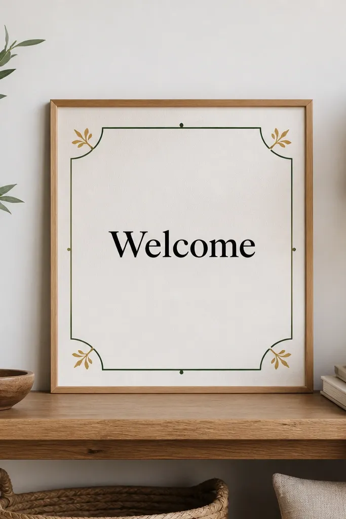
A thin line border makes a sign look designed, even when the materials are basic. Pair it with black text and one accent color like terracotta or deep green and you get a clean, modern look. This works well for venues with simple backdrops, like white walls, neutral linens, or ceremony arches. It also photographs well because the lines don’t compete with florals or signage behind it. Keep the border consistent and leave breathing room in the center.
Step one: cut a white or cream base to 8.5x11 inches and use a ruler to draw a thin border inset about 3/4 inch. Step two: write “Welcome” in black and add names/date below, with the date in your accent color for one visual pop. Step three: add a tiny line-drawing icon in the corner like a single leaf, just one — not a cluster. If you’re worried about symmetry, use a printed stencil for the border corners. Expect 10-15 minutes.
Quick tipUse a 0.5mm black pen for the border; thicker pens make the sign look heavy.
Skip thisSkip multiple icons; one corner detail is enough.
17. Gold Outline Letters on Black Base with White Name Line
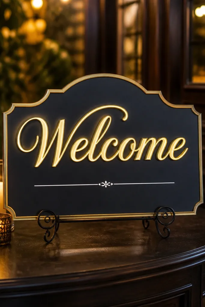
Gold outline letters on black look dramatic and readable, especially under evening lighting. It’s a great match for venues with warm lamps, candlelight, or dark wood. The white names line keeps the layout from feeling too heavy, and it reads cleanly when guests move around. This design feels luxe without needing heavy materials. Use a single gold tone and avoid extra decorations so it stays crisp.
Step one: use a black foam board or cardstock base in 11x14 inches and print names/date in white. Step two: create “Welcome” using a stencil, then outline the letters with a gold paint pen. Step three: fill the inside of the letters lightly with a black marker or leave it unfilled so you get an outline look. Mount the printed names/date beneath and check spacing with a ruler. It usually takes 10-20 minutes depending on stencil accuracy.
Quick tipOutline letters only — filling can look muddy if your pen coverage isn’t even.
Skip thisDon’t use glitter paint; it sparkles in person but turns messy in photos.
18. Photo Strip Welcome with 4 Small Polaroid-Style Frames
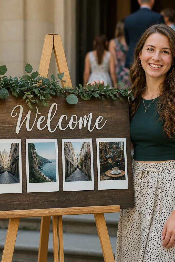
This style is photogenic because it creates a natural “look here” center. Guests love reading it and then noticing the photos, which makes the sign feel personal without being complicated. Use four small images in polaroid-style frames around the “Welcome” text so the layout feels balanced. It’s a great fit for courthouse weddings, weekend celebrations, and any simple event where you want the sign to act like decor. Keep the photos in a consistent tone so the sign looks cohesive.
Step one: print four small photos and trim them into rectangles, then back them with white cardstock to make simple polaroid frames. Step two: arrange the frames in a 2x2 grid on an 11x14 base and glue them down. Step three: place “Welcome” text centered above or between the frames and add names/date beneath. Use matte photo paper and a matte base to reduce glare. Total build time is about 15-30 minutes.
Quick tipChoose photos with bright faces or clear backgrounds so the sign stays readable and not too dark.
Skip thisDon’t use glossy photo paper; reflections will steal attention from the text.
19. Single Large Leaf Silhouette with Black Welcome Text
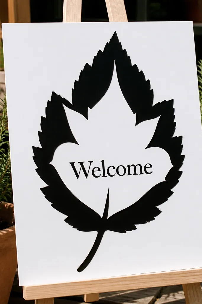
One large leaf silhouette makes the whole sign look intentional and botanical without needing a full floral wreath. It’s clean, modern, and works for both garden and minimalist weddings. The negative space inside the leaf keeps the background light, so your black “Welcome” stays readable. This is a strong option if your venue has lots of greenery — the sign won’t fight with it, it coordinates. It also photographs well because the leaf shape gives the camera a clear graphic.
Step one: print or trace a single leaf silhouette onto a contrasting color paper like sage or deep green and cut it out. Step two: glue the leaf centered on a cream or white base and add “Welcome” in bold black letters across the top or inside the leaf outline area. Step three: add names/date beneath the leaf in smaller text with consistent spacing. If you want extra dimension, add a thin foam strip behind the leaf. Plan 10-20 minutes depending on cutting precision.
Quick tipUse a leaf with simple veins; complicated leaf shapes look messy when cut quickly.
Skip thisSkip multiple leaves; the silhouette should be the only big graphic.
20. Ivy Wreath Style Corner Frame with "Welcome" Center
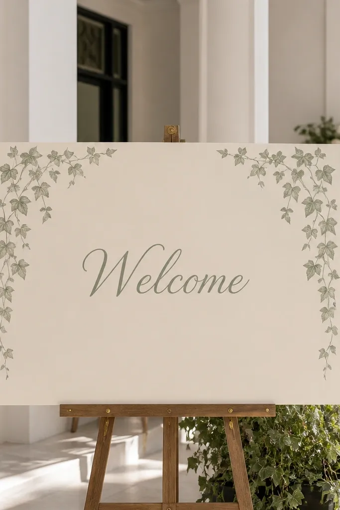
Corner framing looks classy without taking up the center where guests need to read. An ivy wreath style corner gives a soft romantic vibe, but because it’s only in the corners it stays clean and doesn’t overwhelm your entry table. This works well for indoor ceremonies, especially when you have simple flowers and want the sign to feel more complete. Keep the “Welcome” text big and centered, and use names/date in a smaller but readable size. Choose one green tone so it matches your greenery.
Step one: print “Welcome” centered on matte paper and cut it out for a clean edge. Step two: use ivy leaf stickers or pre-cut vinyl in the corners and place them symmetrically. Step three: glue “Welcome” on top of the base and add names/date beneath, keeping the spacing even. Mount on a foam board backing so it stands up and doesn’t droop. Total time is 5-15 minutes if you’re using stickers or vinyl.
Use symmetry marks lightly with pencil so both corners match height.
Don’t put the wreath behind the text; it reduces contrast and readability.



