
1. Matte Black Bar-Queue Menu Board Seating Chart
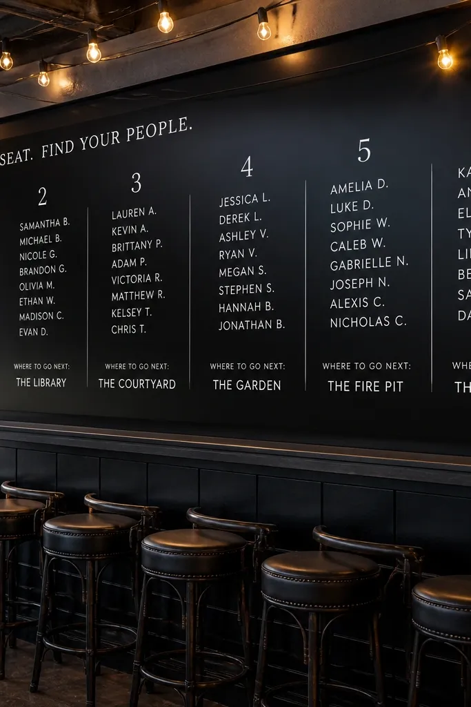
This works because it matches how guests already think during cocktail hour — like choosing drinks off a menu. Put your dining groups and food timing in the top half, then add a simple “Where to go next” line under each group. The matte black background hides minor DIY imperfections and looks sharp under string lights. Use thick white vinyl cutouts for the headings so the text stays crisp even in low light. It’s ideal for venues where the bar is central and guests naturally form a line.
Start by buying a matte black menu board or a pre-primed black sign board with a cork or pegboard backing. Then print your headings on thick card stock, punch them into uniform labels, and mount them with small standoffs so they cast a tiny shadow. Finally, place the board so it faces the line at a slight angle, not straight-on, which reduces glare from glass and lights. Keep the headings to 1-2 words per section so guests can find their group quickly.
Use white labels with a subtle gray drop shadow for photos — pure white can blow out under overhead lighting.
Skip glossy board finishes; they create glare that makes text unreadable in wedding photos.
2. Stained Wood Ladder with Table Numbers and Drink Notes
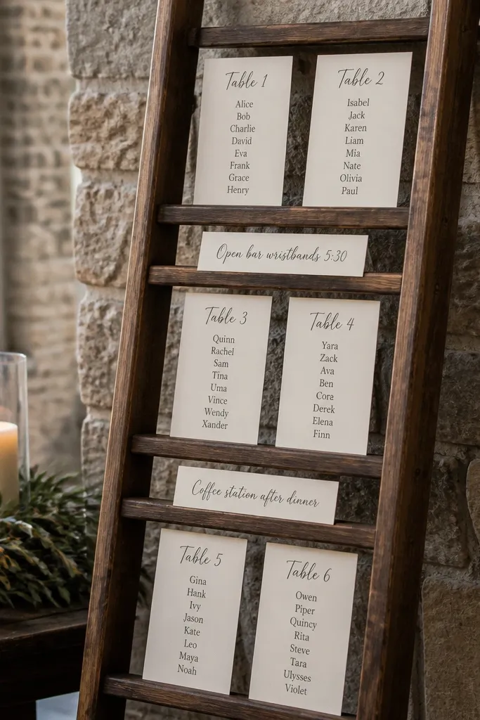
A ladder display looks intentional without trying too hard, and it’s great for a food and drink seating chart wedding because it separates information vertically. Put table groups on the rungs and include a short drink note like “Open bar wristbands 5:30” or “Coffee station after dinner” under each rung. Stained wood reads warm in photos and matches wood frames and bar carts. It suits indoor barns, garden venues, and rustic modern spaces where wood tones already show up in decor.
Start by finding a small, leaning ladder (about 4-5 feet tall) and sanding it lightly if it feels rough. Then attach mini picture ledges or use clothespins with matching twine to hang your cards so you can swap labels easily. Finally, place it near the bar but slightly off to the side so guests can read without blocking the line. Budget tip — print fewer custom signs and re-use the same template with your guest group names plugged in.
Use foam board under each card if the ladder is in bright sun; it reduces glare and keeps ink sharp.
Avoid tiny text on upper rungs; guests will stand farther back there.
3. Fabric-Backed Pegboard with Watercolor-Style Place Cards
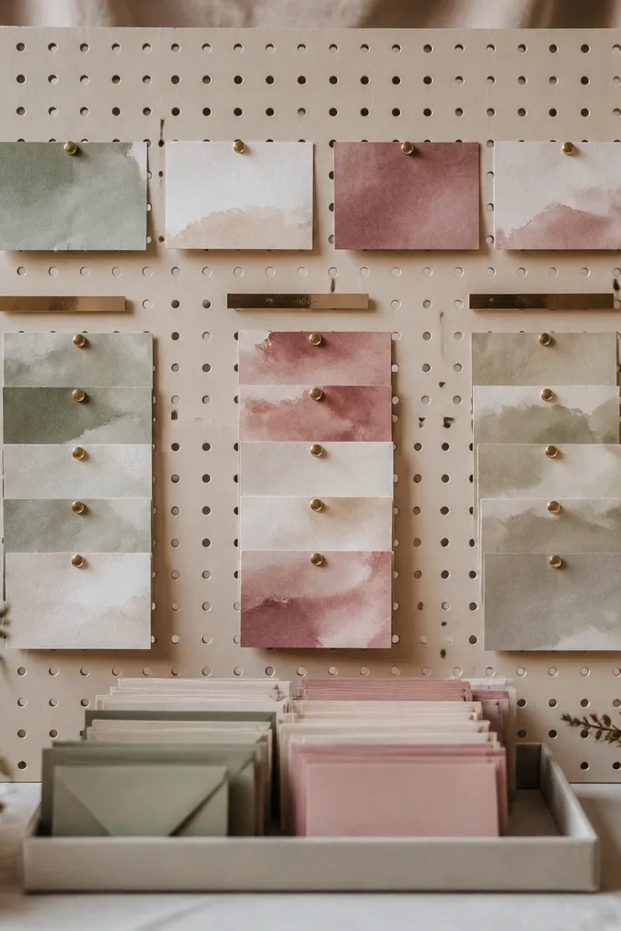
Start by buying a pegboard panel sized to your wall area and covering it with a tight-fitting fabric secured around the edges. Then mount your table-group cards using small binder clips or mini clothespins, keeping consistent spacing. Finally, add a separate row for food and drink notes like “Dessert pick-up” or “Bar cut-off” so guests see the flow. If you’re outdoors, skip fabric and use laminated paper on a rigid board instead.
A pegboard plus fabric backdrop gives you that Pinterest-clean look with real budget control. The fabric softens the background and makes pinned cards pop, which is exactly what you want for a food and drink seating chart wedding. Use a simple color story like sage, dusty rose, or cream, then keep card colors consistent. This is best when you want a display that looks good from multiple angles because pegboards let you build depth. It works well for indoor venues with good wall space and minimal harsh overhead lighting.
Skip thisSkip busy patterns — one repeating pattern competes with your labels.
Quick tipChoose fabric with a matte finish; shiny fabric turns into a glare screen under flash.
4. Acrylic Sleeved Seating Cards on a Clear Welcome Stand
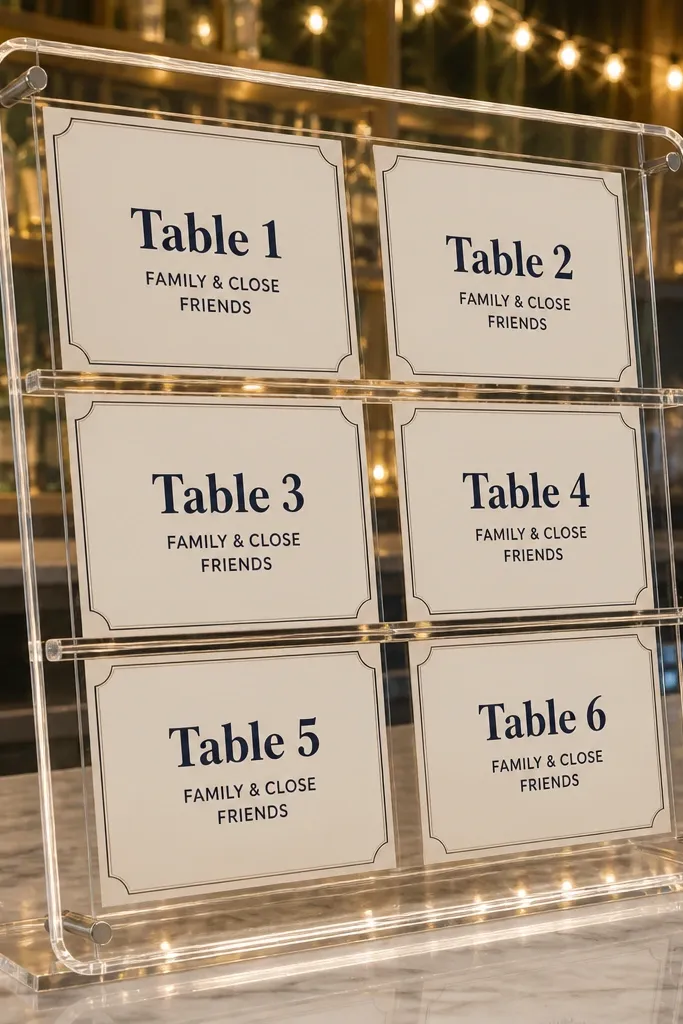
Start by buying a clear acrylic sign holder or tiered clear stand with multiple compartments. Then print your table-group cards slightly smaller than the sleeve opening so edges don’t curl. Finally, set it beside the welcome table or outside the dining entrance, not behind it, so the stand faces the guest path. Budget control — use the same font and layout for every card, changing only the table group name and note line.
Clear stands look expensive and photograph clean because they don’t block light. For food and drink seating chart wedding setups, acrylic sleeves let you swap cards without tearing anything, and the labels stay readable in bright bar lighting. Keep your print design minimal: one bold heading and a short sub-line for food and drink timing. This is a smart pick for modern venues, hotels, and city weddings where you want the display to feel crisp rather than rustic.
Skip thisAvoid overcrowding the compartments; fewer cards per level reads faster.
Quick tipUse black ink or deep navy, not light gray; gray washes out behind clear acrylic.
5. Chalkboard with Laser-Look Vinyl Table Headings
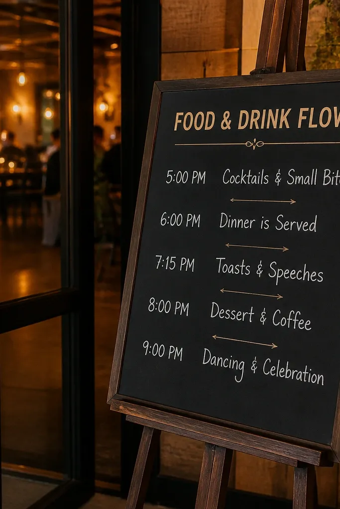
Start by buying a large slate or chalkboard and cleaning it so chalk sticks evenly. Then apply white vinyl cutouts for table headings, and write the food and drink notes underneath with chalk using straight lines and consistent spacing. Finally, seal finished areas with a matte chalkboard sealer if you’re outdoors or near condensation from drinks. Place it where guests approach slowly, like next to the check-in desk, so they can read without bumping into the bar line.
Chalkboards are classic, but the budget win is combining chalk with vinyl headings so you get sharp typography without expensive lettering. Your food and drink seating chart wedding can look polished when the heading text is perfectly aligned and the details are hand-written. Choose one chalkboard color like charcoal or slate and keep the palette tight: white vinyl + white chalk. This works especially well for venues with a cozy, warm vibe and string-light lighting, because chalk texture looks good on camera.
Skip thisSkip all-handwriting for every line; it drifts and looks messy fast.
Quick tipDo a quick test with your chalk under the venue’s lighting; some chalk shades look washed out in warm bulbs.
6. Vintage Frame Gallery Wall Seating Chart Grid
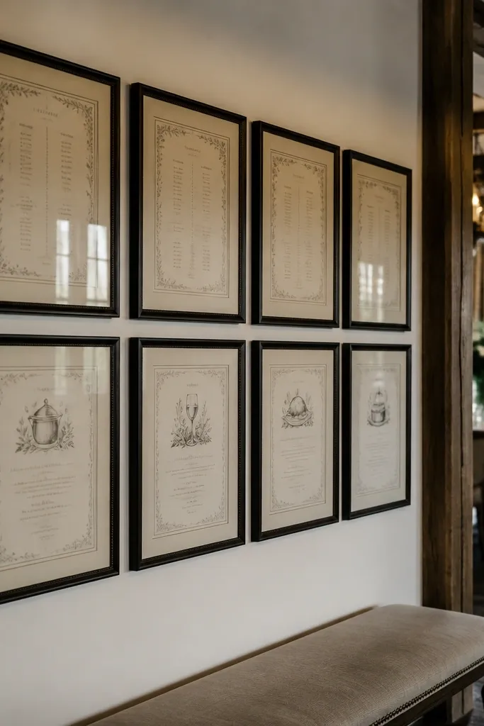
Start by collecting frames with the same inner opening size, because that makes the grid look intentional. Then print cards that fit behind each mat and mount them with adhesive strips so you can replace cards later. Finally, hang the frames at eye level and add a small arrow or “Start here” card at the corner to guide reading direction. Budget tip — buy thrift frames, then spray paint them one color for a uniform look.
This turns the seating chart into decor, which is exactly what you want for a food and drink seating chart wedding display that doesn’t look like a spreadsheet. Use 6-10 frames in a consistent finish, like black frames with cream mats or natural wood frames with white mats. Put table groups in the top row and food and drink notes in the bottom row, so guests get the flow in one glance. It’s ideal for indoor venues where you have a wall, and it’s also great for smaller weddings where you don’t need a massive sign.
Skip thisAvoid mixing frame sizes wildly; it makes the chart harder to scan.
Quick tipUse cream mats if you’re printing dark text; they reduce contrast harshness in photos.
7. Repurposed Window Pane Seating Chart with Table Panels
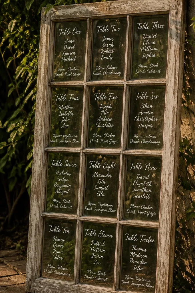
Start by sourcing a small old window pane and cleaning it so dust doesn’t show through your cards. Then attach twine lines or small hooks across the pane and hang printed cards in each grid section. Finally, place it near the path from the cocktail hour area to the dining entrance, where people naturally pass by. If you’re outdoors, laminate the cards or use clear sleeves to protect from humidity.
A window pane instantly looks storybook, but the trick is keeping it readable. Use the window’s grid to break the chart into panels: each panel gets one table group heading and one food/drink note. The wood and glass texture adds depth in photos, and the open structure keeps the display airy. This suits outdoor garden weddings and rustic venues where you want decor that feels like it belongs on the property. It also works when you want a display that guests can walk around.
Skip thisSkip tiny cards hung too close together — they blend in busy backgrounds.
Quick tipChoose a card size that fits a window grid section without overlapping; overlap makes it look chaotic.
8. Table Number Place Cards on a Bar Cart Backdrop
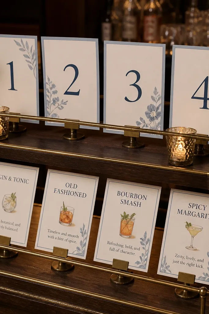
Start by placing your bar cart where the line forms, then create a backboard using foam board or a piece of fabric pinned flat. Next, build two tiers: one for table group names and one for beverage or service notes. Finally, secure the cards with mini easels or binder clips so they don’t shift. Keep the notes short: “Bar open 5:30-6:30” reads better than a paragraph.
A bar cart is already a focal point, so adding a seating chart to its backdrop makes food and drink seating chart wedding logic feel natural. Put table numbers on the top tier and add drink notes on the lower tier so guests can read while they wait for a drink. Use thick card stock and a consistent color for headings, like black text on cream. This looks especially good in photos because the cart adds height and layers. It’s best for venues with a dedicated cocktail hour station where guests are already clustering.
Skip thisAvoid using thin paper; it bends when guests lean in.
Quick tipUse matching label tape strips for headings across every card; it looks designed instead of random.
9. Round Menu Sign Stand with Table Segments
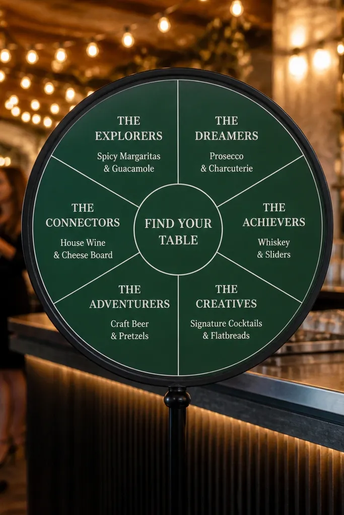
Round signage is easier to photograph than rectangular boards because it reads as intentional decor. Divide the circle into segments: each segment is one dining group, with a small food and drink note inside. Use a bold color background like deep green or navy, then keep the text white and centered. This works well for weddings where you want the chart to feel like a “feature” next to a dessert table or cocktail station. It also helps when the venue has strong lines and angles — the circle softens the whole scene.
Start by buying a round sign blank or using a large foam board circle with a stable base. Then create segments using removable tape while you design, and finalize with paint or vinyl lines. Finally, insert printed cards into the stand’s pockets or mount them directly with adhesive corners. Place it where guests approach from one main direction so they see the segment headings first.
Keep your text centered within each segment; off-center text looks messy on a curved surface.
Skip light pastel backgrounds; they wash out under warm indoor lights.
10. Wood Slice Table Group Sign with Laser-Cut Style Vinyl
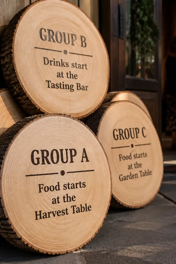
Wood slices look hand-crafted, and they make a simple seating chart feel like decor. For food and drink seating chart wedding displays, use wood slices as the table group markers and add a small note about where the food and drink flow starts for that group. The key is readability: bold headings, short notes, and a consistent placement pattern. This idea shines outdoors and in rustic venues because the texture matches natural surroundings. It’s also a good choice when you want a “path” style display rather than one big board.
Start by buying wood slices in a consistent thickness, then sand the top surface lightly for better vinyl adhesion. Next, apply vinyl headings and add a small printed note under each heading using waterproof glue or laminating tape. Finally, arrange the slices on a stand or along a small table with a clear left-to-right order. Keep each slice’s text minimal so guests can read from standing distance.
Use waterproof label sheets so rain or morning dew doesn’t blur ink.
Avoid carving or etching tiny text; it looks good up close but fails at 8 feet.
11. A4 Photo-Look Seating Chart on Thick Foam with Stand Offs
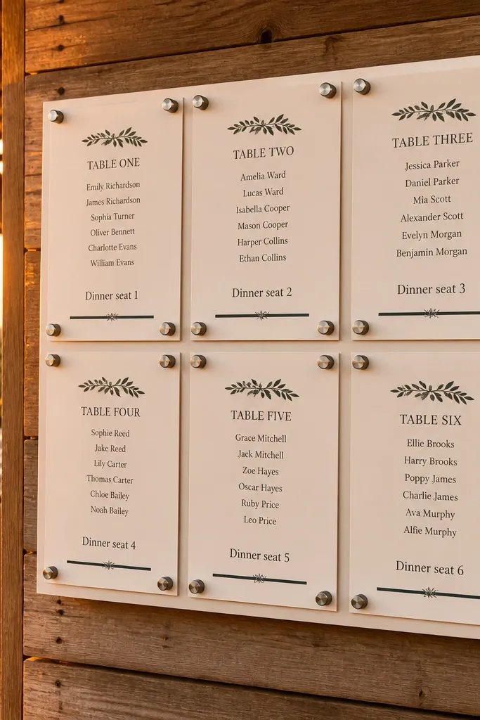
Start by cutting a foam board backing panel and covering it with matte wrapping paper or a solid colored craft paper so the background looks finished. Then mount separate A4 cards using stand-off spacers or adhesive squares so the cards don’t flatten into the board. Finally, add a header strip at the top with your heading and a simple arrow showing direction. Place it where guests stop briefly, like near the cocktail hour entrance or the dining room doors.
This is the budget-friendly “clean magazine layout” approach. Thick foam board gives you a sturdy, straight backing, and A4 cards make it easy to scale your content without cramming. For a food and drink seating chart wedding, keep each card to one table group and include a single food/drink note line like “Dinner seating at 6:45” or “Dessert pick-up behind stage.” The result looks crisp in photos because the cards have consistent margins and spacing. It’s ideal for venues where you can place a single sign near the entrance.
Skip thisSkip printing on regular paper; it curls and looks cheap when pinned or taped.
Quick tipLeave at least 1.5 inches of margin between cards; it looks designed and reads faster.
12. Magnetic Fridge-Style Seating Chart on a White Sheet Metal Panel
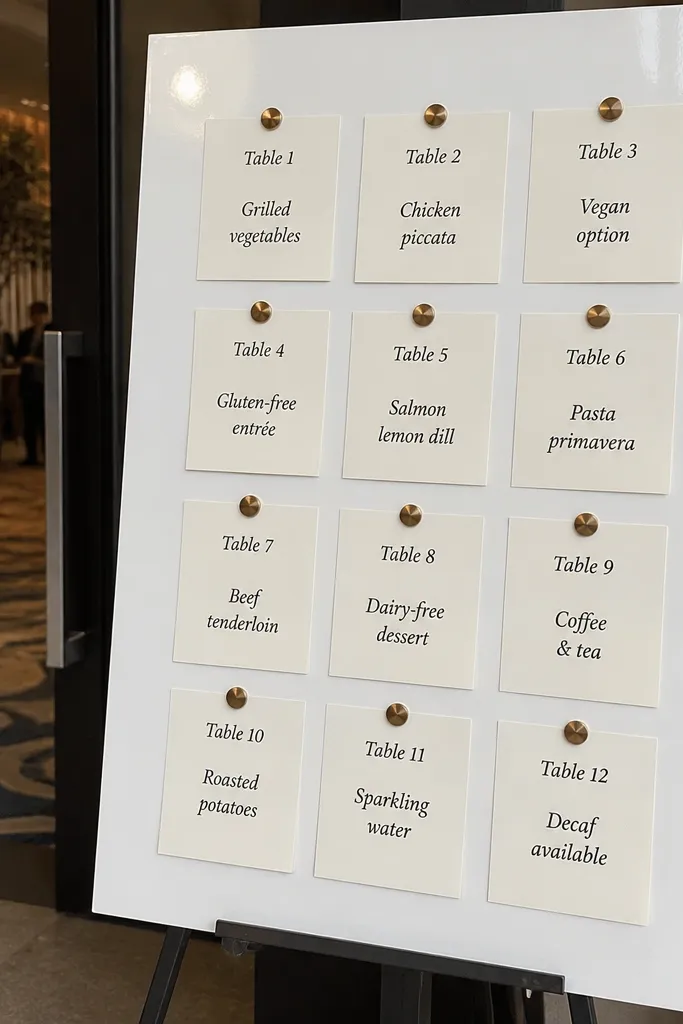
Start by buying a white sheet metal panel from a hardware store and mounting it on a stand or wall. Then print your table group cards with consistent sizes and add small magnetic strips to the back. Finally, organize cards into rows: top row for table groups, bottom row for food and drink timing notes. Place it so guests can read straight on, not from the side where magnets reflect light.
Sheet metal with magnets gives you that satisfying, clean look and makes updates easy. For food and drink seating chart wedding, you can move cards as you finalize guest counts without reprinting everything. The white background keeps text sharp, and magnets look neat in photos because they sit flush. This is best for weddings where you expect last-minute changes or where you want a display that can evolve across rehearsal, ceremony, and reception. It also works well indoors near a service area.
Skip thisAvoid mixing card sizes; it makes the layout look like a last-minute corkboard.
Quick tipUse matte laminated cards so reflections don’t show up behind the text.
13. Tiered Acrylic or Lucite Riser with Color-Coded Table Bands
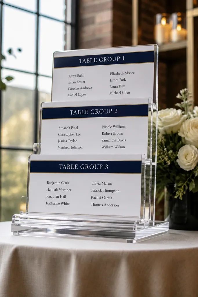
Tiered risers look high-end because they stack content at different heights, which helps guests scan fast. For food and drink seating chart wedding, color-code only one thing: the table group band, not the entire design. Keep the text black or deep navy on white so it stays readable. The clear material also makes your display feel light, which pairs well with bar carts and dessert tables. This is a great choice for modern weddings and venues with clean lines.
Start by getting a tiered acrylic riser set or build one with clear acrylic blocks and a stable base. Then print your table group cards with thick white backgrounds and a single colored band across the top. Finally, place one note card on each tier for food and drink flow, like “Bar opens 5:00” on the first tier. Put the riser at the edge of the bar station so it’s visible without blocking drink service.
Pick band colors that match your napkins or florals — use the same palette across cards.
Skip rainbow color schemes; they make the chart harder to read.
14. Chalk Marker on Black Foam Board with Transparent Tape Borders
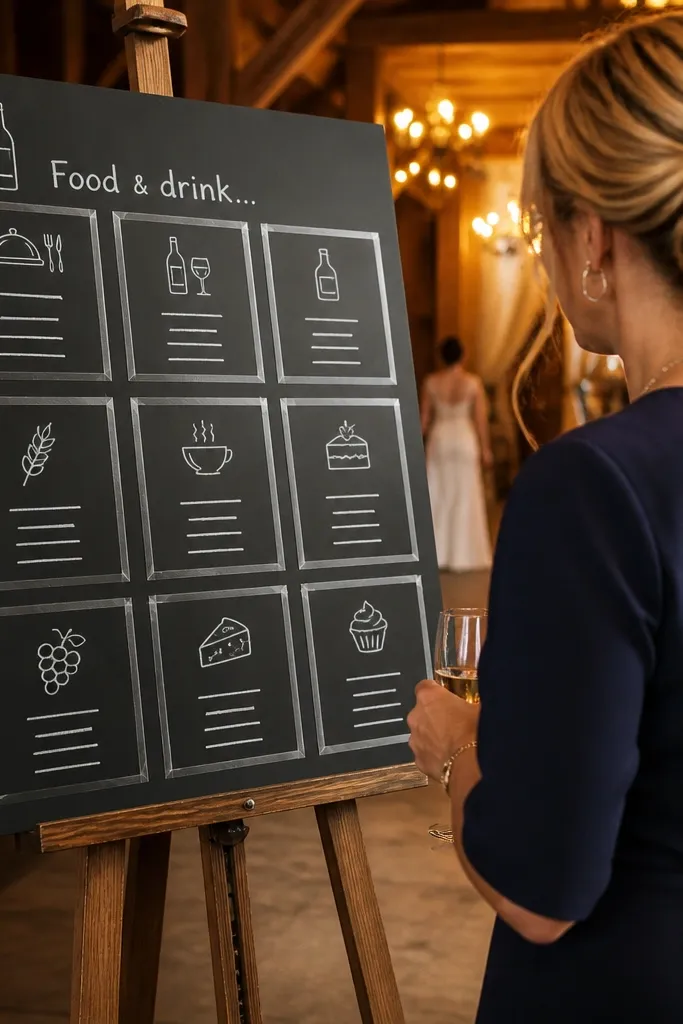
Start by cutting a large black foam board and setting it on a stable easel or stand. Then apply clear tape strips in a grid pattern so your boxes are straight, and write headings with a white chalk marker. Finally, add laminated labels or cover the chart with a clear plastic sheet if there’s humidity near the bar. Place it near the dining entrance where people line up or wait for seating.
This is a clean, graphic look that’s still cheap. Black foam board hides scuffs, and white chalk markers pop hard in warm lighting, which makes your food and drink seating chart wedding display easy to spot from across a room. Use transparent tape borders to create tidy boxes, then write only the essentials inside each box. It looks modern in photos because the layout is crisp and geometric. This works best for indoor receptions where lighting is consistent and you’re not dealing with heavy rain.
Skip thisAvoid writing in cursive; it gets hard to read at distance.
Quick tipTest your chalk marker on a scrap piece; some brands smear when touched.
15. Sunburst Paper Fan Seating Chart Behind the Bar
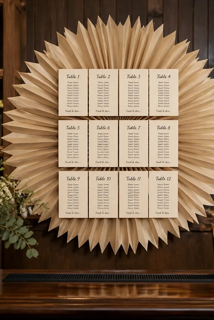
Start by making a sunburst backdrop from kraft paper or colored cardstock strips, glued in a fan pattern on a board backing. Then pin table group cards at the center using push pins or binder clips so you can swap them. Finally, secure the whole backdrop on a stand or to a wall next to the bar. Keep the cards fewer and larger, so the chart stays readable and doesn’t look like a collage.
A sunburst backdrop makes your seating chart feel like a photo prop, and it’s perfect for a budget-friendly display because you can build it with craft paper. For food and drink seating chart wedding setups, center the dining group cards on the sunburst so guests' eyes land on the middle first. Add one small “Food & drink flow” note at the bottom in a contrasting color. The fan texture creates movement in photos, especially with string lights. It suits outdoor receptions and indoor spaces where the bar wall is blank.
Skip thisSkip tiny cards — the sunburst already has visual texture.
Quick tipUse a matte paper for the fan; glossy paper reflects flash and kills the contrast.
16. Large Ceramic Tile Seating Chart with Vinyl Table Labels
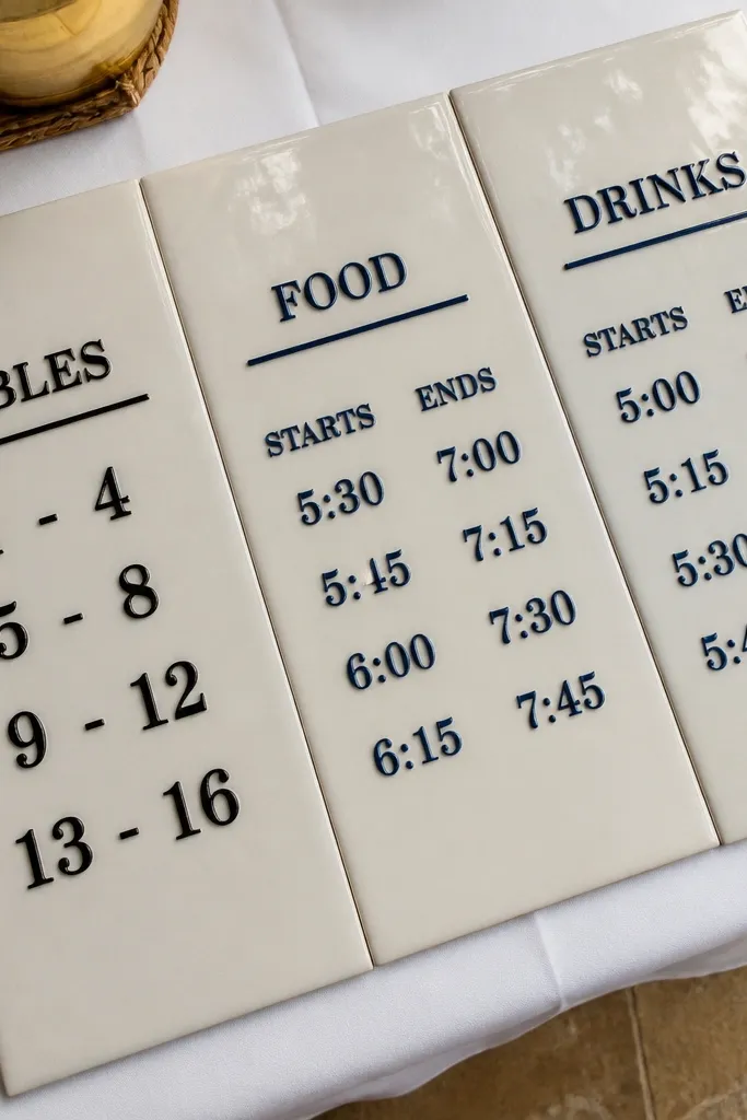
Start by buying a set of large decorative tiles or plain white tiles and arranging them on a sturdy tabletop or easel. Then apply vinyl labels for headings and attach small printed note cards with removable adhesive. Finally, arrange tiles in a left-to-right order and place them at the dining-room entrance or near the coffee station. Budget tip — use plain tiles and spend money on the vinyl labels and clean typography.
Ceramic tiles look clean and upscale, and they photograph well because the surface is flat and bright. For food and drink seating chart wedding, use tiles as separate panels: one tile for table groups and another tile for food and drink timing notes. Vinyl labels stick well and look crisp, and you can remove them if you need to revise the layout. This works beautifully in venues with modern decor, outdoor patios, and spaces with lots of natural light. It also gives you a sturdy, reusable display after the wedding.
Skip thisAvoid dark tiles if your venue lighting is dim; they reduce readability.
Quick tipKeep all labels the same font weight; tiles already add texture, and inconsistent fonts look messy.
17. Vintage Window Shutters Seating Chart with Hinged Flip Cards
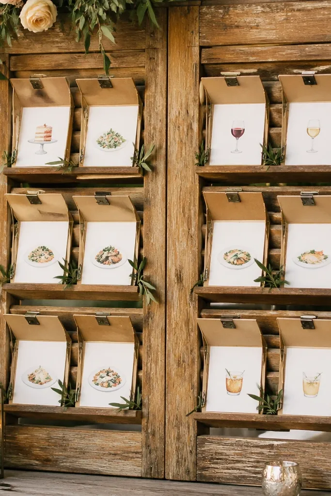
Start by sourcing a small pair of shutters and cleaning them so the finish looks even. Then attach hinge cards or small acrylic flaps to each compartment, using magnets or velcro so they stay closed. Finally, print your table group headings on the front and food and drink notes inside the flap. Position the shutters where guests approach from the side, so the flaps open toward them.
Shutters create natural compartments, which makes them a strong option for a food and drink seating chart wedding when you want structure without a big board. Use hinged flip cards so guests can lift a flap to see the food and drink note for that group. The compartments keep text tidy and prevent clutter, which is what ruins most DIY charts. This look is especially good for outdoor venues and farmhouses because the texture reads warm and authentic. It also creates a fun interaction at the display without requiring a guest to read a long list.
Skip thisSkip thin paper inside flaps; it wrinkles when guests flip them.
Quick tipUse a simple two-color palette on the labels to keep the shutter texture from overpowering the text.
18. Gold Frame Seating Chart with Oversized Table Group Cards
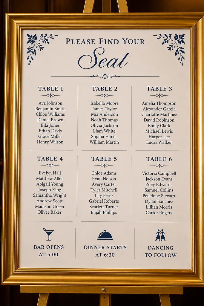
Start by buying a large gold frame or gold-finished poster frame with a flat backing. Then print table group cards at a size that fills most of the frame opening and mount them behind the glass or in front of the backing. Finally, add one separate small card for food and drink flow at the bottom so guests understand where to go next. Place it at eye level and keep glare in mind — use anti-glare film if your venue has strong overhead lights.
A gold frame instantly makes a seating chart look like decor, not admin. The trick is using oversized cards inside the frame so the food and drink seating chart wedding stays readable at a distance. Put table groups on large cards and keep the notes short, like “Bar opens at 5:00” or “Dinner starts 6:30.” This setup is best for weddings with a clear staging area — welcome table, check-in, or just outside the dining room. It’s also a strong choice for winter weddings where indoor lighting and warm bulbs make gold look extra good.
Skip thisAvoid small cards that leave lots of empty space; empty space makes the text feel too “lost.”
Quick tipUse anti-glare sleeves or film if the frame has glass; wedding flash reflects fast.
19. Acrylic Arrow Path Seating Chart from Bar to Dining
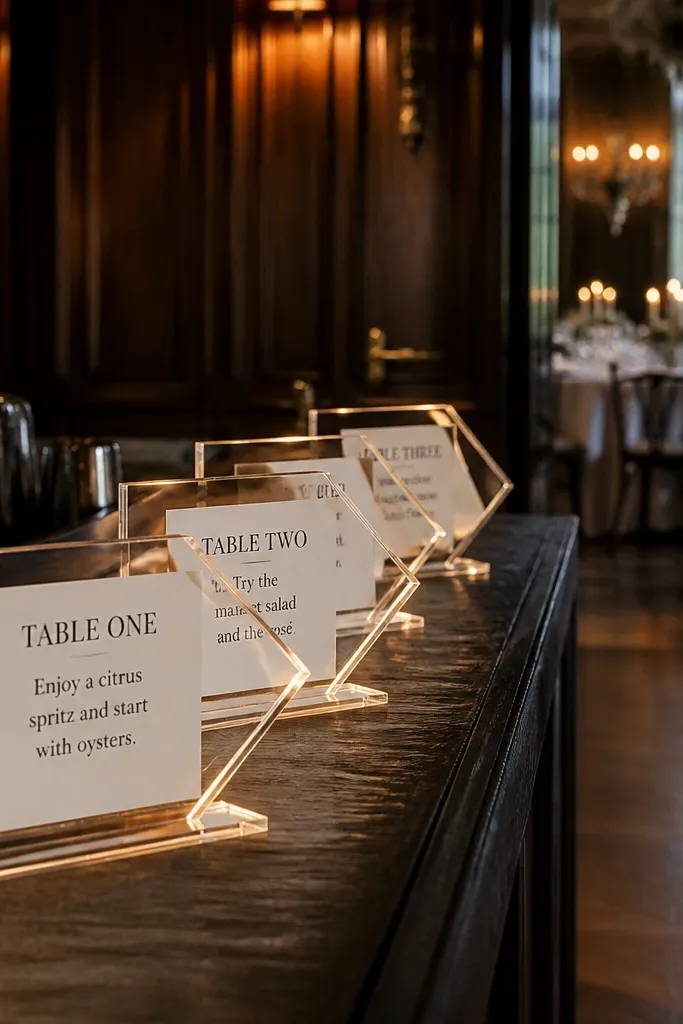
Start by laying out your route on the floor with painter’s tape so the arrows align with guest flow. Then mount printed table labels on small acrylic plates or sign stakes, and attach arrow signs to point toward each labeled stop. Finally, place the first stop at the bar exit and the last stop at the dining room entrance. Budget tip — print the labels once and re-use the arrow plates; only the text changes if you revise group assignments.
This idea solves the biggest seating chart problem: guests don’t just need the info, they need the direction. Clear acrylic arrows create a visual path from the bar area to the dining entrance, and your food and drink seating chart wedding labels sit on the stops. Use one arrow per dining group, with a short note like “Table 3 enters now” or “Coffee station behind stage.” The look is modern and photogenic because arrows read cleanly even in busy backgrounds. It works best when your venue has a predictable walkway and the bar and dining spaces are visibly connected.
Skip thisSkip complicated instructions; arrows work only when each stop has one clear action.
Quick tipUse matte vinyl on acrylic instead of printed full sheets; it reduces glare and keeps text crisp.
20. Woven Rattan Charger Charger Display with Carded Table Numbers
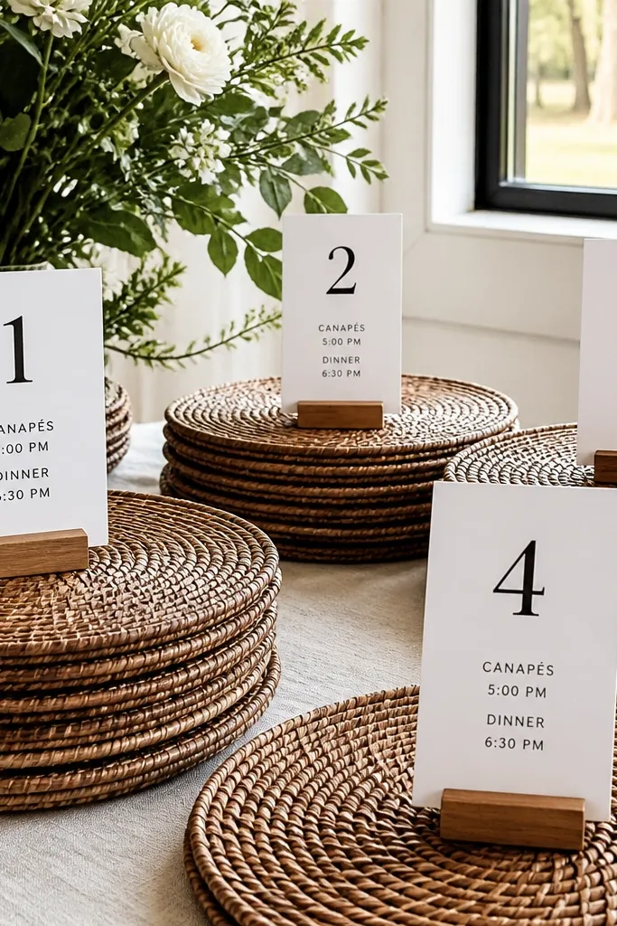
This is the kind of food and drink seating chart wedding display that looks intentional even when you’re keeping the budget tight. Use a stack of woven rattan chargers as shallow bases, then slide small table-number cards into a simple card holder so each station reads fast from across the room. It works especially well for outdoor receptions because the texture hides small paper imperfections and doesn’t look “too flat” on a table. It also fits warm-weather venues like patios, backyard gardens, and beach houses where you want seating to feel breezy, not formal. The best time to use it is late spring through early fall, when natural light makes the woven texture pop in photos.
Step 1: Buy 8-10 round woven rattan chargers (flat, not deep) and matching clear acrylic or metal card stands sized for 4x6 cards. Print table numbers plus a short line for food and drink notes on thick paper (at least 250 gsm), then trim to fit the card holders and add a small icon for drinks like “Beer” or “Signature Spritz.” Step 2: Place chargers on a single long welcome table or bar-side sideboard, grouped by table number ranges (like 1-4, 5-8) so guests don’t hunt. Step 3: Expect about $40-$90 total for chargers and card stands depending on how many you use, and plan 2-3 hours to print, trim, and set everything up. Book your printing a day earlier than you think you need, and do a quick test print at the exact size so the number sits centered in the stand.
Pack a small roll of painter’s tape and a spare card stand. If a stand tilts during setup, tape the base to the charger so it stays straight for photos.
Don’t use flimsy cardstock — it bends in transit and looks cheap when the light hits it.



